Transcripts
1. Introduction: The secret to creating a lively color scheme is by understanding these
three simple terms, hue, value, and saturation. My name's Ira Marks, and color theory is an essential part of my
illustrated storytelling. Today, I'm sharing
just a simple, bite size lesson and a super simple class
project that's focusing on the single idea of understanding
color theory and what it takes to make an impactful color scheme
for your drawing. Exploring color is
a lifelong journey, but today is about setting
off on the right foot. So let's get started.
2. Create A Drawing To Color: Hey, everybody. Thanks for joining me in class here today. Just to recap, here's our single goal for this
class to better understand color and make a class project that reflects our
new understanding. Now, we're going to do
kind of a deep dive into the three key elements that make up what we conceive of
color to be, right. And within those elements, we can make different decisions. And those will help refine and develop and level up our style. But before we get into experimentation and
a class project, we're going to need
a good solid drawing to be able to play with color in these key basic
experimental ways. So let me show you
what I mean here. Let's flip ahead through all kinds of different notes and get to the sketches
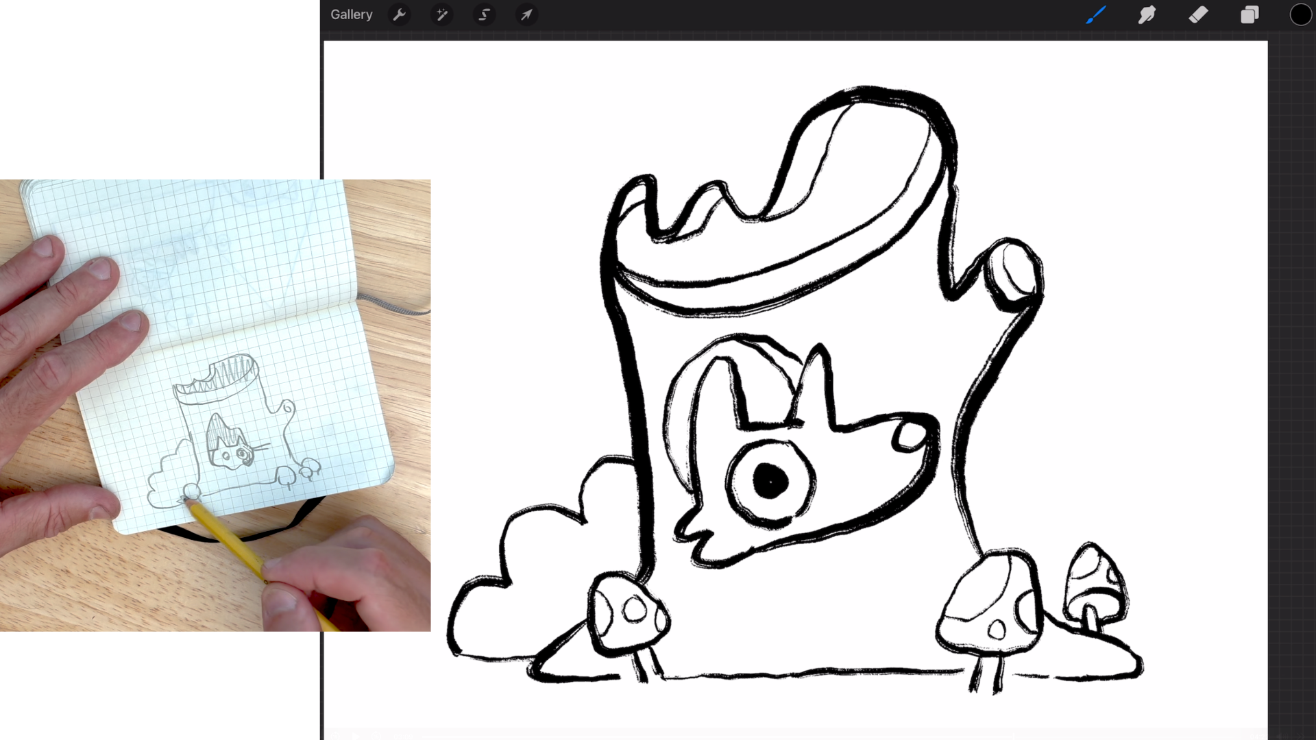
I was doing here. I like to work on graph paper because I'm graphically minded, and sometimes when you're
planning out a composition, it's really best to look in kind of two
dimensional spaces. So you can see my
shape language for my composition is really simple. It's just flat organic
roundish forms, mixed with some pointy shapes. Yes, this is kind of a fox like creature that's a log,
and that's a mountain. But really, I'm thinking in
shape language at this point. Now, I had just a simple idea of an animal on a log with
the background element. So foreground, background,
and that's simple. That was really
what I began with. I tried a couple of
different animals. And let's see. I did an example where I was focusing in on
their garments, its potential to explore color. But I decided overall it's better to play with
a bigger scene. That way we can talk
about narrative and moving the viewer's
eye through the image. So just focusing on a single garment didn't
really seem like a great fit. So I zoomed out again.
I've got a character in a very specific wilderness
explorer outfit and some key
background elements. I zoomed in a little bit, and then just to
flash forward here, I eventually decided on a tree trunk with some little bits of texture
and a unique silhouette, an animal framed by
that tree trunk, so we're not seeing
the whole animal, just the head and some other
environmental elements, little mushrooms
and a shrub that allow for some
reactionary colors. I've got my subject matter, and then the use can be
secondary forms that can be colors that level up
the main subject colors. And you'll see what I mean
a little later with that. So, fundamentally,
what you want is a simple subject mixed with some secondary elements in really basic shape language. Notice there's not
a lot of hatching, not a lot of line art, not a lot of detail, not a lot of different
things to color. I can describe on one hand, the subjects of my composition. Okay, here we are in Procreate. We're going to
make a new canvas. I'm just going to
use the screen size, which totally suits
a project like this. I'm going to sketch on one layer and then ink on another layer, and then from there,
we'll get into color. So I love to work with the
peppermint sketching tool. I believe it's in
my recent brushes, but if you are in sketching, peppermint is near
the top of the list. All these pencils
could be great. I just happen to
like peppermint. It responds to the way I apply pressure with
my pencil naturally, and I'm not going to
sketch with black. I like to sketch
with a soft kind of cloudy blue color because it doesn't make
me want to erase. And I think naughty erasing is a great part of this early
stage of creative development. So, for example, as
I start to plan out this composition and develop its simple shape language
with the tree trunk, adding some other
little elements. Notice I keep my
pencil very light. And I only commit to lines once I'm certain of the ones
that I'm happy with. So instead of
erasing any of this, I might just go
through and darken. Say, I want to add some
imperfections here. I don't go back and erase. I just bring forward the
lines that I want to keep. I'm thinking of
this as kind of an alien or fantasy world because, again, I don't want
to force myself into any ideas with color. That exists outside
of my imagination. All right. So if you want to maybe refine your sketch a little
more, which happens, especially if a composition is trying to say a lot
of things at once, in this case, it's not
really, but I'll just show you what my second
sketch might look like. I'll build another layer on top of this lowering
the opacity. And I would switch
to a reddish pencil simply because it has a high
contrast with the blue. I think the blue
is a little light. Let me darken that
so you can see it. Back to the peppermint brush. Now, a second sketch usually requires focusing the
emphasis of the design. So let's say this little
creature is my emphasis. I'm going to sketch him first, make him pop a little better. A second sketch is often about
adjusting scale and form. Notice how I'm trying to make the silhouette a
bit more distinct. Looking at the silhouette of
your sketch is a great way to consider its visual impact. Now, this is a great
opportunity to possibly do a little editing
with your composition. Like say, for example, I have
four little mushrooms here. A rule of three with objects like this, I
think is a better fit. So simplification
is often better. So if I just remove
that little mushroom, The image feels a
little stronger. Sometimes for fun,
I like to grab the transformation tool
and see if adjusting the squash and stretch of the design actually makes
it a little more appealing. Like, maybe I need this
tree to be a little taller or so. There we go. Alright, our goal again here
today is to create a drawing that is going to let
us experiment and have fun with color while also
representing our style. And I think this sketch
does that pretty well. I'm going to make a new
layer on top of this, switch my brush color to black
and move over to a tool. That's going to give me
some nice strong line art. Now, you're welcome to work in any illustration
style you want. I'm going to work with
line art because that's kind of the nature of a
lot of the work I do. And it's going to be
a great way to let us focus on color
because we'll have some very clear forms
to draw inside of. Okay. I'm going to turn off my background layer. Charming.
3. Basics of Color Theory: So the biggest thing holding
an artist back from becoming a color expert is
not understanding the terminology and
what color actually is. So question of the
day, what is color? Well, color is really
an overall perception of three distinct qualities. Those qualities are hue. Saturation and
value, and they come together to define
a particular color. So to better understand
these ideas, let's look at Procreate's
adjustment menu to practice playing with
these three qualities. Now, let's start with hue. Hue is definitely
the most visually impactful of the three
qualities of color. Therefore, it's the
dominant influence on colors uniqueness. Defining the hues
of the color wheel is the first art
lesson we all get. So while hue is the easiest
way to identify a color, it's not the most
essential for an artist. In fact, value is probably
really where you want to focus a lot of your energy
when you're trying to direct a viewer's attention
through a composition. So why is that? Well, value has the most impact on what we
look at and when we look at. Think of it like
pointing a spotlight at something on a stage because
value addresses light. The more light we
put on a subject, the more important it can feel. Also, value pushes
things further back. Things that are cast in a shadow often move further away from us because that's how things appear in
photographs so often. And the idea of photography, the language of photography
is often how we consider the hierarchy
of the visual world. And last but not least,
we have saturation. Saturation refers
to the intensity or the purity of a color. So while value is adding black or white to
simulate light or shadow, a highly saturated color
is its most pure hue. While desaturation actually
means removing the color, which leaves us with kind of a gray muted washed out version. In fact, to pull out color
to fully desaturate, any color arrives at the
same general values of, like, mid tone grays. So if you want to turn down the volume or turn up
the volume on a color, you address its saturation. And for all your visual
learners out there, here's a color diagram
that addresses, at first, the hue as its presence along a certain
ring of the color wheel. And then through the center, we have like a cylinder that
represents various values, white at the top and
black at the bottom. So around up and down,
and then going out, we address the intensity
of the hue itself. So that's saturation level. So kind of three dimensions of our perception of a color comes to define that
particular color. So, you know, consider
the difference between when you're a
young kid and you're like, My favorite color is purple. That's what I would
have said as a kid. Now, when we're
young, we perceive purple as kind of like
a generic vision. But as we grow up, and maybe purple remains our
favorite color, we start to address the value of that shade of purple
that's distinct to us, the saturation level of that shade of purple
that's distinct to us. All that said, color
is a big part of our identity as an artist
and therefore our style. So being in control of value
and saturation as much as hue can really help you develop
your own distinct look. Now a couple more really
useful terms to know involve the pairing of colors in the building
of a color scheme. Now, Procreate makes it really easy to explore some
of these ideas. So if you go up to your
color selection tool, we've got the color wheel, we've got the classic
color selection with our different hue,
saturation and value. And then we've got harmony
right here in the center. Now, if you come up here
under the word colors and you click where it
says complimentary, you get various types
of color schemes. So a complimentary color
scheme involves opposites. This is how we find a
lot of holiday colors. They're colors that stand at odds with each other and
make strong visual contrast. A split complimentary
has three colors in it. So instead of the color being directly across
from the other, it splits the difference, and we get two strong values, giving you three
colors to work with. Analogous means colors that are next to each other
on the color wheel. It's harder to find strong
contrast with analogous, but it can be done depending
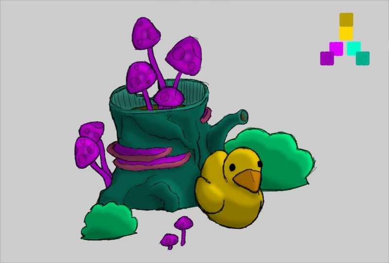
on where you balance your warm and cold color values. Here we have three distinctly
warm color values. Here we have three distinctly
cool color values. But if we set this here, we get stronger contrast. I triatic. So instead of a compliment
straight across, we move further out, and we get three great values. Now, once we get
into three values, it's more about the
ratio of the color. You wouldn't want to equally balance these in a composition because it's almost like too
many conflicting flavors. So once you go beyond two
colors in a color scheme, you start to play with ratios, and we'll get to that in a bit. While we're here, we might
as well look at some of these other categories into
your color palette section. So we can look at value where
you can adjust your hue. I shows you the kind of formula
of red, green, and blue. We can adjust the white
and the black value. Then on the end here, we
can build our own palette. So there's a few
that are preset, but we can actually
make one of our own. So we could say, create new
palette, go back to harmony. Let's say we want a triadic
color scheme, right there. We can go one, two, three, we can even view
them as cards where they get their color name. And we can see right
there we've got a pretty strong
triadic color scheme without too much effort. And more importantly, we
know the terminology now.
4. Inspiration and Reference: Finding inspiration in
the art of others and using their process as
a jumping off point for your own creative journey
is the fastest and probably the best way to develop your sense
of color theory. So I'm going to share with
you three artists from art history that have been a big impact on
my approach to color. But we'll start with one artist who inspired this whole class. So this is a drawing of a dog in a peach colored
raincoat by Jenny Muse. And when I saw this pop
up in my Blue Sky feed, it inspired me to make this
class because I was like, the simple use of a distinct hyper specific
color to know, to use that in a way that will really create a strong
sense of personality. It's such a seemingly
simple choice, but takes a really
advanced understanding of color to get
to that decision. So that's why I wanted to
make this simple class, just to remind us all of
how the detail of a color, the actual character of
the hue, saturation, and value can say so
much with so little. Alright, thanks, Pup. We
appreciate your help. Now let's look at a little
bit of art history. I'm going to start with a
big influence of mine from the world of comics
film and illustration, the French artist Mobius. Their fusion of sci fi and surrealism blends like a futuristic technology
in dream like, often bizarre world building. The great thing about Mobius is often the colors
are quite flat. So while the line work
has a lot of detail, if you just step back
from the line art that's doing so much
descriptive work and think of the use of color, it's actually pretty
straightforward. We've got kind of a
beige, sandy landscape. And then we have this
green character, a strong secondary color with different
values blended in. A couple little extra warm
and cool colors as accents, but just the simple idea that this wizard ish character
is green really implies a lot about the
condition of them in this world, the contrast between the grass and the color of the wizard, like this lively green against this more muted sand color. Now, another great
lesson for Mobius is more color doesn't
mean better color. Mobius is a great world builder, and a lot of their
images are like these huge deep epic landscapes. But you can see,
in terms of color, the palette is quite simple, and it really comes
down to use of value and getting
the saturation just right between the warm and
the foreground of this rocky, like, cliff side, and then the rocky face
in the background. In that warm, cool juxtaposition shows the contrast
between these characters and emphasizes the immense scale that's already being
generated by the linework. Let's look at another
icon, Mary Blair, an early Disney animator and concept artist who is there
through some of the most, like, influential
early Disney work. For example, Peter Pan, here's just a really whimsical, cool summer feeling
night scene of, like, a flying ship. Notice the strong contrast
between the Blacks and the really almost
monochromatic color scheme with one little accent of this, like, dull, almost
pastel like yellow. Mary Blair worked in guash, and you can see the qualities of that material are really
definitive to her work. Here's another example of a character scene from
concept art for Cinderella. Notice, kind of the dull, muted warm sense of the room. We have one, like,
charming little accent chair over in the corner, and then this soft pink
color of the rose, this kind of
premonition of, like, where Cinderella is
going in her story. Now, last but not least, we're gonna look at
one that hopefully is totally new to you. This is the Hungarian
animator, Marcel Jinkovix. This is a scene from their 1981 film Son
of the White Mare, which is based on
Hungarian folklore and some narrative poetry. It features Hungarian legends
and elemental characters. That represent aspects
of, you know, the sun, the world tree,
different seasons and this kind of cyclical
nature of time and history. This is a perfect example
of how color applied to really simple shape language connects with us on a
deeply emotional level. Before we understood the
fancy art world words that describe, you know, complicated emotions with art, we had these easy early
reactions to color and shape. And this film really
emphasizes that. And, you know,
this is what makes a masterpiece that really primal relationship
with these ideas, believing in the power and ideas that are already built
into our sense of color. Okay, so I hope you have your own collection of references and inspiration you can draw from in your work. We're going to hop into
our class project, but know that it
might be great to take a minute and think
about the artists you love and what you
want to represent from their inspiration in
your class project. Okay, here we go.
5. Coloring Your Class Project: Now that we've got a
better understanding of hue value and saturation, we can take this new
information and make small little adjustments
to our creative process. And because we've already
got some line already, we can hop right into color. So I'm going to take
three approaches to what's called flats, which is to lay down just a base solid color
within different spaces. It's almost like coloring
in a coloring book, establishing the
overall palette, and then we'll get into the fun of adjusting textures
and so forth. So let's try three
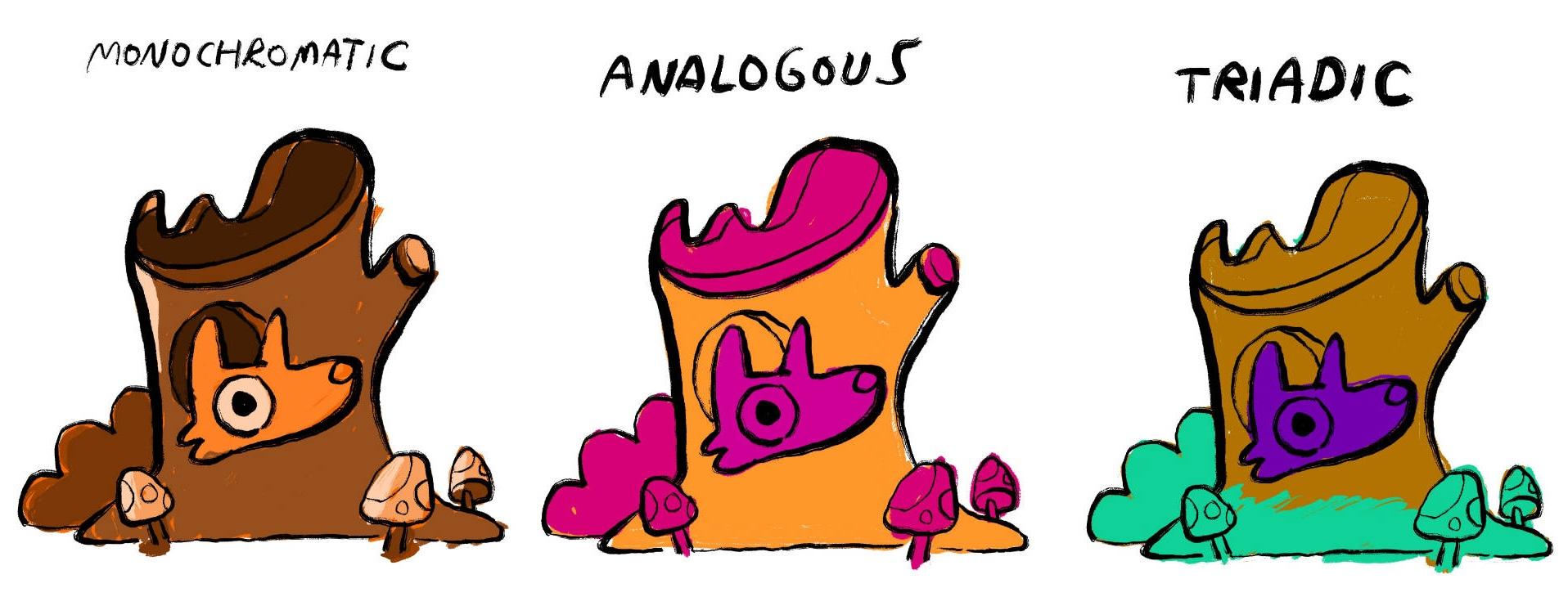
different color schemes. We'll start with monochromatic because that's the most limited. Let's go with a
nice warm orange, which suits the fall kind
of flavor for the scene. I'm working in a specific menu in Procreate's color palette. I like to use the classic
color option because you can see saturation and
value and hue. I'll separate it, so it'll keep those three elements in mind. As I fill different spaces with different values and saturations
of this orange color, I'm thinking about the
contrast I'm creating. What's coming forward in the
image and what's going back. Often darker colors get pushed to the back because
they absorb more light, and the brighter
elements come forward. So I'm making the little
foxy guy the brightest or, you know, the lightest
value of orange. Here's a great little
tip for understanding the role of value in your composition without
the distraction of color. So this is just a
little exercise that's very helpful to
do from time to time. Take a new layer over
your flats layer. Make it solid black, fill the whole
canvas with black. Now, in the menu for the
blending of that layer, scroll all the way
down to color, which is really
close to the bottom. And that will strip out the
color and just show you the pure value of the different
aspects of your color. And this is a great way
to kind of punch it up because if everything sits
in kind of a mid scale gray, there's nothing that's really
jumping out to the eye. And therefore, when the
viewer looks at your work, it's going to take them a
little extra time to decode. What are the focuses? What's the emphasis
of this illustration? Whereas if your
contrast is stronger, your value distinctions
are sharper, then it's easier to kind of decode the narrative
of your image. I think mine works pretty well, it's quite easy to see that
the foreground element, the little fox head, and those little mushrooms
are brightest. The interior of the
tree is darker, and the little shrub
behind the tree is almost as dark as the interior of the
tree, but not quite. So we have these nice steps
of value happening here. And therefore, it
will make my color, my hue. Be specific, Ira. It'll make my hue stronger. Let's try Analogous,
which is three colors. I'm keeping it in
the warmer spectrum. Now, analogous, as
I noted earlier, it can be harder to
create contrast here. But we'll set up our three colors and then hop
into the adjustments menu, play with saturation and hue and the values a little
bit and bump things around till we have something
that just feels very distinct from what we created in our monochromatic
color scheme. This one's a lot punchier. It's got a more neon feel to it. But the thing that's
holding this one back is the fox's head just
sort of blends into some of the
other shades of pink. So, in this case, analogous doesn't convey my narrative
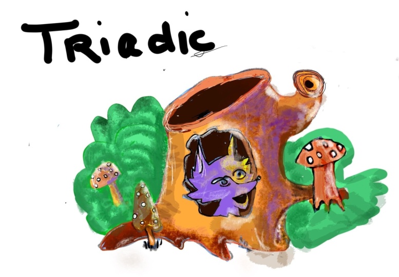
in the way I'd like. So let's try Triatic, which is a more triangular, even spread of our
three color elements. So you can see
right off the bat, this is a lot more of a
literal color scheme, as in the tree is more
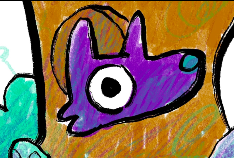
of a conventional, reddish brown, the
shrubbery is green, and then the fox, he's a
little more supernatural. He's gonna be purple. Okay, so I've established the flat
version of my color scheme. Once this is as strong
as it could be, there's a lot more fun to
be had with texture and plane with all the different
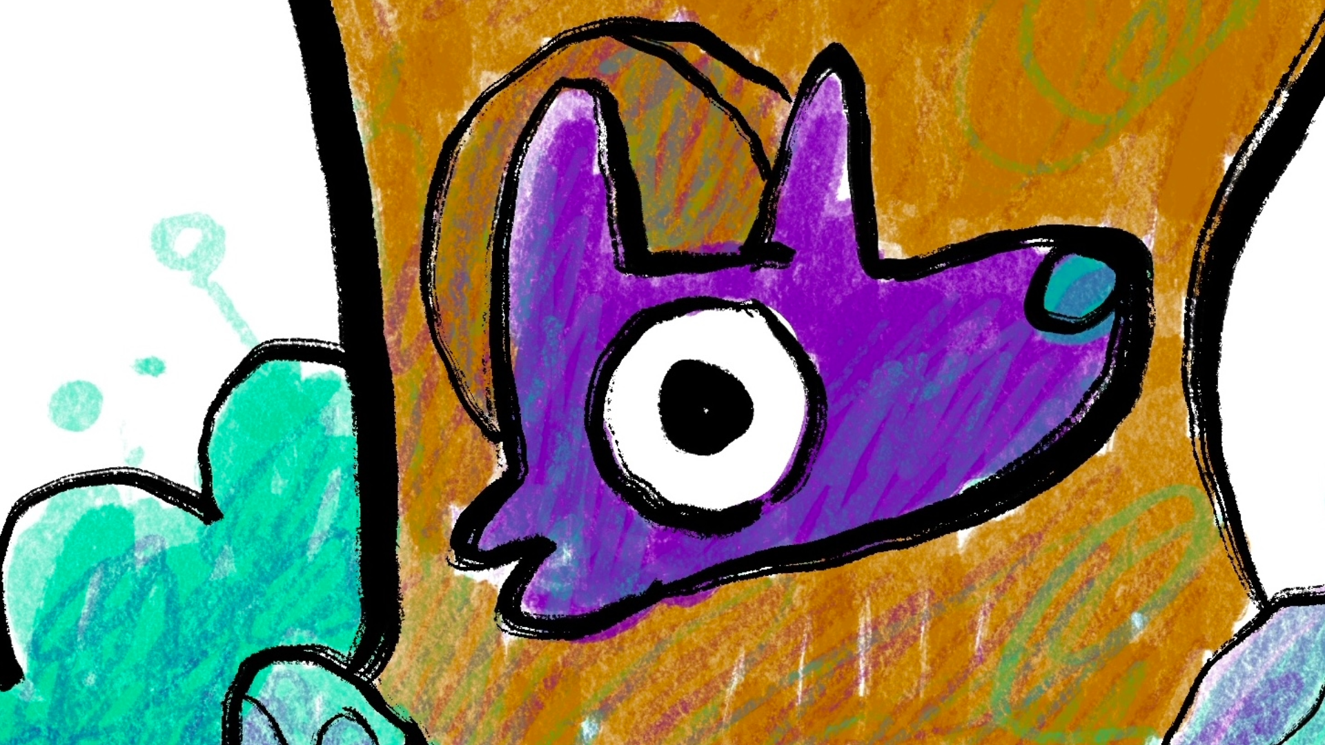
fine brushes in Procreate. So I'm going to, with this color palette in mind, hop out and grab a
different brush. I'm going to go into
my drawing menu here. This tool applies a
lot more pressure. As I move around my surface, I'm like, building up my color, which in a way is
playing with value, just in terms of
the application. And I like to keep
things a little messy because there's a charm of pairing messy color fill with
a bit of a messy line art. Like you can really
see the gestures through my black line art. So I'm doing the same thing
with my color scheme. And once I've established the roles and the main
placement of my colors, I can start to build my attritic colors on
top of each other. So I can take that purple,
put it on the tree. I can take my purple
and put it on the green and blend and mix and match and get a
little experimental, a little wild because I know the foundation of these color
choices are very sound, and they're going
to retain a lot of their contrast and narrative. Once I've got some
fun textures going, I start to think
a bit more about the values and making
some stronger contrast. So I'm implying some shading
elements as objects overlap, I'm using some of my colors
in a harder brush pressure to create like drop shadows
behind certain elements, pushing things forward and pulling things back
into the distance. I've also got some
little highlights going here on a separate layer. So now highlights and
shade and shadow, they add more form, right? What was once a flat, very graphical color
scheme now has a little more dynamic three
dimensionality to it. And as a final step, I'm just going to
come in here and reassess some of the levels. I'm playing with
saturation, brightness, and hue just a little
bit to create, like, the final mood I want. I like the grittiness of this, the real organic feel,
like, mixed with, like, the extreme vibrancy
of cartooning, but I don't want it to
be wildly cartoonish. I want the tone to be like
a little richer and deeper. So, you know, adjusting the saturation can
really help with that. And there we go, a little fox living in a tree. Think back to our
different stages and how the texture and some
of the experimentation was broken down in steps. Establishing a
strong color scheme through flat color spaces, very important to being able to play with color on
the next level. And there we have it.
6. Sharing Your Class Project / Next Steps: All right. I hope
you had fun today. Thanks for joining
me in this little bite size lesson
in color theory. First and foremost, if you
created a class project, I'd love to see your work, and I'm always checking my Skillshare channel to
see new projects posted. That's the thing that inspires
me to make new classes. If you want some feedback, simply post some images, share a little bit of the behind the scenes of your
own creative process. And ask specifically what you're looking for
some feedback on, whether it be reflections
on the work you've already created or next
steps of where you should focus your skill building. Next, if you enjoyed this class, I got some
good news for you. I have a channel of about
20 Skillshare classes. They all focus on
narrative art as an idea, how to tell stories, even very simple stories
through illustration. As a comic artist, I
have plenty of classes on cartoon art,
comics, panel based, sequential storytelling,
character design, some classes on world
building and sci fi, some deep dives
into art history. I've got a class on a real deep look at color theory with a fun character design
project attached to it. There's all kinds of stuff there that I think
you'll have a lot of fun with if this is your
first experience with one of my
Skillshare classes. If you have time to write a
review, I love that, as well. And thanks again for joining me here today.
I'll see you next time.
 Ira Marcks, Cartoonist