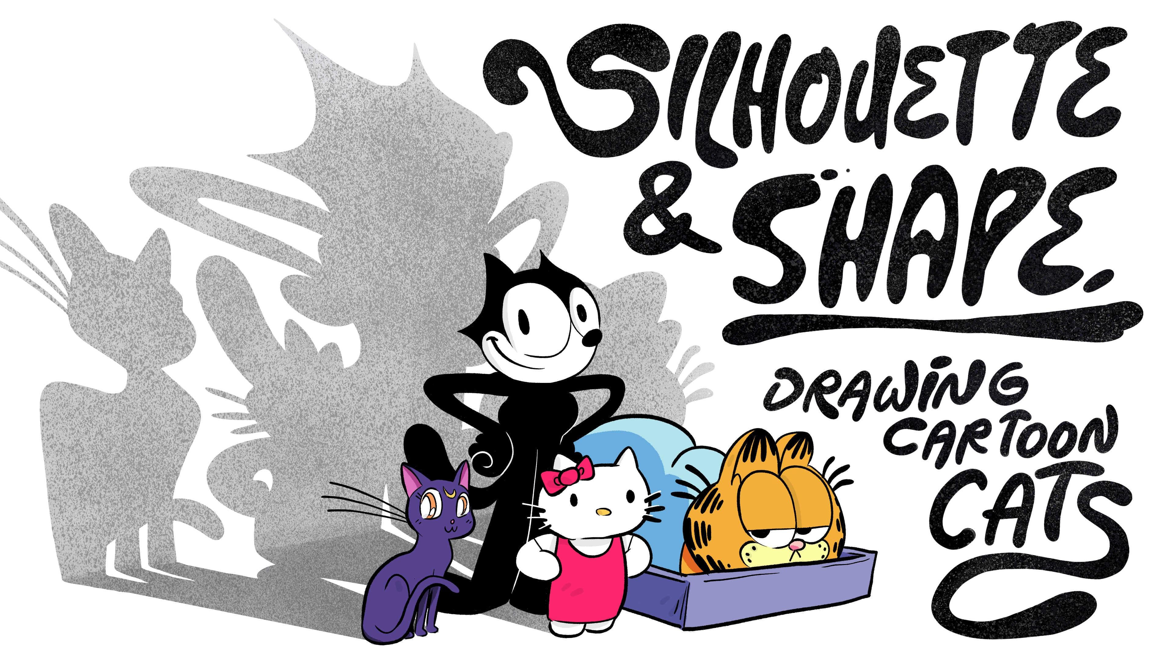
Transcripts
1. Introduction: Hey, I'm my remarks. I love helping artists unlock those little tricks that
make a drawing really pop, and today we're focusing
on a single technique, the art of the silhouette. Silhouette shows us how
to use the space around our characters to refine their design and make them
stand out in a crowd, or in this case, a litter. But how does a cat's silhouette show personality and movement? We'll hop into
Procreate and find out, and with some inspiration from the iconic cats of art history, we'll create our own
original feline friend. They can be spooky.
They can be sweet. They can hate Mondays. That part is up to you. Today's project combines
two of my favorite topics, cats and cartoon
character design. So as long as you're not
allergic to either of those, I think we should
pounce right in, okay? Here we go.
2. Why Silhouette?: Let's start by talking
about silhouette and why I might want to make a whole class centered
around this idea. So in my background
as a cartoonist, one of the main stages of the creative process of
developing a character design, and this is true for the history
of cartooning is to look outside of aspects of the character that really
draw our attention, like the eyes, the
nose, the mouth, the eyebrows, the things we look for emotional
connection with we want to step outside
of what those do and look at the contour of
the design as a whole, the outer edge or
the silhouette. And by disconnecting from that emotional
element and looking at this graphical element, we can think about iconography. We can think about
the things that draw our attention
off the design, things that maybe balance
symmetry or break symmetry, things that evoke
motion in clear ways, things that evoke weight, outside of the emotionality of the interior base
and body and even, like, details of the clothing. So shifting back and forth
between those two views of our character design
can be really valuable and level up
the project as a whole.
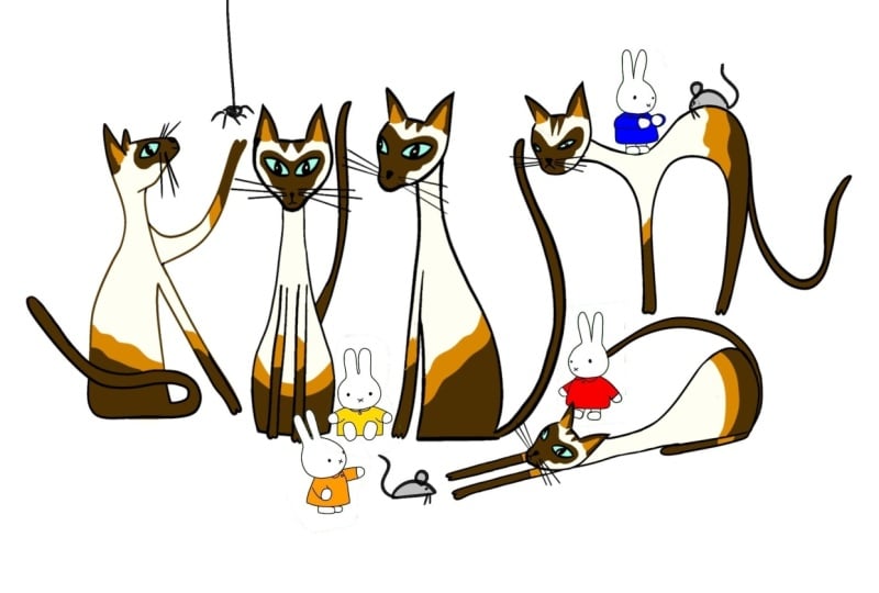
3. Character Study: Hello Kitty: Take a look at, like, an
iconic character design, like hello kitty and see how its silhouette makes it stand
out from a crowd of cats. In Procreate, I'm
going to just grab a soft blue pencil tool. When I'm sketching and
brainstorming and coming up with that almost embarrassing
creative process of generating ideas that
become a drawing, eventually, I like to work with
this soft blue color because it distinguishes itself from what becomes the black ink of the
final drawing or, like, the color palette of the illustration
or what have you. So soft blue to me,
represents creative process. So I'm going to use it in the early steps of
this conversation. Soft blue pencil. And if
you're drawing along, I suggest maybe using a light colored pencil as
well for this process. Hello kitty's head
is elongated oval. Their ears are triangles
but with rounded tips, there's, like, a softness to the shape language
of hello kitty. The angles of the ears shoot
outward just a little bit. Hello Kitty has three
little whiskers that are nice and evenly
spaced, not too long. And there's this charming
little bow that sits right here and completely
overlaps the center of the left ear and comes
off the edge like so, changing the silhouette
of the ear itself. Now, let's look at the
silhouette of this design. And I'm going to
shift to black here just because it's going
to pop a lot more. No. Soft round ear. Round white head that leaves plenty of
room for the features. Charming little whiskers. And here's the thing that sets hello kitty apart
from a crowd of cats. The way the bow works. And if we just look
at the silhouette, it's really the triangle
with two iterations of, like, smaller triangles
on top of it. It's very clean and simple.
It's not complicated. The bow doesn't have a lot of
twists and turns within it. It doesn't really flow. It
sits in a static type of way. That's something a silhouette
can teach you jumping outside of the thing itself
and just looking at the edge. So if we fill in
this whole design, we can see hello kitty
as we know them, but we can also take
a look at what makes them so instantly recognizable. Like, you don't even
have to think about this silhouette before
you see hello kitty. There's no question
as to what it is. You know, Mickey Mouse
works the same way. That's why his ears
never turn, right?
4. Character Study: Sailor Moon's Luna: Let's try another character
like Luna from Sailor Moon. Luna is a little less iconic. They're a bit more of
a conventional cat. And let's look at the shape
language of their body and then find some
aspects of them that evoke emotion because Luna is a narrative based character that exists in a story
based world, right? So they need to be
able to express. The core of most head
shapes is a circle, but the cat often has this extra element that
represents the draw, and Luna has sort of a soft jaw that sticks off just a
little bit from the head. And to this point, we
can see Luna's head is turned at what would be
a three quarter turn. The three quarter turn is
the conventional way to visualize a character in a two dimensional space because we get a full view of the face, yet the turn evokes
the contour of the front surface just a bit because a straight on
design feels flat. In a profile design hides
a whole 50% of the face. The three quarter
is that sweet spot. That's why you often
see a character standing at a pose like this. Alright, Luna does have a neck. Comes down about that far, and their body is represented by two circles of
different sizes. Now, the shape language of
character is very important, but what's equally
important when we're deciding on the pose of a character is
what is their line of action or line of
motion or line of pose? The line of pose is pretty much like the overall
spine of the character, and the idea of the
spine can extend up through the head and
down through the legs. So Luna's pose, actually, let's switch colors with this pencil so we
can distinguish it. Luna's line of action
is basically this. I don't always draw
the line of action. Most cartoonists might not, but it is always present in
the way we place our shapes. It's something that helps unify the overall connective
element of this design. Let's look at Luna's limbs. Just to show the points
of articulation, the cat's leg bends like this. These little circles represent the bends and the
connective points. Actually, a little
that's not quite right. The legs it's a
little lower goes up forward and scoots
straight down like this. And then the front legs have two little joints like so,
and then the foot there. And there's that
three quarter turn coming into play with
the limbs, as well. When we play something
at a three quarter turn, let me just draw a little
bit of perspective on the ground just to show what
we're talking about here. Everything is going at an angle, almost like there's
a vanishing point like way over here off the page. So while this isn't quite
a project actually, this isn't quite a
project of perspective, knowing where your
vanishing points in a horizon line and a
general understanding of that can really help you make subtle changes to a
character's poets. I messed up a little
there. That line should be facing down because it
is above the horizon. Okay. So that gives you a
slight understanding of the subtlety of where I push
different visual elements. And when we look
at the silhouette, we can see how valuable these little technical
skill sets are. Let's pop in some little dots to show the placement of some
features on the face. Shift to black just to distinguish and
find the silhouette of Luna. Onto your ears. I'm thinking specifically about the contour of the
body and its clarity. So by clarity, I made
distinction of head from neck. Neck goes down back and
around and scoots down. And just for the
sake of this lesson, I'm doing only the
silhouette of the character. And let's just put Luna's
tale. Back there for now. Now, once we shift
into this gear, just kind of try to
acknowledge what your brain is focusing on. We're no longer looking into
the eyes of the cat and thinking about the proportions
of the limbs right. All that stuff is valuable, but it can come at a different
stage of our process. Right now, we want to look
at just the overall shape of the head and watch adding
little details like this, like emphasizing
parts of the head, change the overall feel. What happens if I
make Luna's ears pointy in this silhouette? The vibe is different. What happens if the
tail isn't just flat, but standing straight up? You see the emotive response
changing with this design. So the face is not the only thing that tells us
how a character is feeling. If I stand Luna's tail
up like that, suddenly, they're alarmed if
I make the tail, silhouette, a little,
let's say, like, droopy. Maybe there's a sadness
or a questioning, a hesitation in
their body language. And proportion, if we brought in the chest, fill
out the character. It is no longer Luna, the cat. It's a different character. So in conclusion there, silhouette affects how
we recognize the cat. Even if the face was the same and the coloring
was the same, this just wouldn't be
Luna anymore, right?
5. Character Study: Felix the Cat: Felix the Cat is back in the
anthropomorphic category, and I like to work with Felix because he has such
a clear silhouette. He comes from an era of
black and white cartoon art, and one of the cool things about cartoon art is the
style was really developed in line with the restrictions or
limitations of the art form. Cartoons were often made
like on a cheaper budget, and they required a lot
of repetitive drawing. So when you design a
character to be animated, knowing that you
have to draw them hundreds, thousands of times, it really helps you focus
on what they look like. What are their visual rules? Like, Felix has a
very flat feeling. He doesn't have a lot of
detail within the body. He's a strong black
and white silhouette. Has four fingers because taking off that extra human finger, it makes your drawing
process simpler. It makes the hand
more visually clear, making his ears
just simple points, making the eyes really
big and expressive, and the mouth really
big and expressive, while eliminating the
distraction of the whiskers, all these little choices add up to a character design that is iconic and sustainable over a long creative project, right? So that's one thing to think
about when you think about, how do I work in the
spirit of cartoon art? Think of the limitations
of the medium. Okay? Felix's proportions
are quite different. So whenever you're
designing a character, and we want to work from a place of how much space do
they visually take up? And what are their proportions within the context
of their design? So Felix has a very big head, which makes him have a big range for
emotional expression. He has a very small
neck and body, and he has very
long legs that make his walk cycle pretty
clear and easy to draw. His feet are quite
huge and simple. His tail is small, doesn't take up too much room. And his limbs, his arms, are about the same length
and proportion as his legs. His hand has a big
palm like a human. Cats don't really have, like,
palms in that type of way. So this is part of that
anthropomorphic feeling. There's a thumb. And a cluster
of, like, three fingers. Now, Felix is a pretty
graphical design. He's mostly flat. He's two dimensions. He's just like basically a
contour line in a shape. He doesn't really have
form in the way like Luna evokes a bit
more of a form. Except in his face, where his eyes
shift perspective. So if we grab that
red perspective tool, we can see his eyes sort of
go towards a vanishing point. Like one feels smaller
than the other, the one that is further away. So again, perspective B
being part of this process. While it's not an emphasis. It does affect aspects of these drawings
we're looking at. Notice the way my mark making happens when I switch to a pen. My pencil work is very
loose and sketchy. It's based on, like, kind of generating some energy and getting a feel for
the shape and, like, an overall,
like, looseness. Buoyancy and off the cuff
feeling of the design. But when I go to ink, it's almost like writing
a second draft. It's a refining and a
clarity of the work. But that said, you
do want to retain a bit of the energy of the
sketch in this final work. You don't want to
make it too clean and neat and feel like it's, like, made by a
computer or something. You want, like, that
handrawn effect, as well. So as I go, I keep the
looseness of my hand, but I try to capture
things in single lines. His body is really
just a couple circles that ebb and flow. Like, if we just shift back
to that idea of, like, the action line, Felix's
action line goes this. Actually, it's more
dramatic than that. It's a little bit
more like this. Actually, that's not
even quite right. It's straight along the bottom, and then arcs and
bends like this. So little subtle
changes like that, like the straight line that
then warps all of a sudden, that becomes part of the
iconography of the design. The straight leg, the
round joint of the body, and the bend of, like,
the upper torso, and the distance
between those things. How can we study those things? Thinking in terms of
silhouette without distraction is a
great way to do that.
6. Character Study: Garfield: Our field he sometimes sits like a cat and sometimes walks like a human. He's weird. Like, if you encountered
a Garfield in real life, like, I'm not a
super fan of, like, the three D model of Garfield
because I don't want to, like, live in a world where
a Garfield can walk around. Cartoon art should stay
often in its place. But anyway, Garfield, in this version of
the drawing of him, I'm going to draw him
sitting like a cat. And his shape language is really rooted in some of
the principles of Felix. They're just, like,
exaggerated in different ways and
restrained in other ways. Garfield has a big head, no neck in the Felix ishway and not a lot of
protrusions on the face. His body is, I guess, the best way to describe it. I mean, it's kind
of two circles, but it's also sort
of like a bean, you'd say, it's very blobby. Like, where Felix's
weight was in his feet, Garfield's weight
is really just, like, in his torso. And like Luna, he
sits like a cat. So this is like an articulated
leg version of Garfield. But he has those huge, big
toes for whatever reason, and shorter, stubbier legs. Again, Garfield is
usually sitting in, like, a three quarter turn. And you can tell that is true because often the
way he's drawn, and this helps with the
silhouette is there's this kind of like going
upstage with the feet. Like the front foot is there. So the right back foot is there. The front right foot is there, and then the left foot is there, and we usually don't
see that fourth foot because that would be
like, tucked back here. So there's that
silhouette aspect. Now, let's see.
Garfield's tail usually, like, tucks in on itself. Part of that, I think
is really just because, like, it suits the panel better. Garfield exists in, like,
a comic strip world where panels are often square, and he takes up less visual room if his tail is just
tucked in on itself. That's just my theory, though. There's other ways
to address that. Like, if you think of Hobbs from Calvin Hobbs, Hobbs
is very long. He takes up a lot
of visual space. But also, Bill Waterson draws panels very differently
than Jim Davis does. So, again, proportion
is something we could look at as we develop
shape and silhouette. I like the proportion of
the head to the body, the feet, or the
ears to the head, or the scale of the nose. When you design a character, you're making these choices whether you
acknowledge it or not. But when you're aware
of your choices, you can shift and adjust them. That can help you with a
single character design, and it can help build your sense of variety over a
cast of characters, if you can control just
the subtle changes in relative scale
within a design. All right. I'm not even Well,
I just can't I have to. I have to draw the features. And this is the
version of Garfield, where he's got those really
self satisfied eyelids. Another speculation
on design process that I have no insight into. I always wondered why Garfield's little whiskers
are way up here instead of, like, down on its cheeks,
like they would be on a cat. And I think the answer is that they don't intersect
with the eyeline. Eyeline is a big
important part of cartoon art when your
visual design work is so languid, so simple, and your movement of, like, the camera and shifting of the frame is so
straightforward in the way like something like
a Garfield comic strip is. Eyeline of a character
can tell you where to look as
the reader, right? That's how they direct
your attention. So I'm wondering if the value of the eyeline and not
intersecting it with, like, whiskers that
would be like, right here, maybe
on first thought, I think that might be part
of this design choice. Impossible to say,
but that's my guess. Okay, let's adjust
the opacity and put a silhouette over this
character to just get a feel of how it
all comes together. And got that little
shoulder bump on the back that kind of is where his shoulder
blades would be. And there we go. Now, if
this doesn't feel perfect, again, it comes down to, like, relative proportion
of the features. I would say maybe
Garfield's head is not quite as round
and big as it should be. Alright, now that
we've done some study of iconic cartoon cats, let's look at just the use of shape language
as an emotive tool as we start thinking about our own cat designs.
Goodbye, Garfield.
7. Shape Language Warm Up!: Just working with the black
pen, let's think of, like, how shape language evokes
in a mode of response. If we have a cat, it is
very pointy like this. It feels alarmed or startled
or high energy, right? There's an electric
feeling to this shape, and I also look at
it a line of action. It's very like
Bingbing aggressive. Let's pair that with another shape language that's
maybe more Garfield esque. Instantly, we've got a much
cozier little cat friend. This character's
motive line is very, like, centered on the ground. Like if it doesn't even need to be that distinct,
it's kind of like this. Or you could say it's like that. It's very self contained. It's very, like,
keeping itself warm. Notice the roundness there
that comes into play. Like, it feels more like a
cushion or something soft. Let's make a cat that's, like, in unique proportion,
very small head, long neck, ears on the edge, very wide, boxy
shoulders, narrow torso, tiny cat legs, little cat tail, big muscular cat
arms, long whiskers. This is more of like kind of a Venice Beach
body building cat. So let's just, you know,
just for the sake of that, let's throw a little
tank top on him. Ways the silhouette helps me make some of these decisions, bring that red pen back. I thought a lot about the
length of the whisker, and I thought there was a
nice clean visual appeal by making them the
width of the shoulder. I thought about the scale of the hand relative to the arm, relative to the leg, and
the kind of humor that adds to make the arms much
bigger than the legs. And somewhere in the middle
is the scale of the head. It's not as charmingly small as the feet because
I want to make sure there's plenty of room for facial features.
Well, he is on the beach. So that's probably a
little more accurate. Okay, see how quickly
shape language becomes a character because we already have these emotive responses
built into these shapes. You're just kind
of unpacking them, remixing them for the audience. So know going in that you don't really have
to say as much with your drawings as you think
you do because we all have relationships with visual
language already, right? So that's a good thing. It's
more about just refining little choices to bring out some unique style of your own.
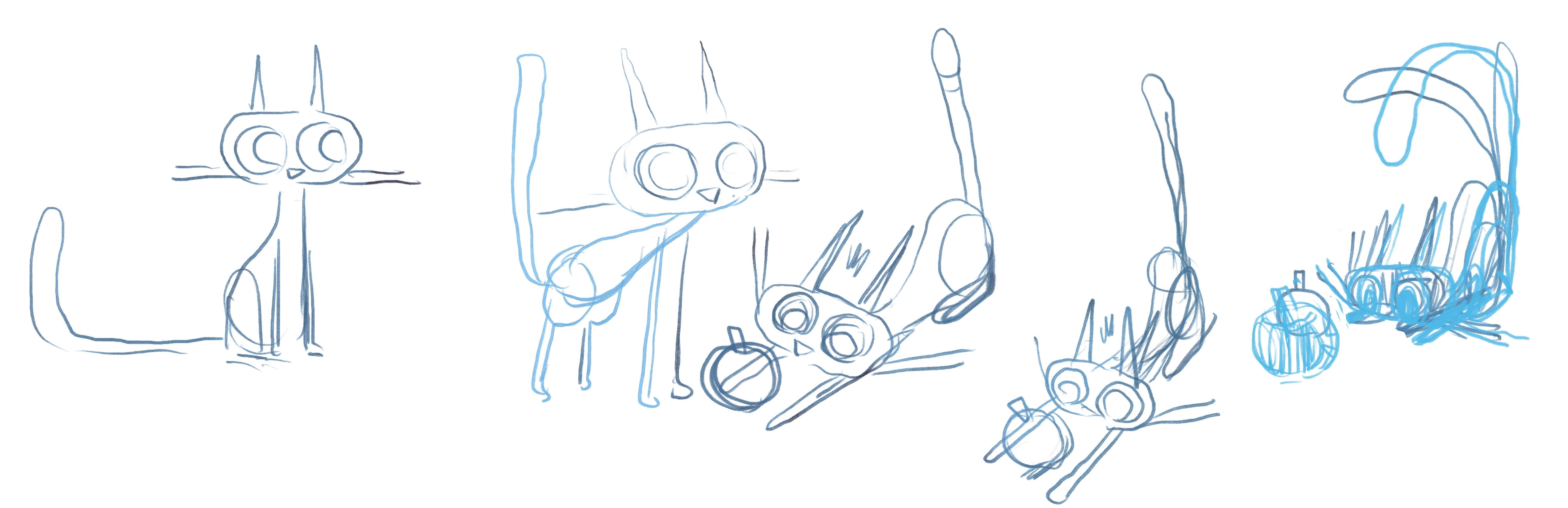
8. Class Project: Sketching and Inking: Alright, I think
we're ready to hop into today's class project. Hopefully, you've got a
bunch of sketches and ideas, and you're already mid process. You can see I am here. So to break this
project into stages, first, I'm going to establish the rules of the
design of my cat. What is its shape language? What does its silhouette
actually look like? Then I'm going to take that
cat and put it into a pose, get to know it a little better, think about its personality, give it something
to interact with. Once I refine that
pose through a couple simple what's
called thumbnail sketches, which are really loose drawings, like what you see
here on the screen, drawings that I'm very willing
to go back and change or do another one of without burning too much
creative energy. Once I've got those
thumbnail drawings, I'll move into a final
illustration in my own style. And you're welcome to work in your own illustration style. This class is mostly about how we think about our designs, not necessarily what
style we're working in. So let's look at what I've got here so far. So here's my cat. I'm working in a very kind of flat graphical shape language. You can see there's a
little bit of influence from all the types of
cats I've talked about. Let's look at this cat's
overall silhouette. Some of the rules of the cat
are that the head is long, and it's almost like the eyes
are like rotation points, and the head is a belt
that turns around them. I don't know why I think
that way about this design, but that's sort of what it
looks like to me in my brain that is clearly
broken in many ways. The ears are almost
antenna like. They're very narrow and pointy. And I like this because
they can potentially do a lot of emotive response. Like, this cat does
not have eyebrows, and for me, with
character design, eyebrows are a very
valuable piece of motive storytelling, right? The ears could do that. If I make them narrow enough where they
can tilt and really add a dramatic effect to the design and silhouette
of the character. Like when they're straight
up and down, the sense of, like, astonishment or
attention is very strong. The whiskers and my
cat are very long, but they don't do that. They're like almost
a balancing tool for my design. So
that's a choice. You could switch that idea.
Your ears could be static and your whiskers
could be dynamic. That's up to you. Now,
the body has a very, in this case,
simple action line. It's kind of like this. But the shape language evokes a little bit of distinction. Narrow in the neck, long in the neck
and very vertical. The feet are quite small. This gives the cat,
like, I don't know, a youthful, dainty energy. But the tail is potentially very expressive and quite long. But there's the overall
silhouette of my design. When I turn that off, you can
see that within it, though, is a sense of where the
limbs are in their form. So, when you create a drawing, the thing you know
about the character is a much bigger concept
than what you actually present to the viewer. Like, the idea of Felix
is a flat black design, very simple is more complicated in its set
of rules and set of, like, sketching practices
and principles. So you the artist always need
to know a lot more about your design than what you
are showing the viewer. So that said, the cat's
looking off to the side, so let's see what
he's looking at here. Oh, he's looking at
himself standing up. Now let's take a look
at this silhouette. First line motion is
really being abrupt. Alright, so here's
what our cat looks like when he's standing up. Notice, when I put
that silhouette in, I instantly start to, like, look at the design from a different way and shift
some aspects around. Now, I started
thinking of a pose. I came up with this
notion that my cat is, like, fairly youthful encountering
things for the first time. So I'm thinking like, Well,
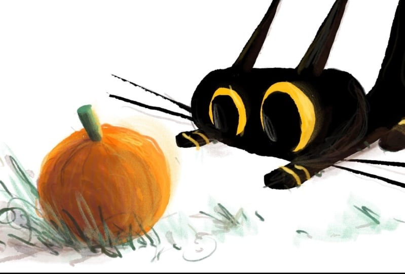
what if this is his first, like, Halloween out on his own? We're not making this
class, it's October, so we're deep in spooky season. I'm thinking about pumpkins. I'm thinking about, like,
creepy crawlies and whatnot. So I drew a little pumpkin
here for the cat to look at. And once I had the
idea of the pumpkin, I started to think of what would this cat's pose be for
engaging with this pumpkin? And let me come up with the motion line that I feel like best represents the energy, like this focused
energy on this pumpkin. He really just goes,
Bing, like this. It's all, like, through the
tail down, through the face. Everything is, like, directed
at this, like, one thing. The eyes are pointing
right in towards it. And notice to, like, react the other way, like an arrow is effective
because it points, but it has pieces that come back that enforce
the point, right? So the ears shoot back. The whiskers shoot back. Everything else,
though, is pointing in. That's a process that
cartoonists often refer to as, like, pushing the pose. I have this idea, a cat
playing with a pumpkin. Well, what does that look like? Now, what does that look like if we really emphasize something? What does it look
like if we take out this other aspect and go
one step forward and add, like, a exclamation point to this idea? That's
pushing the pose. It's exaggerating the intent and reducing everything
else around that. I'm going to continue to sketch this character and
emphasize that silhouette. So notice in this version, if we're talking about
silhouettes, there's, like, this kind of chaotic cluster
of things right here, where the pumpkin
intersects with the leg and the
head is very close. To the leg. I notice
when I fill it in, you can get a sense of how
my brain is using the idea of positive and negative
like black and white space. I'm thinking just as much
about like this area and here in this area here as I am about this area
or like this area. So your brain should be able to switch back and forth between positive and negative study as you want to create a strong composition.
We're pretty close here. I had a big shift in what I felt was working and what I felt was not working. The general idea
is very working. The general idea is
very much working, I think, but I'm not, like, super into what is going
on here and here as much. When I like, zoom out, it feels like we're looking
down on the cat, and I think there's
something a little more effective by squishing the
cat up a little bit and letting him be like right at the edge of understanding
of something. It's like I've taken the moment and I've
shifted its energy. I'm coiling the cat up and letting him
be about to spring. Whereas this version,
while this is fine, it's almost like he's already, like, mid motion with it. There's something about
this one that just feels a little better. For this project at
this moment in time. Part of that is the pumpkins just sort of, like,
on its own now. The cat is just right here, and I can make the eyes as
big and wide as I want. His ears take up a
whole lot of space. Whiskers can be up. And now
the body is really tucked in. It's up for the tail,
which really loops around. The eyes are a really
subtle thing to address. Like, the way eyes shift around is something
we spend a lot of, you know, time studying
when we talk to people, and we look for the same
qualities in a drawing. So I'm going to take out
the pupils for a second and really try to get them
staring right at the pumpkin. And the pumpkin is slightly lower in the character's
eyeline, I feel. Now, in some ways, this could come
the final version. But I think I'm going to redraw it one more time and
see if I can just push this pose a
little bit further.
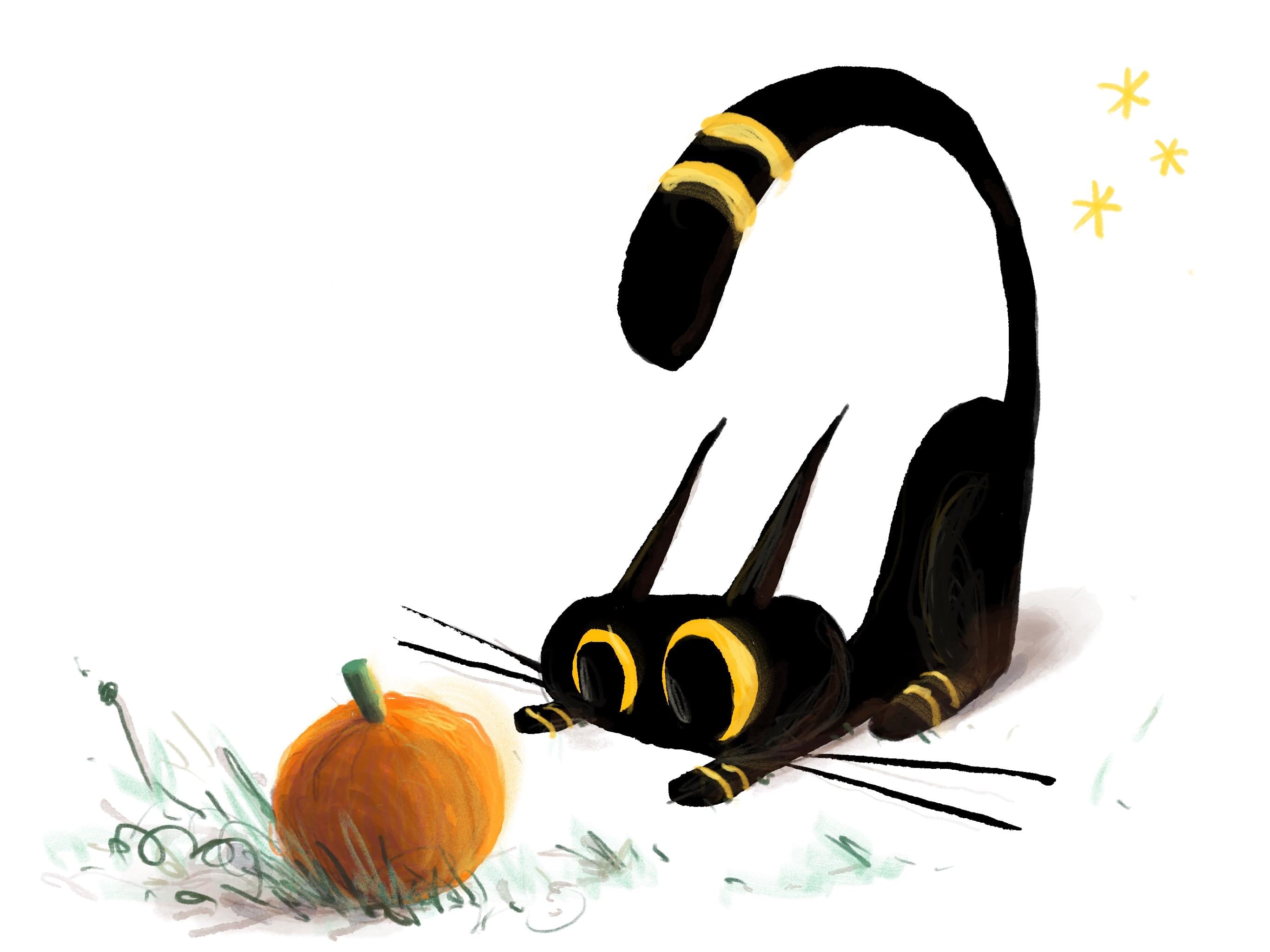
9. Class Project: Color and Texture: All right, I'm going to
shift to the pencil tool and try to add a bit of, like, texture to this design. Just a little bit of
watercolor shadow. Alright, and there's
my perfect little spooky season cat
design inspired by looking at silhouette
and pushing a pose into its more iconic
version of itself. A
10. Next Steps!: Okay. And that's the
class for today. I look forward to
seeing your work. I hope to see your cats pop up in the class
project section. I'm always checking for new
student work on Skillshare. I'll happily share, like, you know, cheering
you on, comments, steps that you could go
next with your work, pushing it into new spaces, building new skills
and techniques. And maybe there's even
some of my classes that might inspire your next project. If you want to check
out my channel, there's all kinds of courses on illustration, narrative art, character design, concept art, science fiction, world
building, map design. There's all kinds of things. So if you like the way I teach,
there's good news there, like 20 plus hours of courses on Skillshare
for you to enjoy. And I hope to see you in class
next time. See you later.
 Ira Marcks, Cartoonist