Transcripts
1. Introduction: Hi, I'm Jake. And I motion Zion from creating this effect we will create
right now in this lesson, I'll show you how you
can create a goal that's transformation effect
using built-in tools of Adobe After Effects. I'll share with you
all my personal tips and tricks which you
need to know to create seamless transformation
of text font and various adjustments to get
unique and fast results. Also, I'll show you
how you can colorize your effect and create a cool, animated and textured
background with seamless loop. The best thing about
this effect is that you don't need to buy
any external plugins. You don't even need to have any knowledge of
Adobe After Effects. You can just download
a free trial version of Adobe After Effects. And we will start
from basics and gradually we will get
to more complex stuff. I think it's the best way
to learn the software. Well graded, interesting
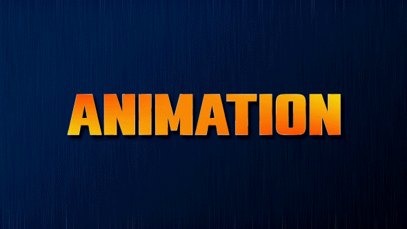
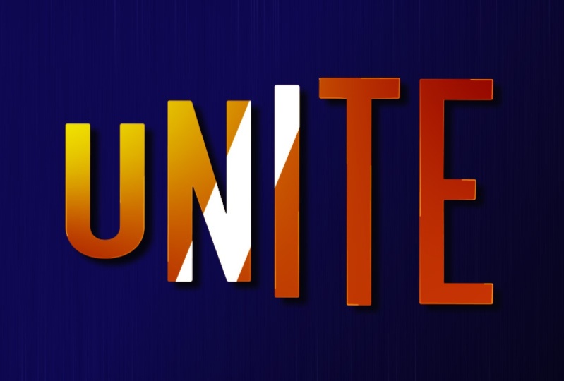
effects for fun. And to complete this class, our goal is to create this seamless text
transformation effects. I'll be happy to see
it in my class as also your result after
following all the steps. So let's get started.
2. Creating Text: Okay, so I'm using Adobe
After Effects 2021, but you can use any version
which you have or you can go to Google and search
for Adobe After Effects. You can download
this free version and start making this effect. So first of all, let's go
here to this standard layout. So your panels should
be similar to mine. If you cannot see some of the panels which you
can see on my screen, you can go to Window and
enable it from here. For example,
character, character. First of all, we want to
create a new composition. We can go to Project panel. Here we will see our compositions to greet
you can position, we can click here on this little icon here.
So let's click here. Let's call it final effect, because this effect is
pretty easy and we can do in simple one composition. I'll set my width. So 1920 by 1080,
which is full HD. And this animation will
take about four seconds. So here is frames,
here, seconds. Let's set it to four
minutes and hours. In our case is four seconds. Let's click. Okay. You can see we've created
our new composition. It has four seconds. Here on timeline, we
will see our layers. First thing which we
need to do is to use this horizontal type
tool let mostly here, we can just zoom in
into this window when using wheel on the
mouse and leftmost click, hold and drag to
create this text box. This text box, we can let
more slick and type any text. So it's a good idea to
have some texts in mind. Before creating this effect. Let's type mg. The last letters in
your word will be, the faster you'll get
your final result, because this effect requires
a bit of manual work. Okay, so let's type any
words which you like. I'm going to type the name of my shell and to sell
it in the middle. First of all, we can use
this paragraph and center, and then we can click here
and check for Align panel. If you're going to
see this Align panel, you can go to Window and
enable it from here, align with this Align panel, we can center our text. So let's align horizontally and click here to
align vertically. And as you can see, it's right in the middle
of our screen. We can also align this
anchor point if you want. This is not necessary, but the handiest shortcut
for this is Control. Alt Home. As you can see, it's
jumped to the center. Okay, so we've created our text. In the next video, we will
choose two points between which animation will happen.
See you in the next video.
3. Choosing Right Font: Okay, so let's choose our fund. You can use any
font which you have or download from the
web on free websites. I've used font
which called typo. Line, expanded for the
starting position. Then we can duplicate
this layer. So let's press Control
D to duplicate it. And let's hide this one below. By clicking on this I will here. So now we're left with
this layer on top. And we can change
this font as well. For this font on top, I've used a font
called uni sense. At this point, we can
just select this text, select the selection tool, and move it lower. And let's hide this text here. So we will see both of the texts to avoid any
problems which you might get. It's a great idea. Use same font. Let's change this font to
Montserrat and use thin font. And then choose this one on top. And also use Montserrat
and shows extra bold. Let's maybe even
change to black. It will be easier to
see the transformation between one fund to
another and this one. Let's make it a bit thicker as well, okay,
In the next video, I'm going to show
you how you can create this kind
of stretched fund and we will start transforming one fund to another.
See you next video.
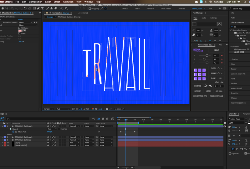
4. Stretching Our Word: So we have chosen our fonts and now let's create a version
with this stretch 1. First of all, we need to set our words to the
center of our screen, just like this and
this one as well, we can switch off by clicking on these eyeballs and make sure that it looks just
like you want. Maybe you would want to
change this tracking. Just make sure it's in
the center of our screen. Now let's create this
stretched version of our text. If you will, enable this text which you have with dinner fund, you could think
that you can go to scale and unlock here
and stretch like this. But as you can see, it
doesn't really have this feel like this font could
exist on its own. Because if you are
going to look here, it still has this field
like this fan could exist. I'm going to show you my
original word, which is here. And if I would
stretch it like this, you can see that this letter
O still doesn't look, right. So let me show you how
you can achieve this. Look. And it still has this feel like this
is original fund. So for this, we
don't want to use this scaling because
it distorts our word. So let's set it
to 100 as it was, and we can close it here. We can just right
mouse click on it, and click on create
shapes from texts. Now as you can see, this
automatically switched off. We can even click here
on this Share button. If you cannot see this button, you can click here
on toggle switches and modes to see it, click on it, and here
we can just hide it. So we will see just a couple of layers on which we
are working on. So now we've created these
outlines on our texts. Basically we've
created a shape layer from our text layer. And what this allows us to
do is just to manipulate each letter has a shape which looks like it was
greeted with the mask. In this way, we want
to open each of these letters just like this. And then we want to select
each letter one-by-one, just selected, let mostly it then hold Control
on keyboard. Select next one. Then using wheel on the mouse. Scroll down, select Next one. And if you can see two letters, you need to select both of them because some
of the letters, as you can see, contains
both of the mask. So this is for outline
and this is for inside. So some letters will
contain two shapes. So make sure to
select all of them. Okay, So we've
selected our letters, and now we can see
all of these points. With this selection tool. We can select only these points. We can also hold
spacebar on keyboard. As you can see, I'm
holding spacebar. It allows me to change
to this handle. As you can see, I'm still
holding it Spacebar. And with left mouse click,
we can just move around. An hour window is pretty handy, so you could see all
of the texts at once. And now make sure that you've selected your
selection tool. Make sure that you've
selected all of the letters left
mostly here outside. Just you need to select
all of these top ones. If you have some points in
the middle of a lake in this letter K or E. This a, just leave it as is, and we need to select
only this top points. Then using wheel on the mouse, we can zoom out and
select one of the points. Left mouse click and drag it up. Just like this. If you hold Shift on keyboard, it will only move horizontally, which is exactly what we want. And about at this point, we can release the
left mouse click. Same thing I want to do
with these points below. So let's let mostly about
here and select these points. If you select some of the points which you didn't want to select. For example, I don't want
to select this point here. So let me zoom in. So you could see
by holding Shift, you can select it
or de-selected. You can see that they're
selected because these ones are empty and
these points are filled. Just by holding Shift. You can select it
or disliked it. My case, I want to
deselect it because I don't want to stretch it
even further like this. So I'm going to press
Control Z to undo this step. So I make is, I don't want
to select this point. And now I can just
stretch it like this. We can also zoom
out using scroll on the mouse and stretch
it a bit more. So it's still should look
somewhat in the middle. So something like this
should work fine. You can also click
on apostrophe on your keyboard to see
this tidal action safe. Or you can just let mostly
here and enable it from here. Basically, this grid
allows you to make sure that your title is
still in the middle. So maybe let's drag
it even a bit down. So now we've
stretched our texts, and now we can just select one
of the letters one by one, and just simply adjusted
a bit so each line of the text will still
look like its own font. And it should not. Look like it's stretched. So as you can see by
clicking on these points, I'm just moving to the right
to make this side thicker. And now this letter m looks
like it's fallen fund. Exactly the same I want
to do with this letter a. Just more in these points. I am giving this thickness. Also, I can zoom in and
shows these points. I made these slides
a bit thicker. And here we can do a bit better. And if you don't like, for example, how this
letter Jake look, you can just select this bolt that's an a bit
expanded to the right. Once again, it would
look with nicer, same thing we want to
do with this letter K. We want to select it here. So it will allow us
to choose our points. Here. Basically, we can
create another point. To create another point, we can click on
this pen tool here. And now, once I move it
on top of this line, you can see that
it has plus sign. It means that I can
add another point. So let's leftmost look here. Shows the selection tool
and just move it like this. So it's still would look like
letter K. At this point. You can manipulate this
letter as you like. You can even change the
appearance if you didn't like the font which you
got for this class, I would not change this anymore, but you can always spend a little bit more time to get the exact
look which you like. So let's disable this
tidal action safe. And this is our stretched
version of the text. We can always say this
e letter and move some points if you would
want it a bit stretched. And now we can just
close it here. Okay, so now when we
have this strange look, we can enable our main
word, which is this one. And now we can just
adjust each letter to each of the letters
of our main fund. So basically we can
select our m letter than a left mouse double-click
on one of the points. And it will allow us
to move it as we like. So I'm holding shift. So it would only move in
the horizontal space. And my goal is to set it in
the middle of this letter. So it will look a bit nicer. Same thing I want to do
with j in this case, if you will adjust the
position of each letter, the morphing and transformation
will look more natural. So make sure that your letters
are in the middle of each other and less than I am
gonna do with this e letter. Just selected
leftmost double-click on one of the
points and move it. So it would be at
the same place. Okay, so now we have
our letters and we have reference to which
kind of look it will get. And the next video,
we are going to transform our main word
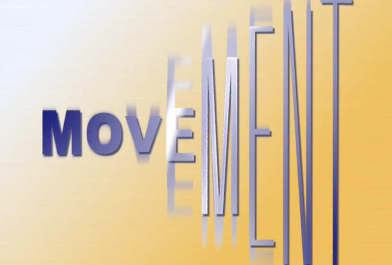
into this stretch 21. See you in the next video.
5. Transforming Animation: At this point, it's a good
idea to save our project because after effects from
time to time can crash. So let's go to File
and click Save, and save it wherever you
want on your computer. Okay, so the next step
is to choose our word, which is this one, bold one. Then once again, right mouse
click and go to create, create shapes from texts. And we can hide this
text layer as well. So let's click here to hide it. And here, so we would
hide all of the layers, which we said with
this Share button. Then it's a good idea to choose this word which has
this thinner font, stretch one, set it above. And now we can just select
this word and go to fill and change it to
something bright and colorful. We can use this red one so it
will be visible and click. Okay, so now it's much easier to see to which
lines we want to get. Now let's select our word
which has this thicker font. Then scroll down here, contents and each of the
letters as we did before. Let's click one-by-one. So first of all, we will
try to make After Effects, do the work for us. How we can do this,
we can just select this M Letter and
scroll down here. And we can see this path and
we can create a keyframe. So let's click on this stopwatch
to create our keyframe. And this is our keyframe. You might ask,
what is key-frame? Key-frame is basically
the point in time, which remember, is the
value of southern property. In our case, this keyframe
remembers this point in time, which is 0 seconds. It remembers the path. Basically this
path or this mask, this properly, which
is this shape layer. So for example here later, I can just change any
point of this letter M. So let's, let me show you. I can select the selection
tool and click on the little m here
inside of this mask. This will allow me to change
any points of this mask. So by changing this 1, it already creates
another keyframe. And now it knows this
shape which I created. Then it knows this first shape, which is original shape. Between these
keyframes, it will try to match this first
shape, the second shape. And if I'm going
to scroll through, you can see how
this point moves. This is basically how animation
in After Effects works. In my case, I don't want
this kind of shape. So let's delete this
second keyframe, which we'll return to
this first keyframe, which is original shape. Open just this mask, this thinner font and
also select this M. So this path, press control
C to copy, close it. And then here, select this
path and this thicker font. Make sure that you moved
your time cursor here, press control V. Now you can see it looks
like it worked fine. And to make sure
if it worked fine, we can just scroll
through this timeline. So luckily, this
automated process on letter M worked just great, which is great for us because now you know how you
can save your time. Just one thing which you can notice that it's
not quite aligned. So we can just
select this keyframe and just move it a
bit to the left. So it would align
with our reference. You need to be on top
of this keyframe. Because if you will not be
on the top of this keyframe, you'll create another keyframe, which is not what we want. As you can see, it
adds new animation. So let's delete this one. Left just with this one. Okay, so it works just
great on this letter M. And I was like can see it
looks already pretty cool. And let's try to do the
same with this letter J. We can also go to this
letter G, create a keyframe. Then let's go to
this stretch one and select this path
and press control C to copy as we did before. Then we can just close it here. Go to this thicker font. We already have this
keyframe here at the beginning and here later. Let's also press
Control V to paste. Once again, to check
if this works fine. We can just scroll
on this timeline. And as you can see, it already worked pretty well. We can just select this red one. Let's maybe rename it. To rename it, we can select
this layer and press return, and we can just call it a thin. So we would know this
font and also word red. So it will be easier for us to understand that this
is our reference. And if we will disable
this reference, we can see how this
letter J looks. For my taste, I would want
to select this keyframe of the letter g and
maybe adjust it a bit. Some of the points. So make sure to click
inside of these masks. And then one of the
points in this way, you can embed in just your letter in case if
you don't like the result. We can also enable
this reference. And once again, make sure
that you're on top of this keyframe and just move it according to our reference. So it will align really well. Once you've selected
your letter, you can also use arrows
on the keyboard. As you can see,
I'm pressing left, right, up or down. It would be easier to
align with your reference. Letter G also
worked pretty well. Let's do the same
with the letter a. This time we have two paths. One is for outside line and
one for the inside line. Let's create a keyframes
for both of them. This letter a from
this thin red font. So let's open this a selected
press control C to copy. Then slide this letter a of this thicker font and press
Control V to paste it. And also let's go to
this thin red font. Select this second path. Press control C to copy. Scroll down here to
this mj outlines, which is original, thicker font. And let's paste to this second a shape layer press
Control V to paste it. And as you can see, it
also works pretty great. We can also select
these keyframes. And then using the arrow keys, just move it a bit to
align with our letter a. Let's do the same with this k. Create a keyframe here
at the beginning. We can also create
a keyframe for this letter e while we're at it. And also, Let's go to letter K. Press Control. Scroll
down to this level k. Let's move it to this
second keyframe, which we created here. And along this letter K, We can press Control
V to paste this path. We can scroll to see
if it looks right. And as you can see, our luck
doesn't work on letter K. So as you remember, when
we've created this letter K, we've created another point. And this could mess up
this transformation part. And this is great because
I can show you how you can fix this issue if
you'll have the same. This issue may occur
on each letter if you will use different
fonts of the text. In my original example, I've used different fonts. So I've had this problem. Basically on each
of the letters. In our case, we
use the same font. And this is why this
kind of animated process worked well on these
first three letters. But as you can see
on this letter K, it doesn't work just because
we've added another point. And the same issue you'll have if you'll
use different fonts, because different fonts will have different amount of points. Okay, so let's start
fixing this issue. So the fastest way to
resolve this issue is to delete this keyframe
because it unusable. So let's delete this keyframe. Let's set a keyframe right on this point and select
it and press Delete. And now we can just
select this K letter. And just manually, we
can zoom in and move each of the points
manually one-by-one. Just like this, as you can see, this is manual process. And luckily, if you
will use the same font, you will not have to do this
on each of the letters. Only on these ones, which we have right here, where we absolutely
had to create another point which must
stop this transformation. But as you can see, it's not
that hard to align mentally. Just make sure that
these points are aligned to the same places
of our original letter. Just like this. Also we can do with
this letter here. And as you can see, we
don't have another point. And we can use this pen tool created and move
it just like this. And now we're going to
move it this time courser. You can see that we have
much cleaner animation. And pay attention
here that I've moved these points according to
their original places. So you don't have to
move this laptop corner to this one because it will also will mess up the animation. So make sure that if
this is laptop corner, you will move it here. This one here, this one here, here, this is here,
this is here. And it goes on. In this case, you will have
this kind of clean animation. So as you can see,
it's not that hard to fix this kind of minor issues. Just make sure to use the same font to avoid this
problem on every letter. And same thing we want
to do to this letter, what we did before. We want to select this
thin red font, this path. Press control C to copy. Here at the path, Let's set our time
cursor to this keyframe. So all of them will be
aligned and press Control V. Let's check for the result. As you can see here,
we have no problems. So basically this is pretty
easy and fast process. And now you know how you can
fix or adjust any kind of issue you may get to get
really nice result at the end. Okay, Now we don't want to
have this thin red font. We can just disable it here by clicking on this eyeball
and click here to hide it. Now we have this
kind of animation, which is really great. But if I'm going to set this
working area to 1 second, but leftmost click on this
corner and drag it here. And if I'm going to
press 0 or numbered, we can see our preview. You can see that we've
stretched pretty good. And it looks pretty good, but we don't have
really nice animation. So in the next video, I'm going to show you how you can add really nice animation
of this motion would not look that linear.
See in the next video.
6. Advanced Animation: So let's add a bit more
interesting animation for this, we can select our shape
layer with our text, scroll it one-by-one to see each of the letters
because we are going to offset these keyframes. So they will start one-by-one
with little delay. My case, I've used 27 frames for this
animation of stretching. So let's select all of
these second keyframes. Just let more slick
and drag below like this to select all
of these keyframes. And then we can go to 27 frame. So I'm going to set my playhead
to 27 frame like this. Select this second keyframes
and just move it like this. So now our animation
is much slower. This is first thing
which we can do. Second thing is to
go to Graph Editor. So let's let mouse click on it. And here we need to select
this Edit Speed Graph. So we will see at the speed of our animation is you can see
we have this straight line, which means that
this animation is steady and have one speed. But if we are going to leftmost, click on this little handle
here, on this little dot. Left mouse click and drag it to the left and down
to this baseline. Once you will touch it,
this baseline like this, you can see that this
plates up orange. This is exactly what we want. So leftmost click and drag to the left and to the baseline. Once it lights up orange,
you can release it. And then this way we
have this kind of curve. It means that here at the start, it begins really fast and
then slower at the end. So let's press 0 number
to see what we got. Now, as you can see, it's
much more exciting animation. We can make this
animation even more exciting by adding
more keyframes. For example, we can just
exit this graph editor. And we can select all of our
keyframes just like this. We can just move
it a bit further, for example, to 17th. Let's make this animation
start at 17 frame. So what I want to do at the
beginning, at the beginning, I want these letters
to squish it a bit and then stretch
out fast like this. So to get this
animation of squishing, we can just select
this first key frames, as we did with the second one. Just leftmost click, hold
and drag it down like this. And press control C to copy. Now we can just
move this playhead to the beginning and press
Control V to paste it. So basically we just copy
this still position. It also has this still position here and then this animation. But now, while our playhead
on top of these keyframes, we can now change
these keyframes. So let's scroll up to make sure that we are going to select
all of the keyframes. Leftmost click and drag it down. And after this, we
can just leftmost double-click on one of
the points of our texts. So let's double-click
on one of the points. And now we have this
kind of border. And this border has
this kind of end, which allows us to
stretch this text. And our case. I don't want to
stretch it like this. So I am going to press Control
Z to undo this movement. And if you'll hold control, as you can see, I'm
holding Control command. If you're on a Mac, you'll be able to squish this text from both
sides equally. So let's release Control key. Then leftmost click
on this one side. You can see I'm stretching
as I did before. But now if I'm going
to hold control, I'm going to squish
it from Cellar, which is exactly what we want. So let's squish it a bit just
like this and release it. In this case, we have changed our text to a bit
more squished one. So let's zoom out and
see what we've got. You can see this
squish animation and then the second part of the animation which
we already created. So let's press here on out. But to see how it looks, you can see we have this kind of anticipation of the action, which basically means
that we are squishing. We were preparing to stretch
out and then straighten out. To amplify this movement, we can just simply select
these keyframes and press F9, which basically will
make animation slower at the beginning and a bit
faster to this point. So let's press 0 number
to see how it looks. Now as you can see, it
looks much more organic, like it's preparing to stretch
out and it's tracing out. Same thing we can
do here by the end. Let's make sure that our
work area is much bigger. This kind of animation. I want to be like 11 frames. So as you can see,
I'm on 14 frame, and now I'm going to
skip to 25 frame. It will be enough to return
to this squished position. And as you remember, are squished position is
here in the middle. So we can just select
all of these keyframes. Make sure that
you've selected from the top press Control C and
then Control V to paste it. Now you can see
we have this kind of squished position here. And finally, we want to add this relaxed position
at the Biennale. Wish we had. So let's skip a few
frames, maybe like seven. We can skip frames
by frames here. So let's click it 1234567 and just copy these keyframes
from the beginning. Press Control C and
Control V to paste it. If you are wondering why I'm
using these seven frames, is because I play around and see what kind of
animation works for me. But you can always change the position between
these keyframes. And you'll get a lot slower
animation or a lot faster. So for example, I can just
move these keyframes closer together and press 0 numbered. And you can see that we have
a lot faster animation. So basically by jumping to exactly same time
positions as I have here, you'll get the exactly
the same animation. But feel free to experiment
with the spacing between keyframes to get the look
which you like the most. So let's see what we have. Let's put 0 on campus. As you can see, we have really
nice begin an action here. And here is kind of too smoky. We could select these keyframes and make sure that it's
also starts slower here, where it's squishing down again. So let's go to graph editor and also click on this handle, on this yellow dot, leftmost click, and drag it to the right and down to this
baseline as we did before. So basically, this
animation looks like here. It begins faster
than really fast, slow, and then fast again. Let's exit this graph editor and press 0 number
to see how it looks. So now as you can see, this
motion looks pretty organic. And finally, we can add some
delay between these letters. Now we can see each
of these letters, which is really handy. We can just select all
of them like this. And then hold Shift to
deselect this first letter M. Then we can set this
playhead to beginning, skip two frames, 12 by clicking on this
next frame button. And as you can see, we've still selected all of other keyframes. And now we can just move it
to this two frames further. Same thing we want to
do with this letter J. We want to de-select it. Skipped two frames, 12. And move all of these
keyframes to two frames. Here we want to
deselect this letter a. In this case, it's all of these keyframes which
represents the letter a. Skip two frames, one to move it. Same here, deselect
this letter K, 12, and move it once again
with this letter e. And now let's press is your unhampered
to see what we got, we have this kind of delay, which looks even
more interesting. You can experiment
with amount of delay. You can add even more
than two frames. But in my case for preview, I've used just a two frames
delay and it's up to you, which kind of look
you want to see. Also, you can just stretch these two points of
these two letters, just like this to get kind of more slower
animation here by the end, it will add a little something. So these final letters
will move a bit slower. And it may look a bit
more interesting. So let's press 0 number. Now as you can see,
we have this kind of delayed motion at
the last letter, and it looks a bit more organic. We've created our animation
and the next video, I'm going to show
you how you can add a bit more texture
to the background. And also we will add some
colors to our animation. See you next video.
7. Coloring and Texturing: So let's save our project. So if after Effects will crash, we'll still have our project. And let's add some
colors to our texts. So to add some colors, we want to go to
effects and presets. If you cannot see this panel, you can go to Window
Effects and Presets. And let's type four
color gradient. So now we can just select
this four color gradient. Let most leak and drag it on our text or an hour shape
layer here and drop. It. Just makes sure
that you are typing for hyphen color gradient. In this case, you'll
see this effect. If you use spacebar, you will not see this effect. With this color gradient. We can add some colors, as you can see, with these dots. We can set where these
colors will be on our text. My case, I've used
here red color. On this one. I've used more like a yellow color here,
also yellow color. And here red one. These exact colors which
I've used for my preview. But you can use any
colors you like if you want to get a bit different
kinds of results. Also, if I'm going to click on this toggled transparency grid, you can see alpha channel. And this way you can see
that on bright background, this kind of text may
not be so visible. So let's add some
drop shadow effect. This type here, drop shadow, let more slick and drop
it on our shape layer. Let's set opacity to 100. So we would see our shadow
effect a bit better. We can change the angle, may be something like 1.5. Once again, it's up to
you what you like best. I just want to
increase the distance. So I'm going to see this
effect beta and gamma set to 21 and sadness, maybe 35. At this point we can
add some background, so it would look even
more interesting. Let's disable this Toggle
Transparency Grid. And let's go to layer new solid. And this solid, we can
call it BG for background. And color doesn't matter. Make sure to click here
on Make Comp Size. So it will fill all of our
background and click Okay, then let's move it down. So it would be
below of our texts. As you can see, the order
of these layers matters, which is on top, it will
be on top on our screen. Let's add some gradient
to background as well. Let's type here Gradient Ramp and drag it on this
background layer. Let's add this end color
to black one and this top one to some kind of blue on something like this
should work fine. Click Okay. And we can just change
this position of colors. I just want to have
it a bit diagonally. Then my case, I've used
these kind of coordinate. If you want to get
exactly the same, you can just type
here a 656, here, 32. And this way you'll get exactly
the same background as I did here, 2144, here, 1650 to basically
I've just placed my dots here and here to
get this kind of gradient. At this point, I think
this color is too bright, so let's change it a bit. Let's make it a bit darker. Something like this
should work fine. And click Okay. Once again, you can choose
any other color if you want. And also, I want to add some
texture to this background. We can just duplicate the salad. And let's also increase this ramp scatter
because as you can see, we have this kind
of pasteurized look and this is exactly
what we want. So let's change to
something like 300. You can see we get rid of
this kind of weird look. And now let's add some
texture to our background. To create some texture, we can just duplicate
this background layer. Press Control D. We can remove this Gradient Ramp because we don't want it. Just select it and press Delete. And let's add Fractal Noise
here and effects in presets. Let's type fractal noise and drag it on this
background layer on top. Let's change Fractal
Type two, rockier. This contrast, I
want to increase it. So we will get more
kind of texture here. So let's set to maybe
440 and brightness. I want to decrease
it because I just want to have some bright
spots and my texture. So let's set to minus 190. Here in transform, we
can change the scale, and I want to change
the scale to five. So we will have only
these little dots here. And now we can just click on this toggle switches and
change this mode to add. So it will be on top
of our background. Finally, I can use
Gaussian blur, leftmost click and drag it
on top of this background, which has fractal
noise like this. And we can change
blurred dimensions to vertical and amount. Let's increase to 150. In this case, you'll have
these kind of lines. Also, we can click
on this checkbox, which will add this kind
of highlights two edges, which also looks
pretty interesting. You can easily change
this from vertical to horizontal if you want to
get this kind of look. But in my case, I've liked
this vertical one better. If I'm going to press 0 numpad, you can see that this
background aesthetic and I want to have some kind of motion and it is
pretty easy to do. We can just simply goes to 0 frames to the beginning
and go to this evolution. And here and evolution, we can click on this stopwatch
to create a keyframe. We can press U on the
keyboard to see this keyframe and then go to the
very last frame. Here. Let's add two rotations. Here we are changing degrees and here amount of rotations, I want to change to two. And basically it
will add this kind of a bit of animation
to our background, which looks pretty interesting. Also, if you're gonna go
to evolution options, you can click on this
cycle evolution, which basically
means that it will seamlessly go in the loop. Let's click here. And we know that we
had two rotations. So basically we can
set here to two. It means that it will have
two rotations in this cycle. And now if I'm going
to press 0 numpad, you can see that this
cycle repeats seamlessly. Now we can have this really
seamless and less animation. For example, if I'm going
to uncheck this check box, you'll see a little
jump here at the end. Just pay attention
to background. So now as you can see, we
have this little JIRA. The answer, this is
basically how you can create endless animation
of fractal noise by using this one checkbox. And finally, what I did
in my original example, I've added these kind
of lines to our texts. It adds a little
something to make this animation a
bit stand out more. We can also select our
texts and change from black shadow to this
darker part of our image. With this color picker, we can just select it some of the darkest part of our image. This way. Our shadow will not
be that noticeable. So let's duplicate our shape selected and press Control D. To duplicate it, we
can just simply remove these effects and we can
use an effect called Vegas. Let's type in Vegas here and
drop it on this layer above. With this effect, we
will add these kind of highlights on the
edges of our text. So to see how this effect works, we want to change this blend
mode from our stencil. Now as you can see,
we have these kind of little dashes to see it better. We can just hold Control Shift H is you can
see I press Control Shift H. It allows me to disable
these borders and enable it. I'm going to disable it. So you would see how this
effect looks here and segments, we can decrease this
amount to four. So we will have not so much of these lines with this
length, we can animate it. So for example, we would want them to appear by the
end of this animation. So for example here, our length will be 0. By the end of the animation, we can set it to one, which is full length
of these lines. Here at the beginning. We also want to set it to one. And here, when this
animation starts, we can press U on
the keyboard to see this length animations. Here, I still want to be one, so let's set it to one. Then once it collapse, like this, we want
to set it to 0. So it will disappear. It will have this clean look
and then appear once again. We can also change
this color to white, so it would be easier to see. We can also animate
this rotation, which will add this kind of
animation on the letters. So let's set here at
the beginning to 0. Here by the end where
it's not visible, we can set it to one here to 0. Again, it will come back to same kind of
animation which we had. As you can see, we have
this kind of animation, but it goes clockwise. And by switching
these start opacity to 0 and end opacity to one, we will get the
more organic kind of animation of these letters. This is basically
how you can add these kind of lines on our text. Let's close it here. And finally, to add more interesting look
to this animation, we can add this kind of highlight which you could
see in the preview. This little line. It's really easy to do. You can just select this, our main text animation. Just select it, press
Control D to duplicate it, set it above, and let's
call it highlight. Just select our layer and press Return or Enter on
keyboard to rename it, Let's delete these effects. So we would have only
this white color. And to add a mask to our word, we can just simply right mouse click on it and go to Mask, new mask, leftmost liking it. And I'm going to press
Control Shift H to see it. And also make sure that you
pressed here also to see it. Now we have our mask. Now I can just left mouse double-click on the
edge of this border. Expanded. By holding Control, we can
expand it in both ways. As you remember. Then click inside of
this mask like here. And this will allow us
to squish it like this. We can also click
anywhere like here. We can also select our
highlight and move this below side to the left to
have this kind of angle. Once you're happy
with this angle, you can leave it as is
and just animate it. In my case, I've started my
animation from the left. So I'm going to just select
my highlight leftmost double-click on one of the points and move
it to the left. So it will start about here. I decided to start
my animation At 1 second 50 and frames
just about here. We can just press M on
the keyboard to see our mask and create a keyframe. The end of animation
could be around when this text collapsed,
just like this. So let's move this
mask to the right, like this, and let's
see how it looks. Maybe it goes too fast. So let's make sure that
it starts a bit sooner. So it will have more time to go by n just by changing the
timing of these keyframes. You can change the timing
of this final highlight, which adds even more
interesting kind of look to this animation. So let's press 0 number
to see how it looks. Finally, if you want to have some final
color adjustments, you can always go to layer, new adjustment layer and apply
an effect called curves. Sometimes it's a good idea to set this curves
adjustment layer. So you will be able just to
add a bit more contrast. To have this a bit
punchier look, you can always disabled this adjustment layer,
but as you can see, you can add a bit
more contrast and more exciting look just with one layer and one curves effect. Let's press is your number
to see what we got. And this is basically how
you can create this effect. Guilty to follow me
here on Skillshare, the effects classes using
Adobe After Effects. Also, as you can see,
I post classes every week and if you're
new to After Effects, I have this fundamental section
where you can learn about text animation and animation
in general and the future. I'm going to share even
more texts animations. Also, I have some
complex, the effects, logo animation, and even
Da Vinci Resolve class. I recommend you to watch
this really short VFX class. It takes only in 12
minutes and you'll get really powerful
result at the end is also just follow
me here on Skillshare to not miss my next class. I post classes every week. Thank you for watching.
 M Jake, Lets Create VFX & Cool Stuff Together