Transcripts
1. Introduction: Hello, everyone, and
welcome to color stories. Exploring abstract dart
with a limited palette, a class where you'll
discover how much beauty and depth you can create using just two colors plus
black and white. Through playful color mixing and expressive
abstract painting, we'll explore the power of
limitation as a creative tool. I'm Denise Love, an artist
who loves exploring texture, color, and creative
play in the studio. I'm so excited that you're here. Working in a vintage
style ledger journal or any journal that you choose or even blank pieces of paper, you'll build custom
color pallets on one side and paint intuitively
on the other side, creating a personal visual
story with each spread. Whether you're new to
painting or you're looking to reconnect with
your creative voice. This class offers a fresh, approachable way
to explore color, composition, mark making,
one palette at a time.
2. Class Project: Your class project,
you'll create one full spread in your
ledger or your art journal or on just regular
sheets of paper using a limited palette of two
colors plus black and white. On the left side,
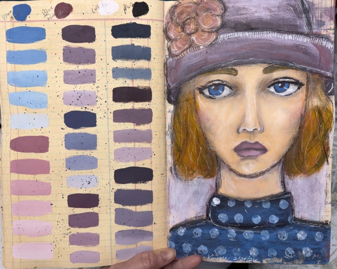
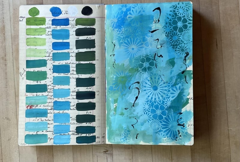
you'll mix and swatch as many variations as you
can from your chosen colors, documenting your discovery in a simple, beautiful color grid. On the right side, you'll use that custom
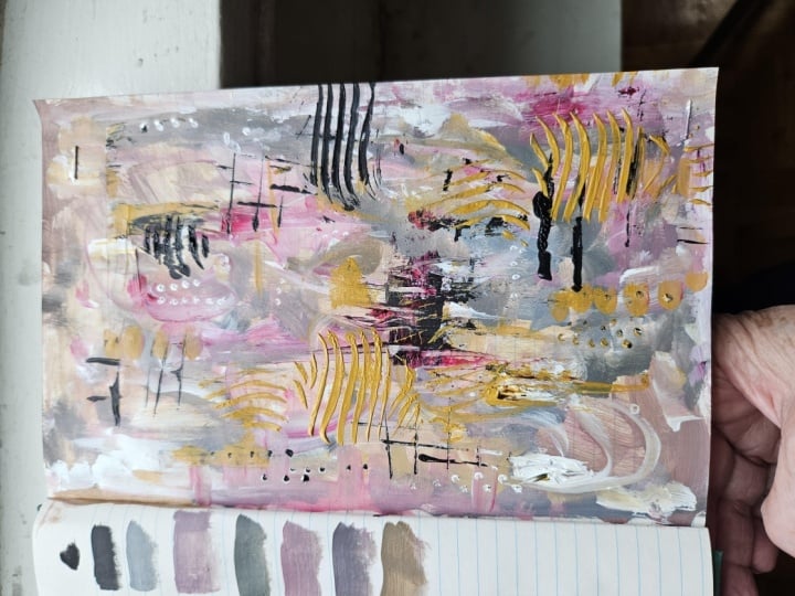
palette to create an abstract painting
or any art that you enjoy creating
using the layers, marks and intuitive brushwork to express mood or
story through color. Your finished spread will be a unique visual record,
part reference, part artwork, and a
powerful reminder of how much you can do
with just a few paints. Don't worry about perfection. This is all about exploration, play, and trusting the process. Bonus points if you share
a few thoughts about what inspired your palette or how it felt to work with
the limitations.
3. Inspiration: I want to share with
you my inspiration for doing this
particular project, which I have come to
truly love and enjoy. So in 2025, the Ranger
company got with Dana Wakeley and came up with
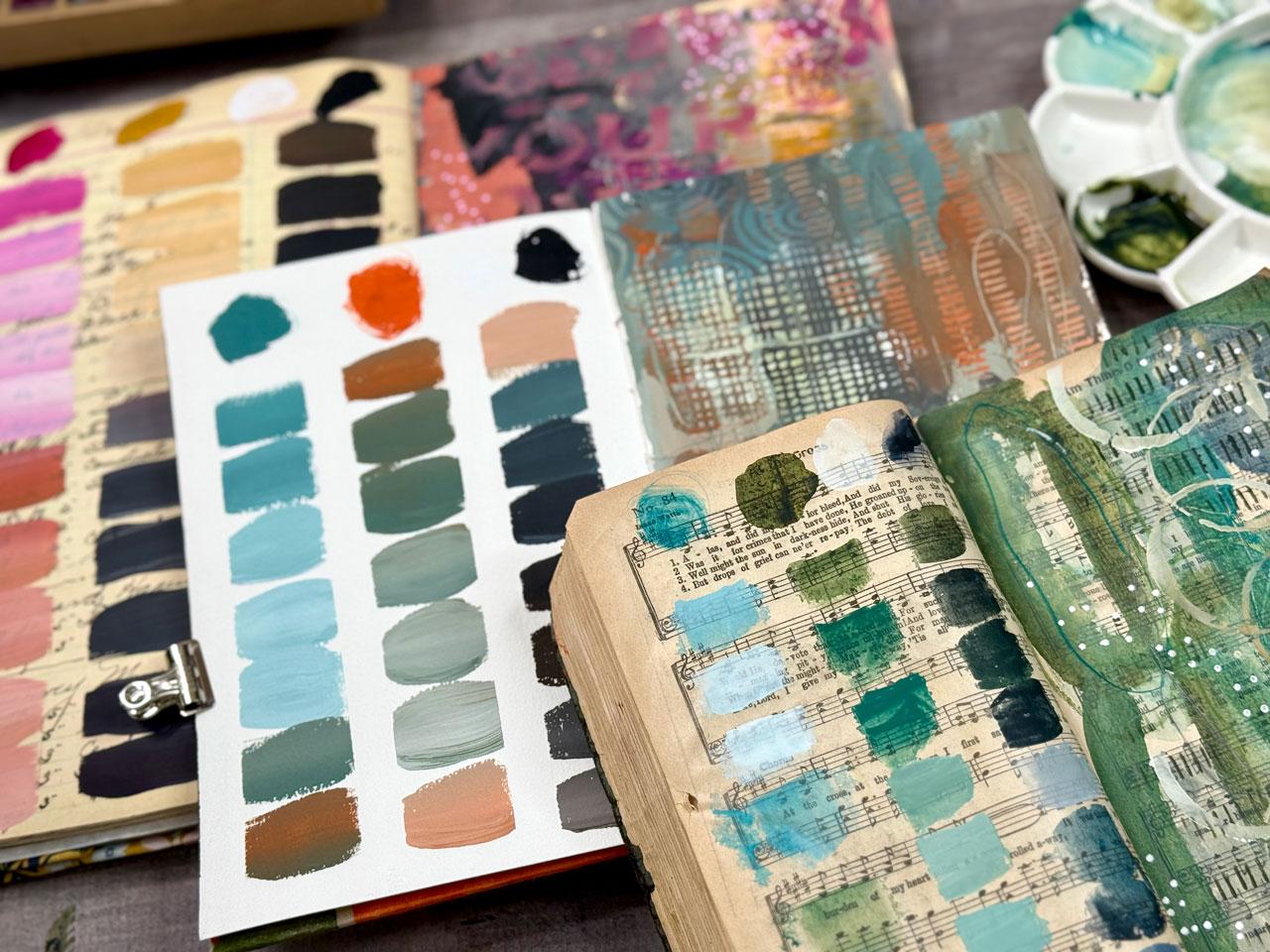
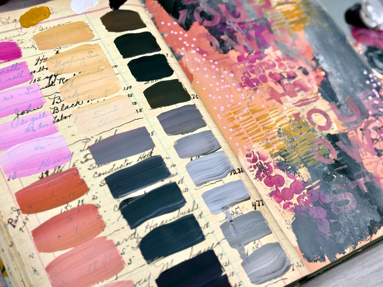
this lovely ledger journal, which is a replica of an actual real ledger
journal that she found when she was out shopping
at the antique market. And they replicated
the exact size, the cover, and the inside
pages of that journal. They've made it in a very
nice medium weight paper with a smooth surface, which is ideal for mixed media collage
work, acrylic paint. I've really enjoyed these pages, and I like vintage books
and vintage pages. And so paid. I like painting in
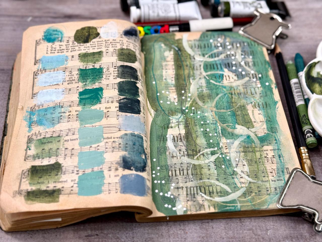
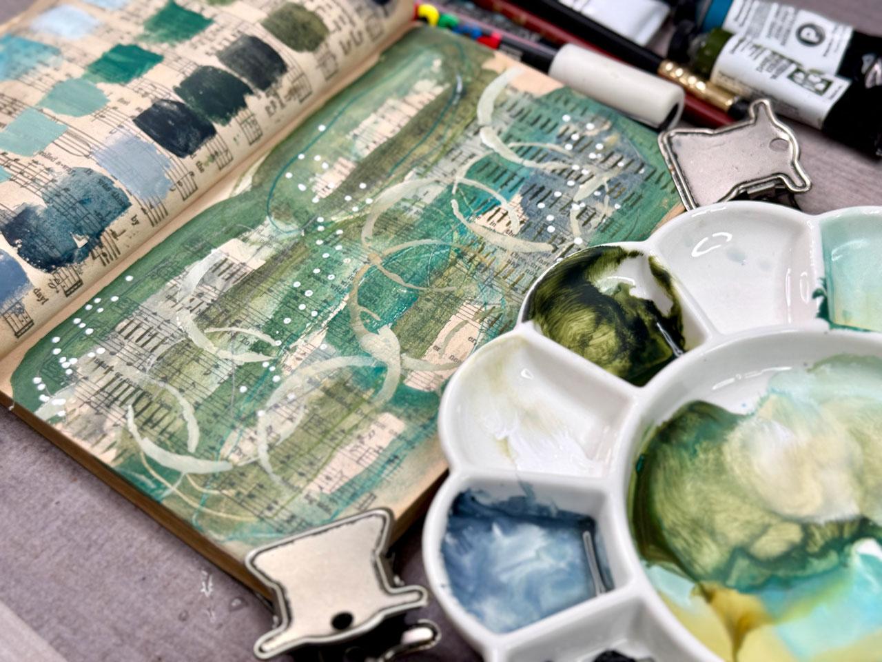
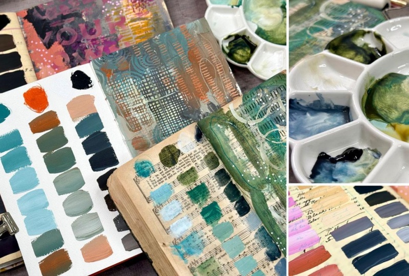
real old books. So I have a very old hymnal, and all through here, I have used it as
a color journal, and I would take the
pieces of art and then put beside the
different things that I was using in that piece as a
color palette guide like my very first initial
color palette jumping into and saving things that I really
loved before I got things like the color cube and working with color
palette cards. It's really fun to work
in a vintage book. If you don't have the Dena
Wakeley media journal. You can get any old book
and do this kind of project in that book,
and it's fantastic. Well, when this came
out, I thought, oh, that's perfect
because it was like, I want to say $32 on the
Ranger website, give or take. And this book right now is definitely when
the class comes out, it's still available, and then I don't know how long
they'll be selling it for, but it's usually
a couple of years that they keep these things, and then later when they
no longer have that, but you're watching this class, then you can look at some of the other options I'm
going to present to you. But I just wanted to share the
inspiration first, though. I got this book practically
right after it just came out, I was a first early
adopter getting this book. I thought, oh, what
could I do with this? That would be super fun, a good reference, something that could inspire me to paint
through the whole book. This is the one I've been working in for more than a year. I just made a fabric cover, which is basically folded
and glued on here. It's not even really sewn, but it's kind of made like how we used to cover our school
books in grocery sack. You know, the cover, it's kind
of made in that same way. It's just folded over and glued. I put a button on here. I actually sewed this
part of the cover. I just kind of stitched
a stitch on it, even though this
fabric is glued to that fabric and then it's
all glued to the book. I just got creative
making the cover. And then just flipped
on the back side too. And then I sewed a button on it, just came through
here with my all, poked a hole and sewed a button, and then I have some
pretty ribbon that I right now have it loose so that it's not
permanently attached. I can keep working in the book without messing up the ribbon. I can take the
ribbon off for now, but I like these vintage
looking uh, velvet ribbons. They look so rich to me. This is my very first original one, and I was playing and I thought, you know, I love color palettes. I like the way the mixing
palettes look when I've seen other people do those
on just regular paper. I thought this would
be super cool if I did a mixing palette and
then painted a piece right next to it kind of as a
reference library of what these colors mix and look like and what
you can do with it. And this has turned in to
the very best project ever. This is the very first
page that I did. I left a blank page at the front and went back
and did that palette. This was the first
palette that I did in this book and I have a
whole playlist on all of these inspiration pages that I'm going to show you so
you can go back and watch all of these pages and just keep on learning and seeing what
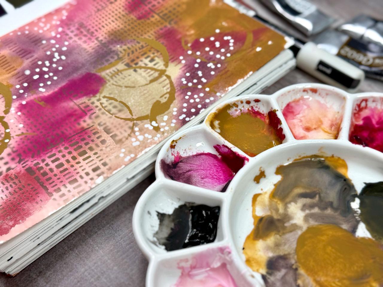
else I've done in the book. But this is the Zorn pilot
and Zorn pallet is an artist. The Zorn palate is a famous limited pallet of
four colors yellow ochre, ivory black,
vermilion or cadmium red and white or titanium. It's named after the Swedish
painter Andrew Zorn, who masterfully used it for rich harmonious
skin tones and figurative work by creating a wide range of values and
muted colors through mixing. While Zorn popularized it, the palette roots are ancient, allowing artists to achieve complex naturalistic effects
with minimal pigments, though it's less suited for
vibrant, saturated colors. I had just come across like
some information on Zorn, I thought, Oh my gosh, that would be so fun to experiment with
that color palette and this was the first
page in here and it was a red, yellow,
black and white. Then I thought, Wow, I could
really run with this idea and just pick two colors in whatever paint line
that I wanted to use. I particularly enjoy
experimenting with the black mat paints because they're a
good quality paint. They're a little bit
more than a craft paint, but they're less expensive than an artist heavy
bodied kind of paint, there's a lot of
colors that I could have I have through
the years collected basically their whole line of these because
they're fun to play in for your sketchbook or your pieces of art that
you're playing with. I actually dated this one. In here, I've gotten where I did this one in February of 2025. That's right after this
book was introduced, and it's the Zorn palette. You can make notes in
here if you want to. If you pick pages that are heavily already written
on in the ledger, then maybe it would be
harder to make notes, but you could put a
sticky note in there if you wanted to make
notes and stuff. I write the colors
at the top usually, and then this has been the most exciting
experimentation for colors and just
play and creating abstract art and that I've done. It's a beautiful
reference library, and it lets you now go
back and look and see, maybe I'm looking for this
lovely orange blue color. Now I know how to make that and what colors that I
use to create it. I have thoroughly enjoyed creating and working in this
book to the point where now I just want to go ahead and
put this idea out there in a class so that if you haven't been on my
socials and seen these, then you too can
jump into this idea. And this is my favorite
journal probably just because of its beauty and the fact that it's now an amazing
reference library, and it makes color mixing fun. I know a lot of people shy
away from color mixing, and a lot of times in videos, I'm using convenience colors
because it's convenient. Something like this
really gets you outside your comfort zone and gets
you to start experimenting. So as far as I got a little
bit of the book left. I'm excited that I got that
many pages in here done. But what kind of beautiful
journal does that make? I mean, don't you
want to come and just look through the
pages and be inspired? It's excellent for reference. It's good for inspiration for experimenting with
your art supplies, for playing with
different palettes. Yeah, so this has
been super fun. So this is all acrylic paint and other things on top of it
that I've used in this book. It's kind of fun if you have, say, one whole supply that
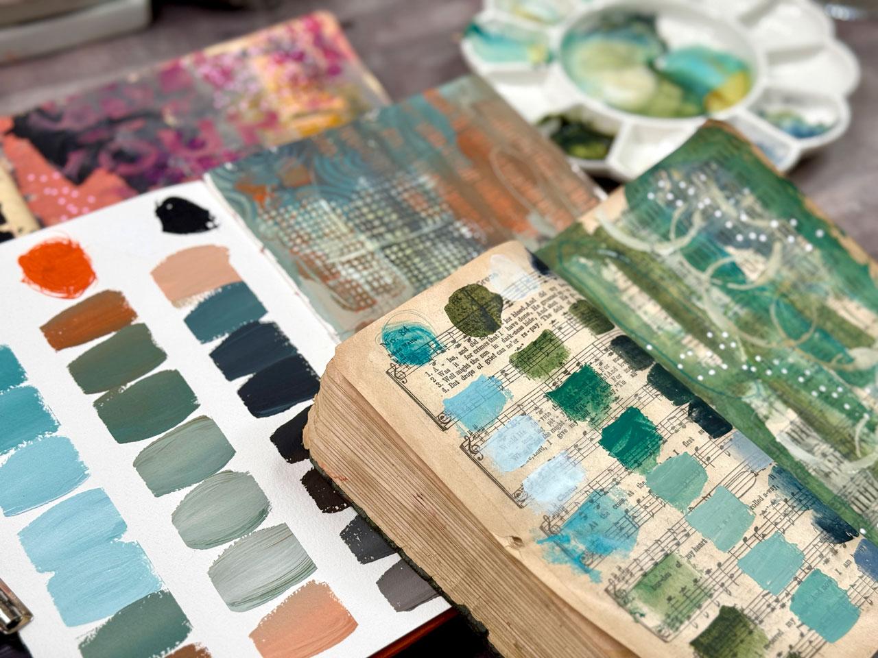
you've experimented with. I started a second book because I had enough
people ask me, well, how does it
work with watercolor? This is a watercolor
page with the watercolor directly on the paper with no prep work, and
it worked fine. But the watercolor didn't
really move around. I do like the way it looks, but it did not do the same as if it were
on watercolor paper, but it did work, so
you could do that. This page is watercolor
with prep on the page. I used Daniel Smith
transparent watercolor ground. Then the paint did
actually move and react differently on this page than it did on this page and you
can see it's a totally different using the prep
and not using the prep. So you could do a
watercolor one. The paper does hold up to it. It's not really
warped or anything. If it warps while
you're painting it, you can always close
the book up and let it sit flat under
some other books because they flatten nicely. So you can do watercolor
if you want it. I did experiment with that. This one is a my
next whatever idea I have, I got a couple of them. So in this class, I
just kind of want to show you the process
of how I create these. And then I have a
gigantic playlist of all these pages that I'll put in your supply PDF so that you can go back and watch
how I did some of these. Alright, so I'll see
you back in class. All right.
4. Surface Choices: I wanted to talk about
some book options. In this class, I am going to be using the Dana
Weekly Media Journal. You can get that on the
Ranger Inc website. You can also get it on
several other websites. You might Google to see what's
available where you are. If this is not available or this class has been out for a while and maybe you
can't get it anymore. I feel like when
the class is out, we'll be able to get it all
through the next year or two. But after we may not
be able to get these. If we can't get these anymore, there are other options
that we can do, so you can get a vintage Ledger
journal and paint in it. If you do that, then
you need to gesso the pages with gesso. I would do Liquitex or
whatever brand you want, but I would do the clear Gesso. This book has some
watercolor ground on it, which is basically
Jaso for watercolor, which is this Daniel
Smith watercolor ground. But this page has been painted with that
watercolor ground, and that's what clear gesso and watercolor ground look
like on the page. You can't tell
it's there, but it feels like a sanded surface. You can tell that
there's something on this page versus
a smooth page. This is what a prepped
page would look like. You can't really even
tell anything is there, but it makes a
huge difference in a vintage book like
this one here. Where I've used it to
do lots of exploration. Like this page right
here, real smooth. This page has ground
on it and feels like a sandpaper just about. Painting real vintage books. This is a hymnal. It's
beautiful. It's very delicate. So when I did stuff like this, I actually stapled a few pages together so that
it was stronger. Then the next page that I paint on would be
several pages later. I staple these together. And made each one of these more than
one page thickness because it was just so delicate. I didn't want to do
it on single sheets and then it fall apart even
faster than I expected it to. So, these old books, go to your Thrift store,
see what they've got. If you find an old edger
journal, fantastic, just go ahead and
prep your pages with clear or if you're
doing watercolor, prep them with
watercolor ground. Another choice is some
handmade art journals. I've got all the handmade
art journal classes that you can go watch
where I've made these, but you could do color
palette on one page, painting on the second page. That's an option with whatever watercolor paper
is your favorite paper. That's something that
you could work in. I also have these that I made with the
different pages in it. This is also another
fantastic use of the handmade art journals, whether they have a different
page here where you've done a color palette and then the painting on the
page beside it. You can do this
with basically any of your art journals or books. Another option is premade
art journals, obviously, and I thought something like the perfect sketchbook that has a cotton watercolor paper in it, which is what I like to work on. I thought this kind of Nice. It's a nicer art journal. They're more expensive if you get the eta one because it's got the arches kind of paper
in it or something nice. It's 100% watercolor paper, but I just want to
show you like options. So you can do the color
palette painting on this side. You could also get you know, use inexpensive
watercolor paper sheets. You could use, you know, just single sheets and cut it in half and do a palette and a painting, that's
an excellent use. Then this could be a page in a future art journal that you maybe stitched together after you've painted lots of these. You could do that on inexpensive
cotton water color paper or whatever your
favorite paper is. I'm just showing you
the options that I have sitting around my desk. You could also do this in the original Dana
Wakeley Media journal, which has all the different
types of paper in it. There's enough in here where you could do a pilot and a painting, and then you could maybe do
another painting and fill in. You could use the
different pages in the same way that I'm
using the ledger journal. So that's another
option. So get creative. You can just do these on plain inexpensive watercolor
paper if you want. It's all about the play
and the discovery for me. And then as you're
going about it, if you're going to end up
with something this amazing, then consider going
one step further and maybe gluing some
fabrics or painting the cover or using
a nicer book for your reference
library because these are worthy of your sketchbook, if you've got any of the sketchbooks and
you're scared to use it. Perfect project for any
of those because it's beautiful and it's
inspiring when you're done. Don't get hung up on
what book I might or might not be working in versus what you have available. Use what you've got if you want to do some of these
on just plain paper. If you've got a
sketchbook or something, an inexpensive one that you
want to use, then go for it. It doesn't even have to
be a big one like this, but I do think the
larger size is really nice because
then you've got more room for color mixing. If you just want
the whole book to be color mixing,
you could do that. I just like how there's a
reference one next to it. You're like, look what
those colors really do, whereas maybe you
can't visualize it with just that, now you can. So use whatever you've
got if you don't have access to the same things
I do. Use plain paper. That's fine. If you
have one of these, this is, like, the perfect
use for this book. So I definitely want
you to get creative. Make a sketchbook, if you
want in what you're using. And then I will see
you back in class and we'll start
painting some layouts.
5. Supplies: Let's talk about the supplies that you might consider
for your project. So you'll definitely need
either single pieces of paper and then maybe you can work on a
single piece of paper, half of a color palette
and half a piece of art. So you definitely need
some type of paper. I will be using the Dana
Wakeley Media Journal, which is a vintage is a reproduction of a
real vintage journal. In that, I'm using one page for color palettes and one page for the painting with
that color palette. I like to do abstract
painting and mark making and playing with stencils and
just making a mess over here. If you just make a big mess over here, that
would be fine too. The idea of this page is just showing you how the
colors mix and blend together, whereas on this page,
they're separated, and so it's maybe not
as easy to visualize. This could just be one big mess of you cleaning off your brush, and that would be just fine. This could be some elaborate, full scale painting of
whatever style that you enjoy. I enjoy abstract art. That's where I have gone with this is the beautiful palette, and then what can I create
with that on this page? So you need either plain paper
or maybe a ledger journal, if you want to, that's available and you can still
get one and get one of those. You could also work in
a regular sketchbook. You could work in a book
that you made yourself. I've got several how to make your own journal books
and you could do a plot and then a painting
and something like that. I've got several
different classes to show you different
styles of bookmaking. You need a book. Scoot
this out of the way. Then you need to decide what
paint are you going to use. I did kind of glue a cover on to here and attach
a button and some ribbon. So that would be next level for anything
that you wanted to create, but you can check out making, stuff like that in one
of the book classes. But I think that elevated it if you paint or cover your journal, that might be something
that you consider. And then I discovered that
when I was painting these, I started off just
painting them just like this haphazardly and I
decided, here we go. I decided I didn't
love that look as much as defined columns where
there was a stop Start paint. I have been using a half inch painter's
tape or artist's tape here in this book and
then I've discovered that this paper does not
work well with tape. There are some layouts in here where the tape
has peeled the paper. So you definitely have to put it down, paint your palette, and then use a heat gun to
heat the tape up really good and peel it very slowly for it not
to tear the paper. You can't leave the tape
on for a long time. It will not release and
then paint on this side. I'm using a half
inch tape for that. I liked the width of that. And the further I got,
I just love that. I didn't mind that it
was different widths. Or heights, but I did want
there to be defined columns, so that's how I got that. Then the next thing that
you want to consider is what is your reference
library? What paint is it? Whatever paint you want to use, whatever paint you have, that
could be your reference. You could have any
acrylic paint. I do think this works pretty
good with acrylic paint, but you could have anything, any kind of paint that
you want to work with, you can use in
something like this. This is your reference library. It's what's going
to allow you to see how your materials work and
what colors you can get. I like the Blick mat paints
because I use them a ton. They're nicer than craft paint, but they're not as expensive
as um artists paint, and they're very pigmented, because I enjoy
using these so much, I thought, aha this would
be a good choice for me. You can use whatever paint
it is that you love. If you're going to do
watercolor, definitely, you need some watercolor ground because on the one where I
tested the watercolor out, the watercolor ground pages
got ribbon hanging out, hang. The watercolor ground page, this is no ground,
this is with ground. The watercolor ground pages looked a little more
like watercolor and it allowed the watercolor
to blend and flow a little differently
than without the ground. But you could do it either
way. The book could do watercolor just fine. The pages held up,
they're not warped. So do what you want with
your different paints, just decide what
you want to use. With every one of these,
you need two colors, orange and blue, for instance, and then you need
black and white. Every palette has
black and white. That's how you're
making your lighter shades and your darker shades. Then in between those, we're
using some of just this, some of them mixed,
some of just that, that's how we're
getting the variety. White and black and two colors is what each
page is comprised of. Then when I get to
my painted page, it's whatever I want to use. It's definitely still
the acrylic paints. But then what am I going to use on the layers on top of that? Whatever I'm using
on top of that, I am trying to stay within
this color palette. For instance, I like to use the No Color two crayons a lot. If I were doing
something on this page, I would pick something
that falls within that color palette to continue
working on this page. That's the goal. Say within this color
palette but pull whatever other materials that you have that you might
want to work with. A lot of times for me, that's a posca pen, a neocolorT crayon. Um, you could work with acrylic paint markers like
the different brands. You can work with something like temper sticks
if you wanted to, but try to stick
within your palette. And then that's how I
approached this page. Stay within the palette. A supplies that you want to work with is where
you're going here. Then if you want pencil
and pen kind of things, then I consider
those to be neutral. There we go. Start
gathering your supplies, and then we will start painting a palette and a
piece of art and just see, like, what can we come up with? So I'll see you back in class.
6. Acrylic Palette In Ledger Journal: This first project,
I'm going to start in my original
inspiration book that I did and just a quick flip through of all the
color palettes that I've experimented with. And I'm going to do a color
palette mixing on one side, and some type of painting
on the other side. My book is all about
abstract painting and play. Your book can be about
abstract painting. It can be about whatever
type of art that you create. This is very personalized. The goal here is to
Experiment and play and see what amazing colors all of your colors create
that you've chosen, the two colors and
the black and white, and then to have some type of
lovely painting beside it, or even just splotches of color. You can just throw all the
extra paint on this side as a visual of what these colors might look
like when you're using them. Um, so I chose to do
abstract paintings that are, you know, basically complete, but you could just squash
color over here and have that be your reference also because
it's very personal to you. Don't want you to get
stressed out about it. Don't want you to get upset if this page is not exactly
what you were thinking. The goal here is just mixing and then giving a reference of how
those look together. But man, this is one of
my favorite books now. Look how amazing these turnout. And these are not perfect.
They're not great. They're not anything
special. But I love them. I love them. Okay, so I'm going to use half
inch painter's tape, and I'm going to use
the one that leaves residue so that I
can show you what to do if you have something
that left a residue. I got a trick. I like
tricks. I like tricks. And I like it to
be three columns, so I just kind of tape
off three columns. And this is painter's tape, so it is the blue tape that
I got at the paint store. I'm not sure how I
got one that was a little bit odd and left
residue, but I did. So then I had sticky stuff in my book until
I came across the secret. And what is that secret? A high polymer eraser. So when we peel this off, if we've got any sticky residue, you can use one of these erasers just to erase the residue. It's amazing. Another thing that I discovered, and I'm not going to stick
these down super hard, but another thing I discovered, I want three columns, so
that's what I'm doing. Um Now I forgot the other
thing I discovered. Maybe I'll think
of it. All right. So I've got three columns. I like it to start and stop, you don't have to use
painter's tape at all. But I like the
defined grids there. I'm using the Zorn palette modified because Zorn
is basically red, yellow ochre, white and black. I'm using pink, deep and yellow oxide from the
blucke mat paints, which is my red and my yellow, and then black and white. You can do this with any
kind of paint that you have. You can do with
anything. It doesn't have to be anything
that I'm working with. I want this to be a
reference library for yourself and the
paints that you have. The goal here is to and I'm using a
Princeton umbrea brush. I usually put the color right
up top that I'm starting with and then doing
columns coming down. And I'm going to mix that
pink with the white. I'm going to mix that
yellow with the white, and then I'm going to mix the
pink and yellow together, and then I'm going to mix
the pink with the black and yellow with the black and that mixture together
with the black, so you can see how we can end up with an absolute
ton of colors. I do like to write.
After these are dry, I like to write what
colors that I used. Again, you can do this with
watercolor if you want. But this paper is not
watercolor paper, if you do it with the
watercolor paper, you can do it without ground
or with watercolor ground. Remember, I used the transparent Daniel Smith watercolor ground in the one where I did watercolor I think
it was this one. Um, this is without
the watercolor, how it looks without the ground, and this
is with the ground. You can tell it does a whole
completely different look with the ground
without the ground. So you can do it
with watercolor, and it does hold up, but this
is not watercolor paper. Alright, so let's
just get started. I have discovered if I start painting this at the
same time as I'm mixing, I don't forget any
colors over here. They don't get lost because they were just sunk into some
other color as I was mixing. We don't lose
those. There we go. I'm just going to start mixing that with white and
then a little more white. You don't have to
be perfect here. It's not about perfection, it's about play and discovery and seeing how many
variations can you get. And then I'm going
to start mixing in this yellow with this pink. Look at that. Let's use
some of that color. It's like a pretty salmon. And this is with a lot
of things that I do, kind of come in from the edges. I just personally like that. It's my own little my own little way
that I start and do stuff normally is I come in, kind of like that and just
start moving color around. Alright, so that's a really pretty salmon
that that created. And then I'm going to
start mixing in some white and seeing
where that takes us. Oh, you know what? Here we go. I also discovered if you leave the tape on
here for too long, you're more likely
to tear the paper. It's really good if you can get to pull in that tape
before it really has time to sink in super duper These are so pretty. Oh, my gosh. Okay,
so the pink is cool. All right, so now I want
to go yellow with white, so I may even have to put
some more white down. It's not about even
keeping the white clean. It's just more about mixing and let's get some of this
paint off this paint brush. This is why you might
just put blops of color over here and
it's just about seeing what color did we
get rather than turning it into a full on
abstract painting. I just because you're not
really going anywhere here. You're not starting
with anything specific. So if you're finding it hard to get to a finished painting,
that's not the point. The point is to have
fun and mix and play and just see what can we come up with? Let's
put that yellow up there. A little more
white. Bit lighter. I'm not fully mixing
my colors either. It's loose, but
that's just fine. It's not a big deal. This
one here. That's pretty. Then I'm going to go back
to my red with some black, my yellow with some black,
my mix with some black. We're trying to get
into increments. I'm going a little bit not
as incremental as you could. So no, don't worry
about perfection here. Wow. This is so pretty. Let's go ahead and start in with maybe some of
this mixed with black. We can mix in with some of our colors and
you'll notice too, that you'll get some of the
really prettiest grays. This is the two mixed together. If you don't remember
how you got your stuff, it's not about 10% of
white with 90% of pink. It's not about trying to get perfect and figuring out what
was that exact mix for me? You can do that if you want.
You can make notes that says this mix was 10%
or whatever versus Oh, look at that pretty gray. Um, you can make
notations if you want. My goal is to not be that
stressful with my color mixing. I just know that I started
here and I made these colors. I could get there
again if I needed to. Kind of wonder if we can
move this around with, like, an old card just to get some mark making
and just some fun. There's some with
more pink in it. You know, black is a
very dominant color, so you're gonna get
wherever it is that you're going really fast
with the black. And, you know, I don't
want it to all just be black. Oh, look at that. That's like a a mustardykind
of black, mustardy black. Oh, that's like a pretty kind
of mustardy black brown. Yeah, that's a good
one. Oh, look at that. Let's put some of
this over here. We could take some of this
and do some mark making. Oh, that's fun. Fun. Okay. Then I've also
got pink yellow, mix that and maybe
a tiny bit of black and we can throw in with
some of these mixes, some white so that we get
back into lighter colors. Let's throw this over
here with white. Oh, look at that. We're
end up pretty gray. Let's do some more of that and we'll get
a little lighter. So I mean, you could
end up with, you know, way more colors than I've
done or way less colors. It's just dependent on how
incremental you want to go. Let's mix this with
this yellow over here. Maybe a little more
white with that. Maybe a little more
white. Oh, look at that. Okay. Dudes, that was a lot of yumminess we
had going on there. Okay. So now I got a lot
of paint here on my brush. Let's get rid of some of
this paint on the brush. And then I might pick up some of these other colors which
are going to turn dark. Okay? They're gonna turn dark 'cause there's so much
paint on my brush. I'm gonna pull some
of this paint out. It's not as much left, so I'm not wasting
any paint there. It was the very last of that. And let's go over here. And then what I might
do cause I'm feeling it is maybe some stencil on top of that.
That could be fun. Okay. So really,
before I forget, too, let's go ahead and heat our tape and get that off before
we tear our paper. Oh, yeah. Now, we got
a tiny bit of residue, so good, so we can do
our little trick there. Perfect. Secrets do not go very fast, heat up that tape really good. I'm just using the heated
craft tool. It's a heat tool. It puts out more heat.
It's not a hair dryer, which puts out more air. I just have a little they make lots of different
ones of those, so you just look up heat tool. Somehow I managed to touch where I didn't
mean to right there, but not even worried about it. If you make a little mistake
or you move something where you didn't intend,
don't stress about it. It's not a big deal. I want to maybe do some stencil work, so I might dry this off. My favorite places
to get stencils are Stencil Girl and joggles. So I just need to
go on their site and just see what fun stencils and stuff
that they've got. I really like this
little stencil here, which I may or may not be
able to see a number on. So go on to their site, stencilgirl.com or joggles.com. And just
see what they got. I've got an ink blending brush that I use with my stencil work, and I'm just going
to come through with some of this
stuff I've already got out on my color palette. You can mix some more if you
run out and you're like, oh, I love what I'm
doing over here. I love what I'm doing over here. That was a good
one. I like that. It's a little misshapen squares, but definitely look on their site because
not all of these, I can't see any of
the numbers anymore, and some of these are too small to even see what that was. So definitely play in whatever stash of stencils that you've got. I
really love this one. This one is a stencil girl. Steg Miller, STEGLLRS 321. I'm feeling right over
here with this red color. Maybe some of this fun
little wave. That's fun. Not quite what I was
thinking, but it is fun. I need some more of this color. Let's just put
some more of that. A yummy color out. I'm not going to do
any more of that. It's fun, but it wasn't
quite what I was thinking. Now I'm just looking
at, look at this one. This one's fun. It
is a 355 Wolf WOLF. And when I do stenciling, I don't do the whole square. I just do parts and
pieces of it in my work so that it's
not too perfect, too exact, and I
just move it around. And then I'm like, I love that. Not starting off with any particular idea.
We're just going for it. Whatever we're going,
we're just going. Oh, this thing's fun. Look,
this thing, I like words. This one says write
your own story. This one I think is a
where's the number? It's Seth apter. Let's see if I can even
see what that says. Stencil Club 11 of 2015. The stencil club stencils, you have to be a member
of their Stencil club. Let's do this then like
I don't know, something. Let's just let's just mix around and see
what we can get here. So yeah, the stencil club, you got to be a
member of their club to get the stencil
club stencils, and it's got its own page. So these would have
been ones that I got part of that stencil club. But I like having a little bit of a graffiti look
in some of mine. So I like word stencils. So even if you don't have, you
know, something like this, you could have some other words sencilar letters,
stencilar number, stencil. Anything that looks kind
of graffiti ish, I love. Okay, this may be almost there for me.
I kind of loving it. Maybe we could do some oh, maybe we could do some just
thinking as I'm going. This is this is how
I always do it. I'm going to put my brushes
in the water so that they are doing their thing until I get to them to dry them. But maybe we need
some posca pen. I'm looking to pull
in some colors that are already over here, so I'm staying within
my color palette, even if I'm not still
using, for instance, the exact colors that I mixed and maybe some
extra mark making. At this point, we're done. We've done what we set to do. We've put our colors out
over here to see what it looks like as a piece
that we've created. And we're done. But you might go
the extra step and have it be a finished piece over here to whatever
that you happen to like, which is what I'm doing because now it's a book of finished
pieces and color palettes, which to me, makes it so
inspiring and delightful. Brings me joy every
time I open this book. I just love it. Like, it's the best art idea I've ever had. When that came to
me, I got it in the mail and I was
like, Oh my gosh, I have a vision for this
book. It has been the best. Now you'll see a whole lot
of people out there doing this idea, but I did it first. On this book. Okay,
that's pretty cool. I'm loving exactly where
we landed with that. How do you think
that turned out? Zorn modified Zorn palette and abstract in our ledger book. So you don't have to have a ledger book to do any of this. We'll do some projects on
some other pieces of paper. But I did think it
was pretty cool to paint and just see
where we ended up. We spent 20 minutes, 25 minutes painting this, and then we had a
super cool spread. If you like to do collage work, this book is great for collage. You could collage things down. And then paint things
on both pages. So many ideas and
directions you can go with. One last. One last
thing I forgot. We did have a little tiny bit
of tape residue over here. So in that case, you just run right up and down that area with your eraser. And you can do this later too. It doesn't have to
be immediately, but anywhere that you
feel any tape residue, if you've used a tape or a washi tape or whatever that's left some because
you heated it up, um oh, you just come back
and just erase that residue. It's amazing. So I meant to
mention that real quick, 'cause I did have
a tiny bit of it, which I used that
tape on purpose just so that we could
get rid of that. Alright, there we
go. So there we go. See you back in class.
7. Acrylic Palette in a Watercolor Journal: This project, we're going to work in one of my
handmade journals. This is one of the Bar
spine beauty journals that we make in
the journal class. I call it Bar spine beauty
because it's basically watercolor paper
folded in half to make some different signatures. If you look on the edge, you can see the edge
of all the signatures. This is super easy to make. It's just a your bookboard
which could also be the back of your
pads of paper. You could just cut that in half. One pad of paper, and this happens to be the Hnomule paper that's
in this book, which is why I thought that
would be fun to work on this. You could work in a
book like this with the Hnomule paper or
whatever your paper is, or you can work on
just sheets of paper. It would work out
the same. Um, way. But one pad of paper makes one of these books, and
then when you're done, you have a gorgeous book instead of just plain sheets of paper. So I'm going to work
in one of these. I haven't gotten these out yet. I'm not going to
do the front page because maybe we'll
come back later and do some fun painting on
there to get it started. But for this, I'm going to
work on it's just a spread. Color palette on one side,
painting on the other side. And to keep it kind of from going on to
all the other pages, I could just flip a piece
of deli paper in here. And so that I'm not
all over the place, I'm gonna go ahead and
just cut it down and I can keep on using
this piece of paper. In this book, I can just
move it back as I'm going. That'll hopefully keep
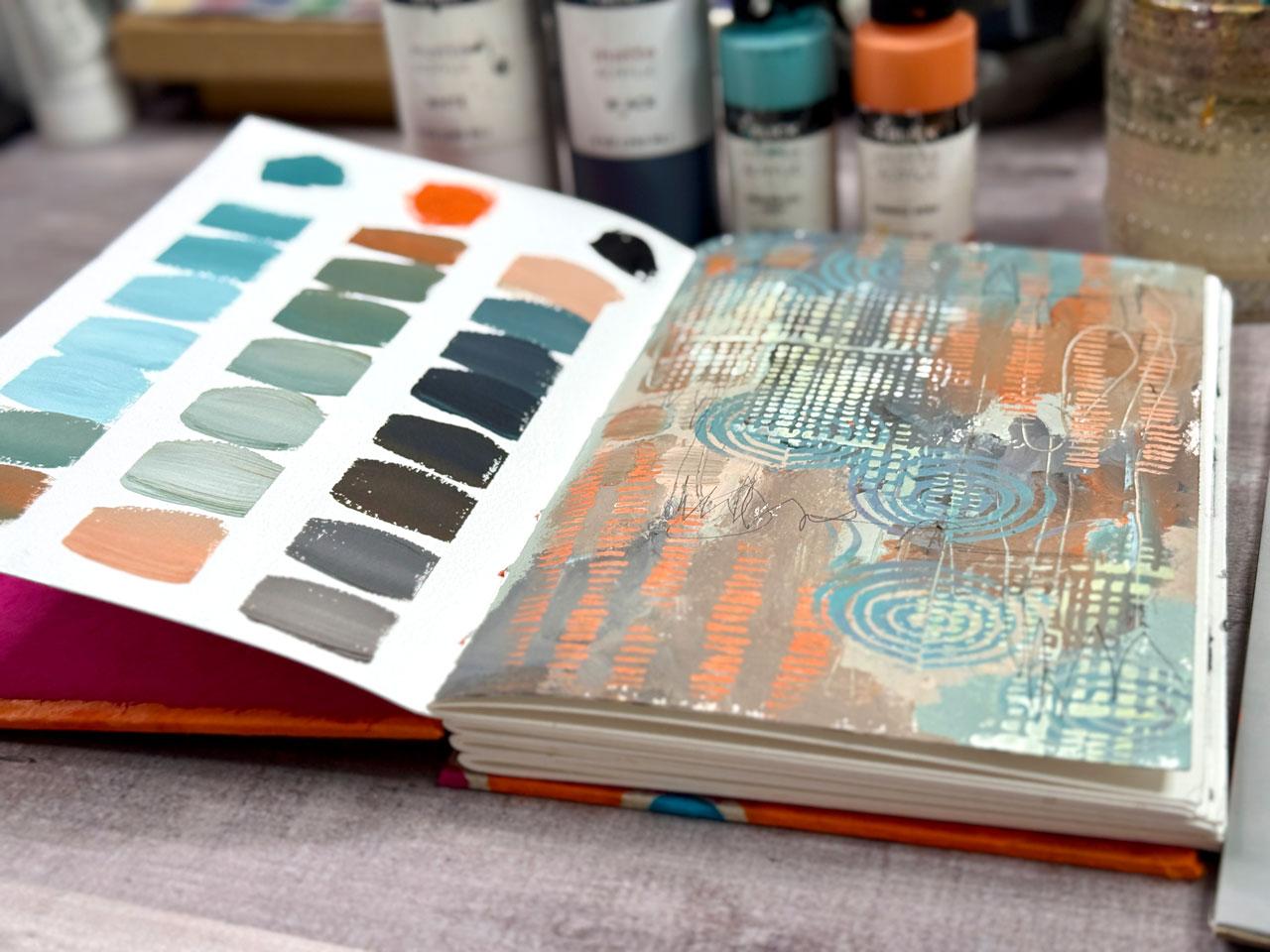
me from painting on the pages below as I'm doing the abstract piece on this side. So there we go. I thought we
would do blue and orange. So I'm using green blue
deep and orange deep in my black mat paints. Just getting the build
up off the cap there. So I'll start with some blue. And then I got some orange. I'm going to put some
white over here, and I'll put some
black down here. There we go. We are ready. Let's tape this
off on this side. I've got my little bit
of painter's tape, and I'm just going to do
the same thing that I did in that big journal. That is to tape myself
off some areas. I can adjust it before I
stick them down for good, but I do like to have
my colors in columns, so I've discovered through painting most of
that ledger journal, which again, you'll find
I put in the supply PDF, the big playlist of all those ones that
I've already done, so you can have plenty of fun videos to watch
and get inspired by. Go check those out
in your supply PDF. And then this is the
honeymule paper, so I have extremely
good luck with it not tearing my tape. No tearing my paper
as I peel my tape, so I'm gonna go ahead and just get that on there pretty easy. And then I'll leave the top
for my original colors, and then I might
take a pen after the fact and write
what those colors were up there because I'm not going to
remember that later. Using one particular
set of colors though, like all your Daniel Smith or your golden paints or
whatever it is that you decide to do yours because I want you to
use whatever you have. This is about figuring
out your supplies, how they work, what the
mixes you can get with it, and then having yourself a reference library
when you're done of everything you can do with those paints that you might not have known you could
do with them later. So I've got my water
right up top there. White really not using the
water, but it is up here, and then we'll start off
with our colors here. I might start the blue with
just a little bit of white. I'm just doing the same thing. I am working on watercolor paper rather than mixed media paper because I like watercolor paper. Almost everything that I do, I do it on watercolor paper. I'm not interested in having 15 different kinds
of papers that I work on. I like watercolor paper. So working in this journal
is perfect for me. This is also perfect. If you're doing watercolors
tests like this. If you're in a
watercolor journal, then you're already working on paper that would be
appropriate for that medium. This would have been a good
time to switch mediums, but it's all about just
play and experiment. Don't get hung up
on your pieces. I had a lot of white in this. Let's go ahead and dump
some of this over here on this page because there's too much paint in my
brush to keep going. And that's a really
unusual gray color that we just ended up with. And we end up with neutral colors when we're
starting with opposites. Blue and orange are opposites
on the color wheel. So they are going to cancel
each other out basically and usually give you a gray or brown or some type
of muddy color. So that's what we just got. We got mud because I had blue and orange with
the color in the middle, when you're mixing the
two colors together, another color range that
we could get out of that is that color with more orange and that color
with more blue. You can definitely get
more colors out of these by just going
a little more one way and a little more the
other way rather than going straight into the
white or the black, which gives you mostly dark
shades of gray and black. I didn't do that as much
on the other one where I went skewed more blue or skewed more orange
in that middle mix, and I should have
because it's different. You get different shades of
whatever you were going for depending on how
much of one color or the other you mix in there. And then mixed all
that with white. I'm not going perfection, but you could go for straighter
rose instead of fatter. I'm not worried about it. I'm just playing, enjoying
where this takes me. And then cleaning the
brush off when it's got too much paint on it rather
than wasting that paint. Put that paint down
on that paper. Okay. Let's go over here to the orange with the
white orange and white. Then you'll see too, I have more colors, but my rows are shorter,
do I have more colors? Because really on
the other book, the rows are bigger before I get to the Blacks. Okay. So let's go ahead and I'll start mixing in some blacks now. So I want the blue and a black. So let me get some black
out and pick up this blue over here and see
where that takes us. And then a little more black. Again, I don't want
you to get hung up on mixing and getting
stressed about it. It's just think in your mind, I got that, a little more black, a little more this, a
little more of that. Let's go for the
orange over here. Let's mix some of
this onto our paper. Look at that. That's a pretty brown
that we've got in there. I think it's a little
bit because I've mixed with the
orange and got that. But that's pretty. Look at that. Let's mix the orange with
a little bit of black. Then let's throw some
white into these mixes. I've got the blue and
the black and the white. And then over here, I've got the orange and the
black and the white. I basically have
three rows of color. Look at that. That's so
pretty. Oh, my gosh. So now let's come over here and play on our
abstract over here. We've got all these
yummy colors to fill in. I do use my brush personally way back, basically fisting it. It's my own personal preference. I like holding it like I'm a 3-year-old with very
little control, which is why I hold it
way back to the back. If you want more control, then hold it more like a pencil, but that's going to be
very, very controlled. My goal with abstract painting is not to be so controlled. I want it to be whatever. Now I'm just mark making. We could do mark making with
some other tools and stuff. This is one of my clay tools. It looks like a needle. But we could come over here and kind of drag
through our paint and see what we have in
the different layers. I like doing that a lot. And then we could continue
doing some mark making. You can do some stencil
work on top of this. Let's go ahead and dry
this a little bit. I'm going to put that
paint in some water. Then I might get out some
of my stencil girl stencils again because I enjoy
them s376 Shaw. I like this one because of
the constant little marks. You can do that with
a paint brush too. You don't have to do
it with a stencil. I'm just doing stuff that I enjoy and just
bringing you along, giving you ideas, just kind of showing you some things that you could maybe
do and consider. Oh, yeah. Oh, yeah, that was a good one. Oh, my gosh. Oh yeah, yeah, yeah, yeah, yeah Perfect. Okay,
that's a good one. It's one of my
favorite. That's 376 by Shaw, Stencil girl. Oh, I I like these
ones that look like little two sided rainbows. I kind of feel like I need a few of these with the bluish color, and I don't want to
go directly with the ink blending
brush that I just had because if I put blue
right on that orange, I will have brown or mud or something
that's not this color. Okay, let's go this
way. That was it. That was it. I love that
one. That's a good one. S943 dub DUBE then can
look at it and think, is there anything
else I'd like to do? I'd like to come back with some white something with some white maybe maybe
these lovely squares. I like these. These are S five
oh one Wolf WOLF. And we're going to go with some white. Oh, yeah, look at that. Perfect. That's so much fun. Okay, that's a good
one. All right, I'm gonna throw these
stencil brushes in the water until I can go rinse them
off like a paintbrush. I just clean those
like paintbrush. And all these supplies
are on my favorites page. So check out my favorites. I've got that in
your supply PDF. I'm going to go ahead
and peel this tape. I don't know if I'm done yet, but I'm giving this
a moment to dry. And because I'm using some
good quality watercolor paper, I should be able to get this off without the tape
tear and the paper. But just as a precaution, you could take your heat tool, craft heat tool, and heat
that tape up a little bit, and that'll make
sure if you're using a wood pulp paper,
it'll definitely tear. So definitely heat the tape
up before you peel it. This is a cotton
paper, and sometimes it tears and sometimes
it doesn't depends on paper got wet or whatever
while you were painting. Pretty, pretty. Okay, so then I can
look at this and think, is there anything
else that that needs? Do I want to come back with
any additional mark making? I could come back
with some pencil. Just kind of mark
making in there. It's still wet paint. Just as, you know, any final marks or however you might
want to finish your piece. These don't have to
be finished pieces. I think it's just fun. Do that? Look at that. Oh, my gosh, super cool. That's super fun to do
this on watercolor paper in or whatever mixed media paper that you want to use in a book that you
made yourself. So definitely consider
making yourself a fun book and then doing these as the pages because then I
would flip it right over. I do the next color
palette here and the next piece of art there, and then the next color palette and the
next piece of art. The whole book would be this
lovely reference library. Again, the main goal is to see what colors you
mix, white, black, red, orange and blue, seeing all the different kind of colors you
can get out of that. And then just getting
that color down so you can see what those
look like together, how they're going to
really work together. 'Cause blue and orange,
they pop off each other, so you get some really
cool color combinations and contrast with
that color palette. So this was a fun
one. I hope you enjoyed hanging out
with me for that, and I'll see you
guys back in class. Mm hmm.
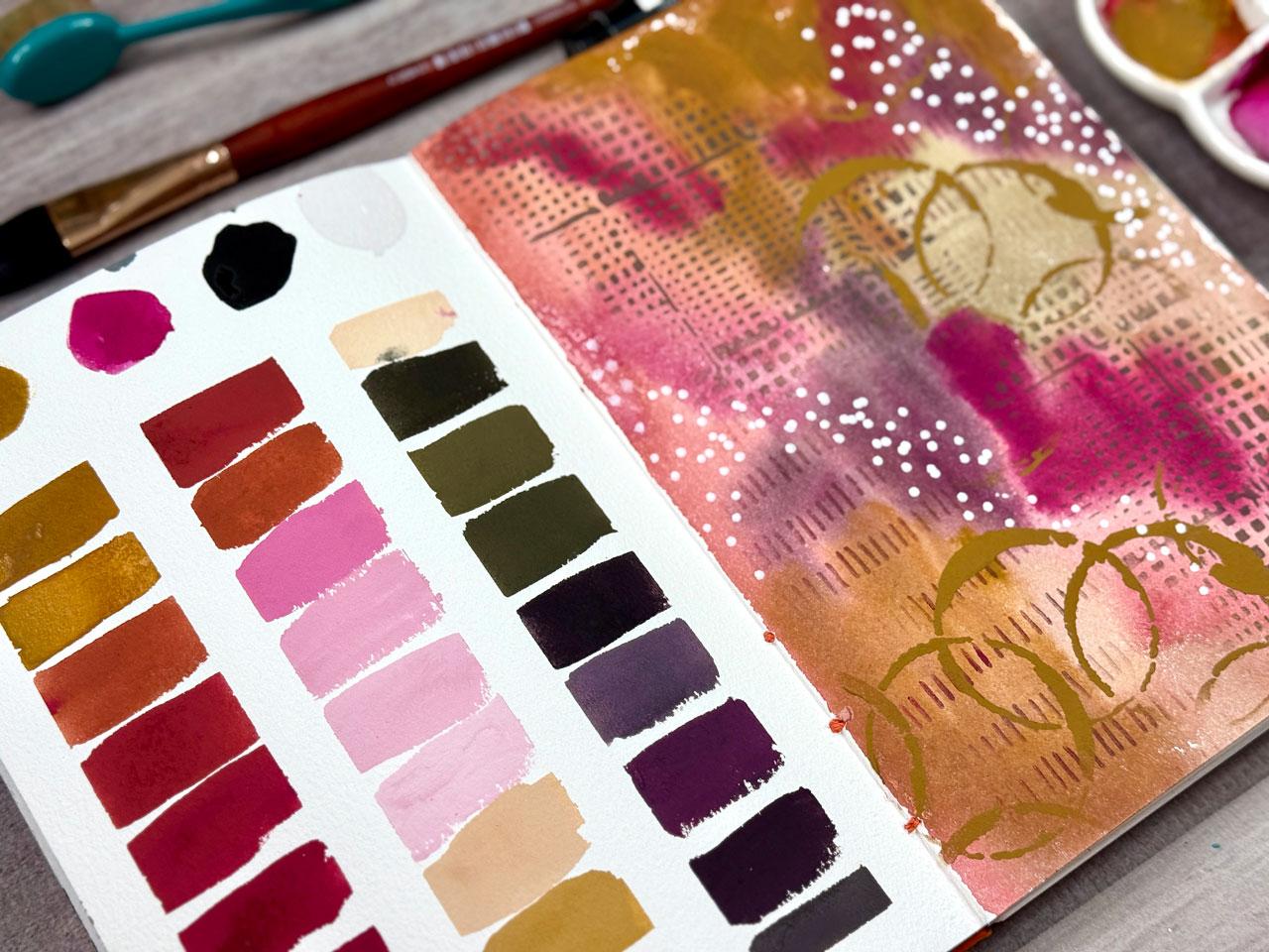
8. Gouache Palette in a Watercolor Journal: Project, I thought
we would do a quash for our collar palette and
I'm just taping off a grid. I'm working in that same fair spin and beauty
sketchbook that I made. This has got the Heine
Mule paper in it. I thought I'd go ahead because
I'm working in a guash, which I use squash just
like I use watercolor. It's very similar to watercolor. It uses the same binders
usually as the paints do, but the pigment
sizes are different. I like guash. It's just
different. I like it. I thought what we would do is try this project with the guash. And just see what fun
we can come up with. I could go ahead and just
protect that page there. It's another piece
of watercolor paper. I've got the deli
paper somewhere. We'll just play the
same experiment with the white got some white guash
and just see how it works. A lot of times with
watercolor and guash, I'm doing a color
palette and a lot of times I'm mixing
like one color in that palette with
all the colors and a hero color or mother color and getting a cohesive
color palette in that way. But this one, I'm going to try the same experiment
as we were doing. But you could definitely
do a color palette, mix one in and see
what that gives you because that gives you a cohesive set of colors
that are going to match even if they don't
seem to match to begin with. But I want to do a two color
black and white just as a similar challenge as we
did with the acrylics. I've got white black
in the Holbein guash. I'm using G six oh six and g659. I've also got raw umber G six oh two and Rose violet g588. I just looked at the
colors and thought, what inspires me today
and just picked some. There was no rhyme
or reason as to why I did a specific
color over another one. I think for this, I'm going
to use watercolor brushes and I could use a square brush or I could use just a
regular round brush. Looking here at my options. So we can then do this or with the round brush,
I could just do this. I might just do the round brush. There's no right or
wrong way to do these. But I'm looking at
my options here. I got a lot of mop
brushes because that seems to be what I like to use. I don't want that
to be super short. Let's just use this round
brush and go for it. So what I'm gonna do
is I've got water. I've got the quash. Maybe I'll pick up the water I
just put on my table. And I'm going to put just up top the colors that
we're starting with. And again, just pick two colors. It doesn't even
matter what they are. The goal here is to experiment
with all your paints and see what all the different
color palettes can do, and you might end up finding some surprises and things that
you really didn't expect. I do that a lot. Like, Wow, I didn't even see
that coming kind of thing. And I'm going to
go ahead and put the white up there even though
you can't really see it. I've gotten extra water just in case my waters get too dirty. Um, so I'm going to do the same experiment
that I was doing. I picked one of these
pallets with a lot of extra wells so that I could
then come over here with, say, a lot of yellow and
maybe pick up a tiny bit. Well, just mixing
that up, aren't we? Um, and that's real thick too, so I could add more water
and we could actually have different opacities in our color charts
that could be fun. It's squash though, it is
thicker than watercolor. It's not meant to be
exactly the same. It's usually opaque,
which I love. Let's pick up some more of this yummy pink and mix that in. Again, I'm not trying
to be real exact here. I'm just adding a
little extra to it just to give me a color
shift so I can be like, here's what it is with a little more of this or a
little more of that. I do like the sides to be straight. That's
why I tape it down. That's a half inch
painter's tape. I don't mind if
the heights vary. I just like the uniformity
of doing it with the sides. We're just getting further and further towards the pink here. Almost to the point where it's
just going to be the pink. So we could go like that and then start adding
yellow to the pink and just see does that make any difference to
what we were already getting if I add a little
bit more yellow and go back the other way with pink being the dominant
color, basically. Does that look different than when yellow was the
dominant color? It might not look different. It might look like we
just reversed them. But this is how we figure
some of those out. This is our discovery. And because I've
already got that going, I might also I'm going to start adding
white here in a minute. Thinking out loud, sorry. Yeah, let's start adding
in some of this white. Kind of the white with the pink and see what that gets us. Look how pretty that
is. Oh, my gosh. Oh, that's a pretty pink. We'll put a little
more white in there. And then we could pick
mostly white with just a tiny bit of pink
and get real white there. Then I want to see what
that looks like, of course, with the yellow so I might
pull some white out. We're going to have
a little bit of color contamination,
but I don't even care. Does not bother me. M. And then I'll just keep adding a little more yellow in here and seeing what shades of ochre are we going
to get basically. That's a pretty color. I mean, it's not even ochre we're using. We're using raw umber, but
it's a very ochre color. Huh. Ooh, that was a lot of paint on the brush that
I didn't get mixed in. Because raw umber is more
yellow than burnt umber. Burnt dumber is more brown. Now I'm going to start adding in some black and see what the black does with
some of these colors. Again, you can be super
exact if you want or you can be mismatched just to it's
about exploring for me. It's not about getting
it perfect or exact or getting an exact
ratio because let me tell you it's
stressful when you get into the oh it's got to be this exact ratio or or
you're not doing it right. I'm going to play and mix
stuff and just see what I can get. That to me is more fun. Look at that color. That's a beautiful deep
brown. I like that one a lot? I love this color. We got
some good ones out of there. Let's add the black to the pink. I'm adding it to some
of the solid color, but we can also add it into
some of the mixed color. The black was very
dominant there. See if we pick up some
of this mixed color, we can get up some grays. That's the two and the white. I'm sorry, that's with
the pink and the white. We can get some pretty grays in here if we're
doing some of this. Want to pick up a little
tiny bit of black, but more pink. Oh,
Yeah, look at that. Then we start getting shades of these pretty colors instead
of solids of those. I love that. Oh,
my goodness, yes. Let's do a tiny bit
more. That's too much. It's what makes this great
big pilot here, fun, too. I got enough wells to play in. Then let's see. Let's do one tiny bit more, maybe with some yellow here. Oh and a little bit of white. There we go. Let's
get that right there. Oh, there we go, like a
pretty gray. Excellent. Okay. Now, because this
is watercolor paper and that's watercolor
or that squash, which is very similar
to watercolor, I'm going to let it do its thing there before I peel the tape. I'm going to pick
up a bigger brush because let's just go ahead and put something over here with all the randomness
that we've got going. Doesn't have to be
anything exact, but I think I'm going to use maybe this great big Oval wash, which is the bigger size of what I normally use
in my smaller pieces. I just think having that great big brush
would be convenient. I'm just going to start
picking up some of these colors and laying
some color down. Look how pretty that
is. Oh, my gosh. Alright. That right there is already been like,
oh, I love it. Okay, that's a fun choice. I'm just going to pick out of here and pick and choose
and I've got dirty water, but I'm not even
worried about it. Then again, when I go
to layer on top of this because I like the
mixed media aspect of a lot of things that I do. When I go to layer
on top of this, I'm just going to
shoot for, say, if I do stencils, I'm
going to shoot for colors that are in my palette, even if I didn't mix
it, for instance, just to be consistent
if I want to finish, it's really still all about playing and experimenting
though and learning the colors and seeing what
do I get out of here with this set of colors that I've mixed and how do they mix
together and what do they do? I'm not trying to create some beautiful finished
piece of art either, even though I do enjoy
when these are finished. And they look like
lovely abstract art. But it's okay if they don't
can just be color blotches. I mean, at this
point, just adding the mixed colors over on this page could be done. You
could be done right there. The goal is to see what this palette would look like if you used it
in a piece of art, but it doesn't have to be
a finished piece of art. It could just be lovely
color splotching like this. This is pretty. And then just seeing
too, how does that paint interact with other colors
and stuff on the page? Okay, I kind of want to
stick this back down. Let's put that
right there. Okay. So I could let this dry
and come back in and stencil through
with some I could even use the guash
for the stenciling. Got paint stuck in that brush.
I need some clean water. I'm gonna let this dry a bit. Let's do that. Let's dry it. Okay, not completely dry.
We're getting close. I'm gonna pull out some
stencil girl stencils. So I do link my
favorite resources and stuff on my favorites page. Definitely check out
your projects and resources PDF for links and stuff to some
of these favorites, but I love this grid here, which is S five oh one Wolf
WOO LF I'm going to just use the Guash as my stencil paint instead of getting
out acrylics because we've already got some really fun colors that I
like right here, and the brush is dry, so I'm just going
to get some paint in the brush and just see. What does it look
like if I use it? It's all about maybe some
extra experimenting. I don't really know. What? Look how good
that looks. All right. Guash is a great stencil
medium for the wind. That's almost like using
an ink because it's an ink blending brush to get the texture on there
exactly like I liked. Oh, my gosh, that
was a good choice. Squash for the wind.
Let's use this other one. I love this one too.
This is s376 by shaw. Want to maybe pick up. I don't know. We'll
just pick up something. I don't know what
we're getting here. We're just going
to pick up a bunch like we're mixing
right in the brush. It's all about play, experiment, see what
you oh, that's perfect. It's just so light and
I like the layers. The layers are what make
this so good for me. That was fun. Do we have anything that might, these are fun. Let's use this. Preferably maybe
with some yellow. Let's pick up some
of this yellow. I'm just digging
that into the brush to make sure I don't
have a big lop of paint. I was a little thicker, but I'm liking it. Let's
see what that did. Oh, yeah. That's perfect. Okay. Yes. So the guash. Good for stenciling. Or at least the whole bind one. That's the one I'm testing.
Oh, yes, yes, yes. Mm. Okay, so that's a good
one. This 1s574 Shaw SHAW. So again, all at stencil Girl. Art, do I feel like I'm there? I mean, we could come back
in with maybe even, like, just to finish it off, maybe some white dots
with a posca pen. Again, I'm still staying
within my color palette. But what I think is fun
is even though you could just do blops over
here to get an idea, it is fun when the whole
book looks like palettes in abstract art or palettes in
whatever art you love doing. That little tiny bit of extra effort is
what makes looking through these pilots
and pilot pages. I really gives you a sense of accomplishment
and a lot of joy. At least I get a lot
of joy out of it. If you're going to do
it, you don't have to be exactly about it because we're doing a page and under you know, 30 or 45 minutes. But when it's done,
you can look back. I didn't think, Oh, my gosh,
look how good that looks, and it's a good reference
guide. These are my favorite. I just love doing these pages. This is the only
art that I made for the rest of my art career,
I'd be happy with that. I like playing with color,
texture, experimenting. Okay, I like that. That
looks good. Good job. Think I'm there for today on this particular palette page. You don't have to be all invested in a whole
day of art making. We can simply be in
to something fun. Let me dry this real quick. I think I got this
palette off of Amazon. I do go through the little Amazon storefront that I link at the top
of my favorites page. I link all the supplies
that I get on Amazon. I usually tag in
that store front so you could be able
to go back and find it or something like it or
even just ceramic plates. I like ceramic because
you can go wash these off pretty easy or you can keep using these paints and that could be your
color palette for a while. Because these rewet really
nicely, just like watercolor. These are not 100% dry,
but they're mostly dry. Let's just peel the tape
and see what we got. And you could come back in, too, and draw like an ink grid around these if you wanted
to kind of ish it up, make it look a little more Wow. You could come back
in and wow that up with some separating. You could do black.
You could do gold. You could draw a line across here and kind of frame
them all in if you wanted. I'm not going to do that, but I do like the thought
of that, and there we go. What do you think about doing the lovely color palette with gouache instead
of acrylic paint. I just wanted to give you an
idea of how that might work. Hope you enjoyed hanging out and painting this one with me and
I'll see you back in class.
9. Watercolor Palette in a Vintage Book: This project, I'm going to do a watercolor palette in an old book so that we
can see how to do that. This is an old hymnal
that I have used for a couple of years for a
couple of different projects. The first project I
started was put the piece of art here and put the
color palette that I use. If I ever wanted to come back to that color palette, I could. I did a whole bunch of those. When you have a book
that's old and delicate, it really helps if you
will staple a few of the pages together so that
it's a little bit stronger. Like you'll see, I've just taken a regular staple and just
stapled some of these together. I didn't even glue it, but
they do great, just stapled. I could have done both sides, but I was just kind in here
playing a couple years ago with a modified version
of a color palette, so I remember what did I use
in these particular pieces? I didn't have color
cubes at this time or work with the color
palettes like I do now. It was a really nice way to
have a reference library for pieces that maybe you loved or maybe you didn't
love and then you thought, Okay, I didn't love this, definitely don't go back
with this brown or whatever. It's just a good way to keep a little diary of pieces
and what you've done. Then I used it also for an
interesting color palette. With a guash. You can see how pretty that is with
the vibrant gouache. And what I like about this
is you can kind of see through the paints
and you can see, just things peeking
through there. I thought that I would
take this particular one, which is a couple of pages,
again, stapled together. I think it's only two
stapled together. Yeah. And so I might staple a couple of these
together when I'm done, but I'm going to go ahead
and just prep it for now. So I'm prepping it
for watercolor, so I am using our watercolor
prep. The Daniel Smith. What, watercolor ground. You can try with gesso, but I don't know if it
would work as well with the gesso as it does with
the watercolor ground. I don't know if
they've got something different in those mediums, but since I've got
the proper ground for the medium that I'm
going to be working in, I'm just going to go ahead
and prep these two pages. With the ground. It just needs just a nice thin layer and
then set this to the side and let that dry and
that will protect the vintage paper from any medium that I'm
putting on top of it, like the watercolor and also
allow the watercolor to do what it's really supposed
to do rather than just sink into the paper and
do something wonky. Now that we have prepped that, we're going to set that to
the side and let it dry and then we'll come back and do a palette with some
Daniel Smith watercolors. What color palette are we thinking that we
might want to do? I I got to decide on
the color palette. We've already done
an orange and blue. Of course, I'm setting that right on top of that wet paper. We've done a second modified
Zorn Palette and then we did that's the palette in this one and you can see how interesting the
differences are. In a similar color palette, you've got some
differences and you've got some similarities and it's
fun to compare those. We could look at some
of the color palettes that I've already done and I could revisit
something like that. Let's just see we've
got blue green, we've got the red ochre, we've got the yellow,
orange and the blue. We've got a pink and a teal. Red and orange or red
ish, purple and ochre. We've got a blue and orange. We've got a pink and purple,
which I like that one. I like this blue
and orange quite a bit. Purple and yellow. We've got a blue and a green. This one's got some oil pastels in it and I haven't
gone out to spray it. And you can see,
it's not sprayed. I will still come
off on your fingers. In a book like this, I probably wouldn't do more
oil pastels unless I were going to be more diligent about spraying them or you could put a piece of wax paper
in there to protect it. We've got red and tell, which for some
reason, I just love red and tell. That's a good one. We've got yellow,
green and pink. I got blue and yellow.
I do like this. It's really a rich palette, and I didn't really expect that, but it's a brown and orange. Maybe a brown and
something would be fun. Purple orange, blue and
aqua, Zorn Palette. I really like that palette. We've got brown and burgundy, another brown and
reddish burgundy, yellow and pink,
blue and yellow. Blue and green. So you see we've got
some good choices. So we're going to let that's kind of two
Zorn pallets in a row. I really like the Zorn
Palette apparently. But look how pretty
those turnout. There's a reason why that was a master's palette and
became so popular. Alright, so we're going to
let this finish drying. It's almost dry, but we're gonna let it finish, and then
I'll be right back. Alright, I have let this
dry for quite a while. So it really be good if
you had plans to do this, like in the morning. Then the evening before, you could come through and paint your pages and
be ready for the next day. Now, what I'm doing is I'm super curious is this delicate
paper would hold up to me color mixing and swatching and
taping off my grid. So I'm going to
go ahead and tape that down and I'll
be right back. I've decided to do a
blue green palette. I pick some Daniel Smith colors, Sleeping Beauty and undersea green because I
like these colors. I also don't have a
black watercolor. Randomly because you
don't usually use black as in watercolor a whole lot,
people tend to avoid it. I have pulled out a Pains
gray to be my black for today because the Daniel Smith Pains gray, it looks pretty dark. Then I've pulled out a
random white watercolor from M Grant and company
so that I had a white. Normally, I don't normally don't use white and
black too much. What I'm going to
do is just get it started right up top here so that we know what
we're starting with. Then I'm going to do just like I did with the acrylic palettes. I am going to mix a little of
this with a little of that and just see where we can get with these and color mixing. You can do circles
and you can do your own version of color
mixing. I think it's fun. See, that's really close to a black well. I just
hit it with the white. I want it to actually be black. I'm going to take a tissue and wipe it off before it
soaks in. How about that? I actually want it to not
be mixed in with the white. There we go. Okay, so I'm going to do a little of this and a little
of that. I like the columns. That's my own little thing
there that I want to do. I'm going to start with
the sleeping beauty with a little bit of white
and we're just going to see where we can go
with this color. I didn't need to wipe that out. I don't
know why I did that. You can do circles, you can do however it is that you're thinking that
you want to do. That's pretty fun
there. I think I could have had even a darker
shade out of that. Don't know why I keep sticking my brush and my
water. Ignore that. There we go. I like that. Going to go ahead and
mix blue and green, maybe I'll pull a little of this out and put a little blue over here and a little
green over here. And just see. You
can do a little more green and then
a little more blue and let those go off in their own directions and just see how many
shades can we get? It's not about perfection. It's about experimenting and seeing where these
colors can go, a little bit more
blue on this one, maybe a little
more of that blue. Be now you're going to have a
really good color reference of what will these colors do
for me? A little more blue. Now I want a little bit
of white in one of these. Look at that. The white, you can see makes them
even more opaque, so they're not as transparent. That's a super
interesting observation. If we weren't aware that
that might do that, super interesting that
we discovered that. Maybe a little more blue over here and this white
and this green. Yeah. Then I'm going to mix some of
these with our Pains gray, which is my version of
black in this scenario. If you don't have a black, don't be afraid to substitute it for the darkest whatever
that you happen to have. Now, some of this
looks like it's bubbling up with the
watercolor ground. That's interesting. There was the green and the blue
with the pains gray. Maybe I'll mix a little bit of the green and blue over here. That was the green
with the pains gray. Going to do a little mixture
over here with the green, the blue, and the pins gray and you can see I'm not
getting real exact. You are welcome to be way
more exact than I am doing. But it's not about the
pressure and stress of getting it perfect.
That's pretty cool. I actually want to mix
some of that with the white and just see what
does that turn into? It turns into a grayish. I also needed to mix
some of let's see. We did the blue and the green. I didn't do the blue
and the pains gray. Maybe we'll do a little
blue with some pains gray, and see what that does. Maybe a little more pains gray. Maybe a little bit of
that mixed with white. The white definitely
adds an opacity to it, which I think is
very interesting. Okay, look at all these colors
that we got out of that, and that was a
very unscientific, playful way to go
ahead and just play. I want you to get in the
practice of mixing stuff without it being just
too much thought and worry and stress. Now I'm going to
paint something on this other side and I've
got lots of choices. I'm just going to pick up some paint and
see what it does. And I've used the watercolor
ground quite a bit. It reacts a little differently
on different papers. It's interesting to see what it does with the
different papers. Because this one I'm
really seeing a lot of the design coming
up from underneath it, but that could be
because I'm using a more transparent watercolor
when you know mostly what I use is more opaque
watercolors, a lot of times. So or vivid, ones that
are really vivid. I'm doing a big oval abstract, which is one of my signature fun things that I like to do. For abstracts is
gigantic oval things just because I like that shape and it makes for interesting
abstracts when you're done, Okay, I like that
a lot actually. Now I'm thinking that
we could use some dark, but it doesn't
necessarily have to be the dark of the watercolors
that we've used. What we could come in
with now is other mark making things to just give
us a finished fun abstract. Or you could stop right there. That could be your abstract. Then now you've got
what the colors will do and how many
colors you can get. But I could also come back in on top of this with some things that match with that and make
it a true finished piece. I'm going to dry
this a little bit. Normally, I like it
all to dry itself. But I'm gonna dry
it a little bit. I'm gonna go ahead,
too, and pull my tape, and I'm going to heat
the tape so that I have less chance of
damaging this paper, and this is our
experiment to see. Can you gesso it
with a ground or regular gesso and
still get the tape to peel off or will it
tear your old book? So I didn't get it
taped down super good right there, bled
up underneath it. But I didn't push it down real
hard 'cause I was afraid. Okay, so yes, the tape will pull off book with the
ground or the gesso. If I were doing acrylic paint, which is what I've done
on all those other pages, then I would prep
that paper with the clear gesso rather than
the watercolor ground. The watercolor ground is
just watercolor gesso. Clear gesso is good
gesso for acrylic paint. If I were doing all
this in acrylic, I would prep the pages
with the clear gesso so that I can still see the page
coming up underneath it. Now that we have that,
thinking that we can mark make and just add in here some of these colors as some
extra mark making. Yes. Just some fun. Just something that gives us some extra interest
and then gives you an idea too in this
color palette. What else could I add to that that's not necessarily just the paint that I'm using? Good choice. I do graphite pencil a lot
of times personally. I might put some
graphite marks in here. I like dots, so I
might come up with some white dots or some colored dots or
something like that. I think the paint
is still drying, but we're going to go ahead and just see what we can do in here. I could do some stenciling
on top. You know what? That might be fun just to get one or two stencils and use the watercolor as
our stencil medium. Because it's all
about experimenting. If you think of
something and you think, I wonder if I can
do that, then I want you to give that a try. Let's pull out some stencils
that I've already used, but I like them for
something like this. This is stencil Girls stencils. I've got s376 Shaw, which I love this 1s574 Shaw which looks like water ringlets. I'm going to get
ink blending brush, and we're just going to
pick up some watercolor, dry brush and not super wet watercolor,
let's just see what it does. Let's see if we get some marks. Okay, we do. Look at that. I love it when I just come
off the cuff and I'm like, let's try this because
some of this stuff, it's all about being
a little kid and playing and
experimenting and just trying it out and just
seeing where you get. There's no right or wrong way
to do some of this stuff. I want to mix a
little bit of say, white in this blue. Can I pick up enough
of that blue? Because I want it to be opaque, but that color or any color over there
will be fine, actually. But the white is going
to give me some opacity. And then what if I picked that up with the blending brush. I might not get
anything. Let's see. Kind of need some more of
that white. There we go. Oh, yeah, yeah, yeah. Okay, yes. A pick up, pick up
a bunch of white. Oh, look at that. Oh, my gosh. Total winter. Alright. So don't be afraid. To pick up some
watercolor and do that as a stencil if you're wanting
to stay in the same medium. Look at that. Oh my gosh.
That was a total win. Now, let me tell you
on your stencils, the problem with some
of this that I've done, watercolor and gouache are
mediums that will reactivate. If I go to use this on
my next project and I've got this medium on here
that reactivates with water, that color will bleed into
the new piece that I'm doing. In the very rare
occasions that I'm not using acrylic paint
because acrylic paint, I just let those
dry on my stencils. I don't even care
because the paint is so thin and I can use these for
a long time before I'm like, maybe I've done too much, but I don't even worry about it. You can throw these into a little tub of water
while you're working if you're wanting to
keep them clean until you can wash them off if
you're using acrylic paint. But if you're using
watercolor and guash, this will reactivate. I could go wash that
stuff off and it would reactivate
and come right off, but it will also reactivate and come right off on the next
piece of art that I do. Weirdly enough, I don't mind that and so I'm going
to probably leave it on there and you're going
to see it show up in a future video and it's going to bleed
onto something that we may or may not like. But I thought I
would mention that depending on the material
that we're using, you could have that color bleed off into the next piece.
This is super cool. This is for today, just fine. It was all about experimenting and seeing what these colors would do in our piece with the color palette
that we picked, I would take a little black pen probably and write the colors on top of those of what I used. But there we go. So if
you can't get, say, a lecture journal and you
want to use something more interesting than say
a watercolor paper, go and find a very
interesting old book at the Thrift store or
the antique market. I wouldn't spend more than
$10 on it, personally. I think this might have
been $10 when I got it. And then look at all these pages that we still have
that we can fill up. Even though I staple two or three pages
together when I do stuff, there's a ton that you
can do in these books. So if you go every other
page and staple them, look how gorgeous that is. Oh, my gosh. All I
hope you had fun experimenting with watercolor
in a vintage book. I don't see you back in class.
10. Evaluating Our Projects: All right. Let's take a look at some of the things
that we did in class. I started with the Dena
Wakeley Media ledger Journal, which is a replica of a vintage journal
that Dana Wakeley found. And it's really nice
for mixed media. It's not a watercolor paper, so I don't like it as
well for watercolor, but I did do watercolor
experiments in it, just to show you that again. If you didn't see that
in the earlier video. This is watercolor on
the straight paper. This is watercolor using watercolor ground
underneath the paint. So it's definitely
doable with watercolor. I did like the way
that it looked with the ground a little better if you're liking the
watercolor look, the transparency of it. This looked a little more
solid to me and did not move and swish around like a watercolor might normally do. So that was my experiments with watercolor in this
book, just to show you. And so for the rest of the book, I actually liked doing the
acrylic paint experiments, which is how I started
being inspired by the Zorn palette and just
playing and experimenting. And you don't have to have
a piece of art over here. It's more about color mixing
and experimenting and then throwing that
color over here just to see what they do and
how they interact. And I just think it's
fun that I did do some mixed media
pieces over here because now this book is
super fun to flip through. So these, I have a playlist of all these other
videos that you can check out if you want to watch more color swatching and
abstract art making. So that is in your supply PDF. Download that off the
Projects and Resources page. And so there's a whole
bunch of videos that you can sink into in this journal. So this journal is about 33, $34 in that range. I thought it was super
reasonable for what it is. It's a new book that if you have a problem using old books and tearing them up and
painting on them and stuff, and some people do, then this is a nice alternative and the
price is very reasonable. So, acrylic paint in that book. Now if you don't, if these
are no longer being made, and at the time that
I made the class, these are fairly new steel,
so we've got a while. But after that, they're not
going to be made anymore, then you can do your
color palettes and experiments in
watercolor journal. This is a handmade journal in
my bare spine beauty class. It's one pad of paper
to make one book. If you've got whatever your
favorite paper to work in is, mine's a honomule paper. Takes one pad of paper
to make this one book, which let me tell you. Ends up being fantastic
because they then fill the pages and you're
using the good paper, but you're using it in a way that is meaningful and you're going to get
a lot of use out of, and then you're practicing
on the good paper and you're making
something that you're not afraid is going to be ruined or at least I'm not
because I love these. We experimented with acrylic
on the watercolor paper, which I do all my media
on watercolor paper. It doesn't bother me a bit. Um, and then we did gouache
on the watercolor paper, which turned out fantastic. And then, of course,
you could do watercolor on the
watercolor paper. This really is the perfect
paper for tons of mediums. If you're using oil paint and you want to make
something like this, you could use the arches oil paint paper and do
the same thing. So, got you covered on any medium that you happen
to like and want to do. Then check this
out Vintage Book. So if you don't want to do any of the other
options and you're like, Oh, I want a real vintage book. Go get a real vintage book
or your own vintage ledger. Go to the antique store, go to the thrift store, look around. I like to keep my
purchases under, say, $10, and then I'm not afraid
to tear it up and use it. I don't it doesn't bother me a bit to paint and
tear up stuff. I'm giving it a second life, a book that might have
wound up in the trash can. Then look how amazing
it is to flip through a real vintage book that you created
amazing stuff in. So look around and the
more interesting the book, the more creative the
finished piece might be. This is a hymnal, so it's music and I love that. We did watercolor ground
and watercolor in this book as a test to see,
could we peel the tape? Did the watercolor ground
do what it should? Even though some of the watercolor bubbled up on the ground as it was
going, it dried. Amazing. Don't even
worry if you're getting it bubbling a
little bit on the ground. If you're going to
use a a vintage book for acrylic paint
or anything else, then I would use clear gesso on the pages instead of the
watercolor ground, like I used. But whatever you got, I'm sure the watercolor ground
will work just fine too. It's just for cost wise, gesso is probably
cheaper than ground. Yeah. What a fantastic way. To make yourself a library of mixing without the pressure
and stress that a lot of the color mixing things puts on us and several
different ways to get creative in your
books to create the most amazing
reference library for yourself and to have just a beautiful piece of
art when you're done. I hope you enjoyed creating
some of these with me. I'm super excited to
see what you create, definitely come back and share
whichever route you went, share those in the project area. I can't wait to see them, and I'll see you guys back in class.
11. Final Thoughts: Thank you so much
for joining me in this creative journey through
color and abstraction. I hope this process
of working with a limited palette has shown
you how much depth, variety, and emotion can come from
just a few colors and how freeing it can be to
explore without overthinking. Remember, this is a practice you can return to again and again. Every new color combination
tells a different story. So keep experimenting. Keep playing in your ledger, and let curiosity lead the way. I'd love to see what you create. Be sure to share
your spreads and your color stories
with the community.
 DENISE LOVE, Artist & Creative Educator