Transcripts
1. Welcome!: When I first started watercolor, I didn't know how to
properly mix paints. I used the colors
that simply came with the palette and left it at that. Little did I know that one of the most misunderstood
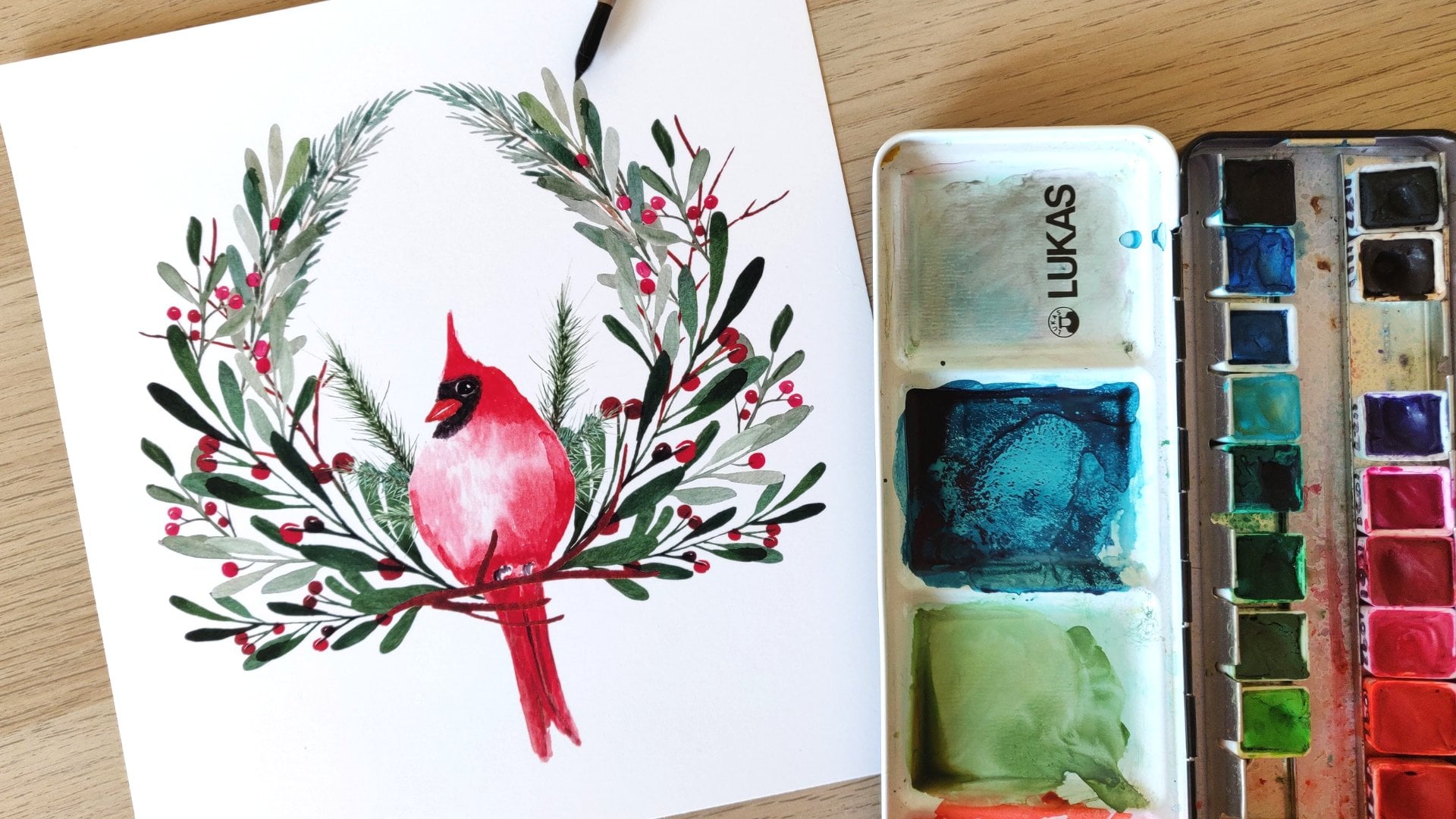
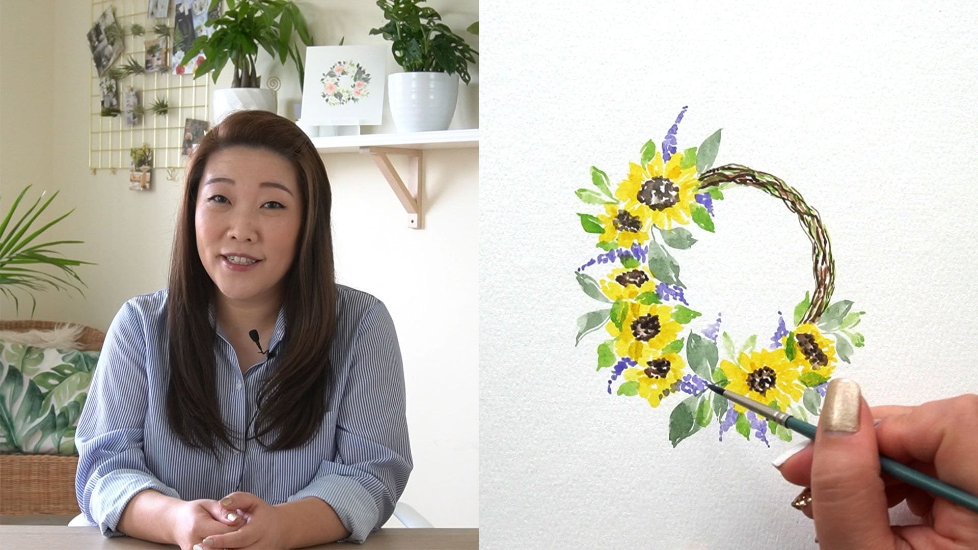
but best part of watercolor is mixing. Hi there, my name is Audrey. I've been teaching on
Skillshare since 2017. I'm a top teacher and you may
recognize my loose florals, wreaths, and
paintings of nature. I'm so excited to
welcome you to my class, Color Palette Basics: How to Mix and Paint with
Watercolor Grays. I chose gray because
it's the last color that people think of when
it comes to watercolor. It's often associated with
dullness, dreariness, and gloom and most people would gravitate towards the
pinks, purples, and greens. But I want to show you how the color gray can be bright and beautiful when used
in the right context. Through this class, you'll increase your color
theory knowledge, learn how to paint with values, and paint vibrantly with
a limited color palette. This class is for you if you already have a basic
understanding of how to paint with watercolors and you're ready to challenge
yourself to think more critically about the colors you use in your painting. Well, what are you waiting for? Let's get our brushes
and palettes dirty. Start mixing the color gray, and take the next steps in our watercolor journey together. I'll see you in class.
2. Your Project: Your project for
this class can be any or all of these suggestions. Gray swatches. Maybe you're not ready to
paint something just yet, but you're having fun mixing colors and discovering
new grays. Show off your gray
swatch grids and share the color
combinations you've tried. Cityscape and cat painting. If you followed along with the painting videos,
share that painting. Your own painting. Maybe you are inspired to
paint something of your own. Think of a winter landscape or a stormy beach or a
different animal. I'd love for you to also
share your thoughts on color mixing and what
new things you learned. Make sure to share your
project here on Skillshare. Go to the projects and
resources tab on your computer, not a mobile device. Click the button to
create a project. Upload your cover image, title, and description, and add more content by clicking
these buttons here. Then hit Publish and be proud of what you've
accomplished. When you're ready,
I'd love it if you could share on social media too. Tag me @AudreyRaDesign and use the hashtag PaintWithAudrey. Now let's get into the class and look at the
supplies we need.
3. Supplies: Here are all of the
supplies you'll need for this class, watercolor paper. I'll be using 140-pound
cold-pressed watercolor paper. I like to buy large pads of paper and then cut them to size. For the paintings, I'll be
using five by seven sheets. I'll also be using
larger 11 by 7.5 inch sheets for the mixing and swatching sections
of this class. Watercolor brushes. I like to use round
brushes for painting. You'll need round
brushes and sizes 2 and 6 or comparable. For the swatching section, I'll be using a
half-inch flat brush. You can still paint
with a round brush, but I like the flat brush to
paint the squares neatly. I will also be using
a five-eighths inch mop brush for your
project paintings. Watercolor paints. Watercolor paints come in
different forms such as pan, tube, liquid, etc. For this class, I
recommend using tube paints for fresh colors. For the tube project
painting specifically, I will be using the following
colors; ultramarine PB 29, burnt sienna PBr7, violet PV3 and PR81, and chromium oxide green PG17. Please note that the names of your paints may
differ from mine, but what's more important
is the pigment name. If you are using tube paints, you can easily find them
on the tube itself, perhaps on the back of the tube. If you are using pan paints
and don't have access to the original wrapping or if you didn't take notes, that's okay. If you know the paint brand, you can look up the color on their website and get the
pigment name that way. For this class, it's
more important that the pigments match rather
than the paint name. For the mixing and swatching, I will be using a variety of colors for
demonstration purposes. If you have the same
colors, that's great. But even if you don't, it's important to watch in order to understand color theory. Here are the various
colors I will be using in the later videos. Viridian green hue PG7, black PBk6, brown red PBr25, red ocher PR101, yellow ocher PY42 and PY83, cerulean PB15,
Prussian blue PB15:3, red PR17, yellow lemon PY3, PW6. It's important to
note that I'm using mostly ShinHan watercolor paints and Lukas watercolor paints. Sketches. Make sure to
download the sketches in the project resources or click on the link in
the class description. There are three sketches; the swatch sketch,
the cityscape sketch, and the cat sketch. Aside from these watercolor
specific supplies, you will also need
the following tools; a pen and pencil, an eraser, paper towel or cotton
rag, jars of water, a light pad or you can use a
sunny window, artist tape, washi tape or painter's tape, a ceramic palette or other plate tray or large surface
to mix your colors, and a spray bottle of water. Now that you have all
of your supplies, let's discuss why painting
with gray is important.
4. Why Painting with Greys is Important: In this video, let's discuss why painting with
gray is important. I believe there
are three reasons why this practice is important. Number 1, you will increase
your color theory knowledge. Number 2, your paintings
will be more vibrant, and number 3, you will understand how to
paint with values. Let me expound on these
points a little bit more. Increase your color
theory knowledge. Up until now, if you have
used gray in your paintings, you either water down
your black or used a convenience gray color like Payne's gray
or Davies gray. But you may not have
stopped to look at the pigments that
make that color, or you didn't know
that you could mix your own unique gray color. Later in this class, we'll discuss how to use
color theory to make your own unique grays
and you may be surprised at how easy it is to
create your own grays. Your paintings will
be more vibrant. With watercolor
oftentimes less is more, and sometimes a less pigments
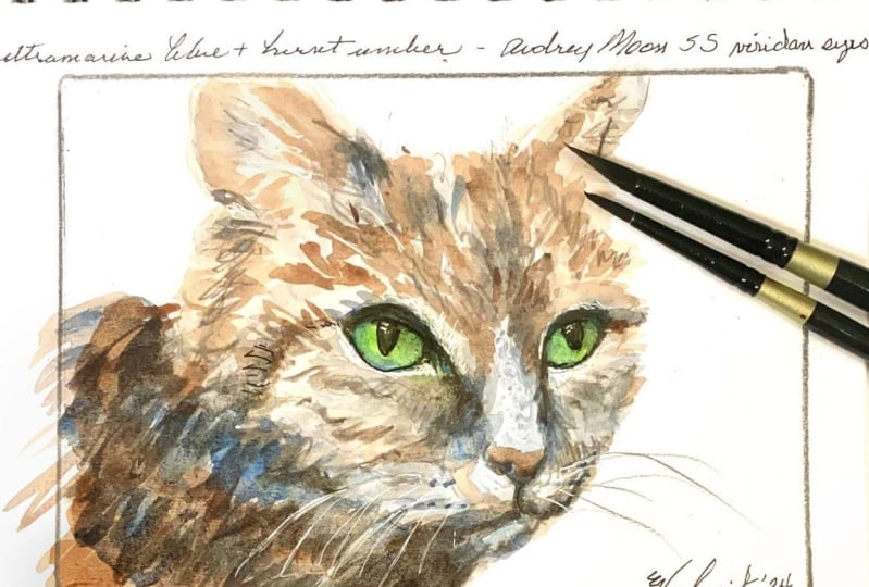
that you use, the better. For example, I
painted this blue jay two different times using
slightly different colors. The first time I
used cerulean blue, burnt sienna, and a watered-down
black for the gray. The second time I used
ultramarine blue, burnt sienna, and a mixture
of the two for the grays. In both instances,
there's color harmony because of the blue
and brown mixtures. But in my opinion, the grays and the second blue is
a little bit more dynamic because of
the various values I was able to achieve. Because of the granulation
of the paints, created an interesting
texture and effect. In the paintings you'll
be doing in this class, we'll be using complimentary
colors to mix our grays. In the cityscape
painting will be doing, you can see how the mixture of the orange and blue
made the gray. Then using that same
orange and blue in the painting mix those
colors really stand out. Using complimentary colors
in a painting will do that. It will bring out the best of those colors when used properly. You will understand how
to paint with values. Value is the relative lightness
or darkness of a color. Now when I first
started watercolor, I knew that adding water to my paint would make
the color lighter. But I also thought that if I wanted to paint a darker color, I would mix black
into the paint. I quickly learned from that
mistake and became less shy about liberally
using up my paint. Because there's a tendency
in us to try and stretch out the use of our supplies
for as long as possible. But in the end, that's only
hurting the quality of our paintings and you are also missing out on how
to paint properly. In your projects,
you're going to paint a variety of values of
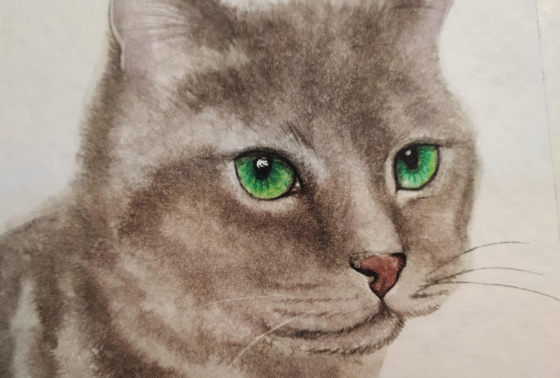
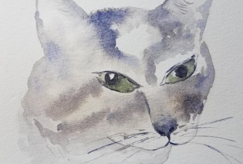
the gray that you create. In this cat painting, you see a really dark,
almost black color. But it's not black. It's simply a very
dark value of the gray that was mixed using the
purple and green colors. But you also see a very light gray around the face and mouth. In the cityscape, you see
the dark colored branches. This is simply a
dark value of the gray that was mixed using
the brown and blue. You see very light values of the gray in the
building background. Knowing how to paint with
various values will create a more interesting
painting and give your subject a more
realistic look. This class is going
to help you think more critically when painting. Instead of reaching for the
most convenient paint color, think about how you
can mix and create a unique color to bring visual
harmony to your paintings. In the next video, let's begin our exploration of how to
mix to get a gray color.
5. 5 Common Ways to Mix Greys: In this video, I
will briefly explain five ways to create
a gray color. Number 1, black plus water. This is by far the easiest
way to make a gray by simply using a lighter
value of a black color. The color black is usually part of a basic
watercolor palette, so this is a great
place to start. Number 2, black plus a
second color, plus water. This is a great way to
add a unique gray if you don't have a variety of
other colors to make gray. Here are some examples of black plus a different
color like yellow, ocher, green, purple,
and burnt sienna. Number 3, a convenience
gray plus a second color. Similar to number 2, you can mix a
convenience gray such as Payne's gray or Davy's gray, with a second color to
create another gray. Here are some examples
of a Payne's gray, a cool color, mixed
with other colors. Number 4, primary colors. The primary colors red, yellow, and blue can be mixed
to create black. Then you can water it
down to make a gray. Note that using warm
or cool variations of the primary color will affect
how your gray turns out. In this swatch, I mixed
red, yellow ocher, and Prussian blue, all of
them on the warm side, and they created a
very dark gray color. In this swatch, I mixed cool primary colors
such as cerulean, lemon yellow, and
Alizarin crimson, and it created a lighter gray. In both instances, you can modify the gray to
make it more warm or cool by adjusting the amount of primary
colors you're mixing, or mixing up the warm
and cool primary colors. To make it more warm, add more yellow and red. To make it cooler,
add more blue. Number 5, complimentary colors. This is my favorite
way to mix grays, especially when I'm going to use those same colors in
the final painting. This is also the method
by which we will be doing our project paintings. Using the color wheel, you can locate complementary
colors, or opposite colors. You do need to be
careful though, because sometimes mixing
complimentary colors will result in a
muddy brown color. The key to a nice
gray color is to mix blues and greens with
oranges and earthy colors. Here are some of the
various grays I was able to mix with
complimentary colors. The reason I prefer this method over watering down black, or mixing primary
colors is because using complimentary colors
allows you to use as little as two pigments. You'll notice in watercolor
paints that when you mix too many
pigments together, the muddier, and more
unpredictable your color will be. When you look at most
convenience gray colors, it will have at least
three pigments. For example, Payne's
gray from the Winsor and Newton Cotman line
has three pigments, PBK7, PB29, and PB15. This is basically a
mixture of black, ultramarine, and Prussian blue. The neutral tint gray from
Lucas has four pigments. PY153, PV19, PB15: 1, and PG7. Now if I were to mix this
gray with a second color, that's adding at least one, if not two or more pigments. While it is convenient
to do this, it could affect the quality
of the mixed color, and dull the vibrancy. But when you use two complimentary
single pigment colors, you only have two pigments, which makes for a more vibrant, clean color, which you'll learn more
about in the next video. Now that you know the five
common ways to mix gray, let's dive deeper into
doing the mixing ourselves.
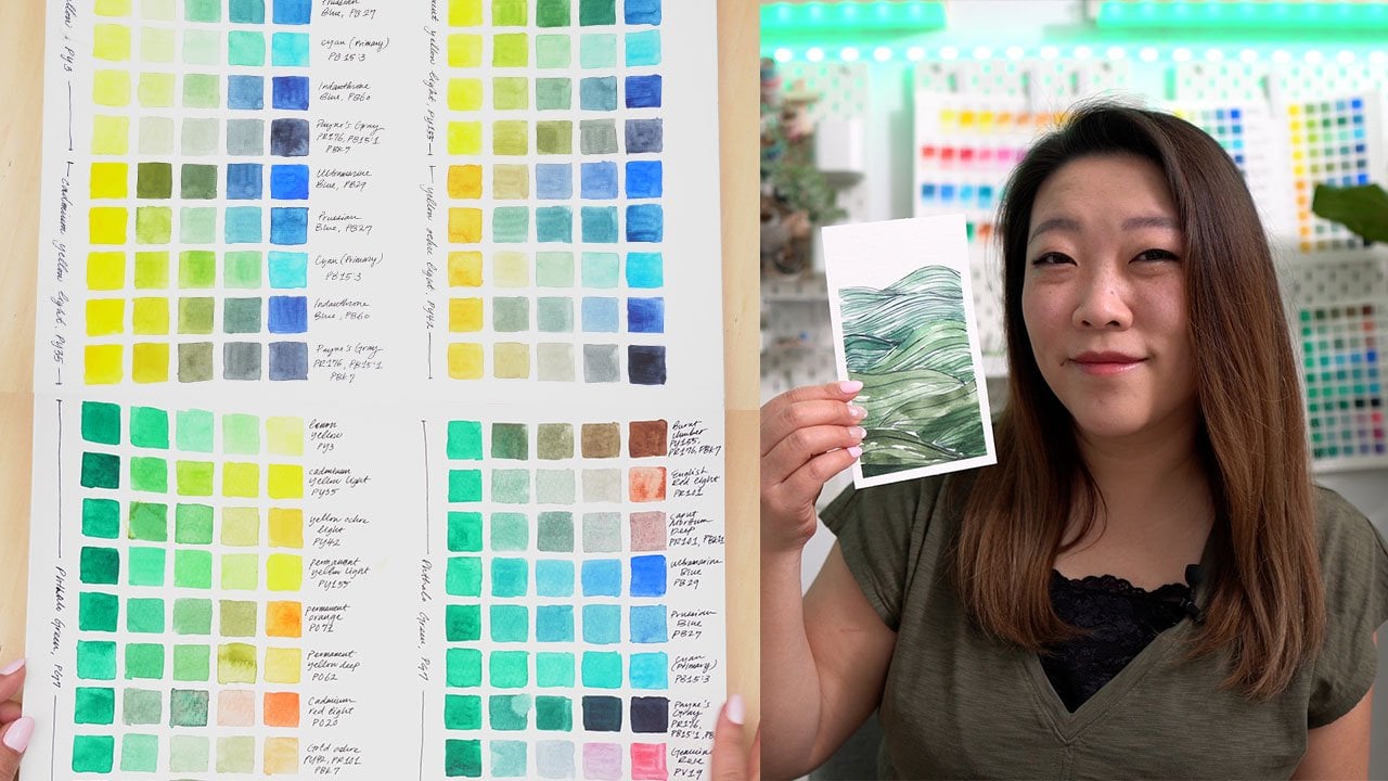
6. Mixing Our Own Greys: In this lesson, we're
going to create our own swatch grids of various color mixtures
to make gray. If you'd like to make
the same swatch grid, take an 11 by 15 inch
sheet of paper and cut it in half so that
it's 11 by 7.5 inches. If you don't have a printer or cutting machine, no worries. You can still create
the swatch by just free handing your swatches. Grab the swatch grid file in the class resources or in
the class description link. The file can be
used in two ways. You can use the
JPEG file to print and then use a light pad
to trace the squares. You can use the PNG file with your cutting machine like
a Cricut or a silhouette, and then cut out the squares. Either way, prepare the grid
and draw the squares on your 11 by 7.5 inch
sheet of paper. I use several of
these grids to show the different ways of
mixing your own grays. Since your project is going
to use complimentary colors, let's focus on that. Orient your paper
horizontally so that you have eight columns and six rows. We will use the
first two squares for the complimentary colors. The third will be the mixed
gray at the darkest value. Then the rest of
the squares will be the same gray in lighter values. This swatch grid is
helpful because you'll be able to see the
original colors, the mixture, and the values. If you don't have these
same colors, that's okay. Try to work with the
colors that you do have. Or if you don't have enough
complimentary colors, feel free to use
the other methods like mixing black plus a color, or a convenience
gray and a color. Let's start with our
first color combination, ultramarine PB29 plus
burnt sienna, PBr7. Now the first square
will be ultramarine. Second square will
be the burnt sienna. The third square
will be the gray. Use your spray bottle to prep
and activate your paints. I'm going to use a round size 6 brush
for this exercise. Let's start with
the ultramarine. I'm going to grab
it from my palette here and then move it
into the ceramic palette. I want to try to get the
darkest value of this color, so my brush is not too wet and my paint is
not very watery. Now I'm going to use
my half-inch brush, pick up the paint, and paint in the square. Let's do the same for
the burnt sienna. I'm going to drop the burnt
sienna on the other side of this palette because
I'm going to mix them very soon
to make the gray. You know what, I'm just
going to stay with my round brush and
paint the squares. Now let's mix. As you're mixing, you can probably tell
within the palette whether it's making
a more muddy color or a more gray color. As you're mixing, try
to adjust as you go. At this point, it looks
more brown than gray. I'm going to add just
a touch of the blue, just a little bit at a time to make it more
gray, there we go. Again, my brush is not very wet and my paint
is not very runny, so I'm going to get
a fairly dark value. Look at that. We start with the
darkest value here, and now I'm going to
wash out my brush little by little to remove the pigment and add some
water to get lighter values. All I'm going to do is just
swish around my brush in the jar just for a
second, maybe even less. Just dip it in just for
a second, take it out, blot for another half second, then paint the next square, and it should be
visibly lighter. Now, if you went too
light, that's okay, just bring in some of the
gray that you already mixed and just add that. You don't want to go too
light because we want to show that range of values. Do it again. Swish, blot, paint the next square. Your squares don't have
to be perfectly painted, so don't worry about that, it's okay to go outside the
lines just a little bit. Just keep washing out and
blotting until you get lighter and lighter values
and your last square should be almost as
light as possible. That's our first
color combination. Let's keep going. Our next color combination is the red ocher PR101
and ultramarine. Let's take that same ultramarine
that we used earlier, drop it in our ceramic palette. I'm going to paint the second
square this time with it. Wash out your brush. I'm going to pick up
my red ocher color. Again, I want really
thick colors. Make sure not to
use too much water. I'm going to paint
this first square with it. Now let's mix. Again, as you're mixing, take a look at this;
this is very brown. It's almost reddish brown, I definitely need to
add a lot more blue. I think even more
blue than that, and just add just
little bits at a time. You don't want to go
too far the other way, because then you'll end up
adding too much of that paint. What you'll notice
about this one is that this color is a little
bit more purple gray than the ultramarine and
burnt sienna combination, and that's because of the
red in the red ocher color. Red plus blue makes purple. Once you have a
nice purply gray, I think that's
when you can stop. Again, to get lighter values, simply dip your brush in the water just for
half a second, blot, and then paint our next
square. Just keep going. You can already start
to see a range of grays from warm to cool. Let's see what else we can make. The next color combination is cobalt violet and
chromium oxide green. Let's start with the violet. Now, the green. Let's mix. This is the color combination
that we're going to use for our cat painting. I hope you like the
gray that it creates. Wow, I think I got the
right mixture of both the purple and green. Let's go ahead and paint
that third square. I love this. This for me creates
a very neutral gray. It's not quite warm, it's not quite cool,
it's pretty neutral. The next complementary
color combination, red and viridian hue. Again, if you don't have some of these exact colors, that's okay. Just try to use as close to
these colors as possible. If you don't have red, but you have a red-orange, try to see what that looks like. Now my viridian hue is very saturated. I
mean, look at this. I barely grabbed it
from the palette, and it's so richly pigmented. It's not that quite common to see a green that has
a single pigment. This green is just
one pigment, PJ7. Because of that, two single pigment
colors is going to create a really rich color. Let's see what it looks like. I'm going to add just a
little bit more of the green, and it creates this
almost black color. Can you see that? Make sure to mix your paints quite
thoroughly, Here we go. Look at this. This is the
darkest gray I've ever seen. Two more color
combinations to go. We've got alizarin crimson
plus viridian hue again. It'll be interesting to compare the alizarin crimson plus
viridian and the red plus viridian because
the alizarin crimson is a cool primary color. Let's see how that
gray turns out. Let's add the green, and now let's mix. Definitely had way
too much green. Just add touches of the red until you get a nice
dark gray color. You know what, it was still a little
bit too green. I think, unfortunately, I did mess up on
this color because I think I didn't wash out the green properly
from my brush, and so you can start to see
in this square right here, it's mostly a green hue. That's my fault. Make sure to wash out
your brush thoroughly. Now see the last combination, brown-red PBr25
plus prussian blue. Now let's mix. Definitely
needs some more brown. This is making a
beautiful gray too. Let's see how it swatches. This created a very
neutral gray as well. I'm liking that
color combination. Great job in painting
this swatch grid of complementary colors
and the gray mixtures. If you're curious about the
other swatches I've created, or other color combinations I've done to make my gray collection, download my ultimate grays sheet in the project resources. Before going into the projects, take some time to get
to know your paints. Create your own swatch grids. Play around with your
convenience grays and blacks to make
new gray colors. Experiment with different
color combinations and see if it makes gray. If it does, great, if it doesn't, then, you know, take notes and you can remember
that for next time. Once you've exhausted
your color palette and painted all kinds of color
combinations to make grays, let's go ahead and
start practicing and apply our grays
to our paintings. Make sure to watch the
next video if you need some warm-up practice with
the wet-on-wet method. If you're fairly confident
with this method, feel free to skip it and I'll see you in the following video.
7. Wet-on-Wet Practice: We're going to use primarily
the wet-on-wet method to paint both the
cityscape and the cat. This video is for those
who feel like they need a refresher or warm-up practice before painting the
final projects. I love to use the
wet-on-wet method when painting subjects like
landscapes and animals. It helps me cover
large areas with a soft wash and keeps me from overthinking
and over-planning. While the wet-on-wet method can be unpredictable
and frustrating, I want to help you with
some warm-ups in order to control where your paint goes. First, grab some
watercolor paper. It can be any size, next, with a pen or pencil, draw, six squares, mine are
about two inches wide. They don't have to look perfect. As for the brush, I'll be
using a round size six, and for the pink color,
you can use anything. Maybe you can use up
the grays that you mixed earlier while
we were swatching. In each of these squares, we're going to practice
different ways of controlling the paint. The biggest tip I have
for the wet-on-wet method is to understand
how wet your paper is, and then control how
much water there is on your paint, and
on your brush. Let's prepare our paint first. Spray a little bit of water
into your paint and activate it. Just a little bit and swirl
it around with your brush. Now if it's too runny, it's going to be too watery and the paint is going
to spread really quickly and the color will be diluted on the
paper immediately. What you can do to get a
thicker consistency of paint is to either add some
more paint fresh from the pan or tube
or make sure to blot your brush before
picking up this paint. Now let's start with
the first square. Fill the square
with clean water. Hold your paper at an angle periodically to see
how wet your paper is. You want to see a shine, but still see the
texture of the paper. If you're seeing
water that's pooling, it's too wet and your paint
won't spread beyond the pool. Blot your brush. Now, touch your brush anywhere in that square and observe how
the paint is spreading. It's okay if it
spreads too fast, just make a note of it. Notice how it's
spreading fairly slowly, now watch what would happen
if my paint was too watery. Do you see how that's
spreading really quickly? It's spreading really quickly, and then the color
has been diluted so just take a moment and take notes of what just happened
in that first square. In the second square, let's fill it with
clean water again, but this time let's
concentrate on adding the paint just
around the border. Again, hold it at an angle
periodically to see the shine. Now, this time I want to add the paint around the border, but I don't want it to spread
too far into the center of the square so I really have to make sure
that my paint is not too runny or watery, and that my water is not
pooling at the edges. Now blot your brush,
pick up your paint, make sure it's not so
runny, and here we go. Do you see how there's just
a little bit of spread into the water or
into the wet paper, but it's not
spreading like crazy. Again, take a moment to take
notes of what happened. In our third square let's
add our water again, and this time I
want you to paint horizontal lines and make sure that there is some space
in-between the colored lines. Make sure to blot your
brush before you pick up your paint and now
let's paint our lines. Watch how it's spreading
just a little bit, but there's a lot of control because I made sure
that my paper is wet, but not overly wet and that my brush is not too wet
because I blotted it and my paint is not so runny and watery because I made sure to
use a thicker consistency. In the fourth square, again, let's add clean
water and this time start with a lighter
value or drop in lighter values and then
while that square is still wet, add darker values. To add darker values, you can simply
pick up your paint directly from the pan
or from the tube. I'm going to use a
watered-down ultramarine, and then drop in pure ultramarine
for the darker values. Again, blot your brush
that it's fairly dry, and then pick up your paint. Here's my lighter values, I'm just painting some
circles in the corners. Watch how it's spreading, and now while it's still wet and I wash out
my brush, blot it, pick up the paint fresh
from the palette, and then drop it in there and it should still
spread a little bit because it's not
completely dry paint and it's still
spreading a little bit. For the last two squares, draw some smaller circles
within your squares. I'm going to draw
three small circles, and in each of them we're
going to do the opposite. In this square we're going
to paint inside the circle, so drop the paint just inside and for the last
square we're going to add the paint outside of those circles so we want
the circles to be white, but I'm going to
challenge you and still cover that entire
square with water. The idea is going to
be making sure that you can control where
the paint goes. Now, I will mention another
technique called lifting, which means like
erasing the paint. When you lift paint, you want to do it while
the paint is still wet, and you can use a dry brush
to pick up that excess paint so it's just going to
make it lighter it's not necessarily going to
erase it completely, but it's just going to make
it a little bit lighter. Once you've got your
square filled with water, let's pick up our paint. I'm going to use that
same ultramarine. Again make sure that
your brush is fairly dry and try to paint and
stay within the circles. Now, it's okay if it spreads out just a little bit but what
you don't want to see is this paint spreading like wildfire see how I'm
controlling it very well. Now if you wanted to try what
we did in the fourth square by adding the darker
value, try that too. Add that to the centers, and now they look
like blueberries. Now, let's work on
the last square. Again, add the water
to the entire square, but now the challenge
is going to be adding the color and avoiding the
squares or the circles. Now, I did forget to demonstrate the lifting so if we go back to the fifth square, so this paint that's spreading
outside of the lines if I wanted to erase
that or lift it, then I can make sure
that my brush is fairly dry and then simply rub my brush along
that pencil line, and then pick up that
excess paint that went rogue and notice how it slowly disappears and make sure to
blot your brush in-between the lifting so that
you're removing that excess paint and not re-introducing it
into your painting. Now you have clean circles. Let's go back to
our last square, I'm just re-wetting it. Pick up your paint, make sure it's not too watery, and now I'm going to
drag my paint and brush around the circles and try to avoid getting the paint inside, but even if you do, you can use the lifting method to try to
avoid it and clean it up. I'm going to go
ahead and just fill in the entire square, and then as soon as I do that, I'm going to go back and
lift the areas so that the circles are a little
bit more obvious. Now I'm just blotting the brush and then picking up
that excess paint. Good job with these
warm-up exercises, I know this was just
a quick practice so if you want to
keep practicing, draw some more squares
and challenge yourself, or instead of squares,
draw organic shapes. Once you feel comfortable
with this method, let's go on to the
next two videos, where we will apply our
knowledge of grades and paint a cityscape
and a cat together.
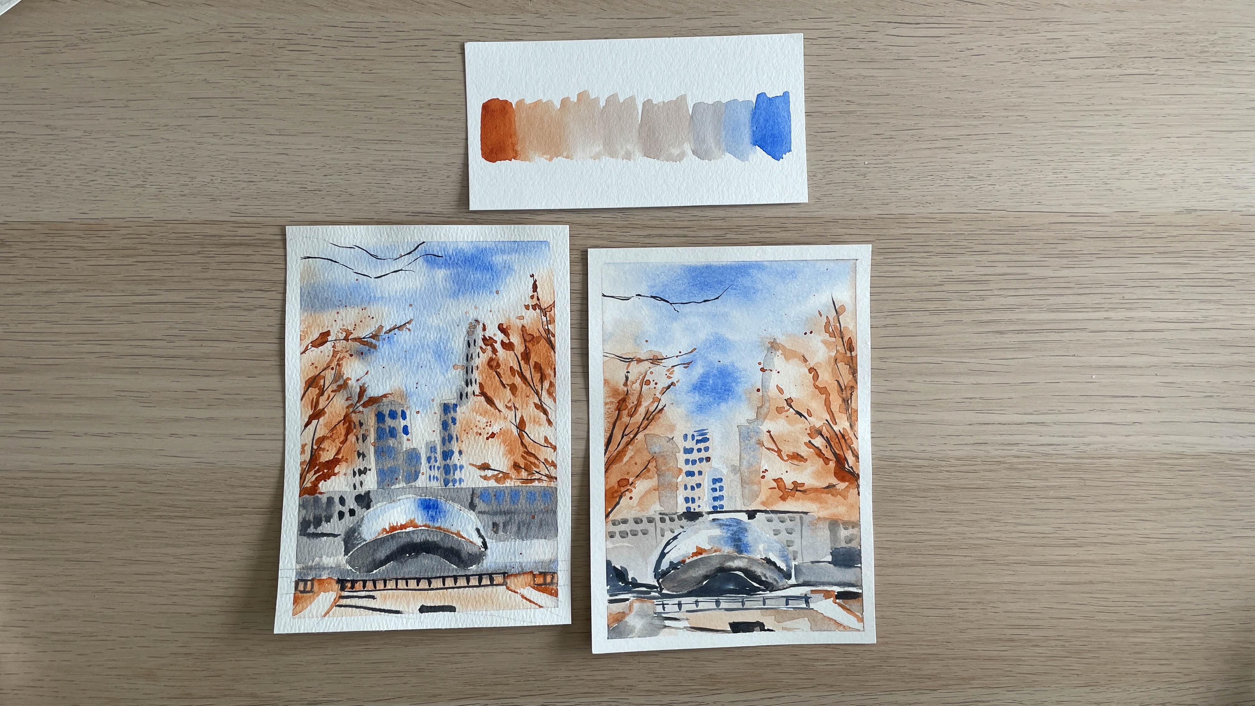
8. Cityscape painting: In this video, you're going
to mix a gray color using complimentary
colors and applying them to a cityscape painting. This cityscape is of
Chicago where I live, and this iconic sculpture
is nicknamed The Bean. This photo is from Unsplash
or royalty-free photo site. First, let's get
our sketch ready. I'm using a five-inch by seven-inch sheet of
watercolor paper, and the sketch can be found
in the project resources. You can trace the
sketch by either using a light pad or tape the sketch to the back of the watercolor paper and use
a sunny window to trace. Next, use artist's tape to position your paper
on your work surface. We're going to use the
wet-on-wet method to paint and taping your paper will
prevent it from buckling. For this painting, I'm using the ultramarine PB29 and
burnt sienna mixture PBr7. Let me squeeze some of each
color into my palette. We're going to start with
a small amount because you can always add
more if you need to. Have some scrap watercolor
paper available so you can swatch and test
your mixed colors. Now before we begin painting, let me walk you through
the general steps because once we get started with
the wet-on-wet method, it will move fairly quickly. In general, we will move from
lightest to darkest value. One of the first
things I like to do, especially if I'm working
from a reference photo, is to desaturate the colors so that I can look
at the values. Once you do that, you
can really see where the lightest and darkest values are and that will help
you plan your painting. First, we're going to cover
the sky and tree areas with clean water and apply our lightest ultramarine
and burnt sienna values. As it's drying, we'll
add the medium and darker values of the
ultramarine and burnt sienna. Next we will work
on the bottom half of the painting around The Bean and paint and grade the buildings
and the foreground. Then we'll paint
The Bean itself. Notice how the top
half has various gray, blue and burnt sienna
colors in various values. We'll use mostly the wet-on-dry
method for this part. As the layers are drying, we will mix the
darkest value of the gray and paint in details
like the branches, railings, windows
and other shadows. Finally, if you'd like, you can add some splatter with the burnt sienna for the leaves. Now, since my style
is more loose, I omitted a lot of the details that you
see in the photograph, especially on the buildings. I instead focus on
the details more on The Bean and the foliage because they are
in the foreground. Let's go ahead and
mix our grays. In two of my walls, I put both the ultramarine
and burnt sienna in there so I can just mix
them directly together. I think I need a
little bit more burnt sienna in this one. Now I do want to swatch this
and see what it looks like. Yes, that's a great
gray right there. Let me just get some
lighter values to see. Wonderful. I'm going to take
that gray now that I like it and just move it
to the middle and add a lot of water to it. Because that's going to
be my lightest value. I'm going to use my mop brush to add lots of water
to my painting. I'm going to use my size six
brush to drop in the colors. Then the size two round brush for the final
details at the end. For this first part of
the wet-on-wet method, I'm only going to add water
to the areas above The Bean. Right about here and above. The mop brush is great for this because it can hold
a lot of water. It just distributes
it really nicely. Again, make sure that your
paper is just wet enough. Now I'm going to take
the lightest value of my ultramarine, just add a little bit
of water to that. Then add in the sky. I want to leave
some white spots. Just like our practice,
I want to add some of that darker value. Just here and there. Now I want to add some of
that lighter burnt sienna for the tree. Again, leave some
white space here too. Now while it's still wet, I'm going to add in some
of that darker value. I'm just being very
loose with my approach. I'm going to take
some of that light gray and then add it to my
buildings in the background. It's a very light wash. Now I'm going to add water to the bottom half of the painting
right around The Bean, using my mop brush
again for that. I'm dragging some of that burnt sienna down,
but that's okay. I want to go right
around The Bean. Use that gray color to add to the background
buildings here. Some of the foreground has a little bit more of
the burnt sienna, starting a little bit more
to the background buildings. Now the area underneath
The Bean is going to be fairly dark because
it's in the shadows. I've established that
dark shadow area. I'm also going to add
another shadow layer to my buildings up here. My paper is still a little
bit wet, so that's good. Again, lift as necessary. Now we need to wait for
this painting to dry. While that is happening, let's get to work on the bean. At the bottom half
of the bean is going to be a little bit darker. I add a little bit more gray or get a thicker
consistency of that gray. I'm just going to paint that in. As I do that, I want the
bottom part of that bean to have a darker value
so that we can make the illusion
that it's a 3D shape. Next, for the top
half of the bean, I want to start with
that sky first. I'm going to start with that
light ultramarine blue. Note where the highlights are, meaning where the white
parts are going to be. There's some concentration of
the blue here for the sky. I'm going to add some
more of the darker values right there, I wash out my brush and drag that light ultramarine
around the sides. They're really trying to
preserve the white space. Then towards the right, I'm also going to
try to preserve some more white
space because that's where the buildings are at. I'm going to pick up
some of the burnt sienna in a thicker value or darker value and then run it along the middle line because this is going
to emulate the foliage. You want a fairly thick
consistency so that it doesn't bleed into the blue
or the gray below. There are also some
other shadow details so use the dark gray. Going to add them to
the corners here. I'm going to add
some more of the darkest values to some of the shadow areas here
in the foreground. I'm going to use a slightly lighter or medium
value of that same gray and then add another layer
of wash to the buildings. Going to use the darkest
value of the burnt sienna to add some more details to some of these stonework up here. All I'm doing is just
outlining the walkway. I start adding some
windows and use a very thick consistency
of the ultramarine. You can make it a little
bit grayer if you want. I'm just going to add them just very loosely here on
some of these buildings. It's okay if it
bleeds a little bit. It doesn't have to look perfect. The buildings in the background, they're just to give
you an indication. They're not really there to
have any concrete details. I'm going to switch to
my size 2 round brush. These are the final details, so make sure that
your painting is completely dry
before you move on. I use that darkest value of
the gray paint that we mixed up and then start adding some of the final details like the
railings and the branches. For these branches, I'm
going to use the very tip of my brush and really just
the lightest touch. I'm also going to take
my size 2 round brush and use a very thick consistency of the burnt sienna to add some more leaf details right around where I
painted the branches. I'm just dotting it
right around it. If you wanted to
add some splatter, use your round size 6 brush and water down
that burnt sienna, make it really watery, and then hold your
brush close to the paper and then
just tap on it. Great job in painting
this cityscape. In the next video, let's mix another gray using complementary colors
and paint a cat.
9. Cat Painting: In this video, you're
going to mix grays and complementary colors and apply them to a painting of a cat. I have a cat of my own, and although he's not gray, I thought an animal would be a great subject for
painting in grays. Other animals that you
might want to consider painting on your
own are rabbits, wolves, dogs, birds,
rhinoceros, etc. Take the principles
you learned in this painting and apply
them to your next painting. I found this beautiful
gray cat from Unsplash or royalty-free
photo site, and let's do the same to this photo as we did
to the cityscape. When we desaturate this photo, you can see that
the darkest values are right around the eyes, the forehead, and the
corners of the ears. Note also where the
lightest values are because that contrast of
light and dark will make your subject and
colors really stand out. Let's get our sketch ready. I'm using a 5 by 7 sheet of watercolor paper and the sketch can be found in the
project resources. You can trace the
sketch by either using a light pad or tape the sketch to the back of the watercolor paper and use
a sunny window to trace. Next, use artist's tape to position your paper
on your work surface. We're going to use
the wet-on-wet method and taping it down will
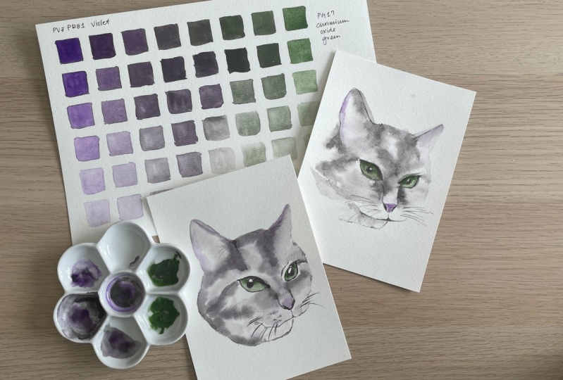
keep it from buckling. For this painting, I'm
using the violet PV3, and PR81, and Chromium
Oxide Green colors PG17. Let me squeeze some of that
each color into my palette. We're just going to start with a small amount because a
little goes a long way, especially using two paints. Before we begin painting, let me walk you through
the general steps because once we get started
with the wet-on-wet method, it will move fairly quickly. In general, we're
going to move from lightest to darkest values. In the first step,
we're going to cover the entire face except the eyes with clean water and then lay down the
lightest gray value. While it's still wet, we're going to add
darker values and just let it spread organically. We'll also add in
hints of purple along the ears and the nose
in a light value. Once the face layer is dry, we will then work on the eyes and the
darkest value details. Remember the wet-on-wet
practice that we did earlier so that you can have some control over how
the paint spreads. Let's mix our grays. I'm going to takes some of
my chromium oxide green here and mix it into my purple. I do have some scrap
paper ready just in case. I'm not sure how
this looks so far. It's hard to tell, but let's just swatch it out. I feel like it's a little
on the green side. Let me just add just a
little bit of purple. Make sure to incorporate
it really well. There we go. Yeah, I feel like that
looks a little better. I think that's a good gray. I'm going to take
some of that gray. That's going to be
the darkest value, but I want to move some
of that to another well, so I can add a lot of water to it to get the lightest value. Go ahead and use my mop brush
to add water to my cat. Again, avoiding the eyes. Remember we're
going to start with the lightest values and use the reference photo to
figure out where to place the colors first and
which areas to avoid it. I pick up that
really light gray. Make sure my paper is
not too wet. Here we go. Start here in the forehead. We've got some grays happening here onto the
bridge of the nose. Little bit here along the ears. Right here from the
eye out to the cheeks. Right around the eyes too
on either side of the nose. Right here on this under lip where the bottom
half of the lip. Let's start adding some of
that darker value grays. Really concentrate them in the forehead and right
around the ears. Right here around the nose and the inner corners of the eyes. Let the paint just
spread and do its thing. Now while this is
still pretty wet, I'm going to add
a little bit of a very light purple along the ears and the nose. I know that the nose is
actually more pink than purple, but for the purposes of using
these complimentary colors, I want to keep it purple. I'm going to switch to my size 2 brush and start
painting in the eyes. Now for the eyes and starting with the green and
I'm going to make the top half of the green
of the eyes a darker value. Then wash out my
brush and then paint the rest of the eye
in a lighter value. You have that beautiful
gradient happening. Same thing with the other eye. The top half will
be a darker value. Wash out your brush, and then paint the rest of it. I'm going to use a really dark gray to paint the other
details in the eyes. I'm going to outline the nose just a little bit
painting the nostrils. My paper is still a little wet, so I might come back to that and define the nose a
little bit more. Define the lips and
the mouth a little bit using just very short
strokes to outline the chin. Use that same dark value of
the gray to outline the ears and then draw some very
fine furs for the hair. Finally, I want to add
some whiskers and again, use very light strokes for this. If your paper is still
wet, that's okay. Come back to it later. Just going to erase the pencil
lines around the border. There you go. Great job
painting this count with me. I can't wait to see yours. Join me in the last video as
I share some final thoughts.
10. Final Thoughts: Congratulations on
finishing this class. I hope you had fun exploring
your color palette, mixing grays, and painting
using only three colors. Don't forget to post
your project and show off how beautiful the
color gray can be. A couple of tips before you go. Number 1, take notes
on everything. Whenever you're
exploring something new, like a mixture of colors or
a new technique, take notes, mark the date on the sheet of paper or the
sketchbook that you're using because you never know when that information
may come in handy. Number 2 remember less is more, especially when we're
talking about pigments. Be selective with which
colors you're mixing and try to keep the number of
pigments to three or less. Last but not least,
challenge yourself. Perhaps this was the first
time you painted with mostly gray colors or
only a few colors. It's actually a lot of fun
when you limit yourself and focus on painting values rather than trying to
get the colors right. You'll be amazed at what
you can accomplish. Now that you've painted
a cityscape and an animal, try something else. Maybe you'll try a
landscape or a seascape, or paint a bird. I'd love to see what you
paint with your grays. Well, that's it from me. Thank you so much
for taking my class. I hope it was valuable to your understanding
of color mixing and that you had fun
exploring and experimenting. I'd love to hear from you. Please share your project. Post in the discussion
section of this class. Shoot me an email or find me on social
media @AudreyRaDesign. Happy painting and I'll
see you next time. Bye.
 Audrey Moon, Watercolorist and Modern Calligrapher