Transcripts
1. Welcome: Siege, mix, eucalyptus. These are just a few
of my favorite greens. In the past year, I've been exploring color
mixing and unlocking watercolors' secrets in order to avoid dull and
lifeless paintings. Hi there, my name
is Audrey and I'm excited to welcome
you to my class, color palette basics, how to mix and paint with
watercolor greens. I've been teaching on
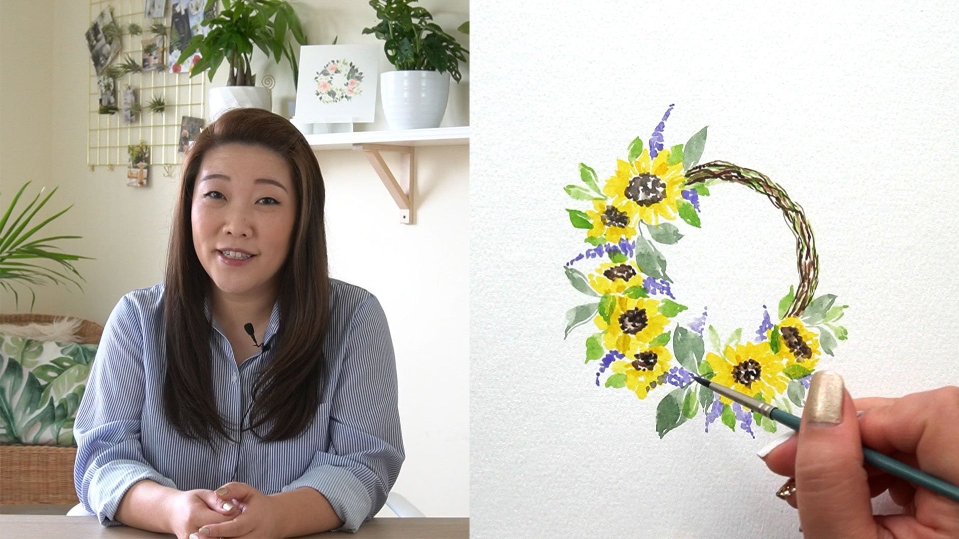
Skillshare since 2017. I'm a top teacher. You may recognize
my loose florals, wreaths, and
paintings of nature. Through this class,
you're going to really get to know
your color palette. We'll start with an
understanding of color theory. Then we'll discuss
why mixing greens is an essential skill
as a watercolor artist. Then we'll explore three
different ways to mix greens. By the end, you will
appreciate the color green in a whole new way as you paint
this abstract landscape. This class is for you. If you already have a basic understanding of how to paint with
watercolors and you're ready to challenge
yourself to think more critically about the colors
you use in your paintings. What are you waiting for? Let's get our brushes
and palate steady. Start mixing the color green and take the next steps in our
watercolor journey together. I'll see you in class.
2. Project Overview: The project for this class, we'll demonstrate
an understanding of how to paint greens. The main project will be to paint this abstract landscape. You can include other
smaller projects, such as your swatch chart, color mixing practice, and any other nodes or interesting things you might want to share. In the end, I hope you will take your understanding
of mixing greens to a whole new level and be able to apply it to all
future paintings. Please remember to
share your project. From your desktop, head to the projects and resources tab. Then click on the button
"Create Project". From there, you can
upload a cover image. Write, a project title and
description and include additional content like
more images, video, links. When you're all done,
click "Publish". I can't wait to
see your projects. In the next video, let's discuss why
you need to learn how to mix greens in watercolor.
3. Why Mix Greens?: You'll hear a lot of
watercolor artists say that you shouldn't mix your
own greens because the ones that come
with your palate are not realistic or
organic looking, and I would agree
with that statement, especially if the
green is more of a bright, almost neon color. I would add just a few more
reasons to that main one. Number 1, you could save
money while there are convenient screens
or ready-made greens that are more natural looking, having to purchase individual
tubes could get expensive, and depending on the style of painting or subject
matter you paint, you may not end up using
all of the paint tube. Number 2, you will have a better understanding of
color theory and your paints. Being able to mix on
your own gives you the most control over your paints and how
you paint with them. You also discover more about what your paints
can do and you'll be surprised at how much
more you can do with less. Lastly, you will create
dynamic paintings. In real life, no green
plant is just one color. You're going to see highlights,
shadows, mid tones. Each of these tones are
slightly different greens and sometimes when you place a green next to another color, it's going to change the
overall perceived color. As you will learn more in the next video
about color theory, the color green is
a secondary color, which means that you have to mix two primary colors to
get the color green. But color theory for
watercolors and thus mixing greens is a bit more
complicated than that. Let's investigate
in the next video.
4. Color Theory Basics: In this video, I want to
cover two main topics, color theory basics,
including the color wheel, and what color bias is. Second, types of
watercolor paints and how they can affect color. Color theory is a
set of rules that explains what happens
when you mix colors. These rules apply to every art form
including watercolors. Color theory was originally formed by the three
primary colors, red, yellow, and blue. From there, you can mix primary colors to create
secondary colors, the orange, green, and purple. From there, you can
mix a primary and a secondary color to
create tertiary colors, which are the
hyphenated color names. These mixtures of
colors are what create the foundation of
the color wheel. Let's take a look
at the color wheel, you can see that I
have primary colors, secondary colors, and tertiary
colors are represented. If you were to split it down
in the middle like this, you'd get warm colors on the right and cool
colors on the left. If you mix all primary
colors equally, you would get black. Now the cool thing
with watercolors is that you may
have noticed that there is more than one
type of primary color, meaning that each primary
color has a color bias. This also means that no primary
color is completely pure. This is what I mean,
notice my two reds here. This permanent red has a yellow bias and looks
warmer compared to the alizarin crimson that has a blue bias and is
considered a cool red. Then goes for the
yellow and blue. Each has a different bias
towards another primary color. You'll notice that mixing
certain primary colors with certain biases will create
a wide array of results. In short, if you want
bright clean colors, choose colors that share
each other's color bias. A cool yellow with a
cool blue will create a bright green because they
lean towards each other. Or a cool red that
leans towards blue and a warm blue that
leans towards red, leaning towards each other, is going to create
a bright purple. But sometimes the muddy, muted colors are preferred
and that's okay. As long as you're
not experimenting on the fly, as you're painting, you want to make informed
choices when it comes to colors that you're not surprised by what
happens on the paper. Now let's discuss the types of watercolor paints and how
they can affect the color. Number 1, transparency. Watercolors are so special because of its
transparent nature. The more transparent
the color is, the brighter it may appear
on paper because it's allowing the white color of
the paper to shine through. If you find that your colors
are too opaque or too dull, it may be due to
its transparency. Next, sedimentary or granulating
types of watercolors has pigments that are deposited on the top
layer of the paper. You can visibly
see the pigments. This characteristic is sometimes not preferred because
they tend to be less transparent and thus
contributing to a less bright
watercolor painting. Lastly, staining. Staining watercolors
quickly sink into the layers of the paper
and basically dye it. These types of
paints will create a more opaque effect and it
will be difficult to lift. So make sure that you're
very careful when you're layering with a
staining type of paint. To understand more about your
paint's characteristics, please refer to the
paint manufacturer. If you bought two paints, the information can be
found on the tube's label. If you have pan paints, you can refer to the
manufacturer's website and make notes. I highly recommend
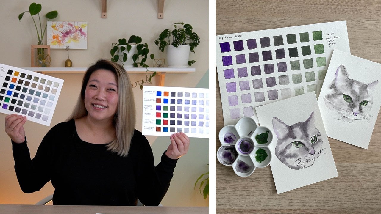
first starting out with a basic swatch of all of
your colors like this. All three of these
watercolor types can affect how your green
mixture comes out. If you mix a granulating
blue with a staining yellow, you will probably get a
green that is very opaque. If you mix two transparent
colors together, you'll probably get a very bright transparent green color. This knowledge combined with
color theory will help you mix greens that are
exactly what you need, whether that's a
bright transparent green or a muted
more opaque green. In the next video, we'll
discuss the supplies that you need and start mixing.
5. Supplies: Here are the supplies that
you'll need for this class. Watercolor paper at
140 pound or 300 GSM. You can have different sizes depending on what you're doing. I like a large pad like this in case I'm
doing a swatch chart, and you can choose a smaller
size for your final project. You'll need
watercolor brushes in different sizes and shape. I usually like the round brushes but you can also
use a flat brush. Whatever will help
you mix and paint the appropriate amount for
the size of your paper. In general, I really like
the round size six or eight. You also need watercolor paints. You can use pan or tube paints, and these are the
main colors that I'll be referring to in this class. For the cool yellows, I'll be using either
Lemon Yellow PY3 or Permanent Yellow
Light, PY155. For the warm yellows, we've got Yellow Ocher, PY42, or Cadmium
Yellow Light PY35. For warm blues, I'll be
using the Ultramarine blue, PB29 or Indanthrone Blue, PB60. For the cool blues, there is a Cyan, PB15: 3 or Prussian Blue, PB27. The convenience screen
that I'll be using is the Phthalo Green, PG7. You can also use
other earth colors like Burnt Sienna, PBR7. You'll need a watercolor palette or some large mixing area. A pen or pencil and an eraser. One or two jars of water. some paper towel, and this just spray bottle with water to keep your paints fresh. Go ahead and gather your
supplies and let's start mixing.
6. Let's Mix Greens: In this video, we will explore three different ways
to make screens. Now that we've
discussed color theory, you understand that depending on the color bias of
your primary color, you're going to get
a variety of greens. So let's dive deeper
into that understanding. In general, if you want to
mix a more muted green, you want to mix a warm yellow, which leans towards red, and a cool blue which
leans towards yellow. The color bias leans
away from each other. A great option for
a warm yellow or cadmium yellow light PY35, or yellow ocher PY42. Some good options
for a cool blue are cyan TB 15:3 or
Prussian blue PB 27. If you want to mix
a bright green, you want to mix a
warm yellow and a warm blue or a cool
yellow and cool blue. Here are some good
options for cool yellows. Lemon yellow PY 3, or a permanent
yellow light PY 155, and some good options
for a warm blue are ultramarine blue PB 29 and
Indanthrone blue PB 60. The third way is if you want to explore mixing with your
convenience screens, try and mixing it with
a modifying color. One of the most popular
convenience screens is phthalo green PG 7. It's a really bright color, not my cup of tea, but with the right
modifying color, it can be really beautiful. Remember that when you're
choosing a modifying color, try to choose colors that
are single pigment to reduce the risk of mixing
too many pigments together. In general, I like to
use warmer earth tones to neutralize and darken
the results in green. Here are some options
to get you started. Permanent orange, PO
71, cadmium red light, PO 20, burn Sienna, PPR seven, and English
red light, PR 101. You'll find that if
you use cool colors like blues and cool reds, pinks and purples with
the convenience screen, you'll get a bluish green, even a warm blue like
ultramarine blue will still result in a bright
blue-green/teal color. Some great options for reds, pinks and purples
are genuine rose PV 19 and dioxazine violet PV 23. As part of your project, create some swatch
chart like this. It doesn't have to
be fancy at all. You can do simple
circles like I did, or create a larger
chart like this. What's most important is that
you're showing a variety of greens and observing what happens when you
mix certain colors. Pause the class here. If you need to spend more time getting to
know your paints, don't be afraid to deep dive and make notes as you go along. This whole process
should not only be educational but fun too. Then when you're ready, go on to the next
video and we'll paint our final
project together.
7. Final Project: For your project,
you'll be painting an abstract landscape
using a variety of greens. I want you to mix two
different greens, a warm muted green
and a cool green. We will use these colors and their various values
to paint this. Make sure to share
in your project which pigments you
mix so that we can expand our library of
color mixtures. Let's begin. This is the final project
that we're going to create. When you paint a
landscape, in general, you want cooler greens
to be in the background. Cool toned colors tend to have a receding effect
and then warmer, brighter colors tend to
have a protruding effect. You want those in
your foreground. The first thing I
want to do is choose my warm green color and the cool green color
and then we'll use various values of it to create the depth
in our landscape. Here's my color swatch chart
that I've made a while ago. I'm really going to be looking at the middle
column because this would be about 50 percent of both the yellow
and the blues. I'm liking this olive
color right here. That's a mixture
of cadmium yellow light and indanthrone blue. So like that. As for my cooler green, I'm liking this one up here with the permanent yellow light
and indanthrone blue. I think maybe using this as my main blue base
and mixing it with either permanent yellow light or the cadmium yellow light
will be the way to go. Let's do that. I have my watercolor
paints up here, but I'm going to use
this palette to mix. First, use your spray bottle
to wake up your paints. This is my PB60, the
indanthrone blue. I'm just going to
pick up a good amount and place it on both sides of my palette here. This is a pretty small
palette, but that's okay. My cadmium yellow light
is this one over here. It's going to grab
a little bit here. [NOISE] A permanent yellow
light is over here. It's going to bring
in a little bit at a time to mix in here. Look at that, already a
really beautiful green. [NOISE] Really nice, cool green as well. Looking really nice. I have a smaller size sheet then my Example 1,
and that's okay. You can use whatever
size you want, but I'm going to use
my Size 6 brush. I'm actually going to
use some washi tape to keep my paper down and create that
really nice crisp border. Try to keep your
brushstrokes really loose and don't feel too much pressure to try to make it look perfect. I'm going to start with a
darker value towards the front. As you create each stroke, tried to leave a little bit of white space in-between
each stroke. Mix up more of the
paint as you need to. Just notice how I have
different values. These are pretty dark values. These are lighter values. Then as I move upward
towards the middle, I'm going to pick
up my warm value, I'm going to pick up just a
little bit of that cool green and then start transitioning
more into that one. Again, wash out your brush a little bit to create
different values, and then we'll leave that
to dry a little bit. Then once that's done, we'll add in some line details. I decided to grab [NOISE] another piece of paper
and do it again. Now, because I didn't
like the first one is just that I split up my paper into two cuts and so I figured [NOISE]
mine as well make two. Why not? [LAUGHTER] Again, mix up some more of
your paint if you need to. I'm just going to set this one aside and bring the
other one back. There it is. I'm going to use a
slightly smaller brush, a size three or smaller, and I'm going to
use a dryer brush. I'm tapping my brush so
I'm blotting my brush on the paper towel and I want
the darkest value possible. I'm just going to start outlining
the shape of the hills. These lines can be as precise or not precise as
you want them to be. They can be spaced out, they can be closer together. Just go with the flow, like don't think
too much about it. Instead, just get lost
in the act of creating. Once you're all done, now you can peel off the tape. You can hold your
painting up far away, and you can clearly
see because we use warmer colors here
in the foreground, they seem to be
coming towards you. Then the cooler
lighter values in the back make it seem like it's going further
in the background. Let's do the same with
the other landscape. This time I think I
want my line details to have darker values. I'm going to add just a
little bit of Payne's gray into the mixture and add just the cooler yellow and blot my brush
that it's pretty dry, and do the same thing. Again, just get lost
in what you're doing. Don't think too much about
making the lines perfect. Let's do the tape
peel for this one. There you go. This is your
final project. Great job.
8. Closing Thoughts: Congratulations on
finishing this course. I'm so glad you
made it to the end, and I can't wait to see your
work and hear from you. What was the favorite
green that you mix? What surprises did you
find along the way? Think about this as you finish this class and move
onto future paintings. If you liked color mixing
and want to learn more, check out my other class on
how to mix watercolor, Grace. Please remember to
share your project. You can also share your
work on social media. I'm on Instagram,
Facebook, and TikTok. Please tag me @AudreyRaDesign and use the hashtag
paint with Audrey. Will you also take a moment
to review the class. It will help me improve and continue to bring
you quality classes. Thank you so much for
taking this class, and I'll see you
in the next one.
 Audrey Moon, Watercolorist and Modern Calligrapher