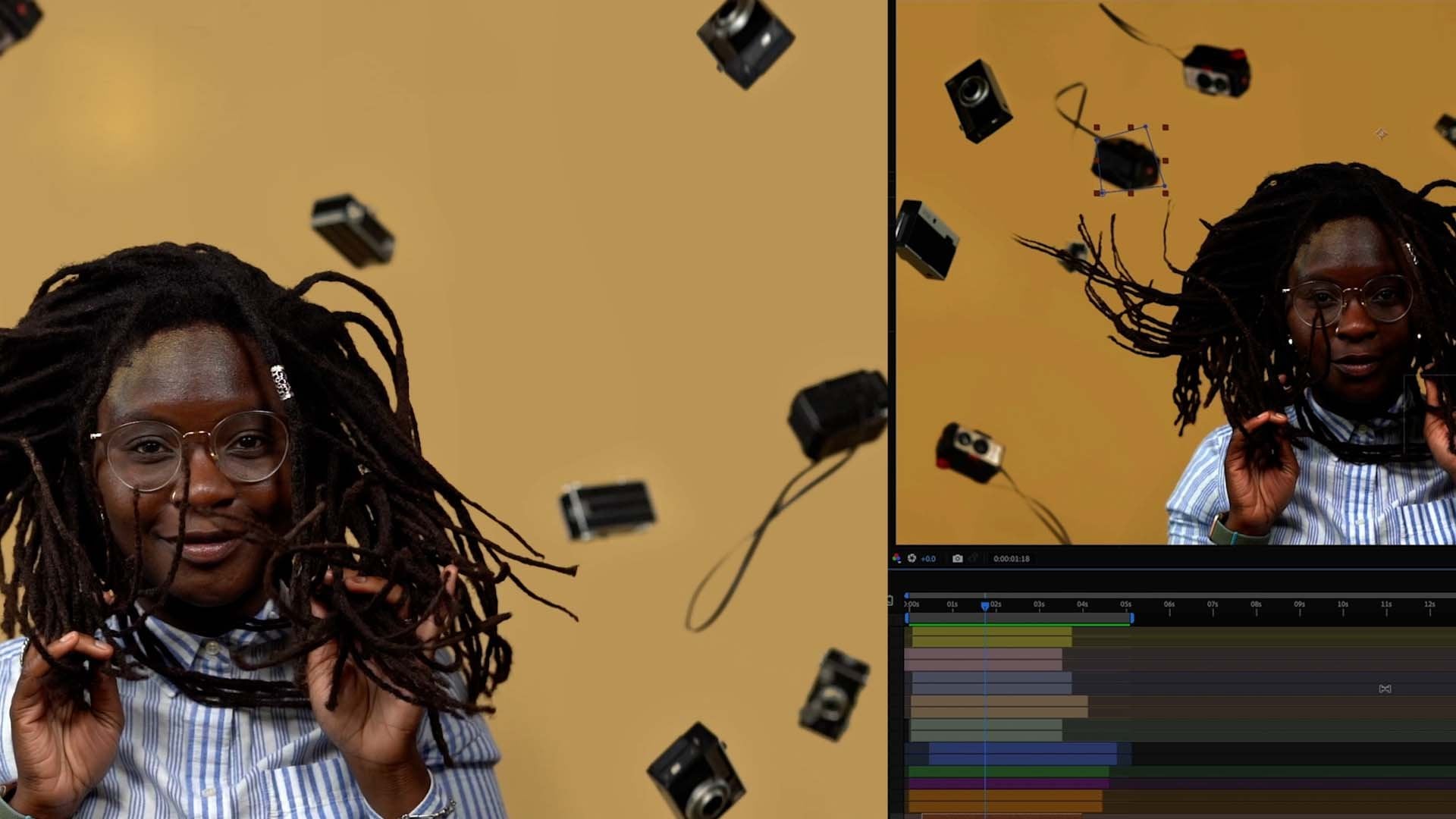
Transcripts
1. Introduction: Hello everyone. I'm Hallease, a digital storyteller and filmmaker and thank
you so much for checking out my class
color correction and color grading in
Adobe Premiere Pro. Cinematography is one of
my favorite aspects of production but a lot of times the beauty of the shot
actually comes from the edit, or rather the color
correction and color grading you do to it. Although I'd love to, we can't all afford to
work with a colorist. I don't know about
you all. I don't know what kind of
life you all live, but I can't afford a
colorist, not yet. We're going to do it
ourselves together. Through this class we'll work in Premiere Pro to color correct
and color grade some of my favorite creative projects and I'll teach you some of that the tried and true tricks I've learned over the years
for balancing skin tones and fixing mistakes I
made while filming. We've all been there.
We all make mistakes. I would recommend this class to anyone who already has
an understanding of the Premiere Pro
interface and how to edit videos and is looking to
up their creative skills. Maybe you're an aspiring
filmmaker or a new filmmaker who's moving into post-production
on your first project. If so, congratulations. I'd also recommend this class to content creators who are
ready to express more in their videos and
also want to utilize color to establish their
personal brand and style. Then finally, I would
also recommend this to in-house editors for
different companies, organizations as well. If you're new to Premiere
Pro and don't have a firm understanding
of the interface, I would recommend you take my
intro to Premiere Pro class first before coming back
here and taking this class. For this class though, you'll need the latest version
of Adobe Premiere Pro, as well as an Internet
connection to download my footage and follow along with me as I move
through the lessons. You don't have to download my footage if you don't want to, but I definitely think
it'll help enhance the learning experience if
you do so if you've got the space on your computer,
give it a download. Again, I'm Hallease. I'm so excited for you to
take this class with me. Thank you so much for
entrusting me with your time. I really appreciate it
and let's get into this.
2. Class Project: Okie dokie, welcome back. I'm Hallease. You're you. Together we are vibrant,
colorful beings. Let's talk about
this class project. For your class project, I'm going to give
you a scene or two. You'll just have to download
the footage and see. From my comedy web series, this could have been an email. You're going to color
correct and color grade it. You're going to be my
colorist on my show. Now, the show already exists on my YouTube channel so at
the end of the class, if you want to go
see my version of it and compare it to
yours, feel free. I'll link to the show
in the resources sheet, but it's also very searchable, so you can just search
it if you want. Have fun with it though. We colored the show very simply, but I want you to explore
your colorful side with this, really make it your own. I'm also going to give you a vlog from my YouTube channel. Again, that isn't color
corrected or color graded. I'll reference both
throughout the class using each to reinforce
the different lessons. Again, I highly recommend you download them so you can
follow along as I go. Empty out some space on your
computer, it's worth it. Speaking of that,
let's briefly go over the organization
of the class. First, we'll go over
the interface and all the tools in Premiere
Pro we'll be using. I'll talk about the
Color workspace and all the ways that Premiere
Pro interprets color. There will be a ton of nuggets
in the interface lesson, so it might be a smidge longer than the rest
of the lessons, but I encourage you, please stick through it
because FAQs for days, I'm answering them
in that section. Then we'll move into
color correction basics. I'll explain how to read
your Lumetri Scopes then we'll move
into color grading, the artsy Farsi, the fun stuff. I'll also show you how I fix some mistakes in post
as much as I can. My favorite features in Premiere Pro for bringing
out different skin tones. Finally, I'll show you
my favorite presets in Premiere Pro and how to create
your own presets and lets, which can be really useful for establishing your own look
and feel as a filmmaker, content creator, or again, if you work in-house
for an organization. If you haven't downloaded
the footage yet, go ahead and do that and I'll
see you in the next lesson.
3. The Color Workspace & Workflow: Hello everyone and welcome
to the first lesson. We're not going
to waste any time and jump right into things. Make sure you have
the latest version of Adobe Premiere Pro downloaded and go ahead and open the
project file that I sent you. When you open your project, if anything is offline, just navigate to it and
re-link everything. I'll show you how to
do that really quick. All you're going to do is
highlight all of the footage, right-click and then
go to Link Media. When you do that, a new
window will appear. Make sure you have filename and file extension checked and also make sure that you have re-link others automatically. As you can see, it didn't even let me search for everything, it just re-linked everything
automatically for me. But just to make sure that you can do this for
yourself as well, when I click on everything
and go to Link Media, I'll hit Locate and all you
need to do now is navigate to wherever you have downloaded the full folder that
I provided for you, and follow the path to get
to where that first file is. Again right now, I have to
display only exact matches, which will help the relinking
process move a lot faster. If I took this away, you would see everything
that I've provided for you in the assets folder. But when you hit
Display exact matches, it only shows the file that corresponds exactly
and then hit Okay. From there, because I hit
Relink others automatically, it just did everything. Again, if for some reason
your stuff is offline, that's how you link
everything back up. To ensure that we're
all working from the same layout of Premiere Pro, let's hit up to the
right hand corner and go to the Color workspace. I'm going to double-click on it. As you can see, that changes
the entire layout of Premiere Pro to focus on color correction
and color grading. If for some reason yours
does not look like mine, just double-tap on
color and that'll make sure to default it back to your original
color layout. I want to make sure that
we're all looking at the same thing as we move
through these lessons. Another way you can change
the workspace as well is by coming up here to the
top right hand corner and hitting Workspace. You can see all the other
workspaces that are provided. Generally though, I usually
just focus on changing my color workspaces
directly from the top bar. The first thing you'll
notice is the Lumetri panel, which is on the right side
of the screen over here. This is where you'll start
to manipulate the color of your footage by messing with different parameters and values. Throughout this
class, we'll be using the Lumetri panel a lot. If you're a photo manipulator, photoshop or lightroom with, some of these values should
look familiar to you, especially in the basic
color correction section, which is open for me right now. Moving on to the left
side of the screen, you'll see the
Lumetri Scopes panel. Yours might have different
scopes than mine, which is perfectly fine. The way to adjust
them to match is by right-clicking on the
Lumetri Scope panel. I usually like to have
the vector scopes up, the parade, RGB
and the waveform. All of that will make sense as we continue to move
through the lessons, but go ahead and have those checked now so that way you can see what we're working
with and that we're all looking at the same scopes. Lumetri Scopes are
important because they depict the literal data value of color and how it is represented in the frame. I'll
show you what I mean. Go to one of the web series scenes and
let it play for a moment and notice how the
waveforms begin to adjust in real-time
during playback. I'll pick a scene.
Let's go here. Thanks. When you did
something [inaudible]. Now go to one of the vlogs
scenes and do the same thing, play it back for a
little while and see how the graphs and values change in your Lumetri Scopes panel. This is the data you'll
use to color correct and color grade your footage
through the lessons. To recap, the Lumetri panel is where you change the
parameters and the Lumetri Scopes are
there to show you how those changes
are interpreted. Now that we know the layout, I want to show you a few ways that premiere interprets color. This section will be
helpful if you're someone who's starting
to mess around with High Logarithmic
Gamma footage or high dynamic range footage, save from your iPhone, smartphone or a
higher-quality camera. The first way premiere
interprets color is through its color
management settings, which are located in
the project settings. I'm going to go up to file project settings
and hit General. Here at the very bottom, you'll see color management
represented and HDR Graphics White Nit is what
I want you to focus on. Right now I have
mindset on 300 so I can get the full range of
footage that I captured. Without getting too
inside baseball on colored technology, HLG stands for High
Logarithmic Gamma, essentially providing
more dynamic range for how much you can
alter the footage. To show you what I
mean, I'm going to now change mine to 100. You can see what happens
to my HLG footage. You see now it's
exponentially brighter. Now, don't be
concerned, all the data is still there that I shot. All the dynamic range
is still there as well. I can go in and bring the exposure back
down if I want to. Say I click here and I just want to bring the
exposure back down. I can, the information
is still there. It's just how premiere
decides to interpret the color based on the
changes that I've made. If you've shot using
HDR on your phone, for example and brought it
into Premiere and it looked incredibly blown out but when you're shooting
it on your phone, it looked fine, this is why you just need to change your
color management settings. Let me go ahead and change
this back to what I prefer. I'm going to put my
exposure back to zero. Again, it looks blown out. I'm going to come to
project settings, general and put
this back to 300, which is generally what I
like to have my settings on because I usually
shoot HLG footage. The second way that
Premiere Pro interprets color is through the
sequence settings. You can get to those by
going to sequence settings. That'll bring up a
new window for you. About midway through the box, you'll see the working
color space is Rec 709, which is the standard format for anything you would create that goes straight
to the Internet. Remember, Adobe Premiere Pro is a professional editing software. They have a few different working color spaces
that you can choose, which would matter if
you're trying to export or work in certain footage types for different medias
and different means. If you want to geek
out on the different color spaces and
their importance, I'll put some
continued read links in the resources sheet. But for now, just know that Rec 709 is pretty much
the industry standard for anything you're doing going to social media platforms or just living on the Internet
in some capacity. My one final thing
I want to throw in, if you are using a Mac, makes sure to head up to the
top of your screen and go to your display settings and
make sure that you have turned off night
shift and true tone. Because that will tend to
alter what your screen looks like and add more orange hues or blue hues depending
on the time of day. It won't be an
accurate depiction to your eye of
what you're doing, even though again,
the data doesn't lie. You have your Lumetri
Color Scopes to guide you. It's better if you
can look at it on a screen that is not
altered in any way. Now that we've explored the color workspace
and discussed how Premiere Pro interprets color
through various settings, let's start color
correcting some footage. I'll see you in the next lesson.
4. Color Correction & Auto Color: Hello and welcome back, I'm sure the last lesson
was a little dull, but setting up Premiere
for color is important. Now we're going to
color correct one of the scenes from
my web series. Before we begin, a few
things to note though, when comparing my web series
footage to my vlog footage, you probably notice that
the web series footage is a lot flatter and desaturate it. That's because it's
filmed in LOG, specifically S-Log because
I use Sony cameras to film, but every major camera brand
has their version of LOG, C-Log for Canon, etc, LOG footage is flatter
and desaturated. That way you can get even more dynamic range
and control of the color. When you shoot in this format, it is specifically meant to be color corrected
and graded, whereas the vlog footage, it's HOG so you can more or
less leave it if you want to. Go ahead and color it, but you can leave it. What is color correction? Color correction is the act of correcting the color of footage, so it looks more or less neutral and natural
to the naked eye. Generally, there is nothing stylistic about
color correcting, it's purely making
it look normal. Let's do that, with web
series scene 1 open, I want you to now look back at our Lumetri Scopes
here on the left, and I'll explain some
important values to you. We all can't afford expensive
color-calibrated monitors, so that's why we use the scopes, your eyes can lie
to you about color, but remember, data doesn't lie. The two things I want you
to remember is zero and 100 over here on the left
side of every scope. Right here, zero
and 100 and then in our RGB Parade, zero and 100. Keep those in mind. If your graph shows
anything hitting at 100, that's pure white and blown out. Essentially there's
no data there, because the exposure
is too high. Conversely, if anything
is hitting zero, that means it's pure black, which means it's so
dark that there's no data in that pixel anymore. When you're color correcting, that's where you live in the in-between here
I'll show you what I mean. Let's take this shot that
I have on Evelyn right now and let's have it hit 100
and have it hits zero. With the shot highlighted
in my sequence, I'm now going to go to my Lumetri Color panel
on the right side, and I'm going to bump the exposure up as
high as I can go, and as you can see, the higher I go, everything is
starting to hit 100. But even so, even though I turn the exposure
all the way up, we're still actually getting a little bit of color information. You can see we can still get this character's hair
a little bit as well, and we're still getting
a little bit of Evelyn's pigment as well. That shows you the dynamic
range of this S-Log footage, but overall, we can
tell this is not good. [LAUGHTER] Don't
submit this please. Unless you have a very
strong stylistic decision you've made, then go
ahead and do that. Now, let's conversely,
do it on the other end, all the way down, and you can see it
actually never hits zero. Again, testament to LOG footage, as you can see it's
not completely gone, we haven't lost all
the information. There's still some
pixels enough to see that that shirt is white,
so on and so forth. That's the value
of S-Log footage, you have so much range that you can play with in the frame, and that's why usually
most professional films, TV shows, etc, they're shot in some LOG
so that way they can have full dynamic range to
manipulate the color a lot. Everyone color corrects and does their order a
little differently. It's honestly your
preference and taste, and as you work more in
the Lumetri Color panel, you will start to decide which things you want to do first. But generally I
go in this order, contrast exposure, whites, blacks, and then from there I like to tweak my
highlights and my shadows. I like to start with contrast because this is LOG footage, so there's usually
very little contrast, and then the next thing
I usually do is I bump up the saturation and this will all make
sense in a second. Again, we're about to
color correct this. Now, rather than
color correcting each clip individually, I usually work from
an adjustment layer, so that way I'm not copying
and pasting over and over to individual clips and essentially reinventing the
wheel every single time. It also helps me to not lose my place in
the process as well or accidentally put multiple Lumetri panel
settings on the same clip, which is possible
in this program. To create an adjustment layer, you just go down to the bottom, all the way to the
bottom here to the little New Item icon, click on it and then
hit "Adjustment Layer". Once the Adjustment
Layer window opens, whatever sequence is active, it usually will take the width and height of that sequence and also the time-based
and pixel aspect ratio, so generally you don't need to change any of this
just hit "Okay". You'll see now we have
a new adjustment layer in our project folder. I'm going to rename
this adjustment layer, just so I don't get
confused I'm going to rename this to be [NOISE]
color correction. To rename it all I did
was double-click on it to activate that and then typed in what I
want, hit "Enter" again. Now again, I like working from adjustment layers because
that way everything I do will now affect everything that is below
the adjustment layer. All an adjustment layer is, is essentially a blank
empty clip that you can manipulate and
do things to you and everything that is
below it will be affected. With my adjustment
layer highlighted, important, my adjustment
layer is highlighted, now I'm going to start color correcting
this entire scene, because it's more or less
shot in this office. We might have to make
some minor adjustments to these first shot since they
are in more of an open space, but starting from
this third shot, it's all in the same space, it should all more or less be the same color correction
and color grading. I'm going to pick
a section yeah, where one of the
main characters is already sitting and
we're going from there. I like to start with saturation and contrast because in general, with S-Log footage, it's so flat as you can see, all the data is right
here in the middle that I really want to just
bring that out more. I'm going ahead and do 150, which as you can see then
now we're starting to get a little bit more color
in Evelyn's skin tone, that's the actress
who's sitting there. Then the next thing I'm going is I'm going to really
bump up my contrast. You can see what
contrast is doing, it's basically expanding
the color of the frame. I'm going to keep it at 30. Now I'm going to start messing around with the
rest of these settings. Something I will mention in
this class is that you'll notice I haven't really done anything with the white balance. That's because for me, I already know that
all of this is more or less white balanced correctly, because we did some
things in camera. But for example say, you have some footage and you want to make sure it's
white balanced correctly, something I always
recommend that people do is have a color picker with them and hold it
up to the frame. I would hold this
up to the frame, which we have done I just didn't provide those
scenes for you, but we did that for this footage and what you would
do then is hit this color picker and find what where the white is
and click on it. Now, I just did
that because I know this office is more less
white in the background, but I know it's not
exactly right and so you can see it added a little bit more of an orange hint and an orange tint to the footage
and it went a little green. Again, that's because
that wall is not actually the correct level of white
and gray that camera's want. You can buy one of these
if you want, but honestly, getting a white piece of paper and a black piece of paper, holding it up to the
camera just as good. Don't overthink it, in the resources sheet, I will also give you an
option that's color card, so it's got the white,
gray and black for you and incredibly inexpensive and
it's like $12, not crazy. Don't break the bank on that. Anyway I'm going to go
ahead and put these back to zero because again, I already know that
the white balance more or less is correct on this. We started with
saturation and contrast. Now, this is when I usually
start to get into exposure. Just bringing everything up in general and so you'll notice how exposure is shifting everything that was more
or less at 50 and above, just shifting it up more. We're going to stay there. Then from there, I usually like to start messing
with my whites and my blacks and I really
want there to be some more black in this because and see what that's
too much contrast, but I don't hate that. I think we're looking
pretty good I want to bring the highlights
down a little bit. That way I can bring
the contrast up. Again I'm not doing anything too crazy
and as you can see, there we go and then my shadows, that was what
I was struggling with. Like we're losing so
much information. As you can see, I tend to bounce around a lot. But that's just because
I know the order that I start in and then I
start moving around. As you inevitably
color correct and color grade more things, you'll start to learn what
order feels good to you. I know some people that
start exposure first, then whites, then
blacks, then contrast. Then I know others you can
bounce around like me. It really just
depends on your style so get in there,
have fun with it, try it out and also mess
around with these in general, just to see what they do. I feel pretty good about what
I'm seeing here I think it looks close enough
to being natural. We're starting to get
into personal preference. I would say my natural, I like to have it a bit
more saturated than this, but for the sake of the lesson, this feels pretty good. Again, yours might
not look exactly like mine and that's
fine and that's because, like everyone interprets
color differently, our eyes are all different. Don't be afraid,
have fun with it. We have essentially color
corrected this scene. Now even if I scrub over
to my other actress, that looks pretty good on here, but her blazer was pretty red
and so we're getting that, we're getting some
good color from her. This just looks pretty natural and neutral.
I'm happy with it. Now that I showed
you how to color correct the long
way, if you will, of actually going through and
changing things yourself, I want to show you
this nifty tool within Premiere Pro
called Auto Color. To mess with it, let's
head over actually to one of the vlogs scenes. In the web series scene you'll notice we used
an adjustment layer because everything
in that moment was shot in the same space, lit the same way, balance
the same way, etc. Working smarter, not harder. In the vlog, I'm
all over the place. Here we're not going to work
from an adjustment layer, we're actually just going to
work directly on the clip. With the clip highlighted, let's go ahead and hit auto. You'll see that auto color
is actually this auto button at the top of the
basic correction in the Lumetri Color panel. What it's going to do is with
the power of Adobe Sensei, which is Adobe's AI, it'll take a best guess at just auto coloring
me. Here we go. Again, I shot this HLG, so it shouldn't need much work. But as you can see, it went ahead and did a best guess based on
what it saw in the frame. You can actually mess with
this intensity slider to bring it up and down further. When you do that, you can
see how much it changes. That is zero adding nothing. It usually starts at 50 and then you can expand it further. I really like starting off
with auto color because again, it's a great starting point. I would not recommend you just auto coloring
and keep moving. But it does a pretty good job of just taking a best
guess of the frame, giving you a starting point
and going from there. Definitely try it out
with the vlog scenes. But for the web series, it's probably not going
to work too well. Because again, this was
shot in slog and so it does a pretty good job of understanding and
interpreting log footage, but it works a lot
better when you shoot on just common standard
profiles that don't have too much logarithmic
dynamic range. I'm actually going to do a
couple more minor changes based on what I see
in the waveform. I already know for
my HLG footage, which is how I shot this. I usually like to
have it at 01:15 and you'll notice once
I change something, auto, I can't change the
intensity anymore because now it needs to reset and know
the information in the frame. From here now, it's just me. I'm just going to make some minor adjustment
like I like contrast, see, I'm starting to do
things that I prefer. I really love my
blacks to show up, and I really like my whites to be pretty bright. There we go. Now you see though,
I let auto color go. I made some minor tweaks
boom, I liked the shot. Here's where we started
and here's where we are. It's great. Now that I've shown you the basics
of color correcting, go ahead and start
color correcting the second web series scene I provided for you and
the vlogs scenes too, you can either work from
adjustment layers or color correct directly on the
clip is whatever you want. Once you're done, don't
forget to save your work, Command S or Control
S if you're on a PC and I'll see you
in the next lesson where we'll be moving on to the color grading. I'll
see you over there.
5. Color Grading & Built-In Presets: Hopefully, you got everything to a good spot from the last
lesson and now you're ready to move on to color
grading because that's what we're
doing in this lesson. Color grading is when
you start to add a stylistic look to your footage based on
your artistic intent. For example in The Matrix, everything is green whenever
Neo is in the matrix space. But when he's in the real world, the colors are more
natural and bluer. There are countless
other examples but next time you're
watching a movie, a TV show, notice the overall color and
style of the work. Another example is The
White Lotus, Season 1. It's very orange,
almost painfully so. That's a color grade
stylistic decision. Knowing that, what color grade
would you give the show? It's a workplace comedy but we do have these glitches happening at certain moments
when Vanessa is overwhelmed by this epic boss. Let's give the whole
piece a stylistic look and then push it even
further with the glitches. The first thing I'm
going to do is I'm actually going to create
a new adjustment layer, and this will be my
color grade adjustment. Again, we're going
to come down here at the bottom, hit
"Adjustment Layer". Again, all the settings
are going to match whatever sequence is active and then we're
going to hit "Okay". Then I'm going to
change this one out to be my color grade. Then I'm also actually going
to change the color to use. That way, when I bring
it into my timeline, it just looks different; it's just very
obvious what is what. I'm super organized. If you watch my intro
to Premier Pro class, then you know,
organization, I'm obsessed. You have to be if you
want to be a good editor. Label, let's make it something crazy like magenta,
super bright. Actually that's too
close. Let's change it. Let's make it brown. There, very different. You'll see now how
I've layered it in its own track on top of
the color correction. It goes color correction first, then your color grade. With this selected, let's
go into the curves. Now, in a later lesson, I'm also going to show you
how you can use curves to enhance skin tones
and balance skin tones. But again, this is
our color grade, so we're going to mess around with curves when we do this. This top curve is
the overall RGB. Again, remember we
have our RGB Parade, red, green, blue here
on the left side. If you click, you can
start to overall make changes to the look and
feel of the footage. Now, what I just
did is an S curve. It's an incredibly simple curve that I think a lot
of color correction, color grading starts off
with on the baseline. Taking the highlights and
boosting them up and then taking the shadows and
bringing them down. You'll notice how
this starts to add a really epic contrast
to the overall piece. Now, with this, you can tell we're
starting to really bring up our highlights a lot. But maybe we want it
to be dark and moody. We can always drop it down more. Again, the world is your oyster because now
we're in color grading, we're not in color correcting. Really anything goes, maybe we want to make this
space a bit more sterile, like it's lifeless, like it's terrible to
be in this office. I can then switch to my blue and mess with my
blues specifically. Maybe I bring the blues up specifically higher
in the highlight. Now that starts to give it this whole interesting
tone and it gives it this blue undertone
to the entire look. I'll turn it off so
you can see what I mean. I'll turn it off here. Here's where we started. This
was our color correction. Now here's where we're at. It's feeling more blue, more sterile, maybe if we up
the green a little bit too. You'll notice how
when I drop it down, I'm removing green
from the image. Or I can push it up and
add green to the image. You'll notice I'm doing, there we go, super minor tweaks. Again, let's see what
it looks like off. Here's where we started. Here's where we're at now. Let's play a little bit
and see what we feel. When we cut to her now, we're losing some stuff. She's not blown out. As you can see, we're
not hitting 100 yet, so we haven't actually
lost any data. But I would say she's
a little blenched. This is when we would start
to make specific changes. Maybe we would cut right here
and what I did there was I just cut the clip and so now I can make separate
changes to this one. Maybe we bring down
the highlight for her. This is where you start to
get specific for each cut and scene and you can start to really tweak the overall design. But overall, I think this is okay for what we're
trying to do. I think it's pretty
good because then we can start to mess with the reds. We can make it to where
every time it cuts to her, it's just a little more red. It just enhances that red
blazer she's wearing and just enhances rage
that much more. Again, you can do
whatever you want. With this, the color grade is a beast of your own
making for sure. Let's calm down the red and have everything more or
less where we want it. I want to enhance
the glitches, these. Those glitches that happen, I actually want those to maybe be just different, just weird. All I did was cut right
where the glitches start. There are these three shots right here, let me
zoom in for y'all. I'm hitting "Plus" on
my keyboard to zoom in. These three shots right
here are the glitches. All I'm doing is I'm
going to where they start and they end and
I'm creating a cut. That would be
Command K on a Mac, Control K on a PC to create
a cut. I'm just matching. I have snapping
turned on which is the S key on your keyboard
to turn on and off snapping and I'm
just creating cuts now where each of
these clips are. For this first one, let's make it rage, [LAUGHTER], red rage,
and I also want it to be a weird red. Then we playback, weird. Then for this one, since it's the color grade, I also want this one
to have no saturation. All I did was come
up to the top here, turn the saturation
completely off. Then with this one, for the last one, I want it to be intense color. What I'm going to
do is I'm going to expand this curve to be just insane. There we go. Then I'm going to
reset it. There we go. I'm going to expand this
curve to be insane. Just really doing epic contrast to the whole thing and then
let's see what we got. Was that a glitch or
was that a glitch? You know what I'm saying? Congratulations.
You have now done a basic color correction and color grade on a scene
from my web series. Again, keep tweaking, playing around,
having fun with it. Now though, I want
to show you some of the presets for color grading that are built into Premier. As you saw, I came into the RGB curves and started
playing around with how those curves are
represented across those three colors and then just overall with the exposure. But there's a lot
of presets just built into Premier
in the creative tab. Now I'm going to take everything that I did here and just remove it and reset my color
grade to be nothing else. This is what we had
for our color grade. I'm going to go into
the effects controls of our color grade and just
remove what I've done. We're back to our
color-corrected state. There's nothing on our
color grade anymore. Let's check out some of
my favorite presets. Again, these are all located in the creative tab of the
Lumetri Color panel. This is really cool because instead of having
to try to create a stylistic decision
from scratch which was what I just
showed you that I did, you can actually use a lot of the different
looks that are available here in
the creative panel. Some of my favorites
that I think are worth checking out is one, Gold Rush. This is essentially the teal
and orange which if you watch any major motion
picture from forever, most of them will have some variation of teal
and orange happening. You can see the
blues are brought out and the orange
is brought out. You can also mess with the intensity of how epic
any of these presets are. For example, with this, I would probably drop it
down to maybe 40 percent. You can also up the
vibrance a bit more. There's more things you can
adjust and play with to your heart's content
to really get a super stylistic look. All I did just now was bring the intensity of Gold
Rush down to 40. I added a little bit
of vibrance and then also uped the saturation
just a little bit. Let's see what this looks like. Yeah, and as you can see, it really brought out the warmth of her
skin tone as well. It just like really warmed
her up, brightened her up, gave us a lot more depth of what's going on in the
background as well. A really nice, easy,
simple color grade. Here's with off, on. You can see that's that one. Another one that I tend to enjoy a lot for my vlogs actually when I'm creating content
online is Clean Fuji B. On here, it's going to
look a little weird. But if I come to our single clip here that we edited in one
of the vlog clips, if I come here and add it, you can see why I like it. Fujifilm in the past has
been known for adding a green grain to their footage. I really like using
it because it really enhances all of the
green and foliage. In fact, this class that
you're watching me on, my color grade on it is
probably a variation of Clean Fuji B because
I've got some plants here in the background and I
just love how it brings out the undertones of
my skin tone as well. I really like it. It's subtle. You see how subtle this is, turning it off and on. But it's just a nice
little finishing touch. Another one that I
really enjoy using, we'll hop back into the show. But another one I
really enjoy using, is this even a color grade if
it's called Neutral Start? But I really enjoy using Neutral Start
because it enhances everything and brings out the saturations of skin
tones and colors, etc. But it just does it in
a very neutral way. I really enjoy starting
off with this, and again, dropping it down to maybe
like 40 percent just to see what it does and
I really like it. Now, there is a ton more
presets built into here and you can really start to develop your own look
and feel and style. Maybe you have your
color correction, Then you like to
use Clean Fuji B at 30 percent with some film
fade and this and that. You can start to really build out a look and
style for yourself. Take some time and
explore all of these. The monochrome settings
are interesting as well. Another one that I
think is really cool, Blue Intensity.
Boom, there we go. Just what I had done earlier, Blue Intensity plopped it on and just did it really quick. I didn't necessarily
have to know exactly what to mess
around with here in the curves to achieve the
look I wanted to achieve. Definitely, don't sleep on the creative presets that
are built into Premier Pro. There's so much in here
that you can mess with and really start to create your own look and
feel of your footage. We're going to keep this
on Gold Rush because I just really love Gold Rush.
It's one of my faves. With all of that, we've successfully
color corrected and color graded a scene. We've got our two layers
here and that's it. We're moving through
these lessons. It's not as complicated
as you think. That being said though,
feel free to keep tweaking your grade to your
heart's content and when you're ready
in the next lesson, I'm going to show
you how I adjust even more in the
curves to bring out skin tones and all
the vibrant hues we all have. I'll
see you over there.
6. Skintones: We've done our color correction
and our color grade, now I want to show you how
I approach skin tones. This is technically extension of color grading and is
slightly advanced, but I think this is so cool
because it'll really help you pop against your background regardless of what
skin tone you are. Generally when I'm starting to do things with
skin tone tweaks, this is where I actually
will put on the clip itself. That's just how I like to do it. Again, you can also make another adjustment layer and
have that adjustment layer be called skin tones and only do your skin
tone adjustments there. Whatever keeps you organized so you know where
everything is happening, is the name of the game.
Just remember that. Evelyn is right here and
you'll notice again, I have this clip
specifically highlighted. Now what I want to do is I
want to go into our curves. Remember, in the last
lesson with color grading, I started showing you a little
bit about the RGB curves, but I only stayed
up here at the top, the overall curve
you can mess with. I did not come down here
to the next section, which is the hue and
saturation curves. Now, this can start to look
a little epic and confusing, but here's the thing
we're going to focus on. We're just going
to focus on two. We're going to focus on hue vs saturation here at the top, and then we're going to
focus on hue vs luma. Basically we're going
to isolate aspects of Evelyn skin tone and enhance it. You'll see this color line
just like with our scopes. This is another
representation of color, but this one is
going to represent what colors we pick
with our eyedropper. Go ahead and take
the eyedropper and find a good spot of Evelyn's
face and click there. This is hue vs saturation. That's what we're working with. Hue is another word
for just the colors. Then saturation, how much we enhance that
color specifically. Think of this graph
as just that. The higher up that you take it, the more it enhances
those colors, the more you bring it down, the more it desaturates
those colors. If I bring it up, and what I usually like to do with this is I usually like to add some extra dots
and I'm just clicking, these are just almost
like key frames, but I'm just clicking
and just adding more, I'm actually going to bring it a little further out
because I want to make sure we're getting all of
Evelyn's melanin there. There we go. You'll see
it's a subtle difference. It is really making vibrant
Evelyn's hue specifically. Now if I take it away, boom, that's what we had before.
That's where we're at now. We just gave her so
much more life in the frame for this clip
specifically. That's cool. Now, the more we raise it, the more it saturates Evelyn. We can go pretty high
and really bring out her vibrancy in her
skin tone if we want to. I think that's a bit jarring, so I'm going to bring it back
down and then conversely, since this is hue vs saturation, if we bring it down, we lose everything that
is in that color space, we lose it in the frame. You'll notice how not only did she become a
bit desaturated, but even a bit of
the background, we're losing color in the mug, we're losing color in her watch. We lose a lot. That is hue vs saturation. It can be a really great tool to hone in on someone's
skin tone and just saturate it and make it look that much more
rich and vibrant. Conversely, another thing I like to do is the hue vs luma. With hue vs luma, when we pick a color on here, what we're now doing
is we're saying how much light do we
want in that color. You'll see what I
mean in a second. I love to use this
on myself personally because my cinematography style, sometimes I feel
like sometimes I'll have my lights a little
too bright or too close to my face
and so I'll have it just really hitting
harshly at one section, my face, especially if I don't have high-quality
lights potentially, it can really just be
super bright on one side. Obviously you want to fix
that in cinematography. But if you make that mistake or if that's
how you like to film, then here's how you
can calm that down. We can see that the light is hitting right at
Evelyn's side here. We're getting a little
bit of fall off. Her brightest part
of her face is here, her darkest part of her
face is over here because the light shining
across her face. What I want to do is I want
to just balance it out and almost give her a matte
across her whole face. That's where hue vs luma
comes in, the second one. I'm going to take my
eyedropper and I'm going to click the brightest
side of her face, which to me I think is
really her cheek area. Yes, and so you see
the difference. We're in this area and we're scooting over
just a little bit. It's not exactly lined up. The colors are a little bit
brighter, which makes sense, and I'm just going
to bring it down, a little with this one, a little goes a long way. I'm actually going to
enhance just this side. I'm not going to
enhance the other side because I can tell it's leaking into my saturation
that I've done. I'm only going to do one side. Again, you see if we
go too far, too much, [LAUGHTER] we lose it, and it looks clownish,
it looks weird. But if we just stay right here, turn it off, that's
what it was off, on. You see we've just given her a nice matte across
her whole face now. Now, this is something
that's specific actually to my color correction and
color grading style. I do this on myself a lot to just balance my
overall skin tones. I'll do this on other subjects
for my production company. If I'm doing documentary
interviews and things like that, I'll really go in and just
really try to bring out the warmth and the vibrance of people's skin tones because
I just really like that. That's my style. But I really do think this is a great trick for anyone regardless
of your skin tone and regardless of what
project you're doing. Because in the same way that I'm using it to create
a matte finish, you can also use it to create more of a stuart
finish to somebody. Again, it's color grading, so it is all about your style, your preferences,
your look and feel. But take this trick with
you and keep on going. That's what we did for
Evelyn and I like it. I feel like we get
a really good sense of her overall vibrance. I feel like she looks
how she looks when I see her in person,
which I really like. Let's do the same thing for the HR director as well, Kelsey. Let's find a great
shot of Kelsey, which we have, who plays our HR director. There we go. Let's do
the same thing for her. Hue vs saturation, I'm going to click and
I'm going to try to find a spot that I can tell it's accurately picking
up where Kelsey is. It's in the same
wheelhouse as Evelyn. Let's see what it does. I'm going to bring it up. Are we getting her? I
think it is a little off. Let's bring it over. Let's see here. Oh, yes. Very subtle, but
you'll notice we gave Kelsey some
more life there. She was looking a
little flushed and now, boom, she's warm, more vibrant, which again, she's technically
the villain of the show, so maybe we want that, maybe we do want her to not
look vibrant and happy. Again, it's your prerogative,
do what you want. [LAUGHTER] But for now
I'm just showing you how it works on Kelsey. That looks pretty good. Yeah, we gave her just
more warmth to the skin. Then I don't even
know if I want to do hue vs luma on her, but let's just see because
it's a little shiny here but I'm okay
with it, honestly. Oh, now, actually that is matting her out a little bit, which I like. You'll notice how
when I did this, we dipped into the
color of her blazer. We've got to not go that deep. Then, we've also got to
decide to even like this. We're getting more of her
lips actually, which is nice. I don't hate that, we're
getting more enhancement of her overall lip
color, which is cool. Then when we take
this away, yeah, we warm her up a bit more. That's how we can do the
same thing on Kelsey. What I would now
do is I would go through and every shot
that's of Kelsey, I would then put that on there. Every shot that's on Evelyn, I'd take her specific skin
tones and put that on her. That's how we get to
have our actors or our subject have a really nice skin tone
throughout the project. Again, this is a fun thing that I like to mess around
with with everyone. I feel like it works with
everyone and most people usually like the
way they look when they see the final product.
I hope this helps. If you're a content creator, play around with this on
yourself in your next video, and if you're an
in-house editor, trying to up your skills, see if you can enhance people in your next corporate documentary
project by using this. As you now saw,
there is a myriad of other curves
you can play with. Take some time now and play around with
them. Do just that. Mess around with the hue vs hue, mess around with the
luma versus saturation. See what happens. Don't be afraid to experiment. That's why I gave
you this project. That way you're not wearing
about ruining your own thing, mess around with mine, have fun with it. In the next lesson,
I'm going to show you how you can take
your unique looks that you'll inevitably develop
and save them for later. That way you're not wasting time reinventing the wheel every time you color correct
and color grade. I'll see you in the next lesson.
7. Creating LUTS & Presets: Welcome back, in this lesson I'm going to show you how
to create LUTs and presets from your color grade and save them for later
so you can start to develop your own personal style and maybe a brand look and feel. For example, someone I
follow on social media is Birdspapaya and if you look
at her content on Instagram, no matter what it is, it's always a little pink. Now, she's probably not going in every time and dialing
that in manually, no, more than likely she
probably uses a template. I'm going to show
you two ways to build a template for
yourself to reference. We'll create a lot or a
look up table and a preset, they each have
different benefits. Let's start with
creating a LUT first, let's say I created a
unique color grade for my footage and I know
I'm always going to use that look because it's my signature look
now and I know for a fact I'm always
going to use it as my color grade after
I've color corrected, I just know that
this is the look. Let's go ahead and design
something like that, let's just design something
crazy so you can really see the difference and we're going to put it on our
color grade layer, we're going to open that backup. Because we did a lot
of other things, it looks a little crazy, I'm just going to turn that off. We have a gold rush on right
now in our color grade, let's bump it up to 100. We're just going to really
make something crazy, add some faded film. Let's also mess with some
curvatures, even more, let's just really make
it crazy time USA here, I hate that, it's a weird
interesting mat look. Let's also do some Hue vs Hue, let's make the jacket
the wrong color, just something crazy so you'll know it when you
see it kind of thing. Let's say that this crazy
style is the Holly's look now. We can now create
a look up table or a LUT from everything we've
done in this Lumetri panel, in our color grade adjustment
layer that we built. The way to do that
is you'll go to the hamburger menu right here, and you'll hit export cube. When you do that, a new
export window will open up. When I create LUTs or pre-sets, I generally actually save them to my Creative Cloud account so that way they are easy to find and I
know where they are. I have a templates folder in
there and as you can see, I have a LUTs folder as well, and in there I have as you
can see all sorts of stuff, LUTs I've bought etc. Let's call this one
crazy green class so that way we know and then
we're going to hit Save. We did all of that crazy stuff. Now what I'm going to do is
I'm actually going to go to the Effects Controls and I'm
going to now delete this. I'm going to delete
the Lumetri color, everything we've done
I'm going to delete it and we're now back to
our color correction, nothing is now
added when we look. Now, we saved that
LUT or look up table and we can now just add
that on top of our footage. What we would do is we
can go to creative, and then go to look,
and go to Browse. From there we're going
to go to wherever I saved that template, here it is right here,
crazy green class, and we're going to hit open. Everything we had done
for that is now just there and this is really
cool because again, this saves you time. Now the thing about
LUTs or look up tables is it becomes a little difficult to edit
them after the fact, so generally what you do with
a LUT is you have it and then you can adjust the
intensity of said LUT. But in regards to going
through and actually going into the curves and
changing what I've done, it becomes very difficult, so that's the struggle with
LUTs compared to presets. Presets, you can
actually go in and adjust everything
you've done again. We're going to command Z, control Z a lot, it got us back to removing that LUT we created and now just
having all the data, I just undid a lot until we
got back to where we were. Now I want to actually create a preset because
let's say eventually, I like this and this is my starting point for
my color grade but I know I'm always
going to go in and want to actually make
very specific tweaks, not just in the
intensity but overall maybe bring down the
green or bring up the green or just whatever
the thing is. To save a preset, which is not the same
as a LUT by the way, we will go back up to the
top here at Lumetri Color, and then we will go Save Preset. This is going to bring up a new Save Preset
window and again, let's call this color
grade green class. With the type we're
going to just say scale so that way it always covers the entire frame of whatever we're working with. If you want to put any notes around this is just more
like data for yourself, go ahead, feel free. But I'm going to just leave
it, I think it's fine. Then we're going to hit, okay. You'll notice nothing
really changed, where did our preset
go? Where did it save? It saved in the Effects, so if you go to your Effects tab and if for some reason your
Effects tab is not there, head up to window at the top
and then highlight effects, you'll see presets are here. Once again, we're going to get rid of everything
we did with this, going to hit Backspace to
delete it, everything we did. We're going to now go to Preset, there is our color
grade green class. I'm just going to click
and drag this onto it and let go and boom,
it's there again. But now, you'll notice
when I go to look, it has now inserted all of those parameters that I had
built to create that preset. Now if I want to go in and make further adjustments, I can. That's the difference between a look up table and a preset, a preset literally changes all the values for
you to what you had set the preset to so that way you can go in and have very detailed control of everything whereas a
LUT or a look up table, it's just a blanket
cover look that you can increase the intensity of or decrease the intensity of. But generally you're going to
have that as your base and then whatever you do on top of it is whatever you
do on top of it. There are pros and
cons to each of them, I personally tend to use
LUTs more than presets actually just because
I've fine tuned my LUTs, I know how I film, that I don't actually need to go in and have all of these
parameters added on, it's more or less going
to be what I want. But if you're someone who really wants full
control all the time, then getting a preset
set to where you like and using presets instead is
definitely the way to go. As you move through color correcting and color
grading my footage, if there are looks
that you really like and want to remember
for future projects, go ahead and either create a
LUT or a preset from them, so you don't have
to keep reinventing the wheel every time
you work in a project. In the next lesson,
I'm going to show you how to mask clips so you can color correct and balance one section at a time.
I'll see you over there.
8. Masking: Let's hop right into this. In this lesson, I'm
going to show you how to use basic masks on a clip to color correct and color grade
certain sections. I'm going to show you two
different ways to utilize masks in Premiere Pro. That way you can isolate your Lumetri color to
one section of an image. I'll show you how to
do it directly onto a clip and then also, I'll show you how to just
duplicate that clip and isolate the things you want
by utilizing the crop effect. Let's hop into the vlog sequence and come to this
clip specifically. This is a clip of me talking
about my day in Mexico City. You'll notice I'm pretty
underexposed here. This is a vlog, so I didn't bring any
lights with me or anything but if we try to adjust the exposure
to be good for me, the background gets blown out and I'll show
you what I mean. Coming here, we
quickly start losing the background if we
actually start to expose for me which isn't good. At least for me,
I don't like it. We're going to create
a mask around me and adjust my color only, then we'll adjust
the background. You'll notice that I
am pretty underexposed and this is actually something
that cinematographers will do if the
lighting is not ideal, but they know that they
have a little bit of dynamic range within the
footage to play with. They'll underexpose, so that way more or less there's
no missing information from the brightest scene and hopefully not too much
missing information from the darkest scene. In this case, it's me. I'm very underexposed but we're getting all of the
background pretty well. The way I would go about color correcting and
color grading this is, I'd duplicate the clip and I have two clips on
top of each other. For something like this, I don't usually use
an adjustment layer. I'm going to go ahead and color correct on the clip itself, but I'm going to duplicate it. To duplicate a clip, you can always just
hit Command C, Control C, Command V, Control V to just
create a new clip. Drop it on top of
the other, like so. Cool. But the shortcut for that, by the way if you want
is hold down option on anything that's
highlighted and then just drag away from it. It creates a duplicate. Keyboard shortcuts,
name of the game. Now with the top layer, what I'm going to do
is I'm going to go into my effects
right here and I'm going to take this
effect and just add it to the top layer. Now there's crop up
here and then I'm going to just crop in. That way I can see it. I'm
going to turn this layer off. There we go. I'm just
going to crop in. The goal here is to crop in so I can only
more or less see me. The thing I always like to
do with this is feather. That way it's not
too crazy what I've done because you'll
see in a second, if we don't feather, then it's just like harsh line of what's happening and
you don't want that. I've created my crop really simple and now I'm going to
do what I would normally do. I'm going to go into the
basic color correction. Let's go ahead and turn back on the bottom layer which has
no crop or anything on it. But I'm going to make sure
the top layer is highlighted where my crop is and
then I'm going to just bump me up and I'm going to
turn on the Lumetri color scope so I
can see what I'm doing because the
data doesn't lie. I'm now just going to
only color correct for me and you'll see, let me play it a little bit,
so our colors are matching. There we go. It's like, why are we getting the data there? Now we go. I'm bringing up
the overall exposure up, but I'm bringing
the whites down. That way we don't
get too much of that blown outness in
the back so it's not too obvious that I've actually
masked out part of the shot. Turning it off, this is our original shot
and now there we go. Super simple, super basic fix. But now it's good to go and what I would then do is I would then do my overall color
correction for this shot. I would then bring in my color correction adjustment
layer and from here, now I would do anything I wanted to
do to the whole frame. Or if I just wanted to do minor tweaks to
just the background, I would then go in on the bottom clip and do
those minor tweaks. Maybe see what the
background have. Bring that up a little bit too. Don't want to do it
too much. We are losing a lot of information. We're losing information
because of this. All of this up top, that is what's being
represented here in the frame. But you see me, I'm right here. I'm good. I'm in a good
spot with the frame. Since the subject
of this shot is, mwah, that's okay. I think that's perfectly fine. Overall, that is a really
quick and easy way how to mask. That was one way to do it, where you just copy the clip up, do what you want to do,
create a crop on top and then do what you need
to do to the bottom layer. That's one way to go about it. Another way you can
go about it is by keeping a single
clip like this but having multiple
Lumetri color effects in your Effects Controls tab. I personally don't usually do it this way because
for me it starts to get confusing but
let's give it a go. In our Lumetri color, right now with our
clip selected, I have it highlighted. I'm going to just go ahead and switch over to my scope
so I can see what's going on. I'm going to go ahead
and expose for me. Again, I'm represented
all down here. All of this right here is me. You can see the red of my
sweater is right there. I'm going to go
ahead and expose for me and I think
that's pretty good. You'll see when we
go to our effects controls, there it is. That's the exposure
we've done for me. If I take it away, there it is. Now, we can create a mask
of just what we've done. All we have to do now is hit this shape or we can
draw a mask as well. If you've worked in
Adobe products before, masking should be
pretty familiar to you. But I'm going to go with the square just
because I like it. You'll see now our exposure
completely changed. It has now relegated
the Lumetri scope changes we did to just
what is inside that mask. From here, I'm just
going to now adjust the mask to more or
less just be around me. I want to add more to it I can. You'll notice how I'm going
all the way off of the frame. That way it covers the whole thing and then
we can play through this. My hands can go out of the mask but the way
to get around that is, we're going to feather it a lot. Again, feathering with
this stuff is your friend. We're going to go to our mask
feather here and just boom, look at that, really
feather it out. Let's click away. Now you see in more
or less, there we go. We have now corrected this
shot to seem as if it's more or less exposed correctly throughout
the whole thing. Then once again now, we would take our color
corrector or color grade and on top of this now make overall changes maybe
that we want to make, so maybe overall, we want to bring
the exposure up, overall we want to
up the contrast, but we're always starting
from the base layer of what we created using our mask
of our Lumetri color. This can be really helpful
especially if you are a vlogger or if you're someone who's running gunning or a documentary filmmaker,
for example. You can't always have a really
lovely, nicely lit setup. Sometimes you got
to running gun, you got to follow the story. Here's how you can begin to make those adjustments
in Premiere Pro to balance things out when you inevitably have
to change things around. Masking like this, even
if it's just primitively, can have a big effect on your
color correction and grade. Maybe you want to make someone appeared dead or desaturated, you can mask them just
like you would in, say, Photoshop and make an
adjustment layer to it. Now there's no right or
wrong way to do this. I wanted to show you two
different ways to go about it though because
depending on the type of shot, a mask might work
better or doubling the clip over in your timeline and cropping it
might work better. Either way, now you know
both. You're welcome. In the next lesson, I'm
going to show you a fix for a common frustration when exporting from a Mac
in Premiere Pro. PC users, feel
free to skip over. I'll see you in the
conclusion if you wish, but Mac users, stick around I'll see you
in the next lesson.
9. Exporting for MAC: Are the PC users gone? They are? Good.
I'm just kidding. If anything, they're
the ones who are winning because
they don't have to deal with this aspect of
exporting from a Mac. Good for you all PC users if you stuck around
for this lesson. If you've been working in Premiere Pro and
color corrected and graded a project in the software
and you're using a Mac, you've probably noticed that sometimes your
export doesn't quite look the same as it does
while you're in the program. I'm going to tell you why. Macs actually export natively at a different Gamma than
literally everyone else. [LAUGHTER] It's
frustrating, but it's true. To bypass that
different Gamma export, I always add a final
lot during my export. This light is available for download through Adobe directly and was actually designed by
their lead product engineer. I've provided the light in the resources sheet where
you can go and download it, and I have also included it in the download files as well. Again, make sure
to check it out. Again, this is a Mac issue and not necessarily a
Premiere Pro issue. For Rec 709 when
you're exporting it, the standard generally across the industry is to have
your Gamma be set to 2.4. But for some reason, Macs have their Gamma set
when exporting for Rec 709 to be at 1.79, something like that. Basically, they don't match. When you export,
you'll probably have noticed that
whatever you export, your color correction and color grade is a little lighter, but also slightly desaturated. I'm going to go
through again and do a quick color correction, color grade of this buckshot. I actually want to register
the shot. There we go. I'm going to up my exposure. I already know I want to up my saturation on this because
I know how I shot it. I want to drop my
blacks a little bit. I really enjoy high
contrast on this stuff. Up my highlights a little
bit too because it's dark. There we go. These are crickets, and you can actually eat them. Isn't that crazy? They
taste really good, by the way, you'll see in
the vlog, they taste good. In and out, this clip
only. Just here. Let's throw a creative. Let's do all my old
reliable on there. Let's do our gold rush, UTR because I love it. I love gold rush,
I just enjoy it. Anyway, we've color-corrected
color graded this clip. Let's go and export it. Command M, Control M
on a PC will bring up our export window or you can just click the Export
button at the top. Then I'm just going
to save this to the desktop so we can see
what I'm talking about. We're going to call this Color
Correction_NOGAMMA, desktop. Then I'm going to save it
to how I would probably export it to YouTube because
this was a YouTube video. We're going to go 2160. All that great stuff. Here's our shot. I'm not even going to send it
to media encoder queue, I'm just going to let
it export because it's a pretty quick shot.
Here's our shot. Now, here is how it looks, and you can see
there's a difference. It's not nearly as saturated. It's a little lighter,
just overall. That's again because
the way Macs export and how they interpret Gamma is different
than the standard. Premiere Pro is using the Gamma standard that is more or less used
across the board, across everything except for Mac products for some reason. The way we circumvent
this is we take that Gamma compensation
cube that has been provided by Adobe and add this as our last result on top
of everything we export. This is only relevant
if you're on a Mac. If you're on a PC, you
shouldn't have to do this. Everything you do in Premiere
Pro should more or less be represented in
how you export. But again, I will provide these files for you to be able to download in the resources sheet, and then also I will
make sure to include the direct link so
that we can just add them to your
creative cloud files. You can just copy
the files over to your creative cloud
account if you have one. But what we're going to use is the QT Gamma
Compensation Cube 1. I already have it saved in
my creative cloud files. Again, I'm just going to
go to the export window, Command M, Control M. Now, we're going to call this one
Color Correction_WITH GAMMA. Again, keeping it YouTube 4K because that's
where this would go. Then any effects I'm
going to add the LUT. The QT Gamma compensation
cube that Adobe has provided is a LUT, just like we learned about in our presets and LUTs lesson. This is what I do at the end of every video
I've color-corrected, color-graded, gotten everything look how I want it to look,
everything looks good. I come into the export
window and I do this, I add this final look
on top of everything. I'm going to navigate to it. I keep this LUT already in my creative cloud
account under LUTs. I have a whole bunch
of different LUTs, I've bought from people,
different organizations, etc. I already just have it
and I always have it, and then I'm going
to hit "Open". Remember this is now
compensating for the different Gamma
that Macs are using. When you see it here,
it's going to look way oversaturated
from what we did. Don't freak out, that's
how it's supposed to look. Now I'm going to hit "Export". Perfect. Now let's see what it looks like with the
Gamma and without the Gamma. Here's the version
with the Gamma, pretty close to what
we originally had. Here's the version
without the Gamma, and I'll put them next
to each other so you can now see the differences. Here's our original,
what we wanted, here is with the Gamma
compensation cube a lot closer to what we actually
intended for this shot. Then here it is without the
Gamma compensation cube. The Mac exporting at that
different Gamma level, and it being desaturated and a bit brighter than what
we originally wanted. For Mac users, this is annoying, but we got to talk to Mac to be with the rest
of the industry. [LAUGHTER] But that's
just how it goes. Again, this is the
last thing I do for any project I'm working on, just to make sure that what I truly intended for my footage, for my film, for my
project to be, it is. Make sure to check out the
Gamma compensation cube, add it to your
workflow so that way you are ready to
go and you don't find yourself annoyed and upset at Premier because
it's not Premier's fault. Like I said, it's
frustrating for Macs and having to
add this final layer, this final step to your export. But now you don't have to
try to overcompensate and try to do it
yourself when you're color correcting
and color grading, there is a very simple
LUT you can just throw on your footage
at the very end, the last step, and
it will more or less be what you
originally intended. With that, we're
pretty much done. I will see you in the wrap-up, but thank you so much. I hope you enjoy this class.
10. Conclusion: Oh my goodness, somehow some way you've made it
to the end of my class. Let's recap everything
we've done, shall we? I provided you with
two different scenes from my web series
this could have been an email and some scenes
from my Mexico City vlog. We walked through the color
workspace in Premier Pro, and I gave you an
overview of a few ways Premier Pro interprets
color information. I then walked you through the Lumetri Scopes panel
and how to change and understand the different
scopes before moving into color-correcting a
scene from the show. I showed you the Auto
Color feature and how it can shorten the amount
of work you have to do, and also my favorite built-in
presets in Premier Pro. Finally, I showed
you my secret for enhancing skin
tones using curves, creating your own Lutz, and presets to save
you time as you begin to create your
own look and feel. Finally, how to create masks. For my Mac users, I gave you a lot to correct your gamma on export,
you're welcome. With all of that, you now have a basic knowledge
of color correction and color grading and can
now begin to work in Premier Pro on your
own creative projects. If you're an in-house editor, I hope I've given
you tools to lighten your workload because I
know how hard it can be. If you're a filmmaker
or content creator, I hope this is the
first step for you to discover your
own creative style. Remember, I want
to see your edits. Share your projects
in the community. They can be the scenes I
provided or your own projects. Be sure to include
some before and after stills as well so we can
see where you started. Feel free to share your
projects on social and tag me @HALLEASE.MP4 on Instagram and @HALLEASE on YouTube and TikTok. I love seeing what you create over there too and
if you want to see what I do outside of
teaching here on this platform, check me out on YouTube. Over there, I'm always
documenting my creative journey, telling stories, interviewing other
creators, and much more. Again, I am Hallease endeavoring
to persevere as always. Thank you so much for
entrusting me with your time. I do not take that for granted and I will see you
when I see you.
 Hallease, Digital Storyteller, Video Producer