Transcripts
1. Intro: When I was first teaching myself to paint with watercolor, I had beautiful images in my head of what I wanted
my paintings to be. What happened on the page
was so disappointing. Looking back at those
early paintings, I can see now that one of the reasons they
didn't look how I wanted them to was my
awkward use of color. Color mixing can be
baffling for beginners. Does mixing just
the right color for your watercolor paintings
frustrate you too. Are you overwhelmed
by color choices or confused by why
you're red and blue? Don't create a beautiful purple, then the class is for you. Hi, I'm Anne Butera. I'm so glad I didn't give up my creativity 13 years ago when I was stumbling
with watercolor. Because today I'm a
professional artist creating paintings that
do look like what's in my head color brings me so much joy in my garden
and in my art practice. I love sharing that joy
with you and encouraging other stumbling
beginners to keep going because you never know where
you'll end up in this class. I'll help you to better
understand color and how to use it in your
own creative practice. I'll share exercises designed
to develop your skills with watercolor and make
mixing it less baffling. In order to mix color, we need to see color. And throughout this class, I'll help you do that. Each of us has our own
innate sense of color. And I'll help you uncover it
through these lessons too. This class isn't about following rules or replicating
color recipes, because I don't
think that's how we learn and develop creatively. Instead, I'll encourage you
to be aware of color and to explore it with
curiosity and with joy. By the end of class, I hope you'll have fallen in love with watercolor and begun a life long journey of
curious, color exploration. If that sounds good to
you, let's get started.
2. Gather Your Materials: I love art supplies and experimenting with
new to me materials. Watercolor is,
however, my passion. One of the great things
about watercolor is that you don't need many materials
to get started. If you already have
watercolor supplies, don't feel as if you need to go out and buy anything
new for class. Just gather up your materials
and you're ready to go. I do get a lot of questions
about the materials I use. I wanted to start off
by sharing them here. If you're new to watercolor, this will also give you
an idea of what you need. Again, don't feel as
if you need to use the same exact supplies
that I use in class. But there are a few materials
you'll definitely need. First, you'll need some paint. I love watercolor
and get carried away trying new to me
colors and brands. Earlier this year,
I re organized my paint and arranged it by
color instead of by brand. Giving each color
family its own palette. Tin. I love working this way, but unless you have
a large collection, keeping all of your
paints together in one tin works fine. I highly recommend using the highest quality
paint you can afford. I use professional or
artist grade water colors and prefer using paint
that comes in pans. This is a personal preference. If you like paint that comes
in tubes, great use that. There is no perfect
brand of paint. Higher quality
paint is easier to work with because it
is more saturated. There's more pigment
and less filler. You'll need less paint to
achieve deeper colors. But this also depends on the pigment which you'll
see later in class. The watercolor brands I use
are Arka, St. Petersburg, Daniel Smith,
Sennelier, Windsor, and Newton Schmincke, Horodem. Holbein use what you can afford and you'll discover your
own preferences over time. Purchasing a set of paint
is a great way to start. But I've found that sets often include colors
I don't need. If you want to put
together your own set, I'd recommend choosing a
warm red and a cool red. Warm reds include any
of the cadmium and anything with scarlet or
vermilion in their name. Cool reds include Matter, lake, carmine, las, and crimson. And any of the quinacridones. You'll also want a
warm and cool yellow. Cadmium medium, or deep. Hansa yellow, or Indian yellow are some of the warm yellows. Any yellow with lemon
will be a cool yellow. I also recommend including a warm and cool blue
in your collection. But these distinctions are
controversial among artists. We can't seem to agree which blues are truly
cool and which are warm. I'll talk more about how I tell the difference when we
talk about color theory. You'll be able to
mix many colors with just two versions
of each primary. But it's also nice to include a few other colors
in your palette. I paint a lot of pink
and purple flowers. Many purples mixed
from your primaries aren't as vibrant as colors
mixed with a purple pigment. You can't mix a
beautiful pink with just your primaries colors
like dioxazine purple violet, Opera rose,
Quinacridone magenta, or cobalt violet will allow you to mix lots
of beautiful colors. I also like having
orange in my collection. Colors like red, orange, or cadmium orange are lovely. Because I'm a botanical artist, I use a lot of green and often dislike the greens
included in sets. Although you can mix
beautiful greens yourself, I like having greens in
my palette and would recommend any sap
or olive green. But play an experiment
for yourself. One note about the
different brands in different colors
as you can see here, Although these are
all called Sap Green, they are not identical. That's true for other colors of paint to just because they have the same name with
different brands doesn't mean they will
be the exact same color. Black and white
aren't necessary, but they do make a
nice addition to your palette for
other types of paint. White is used to mix lighter
versions of your color. But with water color, all you need is more water, also with water color. When you need
something to be white, your paper is the white. I think white is a beautiful
way to make your mixes more opaque and to give
them a milky quality. I like to use it when painting fuzzy or gray green leaves. You can mix your own black, but I find it takes
a lot of paint. Rarely use black in my mixes. But I like using a tiny bit of black paint when I need very
dark details in a piece. In this class, I'm not going to be using my full
collection of paint. Instead, I've put together two smaller palettes
and other tins. I've added magnets to
all of my paint pans, which makes them easy to use in repurpose tins like this
neocolor container. Here, I've tried to
replicate a set of paint you might buy in class. I also use a set of
just three paints, which I put in a tin. If you are putting
together your own palette, you can slowly build
up your collection and repurpose whatever
containers you have on hand. You'll also need some paper. You can use any paper
you have or like. For this class, I'm using
lots of small scraps of various brands, all 140 pound. Some of the paper
is Canson Excel. Cold press watercolor paper. It has a smoother surface than some other
cold press paper. I'd say it's moderate quality
and fairly inexpensive. I'm also using a more expensive Anson Heritage cold press paper, which has a lot more texture. I've used all of the
paper in my block, so I can't show it to you. But here is a small
scrap of the same paper. I'm also using two sketchbooks. One is this Anson Excel
Watercolor sketch book, which has the same paper I just mentioned only in a
spiral bound book. I'm also using this
handbook journal with watercolor paper. This paper is 90
pound cold press. You could also glue or tape other papers into
your sketch books, no matter what type of
sketchbook they are. Again, use what you have. Watercolor paper works
best with watercolor and there's great variation
between different papers. Every brand is slightly different
in terms of texture and color and how the paint either absorbs or
sits on the page. Which paper you like
best is very personal. In addition to paint and paper, you'll also need a
container for water. I'm using a jam jar,
you'll need a brush. I'm using this Grumbacher
golden edge size ten round brush. I like to use it for
mixing because it's nice and sturdy and holds a
lot of paint and water. Any sturdy round watercolor
brush will work well. Use what you have and
what you like using. You'll also want something to blot and clean your brush on. For years I used
paper towels and re, used the same small
pieces over and over, but I've also started using microfiber cloths
and I love them. Finally, you'll need a palette. In class, I use this cute
ceramic flower palette. It's great because it has
six outer wells and you can use it to create your own color wheel right
there in the palette. Favorite palettes
though, are these plastic 20 well mixing palettes. They have plenty of space
for mixing lots of colors. They're also easy
to find at craft or art supply stores and also on line from art suppliers
and even Amazon. In the next lesson,
we're going to be doing something fun and different by investigating our own
personal color palette. I'll see you there.
3. Discover Your Personal Color Palette: Everyone has their
own color preferences and a unique and
instinctual grasp of color. Yet I've talked
to so many people who doubt their ability to work with color and lack the confidence to
explore on their own. That's really why I'm
teaching this class. In this lesson, I
want you to begin thinking about your own
relationship with color. You can begin breaking down any barriers to your
natural color ability. Kap Facet is well known for
his fearless use of color. In his book, Kap
Facet in the Studio, he writes, obsessed as
I am by colors power. I often call my
house a color lab, yet I'd never label
myself a color expert. Color is such a gigantic enigma, changing and revealing
different possibilities each time one concentrates on
it for more than a moment. The average person, particularly
in Western cultures, seems to rank color quite low on their list of
significant priorities. Which accounts for the
predominance of grays and beiges in fashion and neutral
preferences in interiors. If you don't know
much about him, I'd highly recommend K Fascists autobiography,
dreaming and color. His life and art is
fascinating and so inspiring. Paging through his books
is sure to give you a boost and get your
color curiosity flowing. I think some of our
nervousness about color and using color comes from ideas
about rules around color. Justina Blakeney is
another inspiring artist with a strong sense of color. She shares a story
in her book, Jungle. She was six years old and her cousin criticized
her for making a color mistake and wearing
red and pink together. Her cousin told her that they clashed for years afterwards. She never combined
those two colors. Color associations
can be cultural, seasonal, personal, maybe you've internalized
those sort of rules too. Or maybe the proliferation of color advice in
decorating magazines and fashion magazines makes us hesitant to follow our
own color instincts. Then there's the fact
that so many colors are associated with
well known brands. It's a lot of influence you probably aren't
even aware of. Let's start paying attention. If you're in a hardware store
looking at paint chips, which colors are you immediately drawn to
next time you are? Collect a handful of colors
without overthinking. If you're in a craft store
shopping for a project, or just wandering around
getting inspiration, which colors do you choose? Are you continually drawn
to the same colors? Are there certain colors
you never think of? Maybe you have a
collection of yarn, or fabric, or other materials. Be curious about your choices. Be curious about what colors
you have in your home too. What colors do you
decorate with? Are they bright,
muted, warm, cool? Do you have a strict
color palette or do you surround yourself
with many colors? It might be helpful to
think about why you've chosen to bring certain
colors into your home too. Do you change the color scheme
of your home frequently, or have you lived with the
same palette for years? I also want you to think
about how the colors you surround yourself
with make you feel. Do certain colors have
specific associations for you? Is this something you've
thought about before? If you're a gardener
or love flowers, look at the flowers
you've chosen for your garden or to
bring into your home. What colors do you choose? How do those colors and those color combinations
make you feel? These color feelings are part of your artistic voice if
you're already making art. Another way to investigate
your relationship with color is to look
at the colors you use. Think about why you've chosen
certain color palettes. Pay attention to the
colors you don't use. To looking at your arts plies
can give you more clues. Which colors do you pick
up again and again? The shortest pencils and
the emptiest pans of paint tell you which are the most used in
your collection. As with everything, I
don't think there are any right or wrong answers
to questions about color. More than anything, I want
you to be curious and aware. You might want to spend
some time writing in your journal about your
feelings around color, relationship with color,
your history with color, why you like certain colors, why you dislike certain colors. Explore your thoughts
and feelings. If journaling isn't your
thing or if you want to do something else around
your color palette, play in your sketchbook, collecting up any colors
that speak to you. You can do this
with art supplies. You can do this with paint
chips from the hardware store. You can do this with
photographs that you've taken or images you've
cut from magazines. Have fun with this
and make it your own. Now, I've already said that rules around color
can be stifling. Yet in the next lesson, we're going to talk
a little bit about rules or just about
color theory. It was something that I avoided in my own
art practice for a long time because I thought
it was a bit obvious. Because I thought it was boring. In part because I just
don't like rules. In the next lesson, I hope
to dispel that thinking.
4. Some Basic Color Theory: When I was first teaching myself to
paint with watercolor. I read a lot of books on it. Skillshare didn't
exist back then and I didn't know of
any online tutorials. If there were videos on Youtube, I certainly didn't find them
as a lifelong book nerd. I turned to books, I didn't find anything that was quite what
I was looking for. Most of the books
began the same way, talking about color
and color theory. I always skipped over that part because I wanted to
get to the good stuff. I wanted to get to the painting. I think that if I had immersed myself in color
from the beginning, I would have developed my skills so much
faster and easier. My color mixing skills
developed naturally over time. I trust my instinct when
I'm working with color. I don't regret my
organic approach, but I do want to share some things that may be helpful
on your creative journey. I think most of us know that the primary colors are
red, yellow, and blue. These colors aren't created
by mixing other colors. Secondary colors are mixes of two primaries, red and yellow, mixed together make
orange, yellow and blue, make green, red and
blue make violet. Tertiary colors are
the in between colors. Red, orange, yellow, orange, yellow, green,
blue, green, blue, violet, red, violet, neutrals, grays and browns aren't
on the color wheel. But to me, there are some of the most exciting colors to mix. To create gray or brown, you need all three primaries. But the truth is a lot
less clear cut than this. Have you ever mixed
two primaries and been disappointed with
the color you've created? If we look at my color wheels, you can see that some of the secondary and
tertiary colors aren't beautiful versions
of those colors. Why not? The short
answer is that most red, yellow, and blue paint is
not considered pure color. Each of the colors you
have in your palette probably leans
toward warm or cool. Generally, we think
of warm colors as red, orange, yellow. The cool colors as blue, green, and may be violet. But there are cool
versions of red, orange, and yellow, warm versions
of blue, green, and violet. Let's take a look.
A cool red is one that leans to blue direction
on the color wheel. If you think about it as
mixing a bit of blue with red, your red will lean
toward violet. If you look at a red and
leaning towards violet, it's a cooler version
of the color. If it's leaning in the
opposite direction on the color wheel
or toward orange, then it's a warmer version. A cool yellow is one that leans toward the blue direction
of the color wheel as well. For a cool yellow, you can think of it as
leaning toward green. Then there's blue, which is
a bit more controversial. Artists can't seem
to agree whether a certain blue is cool or warm. And it's no wonder because if your blue leans toward green, it means it's leaning
toward yellow. Yellow is a warm color. If your blue leans
toward violet, it means it's
leaning toward red, which also is warm. Trust what the
manufacturer says about the color and also
trust your eye. Where this plays out is
in the color mixing. A warm primary mixed with another warm primary will
give you a warm secondary. Cool primaries mixed with cool primaries will give
you cool secondaries. Mixing a warm primary with a cool primary may give
you a grayer or browner secondary because it's
almost as if you're mixing a bit of the third
primary into your color. Don't worry if this all feels a bit confusing or overwhelming. You don't have to wrap your
head around it, All right? Now, mostly I want you to
be curious about color. I want you to have a
little bit of knowledge that will help you when you
go about mixing your colors. You can understand why
things work the way they do, why things are
sometimes surprising. If you want to dig deeper
into color theory, I have some suggestions
that I'll share later. For now, one thing I want you
to think about is whether a color leans more towards
warm, more towards cool. As I have already said, sometimes it's not obvious. But just be curious and
be open and observe. In the next lesson, we're going to be swatching
our colors. I want you to pay close
attention to them. And I want you to think about whether or not a certain color you're using is cool or
warm. I'll see you there.
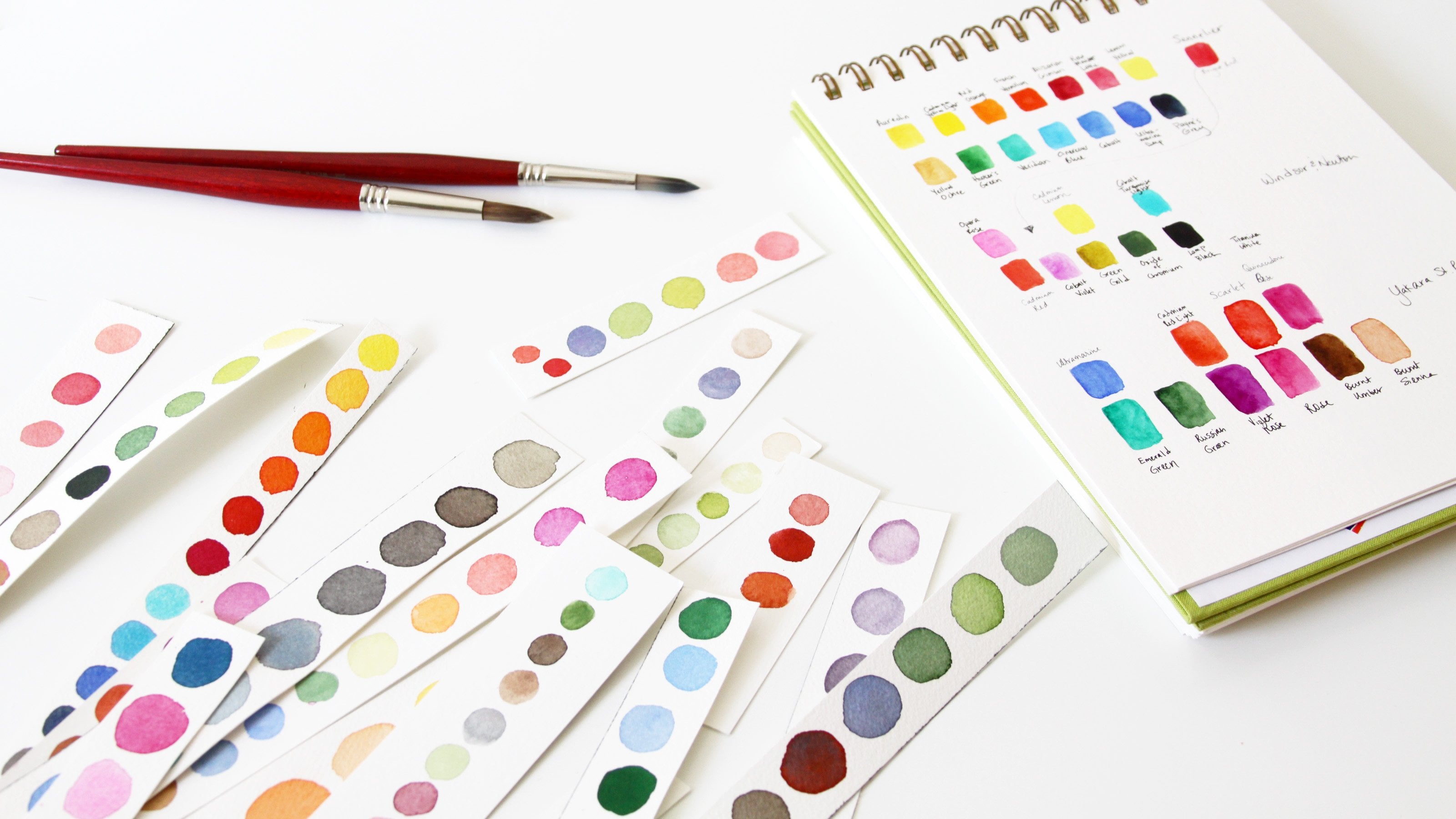
5. Swatch Your Paint: Swatching your
paint is a simple, low pressure way
to begin painting. If you're new to watercolor,
it's wonderful practice. It's an exercise
you can't mess up. You'll also learn
some valuable skills when you swatch your materials. Even if you're a more
experienced painter, swatching your paint is a perfect warm up for
your creativity. First, you will really
get to know your colors, how they look on paper, and how they react on the page. It'll give you practice creating washes and graduated washes. It lets you see the immense
variation possible with just one color of paint by
simply diluting it with water. If you create swatches on
different types of paper, in and outside of Sketchbooks, you'll begin to learn
the papers differences too. Let's get started. It's important to know
what the color is. On the backs of
my Swatch papers, I'm writing the name, the name of the color, and
the name of the brand. If you do not have
more than one brand, it's not that important to
write what brand it is. To make my Swatch, I wet
my brush and then rub it against my pan of watercolor
paint to pick up some color. Next, I gently brush it
across my scrap of paper, moving it back and forth
to cover the surface. Then I dab my brush
in the water, both to wet it and to dilute whatever paint is left and go back to finish
filling the space. I'm trying to get the
best gradient I can. If the darker side
doesn't seem dark enough, I can add a little
bit more paint so that I get a full gradient. I'm going to do this
with each of my colors. That way I have a record, not just of the color, but how it looks, both light and dark. This is often called
a graduated wash, although this is great practice for creating these washes. Don't worry about
them being perfect. Just move your brush
gently across the paper. If you need more
water or more paint, go ahead and pick that
up with your brush. And you want to try and get as much difference between the dark and the
light as you can. This is a cold press
watercolor paper. Use whatever paper you have. It doesn't matter what
type of paper you use, the type of paper you use, the way the paint reacts with it will determine how
your swash looks, whether you have
blooms in your paint, how well it absorbs
into the paper. All of that is determined both by the paint and
the type of paper. Pay attention to whether your
paint is more transparent or more opaque if the
paint covers the page, well, if the pigments
granulate out, all of those are important
things to observe. One of the wonderful things
about this exercise, these little scraps
of paper that I'm using are 2 " by 2.5 ". But again, do whatever works for you if you
want bigger pieces, if you want smaller pieces, if you want to work
in your sketchbook. One thing that's important
to observe while you're swatching is how well the
color transfers to the paper. And some paints are
very good at this and some are not using Tara
Vert from Windsor Newton. It is very hard for me
to get a dark color. Sometimes if you're using
lower quality paints, you'll be struggling
like this all the time. This is a very high
quality paint, but the pigment is
just not very strong. Again, this exercise will
help you get to know your paint and you'll get to know which paints are strong, which pigments are less strong. And that's going to
really come into play when you're mixing
your colors later, Swatching your paint is the perfect time
to get to know it, and you do that by observing it. By contrast, this color is much darker and much easier
to get a dark version. And it's a wonderful thing
to know about your paints. Pay attention and observe, but also remember to have
fun with the process. I just love seeing
all these swatches. They make me so happy. Now, as I said, you do not need to create your swatches
on scraps of paper. You could do this
in your sketchbook. You also don't need
to do a large swatch going from light to dark. You can do multiple swatches and let each one get less
and less saturated. I'm just going across the page and adding a little
bit more water to my brush each time to
make a lighter version. Now that one was going a little bit too fast from dark to light, I added back in a
little bit more paint, which is something
that you can do. Again, this doesn't
need to be perfect. It's really just
a record for you. You can see the
variations in color, your sketchbook or your small
swatches on separate paper, all of that is your record. But the process of
creating that record, the process of creating your swatches is where you
learn and that's where you're going to be
observing and paying attention to how the paint acts. And I think that is
really the fun part. It really doesn't matter how
things look on the page. What matters is the experience, which is so valuable
and also so joyful. Some things to think about while you are making
your swatches. How strong is the color? Do you need a lot of paint
for a deeper version? Or is it dark
without much effort? How difficult or easy
is it to lighten? How well does the paint
spread on the page? Does the pigment seem more opaque or is it
more transparent? Does the pigment granulate? Or is the color even? Is the color more
warm or more cool? How does the darker version compare to the lighter version? How does the wet color
compare to the dry color? Pay attention, observe,
and see what you see. And don't forget to
enjoy the process. Your swatches don't need to
look anything like mine. There are no rules and no
limits to your creativity. Use different papers,
different sketch, different shapes and
sizes of swatches. Let your curiosity and
your joy be your guides. Once you get more comfortable
with your materials, you can begin to be more
creative with your swatches. Your curiosity will take you
in interesting directions. Think about what you most want to capture about
a certain color. Imagine what type of Swatch
will help you do that. Water color is magical. I'm constantly amazed by how different the
same paint can look when it's fully saturated than it looks when it's
completely diluted. Just playing with paint in this very simple way never
fails to bring me joy, energize me, and inspire me. I hope you feel that way too. Be sure to share your observations from
your swatching exercise, either in the class discussion
or in your class project. I'd love to talk
about color with you. If you have questions, be sure to ask them or answer them if you
see one from your peers. In the next lesson, we're going to continue our
curious exploration of color. But this time we're
going to go out to my garden. I'll see you there.
6. Observe Color in the World: For this lesson, I
want to take you on a color curiosity walk
through my garden. My garden is the main source
of inspiration for my art. Mixing colors to match my flowers is one of
my greatest joys. Sometimes when I
look at flowers, even when I'm not planning
on painting them, I like to think about
the colors I see. Often one color will
blend into another. I'll see many colors in a
single plant or flower. Unless you're paying
attention to this, you might not even notice the blending and
gradation of color. You'll think of a
flower as pink, or orange, or red, but if you look at that
same flower with curiosity, you'll begin to wonder which red you're seeing or which pink. Is it cool or warm? Or maybe you see some
of both warm and cool. Is the orange you see light
or dark, pale or saturated. Once you begin paying attention, you'll begin to
see that no flower or plant is a single flat color. You'll see variations of light
and dark, warm and cool. You'll see one color
flow into another. You'll see patterns
and textures. The closer you look, more subtleties you'll notice. I often say that one of the most important skills for an artist is their
ability to observe. This is certainly true
when it comes to color. If you've already
swatched your paints, you may even want to think about the colors you just swatched. Are the colors you're seeing
similar cheer paint colors. If they are, how
are they similar? If they're not, how
are they different? Imagine the gradation of
paint from light to dark. Do you see gradation in
plants and flowers too? Spending time, simply observing
what's in front of you, asking questions, being curious, will truly help you develop
your skills with color. Before you can mix color, you need to see color. As a botanical
watercolor painter, I'm endlessly excited by color. I'm curious about the colors I see in my garden and nature and I can't help but spend
time exploring and observing. This is how I've developed
my artistic voice. I want you to be
excited by color too. One fun way to practice color observation is to gather
as many colors as you can. Do this by cutting
your own flowers or taking photographs. Finding images in magazines. You don't need to use
flowers for this. Either choose something you especially love or that
you find interesting. Another fun project is to create a color wheel with the flowers or images
you have gathered. Start with the primaries. Can you find red,
yellow, and blue? What about the secondaries, orange, green, and violet? My guess is that you'll
also be able to easily include those in between
tertiary colors. And probably plenty of colors that don't quite fit
any of those labels. If flowers aren't your thing, gather objects from your home or anything colorful that
catches your eye. I hope you have as much
fun with this as I did. If you do end up making a color wheel out
of found colors, please share it in
your class project. I can't wait to see
what you come up with. The next lesson, we're
finally going to begin mixing some colors.
I'll see you there.
7. Mixing Two Primaries: With all these
colors and thoughts about colors floating
around in your head, we're going to finally
begin mixing color. Instead of trying to
mix a specific color, we're going to be mixing color with a curiosity
and the question, what if we'll start
with two primaries? My aim is to create as many
variations as possible. I hope you're feeling
more confident and ready to tune into
your observation. In this lesson,
you'll get to know your materials and how
they work together. You'll learn to
create a full range of darks to lights
with just one color. You'll learn how
to slowly change a color by adding another
a little at a time. You'll learn how
different primaries combine to form many
different colors. Sometimes those colors
will be surprising. You'll learn to be
curious about color and learn from
your observations. A couple other things
that are great about this exercise is that by
mixing the colors like this, you'll slow down and
work in a mindful way. You will also discover
the joy of color. I hope you will
be open to those, as well as the other
skills you will learn. I've chosen a yellow, red, and blue from my collection
of paint for this exercise, and put the pans into a small
tin to keep things simple. All three are Daniel Smith, Hansa medium is a warm yellow. Pyl scarlet is a rich, warm red. Fallow blue is a
beautiful deep blue that looks a bit warm to my eye. I want to start out
by swatching each of these colors dark to light, just so I can see the full range of colors from each paint. Now I'm going to add some
paint to my mixing palette. I wet my brush and pull up
some paint from the pan, Rubbing my brush again
and again on the paint, then I transfer the
paint to my palette. I want to go slowly
with my color mixes, and I know that yellow can easily be overwhelmed
by other colors. I dab only a tiny bit of red
with my brush and mix it in. Now I grab a bit more red and add it to my mix and
swatch this next color. If I need to add more, I can. And if I need to go back and add more yellow, I can do that too. You can see I'm very
slowly changing the color of my mix
from yellow to orange. I'm very careful to clean
my brush each time. My aim is to create as many
variations as possible. The first colors I've
mixed and watched are still a variation
of a warm yellow. The more red I add, the more the color
shifts toward orange. Between yellow and orange. And then between orange and red, we have many different colors, all mixed with just
two of these paints. For each of these colors, there's a huge range
from light to dark We can achieve by adding
more or less water. Now, none of that you
can see on this page, but if you wanted to
take things further, you could easily do so. Do you see now why I consider water color
to be so magical? Now I'm ready for
the next color. I've added a pool of red
paint to my palette, and I will begin very
slowly adding blue, just a tiny dab. At first, this red is a very warm color,
leaning toward orange. As I add the blue, the color is shifting to
a beautiful, rusty color. Then we get some gorgeous
browns and grays, and finally, deep navy. Oh, so beautiful
and interesting. But you'll see none of these
look like violet to me. Let's see what happens with
our yellow and blue again, I want to start slowly, which is hard with
yellow because it's so easily overwhelmed
by darker colors. But remember, you can always
go back and add more of the yellow if you think your
mix has gone too quickly, even adding back in the yellow. This first mix is a little more green than I would have
wanted, but that's okay. I'm just going to go with it. Remember that this does
not have to be perfect. The point is to explore and be curious about
color and of course, to enjoy the process. I just love seeing
all those colors. It always makes me so joyful. Our color turns from yellow, green to green, to some
gorgeous teal colors, to a deep rich blue. I want to show you
another example with three more primaries, This time in a sketch book. I've chosen Quinacridone
red from Snellie, pure yellow from Smink Rode. Cobalt blue also from Snellie Quinacridone red is a cooler looking red
than the scarlet. The pure yellow is
supposed to be in the middle between
warm and cool. We'll see how it reacts. I've heard some people say that cobalt is also supposed
to be a pure color. This time, I've just painted a single swatch
of each primary. I've added three pools of
color to the mixing palette. I'm going to start by
mixing red and yellow. This time adding the
yellow to the red. Again, I want my mixes
to progress very slowly, so I'm only adding a little
bit of color at a time. This is a wonderful practice
for mindfulness and slowing down the color mix
progresses from mostly red to end mostly yellow. In the next line I'll mix
blue slowly into yellow. I'm working right to
left and this one, but it doesn't really
matter which direction you go or if you even go
in straight lines. And it doesn't matter what shape you use for your swatches. Choose whatever brings you joy. Remember that what
matters is the process. This exercise is about being curious and paying attention, observing what happens when you mix one color with another. I'm running out of paint, so
I'll add some more yellow to my palette before I begin
mixing in more blue. Don't panic if you run out of paint when
you're creating a mix. I get that question a lot
from beginning artists. If you know what colors
you used for your mix, you can easily mix more
with a bit of patience. If your first attempt isn't
quite right, try again. These grains look
a bit muted to me. As the color shifts
towards blue, it looks a bit gray. What do you think that tells us about the temperature
of these colors? In this next row, I'm
mixing red into blue. And I need more of both red
and blue on my palette. In the same way that I
mixed my other colors, I want to slowly add more
and more red to my blue. I'll be moving the color from
mostly blue to mostly red. If I need more of any color, I can always add more
onto my palette. One thing I'm noticing about these three primaries
is that they seem to be a lot less saturated than the first three
I used for my mixing. This observation is so helpful when you're getting
to know your paints. The type of paper
that you use will also affect how
your swatches look. This sketchbook paper is not as high quality as the other
paper that I was using. It's also important to note
that this is the backside of this paper and the swatches
will look different as well. You can experiment
with mixing each of your primaries with each of your other primaries
and see what happens. Be sure to ask yourself
questions about the colors, the colors more warm or cool. What happens when you mix
a warm and cool together? What happens when you mix
two warms or two cools? Are the colors that you mix, what you expected to mix. These are all wonderful
ways to remain curious and to observe
the color mixing process. You will learn so much by
just mixing two primaries, but in the next lesson, we're going to dig deeper
and mix all three. I can't wait to show
you what happens.
8. Mixing Three Primaries: For this exercise,
I'm going to continue working with the primaries
I mixed in the last lesson. This time by mixing all
three colors together. I've said before that I find the neutrals to be
the most exciting. In this lesson, you'll
discover why I'm just going to continue on the same paper I started in my mixes
in the last lesson. Then this will be a reference for all three of these colors and the many variations I can
get from just three paints. This is always so
exciting to me, You can do this many
different ways. But I'm going to
start with yellow and slowly mix a bit of both other primaries onto my palette and then
swatch them as well. My first color is
a yellowy green. The red isn't affecting
the color too much yet, but it does feel like a
very warm color to me. Adding a bit more red
makes a mustardy color. This is where the color mixing
begins to get so exciting. I love seeing all these
variations in color. By mixing the three
primaries together, I added blue and it takes our
color more towards green. Again, there are so
many different ways you can go about mixing
the three colors together. But I think we'll continue
by adding a bit more red and switching back and forth between additions
of red and blue. My aim is to see how many different colors and color variations I can create. If you've never
done this before, you might be surprised
by what you end up with. What a beautiful green that is. One of the things I've learned by playing with colors like this is that I can create more
interesting secondary colors. Oranges, greens, and violets. By adding a bit of
the other primary. If you want to think about
this in technical terms, it's adding the
colors complement or the opposite color
from the color wheel. The greens I'm getting with
all three colors are much more interesting and
natural looking to my eye, at least, than the greens I got when I mixed just the
yellow and the blue. Eventually, as your mixes have more of each of the
primary colors, they will move toward
browns and grays. When the colors you use
are those neutrals. Those browns and
grays will be warmer. When the colors you
use are cooler, the neutrals will
be cooler as well. What beautiful colors
I'm seeing here. I want this process to
be as slow as possible because in addition to
neutrals are grays and browns. And our secondary colors, I can also mix interesting
versions of reds, yellows and blues, which are really in between
or tertiary colors. But I don't want you to get
hung up on technical terms. It really isn't necessary. Yes, color theory can be
helpful in a basic way. But what I think is
even more important, observing how your colors work. Don't just follow some rules. Instead, observe, see how
your colors play together, what your colors look
like on the page. The more you experiment and play and are curious
about your own paints, the more you'll
get to know them. You'll develop some
favorite paints and favorite color
mixes along the way. You don't have to
think about rules. Instead, think
about what you see. Be open and curious. That's really what these
exercises are all about. Yes, I'm mixing my colors in
a slow and methodical way, but I'm doing so because
the question I'm asking is, I wonder what would happen
if I mix this with that? What would happen if I
add a little bit of that? Ask those questions about
your own materials. Play, experiment,
observe, be curious, also enjoy the wide range
of colors you can create, witness the magic of
this beautiful medium, the joy of color in
all its variety. With this row, I started
off adding a bit of yellow and red, and
then more yellow, and then a bit of blue
and a bit more yellow, and then red and more red. Once you have all
three colors in your mix and you've
explored in one direction, take your mixes in
another direction. This is the exciting
part of the process. This is the fun part of
your experimentation. My greens changed to browns. Then with more red, these colors begin
to shift toward rusty oranges as I move my
color forward with red. In your own experiments, I want you to follow your
curiosity and shift back and forth between colors in whichever
way feels right to you. There's no wrong way
to do this exercise. Let me remind you again, you can do it with any
brands of paint and any specific colors you
have, and any papers. Anything that you're
curious about. Letting go of rules can
be hard for beginners. But trust yourself. Trust your curiosity and
trust your creativity. Trust this process. Those oranges are so much
richer and deeper and more interesting than the
initial oranges I mixed when I was just using
the red and the yellow. By following my curiosity and mixing colors just
to see what happens, I come up with color mixes. I would never have discovered in any other way something
else that can be fun and very helpful when
you find a color that you absolutely love to make a larger swatch of
it so you can see the variations of light
and dark of that mix. Be sure to also
record which colors you use to create your
mix so you can mix it. Again, any of these
colors could be so interesting in a gradient
swatch like this, where you can see the
lights and darks. Oh, this color is so
beautiful from here. There are so many different ways I can go with these mixes. I just need to choose a
color and keep going. I still have lots more
mixes I can create. This exercise can be a
bit of a meditation too. When I'm doing this, I find
that I'm slowing down. Because I'm slowing
down the process. I'm slowing down myself and
I'm slowing down my mind. I'm completely in the moment after I created all
of these mixes, I also went back and mixed all three of
the other primaries I used earlier in this little
sketch book I worked in. The same way as I
just showed you, slowly adding more of
one or another color, aiming to create as many
variations as possible. These three primaries have also created so many
beautiful colors. I've been painting for
just about 13 years now, and I am still always
amazed by how many colors I can create with just three
paints after it dried. I noted the names of
the paints I used, so I can go back and mix these
colors again if I want to. I ended up making two Swatch
cards of the mixes I liked, but I wish they had made more. Colors are so gorgeous. Although the colors on
both of these pages were created with red, yellow, and blue paint, it's fascinating how
different the mixes are. One thing that's
interesting to note, and something I've noticed
again and again over the years working with
lots of different paints, is that cobalt as a pigment
tends to granulate. That means that
the color doesn't like to stay mixed
with other colors. When the paint
dries on the page, it creates interesting effects
and beautiful textures. Just looking at these swatches makes me want to mix
some more colors. Again, I want to
remind you that it doesn't matter what paints or papers you use for this exercise
or throughout the class, I don't want you to feel
as if you have to recreate exactly what I do using the same colors and
the same mixes. I want you to develop
your own curiosity and be open to the discoveries that
you will make along the way. These are the skills that will serve you throughout
your creative journey. The next lesson,
we're going to take our color mixing even further. I can't wait to show you.
9. Mix All Your Colors: Testing out color
mixes is something you can do in so
many different ways. I hope that you will play
an experiment on your own and follow your curiosity in whichever direction it leads. One way you can
get to really know your colors and how
they interact with one another is to create a color sheet for each
color in your collection, mixing it with every
other color you have. You can do this in
your sketchbook or on separate pieces of paper. Think of it as your ultimate
color mixing reference. I'm going to start by swatching the color by itself
from dark to light. I always think this is a valuable exercise to really
get to know your paint. A single color of paint can look so different
from dark to light. It's truly one of
watercolors, superpowers. That's why I keep showing
it to you again and again. After you've swatched
your color by itself, then fill the rest of your
page with swatches of the color mixed with each of the other paints
in your collection. This is a huge project, especially if you have a
large collection of paint. For these examples, I'm using a small selection
of colors chosen to give me a nice range of options for each
mix of two colors. I won't be able to create
the full spectrum of possible colors simply because I don't have enough
room on this paper. But I want to try to
mix enough colors to show the shift from
one color to another. This is another
meditative practice and one that forces
me to slow down. I'm making a point
not just to record what colors I'm using and the resulting mixes
when I combine them, But also to pay attention to what's happening on the page. I'm constantly asking
myself questions like, are the colors easy to mix? Does one quickly
overpower another? Are the colors I mix pleasing? Are they warm or cool? What happens when I mix a
warm color with a cool one? I'd love to know
what other questions you're asking yourself and what other kinds of
observations you're making while you're creating
your own color mixes. So I hope you'll
share them either in the class discussion or
in your class project. Although I haven't done
this on these pages, it can be helpful to
write down notes of any interesting observations you make when you're
mixing your colors. You never know what you'll
discover along the way. One of the great things about working in this way is that it forces me to mix colors I might not otherwise
have thought to mix. It's always interesting to
see what happens when I mix, what might be considered
weird combinations of paint. Remember, the more
time you spend studying your colors and
exploring your materials, the easier it will be
for you later when you want to mix paint to
match a specific color. This project is
something you can slowly work on over time. It's a huge project, especially if you have a lot of colors in
your collection. I haven't finished mixing all of my colors with all
of my other colors. But it's something
that I can come back to whenever I need an easy exercise to help
boost my creativity. In the next lesson, I want
to give you another idea for exploring your colors even more deeply. I'll see you there.
10. Explore Interesting Mixes: For this exercise,
we're going to take the techniques
we used for mixing our three primaries and use them when mixing
three other colors. This is going to help you
dig deep into understanding your weird color mixes and
it's such a fun practice. On the same page
where I mixed each of the colors in my limited
palette with Opera rows, I'm going to experiment with mixing three colors together. I started by creating more color mixes of opera
rows with sap green. You can choose any colors
for these experiments. And I'd suggest looking at your color mixing
swatches and choosing paints that create what you
see as interesting colors. Trusting yourself when making these choices is part of
developing your artistic voice. The combinations of
opera rows mixed with sap green seemed
interesting to me, as did the mixes of opera
rows with Quinacridone Gold. As I've said a few times
during this class, I want you to ask yourself, what if, what if I mix
these two colors together? What if I mix these
three colors together? This is how we learn, how we make learning
joyful and fun. I first mixed a range of colors with Opera
Rose and sap grain. Then a range of mixes of Opera Rose and
Quinacridone Gold. Now I'm mixing all
three together. I'm doing this in
the same way I mixed my three primaries
by adding a bit of one and then a bit
of the other color. This, like our
other experiments, is another meditative practice. I love watching as the color shifts and becomes more
and more interesting. Going slowly like this gives me not only a range of
different colors, but it helps me see how the colors and how
the paints behave. Choosing seemingly random colors without a specific goal in mind opens me up to making
so many discoveries. Again, I want to
remind you that it doesn't matter which
colors you choose. You can go back and try
this with any three colors. Over and over with
each experiment, you'll make more discoveries. Along the way, you'll truly
develop your color mixing skills and build your confidence in ways you never could imagine. I would never have thought to
mix pink, green, and gold. But the colors that they created together
are so beautiful. Let's try this with
three more colors. Looking at my page of
mixes with red orange, I'm intrigued by the combination with cobalt turquoise light. I'm also curious about the
mixes with dioxazine purple. Instead of working on the same page as my
red orange mixes, I'm doing this exercise on another sheet of
watercolor paper. I've started by swatching each color by itself
from dark to light. Then after making my initial
single color swatches, I'm mixing two of the
colors on their own. First the red orange with
the cobalt turquoise light. I have more room on this page, so I can create many
different versions of these color mixes. And I'll take my time with these experiments as
I mentioned before. But is a granulating pigment and it makes such
interesting color mixes. Next, I'm mixing the cobalt turquoise light with
the dioxazine purple. I'm trying to keep
my color mixes together in groups
that make sense. I can also write myself
notes as reminders. Something else to pay attention to is the fact
that the paper I'm using is a higher quality than the other
color mixing page. Which may affect
the way the paint behaves on the page and
how the colors look. Both papers are cold press, but this one has a lot more texture which
also comes into play. My last combination
of two colors is the red orange with
the dioxazine purple. Once I've watched each
combination of two colors, I can begin working through
the mixes of all three. Again, I'll go slowly with this alternating
which colors I add. There's no wrong way to do this. These colors are so intriguing,
such beautiful grays. Just as before, I can also make a larger swatch
of any color, I think is especially
interesting, capturing the lights
and darks of the mix in a way I can't do with
a smaller swatch. This will help me remember this color combination and it's also just fun to do on
this larger Swatch. I'm also already seeing how the cobalt pigment
is granulating, creating beautiful
variations and textures. Even before it's fully dry, I can add more paint to
my palette as I need to and continue to experiment with mixing these three colors. I don't have to alternate
one color followed by another in a meticulous
way unless I want to. In your own color
mixing practice, I hope you'll feel free
to play and not feel bound by any rules I've
said again and again. There's no wrong way to do this. The most important aspect of these exercises is your
playful curiosity. Yes, you're developing skills
and building confidence, but I hope you'll also
enjoy the process. Have fun, relax, Savor the beauty of color and
the magic of water color. This last color is so pretty, I want to paint a
larger swatch of it. Oh, what a beautiful
color this is. I know I say this
again and again, but seeing a color from dark to light is pure magic to me. What's wonderful about all
these cards and swatches, and pages and papers
is that they'll become a valuable resource for
your future art practice. Again, looking at all of
these colors makes me wish I'd made even more larger
Swatch cards like this. Anytime you need to mix a color, you can come back to your color
experiments as reference. The Morse watches you make, the richer your reference. I can't wait to see
what colors you create. Be sure to share them
in your class project. In the next lesson, I'm
going to demonstrate how I mix colors to match
a botanical subject. It's one of my very favorite
parts of my art practice and one that never fails to
bring me joy and calm me. I can't wait to
share it with you.
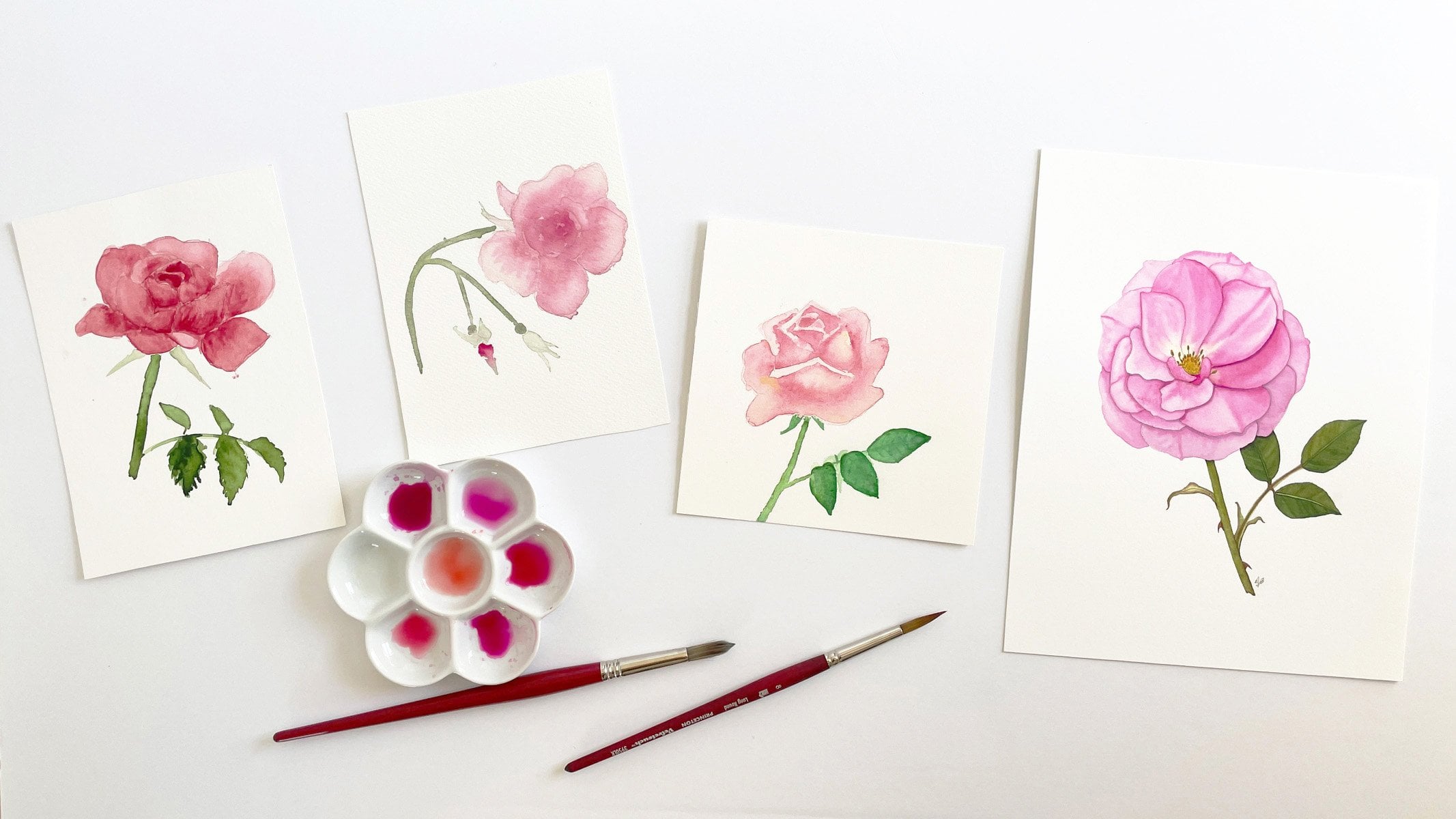
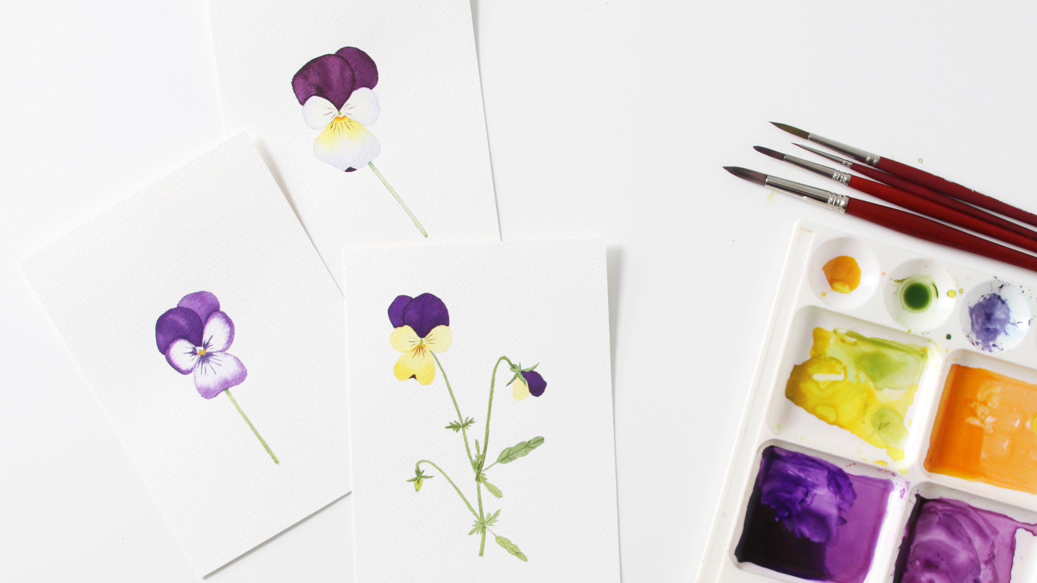
11. Mix Matching Colors: We've been practicing our
color observation skills and building our knowledge
of our art materials. Learning what
happens when we mix one color with another
and getting comfortable, experimenting and being curious. Now we're going to
put it all together and mix some matching colors. I always start by
studying my subject. When studying your subject
to match the color, it can be helpful to set it
against a white background. Looking carefully
at this flower, I see that there's pink, maybe a hint of orange. There's yellow and
a green color. Now, if we look at our swatches
to pick out some colors, none of them really
match the colors. I see. That's why it's so important
to mix your own colors. When you're painting something
from life like botanical, anytime you need
to match a color, it's unlikely what's
in your collection of colors will
match what you see, even if you have as big a
collection of paint as I do. I'm going to start with the pink that's in
my paint tin here. This is Opera Rose. And I'll grab a bit of the paint and add it to my mixing palette. Before I do anything else, I'm going to think
about this color pink and compare it to the flower. The paint is a very cool
looking color to my eye. The flower feels much more warm. I want to add a warm
color to my mix. I'm going to start
with a little orange. My process is not scientific. Tend to just go with my
gut and see what happens. Now, the only way to know how this color is going to look
on paper is to do a swatch. Let's swatch it and
see how it looks. Ooh, I'm really
liking this color. It's not quite right yet, but it's really lovely. One thing to
remember now is that this mix on my palette
has a lot of water in it. It's going to look a
lot lighter than if this paint were to dry on my palette and I were
to reactivate it. Usually when I'm
working on a painting, I will let all my mixes dry, so I'll have a greater
range of color. So I'll be able to paint lights and darks
of the same color. Looking at the color, I
think I'd like to add a tiny bit of warm red, this pyro scarlet,
and see what happens. I think that took us
too far towards red, but I'm going to
watch the color. Oh, it's another
really pretty color, but I don't think we've
quite got a match yet. Now, looking at this color, I said that it is too red. I think it's also too warm. I'm going to try
pushing it back towards the cooler side by adding a little bit
of this lemon yellow. Adding yellow to a mix that was too red will give
us an orange color. I know it's not going
to be quite right yet. Now, these three colors
together are beautiful. In fact, combined in a painting of a flower
like this Sina, these three colors
could look very close to the actual
color of this flower. Of course, each of these
colors that I've been mixing gets lost as soon as I
add another color to it. It really intimidates a lot
of people thinking about, oh, I'm going to have to
recreate this color, and how do I recreate a color? As long as you remember the
colors that you've used, you can go back and recreate it. I have faith in you to take
it away from the orange. I'm going to add back in a
little more of the Opera Rose. Now this looks very
dark in the palette, but let's see how
it looks on paper. I think it's too red. I'm going to add a little
orange and see what happens. Again, I always swatch my colors even if I don't think they're
going to be quite right. Looking back at the flower now, I see the center looks more
pink and a little cooler, and the petals radiating
outward are more orange. I'm going to mix a
few colors here. This swatch looks
very dark to me. What I'm going to do is make another swatch
of the same color. More water and less pigment
to see how it looks. Oh, that is so beautiful. Now remember, these two
swatches are the same color. The one is just less saturated
because it has more water. Now I want to paint in
between version of the color. I'm going to make sure I
don't hit my flower here. I am really liking
this color of paint. I'm going to leave what's
here in this well of my palette and begin
mixing another color. I want a color that is more
pink for my second color. Because that first color
we mixed where we stopped, that was more orange. I'm going to start
with that Opera Rose that I started with before
and add some of the orange, just like we did the first time. I really like the colors
that we've created. There's a lot of back and
forth in this process. Often once a color is
sitting on my Swatch paper, I like it even more than I
did when I first mixed it. This process brings
me so much joy and these colors are
making me so happy. I want you to take
your time with this and enjoy the process. Now, our color is
still not quite right. I'm going to add a
little bit more orange, but that was a little too much, so I'm going to add some
more pink to make up for it. Now, I'm going to
try this again, make another swatch here. This is looking very close. What's going to be
helpful? I'm going to take a smaller paper to
swatch the colors. I want to use, that
way we can see them together without
those other colors. Even though they're
so beautiful, I'm doing these in
the wrong order. But we'll have a darker and
lighter version of each one. I just love how these look. They are so beautiful. I'm going to try and darken
that first Swatch we painted, so the dark versions will
be closer in intensity. They are so lovely. I'm really loving them. I do want to keep
experimenting here and make another color
for this third color. I'm going to start
with the opera rose again and mix a little bit of the orange and then just a tiny bit of this
cobalt turquoise light. And see what happens that's looking interesting. Let's watch it and see how
it looks on the paper. Now that's pretty dark. Let's swatch a
lighter version too. These are so
beautiful. I love it. Now, the cobalt turquoise light, which I know from using it, I know that this is
a granulating color. That means that the cobalt
turquoise pigment will come out of the mix and add interesting
texture and color. That is something
I really enjoy. I don't know if there's
enough of the pigment in this mix for us to see that we'll only really
know once it dries, if it does, I think
it'll look good with this flower and the way the
petals are sort of modeled. I think these three
colors that I've mixed so far will be so
beautiful together. The last color I'm
going to need is this greenish yellowish
sort of color. This one is different
than the other ones, but I'm going to use
some of the same colors. I'm going to start my mix
with the lemon yellow that I used earlier and a little
bit of the cobalt turquoise. Now, using the same paints in different mixes will help
unify your painting. All the colors
will be different, but they will have similarities because they have
the same pigments. This one is super bright, but I love it. I don't think it's
quite right yet, but let me get a lighter
swatch of it too. There is not much
paint on the palette. So I'm going to add more
of both the yellow and the blue before I add
any other colors. Even though the
greenish yellow color I see is a very cool color, I think I want to add
a little bit of warm. I'm going to add a little
bit of the warmer yellow, that Hansa medium, and see where it takes us that looks
a little too warm. So I'm going to add
a little bit more of the cobalt turquoise light. And then I'm going
to take a big risk and add in a bit
of the Opera Rose. I really enjoy adding
reds to greens. And the pink is going
to work in that way. I don't want too much, so I'm
going to just dab some on the side so I don't
overwhelm my mix. Oh, I really love it, and I love the way it looks with my other colors because paint looks different
when it's dried. I wanted to show you the dry
swatches next to the flower. I think they are so beautiful and I fully
enjoyed the process. I hope that you will find joy in the process of mixing
your own matching colors. In the next lesson,
I'm going to give you some ideas and
suggestions for creating a color practice
that will help you build your color mixing
skills and your confidence. I hope that this will be
a life long journey for you and one that will
bring you so much joy.
12. Your Color Practice & Class Project: I had such fun sharing my love of color with you
throughout this class. Thank you so much
for joining me. I hope that you're looking
at color with curiosity and beginning to feel more confident in your
ability to work with it. Remember, this isn't
about memorizing rules or following
color recipes. The beauty of color is that
it is dynamic and personal. No two people use it, see it, or understand it
in quite the same way. Every person has their
own relationship with color and their own innate
sense and instinct. That is truly a
lifelong exploration. And I hope one that will
bring you so much joy, I hope you'll continue your curious exploration of color in the world around you. Pay attention to the colors
and color palettes you see in crafts and sewing
in your own life. When you visit with family and friends and when
you look at books, what colors do you
notice in interiors? Or when you walk down the
street in your neighborhood, look at the colors you
see in nature to animals. Butterflies, So
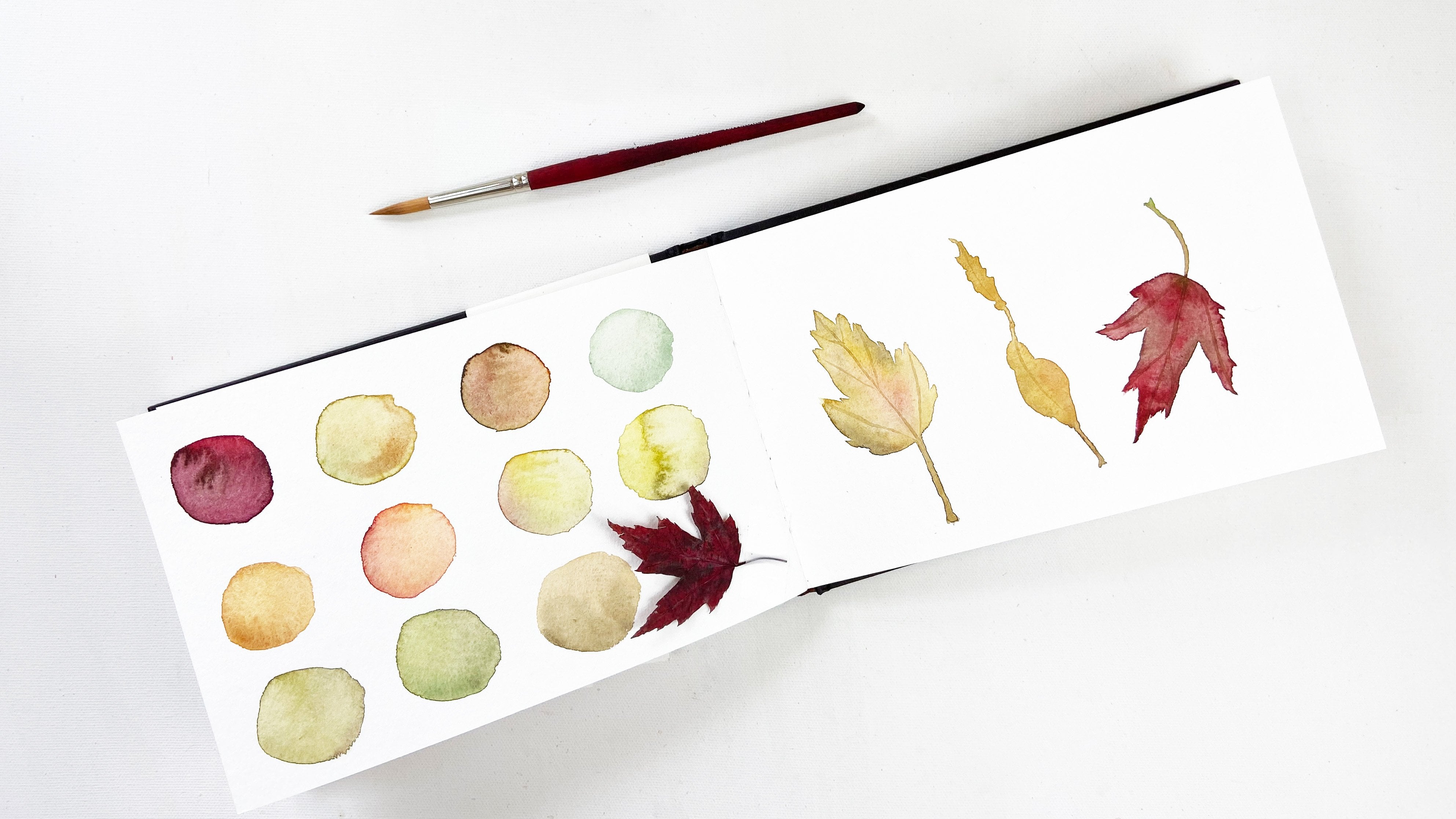
much inspiration. I'm finishing editing this
class in the beginning of autumn and the leaves are starting to fall from the trees. I can't help but pick up the colorful leaves when
I'm out on a walk. They're perfect inspiration
for color mixing. And I see so many colors
in just one leaf. What colors do you
see? Try mixing them. I truly believe that
we learn by doing. The more you play with paint, the more comfortable and
confident you will become. I shared many exercises throughout the class to get
you started on your journey. If you work through
them, you'll be well on your way to building your
skills and your confidence. I love sketchbooks and using a sketchbook is a great way to continue your color practice. It's an ongoing outlet for your creativity and a wonderful way to continue to develop your skills and your
artistic voice. I've learned to let sketchbooks be a low pressure
place to create, not worrying if
they're messy or if the pages don't turn
out as I expected, Keep all of your
swatches and color mixing exercises
together in one place so it'll be a perfect
color reference for you in your sketch books. You can also keep track of your color mixes when you're working to match
a color you see. It'll be a beautiful inspiration to look through when
you need a boost. Most of all, it will be a fun place for
your creative play. If you want to dive deeper into an exploration of the science behind color and color theory, I'd recommend spending
some time with some books. I checked out a lot of
books from the library about color when I was
putting together this class. And I learned some things
that I hadn't known before. Take a look at
your local library and see what you can find. I also own some books about color as a practice
in and of itself. Local Color by Mimi Robinson Warner's Nomenclature of Color by Sim and Lorene Edwards Faulkner's Color In
and Out of the Garden. They're so inspiring, I
love to recommend them to students who doubt their skills at
drawing and painting. I'd also highly recommend taking some other classes
here on skill share. When you're doing your searches, remember that you have
lots of ways you can limit your results so that you can find just the right
inspiration for you. Because color exploration
is an ongoing practice, your class project can reflect that in any
way you choose. Maybe you'll tell us
about your materials and show us your swatches
and your color mixes. Maybe you'll tell us about
color in your life and share your own personal color palette if you chose to
make a color wheel, either with paint or
with found colors, I hope you'll share
that as well. I had such fun creating
my floral color wheel, and I'm sure whatever you choose will be fun and inspiring too. That's the beauty
of skill share. It is a place of
inspiration, of community. We're all in this
together and we can encourage and
inspire one another. So don't be shy to
share your project. Ask questions, or answer
questions in discussions, because that's how we learn. I know when I see projects, when I'm a student in a skillshare class,
they inspire me. And even as a teacher, I'm so inspired by your projects and what you create and how you
see the world. Each of us has our own
unique gifts to give. I always love hearing
from my students, so don't hesitate to reach out with questions or comments. I'd love to know what else
you'd like to learn too. And don't forget to follow me. So you'll be one of
the first to know when I have a new class or
when I'm running a contest. I hope you'll also stop
by my website where you can sign up for my
newsletter and read my blog. I have a library of free
resources there for you, including a Guide to Watercolor that you can download and enjoy. Be sure to leave a review of this class and let me know
what resonated with you. Thanks so much for
learning with me. Until next time, I'm wishing you so much joy and creativity.
 Anne Butera, Artist. Instigating creativity and joy.