Transcripts
1. Introduction: Hello and welcome to
Character Art School, Complete Coloring and Painting.
My name is Scott Harris. I'm an Art director, Das, and I'm also a total freak for character design,
character painting, character coloring,
character drawing, I love characters and I think you're here because
you love them as well. I'm going to take you through
this course very much in the same way I would
teach my actual students. Hopefully you're going
to get the feeling that I'm standing
right next to you, that we're side by side. When I'm teaching you
the various concepts, I want you to learn
very, very well. Now, this course is separated
into three main sections. The first section really is the fundamental theory
that we need to know, particularly on color and light. Light being the most
important part. Then we move on to the
general painting workflow. This is how we're going
to be applying all of that theory in a
logical and coherent way. And this is going to
be very important for you to memorize
and take to heart. Last off, we then take a look at some coloring styles and then
we also have some demos, full demos as well as time
lapse commentary so that you can see the painting
process in granular detail. Now this course has been
designed to take you from a zero level of knowledge to a very professional
level of knowledge, and I think the course
will achieve that. You may be approaching the
course from varying levels. My advice to you is if you
know digital art software like Photoshop or equivalence to
completely skip module two. Otherwise, modules 134.5 are good for everybody and I would highly recommend
them to you. I'd also advise
that you go through the course twice the
first time around. Just take a look
through the course, watch all the
videos, take notes, and try to gain a
fundamental understanding of what is happening
the second time around, Do all of the assignments
and really be diligent and dedicated
in what you're doing. One of the driving factors
when I was creating this course was to create
a course that was clear, efficient, and extremely
comprehensive. I do believe that this
is probably one of the fastest ways to learn high end digital
painting of characters, as well as coloring of
characters very, very rapidly. I hate time wastage, I hate rambling, and I really, really don't want
to waste your time. I want you to do this course, get your value out
of the course, and then proceed to continue
to color and paint in a professional way
the characters that you want to
present to the world. Let me also say, thank you
for buying the course. I'm sure you're going to
find immense value in it. I'm very, very
excited to teach you, and I cannot wait
to see what you're going to produce by the
time you're finished. So let's get right into it and I'll see you
guys in the lessons.
2. Art Tools: Before we get into the main
lessons of the course, we're going to take a look at the software and
hardware that can be used to color your characters as well as draw your characters. Now, if you are already familiar
with digital art tools, you can totally skip
over this lesson. You really don't need to go
through this if you're new. Let's take a look at the tools available to you and
let's get right into it. First thing is you want to
make sure that your computer, whether it's a PC or Mac, has at least an Intel
Core five processor. Really, this is just to ensure great performance
on your brushes. The capability to work on larger canvases with
higher resolution images. The Ram helps for that as well. You also want to have
eight gigs of Ram. I would recommend a ten
ADP screen if you can. If not a higher
resolution than that. So ten DP is full HD or higher. And the reason is it gives
you more screen real estate. And of course, I also want to
mention that if you can get a computer or a laptop or a tablet with a high
quality display, that would be better as well. A display that is capable of showing a broader
array of colors. And you'll see when you go to the store, when you're
shopping around, they'll mention the
types of displays and the types of color
capabilities of the displays. Ips is something
that is favorable. The IPS display technology, it really does display
very vibrant colors and really a nice broad
range of color accuracy. Something else you
can look out for is the Adobe RGB color
gamut of the screen. Now I know that might sound complex if you've
never heard it before. Really, it's just a little
stat and it tells you how much of the Adobe color gamut
the screen prescribes to. A lot of mid tier to high end
have about 70% color gamut. And the very high end can have up to 95% possibly even up
to 99% color gamut coverage. Which means you're going
to see more colors and more subtlety in the colors. Now obviously there's a
price implication Work within your budget and
see what you can afford. Let's take a look at some of the software that you can use. Adobe Photoshop really is
the industry standard. I know the word photo
is in its name, but it really is a very
powerful application. The cost to use it isn't
too high, it depends. You can no longer
buy it outright. You can buy it on a Be
Photoshop photography program for about $10 a
month, I believe. Ten or $15 a month. And that will get you
light room as well. That's for photo editing, but you can then use
that for $10 a month. You can use Adobe Photoshop and get access to
all of its features. It is the industry standard. It has perhaps got the highest level of
tweaking that you can do in terms of layer modes and in terms of brush settings
and things like that. However, just because it is the industry standard doesn't necessarily mean it's the best. We're going to look at some
other software that is quite similar and
also fully capable. Something to also
remember as we move through looking at the rest
of the software is that most of the software can do 95% of the things
we needed to do. All right. Adobe Photoshop, you've probably
heard of it before. It's become a pop culture thing as well when people say they're going to shop this or shop that, But it is the industry standard. And I think it is
very beneficial if you can use Photoshop. Just learn the best right now and get it
over and done with. And then you can move into the other applications
relatively easily. Another great application
is coral painter. Very similar features to
Photoshop, of course, less focused on photo
editing in terms of the extra tools and more
focused on the paint tools. It's key feature really
is that the paint and the papers in the application or the backgrounds really with
the papers as they say, act like the real media. You will get rough types of
paper, smooth types of paper. You'll get water colors that
bleed, like water colors, oil paints that dry,
like oil paints. You can even dry the paints
in the app if you want to, and the paint looks
quite realistic. Now of course, this
depends on the type of style of coloring or painting that you're
going to be doing. But Coral painter
has everything from very digital tools to
very traditional tools. It's a good option
there. Just to point to note with
Coral Painter, Coral Painter does use
a lot of CPU power. I would recommend going
to an I, seven model, 16 gigs of Ram and maybe a dedicated graphics card if you want to use
Coral Painter. It is very resource heavy and
it has been for many years. It just takes a lot of
processing power to do all those calculations
of the paint moving and swishing
and mixing together. Do keep that in mind
with Coral Painter. Next up we have
clip studio paint. Honestly, I cannot praise
this application enough. I believe it's a Japanese
made application. I'm not 100% sure on that, but I think it is Japanese made. I've been using it for
three or four years. I use a bunch of
different software times. I'll switch between, but Clip Studio Paint effectively
is a one soft purchase. You can buy just
the pro version. They've got the Pro
and the E X version. The pro version has
everything that you need to draw and
paint characters. No problem. It has great
brushes, great brush mechanics. It has very similar
features to Photoshop. The developers are
really constantly updating the application
and the best part is. The software costs, if
I'm not mistaken, 59, $99 Of course, depending on when you're
watching this course, that price could
increase or decrease. But nevertheless, it's
a once off purchase. And you have this powerful, very awesome and
extremely productive, efficient software in
terms of system usage. It's very efficient. It can work on a lot of range of computers, and the performance
really doesn't degrade. I cannot recommend clip
studio paint enough. All right, let's move
on to Procreate. Procreate is an
ipad application, particularly for the ipad
Pro with the Apple pencil. We'll discuss that
a little bit later. Procreate is fantastic because it really brings
the world of touch, interaction of your canvas with the world of
drawing on screen. It has very powerful features. Like I said, most of
these software packages share similarities
between each other. And procreate is no different. It has layers. It
has layer modes. It has variable brushes
and you can make your own brushes and
great canvas sizes. And it really is a fantastic application
for the ipad Pro. It really is ipad Pro specific. If you're going to be
drawing, painting, coloring on your ipad Pro, this is the application
you want to use. There currently
is no application that can compete procreate. There are some alternatives, but they aren't even close
to as good as procreate. That's it for the software side. Those are my recommendations. Definitely, take a look at
those pieces of software. Let's move into talking
about the hardware. The first thing we want to
look at is drawing tablets. Now these types of drawing tablets do not have
a screen on them. There is a little
bit of a disconnect when you first start using it. These connect to your computer. There are two brands here. Wacom, which has been really the biggest brand since drawing
tablets came into being. And more recently,
a Chinese company, if I'm not mistaken,
has come up called Hu. Ion And they also produce really great quality tablets at a much cheaper price point. However, I am pro Waco, but that's really just because
I've been using it for so many years and they really
are sturdy and robust. I have very old tablets that
have lasted 1015 years, so I can really recommend Waco, but Hon gets great reviews
and you can look into that. These tablets are great, they come at a great price point. They're as accurate as
on screen displays. The pens work the same
way, they're wonderful. You may be worried that, yes, there's going to be a disconnect because you have to stare at your computer screen and
have your hand below you. Not really looking at your hand, but I can assure you three
to 5 hours on one of these, just constantly drawing and you really get the
hang of it in it, it's no big deal afterwards. The only area where these
drawing tablets are weaker than on screen drawing is when you're really
wanting to do clean, refined lines for your drawings. The very clean
lines, right inks, if you will, or your clean up lines or your refined lines. But other than that, it
is achievable these days. Especially in something
like clip studio paint, where you have the
ability to turn on a feature called
brush stabilization. And brush stabilization
really allows the computer to calculate out all
your little wiggles if you're managing to
draw a line slowly. So you know, it's
really up to you. But if you want a more
natural drawing experience, you'll want to look at something like an on screen tablet. Here we have a Wacom
Synteq on the left and a Hawaii version
on the right. These also plug into
your computer and they act as secondary displays. However, you can
actually move Photoshop onto the screen and literally
draw on the screen. It is very cool. It
is very awesome. It's not going to make you
better at drawing or painting, or coloring. Please
keep that in mind. And in fact, for coloring,
I would actually recommend just a standard drawing table because your hand
gets in the way, obviously, when your hand
is covering the screen. But nevertheless, you can't go wrong with these guys either. I can also recommend them
and they are really great. Those are on screen tablets. They vary in price. They are significantly
more expensive than the non screen tablets,
significantly more. They also vary in
size and style. They go up and you get ones that can fold in
different ways and ones that can stand really
vertically or they can rotate. Do research them, but of
course, consider your budget. I wouldn't go and spend
too much on one of these. Think about it
before you buy it. The last but not least, we have drawing tablet PCs. And these are fairly new. Maybe in the last three to five years they've been coming up. The Apple Prad Pro is very new. I think it's only about a year and a half old now already. But it does require a
separate purchase of the Apple pencil and
also that apparently the new Microsoft Surface
Pros do not include the pen, but the older models do, and the older models
are still on sale. Nevertheless, the Apple
Ipad Pro runs on IOS. You'll be primarily
using Procreate on there and perhaps a suite
of other apps just to kind of complement it
or maybe help you with some edits or post
production of your work. But nevertheless, it is a
fantastic, fantastic device. I have an ipad Pro. I
love drawing on it. The battery life is crazy. I've drawn it. I paint on it. I color on it all the time. It is a good device,
it is very efficient and procreate can export to PSD. So you can move to your PC later and do some tweaks
if you want to, and a lot of time you
don't even have to. Microsoft Surface Pro, on the other hand, is
a full computer. It's a full tablet PC. As I said, the older models
come with the stylus. The newer models
apparently do not. You have to buy it separately. It's $100 I hear it doesn't
use Wacom technology. It uses different type of
technology in the pen. But I have used these and it
works perfectly fine to me. There is no discernible
difference in the drawing capability or the painting capability.
It really is the same. Now when you're using a service pro, because it's a computer, you'll then want to use
Photoshop or Clips to your paint or another software suite to draw and paint in. And also a great device, as another point to note on the Service Pro that
Kickstand kicks back in a really nice way where
you can rest it for a drawing in mode where the
screen tilts up a little bit. The ipad Pro, you're going
to need a laptop stand or something to prop it up if you want to use it in that way. But nevertheless, those are your hardware and your
software options. I've just recommended
the that I think are really good and we'll help you just get into
it really quickly. Let me also say guys, we want to keep in mind art is really about the
theory and the practical. Don't worry so much
about the tools. Don't let it stress you out,
Don't freak out about it. You can get by the
mid range computer, a cheap Wacom tablet
or Ion tablet, and a subscription to Photoshop or a purchase of clips you pain or whatever you can get by. Just fine. Try to
grow your skills. Don't worry about the hardware
and software too much. All right, but those
are my recommendations. And I will see you guys in the next lesson in the
course. See there.
3. How We See: Welcome to the first
lesson in module one, Understanding Light and Color. In this lesson, we're
going to be taking a look at how the eye works. All right, in order to do
this I'm going to just do a small little
illustration here of the side view of our eyeball. Draw in the
photoreceptor sections here at the back as
they go into the brain. We're going to do some theory. And this will actually be so useful to you because
you'll understand why we choose one
particular thing to focus on heavily in our art, which is value over another
thing, which is color. All right, in your
eyeball, as light enters, it hits a bunch of photo receptors that are
split into two types. It probably looks
something like that in the eyeball, all right, it's little spiky ones and then there's little round
masses as well. There's all these
little spiky ones. Little round masses probably looks like that
from the side view. Effectively, I'm going
to just simplify here. We have rods that receive light information and
then we also have cones receive light information. All right, the rods and
the cones and these are very important in terms of
how we understand how we see. All right, inside the surface, when you're looking
directly into the eye, there's tons and tons and tons. I probably couldn't
draw them fast enough. There are tons and tons of rods. About 120 million
rods in the eye. In fact, let's write
that down there. 120 million rods and then there are about 6 million
cones. All right? In the average human eye, that's probably
the distribution. The rods are what detect
brightness, right? Brightness and darkness. Okay. We'll just
indicate it like this. Darkness to brightness, right? The rods detect brightness. The cones pick up color, right? You can see just by
the split here of the 120 million to 6
million that a lot of our three D vision
is due to the rods. Because the rods can see
the difference between somewhere that is lit and
somewhere that is not lit. Right. Can see the depths of the shadows and the
brightest highlights. And the rods are doing
the heavy lifting in terms of our
understanding of form. All right, whereas the cones, they are primarily
there to pick up color. Now from a scientific point
of view, if I'm not mistaken, the cones also can detect degrees of brightness
in a particular way. But the heavy duty lifting
of that is the rods. And the cones have three types
of receptor cones, right? You have the blue receptor cones and the red receptor cones. And then you also have
the green receptor cones. And now bear with me because I know that you've signed up for a course on how to color
and paint your work. But of course, this
is really pivotal. And believe me, this will be very useful to you and
very, very helpful to you. So bear with me as
we go through this. But don't worry, it's not very long and it's not very complex. And I'm also extremely simplifying the
process as well here. All right, so this is what's happening in our eyes
in terms of the cones. I actually want to just
turn it like this, and perhaps you've seen
these colors before, maybe you've seen
them on your TV, or you understand them in terms of pixels on LCD displays. That the individual pixels
of your screen is made up of one little little lights and one little blue
light, one green light. These three receptors
combined is how we get our full
spectrum of color, is how we see our full
spectrum of color. But what's quite crazy, what's really interesting
about this is that your brain mixes
the blue and the green. Or should I say,
rather that you can detect all the things in
between the blue and the green, right, as the blue
and the green mix. And you can detect
all the things between the green and the red as the green
and the red mix. So you can imagine
going into red, you're getting browns,
you're getting yellows and things like that and then it's going into red. And then from the blue
you're your cyans going into your lime greens, your turquoises and that
as you go into the green. However, your brain doesn't link these particular receptors, sorry, do not link
to each other. Blue and red. They do not link. Your brain just makes up
the color in between. All right? And it's quite crazy. I know technically the made
up color would be magenta. That's the base value. It's just made up in your brain, which means your magenta. And my magenta could be
completely different, and we would never know, because whatever I call
magenta is magenta. Or you really like
pinky purples, you might call it that too, but it could be an actually completely different
color to you. All right, but nevertheless, it's a bit of a crazy thought. But this is how we get
our spectrum of color. And also our color wheel is derived from the system
of red, green, and blue. These are what we
would want to really call the true primaries. Some people would argue
that the true primaries are cyan, magenta, and yellow. That's more of a technical
debate on the subject, but really just
keeping things basic. Red, blue, and green
are our primaries. And it's also how
our computer screens and our cell phone
screens display the full spectrum
of color to us by using RGB set ups in
the pixel structure. That's how we see. Once again, the big thing we
want to take away from this, the big thing is just how
pivotal rods are, right? And just how important the
value information is, right? The brightness information
is for how we see, primarily discerning
three dimensionality and form in terms of the light
receptor part of it. In terms of light, via the rods, via the brightness, via value. Value to us as artists is absolutely foundational,
it's absolutely core. And you will see how this
ties in very heavily to professional coloring and professional level
character painting. Value is exceptionally
important. Of course, color
plays a big role too, But the split of
importance is something like 90% important value,
10% important color. Because color, of course, there's multiple uses of it. But color can really
lead to mood. But value leads to true
understanding of the forms. All right, that's
it for this lesson. Let's move on to the next
lesson. I'll see you there.
4. The Scale of Light: In this lesson, we're going
to now look at value. As mentioned previously,
value is important, it really is the foundations and the fundamentals to
coloring and painting. Well, if you grasp this
lesson really well, you're on a solid
footing moving forward. All right, so first off, we're going to take a
look at the value scale. Right now in art, we obviously only have a range of white being the brightest we could
represent in an image, and black being the
darkest we can represent. If you look at the color pick on the right side
of the screen here. When we're talking about value, we're really just talking about brightness and darkness in art. We represent this brightness and darkness in of ten steps. Let's start with the
brightness being white, which I'll just use
a very light gray to represent that on the screen. Can barely see it,
but it's there. Our next step would be a
little bit further along. Step two, step three, step four, step five, step 6789. Let's grab these guys and just make them a little
bit smaller so we can get ten in there and
ten would be black. And this is what we call
our value scale. Okay? The reason we do
this is in reality, what is the brightest you get? Who knows? Probably some
star in the galaxy, right? It's extremely bright. What is the darkest you get? Is there blacker than
black, You know? What does a completely
lightless area look like? You know, unless
you're in there, I assume it's hard to tell. But it's probably, you
know, for us, pitch black. All right. But in odd, in order to talk about value properly and in a more
efficient way, we break down. The brightest can go
and the darkest we can go into these ten value steps, or these ten value stops, right? And it depends who
you're learning from, whether they go one to ten, where one is the
brightest to ten, is the darkness darkest, or vice versa, it doesn't
really make a difference. But just knowing that, we talk about these ten steps, these ten value stops, right? So this is how we will say that. You want to make sure that
when you're painting x y, z object or coloring x y, z object, that there is a big enough stop between
two values, right? Two brightness levels,
so that the viewer can see what is in light
and what is in shadow. Now we're going to
go more into that. We're just taking a brief
overview now of value. We're going to go more
into something called the two value statement
a little bit later on, but for now we want to
understand value in art is really
brightness or darkness. It's got nothing to
do with color, right? It's just brightness
or darkness. Now of course, go back to the color picker
here on the right. We can see that color
can be bright or dark. So we can have a bright
red or a dark red. But that's got to do with the
value of the color, right? And value forms the foundation
of all of this, Okay, so that's the first big thing, the value scale, Learn
the value scale of heart. Get used to the idea of the value scale so
that, you know, a one or retina is bright white or a one or
retina is black, depending on which way
the scale is moving. And that five is
generally what we call a 50% gray or
a neutral gray. And that we go from, we paint with 5.3 or we
color with 5.3 that is one stop away from the
other values, right? Because there's a stop away. We say, oh, separate
something by one stop. While we'd separate 5.3
by the stop of 42 stops, we'd separate 5.2 by the
two stops of 3.4 Now, let me not make you feel like it's super complex,
it really isn't. We've really just got ten values in a scale, brightest
to darkness. And that is how we talk
about it when we say, okay, you want to keep the
value more neutral or middle. You want a brighter value
or you want a darker value. Okay, so that is
the value scale. But there's some
important stuff we want to talk about
with values as well. It's so obvious, but no
one really states it. So I decided, you know what, I have to state this so that you guys are pro ride
in the beginning. Here we have a value
only version if you want to call it a gray scale or a black
and white version. Although it's technically
not black and white because there's many value
ranges in here. Nevertheless, we have
a gray scale version here of a piece of artwork
that I've done previously. The important thing
I want you to realize is that
different objects. Have a different
inherent values, just like different objects
have different colors. If someone said to you while a leaf is green and the
bark of tree is brown, you'd be like, do.
That's obvious. But what is not so
obvious is that different values, I mean, different objects, right,
have different values. That's not to say
that some objects don't have the same values. But this is such a
crucial point and I've never seen a tort
ever in anything. Different objects have
different values. What I mean by that in
your character work to use red on the
illustration here is her hair's value differs
from her skin's value, right? The eyeball's value differs
from the skin's value. The earrings value differs
from the skin's value. The lips value slightly
differs from the skin. The value of the
earring differs from the hair and so on and so forth. And obviously on the skin, the skin has its value areas and then shadowed value areas. All right, and same
thing with the hair. It's shadowed areas
and it's lit areas of you will have some values that can be shared
in a value sense. For example, the highlights
here in the hair seemingly are quite
close to the skin value. All right, but
keep this in mind, different objects have
different values, just like different objects
have different colors. Later on, we'll go through
a value check layer. Just a simple tool
you can use in Photoshop to check the
value of your work and see I see I've made my hair value and
my skin value the same. Let me change it up because
here's the key thing as well. If we make two values
similar to the viewer, the object is the same object even if you've made
the colors different. Now this may seem crazy because you're like,
that doesn't make sense. Like the color is
different. But you're saying the value
can be the same. It is true the color can be different, yet the
value can be the same. You could have a blue and a red that are at
the same value. While the viewer will perceive
the difference in color, their brain will not perceive
the difference in value. And they'll lose one key thing, which is why we learn
value in the first place. They will lose the
ability to distinguish in three dimensions the difference
between those objects, as well as the planes and
the shadows and so on. If the values are the same, value is pivotal and value
is fundamentally important. All right, so that
is it for value. For now, we are
going to go through some more advanced
topics on value. But learn the value
scale of my heart. Get used to this idea that different objects have
different values. And start asking yourself
as you look around, what is the value of this?
What is the value of that? What is the value of this
light that I have on in the room in contrast
to the value of maybe my computer
monitor or my pencils or what have you start
looking for value. Because as we grow in
our artistic ability, we learn to see better. And learning to see value is fundamental to being able
to paint well. Right. And color well. Awesome. I'll
see you in the next lesson.
5. Perception of Forms: When it comes to how we perceive things in
the real world. There are really two big fields that help us to see three D, and the one is perspective and
the other is light, right? Light is really where we're going to focus on
is our concern. When we're talking
about character coloring and character painting. One of the most important
things we want to always keep in mind is
that as human beings, we see shadows first and
then we see the light. That means we determine the three dimensionality of
an object by its shadows. Now that seems weird
because you're like, well, you need light to see things that is of
course, obviously true. But the shadows, the form
shadows in factors are called, help us to understand and distinguish what is
in front, what is behind, what is around, what is turning, what is square, so
on and so forth. We see shadows first and then light shadows are what essentially help us to
understand three D forms. This gives rise to
something called the two value statement
or two value form lining. We'll get into that in
a bit, but for now, let's take a look at this
example image on the left, we have this girl leaning against a wall or window
with her cell phone. What we're going to do is first
we're going to just break that image down into
just plain value. We can see there's
a nice value split. Her jeans are different
from her shirt. Her shirt is different
from her jacket. Her hair is different
from her skin, et cetera, et cetera. And even in the scene, we can see various different values. All right, you can see how
bright her shoe value is compared to pretty much the rest of the scene, barring the sky. What we can do is we
can simplify the values even further to maybe
just two or three values. And we get something along
the lines of this, all right, where we can still really understand what's
happening in the scene. You can see a girl standing, she's wearing jeans,
got sneakers. She's got a phone or
something in her hands. We can see her face,
we can see her hair, we can see the buildings,
we can see the sky. And as you can see, everything is still
fundamentally understandable. And we've broken down
that vastness of complexity into really
just two or three values. What we're left with
at the end of the day really is light and shadow, and we're able to distinguish
the forms by those shadows. All right, here we see a good example of
the two value statement. There are around three
values in this image, but nevertheless,
the principle of having light and shadow applies. I've painted this
simple cube over here. It's just got two planes, the front and the
side of the cube. And we can see, especially when you look at
the thumbnail view, that we could easily perceive
this as a three form, yet we've only used two values. All right, the two
value statement or two value form
lighting leads us to a fundamental principle
when it comes to how we want to color
forward, paint our works. What this is is
really that we want our shadows and our light
to read clearly, right? What that means is that just the two basic
values of shadow and light should make the
object look three dimensional. All right? We should
be able to achieve a three D look with
just two flat values. Okay? That's not to say
that we're going to be starting any kind of
workflow just using two values. No, that doesn't make sense. Although you can certainly
practice that and you'll have practice
assignments on that. But it's to have that
key understanding that if you're
painting something or you're coloring something,
you think to yourself, well, this looks really flat and
perhaps your intention is for it to look very three D. Then
you need to ask yourself, apart from all the
other complexities that you're busy dealing with on that particular area
of the painting or the coloring section
of your drawing. Have I got the two
values down, right? Do the two values read
clearly? All right. As we will learn as we
move through the course, shadows become a very
big concern for us. Both form shadows and amb, occlusion shadows which
you will learn about because these are essential
to creating a three D look. To end of this lesson,
I just want to say again that a strong
read of light and dark, light and shadow is all that
is needed for a strong form. Foundation, hope this has been useful and I'll see
you in the next lesson.
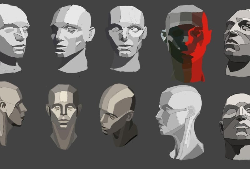
6. Planes: We now understand that we
can achieve a good form, read a good three D. Read with just light
and shadow, right? And having those
things read clearly. But the key question is, where do you put those shadows, right? Where do you put them? And the answer lies in planes and learning the planes
of the human form, I have these three heads
here as an example. The first head here on the
left hand side really is just a very basic model
of the head and it's filled with mountains and
valleys of complexity. If we go to head two, the actual plan
planes really are just the different sides of
things is quite complex. So if I start
drawing planes here, I would imagine they would
do something like this. It would go in and then
around the eyeball, down around the cheek, down in here and around. And you can start
to see that, wow, there are like seriously a large number of
planes and they change. For example, here, if
we go over the lip, the planes start changing. And we can grid them out, right? So we can get a grid view of all the different planes and the angles that they are facing. Now, light travels
in straight lines, and we're going to
actually look at that in the next lesson. But we want to understand that obviously different objects
have different sides, right? A three D object has
multiple sides and light is going to hit some
sides and not hit the others. We need to know the sides. As you can see, planes
are fairly complex. How the heck do you learn them? The answer really
is that we'll see number three here is we want to study simplified
versions of the planes. For example, if you can
imagine ahead number two here, we'd have like planes
on the nose like this and then the
underneath planes here. And there would just
be so many planes of how the cheeks go and then the planes go in there and around the eye and
then out like that. It's just really complex.
There's so many of them. Thousands, millions of them. Even, right, we
need to simplify. A simplified version of the planes would be
something like this. Where we say, all right, what if we make this
whole section of the forehead here?
Just one plane. Just one plane. Just
one plane here. We have one plane going in
toward the eyes, right? One rounded plane for the eyeballs because
they're circular. Another plane coming
out below the eyes. All right, Plan here
for the cheeks. Plain here for those cheeks,
et cetera, et cetera. And we split the nose
into just two planes, a bottom plane and
a top plane here. And we can actually in a side plane that
comes down like that. And you can see we start
to understand how we can get the general shadows
in, in a general way. And as we're learning the
planes more in depth, we can start bringing the
level of detail up if we're going for a very realistic
style of coloring or painting. Now of course, when you talk about those
types of stylings, things scale, sometimes you just want very simple coloring
and that's fine. Sometimes you want more advanced coloring
and that's fine. But I'm teaching you to be a professional and that
means you know how to do everything from the
most complex thing all the way down to
the most simple thing. Going back to planes,
planes are critical. How you learn the
planes is you find models of simple facial planes. You look for reference images
of simple facial planes. Now usually these come in
the forms of sculptures. An artist would actually make a simplified planes structure
sculpture of the head. Now I can't show you
those because pretty much all of them are
copyrighted images. I don't personally sculpt, so I don't have one
of those heads. But nevertheless, a
simple Google search, planes of the face planes of
the human body will give you millions of results that you can study and reference from. Believe me, when I say this, you want to go in depth in terms of your
understanding of the planes. You want to do a lot of
planes studies and really get a feel for the angle of
the planes on the face. For example, this points
down, this points up, this points out you have all these planes when you
understand the planes. Then we add a light source. For example, we say, okay,
the light sources here, top left, where
will the light hit? We can then see that it may not hit this plane
here or of the nose. So that would be
in shadow, right? It may not hit some of this
plane or some of this plane, but it hits this
section here and we start to get that three
D form coming through. There was a plane here,
probably wouldn't hit there. It might hit a little
bit there, some here. But maybe not this
section either. We start to build form out of the understanding of the planes and the location of the light. That is the basics of planes. There will be more information
in your assignments. I'll see you in the next lesson.
7. Light and Reflection: In this lesson, we are going
to be learning about light, light sources, and reflection. Okay, The first thing we want to know about light is that no matter what
the light source is, whether it's a light
bulb or the sun, that light typically
moves in straight lines. Okay, light moves
in straight lines. A consequence of it
moving in straight lines, it radiates out in
straight lines, is that it reflects in
straight lines as well. If there was a surface
here, very smooth surface, the light would reflect in
straight lines as well, right? No matter what the
surface is actually, the light always reflects
out in straight lines based on the planes
of that surface. Our first big point, and something we
want to think about particularly in
regards to the planes, is that light moves
in straight lines. Okay? Very perfectly straight
lines. Straight lines. This is how we want to think
about how light moves. All right, The second
thing we want to be aware of is the sources
of light around us. So I'm going to draw
a simple scene here. We will have the
sky and the ground, then we can put in a sun here, let's say this is
an outside scene. In our typical outside scene, when we think about light
and you ask somebody, well, how can we see everything? Where does the light come from? People will obviously say, hey, it comes from the sun and
it's radiating from the sun. While that is true, and the majority of the light
is coming from the sun. On Earth, when we're
standing outside, the sky is also acting
as a light source. Light waves move through
the atmosphere and the sky and its beautiful blue nature itself becomes a
light source as well. The sky in itself also costs
down its rays of light. It's blue light gets cost
down into the world. We have the rays from the sun and the rays from
the sky shining down onto the ground and onto the objects and so on and so forth in straight lines. We have two light
sources already. But then what happens
is everything that is accepting the light on the
ground, the ground surface, and what have you
then itself sends light back up into the
atmosphere and of course, to the objects around it. You can see here
that we actually typically have three major
light sources going on. Now, if you are in a room, your bedroom, for example, and your bedroom lights on, then you're really only having
around two light sources. That's this style of
interior lighting. You know someone is inside based on the light being a
particular way. Right? They're lit from
one light source, one main light source, the bulb. And then that light bounces all around the room and
on all the objects. And then you have the secondary
lighting coming there, should I say, the
reflected lighting from all those objects
filling the room. Now in this instance, we would technically
call the sun the key light because it's the brightest and it's
the main light source. Sky would be our
secondary light source. Or you could call it the
ambient light source as well, but let's keep it
secondary for now. Then the ground would be
the reflected light source, reflected light, which you
could also call bounce light, which itself, depending on the circumstances as
well, generally speaking, would also be ambient
light because it's contributing as bright
light to the scene. The key light really is
the brightest light, the secondary lighting and
the reflected lighting. The ambient lighting is the
other types of lighting, and we'll talk about
three point lighting later on not too far from now. Three point lighting is really critical for us when
we want to color and paint our characters
in a way that is super convincing,
super believable. Doing things that
you wouldn't think you would do with paint color basically to achieve a very believable and a
very appealing effect. Our second point
over here is that, generally speaking, three
light sources are good, right? Three light sources
are something we really want to have in
our work if we can, and of course based
on the style of the work that you're
doing, if you are doing. More simplistic coloring. You may not even have distinct
light sources, right? If you're not going for
a super three D look. However we want to
know the extent of our capabilities when it comes to lighting and how
light actually works. All right, now moving on to
reflection and reflectivity. Just going to make
this stuff a little bit smaller so
there's some space. Imagine if you will,
light flying from the sun in straight
lines, it's beaming off. And it's going to hit
two balls, right? We'll have a ball here. Let's call this ball
the glass ball. We'll call this ball
the clay ball, right? It's hitting a glass ball and
it's hitting a clay ball. What we're going to do
is we're going to zoom in with a microscope onto the molecular structure
of these balls. Here's our zoomed in view. Okay. When we zoom into the
molecular structure of glass, we see that the molecules
are really close together and they're really tightly packed next
to one another, that the surface of the
glass is really smooth. Okay, When we come
to the clay at this very close o
particle molecular level, we notice that the
particles are very, very randomly placed and they're
going all over the show. And the surface of the
clay at that level has all these little
mountains and valleys and ditches and things going on. So what happens is light still continues to
move in straight lines. Doesn't change that, it
moves in straight lines. But when it hits the clay, it hits at all these
different angles and then reflects off in really
crazy ways, right? That light particles and the lines of the
light particles, if you will go in all these different directions
and start overlapping each other because the reflection
is not a direct bounce back. A straight bounce back, you get a hazy appearance. When those types of surfaces, like clay type surfaces,
rock type surfaces, matt surfaces are
hit with light, they just do not reflect
things very well. Sure, they reflect their color, they reflect their
value, they do not reflect high lights
very well there. Then they do not reflect the environment around
them very much. They also have a different
type of bounce lighting, right, which is very hazy. You can imagine if these
were little particle dots bouncing around here in the clay area of
things with just like a hazy glow
of lights, right? However, conversely,
when the straight, when the straight
light beams hit glass, for example, as a surface type, it bounces directly back. Because of this
direct a bounce back, this gives glass its
nature of showing off highlights and often reflecting
the world around it. Colors around it, the
things around it. And this applies to all
highly reflective surfaces. Glass and metal and chrome
and things like that, right? Very shiny plastic,
et cetera, et cetera. Knowing this, understanding
how light works and interacts with these types
of surface types helps us to understand how we would
render or paint or color something that is plastic
versus something that is perhaps cotton versus something
that is perhaps chromed. Right? So it helps
us understand. Okay, maybe I should have really bright highlights
on things that are metal, on things that are very shiny, but on things that
are cotton or wool, I wouldn't go too crazy
with the highlights, right? And things of course, go into various degrees of complexity
where you really want to take time to understand why and how does
silk reflect light compared to why and how
cotton reflects light. And so this gives us
our third point here, types of reflectivity, right? Based on the material type, okay, types of reflectivity. Now we are going to move to the form lighting
principle in the next lesson. The form lining
principle is really the hardcore lighting principle that all painting
coloring is based off of. But I feel that you should
be now well equipped, well equipped in your
understanding of light planes and value to really grasp
that in a rapid way, and I hope you do that, is it for this lesson. Lights move in straight lines. Generally want to strive
for three light sources. That's a guideline, not a rule. And the types of reflectivity based on the service
material type. I'll see you in the next lesson.
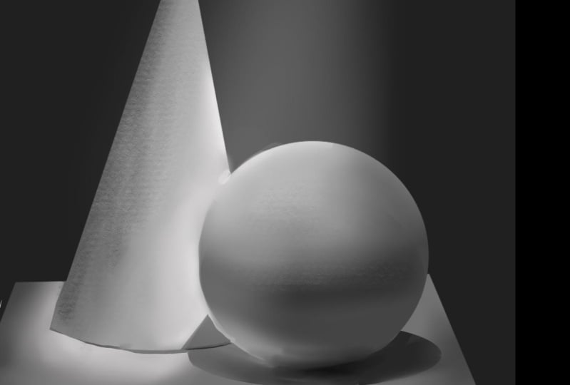
8. Lighting Forms: Welcome to this key
and pivotal lesson, The form lighting Principle. The form lining principle really is the core foundational
principle we, as artists use to
help us color and help us paint our work to varying degrees
of believability. We base all of our
lighting knowledge pretty much on the form lining
principle foundationally. And then we add extra bits of information as we need
it on top of this, this really is our foundational
principle for lighting. Now I'm going to be
doing this step by step. Don't worry too much
about how I'm doing it, how I'm using Photoshop, or how I'm using the tools that is covered later
on in the course. For now, focus on each of the individual elements of
the form lining principle. Let me also say
this and hopefully I'll remind you at
the end as well. You want to remember every single element
of this off by heart. Let me say that if you can
remember it off by heart and how it works in the
form lining principle, you have a very, very strong foundation in
painting already. All right, let's get
started in front of us. Here we have just a gray circle. This gray circle is going
to become a sphere. What we're seeing is the
sphere without any lighting, and all we see is
its inherent value, which is about a five
on the value scale. And its inherent color instance, we've gone with just gray. Its color and its value
are very similar, okay? It's a farm in the
value scale and its inherent color is gray. What we need to do is determine
or define a light source. Okay? We are going to say, let's put the light
source top left. And we'll just draw in little three D arrow here just indicating
where the light is. Our lights coming
from the top left. Now that we have a light source, something starts
to happen, right? We're going to start seeing form shadows occur where
the light does not touch. I'm selecting this shape, this circular shape here. I'm going to grab
the soft brush. Gently add in based on
the planes of the form. Now obviously a circle has
gazillion trillions of planes. Nevertheless, we're
going to wing it. Put in some form, shadows, darken it here in the areas where
it gets pretty dark. And you can see immediately how, what we've learned about the two value statement and just the power of
light and shadow, What that can do to something
so simple, like a circle. It has effectively turned
it into a sphere already. And yet, we haven't even done all the other elements of the
form lining principle yet. Remember again how important the two value
statement really is. But if you look at
the thumbnail view, if you had to show
this to some rain a person and say, hey,
what do you think this is? We'll go, well, it looks
like a gray ball or maybe it's a gray planet or it's
a gray sphere, right? They wouldn't say, oh, well
it's just a gray circle. And that is the power of shadows and light in
terms of the area here. That is our base local value. Okay, so those are form shadows. And there are
shadows that appear on the form once
the form is lit. Okay, the form shadows. Next we're going to add
ambient occlusion shadows. Now, ambient occlusion shadows, the name hints as to what the purpose or how this
shadow comes about. First of all, ambient refers
to the type of lighting. These shadows are caused
by the ambient lighting, not the direct lighting. The direct lighting
causes the form shadows, but the ambient occlusion. Shadows are caused by the ambient lighting around the area or the
environment of the object. Occlusion refers to
light being cut off, light not appearing somewhere. When we understand occlusion, shadows which we'll
get into just now, which is like a space
between your fingers or the darkness underneath your shoes when you're
standing on the ground, it's almost pitch black. Occlusion just
means two occludes to stop the light coming there. Of course, shadows
just indicates that it's the ambient
occlusion shadows. Now, ambioclusion
shadows are weird. I'm probably explaining
it in a strange way. But what's important
to know is that ambient occlusion
shadows appear to us when the edges of a form tend to turn the sphere tends to go over around into the back sections of
the sphere, right? There's a back and a front
and a side, et cetera. What happens is the
inclusion shadows are very subtle shadows that appear around the edges
of forms like this. And they help us to get a sense of the turning of the form. All right, the
turning of the plane, and you can see it enhances
the overall spherical look. I just want to be a little
bit more subtle here. That's also a hint as well. You want to be subtle with them. They're not supposed to be
overly harsh shadows, okay? Let's just get that in there.
Okay, that seems nice. All right, those are our
ambient declusion shadows. The purpose of them, once again, is to show the turning of a
form if an object or a shape that you have drawn does in fact turn or is a rounded form, even if it's a square form. If it turns or it
has another side, you want to have a
degree of ambient. It is a shadow that is being formed by the occluded
ambient light. Okay, let's move on
to the next element. What we're going to do
here is we're going to add just a general level of additional light before
we get to the high light. Now, the light often is just formed automatically
in this region, right? It's just formed
automatically because we've shown a light source that's created the form shadows, and you already kind
of have a light zone, and you can see
in the thumbnail, we already have a
light zone there. But we're going to
add the stage as well because it's also
very useful when we're painting and
we're coloring to think about light as a stage. Now let me just
reiterate once again, you don't want to
think of painting as adding light, adding shadow. I want to really
encourage you to think about get the right
inherent value, an inherent color, and
just add the shadow. And you've saved
yourself a lot of drama and a lot of steps in trying to make
it look three D, working on making sure your
shadows read correctly. Anyway, let us add this light. I'm going to select
that local color there. And I'm going to increase the value maybe by
one or two stops. And we're just going to beam some light onto that section. Our ball looks a little
bit more, three D now. Okay, that is the light. And the light is obviously
coming from the light source. We're lighting a zone. Let's go to our next layer, if you will, or our next
element of lighting, which is the highlight. Now the highlight generally occurs at only specific points. Another way I want
you to think about a highlight is think
of a mountain range. There is one mountain that
is the tallest mountain. Let's call it the peak
of the mountain, right? The peak amongst peaks. Think of the
highlight like that. When you start putting a lot of highlights all over something, they don't really seem
like highlights anymore. They seem like really
bright little markings on whatever you're doing. The term highlight really comes from the highest point of light, like the highest peak
in the mountain range. Use highlights very sparingly. What we're going to
do is now select that light color,
increase its value. We're going to add a little bit of a
smaller highlight here. One location where the
light is brightest. Okay? Even go a little bit
brighter in the core there. All right, in the center
of that little shape. Okay, fine, that
is the highlight. But there is still
work yet to be done. What I'm going to do now
is go behind our sphere and I'm going to
draw a cast shadow. All right, let's do a
cast shadow like this. That seems reasonable
enough for an example. Okay, So important
thing to remember with car shadows is car shadows
are transparent, all right? They're pretty much transparent. You don't really want
to do them opaque. It'll look weird having
this really harsh, dark, black shadow
over something. Unless of course,
you're doing that for an intentional reason. It's important to remember, car shadows are transparent, but they are usually quite dark. Another point to note
is that the edge of the car shadow is sharp in
very clear, bright light. And it can be a little bit fuzzy when the
light is diffused. For example, think of a
fluorescent lighting. Think of a very cloudy day. Shadows don't tend to have very sharp edges when
it's a cloudy day. Okay? When the
light is diffused. But in sharp bright light or general normal lighting
circumstances, the cast shadows tend
to have a sharp edge. Now, the thing to remember with car shadows is that they are casting off from the form as the light beams
past the form, areas where the
light does not hit. The cast shadow is formed pretty obvious
in a way the same time, you want to think about how a car shadow might
look based on how the light is moving past the form that is
the cast shadow. All right, cast shadow. We've just put that
layer underneath our sphere just for
convenience sake. As we're working next, we want to talk about
reflected or bounce lighting. Okay, so I'm just selecting
our sphere again here. We are going to grab
a bit of the light here from this surface which is now a white table
or our white environment. Because as the light shines, some of the light shines
down past our sphere, hits the table surface, and then bounces up again
to the back of the form. All right, and this is our
reflected or bounce light which we've already learned about a little bit
already when we had done the elements of light. All right, the light sources, what I'm going to do is just
do a gentle soft whip brush, do a very subtle spray of this reflected light in
that shadowed area there. The key thing to remember
with reflected light is that it generally appears
only in the shadows. Bounced light for its
reflected light tends to really show itself only in the shadows.
Now, why is that? Well, because it's
reflected light, it is a lot less bright than the actual
light source itself. If there was reflected light in the light areas,
which there is, you simply cannot see it
because the light areas are being overpowered and blasted with the
direct light source. Our reflected light is firmly
seen in the shadow areas. I'm going to add another
light element yet, which we will call
our secondary lights. Okay. Our secondary light is, could be the sky
if you're outside, or it could be another globe. If you have an orange
globe in the room and then a red
globe in the room. The red globe being a
slightly less powerful, maybe a more distant
light source. It would still shine its lights. Light would still
reach our object. This is our secondary
light source. It's secondary to the primary or the key light source here. I'm just going to
hint at it just a little bit on this outer edge. All right, We're going
to say that there's a secondary light source
to the right now. It's different from
the reflected light because it can be brighter. And secondary light
sources based on their brightness can also
be seen in the light. It just depends on
the lighting set up. As we do that, let's add our secondary light
source in here as well, so that we're aware
that there is a secondary light source
coming from the right. Maybe it's really far away
and a little bit distant. Okay. All right. Our secondary light
source. It's weaker. I'll just put here second that we know it's our
secondary light source. I'll just say primary
here or key light source. Okay, we've got one more thing
we need to do in our form, lighting principle, and that
is the occlusion shadow. Now, whenever an object touches another object,
generally speaking, you get an occlusion shadow happening there where light
just simply does not get to. Right. The light is
itself occluded. Let's just put that
in there firmly. Occlusion shadows. I'm going
to select our sphere here, just hiding the selection so
it doesn't get in the way. While we're working, I'm going to select a
dark shadow color. I'll just even select black. I'm going to be subtle
with it because there is a lot of curvature happening
underneath our sphere. You'd only have a little bit of an area with the
occlusion shadow, but it would be
something like that. That's a little bit too lacking in subtlety, but there we go. All right, those in fact are all the elements of the
form lighting principle. We use these elements
when we're painting a particular thing to determine what elements we want to
add and take away based on the lighting scenario of
that particular object. Now, when you're dealing
with various types of art, maybe you're going for
a very cartoony look. You may not use all of the elements of lighting
workflow, right? You may use none of them. You may just do
completely flat color. But if you want to bring in
more and more dimensions, you want to use more and more of the form lighting principle. Let's discuss this
principle now with just some key notes on
what's going on here. And we also want to start to
try and see how a workflow, how we might work and
implement coloring might derived from this
particular principle. All right, what we
want to do first is split the families. Here we have the light family, we have the shadow family. Things from the light
in the shadow family do not cross into each other. Generally speaking, for example, we do not have values from the light family occurring in
the shadow families areas. It just doesn't happen. The values are completely
separate. Why? Well, if we remember our
two value statement, everything needs to boil
down to the two values. Obviously, if we have values
from the shadow zone, in the light zone, values
from the light zone. In the shadow zone,
everything becomes a blurry mess and we can't
read the forms anymore. That is the reason these
families are in effect at war. You could say in
the light family, we have our base or
local color and value. We have our lit area, we also have our
highlight, right? And we want to remember,
we don't want to go crazy with highlights that is almost at the instant sign
of an amateur or someone who really doesn't
understand lining principle. They just have
highlights on everything like the character or whatever they're
drawing or painting. It's just super
glossy and stuff, it just looks really weird. Okay. So those are the
elements of our light family. Crazy thing is you'd think the light family would be
this crazy, huge family. They've only got
these three members. Really, everything else is
part of the shadow family. Once again, emphasizing
how important shadows are then in the
shadow family side, although yes, we do have
the ambient occlusion occurring in the
shadow family side. It's a little bit different but nevertheless, it's lighter. It's part of the shadow family. We have our ambient
occlusion shadows. Yes. Mind you, Also in
the light family would be the secondary light source
as well obviously because it itself is a light. Okay. So we have the ambient occlusion shadows in the shadow family. We have the form shadows which are really
our base shadows. When you're doing shadowing, you mainly want to focus
on your form shadows. I put a number one there
and number two and your ambient occlusion shadows when you're just working with your base value and
base color and you have the desire to create that three D form work just with your form shadows and your
ambient occusion shadows. Work those until it looks D, don't worry about the
other elements yet. We have our occlusion shadows. I'm reiterating this for
your sake so that you're getting used to the idea
of all these elements. We're going to list it
out on left as well. That's not to waste your time, it's because we want to
derive a workflow from this. It's all good and well learning the form
lining principle, but can you use it in
actual piece of art? That's the real question. All right, we just had
a sip of water there. Okay, This is our
reflected light, also called bounce light. That's because the
light shines down and then it bounces off the surface and back onto the object right at whatever angle it is in
relation to the object. Key thing to note
here is reflected and bounce light are part of
the shadow family, right? Because these lights
occur in the shadows, you see them in the shadows, even if scientifically they
are occurring in the light, you do not see
them in the light. In the terms of an
art, we want to be mindful that they are occurring in the
shadow areas, right? Just doing an arrow there to
our secondary light source. And then we have
our cost shadows, which are cost by the form. Important to remember,
they are transparent. All right, when you start looking at all of these
elements in a list of fashion, we have our base, local color and value. Then we have our form shadows, our ambi inter
collusion shadows. Then our lights highlights
reflected lights. We can add secondary lights
at this point as well in the workflow collusion shadows and our cast shadows. Let's make sure we've
all got them all. 123-45-6789 Okay, there we go. We've got all of them there.
Now something important to note is look at where
the cast shadows are. Look at where the occlusion
shadows are. They're last. And this is very important. You don't want to be
painting in cast shadows somewhere in the beginning
because you're going to end up painting or
coloring over them. And that would be weird because cast shadows, cast over things. Usually if an arm is
over a character's head, you want to have
painted the head and then do the cast shadow
over that, right? So it's very important.
But in essence, this is how we get our
general lighting workflow. Okay, Our general
lighting workflow. I hope this has been a
very useful and very to the point form lighting
principle lesson. Learn it well. Learn all of
these elements off by heart. Get it over and done with, and you will thank me later. That's the end of the lesson and I'll see you in the next lesson.
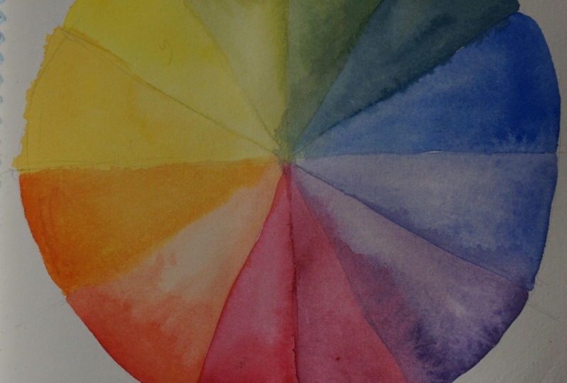
9. Understanding Color: In this lesson, we're going to learn about the
elements of color. In front of you, you see a
pretty typical color wheel. This type of color wheel is
called a Arb color wheel, and you'll find out soon
why it's called that. Nevertheless, color has
a properties to it. One of which you'll
already know, which is value, which is the brightness or the
darkness of something. The next one we're going
to take a look at is hue. Hue basically refers to all these different
colored segments. Not necessarily
the color itself, but rather the
frequency range or the color range that the
particular color falls into. In order, we have yellow, red, magenta, blue, cyan, and green. The word urine comes from the
yellow, red, magenta, blue. Going back into the
yellow section, I don't know necessarily
why they left out C and G, but something that
is important to note is it's good to come up with a mnemonic for yourself so that you can remember
all these segments. Because the color wheel, knowing the color
wel off by heart, helps you know what
intermediary colors a color can move to in
its particular range. Obviously, yellow goes into oranges, oranges moves into red, red into pink, reds
into magentas, magentas into purples,
and so on and so forth. Now, another
important thing about hues is that colors are divided into warm colors
and cool colors. And I'll split the wheel now to show you the
warm and cool split, which is around here. Warm and cool colors tend to
really contrast one another. Warm colors, as
the name implies, feel warm and heated. Cool colors feel cool and cold. As we move through the course, you'll start to see how having a good interaction
between warm and cool, and also how we treat warm and cool when we're
lighting objects, is a very important facet
of understanding hues. We have color, we understand value is
brightness and darkness. And we understand
hue, warm colors and cool colors as well. But there is a third element, and that third element
is saturation. Saturation refers to the amount of gray in a particular hue. If we look at this
orange segment here, as it moves to the center
of the color wheel, it gets less and
less color rich. That has more and
more gray in it. In this instance, we call
this neutral gray or the 50% gray saturation. You can regard it
as the amount of gray or you can regard it
as the color richness. Either has a lot of gray or a little bit
of gray essentially. And that will saturate
or desaturate the color. Now when you combine
this color wheel into the information and the knowledge you
have about value, You have a very broad range
of colors to work with. Tons of different brightness
and darkness levels, combined with tons of
different saturation levels, combined with tons
of different hues. And obviously, the color wheel is a simplification of the hues. Because as you can see on the color picture
here in Photoshop, you know the hue levels
just quite crazy. Most computers
support 24 bit color, which is 24 million colors. And in reality, the range is significantly higher than
that I'm led to believe. Okay, but nevertheless,
these are the core elements of the color wheel and the
core elements of color. Now there is some
addendum information to be spoken of as well. It's more about terminology. You may have heard
these terms before. Tint to what is a shade? What is a tint? What is a tone? To be honest with
you, day to day life, most people misuse these, particularly the word tones. But I suppose it does have
a use in music as well. But nevertheless, shades, tints, and tones are separate elements. A shade is when you add black to a color or degrees
of black, right? You will start
getting the shade or the shadow values of
that particular hue. Tints, on the other hand, is when you add white
to a particular hue. Tones are the varying
steps of saturation. It's when you add gray
to a particular hue, those are what shades, tints, and tones are. Having this vocabulary
under your belt, and this understanding
will very useful to you when you're painting
and coloring your work. All right, as an example, let's take this red for example. I'm going to get a
painting brush here. What I'm going to do is
slowly in the darkness of it to give me different
shades of that particular red. You can see we get
quite a nice spectrum. Tints of this red,
on the other hand, have increasing the amount
of white in the color. And once again you see
a very nice spectrum. And last but not
least tones have us dealing with the
saturation level here. We will move more toward
gray on Photoshops, particular color
picker here we'll move to a 50% gray in
a diagonal fashion, desaturated a little bit more. Those are variations of
tones that really is color. In a nutshell, that
is the lesson and I will see you in
the next lesson.
10. Color Shifting: We've learned about
color theory, now we're going to learn how light color affects
surface color. A very common beginner mistake is to assume that when
light hits an object, that the object is simply
going to increase in value. What I'm going to do here is
I'm going to just give you an example of this on the
red sphere at the top here. The assumption is that, okay, I've done my base color, I've done my local value,
and my local color, I've added in some shadow
and now I want to light, I'm going to select
the base and I'm going to increase the
value of the red, and I'm going to
put some red here. While this is not necessarily untrue under certain
lighting conditions, what is more common is that the hue will change based
on certain factors. All right, the hue will change. We won't just
increase the value, the brightness of the base red, we're going to change
the hue as well. Now this means we need to
go to our color wheel, here, our ob color wheel, and do a nice line split between the warm and
the cool colors. All right, on this side we have the warm colors and on the
side we have the cool. Now, generally speaking,
as a general guideline, most of the time we
fall under warm lights, whether it's globes
in our house, whether it's even
fluorescent lights in our house or our offices, or we're outside
underneath the sun. Our primary light source
usually is warm or fairly warm. When it gets cool, things
become a little cold and chilly and feels
a bit weird to us. I think in general, we
opt for warmer types of lights or more daylight like lights because it
feels more natural. When a warm light hits a
surface of any particular hue, it tends to cause surface
hue to warm up as well. Okay? When a warm light hits
a particular surface hue, whatever the hue of
that surface may be, it tends to cause the
surface to warm up as well. Now, there are many lighting circumstances that are possible, but this is a very
common one In general, this is the most natural
looking way to do it. Also, before we go
into the examples, is the opposite true? If a cool light hits a
surface of a particular view, does that hue cool? And the answer is
yes, of course. It also depends on the coolness of the light and the color
of that particular light. But lights are
going to fall into a category of warm or cool. And the sun is generally considered warm
because it is yellow. Let's move over to our
spheres and see what the correct approach would
be to lighting them. Which doesn't mean just
increasing the brightness, but we're also going to
warm up the hue as well. So I'm going to switch
to the soft brush here and we're going to
start with the red one. Now if we ask ourselves, what warm area or warm direction will this red move into this
particular red? It's probably going to be toward the orange and the yellow. It's going to warm up towards
the orange and the yellow. We'll pick the base
of value here, base color, the local
color, increase the value. Because we're
lighting this side, we can increase the value. There's going to be
light there. But we also want to move the
hue a little bit. Of course, the extent to
which you move this is dependent on what you're
actually trying to paint. But you want to get
the general principle here that would be a good way to light that
particular surface. You're changing and shifting
the hue of the local color. Warming it up as
the light hits it. Let's go to the blue. The blue would
warm from the cool here up into a San, right? It's going to warm
up into a San. We'll select it. We'll increase the value because we
wanted to get brighter. We'll warm it up towards San. You can see how
natural it looks to do a hue shift as well
as a value shift. All right, last but not least, let's do this green sphere. Once again, we'll
increase the value, then we'll hue shift
toward a lime green. Going into this lime area
of the warm colors here, it provides a fairly
convincing, nice warmed hue. It looks naturally lit. Now a question you might ask is, well, what about
the shadow areas? What about the shadow
areas on the dark side of these spheres over here to the key that you want to
remember here is that shadows themselves are effectively
the absence of light, the absence of light, which means it's the
absence of that hue, shifting ability of the light. Really, shadows are
just a lower value of the local color. Okay, The shadows really aren't necessarily
affected by any hue shift. You don't want to
go and be like, oh, well I warm the light so I'm going to cool the shadows though you could do that and you
have creative freedom, generally speaking, shadows
or the absence of light. And definitely, if this
is your base here, you would just really
drop the value for a shadowed area
and let the light and the hue shifts in the
light do the talking. Okay? That is in
effect how light color effects surface color or the
local color of an object. When you have warm lights, you want to hee up. That's the end of this lesson. I'll see you in the next lesson.
11. Colour Schemes: In this lesson, we are
now going to take a look at color harmony
and color schemes. But we're not going to go
to crazy extents with this, because color really
is quite subjective. It doesn't really have
hard and fast rules. It has more guidelines
in front of us. We see the color wheel on
the left and on the right a bunch of different splits
out from that wheel. And this is your typical
kind of splitting of the wheel into various schemes
if you will, or divisions. At the top, we have
the primaries and the first one primary
is just R, G and B, red, green and blue, which we
build most of our wheel O, which is how the cones
in our eyes see color. Then we have next to it
the Arguable Primary. Why is this called
the arguable primary? Because it is argued
in certain art circles that these could also holistically really
be primaries as well. If you look at printing or the printing industry
for example, they often print in
what is called CMYK, which is sine magenta,
yellow and black. Cmyk also produces perfectly
legible and readable images when you're looking
at your magazines or books and what have you. Then we have secondary. These are secondary
colors that are really just the colors next
to the primaries, hence why they're
called secondaries. And you can derive a
secondary color scheme, which is a color scheme
using secondary colors. And then, of course,
you may have heard of complementary colors before. Complementary
colors are directly opposite each other
on the color wheel. As we hit this point, you can start to see some subjectivity already
taking place. Because you may be saying, well, isn't blue and orange
complementary? Aren't red and green
complimentary? What's up with this color wheel? Why doesn't it work like that? Well, that's because
there isn't really a perfect color
wheel per se, right? Just manmade color wheels. And if you look at Photoshop,
doesn't even have a wheel, although you can download
a particular wheel, but it doesn't really
even have a wheel, has this color strip. And how would color
schemes look if we had to work with
this strip, right? Color can be very subjective. Then we have analogous colors. Those are really colors that are right next to each
other on the wheel. For example, yellow, orange, and red are considered an analogous and so
on and so forth. As you work around the
wheel, you can just pick the colors that
are next to each other. Split complementaries
really that you have a primary and then just
diagonally off from it, instead of directly across, you have a split complementary which gives you a
three color scheme. There you have monochromatic
color schemes. Monochromatic really just
meaning single color, You'd have a single color, In this instance,
we have the blue. Then you'd have
various other colors being either higher
valued blues, lower valued blues,
darker valued blues, more saturated of that
blue, less saturated blue. So you're really staying
in that one hue range. That really is an overview
of the general splits you might see when it comes to color wheels
and color harmony. However, I want to show
you a great way to simplify this process where you don't really need to
necessarily learn all of this. It's not going to make a huge
difference in your life. We're going to that right now. What we're going to do is
we're going to achieve color harmony using
the rule of three. Technically it's the
rule of three plus one, but we're going to
call it the rule of three here for this example. Okay, let's put it here, color harmony by rule of Three. With this system, you
really can't go wrong. There may or may not be
a U in the word color. It depends how you
like to spell it. Just interchangeably, use both. All right. Color harmony
By rule of three, what you want to
do is you want to pick your primary color, whatever you think
the main color in your character is going to be their main descriptor color
instance. Let's take blue. Okay, we're going
to go to the blue, pick its value, pick
its saturation level, pick the hue as you prefer, and decide to yourself what your primary color
is going to be. Here. We are going to have
a single primary color. I don't like that. I want it
to be a little bit darker. That will be our primary. Then pick a secondary color. Okay. I'm just going
to go with whatever. Let's go the yellow and orange. Okay, let's take that. It has its own hue and
value and saturation level. Important to note, you do
want these colors that we're choosing here to be
different in value, right? Different in value. And of course, different in all the other elements as well. The more difference you can
get between them, the better. Because that way
we're eliminating parallels in our value. And eliminating parallels in our color as a tertiary color, which we're going to be
calling our accent color. I'm going to go for a red. Let's go for this type of red. Very warm red. Very
warm and bright red. Okay, so what we
have here is we have a primary secondary color, which we have just
chosen based on what we feel like we're
being subjective here. And then an accent color, okay? You could also call it
your tertiary color, but let's keep it accent, and I'll tell you why when
we have the selected. All right, let me just get the square selection tool here. When we have these selected, we want to arrange the percentage of color
in our particular piece. Let's say it's our
character outfit according to the status
of these colors. For example, the primary color, let's use black for the notes. Our primary color,
we will want to have around 50% coverage and communication to the viewer
that this is the primary, most of the color
on that character, whether it's the suit or
they're out for their costume, is going to be blue, blue, or the primary
color 50% You want your color split here to
be 50% to your primary. Then when it comes
to your secondary, you want your secondary
to be 30% right, 30% The color used
on your character to define their color scheme
will be the secondary. And then last but not least, the accent or the tertiary color will be the last 20% Okay? So that you have an
uneven split, right? Asymmetrical split
of the colors. Now, when you're
building a character, when you're painting a character and coloring a character, this does not mean that you only use these colors
for the character. No, rather this is the color
scheme of the character. The hair is still
going to be whatever their hair color is going to be. The skin is still going
to be their skin color. If they're wearing
watches, or accessories, or bangles, or what have you, you can choose
whether or not you want that to be part
of the scheme or not. But generally, if they're
holding something that simply cannot be
part of the scheme, for example, they're
holding a golf ball. Golf balls are typically white. Tennis balls are
typically green. You would still color things
in the way that they are, but you want the overall
vibin feeling of your character's clothing or their outfit and their shoes, and their general accessories. Or they feel to be these
three particular colors. So that if you were to put
these colors down and say, hey, what characters do
you think fit this scheme? So let's take, for example, this particular color
scheme I have here just occurred to me now that
I used radial and blue. But nevertheless, I would
think something like X Men may be cyclops
when I see these colors. Right? He's got a blue suit,
it's got yellow straps. He's got his red visor. And actually here's
a perfect example. In this instance, if you're not familiar with the X
Men character Cyclops, the comic book
version character, you will note that the color splits kind of apply to
him in this way as well. The only thing that's
red is really is his visor on his glasses things. And then he's got yellow straps, but most of his suit is blue. So he's actually a pretty
good example in that case, obviously we can't put an
image of the dude here. Nevertheless, I want to reinforce that you want the values between
your colors to vary. A simple check to do
this in Photoshop, and we'll do a more advanced
check a little bit later on, is to just color pick and
check the value level, right, Where is that blue? All right, maybe
that's about a four. Where is that yellow looks
like? Where is that red? It's like a 1.5 on the
value scale, right? Because you want that
variation of value, because the viewer's brain
is perceiving that value. Now let me just add a little
extra thing. Feel free. You heard me earlier says the color harmony by rule of three and then
I did mention plus one. Feel free to add in
additional accent of just value whether it's
black or grays or whites, because that can
also help add to it, obviously depending on
what you are doing. All right? But the rule here is to strive to keep the color age, the general scheme
usage to three colors. Don't use more than three, don't use less than three. You can actually get away
with using less than three. To be honest with you,
that means you really just eliminate the accent color. But consider and contemplate
this very simple way of really getting
great color schemes by just using the rule of three. That is it for this lesson. I'll see you in the next lesson.
12. Dynamic Lighting: We're now going to
take a brief look at the concept of
three point lighting. And on the right we have a wizard character
girl that I created. And on the left we have a
single point lit source sphere. Now you already
basically know a lot of the three point
lighting principles because we've gone
through it already. But I wanted to go over this again just in a little bit of a different way and use the term three point lighting to help you realize how important three
point lighting can be when it comes to creating a really believable and a
really appealing three D look in your work. Now you're always going to have at least one light
source on your work, unless you're doing a very
simplistic coloring style where there really aren't
any clear light sources. It's more of a graphic
style and less of a realistic lighting or
formed type of style. Okay, now beginners tend to generally always only use one
light source at the start. They think to
themselves, all right, there's three object is lit, so there must be an area that is lit and an area that has shadow. And that's all I'm
ever going to do. Whilst that's not
necessarily untrue, if there is a single
light source, when this is done
in all the work, the thing, the object, or the characters that
they're painting or rendering seem to be
very flat, right? They seem to be very boring. And this is where the wonder of three point lighting
comes into play. On the left hand side, we have our sphere
and it is currently liked from just one
side, the top left. What we're going to do is we're going to introduce
a blue light on the right hand side
and we're going to introduce a reflected
light on the bottom. Like I said, nothing you
haven't typically seen before. But we're going to
take a little bit of a twist when we look at this. And we're also going to use
our wizard character Kami on the right to illustrate how effective three
point lighting can be. Now, three point
lighting is called such because we have key light, which is our main light,
our secondary light, which is going to
be our blue light, and then our reflected
light at the bottom, which is going to be
our tertiary light. We have 123 point lighting. Let's get into that. And we're going to quickly
add in these lights. I'm going to use a similar
blue that is on armies, a bright colored blue
using the soft brush. To do this, we're
gently going to add in this secondary
light source here. Note how I make sure
that it's certainly a lot brighter near the edges. And I can actually increase
the human value a little bit there at the very brightest
points of the light. All right, We've now introduced our
secondary light source. You can also see in the
thumbnail view that it increases that three D
read quite significantly. All right, now
let's go ahead and add in our reflected light. I'm going to just make this
light but more dull color. It's going to be a high value
gray in the green range. The reason is, we don't want to have competing value levels, or we don't want to have
symmetry, if you will, between the values
of the secondary light source and the
reflected light source. Also, keeping in mind
that our reflected light generally only appears
in the shadows, right? In our work, we want to keep it not too
bright, not too light. In fact, I actually think we should take that shadow value. Rampant steps up a little
bit, but not too much. Then we can move into
that greeny gray range. We can actually give
it a bit of a test and see that seems reasonably good for a reflected
light source. We don't want to
make it too bright. All right, so what we have is a significantly more three
dimensional looking sphere, because we've lit it
from three points. Of course, we can
further enhance it with a highlight
and so forth. That's not necessary for
this particular example. Now if we go and take a look at Carmie and let's zoom inherit, take a look at her
face for example. We will notice that she
is indeed a victim, if you will, of three
point lighting. Making her look more dynamic and more three dimensional
than she would otherwise look
without the lighting. We can see that on the
left hand side of her, she's got a key light. Let's just change
the brush there. She's got a key
light and she's got a secondary light on the
left hand side of her. Our key light shows
itself here in the highlight of her nose
and the way the light, the value increases
on her forehead. In terms of her jewelry and the trimmings of her
clothes, her scarf, you can see the impact of
that key light on the base, the local color of the objects that the
light is shining on. It's the same on her gloves
and so on and so forth. There is a definite key
light in the scene, and that gives her a good sense
of three D and of course, the shadows reinforce
that key light location. Next we have the
secondary light, which shines almost in a repeating pattern, if
you will, of dark light. Dark light, for the most part where there is light,
then there isn't, then there is light,
then there isn't on areas that that secondary
light is hitting. For example, we see here, it's hitting the top of the hat, then it doesn't hit.
Then it hits again. Probably doesn't hit again. It hits here, but it doesn't
hit there, hits here. It doesn't hit there. It
hits a little bit here. Then we kind of go into
reflected lighting there. And we can see here how that blue light is
shining on her hair, on the side of her face, right on her lip, a little bit in her eyes, even on the inside
of her eye socket. You can see how that
secondary light is enhancing the three
dimensionality of her. All right, three point
lighting is great for this dynamic effect
here on the gloves. Now keep in mind as well, when you are doing
secondary lighting, try to have it fade
as naturally as you can from the edge into the form. And obviously be logical
about the planes. Also, don't draw solid
straight lines of the secondary light just beaming in a solid
straight line like this. Don't do something like
this or it just keeps going because you want
to break the light up, it looks more natural. You look around you, even right now, look at
elements in your room. You will notice light generally follows a pattern of lit area, shadowed, area, area shadowed area, lit area shadowed area. Whether it's in a macro
sense or a micro sense. Nevertheless, moving
on, we also then have a reflected light source
shining up from the ground. And that we can see here in the more gray light shining up at the bottom of her chin
there going into her jaw, bottom of her ears,
even the bottom of her hair picks up some
of this reflected light. Any bottom surfaces that
you feel would pick up this will get this bottom
reflected light treatment. That's secondary. This is
bottom reflected light. This bottom reflected
light on her earring. You don't see the left
hand side secondary light because it's very similar to
the color of her earrings. But you do see the
key light in the form of that high light there. You have it, more or
less in a nutshell, three point lighting, with the
example of Kami over here. And I do hope that this has
been very useful to you. I'll see you guys
in the next lesson.
13. Atmospheric Perspective: In this lesson, we're going
to take a look at what atmospheric perspective is and what it means in the real world. In our drawings and of course
in our character coloring and character painting
in the real world, air builds up between objects As they recede further and further back
into the distance, there is more and
more air build up. What this means is that
foreground elements are darker, clearer, sharper, and more contrasting as elements move back into the distance because of the build up of air, their values are lighter, they have less detail, they're much less contrasting, and that means contrast
between one object to another and they
overall less detail. And so this really is what
atmospheric perspective is. Now, in a sense, at your typical kind
of camera angles, or rather, should we say,
at the typical perspectives of viewpoints that you tend
to draw characters at. You won't see an
incredibly large amount of atmospheric perspective because
the objects, for example, an arm on the other
side of the body is pretty close to
the body still, there's not a lot of air that
could be built up there. But nevertheless, we use this as a tool for
dramatization, right? So we're building
in additional drama and an additional
sense of depth And three demand ensionality
into our pieces using the principles of
atmospheric perspective. Now on our drawing in the
middle here, this is. Go groan. Here's an Orc. You may know if you know drawing theory
and line weights that we tend to draw thicker line
weights on lines that are in front and thinner line weights
on lines that are behind. And as the lines get
thinner and thinner, we receding those objects
into the background. So it's a way for us to create depth using atmospheric
perspective by ensuring foreground objects have thicker lines and background
objects have thinner lines. And that is how we
typically use line weight. So you can see in
Grogan over here, he's got significantly
thinner lines on his hair braids compared to the line of his shoulder
here going into his arm. And then once again,
the lines are really thick on this foreground, hand here, as well
as the blade to distinguish it and
create a sense of depth. Now you might say,
well, there really isn't a lot of air
between these things, and you just said
that there's not a lot of air between
these things. That is true. But remember, we are creating images. We're not creating real things. We're creating images
and we're trying to persuade the viewer of the
believability of the images. So any tools we have and can use that will help to
persuade the viewer is good. We also want to keep in mind believability
trumps realism, right? Believability trumps realism. If something is more believable
and not really realistic, it's still more believable
than it is real, right? Believability trumps realism. Now, moving on to Charlotte
on the far right here. The elements in our
particular sphere of interest are
her rear arm here, her right arm, as well
as her right leg. And both of them have lighter values compared to
their foreground elements. And again, this is done to differentiate them from
those objects and elements, and also to help the viewer understand that there
is depth in the image. Now it's generally
a subtle effect. A fairly subtle effect. But having it in adds so much
extra depth to the piece. Use it as you see fit. That
is, atmospheric perspective. And I'll see you in
the next lesson.
14. Edge Differentiation: In this lesson, we
are going to learn about the essentials of edges. How they relate to coloring, how it relates to painting, and the type of cornerstone they really are in art
creation in general. But before we get to
the edges themselves, it's important we learn
about depth of field. Now I want to do a
practical exercise. Pick something up nearby to you and hold it as close to
your face as possible, where it is still in focus. Just focus on one
point of that element. What you'll probably
notice and is something you've
probably seen before, is that once that's in focus, everything else
goes out of focus, it becomes very blurry. In essence, you've created a shallow depth of field by holding it so
close to your face. Now, depth of field technically
refers to the distance between the nearest
and furtherest objects that are in focus. That is the depth of field. You could almost
call it the depth of field of focus, right? The distance between the furtherest and the closest
objects that are in focus. Everything outside
those areas is blurry, right, and out of focus. A shallow depth of
field refers to an area that has only a small
amount of objects in focus. And then near or foreground
objects are blurred, Background objects are blurred. A deep depth of field refers to not much blurred
in the foreground, not much blurred
in the background. A lot of things are in focus. For example, landscape
photography. Generally speaking, a lot
of things are in focus. When you talk about
portrait photography, generally only the person's
head is in focus and then the background is beautifully blurred
in that instance. Now, why does this matter? Well, just as a start, if we take a look
at the edges of these stars, they're
pretty nice. And we take a look
at the edges of these stars, they're
pretty blurry. And immediately to our vision it tells us something
to the likes of, hey, look at me, I'm in focus, and hey, don't look at me. I'm not in focus,
I'm not important. It brings objects forward when they have sharper
edges and pushes them back. Now, how this relates
to us and how we paint has a lot to do with
the brushes that we're using, or the edges of the
brushes that we're using. Most art applications support multiple types of edges, right? They have a bunch of
different brushes that do a bunch of
different things. Now, here on the
hard edges side, we can see what a nice, crisp hard edge looks like. And then, similarly with the soft edges and the lost edges, in your traditional typical art theory or art fundamentals, you will be taught that there
are three kinds of edges. Hard edges, soft
edges, and lost edges. Edges that are more implied but not stated, they get lost. It's simple enough to
grasp this concept. Some more examples here, just showing what is
happening between the edges. Now once again, I want to
reinforce that you want to think about hard edges
almost as if they're saying, hey, I'm over here, look at me. They create such
a strong contrast between values and of course the edge itself that they draw the viewer's
attention to themselves. And soft edges, on
the other hand, are very timid and they
don't want to be noticed. And they're kind of
like, hey, don't really notice me kind, I'm not really here,
don't look at me. And that's the way
you want to kind of think of soft edges. So we can use soft edges in the sense to push things back, and hard edges to
bring things forward. But we can also use edges in a compositional sense
in our works where, where we place hard edges, it draws their focus, right? So we can define
focal points with edges and non focal points
with soft edges, right? So that's the way we want
to think about edges. But what I want you to do
with edges as well is think very much of edges as
you would a value scale, except in the world of edges. And so we'd have, let's
just say argument's sake. Ten steps. I'll do as many
foot on the page yet. But we are going to take
this particular brush, it's a hard edge brush and
slowly lower its hardness. Now, not all apps support this, but that's not the
point of the exercise. What we want to do is slowly
soften the edge hardness. Actually wonder if
this effect is even going to work, okay? All right, we're slowly but surely hardening
the edge hardness. And you can see almost most of this bar is pretty hard edged. And what you want to do is
think about edges as a scale of edges going from very
hard to increasingly softer, softer, and softer, and
softer, and softer. So that you think of edges
as a broad range of edges. We'll go about this far and
then I'll use a soft brush just to indicate
even softer edges. Okay, Think about
edges as a scale, going from very hard to
firm, mediocre, soft softer. Let's make that a
little one softer. And then softest edges, right, that are really, there's almost no edge there. It just looks like some kind
of smoke or gas or air. Think about edges as
in an edge scale. Now we will elaborate on
this more when we get to the style examples of the different
coloring techniques and different
painting techniques. And when we're doing
those practical examples, think on the theory,
remember the theory. And if you can
please take notes, edges are a cornerstone
of art that a lot of artists pushed to the
sidelines and only realize many years later how much they really needed all of
this edge theory. As a last example, we're
going to take a look at the impact edges really can
have when it comes to focus. Here we have a
series of red dots in the background and a
blue.in the foreground. The only reason we're going
to say the blue dot is in the foreground in the
moment is because it's overlapping the red dots. But when we start
manipulating the edges, we can see how our eyes
are immediately fooled, tricked by what's happening when we change the edge types. Here we've blurred the
edges of the background. Suddenly it appears like that blue circle
jumps forward, right? But what happens
when we then blur the blue circle and we
keep the background shop? Now our focus is deferred
to the back circles. This is the power of edges and it really is a
simple thing to do, but like I said quite
often and neglected, keep this in mind
when you're painting. Be mindful of your edges
and be very intentional at what points you want
to use hard edges and what points you
want to use soft edges, why you are using those edges
at those various points. That's it for this lesson and I'll see in the next lesson.
15. Observation: As we're leaving our core
lighting and color theory, I want you to ask
yourself the question, how did the art
masters come up with all these crazy
theories that we use today in realist type
coloring and painting? How did they come up with them? The answer is obvious. They really took their time in observing the world around them. And I want to encourage you
as we leave the section to become an observer of
the world around you. Look at the way light
hits certain objects. Look at the patterns
that light creates. Ask yourself why light
does one thing on one surface and another thing on another surface
While you're at it, start paying special
attention to the subtle ambient occlusion and form shadows that
occur on objects. Because as we've
learned as we've moved through the section,
those two values, your light value and your
shadow value are really the foundation of your three D forms
when you're painting. Now even if you're
going to be doing more simplistic coloring
on your characters, more cartoon style coloring, if you want to do
something that is Cel shaded like a
mango anime style, all shading even so those simplistic styles are derived from the
fundamental principles. So I want to encourage you, become an observer of
the world around you. Be a little bit crazy about it, be a little bit
intense about it. Look intently at things. Be weird in the mall or when you're working
in the streets. When you're at school or when you're in class
or in university, wherever you are,
be crazy about it. Observe the heck out
of things you need to learn to see more than the
average person is seeing. Paying special attention and giving special value to shadows and lights and
reflected lighting and bounce lighting and
secondary lighting. And understanding how the lights and the shadows are working to create that view of three dimensionality
that we experience. So let me encourage you, become an observer, go
out into the world, be more than you
are when it comes to the visual world and
be a little bit crazy. Go overboard when it comes to looking at
the world around you. That is the end of the section. I'm so excited to teach
you more practical, more applicable things in terms of character coloring
and character painting. So let's get right into it and I'll see you
in the next module.
 Scott Harris, Illustrator, Painter | Character Artist