Transcripts
1. Intro: Welcome to the wonderful
world of colors. As an artist, probably
you struggled sooner or later with
using colors in your art. And I totally understand it. But I can assure
you learning colors doesn't have to be
stressful and overwhelming. I invite you to see
this class where you will only one color theory. In this way you won't
feel overwhelmed and you will learn multiple tools to
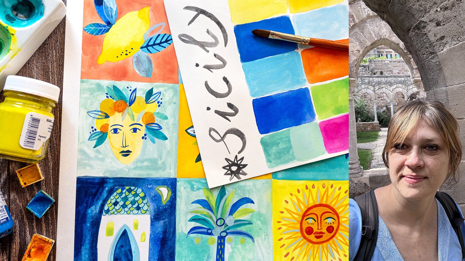
improve your color skills. Hi, my name is Anya.
I'm an illustrator. I illustrate books. I teach here on Skillshare
and I sell my art online. In my artistic voice, color takes a really big part. It is really important. What I notice that often I use it in an instinctive
way without thinking. But I notice that when I
do it in a thoughtful way, when I study colors
and use color theory, my art and illustration
goes to a higher level. In this class, you will know not only what are
complementary colors, but I will also show you when and why you should
apply them to your art. I will show you examples
of great artists, why and when they use
complementary colors into the art. In this way, it will
be easier for you and clearer why and when you
should apply them to your art. I'll show you also
some examples of my illustrations and when I
used complementary colors. I will also invite you to develop your
observational skills. To exercise your
creative muscle. Try to observe colors
that surrounds you. In this way, you
will fix this idea, what are complementary
colors and how to find them? We will do lots of simple
exercises about mixing colors. Then we will create
multiple beautiful, cohesive color palettes and we will apply them to
our final project. The main skills that
you will take out of this class is that you will learn what are
complementary colors, Where to find them in nature,
clothes, and architecture. So you will learn how to
observe and search for them. You will learn where the great
artists use them and why. How to mix your complementary
colors and create cohesive, beautiful color palettes and
then apply them to your art. At the end, you will feel
more confident and conscience about using colors in your art and your illustrations
or whatever you do. So I'm really excited
about this class. I cannot wait to share
with you all my love and knowledge about colors. And in the next lesson, I will explain you better. What is the class's
project? Let's get started.
2. Class Project: For the final project, you will create
illustration based on all the knowledge
that you will learn in this class and based
on the color mixes and color palettes that you will
create during the class, I think it is important
to understand colors. As I told you in the
previous lesson, I often use colors in an instinctive way
without thinking. But once that I
apply color theory, I see that it works
really better. I can really see the difference. It doesn't have to be difficult. I think that learning step
by step, taking baby steps, one color theory at
a time will help you to not feel
overwhelmed already. You will see how many tools you can have within just
one color theory. Also, complementary colors
are very important. It is one of the most important and popular color
schemes that are, that are used in art in
many other contexts. And I will be happy
to share it with you. I think it is cool to be able to create your own cohesive, functional color palette
within several colors. Here are the steps that we
will take in this class. I will basically show
you all the theory. I will show you a lot
of examples in art, in everyday life, in nature, where you can find
complementary colors. We will examine the
examples together and you will see why and when you could use complementary
colors in your art. Then we will jump
into color mixing. We will do it gradually from simple mixing of single colors. Then we will develop
the column mixing. And at the end, we will
create color palettes, also here from simple
color palettes. By gradually adding colors, we will create really developed
beautiful color palette. And you will pick one color palette and apply
it to your final project. I will paint bird with
mixed art supplies, but you can paint with
whatever supplies you want, Whatever technique you want, because it's more
about improving the color rather than
exploring the techniques. When you're ready, I cannot
wait to see your project, so be sure to app it to
the project gallery. You can share with
us all your process, all the colors
that inspired you. In the next lesson,
I will show you the art supplies
that I will use. But first, you can grab
a pen and your notebook. Because afterwards, I will share with you all the knowledge
about complimentary colors. So maybe you want to write
it down. See you there.
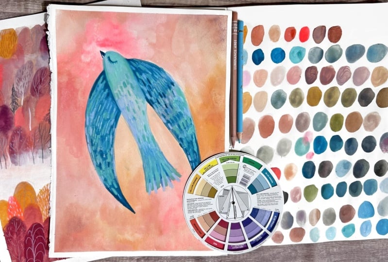
3. Art Supplies: I will show you the
art supplies that I will use for my final project. I will basically use water
colors mixed with other media, but you can use whatever
art supplies you want. If you're acrylic artist, then you can use acrylics, oil colors, and so on. Obviously, we will need pencils and Azor
for your sketches. As for the brushes, whatever brushes
you have at home, synthetic brushes, I have
different sizes and shapes. Because I usually use
different shapes. Whatever fits you best
will work just fine. If you have simple
synthetic brushes, it is fair enough of something for your
water to mix your colors. I often use a rack of
cotton or paper towel. It is always handy. As for the paper, you can use both sketch books. I have this mixed media
sketchbook which works fine. Also colors for
water soluble media, smaller size or bigger, whatever suits for you. For example, I did my exercises for the palette
in this bigger sketch book. Again, whatever format
or size fits you, important that it is
at least mixed media or watercolor paper. If you don't have sketch book, you can watercolor paper. Again, the size and the
type is not important. You can use some better one if you have mixed media works fine. As well as for the colors, I will basically work
with water colors. There are different kinds. Whatever water colors you
have at home will work just fine in those pants or in tubes. I decided to also other
media if you want, you can just water colors, but I will wash for
my final project. Again, different kinds, you
can find various kinds. I have this one in tubes. Those are also acrylic quash
which is another kind of uh, but it's the same if
you have a regular one, I will mix them all
those are regular. In those little ts. For the details, I will
use color pencils, different kinds probably. I will also use those ones. Those are crayons. I often like to mix different kind of pencils
and crayons in my art. Probably I will
pick those as well. If you have some other materials that you usually work with, you can work with
whatever materials you want to because we will
learn the color theory. I will work for the final
project with those materials. But if you want to use
acrylics or for example, markers like this one, maybe I will add them as
well to my final project. Then go for it. You can
experiment media that you prefer. The final protagonist
of our lesson, of our class will be color. It's really handy to
have the color wheel. I will use this big color wheel. There are different
kinds that you can find. It's really useful and handy. But if you don't have one, you can also make yourself one. For example, this one for those two ones that I did for the other class
about basic color theory. You can also watch my other
class if you want to see how to make your
own color wheel. It's also good exercise, invite you to the next lesson
where we will see what are complimentary colors
and how to notice them around you in
your everyday life.
4. Complementary Colors And Where To Find Them: In this lesson, we
will see what are complimentary colors were to search them in your color wheel, and we will also try
to see them around us. We will try to observe them, notice them in your life. So what are the
complimentary colors? First, look at the color wheel
that I'm showing to you. And if we count all the colors that we
have in the color wheel, there are 12 different colors. The complimentary colors. If you buy the color wheel, it should already have the indications for
basic color schemes. And the complimentary colors
are signed with this arrow. It means that they are the colors that
are on the opposite, on the opposite
side of the well. For example, yellow will have a violet as its
complementary colors. If you make a simple
math, accounting, you will see that there are six different pairs of
complementary colors. You can turn around your
color, wheel your arrow, and you will always see which color is complementary
to each other. For the yellow green,
it will be red violet. For the green color
it will be red on. We can say that there are three basic pairs which are made from primary
and secondary colors. It will be yellow with violet, green with red,
blue with orange. Then you have all the
other pairs that remains, Let's say that's very simple. This is the first basic color scheme that
I will show you. And it's indicated by
this arrow. Remember it. If you make your
own color wheel, then you just have to
look at the colors that are opposite
to each other and you have to obviously follow all the colors that are
originally on the color wheel. You cannot make any mistakes here that aren't on
your color wheel. Usually you say you cannot
find some of the colors, for example, pinks or some
different kinds of greens. It's not true because you
can find in the variety of, for example, red violets
by adding white into it. This is another definition that you can find on
your color wheel, the tint, the tone,
and the shade. The tint is the light to
version of your color when you usually add
white to it, for example, you can say that you
can search for pinks in your red violet scheme and yeah, by adding white into it. If you want to search for
complimentary color to pink, you will have to set. Let's search for our arrow. You will have to search in
the tints of yellow green, I don't know, maybe
or pistachio color. It's the same for other colors. If you're not sure
where to search for a color in your color wheel, then you probably
will have to think about your basic
color right here, the basic 12 colors. Which family your color is. You can put in which
family you can put the color that you
are searching for. I think a great
exercise for us is to try and start to
understanding colors. And start to observe, Train your eye to
catch the colors, see the colors that
surrounds you and name them. For example, once you get familiar with
complimentary colors, the pairs of
complimentary colors, I can assure you you will
see them everywhere. Besides the world of art, there are lots of complimentary
colors that surrounds us. For example, you can observe
houses that are colorful. For example, I went to the
Italian isle called Burano, which is famous for
its colorful houses. So it was plenty of examples
of complimentary colors, and not only you
can see them also in some objects
maybe or maybe close Today I was going in bike and I saw a woman that was
dressed with red and green. And that was quite fun. And it's also interesting,
I'm asking myself, if people do that on purpose, do they know that those are complimentary colors
and why do they wear them? Another great place
to observe is nature. Just a week ago I was in forest because it is early spring
when I'm doing this class, the first flowers are showing. And I saw this beautiful
yellow and violet flowers. I thought, wow, this
is, this is perfect. For the class that
I'm preparing, I made some videos for you, but they are basically
everywhere in the nature. Again, I'm inviting you to try to exercise your mind, your eye. It is also a good exercise
for you as an artist. So then it will be more
easy and automatic for you to choose some
colors in your work. If you want, you can share with us with the discussion panel or within your project gallery
the colors that you observe. Maybe you did some photos, maybe something that inspired
you for the final project, it would be really great if you would share with
us your observation. In the next lesson, we will explore the
main characteristics of complimentary colors
and how famous painters use them in their art.
5. Use Colors Like Famous Painters: Welcome to the lesson that
I'm most excited about. This lesson will be about characteristic of
complimentary colors, but also why artists decide
to use them in their art. I don't know how about you, But I'm really fascinated by the story of art when
I'm in the museums. I really love to know why and what stand behind the
certain paintings. I'm excited to analyze
some of the paintings with you in the key of using
the complimentary colors. I will show you also
some examples of my illustrations and use of complementary
colors in my work. The first main characteristic
of complementary colors is that they create a very vibrant high
contrast relationship. When you use a painting, for example, you would use
only two complimentary colors. For example, in no
yellow and violet, you create a very high contrast. Let me explain what
it exactly means. In the meantime, I will show you examples of the
famous paintings. Claude Monet once
said that color makes its impact from contrast rather than from its
inherent qualities. And the primary colors seem more brilliant when they are in contrast with their
complementary colors. What he meant by that
was, for example, in his painting
that you can see, red has no meaning
or power by itself. But when paired with a
complementary color, which is green, you are able to properly see the richness
and warm of that red. The same for violet and
yellow as you can see here or in the Vangog
famous painting, et cetera. So complementary colors
basically provide striking visual effects
when paired together. So artists and designers
often will place complementary colors next to each other to increase
the contrast. This makes the other color
appear more vibrant. And using a color which is
its complementary color, we'll emphasize them both, making them stand
out to the viewer. As we saw with the irises, the irises really
stand it out and make the violet and
yellow really bright. Also, in the self
portrait of Bangok, you can see how usage of blue and orange makes the
color so bright. And it seems like the head
of Vincent is standing out. You can also add some
kind of tension and drama to your art by using
complimentary colors. For example, the
Night's Cafe that you can see here by Van Gogh. He wrote to his brother
Theo about this painting, that he tried to express
the terrible passion of humanity by means
of red and green. He wanted to create
attention in this painting, this was the first
characteristic. What can you take for yourself from this first characteristic? Well, basically, if you like bold and striking
contrast bold colors, then you probably would have to explore this color theory. I will show you
some of examples of my drawings where I use them. Basically, I really like a
bold and vibrant colors and it is a part of my artistic
voice to use colors. Let me show you other some
of my illustrations and it will be fun to comment
a little bit together. Probably already are more aware. And you can see
that here we used red and green primary colors. Because the background is white, the contrast is not so high. But still the
colors are striking and quite vibrant were
put next to each other. Here you can see some
other examples of complementary colors
with white background. For example, instead I use the green background and the butterflies are
reddish orange. And you can see that you
can see them immediately. Or for example, here I
use the very bold colors, yellow and violet
and bluish colors. Here you can see a real
vibrancy of the colors. As for the drama and tension, I tried to create it
in this illustration. I also wanted to represent
some kind of piece that gives the forest. But it was the illustration
for a story about a man who was lost and was
searching for himself. With this kind of colors, I think this kind of
tension was created. But you don't have to
necessarily use bold colors. You can also use complementary colors
in the background that is more neutral in order to create focal
points to gain your attention. That's why you can use your complimentary colors for the composition in your art. For example, in the
bluish violet mountains, if you put orange G point, it will attract your attention. Artists often use
complementary colors to draw attention to
specific elements, emphasize particular features, and to create focal points. By planning the
color composition and color scheme in a painting, you can create a dynamism and a sense of movement
in your piece. As you can see, it is
very useful for you, for us as an artist. For example, here we can
see another example. This time my painting. Notice how the blue and orange
and in the other painting, red and green placed
next to each other. Make that area of painting stand out and draw your attention. Or another example. Here in the Gas Edgar Degas
ballerina and Lady with Fan, the ballerina is the focal
point in the painting. The warm orange tones
brings the figure toward, against the muted background
and cool blue stresses of the other ballerinas and the purple blue tone fan
of the lady in the front. I will show you one of my examples where I used
complimentary colors. For example, in
this scene, again, about the same story about a man that was
searching for himself. In this scene, which is quite dark and there are
blues of the ocean, I used a line of yellow, orange color in order to show the direction and to show that there is a
boat which is dark. You cannot see it. Probably
without this yellow color, you wouldn't noticed it. So another characteristic,
and something that may surprise
you a little bit because we were talking
about all this vibrancy, is that complementary colors can create a totally
neutral palette. You can create browns, grays, all the muted and neutral colors by mixing two
complementary colors. And we will dive into it in the other lessons and you
will see how to do that. We will mix all the colors. Just right now,
be aware of that. If you're not about all the
bold and vibrant colors, it doesn't matter
because you can totally create some beautiful, coherent piece by creating
the palette of neutrals. And then you can
just put a focus on one vibrant spot if you want. And this knowledge about mixing
neutrals is fundamental. Many professional painters use complementary colors in order to create not only
neutral colors, but also shades
to a basic color. Artists began to become particularly aware of
the significance of complementary colors
after the development of scientific color theory. So it was more or less
19th 20th century, so all the impressionism, post impressionism
as well as fauvism and match mother painting
used this theory. And impressionists were the first to note that
the shadows are not neutral but are the
complimentary color of the light that throws them. So for example, yellow sunlight
throws a violet shadow. And this can be
seen very well in Claude Monet's woman seated on a bench in the crease of her arm and the pull
of shadow at her feet. The last reason and
characteristic that I want to show you here is that
with complementary colors, you can use beautiful,
cohesive color palettes. Famous painters did, they
used color palettes. They were masters
in creating colors, in combining colors
and color palettes, Thanks to this one color scheme, you can do it as well. You can be a pro and create cohesive,
functional color palettes. Okay, I hope this lesson
was helpful for you. I know it is not a lot, there are a lot more examples. There are books about
color theory in art. But maybe it intrigued you
to study more this topic. It would be wonderful, but maybe you already
are inspired. If you want to
inspire yourself and your final project also
by some paintings, that it would be wonderful. Let's jump to the next part of this class where we will
start to paint actually. And we will start with basic
mixing. See you there.
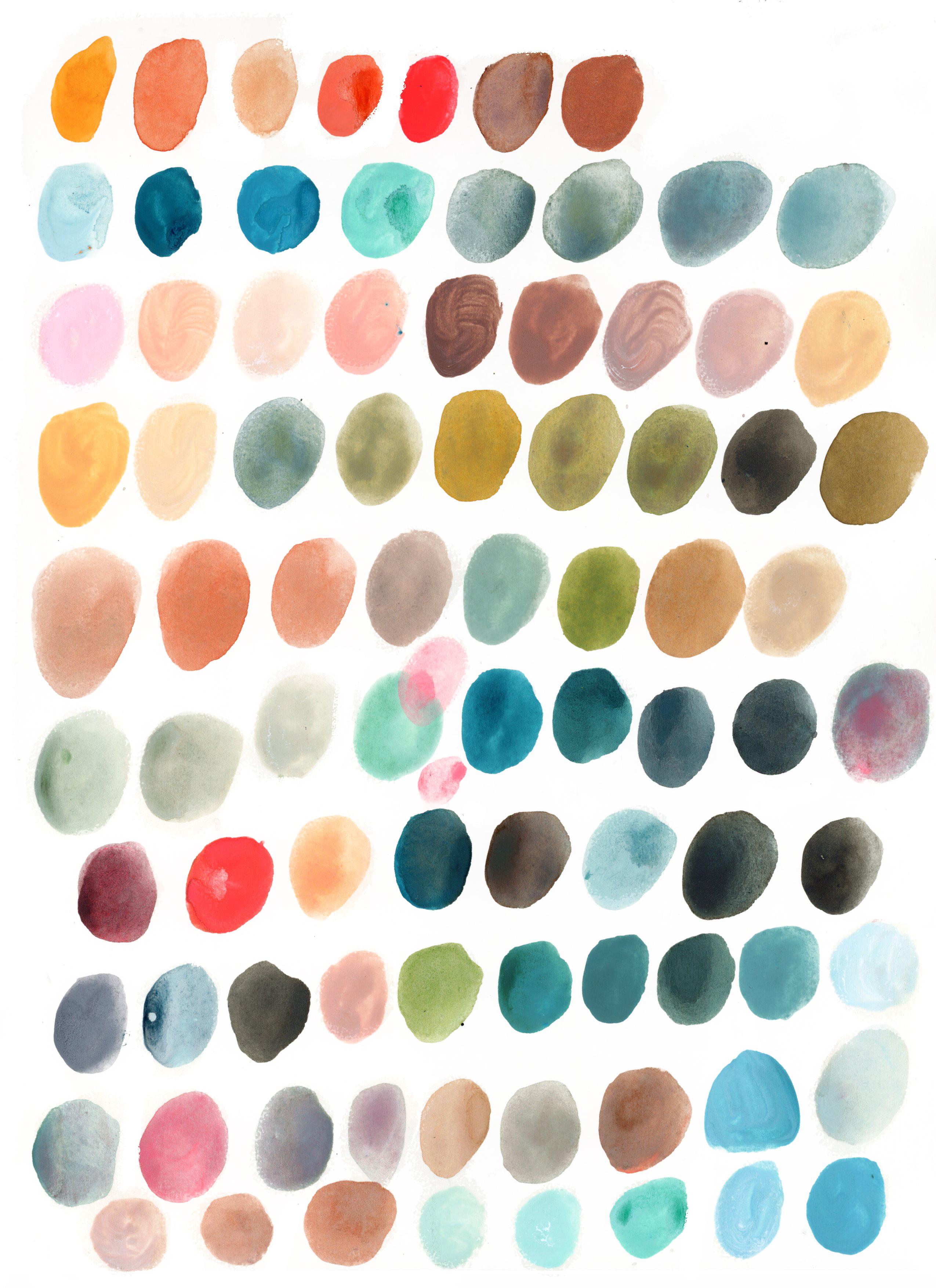
6. Mix Complementary Colors Part 1: Welcome to the first
lesson about mixing. We will start to mix and we will do our lessons and mixing
practice gradually. Right now, we will start
from the basic theory about mixing two
complimentary colors and we will see
what will happen. Okay, so let's start mixing
our complimentary colors. I prepared for this lesson, Three pairs, We will mix just three basic
pairs of colors. If you want, you can do all six. Let's start with the basic ones. The first one is
yellow and violet. So I prepared my
watercolors here. Blue and orange as well, and red and green. I will start
swatching both to see what kind of yellows
and violets they are. I tried to pick the most ones. It means try to search
in your set for colors. If you want to swatch
the basic pairs, the colors that are not
too warm and not too cool. What I mean by that is
if you are searching for your yellow for
swatching, try that. It will be yellow like this one. Not the orange yellow or not. The green yellow which
would be cooler. And the orange yellow
would be warmer one. The same for violet. If you have in your
set more violets, then again pick one that is between the warm
and the cool violets. If you don't have violets, then you will probably
have to mix it up, but I assume you have one. Otherwise you will have to
create it from scratch. Let's start with the first
pair and it will be yellow. You will make a small
swatches to start. This yellow is okay. Now, let's take our violet. Yeah, I thought so that
maybe this one is took. This one is too cool. I will see if I have
some other violet in my set. I think I don't. What I will do, I
will try to mix some blue into it. Warm blue. I have this ultramarine violet. Let's see what will happen,
probably. This one. This one is better. I just added this ultramarine
violet into my purple, which was too pink
in my opinion. Okay. So you can do the same if you don't have
a good violet in your set. Okay. So what I would do, I would use this one, which is more like a pinky one, to swatch probably
red violet, I think. Okay, So there's my first pair. I will keep my violet for later on because we will use
it for the next step. But first, let's
watch all the colors again, orange and blue. Yeah, this orange is fine. Who? I have the then I chose this blue
sky, blue, mountain blue. It is quite neutral but
if you have ultra marine, probably you can use it as well. Yeah, I think this one is good to be considered
basic classical. And the last pair
is green and red. For the greens I picked, green which is, this
is quite normal, basic green, Not too
dark, not too light. Again, if you don't have
a green in your set, you can mix it on this red, this is cadmium red light. I have to see if it's not
too cool. No, it's okay. All right, so here we have
three pairs of our colors. As you can see, they are really
vibrant and create this high contrast if you
can see next to each other. Okay, but we're in
this lesson to see other property of the
complimentary colors, which is creating the archer saturated
version of the colors. We will start by swatching again our purse, for example, yellow. I'm picking my violet again. What I mean by that
is if you want to saturate your yellow or have a darker
version of your yellow, you would have to
add violet into it. Let's try it. What I will do is I will paint
directly on the paper. I have my yellow. Now I'm picking the violet and I'm adding it
directly on my paper. As you can see, it creates this muddy brown
version of yellow. The more you add, the
more violet you add, the darker and the
saturated it becomes. Often, artists use complimentary colors
to create shadows, to create darker
versions of the color. For example, if you want to paint lemon and
you would like to create darker parts like shadows or some parts
that are darker yellow. Then to mix brown, this dark yellow that you want, you would have to
add violet into it. And that's usually what
professional painters to. Now you know it as well. You can use it in your art. To be honest, I often
talk about this topic, about these properties of complementary colors
in my other classes. Especially, I dive into it during my other course
where I explore basic color theories and I do
the exercise of shadowing, so you can also have a
look at the other class. The same for violets. If you want to create
a darker violet, more saturated violet, we
will have to switch colors. I'm running out of space. Probably I will have to
swatch smaller pieces. I'm taking my yellow
and I'm adding it directly to violet. Probably my violet
was too light. Now you can see that
the yellow is stronger. I will add violet again
while it's still wet. You can mix your colors. Probably the difference between
those two isn't too big. But this is considered to be a darker, the
saturated violet. And this one is
saturated yellow. You can experiment with
different amounts of colors. For example, if I have
added less violet, maybe it would be
different, the same here. So it's all about
trying and testing, but the rule is quite simple
and I hope it was clear to you the last two pairs
I made in high speed. Because I'm sure you already get the idea of how to
do this exercise. You can do just three pairs of basic colors, primaries
and secondaries. Or you can do all the six pairs if you're interested in it. If you are not happy
with the result, you can do more pairs. You can do just
tiny tiny watches and see what mixes works out. For example, here
I'm adding green again because I thought the
color is not really correct. So it's all about
understanding the quantity of, quantity of colors
you have to mix. Okay, so now we can jump to
the next lesson where we will extend this
basic color mixes.
7. Mix Complementary Colors Part 2: Welcome to the
lesson where we will extend the mixes that we
did in the previous lesson. We will develop the
skill of color mixing. See them. We will work always on the basic three pairs that we
did in the previous lesson. This time, it will be handy
to mix it on your palette, not directly on the paper. What we will do is that we will start from swatching
the first color, in this case, my yellow. On the other side, we will put the
complimentary color violet, which I premixed here. Here we have our first couple. What we want to do is to exercise ourselves a
little bit to understand the quantity of
color that we want to add to the first color. And try to see different hues and shades
that it will create. To do that, I will
add a little bit of the violet every time I will swatch it so
I have a yellow. So let's add a little bit, just a tiny bit of violet. And you can already see
that it's changing. I will add a tiny bit
of violet each time. As you can see, gradually the
yellow is the saturating, it's becoming more
brown and muddy. And that's what is
supposed to happen. Now it's becoming
more yellowy violet. The last watch rhyme
Basically mixed everything together gives this
warmy saturated violet, which should be more
or less this one. Again, I will do the same thing with remained two pair of
colors with blue and orange and red and green. Here it is. This is how I did this exercise. It's useful to do it
because in this way, you fix this idea
in your mind that in order to saturate one of
those complimentary colors, you basically just have to Milo. Thanks to this exercise, you can see the different
shades that you create, different hues that you create. For example, if you want
to paint the famous lemon, then you know what quantity
of violet you would have to use to add to your yellow. As it's funny to see how
many different hues you can achieve by mixing just
two different colors. That's very interesting.
If you want, you can swatch all
six of colors. I will stop here. Another thing that I
wanted to tell you is, yeah, this exercise is
useful to fix this idea. But also I'm thinking about the names of
complimentary colors. You can think in both ways
to fix this kind of idea. First is that the colors near
to each other are vibrant. But when you mix them, they are not vibrant. They are the
contrary of vibrant. This is one way you
can fix this idea. The second one is the name
itself, complimentary colors. When you say complimentary, you can think that they
compliment each other. But when you mix them together, they compliment each other. So it means that they
cancel each other. They basically become opposite of what they are when
they are nearby. They enhance each other, but when you mix them, they cancel their
vibrant properties. Okay, so that's it
for this lesson. I hope you will try it as well. And if you want, you can share it with us within your project. Let's jump into the other class when I will show you how to create your first
extended color palette.
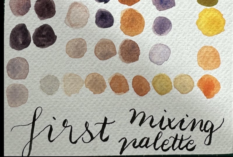
8. Build A Color Palette: Welcome to the
lesson where we will build our first color palette. Before we will do that, let me show you first the
palette that you could create by mixing just two
complementary colors. Here you can see
an example of red, orange, and blue green. You could create
this palette only by mixing the two colors. I won't do, I will skip
this step because I wanted to jump into more
extended palette that you could create by
adding some additional colors. I will explain you
everything in the lesson. Which colors should
you add and why. But yeah, if you want, you can also start by mixing
just two basic colors. Which is basically the
same what we did in the previous lesson just
in an extended version. Let's jump into the part
when I will explain to you how to create a little bit more developed and
extended palette. In the last lesson, we created the range of colors which could be considered already a
mini color palette, but it's quite
limited right now. But you can see
that you can create a range of colors right now. We will extend it
a little bit more. Right now, I will
pick one of those two to create extended
version of it. I want to do all three
of them. Just one. The same system can be applied for all complementary colors. I will choose red and
green for this exercise, for this extended palette. What do I mean by
extending colors? If you remember, I
already told you about different shades
and tints of your color. On your color wheel, you can see that each color have its own tint,
tone, and shade. Tint is when the
color is brighter, lighter, you probably
would add white into it. Or if you're a pure
water colorist, then you would have to just
dilute it with water anyway. It's the lighter, brighter
version of the color. Tone is the version
of the color which is a little bit darker in shade. It's the darkest color. For example, with water
color you would add white. The color will says its own. For tone you would add gray. And for shade you
would add black. We will do it for this
extended palette. Let's get started
without further talking. We have two basic colors and
to which we will add black. I'm not sure if the black
is the best solution. It's really very dark. I will use it, but
I also wanted to try to use other dark colors. Not a pure black, but sepia, which is neutral, dark brown. I also have in my
palette neutral tint. I will try those three and I will see which one works best. If you have only
black, then go for it. If you have only dark brown, for example, you don't have
black, you can also use it. Or a dark gray for example. You could also use as well some alternative dark
color for black. Also, you will need white color. You can also use diluted
version of a color, but since I'm not really
traditional pure water colorist, I don't mind to mix it
with a white color. I will use white water colors Basically do exist if you have a white
color in your palette that probably it and two colors. Mix all together
in order to create extended version
of this palette. This one. Let's get started. You can switch your
colors into palette, or, I don't know, mix them
directly on your paper. Whatever works best for
you during the process, I will get messy. I will see what will happen. But for now, I
will try to swatch all the colors to have
them clean on my palette. Probably later on,
it will be a mess. They will be mixed altogether. This is black, is
this is neutral tint. What I will do, I will swatch the pure versions
of colors beforehand. Before I will start mixing them, it's handy to have
your water nearby and also your rock or your paton. My paper towel is quite, but I still can use them. This is clean red. This is my clean green. This is my clean black CPR and neutral Tens. I also swatch white. Why? It probably
won't be too visible. But I will know at least what kind of colors
are used for this palette. If you want, you can
name them, for example, you can write the
names of your colors. For example, sub
green, cadmium, red, light, neutral tint,
and et cetera. I won't do it this time. I will let my self
into the process. There is no system, you can do it systematically. And for example, mix first
all reds and greens, and then all red and black,
neutrals and whites. We could do it, maybe it is a mode to have
it a little bit organized. I can start it like this
and we'll see I'm usually no systematic and
ordered person. I usually get more into the Celtic
process of creating. But for the purpose
of this class, I'll try to be more systematic. I'm not promising anything here. The purpose is to explore
different color mixes. Doesn't have to be logic. Now, we can make, for example, red with black and
see what we can do. For example, I could
name them somehow. I can write 123456, for example, if we
are trying to be more schematic and systematic.
And this would be. One and two maybe in the future if you
want to pick color. You know already what in of
mixes did you use? Why not? We can try to be more, more good at this now. Let's do no, you
already messed it up. I wanted to do one
and three instead. I will do two and three. Oh, well, never mind. But yeah, I can do green
with all dark colors. That's it. Now I will try to make
the same with red. So I will mix red
with the dark tones. Oh, I love this neutral tint. It gives really violet
vibe into the mixes. And the red starts
to be more muted. Violet violet version.
Here's red with, here is red with a
lot of black blue and eyes seems like a
deep dark violet. It's kind of
interesting, you know, to see all the, all
the things you can do. Okay? I will write
here that those are one and two plus three is no six plus three,
four and five. What can we do now? We can add whites into red and
whites into green of. Let's start with red and it
creates the slovely pink. I'm only adding white with
indifferent quantities. Obviously you will have
different shades of pink. So I will do the same
with green here. Basically, we mixed all
the colors between them. But now what we can do
is to mix all together. For example, this with white, the mixes of red and green, with white or in between them, what I will do is I
will try to swatch the browns that I created and basically
mix a little bit altogether with whites
and see what will happen. For example, there's a
little bit of green, a little bit of red and white, and I love those colors. I'm mixing pink with green. You can see that you can create lovely grace at the
end or besh color, it's mix of pink, green and white also cool to mix white into
the mix of dark green. Which actually don't give
you the green this one, but it gives you
another type of green. Again, you can mix again
some of black or sepia. As you can see, there are infinite possibilities
of creating the palette. Because I'm running out of space and I'm still
adding new colors. Actually, I'm loving
the new mixes. I will add it over here, even if it's not the right place to them, but I don't mind. I'm adding now black into the pinky base mixes and
I'm really enjoying it. It created those neutral, really beautiful,
neutral and green gray. I created this palette
for greens and reds. As you can see, I
used all the page. You can use a larger
space if you need to, if you want to extend it. Furthermore, you can use less space if you don't have
all this need of exploring. But I encourage you to
really give it a try. I will show you the mixes I did, which take only
half of the page. You can also less
space if you want. This is the mix of yellow and violet with white and black, yellow, orange and blue, violet, orange and blue, red, orange and blue, green, which is
really, really lovely. Red and green,
which is this one, shrinks in less space. The last one, which is red, violet and yellow green. I hope you enjoyed creating
your first color palette. And in the next lesson, we will bring it to
the higher level, because I will show
you how to extend it furthermore and create
beautiful cohesive palettes.
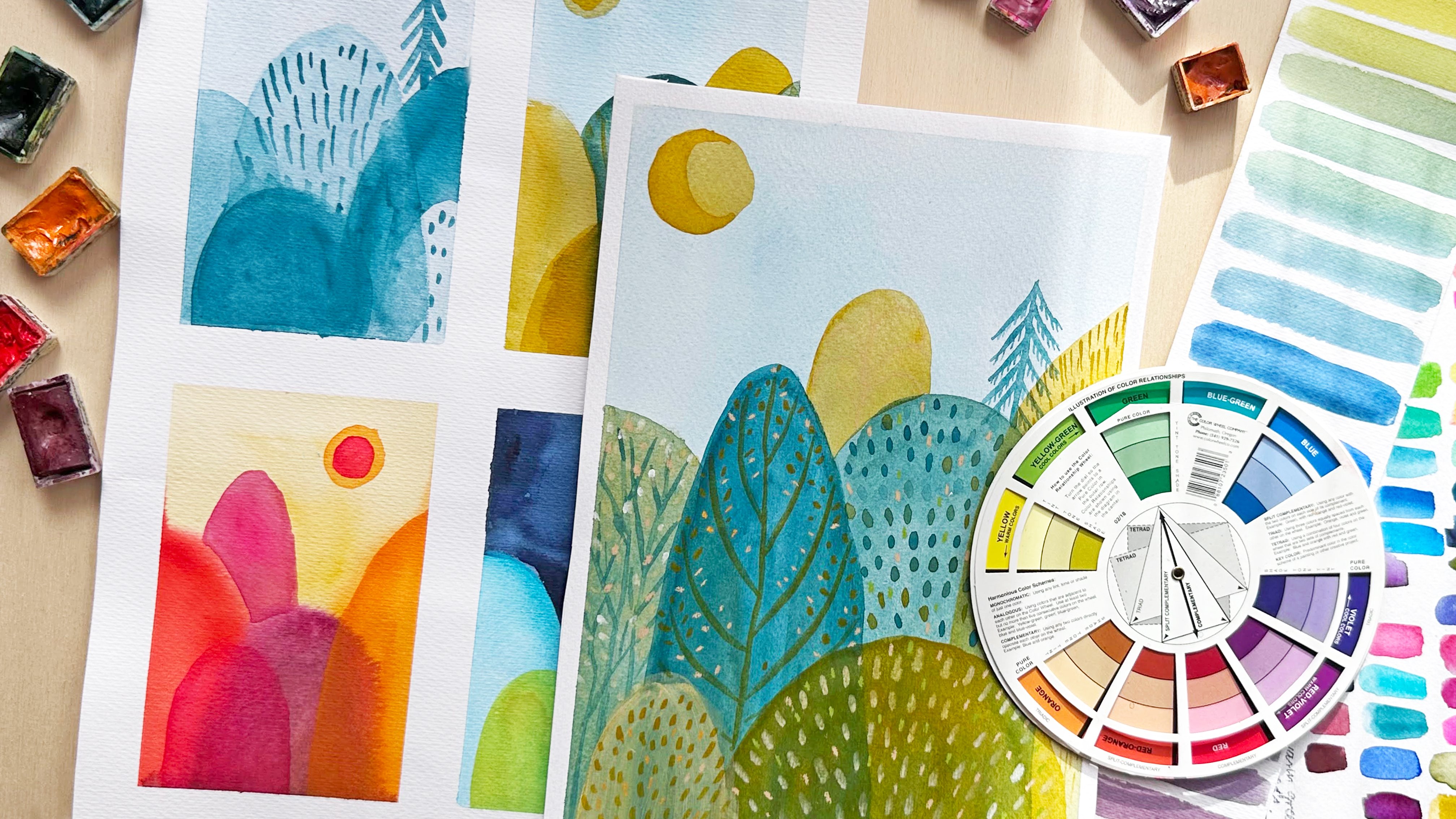
9. Extend A Color Palette: Welcome to the
lesson where we will create our last color palette. Most developed
color palette that you will use for
your final project. We proceed gradually. First, we started with
smaller color palette, with mixing just two colors. In the previous lesson, we added black and
white to our mixes. In this lesson, I will show
you what other colors can you add in order to create extended, beautiful, cohesive
color palette based on complementary colors? At the beginning, I want to
explain that you can work on the palette that you already
did for the previous lesson. Or if you did all the six complimentary
color palettes like I already showed you. For example, those are my palettes that I did
for all the pears, yellow violet, et cetera, all the six that are
here. This one not. I will pick my favorite one for the final project that
inspires me the most. You have two options you can rather work on the one that you, if you don't want to
explore other six palettes, or if you explore
other six palettes, pick the one that inspires
you, that you prefer. For example, I know the palette that
inspires me is this one, red, orange, and blue greens
on the color palette. This is the one. This is
the complementary pair. What I mean by extending it, this is my base, this is my
already extended palette, but I want to expend it. Furthermore, what I mean
by that is that I want to extend the range of
my complimentary colors, not only using one red, orange, and one blue, green, and white and black
of which are already there. But I want to extend
those two colors. What I will do is I will pick something between the
colors that are nearby. Red, orange. For example, I could use red, orange, and orange, which is nearby. Blue, green, and blue. It would mean that you would a pair of complimentary
colors in your color palette. I hope it is clear. I'm not sure if I will use
orange or if I will use blue. But I will explore in between. I will explore those
turquoise colors, different shades and tints, maybe that I already
have in my palette. For example, I already
prepared something that could be my palette with
which I want to work on. As you can see, I have my different kind of
blues and greens, which are in the family
of bluish green. Turquoise, for example,
maybe is more blue. This one is called Pale Aqua. It's cobalt water,
something like that, but it's still the same family. For example, I have this cascade
green from Daniel Smith, which is a granulating color. And have this lovely deep green, which have this granulation
which goes into blue tones. I have different kind of my water colors if you already know me and if you did some other
classes with me. I really love the
granulating watercolors. So I picked some of them. This is Schminke Glacier Green, which is one of my
absolute favorites. I have forest blue
from Schenker. This one is shire blue and this one is not
granulating one, this one is cobalt turquoise. This family, for
example, for my oranges, I picked something that is in the family of warm oranges because it should be red orange. But yeah, I picked
something that I have in my palette that could be
considered warm orange again. And watercolor because I
will mix them altogether. You can use only
watercolor if you want. You can use only Gh. It's up to you or
even other media or mix them, as I will do. I have this granulating
galaxy brown, which is really nice,
warm orange, brown. I have a water colors again, since I want to
extend my palette, I want to use only oranges. I will also use pure orange. Orange is already warm, but not red orange. I will see if I will, Tom's, this orange is red. I will also use some extra
colors to my palette. What I mean by that is that
I will use favorite colors, which are flu colors
and metallic colors. I really like to add
them into my art. You don't have to use it a lot. It's really sometimes about
adding just a small quantity, but it creates really
lovely contrasts. For that, I will use Lumi red from Turner,
which is acrylic. Gh, Copper from Talents, which is metallic color
I really like it of. I will also use white
and my neutral darks in order to create shades
and darker colors. There are quite a lot. Of course, you can use some
other smaller quantities. If you don't have so many kinds, then whatever you have, I mean, it could only be
three for contrast, for your complimentary color. Also, this could be
indication for you on which kind of palette
you would like to work. If you know that you
have a range of oranges in your palette and
your art supplies, then for example, you
could give it a try again, art supplies that you will use. If you want to continue to work only with water
color, it's fine. This class is not
about explaining or exploring the art mediums. I will use gash more or
less like water colors. They won't be too thick. If you don't feel comfortable, then you can stick
to water colors. Okay, so let's get started. I have color palette, but I will use it until, and it will be, it
will run of space. Probably really in a quick way, I think that may even
have too many colors. I will probably, for example, is very similar
to the other one. I will eliminate it. What else? I think, oh, it's terrible to
eliminate colors. This one, because I already
have orange in my palette. Let's start with
Swatching, pure colors. Those are the basic
colors I want. Swatch, white and my
neutral dark colors. But obviously, I will
use them in the mixes. Now I want to be systematic. I will just try to mix different blues and
reds here and oranges. And mix them also with white, black, A, and see
what will happen. Okay, I finished. I think I will call it done. It was quite a messy process, but I really enjoyed it. Obviously, you can go
ahead without ending. You can add, add and add, especially if you picked
as much as I did. But it's not about testing every possibility
that you can have. Obviously, you can explore it
more and more if you want, but it's more about getting
into this understanding. What does it mean if you
mix orange with blue? What kind of neutral
you can get from it? For example, I achieved
really lovely, lovely grace from mixing
turquoise, orange, and white. It's about creating more
or less the palette. It's already, it's
already really extended. You can add more swatches, but I will stop here. I already like it. I have my dark, I have my bright. I already think that I could
create some scene when the background would be cooler
and lighter in the front. You can paint with darker, stronger colors may be warmer. It's also good to
think that you can create backgrounds
with some colors. It can also suggest to a theme. For example, this one
is quite wintery. I think a lot of turquoise
blues this orange gives me, makes me think about maybe
fire, maybe a light. But there are also nice greens, but quite muted green. Those are good for also greens
that are in the winter, that are dead, that are faded. It also suggest you something that you
would like to paint. I hope you create a
beautiful color palette. I cannot wait to see it. And in the next lesson, we will start to create drafts for our final
project. So see that.
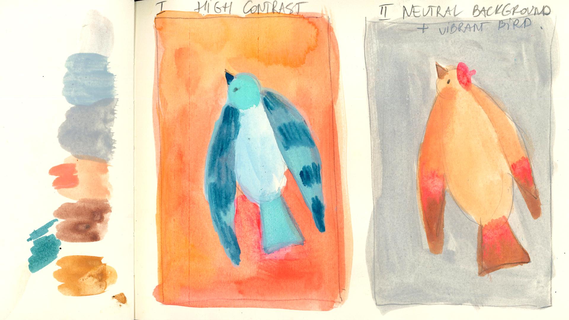
10. Color Drafts For The Final Project: Welcome to the
lesson where we will draft color schemes
for our final project. Don't worry, it won't
be nothing difficult, or complicated, or long. I just want you to
get the idea that it is useful to create
drafts of colors. We will do just two
drafts of color. And it will be useful
because in this way you will understand which color
combination works better. What color combination
or mixes you prefer. The vibrant colors or
the neutral colors, and in what combinations.
Let's get started. As you remember, we can use complimentary colors
for two, in two cases. One, it would be by using a bold contrast to
highlight the contrast. A vibrancy of the color. I will show you
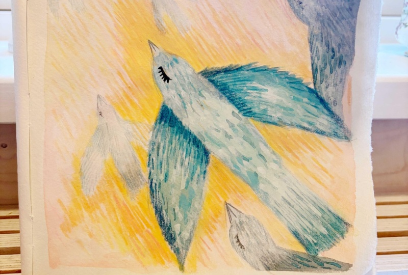
the example of one of my drawings, this bird. You can see this
orange and blues, which are not even
a bright blues. I used a darker blue, but it gives this idea of
contrast of bold colors, of very vibrant art. As you remember Vangcusic, there's a lot of artists, illustrators, that use
this kind contrast. The other way would be to
use more neutrals that you achieved by mixing
your complimentary colors. For example, here I used a toned blue grace to create
a background and a bird, which should be more orangy. But it gives you the
idea of more toned, more muted colors that you can
use for your illustration. In this case, you can use your cool and neutral
grays, or blues, or brown, the colors
that you have in your palette to create
a toned background. This illustration is example where the contrast is not high. Your bird or your element of the illustration
can be more vibrant. More contrasting At the end, I want you to choose, pick the draft that you prefer. First, we want to draw a
draft for our illustration. Think of what you want to draw. I suggest you something easy, because we want to focus
on colors right now. I don't want you to be
stressed about the outcome. What do you want
to draw? Think of something that really
comes easy to you. For example, for me,
those are birds. Usually, I love to
draw birds or trees, those are my obsessions. It comes really easy
for me to draw them. Think of something like that. If you like birds as well, I will draw birds then go for it if you,
for example, prefer, I don't know, flowers or
even geometrical shapes, something that
really excites you. Then go for it. We will
prepare two drafts for this. For our final project, I will work on four. I will more or less draw rectangular formats that
represent my final format. I will work in vertical format. I don't know. I will paint a flying bird. That's what comes
naturally for me. Okay, And the same, exactly the same bird here. Right now we will
study the colors. As I told you, one
of the drafts I want to make high contrast
illustration and the other one will base on neutral background plus brant bird. Or maybe not vibrant. Maybe I will just put some element that will draw the attention to
the bird we will see. But more or less, I want to have the neutral
background base. I have my colors
that I for the salt, I have them right here. Those are the water colors. I will give the warm background and the bird will be blues. And in this case, contrary, the background will be muted, gray and blue and
the bird will be. That's why we make the. If I don't like it,
I can always make other samples and see
which one works best. Let's get started. I'll keep my color palette as a reference. I will put it nearby
me, you won't see it, but I want to know the colors
that I want to recreate. Okay, so I created
my background. I basically mixed different kind of oranges that I
have in my palette. Blended them in wet,
on wet technique. More or less, I let the
color blend into each other, different kind of oranges. I put some of my as well. I will start with
something lighter, so you can always start easy and light and
then build up the drama. The contrast. I can make our wings D, This tail maybe was too dark
and draw too much attention. I dubbed the color. We can draw attention
into wings for example. We can add more
contrast to the wings. I just decide to highlight one element of
the bird. It will be wings. Okay, so this is my first draft and now I will skip to this one. Right now, I'm searching to
recreate neutral gray colors. I would like to
make it warm gray. I don't want this cool
and warm background. If I remember well, it was about mixing white, a little bit of warm orange
and some blue into it. It's also a great exercise
of mixing colors, understanding how you can
create some of the colors. This is the gray. It's okay. But maybe it's too orangy, so I will put some
more blue into it. Yeah, I think it's okay. I'll try to more of the color with a bigger brush because
it's too translucent. Maybe I put too much white. Oh, it's tricky. As you can see, I'm struggling here,
but it's okay. It's all about exploring. So here's the color now. It's too cold right now. As you can see,
it's not so easy. Not always easy. Let's try right now. Yeah,
it's much better. Now you can see I
created those 2 grays. One is cool, one is, I'll go for the now because I want to have less
contrast this time. So here it is. Here
is my warmer gray, and now I will make for a bird. More or less. I'm ready. Obviously. The final illustration
will need more details. For example, I, I. But here I can see more or less the direction
of colors I can take. You can prepare more
drafts if you want. You can, for example,
flip the colors. Make blue here and orange there. I could do much more drafts. Right now, it's about
choosing between those two. Which one you feel like? I really love colors. I more naturally use
more bold colors, but I'm also attracted
by this one. But what I could actually do
is to add a highlight here. Because otherwise maybe it's, it's too muddy for me. If it's your style,
that's absolutely fine. But I always like to
add some highlights. This could be details like
this or I don't know, a hat, maybe a scarf. Okay, those are my
two drafts where I developed the first rule
of complementary colors, where the contrast we create high contrast by painting two complimentary colors nearby. The other one where I explored more neutral colors that we can create by mixing
complementaries. And the theory that you can
use it to your composition. I wanted to draw
attention to the bird. I tried to put some high contrasting elements
in the bird, but still it's more neutral
version of my two drafts. Right now, I'll have to decide
which one I want to use. I will pick this one because
I really like colors in my, this is part of my
artistic voice. I want you to choose
the draft that you prefer that represents
more your voice. If you prefer more muted, neutral colors, probably
you will choose this one. It's up to you. It's
up to your decision, decide which one you prefer. Okay, now that you
prepare your draft, we can jump finally
into the lesson where we will paint
our final project.
11. Final Project: Welcome to the last lesson. We arrived finally to draw
our final illustration. But all the lessons from
this class are important. If you arrived here, you're probably already full
of knowledge and inspired. I hope it will be more easy
for you and now you can enjoy the effort that
you put in this class. In your learning. Let's jump into the painting
of our final illustration. Before, remember
that you can use other art materials
that you prefer. I will use mixed
media or you can use just one art supply or
some other art supply that you It's all about using
color with purpose. With understanding
the supplies that you use is not the most
important thing. Also, I want dive deeply into the techniques that I will
use to paint the bird. Because those are the techniques that I explained
in other classes, you can follow my steps or just feel free to use the
technique that you know or prefer and would like to use to create your final
colorful project. Prepared my sheet of
watercolor paper. I like to leave white
margins and to fix my paper, but I also like to
move it around. I won't fix it
directly to the table, but to the back of this block, you can do it the
same or you can paint directly in your
block as you prefer. Okay, so now I will
sketch my bird. I want to maintain
the same composition, but I think I will make the wings bigger so
they will really draw attention and we can really be creative with all the colors that
are on the wings. We can start to paint. They will start from
the background. I have still my
colors that are wet. I think I will use
wet on dry technique. What I mean is that I will join colors without
wetting the surface before. And I will mix different kind of oranges and let them blend into each other. As you can see, I'm
mixing my oranges. I let the colors do their work. I'm not trying to control it. The mixes are
basically the effect of this random blending
that I don't control. I'm adding white areas, can be a little bit lighter. Now I'm mixing
grays for the bird. Grayish blue tones. I want it to be light at
the beginning so I can layer up contrast and
darker colors later on. I'm starting up with
basic cool gray layer. I'm building up blues into it. It will become darker
with next layers. Since I told you that I want the wings to be a focal point, a point where is the
biggest interest? Where I want to draw attention. I will create a
contrast on the wings. I will try to build
up a contrast. I will try to make them a little bit more
details on them. I'm building up those layers, those details and contrast. I'm working basically with
wet on wet technique. When the color is still wet, I'm adding another color. But sometimes it is also
a wet on dry technique. I'm basically trying
to blend colors, the slowly colorful
pattern and texture. Right now, I'm adding into the colors some
other art supplies. I often add water
soluble crayons and pencils into the
texture of my drawings. I also did a separate class
about this kind of technique. Basically, I'm just playing
with mixed art supplies. I am exploring blue
greens, blues, cool colors in a range of
the complimentary blue, green and blue family. In order to create
other contrast, I can layer some brighter
colors on my base layer. For example, this green is
quite light turquoise green, which is brighter than wings. I'm willingly adding contrast
into my basic colors, It creates a vivid,
vibrant contrast. Also, I will add
some light spots on the wings to create a higher contrast between
darker and lighter colors. It will also help to create a spotlight that
will draw our attention. You can see the wings
are I created contrast between the main body and
the wings of the bird. They're standing out more
than the rest of bird. Let's continue building up
those layers and those colors. I'm adding last
touches, last details. I'm building up a
contrast of the wings, the details and texture. I decided to call
it done because I think it's better to
stop earlier than later. Here's my bird and
I think it's okay. And it created the
effect that I wanted. It stands out really well, and wings are the main focus. I'm also happy about the colors and the
palette that I created. I'm also very curious about
the palettes that you use, the color combinations
that inspired you. So be sure to share it
also within your project, we finished our
final illustrations. I'm very happy, be
sure to applaud it. But before we will
finish the class, I invite you to see the
last lesson where I will give you the final
information. See you that.
12. Final Thoughts: Congratulations, you made it. I really hope you
enjoyed all the process, all the journey that you took. That now you feel more
confident about colors? Yeah, I hope that it is
the main thing that you took from this class that now
you don't feel overwhelmed, that you feel more secure and conscious about
colors and confident. I invite you to host it
in the project gallery. You can include your project, but also the palettes that
you created, all the process. What inspired you, what
colors inspired you, and why you chose
particular colors. Did you want to enhance some
part of your illustration? Why did you use those colors? I'm really curious, so
let me know about it. And I invite you to comment also on the projects
of other students. It is very encouraging
and important for us to get positive
feedback from others. I will also leave you
additional resources, so if you want to have a look, so be sure to download them. I would like to ask you to leave a review of this class
if you enjoyed it. If you liked it, it is
very helpful for me. It helps the class to be more
visible for other students. If you enjoy it,
please leave a review. If you have anything to say about the class,
be honest with it. I will appreciate all of your opinions and also
invite you to follow me on my Instagram and on my Youtube where I
share my art with you. I also invite you to see
other classes about colors, but also all the other classes where I explore many different
artistic techniques. You see you and have a
great creative time by.
 Ania Kropla Malinowska, Award-winning illustrator