Transcripts
1. Introduction: Hi, I'm Piper Diggin. And in this class I will teach you how to create unique collages. Using papers that you've collected will also incorporate a mindfulness technique which allows us to get connected to the right side of our brains, where inspiration, intuition and new perspectives are available. I will guide you through the process of creating unique collages using papers you have collected while integrating mindfulness using the rain practice. This class is designed for play, creativity and mindfulness. I invite anyone interested in creativity, connecting to their intuition and developing their ability to be more present to take my class. I've been practicing mindfulness and collage for over 20 years and continue to learn, grow and be delighted with new discoveries.
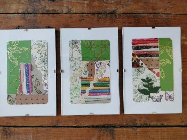
2. Project Introduction: using repurposed materials that delight our senses. We will create three collages on the backs of playing cards, pausing throughout the process to cultivate mindfulness. Working in sets of three allows for a more playful, intuitive approach and supports the practice of connecting to the present moment. Ensure that you have a distraction free space that nourishes your creativity. I like candles, used essential oils in my diffuser and play by neural beats, which are found on YouTube by neural beats. Air used to encourage our brains into a relaxed state and have been shown to reduce stress and anxiety. Increased focus deep in meditation and enhance mood. We will gather our materials and complete three mini collages that are sisters, not triplets. Please post your collages in the project gallery.
3. Supplies: Collage Design Elements: All right, let's play will gather some supplies so that we're ready to create. And here are some playing cards that I love and my favorite little tidbits of papers that have collected summer store bought summer recycled upside cold, gorgeous colors that appeal to me. Text with pain, too little handwritten notes, other languages and musical notes, store bought scrapbook papers with patterns see through and my favorite security envelope. So much texture and interest here stamped book pages see through thin waits, pattern making paper. This is a store bought organic designed that I absolutely love because it could be added, unveiling overtop here we've got magazine pages and book pages, ink drops and little tidbits. Just a nice collection, a variety of things that appeal to you. Let the papers speak to you. These papers are going to inform our design. Now here I have an example of organic and non organic lines. Got some veiling here with the thin tissue papers going over top. Different shades of white in different types of size and shape of text really creates interest for the I, so I would encourage you to keep thes design concepts in mind while we are creating. But ultimately I just want you to have fun and play. See the contrast here between the dark and the light tones, and here we have contrast between warm and cold. Now let's begin. I've got this magazine page and I love it because it's got the purple, which is warmish with the red and the nice, cool, pale green and love that color so automatically have created interest there. And now I'm going to go for some smaller, tighter design. So the magazine pages more expansive and then adding this text will allow for another, more linear type of design. I like to rip the pages a little bit larger than my substrate. That way, at the end, we could turn it over and cut off the leftovers, and we'll have some little tidbits for embellishing, which is so fun it really invites in collaboration with your art and letting go of that need to have absolute control and be in charge of every design aspect. So working this way is going to encourage us into the right side of our brains, and it doesn't mean that we're not making just design decisions doesn't mean that we're not being thoughtful in our choices. CM placed that there and I didn't like it. So now I'm all about the dots. I just can't get away from them. In fact, I've asked myself several times to stop because I said, Why do we have to have dots and everything? But, you know, this is it's by play time and I just love thumb. I love using my little hole punch. You can absolutely pick the colors that speak to you and add a little pop. And as you'll notice the colors I picked, ah is going to tie into that deep purple. It's a little bit lighter now, using my glue stick if I can figure out how to open it. Yes, this is great glue because you can put it on either your substrate or your papers or both. I like to keep things simple, and if you're not happy with something, you can lift it up. You could move around so as you saw I designed it and then I deconstructed it. I've done this for a while so I can have a good idea of where things were, but often I put them back a little bit different. And again, I feel that that is a collaboration with the project going with the flow, not being too precious and tight and just trusting. Just letting go. I love this warm pink. It actually has gold in it. I got it at a Japanese store. It's a very nice origami. And if I don't like, see how great that glues If I didn't like the way it was on the first time, I'm able to turn it, pick it up and turn it and again just imagining the space that you're working in. So I have an idea of where the edge of my substrate is, So I'm able to play with the magazine page, and sometimes I like lining up all the edges, so I have less cutting. But I've discovered lately that putting things over the edge that are all glued creates these fabulous little tidbits. So, yeah, you could always turn it over or, um, apply some kind of pressure to the front, you know, just rubbing it out with your fingers. It's nice to have the papers flush to your substrate, but I also sometimes I get a little wrinkle and I think that that adds interest. So I'm all about going with the flow. Now here's the beauty of doing it on these cards is that they have enough weight and strength that when you cut off your extra edges, they create a perfect little guide. And you don't have to worry about cutting them, which sometimes can happen if you're using a lighter weight paper. So now I have my basic design, and you'll see I've used only three different no. Four different pieces of paper find. If I put too many different things on, it gets real busy and overwhelming and can lose focus. Now let's see what I have you this little guy might want to see now see how the patterns air speaking to each other even though they're not. They're not actually one piece. They're in relationship and they're connected. So that's fun. And I love this one. It's just really like a tourney edge. That tourney edge creates a little bit of white, and that white adds interest. Now this is my little trick. I pick up the dots with my finger, put him straight on the glue stick, and sometimes it's a little bit challenging to get them off. But then again, they might Jane shape a little bit or move around a bit. And that's what I'm going for going for, letting go of control and playing and exploring. And now Oh, I really like that. I think that's perfect. And like that, it's going in the opposite direction. So the first piece up and down and again it's a relationship because we're using a piece of that original piece, but it's going in a different direction, creates interest for the I. Now we can trim that off and have a good look. Just take a moment. One of my teachers talks about spiralling in and spiraling outs. When you've been working on something, you can get real close. So I like to just take a moment and, yeah, I feel like a little again. We're creating communication and relationship between the dots on the right and we're connecting, and so the eye has a way to travel, and there you have it
4. Mindfulness Practice: RAIN: all right. Now that we have created a beautiful space for ourselves, gathered all our supplies and you've watched my demo, we're going to pause for our mindfulness moment. So, first of all, ensure that you are comfortable is possible, Whatever that looks like for you, just take a moment, get settled, pause and bring your body in your mind into alignment with the now. So begin by coming into stillness, you might close your eyes or lower your gaze, and I invite you to take a few moments to notice any part of your body that wants to let go a little. No scanning your life. Bring to mind any area where you feel stuck in either reactive emotions. Fear hurt anger, conflict in a relationship. Difficulty at work challenge with your health, not something traumatic, what we're looking for, something that's charged and feels difficult. Once you have a situation in mind, let your attention go to the moments where you feel most activated. Rain begins with E. R. Of recognizing. We recognize what's going on. Whatever is most predominant inside you. At this moment, there's some noticing and naming Oh, fear or, oh, judgment. Oh, anger, Whatever that disturbances for you. And if there's nothing, that's all right, too. We're practicing, bringing our attention into our minds. Arena of the body. The A of rain is to let it be there for right now with allow we pause to make space for what's here. You're not fixing leaving, telling stories, blaming, rejecting, just letting it be here. We don't need to understand why it's here. It's not your fault or anyone else's fault. It simply is. And this pause of allowing deepens your attention with the next step of rain, which is I investigate, since what most wants your attention. What's the most difficult part of this? Where do I experience it in my body? Curiously, Investigate your body sensations to find where the disturbance feels the strongest you're feeling into the place where failure, shame or judgment lives. You might pay attention to your throat, your heart, your belly and just let your breath go there to focus your attention. What emotion is strongest? Ask that part of you. What do you need right now? How do you want me to be with you? Does it need acceptance, forgiveness, some expression of compassion? The end of rain brings nurturing sense that you can offer to this vulnerable part of you the compassion that it needs. It's very powerful to convey care with a tender touch, perhaps Place your hand on your belly or your heart. What message does this part need to hear right now you might offer. I'm sorry. I love you. I care about your suffering. You belong. Offer this message from the most awake part of your being. Let yourself be Baisden compassion. And now begin deepening your breath and shifting your awareness from the internal experience to the external, taking as much time as you need.
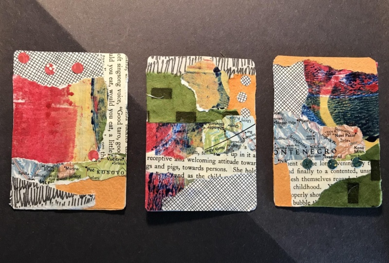
5. Working In Threes: All right, let's play. So we have our three substrates are playing cards I like to pick beside that is the most attractive to me and have that be the back, So we'll be working on the front Oh, I love you got an ace and some diamonds You never know what you're going to get And then I've got Here are several examples of different contrast. So this contrast is between a pattern and a non pattern. It's also between a warm and a cool, and this is a much darker tone than this. So this really pops because it's bright. Now the more interest we can create by having opposites the batter on. I will explain to you how that works here with this little guy. So as you can see, I've got organic blinds with the Tauron piece pieces of paper, and then I've got these straight non organic is the best term I can use. I've also got a bit of, ah, tight pattern that's very graphic. And then I've got the smooth, dark pinky purple and the light green. So these two are opposites in that this is cool and this is warm. Having a nice pattern piece on top pops. And then, as you saw earlier, I used my little hole punch and punched out some beautiful little pink dots. And then I love using tax. So this is just a book page ripped it out randomly flipped it around to see which page had more interesting words to me. So this one says, France, Queen, Arizona, And that's intriguing. And that also included this little bit here, which is a graphic paper that has the non organic line so again creating interest by having opposites and variety. Now this one is another example I put together to show you guys. So here we have the non organic in the organic, non organic, known organic no inorganic no, that's organic. And then, of course, this thes very organic lines. So when you look at this, you see your I can dance around from all the different places. There's lots of variety, and it's interesting. Things were moving forward in things moving back, depending on what's lighter and what's darker again interesting for the I, and this is an example of cool tones in a light and a dark, and when you want a more peaceful, harmonious feeling. You can work within one color palette, so just working with the Cools gives a nice, relaxed feel. And then I've sorted. So I've collected all my papers and I have my warm pile and you'll notice with my warm pile that I have different tones. So this is much lighter than this. For example, this is a very saturated color and because this has some golden it, it's very shiny. Got a little bit of red in here, which I love to add a pop of red. And then I have my cool pile. And in my cool pile, I've got dark, cool, got some midrange cool, some lighter and then even lighter. I call these types of paper veils because you can put them on top of something. It obscures it, and it popped, but it pops through, so it could be very interesting to use this type of veiling. Ah, particularly with contrast ing so well, that was not is interesting. Definitely looks good over the red. They have also collected a variety of white papers, while I call them white and black with different design. So here we have the music notes, some text in another language, some hand written notes. These this is the security envelope. I'm just in love with security envelopes because you never know until you open them which pattern you're going to get, and they're all so different. So I picked this one today. I'm I like the circular sensation and then I have my play pile. So this is this is things that, well, this one's just wild and crazy. It's a mosaic photograph out of a magazine. This is some leftover paint from a project I was doing, and this one has such strong contrast. And if I need black, I can use that and, you know, whatever just speaks to you. These are little bits of maps and love using maps. I love to imagine that the person who made the map the actual terrain I like picking maps that have meaning. But my most favorite is to pick maps that are the color I love because I'm all about color . And as you've seen for my work, I'm also all about the abstract, so I don't use stamps very often, but I do have quite a nice selection of thumb and again, this is an intriguing story. You know who What? What was the letter? Who wrote it? Why were they sending it? These? Who's the artist who designed this beautiful hummingbird that got put on the stamp? Where did these things travel? So I like to have stamps nearby. Uh, I also like Teoh throw on a little thread sometimes to create. Let's see what this looks good to create some abstract line. It's very light and simple. And then I've got my veiling pages. I just have a few, uh, this is tissue paper that I stamped with the little tiny dots because I love circles. This is pattern paper. I don't know if you can see, but I drew some little circles on it. It's really nice for veiling also. And then this I got at the art store, loving that organic tree type of look. Here's something else I don't use a lot of, but these. They're called washi tape, and they have them at all. The, uh, supply stores like Michael's and that kind of jazz, so I often end up cutting them into more abstract organic shapes. But again, it's nice because you can just add a little pop of something. And then finally, I have to always have to have some red because it's so vibrant and powerful on adding a daughter of red or a splotch of red. So I made up a new word. A spot is fabulous and, of course, my glue stick. I tend to tear everything. I don't use the scissors a lot, but there the scissors air here for the finishing touches. And then I never know when I'm going to need some dots. And, ah, I also like to used the left over from where have cut the dots, adding that on C. See if you can see that, uh, having the color pop through on the other side. So it it, uh, creates some interesting highlights. That's a fun technique. All right, so let's begin. We have all our papers, and now it's a matter of designing. So as I did in my intro where I showed you the demo, this is fairly simple. It's got a variety of components, and it's pleasing to my eye again. It's abstract, so feel free to use, you know, imagery that is meaningful to you. If you like houses and birds and cats. And this does then by all means. This is about pleasing yourself in making something that you love. So we're gonna work in threes, and when we work in three is the idea is that these three are in relationship with each other. So we would say that they are familial. They're all in the same family, but they're not triplets. The way to make sure that you have them connected is to have the same elements on each piece. So I would start by that. And they don't have to be the same size. They're not necessarily the same shape, same placement. But just that brings it together. One of tearing. I like to use the straight edge, uh, so that I don't have to fiddle around with it to to buttress up here against my straight ege. However, a wonderful thing that's you some orange today orange is that you can have it hang off the edge, and then when we're done, we simply flip it over, take the scissors and trim whatever shape you want around the outside really saves from the stress of trying to have to line it up and brings in the more playful approach. All right, so there we've got our warm color on. And since everything so light, I think I'll go into some cooler, dark. And as you could see, I'm just I'm not measuring. I'm just tearing. I like Teoh. Invite the unknown into the process. It I may end up modifying something later, but all right, so we have three maps on going to try to gets more contrast going here. So I've used warm and have used Cool. Let's get some of my favorite security on envelope and maybe we'll let this go along the edge. One full edge have so they one more.
6. Color, Texture, Design: all right. Now everything is seeming. But with the exception of these, the orange and the dark, these three air all kind of in the same tonal range. So I'm not getting as much contrast is I would like. So I think I'll get this one here. See, that's a photograph of someone on the water at sunset. I just love that. What were they doing? Who is the photographer? What's happening? Okay, sometimes when I'm working, I'll discover something great on the back of something I've ripped, you know, like this was to say, experience the enchantment of the moment. Like I love that. I might have to use that or this Just a little text. Okay, so that's gonna be my my basic, uh, my base will start fiddling around with that on, and then we can do some embellishing some fine tuning. Sometimes things that were there Go away. You never know what's gonna happen in this process, which makes it so delightful. So So once I have a general idea. I know I want this along the edge on all the people, Uh, get my glue stick. And sometimes I do both the card and the paper. Sometimes I don't just turns on how I'm feeling. This paper is a little bit heavier, so doesn't hurt to glue it both sides on and give it a nice little rub, a dub dub to get that married. And what I like about tearing paper is that you get this. I'm not sure if you can see it in this light, but there's just a little bit of white highlight along here, and it creates interest. This glue was just wonderful because you can put something on and then you can slide it around to make it just right. You can spill it over the edges and it'll dry perfectly. Ah, so you can see here. I'm trying to create contrast, so I have, ah, the tiny pattern. The big pattern is dark and cool, and I'm going to add a warm, non patterned piece. It's just saturated color. This is the sunset from that photograph of the fishing or boating person. I'm just lining up my bottom edge here and again. We don't worry about things going off the edge because we're going to cut them when we're finished again. I'm big on the tourney edge, so I'm gonna tuck this straight edge underneath and there we go. Who's next? Drew A little map. The map? I don't know. That pleases me. Look how that fits. This is where I feel there's and then intuitive process happening because I'm randomly ripping the pieces and then I'm finding where they want to go. So I'm collaborating with the materials and it's process. It's a process letting go go with the flow, trusting your first instincts. I'm not sure if I like that. That's quite a bit of contrast. What about this little magical message? Experienced the enchantment of the moment. Totally synchronous. Uh, I think you're too fabulous not to have. It's okay, Dokey and look at that. That's right in there. Now, here we have an opportunity for embellishment because I have that one little tiny corner that didn't get covered. So this is when I asked myself, I do have a lot of dark and, um, cool tones, but I rejected this because it seemed too bright, although it's nice now because we have the orange text here, so maybe we'll just put a little smidge. And again I'm gonna tuck under because I like organic And maybe I don't like it that way. All right? That'll do. It just barely. Just barely covers it. See how I could just bend this little guy back because you didn't get enough? Put it down. Okay, Now I want my scissors so that I can add something really sharp right down here. And I think it needs to be dark. Actually, this has a little agin natural ad agency what we get. So now this piece of art is telling me it's sort of directing me other than me directing it . We're looking for areas that are calling for a little bit more or areas that need to be obscured. So I'm finding this right here is a bit distracting. See how nice that is when I take it away. So who wants to go there? That is the question. Someone dark? No. All right. Perhaps a little more. It's nice sometimes to have Ah, a little bit of mirroring. So this would bring the security envelope to the other side? Yeah. Let's do that, Pinocchio. All right. Experience the enchantment of the moment. So now gonna flip it over. Don't give it a good rub. Make sure everybody's adhered, then just trim off. So the edge of the card ox is a natural guide. Sometimes I leave the corners sharp and sometimes like to follow. The edge of the card foot on this one will follow the edge. And these scraps, these scraps catch me sometimes these little shards. I find them intriguing. So who knows? I might add that to the siblings. Look at that. Teeny, tiny. All right, so I'm noticing that this is flipping up a bit. I missed some, so I just go in there, give us a good attachment.
7. Stories: Soul Of Forgotten Objects: all right. Oh, we're kind of warmed up. So since I did this security envelope on the right side, I'm gonna do it on the left side this time. Looks like this was an important message. The break green sticker. Okay, here we have you, So Oh, I just love that. It's not quite Perhaps I should use this one. Yeah, that works. Okay, there we have the voter from another country. We don't do that type of boating here in Canada, and I'm gonna grab one of my dark that right there. It's so much easier after you've done the 1st 1 just really gets much more comfortable. I guess it's like anything after you've warmed up, you're in the flow. You could see I'm not agonizing over things here on just letting the shapes and the colors and the patterns speak to me. And I do have the design goal of things being creating interest by having variety. So with this solid color and then this tight pattern, this, uh, swirly line and then these straight lines this all create interest for the I. But you see how forgiving this is. I don't like doing fiddly, fussy, stressful things. Andi. Yeah, Let's have a real nice Let's actually want a longer piece. So I have back here too. Now, here. I'm gonna measure because I know what I want. And you could certainly cut gonna lift these guys up because I really like that Toren edge . Get my glue on here on this. This is some really nice. I don't know if it's handmade paper, but it's art paper. Once you get into this, people will gift you all kinds of fund papers. I had a have an Airbnb in my house. One of the rooms I rent and had a guess, too. Came to take care of his mother's estate. And she had all these really old letters hand written and typed. You don't see typed letters anymore. And she, he, uh, left me some to incorporate into collage. And then I made one just for him to honor his mother. Ah, but it was really exciting because their their treasures, you know, they're from someone's life. And from a time gone by, I really was excited about that. One of the downsides also is you can end up collecting. All you do is collect Thanks and then you become a little many quarter you don't actually make. But I just I got really into maps, and, uh, then I had to put myself on hold, not allowed Teoh collect anywhere mops because you you know how large map is and that he only is especially when you're working this small, little tiny. Okay, So if there we have two siblings And now how? Let's see. Since I did did it on the sides. Maybe I should do one on the top of one. Yeah, why not? Okay, so here's my ace. Yes, we've all been conditioned to get excited about that. Not even a card player. But I know that Aces Air. Good. So here. Here's a little technique I like now that it's they're just use that edge. Rip it off. Pretty sweet, huh? Well, it's not quite long enough, so go back to my pile and you can I'm going to let this one dangle off the edges, give it a nice wraparound that creates that crease for tearing, and then just apply pressure there, and they're wonderful
8. Letting Go Of Control: Okay, Dokey. Now I'm quite into the orange. See, I started out here. I took it out altogether, and then I had to put it back in. And as we go along, it's just becoming more and more present. So you may find that the 1st 1 was a warm up in the 2nd 1 was, you know, getting closer. And 3rd 1 is your masterpiece. Who knows? That's just so fun to play. And because thes things air all you know, the cards were picked up at the thrift store, security envelopes, the magazines, Cesaire, all things that we having our everyday lives that are just going to go into the recycling. So it's very liberating. Yeah, that's not precious. You don't feel worried about wasting or how much it cost. And you're giving these things a second life, which I think it's wonderful. Uh, periodically, I have let the background come through. If it's seems to work with the design, that's interesting. But I don't know if there's enough of it to really make a difference. So, yeah, I'm probably gonna cover now. What did I use here? I'm gonna use that. Oh, no, I can't. Not going to use that because it's the same as this, and then it won't have any contrast. So who can I use? Look at these people. See, they started out as part of the project, and then they got cast aside. What about one of these interesting Dingell hoppers? This is a bit of that works for me. Look, I just picked up some dots. Little tiny dot Here. Do we wanna have a dog? Sure, Why not? So when it comes to embellishing with dots or you know any repeating pattern, we always do an odd number. This one doesn't want to go. Uh, why do we always do not number? It's just more interesting to the I. I think, you know, because even numbers are balanced and more of a pattern. So now if I wanted to, let's say I wanted to have ah, contrast here, I would use. I'll do some of these. I'd like to once I've You don't want to use too many different types of paper. It gets kind of crazy looking. So I like to incorporate for my circles something that's already part of the arch and not there. And I got so excited about circles. I left a blank spot there, so we have to remedy that. And then our project is complete. Two. I want some black circles here. So you see, I'm using I like using light on the saturated color music dark on the warm color, but as well, we've gotta seem happening here with these guys all being in the same family. So why not Don't put you there. Okay? Now we need to cover this final spot. And I really shouldn't introduce a new type of paper because I've all already created my pattern. So who's missing? Ah, the mapping map. Look at that beautiful blue line. That's a river. I love rivers. They left love rivers. We have a river right near here. And every summer my girlfriends and I hike down. We found a special spot where we can lay on these hot hot rocks and skinny dip and get in that nice ice cold water. Okay, so just going to trim this one up. And that is our first class. Creating three collages using playing cards, connecting to our intuition, using contrast between warm and cold, dark and light, organic and non organic and patterned and non patterned. Now, once you've got them done, they they may want to be in a a new Let's move this out of the way. I don't need you anymore. Perhaps they want to go this way. You could play around with, um, created, pleasing some blockage. Okay. Well, thank you so much. I hope he really enjoyed yourself and learning these new techniques. And I'll see you in my next class. Don't forget to post your projects in the project gallery.
9. Final Thoughts: thank you so much for joining me in this collage in mindfulness journey. You know, the more were present to ourselves into life, the more expensive and contented we become. And this practice of being creative can really connect us to a universal intelligence. It can allow us to cultivate our intuition and and I find that always brings more joy into my life. And using the rain concept really invites us to bring ourselves into alignment with what is allowing, nurturing and supporting ourselves as we navigate the challenges of life. So once again, thank you so much. And please share your work with us in the class project gallery. I'm really eager to see your creations and hear stories about your materials.
 Piper Deggan, Collage and Mindfulness