Transcripts
1. Introduction: Hi, guys. I am Sherri Burbach. I'm a mixed media
artist and writer, and I love sunflowers. I recently went to a sunflower farm and
I was so inspired. I took in how tall these
flowers were and the color, what it was like to stand before them, what that felt like. How they moved in the breeze. I took in all of that and I
thought it would be great to do a collage and paint project
inspired by sunflowers. One of the things that strikes
me about sunflowers in particular is their
ragged leaves and petals. They're so beautiful. But yet, if you look closely, there's a lot of
roughness to them and I thought that would make a
perfect collage project. So what we're going to
do is paint a sunflower, and we're going to use a lot of elements of collage to create all those petals that go around that head
of the sunflower. It's a fun project, and it's a great way
to use up scraps. I have a lot of different
types of collage scraps, a lot of different papers
that I'm going to show you I hope it gives you an
idea of what you can use. There's magazine pages,
or just scrap pages, there's junk mail, there's
all kinds of things. I hope you will look
through what you have and just really pull out things that inspire you
and use that to create. In addition to the scrap papers, we're going to be using
acrylic paint and a canvas and it's any size canvas that
you want to work with. I used a square canvas
2. Sunflowers Supplies: In addition to the scrap papers, we're going to be using
acrylic paint and a canvas and it's any size canvas that
you want to work with. I used a square canvas. You could do it on any
size that you want to use. We're also going to be adhering those collage elements to
the canvas and for that, we're going to use gel medium. The brand that I love for
this is golden brand, but really it's any type of gel medium that you're
comfortable working with. If you don't have that, you can also use
just regular glue, like an Elmers
glue and use that, especially if you're new and starting out
and you just want to play around and
see what works. That works perfectly
fine. My preferred medium to adhere things
though, is gel medium. As you do more projects
like this, Um, you might want to pick up
one of those supplies, and of course, paint
brushes, water, paper towels, those are all great for this project as well.
3. (1) Making Petals: This project is close to my heart because it
involves collage and paint. I like to do both sometimes. What I'm focusing on with the collage and I've got some
papers here I'll show you. But I have this square canvas. This is a ten by ten. You can use any size, Canvas. What I'm focusing on is
this inspiration picture. And the ragged edges
of these petals, I am in love with the
ragged edges of them. I just love them.
So what I want to do is do a combination
of paint and collage, and that's what we're
working towards. Because we're using
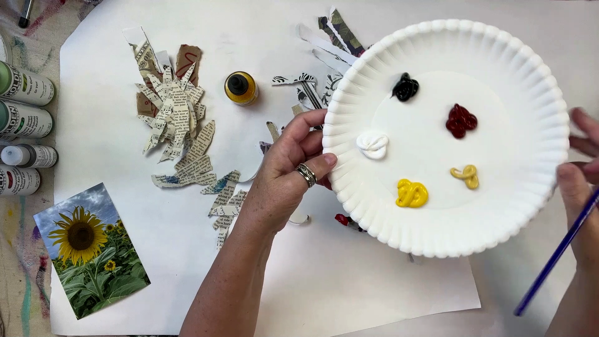
paint and collage, so I'll show you the paints. These are paints we've
been using in this course. Got some regular body acrylic, black and white in regular body, then a couple of different
yellows and a burnt sienna, naples yellow, and
a cadi yellow. You've got that I have because I like
using fluid acrylic, especially with
collage and paper. I've got a collection of fluid acrylics that I really like that are all from
the golden brand. Now, when I tell you fluid
acrylics and things like that, I'm giving you supplies, but you can use whatever you feel. This would be a
project that would be perfect with craft
paint, for example. So feel free to use what you
have. Here's what I'm using. I have two different
colors of green, palo green, green
gold, Nicko Oso gold. I have a raw umber, a transparent yellow iron oxide, and then a yellow. These are in fluid acrylic, which means they're
fully pigmented, but the texture of
them is more watery. When I say watery, that's the
texture, not the pigment. The pigment itself
is as vibrant and bright as a regular
body acrylic. That's what's so
fascinating about them. I'm also going to use
this yellow India ink. This is golden
yellow from Bombay, my favorite brand to use. I've got that. I have my canvas and I have a collection
of collage papers. When I say a collection, it's just random stuff. Some of these are
scrapbook papers, big pile of those.
Let's get through that. I've got some music sheets. I have some book pages. Um, I have some stuff that
I've already painted on, you just scraps that I used
as a scrap. I might use that. I keep all my scrap papers. I always keep them off to the side because you
never know when you can use them for collage or underwork or in your
art journal, even. I have a old recipe book page. I love old recipe
books, you guys, and I love these
ones where it has people's handwriting and their
recipes are so hilarious. And they usually
have little like illustrations in there,
like that one does. So it makes me laugh. I don't know if I'll
use these for this, but I have some old book
pages of bird books. For this one, I probably
will not use these, but, you know, you never know. More music sheets, um I've got a recipe
that fell out of a book, um, yeah, more
handwritten recipes. This is from a cookbook, I
bought at a rummage sale. These are all papers
that were just randomly painted on scraps, you know, that I used up old paint that I
had on my canvas. Like if I have just paint leftover at the
end on my palette, I just put it onto scrap paper. That's what this is.
And then I keep it. And I might continue
to add stuff to it. I might rip this up, chop it up, use it
in different ways. So that's what all these are. I have this old we
went to Fast Food somewhere and they
gave us this bag and I thought the bag was just great because it had all
these different images on it. I like the color and
the texture of it, so I kept it and I probably will use it for
collage for this. I have a magazine that has
interesting inside pictures, fiber art, and I'll probably use this
for collage as well. These are all the
things I'm starting with and what I want to do is just start thinking about
what these petals look like. These petals are ragged and
they go all the way around. So I am envisioning me ripping pieces that I can collage
then around this center, and I'm going to paint
the background here. We'll do that first,
and then this will be the elements
that we put on top. But I want to work on
them first so they have time to dry so we can then
put them on our painting. So that's what I'm focusing
on the raggedness of them, the length of them,
that type of thing. So I'm going to just randomly let's start
with a magazine page. They're always fun to use. I want something that
has a lot of business. Start with that one. And I am
not fussy. I rip them out. I don't you know, I'm not I really am not fussy about perfection when
it comes to collage. I will rip until I feel like
I have a piece that I like. So I've got a couple of ragged
pieces here. I like that. Dig into this. I'm gonna start by just
ripping that in app. How about that? I I like these illustrations. So
I'm gonna go with that. So I like these pieces that
end up with a point on them. I am taking note of
how it rips because these petals have points at
the ends. Many of them do. Some of them don't of them do, so I'm taking note
of that as I rip. And it's okay if you have
smaller pieces, larger pieces. If you have a wonky piece
like this that just rips. You don't know what you're
going to use at the end. So I have those. I want to
focus on put those aside. I want to focus on maybe some of these recipe pages because I think those
are interesting. What we got here. I just
love old recipe books. I mean, I am wild about them.
I think they're awesome. Something nostalgic about
them and charming and, you know, you come across some of these recipes and
you think, Wow, really? You guys ate all that? Like you know, some of the stuff that we
just don't make today. So I've got weird
pieces like this. That's okay. That's good. I like weird pieces. And as far as how many to do, I'm just going by what
feels right. It's better. I think if you have a collection to choose from as
you're choosing what to put around the
outside of your flower, if you run out, you can
also make some more. I mean, you're not stuck by
what you do prior to it. You can make some
more at them later. It's okay. I'm going to
rip up these music sheets. Again, I'm trying to rip on an angle so that when
I'm ripping this, I'm trying to rip there so that this top comes to an
angle a little bit. This one comes to an angle, so that's good to
use for a pedal, like that kind of stuff. I'm really just really just trying to get
pieces that way. And while I am paying
attention to what shape comes, I'm not planning, I'm not
going to make it perfect. I'm really just going with it, ripping it with the idea
that I want it to come to a point or at least have an edge that would be helpful to use with these petals and
maybe some of them won't be. And then I won't use
them, and that's okay. All of these items that I'm
using, I mean, most of them, if I'm talking about
these old books, I get at rummage sales or
estate sales, thrift stores, Old books in particular, I feel like don't
get a lot of love, because we're not reading them, and I feel like this is
a nice way to use them. There might be purists out there who don't
agree with that, I do. I think I think that's pretty cool to
use something like that. So just continue ripping these. Now, we are going to do
some stuff to these too. They're not just going
to stay this way. Some of them will be transformed because we're making
a picture of them. So I'm going to put
these ones that are, um, that already have
some paint on there. I'm gonna take a couple of them, but the majority of them
I'm gonna put aside because I want to show
you what I do for that. So I'm putting that aside. And notice I'm not worrying
about the colors that are on these papers or the collage
sheets or anything else. I really am just going randomly. I think when you do this
and you really go just kind of you just sit here and
rip up some paper without, you know, thinking
too much about it, it really is relaxing, I find. Don't you when
you're doing that? I think it's pretty
pretty interesting. So I'm going to put these
painted on sheets aside for now and take this lovely um, recipe page from this lovely
woman, Wever she was. Now her stuff is becoming art. I don't know if
she'd like it, but you know what? I hope she would. Okay, so I have some more music sheets
I'm gonna put aside. I want to focus on some of these collage scrapbook
papers, rather. So I do have some that
have this kind of yellowy, you know, which is
our color palette. You know, we're
doing a sunflower. So I have some of these, so I will rip them. Now, I want to take note, these are a lot thicker than most of these, and that's okay. We can do different thicknesses. Just be aware of it because we are going to adhere all
this with gel medium. That's the other
thing we need, um that I did not mention
in the supply list. But that is how we're
going to attach these. So these will all work regardless of thickness,
they will all work. But be conscious of them because
they'll rip differently. They'll have a different
look. You know, these are all choices that
we're making for our picture. You'll note when I'm
ripping this way, the white shows on the edges, and I kind of like
that because it gives me an opportunity
to add more color. So, you know, that's up to you. You don't have to use
the yellow pieces. You can use, you know, whatever and make it work. So I've got a couple
of those yellows. Let me put that aside.
What else we got in here. We have something totally. I mean, besides the yellow
here, if I look at this, this is all pink and purple is this something that can work? You
know what it is. Don't worry about what
kind of paper you have. Even if you have
paper that doesn't match with your color scheme, you can make it work
in your painting. I'm going to take
a few of these. Okay. It's a weird
little piece. Okay. And so you've got this, this kind of even matches, so I might not even
paint over this. I'm gonna go to see how it goes. But I'm gonna rip
it and include it. There's an art to
ripping paper, you guys. I don't know if I
have the skills to do this professionally. The paper ripping that is. If there is such a profession as professional paper ripper, but I have ripped quite a lot
of paper for art projects. I'll tell you that.
So keep ripping this. I just love these
little wonky pieces. They're really nice. So we've got a few of those.
I'm going to put that aside. Here's some white and black. We can definitely use this. We can make some nice color
on there that should go. And let's see. Rip those pieces.
So these are small. Let's get a nice long one. And Okay. I've got a couple of those. This is a black and
white where the black is the dominant color.
We can still use it. You bet we can. The thing about mixed
media art is you can use so many elements
to create your image. I think that's great because how many things are considered garbage
in this world, and this allows us
to transform them in a really interesting way. I think a really beautiful way because I love mixed media art. I'm drawn to it.
And let's see here. Got this nice long piece. Rip the edge off. There's a straight edge. No, I don't want
to straight edge. Put that on the reuse pile. I rip this straight edge off, get a little angle. I've got that type. I like this is a different pattern than
these one, so I will use it. Get a couple of those pieces. Okay. Then stripes. I love the contrast of that. Let's use this one definitely. Oop. Okay. Look at that. How interesting is that? Okay, got that. Let's use one more because I just loving the
stripe on here. So cool. All right. Get a few of those.
One more, you think? One more you guys.
One more long one. I think this will
help us when we do black and white in a
picture, it's always helpful. And I like the black
and white of this. Now, we do have a lot
of black and white, but I'll do, just a couple. How about that? Just a couple. Especially 'cause
that ripped so nice. Since it was so polite and
ripped in a nice way for me. That one didn't one
didn't cooperate with me. How dare how dare this
paper not cooperate? Okay. That one's a good one. Take this little
tiny piece away. So here's a couple
of other papers. Now, this is paper
that's very thick, really not in our
color scheme at all. But I'm going to show you
that we can even use that. So, I mean, think about
the papers you would have. Do you have old wrapping paper? Do you have old, you know, junk mail? I mean, that works. All of that works. In fact, I might even have a piece here. Good. I'm going to use it, guys. Yeah, I got an old piece of
junk mail sitting right here. All right. Old piece of some kind of TV
sports advertising. Let's use it. Now this is very
thick, but we can use it. It will rip. When it rips, the paper breaks
down like that. See that? You get an interesting texture. Okay? Old food boxes. Anything works for collage. I love using junkmil
though, don't you? Don't you love the idea?
Then just think about it. Anytime you get junk mail, you can go, Oh, that's cool. I can use that for my art. I like the wording on here, although it's probably
some fine print stuff that I don't want in my art, but I like the wording on
here, so I'm gonna use that. Let's see here. Okay, so
here's another thing. This doesn't match,
the color schemes too dark, doesn't matter. We'll keep adding a couple
pages for our leaves, our petals, do that. Finally, I have these
that are leafy. If you got something
like that, you should take advantage of it. That can work. We'll just do a couple of those. Okay. So I'm going to clean all
this up and then I'm going to have these papers
ready because we're going to work
on these a little.
4. (2) Painting Petals: I have all my random scraps. I have paint on my palette. This is all the colors. We're going to use these
in the regular painting, and we're going to
start by making the scraps that we have have
touches of these colors. I have the India ink
and gold and yellow. What I'm going to start with is anything that has
a thick texture. This was the junk mail piece and it has a really
thick texture. I have a flat paint
brush and I'm going to just use
some color on it. I'm going to take
some white and I have this piece of white
paper that's just going to protect the edges. So
I'm going to go over it. Now, you don't need
to cover everything. I mean, you can see the colors
through here a little bit. You don't need to
cover everything. I'm trying to give
it the touches of yellow that would help it be part of the painting because that's
what I'm looking for. So I'm just painting that piece. I'm going
to put it aside. Stick to my fingers. I liked
the color of these pieces. These little brown pieces, so I'm going to leave
them the way they are. You don't have to
paint everything. This is another
really thick piece of paper that was
the scrapbook paper, and it's very thick and I
am going to paint on it. Again, some of these colors on the paper are going
to show through. That's okay. We don't mind that. Just putting a couple
and I'm not even worried about how much paints on
there, what it looks like. Putting that aside. Let's do a couple more of those. I've got a couple of those
really thick scrap of pages. I don't know about you, but
I am somebody that buys scrapbook paper and I don't know if I ever
use it for I mean, I used to scrapbook
a long time ago, and then somehow my
scrapbook page painting or pages rather, became just papers
in my paintings. Now, this was the
scrapbook page that had the green little bit
of kind of pink. I kind of like it as it is. I like the idea of putting maybe a little greenery
around the edge. I'm going to leave
this as it is. Here's another bit from that junk mail cover up this and this is where the
paper curled a little. I'm going to go right down
to the edge with that paint. I'm doing just one side of the papers because it's
going to be collage down, so we're not going to
see the other side. Put that aside to paint later. Now, these little um, this is from the
takeout, restaurant. I like the rawness of these. I like the color of them. They don't match with, let's say, regular sunflower. I mean, this isn't
going to be like, what a regular sunflower
petal is going to look like. But yet, I like it raw. I like the way it is, so I'm going to leave it the way it is. I may use it and I may not. Here's some more thicker
scrapbook paper paint on that. I'm using the white in
this case because it really helps provide a
base for the yellow. The yellow is not as opaque
as the white in this case, and the white can help that yellow go over it a
little bit better. But if you want to
just do yellow, if you want to do gold, in fact, I could add a little
bit of naples yellow, give it some variety here.
That would be great. I've got that piece and I'm going to put
that aside to dry. I'm going for anything that
has some thickness to it. Here's another scrapbook page. I do like the black
and white on there, so I'm not going to put
the white paint over it. I'm just going to put the
yellow because that way the black design shows through. I'm going to
leave it like that. And let's see if I can
get another one of those. Now, this one, the black is a dominant color on here when
I put the yellow on here. Do I love that? I don't
know if I love it. Put a little white over it. You can still see the pattern, you can still see the
black underneath, but it's covered with
the white a little bit. Now, this one has
some yellow Oops. This one has some yellow on it, it could be nice
with just a coat of yellow over the
edges that were white. And we'll do another
piece like that. Another scrapbook page paper. A paper you have that
is different color, you know, thick, weird looking, you can use it. You
can make it work. Go through your pile.
There's another one. I'm going to put that
to the side to dry, go through your
pile, and just paint them as you see fit randomly. Add the yellow, naples yellow, whenever you want
your picture. Okay. We've got those. I'll keep
working on those off camera. I don't think you want to
watch me paint all of them, but I want to show you
some with the ink. What I like to do with ink is to take some of
these book pages. We have the words
that show through, and I want to keep all that. I don't want to
cover it with paint, and that's where ink
provides a really nice look. I have this ink bottle dropper. Sometimes I apply it
with this, but for this, I'm going to just use this here. It's going to roll. For this, I'm going to use just
a craft paint brush and dip it in the ink. And put some ink on there. And if you notice it keeps
the words underneath. It really seeps into the paper in a really lovely
way, and so I love that. I'm going to let that dry. I'm going to do this with
all the thinner paper that I have because ink works really well on that.
It's thinner paper. It can go over m the words and the images
that might be on there. And on this one, I even have a little slip that
it has not covered, it's not been covered with
the ink, and that's okay too. Some of the plain paper
can show through. And you might want to
leave a couple like that. I'm going to do that
with this one has nice big wording on it. I'm
going to leave it as it is. This one has nice music
music notes, wording on it. I'm going to leave
it. I'm going to take a few and leave it
just like that. But the rest, I'm going
to put some ink on there. And a little ink
goes a long way, so you dab it in there
and just spread it out and put it aside to dry. I like the ink over
hand writing like this. I think that can
look really cool. I'm going to do that, putting
them all to the side. These little tiny strips. Going to use some
ink on that. Lovely. Putting all over to
the side here to dry. Let's see what else we got
that we can put some ink on. Another really thin piece of paper that comes
from a cookbook, has a little bit of
handwriting on it, and I'm going to do that. I'm just going to keep
working on these. What I'm going to do
is take a couple and leave this I like that it has just a little
bit of ink on there. That's a nice look. Like that. Just has a little bit.
I'm going to leave that. Let's go back to the
striped pages because I've got these thinner
pages I can cover with ink, the thicker pages
I'm going to paint. Some of the this was
from the magazine. There's $1 on one side,
I'm not going to use that, but this is a nice pattern on it and I like
the coloring on it, and it has that white edge
from where I ripped it. I'm going to just
take ink and go over the page and it's a
slippery thicker page. But because of the design
on it and how the paper is, I think that looks
really nice and will work well in our collage. Here's another one
from the magazine. It's a slippery firm
piece of magazine paper. It has that white edge
from where I ripped it. If I put a little ink on there, it brings the image
to life and it helps it blend in with yellow. Put that to the side. Now I want to go back to these black and white pages because I could put
paint over them, but I really like the design
of the black and white, especially the black stripes. I want to just put a little
ink over it because I want that black design to stand
out in our final piece. I don't want it to be
covered up at all. You can see the difference.
Let's do this one. This is ink. Let's do one
with Let's do one with paint. The paint covers the
black a little bit, and the ink lets
the black shine. It's a little bit different, has a different consistency,
different vibrancy. I'm going to go through paint
the rest or leave the rest. I'm just going to evaluate and we'll come back and
start painting our picture.
5. (3) Paint The Background: Canvas here, I have
my inspiration photo, and I have my palette. This is the same palette I just used on all
the scraps of paper which are now at the edge of my painting table all drying. You see some of them here. They're just all sitting
there waiting to dry because they're going to get
their turn on our painting. But for now, we want to get
a place for them all to sit. We want the background
elements on there. So I'm using colors I think will go to create the background. I'm using some greens because I'm going to put some leaf area. I'm going to put that
center area that these lovely petals
can float around. The only thing I'm
going to change from this inspiration picture is the sky because we have this beautiful cloudy sky,
it has blue on there. That would be beautiful
for a painting. However, What I want to
do is have you know, I'm picturing this
sunflower forward more so that all you see in
the back is just greenery. And that's what I'm going to do. I'm going to focus on this
sunflower against green. And do you know what?
Since it's our painting, we can do whatever we
want. How about that? Isn't that cool? Freeing. I'm going to use
this as the inspiration and I'm going to create this area for the
sunflower to set up. I'm going to start
with the circle, this round area with the brown. This is the regular
body acrylic. Really what I'm
doing right now with the brown is working to add a placeholder for where this sunflower is going
to be on the canvas. I'm just almost sketching it
out but doing it with paint. I'm adding a little
Nicko Oso gold. So between the brown and
the Nickel Oso gold, I'm just creating
a little center. Doing a little round center. And from this, I'm envisioning the petals
to all come off of here. Got that. Got that. We'll let that little guy dry. I'm going to focus on the
rest of it. All the greenery. Now on this inspiration photo, again, we have different
sunflowers here and there. I'm really just going
to focus on the green. I want this sunflower
to stand out against all these green petals, all these green leaves. I mean, I want it to
be a see of green and just have this one beautiful
sunflower against that. I am going to take this is phallogreen and I like mixing it with
different greens. It's a really nice
vibrant, bright green. I'm just creating a stem, bringing it all the way down. These early layers really are just sketching things
out and getting placement. That's the way I look at them. I don't look at it as even
working on the final picture. To me, I'm just creating the layers that the final
picture will sit on in a way. That's how this works for me. I'm just creating a
couple leafy areas and blocking out
where those might be. I've got one there, that
one coming off here. Again, this is your painting. If you want to make I want to make this a
little bit more ragged, you want to make these
different looking, that is up to you. Of I've got that leaf
coming off there. I have the placeholder
of where some of these more prominent elements are going to go on the painting. Got that. Got this big leaf down at the bottom that is
just so attractive to me. I love it. It comes
up like that. I really goes all the way
down. I'm going to do that. Again, as I've said
before, you know, your inspiration photo is
just there to help guide you. Don't worry about
getting it perfect. You know, allow yourself to paint what you're
going to paint. No, I'm not saying painting
direct and trying to make it, you know, exactly as
you see it is wrong. That's a different
type of painting. I'm saying for these exercises, really allow yourself to just let your mind go and
use it as inspiration, but see what comes up
here, see what develops. I'm going to start filling
in the background with some green and also
some leaves and I'm really just blending
a little bit more of the green gold in with
this philo green because I want this background color to
be a little bit different. I am adding the
same ragged leaves and I'm going to put a little
bit of white in there. I just want them to be
a little bit different, a little bit softer looking. These two are acting
as placeholders. I mean, really, I'm going
to keep adding layers until I feel like the painting
is at this complete stage. That's the way I like to work. I like to blend
directly on the canvas. So put some more
hallo green in there. I could sometimes
blend on the palette, but I really like to see
what comes up on the canvas. I like to see what
surprises happen that way. And I like adding
the elements of white that just blend along. Now you'll notice these leaves, none of them are in here. There aren't leaves that go
up over this and you have to picture I'm doing
these leaves because the petals are all going
to come off of here. This will all be covered
up with these petals, but I'm just creating
that background space. So we're we're creating our
own sunflower field here with this star sunflower
that's going to have paper as its petals. I think the paper is really, it's really going
to blend well with this ragged look
of the sunflowers. That's one of the things
that attracted me to sunflowers and
to painting them was just seeing how rough and ragged they
looked and gosh, I just thought they
were beautiful in this type of roughness, in the type of way
that, you know, Van Gogh saw them as beautiful because they
were not perfect and, you know, what we would define as traditionally
beautiful flowers. But they are. They're just
so amazing, aren't they? And I like the rough
and ragged look of them and the paper is
going to work well with that. I'm going to keep painting
and keep adding some leaves. Using the same brush, I'm
just going to keep at it. I'm going to go until I fill
up the entire background. Then I'm going to come back and put some more detail in here. I've got to this point where I have a lot
of leaves built up. This is still the main leaf. It's a little bit darker. These other leaves, I'm
mixing the green gold with the gold green gold with the fallo green with the
white, and I'm filling in. Now that I have this
much filled in, I'm going to keep working
on the background. Oops. Put a little bit more
green gold on my palette. I'm using the green gold because it has a lightness to it. It allows whatever I'm putting on here to be
a little bit lighter than these main leaves because this is the
background I'm working on. I'm going to fill in because
now I've got a bunch of leaves here and I'm just
going to fill in with What I like to say is
the look of leaves. But I'm not painting
individual leaves. It's just look of
a patch of leaves. I'm filling in with
this green gold just like I did with a leaf. I use green gold. I use a little bit
of the palo green, and I'm putting
that in there just a little bit here and there. So go all the way down
this side, for example, just to fill in and so I have
all these little patches and I'm going to take
the white and blend, just like I did with the leaves. Going to blend so that I
have a variety of color. I'm not worried if this
looks like a leaf. I have leaves. The impression
of leaves is on there. I'm just filling in
the background now. Now, you could also
start this way. You could fill in the
background first. A lot of painters choose
to do that because it acts as underlayer and creates a base for
the rest of the painting. I very often start that way. This way this painting
because I wanted to do this placeholder
in the middle first, I started a different way. There's a variety of ways
you can start a painting, start or finish a painting. All I'm doing is just adding
a little bit of green, little bit of
white, a little bit of green gold filling in. I'm going to do that
throughout these little spots. I'm not going to worry if the
paint gets onto the leaf. Not going to worry about
that. If it happens, then that's what
happens. It's okay. Adding a little bit. I'm using the palo gold just sporadically. I'm sorry, the fallo green. I keep saying phallo gold
because it's green gold. Is green, this darker green. Using it sporadically
because I want the darker greens to
be these main leaves, I just want the rest to be
part of the background. Blending all this in lightly. The fluid acrylic works
really nice for this, it goes over evenly
and then to add depth, I'm using regular body white. I like mixing those two
things in paintings. I think it works really nicely, both in texture and
color blending. Putting a little down here, just filling in, just
filling in color. Not worried about the
definition of the leaves because this is all meant
to be a background layer. All of this is going to
blend into the background. These are what's going
to stand out, of course, once we get our petals, that's what's going
to stand out. That's the process for
this particular painting. So I'm going to finish up
the rest of this painting. Same type of technique, starting with green gold, adding a bit of palo green. I wipe off my paintbrush and
add a little bit of white. I just use that white to
blend it right on the canvas.
6. (4) Adhere Petals To Canvas: This is entirely dry. And these little scraps
are all dry completely. And I have my
inspiration picture, and I'm going to just put
it off to the side here. To remind me why I'm doing this and to give
me the inspiration to see what it looks like and to take my
ideas from there. And for this step, I'm also going to
add one more thing, which is vinyl gloves. These are the type that I use. I get them at the hardware
store in a big box of 100. And the reason that I'm putting gloves on
for this is when I'm using this regular gel
gloss with, you know, paint brush that I'm
going to throw away, when I'm adding the papers to this and moving them around, the gel gloss can get very sticky and very hard
to get off your hands. And, you know, if I'm
moving them around, I don't want that to deter me. I want to just wear
gloves so I can just throw the gloves away and get on with my
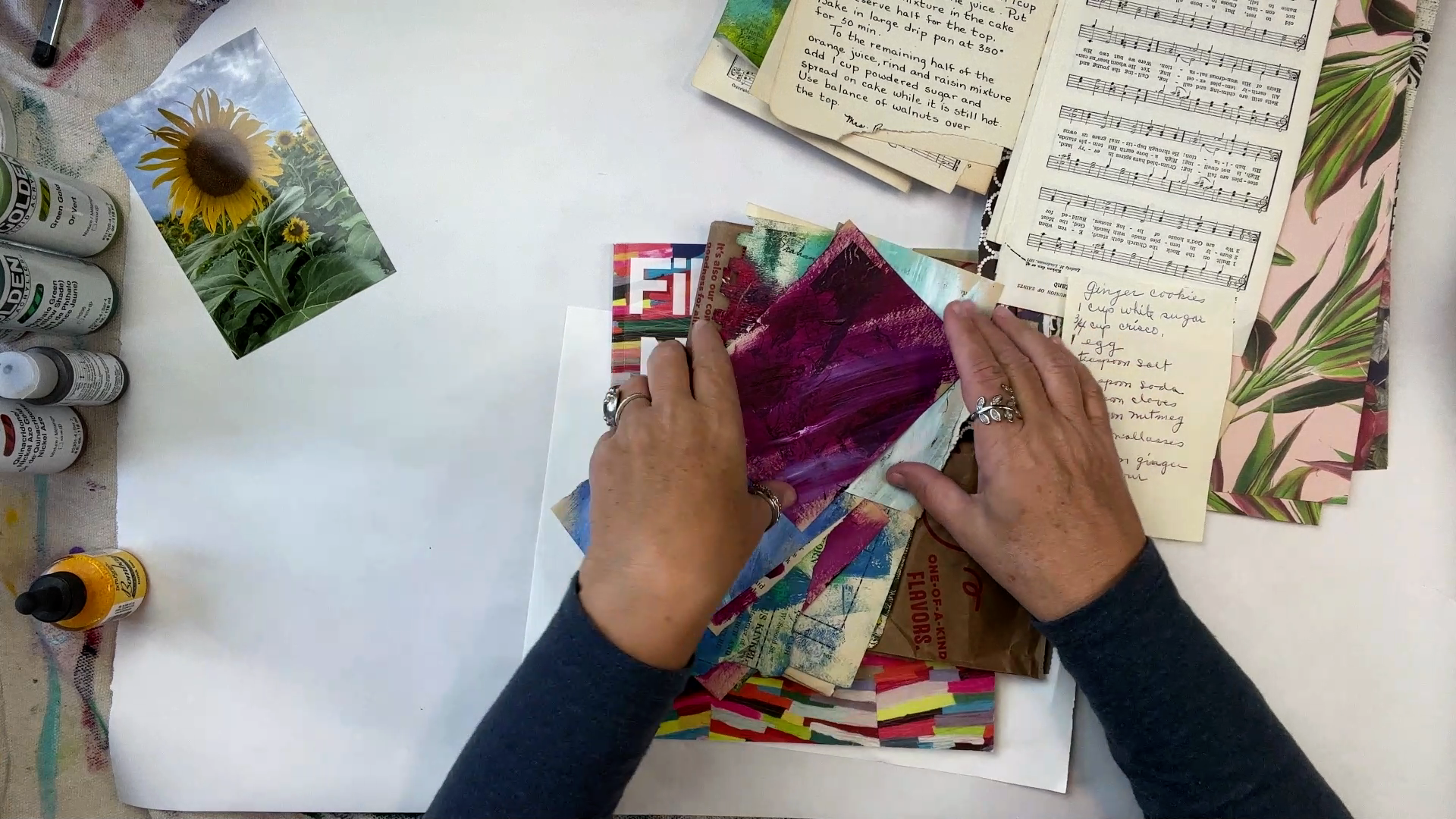
day and not worry about sticky hands and all that. It's up to you if
you want to do that. I'm going to open this up. Now, for this, we're adding these little scraps all the
way around, like so, right? And we're creating the
petals for our sunflower. Now, you can do this
on you can do it in a dry run and just place these here and there and
see where you'd want them. I like to work
organically and just kind of create as I go. I'm
not going to do that. But what I'm going to
look for in these scraps, I had some that were just
the black and white. I had some that had
this craft paper look, and then I had some
that were painted, and I had some that were ink. I'm going to look
for a balance of them as I place these on here. What I want to do first is just get a little
bit of gel gloss. Now normally what I would
do is put gloss on a canvas to prep it for
these little scraps of paper. But I don't
want to do that. I don't want to
put it all the way around here because there might be spots where I'm not
putting something on there. I want to just wait until I know where I'm going to
put it and then put the gloss down and
you'll see what I mean in a second. I'm going
to start with this one. It's just a plain music sheet that I ripped and I like
the idea since it's longer, maybe putting it that way. Like that idea. I'm
going to do that, and I'm going to brush a little bit of gel
gloss on my canvas. Then I'm going to
brush the back. You'll see this
is another reason why I like wearing
gloves for this. Brush it on the back of my
paper and place it down. Okay. Now for this, this is
going to be the top layer. So you don't necessarily need to put your gel gloss over the top. Unless you feel
like there's some sticking out that might peak up might come up a
little or peak out. I'm just going to not put gel gloss over the
top of my papers for this round because it's the final piece of it and it's going to be the
top of the painting. This is a real long piece and I like the idea
of putting it there. Let's see here. Puts
put my gel gloss. Wait along here. We don't
have to get it exact. I'm going to put the
go gloss a little bit. On the back and place it down. Now on this, I have
this little tiny I have actually this end
that is coming up. That's what I mean
by peeking out. I have that one
that's coming up. I'm going to put some over
the top right there just to help it stay
secure at this end, I have the same thing happening because it's very
delicate paper. I'm going to put a little
bit over the top to help it. Stay. So we have
two petals already. How cool is that? So I really
like these brown ones, and I like them in
the base, I think. You know, I like the
idea of putting these down maybe right there
and right there. So I'm going to do that. There's something about
this brown craft paper in general that is really attractive to me to create with. And then when it comes on
something like, you know, a food bag, because
that's what we got this at a cure takeout bag,
that type of thing. And this I will put
over the top because I got a lot of edges on
this one peeking out. Wow. This little craft paper I did not want to
stay down, but it will now. I like the idea of using
different things in our art, especially things that we
could consider garbage. Because this isn't
a good feeling. You take something that's
considered throwaway, useless and you find use for it. I love that. Then you create something new
from it, even better. This is that sheet
that was junk mail, I had a little bit on here, so I put paint over it. Let's see where that might go. I like the idea of
putting it there, but it's a little bit long, it goes off the canvas. Let me rip a little bit of this off so that it'll stick better, stay on. How about right there. This is very trial and error. You work slowly. Again, I find this very
relaxing placing all this down. Little by little, you just
work and see which pieces fit. Don't discard the artistic
choices you're making here. Every one of these choices
is an artistic choice. This isn't just like we're
pasting things down. You're making choices
with what you put down on your art, with how
it's going to look. There's a lot of things
that are going on here and that's why art is so unique all the time and different from person to person because
we're all going to make different choices
with this and we're going to add our own take
in our own personality. Which is what makes it
unique and interesting. I'm just going over any edge
that I feel is sticking up. I'm not really brushing the gel medium over the
top of every piece. I when I see some
edges sticking up, I brush them down. Now, this is a piece
of scrap paper that was it had leaves on it, so I left it that way. I like the idea of putting
that on just as it is, and I like the idea of doing
that right there, I think. I'm going to turn
this around though. I like that. Maybe right there. Oh, I like that. So
I'm going to do that. Okay. All right. Put that down and have these little edges
peeking out again. The gel medium works really
wonderfully for that. I'm gonna put the gel
medium down on the edge. And what I'm doing is
varying the types of paper, the balance of color
because each of them have a little bit of
different yellows and the different
designs and all that. For this, I have a
music sheet that I've painted with yellow, and I have a plain
music sheet here. I don't know I think I'm
going to put it over here, just to spread it out. I'm going to rip this edge
because it's a little harsh. It's a straight edge,
right like that. I'm already I'm already loving how these rough
petals are beginning to take shape and really create this look of those
rough sunflower petals. That sunflower is just such an amazing inspiration
for us, I think. This was the cookbook
page that I had inked on. It's real vibrant and it allows the wording to show
through. I love that. I'm just looking
for a place for it. I think it would be
great right there. Now, I'm not worried about
going over any of these. In fact, I will because
sunflowers the petals, they're not just
lined up one by one. Some of them are in
front of each other. You know, on our
inspiration picture. Some of them are in
front of each other. They're bunched together. So if that happens on
here, that's totally fine. Since I have one of these
plain music sheets, I have another one and I think
I will put it right here. I think it would be good there. As far as what to apply
this gel medium with, I like to use
either a foam brush or just a throwaway
brush like this. Whatever works best for you. Okay. This is a delicate
little piece. There we go. If you need to rip off a piece, as you're placing
like I am, feel free. I've got this black
and white one. I think I like that right there. You can tear it and get it to fit however you need it to go. It is very fun though, to take something unexpected and create art out
of it, I think. I always enjoy that
when I see people do that. That little guy. I'm just going to keep going
here. What else we got? There's some words on. I like it this way, I think. Okay. That there. It's taking shape. You'll
notice as this gets covered up, the backroom gets covered up, these leaves are probably
going to mostly be covered up. I'm fine with all that
because these were all the placement for
this main sunflower. So this is the scrapbook page that I had scrapbook paper
that had the brown on it, and I like the idea of a little bit of
brown in there too. I'm going to add that
I think right there. Can have different levels
of color in your petals. Doesn't all have to be yellow. I've been in sunflower
patches where there's a vibrant orange one that
stands out. I love to see that. It's just like, wow,
where did you come from? Some of the petals are lighter yellow, some of them are darker. Here is the magazine page and
it is covered with paint. I'm going to see where I would like to put
that probably right there. Seemed like
it wanted to go. And now that this is
complete and I think it is. I like how it's filled in. I like how there's some wonky
petals that come way down. I like the balance of
color and texture, all the different design
elements that we have on there. I like the balance
as I'm saying that, I think I want one more yellowy one right here, of course. As you take a final
assessment to your picture, and I like that one
right there, I think. So it off. One more
yellow one right here. I think that would finish it. So do that. Take a look at it. Take a final look,
take an assessment. Oops. What you think. Take a look
to see if you have any, you know, paper sticking
up or kind of curling up. You can tap it down with a
little bit of gel medium. Now, if you notice
on your painting, if you've got the gel medium in this brown area and it looks like there's gel medium on there, it will dry clear. So don't worry about that. Um I got a glue here. So take a look, you know, hold it out from you, hold the painting out
a little bit from you and get an idea,
you know, that way, get the distance to see Okay, that's something I like or not like when you're looking at a picture this
closely all the time, it changes your perspective. So put it aside and take a
look at it if you want to see, let it dry and see how
you feel about it then. You can always add more petals to it if you feel like
there aren't enough, if you don't like something. That's the really
great part about it. Right now, as it stands, I really love the look of this and love what's
happening with it. So I'm going to
let it dry because you need to give it a good
amount of time to dry, and then I'm going to
take another look at it, and then I'm going
to just do one final touch on the centers here. But other than that, I feel like this
painting is complete, but we're going to
let it dry first.
7. (5) Finishing Touches: Nice and dry. I gave it
really several hours. You know it's dry when
you touch the edges where you had that gel medium and it does not
feel sticky at all. So we're almost
complete with this, but I want to do some
final touches on it. Right now, I love the ragged look of all
of these little petals and what I want to do is add just a little bit of
shading to the center. In our inspiration photo, you can tell there's
a little bit of a dark shading or shadow
where the petals connect. I want to add that. I also
want to put a little bit of detail on the
leaves so that this looks like a connected flower. We've got our background, which is blending in the background and not the
foreground, which I like. Then we have these pieces which come out on
the foreground. For this, I'm using
incidentally, just a regular pencil. I just got it at a
back to school sale. Back to School sales are
wonderful for artists. Find lots of stuff there.
Don't ignore them. When you see a back to school
sale, see what they have. I'm just going over
the edges of the paper and this round circle that we had painted with the
quinacridone and the brown. I'm just going over it
just to add some shading, just roughly going over it. This gives it a rough, homemade look that I
think goes really well with the mixed media
that we have on here. All goes well together. So all the way around. So it's very subtle,
but I like that. Now I want to go around
the petals and I want to add some of that same
definition with the pencil. Again, it's going to be subtle. This isn't so it's just to add just a little
bit more definition. That's all it's doing. I like to add things
like a graphite pencil or sometimes I use a Sabilo
pencil for things like this. I'm just going around
just the very edges. If you use something
like a stable pencil, it actually is formulated
to be on paint like this, it'll be darker and you'll
be able to blend more. But I actually just
liked the idea of doing a regular number two pencil
like we had in school. Just a simple pencil. I use different types of
pencils in my artwork. My graphite pencil
is somewhere here. I use that quite often. But there's something
fun about drawing with a big school
pencil, isn't there? Somehow I think it fits with this project. Just going around. Again, all these little details
reading, they're subtle. We're not changing
the picture at all, but I like these subtle details can sometimes just
bring it all together. Doesn't take very long. And I'm going over wherever
I had a raw white edge, I'm going over that
with a pencil. It's a personal choice. You can leave yours
white if you'd like. I decided to keep it uniform, so they all had the same edge. Again, all these
choices we make, these are gosh, my arm
keeps sticking there. These are all artistic choices, so you can make a different one if you
choose and that's fine. Okay. I goes really fast. Now we're
at the beginning. It's just a subtle detail, but I like that it pulls
everything together. Now as I'm looking
at the leaves, I want to do a little
bit of detail there too. Again, I'm going
to add a pencil, but it's going to be subtle. But it helps connect
these two things. I'm going to go along the edges of the leaves and I'm going to put a little veining work
in there with the pencil. When you're doing a picture like this and it's got a lot
of different elements. As this one does, it has paper and different papers and ink and paint and different
kinds of paint. When you're doing something
like this at the end, just something simple that
can unify everything, it really trains the eye to see it as one
cohesive picture. It's a subtle thing in art. Color does that,
linework can do that. Little details like
this can do that. And that's it. That's
all I wanted to do. So here we go. And there's our little
collage sunflower.
 Cherie Burbach, Artist, Writer, Poet