Transcripts
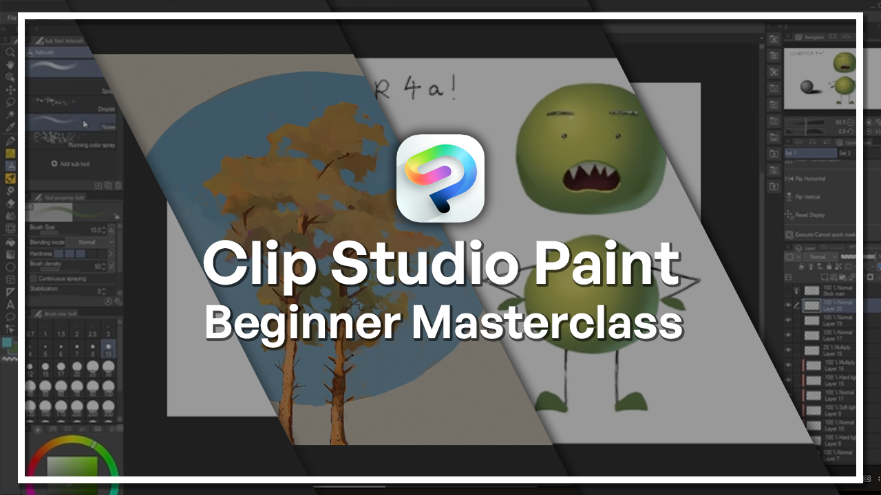
1. Welcome to the Clip Studio Paint Beginner Masterclass!: Welcome to the Clip Studio
Paint beginner course. I ever wanted to start
creating a digital art piece, but not real sure
where to begin. Whether you're a
complete beginner or just coming from
another program, this tutorial will
teach you step by step how to navigate
Clips Studio paint. My name is Cara Harvey Hill. I'm a full time freelancer, animator and background
and layout artist, and I've been using Clip Studio
Paint for many years from school to Uni and now as professional full
time freelancer. I developed workflows that
I think can help you, especially as a
beginner, and I'd love to share those with
you in this tutorial. The tutorial will start
from the very beginning, we'll talk through
what version of clips you paint is best for you. What tablet might work
best for you as well in terms of the drawing tablet to accompany you during the course? I'm just navigating the basic interface and
getting used to that because it takes a little while sometimes and it can
look a bit overwhelming, especially to a beginner artist. From there, we'll go into the fundamentals of
drawing and coloring, we'll be talking about
rough sketches of a character,
finalizing that line. Coloring in a basic sense
and getting used to shading. From there, we'll go on to
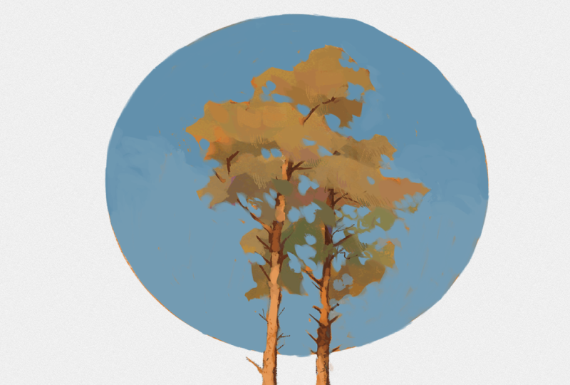
more advanced colorings to enhance your workflow. Blending modes, gradient maps. Finally, we'll do a full
illustration project from start to finish of a tree. We'll do a few mini projects
within the tutorial, but then we'll do our
main final piece, which will be a
picture of a tree, which will just
help you encompass everything we've learned
during the course. By the end of the
class, you'll have the skills to go ahead and do your own illustrations
and you'll also have some illustrations to back you up, hopefully. Let's begin.
2. Introduction, Instructor Experience & Course Overview: Hi, my name is Cara AveHll and
I'm going to be taking you three or three hour
beginner course in Clips Show paint today. A little bit about
me before we start. So I am a freelance animator and background and
layout artist. But I've been using
Clip Show Paint for a long long time when
I was in school at UNI and now post UNI
as a freelance artist. It's a really great
tool to have, especially for a beginner. There's so much you
can do on there. You've got animation. You've got your webtoon and comic book, and then also just regular
illustration as well.
3. Choosing the Right Version of Clip Studio Paint : There's two versions
of clip Shea paint. There's Clip Sheer Paint Pro and there's clip Shea paint X. You can do a lot in P. X is
the more advanced version, I assume per version. It allows you the difference
of having larger projects. So you can do comic books with multiple pages
at once rather than just the one page that you
get with the P. As you can only animate up to 24
frames on the pro version, which is normally
about 1 second. Maybe two. It's just worth considering depending
on what you're going for. If you're a beginner and
you're not really sure, maybe go for the pro version
and then if you're a little bit more advanced or just knowing you're going to be wanting to use this program, maybe thinking about the X or if you've got big
project coming up. They also offer monthly plans. If you're not sure,
you could try one, try the other, see
what you prefer, things like that,
seeing if you need those extra features or
not, which is offered here. I think they have
student prices as well. If you have a look in
the education section.
4. Tablet and Driver Setup : In terms of this course, the one piece of
equipment that I would recommend is a drawing tablet. I currently am using
the Wacom SynthiqP 22, which is this one
here, which is great. It is a little bit
higher in budget. So if you're looking for something a bit more
cost effective, you can either look on Ebay
or something like that. I managed to get mine for a
much lower price than this. I'd always recommend that or looking at something
like XPPM which is a bit of a more
budget alternative that's still really
good quality. If you still looking for
something maybe smaller, more portable or just cheaper. You can look at Wackam intos. That's a tablet I've used
earlier on in my career. This doesn't have a
screen, but it syncs up. The points on the tablet is very similar to where the points are on the screen, you
have to sync it up. It takes a little bit of getting used to, but once
you're used to it, it's not that bad at
all, and as I said, can be a very useful
portable option. This tablet also comes with Clips Pink P
two year license. That's always worth
thinking about and it has a few extra complimentary softwares and things like
that you can think about. But as you're doing
Clipsio course, that might be quite useful. Awesome. The one other thing that I want to point
out that I didn't actually think about
that much when I was a beginner because I didn't
realize what it was. Making sure you have
that correct driver installed for a drawing tablet. It just ensures that your laptop or drawing tablet
or whatever they're working together in
harmony basically and just the software is
running completely as it should be and
all those pen strokes and everything are coming
through as well as they can. Always make sure
whatever tablet you buy, you've got the right
driver installed to be able to interpret what you're doing on
the drawing tablet. For this course, we're
going to be doing 3 hours, covering the basics of drawing mainly, we're going
to be drawing. First, we're just
going to get used to the navigation panel
and everything like that, make sure we're
completely confident. We're going on to doing a
little bit of coloring, moving into shading and a little bit of the fundamentals
of drawing as well. Finally, in this section, we're going to be doing
an illustration piece using a lot of what we've
learned right at the very end.
5. Creating Your First Canvas : When you first open Clip Studio, you'll probably be met with something along
the lines of this. This is just Clip Studio. We're going to be
Clip Studio Paint. This is just the interface
you'll be met with. All you have to do
really at this point, I mean, it will show
you pass works. You probably wouldn't have
anything here because you're new to the software, but you would have
your pass works here, and then we can worry about
the rest of this later. This is just a updates page
or something like that or different assets
that have come out and tutorials and
things like that. All we really need
to worry about right now is clicking that
paint button here. I've already got it open,
so I don't need to, but all you need
to click is paint, which is what it will say. It says return to paint I've already got it open
at the moment, but you can just click paint. It should open up something
along the lines of this. Yours might look very
slightly different because I have some brushes
and things like that up here, but here are your brushes so
you can choose, for example, between if you wanted
a pencil texture or a calligraphy pen
texture, they offer some. You can actually
upgrade them and buy your own different
pen sets because it's nice to have a bunch of range of textures and
things like that. We've got our pens here. Some more there and different
types all down here. We'll go through
it in more detail, but first, I'll just open up. If we were to open a new Canvas, we'd start by saying new and
we can leave it as this. We're going to go into doing comics and things like
that a little bit later, which is what this
top bar is for. You can name your
illustration there. If we called this tutorial, that would be a good start. Preset. This is to do with the aspect ratio of our drawing. We can just customize
that 1920 by 1080 is standard for a picture with
a resolution of 300 PPI, which is pixels per inch. We can leave that as
color. The paper color, you can change it if
you wanted a red page. I'll come up as a red page. It's completely up to you, but you can change
that about and we can just leave the rest for now because we're not
doing anything too crazy. Let's make this
white, so red ino. Perfect. Down here, we can
check record time lapse. If we want to be recording
from the very moment we start, but I'll show you
later on how to actually start that when you would like to start
that necessarily. I was running through,
let's open this, you have to clicks okay and that will ready for you to start off. But I have a resource
that I'd like to use. What I'm going to do is open my recent Chapters one
to four. There we go. I'm not sure why this is
flipped, but That's better. This is our Chapters
14 resource, so we don't actually
have that much on there, but it's just useful
for our start. If you were to flip back to
that original page so you can have multiple open at
once, that was our tutorial. This is what we've just
opened here and then is moving on from the first
chapter to our second one, which is understanding
the interface.
6. Workspace Overview : So just to start off, we're going to do a workspace
overview because there is a lot going on here and it can seem very
overwhelming at first, but I promise you with time,
you do get used to it. On the left side here, we have a subtol area. So depending on what
tool you're on, it will give you a more in depth breakdown
of what's going on, depending on whatever
you're clicking on and I'm going
fast through it, but it will give you more
options within that tool. For example, here, we've
got the Zoom tool, so we'll have Zoom in and Zoom out as our subtols in there. Awesome. Then down here, we've got even more options, so this is our tool properties, so we can adjust on how we
do it and things like that, but we don't need to worry
about that right now. Then down here, what will stay the whole time is
our brush size. Brush size is to do with
when we're actually drawing, how big our line is going to end up being
how many pixels wide it is, whether it's 0.7 and that
ranges all the way up to 2000, but you can extend it
further than that, I think, just in a different way, which we'll come to as well. Then let's go over
to our right side. We have our navigator up here, which is just going to show us a smaller version of
the entire thing. Even if we're zoomed in, we can see where we are zoomed in on. If I just quickly draw, I'm going to go through
this properly in a minute, but let me just draw in
a smiley face for now. Say I zoomed in, let's go
to our first tool here, zoom in and just zoom
in on this area. That top portion will show us exactly how
much of the picture we're seeing and we can navigate our way around
using that as well. But it can give us an idea
if we're really zoomed in, how it's looking far away, I can just give us that
really nice breakdown of how this detail that we're looking really
close out that is looking in terms of the
entire picture we're drawing. We don't really need to worry
about any of these for now. I just keep it simple and
ignore that second panel. We've got layers down here, which we're going to
go in more detail, but this is how you handle the coloring of your drawing in comparison to the line
art and things like that. Again, I'm going to break that down a little bit
more in a moment. This is just an overview. At the top, you might
be quite familiar with this bar if you've ever used a Word document or PowerPoint or anything like that or even on Photoshop you might
have been on, you see something
very similar to this. We've got file up here, pretty typical things like saving is here,
exporting things. If you want to make a time lapse of your work as you do it, it's going to be here, printing and all sorts adjusting
your settings. We got Edit, which
has got options to do with editing your
picture as it says. If you're willing to transform, move around your drawing, if you're willing to correct
it and things like that. Brightness and
contrast. Again, we're going to recap this later on. This is just to give
you a basic overview so it doesn't feel
quite so overwhelming. Animation we can
ignore for now because we'll go through that in
a more advanced course. Layer specific to a layer in particular, so what
we're working on. We're going to be talking
about that again in a bit, but this is general overview, selecting, taking
smaller portions of your drawing when you're moving around and
things like that. E and then we can ignore filter. Windows to do with editing
how your workspace looks and help
training tutorials, things like that, which can
be useful for beginners. So what we're going to
start off with, though, is just to get used
to those subtols.
7. Navigation Tools (Zoom, Rotate, Flip Canvas) : Out here, we just
had a brief look at Zoom in and Zoom out. So, if you're just clicking
with the Zoom in button on, it will zoom in like that and the same thing with Zoom
out as we see here. If you're willing to adjust,
we can move it to the side, left and right using these sliders here for
our Canvas in particular. Then we can move on
to our next one. We have hand. This hand is not going to be doing any drawing
or anything like that. This is if you want to
move your canvas about. Say I was really zoomed
in, so let's go up. Zoom in. Perfect. Then I wanted
to move around. I would use that hand to guide
my way around the picture. I'm not just drawing. Yeah. Just quickly with that
zoom in and zoom out, I typically wouldn't use
this on the task, well, to be honest, I would use
the shortcut Control. Let me write it out for you. Control, which is that bottom
corner button, control, and then plus and control minus. This will be zooming in and out of your project
without having to go through all of the going over here and finding
zooming and zoom out. That just makes it a little bit easier. You do get used to it. Obviously, as a beginner,
it can be a little bit much to remember
all the shortcuts, going over here might be useful, but that's definitely
something to try and take note of if you can. Let's go back to our hand. Awesome, we got a hand there
just to move things around. That's all we need
on that right now. Objects selectingyer,
light table timeline. Don't need to worry
about those yet. We've got our move layer, so if we want to move
a layer in particular, say this will not be moving, so it's control minus as we
practice zomo a little bit, using these bars
to move us down. Then if it's move layer, it will be moving what I'm using at the moment. This
is what I've just drawn. I'll be moving all of that
rather than when we're on the hand icon that
will move our canvas, which is slightly different. Cool. Let's skip these next
ones because we're going to go in depth into those until
we get to this top one here.
8. Essential Tools & Toolbar : When we have Clip Studio Paint, we have lots of separation as to different types of
pens and things like that. I will have more different pens here because I've downloaded them online and
things like that. Don't worry if you
don't have all these. You will have the
GPN ones hopefully already installed because
they come with the software. The top few will probably look quite familiar to what
you're working on right now. Again, it's in the subtol area, so we can see exactly
what's going on here. We can try out a couple. Let's get rid of this for now. Let me just clear that just give a go
doing a few strokes, maybe draw a smiley
face or something, just to get a feel of how it is using a
drawing tablet as well, especially if you've
just started out. It's definitely good to adjust. We've got different ones,
so they have very slightly different that's got a different
brush size as this one. If you're willing to
adjust your brush size, let's stay on the GPN for. Say I wanted to make the
GPN slightly bigger, we can go down here to where
it says brush size and go, I want it at 100 we go
or I want it at 800. It's a little bit lower
300, there we go. A big thing to remember,
especially as a beginner, something I forgot sometimes is that pressure
definitely matters. Don't just press as hard
as you can when you're working just because
you're not used to it yet. I feel like I lost a lot of my artistic touch when I first started out because I was originally a
traditional artist, and I didn't quite
understand that you can be gentle and then push harder
when you want thicker lines. I mean, that wasn't
the smoothest of transitions because I'm just
doing it non naturally, but that is a really
important thing to remember, and I'll give a lot of
life to your drawings if you're making sure to
vary that line weight. Another way to adjust our
size of our pen here. Obviously, we've
got these, but if we don't want one
of the presets, we've got this slider over here. This is in depth
breakdown of each pen, so we've got different things
going on here which you can adjust depending on what
you like in a brush. But, you can adjust that so it's a bit more
precise as to what you want. I often use this slider instead of this in my work personally. Say you're not looking
for such a smooth line. This is quite a basic brush. Say you wanted something
slightly different, you might go to something
like textured pen, and there you go. Probably isn't going to
look that good, bigger, but if we go a
little bit smaller, it gives more of a textured
feel to your line. So it's a bit more sketchy looking when
you got it like this. Completely your preference, completely what you
want it to look like. Got a few different ones. Bring that up a bit. That one's quite similar to the G Pen, but probably will have a
difference in terms of maybe pressure or slightly
the different looks. You can look at the specs of different pens based on what you're looking
for, of course. If you want to swap, we've
got different types of pens. This is, I guess,
traditionally centered. It's not in Photoshop, you get all of your
pens in one place, all of your brushes
in one place. They can separate into being clear at of
the space. Quickly. I will be showing you how to
do this, but just for now. We've got marker here
underneath here, that was pens but we can
also look at pastel here, we've got airbrush
and we've got brush, which all do very slightly
different things. Mainly, it's just to do with texture and
things like that. Here we've got our
pencil. I like this one. This is one I've
downloaded separately, which I will be
showing you how to do. Yeah, we got pastor here. There's different subsections. Obviously, different pens are going to be good for
different things. I probably wouldn't
draw a picture with this pen because it's just
not going to give me look, I want maybe it is, but it
doesn't quite look right. This is probably
because it's more suited to coloring
and things like that. Different brushes have different uses and
stuff like that. We've got chalk here. There's just all sorts you can
do with different brushes, and it gives you
that versatility and also the ability to make your drawings look very
traditional if you want to. There's a lot of textures
in here that even come with the
default brush sets. That's always something
to think about if you are a traditional artist or just looking for that
traditional look. But we've also got things
like this soft airbrush, which is very digital in
terms of it's very perfect. It doesn't have those
natural textures that you might get from something
more like this noise brush. Make that bit bigger cause
that looks more like it's been spray painted or
airbrushed onto a wall. Again, just something
to think about.
9. Introduction to Layers & Brush Basics : We've just been
talking about brushes, but say I don't want
to paint in black. Say I want to be writing
in color such as red. What you do is you come
down to the spot and corner here where we
have our color palette. You can change it if
you want to a triangle, but I prefer a square personally just because I prefer
the layout that way and you can just move around here and
adjust the color. I will change up here and down on your palette
over here as well. But say I wanted
a red over here. Perfect. Now when I'm drawing, I'm going to get that red color. I wanted to change it, instead, I wanted a green, for example. I would just move the
slider along this way. There go, we're
getting that green. In terms of this part in the
middle and what that's for. Say I wanted a darker green, I'd move it down this way. That looks more black
because it's quite dark. But darker green but
still saturated. Saturated is how bright the color is. That's
still going to be bright. Then up here is
light and bright. Over here is going to be
bright but desaturated, close a gray tone and down
here, as makes sense. It's going to be desaturated,
but a little bit green. It just depends on what
you're working on. But you might be looking for
different shades of green. That's just how you adjust
those colors there. We are going to be starting to look at actually
coloring something in. The first thing we need to do is develop something to color, so we'll try a bit of line art. If I just get rid of this, I'll just go like
this, click delep. We can start with our
paper refresh again. I'll just quickly talk you
through our layers first. This is our layer
panel down here and I said I was going to go through
it in a bit more detail. To start off, I know there's
a loads of buttons here, but all we need
to worry about is this one that says
new Raster layer. Creating a new layer
basically means that we're not drawing directly
onto our background. If you draw on that white page, you're not going
to be able to draw underneath with color. I'll show you what I mean. Say I did a really
simple drawing. Let's change our thing to black so you can see down
here, there we go. And about size eight. Say I did a really
simple drawing. Of a stick man just
for time's sake. I wanted to add color if I'd
have done it on this bottom, I actually can't just because a lot of people
accidentally do that. But if I wanted to
add color underneath, I need to add another layer, bring it underneath
my stick man. Let's just label that stick man. We double click, write the
word stick man in there. Pop that layer underneath and choose a color
of our liking. Say I wanted my
Stickman to be blue, come into that color panel, push that over there,
and what we can do now is draw bigger. Underneath like that. It
just saves us that time. If we're trying to
color over the top, it'd just be a bit of a pain. You can't really get the
lines and things like that. That's what the whole point of layers is so we can do
multiple different ones. Say I wanted to
give this stick man some cheeks in a
different color. I come to where my
first color layer is. Let's say skin is what
this layer is called. Just a reminder, they're double clicking on that bottom part where it said layer
two and then just putting in what I
wanted it to be called. Let's add another layer. There, that's gone
in the right place, so we don't need to
worry about moving it. Let's say this is cheeks. We'll add in maybe some
light pink. There we go. This is a bit smaller. It allows us to add in multiple different
alterations of colors while keeping
them separate. I decided I didn't
like the cheeks anymore or I just didn't want
them visible for a while. All you have to do is come
over here and click where that eye icon is and it will
just disappear for you, but it's still there
because if you click it again, it will come back. Yeah. Awesome. We don't really need to
worry about this anymore. If we want to get
rid of our layers, finally, they're
not coming back, just click on that bin icon in the corner and they will
just disappear for you.
10. Process of Creating a Rough Sketch : The next part of our
process is going to be a small character just
so we can get used to the process of coloring and line art and
things like that. I've actually
designed a character here before we
start the tutorial, but I'm going to take
you through roughly how we can design a character. So, we're just going to keep it simple. You can do
whatever you want. Normally characters
you pick a shape and you'll keep most of your shapes to something
consistent along the line. Here I've got a lot of circles, but you can do a lot of squares or triangles
and things like that. That's just something that a lot of character designers go by. We can just keep
it simple for now. You can either copy my
design or I'll just give you a quick guide as to how
to design your own. So our first step,
I like to work in red when I'm doing my roughs. I've added a new layer.
Just to do that. Awesome. Our first thing
is to do a rough sketch. To start off with my stick van, what I did was, I want to do
a face, something like that. I'm going to grab my brush, get about the right size, and just do a bit thick
for my liking. Hold on. I was drawing it
in, not worrying quite so much about
getting those clean lines. Something that is useful for beginners is
just making sure you're doing loads and
loads and loads of lines. We can keep it simple. It's better to have a couple of rings around if
you really need it or just keeping it that one and just trying
it again and again. If you've gone wrong, like I have, Control Z. Control Z or clicking
this undo button up here, is really great rather than just doing an uncertain circle, something like that
because that's just not going to end
up looking neat. This looks much more clean and easy to read and also it takes less time once
you get used to it. We're going to
design a rough body, we've got another one
here along these lines. Yeah, draw in some eyes. Eyebrows. Say I went wrong, like I've shown there. What we can do as well is I didn't go through it
necessarily before, but it's the same thing
as where the pens are. We've got all the different
types of rubbers here. We're going to get
a hard rubber, which means that it's going
to have that hard edge, it's not going to be soft. We'll just rub that one out. We just get rid of
that or we could have done Control z up to you, then back to our pen and
drawing that other eyebrow. Yeah, you can do your
mouth however you want. You can make him smile,
have his tongue out, up to you, and then we'll
move on to our arms. So we'll put them in like that. Completely up to you how you
do it, what pose they're in. You could do thick arms, thin arms, completely up to you. Just do a quick design of
whatever you'd like and don't worry too much about the lines being completely
clean. Awesome. So we have kind of a mock up of roughly what we want our
character to look like.
11. Linework : Our next steps are to add in our line art, which
you might have heard of. Line art is that clean, final line like what I've
got on the left here. So what we do is we need
to get a new layer, add in our new layer. Perfect. And we will go back to our
layer one. This is our rough. Let's just label that in there. Then let's do that
called line art. Awesome. Perfect.
On our rough layer, we want to adjust
something called the opacity just so we
can see what we're doing. Over here, we've got our opacity and if we scroll that down, it's just going to
slowly disappear. If it was zero, completely disappeared, it's
completely transparent. We're going to put
it at about 15. I like to keep it quite low just because I find it
distracting, if not, but it's basically just
a gentle guideline just to make sure we're
doing it right and then we'll change our color to black or whatever color you want your lines to be and just
go over that carefully, adding in your final lines. Yeah. Again, here is where
we are going to be trying to get our
lines to be just one. Before we had our sketchy round looking multiple different lines just to get an
idea of the shape. But here we're going
to be trying to get that final circle and
you might go wrong. You might not like the shape of the circle the first time. What you need to
do is control and see again and you can
try one more time. Then I might take a few tries before I get exactly
what I want. Yeah, go ahead and
fill in the rest of your line art until you've got something along the lines of
my character on the left. Again, this was just for demo, and I've actually already
got my character ready, so I don't have to finish this, but pause the video
here and go ahead and fix up your character until
you're ready for color. All right. So pause video here. Awesome. Once you're ready
with your character, what we can do is, first of
all, get rid of our rough. We don't need that
anymore. So we'll just come right over to the
corner here. Delete layer. You don't need that. I'm
just going to delete this line art as well because
we don't need that either. All I'm left with
is my stick Mm, which is my linear
as I'm showing here. It's not connected to the
background or anything, and we can make
it disappear just by clicking that I icon here, as I mentioned before. When it comes to
coloring a piece, there are multiple
ways you can do it. We're just going to focus
on a quick blocking. It's just the quickest
and easiest way to get your character or get an idea of the colors you
want and things like that. As I said before, we're just going to practice
with those layers. Add in a new raster
layer just like that, pull it behind our stick man. Awesome, and we are just
about ready for color.
12. Basics of Colouring and Using the Colour Wheel : Cool. This is the start of Chapter three
drawing fundamentals. We already started on line art and getting used to
drawing in interface, but now we're going to move
on to doing some coloring. We have our Stickman layer, nice and simply done there, our clean line art
and everything. We're just going to go
underneath this layer one and as we did before, just get used to naming our layers because that's just a really good habit to get into. Otherwise, you end
up with 80 layers and no clue which
one belongs to what? Let's just call this
bottom one color. For now. Awesome. What nature is to do if we're just
locking in stuff is using that fill tool,
which is always useful. Let's say I get this fill tool, which is this bucket down here, and I wanted to fill, say my character in a shade of green,
something around there. If I go to fill based
on this character, say, I want my head to be green. Say I wanted our head to be green and I just
click Fill there. The whole thing is going
to be filled in green, which is not what
we want exactly. We want it just to be in the area of the head.
We can do two things. First of all, set
our Stickman layer as our reference layer, so it knows what
we're talking about. We don't technically have
to do this right now because we only have
one layer of lineup, but when it comes a
bit more complicated, you might have multiple
different layers. I can always be useful just to set that as what
we're referring to. We're saying we
want it to respond to these lines in particular. Let's just get rid of the color. Sorry, reference layer. Then we're going down
to our color layer. Now if it says refer
to other layers. Right now it's referring
only to editing layer, nothing's going to
happen, nothing's going to change from
what happened before. But if we click refer
to other layers, now, if I want to fill
in his skin green, it will fit to that
size in particular. Let's try doing the
rest of the face. Say I want a dark red maybe
for inside his mouth. Perfect, and maybe he
hasn't been brushing his teeth quite quite enough, he has slightly yellow teeth
going on there. Awesome. Now say I wanted to color
in his body green as well, and I wanted that
same shade of green. I could try and match the color roughly of what I
was aiming for, but it might not come out
exactly the same. You see? I've got a bit of a slightly
darker shade of green. I don't want that. There's an easy way to fix that and it's using the
eyedropper tool. We can either come
over here to where that droplet sign is here. And we can click Pick display color and that will just match
exactly to what we want and just pop that in
there that will give us the exact same
color or we can use the tool by clicking the letter I on our keyboard
and then that should just match perfectly
for us whatever we need and then go back to our tool
when we need it. Perfect. Then let's just finish that off. Let's do his hands. They might be a little bit open and the feet I don't
think are going to work, because it's too open. But there's other
ways we can do this. If we go and just clean this up, let's use our brush, maybe make it a tiny bit
bigger and fill in those feet. Just being, you can be
as careful as you can, but we are going to it's
better to be careful afterwards when we're just going to go through
and make sure everything's filled in and
everything's looking correct. We're going to use that shortcut that we learned earlier going to we can either
go here and click Zoom in or use Control plus, as I said before, and use the hand tool with
the hand tool. The way to quickly skip
to there is just by clicking space and holding space and then you can just
move around like that. Or as I showed you before, you can go to the hand like this that will help
you move around. But once we zoom in, we realize our color isn't quite as
neat as we need it to be. We go in with a
rubber a hard rubber because if you use
a soft rubber, there's a hard we use a soft, we're not going to get
those clean lines, it's not going to work. That would be for probably when we're coloring or trying to get that
smooth gradient, but right now we're
suited to a hard brush. Just go through and find all of those imperfections and just make sure drawing is
looking nice and sharp. Awesome. Anything wrong up here? Go in with our brush. Remember
our eyedropper, shortcut. Click that teeth thing, and there we go. Awesome. Say we wanted to
we've got our Control minus. Zoom out. We've got
our drawing now. It's all colored
in, but we want to see what it looked like
before we colored it in. We go back to how
it looked before, but we don't want to
delete all of our color. All we have to do,
as we said before, is click that eye
button off just to have a view of it and we can go back on and the same
thing the other way around. If we want to look
at our colors, you can just click
that off there. Perfect.
13. Using Clipping Masks : The next step in what we're
doing here would be just have a quick look at using clipping masks before we go onto our first proper exercise. Let's add in our new layer. We want to add some
shading to our character. Let's label this shading that
double click and shade it. Perfect. Just say that. We're going to click
this top button here, Clip two layer below. So we're creating something
called a clipping mask, which means that
our color will only go inside whatever's
on the bottom layer. We can only shade in, say I but I'll show you exactly what section
we're talking about. When I fill it in, hold on. When I fill it in, it will show exactly what
I'm referring to. We can only color in that
section in particular. Or if I do just a little draw, see how it only shows
up in that section, which is exactly what we want, it's still underneath
our lineup, but yeah. Perfect. Say what I wanted to
do here was shade the skin. Let's look at what
color our skin is. Good. Then move this over and down a little bit
just to get a shading color. We go in with our G
Pen in decent size, maybe a little bit
more than that. We can add in just a lovely
little cell shaded line here. Just to give this
character some depth, make it look a little bit three. You can also add a shading line here and something
over here as well. Just to make it look
like the light is hitting over on the
left side of him. We've got a sun coming in from I have to come
up there down here. I got a sun coming in
from over here somewhere. What we're going to
need is shading, but we haven't done the
shading on the top. Let's just grab
that color again, and go back to our GPN in a decent size and draw
in that shadow there. Yeah, we can even do a little bit there because he'll be
blocking the light as well. Name that up. Yeah. It's just really useful in terms of not having to worry about if we didn't
have this clipped, we can unclip it as well. So if we click that again, look at all those outside
lines that we've got going there that we
don't need at all, it just takes much
less time than trying to keep in the
lines and we can just focus on the important parts rather than something
easy like that. That's a really easy
way to approach. Awesome. I'm going to just quickly stop the
video here again, and then we're going to go
on to our next exercise, which is the drawing
sphere exercise.
14. Using the Lasso Tool : The next thing
that we have to do just before we start
on our sphere, just to keep everything really
nice and neat and tidy, we're going to put our stick man away
because we don't want to get rid of him yet because we still might want
him on the page. But say we're just not
dealing with him right now and we're going to have
a bunch of new layers and we don't want
all to get mixed up. There's a really easy way
to keep them together. If you go to here where we had our layers and go across to, we've got new layer folder. We click that, we'll come up with the word there folder one, and let's just call that
stick Man, just like that. Now, if we click on our
layers that we want, hold down shift, click
that second one. Sorry, hold down shift, click that second one
and the color one, and just drag that in till that gets that red highlight
around the outside. When we drop it, nothing
seems to have changed, but if we click this down
icon here, hopefully, all of them should
disappear into our stick Mount folder.
They're all separate layers. Say I wanted to change our
shading said I wanted to add in some want to make it
dark or something like that, I can still go and
do whatever I want. That's not making it darker, but I can still go
in and do whatever I want and I haven't
lost all those layers, but we can now also treat it
as a whole picture as one. We can move it around as
one and things like that. If we want to move
around our layer, for example, the Stickman, use Control and That's
Control We want to transform the layer and that will
enable us to be able to move around our character. Say we want to move him down here to get
him out of the way, click Okay down
there and he'll be completely fine as it is. It's popping back up
where he was. Cool. The other thing that
can be really useful with Control T is say, I just wanted to move his head. Say I wanted to
change his head to a different one and put
his head down here. Let's just pick
him up like this. We highlight the
area you wanted. We went to, click to Lasso, and then we use that
same Control which allows us just to move
the area we've selected. We move this down here. Pop that down there
and to get rid of this because if I say wanted to start drawing a new head
now over here, nothing will happen because
we need to be drawing inside this section
and also on a layer. But we can only draw
inside this section. We won't be able to
draw it anywhere but where it is highlighted, so we click Control D, then everything will go
back to normal and you can draw however you would like. Let's just pop his head back on because we don't
need that. Perfect. So we've got our stick
man in our folder there nice and neatly and we've
got a title up here as well. But now our next thing to do is go through some fundamentals. We're going to be
talking about how to draw a ball and shade
it realistically. Our first step is going
to be to add a new layer. We're going to go to
our lasso tool, I mean, I briefly mentioned
the assu already, but we have lots of different
types of lasso here. We have polyline, which is if you wanted those straight
edges when you were selecting, it will give you a much
more trolled shape. Control D to let go. For example, it can be useful depending on
what you're drawing. Get rid of that, or we have rectangle ellipse and
things like that. There's all different ways
you can so if you don't want to have that free form organic way of doing it as well. Say I wanted to select
a complex shape. Say I wanted a rectangle, for example, and I wanted a circle attached
to that as well. What we can do is where
we have selection mode. This is just going
to move it around. Say I did one over
here, it's going to be a new one and a
new one and a new one. If I have my selection there, and then I go, I want to
add to my selection now. When I do a new one, it will
just add to that selection. We got the same thing.
Say I wanted to cut something out, can
cut something out there. Or down here, and here we
get just the middle part. We can actually get some
really nice complex shapes by doing this method. We can change it if we wanted
to add an ellipse in there, we can and that will do
the same thing there. We can add in our free form. You can switch
interchangeably within these and it still works. That's just always
important to note. But getting onto our ball, which is what we're doing,
we're just going to go for a simple ellipse,
which makes sense.
15. Shading Exercise: Drawing a Sphere : If we just try and
draw a circle, it can actually be quite
difficult to get it as a circle, it might end up looking
a little bit lopsided, a little bit thin or fat. But if we do our circle
but hold down shift, that will just give us
an even regular circle. Hold down shift and
then let go when you're ready it's about the right size, and we're just going to
do this in monochrome. Let's pick big dark gray from over here on
the color picker. Go to fill and referring only to editing
layer, can fill that in. That is our first step ready for this ball
to come to life. From there, we're now going
to add a clipping mask, which is what we already
talked about a little bit. We're going to add
in that. Let's put this as our base layer. Then add in our new layer. And call that shading and
go to clip to layer below. If you remember, clip to
layer below is what we did here where we had the shading on a different
layer and it can only show up. Everything we do
will only show up in this ball section now
no matter what we do. If I had bright green
and I just colored over, it would just stay in
that circle there. We're not working with
bright green right now. Let's just do a
mid tone of gray. What I want to use for this tutorial is
this soft airbrush, which you should already have because it is a default brush. We're going to
make it quite big. Keep the hardness very low. Because hardness will give more of a defined edge
if it's very hard, you can't see because
it's eclipsed. Let me just show you
here. That'll give quite a hard edge where this will give us a nice soft
blended edge like that. We're looking for
something soft right now, so we're just going
to in of that. That was just demonstrating. We're going to pop
in our half tone. This is the ball with
no light on it at all, and we're just going to drop in a nice lighter color here. If we have our light color here, that implies that let
me just add this in. Implies we have a light
coming from over here. Yeah, so we've got sunlight coming in over this side here, and it's going to be
hitting the ball and then we're going to have our
shadow over this side, just so you know, we back
to our shading layer. We've got our half tone here. Which is how it's responding to the light and then
we're going to bring up that half tone as we can. We're going to go
with the same color as this about halfway. We're just going to pop in
that lovely shadow there. Not shadow, lighting there. Then if we make it a little
bit smaller and what we can do is add in something
called reflected light. When you have this
is very simplified, but when you have light, normally on basically
every object, you'll have your
actual light source, but you also have reflected
and bounce light from the objects around you that
will reside in the shadow. Normally, this area is also going to have a little
bit of a light to it. Over here, you're going to have something a little bit lighter and you can add
that into yours as well. You can bring that
up a tiny bit. It's looking a little bit dark. We've got a reflected light. Let's just label that in light. You might have done
this already if you're into traditional art, but it's just always
good to know and experiment with the
brushes is useful anyway. We've got our half tone. We've got our core
shadow over here, which is the darkest
part of our ball because it's not getting any reflected light and it's also on the darker
side of the ball. The next thing to do is so we're going back to
that shading part, and we're going to bring
up our highlight area. We want to define where the
light is hitting first. So let's let's make this a little bit
larger. There we go. Only slightly, I'm just
going to make that get lighter in about the same spot as where this light is hitting. We can just edge that up and make this bit
smaller as well. Can you see this ball starting to look
like a three D form? It's all about I feel like that reflected really brings it together just to make
it look realistic. Then when we get quite close to the lightest value
we're looking for, we can bring it much smaller and define a high light area. That's the lightest section
of the ball itself. Just to add a bit more
contrast as well. Where I said that core shadow, the darkest part of our ball, we can add in a bit
of a darker area. I'm just going to go in with
that dark color pop on here. You can use whatever
type of brush you want. I'm just going to
pop on this one, but anything you can find and that's a bit to light still. Bring in a little bit of darkness over here,
where it feels right. If you're not sure on the color, pop in where the dark shadow
is and see how dark it is at the moment and then just bring it down a little
bit more from there. You can just emphasize that
section a little bit more. And it really just brings out the three D
aspect of the ball. It takes a lot of
trial and error, so don't worry if you're
not quite getting. I'm not sure why that's
coming out, the wrong color. Let me just pop it
in a different. Pen. There we go. Perfect. That might
just help us to get the more contrast go in
there and our last pop. Let's just label up
what we've got so far. As I mentioned, see if you
can remember pop in red. Got our highlight over here. As much the same size
as the other ones, is 2.5, there we go. Highlight. Then we've got one
more thing to add in, which is our shadow. I will cast quite a dark shadow. We can't actually do the
shadow on the ball because the shadow will be cast into the outside of the ball range. We'll just go underneath, not on the base
layer, but underneath that, add a new layer. Let's labeled this shadow. Perfect. We can use that soft tool as you're doing
before. Make it quite big. As the shadow gets further
away from the ball itself, it's going to get less visible. It's going to get lighter. Let's just pop in. Something to start off with and this really
brings our ball to life. Popping something
along the lines of this with the darkest
part being there, you can even darken this side a little bit once you've
established something. Then I'd also sharpen up the side closest to the ball because as you
get further from the ball, lines will become fuzzier. But in close proximity, that's a bit too hard. Once something soft, then we
can just up the hardness. We can get something that's a bit more sharp and
it will end up being softer as we work so we can work our way backwards with that hardness and just add in the transition
and we can pop on the other side as
well because that needs to be a bit
flatter anyways. If we turn the
hardness right down, it's right up and just take a little bit off that end to
make it go a bit lighter. You can adjust and play
with this as much as you want to get the right
result for you. You just pop this on high and bring this down a little
bit comes hard bit too far. The and awesome. We have produced something that gives that three D effect. We've got us so we've
got that highlight, which is the brightest point on our ball and then our half tone, which is the general
color, core shadow, and reflected light and our
actual shadow underneath. This is called a cast shadow. I'll just pop that in
there. That's always a good time to know as well. Cast Shadow. This
is a value study. Values are how bright
or dark a color is. Once you've established values, every color has a value, but this is a black and
white representation. Of what you can do in
color, if that makes sense. This is the most important
foundational part of what's going on, and then you can add
colors that are light, so they'll correspond
across this way. Where we have this highlight, it might be something that's
more like a bright red, and then our dark part
would be down here. I'd be a dark value. I would coincide with the gray, but it would just be a darker
red, if that makes sense. It's really important to
get your value knowledge strong and then that will help you with your coloring as well. But this is our basic, if I can get rid of this just so we can
look at it by itself. This is our basic bull study. Really well done so far. Is there anything
else I need to cover? Oh, and we'll be moving
on to Chapter four soon, which is looking at blending modes and gradient
basics and things like that. You can have a go at
doing multiple of these just to get
used to that idea, pushing the values even further. In terms of pushing
the values further, the further you push the
values and the less textured, the brushes you use. We used a soft brush. If you use something more
like the noise brush, you're going to
get something that looks a bit more textured. This almost looks like metal
or something like that. It's quite neutral. If you
pushed it even further, so it's brighter highlights, less smooth gradients,
more harsh. And more contrast, that's
going to look more metallic where the opposite
way might look more like velvet or something that doesn't have
any sheen to it. These value studies
you can practice, making it look more like
different materials, and you can also just practice making things look three D. Awesome. That's what's
covered for now and we'll move on to Chapter
four. Thank you so much.
16. Keeping Layers Neat: Layer Folders : The next thing we have to
do is just make sure we're keeping our workspace clean,
keeping our layers clean. We're just going to have
a look through there. Rename this nibs. Perfect. We're going to
take them off anyway. We're going to add a
folder like we did before. Just click on that, rename it. Once again, doing that, hold down shift and clicking
all the layers we need in there and pulling
that into our folder. When that goes red,
we can just drop it. We've got everything in ball
and we've got everything in stick man so we can make
either of them disappear.
17. Gradient Maps : What I want to do
now is just have a little look at our stick man again in a bit more detail. Let's bring him to
the center for now. Right now we have
quite a boring texture going on with our stick man. He is just this
solid green color. He has his shading here, but say we want to step
this up a little bit. Let's say we got our color. We'll call that our base for now and we'll add a new layer. This time, what I'd like to do is I'd like to
add a gradient. A gradient is where it goes
from one color to another. We can see on this side, I've
clicked the gradient tool, under the fill button
and we can have it going from one color to
the other as a fill. For example, just draw
a line in like that, and there we have our gradient. We can choose what colors are in our gradient by using these. If I set this color, say I want him to go from
light blue light blue color. Then we go to our
secondary color there, double click that and
I want it to go to a purple lavender
color, S there. That's what I want my
character to look like. Now when I do my line, we can do that transition. Yeah. If I wanted to
go the other way, I'd start from the bottom go up. If I want it more gradual, I'll make a longer
line like that. If I want it less gradual,
would be shorter. We can have it so it
basically doesn't have much overlap at all.
Completely up to you. There's also four
ground transparent which would be one side
to the other and it just becomes completely one
side will be just Alpha, which is nothing, and then the other side
will be one color. This is just going
from blue to nothing, and there are many
different ones you can do. Let me just table this off.
Now we're back to normal. You can also have
multiple colors. You can have more complex. Here's a sunset, they've got five different colors in there
or six different colors. I miscounted. So when I do this, got a whole sunset going there. I will do blue sky. Let's do that. Perfect.
Actually I want it this way. This is how I want my character
to be colored for now. I'm going to add over the
top of this another layer, his mouth again,
just that dark red. I'll just fill that in for now. We can use the Lasso selectol and using the
reference layers as we did before or you
can just fill it in. This might not be
quite as perfect. I felt like do it in
this case to show you the different range of things
you can do and then do those slightly
yellow offish teeth or his teeth and
then go back in. I selecting that darker color. Okay, everything shaded
in nicely. Awesome. There you go. All right. Now it's time for the shading, so we don't need
this one anymore, get rid of it and
let's try a new one. If I want that darker color, maybe I want that dark blue, so we'll get the big
GPN as we did before. We'll go for blue, dark blue, and make sure it's clipped on. Remember that clipping below. Give it a bit bigger,
not that big. See there we've
got shadow color. But this doesn't quite
look right anymore, does it? It looks
a little bit off. This is because, obviously, our colors changing throughout the character from
top to bottom, so it's not going to make
sense for our shadow color to be the same the entire way through. Doesn't
quite look right.
18. Introduction to Blending Modes and Gradients : But what we can do is use something called
a blending mode. If I choose instead of just having this block
solid color to go over here and pick a different way for the
layers to blend together, I can get a much nicer result. I swap to multiply, which seems to have just
made it darker and not done much for the image. But if I now bring back the opacities and make it
a bit more transparent, you can see that
although it's made, that consistent shadow, it's adjusting based on the light
of the layer, each layer. Over here, we've
got a darker shadow because it's on a darker color, but it's more of an overlay. We can also use overlay, which is another
type, which just has a very slightly
different effect, but it will adjust based on your colors
that you're using. That can be really helpful if you don't have that
consistent look. If you have a textured character as well, that can
be really helpful. That always comes
into play very well, and we have all these
other different types of layer blending modes. Say we wanted to add a
light, add another one, flip that in and let's
add a bright light. Make it something like bright
yellow. Just get it shine. We know that the shadows
coming this way, so let's add a soft light. Up here, the hardness is low. Perfect. It doesn't look
all that great now. Maybe I can bring it up a little bit and then add something. But when we a bit
bigger into it all the time over here and in here. When we make it into a light, we can have soft light here. That just adds that a little bit more glow into your image. We soft light, we've
got hard light, which is going to
be a bit harsher. You can adjust the opacity to make it fit your picture more. You can adjust the
color a little bit. Vivid light, that's going to be a little bit more vibrant. Yeah. There's all these different
ones you can experiment with. Those are the main ones you'll probably be using as a beginner, but there's different sorts
so if you're not sure, you can look up what they
do or you can just test out different ones and see
what works best for you. This is how you can
use a bit more of a complicated process to
coloring your characters and this comes really handy
when you're using more complex colors or if it's
multiple different things, they are different colors, but they're all in the same shading.
19. Downloading and Installing Brushes : The next thing to cover is
using different brushes. We have quite a nice
range of brushes. The default brushes on Clip
Studio paint are quite nice. But say you want to upgrade or change or use a
specific type of brush, say you wanted an
oil paint texture or something like that, for example, and you
can't find what you need. Clip Studio has a really
nice marketplace of loads and loads of
different types of brushes that you can use. So to access those, we have to go back
to our Clip Studio. It will be on the screen
for you. What's the loads. For some reason it's only
going to in upgrade now, but that actually doesn't
matter because we're going down to where
it says service. We want to go to Clip
Studio paint assets. Assets is where we
can basically get a combination of all different
things to help us draw. It'll be quite easy
to navigate and you can search in exactly
what you're looking for. But yeah, they've got all
these different things. You can see all these
advertisements for different things that
artists have created as resources and we are looking for drawing and
painting materials. If we click on there. Say we wanted, as I said, an oil painting
brush, click on here, it says free, you can pay
money and things like that, but we're just going to be
looking at free ones for now. Must have miss clicked on there. You click on there. There we at. Perfect. It's giving us
samples of exactly what these different
types are going to look like and even a demo. You can see this is very similar to what we're covering
with the ball. We've got that half tone and we've got the
cast shadow there, we've got the reflected light. This is the core shadow here. It's quite similar. Awesome. That's just a
demonstration of how this brush could work for
you or these brushes, collection of brushes, and it's got a demo of
all the ones there. To get this downloaded
onto your Clip Studio, we have to do is click
Download and it should download as an ABR file. Yeah. So once that's all
loaded in, I will come back.
20. Creating a 3D Character & Using Soft and Hard Light Layer Types: This is Section four A of
the course and it's going through applying
what we learned in Chapter four and the
previous chapters as well. Basically, what
we're going to do in this section is render out a three D version of
that stick man that we developed in Part three, using the techniques we've
learned in Part four. The first thing you're
going to want to do is grab that stick man and
we're just going to take him out of the stick man boulder now and pop into the
top. There he is. Awesome. Control T that and grab him and pull into the
middle of your screen. Remember to hold that
shift button and then drag him out so
he's nice and big. Jumped. There we are. Let go and click Okay
when you're ready. Awesome. To start off, we're going to use quite
similar techniques to what we did before when we were
coloring in our stick man. All we're going to do is
add a new layer underneath. And we still got the Stig
Mansa as our reference layer, which is awesome and
we are going to go to fill and choose
a dark green color. Let's pick something
out like this. Have we set this to
refer to other layers? No, we haven't. We need
to make sure we're clicking that refer to
other layers there. I'm just going to desaturate that a bit and bring
it a bit lighter. Keep it brain neutral. That seems about right. Perfect. Now, if we get rid of reference layer
of the stick man, we're left with something
along the lines of this. Now, because I use
the texture brush, which you might
have done as well, I'm just going to
have to go around my edges and clean up. I'm going to get just a G pen. I can either go round with a
pen like this or I can rub away just that texture on the edge and give
it a smooth finish. I'm actually going to using a hard rubber, a
little bit smaller. Just going around
the whole thing, and smoothing out all those
bumps because we want that smooth three D look going. Going around the
whole of my shape, taking up the smooth edges. Again, some of you
won't have this problem as you will use
just a regular pen, which makes your life a little
bit easier for this step, but it shouldn't take too long, just to roughly plush out. It doesn't have to
be 100% perfect, but you can see there's quite
a lot of little bumps and crevices in this
shape at the moment. Which I don't like. I'm just going to try and get rid
of them as best I can. I actually quite like
the imperfect finish. I feel like it makes it
feel a little bit more handmade with the final result. I don't mind doing this. Just going to lightly
shape round it, I would say, and get
that nice smooth edge. Try not to change the shape
of the actual head as you've already
developed this and hopefully it should
be free even. Lovely. I think we're
just about ready to move on to the next
step. Awesome. That is looking good to me. No next thing to do
is just smooth out that inside as well
where we see those. We don't want that to
be a horrible line. Doesn't really matter
about those dots for the eyes at the moment. We are just focusing
on getting these lines around the mouth and around
the edges of the character. Make a mistake, you can either
click undo or just fill it in using a pen on the
other side. Like that. Just taking out those
bumps just there. There, I think that was
a bit too much there. Just try that one
more time perf. Awesome. Now we have a
lovely base to start with less of those jagged
edges that stand out. Obviously, it's not perfect. We're going to be
using a clipping mask, which hopefully you're
familiar with by now. If not, we can run
through it one more time. We're adding in a regular layer, then clicking where it
says, click to layer below. That means that when
I'm drawing over the top of it, I'm using rubber. I draw over the
top of it, it will just stay to that area, and we're going to have
a go at shading the same way we did
that ball just now. Our first thing
that we want to do, I've decided that let's
take some notes first. Actually, just to make sure we know everything
that's going on, we're going to have a light. Going to use a different pen. We will have a light coming from this direction.
Let's draw that in. There's our light direction, and it's going to
be a yellow light. As we mentioned when we're doing the ball, make this visible. Hold on. Can we cut this? Just in the road please? When we had our ball, we had
our light direction over here and we have to first create this
half tone light going on here to start
adding that depth. The first thing we
do after we pick that dark color because I'm
making my character green, you can choose whatever
color you want. But my character is going to be green with that yellow
light shining on them, so I'll do something like this. I'm just going to grab a soft
airbrush as I did before, change my layer to a hard light layer because it's going to be
quite a strong light. Make it nice and
big and just add a warm glow in that area. It's going to look quite similar
to the last ball we did, and then I'm going
to make it smaller and just up the intensity a bit. That's a little bit too pale. It's quite easy to
tell when you've gone wrong with the color because it will
not look like it's naturally getting brighter
in the right spot. Wrong, that looks better to me, adding a highlight
over here too. I don't want to make
it too significant that it stands out
because this is just the slight
gradiation then we want to get that really nice bright highlight
in there as well, something along
the lines of that, making sure we get it
in the right spot. That looks about right to me. Then we're going to
add another layer. Clip this one as well. We're going to add
that bounce light, which was this part down here. Our bounce light is coming
from our surroundings and main light is coming from
how it's actually lit. The best way to explain that
would be the environment, so the sky, the sun
and things like that, have a general effect and light up everything
a little bit, but then you might
have a bright studio shining on you and
that's what you can see. Now we need to paint
in that bounce light or the reflected light. We're going to use
that soft again, but we're going to use
a soft light this time. In a blue because it
might be like the sky, as I said, or just that
blue color reflecting. You see when we
drop this in here, we get that nice three D feel to our character
all of a sudden. I don't want to go
too crazy with this. Otherwise it ruins the illusion. That's too hard. I'll
bring us right down. That should be all right. I think. Looks good to me. We've all bounce light going, I might just lighten
it up a little bit right in the center just to give it that
sense of direction. We know exactly where
the pinnacle is. You can see we've got
that nice core shadow, this dark line here
forming that we want, but we can actually
emphasize that a bit. That looks a bit off. I just want to bring
that down just a touch. Then we're going to
pop in after that put. We're going to pop
in another layer. This one, no effects on it, and select that nice dark color, bring it a tiny bit
darker again adding in just a little bit of a dark
line over here somewhere. Maybe pop a little bit
there for some contrast. You can then down
this side as well. You can still clip on
this you want to do that. To help it blend a
little bit better. I'm actually going to bring down the opacity just
slightly to about 68%. Then when I cup
it and put it in, hopefully we'll get a bit of a softer shadow that still looks good and do the
same on the bottom, something like that,
and over here as well. That just gives us a
lovely three D feel. It's feeling like it's
in a three D space already, which is great. But now we need to
add a bit more of our character to it
if that makes sense.
21. Rendering Materials : Our next step is to take
another look at the character. The next thing we
could put in is maybe his mouth and his teeth. Let's go underneath what
we have so far and just pop in a dark red for
inside the mouth. That's looking a
little too pale. Let's just try again,
make sure it's really red and dark and make sure
our opasts back up. That's where our issue lies. Now that's looking a
bit dark. There we go. We have his mouth in there, and I also want to add a little bit more
darkness as well. I'm just going to
pull that that way and just drop in a
bit of a gradient. That always helps to make
things look a little bit more realistic if you have
that variation in color. G add a little bit of a
light underneath as well. My more pink. And that's starting to
come together really nicely as a three D look. The next thing we need to add, you can go ahead and
pop in some teeth, add a layer just above and just section out
those teeth like this. We can just fill those
in with an off white, keeping it moderately
muted and dark. If you just fill that in refer only to editing layer
and put those in there. Looking good so far, turn
that off really quick, and I realize that might
be a little too dark. We're just going to have to
balance it out in a second. Just sharpen up those teeth
and correct any errors, and then we're going to
do a little clipping mask on top of that area as well in multiply and add
in a nice muted blue. Shadow, if I'm
using the correct. Add some hardness to this. Just bring that down like that. Awesome. That just
gives these teeth a bit more of a three D feel as it pushes them back
into the mouth. Bend these to make them look
a bit more curbed and three D. I reduce that shadow because that's looking a bit
too harsh at the moment. Awesome. Got some
teeth going there. And just to add a bit more
contrast to the mouth itself, I'd like to add on top of everything we've
got a hard light. We're going to do a hard
light and remember it's going from this side and it
is a bright yellow light. Just go in there with
a nice defined pen. It should be clipped
to there. There we go. That'll come out a bit better. Now when we add in our lip, it will look as though
the light is hitting this section because it's coming from up here and
it's going to hit there. I'll just give that nice
three dimensional look to this and we can do the same
but with a darker color, multiply on the top as
well if we want to. Where the lips are turned away from the lights
just pop that in there. If you're not 100%
about anything, color, remember, we've got
that tonal correction. I'm thinking this isn't quite
looking how I wanted to. Let's just go edit tonal
correction brightness, bring that right down. That's looking a
bit more my speed. Awesome. We've got
our mouth going. We've got our face and our body. The next thing to
add is our eyes. I was thinking about how I want to stylize the eyes
because obviously, they're quite drawn
on at the moment, but I'm thinking I'm
going to make them look a little bit metallic almost, so we can drop in something, maybe a little bit yellow because that's the most common color in the
environment because the studio lights being
yellow and just drop in a sharp circle here
and circle there. We'll be able to see
them in a minute and drop in those
eyebrows as well while we're one
there, and one here. We can also go ahead
and do the arms, one like this one like this. We can always clean this
up later, don't worry. I remember Control Z if you
make a little mistake there. Just pop these on here, this. Same with the legs. We can deal with the hands
and feet in a minute. Let's get rid of our thing. Awesome. They're looking
all right so far. When you're dealing with
something that is metallic, there is often a lot
of gradient in there, but there's also harsh
highlights in there. We're going to go from
one extreme to the other with this section. I'd like to go in
with a small brush. That almost fits
in there and add in some highlights that aren't
very gentle necessarily. Hopefully, es try
this one more time. Just cut this here and we're checking
how I did it before. Going to add in
some bright spots. You make it slightly
smaller. Hang on. I'm just going to add in
a nice highlight on top. To give a real metallic feel to it and the same on the top, making sure we're leaving
that little black section at the bottom to give
that contrast and the feel that this
is made of metal. The more sudden white we
put in more highlights. Cool. They're not
really feeling like they placed on the
character though, so we're going to add a little
bit of shadow in a minute. But just pop on the eyes a nice highlight
looking not too bright, but quite bright one side, the nice gentle one
in the bottom corner. That should give the feeling
of a three D e. Nice. Nice that back, I
can see a bit more. We got that defined
highlight there and then just a really
light bounce light or reflected light on the side. That makes it feel
like a three D BD eye. Awesome. We've got
our multiplier layer there and we can actually
just use the same one. We're just going in with
that darker green color. Let's pop in some shadows. If we go in with this, make it a little bit smaller
than that with eight. That's a bit too dark. Let's actually add another
one, another multiplier layer. Then we can make it a little
bit less intensive as well. The shadow is going to come over here as the
lights coming from. You can't see this
general direction. Yeah, we're just
going to pop them in there and then bring down that multiply layer
too much, then I think. You can also add in a little bit there as well as on
our hard light layer. Add in a highlight
at the bottom. Don't worry too much
about getting on your eyes because it
should be clipped, it should be pretty
easy to put in. That just adds that
extra little pop. The contrast will make it feel like they're two separate
things rather than laying flat. Awesome. Our head
is basically done. Got those weird
metallic eyebrows, the eyes done, and
the mouth done. We're going to do the
same thing with our arms. Let's just find
the layer where we did the metal. Perfect. We can just adjust
the silhouettes, make them look a little bit more interesting maybe a little bit thinner around these
areas, just like that. Put that same thing on the other side. I
was a bit too thin. But just to keep it interesting, just shave off a
little bit maybe. Perfect, down here as well. And same thing with the legs. Otherwise, if you don't
vary the line weight, it can just look like you
drew it, if that makes sense. We're going to be doing
something quite similar. First of all, I
just want to finish off these lines because I feel like in some places you
will be able to see. I'll probably get thicker
where it goes in, you will be able to see where
it goes in on the arms. Then let's add in
some highlights. Make it nice and small. Pop in it takes a
few tries sometimes, but don't give up. Maybe you've got some
nice variation on that because it's
been welded there. Then try the other side. That's much more high contrast. Highlights than you would see in some other things like
the body we've got here. I'm just going to take
out let's do it in black. Just going to take out some of the highlights on this side because it would be in shadow there
wouldn't actually be any highlights around here. It's not picking up
anything because it's blocked by the body. It's not getting any
light, so it doesn't make sense it would
have a lot of shadows. Just while I remember,
let's drop a couple of shadows highlights
into the legs. That looks about right to me. So we have our multiplier
layer and hard light, we'll add in a
nice bright light. Now we'll add in a dark
shadow underneath. We goes in. Add some
contact shadow. Awesome. Looking good so far. We've got our arms,
we got our legs. Let's just cut
these off as well, while I remember to make
sure it's looking super clean and perfect because we won't be able to see
where those legs join. Our last step is just adding
in those arms and legs. For this part, we can
use our lasso tool. Let's just select in these
areas that we need to fill. There and there. Perfect. Works very well. Fill them in with
that same base color. The easiest way to get
this is going to be there. Click I when you're doing that. Then let's just fill
in these sections. We'll give them their
own layer, actually. Above the multiply, we're
going to fill in those four. Now you can get rid of the stick man almost for good
because we're almost done. Perfect. Let's just refine
up the shapes if we want. Take out that really
weirdly pointed corner because that's not going to work in a three D
shape for this. It's more of a two D look
and just round out some of those shapes ready
for our next step. Awesome. This is going to be quite a similar process
to what we did before. We're going to have to
find that highlight. Let's go in with our
soft and our yellow. You go with slightly smaller. If it's coming from
over here, we're going to need to make it hard light first and also clip
it to that layer as well. It's make it hard light. There we go. That's
looking much better. On this side, we're
going to do this, but it's not going
to catch as much because we have
the shadow there, so most of it will be in shadow. You can already see how
that's really bringing together the three
Dness of that hand. That's looking good. Let's do the bombs. It's just going to be
catching at the top there. Let's just shake that
out a little bit. Our highlight will be more there and then also on
this side there, and we'll get that soft
rubber high hardness and just break apart
those shadows. Those highlights a
little bit to make it look a bit more rounded. Perfect. We've got our feet and
we've got our hands. Now we can drop in
some bounce lights, add another soft
light. Get some blue. Pop that in wherever it seems
to fit. Get it under here. Maybe coming up, but
that looks cool to me. You can tone it down if you're
not feeling it so much. I think that is about
right for mine. I think our last step might
be similar to what we are adding with the ball is
adding those shadows. The last thing we
need to do after clue this is adding in some shadows. We can do this using multiply. For our head, our head is going to cast
a shadow onto the body. Let's have a go
using our soft tool, low hardness and
just popping in, that's way too saturated. We don't want to look like that. Something maybe
blue. I'm pulling it over this way because we know the show is going
to hit that way. That's looking nice. But what we want is as we had before, shadow, when it's close to the source of the shadow
is going to be much more defined than as it
drifts off down this way. We can put it more like that. That makes sense. Making sure we've got a great shape there. You can cut that down again. Awesome. I can bring that
shadow down a bit of extreme. A add in. I mean, we might want to do a
dark blue like that. Add in a lovely shadow for
our character as well, just on the floor
just to make him feel like he belongs
in the space. So we do there and there for the feet and he's going to have a big shadow for his body. As I mentioned, this part is key in just making sure that
he looks like he belongs. Let's try it more time. Actually, let's do this on a
separate layer because it's getting all over his legs. We can just pop this down to the bottom because it needs to go under everything anyway. There we go. Getting a
bit more of a pop now. Let's just bring
that color down a little bit more before we start. There are with our rubber, take out everything
on that side and most of what's on this side as well there quite parallel
to the character. So it shouldn't be too
big of a s shadow. Lights come up here. It's actually probably
going to be more like this. It's not going to be
cast very far at all. Over here, might only
get that teens shadow. Take all of this.
Then just add in a nice soft circle or where ding. Actually, I might leave
it out to circle, simply things down a little bit because that's
looking a bit much. There. Then this is in
again and see how it looks. Yes, better there before and
that one's already covered. Something like this is basically applying all
those ideas we learned. Using those hard light and
multiplier layers actually in practice just really
helps you to get used to using them in context. I know we're doing
that with the bulb, obviously, this is a
little bit more complex, but hopefully this was
helpful and we're moving now on to our final
illustration piece, which is going to be a tree, which we're going to approach in a more traditional sense, where here we used more multiplier layers and
hard light layers. Thank you.
22. Sketching a Tree Illustration : Now we're going to apply most of the knowledge that
we've learned throughout the rest of the course and also build on that knowledge as well with an
illustration of a tree. Our first course of action we miss starting a new
illustration project or at least mine. Obviously, everyone's process is different is making sure
we find some references. The first thing to do would be to find a
reference of a tree. You can either go
outside and just take a victory of one if
that's what you prefer or have a look
online and just find a strong reference to be
using for this process. Show you here. I have grabbed this picture of a tree and I
liked the shape of this one. Let me just click
on Layer seven. When you copy and
paste in an image, it might go out at any size, so we're just remembering
those control. Control T is to grab our picture, then
we can drag it about. Don't panic if you
can't do anything else or you're confused
as to what to do. If you want to rotate it,
that's how you rotate it. But don't be confused if
you're not sure what to do, make sure you're clicking that
okay or you can just click your Enter button and then it will sit in the right position. It also might sometimes go a little bit lower quality when you're moving
it. Don't panic. Once you click Okay, it should go completely back to normal. We have this picture of a tree. That's what I want to
create, but you can make more of a mood board. You might have more
of an idea of, I like the shape of this tree. But I don't particularly
like the colors, so I might use a different
thing for the colors. You can just have a look
on Pinterest or on Google, whatever you'd like, just to get some inspiration
for what you want. I've also got another
picture here, so let me just open this up. There we go. I prefer
this set of colors. Sorry, I'm on the
wrong layer there, going down to Layer
six. Control T again. I really like the
colors in this image, so I'm looking for something
more along the lines of this for my picture. I prefer to have this set of references on top of my original tree just
so I can see it. I'm just going to pull
that up and label these both reference one. I double click to there
reference one and click off when you're ready and
I'll label that for you and then reference. Two. Perfect. Then just to keep
things extra neat, get rid of that we
can put all of this into a folder as we
have been doing before. Folder, call them references. Are There we are. We'll click these two, hold
shift, click both of them, just drag them until
that red outline comes up and we can just
pop them all in there, they're not going to bother
us anymore and we can also get rid of them at the same time if we're not using them anymore. I want to hide our first
one because all we need is our actual reference
to the tree right now because the first thing
we're going to do is that basic sketch to
get those shapes in. To start, we're going
to want that new layer because if we're not
getting that new layer, it's going to be
on something else. Is going to be really
inconvenient and we'll call this our base sketch. You can use you'd like. You can use whatever you'd
like to sketch this out. I personally I'm
going to use from the brush pack that we downloaded in Chapter
four right at the end. I like that oil sketch brush. I've been using
that I would like to start off in a
dark red. Sometimes. You can start off in black. It's completely your preference, of course, but personally, I like to draw it a dark red. I just find it makes
it easier for me, not really any reason why. Let's go ahead. I'll
change my brush size. Remember there's two
ways to do that, guys, we can either go down
here to where it says brush size and change it there
or use the scroller here. See? That's a bit too thin. We want to be able to see
some of that texture. Just a tiny bit smaller. I've gone for about I think
17 will be about right. That seems good to me.
Then just start off. We want to be starting
getting those basic shapes. It doesn't matter if I'm just going to make
a tiny bit bigger. Let it go. Exactly, everything
right because obviously you can go
back in and correct. But just getting an idea of roughly what it's
going to look like. All I'm focusing on right
now is the branches. We don't need to worry about
the leaves at all yet, just blocking in
that basic shape. I pops in here, goes up to about there before it's
interrupted by branches. Then I assume there'll
be a branch under there. Let's come down on
the other side. A really great
thing with trees is trying not to make
everything match each other. Instead of doing that, you make it very slightly different on each side to give it that more interesting shape and making sure we're going
light with our touches. It's going to give it that
more expressive alive feel because this isn't
very dynamic in comparison to just
adding a little bit of curve there as I'm
planning to do here. Let's continue. Get rid of that. You can control Z,
if you remember. Then let's go back to
adding some more on here. You can add in some
basic details, but we're going to be
painting over this. This is just a rough guideline. This isn't important at all yet. It's just to establish
those base shapes. Drop it down to there, drop
in those branches like that. We've got this main branch over here that can make it
a little bit thicker. As we go. Perfect. You can take your
time with this, absolutely no rush at all. With time, you'll
get stronger and more confident in laying
those lines down. If you find it helps you
get a bit more confident, you can even trace
over this at first just to be getting an idea or even if you want
to focus on your coloring, you can just trace it if
you use a bright red, for example, you'll be
able to see a bit better, but you can literally
trace over. Transfer that drawing and then when you're
worrying about doing something more like
your drawing process, that's when you can focus on doing your actual base
sketch by yourself. I'm just going to make
this a little bit thicker, I think, just to
make it feel right. I know there is a rule
when drawing trees that the total of all the
branches added up together is the
same as the base. The thickness of this, you
can't see where I'm drawing. Let me just do the
thickness of this section here should be the
same as the total of this and all the branches
combined, if that makes sense. That's how it gradually
gets thinner. Well it back down here and grab our brush and add in a
few of those brushes. Again, no need to worry
about it being too perfect. Then we've got this
branch back here as well. I do both. I'm just
going to bring this. I can see I've gone wrong here. Again, no worries
if you go wrong, you can always correct it. There's something really
nice about digital art. The beauty of it is
that it doesn't ruin your page in the same way
it does if you go wrong. There's a lot of room
for experimentation. Lovely. I just bring down
that other side like this. A lot of sticky out
branches like that. Just establish some
of those in there. Again, not needing to get too bogged down in the
details right now. If you want to change
something, for example, I like this drawing, but I think that they need to
be slightly closer together because this space here does not feel like the same
as that space there. No we go Control Z to
get rid of that part. Then we can just use our Lasso tool as
we learned earlier, grab this section and say, Okay, I'm going to Control T to grab it and just
shift that over. You can either use
your pen to shift it or you can use
your arrow keys. I'm pulling that
over to the left a bit and that's looking
much better to me. I'm going to pop it
there by clicking Enter and then Control
D to deselect it. Or you can click this button in the corner to deselect it if you prefer to do that as well. Back to our brush. I'm
popping in that extra area. But these branches
will come later. I think that's
about all I need in terms of the base sketch
for our branches. Awesome. Let me change that
to base sketch base branches.
23. Coloring and Shading the Illustration : Now we're going
to add a blocking of the shapes of our trees. The next step is to go, I would like to go in
with our dry oil paint, which just that little bit
thicker and try and block in the rough shapes
of our leaves. Let's label this.
Leaves. Let's just pop in some shapes so
we can see over here. Here we can also
identify the forms. We're trying to look for where they're forming little circles or circles where there will be the different
chunks of the tree. You can see if I highlight in
a bright red or something. We've got this area here, there's one area behind, and then in front of that,
we've got this branch here. We got one up here as
well. One over here. We can separate
intersections and get an idea of the form
of the tree itself. Just so we can
think about that in our minds while we're doing
this step in the process. We've gone in with
that bright red. Pop it down to there and make it a little bit more
orange as well, I'd like to do. I just pop that in there. Looking like more what I want. There's something about here. Again, not having to
worry too too much about it because we are going to go
back in and clean this up. But it's just giving us that rough idea of what
we're going to end up looking like because it's better to block something out
and then bring it back rather than getting lost in
the details really early on and then finding them when it's too late to change it,
if that makes sense. We're going to pop
some stuff here. I got a darker branch here, a bunch of stuff
scattered over here. Awesome. I was looking dog the pen used before. This is a rough idea of
what I want. Perfect. Yeah, I think I'm about happy with that and I can
just go with a robo. I'm just going to go
with the needed erasa and just take out a few of those areas if I'm thinking that's really off
from what I'm looking for. So I want that a little
bit rounded out. I notice how this area seems
to have a little bit less than the density of the rest of the picture falls
off around here, but I like that asymmetricality
of it, it looks nice. You can also in this
stage push your shape. If you want something to
be a bit more cartooning, you might want to have
some more straight edges or something like that or add a bit of personality to the tree completely up to you or you can keep it
more naturalistic. But just popping
in a little bit of variation and shape language if you just popping that
last bit down here. Cool. I think I'm happy
with this so far. But an amazing way to check it out is by flipping
it horizontally. You wouldn't think of
it, but especially with drawing faces
and things like that, when you're drawing, you get
very used to looking at it. In traditional art, normally use a mirror and then you just hold up your picture
in the mirror. I can give you a really
good idea of what it actually looks like because
your eyes are so used to it. What we're going to do is
there's two ways of doing this, but we're just going
to go to Edit. We'll go to rotate and flip
canvas and flip horizontal. When I flip it, do
I see any issues? I think it's looking pretty
strong to me at the moment. Maybe I'll add a
tiny bit more down here just to match up with
what we've got going. That's that smaller
branch there. This connects about over here. Overall, I'd say I'm pretty happy with
what I've got here. You can make a bunch
of adjustments here if that's what you'd like. Maybe I'll knock off a
bit more under here. But again, not needing
to scrutinize it too much at this point in time. Awesome. Let's flip that back. Edit, rotate ashbth Canvas,
and flip horizontal. There is a way to make it
slightly more accessible. I've actually got it
open at the moment, but you won't have that
open on your window. If you click Window and
scroll down to where it says, quick access, it should be Quick Access up
here, Dai missed it. But if you have that
checked, I've just unchecked it recheck it. Quick Access, it should
open a tab that will look like this and I'll
have set one and set two. You can scroll down
in set one and just go to where you have all
these tools already ready. You can just pop that into
your toolbar up here, so it's ready to use, and then you can flip
horizontal whenever you need because that's
just a really helpful tool to have throughout
the entire process. Cool. Our next point in the process is starting
to put down those values. What we're going to
do is we're going to add a black and white filter so we can get a better
idea of the value, so how dark and
light each area is, and also a posterized
filter as well just to make it exceptionally clear exactly what's going on. What we're going to do
is we're going to go to filter correction
what we're going to do is we're going to go
across to edit and then go to What we're going to do is we're going to
go to layer and then correction layer and see
where it says posterization. Then we're going to turn
that right down low. It really simplifies
down that image. Let's turn it down to three,
for example, perfect. Got that posteration letter, posterizyer going. Don't panic. It's not actually
changing your image. It's just the layer, so you can take that off
whenever you want. That can be super helpful to
simplify down those values, but it's much easier
when we've added in, you can add we go to gradient
map, which was layer, new correction layer
scrolling down to the bottom, what we covered at the
start of Chapter four, gradient map, that's popped it into black and white for us. Now we can see,
there are the darks, there are the mid tones.
Here are the lights. We know in this photo, our background is going to be the lightest part and
then we're going to have a highlight color that's the midton and then
we're going to have the darkest
color in the leaves. We know that the branches
are actually quite light and then they've got
those small areas of contrast. Okay. Taking not this, we're just going to
grab a dark color. They're looking quite
orange, I would say. Let's go for something
a bit orange. We can actually correct this and I will show you how if you're not really feeling the colors
a little bit later on. Let's say we go I like to go for something a little bit
saturated first and then work my way
backwards a little bit. Let's pop in our new layer. Going to pop that
on top and say this is color branches now. So I'm going to add in using I mean you can use
anything you want at the moment, so maybe we'll add that in using dry oil paint or you could use a pencil or a pastor
completely up to you. I'll use this pencil here
and just drop that down a little bit so we
have a better size. We can start blocking in. That's a little bit
dark for our drawing. Start blocking in
some of those darks. It doesn't have to be perfect. As I'm saying before,
everything can be changed as this is
just a digital drawing. Popping that in
there and we will see how this comes out
a little bit later on. This part has a very dark patch. Popping a little
bit in there maybe. Then we'll make it
nice and small. We can add in some
of these branches. It comes over there like
that and has extra area. If it looks ugly, don't worry. This is the ugly
stage of the drawing. I promise you it
will come together. You just have to be
patient with it. Add in some of these
extrai branches. And fill in down. This one doesn't seem to
have that much dark at all, so we can just pop in
a little bit down one side then up here we
get a little larger. Multiple different
ways to do this. You can just put a
base color down for the whole entire tree. You fill in your coloring with a base layer more
similar to what we did when we're working
with the stick an at the start and then just add a multiply
layer over the top, which we covered in
the fourth chapter. But I'm just showing you different ways you
can do the process. Let's pop in this section here. You can see there's
a dark section. You're completely welcome
to use my reference, if that's what you prefer or if you're following
your own reference, it might just be
slightly harder because obviously you're not working on the exact same thing I am. We're popping some
up here. Perfect. You can color over
the leaves for now, it's not that important or you can leave it so it's not because we can always pull
our colour branches under our leaves as well. There's no problem there. There's a little bit
over here and we don't need to get bogged
down in the details of the leaves because that's
coming a little bit later. Once we've added in the majority you want, put some there. Let's go ahead and test it against the gradient
map and posterization. We pop them both
up. Just put this underneath those so we
can see how it's looking. I might take off my leaves because they're getting
a bit distracting. We can see here, so we want
that dark section there. We want that to be a curve, and we've got just our darks and
our lights at the moment. Don't worry about
those midtne values. They will come with time. But I'm thinking everything
is looking pretty strong. We can take out
here as you color, you'll see any faults
in your silhouette. I can see there that that's supposed to come in a bit more. Don't be afraid
to add as long as you're not color picking
during this time, you can add it and
when you take it off, you'll be coloring
in the right color. But I'm just going
to add in some of those key areas I've missed. That is looking pretty
strong to me so far. That is this branch down here. Let's just make a bit of a change on that because it's not quite looking right, is it? Good. Cool. I think I am about happy with
how it's looking so far and the values are looking similarly balanced,
which is awesome. When you step back, it
shouldn't look too awful. But obviously, it's quite
abstract right now. Let's pop off those filters. You can put the leaves
back on if you want, and we could add in
that light color. Let's look at a lighter orange maybe. Something like that. Going in, it's
nice to go in with a bit of a textured brush maybe just two or let's go
with a thin gage brush. That should be a default brush. You should have that as well. It may be in a 15
and just popping in that extra bit of color
here for the lights. I think this is bang on, but we can add some more
if we're not feeling it. A really good thing to
make sure we're including throughout the whole of our
drawing is color variation. It just makes a painting
look so much more realistic. You can just move about
your colors are slight bit. Maybe as you travel
down the branch, it gets a little bit more
orange or saturated. You can see that happens
in the bark over here. So as I'm adding this, I'm
getting a little darker. You add a little
bit more yellow. We're going to add more
variation in as we go so this isn't the most
urgent thing to add. Just make that nice
and bright up here. Maybe a bit more
saturated as well. Obviously, there's no harm in making mistakes because you can always go back and
change it afterwards. My strongest piece of advice
would be don't be afraid to make the mistakes because you improve so much better
and so much quicker, working that way rather than
being afraid to do things. It just takes much
longer to learn how to do things if you're not willing to make the mistakes
in the first place. Let's just add in a bit more
on the other one as well. That's going to be a bit
light now, isn't it? Pop those down there. Let me get a little bit more orange. This brush has a bit of opacity variation when
you go a bit lighter, so I can just add in those sun dapple effects that
we've got going on there. And we bring that up again, this one seems to be a
little bit darker in value than our first tree,
as you can see here. I'm going to take
down that saturation bit because that's
looking a bit too much, but keeping those values a little bit darker on this side. Filling in those gaps. This part seems to
be pretty dark. It's not as vibrant, clearly not saturated enough. You just take that out,
try again, so control sy. And I'll show you
another way just to adjust it if you're
still not feeling it. If you're thinking to yourself, these colors just
aren't right or this is too light or too dark
or not contrasting enough, there's something called
a tonal correction. If we go to edit, scroll down to tonal correction, we've got all these different
really useful tools. We can look at brightness
and contrast, for example, and we can say, I wanted
that to be darker, pull it down, it's all darker. Or contrast up will
make them more saturated and also
emphasize the difference. You can take off the preview there, put the preview on there. Obviously, I don't want
it to look like that. That's a bit crazy,
but you might just want to adjust your
values a little bit. Keep comparing with
your posterization. How are these looking
in comparison? So what we're needing
now is that half tone. We're needing
something in between our lightest value
and our dark is value to pair the two and marry the two and
make it look natural. We've also got a little bit of dappling in this
area in particular, which we can add in
with a texture brush. Let's go ahead and check
that out. Take these off. Looking at this kind of color. I quite like that color. Let's pull that in
where we can see. I actually might
turn this on that doesn't seem to be doing
much to make it brighter. But that does. Let me just
check that colors right. Yeah, that works. These back on and we can see here
roughly we've got some dots and maybe
I will go back to something a
little bit more dry, like an oil paint or the
oil sketch brush just to really give a bit of
an idea of some texture. They're supposed to be
make this bit bigger, a bit of transition here. This is a bit light,
as we can see, Lets go straight into dots. Obviously, you can adjust
this to your preference. You don't have to be
completely on the reference, but I'm just
enjoying doing this. This is how I prefer
to go about it. I think those values are looking a little too orange
for my liking, I might just bring them
down a little bit. A little bit of dabbling there. What I also like to do, they're looking a little bit
off right now to be fair. It will take a moment for
things to come together. What I like to do just to
make my drawings a little bit more interesting is
where I have dark values. First of all, I add
my extreme docs, which is just pulling down and seeing where is there
no light at all? Push that a little bit, just give that detail that
makes it nice and believable. Areas like that over there. This whole section here seems
to be an extreme dark or roughly an extreme dark
and this section here may What I like to do, as I was saying, is go for what are my darker colors and
you can actually add variation by just going towards the much more desaturated side, but doing it in a blue color or a green color because
there's a lot of things like reflected light that
can just look actually really nice if you pop it
in there just a little bit. Let me try with this brush
a little bit smaller. Maybe you might have some moss
growing or something like that or a reflection. Let me make this a
little bit lighter. In certain areas, because
it's got the same value, blending really nicely to that trunk and not
look out of place. You can go anywhere
with it though. You could have a bit
pink in there maybe, push it a little
bit more purply. You can have so many
different colors in your trunk without
looking strange. You can add areas that we
think are more sun facing. We bring those up
a tiny bit more. Add that variation in there. Until we have something
along the lines of this. I know it's looking a
little bit shaky right now, but just give it time and hopefully everything
will come together. Our next step is something called working with
an underpainting, which is something I like to
do personally as an artist. I will add a new layer and clip it to where
I put in my leaves. All I'm going to do is basically go crazy with some
texture brushes, literally anything, and pop in loads of really
bright values. This is for the same reason as what I was talking
about before, where I just want to
make sure my colors are popping and very
nice and exciting. I might look crazy right
now if I just throw in some nice bright yellows, even blues, maybe blues in the darker areas where I'm seeing there's
going to be some shade. You might have blue
and purple down there. Let's put some bright
purple in these areas. Don't go too crazy. You want
this to look pretty itself. So you don't have to add
too many different things. But I would say avoid, I guess, the color that you think
you are going to be using because we just want things to stand
out on top of that. I want it to be quite a
saturated orange look because it's supposed to
be sunset in my picture. I'll pop those in there. I like this red that
I've got going here. Let's put a bit more down here. I can use all my
different brushes. Let's pop over to my pastel. Might add in a bit of that. Crayon, doesn't matter if it
looks a bit wild right now. Blue. Let me make that
a bit darker. Blue. This can also be an
earlier indicator of your values as well. You can drop in those darker values where
you're looking for them to be. Where we have this
dark section here, I'll put some darker colors and lighter sections, of course. Maybe I'll put in a
bit of a glow there. And in the areas where I think it's going to
be a little bit lighter. I know it looks crazy right now. Again, if you're not sure, you're not thinking your
colors are looking the best, tonal correction and there's all of these
to help you out, but you can do hue
saturation luminosity if you want to get
crazy with it, switch out from what you were thinking you
were going to do. There's all these
different types of color patterns that can come out of your work even if it's not what you were
originally planning. I actually quite like that. What do I prefer my
original? Quite like that. Let's go with that.
Perfect. This is going to be my underpainting. Now it's time to
take a bit more of a look at my second reference. Let's just go back here, make that visible again, then we can close
this down like that. Let's keep everything labeled,
this is underpainting. Then add in our next
layer on top of that. I mean, I can go over this with a color picker a little
bit just give me an idea. Although these
branches are green, I am not seeing a lot
of green in this image. I'm seeing a lot of oranges and yellows that look like greens because of
the circumstance, which is very common in color where things aren't
quite as they seem. We've got a lot of yellows and almost oranges
going on here, even though they look like
perfectly green trees. I'm going for something
along the lines of maybe this if we just look
at that posterization again, we're looking for a midtone and then it's going to descend into the darker area about here. We bring this up and
say I want to use my Where is my brushes gone. There we are. Perfect. Another one I
really love to use. It's one of the default
brushes is that watercolor splash brush
on my underpainting. I just think it's
really gorgeous. The way, it'll probably be more visible if I just do
it on a separate layer. It just adds that natural
traditional look of a splash of watercolor or like a droplet on your page that wasn't
supposed to be there, but it really adds that
lovely texture in there. That should be in the
underpainting layer. If you wanted to
combine those layers, you can just pop them
together like this, right click and merge
selected layers, pop them together, and
then just clip that back. No need to panic. Obviously,
that pen everything out, and then let's put a new layer. This is going to be
leaves to Perfect. So we have our color. We know it's going
to be kind of like a mid tone yellow
weirdly enough. And we're looking
for kind of like a mid ish color right now. Just popping that in with a
round part color brush maybe. No, it's not coming out. Actually, I'd rather use one of the just use a thin
gouache brush instead. That'll come out a bit
better. There's no pressure to go very hard in this
stage of the process. Obviously, you can keep
changing around your colors. We don't want to lose
all this underpainting we've just done and
we are actually going to turn down the opacity
of what we're putting on right now so we can
still see that, but we're just going to pop in our values so we
can see over here. We've got our bright sections. Then there's add in
something a bit darker. I think I want to
go for my shadows a bit more red and deep. Maybe it's not
quite what I want. Again, not being afraid
just to readjust. M of these aren't perfect
because we are going to be going back into
these areas once. We're just basically
establishing those dark and light spots. This area under here. I want under here to
be dark over here. Bob in with that
light color again. I and click and put that on top. This is looking about right to me in terms of
what we're going for. I know there's a bright spot here, that should
be about right. I want to bring this opacity
down a little bit so we can actually start to see our
underpainting underneath. We can see those
beautiful colors coming through and adding
one more layering. Basically, we can just
start grabbing colors in. I'm going to pop this over the top of the
color branches now. With whatever pen you
want, you can go with more textured or less textured
depending on your preference. We can start
smoothing some stuff out and adding in
some new values. I'd always recommend working
from a big brush and working your way down to smaller brushes so you don't get bogged
down in the details, but it can be really fun. This is one of my
favorite parts of the process, having fun, picking out those
colors that you like, and you can move
them about as well. Let's say I only use this one. Bigger size. It's bluey
color, actually, white. Eye and click again. But we end up with all
these gorgeous colors that the right balance, but also giving that
variation to your branches. And also a bit of that texture can get
revealed underneath as well, which is really lovely. I didn't like that one. It's just a process
of mixing and matching what you like and
don't like because obviously, not all the colors
are going to meld in perfectly to what you wanted. I might say, I want
that dark purple. This dark bulb instead and bring that over here because I didn't get enough of
it in this section. That looks great
under that there, or I feel like that looks great. Well, maybe I want
something a bit more of a bright orange
in this section, and so on and so forth. Add in this ready color here. It just keeps that Oh, this whole area full
of life because there's so much variation in color in the branch
and things like that, and that's just something
that's really fun to emphasize or at least I feel
that way in my own work. But this is completely down to the preference the person
drawing, of course. We're looking like we're
getting somewhere with this. I'm thinking that
my color branches aren't quite working
at the moment, though.
24. Final Touches and Details : What I've noticed in my
reference is that they look much more
saturated and orange. I'm going to see if I can
make a few adjustments. Tonal correction,
hue and saturation. I'm going to turn up that
saturation a little bit. Let see if I can adjust
the hue to make it more red at all. I'm not sure how
happy I am with that. There's always room
for painting over. I've adjusted it a
little bit and I'm seeing here that I'm wanting something a bit more orange
than what I'm getting at the moment and
maybe a bit darker. We can just go in and make some adjustments.
This a bit bigger. Go in with this one. Yeah, everything can be fixed. So don't get stressed out
if something's not looking quite right because you
can fix it, e you can. But I might not get bogged
down in this until I've established the whole scene because that might just
change things a little. I'll just move on to
the next step for now. I'm really liking
the colors that I'm getting in my branches. The next step of what we're
going to do is add sky. I like to do this in two. I add a normal layer
at the bottom, and I'll call this my
underpainting as well. Underpainting. There we go. Personally, I'd like to go
with something a little bit more obscure than just
doing that square border. I want to add in
something circular. I've just gone onto that
atto tool and click Ellipse, get a Control T and just adjust it to exactly
where my liking is. I'm going to want my trees to be in the sky with a framing,
something like this. Awesome. I just want to fill that with a lovely bright orange
to contrast our blue. I'm just going to
add in some noise, big brush like this, something nice and bright. Literally, no worries as to what going in
with big brushes, normally, you can do
whatever you like. Some chalk, perfect. Maybe switching around
my oranges a bit. Just adding in some beautiful
textures to the work. When I paint over the top, it will just give
me a little bit of contrast and interest to go That looks
perfect to me so far. Then I will just go over
the top with my blue. That's going to go right on top. We're going to go
over everything. Going to pick out a
lovely blue color. I think well in
my painting here, the sky is looking on
the paler side of blue, but something along these
lines, I think I'm happy with. Then I'll go in with
whatever brush I'm feeling. Let's say, I could do thin gouache brush to them
but all on the same page. I'd like for it to go. I noticed in my reference, it goes from a light color
to a bit of a darker color. We've got our posterize on yet, we've got that light color
going into a darker color. Oh, going to do that. Perfect. We can basically just start to carve out
our actual shapes. This is where we're starting to actually hold down
the tree a bit more, so we're getting those
shapes that matter. This is why I was
saying, don't worry 100% about how it's coming out. We can leave a bit of the
underpainting in there, so I'm just going to bring this back and try one more tanks. I'm not feeling that. I'm just going to take off my reference there so I can do that one bit. No one, this one. There we are. I'm just going to start carving out
this area here. You can always go back
and fix things up, so no worries for mistakes. But where we can see
holes in the trees, branches, or whatever,
we can add those in where we can see
those distinct shapes. We can add those in as well. Here don't feeling this
brush. Let me try this one. Making sure again, we're not
pressing too hard because we do want some of that
underpainting bleeding through. I feel like this
area could do with a little bit more
underpainting bleed through. I'm just going to go in
with a soft brush like that and go back in with my We can get some of that beautiful orange color going under here.
You might have. Everything is looking
quite soft right now, but I'm just going
to remind you that we are going to be going back in and carving this out
as well. No worries. There's a lot of blue
space in this picture, so we can have a lot of fun. Adding in all this dappling. This is also why I was saying, don't worry too much
about the branches because obviously we're
losing a bit of it in this. I'm just going to bring
that back a little bit because it's not
quite how it looks. There we go in here
we got kind of break. That is this area here. I personally, I am
not too fast at this point about it looking
exactly like the tree. I'm more focusing on stylizing it based on my own preference. You can really try
and stick to exactly how the tree looks if that's
what you're looking for. I am literally just going for a nice shape wherever I feel looks right
where I want to carve it out, let's just make this
a little smaller. You can get those really nice
clean lines if you'd like. You can change the shapes of the holes to make them
look a bit more realistic. It will come together
in a minute, I promise. You add it with the blue? I'm just going to
darken my blue, make it a bit more
vivid as I go up. That's a bit too far for me. But make it a little different, like that. Start
establishing that. I like quiet painted looking sky might not be what you like, so you can make it very
nice and uniform or you can keep it a bit more
painterly the way I am doing. This part looks pretty solid. There's not much blue
gap in the actual bush. It's underneath. I think I've mistaken this area up here
for the wrong part. That's more along those lines. Actually, I liked it like that. Go in once again blue to
cut out those shapes. There are obviously 100
different ways to draw a tree. This is more on the
abstract viewpoint, but I think it will just
give you that insight into the different
ways you can use these painting tools
doing it this way. But completely up
to you, you can go something a little bit more grounded and realistic
or putting in more detail. You can do more drawing heavy. Linear heavy, you can keep your line art in for
that cartoony style. If you're going for
something animated, love animated backgrounds
are more cartoony like that. I do like working with line
art and things like that. But as I say, completely
your preference, this is just this tutorial. There's so much room
for creativity. I really love how this part is getting a bit more scattered. It's really cool to introduce those blues in down here and you can see the difference within that part and
comprised the top, where it gets thicker. I personally like to emphasize. I didn't have faith in my values for the branches, but as I said, I just wanted to wait out because I feel like they're
popping much better now against this blue background and it's quite hard to tell when you're first starting out. I'm glad I waited a bit before I went crazy
trying to figure out what was wrong because
this blue part can be one of my favorite
parts of the whole process. But it's actually coming
together a little bit now. I feel like it's
looking all right. Going into this top it with
the wrong color. Always good. You can add a transition color. The way I like to find that
would be to be looking between those two values,
soiling of something. I don't think I do that right, looking at the color wheel. Down here up here, it was in that we want something
out there maybe, which will just bring these together in a really lovely way. You can make it look
cloud like almost just to blend them together
because if you're trying to make it really smooth
and almost like a gradient, it can just make it look clumsy. But if you make it intentional
and add in some shape, it can make it look more
artsy like you meant to do it the whole d. Awesome. Just pop some in similar
on the other side. Now, I love those
small little bits of underpainting that like
to creep through as well. I just really gives that
painting that life. It really feels like it's that sunset you feel rubbing
out the wrong layer. It's supposed to be this one. Then just carving
out some of those. They don't look the same.
If you're using one brush, you can end up getting that same shape over
and over again. I might be some places
where it connects a bit. Don't like that, there we go. I'm getting those
tiny little holes. Overall, I'm feeling
quite happy. Let's just give it up,
flip horizontal test. I'm feeling like it's
looking pretty strong. If you feel like it needs a
bit of filling out as well, you can just go
onto a new layer. Let's just label some
of these up because we're letting them go sky. Layer six is our leaves three, go color branches, and I'll lay at eight is
nothing at the moment. Just checking everything
looks okay here. Yeah, we got that dark tone. I was taking more inspiration
from the picture before. I decided to go with a bit lighter colors than
what we've got on here, but we still got that idea of the shadows and then the
lights in similar places, this dark corner, then we got those light areas on our tree. So I'm pretty happy with that. We can go back and
just basically do some cleanup on this area using a nice strong
brush some sort. Maybe we add some texture in
not necessarily that brush, sometimes it takes a
bit of a trial and error to find what kind of
texture you're looking for. That might be kind of it. Awesome, just to really get across exactly what
you're wanting. Just pop this in here. Just make this nice and
maybe not 2.5, there we go. Pop in some more
branches because we've got quite a lot going on here that's been simplified. I think it's time to put in anything we're
missing out on. There's quite a lot of detail in here that's been simplified. We can go in and add
in all these dainty little branches to give it a more realistic feel or we can just leave
them out if you're feeling for more of a simplified
look, which can be good. If you've got loads
and loads of trees, you're adding into your design. A lot of little branches can
feel a bit overwhelming. I just depends on your
stylistic choice, really. Pop in a little bit more. This one is looking like it
was in the pen I was using. Well you make it bigger. That's fine. Carve out some of these branches to make them look a bit more purposeful. Yeah, a huge part, especially when you're
at the coloring stages, is just carving things out. So even if the line
doesn't look strong, once you give it a bit more life and variation
in its line weight, so how thick it is, it
can look much better. That just looks like a stroke, but when you take out
a little bit there, take out a little bit
there, looks more like an actual twig,
that makes sense. I'm thinking that looks
a bit too strong. I'm just going to
pull that back a bit, maybe put a bit of this
brown over the top, just to bring it back to
what I'm looking for. Put some green on
top of there as if the branch is covered
by some leaves. You can add highlights if you, if you want some
really bright sky, maybe a bright sky, bright light coming
from the sky. Quite one I'm looking for.
You can again do this with not clipping
layers, those types. You can go in with a soft
glow or anything like that. Soft glow, soft
light, all of these, and do your own layers
separate to that. But for this painting,
we're just going to go in with more of a
traditional feel. You can add some
watercolor splashes over the top, just to bring
it all together. Just that extra texture can make it much more
appealing to look at. I also sometimes
like to go in with. I'm just going to use the brush. We just downloaded, which is
down here in thick paint, going down to oil
sketch and just adding in some scribble
lines to add texture. You can just color pick
wherever and add some lines of scribble to imply some texture or just add some interest
to your picture. Could be some light raking over some leaves or something
along those lines, making it a little different
from all being smooth. In there, maybe if there's an area that isn't dark enough, you just visit that with a
darker green or vice versa, if you want to add
in some highlights, this can be a great
way to do that. Yeah, I'm thinking that's
about done for my picture. I'm feeling really
happy with it so far. I'll just show you
again the idea of using a gradient map. Say you just want to see what other colors might look like on your picture or you're just not feeling quite confident
in the colors you have. Sorry, I'm just fixing
this. I just noticed it. One last flip horizontal. Yeah, I'm feeling quite happy. Just might want to bring
that in a little bit more. Again, just finish whenever
you want to be finished completely up to you how you're feeling
about your own work. I think every fellow better. Just balance out a little bit more and take off a
little bit there. That's not matching my
lovely blue sky. Cool. Back to the filter. Let's go to layer,
correction layer, gradient map and say, I want to go to sky and
I want it to be sunset. Obviously, that's going
to made it look awful. But if we bring it down, it can have a
completely different effect on how it looks. I washed out the blue because
it's adding that red to it, but it's also giving that
sunset feel in a different way. All these different
gradient maps have those different effects. I'm going to get
rid of that, delete that and just give you an idea by adding more new
correction layer gradient map. Maybe I want midday sky. Obviously, these are quite overwhelming until we bring
that down a little bit. But this makes it feel more like it's a
dark, more moody day. There's los different ways
you can adjust your photo. Even if it is just
a 10% addition, it can just make all the difference to
the mood of your piece. I'm just going to
delete that again. Delete and delete that. Perfect. Those are just
my last alterations. Just forgotten to add some
branches on this tree. And make that look thinner. Adding some gorgeous
little branches here. I think that about
does it for me. I'll group up everything I have. Merge selected layers. I'm just going to show you how
to do that in more detail. We're going from
the underpainting. We're going up to our top layer, going to left click and click merge selected layers to
bring everything together. Now we just have tree. Perfect. We can get rid of
our references now. Don't need our title anymore. You can delete our
posterization layer, delete and delete our
gradient map here. That was just make
it black and white. Delete. We're going
to control We can move all of it
at once now and just zoom that in holding shift to maintain the
shape that I had. I'm going to have
mine like this. You can clean up these edges, so I'm thinking this
blue would look a little nicer if it was just to
those nice hard edges there. Perfect. Over here. Awesome. Just making
sure it's got that nice. Round but slightly hand
painted feel to it still. Lovely, really happy with that. My last thing is, I personally don't like a completely
white background, so I'm just going to do an off white orangey yellow
and fill that in. I think that about does
it for illustration. I've got my finished
illustration here. The last thing that I will
just say is I love to put a little bit of a
grain over my image. I might duplicate my image, which is right clicking, sorry, and then clicking
duplicate layer. Going filter, render
perlin noise, bring the scale
all the way down. This looks like
nothing at the moment. But if you just
bring it right down, just adds that
little bit of grain. We can do that and maybe add
a multiplier layer to it. If you zoom in, you can just see it adds that little bit of extra variation
where it didn't before. You might not like
the way it looks, but I personally do. That's just given
me my final result, which moves us on
to Chapter six.
25. Exporting Your Artwork (PNG & JPEG) : We're now moving
on to Chapter six, which is our final chapter, which is just looking at saving your artwork
once you're ready. The first thing to
do is just make sure that across
the course of doing this artwork you have been
saving in case you have to go away and do something
or unfortunately, if your program crashes, which is unlikely, but it's
always bet to be safe. S's clicking Controls
when you want to save or just going file
and save along here. But once you're ready to
export your artwork fully because this is a Clip
Studio Paint file, so you can't just use this
as an image right now. You need to export
it because it's got all this layer data and it's just not going to open unless you have
Clip Studio Paint. You need to go
export single layer. It's going to be a single
layer for us and then clicking JPEG or PNG or PSD, if you're wanting to
just move it from being clipsuoPaint file to
a Photoshop file. Difference between a
Ja peg and a PNG is a J peg is going to be slightly smaller file
size, more compressed. A PNG, when you blow it up will be slightly higher
quality artwork, but a JPEg should be fine
for this type of work. A PNG also means that say, I wanted to save this with
Alpha in the background, so transparency, all I wanted was that blue circle and then
the trees down the middle. Then I could save it as that. If it's a PNG, will just
fill this in white so you won't be able to use
it transparently. But that's no problem
for me because I want that cream
background anyway. I will be saving it as a JPEG, so I'll go File, Sports
single layer and click JPEG. Once you do that, it
will just open file, explore, and you can
choose where to save it. Try and use good names
so you don't end up with loads and
loads of Untitled one, untitled two, which can just get really confusing and
difficult to navigate. Try and be responsible
with your files, but obviously
completely up to you.
26. File Management and Organization: If you have Clip dio paint
on multiple devices, it can be useful to sync
your different programs. If you're in Clip Studio, you need to make sure
you're logged in at the top here so you put in your
username and password. I'm on my account and then go down to Manager Works
and click that there. It will come up
with all the stuff you've been working
on on this device. Once you close down your
drawing, not while it's open, you can just switch
this syncing button on, and that should mean that if you open it up on a
different device, logged into your
account, you can open it as normal on any device, which can just be really useful because then you
don't have to worry about transferring it
using USB or using a drive link or whatever
to try and move it across. It's already there for you. But that is everything
to cover in Chapter six, and I think we can conclude
it here. Thank you so much.
27. Class Project: Draw Your Own Digital Illustration: For your class
project, you'll be creating a digital illustration. He's applying all of the different
techniques and things that we've learned throughout
the course so far. You can either follow along
one of my examples or you can create your own using the techniques that we've
learned during the session. We're going to be still starting
with that rough sketch, moving on to linework,
coloring that in, and then we can add on our final details like gradient maps, shading, all that sort of thing, and just figure out what
works best for you. Making sure all that time, you're going to be keeping
everything structured. That's labeling all of your layers and also putting
stuff in folders if need. Completely up to you,
whatever works best. After you've finished
your entire project, you're going to be exporting
that as either a JPEG or a PNG file and then uploading
it to the project gallery. You can also upload
a short explanation of what you did
alongside your work. Also just take your
time and enjoy the process and just get
used to the workflow. There's no pressure
on you. Have fun.
28. Congratulations! What's Next?: Congratulations on
finishing the course. You've now learned how to
use Clip Studio Paint, going from just understanding the interface to understanding the tools and finally creating your own illustrated project, taking a huge step forward
in your art journey, so be very proud of yourself. The next thing is just to make
sure you keep practicing. Try out different subjects, different brushes,
and different colors, and all sorts, just
to keep refining your workflow and
see what works best for you because every
artist is different. Got anything to share, please upload to the Project Gallery. I can see what you've
done. I'd love to see what you guys have
created using the course. If you really
enjoyed the course, feel free to leave a review because we always want
to know what we can do better for you guys and
however you can learn better. Thank you so much
for watching. Bye.
 Skillademia Academy, Creative Skills for the Future