Transcripts
1. Course and Teacher Introduction: Hi. My name is Nick. I've spent my
career at agencies, startups and big tech
working as an illustrator, animator, and art director. But I've always
been active sharing personal work on social media. I was surprised when
the cityscape saw they just draw for fun,
bloop overnight. I love drawing in the style and my goal with
this course is to share that ability no
matter your skill level. If you bought an
iPad last year and downloaded Procreate
with the best of intentions but got stuck because you didn't know
what to draw or had a hard time finding inspiration I think this is the
perfect class for you. If you're wondering
how I know what buildings looked like
from above or doubting your ability to draw with
perspective I'll give away my biggest secret right
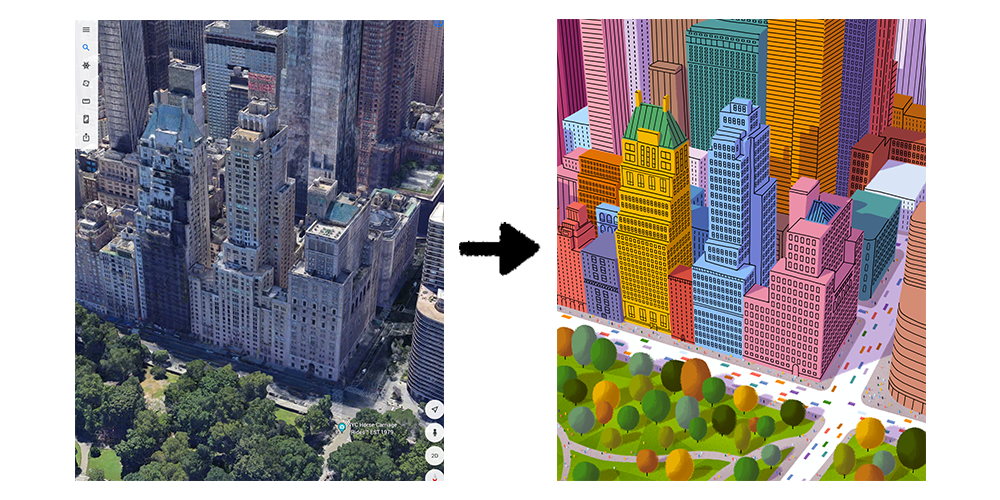
now. Google Earth. Lots of major cities
have been mapped in 3D so I explore the
world on my iPad, screenshot interesting
compositions and trace. Of course, there's so
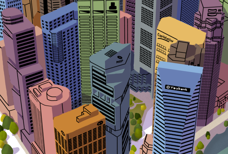
much more than tracing. We'll cover composition, line work, color
thumbnails, blending modes, and every tip and trick
to go from something like this to this. I'll be working in Procreate, but feel free to use whatever drawing application you
are comfortable with. I've got my process down
to a science by now. As long as you have stylists
and some time on your hands, you should be good to go. You can follow along with the same cityscape I'm
making or choose your own, the approach will
basically be the same. Finally, this course
is illustration only. I'm saving animation
for my next class. However, we'll cover
considerations for the drawing that would affect
animation in the future. I really appreciate you being
here. Let's go exploring.
2. Choosing a Composition: In this video, I'll show you
how I find my compositions. You can open up Google
Earth on your tablet, phone or computer and
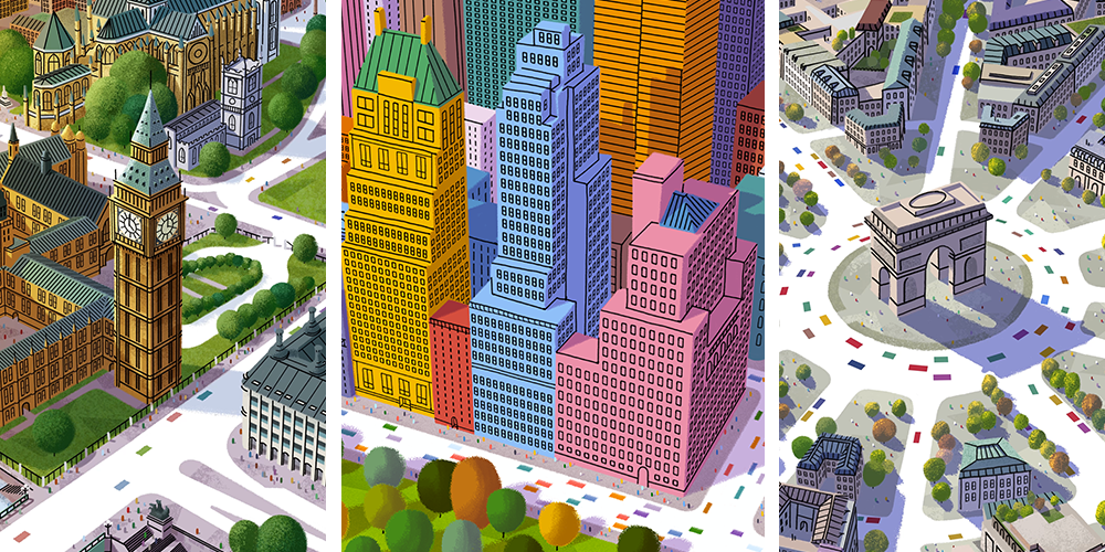
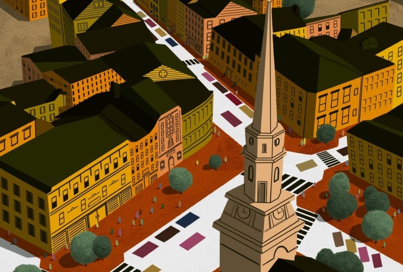
get to looking around. I love drawing New York City,
so that's where I'm headed. You should feel free to follow
me to New York or choose your own location
as the method I'm teaching will work wherever. But there are some
things that are important to keep in mind. First, Google has three map a
lot of cities in the world, but not every last one. There's a chance that place
you're looking at appears flat like this instead of this. Next, because we're tracing on top of our reference photo, I always make sure
I'm not setting myself up for more
than I can choose, so I avoid shallow
angles that show building's going off
forever and the distance. I keep the angle steep to
limit what I'll have to draw, and I recommend you do the same. Lastly, I illustrate
all my cityscapes at a four by five ratio so that I can sell
them as prints for common sizes like
eight by 10 inches. But I also create
animated videos to share on social media, which are nine by 16. If you think you'll want
to take the animation course I'm making after this, keep that in mind and give
yourself enough space to account for both sizes.
Back to New York. I'm liking this composition for those wanting to draw
this same scene, it's the Essex House
just off Central Park. The buildings aren't too
complicated but not too boring. I've got streets that are simple straight lines and
trees along the bottom. I'll take a few screenshots from various angles until I
find just the right one. I've attached the screenshot I'm working from in the
class materials along with other
reference photos I've used in
previous cityscapes. Find your composition and in the next video, we'll
set up our canvas.
3. Setting Up the Canvas: In this video, we're
going to set up our Canvas and get our
brushes sorted out. Let's open up your
drawing application and set up the Canvas. I'd like to illustrate
a two times the size of what I think the
final size will be. Because I want to sell these
at eight by 10 inches, I'm going to choose inches
as my measurement and set the width to 16 inches
and height to 20 inches. I also like to set
my DPI at 300, this basically ensures
that the image will look good no matter how much
you scale it up or down. I can also see
that at this size, I'll be able to have
61 layers at most. If you're on Procreate and
your number is different, it just means we have
different iPad models, but no worries we're
going to try to keep our best to keep layers tidy
and as few as possible. If you want to get
into color profiles, I set mine to RGB
instead of CMYK. With our Canvas setup,
let's talk about brushes. In the class materials I've included.ABR file, which
is for brush types. There are tons of tutorials out there for importing
brushes and since we all might be using
different programs, I'll let you figure it out. We're only going to be using two brushes for
the whole drawing. The first is a rough brush for line work and filling in color, the other is a grainy
brush for adding texture. You likely already have brushes available similar to these, so choose your own
or install mine. In the next video, we'll import our reference photo
and start drawing.
4. Outlining the Scene: In this video, we're going
to outline the scene. Let's import our photo to the Canvas and get it
positioned just how we want it. If you want to draw
less, Zoom in. Remember to keep
in mind the 4 by 5 the 9 by 16 considerations. We'll drop the opacity of the images so our
lines are easy to see, create a new layer for the
outline, and get started. At this stage, we
want to capture the outline of the road,
trees and buildings. We're not adding
details or windows, we're just want to map
for where we're going. Let's first define the sidewalk. In procreate, you
can draw a line, hold the stylus in place at the end and they'll
automatically straighten out. I use this all the time
to get fast, clean lines. As we move into the buildings, the biggest thing
to keep in mind here is that we're simplifying. You can draw as much or
as little as you want, but try not to get caught
up in the details. A trick I use all the
time to tell what's important and what
isn't, is to squint. Things look a little blurry and the shapes become more general. These are the shapes
we want to capture. Here's a good example
where I'm disregarding all the complexity of that roof and putting a flat
box around it. Feel free to make
things up as well. Now that the buildings are done, let's go back down to work more on the ground
and the trees. As you can see, our view of
the sidewalk is blocked. Sometimes I'll go into Google Earth and
look around to get an idea of what's going
on underneath the trees, and sometimes I'll
just make it up. Let's finally add our trees. This isn't something
I attempt to trace, I just look at where the
trees are generally and start drawing circles of
various shapes and sizes. I don't like to
make big clusters, so give them some space. Hide the background image to get a feel for what you've got. It should look
something like this. It's okay if yours is
a little different. One One I've noticed is that in all these areas where we have
a bunch of vertical lines, without the background image, it's hard to tell
what's going on. I'm going to make
a few lines that inform me of the shape
of the building. I'm just looking
at the windows and drawing lines that follow
that same perspective. Our lines good to go. In the next video, we'll
move on the color.
5. Creating a Color Palette: In this video, we'll
determine our color palette. First, I have to decide what season or feeling
I'm aiming for. I think I'd like late spring, so warm and bright colors. I'm going to go to Google
and start looking for photos that when I squint at
carry that feeling. Now, I know that we'll have buildings and trees
in this drawing. So while the image doesn't
have to be a cityscape, I do want to make sure it's got some greens to
cover the foliage. Buildings can really
be any color, but I just want a cohesive
variety to choose from. I think I felt when I like, I'll import the immature Canvas, but we don't want to
just color pick from this image as is. Here's why. If you zoom way in, you'll see that this
tree is made up of pixels of so many colors, we want a simplified palette. Here's a trick on
Procreate and Photoshop respectively to turn
this into this. In Procreate with the color reference photo layer selected, press the cursor button. Along the bottom, you should see an icon that says Nearest. This setting handles re-sampling as you scale your
image up and down. You have nearest neighbor, bilinear, and by cubic. This will only work if
set to nearest neighbor. Make sure that transform type
is set to uniform and scale the image down until it's
only 20 or 30 pixels wide. Place it by tapping
the cursor so that the transform
handles disappear. Then tap the cursor
again to highlight. When you scale this image
backup in place it, it becomes a pixel grid. This takes the average
color of that given area. In Photoshop with
your image selected, go to filter along the top, pixelated, and mosaic. You can set yourself size
and you'll see your palate simplify. Back to procreate. Now that I have my palette, I'm going to play with
the colors a bit, increasing the saturation and brightness until it
feels just right. Now we want to create
five groupings of colors. In a new layer called palette, the first color is
for the sidewalk. I like to use cool
grays and tans. Second is for the grass, two to four shades of
green will do just fine. Third is for the trees. I'm aiming for mid spring, so I'm adding a couple of greens and pops of yellow and orange. Fourth is for the buildings. I want them to be more
colorful than real life, but I don't want
any one building standing out over the other. They're all pretty
similar and saturation. Lastly is for the
people in cars. Because these are the smallest
elements in the scene, I like to choose a rainbow
with more saturated colors. Let's take those colors and
put them off to the side. In the next video, we'll
make our color thumbnails.
6. Creating Color Thumbnails: In this video, we'll
create color thumbnails. Color thumbnails are an
important part of the process. It allows you to quickly play with colors
and get an idea for the end product before
committing to a given palette. We're going to create
a new layer underneath the line reference layer
and call it thumbnail. Let's grab a random fat brush so we can lay color on quickly. The point here is
to be super loose. Don't worry about
coloring in the lines. First I'm going to lay down
the sidewalk color than the grass for the buildings I start in the back and
work my way forwards. I don't have a real
science to coloring, I'm just picking them from
my building palette at random and making sure
they're spread out. I color in the trees last, I'm taking another quick pass, adjusting or changing colors. I'm just making sure
that there isn't one building that stands
out above the others. Now I'm playing more
with the colors, changing the brightness, contrast, and hue. Sometimes I'll use
a yellow fill and change the blending mode
to see what happens. We want to end up
with a few options alongside one another. This is the same thing
you do for a client, presenting a range of options. Once we've chosen
the color thumbnail, the last step is figuring out where the shadows are going. I want to quickly create
four shading options is if the Sun were coming from four different
directions to help us finalize our color thumbnails. Depending on what the color of the underlying material is, shadows can be all sorts
of different colors. I like to simplify this
process using blending modes. First, you're going to
create a new layer on top of everything else and change the
blending mode to multiply. I like to use purple
for my shadows, but any cool color will work. It's just a matter of what
you want the mood to be. As you can see when I paint
on top of my thumbnail, it's going to darken the area beneath imitating these shadows. I think I like the
bottom-left option. I'm going to grab
my final thumbnail, scale it down and placed in
the quarter for referencing. In the next video,
we'll lay down the base color for
a final piece.
7. Painting the Base Layer: In this video, we'll lay
down the base color. Now that we have the outline
and the color thumbnail, we have all the
information we need to get started on the
final illustration. Let's start with the sidewalk. I'm creating a new layer,
naming it concrete, picking from my reference, and filling it in
like a coloring book. Next, I'll color in the grass in a new layer called,
can you guess? Grass. Then comes the buildings. We can make each
building its own layer, but then we'll have
a ton of layers, and I think that's more
trouble than it's worth. But I am going to separate the buildings into two groups; the background and the
foreground buildings, to have a little break.
Let's keep coloring. One thing to note
is that when using a color fill feature on
really any painting program, you see a faint line where your shape wasn't
completely filled in, I always go back around
and clean this up. Also, when your color
picking from your reference, make sure not to pick
the areas in the shadow. We want to use the
unshaded colors. For the foreground buildings, I'm going to show you a
slightly different approach to coloring using a clipping mask. I'm going to create a new layer and call it building front. I'm using a random
color to fill in the silhouette of
the entire group of the buildings in the front. Now if I create a new
layer directly above it, lay on the blue pane of
this particular building, I can go back to my layers, tap it, and make it
a clipping mask. It clips the color to
the shape beneath, while I'm coloring,
I don't have to worry about the outer edges. Next come the
trees. This will be a new layer and I'm taking
my rough line brush and simply scaling
it up to create the tree so it's got
that leafy rough edge. I'm turning off my outline layer and let's see
what we've got. It never hurts to go back and clean up some of those lines. In the next video, we'll make the cityscape pop off of
the screen with shading
8. Shading the Cityscape: In this video, we'll
go over shading. For me, the shading is
the glue that holds the illustration together and makes it pop off the screen. We'll split up the shadows into a few layers to make
things more organized. First, we'll create
a new layer for the ground shadows
above the ground layer, but below the building layer. I like to use a cool shade
of purple because when this layer is set to the
multiply blending mode, it darkens the
colors beneath it. I'll first paint in the shadow being cast from this building. Once you establish the
angle of the shadow, make sure the rest of
your ground shadows are close to the same angle. Next, I work in the trees, which is just a
angled oval shape. It's far from perfect,
but that's what we want. When I set the blending
mode to multiply, I lower the opacity to 50
percent or so and we can already start to see
how the buildings and trees are lifting
off the screen. Next, I'll add the shadows
with the foreground buildings by creating an additional
clipping mask layer. With the outline
layer turned on, I'm going to shade all of the sides that aren't
facing the sun. Here on this red
building, we have a circumstance where part of
the roof would be shaded. Here's a quick way to figure
out where the shadows fall. I'm creating a new layer for reference called shadow line and tracing the angle of the cast shadow on the
ground from that building. The cast shadow should all
be roughly the same angle. If I line up where the corner of the roof meets the building, that shows me where the
shadow should fall. Soon it'll become
second nature and I strongly encourage
you to work loosely. There's going to
be so much going on in this illustration that no one will notice a shadow
that's slightly off angle, if anything, mistakes
just give it a character. Once all the buildings are done, we'll move on to the trees. They'll all have a
similar shape to their shading being
a crescent moon. I've dropped the opacity
of the brush a bit so I can create a
gradual shadows since the trees are shaped
like an orb and therefore won't have
hard shadow edges. Now you could go through and
paint these one-by-one and be meticulous about
where the trees overlap, but here's a shortcut. If you press the selection tool to change the type to automatic, you can tap on a color
and it'll select all the shapes within
that color on that layer. Now the specific
tree color selected, I'll move over the shadow
layer and we can quickly shade and move on to
the next color set. Once we're done, again, we set the blending
mode to multiply and drop the opacity. In the next video,
we'll add texture to the scene to give it
some more character.
9. Adding Texture: In this video, we're going
to be adding texture. Texture is illustration
character. It makes it feel lived in and it's an essential
part of my process. Grass and concrete
layers always get a texture treatment and they're
done the same exact way. Let's start with the grass. I'll create a new
layer above it, make it a clipping mask, and name it grass texture. With my grain brush set
to about 50% opacity, I'm going to feather in
a darker green color around the edges of the grass. This gives it some
nice contrast. Feel free to use multiple
shades of green, but keep them all
relatively subtle. I'm doing the same thing
with the concrete layer. I have one more optional
layer of texture. I like to think of
it as my signature that probably no one recognizes, but I use triangles. You can see them in all
of these illustrations. I think it helps to
sell the perspective. All I'm going to do is create a new clipping mask on top of the grass layer and call
it grass triangle texture. Using the Lasso tool, I simply create
flattened triangles. It's a bit hard to
tell, so give them a temporary red feel
for you to see. Let me undo that and now I'll go back in with my grain brush and a darker green and color and
the edges, keep it loose. I'm going to set the blending
mode to multiply and lower the opacity until
it's just barely visible. Again, texture is all
about subtle touches. See the difference between
texture and no texture? In the next video,
we'll be adding line work back into
the illustration.
10. Finalizing Linework: In this video,
we'll add parts of the original line work
back in the illustration, and I'll show you shortcuts for adding details like windows. Let's unhide the outline
layer and drop the opacity. We're going to use
this as a guide. The rule I go by
is pretty simple. Whatever edges aren't
defined by a difference of color will be defined
by a black line. You see this roof edge, the shadow is defining this edge so we don't
need a black line. You see this building where the roof edge goes
from shadow to light, I'm only going to define the
edge completely in shadow. Next, I always add
little stems to the bottom of each tree to
give them some grounding. Now for my favorite part, the windows, if you look around the original
reference image, we have so many different
shapes of windows, you should feel free
to take as many creative liberties as
you want with this, you can make it true to
life or simplify them. We're going to be
doing a bit of both. The problem with free handing windows is that
windows are meant to be the same size
and spaced perfectly. It's really easy to spot mistakes when you're
expecting consistency. To make it harder,
the windows on the bottom of the building
will be differently shaped and what's on top due
to a change in perspective. But I've got a
shortcut for all this. Let's disregard the windows
below and on a new layer, draw a simple rectangle with all right angles,
no perspective. Then I duplicate it
and shift it over. I merge these two window
layers together to form one and duplicate that
and shift it over. I'm going to keep merging and
duplicating until I've got one layer that's a big
grid of uniform windows. To apply the new building, I'm going to make a
duplicate so that I can preserve the original for other buildings and use the
free form distort tool to warp the group until it matches the angle
of the buildings. Once one side is set, I'll duplicate it, mirror it, and warp it to fit
the other side. You can unhide the
reference image and drop the opacity until it's just barely visible to indicate
how to warp the windows. As you warp and scale, you might notice the lines become irregular in
their thickness. I like to have mine is
close to uniforms possible. So in this case,
I'll just duplicate this side and slightly offset it to increase
the thickness, then merge the layers together. As I work my way
throughout the city, I'll create a few
more variations of windows using this method. Also add details like doors
or lines to the rooftop. I take inspiration from the
reference image and find simple ways to suggest similar shapes.
Here's some examples. We're in the homestretch now. The final video is going to
be adding cars and people.
11. Drawing Cars and Crowds: You made it. In
this final video, I'll show you my shortcuts
to creating cars and people. I create a new
layer called cars. I'm going to use
my line brush and a random color to draw the
individual lanes of traffic. If you want three lines on
the street, draw three lines. I like to use the draw and hold method to create
perfectly straight lines. I'm going to be erasing sections of the line to create the cars. On a new layer, I'm drawing some reference
lines perpendicular to the angle of the street to help me understand
how the car should be shaped and now, start erasing. Create as many or
as few as you like. I just tried to
ensure that there's plenty of variation in space. To color them, I'm
going to unhide our palette layer and
color pick from it. In a new clipping mask
above the car layer, I'll start coloring them in. If your cars are appearing
above the ground shadow layer, you could either move that layer underneath the ground
shadow layer or just set the car layer
blending mode to multiply and they'll mix
in with the shadows. To create the people, I
could do them one by one, but this takes way too long. I create a new layer called people and draw a small
group of 10 to 20. Use as many colors as you
want taken from the palette. Now I'm going to
duplicate the group a bunch of times and
start to space them out. I go through and clean
up the people I don't want and erasing those
appearing on top of the tree. As of right now,
the people who are appearing above the shadows, but unlike the cars,
we can't set them to multiply because we don't
want them to be translucent. I'll create a clipping mask
on top of the people and use the same shadow
purple to fill in the people falling the shadows. When I change this
layer to multiply and drop the opacity
like we've done a thousand times before
we have people in shafts. The final step is adding
cast shadows to people. I don't have a
shortcut for this. I just go through and on a new layer underneath
the people, I draw in the
shadows one-by-one. Set your blending mode to
multiply and drop the opacity. That should be it.
You're all done.
12. Final Thoughts: Thank you so much for taking
interest in this course. I hope it makes
illustration feel a bit more accessible and I love
to see what you create, so please share it with me. If you're interested
in animation, keep a lookout for
my next course on animating these cityscapes.
See you around.
 Nick Fairbanks, Freelance Illustrator/Animator/Designer