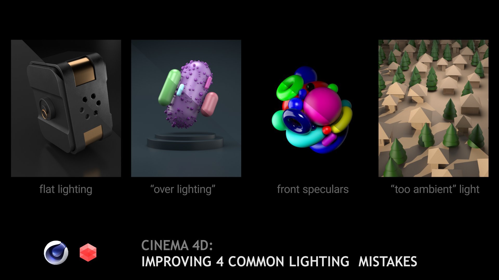
Transcripts
1. Intro: Hello, my name is Alexey. In this class we'll continue to discuss methods and tactics. How can we improve
our work with light? How we can add
depth to our scene, and how to create light
shade transition. On-screen you see the
results of this class. We will divide this training
into four situation. So let's not waste our time and start to investigate
and to learn.
2. Light and Shade Transition: In this section, we're
going to talk about using light to add dimension
to mostly flat scene. So let me open the preview. Now I have seen made from different
assets from cinema 4D. And you see that now we
have very flat view. So let me go out of the camera and close
all these elements. So just a simple cube and
few furniture elements. How are we going to add
dimension to this scene? So e.g. we can load HDRI
map and add some shadows. Of course we can
load some textures. Let me open my plus library from grayscale gorilla just to
show you how it works. So e.g. here, we have strong direct light
source from the right. And we have the
slighting shadows, but overall, there room
is looking very flat. We can go and try to
rotate this scene. And when we have some shadows, we don't have proper lighting. So even HDRI map
doesn't work this way. So each can be the
first problem and first mistake to picking
the wrong HDRI map, how we can solve these thing? First of all, we can add, let me delete these pre-made
relate and add one more. Just adding a light source. I forgot to mention. Just tell you once
again that I have the basic redshift
setup with medium and all settings
are set to default. When we have these
default light, we see that now we
have some dimension, we have some bump. Pretty seeing some extra
light is some shadows. So we tried to rotate our
light source and put it above. And of course decrease
its intensity. Number ten. It seems very similar to what
we get from our HDRI map, but we have some more
interesting things. More sharp shadows. And now we clearly
see the bump effect, bump texture on our hook. So the dimension
of this image is much deeper than we
had in previous. How can we improve
this thing more? There is one trick, that position of
our light will be affecting to our wall and
of course our object. So my idea is to position our light so that we have the
bright areas and dark one. So e.g. we can check their
rotation position like this. Proper lighting at the top and less lighting
at the corners. We have these direction of
our light emissive from our source and in area. And we have these
little sliders spread. The lower value as the sharper border between
dark and white will be. So let keep small blue line. And now we have
really high contrast. Let me decrease the intensity. Really high contrast between
bright areas and shadows. And maybe this is what
I was looking for. I'm going to the top view. I use a middle button to
switch from viewports, shrink down, and put it directly where we
have our furniture. And what results do we get
in the end of our tweaking? So move a little bit further. Let me switch to Beckett mode so we have the clear image
of what we have done. There should be some rendering. Take what? The idea is to create this
light gradient pattern. In our image. We have brighter zones
and the dark zones, we have clearly visible
bump and texture effect on the wall, on the floor. And even in our
materials on our mood. So it looks much more realistic, much more natural than if we had this flat looking light or maybe these highly
spreading shadows. So it's almost finished
because that's the result I want to achieve in these
really flat scene. So we have a lot of front
looking planes, surfaces. What we can do with
this to add dimension is to put our light in such way. So we create a
gradient on our zone. The dark zones. The zones. Of course, this was
the goal I want to achieve when you have
a flat looking scene, just to try to add extra light
or additional light that would be effecting on very specific zone
of your composition. And don't use too
much global lights because globalize will decrease
the effect of each other. They can cue the
shadows of each other. They can produce
flat looking scene. So e.g. I. Decrease. I disabled the
Beckett mode and add one more light and
put it at the top. E.g. I want to maybe light it more and it's highly spread. Lighting decrease the intensity. Maybe five. When it
started to take effect. We see that we're losing
our contrast in image. Of course, there could
be a request from client to create
less contrast scene, but be aware to use too
much lights in your scene. Be very specific with
your light and add these limited effect
of each area light. Maybe you spotlight on
maybe omni light or GRA. Use light very smart
and carefully. Especially when you have
a lot of flat surface, you need to produce
a light gradient to draw and create deep
of your composition, we need to have the dark zones, the zones, the middle zones. And of course, if you're
using bump maps, normals, or the displacement, your
light should work that way. So it reveal all work you
have done with materials.
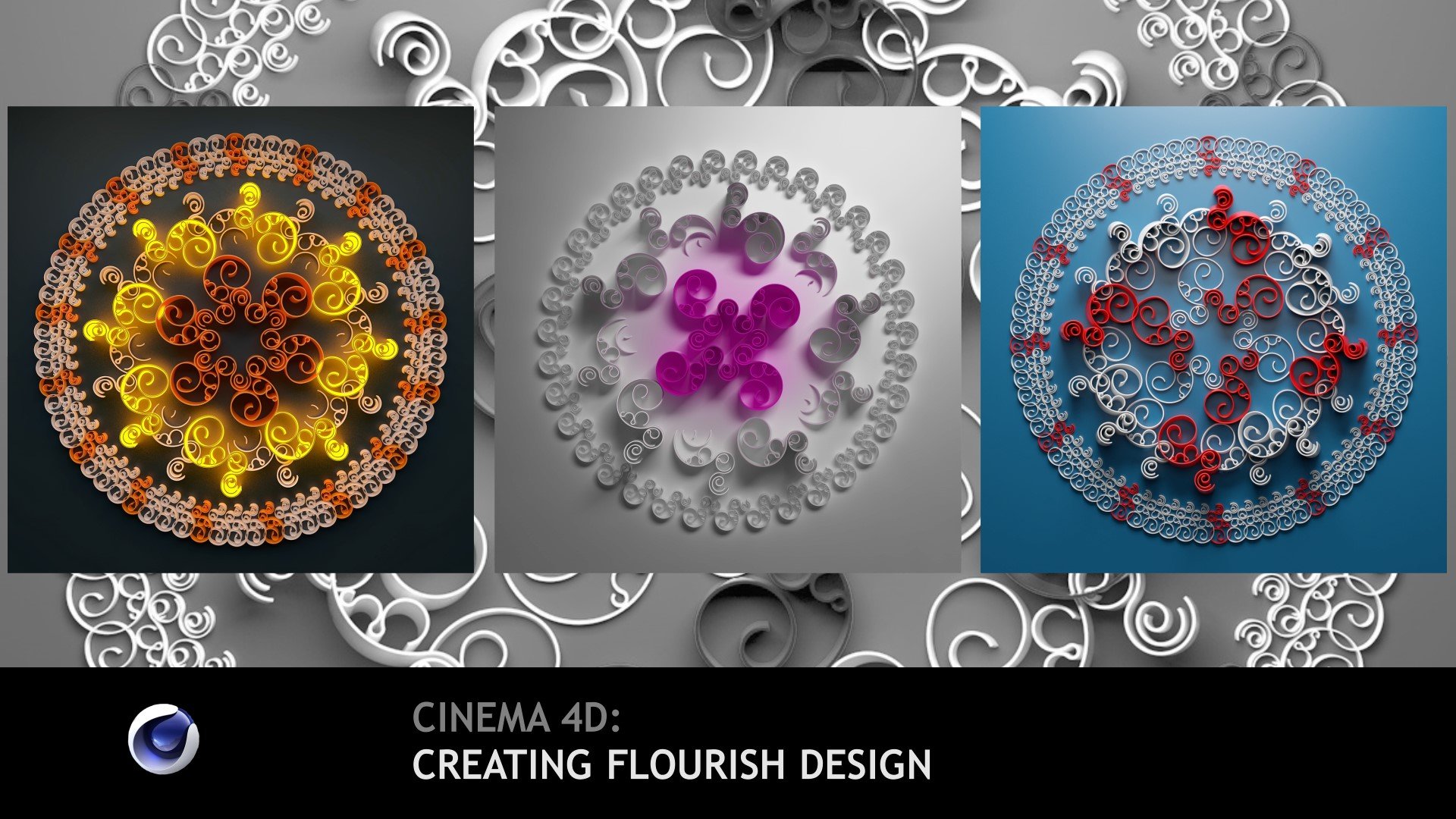
3. Drawing Your Own Gobo Texture: The next scenario is when we have an abstract composition, just primitives with different
angles and positions. And we need to add some depth. Like in previous video, we can take our area light, e.g. decrease, its spreading. Going to the side view. Let me lock the
camera like this. Maybe move it to the side, rotate, maybe orient to our
objects and puts above. So kinda like this. Of course we need to
decrease the intensity. And now we have the same
gradient we had in previous sin. But in this case we have
a lot of dark zones, a lot of shadows
and losing details. Let me go to my material
and add some roughness. I think too much. We need to create
more rough surface. Let me open my structure. This is silver. This is our main interior. Rubber. This is a
simple structure, so I have object colour
going to correct, then ramp and recolor
my diffuse channel. So it generates this kind of pattern than these
type of material. Then I put the same areas, object color two areas, ramp to create this map. Then I have Maxon Noise and multiplying one
mask when we have these flakes only on
several objects and then just combine them with material blender, very
simple technique. I think I show it in
different tutorials. Now we have sight top light. And you see that
in this scenario, our previous method
doesn't work as we want. Of course, we can move it. But let's stick
to this position. I add few more light. So light lights from the
left and moved to the site. So huge left source of light. Of course, I decrease it. Just to lie top
of this geometry. Extended because it
should be a few light. Maybe decrease the strength. Also, I would like to
decrease their reflection. You can do it usually
in more render engines. So I decrease it. So yeah, light we have
and no reflection. And one more light I think
I should add at the bottom. So bottom. Rotate. Beautiful lighting. Let me rearrange top, left, bottom, decrease the
strength to very low value. I think, to maybe one. And now we're faced
the problem that I was talking in previous video
that we losing our shadows. Of course we can use
post-processing and all that stuff. Let me try to decrease
the spreading. And now we have more sharp
shadows and the more visible, but we losing light here. So what we can do, and what trick can we use? E.g. I. Decrease this
spreading to a value that I have small light
and shade transition. But we add one more
light with gaba texture. Let me open Photoshop.
What is gaba? Gaba is a black and white
texture that is loading to relate or any other
light and produce some different light spreading. So e.g. we can draw some
these kind of lines. Of course we have these elements and maybe it's not perfect. Like this. I'm holding
Shift to do this. Pattern like this, okay? And then maybe add
some vertical lines. And as you see, this should be a mask for
our light transparency. I invert this image. And now we have kind
of blinds texture. We will save it to PNG file and load it into our light source. Or we can save it to PSD
if you have moved to layer settings to have
further adjustment options. I'm going back to my Cinema, going to top light. And I want to remind you that
our goal is to add depth to our render to produce more beautiful image
in the result. So we'll use gobo and lower
the blinds file into it. Now you see that
there is no results. So I disabled all our lights, go into Goebbels and
set spread to zero. And now we have these beautiful
non regular lighting. We extend our light
and check this out. We have beautiful
interesting pattern that adding details to our composition so we can
extend play with the toy. Maybe we can keep only
the Goebbels line. So let me go back and own
our other source of light. Now, gobo has very
high efficiency, so we can play with it. E.g. I. Decrease it. Then going to bottom. Nice light from the
bottom. Going to left. Too much for now.
Because now we have great and visible direction
of our line that is parallel to our lines
of our composition. So I can decrease
left lighting more. Maybe put it to the top
or maybe to the bottom. Move our bottom
lighting to the corners so we increase the contrast between shade and bright areas. Going to top light,
maybe further. And when we put it together, we're losing these gradient. Decreasing the light. Maybe extend it. And check. I do like these darker
cornering zone. Yeah, that's what I
tried to achieve. We have this gobo. We can play with its position to arrange the start of our blinds, the ends of our blinds, and all that design elements we want to add to
our composition. So I opened my browser and I made different goal was by myself just for
my personal use. And there are different
types of them. E.g. we can add. Let me keep this one for
you to Final Project. And here I'll show you how
different Globus works. Blinds it simple
lines like this. Then you can draw any other
type of vertical lines. They produce different effects. And of course, you can
add some plants through. It. Just eats up to you
for your imagination, how you want and would result
you want to achieve e.g. I. Do like this result. Maybe I add an extent, the lighting and try
different pattern here. Yeah, lights, okay. Shadows. And let me check my
other set of elements. You see that we immediately have these huge light impacts on
light and shade composition. And their results. Or final lighting
is very different from what we produce
without using gobo. Let me keep this one for you. So I put this material
to final project. And let me show you what
we produced without gobo, but with the directional light that we were using
in previous video. It has the gradient, light and shade and
all that stuff. And we can e.g. play in, decrease their left lighting or kill all lighting
goes from the bottom. It's up to you, but the Gobo, adding extra details
and extra depth. In our light setting, you see this image is much more pleasant and let me
add one more light. So light set to
sphere and put it something here to add lighting goals that goes
from these bright area. Let me extend the scale. I want to add smooth shadows, smooth lighting, decrease the value of
course, of intensity. Just add extra lighting in
front of our composition. I think here. Okay, that's great. At additional light. Maybe it's too much because
it's blown out of the zone. That center eight me be
decreased their reflection. Know it dads some spec
colors. I do like them. And let's render all that stuff with brackets to see
the final result, we see the beautiful
depth of our light, the shades, the pride zones. And the final result looks much interesting that if we use only the directional light with low spreading value being set. So let's go to the
next lesson and check a few more tools that help you to improve
lighting in your sins.
4. Reflections and Textures: The next scene and the next
tool I want to show you is another variation of
using textures for lighting. E.g. we have two cans
with texture and some dots on them, like drops. And we create light. Rotate this thing to 90 degrees. So we'll create two
sides of the box. Studio. Of course, we need to decrease the intensity log of the camera. Oh, go into floor and set color to pure duck and
arrange our light. So it produced
this narrow light, light Control-C, Control-V, rotate and move it
to the right side. You see, now it's not very interesting because
they are the same. So we can take this left, right, and left, and repositioning them so
they don't look the same. So e.g. left should be bigger. Maybe further decrease
intensity, right? Big one to the side, and one more, right? And huge to create
this backlight. So we need to move
our light just to create these narrow light. Of course decrease
their lighting density. Zero point or one. Okay. That's good.
But the front, we don't see the front. We need to produce some external light to
light up there, the front. Let's create a light rotated. I want to remind you that
all these strategies can be implemented almost
in all renders engines. So I just showing you in
Cinema 4D with Redshift, but you can do it in
any type of software. So new top light. Let me take it to the bottom. Intensity one. We have this little
specular reposition. At the top. Year we
see this sliding. So light solo is a
good methods to find where your light hits and what reflection in
produce e.g. I. Do it. And position
almost in front, maybe a bit to the side. Extend. Move it. Yeah, going back, we have
a different light shades. And this one, let me up to
create maybe some gradient. But you see it's very
straight forward. Texture looks not
very interesting. So we open our Photoshop and
draw texture for our light. I create square 2000
by 2000 as a goal, but we need to fill it with pure black and then add
some white zones. But when we were building
our gaba texture, we use very high
contrast technique. Now we need to build a
low contrast texture. So e.g. I'll take
rectangle tool like this, Control H and arrange it. Select, maybe add some corner. This chattering, it will be
the mask of our texture. Now, we can go and
create some noise. Without it should be
applied to our mask extent. Maybe two huge degrees. And we blur this thing
with e.g. Gaussian blur. We don't need all these
details like this. I will add some curves
to extra contrast. Maybe like this. And we mimic to real texture
that is not very linear. It would be our
first light texture and then we create one more. The next type will be
much easier to build. I will delete all these layers, use the gradient tool and set. You layer this simple gradient. I'll click between layers. Control I to invert. And then we can add
some render filter. I think noise. Let me create a small zone. Render Clouds and extended. Very huge. And we need these
to decrease their elements, to decrease the details, I'll click and we'll check some maybe multiplying or
overlaying methods. So I would like to keep some details to add some
details in gradients. So e.g. like this. Oh, this is very smooth either. So we have some texture here. Now, we need to load
it to our lights. So I put them near
my Cinema 4D file, and we go back to 3D. Let me solo their left and
put the first texture here. And you see that
immediately we have some noises and non
linear structure. But I prefer to
use gradient here. And what we get
that higher level is producing much
intensity than the bottom. Let me decrease the intensity. Going up from Canada. Unlock the camera and
set light to visible. So you see how it works. Our light is like
solve the box now. We can up, it's to
produce and maybe shrink down to produce these
gradient fading. Let me look the camera to
the side and be sure that the bottom is not
affected by our light. Or maybe very subtle. Let's own, there are the lights. And now you see the difference. The left side has no
these Lena looking light. So I can increase the intensity
and produce very sharp specular at the top and very
low influence at the button, its reflection from the floor. Let me solo this one. And you see how it worked. So going up, going down. And now you can play
with this slide and produce much more
interesting reflection. And they will look more organic. Of course. I keep the right. As it was lowered, my texture there. Be sure. It's up a bit. And now we have the difference of lighting, of reflection. Maybe we add some
intensity and the right. You see. And in overall,
after all we done, we have different
light behavior and can use it for creating
more organic reflection. Now we will take our mean late, going to load our texture that contains these
kind of noise. Let me go out of the camera, set light to visible
and log the camera. You see going back to our
Ken's going to material. And I will add some
reflection just to show you how these slides we'll bonds and create what
reflection it will create. As you see, we have these
very organic reflection now. So I can extend, let me hold the camera. And if we delete this texture, it will be just solid cube. That is not very interesting. But with all our textures, I think now we need to decrease the intensity
because it produced very strong light too much
for our finally rights. And one with, without
any textures. Maybe we will load
here the gradient one. And of course, it will
affect the results. How light is spreading, how light is calculating. Or maybe we will load here our first texture
that combines and produce and go out of the
camera set to Visible. All other elements not visible. Unlock. Here is our light. Here it is. It doesn't load the texture. So I fix the path. Now we go back to our camera and now you
see the difference. Let me delete this texture and loaded up much
interesting reflection, much interesting light behavior. And of course, it will affect the final result of
composition that you are trying to build with only lights
that you are using. Of course, we need to
add some light here. Let's try to do this to
adding extra area light. Going back to camera here, maybe something
really small, subtle. And you see the specular
is looking very awful. And I think we can't build their proper light direction and properly behavior
without texture. So we need to load
our gradient texture. Rotate our light. So 180 degrees. Solo. It. Going out of the camera. Make it visible. This sure. That will load
proper texture point too. Yeah, and we have this decrease in light going to the top. So I need only if
these parts of light. So going back to camera and
put my light below our stage, maybe just to add only these
low specular button. Back. We'll wait till our
buckets will do the work. And result of this
part is to show you how subtle texture that
were made in the seconds in Photoshop will really increase
the overall quality of our reflection and will
help us to produce more interesting results
in our reflective. Since.
5. Blockers: One more trick method to control the light is we
can call using bloggers. Let me demonstrate how it works. E.g. you have overall
lighting that is set with very global influence. So maybe huge light, maybe sunlight or
something decrease. Ten, maybe 30. Yeah. So very bright light. And you like how it produced these soft shadows and
directional shadows. But you want to
limit this thing. Here. You can do it by creating additional geometry that
will block these light. Passing your scene. E.g. you can create a plane, move it to the top, and you see immediately
it blocks the light. E.g. I. Put it to the left and
put it to the side. And here we have
this imitation of directional light without
working with light. Also, you can do, I think, with materials, because the default color is you see how this scene is working
for on-site is white. It it can produce additional
reflections or reflects. Usually, I use default
material with black color. Let me delete this. You see it's more
lighter and brighter. And when you use dark color,
decrease the lighting. E.g. for this scene, I prefer to change the logic and create a rectangle and sphere, small sphere using
spline mask 12. And instead of uniform or union, I will use subtract and
then extrude by holding Alt to create these
cutout in our sale. So delete these planes going up extent or maybe like this. And like this. So they're saying visual effect,
but another logic. So e.g. if we need
to put our camera, so the top, there'll,
there'll be visible. Of course, this setup is
more pleasant to see. Let me undo the camera movement. Maybe drop down the
top of our sale. And you see that the
color over these will drastically affect how light will be passing
to our scene. Another and no color. So be aware of what
color you're using. And e.g. for this scene, I put my floor, my sale above their underlying
going to top view to that. And picking the right and down. They're spreading. My life will be more
focused and centered. Then if we have their
default diffusion, spreading and they don't want to have the
narrow lighting. And maybe we can use
these blocker with our, with the color of our walls. And now I change a bit camera for better
composition angle. Maybe like this. And hit render with brackets
before we end this part. So I edit segments July. And now I need to check their
position of our element. At some maybe caps. Five should be enough. With smooth. These elements, drop
it to Geometry, remove the material,
go into symmetries, select Q at filleds
field radius to one. And now we're ready to present the final look of
their last chapter. For this series. We were talking about controlling
spreading of light, about power of global, and making textures for
reflective writing and materials to create better and realistic
reflection and fading. And of course, we
were using blockers that can limit your lights when everything
is lighting good, but you need to specify the
area where light should work. Hope you like this training and Kevin eyes day
meet you next time.
 Alexey Brin, Motion designer