Transcripts
1. Intro: Fluid, natural and
expressive gesture drawings. Why it is so hard to draw? Well, my friend, if you
learn the fundamentals, it doesn't have to be. [MUSIC] Hi everyone, I'm Sue, a storyboarder and
comic artist who's been working in the
animation industry for about five years now. I've created storyboards for
several 2D animated series, both for TV and on YouTube. I also create web
comics in my own time. My most recent series
being Kippy and the Whale. The common thread in
all of my projects, no matter how different
they may seem is having to draw the human body
as my main subject. Because every story and
illustration needs characters. To give a character life, you have to draw them in many different ways from
all sides and angles, doing a variety of
complex motions. Throughout the years,
I've had to draw hundreds and thousands of
gestures in my work. I know many of my peers
in the art industry, have had to do the same. This is why it's so important to learn how to draw
gestures right. But what is a gesture
drawing anyway? A gesture refers to the
movement of the human body. A gesture drawing is a quick, simple sketch that captures
the motion of a person. Well, I've noticed over time, is there whether it's
a storyboard, a comic, or an illustration, how
good the end result looked, heavily relied on how well I do the original gesture
in my drafts. You can have the
prettiest colors, best composition and line art. But if the underlying gesture
of your art looks odd, it all falls apart. It's if I tried to add skin and muscles to a body
without skeleton. There's no base of foundation. Almost every field within the art industry requires you to draw the human body well, but most struggle to make your drawing look
fluid and natural. Is tough because people often
don't know what to look for in their references or how
to even start a gesture. By joining this class, you'll be able to
quickly and easily identify the main
movement in a reference, otherwise known as
the land of faction. From there, you
can figure out how to show it as a
hipster angle and understand how to create visual
contrast in your gesture. In the first few lessons, we'll do a series of time
to practice exercises. Having a tight time limit
will help you focus on just a gesture and not waste
time on unnecessary details. Then we'll dive
deeper into capturing motion by using videos
as our reference. You will learn how to
pick the best key frames to communicate a
sequence of movements. We'll study how to draw
body language that reveals the character's personality and their relationships to others. Finally, we'll end the class by trying to push
our gestures from our references by
simplify and exaggerating the opposes for
emphasis and impact. This course is for
anyone who wants to develop or refresh their
gesture drawing skills, especially those who want to push your art to look more
expressive and fluid. To those of you who are true beginners to
join, don't worry, I'll give a simplified version of each lesson's assignment
for you guys to draw. So that it'll be easier for you to start
your art journey. By the end of it, you'll
understand how to draw fluid gestures and be able to express the emotion and personality of the
characters you draw. Just an extra note, the first two lessons
of this class will feature references
that include nudity. So viewer discretion is advised. Hope you guys have a great
time learning through drawing, and I'll catch you all in
the first lesson. See you.
2. Line of Action: Where do we start? [MUSIC] Hi everyone. Welcome to your first lesson. Thank you so much
for joining me on this journey to join
a fluid gestures. I'm going to start by showing
you the different ways you can analyze your reference image before you start to draw. Then I'll share my own
drawing process and take you through the
different methods I use when I draw my gestures. Hopefully, it'll
help you when it comes to your own drawing
practice at home. If you're new to join gestures, you've got to focus on
three key elements. The line of action, the angle of the shoulders, and the angle of the hips. By focusing on these
three elements, you're essentially
joining stickmen. Now, joining this
stickmen and gestures, really helps you focus on
the main movements and not detail all the other aspects like shape, anatomy,
and structure. Those are all incredibly
important to art, but if you want to improve
on gestures specifically, this helps eliminate
distractions when you're trying to develop one
particular drawing skill. What is the line of action? A lot of people
equate the line of action to the curve
of the spine, which is accurate but I would argue that
it's more than that. In my opinion, the
line of action is the movement of
the entire body. To make it clearer,
I'll show you how I apply this in
my drawing process. I like to use Sketchy Daily, which is a reference website where you can customize
so many things. Whether you want to draw someone who looks masculine or feminine, whether you want the models
to be clothed or nude, right down to the type pose and the type of
view that you want. For this session, I made it 30 seconds so that
I'll be forced to draw the body in the most
simplistic way possible. Unlike their website as well as other similar references
in the resources below. I'll be using Clip Studio
Paint to draw my gestures, but you can use Photoshop or any other drawing
program you like. You can also use a sketchbook
with a pen or a pencil. It doesn't matter what
medium you decide to use. The only reason why I'm using Clip Studio Paint is
to make it easier for me to show my drawing process to
you in a screen capture. When drawing gestures
I usually start out by trying to capture
the line of action, then trying to figure out how the shoulders and
hips are bending. This is because majority of the body's movement is informed by the
movement of the torso. Then perhaps I'll join
the hind and draw the rough impression
of the limbs. I try to simplify it to
as few lines as possible. Sometimes I might
switch the order and draw the shoulders
and hips first because I find the
angle tricky or I want to capture the angle
before I forget it. For example, in this reference image the model shoulders are curved upwards and the line of action is simple but
it's quite short. It's almost like a
reverse C-shape. I spend a bit more time
drawing the head here too, because they're looking upwards and that's a bit
trickier to capture. As you can see, I didn't really
finish a drawing in time, but I think I got the
overall gesture down. One tip for people who want to improve on their gestures is that you may not
necessarily want to follow the reference exactly. For example in this image, the model shoulders
and hips are more or less parallel to one another. When the tilt and the shoulders
and hips are parallel, it tends to result in a
more boring and stiff pose. There's a few reasons for this. It looks too uniform, there isn't really a
flow to the gesture. You can't really feel
where the weight of the body is predominantly
resting on. It also tests quite stiff. However, when the angles of the shoulders and
hips are posed, it usually results in a more dynamic gesture because there's more of a
flow to the drawing. This pose in official terms is called the
contrapposto position, which is in Italian so I've very likely butchered the name
and I'm sorry for that. It basically means that
the figure is standing in a position of
asymmetrical balance. This way of drawing
shows more contrast in the gesture because it shows the relax and tense
parts of the body. The stress points and the
pose carry the weight of the body and they relax part
carry less of the weight. Think of the joint
being like a wave that carries the eyes
across a gesture. Slight asymmetry usually
creates visual interests and many artists use this
concept to draw fluid gestures. This is an art
fundamental that has been around for many years. This doesn't mean that
you should change the original image in
its entirety though. This just means that you are
free to alter it slightly, based on what you know
will look more appealing. If it's hard to do
because you are very new to joined gestures, I think you should actually
follow the reference pose as closely as
possible first. Then after you finish your
gesture drawing session, come back to the reference
image and try to redraw it and see if you can improve
the flow of the pose. For some reference images, the angle of the shoulders and hips may not be so obvious. For example in this one, you can't really see how the
models showed us an angle, because this is side view and then kneeling kneeling down, so the chest and hair are
blocking our point of view. To be honest, I struggled
quite a bit with this one but that's okay, and I left it in here
so that you can see that it's completely
fine to make mistakes. If you find you didn't finish
join the gesture in time, that's okay just skip on right ahead to the
next reference. What I like to do
when I encounter a reference that I could've
finished drawing in time is I will come
back to the image and analyze why without
drawing anything yet. This is important because you
want to see and break down the posture to understand it better so that the next
time you redraw it, you can avoid making
the same mistakes. It's a little hard to see
because of the lighting, but the cameras angle
slightly downwards, so we see a part of their back which means it's not a
complete profile view. After realizing that, I also noticed how their
shoulders we're tilted. The left side of their
shoulders are further inward while the right
side is leaning outwards, closer to the back of the head. Whereas for the hips
is the inverse angle. This means that the
left side of the hips is closer towards the body or leaning inwards while
the right side of the hips is leaning outwards. I think it's because the models right leg is bending further and which raise the hip
out to compensate for it. While the left side
of the hips is forced far the end because the left
leg is pointing outward. I know it sounds
very convoluted, but think of it this way. Basically it's like
Newton's Third Law, every action or every bend the body has an equal
and opposite reaction. On my second attempt, and I actually captured a gesture a bit
more effectively, and I started out by joining the tilt and the
shoulders and hips first, the powerful, most
challenging the first time. The second thing I found
challenging was trying to capture the line of action accurately within
the 30-second mark. I also knew how to draw
the head fairly early on because I needed to show how close the head was
to the ground. Then I just roughly indicated
how their limbs looked. Overall, although this joint isn't really that successful, it's still leaps and bounds in the first try and that's what you're really looking
for when you are drawing your gestures, improvement. I hope that helps you
understand how to analyze your references and
draw gestures better. To sum it up, we need to pay attention to the
three key elements. The line of action, the angle of the shoulders, and the angle of the hips. We should also make sure
that the references we choose have clear poses, and if we don't
finish a drawing in time we can always revisit that reference image and analyze
it again then redraw it. In the next lesson, we're going to put
theory to practice. I'll put up 10 references timed at 30 seconds each
for you guys to draw. Now, if you guys don't manage
to finish drawing within the allotted time frame,
don't be discouraged. The point here is not perfection is to make mistakes and
to learn from them. With that said, I wish
you guys the best of luck and I'll see you
guys in the next lesson. [MUSIC]
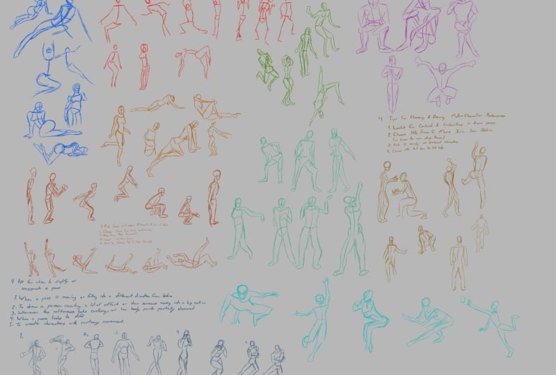
3. Practice Session: Hey everyone. Welcome to
your first practice session. As I said before, we'll
be drawing 10 references, timed at 30 seconds each. Remember to only
focus on drawing the tricky elements and if you can't finish
a drawing in time, skip on ahead to next
reference image. With that said,
let's get started. [MUSIC] Remember to draw just
the tricky elements. Move on to the next
if you didn't finish. [MUSIC] Remember to jump to the next reference, if you didn't finish in time. [MUSIC] Just two more references left. [MUSIC] You got this. Just one more reference left. [MUSIC] You did it. Congrats on finishing your
first practice session. Now if you didn't
manage to finish any of your gesture drawings
in time, don't worry. Always remember that the goal of gesture drawing is to practice, it's never about making
a final art piece. With that said, I hope it
helped you guys get warmed up. I'll see you guys
in the next lesson.
4. Analysing Movement: Welcome back, everyone. Let's continue on
our gesture drawing, this time though, let's
draw the full body. [MUSIC] Hey, guys, I hope the last practice
session wasn't too hard on you. I noticed it's tough to draw
anything within 30 seconds, but note that exercise was
just to get you guys used to drawing quick so don't worry if you didn't
manage to draw much. For the next practice lesson, you guys would get one minute
to draw each reference so that you'd get more time to draw the torso and the limbs. Just to let you know, everything we learned in the previous lesson about finding the three key elements will apply to all lessons
moving forward, including this one because the tricky elements are the base for all of
gesture drawing. In this lesson, I'll talk you through how to
observe and analyze your references by sharing a screencast of myself
drawing so you can see what I'm paying
attention to when I'm analyzing my references
and what I choose to draw. These are the four tips for gesture drawing we'll discuss
throughout this lesson. We'll look at how to identify the angle of the shoulders and hips when the reference shows a profile
view of the model, which means that we're
seeing them from their side. Then, we'll analyze how
to draw a gesture when a model is twisting their
torso in different directions. After that, we'll see
an example of what an ideal reference looks like and analyze what
aspects of the pose, makes it perfect for
gesture drawing. We'll also cover what
references you'll skip drawing especially
if you're a beginner. Once again, we'll be using SketchDaily for our references, and we'll be setting our timer to one minute for each one. For this first gesture drawing, I'll play the screencast in real-time so that
you can see what my thought process is when I'm drawing and analyzing the image. At first, I thought the angle
of her hips were level, but if you look closely, you'll notice that her
hips are seen from the side and leaning
downwards towards her left. This is because her left leg is resting on something which makes her hips slant down towards her left side to distribute
her weight evenly. I drew her head slanting down to a left and sketched in
her head and torso next. I then drew her head looking a bit too far to her right here, and it took me a few tries
to draw the curve of her hips as her right arm
is partially obscuring it. When I drew her legs, I tried to capture how her
right leg is tip-toeing because her weight is mainly being supported by her left leg, which is nearly on her bed. I focused on drawing her
torso and her legs before sketching her arms since the arms were the
easiest parts to draw. The screencast on myself
gesture drawing will be sped up by two times
from here on out. The sooner you can see
the overall approach I take and ways I analyze
each reference when I draw. This reference image is a bit
tricky because you can see the back of the upper
half in this lady's body, but you see the front
of her lower half. This means that there's
a twist in the torso. You can see a little
bit of her back in the upper half of her body, but for the lower half, you see the front. I had to go back and forth
between joining her legs and torso so that I could
capture her overall gesture. Then I came back to make it look more obvious and indicate that her torso is twisting her body in different
directions. It's generally best to draw out the basic overall gesture, because if the reference
switches to the next one, you will have at least drawn a majority of the
previous drawing. In my best to show a little bit off the
back of her shoulders, by drawing in a line
to indicate her spine. I also positioned the socket of her arm a little bit below her spine and her
neck to indicate that there's a little bit of
her back that you can see. This is actually the reference I will recommend you
guys to choose to draw in your own time because the angle of the shoulders
and hips are very obvious. All of the limbs
aren't obscured by any body part or objects, and the references
silhouette is clear. What I recommend to do is
to just roughly indicate the way the limbs are moving
so that you don't forget it. As I said before, it's good to draw the
basic overall gesture first because you capture the core movement of
the reference even if SketchDaily moves
on to the next image. Sometimes they will include
more than one person in their references so you can
go ahead and skip this one. We won't be trying to draw
two gestures at once for now. For this one, the live
action was very obvious, the tricky part was
figuring out how to draw in her shoulders and hips. This reference shows
mostly the side of her body except for her head
that's looking downwards. What I recommend
students to do when they have a profile view
they need to tackle is just make the angle
of the shoulders and hips follow the
angle of the limbs. There are exceptions
to this advice, of course, and I'll get into that later in another drawing. But generally speaking,
following the bend of the limbs helps me in drawing a gesture that's seen
in a profile view. Because her right leg
is leaning on a chair, I drew her hips following
the snot of her right thigh. I got the overall movement
of the body right but I think her head was
a bit too small here. As for her shoulders, even though it's hard to see due to the strong cast shadows, I managed to make out
that her left shoulder, is slightly below her chin, which means that her
shoulders are leaning down slightly towards
her left side. For this reference image, the angle of action
once again, it's clear, but the angle of her
shoulders and hips are unclear because it's
a profile view. We can use the same
approach as before. I drew in the angle for
shoulders and hips in a similar direction to
the slant of her limbs. Her hips wouldn't slant to the same drastic degree
that her thigh does, however, because that
isn't physically possible, and it will look odd. I just drew in her hips, certainly tilting upwards
roughly in the direction of her thigh instead of following the exact steep bend
of her right leg. Once again, you can skip
any reference image that includes more
than one person. There are some images where the angle of the
shoulders would be a bit different compared to the bend of the
limbs like this one. Here you can see a little
bit more of her front and you can see that the
arm on the other side, so I'm talking about
her right arm here, is slightly below her left arm. That's the reason why I drew
in her shoulder angle like this instead of
following her arm angle. For students who are
absolute beginners in drawing gestures, I would actually recommend
you guys skip drawing the reference images that have poses where it's a profile view. Because it takes a bit longer to analyze how the shoulders
and hips should be drawn. For the rest of you do, I highly recommend
you guys give it a try because it can really push your gesture drawing
to the next level, especially in reference images that show a twist in the torso. From here I'll let
you guys move on to the next practice
session where I'll put out five references timed at one minute each
for you guys to draw. Always remember to
start by drawing the tricky elements
first and never beat yourself up
over not finishing a drawing in time or
drawing it badly. You can always come back
to the reference after your session and try redrawing
it according to our timer. Once again, the point of
gesture drawing [MUSIC] is to make a mistake and to understand where to
improve from there. Not to create the final art. Well, that's it, I wish you guys all the best and I'll see you in the next lesson [MUSIC].
5. Practice Session: Hey, everybody. Hope you're ready for a second
practice session. Some to before, we'll be using timed references, but now we'll have five
references timed at one minute each instead.
Let's get started. [MUSIC] Remember not to add any
details like fingers or faces. [MUSIC] Just move on to drawing
the next reference if it changes before
you can finish. [MUSIC] You're doing great, just one more reference left. [MUSIC] How did it go this time? Congrats if you managed to
finish drawing everything. If all your gestures look
scratchy and incomplete to you, don't worry about it. Always remember that the point of gesture drawing
is to practice, it's never about making
a final art piece. By the way, all future
drawing exercises will be home assignments
instead, meaning, I'll either attach references
in the resources below or ask you guys to look up your own references to
draw after the lesson. Every assignment will
require using a timer, and I'll specify how long to set the timer for at the
end of each lesson. I'll let you guys rest now. Or you can watch the
next lesson if you're eager to learn about finding
and drawing keyframes. Either way, I'll see
you guys around. Take care. [MUSIC]
6. Finding Key Poses: Simple Actions: Hi everyone, welcome back. We're going to use
a different kind of reference this lesson. We're going to use
videos instead. Video references. Why should we use them
in the first place? I'll explain to you why we're
using video references. What key-frames are, show you the key-frames I chose, as well as the gestures
you can draw from them. Then, I'll show you the five
principles to keep in mind when choosing and joining key-frames once you
practice this at home. After that, the
rest of the class, will show a screen-cast
of me joining and sharing my thought process when
referencing key-frames. Using video reference helps you enhance your art by analyzing the way bodies move and propel themselves forward
or in any direction. The best way to
analyze a way a body moves is by choosing
key-frames from your video. But what are key-frames? Key-frames are basically
a visual summary of the progression of movement
a person makes in a video. Usually a person's
movement in a video can be summarized into 4-6
key-frames, give or take. To be specific, they
are shots that define the starting and ending points
of any smooth transition. To show you what I mean, I'll share a video I referenced
of a person falling down. I'll show you the video first, then I'll share the key
frames I took from them. These are the key-frames
I ended up choosing. These key-frames show the
rough overview of how the position of every part of his body changes as he falls down. These are the gesture drawings
I made based off them. I'll play the video again, but slow it down this time, then talk you
through how I chose key-frames from it. What I'm doing whenever
I'm choosing my key-frames is observing whenever there's
a change in direction, when the model moves into another action or falls
into another pose. I only choose a key frame when there's a shift in movement or a shift in weight from one part of the body to another. Don't choose every single
frame as a reference to draw. You want to limit yourself, to choosing and drawing
only good key-frames, the ones that follow
the five principles. Let's go over what
these principles are. The first principle is
that you have to pick poses with clear silhouettes
and a clear line of action. Remember all that we learned
in the first lesson, all that still applies here. You want the key-frame to has as few confusing or obscured
elements as possible. If any part is hidden, it should be hidden
in its entirety. A clear line of action is the overall main
movement of the body, which as I said, the
first lesson should show a clear direction
in it's movement. The second principle is to pick poses that show anticipation. This pose shows exactly how
one action leads to the next. Let's go back to the video
of a man falling down to see an example of a pose
that shows anticipation. Here, Here goes from
trying to reach up, to falling down, and
grabbing onto the fireplace. There's anticipation in the
first key-frame because we're anticipating him to
fall down in the next frame. We see that because of how precariously he's
tipped away upwards on just one foot and how far to his left he's leaning
in this pose. This preludes the
following key-frame. He's falling down and trying
to grab onto the fireplace. Seeing this key frame as a
follow-up to the first one is unsurprising because we see the lack of balance in
this previous pose. It hints at whats to come. This is another example from
a video of someone jumping. I'll let it play again, but in slow motion this time. Here are all the key I
got from this video. Among them, this key-frame
best illustrates what I mean by a pose
that shows anticipation. Here, she's crouching
down with the arms back. You can see from her pose that she's ready to launch
herself forward. It makes a nice
key-frame where she's already in the air, make sense. A pose that shows good
anticipation will depict a person about to
move their bodies position. In the first one, the change
happened by accident. In this one, the change
happened on purpose. Now, onto the third principle, make every post purposeful. Don't draw extra poses. When we look [inaudible]
at our video, we see many poses
that he shifts into. But why do we only choose this six key-frames instead
of joining all the other in-between poses
like this or this one. The reason why is because
we want to prioritize the poses that look best when it's taken out of it's context. A pose like this
reads much clear to the viewer if it's used
at a still illustration, comic, storyboard or any
outward that features people. The point of joint
gestures is not only to understand how to
draw fluid movements, it's also to learn how to
draw gestures that look easily readable to anyone who will be viewing
your artwork. Being picky about the
key-frames that you choose is a good way to learn what poses will work best
for your artwork. This is especially important
for those of you who want to get into
animation in the future, because that will
be the main thing you'll be doing at your job. Fourth principle,
create confident lines, not scratchy lines. This one applies to drawing your key-frames rather
than choosing them. I mentioned this briefly
in the first two lessons, but I'll reiterate it here. Drawing confident lines takes much less time than
scratchy ones. It also forces you to really try drawing and committing to
the last action you drew. It's okay if the gestures
you draw look wrong. What's really needed, is to draw it confidently
then move on. Even if the gesture
doesn't look nice, it's always better to restart your gesture drawing
if you make a mistake, rather than fussing over
refining just one key frame. After many rounds of
consistent practice, you'll notice that your
latest drawing will look significantly
better than your first. Drawing scratchy lines
will only slow you down, so keep moving forward. Our fifth and last principle is to start by
drawing the skeleton, otherwise known as the
three key elements. This was already mentioned
back in lesson one, but I'm emphasizing
it again here, because this is the
base [inaudible] of all gesture drawing. It also helps a lot to
roughly sketch out how their leaves are
positioned right after you draw these
three key elements. After that, you can draw
the rest of the body. Now that we know why we're using video references and what
our five principles are, let's get into the screen cast. I mainly pulled my video
references from YouTube, but you can reference any
website that hosts videos. Let's look at the video
of a person falling down because we need to pause and choose key-frames
from this segment, we'll need to slow down the video in order
to make that easier, Let's go into settings
and slow the video down to 0.25 speed. The reason why we slow the video down is so that we can see
the movements clearer. We'll have an easier
time pausing and choosing keyframes we
want to draw this way. I usually start out
by scrubbing through the video to find which poses look clearest and shows them leading into the next action. I will play, pause and rewind as slow-motion
repeatedly to get a better sense
of how the action starts and which pose I
would like to end at. For this gesture
drawing session, I chose this pose as my first keyframe and this one as my final
reference keyframe. I chose these two
references because they've clear silhouettes and a
clear line of action. Is best to choose the
starting and ending key-frames first before you
choose all the other ones. Once you understand how a model's pose starts
out and how they end up, you'll better understand how to choose keyframes that best represent the sequence of actions that lead up
to the final pose. For this gesture
drawing session, the end result is this posture. Every keyframe you choose should be analyzed
in this way so that you view the
gesture joint in contact to its main movement, instead of just
as a still image. We will also be using a timer for every
keyframe that we draw. All the videos of myself joining had been sped up by two times. I started by joining in
the shoulders and hips, then try capturing
the line of action. I had to rejoin a
few times because I realized he hasn't really
done much to his left yet, as he's only just starting
to reach upwards. Then I drew in roughly how
he's stretching out his limbs. I drew on his left
arm reaching up, but I didn't draw his
fingers on his left hand because what's important is to capture the overall gesture. I finished off by
drawing in his legs, his left leg on his tiptoe, while his right leg is pointing upwards and outwards
to balance himself. After that, I did choose
the next keyframe. To do that, I just scripture the video again multiple times. As mentioned before, the second keyframe I
chose was this one. Although this pose is
similar to the first one, there are subtle key
differences between them. He's leaning further
to his left ear, his arm is stretched out
higher and his balance is teetering over to the
left more dramatically. His right leg is also pushed up higher because he's trying to overcompensate for how
much he's lining to his left and for the amount of weight he's putting
on his left leg. You can also tell that his left foot won't be
able to keep him grounded. We need this pose to show
why he ends up falling down. The first keyframe isn't linear
as precarity to the left. So it doesn't really look
like he's going to fall over. This one we need to
choose this keyframe as a follow-up so that it
will lead to the next one. We start with the
line of action, then capture the angle of the shoulders and hips as usual. I roughly mark out the
way his legs are position so I can draw them out later
in case time runs out. When drawing in his left arm I exaggerated how much
is arm is trying to reach upwards and drew it
leaning more to his right. This is the hand
that he's turning to overcompensate for his
body losing balance. Starting to fall
on his left side, I did the same when
joining his legs in. I made his left leg have more of a dramatic lean than
shown in the reference. This difference becomes
way more obvious when you compare the finished gesture drawing with the
previous one I drew. He's leaning much further to his left and this leg is
clearly losing balance, indicating how his
body will fall. I went with this post
next because it's clear and shows him grabbing
onto the fireplace, placing his left shin flat on the ground to
buffer his fall. His right leg kicks
up really high to compensate since gravity is pulling him to
follow in his left. I drew his shoulders
and hips in first, then extended the line for
his hips far to the right because his right leg is
tilting in a similar direction. The original image doesn't show his leg kicking up as high. But I decided to exaggerate and dramatize the angle to emphasize how imbalanced he is and to make him look like he's
falling down hard. Whether or not to exaggerate main movements in a
pose is up to you. If you're new to gesture
join and don't know when it's suitable to
exaggerate a pose, you can stick to
drawing what you observe from your
references for now. The change between this and
the previous pose is stark. He's halfway towards
the ground now and it's holding onto the fireplace
out of desperation. It goes from him trying to reach upwards to him losing his
balance, then falling down. While falling down his
bodies knee-jerk reaction is to try and lessen the blow. The only thing that's
hitting the ground at the moment it says left shin, trying to minimize the
damage to his body. I chose this as
the next keyframe because we need to show
how his hands starting to slip away from a fireplace
because gravity is pulling him down and now he's fully
fallen onto his left side. I drew in the tricky
elements first, marked all his limbs, then during his torso and his hands slipping
off the fireplace, It wasn't sure exactly where his legs will
come out from, mainly because I didn't
indicate his torso's length. I circled in roughly where his bum is to make
it easier to tell. His left leg is bent, so it's foreshortened,
which is why it looks much shorter
than his right leg. For contexts, foreshortening is a distortion that
seen by the eye when an object or a
figure is viewed from a distance or at
an unusual angle. In art, foreshortening
is a way of drawing an object or
figure with depth. As I said before in lesson 2, don't worry too much
about this topic for now because it won't be relevant in your home assignment and I'll explain it further
in a future lesson. I only brought it up
briefly here because I use this technique when drawing
this particular keyframe. I scrub through the video
again to try and figure out how to connect the previous
keyframe to the final one. After going through
it a few times over, I settle on this one, where he is turning
halfway from lying on his left side to
rolling on his back. I drew in his shoulders first
then his hips and try to the reference again to see if they're tilted to
the same degree. His hips are at a steeper
angle than shoulders. Then I rough down his
line of action and marked out the way his
limbs at positioned. Drawing his legs in first, since they are tricky to
capture compared to his arms. I join his shoulder
blades to make it clear that we're
seeing is a back view. When you see this
final gesture in comparison to all the
previous drawings, the progression of
movement becomes clear. Here is where he alters back
then falling to his side. We started off reaching
upwards to losing balance, trying to base his fall, losing grip now, running
off to his side. As shown before, this will
be our final keyframe because he has a
clear silhouette and his big movements end here. His shoulders and hips are
fairly easy to capture here. On this line of action, which I figured
out was his spine connected to the movement
of his right leg. Once again, I marked out all his limbs and
quickly drew in the bottom plane
of his jaw so it is clear we are seeing the
underside of his chin. Then I drew in his back lying flat on the ground and his legs. I left the eyes as the final
part to draw because I felt that his legs will
be more complicated to capture it and his arms. Now, that we've drawn
all the key phase, we can see how he ended
up in this position. Compared to the last one, he's now fully
lying on his back. His right leg is more
bent and his head is located to ceiling
instead of to his left. Bring it back to the beginning we see that as movement
goes from reaching up to losing his balance to basing his fall
and losing grip, then rolling onto his back
and finally coming to a stop once he's lying on the ground and looking
up to the ceiling. Now, that you know how to pick keyframes from video references, here's your assignment
for the lesson. Find three video references online to reference in
the same way that I did. Give yourself one minute for every key pose that you draw. You can also share as a project alongside other
students and discuss. The next lesson will also
feature a video reference. This time, it'll show a
gymnast doing her routine. That lesson will be for students who are looking
to push themselves further and for
those who are more advanced in their gesture
drawing practice. To those of you who
are true beginners, I don't suggest you
try this because it's quite complicated
to follow. I would suggest you guys to
skip to lesson five instead. If you're feeling confident
or curious however, go ahead and I wish
you the best of luck. All the best guys and I'll
see you in the next lesson.
7. Finding Key Poses: Complex Actions: Hey, everybody. Let's dive back to using video references. The difference this time lies in the complexity of the actions. [MUSIC] As I said before, we'll be analyzing complex
actions this lesson, we'll be referencing
a gymnastics routine done by Neviana Vladinova. I gave myself one minute to
draw each frame like before. But if you guys want
to attempt this type of complicated video reference, I recommend you
guys time yourself at two minutes per pose instead. Like before, I'll show you
guys the video in full first, and then I'll show
you how I picked and chose the keyframes
and key poses. That was the video
at full speed. Much I had a previous lesson, we're going to slow
the video down to 0.25 speed so then we can
see her actions clearer. [MUSIC] I sculptured a
video reference to see which poses stood out to me, which ones look clearest, and which section didn't
have cuts in-between. Meaning, I didn't
want to choose a pose where the cameras were cutting
from one angle to another. Your video references have
to be at a static angle where either follows the person as they move or if they still. I opted to start with
this pose because it was the first clear pose with
a static camera angle. Meaning, the camera
didn't cut away from her the entire time. You can see every
single part of a body and her silhouette is incredibly
clear to the audience. Now that we have
our first keyframe, let's look for the final one, so that we understand what all her actions and
movements will lead up to. Here I am scrubbing
through the video and try to figure out which
key poses to take. Since this routine
is complicated, I sculptured the video many
times to analyze which keyframes I want to choose and which should
be my last pose. I opted for this pose as the final one
because once again, has a very clear silhouette
and line of action. Like before, I'll
show you a screencast of myself drawing the first
keyframe in real-time. The following will be
sped up by two times. I started a timer at one
minute and attempted to find the line of action at first and then the shoulders and hips. Her line of action
is very clear, so it was easy to capture. Since we are viewing
her from her side, I drew the tilt of her hips at the same angle as her legs. Like in the last lesson, I roughly drew her limbs
in advance to make sure I know what to draw
in case time runs out. I just have to make sure
that my drawing showed that her arms and hands are
supporting her weight. Since she's in motion, her weight is dropping
her body forward and the next few phase will show
her landing on her back. If you look at our
reference closely, you'll see that her
arms aren't straight, they are bent and
curved in a way that's going to propel
her body forward. I try to insinuate that, when I drew her
back and legs in, making obvious that
her hands are pushing her body forwards and downwards by capturing
the bend of her arms, so she'll end up
bending on her back. The key thing here is to get the overall impression
of the gesture down. Sometimes you may
overrun the timer by a little bit,
and that's okay. I then sculptured a video to
look for the next keyframe. It took a few trials
because there are many options and her
movements are complex. I didn't want to
jump straight to the pose of her
already sitting down, so I rewound the
video multiple times to analyze how is she
moved into that position. I ended up choosing
this keyframe because you can clearly see that her weight is shifting
from her hands to her back. You can also see a clear
silhouette of her legs. You can see her
right legs tying to bend and her left leg
remaining straight. I drew in a tricky
elements first, as usual, the way her hips tilt, fullness [inaudible]
of her outfit. Whenever you guys feel
confused by a reference, you can check if
the person's outfit cuts it off at the hips
like swimsuits do. If it does, it
makes it easier to double-check how
the hips have bent. The torso and the final
gesture was a bit too elongated for my liking,
but that's all right. You can see the
differences between both poses when
you compare them. In the first, she's holding her weight with the
hands, but in this one, she's falling forward
so her weight is shifting away from
her hands to her back. For the next keyframe, I went with this pose of
her lying on her back. This is to show how
her movement goes on carrying the weight on her
hands to falling on her back, then she'll rise up
to a seated position. I drew the line of
action and noticed that her shoulders are
aligned to the upper arms, so I marked it out. The ankle of her hips, follow the purple
pattern of her suit. It was pretty easy
to figure out. I roughly drew in her limbs, the profile view of her head, as well as the baton
she is twirling. Now you can see the flow of how the body's
moving from doing partial handstand to
propelling her body forward, not yet landing on the
floor but preparing to rolling onto her back while she's still
holding her baton, about to move into
a seated position. After that, she throws the
baton up into the air. I sculptured a video
again to see how the pose will ultimately end up to keep in mind what
the end goal is. I settled on this
pose because it has a pretty clear
silhouette and you can see that she's throwing
the baton up into the air, while also seeing
that she's moving from lying on her back to shifting the weight onto her hips into a seated position. The line of action for this
image was straightforward, but I found it tricky to
estimate how long her torso was. I ended up drawing
her shoulders and hips a little too far
from one another. Sometimes when you
draw a gesture, you might find that
you need to redraw certain key components like the tilt of the shoulders or hips or even the line of action. In this case, I
re-drew her hips to be higher up because the torso
looked a bit too long. I didn't draw her
left shin and left foot because it's
obscured by her thigh. We can see how her complex
movements can be broken down. Her weight in this drawing is carried by hips and left leg. Once you look at
previous drawings, now you can see how
the weight has been shifting from her
hands to her back, to her hips and see that her hand is coming up to throw
the baton up into the air. This really helps you
as the illustrator understand your drawing and
context to her movement. Because when you only
referencing static images, it's easy to forget that
the pose you are seeing is only one moment capture
from a larger movement, it's not a standalone image. Video references help us contextualize the
models movements. We get to see how they move
from one pose to another, or more specifically, we
get to see how they shift your weight from one part
of the body to another. For the next pose, I chose this one because
she's in a seated position. You can see that she
just caught the baton, it's back in her hand. Although I can't capture the motion blur like
the video does, I can indicate that
she's caught it. Her legs are also angled
in a way where is shifting her weight from
her hips to her feet. Once again, I wanted to get the line of action down quick. The tilt of her
shoulders and hips are very similar
in this posture. But if you look closely, her hips are tilted at a
slightly steeper angle because her right leg is pointing
out and it's raised higher. I exaggerated that contrast
in my gesture drawing. You can see the
exaggeration more clearly here once I drew her
back and her left leg. I enunciated the curve of a back a little bit
more to introduce a little bit more
movement and I drew in the batons that she's holding, the one she caught and the one that she's holding
in the other hand. I didn't really finish
drawing her feet, but that's okay
because you can see the movement of her body and that's the main thing
we want to capture, how she threw the baton
up and caught it, and how she's shifting her weight from her
hips to her feet. We went from number one, having her weight on her hands, number two and three, rolling onto her
back, number four, shifting her weight to her hips, number five, coming up
to a seated position. It took me a while to figure out which keyframe I
wanted to settle on, but ultimately, I
decided on this one because she's throwing
the baton up in the air, her pose is pretty
clear and it's also showing the
in-between bend of her legs shifting from her hips to her knees
and then to her feet. Like before, I marked out how each of her limbs
are bending and I drew her leaning a bit further forward compared to her
pose in the reference. This exaggeration is the
enunciate the way she's throwing her baton upwards and show that she's leaning
into the throw. I drew her left leg
in knowing that that's the main part of her
body carrying her weight. For this gesture, I didn't
draw in the other arm because it was mainly
obscured by her body anyway, and I wanted to focus on the baton that she's
throwing up in the air. The change in movement is clear. Her weight is now lifted by
her left shin and right foot. Previously, she was sitting and preparing to throw
her baton and now she's risen up and
she's throwing her baton lightly into the air. I sculptured a video
one last time and the the next
keyframe I chose was when she just caught her baton, right before she moves
into her final pose. The difference in the bend of her body is going to be more subtle in the next two gestures. When drawing the line of action, I was trying to
capture the emotion, which took a few
attempts because I was unsure how far forward she was leaning and
whether it would work if I exaggerated her pose. I opted not to
exaggerate her pose this time because in
the next keyframe, her back will be upright. This time I drew
in her right hand that's holding the
other baton and I think I pretty much
managed to draw everything within the
allotted timeframe. Her right shin and left thigh are straight rather
than bent now. Before this, she
threw her baton up and now she's caught
it with the same hand. Her right arm is now stretched up and holding the other baton, when before, her right hand was completely
obscured by her torso. Here, will be the conclusion of our gesture drawing sequence. The line of action
for this one was surprisingly a little
bit tricky to get, whereas the weight of her
body was partially on her knee and leg and
partially on her other foot. But it was pretty
easy to capture the way her arms are bent because it's a very obvious
and clear silhouette. I also realized that
her hips are bent in a way where you only see
the side profile of it. I also drew in her hips at a very steep angle because
her left leg's shin is pressed down onto
the floor while her right leg is supporting
her weight by her foot. Whereas for her shoulders, you can see more of her back, similar to one of the references
in our previous lessons. After drawing in her head, I drew in her back, then her left leg and arms, which are turning
her batons inward. Although the differences
between this gesture and the last one is a
little bit more subtle, you can see that her right arm is in a
different position, holding the baton upwards
and her left arm has turned so that she's
holding the baton inwards. Her legs are also
moving in a way where her body is leaning forward this time instead
of leaning back. Here you can see the
gesture drawings in context to one another, how every gesture and
every pose shifted the weight between different
parts of her body, from her hands to her back, rolling up to a seated position, throwing her baton, kneeling up to catch it, and throwing it back. That's how I draw complicated
gymnastics routine. I hope that helped you guys. Now, I know I just went through a very thorough analysis
of my workflow, but you don't have to follow
it to the exact same degree. You could alter it and
reorganize how you work. For example, you could choose
all your keyframes first from your chosen video reference before you draw your gestures, then draw them
following a timer. You can alter the workflow in a way that feels most
comfortable for you. Your assignment
this lesson is to choose and draw keyframes from a video reference
featuring a person either doing a dance or a sport, a martial arts routine, or any complicated action that you find
interesting to draw. These kinds of references
are tough to analyze, which is why it's so
important to keep rewinding, and pausing the video
reference so that we get to choose the right
keyframes for our practice. Keep in mind that a point of
gesture drawing is to try, so don't beat yourself up
over getting anything wrong. [MUSIC] Now, if you want to, you can post your drawings
up as a project to share and get feedback from
other students or from me. Either way you choose, I wish
you guys the best of luck, and I will see you all
in the next lesson.
8. Understanding Body Language: How do we draw
body language that shows a character's personality? Let's find out. [MUSIC] Hi, everybody. Welcome back. In this lesson, we'll be learning how
to draw gestures that express different personalities through their body language. I'll explain how to do that, then share with you tips on how to choose good references. I'll also show and explain the references I chose
for myself and ways I analyze them before and why
I draw through a screencast. After the lesson,
we'll revise what foreshortening means
in art and why we should avoid
choosing foreshort in references whenever we
practice gesture drawing. Not every gesture in your
drawings will be action-packed. For most of us, majority
of our drawings will feature poses that are
more mundane or subtle. The tricky thing is
to figure out what pose will show a character's
personality best, what body language will
your character have. One of the ways to improve
how you draw body language of your characters is by taking references
from movies stills, and drawing gestures from them. I often use stills or movies or series to analyze how characters pose and carry themselves
whenever they do mundane things or whenever
they're feeling emotional. I find that these
references tell a hidden story through
their movements because the actor is embodying their character through
their physical movements. Most of the stills that I
get are from film grab, screen musings or cinema shots. I've linked all the websites below and the resources for you. If you want to take
references from a specific movie you can
find from the lists. Feel free to take screenshots
of your own from it. Here's three tips on how to choose and draw movies stills. The first tip, is to choose a variety of character archetypes for each
gesture drawing session. If you choose a reference
that depicts a shy person, the next one should be one of an aggressive character then maybe choose a reference of someone coma
refractive, et cetera. The point is to choose
to draw characters with vastly different
personalities so that you can improve
your understanding of how to draw different types of body language that expresses different
types of characters. This way you'll be
less likely to draw everybody posing
in the same way, even if they have
different personalities when it comes to drawing
characters of your own. The second tip, is to choose movie stills that
showed a full body, or as much of the full
body as possible. It can be tricky to
find a still like this, but it just takes
some time to click through and scroll to find it. If you want to choose an
image that cuts off at a knee or below that's fine too, as long as you'll be
able to more or less guesstimate how the
legs are positioned. The third tip, is to
choose stills from movies or series you've
already watched. Is better to be familiar with a character you'll be drawing, because then you already
know their personality. Knowing who the character
is helps you analyze and recognize how their body language
conveys their personality. For example, if you know a
character is determined, zany, and eccentric, you'll be able to pick
out how the actor expresses that persona
in their pose. If you know a character
is quiet, graph, and stoic, or if
they're dominant, imposing, and threatening, you'll be more likely
to notice that shown in the way their posing, if you already knew their
personality beforehand. If you haven't seen any
movies on the list, choose a still that
features a character whose personality you
already know off. Then you at least know
roughly who they are and be able to pick up the
subtle of visual cues, the actor chooses to manifest in their demeanor to show the
character's personality, even if you don't
know the full story. Let's take a look at four
examples I managed to pick out. This first still is from
a movie called Moonlight, showing Chiron as a kid, at an age where he was
ostracized and getting bullied. This post shows his shy
nature and vulnerability. His knees are bent up to
his chest to hide his body. His arms are wrapped around his legs pulling them closer to his torso and his head is angled slightly downwards
whereas eyes are distant. When a character's knees are
brought up to their chest, is usually a visual indication that they want to
protect themselves. They're guarded, some consciously try to
create a boundary between the outside world and the most vulnerable
parts of their bodies, their chest and the
rest of their torso. His arms around his
legs reinforced that, and how his body is sloped down shows a lack of
confidence in himself. In this still from the
movie I Saw the Devil, this character named Kyung-Chul is waiting to attack a lady. Although looking up to
someone it's usually an act that shows
respect to the person you are facing is clear here that he isn't looking
up to our admiration, because of the way he's posing. His pose shows him
asserting dominance and nonchalance about the assault
he's about to commit. His glaring at her
leaning forward with legs apart which is a
threatening gesture. His elbows are
resting on his thighs with one hand holding
a cigarette he just took off his mouth which indicates he's done
this many times before. This is just casually
smoking in front of her. His left arm is clearly injured yet his body language is both
dominant and threatening, another indication
that he's done this before and he's so used to it that he doesn't need to be in full health to threaten
others around him. This still from In
the Mood for Love shows Su Li or Mrs. Cheung, a similarly put together
an elegant lady who hides her vulnerability for everyone except for one person. She's doing something mundane here but the way she's
crossed her legs and her perfect posture
shows that she carries herself in a very ladylike
and poised manner. Someone doing something
as casual as reading a newspaper will
usually slump down, or sit in a more
comfortable or relaxed way, but she positions
herself like this. It's as though she always
has to be composed and well-mannered even when
doing simple actions. Through this mundane tasks, her character it
shows subconsciously through this invisible
way of storytelling. Now, this still from
Mad Max Fury Road shows a character's emotions rather than their personality. This character is named Furiosa. She just had a
painful realization. This pose she's in shows her
agony and with one look, you can tell that her host has shattered without
needing to ask. She's knelt down which shows that she's at a
low point in her life. The shoulders are tense and
has a rigid with split. A subtle detail that
shows how stress and tense her body is reacting
to the situation. Of course, she's leaning
back slightly with the head facing the
sky screaming out, the most obvious
indication of her despair. It's a deceptively simple pose, but it tells a lot
with so little. Let's get into a
screencast to see clearer how to draw these
types of poses out. I chose to draw this
reference from I saw the devil because
I wanted to challenge myself and see if I can draw his dominant code
yet casual demeanor. I started off by making a
silly mistake by trying to draw his head before any
of the three key elements. The element I focused on first was a tail of his shoulders, because I felt that are the most prominent part of his gesture was broad shoulders followed
by the line of action, which is defined by slouch. Then I roughly sketched out
the position of his limbs and drawing what I felt was the trickiest part to capture, his right hand, casually
holding a cigarette. Then I sketched out the
rest of his limbs and made sure not to add
detail to his hands. But I still roughly indicated the sling of his arm cast
to indicate that he's hurt. This is the final gesture
drawing I ended up with. The bend of his head is further to his right
in my drawing, and his slouch is deeper. I think my gesture
was more bold and casual than the original. I'm all right with that, because the goal of
using references IDs are more so to get inspiration from rather than to create an exact copy
of their gesture. Those are all the tips I
can give for choosing, analyzing, and drawing
movies still references. Now, before I give
you assignment, remember that you shouldn't choose still stuff or shortened. I'll explain it in more
detail just so you understand what references
to avoid choosing and why. For shortening is an effect or prospective or angle of vision, is when you see a specific
object of figure in depth. Basically, it's a way
of seeing or drawing a person view from
an extreme angle. Your eye is seeing
that for high above, below them, or in
any extreme angle. Take a look at this
image of a cylinder. If you see this cylinder at any angle between
a side view and top view you'll see the
cylinder being foreshortened. A lot of artists uses
simple shape as an example, because it's easier to see
how the sheer of the cylinder changes when you change the
angle you're viewing it from. Looking at is foreshortened
reference image, we can see how the length
of each individual part of his body is significantly different from when you
view them straight on. This is because of
the distortion. From this point of view, the length and size of his feet is longer and
bigger than his torso, because his feet
and his legs are closer to our eye than
the rest of his body. This distortion changes how
we perceive the length and width of different body parts because of our point of view, and this is why references IDs are difficult to draw quickly. Since heavily foreshortened
references are already incredibly
complex to the draw, I don't recommend
students choose references IDs in
the first place. This is because in more
so all falls under studying the
underlying shape and structure of the human body rather than analyzing the
body's main movement. I'm teaching you the basics of this drawing method just so you're aware of its existence
and roughly how it works. With that in mind, here's your assignment
for the lesson. Collect four stills
showing a single person, you can find out through
this lesson's links I put under the resources below. Each link has a list of
movies they can choose from, so just choose the ones
that you're familiar with. If you chose a
challenging reference for yourself to draw, remember that if
the timer runs out, you can always redraw
that reference again. Every time we feel
dissatisfied with a gesture drawing
because it looks bad, or we didn't manage
to finish it in time, let's remind ourselves
that the main point of gesture drawing is to keep
practicing and improving. Now, I hope you all have fun drawing your movie
still references, and I'll see you guys
in the next lesson where we will continue using the same types of reference, but we'll use one that features multiple
characters instead. All the best and take care. [MUSIC]
9. Body Language: Multiple Characters: [MUSIC] Hi everybody. Let's find out how to
join a body language for multiple
characters this time. [MUSIC] Last lesson, we analyze how to join body language that shows a
character's personality. In this lesson, we're
going to study how to join body language that reveals the character's
relationships with others. The timer isn't
as relevant here, since we'll be
focusing on analyzing their body language and will be joining two people at once. But we should still set a time limit so that
we don't first offer any details and so we focus on the gesture's most
distinctive mannerisms. Don't pressure yourself
if you run over time, but try not to spend too long doing your gestures either, because they not only feel
a purpose of this class. A lot of the time, our
art will feature people interacting with one another
in a variety of ways. Single person references reveals a character's personality, while multiple person's
references exposes the emotions characters
feel toward each other. The body language each character shows when they're interacting, tells us a lot about their
relationship in that moment. How to draw body
language that shows what dynamic characters has and how they're feeling towards
one another helps immensely and telling
their story visually. Is basically the old adage. Show don't tell. If you're able to draw gestures, the accurately depict
characters emotions towards one another, you'll be many steps
ahead in your art. To help you with that,
here's four tips on how to choose and draw
multi-person references. The first step is more
for the joint side. You should look for contrast or similarities in their postures. Notice how they're leaning. Is it away or
towards each other? The both characters seemed
to like each other. There's one character
who look disinterested with the yellow skin, are they at eye level or is one person looking up
or down to the other. Are they facing each other. Are even looking at each other. Are they in physical
contact or not. The contrasts are
similarities in the way they pose is
important to note. You see if both characters are on the same page
with each other. If their relationship in that moment is harmonious
or antagonistic, and if their poses indicate a power differential
between the two. My second tip is very similar to previous one I gave
above single references. Is to choose stills from movies or series
you've seen before. The reason is almost the same. It gives for knowledge of personalities both
characters have, which I said before, will help you notice how is expressed in their
body language. But another reason is
that you also know the backstory behind the
character's relationships with one another that will give context as
to why the nature of their relationship has either changed or remain the
same in that movie still. They helps you analyze the frozen moment
and see how the act has expressed their
character's feelings about the other through
their gestures. The third tip is to choose a variety of character
interactions. Is still you pic should be
different from one another. If your first pic is one
that shows lovers kissing, the next should be
of enemies fighting, or friends hugging, or maybe family
members arguing, etc. This helps you better understand different kinds of
relationships and which parts of the personality each character can
bring out of the other. Whether they are resentful
lovers arguing on the verge of a breakup or their friends reconciling after a
misunderstanding. Dry gestures opposes that
shows various types of relationships will
help you improve how you convey stories
through gestures. The fourth and last
tip is the same as the previous one I gave
about single references. Is to choose movies stills, that showed a full bodies or as much of their
bodies as possible. It's fine if part
of their legs are invisible as long as
their overall gesture is clear and you can
see how most of their bodies are positioned
in relation to each other. Here's another slideshow
break enough for references I chose each one
between two people. In a quiet place, Reagan and her father Lee are having a disagreement
in sign language. It's clear that he's trying to get her to see his
point of view. Looking at the body
language and their poses, we see him bending down to be
at a lower level than her. Which is a visual way of showing him trying
to relate to her. Lean nearly below her
eyeline is subconsciously trying to indicate that whatever difference of
opinion he has with her, is it because he's looking
down on her as a person? It reveals that he views her with higher regard to himself. On the other hand,
rigors body language shows her indignant frustration. She is looking down,
meeting is gaze, her back is straight
and her legs our apart standing her ground. Her expression in her hands, a more confrontational as she's standing right in front of his face because she
doesn't feel like he's actually listening to
what she's trying to say. She's emphasizing her words. Body language and romantic
interactions can also show a difference in
personalities between characters. For example, this kids from Scott Pilgrim
versus the World between Scholar and Ramona hinder each person's
approach to romance. Ramona is not bold forward. We see she's holding onto the
back of his head roughly is hair and her other arm is
wrapped around his shoulders, pulling him closer to her. Alaiser also bent and
pressed against his. She's resting
mostly on her side, pressing herself up to him, and her overall
posture is relaxed. Scholars also into the case, but he's a lot more uncertain
and reserved in his pose. His arms are wrapped
around her too, but they're timidly holding onto the shoulders
and upper ways. If we look at his hands, they look more rigid and
stiff when he's holding her while hers are
free and relaxed. He's legs are
straight but cross. He's sitting in a casual way. His overall posture
is rather awkward and reserved since his movements are more restricted,
compared to hers. Between the two of them
is clear that he's a shy one who isn't leading
their romantic interactions. This still is from Mary story. It shows Charlie
and Nicole moments after they have a huge argument. There's a contrast between
both their postures. You see Charlie
kneeling down and holding onto her
distraught, ashamed, unapologetic while
she's standing up, but comfronting him
by ruffling his hair. Both by physical contact yet neither of them are
looking at each other. The way he's kneeling, bend down and leaning
into her hips, while holding onto her knees, shows his desperation as well as the shame
and interpreting. Nicole is kneeling towards him and slightly
roughly his hair. We can see they're
still affection between the two characters. A body language shows
more than that, however. She also has some shame and hurt over the thing she
said and heard. That's shown by how she's
looking away from him. She's not looking at him
looking down at her knees, even though he's right
by her, holding her. It's a complicated scene
that's fascinating to analyze because of how
multi-layered the interaction is. It's a mixture of
care and shame, shown to gesture body language. This one is from a thriller
called I Saw the Devil. The interaction between
both characters are obviously antagonists
in this still. One person is in a
compromise position while the other looks over him. The venom of this
movie is the one on the left who's kneeling
and restrained with his head on
the chopping block while the protagonist of the film Soo-hyeon and
Sita are leaning over him, looking down on
him with a glare. There's obvious
resentment from Soo-hyeon towards the man before him
because he's looking down, imposingly and showing
dominance in his gesture by having his legs wide apart
and leaning over him. From the way he is
sitting he's not in any rush to finish him off. He's simply looking at him friendly and waiting which
indicates that this is an action of the cold
blooded vengeance rather than an impulsive
rash of violence. The other men's arms are
tired across his back, kneeling down his body bend forward and not
looking up to him. He was barely conscious. The way his body isn't slack and his hands are
curled upwards, suggests a still loose it to some degree regulated
free himself. However, it's clear
in this still that Soo-hyeon holds the power
between the two of them now. This time I choose to draw this reference because
I wanted to capture the attention and tenderness
in their argument that often occurs between
a parent and child. I gave myself two minutes
to draw this reference. I started out by
drawing the line of action for both characters. After drawing the shoulders and hips I made sure to mark up all the limbs and
notice that I needed to readjust their position
on the Canvas. Since I wasn't enough space
to sketch their legs. Once I drew the head
in I focused on sketching [inaudible]
limbs out first, especially since her hands are the most distinct
parts of her gesture. I left these limbs as the
last part to sketch out, as I knew that it
will be easier and quicker to draw as posture. Overall, I think
the sketch captures their relationship
dynamic in that moment. I'm fairly satisfied
with the result. That's how we analyze
body language that shows the relationships
between characters. Your assignment for
this lesson is to choose and draw four stills from a movie you've already seen before or at least know
the basic story of. You can find them through
this lesson's links I put under the resources below. Give yourself three minutes
for each reference. For this assignment, only choose movie stills that feature
two characters in them, so that you'll be able to focus on depicting their
relationship dynamic. I know I keep repeating this, but don't fail to
adjust just a wonky. What's important is developing your ability to
analyze body language. In the next lesson, we'll cover something
on the opposite end. We'll discuss how to simplify and exaggerate
our gestures. I hope you guys have fun
drawing and I'll see you all in the next one [MUSIC].
10. Simplification & Exaggeration: How do we simplify or exaggerate a gesture?
Let's find out. [MUSIC]. Last lesson, we
practiced how to adjust subtle body language that shows the relationships characters
can have with others, in this one we'll
do the opposite. We'll learn how to simplify
and exaggerate our gestures. Simplified or exaggerated poses can help big movements
be expressed better, and emphasize the main
actions in your gestures. It helps create
more dynamic poses, as well as clearer
silhouette and action adding life
emotion to the drawing. The tricky thing is figuring out when should we alter a gesture, and if we do, which parts of the pose should be
exaggerated or simplified. Here is five tips to
know when you should push or simplify a pose. The first tip is that, you should push a
pose whenever it looks the person in
your reference is moving or falling into an action that's a different
direction from before. Remember what we learned
in lesson 3 and 4. If someone is moving or
falling in a new direction, like in this previous
reference we analyzed, is usually a good idea
to push and exaggerate the line of action to
signify his impending fall. The second tip is to push a pose when you
want your gesture to show that a person is
exerting a lot of effort, or if they're about to
move into a big action. For example, a reference of someone pushing
a heavy object can be exaggerated to show how hard it is to push forward. Or if you want to show someone
about to jump really high, you can exaggerate
a pose to indicate how high the jump
would likely be. The more exaggerated the lean, the higher we anticipate
the jump to be. Basically, you can exaggerate a posture of any reference
where you want to bring out how intense
their current movement is or how dramatic it would be. My third tip is to
open up a gesture if the reference has parts of the body that are
partially obscured. What I mean by open up is to alter the posture in
your reference to look clearer by
repositioning the limbs in an unobtrusive way
when you draw them. When the person in
your reference has a hand or a leg
obscured partway, you can either choose to hide that part of the body
in its entirety, or bring the body parts out
to clarify the gesture. That way you simplify
the posing or a gesture drawing so
it is much clearer. Either that or you can slightly change the angle
you're viewing the model from so that you can see the way the body is
positioned fully. When I drew this reference
of a man jogging, I altered it so that
we're viewing him more so from his side
rather than head on. That way, his silhouette
will look clearer and more open and we can see leaning
forward into his jog. An extreme example of changing angles is when I
drew this reference. The gesture drawing
I drew is from adjustically different
angle from the original. Now, this isn't a good reference
for gesture drawing in the first place and I don't suggest any of you choose
references like this, because his arm is severely
foreshortened here and he's leaning far forward
wearing dark colored trouser, so it's not easy to see how
his right leg is positioned. The original reference
is a view from his back. I changed our point of view to see him from his side instead. I only chose his
reference to myself as a challenge and
to illustrate how much you can change
a reference from the original if you want to significantly
improved the gesture. Generally speaking, you
should never choose references like this
to draw gestures from. The fourth tip is to execrate the pose if it looks too
stiff for your liking. Some references may look clear, but the posture comes off as
too posed or stiff the draw. In this case, you can
exaggerate the line of action to leave further into
the direction it's going in. A gesture drawing has more life. The fifth and last tip is to
really push and exaggerate a pose when you want to practice drawing gestures with
a more cartoon style. Think of old-school
2D DC sketches or any gesture that old
Looney Tunes cartoons make. If you'd like to
draw characters that have cartoon silhouettes
in the future, then you should practice
exaggerating a postures in your gesture drawings
to an extreme degree. You can develop
your understanding of how to achieve poses, characters, and
cartoons art out. However, this doesn't mean that exaggerated gestures are only drawn to create a
cartoon effect. Even if you prefer more
realistic art styles, you should still
exaggerate the line of action when it's appropriate to. Just alter a pose to
look more fluid and dynamic instead of over
dramatizing a pose. The same way a cartoon
character sketch would. But how do you
actually implement these drawing decisions when you're altering a
reference gesture? Here's a screen cast
of myself drawing to show you how I do
it in my own practice. This was the examples I gave earlier about clarifying a pose. I drew two versions. The first one, I drew her
left leg fully covered by her right so that the silhouette of her
legs would look clearer. I also brought her right arm out further and positioned her
head to be looking more towards the front and
angle is slightly downward as though she is currently preparing for a drive. For the second version, I decided to bring
her left arm and leg out to see how
that could work. I also drew her head
looking towards her right arm and
grabbing the seat belt. It feels like she's
stretching out a bit more to grab onto the belt
and pull it down. Between the two of these, I prefer the first version I drew where I decided to obscure her right leg further because her posture looks more
natural that way. But I'm glad I tried an alternative method just
to see how it could work. This is another
reference I've shown you guys earlier
of a man pushing. I drew two versions again. The first one is only
slightly exaggerated, while the second one is exaggerated to a
more extreme degree. For this first one, I made his line of action more curved, angled his head
further downwards, and hunched his shoulders up higher to show him
exerting more force. His thighs are stretched
out further here too, so that it looks like
he's starting to strain. These edits are minor so that a gesture drawing doesn't look too different from the original. I just enhance what's
already there. The second version and it's
very exaggerated further. I alter his line of action
to be a very tight curve, and during pushing onto the object with his
forehands exaggerate his shoulders to show how much effort he's
putting into the push. His head is too angled
downwards here, but I decided to draw
his neck sticking his head out as though
he's really straining. His legs are stretched out
further here too so that he has more ground leverage to push the object behind him. Between these two versions, I prefer the more
exaggerated version I drew because of how much more prominent the
line of action and the emotion in
this drawing is. That's where we
should simplify and exaggerate our gestures
and how to do it. However, keep in mind that we
don't always have to alter our gesture drawing to look different from our
reference pose. Let's cover when we shouldn't simplify or push our gestures. Number 1, do not
exaggerate a gesture when a reference pose already has a strong line of action
and looks dynamic. This pose, for example, has a prominent line of
action and you should focus on trying to capture
instead of altering. Same goes for this one. Pushing this further will make the pose look somewhat
overdone or distorted. If you get reference like this, focus on capturing the motion in the pose that's
already there. Don't change them. Number 2 is similar to the first point. Don't simplify a pose when it's already very clear in
its original reference. References that have
poses like this one here or this one are already
easily readable, so they don't need to be
changed in your drawings. You only need to alter your
pose if you notice there's any visual ambiguity
or uncertainty. Only then should you alter
the gesture to look clearer. Otherwise, focus on capturing the posture as it is
when you practice. Number 3, don't exaggerate a pose if you are true
beginner to gesture drawing. What I mean by this is that, if you haven't had
any experience with drawing before this class, I recommend picking
references that already looks super
clear and dynamic, rather than trying
to exaggerate or simplify a reference that
lacks clarity or looks stiff. This is because very new
artists need to prioritize and focus on developing the observational and
analytical skills. It gets very confusing if you're trying to draw a gesture
within a short time frame while also making quick
find decisions on how to alter the gesture
from its original posture. For those of you who
fall in this category, this lesson is just to teach
you the theory in advance. I'll provide alternative
references that doesn't require you to alter a pose for you guys to
draw in this lesson. Everyone else who has either
self-study our fundamentals before or attended
former art lessons in university or in school, or is currently working
as a professional artist, should do the assignment I
give at the end of the lesson. Those are all the
tips I have for simplifying and
exaggerating your gestures, when and how to alter
them, and when not to. Your assignment for this
lesson is to simplify and exaggerate these
five references. In the resources
below are references I've collected for
you to do just that. Remember the set a
timer for each one. This exercise should be set
to two minutes per reference. Just know that the timer is only there to force you're
not to fast over detail. So don't panic if
you run over time. Also remember that
it's better to retry drawing the
reference again from scratch if you feel
that you didn't have enough time to
simplify or is that you had a pose well
enough instead of spending extra time
refining one drawing. To those of you who
are true beginners, you should be practicing drawing references that
are already clear with a strong line of action by using five references
I've attached below, label under beginner references. The timer for each one
should be set to one minute. In the next and final lesson, we'll be analyzing the work
done by industry veterans because these artists are experts at creating
fluid gestures. I'll be referencing
their art for both you and I to learn from. For now, I wish you
guys all the best in your homework
assignments and I'll catch you guys in
the next lesson. See you. [MUSIC].
11. Analysing Simplified Art: Welcome to your final lesson, let's end the class by analyzing amazing drawings done
by other artists. [MUSIC] In this lesson, we'll break down
various artworks done by four
professional artists. We'll see how to simplify
an exaggerated gestures and dissect what might have been their thought process when they were drawing their characters. I'll also use one character
drawing for each artist as my reference and show you how I learn from redrawing their art. Then I'll give you
a final assignment for this class and share some advice on how to use
art references ethically. The first artist
whose work we'll analyze is by Xin Yingzong, a character designer at Pixar. These are gesture drawings Yingzong posted on
her social media, and she was kind enough
to mark out the line of action in each gesture
for her audience. Notice how every limb she drew surpass the main simple
motion in each gesture. Analyze the bumps and
parts of the body, she decided to
exaggerate in her art. In this piece, the
silhouette is very clear and the character she drew
is leaning far forward. Both flicks look very natural because one follows the
line of action while the other is bent to provide visual contrast to the smooth
motion of the model's body. Even in the subtle gesture
drawings she makes, the line of action
is too obvious and the silhouette of the
character is very clear. Among all her gesture drawings, I decided to use this
one as my reference. I love the fascinating way she exaggerated the model's body, and I wanted to try redrawing
this to see if I could pull off such a heavily
exaggerated gesture. This was my third attempt
at drawing this gesture. I had a tricky time
identifying how exaggerated the character's line of
action is and had to revise it by redrawing
their thigh. By this time, I more or less got the angle of the model's
shoulders and hips, but it was hard to figure out the torso and the left leg, so I barely finished it in time. In the end, I didn't got a
spirit of the gesture down, but I made some mistakes. The original character's
arm is much closer to their torso and their right foot is actually facing frontwards. I drew the head a little too small in proportion
to their body too. Overall, this turned out better compared to the previous
two attempts I did. The first one was awkward
because I over-exaggerated the model's hips and drew the hip angle too far downwards. My second attempt
wasn't there either because their left leg doesn't look level
with their right, so it looks like it's
floating above the ground, non inline with the left foot. Despite the flaws, I'm relatively content
with the third result, and I feel like I
learned quite a bit from redrawing this. The next artist's work we'll breakdown are by Toniko Pantoja, the Director of Brushtale Works, who's also a story
artists and animator. These drawings from him are character concepts he drew
from one of his projects, and I really loved
how well he captured the line of action in each one. His drawings combines what we learned in previous lessons. We see how he catches
the body language to show what character
this person is. Likely someone rough
and tough from the way they're eating and combative
way they're posing, and each pose is clear with
a strong line of action. Same goes for the character
concepts he drew here, depicting someone
who seems to have the opposite personality from the previous character he drew. When a drawing is a
strong line of action, you'll feel it in the movement even if it's a still image, this one shows multiple
characters running, and because of how succinctly he captured the motion
each person's run, it feels like a snapshot of various characters running away. The reference I've chosen
from his works is this abstract from an experimental
comic that he drew. I drew this wolf
character because of the way he's throwing all
its way into the punch. I wanted to challenge
myself and see if I could capture the strong motion
as well as he did. After the first reference, I decided I should give three attempts to every
reference I redraw. This was also the third try. I got the line of
action fairly quickly and left on a position
of the wolf's limbs. It was tricky to capture
how the limbs are bending, but I did a decent job. I also find it tricky to
drawing the wolf's arm, especially since it's
partially obscured. Overall though, I then I got the line of action fairly well, but the head should be
positioned a little higher and slightly
more to the left, and the arm, she
bent more because the original wolf had already punched the opponent
in this panel, so the arm is angle
for the downwards. More other attempts
were all right, but he has similar flaws. My first attempt
especially suffer from having too much
scratchy lines in the legs, but that's alright, I
learned a lot and have a greater appreciation while
drawing fighting scenes. These next few pieces are
drawn by Lois van Baarle, a well-known digital artists and character designer
who shares most of her paintings and
sketches online. All the characters
she draws look incredibly fluid because
as you've guessed by now, the line of action is always strong and the way her character's limbs
are positioned are drawn either to
follow the line of action or to add
contrast to the gesture. She also often uses the contrapposto position to enhance the poses her
characters are in. All the artists I previously analyzed used this
technique too, but I feel that's especially
prominent in Lois's work. She uses technique to highlight her character's
personalities, made them look fluid, free and emotional, and it adds to the
dreamy quality in every piece that she paints. I chose to draw
this illustration because I thought the way the character's dancing
is so wonderfully lively and I love
the bubbly vibe. As always, this is
my third attempt at drawing the reference. I got the line of
action pretty quick and promptly roughed out
the position of the limbs. I was trying to make sure I got the character's torso
and thighs right. They're also tricky as well because they're bent in
a very distinct way. I ran a little over time because
I drew in the head last, but I'm actually fairly satisfied
with the final gesture. The only parts I would change is that I draw
the character's head, leaning slightly less
dramatically to their right. Draw the right arm bent at a sharper angle and stretched
their left arm further. Now let me show you
my first attempt, so you can see what I
realized when redrawing this. Although this first
trial is fluid, it's completely unbalanced as though they are going to
fall to their left soon. Lois's character isn't leaning
that far to their left. In fact, the character's head is actually leaning further
to their right side, not further to their
left like what I drew. In my second attempt, I tried to fix that, so the line of action and the balance and the
gesture is better here, but I botched it when I drew
in the character's head. But the third try I knew
what I had to change, so it's much improved
on the first one. This was tricky, but also
really fun to dissect the illustration and get over the illusions my eyes
are playing on me. The last artist's work we'll analyzed is David
Ardinaryas Lojaya, the art Director of Coral Island and the character
designer at Disney. These illustrations by David are perfect examples of what we
discussed in the last lesson. Every drawing here is based off real people
and the references poses have been altered in a way that enhances the
line of action. Some drawings have even been completely changed,
like in this one, where the model is
sitting down and a dog has been positioned behind the character instead so that our viewers focuses
on the model. Each character's pose embodies the main spirit of the
original reference. This one, maintains the cool
persona and brought build up the model despite changing
the pose completely, and this one leans into the
way the model's head is bent. I imagine David drawing the model's right arm
holding their head to give a visual reason why they are bent so far to their right, and that's also why the bag has switched to their left side. Drawing the model
this crossed also adds to the elegance
poised to the drawing, and basic character silhouette
look more interesting, while enhancing the
line of action. The other drawings David drew, though seem to be based
off any references, but they all maintain the
same strong line of action. More so exaggerated
in a cartoony, yet believable in engaging way. Among all the illustrations, I decided to redraw this sketch, it's the most heavily
exaggerated and cartoony piece I found from David's site. I thought it'd be fun to
see how well I can draw someone so heavily
stylized in my own way. This was my third
attempt as usual, and I got the line of
action quickly since it's so obvious in the
original reference. I quickly roughed out their
legs and had to redraw the angle of the shoulders because I got it
wrong the first time. I roughly drew in the eyes, then fleshed out the legs, and finally the
loosely hanging arm. The only thing I dislike in this third attempt is how
long I drew the left arm. It should have been drawn
shorter ending above the ankle. Otherwise, I think I
got the line of action and overall tire
spirit of the gesture. This is my first attempt, which is all right too, but I think I could have
exaggerated the back a little more and
refines it in parts. My second attempt is actually
the drawing I liked best. We should break the third time to try and have it going on, but I feel like this gesture, got the line of action
well and the length of a left arm is
actually accurate here. The only parts that are wrong is the line depicting the
character's right foot. The original foot
is front-facing. I drew it facing too
far inwards instead, that and then right arm should
have been drawn smoother. Despite that, I still like
this drawing the best and appreciate how expressive
David's original drawing is. That's all I have to say
about learning through analyzing and redrawing
other artists work. Something important to
note is that if you want to share your redrawing
art on social media, make sure you credit the original artists and
link to their illustration. I think it's never okay to post redrawing art up
without crediting and linking to the
original artists because then you don't bring the
attention back to their work. This way is expressing your
description as a redraw and people see and know
the purpose of you redrawing the original
artists work, which is to learn
from them and to see how you would draw the same
thing in your own way. This is similar to
the popular draw this in your own style art tag, a popular challenge within
the online art community, where you refer to a drawing
another illustrator put up for anyone to redraw
in their own style. Only in this exercise
we'll only be redrawing quick gestures instead of
finalizing the illustration. Another important
thing, never trace another artist's work because
that's not how you learn to draw your own
gestures or improve art in general, and it's plagiarism. This is a serious thing and it's outright stealing within
the art community. There's a difference
between a draw that's in your own style challenge where you redraw an artist's work from scratch and
give proper credit and a plagiarized art
piece posted online. The point of a redraw is to re-interpret the character
another artist drew, which requires you to draw
for a blank sheet of paper, so in other words,
transformative and the function is educational. Tracing is simply photocopying
another person's art. It does not add
educational value and it's profiting off the
artistic choices of another illustrator. I hope that explanation is
clear enough for you all. The main thing is to have fun analyzing your favorite
artist's work. As long as you make it
clear there is a redraw, credit them, and don't
trace, you're good to go. The last thing I want to
note is that when you're redrawing illustrations by
another artist you admire, do your best not to compare
your skill level to theirs. I know many artists
who end up feeling inferior or beat themselves up over not being as good
as another artist. It's not a fair comparison because these artists
has spent years on their aircraft and
everybody progresses differently depending
on their circumstances. I've heard a saying in different forms from
various artists, and if I'm not wrong, Toniko Pantoja was the first is share it in this
summarized sentence. Practice makes
progress, not perfect. It's a spin on the common
saying practice makes perfect, but personally I feel there's
a lot more accurate to show an artist progression
by saying in this way, I'd like to say because
it only compares you to your own
past, not others, and it doesn't focus on
achieving perfection, because honestly,
profession doesn't exist. As cheesy as it sounds, as long as you're trying
your best and doing what you can to work
smart and hard, you improve bit by bit, and that means something. Your final assignment
is to redraw five references drawn by
your favorite artists. For those of you
who don't really follow many artists online, I've attached five
references for you to redraw in the
resources below. Set your timer to two
minutes for each reference. Once again, you can redraw these references as many
times as you would like to fully analyze what the artist's chose essentially
in the gestures they drew. All the best to your
last assignment, and I'll catch you in the
next one where we'll have an overview of everything we learned and share some
closing thoughts. See you all. [MUSIC]
12. Closing Thoughts: Hey everyone, congrats
on finishing this class. I know there was a lot to learn, but you watched and
study each lesson which I think it's
pretty amazing of you. Now, let's revise everything we've learned
throughout this class. [MUSIC] In summary, we learned how to find and
draw the line of action, the angle of the
shoulders and hips, as well as how to
analyze our references. We also figured out how to identify key frames
from video references, ways to show your character's individual personalities and relationships with others by analyzing body
language, practice, simplifying and
exaggerating actions and our gestures and how to break down the
way other artists draw their gestures
to improve your own. Now that you know the
different types of gesture drawing of
practices you can do, here's some piece of advice
on which ones do you prioritize depending
on which field of art you'd like
to specialize in. Those who are
pursuing careers in animation and
comics will benefit most from finding and
drawing key frames or simplifying and
exaggerating their references. Aspiring graphic designers and illustrators should also
prioritize practicing simplification and
exaggeration although illustrators will also benefit greatly from using
Movistar references. Generally though, I recommend everyone practice all types of gesture drawing because it helps your abilities across the board. This is especially
true for those of you who are
undecided about what they like to specialize in or those of you who
are art hobbyists. That advice I shared earlier was just to let you
know which types of gesture drawing
sessions would help the most according to
your chosen path. Here's a final
reminder that making mistakes is all a
part of process. Most important is to
analyze why it occurred. Go back to analyzing the
original reference to figure out ways to better
capture that gesture. Every artist goes through
this process in some form. Even working
professionals who are masters of their
craft do the same. Personally. I think
it's a wonderful thing that we never stop
learning and discovering ways to overcome our challenges no matter how long we've been drawing even if it can be
quite frustrating sometimes. Making new mistakes
is proof that you're pushing yourself to
evolve your art. There are something
to be proud of. Thank you so much for
joining me in this class. You guys have come
so far and I truly believe that your art
will continue to grow. I wish you all the best
in your art journey. See you. [MUSIC]