Transcripts
1. Welcome to Class!: Welcome to Draw Your world, Illustrating pose,
personality, and scene. I'm Yifat Fishman an
illustrator based in North Texas and a teacher
here on Skillshare. As a professional artist, I create large scale murals
filled with characters, and honestly, it never really gets easy to illustrate people, especially making
them feel relatable. When it comes to figure drawing, your style can be anything from realistic to abstract
and geometric. But what truly makes
an illustration exciting is the pose, that dynamic gesture that
brings energy into the piece. If all this speaks to you,
you're in the right place. In this class, I'll share
the techniques I use to bring brightness and
joy into illustrations, so you can do the same in yours. You might be wondering, do I need to know
human proportions, anatomy or movement
to take this class? So the answer is no. While I learned all those in art school, here, I'll show you
intuitive approaches I've picked up along the way. These are methods that skip the technical details and instead tap into our creativity. This class is perfect for beginner illustrators and
intermediate artists. I'll guide you step by step through the process
from capturing your pose on camera to bringing your favorite
space into a scene. And finally, combining it all into a fun, personal
illustration. At the end, you'll have a finished illustration
that's uniquely yours and along with skills that you can carry
into future projects. Ready to draw?
Let's get started.
2. Your Project: Welcome to the class.
In this first lesson, I'll walk you through
our class project and how we're going
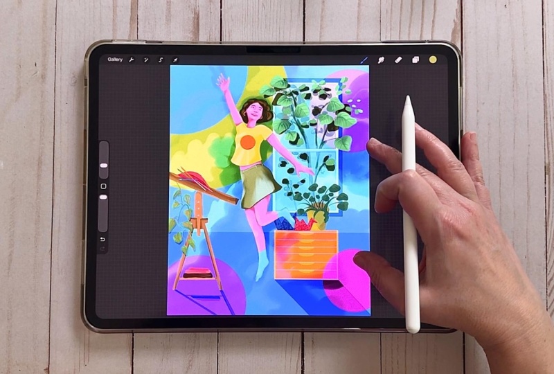
to bring it to life. You'll be creating a personal
illustration that captures your unique vibe through a fun pose and a scene
from your favorite space. Whether that's your
bedroom, studio, living room or a cozy
corner that feels like you, for this project, you
get to be the model. Think of the great masters
throughout art history. Many of them kept mirror near their easel to draw
self portraits. It was their version
of a selfie. And in this class,
we're going to take that idea and have a
lot more fun with it. You'll start by recording a quick video of yourself
striking playful, expressive poses.
And don't worry. No one's watching.
It's just for you. From that footage, we'll
grab a few screenshots to use as references and turn those into fun
character drawings. Then we'll bring
it all together by illustrating a scene from
your personal space, adding details, color, and
storytelling elements. To kick things
off, I'll take you into my favorite
space, my studio. And I'll show you how I approach this project. So let's begin.
3. How to capture Fun Poses: If Let's tap into my favorite place in the house. Welcome to my studio. I've got some plants here, a few framed artworks, and I love the view of the
backyard through the windows. This is where I
feel most inspired. Here's my drawing desk, and today I'll be
grabbing my iPad and using its camera
to film myself. I'm actually using my phone
to record this video, so I'll use the iPad
as my filming device. You can absolutely
use your phone or any camera you
have available. Now let's set up the
camera in a good spot. This little couch is one of
my favorite places to relax. The crochet blanket
and the blue pillow. Those are my daughter's
craft projects. I love having them in my space. It makes it feel
even more personal. When you're setting
up your camera, make sure you can capture your whole body
from head to toe. That way, you'll have
the most flexibility later when picking a pose
for your illustration. Alright, let's have
a fun photoshoot. It's so freeing to see yourself on camera,
just being you. I'm trying out all
sorts of poses since I won't know what works best
until I review the footage. Some fun ideas to try. Jumping in the air,
this adds great motion. Fancy dancing because why not? Hands up in the
air to the sides, stretching or twisting
a slight backbend or shifting your
weight to one leg. Just keep moving and playing. You'll be surprised how
expressive your body can be. Here are a few screenshots of poses I really liked,
and now it's your turn. Record yourself,
explore those poses, and take screenshots
of your favorites. Up next, we'll start
sketching from those images.
4. Sketching Your Pose: Finding the Basics: Now that you've collected your reference photos
from the posing clip, let's bring them into
your drawing app. I'll be using procreate since it's just a popular
choice among creatives, but feel free to
use whatever app or materials you're
most comfortable with. The first step in
sketching our pose is to break down the pose
into its simplest parts. To draw a figure, you want to understand what
makes the pose work. I recommend starting with
an oval for the head, then marking the angles of
the shoulders and the hips. From there, at dots
for the joints. Anywhere the body
changes direction, like the elbows, the knees, and the feet so
we'll mark them with dots and then connect those
points with simple lines. Think of this like
building a stick figure. It's a quick way to see how everything aligns
before adding details. Once you've got that base, you can start layering
in more information. So begin again with the head and then pick out the details that
stand out to you. Maybe it's the
gesture of the hands. The flow of the hair or
the tilt of the torso. Lightly sketch
over your photo to discover the rhythm
and flow of the pose. Remember this stage
isn't about perfection. It's about capturing the
essence of the movement. We are going to refine
it in the next stage. I encourage you to practice three to five
different poses this way because we have
all these photos. It's a good idea to draw
as much as you can, to practice your hand in
capturing poses. And don't rush. Take time to notice how each body shifts,
bends and balances. The more you practice,
the easier it will be to see these structures in
any pose you want to draw. Even if your
sketches look rough, they contain everything you need to build on in the next step. At the end of this lesson, I want you to have a set of rough sketches that capture
the spirit of your poses. And in the next lesson, we'll refine one of them
and bring in more detail.
5. Techniques for Refining the Pose: Now that you've got a
rough sketch of the pose, let's dive into the fun details. This is where your drawing
really starts to come alive. You can stay close to
your reference photo, but I encourage you to
also use your imagination. This is your chance to play
and make creative choices. As you sketch, think
about the mood you want in your
character to express. So for me, I like to
create joyful images. So that's what I'm
aiming for here. Remember, your sketch is the foundation of
your final piece. So each step builds
on the one before. In my reference photo, I was wearing shorts, but in my refined sketch, I changed it to a skirt. Why? Because the flow of the skirt helps me show
more movement in the pose. I also emphasized
motion in the hair by drawing it flying in the
opposite direction of the jump. These small choices add energy and personality to
your illustration. If you want to learn more in depth about motion
in illustration, I have a class for that. Now, let's zoom in on details,
especially the hands. Hands are one of those features that really
stand out in an illustration, so it's worth giving them
extra attention. Here's a tip. If you're struggling
with proportions, try sketching the hand
on a separate layer. You can always trace directly from your photo to get
the placement right and then adjust it so it flows naturally with the rest of
the figure in your sketch. This is one of the great
advantages of working digitally. You have tons of flexibility. You can move things
around, adjust them, and change them until everything fits just
right together. Another helpful technique is flipping your image
horizontally. So use the procura transform
tool and flip your image horizontally. And
why do we do that? Because our eyes gets used to
what we've been working on, and it's easy to miss the
mistakes in the sketch. By flipping the sketch, you'll get a fresh perspective and quickly spot anything
that is off balance, like a hand that is
too long or one that is too short or legs
that don't quite match. Make those corrections now, so your final piece feels
solid and balanced because we're going to use the sketch and build on it for our colors. And so we want to get it
as much right as we can. So take your time
here and remember, refining the sketch isn't
about making it perfect. It's about capturing
the energy, the mood, the details that
matter most to you. Up next, we'll explore
how to find and build the color palette
for your project.
6. Creating Your Color Palette: Skin Tones: Now that we've got
our pose ready, let's add some color. I'll show you how I build a
color palette for my project, and then you'll
create one for yours. Let's start with skin tones. I like to pick three colors. One for the base
color for the body, one for shading, and
one for highlights. Skin colors would
have variations from light skin
that can be shown in pink and light pitch
hues and light browns. And I'm showing you
here how I pick them from the color palette
and place them on my canvas. So I've created a first
row of light skin tones. And now let's try
darker skin tones. We can go for light rich browns and darker browns that are
even closer to purples, and that would be a
spectrum of colors for darker skin tones
and lighter skin tones. So these are all your
basic skin colors. Let's look at how we
find lighter colors and darker shades for a few
of these color swatches. I like to mark them
down above my color for the lighter shades and below my color for the darker shades. So I'm going to find a
few of these to show you how this process works so that you can do the
same for yourself. Now for my base color, I'm choosing this light
tone as the body color. And for the shadows, I'll go just a little
darker and more saturated. And for the highlights, I've picked something lighter, maybe a little warmer
with a soft glow.
7. Fundamentals of Shadings & Highlights: I want to take a
short break from creating our color palette and give you a quick
demo of how to place shadows and highlights
in your illustrations. So this is actually how we use those colors that we created
in the previous lessons. So when you're adding shading and highlights, think simple. Under for shadows and
over for highlights. Shadows appear whenever one
form sits beneath another, like under the chin, on the neck, under the mouth, under the nose, under our
hairline and under the ears, and everywhere where
clothes overlap the body. Now, for highlights,
on the other hand, they fall on the areas that
catch most of the light. So think over the
forehead, the checks, the tip of the nose, the chin, and places in the
arms or top of the shoulders. And also on the legs, there are places that are above, like over, and they're
closer to the light source, and we'll add
highlights over there. Now as your color, imagine
a light source maybe from a window or a lamp and keep it consistent
across your drawing. Shadows add depth and highlights bring your
character to life. So this is the basics
of our shadings and max we'll expand more
of our color palettes.
8. Creating Your Color Palette: Contrast & Accents: Now, let's pick
background colors, and we'll introduce a new
concept which is contrast. I'll choose cooler
background tones to help my character stand out. Because my color is going to
be in warm and light colors, I want to create a contrast between my figure
and the background. So I'm choosing blues and maybe greens since I really love working
with these colors. And here is where contrast
makes a big difference. Since my character
is warm and bright, it will stand out against
this cool background. Next, let's move to
clothing colors. I'll choose two main
ones for my outfit. I want my skirt to be
teal blue or light green, and I am exploring different
ways of creating the skirt. And along the way, I really love all
those brush works, so I might keep
them in my final. For the shirt, I want
something maybe light yellow since yellow is one
of my favorite colors. So sometimes we pick
colours intuitively. We go with color
palettes that we love. To make things a little
more interesting, I'll add one accent color, maybe a pop of orange
for accessories, and maybe that orange can
be a print on the shirt. So in this stage, we're
exploring the colors, and you'll see that
things will come out and you'll choose colors
that you enjoy working with. So trust this process
and follow it as you go. And here I want to
introduce a new color idea. So let's talk a little
about accent colors. Accent colors are like the
spark in your palette. We use them sparsely. They draw the eye and make your illustration
feel more alive. So you don't need many, one or two or four. Is often enough. And these colors are
usually brighter, bolder or more saturated than
the rest of your palette, and they work best
when used sparingly. For example, you might
have mostly soft to neutral tones for your
figure and background, and then you add a pop of
bright pink on a shirt or something in the hair or touch of turquoise
in the background. So think of accent color as highlights for
your color story. They add energy and keep the
whole piece feeling dynamic. As you can see in
my demonstration, I like to test colors
directly on my image. Sing them in the context of your project makes it much
easier to decide what works. I do this on a separate
layer from my sketch. This layer, which I call my
rough color layer is just for experimenting and seeing what we like and want to keep. And later, when I move on to
the finished illustration, I look at this layer
for inspiration. Often some of those quick, messy brush marks end up sparking ideas
that I want to keep, like the bright
circle on the shirt and the different
colors on the skirt. I really love those. So think of your color exploration
as a creative jump start. It's a playful stage that can guide and inspire
your final piece. And remember, palettes
are personal, and the best colors are often
the ones you enjoy most. So have fun experimenting
and make it yours. All right. So let's
wrap this up, and I'll give you
a project prompt. Now that you've got the basics
of building your palette, your skin tones, shadows, highlights, and a balance
of warm and cool colors. And once you have your colors, you can save them as swatches or directly on the canvas and create the palette
for your project. So for your project,
in this step, I'd like you to create and save a simple palette for
your illustration, keep it about six
to eight colors. Two for the skin or three, if you want the base color, the shadow, and the highlights. Create a few colors for clothing and choose your main
colors for the background. Think of this as your personal color toolkit that you'll use
throughout the project.
9. Color Blocking Your Figure: Now that we've chosen
our colors and created the palette
for this project, it's time to start placing
those colors on the canvas. We'll begin by blocking in the shapes of the
character's body. Your brush choices here
can make a big difference. You can use a smooth
brush for clean edges or a textured brush if you want a more organic and
hand drawn feel. I'm using my pastel
brush because it's fun to color with and
gives a nice lively texture. As you start coloring, remember this step isn't
about filling in color. It's about refining your shapes. So pay attention to the edges
of the figure as you paint. This is where you can define
the curves of the arms, redraw the fingers to make
everything looks right, draw the tilt of the head, add the little
details of the ears, and structure the legs. If you want smoother
brush strokes, you can always adjust the amount of stabilization in your brush. To do that, simply tap on the
brush in your menu to reach the brush engine where we can adjust all the
aspects of the brush. This stage is simple
but really important because this is the foundation for everything that comes next, especially when we start
adding shading and dimension. We're going to build on
what we're doing here. So here's a quick pro tip. When coloring the body, try drawing one leg
on a separate layer. It will make it much easier
to add shading later and to adjust the overlap
between legs or clothing. Once your base colors are in, we'll move on to the next step, dressing up your
character and adding all those details that make
the figure come alive.
10. Dressing Up Your Character: In this lesson, I want
to color the clothes, and after that, we'll add
shading to the figure's body. Now, I know this might seem
a little out of order, but that's just part of
my creative process. I like seeing more colors
on the canvas early on because it keeps me inspired
and excited to move forward. So just like we
did with the body, we'll start by blocking out
the shapes of the clothing. Now, before we add any shading, let's make sure that clothing
layer is set to alpha lock. That way, all our
shading and highlights will stay neatly inside the
shapes we've already drawn. Now let's pick a
soft brush that is wide and fun to color
for our shading. Take a few moments to
test different brushes and see which texture
you like best. The brush you use for
shading will really influence the overall style
of your illustration. Just like your color palette, your brush texture helps set the mood and personality
of your piece. As you see in my demo, every brush gives a
different texture and feeling when
applied to the skirt. So I'm going to choose
my dusty brush, which has a soft pastel texture that fill just right
for this project. When you start
rendering the clothing, take a moment to look back at your earlier rough
color exploration. That first stage often holds great ideas for color
placement and texture. It's also a good reminder
that illustration is a process that
evolves as you work. The more time you spend
developing your image, the more it starts
to come alive. So even if that first draft color stage seemed just perfect, just take a second look at this after you finish re
rendering your image, and you'll see the difference in your next step in comparison to the first draft
draft that you had. As you refine the shading, keep your brush strokes
loose and responsive. Try placing shadows at
the back of the figure, under the arms and under
the head and add highlights to the front of the clothing like the skirt and the shirt, where the light naturally falls. Finally, we'll add
definition and personality to the outfit. In my example, I'm redrawing the orange circle
print on the T shirt. You can use this step to
introduce details that make the clothing feel personal and unique
to your character, whether it's a
pattern, a texture, or color accent that
reflects your story or mood. All right. Up next, we'll move on to
drawing the face and hair and tight together with shading dimension to bring your character
fully to life.
11. Bring Your Character To Life (P 1): In this lesson, we'll bring your character to life
by adding dimension, drawing the face, and
sketching the hair. But first, let's start shading the body to give your
figure form and depth. So just like when we
shaded the clothes, we'll begin with the shadows. I'm starting with the back leg, and this is where drawing it on a separate layer
really comes in handy. Notice how shading
the back leg helps define it and separate
it from the front leg. This simple technique
instantly gives your figure more
dimension and realism. Add shadows wherever body
parts overlap or meet. Under the cloth, behind the
legs and under the arms, pay special attention to
the shape of the head, especially where the
chin overlaps the neck. You can outline that
area with the line, but I prefer to suggest it
with shading on the neck. It feels softer
and more natural. You'll use this same idea when defining the
fingers and hands. So use soft shading on
the palm of the hand, but leave it clear and
bright on the thumb. This really helps define
the shape of the hand. Next, let's bring in highlights. I've chosen a warm light color that gives the skin a
soft and glowing look. Apply the highlights
along the arms and fingertips always on the
opposite side of your shadows. Then add light to the
face across the forehead, cheeks, chin, and
the tip of the nose. I've brought back
my sketch layer to guide me through this stage. Once the highlights
are in place, start marking the shaded
areas on the face. This combination of
light and shadows will give your caracter
depth and warmth. Now remove your
sketch layer so you can see your shading
more clearly. Take a close look at
the face and soften any areas that feel too sharp
using gentle brush strokes. Remember, faces don't
really have outlines. So instead of drawing lines
for the nose or the eyebrows, let your shading define
the facial features. This approach will
make your character look more natural
and expressive.
12. Bring Your Character To Life (P 2): Okay, now that we've added
light and shadows to the body, let's focus on the
face and hair, the details that truly bring
your characters to life. So let's draw the
face in details. Create a new layer and use
your sketch as a reference. Start defining the
features, the eyes, nose and mouth. Here's a tip. Eyes and teeth feel
more lively when we start with light
tones to define them. And then use darker colors to outline the eyes
and draw the mouth. This combination adds depth and warmth to your
character's expression. This part of the process
takes time to complete. Use my demo as a reference and guidance when
drawing your character. Drawing the face is done best by gradually adding more
and more details. The fun part about rowing
digitally is the flexibility. We can always refine
and adjust and tweak things like move an eye to a better placement
on the face. Finally, let's move
on to the hair, create a new layer for it. I like to draw the hair with big bras strokes to
define the shape first, and then get into
more details later. Now, here's another tip. Draw some of the hair
behind the figure by placing that layer
underneath the body layers. That way you don't have to
worry about drawing over the parts that you already
have because you're just creating the
background of the hair. And then you can
move on again to the top layer of the hair to finish up all
the fine details. The hair is a great way to
show movement in your image, so try drawing it flowing in the opposite direction of
your character's motion. To finish, use a smaller brush. A pencil brush works beautifully here and adds strands
of hair flowing over your character's
face and at the edges of the hair
for finer details. This step adds definition and texture and personality
to your figure. Take your time here
and enjoy the process. These small details really make your illustration
come alive. Up next, we'll start
drawing the scene to place the
character in context.
13. Planning Your Scene: Now, let's create a setting
for your character, a place that tells us who they are and what kind of
world they live in. In this step, you'll sketch and plan the layout
of the scene. You can start by bringing
back your reference photo or simply look around your
room to brainstorm ideas. I like to make a short list of objects that could
appear in the scene. Then choose the
ones that fit best. Look for elements that
establish a sense of space and add a
touch of narrative, items that reveal
something about your character or set the
mood of your illustration. So in my list, I will put in furniture that I have in
my room, the houseplants. I could put in my
iPad, some art supply, anything that I
feel that relates to me and the character
that I'm drawing. I'll start by sketching the simple shapes of
the window behind my character to anchor the scene in space using basic
geometric shapes first, then bringing them
to life later with texture and shading is
always a good plan. I'm also including the
drawer unit under my window. It's a piece of furniture often
found in artists studios. And so it tells us
something about the figure that she's
a creative person. Once you have those
geometric anchors, you can balance them
with more organic, lively shapes like house plants
or small personal items, you can even include your pet. Since I drew the drawer unit, I'll add a few objects sitting
on top of it just enough to bring personality without overcrowding
the composition. Next, I want to include
my drawing desk. Its top tilts in an angle, and that diagonal shape instantly adds energy
to the layout. As a rule, diagonal lines
are great for breaking up vertical and horizontal elements and giving your scene
a more dynamic feel. When you sketch furniture, try to capture the
distinctive details that make each
piece recognizable. For my desk, that's the unique shape of
the supporting legs. And I'm not trying to
be super accurate here. I just want to bring in those quirky elements that make those supporting
legs what they are. Now, let's catch the floor lines and add a few perspective hints. This helps suggest depth and ground the
character in place. As I look around the room, I notice the view of my
backyard through the window. I love that tree outside, so I'm going to include this
in the background as well, and the tree also
corresponds with the house plant that's
inside the room. Finally, in your sketch, take a moment to adjust
the placement of your elements until the scene complements your
character nicely. You can sketch in
layers so that you'll have the flexibility of
moving elements around. And if you feel like adding imaginative fan touches,
this is the perfect time. Those creative
sparks add energy, charm, and a personal
signature to your scene.
14. Coloring and Texturing the Background: Now that we've completed
the character, it's time to bring the
world around them to life. I've already set up a base
color for my background. Next, before we begin
adding colors and textures, let's make a small
adjustment to the sketch. Change your sketch layers
blending mode to add. This will lighten the lines so they blend better
with the background, and it helps keep your focus on the colors rather than
the dark sketch outlines. The same way we did
for the character, let's place a few
color swatches on your canvas to
guide your palette. Try to keep them within
the same color range. Don't go too crazy in the
background so that it will help it blend better with more important elements
in your scene. These colors will serve as a
reference while you paint, and I like to pick colors
inspired by real life. In my case, I'm drawing
inspiration from a crochet blanket
made by my daughter, and it's on the
couch in my room. So a little personal
touches like this makes your illustration feel
meaningful and authentic. Now, pick a wide and soft brush to start painting
the background. This part should feel
loose and experimental. Think of it as a warm up for the next stage
of your artwork. I like to paint free organic
shapes in the background, nothing too defined yet, but I'm intentional about where I place my
darks and lights. Darker colors can suggest depth or areas behind
the character. Light colors bring attention to warmth and to certain spots. So I'm placing them
intentionally where I feel that my image should be lighter. If you want, you
can start to define simple shapes in this
texturized background. Maybe hints of leaves,
natural elements, florals, patterns, or some other forms that reflect the atmosphere
you want to create. Remember this is your scene. So let the colors and shapes reflect your mood
and sense of place. Next, we'll block in basic geometric shapes for the
main elements of the room, the windows, the furniture, and even the floor lines can
be structured in this way. A And once those shapes are in, experiment with
blending modes for their layers to make them merge naturally with a
textured background. These techniques,
combining texture, colors, and transparency, helps create a unified, cohesive look for
your entire piece. Up next, we'll add
details and definition to the furniture and
objects in the room, giving the scene more
personality and depth.
15. Furnitures: Bringing the Room to Life: Lesson we focus on
adding furniture to your scene and explore two
easy methods to do it. One, using shapes and lines and another using
freehand drawing. So let's start by building furniture using straight
lines and geometric shapes. For example, here's how
I created this window. I drew the frame
using straight lines, then placed the layer as a clipping mask over
the base window shape. It's simple and clean and later we'll
enhance it with depth and details like adding a plant in the window to make
it more interesting. Using the same
method, I can turn a basic rectangle
into a drawer unit. On a new layer set
as a clipping mask, draw thick lines for the frame and thin lines
to divide the drawers. Notice the spacing
in your drawers, minds are not even
the top drawers are narrower than
the bottom ones. So look closely at your
furniture references. Small design details can really give your
project personality. In my own room, the drawer unit
has subtle curves, grooves in each drawer. To capture that, I
drew a long ellipse, cut it in half, and duplicated
it across the drawers. Once you're happy
with the details, merge those small elements to save layer count and experiment with blending modes until they integrate nicely
with the base color. Blending modes are
a great way to quickly test color options
before committing. They often lead to unexpected
and creative choices. And of course, you can
always simply recolor any element and here
is the second method, which is drawing
furniture by hand. So now let's switch to
a more organic method, drawing your furniture by hand. I'll demonstrate this
with a desk in my scene. Refer back to your
sketch as a guide. I start with a random
color for the tabletop, but remember to stay within
your chosen palette. I'm using one of my
accent greens for the desk and a slightly
different green for the legs. In this stage, don't worry
too much about precision, flow with your creative ideas. You can always
adjust colors later, and I'll show you how to do
this in the next lessons. Once I've drawn one leg, I simply duplicate the layer and flip it to create the other. Then I merge the
two layers and add a new one for the
desks supporting part. I first tried using the same
dark green as the tabletop, but when I turned off the sketch layer,
it felt too heavy. So I simply redrew it in a lighter color for
better contrast. And now I really like
how the basic shapes of the desk look, so I'll move on to the details. So to finish, I added the small cutout holes and the shelf line to give the
desk more personality. And now that the
structure is ready, let's bring it all to life. Lock your layers
using Alpha lock. That's a very quick
way of rendering. And, of course, you
can always render with adding layers
in a clipping mask. I like to use Alpha lock for this because it's
just very quick. For adding dimension, you want
to size up your brush and softly paint highlights and
shadows to create dimension. This technique gives
your furniture warmth, depth, and a hand painted charm. By the end of this lesson, your scene will start to feel
more grounded and alive. You'll see how these
furniture pieces anchor your composition and set the
stage for more details like the plans we'll add next. Oh.
16. Drawing Plants: F let's bring more life and atmosphere into our
illustration with plants. I always love drawing
plants in my artwork, but I also like having
them around my house. They have this quiet
charm that instantly softens a drawing and
they bring color in. And illustration
plants can do so much. They fill space gracefully. They balance the composition, and they bring a sense of
calm and growth and movement. Even just a few flowers
or leaves can make a scene feel more
lively and relatable. In this lesson, we'll add a few plants to our scene
to enhance that feeling. So I start with a
small plant sitting on top of the draw
unit in my room. Using the same
approaches before, I begin by drawing the planter, starting with simple shape, and then adding shading and highlights to give it
dimension and fun textures. Don't worry about
perfection here. Plants are wonderfully
forgiving. A few loose brush strokes can easily suggest
volume and texture. Next, I draw the stems. I let them flow in
different directions, some curving gracefully upwards, other crossing or overlapping. This variation
creates visual rhythm and keeps the
composition lively. When you draw your stems, imagine how the plant grows and how light might
affect its form. Even small gesters in your bras strokes can make
the plant feel more natural. Once the stems are in
place, I draw the leaves, keeping them simple for now, just small shapes in
those shades of green. Vary the color slightly
from leaf to leaf. The subtle shift adds
depth and realism. You can always lock
the layer and add highlights and shadings
on those leaves. And I like to add a few larger leaves that spill over the edge
of the planter. These details help soften the straight lines of the furniture and make the composition feel more balanced. To finish the plant, take a
closer look at the leaves. Notice the fine lines
that run through them. As you add those subtle
details to your drawing, the plant instantly starts
to feel more real and alive. These final touches bring texture and movement
to the plant, making it feel
natural and lively. Now let's move on
to the window area where we can add
an outdoor view. I'll demonstrate now how I drew the red bud tree that stands right outside
my studio window. I started by blocking in the general shapes
of the branches and clusters of leaves with very loose and
expressive strokes. So trying not to overthink
and be too literal here, just focusing on the
rhythm and flow. After establishing
those broad shapes, I play with blending
modes to the layers to make the tree feel like it's sitting
outside the window. Once the main shape is set, I start defining the
leaves on a new layer. I keep them loose and
painterly and large because the red bad tree
leaves are very large. As I was drawing, I
had this fun idea. What if the tree leaves started
bursting into the room? It's a small, surreal
twist that adds movement and personality
to the scene. I love how it makes the
piece feel more like the outside world and the inside space are
blending together. This is something that I
hadn't planned on doing. Placing those leaves outside
the window frame inspired that idea that they should stay there and create this
imaginary world. So as I finish this stage, step back and look at how these plants interact with
the rest of the composition, the contrast between organic
and structure shapes, the furniture lines
and the flowing stems. Those add visual harmony
and energy to the scene.
17. Add Character with Personal Items: If Here are two origami paper creations that I keep for
sentimental reasons. They were made by my daughter, and I love the patterns
and colors on the paper. The folded swan is also
the shape in my logo. So this is a personal
piece that feels very special to include
in the illustration. So remember to check back
with your color palettes. I've chosen the two
shades of red that I saved earlier to draw
the origami swans. For this, I'm using
a fine liner brush, similar to those you can
find in the inking set, though this one is part
of my personal brush set. This liner brush gives me a crisp and fine line that works beautifully for small items like the folded paper details. Adding personality
to an illustration often comes down to
the small things. Up to this point, we've
built the room with defining elements and creating a
figure inspired by yourself. But what really makes this
illustration yours is when you start adding those
personal story fill details, after painting the main
shapes of the origami, I add the folded paper lines
and then draw the pattern. So it's a fine balance between stylized shape and
hand drawn ones, which I think this is what makes this little object
really fun to draw. So I'm adding all
those small details that make the paper feel
dimensional and textured. Since we're working digitally, you can also play
with reusing and adapting motifs you've
already created. For example, I duplicated the red swan to
make a blue swan. I simply adjusted its
size slightly and changed the color using the use
saturation and brightness tool. Placing the blue swan behind the character's foot
is intentional because it adds another
layer of depth to the composition and makes the
scene feel more connected. Now for something a
little different, let's draw an everyday object. I'm illustrating my pencil case, which always sits
on my drawing desk. Even though it holds
digital pencils, I will imagine colorful pencils spilling out of it
across the tabletop. It's much more fun and
interesting to draw it this way. Plus, it's a playful
way to bring your own creative world into
the illustration, right? So think of an object that
means something to you, maybe a small keepsake, maybe a mug you always reach for or a tool you
use in your space. Adding the to your
illustration helps tell your story visually and makes your work feel
truly authentic. In your project, choose a few
objects that represent you. They don't have to be
perfect or overly detailed, just meaningful or fun. Each one will help create
a richer narrative into your scene and make your final illustration
truly personal.
18. Making Color Edits: And In this quick lesson, I want to demonstrate
how you can make color corrections
and adjustments to refine your illustration. For example, in my scene, I feel there's a
bit too much green. It shows up in the skirt, the plants, and the desk. Dark green is also on
the cold color scale, so the desk is merging
with the cold background. For that reason, I'd
like to warm up the desk to bring more balance to the
color palette in the scene. To do this, I'll first
duplicate the desk layer so I can always return to
the original if needed. Then I'll open the
color adjustment tool and slightly shift the
towards warmer tones. Remember when we talked about contrast when we built our color palette
for this project, because my background
is a light blue, introducing more warm shades like orange and brown creates a nice visual
contrast that helps the desk stand out from the cooler blue
of the background. In that same way,
the drawer unit is also separated
from the background, while the window is
merging into it. As I make these changes, I noticed that a bit of the original green
still shows through. This is where manual
recoloring comes in handy. You can alpha lock
the layer and paint directly over it to match
your new color scheme. I'm choosing soft oranges
and browns for the tabletop, layering subtle highlights
and shading throughout the desk to keep the dimensional
appearance cohesive. And here's the key takeaway. Color adjustments are part
of the creative process. Don't be afraid to make slight
twigs in you or contrast. Those edits can completely transform the mood and
energy of your piece.
19. Add Depth: Make Your Scene Come Alive: Now, I want to show
you how to create a sense of depth in
your illustration. Right now, my scene
feels very flat. There are no perspective points and everything is front facing. So how do we make it feel more three dimensional
and dynamic? Let's explore a few simple
but powerful techniques. So let's start with the window. There are a few easy ways
to suggest depth here. Notice how the overlapping frame sits in front of the wall. Adding even a slight shadow behind it immediately
makes it look like it's set into the wall rather than
flat on top of it. Shadows are one of the simplest and most effective
ways to show dimension. The tree seen through the window also helps build
a sense of depth. I drew it in layers, a shaded trunk behind the glass, and two layers of leaves, one brighter, one darker. This layering naturally
gives the sense that the tree exists
in dimensional space, not just flat on the wall. Now, let's try a quick way to add depth to another element, the plant on the desk. Duplicate the layer and change the duplicate blending mode to a darker option like
multiply or color burn. And then we can slightly shift this darker
layer to one side, just enough to reveal a
shadow behind the plant. Instantly it feel grounded and more realistic and
the shadow helps separate the flat shapes from one another and create
a sense of depth. We'll use the same
idea for the desk, but take it one step further. Duplicate the desk layer and set the one beneath
it to color burn. Then open the transform
tool set to distortion, and grab the top edge of the darker desk layer and
pull it down diagonally. This creates a convincing
shadow beneath the desk. One final step here is to adjust the shadow so it starts
right under the legs. That placement is key for making it believable
because we don't want the desk to seem like it's
hovering over the floor. Finally, let's stretch a
shadow under the drawer unit, duplicate the main shape, and set its blending
mode as before, and adjust its position. Be sure to place
all your shadows in the same angle
for consistency. If the shadow color
doesn't look right, we can always try to recolor it like adding blue
into that shadow will usually do the trick or we can just experiment
with other blending modes. Here, subtract worked perfectly. It neutralized the orange of the unit and left a soft
natural looking shadow. Then a quick tweak
of opacity helps it blend seamlessly with
the background textures. So by layering, shifting,
and shading strategically, you can create a real sense of space and turning a flat
drawing to look lively.
20. Make It Pop: Adding Energy and Final Touches: To finish this scene, I want to add fun, colorful elements
that bring a burst of life and vibrancy to
the illustration. This not only adds energy but also enhances the feeling of depth and gives the artwork a more stylized designed look. Let's start by creating some
simple geometric motifs. I'll add a new layer and head
over to the selection tool. Instead of the usual free
hand, I'll choose ellipse. Now we'll draw ellipse
on the canvas. If you want to make
a perfect circle, just tap on the screen and your ellipse will
snap into a circle. Next, let's fill it with color
and place it in the scene. I'm putting my
first circle under the desk to suggest more depth, almost like a stylized shadow. Then I'll create another circle and place it by the window. So look how instantly
the composition feels more balanced,
fun, and lively. And we can also adjust
the blending modes to be able to see the textures
in the background. Et's keep building on that.
I'll pick a vivid pink from my palette and create
another vivid circle. To help it blend
naturally into the scene, let's try different
blending modes until we find the one
that feels just right. I might adjust a circle
size and position. Sometimes small tweaks like that can make a big difference. Now as I do it, I'm not really sure where I'm going with my
circles, but I create them. I try to place them around. It's a playful stage
where we try something, and if it works, we keep it and we move on to the next element. Now the whole illustration feels more intentional
and grounded, but I still notice a
lot of cool tones here. There's quite a bit
of blue overall. So I'm going to warm things
up with a large green circle. I experiment with
its placement until it complements the rest
of the composition. If part of the circle feels distracting and it feels to
me there's too much green, so I want to break the shape, I can easily remove
or repurpose it. Using the selection tool, again, I cut out a smaller
circle from the larger one and move it
to a different spot. Or maybe I'll just decide
to leave it out completely. So this is the fun part,
exploration, playfulness. You can keep moving,
adjusting and testing ideas until your
scene feels balanced, stylish, and full of life. I think mine is
ready now, bright, playful, and full of energy. I'll see you up in
the next final lesson where we'll review
what we've created.
21. Final Thoughts: Congratulations. You made it through the end of the class. Together, we've created
a personal illustration that combines a fun pose, your personality, and a scene
from your favorite space. Your piece doesn't
need to be perfect. It's about capturing
your vibe and energy and enjoying
the creative journey. The more you practice, the more natural
and fun it will be to illustrate people and
spaces in your own style. As always, I'd love to
see what you created. So please share your projects in the class gallery so we can all celebrate
your work together. Seeing how each student brings
their own personality and space into their illustration is one of my favorite
parts of teaching. And if you enjoy this class, please consider leaving
a quick class review and check out my other Skillshare
classes on figure drawing, color, and the creative
illustration process. So thanks again for
drawing with me. I can't wait to
see your projects. Until next time,
keep creating and having fun with your
art. Bye for now.
 Yifat Fishman, Artist & Illustrator