Transcripts
1. Intro: Growing up, I've always been drawn to the whimsical and magical, especially characters from those worlds. What would a character look like if it came from a forest full of mushrooms, or I took a bear and combined it with raccoon? These are the questions I ask myself every time I create my own characters. Hi, my name is Ariana [inaudible] and I'm a freelance illustrator that specializes in the whimsy and magical. In this class, I'll take you through the steps I use when I create my own character illustrations, from finding references and inspirations from around us and from some new places you hadn't thought to look, to showing you how to break down those references into the building blocks of your character. I'll show you how I use simple shapes to explore the characters in some quick sketches. After we find our character in those explorative sketches, I'll give you guys some tips on how to create a pleasant color palette. This will bring us to the end where we'll be putting together all the pieces, and I'll be showing you how I bring the final character to life. This class will give you the foundations to create your own whimsical characters from the worlds you've been dreaming of. This course is for any skill level to be used with any medium. I will primarily be using Photoshop, but feel free to use whatever medium you're happy with. I'm so excited to see what you guys come up with. Let's get started.
2. Class Project: For the class project, we'll be creating our own whimsical character from scratch. For me, what makes a character whimsical is that it needs to be a little mysterious and it needs to make me want to know more about the world they come from. In this class, you'll be creating your own character but I would like everybody to have a common element between each other. This will help everybody in the class have a common theme that connects us all together. The theme is mushrooms. Mushrooms are so diverse and different from each other, that is a great place to take inspiration from. Now, you don't have to take the entire mushroom and use it as a character but you can take bits and pieces as inspiration to a piece of the bigger puzzle that is your character. This is also a great starting point for anybody who's a beginner and is feeling overwhelmed. Before we start our lessons, I would like everybody to take the time to read the project description down below and you'll also be finding all the project resources for this class. All ready. With the class project explained and out of the way, shall we move on to the next lesson. In the next lesson, I'll be showing you guys where I find inspiration and references. See you then.
3. Finding Inspiration/References: Welcome back, everybody. In this lesson, I'll show you some of my favorite places to find references and inspiration. But before we start with the references, I would like all of you to have a vague idea of where your character will be going. Will it be humanoid? A human character? An animal character? Is it magical? Is it a spirit of some sorts? If thinking about this seems a little overwhelming, or you just can't choose right now, I have made an idea cue for you down below. It's a cube with six simple categories to help give you a starting place, so please go ahead, print it out, and give it a toss. I also have provided another resource for those who want more options, that is, a random word generator. Use the word as a springboard to get ideas about what your character could be. Once you have a vague idea for the direction your character will be going in, you can start finding your own references. One of my favorite places to find great references or inspiration is Pinterest. This is such a great website with so much goodness in it. You want to find references that are in the same category as your character or the same realm. But I also think finding references from other places outside of that is a good way to keep your ideas fresh. One of my favorite sources is high-fashion and runway fashion. Now, I know that might sound a little bit strange and weird, but trust me, there are so many interesting shapes and textures that will really help push your ideas. Insects is another great source. There are so many colors and unique body parts that you can take ideas from, mix and match to your heart's desire. Lastly, sea creatures. They are a great treasure trove of otherworldly goodness, so many strange animals that can help push your ideas. The next place I recommend looking is your very own backyard or neighborhood. I say this because I'm sure there's some very unique items and plants that are around your house or your neighborhood that aren't available anywhere else, giving you something very unique to work with. Lastly, I would recommend you to look around your house or your room to see if you can find any interesting objects, plants, or you can even use your own pet as a great source of inspiration. I know I do. Hi, Margo. Now, before you move on to the next lesson, I would like you to use these methods to find images that really capture your attention and create a board for all your references and inspirations. Let's try to get at least 15-20 different images from different sources, from different categories. We'll be using these in the next lessons. In the next lesson, I'll be showing you how to break down your references so you can use them to start building up your character. Please have a vague idea of what character you want to create. Keep in mind that we're still using mushrooms as an element for this character.
4. Breaking Down your References: Hello everybody, welcome back. In this lesson, I'll be showing you guys my technique on how I break down my references. First things first, you want to download all your references from the board, either from Pinterest or from your phone, if you used it to take pictures of the items in your house or your neighborhood outside. Since I'll be using Photoshop, I'll be dropping all my images into my document and organizing it there. If you're using analog, I recommend that you put all the images on a Word document and print it out. Now that we got that out of the way, let's begin. We are going to go through each of these images and break them down on why you chose them. Either be it by shape, texture, color, pattern, or something else that intrigues you from the image. We want to try to list 2-3 things from each of our references. The more we break it down, the easier it'll be to use these references in building your character in the next lesson. Okay, everybody, let's begin. When I'm breaking down references, I try to look at the image and see why I chose it. What captured my attention? For me, it was the pattern of this moth and this fuzzy texture. I thought that was really cute. I'm going to circle that, make an arrow, and then write it down, so fuzzy texture. Then for this part, it will be pattern. Now we move on to the next image. What do I like about this moth? Well, I thought it's big eyes, really cute, and these antenna things are really interesting. I'm going to put big eyes, then antenna. Let me go to the other image. Again, looking at what capture your attention, what do you like about this image? It doesn't really have to do anything with the character you have in mind. We're just breaking down the images at this moment. Again, this antenna thing, I really like. Now I'm starting to see little pattern that I like this type of antenna things, and I think the color, these purples, and these pinks are really pretty, that might be a possible color palette I might use, I'm not sure. That's what you want to be doing, breaking down these images and naming exactly why you like it. Let's move on to another group. For this, I really, really like this little feather mask put on her face and these little leaves popping out of her dress. I think that's really interesting. For this image, I'm really enjoying the shape of the dress and I like how they have these little interior lines. It's like a type of texture pattern. I like the shape and the shape is flowy. I'm liking these lines. This one I thought was really interesting. I really like how it covers the entire face, but you can still see through, and I like this little shoulder piece that arches down. I think that's really fun. I like that shape. I like this mask and how you can see through it and I also like all these little pearls. It's a fun texture. For these mushrooms, I really enjoy, again, this lovely flowy shape. I think this is really cool. Very free form. Again, you can see these lines going through the mushroom following the shape, very much like the dress up here. These mushrooms, I really like the little fuzzy tops. Guys, that's the basic gist of it. I'm going to go ahead and finish the rest of my references. That was the last one. Now I want you guys to give it a try. It might get a little tenuous towards the end, but trust me, the more images and the more you write, the easier it will be to build up your character. In the next lesson, I'll be showing you guys an exercise that I use when I start sketching out my characters.
5. Sketching Part 1: Hello everybody. In this lesson, we are going to go over how I sketch out my own characters with a super fun exercise. It's called the blobby shape exercise. Now before we start working on the exercise, I want to make sure that you guys are set for success. Before you start, I would like you guys to go back through your references and the words that you chose in the beginning of this project, and bring them out again. I want you guys to make a list of attributes that you think you would want your character to have. Now it doesn't matter if you don't end up using all of them, this is just to give yourself a better idea of what you're going to be sketching. While going through my references, and from using the words that I chose before, I made a list containing, maybe I want some antennas. I would like my character to have round shapes. Maybe some type of spring character, forest character. Maybe it would have a mask or maybe you would have some type of shapes sticking out of its head. This is a list of attributes that will now help me sketch on top of these shapes much easier than me just sketching without any set list at all. Please do this before you begin the exercise. Now if you've never done the blobby shape exercise, it's basically, we're going to be using shapes we create. We're going to be using those shapes as a guide to expand our imagination and our ability to create some really interesting characters. This is one of my favorite techniques to use when I'm starting to sketch out a new character. I think this is a really great way to push yourself outside of your comfort zone and help think outside the box as well. Let's get started. All right guys. Wasn't that such a fun exercise? I hope you guys made some really cool sketches. In the next lesson, you guys will be choosing some of your favorite sketches, and I'll be showing you guys how to take one of them to the final.
6. Sketching Part 2: Hi everybody. In this lesson, we are going to continue to work on our sketches that we created from the last lesson. But now we are going to take it to the final sketch. Before we start, I wanted to give some tips for those who are just beginning their art journey, or for those who haven't drawn their own characters from scratch before. Just like the exercise we did before with the blobby shapes, when you're building up your character, I will start with basic shapes, such as rectangles, circles, squares and triangles. This can work with humans, animals and objects. Another tip that I have is that you can take things that you like from the other sketches and combine them to make a new sketch incorporating the things you like and you can keep mixing and matching sketches and making new sketches until you get your final sketch down. Everybody, let's get started. Since his mostly right now rounded rectangles and some circles, I want to use those shapes for the rest of his body and see where that goes. Keep in mind that it's always okay to go back at your references and look at them to see how you can create the rest of your character. As you can see, just by quickly making some shapes, a rounded square, for the legs I started off with a triangle, then I cut the bottom and his feet are really just triangles and just by quickly doing that, I already have a body to put with his head. This was all about, you're just going to be using simple shapes, start building up your final character sketch and this might take some time. It might take a couple of iterations for you to get what you really like. One more thing I want to discuss before I go ahead and start sketching is the eyes of this character. The eyes are very important part of character design. For me, usually I either draw a simple little dot or these type of eyes. For this guy right here, we have the basic eyes I started with. But you can either make him cuter or quirkier depending on how far you put the eyes or how close you put the eyes. Feel free to also play around with how big you want to make the eyes, where you're putting the eyes because I can also change your character completely. Just by doing that, that's already a completely different character. He looks a little bit more Shire, a little bit more uneasy for this one. Instead of having these round eyes, why don't we just make it some tiny dots and see where that goes. Now he looks like he's in the void or scared, it's very interesting to see what type of emotions you can get out of your character or whatever personality you can create just by changing their eye shape and the placement of where you putting their eyes. For the last guy let's make his eyes real big. Let's see what happens if I make his eyes really, really big. Now he looks really innocent, and adorable to me. I want you guys to also go ahead and play around with the eye shapes as well. Now with the tips out of the way, I'm going to go ahead and start sketching out my final version of the character. Let's get started. Now that I've gone through most of my sketches and explored them a bit more, I'm going to decide to take one of these to the final, I'm going to go ahead and choose this little mushroom character and see if I can change it up a bit and keep playing around with her using the other parts of the other sketches that I like. I've reached the end. I finally discovered a character I like and have brought her to the final sketch. I'm really happy with my little mushroom girl that I like, I really love her little cape and her hair made out of plants and her little mushroom friends. Hopefully after taking your time and exploring all these sketches and using your references, you now have a really cool final character sketch. In the next lesson, I'll be showing you guys some very basic color theory to help give you a foundation to make a limited color palette for your character.
7. Using Color to Enhance your Character: Hello everybody. In this lesson, we are going to learn all about color. You're going to learn some basic color terms, how to use the color wheel, the different color schemes, and how to make a color palette. The first term I want to cover is just hue. This is the basic word for color, basically. There'll be purple, blue, yellow, orange, cyan, magenta, just colors in general. The second term I'm going to cover is saturation. Saturation is purely just the intensity of the color. How bright is that color going to appear? At the end of the spectrum, you have the most purest form of that red, and at the beginning, you have white, which is no saturation at all. Moving on to value, value is just the lightness or darkness of a color, which is different than the saturation because we're going off of the value scale, white, all the way to black. White would be in red, the purest form of that color, and then we're going to be getting darker and darker all the way till we hit black. These are some couple of terms that I just wanted to explain really quickly. Tints are colors mixed with white. If you mix a color with white, it's going to be a lighter color of that pure color, which is a tint. A tone is mixed with gray. So any level of gray you mix out with a color, it's going to be desaturated, muted. That's what a tone is. Shade is a color mixed with black, and that is to get a darker color. Now I'm going to go ahead and start talking about the importance of neutrals. Now what is a neutral? A neutral is pretty much a color without much intensity or saturation, or color that's lacking in color if you would. But the important thing about neutrals is that they balance out a palette, they create breathing room from highly saturated colors, and they give important variations of color. Now if everything is the same saturation, everything is just as bright as intense, your eye will have no room to breathe, and it will be very overwhelming to the viewer. It's important to bring in colors that are low saturation, low in color, just to give some breathing room and to make it softer. They also are really great, are complementing the colors that are bright and saturated. By adding neutrals to your color palettes, you are going to be balancing them out a lot more. Now how do we make neutrals? Well, the simplest way to make neutrals is to mix two complementary colors together. Red and green make brown. If you take a yellow and a purple, but change the value of one or the saturation of the other one, you might come out with a neutral yellow or a neutral purple, like I have here as an example. You can also mix different amounts to get variation. I'm going to be mixing this tint of red with this tint of green. I'm going to be mixing 80 percent of the red into green. I'm going to get a type of light neutral peach. Same here with a tint of yellow and a tint of purple. I'm going to be mixing 85 percent of this yellow into this purple. I'm going to get a light neutral yellow and so on and so forth. You can mix neutral colors using their tints as well, so that way, you can get a variation in neutral colors. They're called near neutrals, which still have color to them, but they're still very low in saturation. That will give you more variation of the neutrals that you can use in your piece. Already, let's move on to color schemes. The first color scheme I want to go over is a monochromatic. What makes up a monochromatic color scheme is just that it's dictated by one color, but with different tones, tints, and values of that same color. Moving onto the next one, the analogous color scheme. This scheme uses colors that are right next to each other, and it usually uses three colors. If I'm starting with yellow, I'm going to be using green and orange. If I'm starting with green, I can use a more bluish green and the yellow. If I'm going with a bluish green, I can go with the green and a blue. You're just going to be taking three parts of the color wheel and using that as your color scheme. Next up, we have the complementary color scheme. This scheme uses colors that are directly from each other on the wheel, so yellow, purple, orange, blue, green, red, those types of colors. For the next scheme, it's similar to a complementary, but instead, we have a split to it. Instead of going directly from yellow to purple, we're going to be using yellow going down. Instead of using that purple, we're going to be using the two shades of purple next to each other. Moving on to the last color scheme I want to discuss with you, and that's a triadic. This uses three colors on the wheel that are evenly spaced around. They usually make a triangle if you choose these colors correctly. The yellow, this blue, and this red-orange, you connect the dots, and you're going to come up with a triangle. You can use those for any of the colors on the wheel. Now the last thing I want to talk about that is related to colors, I think an aspect a lot of people seem to forget, or a lot of people don't realize is very important in creating your color palette or using color, is your intention of that color. What is the mood that you want to create within your piece? Each color can represent different moods or different atmosphere in your piece. I just wanted to go over some of the most basic colors and what their moods are. With red, you have love, you have fear, you have strength, you have competition. How you use red in the color palette will determine how will come off as. Going on to orange, it's warm, it's friendly, it's fun, it's summertime, it can be flower with those oranges. It really depends on how you use that orange in your piece. Moving on to yellow. Yellow is a very joyful, happy, optimistic color because it's also associated with the sun. The sun is yellow. What is the sun? It brings life, it brings joy, it brings sunshine into our lives. Yellow is a really happy, joyful, hopeful color. Moving on to green. Green is peaceful, it's restful, it has balance, it brings harmony. Green is one of the most available colors on our earth, with our forests, our plants. Moving on to blue. Blue is the color that suits us the most. It's calming. It's why a lot of social media sites use blue, because it keeps you calm and it keeps you scrolling. But it can also be cold and distant depending on how much blue is in a piece or how you use that blue. Purple is the color of imagination, spirituality, mystery, magic, loyalty, and even luxury, as purple is usually the color that signifies royalty. Pink is a color of compassion and unconditional love. It's understanding, it's caring, and it's also a color of hope. White is pure, innocence, cleanliness. Think doctor's offices. Think bridal dresses. But too much white can also represent isolation, loneliness, emptiness. Lastly, black. Black is sophistication. It represents independence. It can represent control, but it can also represent depression if there's too much black in the piece. It can also represent evil depending on how you use that color in your piece, but it can also represent mystery. In the next lesson, I'll be showing you guys how to create a simple color palette.
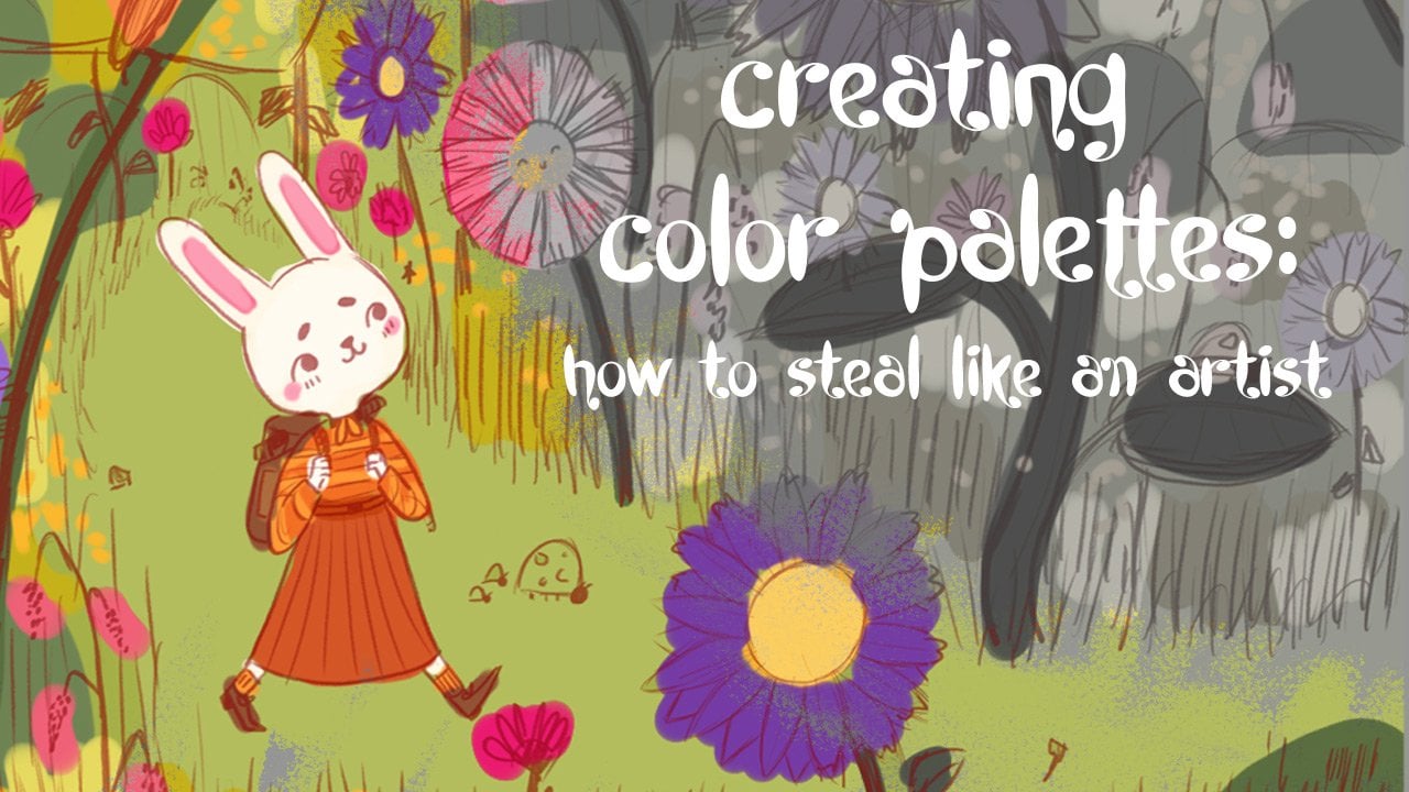
8. Creating a Color Palette: Hi everybody. In this lesson I'm going to show you how to create your own simple color palettes. Let's begin creating our color palette. The first thing I want you guys to do is decide on a color scheme that you want to use. I would recommend if you are a beginner to go with a split complement, it is the easiest scheme to start using when you're just beginning with color. If you're more experienced and you can go ahead and pick whatever scheme you would like. I'll be using a split complimentary for this course and for my character. Now that I know which color scheme I'm going to be using, I'm going to be going ahead and writing down the mood that I want my character to portray to the audience. I want my character to be playful, magical, mysterious, sweet, and calm and now that I know what I want the mood of my piece to be or what characteristics I want my character to portray, I'm going to go ahead and bring up the color wheel. I'm going to start associating these words and these moods and these characteristics to these colors. For me, playful is yellow, magical is purple, sweet would be pink, which is attentive red and calm would be a type of blue and I know that the blue and the red aren't necessarily part of a split complimentary, I want to be using those colors has maybe an accent. I just want to put these colors at the top as my starting colors. Not necessarily the colors that I'll be using in my color palette because again, the color wheel should be used as a reference, not necessarily the colors that you're going to be using in your final piece. Now, with the starting colors, I'm going to start going ahead and use them to start bringing in some variation. The first thing I want to do is I'm going to go ahead and create tints of the starting colors that I have and I want to remind you that you make tints by adding white, but you can also make tints by adding different amounts of weight. So 10 percent of white into yellow or 80 percent of white into yellow are going to result in different colors, but it's still attentive yellow. I'm going to go ahead and do that for all my starting color. Now that I'm done with the tints, I'm going to go ahead and start creating my neutrals. Now remember, neutrals are created by mixing two complimentary colors together, so in this instance, it would be the yellow and the two purples I have. I do not want to be mixing the blue with the purple, the blue with the red, or the blue with the yellow, any of that stuff because those are not complimentary colors to each other. Again, just like when you're mixing tints, you can also add in how much yellow to the purple, how much purple to the yellow, so 10 percent yellow into purple is going to be very different than 50 percent of yellow and 50 percent of purple and don't forget, they can also use the tints they created earlier to also help create some really cool neutrals. I'm going to go ahead and finish creating the rest of the neutrals. Now that I'm done with the neutrals, I'm going to go ahead and start creating the tones of each of the starting colors that I have and remember tones again are using gray and that pure form of that color will equal tone and again, you can also use different amounts of gray or different values was in that gray to make a tone color, so go ahead and play with the amount of gray you're using and the value of the gray you're using to make some really cool tone colors. Guys, now let's move on to making our actual color palette. You want to keep in mind the color scheme that you are using, so you want to make sure that you include a variation of those color, either the tinted tone or the neutral into your color palette and just keep playing around with it until you get something you like and you can also go ahead and use those other colors that don't necessarily fit within your color scheme as accent colors into your color palette as well. Now I'm going to go ahead and play around until I find a color palette that I like. Okay guys, I have finally found the color palette that I do like, and it's going to be make sure of these lower saturated purples and these yellows and I'm going to be using the pink, the blue, and the green as action colors for my character. Good job guys, I know that was a lot of terminology that I just [inaudible] you and I know that it might feel a little bit overwhelming, but I promise if you guys just take it step-by-step through this process as I showed you, it will be easier because color is like a muscle, so the more you do it, the more you'll realize what you like, and the easier it'll be to put it together. In the next lesson, I'm going to show you how to take these color palettes that we've made and use them to make color studies.
9. Color Studies: Hi everybody. In this lesson I'm going to take you through the process of doing color studies. I'm going to show you how I go through my process and give you guys some tips on how to start. Now, color studies are such a great tool to use because it's a great way to experiment on how you're going to be using your color and how you're going to distribute your color within your illustration. Let's get started. The first thing you want to do is you want to look at your sketch and figure out which area is going to take up the most. For my mushroom girl, the areas that are going to take up the most color are going to be the skin and the mushroom on her head. Now I'm going to go ahead and choose one or two colors to fill in those areas. Now that I have two of the biggest areas filled out with color, I'm going to go ahead and repeat this step with the rest of the body. Next I'm going to move on with the cape and the dress. You want to keep doing this until all you have left are the little areas that you are going to be putting your accent colors on. Now that you've put color on the biggest areas of your character, you're only going to have tiny little areas left. I want you to use these accent colors as a way to move your eye around your character or to draw attention to certain aspects of the character you want. Now that you guys have a better foundation on how to approach a color study, I'm going to go ahead and do a bunch more color studies until I find one I really like. While I was doing this color study, I noticed that the pink and the neutral purple, I was have a little bit of trouble incorporating that into my character. I went ahead and made a lighter version of both of those colors and it actually worked out a lot better. Then I updated my color palette with those new colors. You guys feeling a little bit stuck, that color palette isn't meant to restrict you, it's just meant to guide you. If you see that there is a color that will work better, go ahead and try it out and if it does, update your color palette. All right guys, after following my process and doing a bunch of color studies, I have finally settled on this one. In the next lesson, I'll be showing you guys how I put it all together.
10. Putting it all Together: Hello everybody. In this lesson, I'll be showing you how I put it all together. Some tips I have for you guys is to always have your sketch and your colors study available for you to look at. I would work on the big areas to the small ones, and I would do the small details as a last step. Now when I start any new illustration, I always like to put a colored ground just because I think it really connects all the colors together if a little bit of that yellow is peeking through the entire piece, but that's just how I paint. If you like to give this a try, I would recommend, and see if that works for your style. Let's get started. All right, guys. Congratulations on finishing your character. I know this was a lot of work, but I'm really glad that you guys talk through it. In the next lesson, we'll be wrapping things up.
11. Wrapping Things Up: All ready guys, we are done. Congrats. I'm so proud of you guys. I'm sure you guys created some really cool whimsical characters. I know it's probably a lot of take in, from finding references, breaking them down, using those references to make sketches from the blobby shape exercises, taking those sketches to the final stages, and then learning about color theory and how to make neutrals, and how to use neutrals to really make your character pop. Then finally putting it all together, that's a lot of work. But I'm really glad that you guys decided to take this class and make it all the way through. I hope you guys learned a lot in the foundations of making your own whimsical character. I'm really excited to see the characters that you guys came up with. Please share them to the project gallery down below so everybody can enjoy them. If there's one thing I want you guys to take away from this class, is to always keep your mind open and curious. Look at the world around you, and don't just see trees, flowers or pencil sharpeners or dogs and cats. I want you guys to see the every day as fun and magical, that everything can be a fun whimsical character, if you just let your imagination run wild. You guys want to follow me on Instagram? I'll be leaving my handle here. I upload quite a bit up there, if you guys want to follow me along for speed paintings or behind-the-scene progress on works that I'm working on, or even some tutorials I drop every now and then. I would really appreciate it. I'd also love to see what you guys make over there. Thank you again for taking this class. Thank you for your support. You guys have any questions, please leave them below. I'll be around to answer them. Leave a review if you like, that'll be really, really helpful. I'll see you guys in the next class. Thank you again. Bye.
 Ariana Padron, Illustrator of the Cute and Whimsical