Transcripts
1. Welcome: Ever wanted to draw
or paint a face but felt unsure which direction
to go with your style. Characters, portraits,
cartoons, realism. They're all fun, but which
direction should you go? I'm Gabrielle Brickey, and here's what I've
learned over years of creating in both a character
style and a portrait style. You don't need to pick lane, but it does help to understand the different approaches because those early decisions will
shape the end result. Your brush choices,
your reference choices, and even your mindset can naturally pull your work
one way or another. Once you realize
the differences, you can make more
intentional choices and guide your art in
the way you want to go. In this class, we'll explore
the key differences I've noticed between my character
art and portrait art styles. My hope is that it
will help you see your own art and your style preferences
more clearly, too. Then I'll share a
process that'll help you discover what
inspires you and how you can develop or refine your own unique style
moving forward. Then I'll show you the
first 10 minutes of how I personally begin both a character drawing and
a portrait painting. My hope is that this class gives you clarity about
what you like in art and the confidence to shape your style or styles
moving forward. Join me in the next video,
and let's get started.
2. The Differences I've Noticed: Let me take you back
to when I first started drawing faces
as a young teenager. For years, I was completely obsessed with drawing
realistic pencil portraits. My goal was to always draw as photo realistically
as possible. So the more it looked
like a photo, the better. I never quite hit
full hyper realism, but as a team, that
was always a dream. As I got a little older, I started exploring
more types of art, and I found myself drawn to something a little
bit different. It wasn't exactly cartoons, but more of a stylized
character look. I was inspired by all
these amazing artists online that I looked up to, and they all had their
own unique style, and I really wanted
to find mine. That's when I began experimenting
with character art, and it opened up a whole
new creative path for me. Around that same time, I
was experimenting with tons of mediums, charcoal, and then I went into pastels and then I started
exploring oil paint, eventually I started painting
digitally and procreate. That's where my
current portrait style really started to take shape. These days, I'm no longer
aiming for extreme realism, like I was with my
pencil portraits. My portraits lean more toward a painterly sort of
realism, I think. So these days, I bounce
between two main styles, my stylized character art and my more realistic
painterly portraits. I love both approaches, so I go back and forth depending on what inspires me that day. So with all that in mind, I can only speak from
my own experience. So today, I'd love
to share some of the key differences I've noticed between these
two styles I work in. So between the
character art style and realistic portrait
painting style. Since I don't usually create super cartoony characters or
hyper realistic portraits, I won't be showing those
extreme ends of the scale. Instead, I'll walk
you through what I've learned by moving between my character art
and portrait art. They're different enough
that I think you'll be able to clearly see
what sets them apart, even though they
both revolve around the same subject,
which is the face. My hope is that by sharing how I move between
these two styles, you'll start to notice your
own preferences and feel a little more confident about the direction you want
to take with your art. And since I primarily
work in Procreate, I'll be showing you the
differences through that lens. So with all that in mind, let's walk through the core differences I've noticed between stylized character art and
more realistic portraits. Okay, so first up,
brush differences. When I go to make a
character sketch, I'm grabbing a
procreate brush that feels like a real life
drawing material. And when I'm doing a
portrait painting, I'm reaching for
a procreate brush that feels more like
working with paint. And FYI, I'll be sharing these exact brushes
with you for free, but I have two main brush sets, and I would consider these
ones my hero brushes. If I'm going to make
a character sketch, I'm grabbing my willow
charcoal streamlined brush. This brush is smooth
and rhythmic, but it has a little
bit of grit to keep my drawings from
looking overly digital. It feels like working with a pencil in a
traditional medium. But when I created
this custom brush, I made it with the smoothness of soft willow charcoal in mind. I love this brush
and it's essential for me when I go to make
my character sketches. Occasionally when I'm making
my portrait paintings, I might grab that same brush, but more often than not, I'm grabbing this 60 pencil. This is a modified
Procreate default brush that I made some adjustments to, and I'm obsessed
with this brush. I love it for its
painterly quality. And instead of it feeling
like a drawing pencil, this one actually
feels more like a paintbrush to me when
you place it on its side. This brush is essential for me and helps me get big shapes of value up on my canvas when I'm beginning a
portrait painting. So right off the bat,
even the brush sets I'm reaching for begins to set the
tone for where I'm headed. Alright, the next big
difference I've noticed between character art and portrait
art is reference differences. So the image that I'm looking at while
I'm making my piece. If I'm creating a
character drawing, the first thing I'm going
to do is go through my reference database of photos I've taken of ball
jointed dolls. And I know that sounds
a little strange, but ball jointed dolls
work wonderfully for references
because they already have those stylized features. So for me, they're perfect references for
drawing characters. By contrast, when it comes
to painting portraits, I love using beautiful
references of real humans, especially photos with
strong inspiring lighting. Some great places to find
reference photos for portraits are unsplash.com, pixabay.com,
and shutterstock.com. Another big difference
I've noticed between my character art and portrait
art is in the process, and in the mindset I
bring into each process. When I'm creating a
character sketch, I go in with a
drawing mentality. With characters, I always
start with a loose sketch. I'm thinking in terms of line and capturing
flowing rhythms. It's very much a
drawing mindset. But when I create a portrait, I'm thinking more
like a painter. With portraits, I
start by blocking in big shapes of value
with thick strokes, and I'm thinking in terms of
light and shadow, not lines. It's more of a painting mindset. So for character art, my process
leans more into drawing, and for portrait art, my process leans
more into painting. Here's another example of where
you can see it in action. So my character art process leans into drawing
with linework, while my portraits typically lean into massing in with
big shapes of value. Again, now, I want to be clear that this is
just my perspective, and another artist
may lean more into painting for
characters or may lean more into drawing for portraits and still make fantastic
and beautiful art. That's the beauty of art, right? It's about exploring,
experimenting, and finding what
feels right for you. Okay, the next
difference I want to highlight is a
proportional difference. My characters often have
exaggerated proportions. So I typically make
the eyes bigger. I shrink the nose a little bit. I make the mouth bigger, and I make the neck a bit
thinner, that sort of thing. For portraits, I
lean into a more true to life spacing
and shaping of things. I look for landmarks, accurate distances, and
believable human proportions. The next key
difference I want to talk about is in
my design focus. My character art tends to stay more two D with a
focus on shape design. And with my portrait art, my main goal becomes
rendering three D forms. So while both approaches
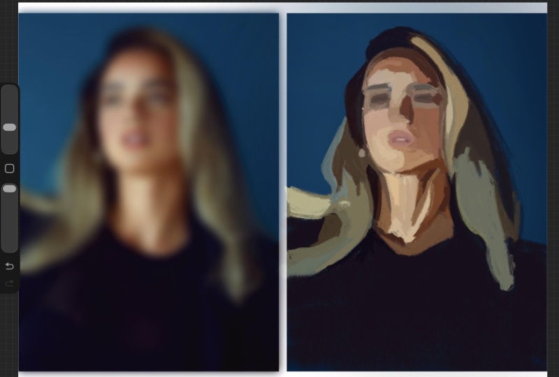
work with shape, you can see how in the image on the left of the character, the shapes appear flat. Like, you can see the shape
of the circle behind her, the simple shape
of her earrings, and then the shading under
her nose and under her neck. It's very simple.
It's all very simple. So with character drawing, when I bring it to a
fully finished piece, I'm designing with shapes. For portrait painting
for me, though, it's more about observing forms. So the soft turn of a cheek, the little forms on a nose. So no longer am I just thinking about the
flat shape of things. I'm trying to make them
more three dimensional, so I'm considering forms. So spheres, cubes, cylinders, cones, that sort of thing. Let's look at another
example here. So here you can see, I captured the little
ovals of her glasses, and I kept it super simple. Her hair is designed with
super simple shapes. He collars just a
super simple shape. There's not a ton of
detail or complexity here. Whereas with this example, I'm appreciating that
soft roundness that happens on her forehead and the form that you can see there. I'm appreciating all the
tiny little form changes that happen on her nose
and around her cheeks. It's just a different
appreciation for different elements of design in both of these styles of art. And then the final
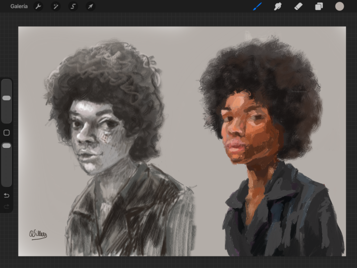
difference I want to highlight is rendering
differences. So this is similar to what
we just talked about, but let's take it
a step further. So, not always, but
typically for me, this looks like flat
two D rendering for characters and three
D detailed rendering for more realistic portraits. So let me explain what I mean. See how this little section of this character's
cheek is pretty much represented
as one flat color. Sure you see that paper
texture I put on top, but it's one color to represent her whole
cheek area there. Whereas on my portrait painting, you can see a whole variety of colors and value
shifts happening. This cheek is not flatly
rendered on this portrait. I'm showing the forms
of the cheek area by giving you more
information and details. So in characters, I'm
simplifying the rendering. Whereas on my portraits, I'm making it more detailed and giving you more information. Another rendering
difference I notice between my pieces
is in the edgework. My character art edges tend to be harder with less variety, and my portrait art edges can
be hard, firm, soft, lost. There's just a ton
more variety there. So let's zoom into this part of the head so we can see
what I mean a bit better. Here on the character,
you can see how the line work works to
create a hard edge quality. Sure, there's a little teeny bit of variation up
there at the top, but it's mostly all
just a hard edge, clearly separating her
head from the background. Now, looking over at
the portrait painting, I mean, look at all
the variety here. There's this textury
soft edge up here. Here we have a harder edge, and here we have kind
of a jagged edge, so kind of softer. There's just a ton more variety in my portrait art edge quality. Again, let me reiterate, though, neither approach
is better than the other. The best way to draw or paint is the way that
feels good to you, where you enjoy the process
and love the results. For me, that just
so happens to be both character art
and portrait art. I enjoy creating both styles, so I keep doing both. But ultimately, it's
up to you to explore and decide what you love
to do as an artist. So let's talk more about how you can discover
exactly what you love. It might be helpful
for you to think about style for drawing faces
as a sliding scale. You don't have to pick one of these and stay there forever. You can live anywhere along
this scale and jump around. You're the artist.
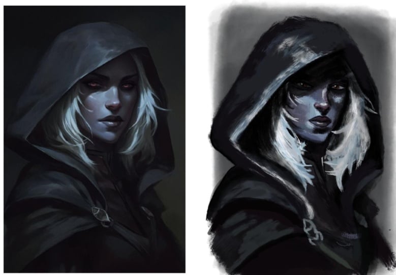
That's up to you. So for me, I land at
stylized character, and I'd say somewhere around
realism for my portraits. Also, this is just
a scale I've put together so you can use your own words to describe these things. But you can totally bounce
around between things. Obviously, I do it myself. So this is my character art style that I've been describing. I consider these to be
stylized characters. And here's my portrait art
that I've been describing. I would probably
consider it realism, but it's also painterly. Then I also have something
like this where I've leaned more into a character
style proportionally, but I played with rendering out the lighting to make
things look more three D. That brings it into a
more semi realism, maybe. I'm not really sure. But
that's what's fun about this. We get to play, we get to
experiment and be artists.
3. Style Exercise: You're feeling a little confused or overwhelmed by all of this. Don't worry. I've got
an exercise to help. It'll help you discover what
you're naturally drawn to, what inspires you,
and how you can start developing your own unique
style moving forward. So this is a four step process, and it is to find
art you admire, analyze and
investigate that art, make a master copy, and then
reflect on your experience. All right, so let's break
it down step by step. Step one, Fine Art you admire. Through Instagram,
through Pentrist. If you have a museum
in your area, look there, look at art books, you know where to find
stuff that inspires you. But you want to find art
that makes you think, Wow, I wish I'd created this. It would be a dream to
draw or paint like this. I'd say find about three pieces that make
you feel this way. Now, step number
two, it's time to analyze each of those pieces and kind of
investigate a little. Ask yourself, what specifically do I love about this piece? Is it the colors? Is it the
way the artist design shapes? Is it the proportions
they used for the face? Try to really be
specific here and write down three to five
things you love per piece. You can even ask yourself, Where do I think this
falls on that scale we talked about earlier?
Is it a cartoon? Is it a stylized character? Is it semi realism? Would you call it realism
or maybe hyperrealism? Just do your best to kind of
categorize it a little bit. All of this helps you move from admiration
into understanding. Putting actual words to how
you feel about the piece is an excellent step toward understanding what
you're looking at and what you love about it. So instead of just
saying, I love this piece because
it's beautiful, try to be more specific. Say something like,
I love this piece because of how the artists layer those pink
and purple hues. The way they sit right
on top of each other, it's kind of like
they're singing. Like, you want to be
that specific with it. So, the more specific you get, the more you can start understanding just why
exactly you love a piece. After you do that, it's time
to pick one of those pieces, maybe the one you love the most and make a master copy of it. I truly believe making
a master copy is one of the best things you can do to improve your skills
as an artist. I feel like I've made
the biggest jumps in my skill level after
making master copies. If you're wondering how
to make a master copy, it's simply the act
of copying a piece of art that you consider
to be a masterpiece. Keywords you consider
to be a masterpiece. It's about studying a piece
of art that is like goals for you and trying to replicate
it as closely as possible. You'll be amazed at how
much you learn just by copying from brushwork to
color choices to composition, it's one of the best
ways you can learn. There's just one
important thing to note. If the artist is still living, it's best practice to
keep your copy private. Like, don't post it online. And if the artist
has passed away, sharing is generally
more acceptable, but you'll want to look up specific copyright rules and
always give proper credit. The final step is
to take a moment to reflect after making
your master copy. Ask yourself, what did I
learn from this experience? What techniques or
choices would I like to bring into my
own work moving forward? And if you made more
than one master copy, ask yourself, which process felt more enjoyable
or natural to me. Okay? So reflect on the experience of creating
your master copy. So find art you admire, figure out what
you love about it, make a master copy, and
reflect on what you learned. This is a great exercise, but it's just one of many. You compare this kind of study with all the other
ways you're learning. So sketching from life, practicing from photos, and drawing from
your imagination. This process is just one
more way to practice. It'll help you sharpen
your skills and shape your unique
style moving forward. Okay, so we have
covered a lot today, and I know that this
is a lot to take in. So now I want to slow
things down and zoom in on just one key difference between character art
and portrait art, and that is the process. And specifically, how
I start each piece. The beginning of the
piece is so important. It kind of sets the tone for
everything that follows. So now I'm going
to give you a peek into both workflows by showing you how I approach
the first 10 minutes of each. So one character sketch
and one portrait painting. So let's hop in Procreate and
I'll walk you through it.
4. Class Project: Rather than overwhelm you with creating a finished piece
for your class project, instead, just share your start. Use this as a moment to try out the processes I'm about to share or share your unique
methods of starting. Here's a simple plan forward if you'd like to create
a class project. First, pick a reference. I've added a small collection of portrait and
character images for you inside the Projects
and Resources tab. Choose one that inspires
you or find your own. Next, start your piece. Work along with me as
I show you how you can approach a character
drawing or portrait painting. And as you work,
notice what feels fun, natural, and easy to you. And also notice what feels
difficult or less enjoyable. Those little observations are important because it'll tell you what style you actually enjoy and may want
to pursue further. Take a screenshot of
your work at the ten, the 15 minute mark
and upload it to the projects and
resources section of class here on Skillshare. The real goal of your
class project is simple. Get your hand moving and pay attention to what interests you. Watching a class is helpful, but combining learning with practice is where the
real growth happens. This project isn't about
finishing a masterpiece. It's about discovering
what feels fun to you. The more you experiment, the clearer your artistic
preferences will become. So let's begin with
character drawing.
5. Character Drawing Start: So here's how I start almost every character drawing I make. And FYI, I'm working on a 5,000 by 3,500 pixel
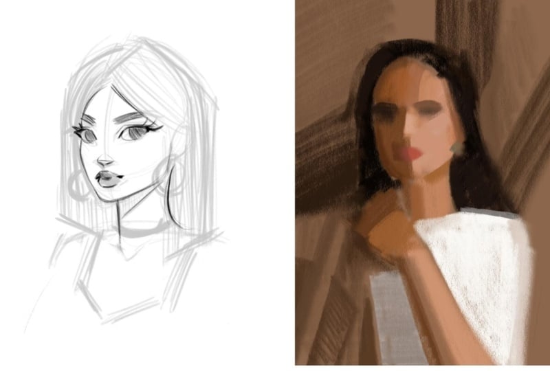
Canvas at 300 DPI. So I start by
pressing the wrench, which is actions, ad, and then I insert this
photo right here. I think I'm going to reference
this one right here. So I'm just going to grab the transform arrow
to size it up. And I make sure uniform is on so that nothing
stretches weirdly. Now I'm just cropping off
the edges of the image, and you can do it like this. I'm taking it off the edge of the canvas and pressing
the transform arrow, and that will just delete
anything I don't need. All right. Now I'm just going to pull that reference over here. I'm going to add a new layer
so I can start sketching. Alright, so like
we talked about, pretty essential for me is using that willow charcoal streamline brush from my
character brush set. So I'm going to
grab that. And I'm going to wind up thinking about the circular
shape of her head, and when I'm ready,
I'm going to touch down and draw a few
wrapping lines. And now the center
line of the face. Then I'll attach the neck on
and hint at the shoulders. Put that ear on there.
Just a simple shape. So now I'm just thinking
about the general shape of those eye sockets
and putting them in as little place
markers for now. And I like to simplify
the bottom of the nose into a simple squashed
upside down triangle. And then the lips can be a simple shape to
start with, too. I like to keep things super simple when I'm first
starting my characters, and I avoid adding any
details in the beginning. This helps keep things
from becoming overly precious because we've dedicated
a lot of time on them. Like, if I went and
started detailing the eye, and then it was just all wrong, I would be annoyed because
I spent so much time on it. So I like to keep things very
loose as I plan my sketch. Okay, let me grab
this eraser tool because I want to move
this nose up a little bit. I'm just messily
hinting at the irises now and lashes and the brows. Let me put a little marker for the jugular notch
and the clavicles, the neck, maybe she'll have, like, a frilly sort of sleeve.
I'm not really sure yet. And then maybe her
hair will come down sort of straight like this. I'm not really sure
if I like that. Just playing around. Everything's still
able to be changed. When I'm working from
the doll references, they're typically a loose guide. So I'm using my imagination
a bit for this too. Sometimes when you
sketch, it helps to flip your canvas
horizontally, just to give you a fresh eye. Maybe her hair comes
down straight like this. Just go to reposition that a little bit so I have
some more room. This first pass on
a sketch is like my permission to play and experiment with
different ideas. She could turn into any type
of character, you know? She doesn't have to be locked into one character just
because that's what I drew. You can always change things, especially in this
very beginning phase. So when this first
pass on a character, I play around a lot
with hairstyle, the neckline, and kind of
the way that's designed, and, you know, which accessories I add and that sort of thing. And actually, with both my
portraits and characters, they tend to just be bus, so I cut them off
past the shoulders. Like, it's pretty
much just shoulders and is what I like
to paint and draw. I'm going to darken these lips. That's another thing that
you can play around with at this stage is kind of
the subtle emotion you can add to your characters. The emotion can really tell
the story of your character, and I found that especially the eyebrows and the corners of the mouth
makes all the difference. And the most subtle shifts in direction with those two things can completely
change the emotion. Maybe I'll try some
hearts back here, that's not quite
working with the attitude she has, so maybe not. Maybe I'll give her a necklace. I think I like that
direction a little better. And I think this short
hairs kind of cool. Maybe she has bangs. Nah. We a try, though. So yeah, it's all
about experimenting and playing with
ideas at this stage. And I'm just loosely using
the reference at this point. So this feels good to me for
a first pass on this sketch. Once I have a basic sketch where the general
idea is mapped out, I lower the opacity and then add a second layer to
work on another pass. I don't have time to show
you the whole process, but on the second pass, I nail down the design better and I add a
bit more detail. Then I repeat the
process again on a third pass finalizing
the drawing. So as you can see, with
my character art starts, I lean into that
drawing mindset, working primarily with lines to get my character
up on the canvas.
6. Portrait Painting Start: Now I want to show you
how I usually go about starting my more realistic
portrait paintings. So you can see I already
have a reference placed on a 5,000 by 3,500 pixel
Canvas at 300 DPI. And the first thing
I'm going to do actually is duplicate
my reference. Now, here I'm going to
press snapping and make sure magnetics and
snapping are turned on. Now I'm just going to drag that duplicated reference over. What we're going to
do now is color in the second duplicate
with one color. That's going to make it so that my reference and my would be painting are perfectly side by side and are the
exact same size. This I find makes finding
proportional accuracy so much easier because we'll be comparing
things one to one. So there's no weird
sizing up or sizing down. I like to make my life easier, not harder, so I really like
this one to one approach. So to fill it in perfectly, first, we're going to need
to alpha lock the layer. So just tap the second
layer and press Alphao. This will make it so
that you can only paint on the pixels
that are already there. So basically, we're
only going to be able to paint
on this rectangle. And you'll be able to
tell it's alpha locked because you'll see this
checkered background here. So now going to my brushes, I'm going to grab
a big soft brush so I can quickly and
easily color it in. And I like to pick up a mid
tone for my background color, so nothing too light
and nothing too dark. And because I alpha
lock the layer, I'm only going to be able to
paint within that rectangle. And like I said, for me, I love working one to one
like this because it makes finding proportional accuracy
a breeze down the road. Okay, so as I mentioned,
for my portraits, I tend to lean into a
painterly approach. I go in thinking about making big paint strokes versus
working with lines. So I grab a brush that
will help me do that. So I tend to reach for
this six B pencil. Before we begin
painting, though, I have one more thing I want
to do that helps me a lot. So back in my layers, I'm just going to duplicate the
reference photo again. Then on that duplicated
reference image, I go to adjustments,
Gaussian blur. Then from here, I just use my finger to drag that
to the right a little. This is going to bring the
blurriness up a little bit. What I'm doing here is
I'm eliminating details. I find that details can be intimidating but
also distracting at the beginning of
a piece like this. So I work to remove the
distractions from the start, and blurring helps me see the more important
thing in the painting, which is the big
shapes of value. So the big shapes of light and dark that make
up this composition. If I don't get the
big shapes right, the details have nothing
solid to sit on. So I have to get the big
value patterns right first, then add details on top of that on top of a
solid foundation. Take a look at this. I'll triple press this so you can
see it in gray scale. When I'm creating a
portrait painting, the beginning focuses
around capturing the lighting or these
big shapes of value. And you can imagine them
even as simple blobs. So not hair, not a
face, not a shirt. So this weird dark blob here, this lighter group
of blobs here. This weird dark blob here. This big triangular looking
shape of light here. This beginning part of the portrait painting
process for me is about eliminating intimidation so that I can start and get
going on a piece. And the blurring really
helps with that. All right, let me
turn it back to color here and
we'll get started. So, like I said, I'm going for that six B pencil because
angled more so on its side, it reminds me of working with, like, a paint brush and
painting with a thick stroke. Alright, so I'm going to grab this color on the
skin and the light. But actually, I'm
on the wrong layer, so this is a good thing to know. Always make sure you're
on your painting layer. So let me go back. Now I'm going to
pick up this color in the skin on the light, and I like to pick up an
average color for an area, and I'm just going
to start putting in those blobs of color. I'm leaving intimidation
at the door. We're just painting
big shapes of value. Then I'm just going to block
in this big dark shape here. And I know that I said
for my characters, when it comes to the design, I focus on shapes more. However, in the beginning of my portrait painting process, I definitely lean into
working with shapes as well. Working with abstract shapes of value just to get something
up on the canvas. Then once I have something up on the canvas that I can start
pushing around a little, then I start focusing more on those forms
we talked about. On the whole, though, when I
consider the entire process and not just this isolated
first 10 minutes, I do consider
character art to be more shape focused
and portrait art to be more form focused. So yeah, just getting
up big shapes of value. I'm not overly concerned about
being completely precise. I can always check
myself later and push things around into
a more accurate place. Right now, my goal is to just get something
up on the canvas. You can see, though,
how different this is from the
character start, though. I'm not working with lines. I'm not making an accurate
or detailed line drawing. Instead, I'm working
with big shapes, massing in big color patches. For me in this beginning
part of a portrait, just like I've mentioned,
I'm just thinking about big abstract
shapes of value. So I'm looking at both
positive and negative space to get everything
up on the canvas. So here I'm looking
at the positive space of her shirt, but
at the same time, I'm also comparing it
to the negative space, that little brown sliver that we can see of
the background. I'm always going back and forth between both positive
and negative spaces. And the blurring makes this
so much easier to see, too. Now I'm just getting some of these value shifts
in the background. So I'm just placing a very general marker for
the eye sockets here. But do you see how this approach leans into painting more? I'm really not focused on
outlines or line work at all. It's all about big
paint strokes. All focused around capturing
lighting and building up a solid foundation
to build forms upon. There's a little bit of a hot or orange color there
that I want to get in. And when I paint like this,
I just get into the flow. I know some artists
really don't like when people use
the color picker. For me, I just don't mind. I just consider it another
tool in my digital toolbox. I encourage you to do what feels best for you as an artist, but I do think it is important to understand and study color. I just use this as a little
digital art shortcut. But when I pick up colors, I'm trying to pick up the
average color of an area. So nothing too light
and nothing too dark, but the average color
to describe an area. As you can see, this
painting looks not great. But as long as you continue to push through and
trust the process, it will work through the weird looking phase and into a beautiful
portrait painting. Now, I'm just going to put in a couple little markers
for the features, and they're just
simple brushstrokes. I'll be wrapping up
this demo shortly, but this is the
general approach I continue on with in my
portrait painting process. After blocking in with
big shapes of value, I gradually move into medium
and then smaller shapes, all while staying focused on developing the forms
through light and shadow. So same artist, same app, same general subject, a face. But just by changing
the starting approach, you open the door to
completely different outcomes.
7. Next Steps: I hope seeing these
two starts gives you a little more insight into
your own creative process, and maybe even inspires you to try both of these approaches and see what feels best to
you or explore cartoon, semi realism, hyper realism, whatever it is that
you're drawn to. Let's quickly recap
what we covered today. We talked about the differences between stylized
character art and more realistic portrait art and the specific areas where I've noticed the
differences in my own work, like brush choices,
reference choices, proportions, the process
design and rendering. We also talked about how there's no single right
way to draw a face. Style exists on a scale, and you can shift along that
scale wherever you want. After that, we explored some of the ways you can start
discovering your own style. We talked about the
process of finding art, you admire, analyzing it, making master copies, and reflecting on what
you've learned. And then I shared a peek into my own process showing
you how I start a character sketch and a portrait painting with a look at the first
10 minutes of each. Support you as you're
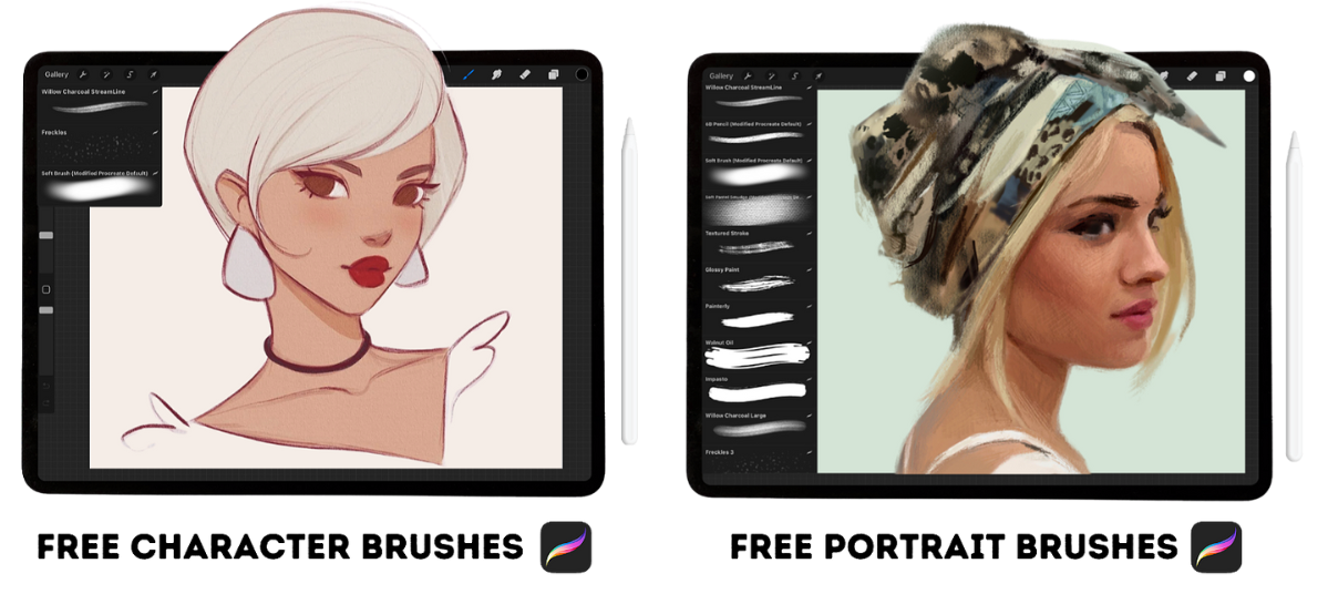
exploring and experimenting, I'd love to give you two of my very favorite Procreate
brush sets for free. One is designed
for character art, and the other is for
portrait painting, the exact ones I've shown
in today's session. So the character brush set is a small section made
for stylized drawing. It includes my go to
sketching brush and a few fun extras to help bring
your characters to life. And then my portrait
set features pantlly brushes
designed to build form, blend smoothly, and add texture and depth to
your portrait work. And you can access both
of those sets right here in the projects and
resources section of class. Once you're in, you'll also
get bonus resources to support whichever creative path you'd like to take from here. Try the character brushes,
try the portrait brushes, try both, explore experiment and see what works best for you. Thank you so much for
spending this time with me. I hope this session gives you a little more confidence and maybe the permission to explore
what you love to create. I'm so happy our
pads crossed today. Thank you so much
again for watching. And until next time,
happy painting.
 Gabrielle Brickey, Portrait Artist - ArtworkbyGabrielle.com