Transcripts
1. Introduction: Bringing a character designed to life is such a fun and interesting process. And I truly believe it's one of the most crucial part in any form of storytelling. Hi, I'm Rohit and append an illustrator and a graphic designer for about nine years now, in this course, I'll show you my process on how I create my character design using Photoshop. And we will render one of the poses of the character design in Photoshop, which can be presented to your potential funder. Over these years, I've learned a ton of tips and tricks that you can use to create a character with personality, which is fun and interesting. By the end of this course, you'll have created your own character, which can be put to use an animation or comics, any project of your choice. And I'll also teach you how to create a portfolio using the designs you've created following this course. This course is for anyone who wants to begin their character design journey or for someone who wants to take that carry design skills to the next level. If this is something you're interested in joining my next lesson.
2. Project: Before we begin, let me show you how this course works and how you can follow me to create your own character design project. Every lesson from no-one will have a learning section for, I'll teach you certain basic fundamentals of character design. I know, I know fundamentals are boring, but these are certain techniques you need to know to create good-quality interesting characters consistently. Followed by the section where I'll say it's time to draw. That is when you pick up your pencil and paper IU graphic tablet to follow my process and create your own design. Alright, now that we know how this course works, let's begin.
3. Materials: Let's go over the materials needed for this course. I wanted to keep things simple and make this course accessible to anyone who is just beginning their character design journey or an experienced artist. So for this course, you will need a piece of paper, any pencil of your choice, a non for a blue pencil, which is optional, and inking pen, and an optional graphic tablet of your choice. It's not completely necessary, but it's highly recommended.
4. References: Before beginning, I would recommend looking at the artist that inspire you and the artwork that best resembles your story. Getting references will not only put you in the right state of mind to begin your work, but will also spark equated juices to come up with something interesting. One of the best ways to find references is from an art book from any animated movie you like. For example, I have this vitamin, The Art of the spider worst movie. By just beginning flipping these pages, you can see what kind of assets they had to create to create a movie. By seeing these reference artworks, it puts you in the right state of mind and it will give you an idea of what your end result should be. For example, the kind of output I'm looking for is something exactly like this page. And I know for the fact that if this is in the official movie art book, this is the kinda sort of output that animation studios looked for by having these reference images in your mind, you can confidently go into your project, knowing by the end of the process, you will have created something professional and that resembles the industry standard apart from just having reference images in mind, the art book also gives you the name of the artist that created these images. You can pick any image, may be a background painting or a character design or an expression chart. And look up the name of the artist and find them on Instagram or their website. By doing that, you'll know what sort of not work they create on a day-to-day basis, how they practice and just understand their process. You can find such art books in any bookstore or Amazon. All you have to do is find the name of the movie are the animation series you like, and just prefix it with the art of the movie. I have few such books and e-books valid illustrates the art of the movie. Whenever I'm, I'm low on being creative or have an art block. I flipped through these pages. I tried to replicate these images and more often than not, they sparked my creative juices to go ahead with the project. I hope you find such books and get inspired. Now that we've found good enough references, let's move on to the next lesson.
5. Story: More often than not, a character's created to tell story. And that is why, even before you begin putting your pencil down on paper, you should have your story ready and set. Having a story in mind, you will make much better decisions along every step of your character design process. That doesn't mean you need to have your story completely ironed out to get started with character design, you need to answer three things. Where, when and whom. The first thing you need to address is where does your character come from? Does it come from the eastern part of the globe? Are the North or South? Did he grew up in a city or does he belonged to a tribe? Is his place of origin cold or warm? The next question you need to answer is, when, when does he come from? Does he come from the future? Does he come from the Viking era? This will influence your character on his style, his personality, and his general attitude towards life. And the final question you need to answer is, whom, who is this character going to be? And where does he fit in the story? Is a character going to be the comedic relief or the antagonist or the protagonist? By having this question answered, this will greatly influence shape, size, and post of the character. For example, if he is going to be the comic relief, you would give him a naturally slouching posts which will make your audience smile by just seeing the character. So the task for this lesson is for you to answer these three questions, which is where, when and whom you need to create your character.
6. Shapes: By answering the questions from our previous lesson, we now know what sort of character we are creating. If our character is funny, trustworthy, reliable kind, is he on the good side or the bad side? Any and every character is comprised of three main shapes, the circle, square, and triangle. Understanding shape language is a first step to creating our character. Now based on day to day lives, we correlate the shapes to certain personality traits. For example, the shapes circle is usually considered to be cute, kind, friendly, or peaceful. Generally on the good side of things, the square, having a strong base, which looks immobile, is usually considered strong, trustworthy, stable, or static. The pointed edges of triangle usually represents aggressiveness, active, edgy, or dangerous. Now we can use this shape language to convey the personality of a character, to illustrate the use of these shapes. As an example, let's look at the movie Incredibles and the character design. Now let's look at Jack. Jack, it's very obvious the whole phase is big circle and his entire body has soft, round edges, which generally represents someone who's friendly and someone whom you can get close with. And Mr. incredible obviously represents a Shapes choir as he's a lead of this movie. And he's someone very strong, responsible, and trustworthy and the antagonist of the movie who is Syndrome obviously see the use of triangles in a his design and how it's implemented to his character. By understanding these shapes and how to use them, you can convey the personality of your character just by making them just appear on the screen. And keep in mind, this is not a hard and fast rule that you should use only one shape. Let's take dash as an example. He obviously has speed superpowers. He's someone who's friendly, at the same time, unpredictable and edgy. They've conveyed this by the use of circle and a triangle, which represents his friendly nature, as well as his edginess. Now how you come up with your own character is completely up to you. You can use just one shape or combine them to get a complex story or it's time to draw. Let me show you some examples on how to go about drawing character phases based on these three shapes. So below here, I've marked the Shapes I'm going to base the character off of so that it makes it easier for you to follow. So let's begin. I always, always start any character design with a circle. And if it's going to be a character based on the shape circle, I'll go about drawing another circle about here and mark my guidelines to draw the eyes and nose. Now let me show you how I go about marking character for a shape square. Like I mentioned before, I always begin any character design with a circle and the guidelines for the eyes and nose. And in our previous drawing, we continue this part drawing another circle. Since character is based on the ship square, I'm going to draw a square over here. Similarly for the character that's based on the shape triangle, begin with a circle. And just like how I drew the circle and the square for my previous character, I'm going to go ahead it drawing a triangle and then marking the guidelines for the eyes and nose. Keep in mind, this is the placement of the shapes that I chose. You can go about doing this in a million different ways. And that is completely up to you. I would say try different versions, find out what works best for you and proceed with that. So now we have our guidelines right now, let me go ahead and reduce the capacity of this. And based on these shapes, let's go about starting to draw the faces. Now since the first character is going based on the shape circle, I'm gonna give all soft and route edges for this character as possible. And I'm going to follow my guidelines even on the edges of the hair. You make sure that it has soft round edges so that it gives you the feeling of this character being friendly. Now, this is the rough outline for my circle character. Now let me go ahead to draw the character for squire, similar to the last character, I begin with mapping out the eyes and nose, and I follow the shape of the square drawn here and continue drawing his face. Now keep in mind, this is not the final design. This is something we're trying to experiment and come up with different ideas. So it's okay for you to use the shape square. Every possible aspect example, this neck over here is also a square and so is the color. Now I bill you have a good enough design for this ship square. Let's go ahead with drawing the character based on the shape triangle. Now, as you can see, straight off the bat when drawing my nose, I'm going with sharp edges, just like I mentioned before, don't be afraid to impose the shape as much as you want. Just always keep in mind, this is something rough you're doing, as you can see, even on the eyebrows. I'm trying to incorporate the shaped triangle and I'm going to follow the shape of the triangle to complete the face. Now, let me just clean up this drawing and there we have it. We have our rough drawing. And based on these three shapes. Now here you can see it is very obvious the shapes that I've used in these characters. And like I mentioned before, the circle character appears friendly, this choir character appear strong, and the triangle character periods dangerous. And now keep in mind that I've been doing this for quite a while. So I was able to get to this pretty quick. I would say experiment with a bunch of different proportions. Don't be afraid to go overboard. And if you can draw something interesting, do shared in the project below. Alright, now that we've seen some examples, let's use a story that we wrote in our previous lesson and use this shape language and try to come up with their own character. And for the second time in this lesson, it's time to draw again. Now keep in mind, the drawing you do in this step should not be the final one. It should be as for, as possible and just try to convey the shapes into your character using your story. As always, I'm beginning with a circle. Since my character as an explorer, he likes talking with people, communicating with people. So he's going to be friendly. So I'm gonna begin with another circle showing his approachable, friendly and kind, and in general, just give round shapes to him for every step of this course, you should be using this story as an anchor to start creating a characters. In the next lesson, let's see how we can use size invariance to further our cat is designed.
7. Size & Variance: Similar to shape, language, size, and variance is another step to exaggerate the personality of a character through body language. In our last lesson, we drew a rough version of a characters from our story. Now let's draw this full body design from how VC human characters normally, our body comprises of three different sizes. Let's use these three circles to illustrate the proportions of a normal body. Let's name these three circles, small, medium, and large. Now let's iterate design from our previous sketch in our last lesson. Normally how we perceive the human body comes something like this, where the head is represented by the small circle, the torso represented by the medium circle, and the legs represented by the large circle. Now, typically, this is the exact proportions that we normally perceive through our eyes. And as you know, this design is not exactly interesting. And to be frank, it's pretty boring. You do not get any read of this character. Is he funny, is interesting, is the boring, nothing else. Now how we can illustrate this in our character design is by exaggeration. What I mean by exaggeration is most characters you see in animation and comics, you would have noticed they would have had unusually small legs, skinny arms, big beefy arms. Now let's use this to our advantage. Now here we have this design that is within our small, medium, large ratio. Now let's take that ratio and try a different variation of this design by changing the proportion of each individual body part. Now let's begin with drawing the face similar to how you did in the previous design. Now using this ratio, let's play around with the proportion of the body. Now, as you can see in the first design, we have normal size shoulders in this design, let's try a different approach by giving him really small shoulders. And let's try drawing the body proportionate to the shoulder. And instead of giving normal-sized arms, let's give him extremely skinny ones. Now similar to the top half of the body. Let's keep up with the trend and draw really skinny legs as opposed to the normal looking legs in our first drawing. And let's finish it up with abnormally large shoes. Now as you can see, the 2 May 1 be very similar to the first one, but already we've started to inject personality into a character design by making small changes, like giving him really skinny legs, large shoes, and small shoulders makes a huge difference to a character design approach. Now, another way that you can play around with the proportion of the design is by switching places of the small, medium, large circles. In this version, as you can see, I've switched the small and medium circles positions with the medium circle coming on top as supposed to the small one in our second first design. Now let's use these proportions and let's begin withdrawing the face as with the previous designs, let's fill in the circle and while drawing the body, be sure to limit your drawing within the small circle. Keep in mind, this is not your final character design. We are still in the process of discovering how we like our character to be. So it is okay for you to have a very okay looking character design. The key aspect is to come up with different variations and try and experiment with our proportions similar to our second design, giving him very skinny legs and large shoes and data. We have a third variation of a design. Now we have three different designs. There isn't any rule that you should stop at three. You can experiment with different proportions. You can switch the circles around instead of skinny legs and arms. You can try with big arms, small eggs, if you're unsure onto how to experiment with this, just look at references from Hollywood movies and just try to understand how the designers of such studios have gone about designing their characters. Once you do that, you'll have ideas that you can apply it to your own design and just keep experimenting and see where the process takes you. Now we have these three designs. We need to pick and choose what we like from these three designs. But now it's not the decision time. Let's move on to the next lesson and find out which version looks best.
8. Silhouette: A strong silhouette to your character redesign could be used as a very powerful storytelling TO, to explain a bit more, let's start with what is silhouette? The silhouette is the overall shape of your character that you get when you completely dark in your character. Every character design is a combination of different kinds of shapes and the shape of the character is very pronounced when you silhouette it. The more identifiable the silhouette a stronger your character design is what makes us strong and identifiable silhouette. Let us take some examples from animation movies. So let's start with our first character. Anyone who remotely has any idea what animation movies would know this is Mickey Mouse. Let's take another character, the strong years, the stance keratinous hand, no dots here, and this is Bugs Bunny. Let's take one last example. I don't think anyone would have any issues finding who this is. You guessed it. It's Batman, as you can see, even without showing you the full proper character, you know who these characters are. And animation studios use these strong silhouettes to build excitement and anticipation. There are the cinematic scenes. You just see the silhouette, favorite characters, and it gets you excited and jump out a seat. Data's how powerful a strong silhouette can be. In our last lesson, we understood the size invariance. Let's celebrate those character design and see which is more prominent. So these three designs were the ones which we finalized in our last lesson. Now let's silhouette DEM, to do that, all you need to do is double-click on layer. You've drawn color overlay and sell it to black. Let's begin analyzing these three shapes. Now, already we have a much better idea on where eyes are drawn to. The first one seems bulky, which isn't what I'm going for, referring back to our story. Now the second one is a lot more prominent with a clear shape, legs, arms, and the pose. And the third one seems to be too complex. It's not as clear and the proportion seem to off. So of the three, I believe I'm going to go with the middle one. I like how the folded genes and the prominent shoe size makes it a bit more unique. So I think I'm going to keep that and asked to the hair, let's add a few more shapes to it and make it a bit more unique. So that doesn't just look like a big round shaped, just like how Mickey Mouse, Bugs Bunny and Batman have their years Prominent, which makes a character distinct if you remove these shapes on the head, it doesn't seem as interesting, does it? So having unique shapes to your silhouette makes a big difference. So I think I'm going to follow that. Alright, it's time to draw. And a couple of shapes which will make the drawing unique. I'm gonna clean up just a little bit of line-drawing, but keep in mind this isn't the final drawing. This is just to get an idea of how the size of legs, arm, shoes, and head there's going to be. So from our silhouetted shape, let me clean up a little bit of drawing so that I have a good enough reference to move on to the next one. So I think I'm happy with this. So let's have this set and move on to the next lesson.
9. Pose: Pose gives a character personality, style and his nature. Now let's look at couple of examples that illustrate the need of a pose for a character to start with, let's look at shaggy. Now. If you're a fan of cartoons, you know, shaggy is a funny character and he's always carried and not exactly the calm and composed character. So how they show it is through the posts. Now you can see the poles of this character is completely off and that is completely intentional. The goal of drawing such a post is to illustrate the characters scared personality and the way they show it is through this completely off-balance pose, which shows any southern movement will make this character r14 is life. Another example similar to shaggy is goofy. Let's celebrate him for a second. Now you can see the pose has no trade lines to center, is completely off. Now Goofy is very similar to shaggy. He's a funny character and not the bravest. And that is shown through his pose and he's confused expression. Now the second example is Superman. Now we all know Superman is one of the first superheroes on comics, and he represents strength, heroism, and generally the perfect representation of a good character. Now if you look at his pose, he's completely stable. There is no way you're moving him. He has a strong stance. Clenched fist completely shows his strength and his resilience. This image is one of the perfect example of representing pose for a strong character, such as post can be used for characters who are driven, strong, and resilient. Now let us try to understand how to draw oppose. Now, let's take this drawing that I drew in one of my previous lesson. Now, this is an example of a pose that you shouldn't be drawing to explain a bit better, let me map out how the shoulder ways, knees and ankles are placed. Now you can see all of these are drawn completely parallel to each other. And that's something you want to wide to tell you why. Let's take examples from real life models. Take her pose as an example. Now, let's try mapping out the shoulder waves, knees and ankles. Now you can see her pose is completely dynamic. That's what makes it interesting and makes a photograph look professional. Let's take another picture. For example, let's try mapping out to shoulders, waste, knees and ankles. Now you can see similar to a previous image, the lines represent the post being dynamic, which makes it look interesting and professional. Similarly, we need to adapt this technique into our post drawing. Now it's time to draw. Now from our previous lesson, we finalize this drawing. Let's use this drawing and improve upon it using our post technique. Now we know the previous drawing had the small, medium and large ratio. Let's use that. And between the small and medium circle, let's draw a line which is straight and between medium and large, another line which is not parallel to our previous line. Let's repeat that in the middle of the large circle, and finally, a line at the bottom of the large circle. Now keep in mind union not exactly draw how I drew it. You can experiment with the multiple different options. It's completely up to you. Some my work, some may not, but during this process you will have a much refined character than you previously had. Now let's use these lines. Let me reduce the opacity and I'll start drawing these proportions. So once I've finished the face, I'll have my right shoulder on top of the line and the left shoulder which meets the bottom. Now I'm going to follow this method for the waste, for the knees and finally the ankles. Now I have my rough outline. Let me clean this up. Now let's compare our previous drawing to this. You can see the difference between both of these images. The one which we Roo right now is more dynamic, interesting and has a bit of depth to it. Now since we have our faced set, our proportion set, and our posts set, it's time to cut proceeding to the final image.
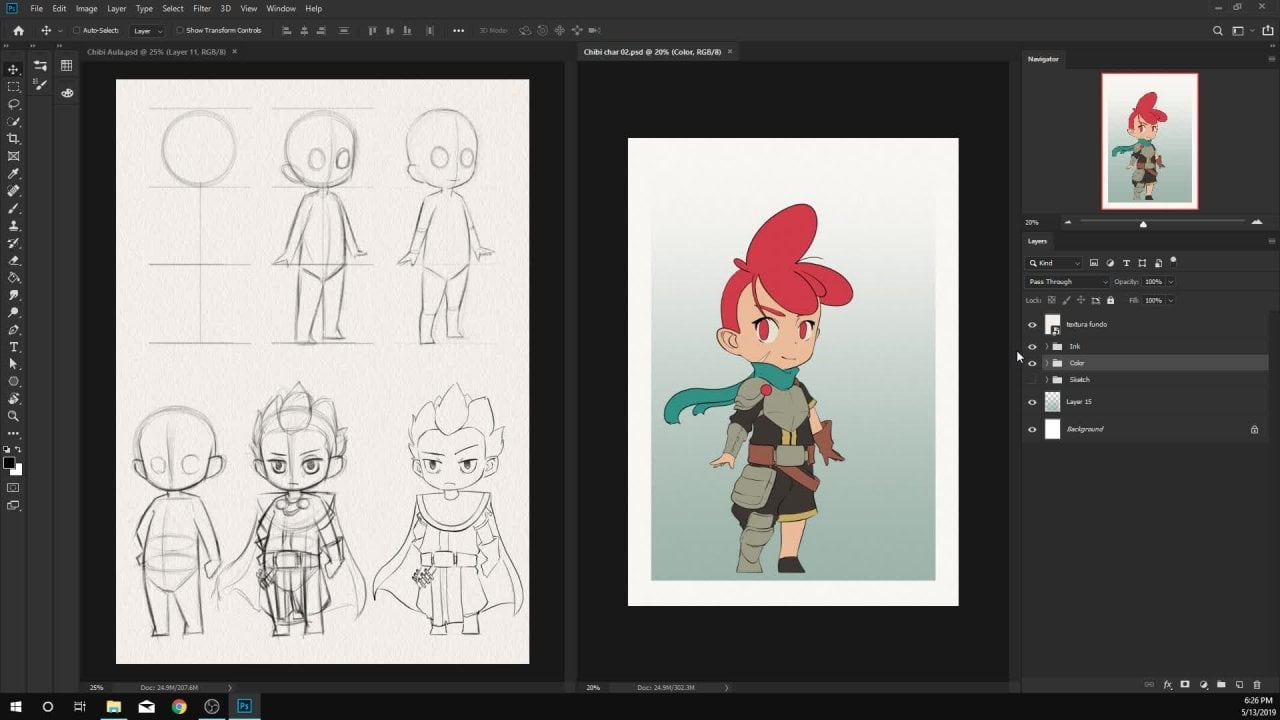
10. Color : I'm not an expert when it comes to color, but I'll tell you my process on how I chose the colors for this character. I always begin my coloring process by first checking out this website, which is Color Psychology.com. In this website, a, tell you all the meanings that humans associate to color psychologically. And here is where I refer to my character story and associate to one of these colors which relates to my character the best. So out of these, the color orange, which correlates to Joy, sunshine, happiness, creativity. So this kind of ties up to our traveling adventure character. So if you click on this name orange, it gives you a bit more details into it. Upon checking out more details on it, it says It's adventure is risk-taker and this color seems to be fitting well to the story of a character. This is kind of a first step in the process of coloring. And for someone who's not an expert in color, going through this route helps me in my decision-making process. So once I have my primary color set, which is orange, I usually just google the complimentary color for the color I've chosen. And google usually gives out what color it is. The reason I'm going with complimentary color is because any object that has high contrast colors associated with it, psychologically, human mind is immediately attracted to that object. So this seems to be an easy way to draw r i into this character whenever he appears in a comic or an animation. So this is my second step, is typically my color picking process. If we want to look for more ideas, I usually check out this website which is colors dot CEO. And I usually just go to Explore and just search for the color I want. And it usually gives me a bunch of color pallets. So I pick one of them and use that palate into my design. And by following this process, this is the final result. Now that we have a character design and the colour set, it's time to move on to expressions.
11. Expressions: Well, drawing expressions, you need to focus on four main things. On your face, the eyebrows, the eyes, the mouth, and the overall shape of the face. Now, understanding how your eyebrows, eyes, and mouth moves in according to an expression comes through practice. So I would say have a mirror in front of you and try to understand based on different kind of expressions. Does your eyebrow move up, does your eye expand and as your mouth expand and contract? And lastly, for the shape of your face, you need to keep three things in mind. Is it going to be a neutral expression, are stressed expression or a squished expression. A neutral expression is something that involves a slight movement apart from your resting phase, stressed expressions are the kind of expressions that would literally make your jaw drop. That would make your face expanded or extended quest expressions are expressions that would make your face contract. So before drawing any expression, you need to understand. For example, if you're wanting to draw an excited expression, you need to understand what you have in mind. Does it fall into neutral, stretched, or squished? Alright, it's time to draw, and let's put what we learned right now into action when drawing expressions, the first thing we wanna do is start with a neutral expression, like all other drawings, let's start with a circle. Since I'll be demonstrating the expressions for neutral stretched and squashed, duplicate these circles to bring it to three different expressions. Now let's begin with drawing the outline for the jaw line for the neutral expression based on how we designed our characters before, let's draw a jaw line based on that character. And for the stretched expression, in this case, I'm going for a shocked expression. Let's extend the joy line from how we drew for the neutral expression and for the third expression, which is a squished face, I'm going to draw an angry expression. For this expression, let's contract a jaw line and make it a bit smaller than the neutral expression. And we'll finish it off with drawing the guidelines for the eyes and nose. Now having this set, let's use this as a base guideline and start drawing our expressions. Now following these guidelines, let's draw the eyes and nose and finish it off with the jaw line and the hair. With that, we have our neutral expression for the stretched expressions similar to a neutral expression. Let's follow the guidelines drawing the eyes and nose, since we haven't expanded jaw line, let's use that with an open mouth expression. And there we have it. We have our stretched expression. And for the squished expression, that cheeks are more prominent. And let's use these guidelines to follow the same process to draw our angry expression. So having this concept in mind, you can approach N number of expressions and come out with something really interesting. So if you apply this theory to two-year expressions, it should look something like this.
12. Portfolio: Now we have our character design set and our expression sheet set. Now, let me show you how I display my category design across social media and my website. First up, let's talk website. On your website, I highly recommend you creating an individual page for character design. And under this page, just line up all the character designs you've done. Just so it showcases your style and your quality of work. And if they want to know more about the character design, they can go ahead and click the image. This is where you need to showcase your process. You need to tell us how you came about finalizing this design. So just like the lessons in this course, start with the character brief, the rough sketches, the character design itself, and the expressions for this character. I did not have time to create the 3D turnaround. If you have the time, I would recommend you doing it. That would be a huge added bonus to your character design. And finally, showcase some of the illustrations that you created using a character design and your expressions. Social media, it's pretty simple. You need a well finished final render of your character design and a bunch of expressions that go along with it and placed on a white background. The reason I'm specifying on the white background is because it brings a high-contrast and puts her character design on focus. And like our website and the time-lapse, use these expressions into illustrations and showcase how usable your character design is in comics and animations. To show you a quick example of how I used one of these expressions to create an illustration. How I look at this quick time-lapse. I said really. All right. Yes. Mm-hm. Oh.
13. What's Next: Congratulations, you've created a completely brand new character design. So what's next before you approach your next character design? Just keep in mind the process we followed in this course can be applied to any type of character design. May be a robot, a creature design, a superhero. Just keep in mind. It all starts with a story. Once you have a good enough foundation, you'll make all the right decisions. Finish your character design. Next up, I'd like you to challenge yourself and come up with something that's completely different from your first character design. I hope you found this course valuable to you, and I am planning on making more courses on digital art if you'd like to learn more, subscribed to my skill share page. And I'd like to thank you for checking out my course. And if you'd like to share with your friends who might enjoy it, I'm active on social media. If you'd like to share your designs with me, tag me on Instagram, and I'll give you my feedback on how you can improve your design. Thanks for checking out this course. See you in the next one.
 Rohit Vinay, Illustrator