Transcripts
1. Welcome to the Class: When I talk about
abstract painting, it is something in which you do not have to worry
about perfection. If you are someone who
loves to sketch and paint, this class is absolutely
suited for you. We are going to create a
beautiful castle painting on a brown paper using
three easy steps. Hey, everybody. You
are most welcome to my new class, myself Rutc Patel. I'm a self taught
independent artist and an interior
designer by profession. I personally love to explore different art mediums and styles and not stick to
one particular thing. So if you're joining
me, you'll find a variety of classes
that I create. We are going to start
by understanding the details about the class project that we are
going to create. Before we start, I'll be
giving you the details about the art supplies that you will need for
the entire class. We are going to learn
about the color palette, and I'll be giving you a simple
and easy practice session in which you can develop your painting and sketching skills. The practice sheet
will help you a lot to develop confidence
while painting, and the chances of making
mistakes will be very less. We're going to create the entire class project on a brown paper. I'll be teaching you how you can place your brown paper on the desk surface so that it will not move while you're
creating the project. We're going to start
with the first step, which is going to be basic
sketching, using a pencil. Followed by inking that we are going to do using a
black sketch pen. There are going to be minute
details that we are going to give using these
beautiful marker and pen. The last step is to add
color to the entire sketch, which we are going to do
using a poster color. While you are creating
the entire class project, no need to worry
about perfection or creating it in
the exact same way. It's an abstract painting, so you can create your
own composition as well, using these three easy and
simple steps of painting. By the end of the
class, you'll be having this beautiful abstract
castle painting that you'll definitely
enjoy creating. Follow these steps carefully and enjoy the
process of creating. You will definitely enhance your sketching and
painting skills. The class is absolutely
suited for beginners and also intermediate and advanced
level artists can try it. So without any delay, grab your art supplies, join me on this
creative journey.
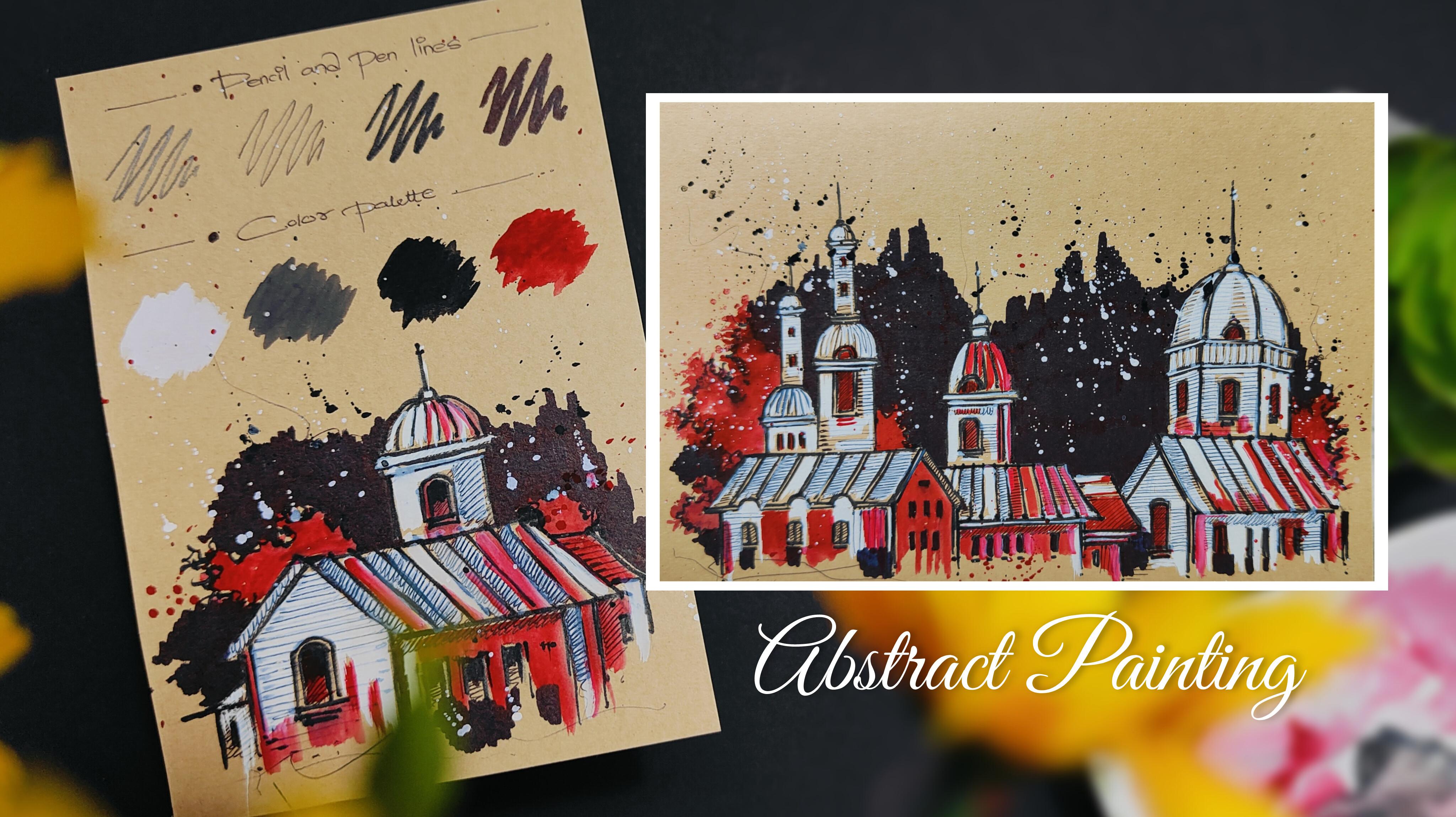
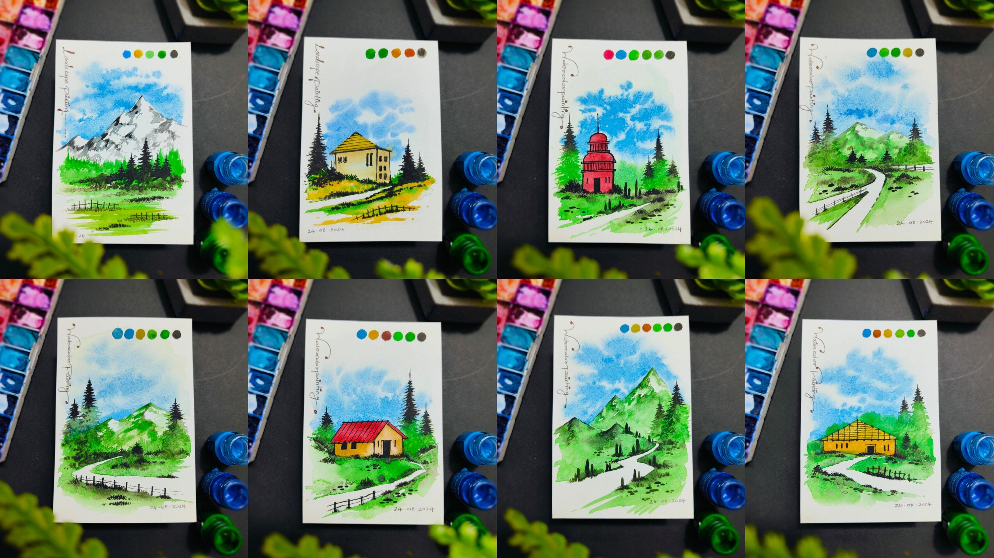
2. Details About the Class Projects: Hey, every buddy, now,
let us talk about the details of the class project that we are
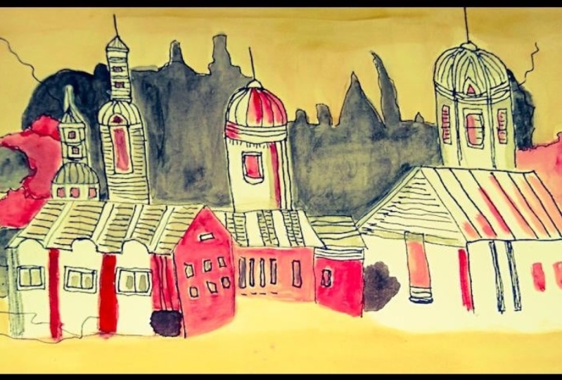
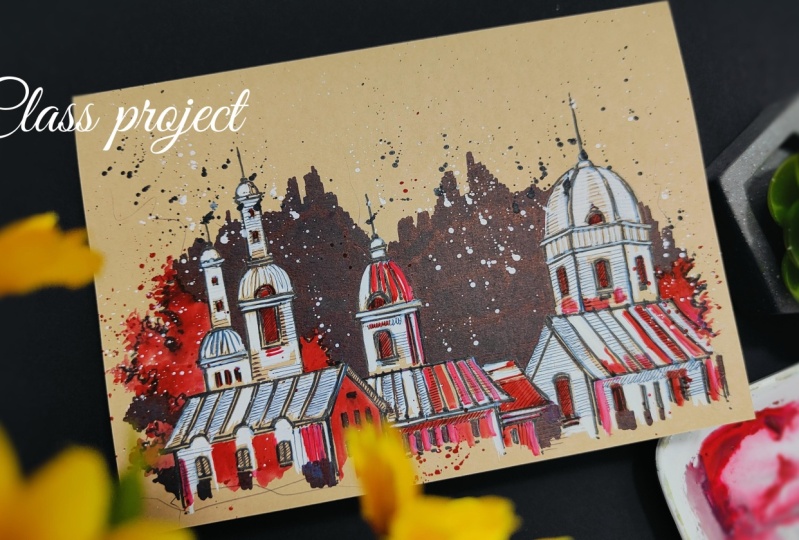
going to create. So here is the entire
class project, and as you can see, we
are going to create the entire class project
on a brown paper. So you can observe the details about the brown
paper here as well. It is 180 GSN, and the size is A five size. You'll find it very easily in
any nearby local art store. In case you want to have
a variation in the size, it is absolutely fine. So I've created
the entire project in this horizontal manner. You can observe the
details carefully. The entire project is created
by using three basic steps, which includes basic
sketching followed by inking, and then the last
step is coloring. If you observe carefully, there is a beautiful
abstract background that I have created using a
solid black marker, which creates a nice contrast with the brown paper
in the background. You can observe
these minute details that we have created
using a solid black pen. The entire class project is very easy and
simple to create. You just have to follow
these steps carefully. No need to worry
about the output, just enjoy the entire
process of creating. Now, let us move towards
the next part and understand all the art supplies that you will need
for the entire class.
3. Art Supplies: Hey, everybody, now,
let us understand all the art supplies
that you will need for the entire class. No
need to worry at all. In case you're missing out on
any particular art supply, you'll find it very easily in
any nearby local art store, or you can go for any other
good alternative as well. So the first art supply is
a simple color palette. As you can observe, I'm already having my two colors on it. So just try to have a
simple color palette in which you have enough space
for mixing your colors. Then the next art supply is a simple brush that
we are going to use. So it's a round brush
as you can observe, and the size of the
brush is seven. In case you want to go for
any other good alternative. You can definitely go for that. So if you are having a size
six or size eight brush, that is also absolutely fine. You can use that brush as well. Then you'll need a simple
pencil to draw a basic sketch. Then we have the
next art supply, which is a nice calligraphy
pen, as you can observe. It's a very similar
thing to a black marker. You can observe the
tip of the marker. And the color of this particular
marker is solid black. So we are going
to use it to give a beautiful outline
to our basic sketch. Then next up, I have
a simple black pen. You can observe its stip. It's a very thin tip that
we're going to use to add minute details to
the entire painting. Then I have my thick solid black marker
from Faber castle. You can observe its stip. It's a very thick tip that
we're going to use to apply a beautiful
solid black background to the entire painting. Then the next art supply is a simple masking tape
you can observe. We are going to use this
masking tape to place the paper onto the disk surface so that it will not move
while we are painting. Now we have a
simple tissue paper that you will definitely need to remove axis amount of water and color
from your brush. It is always good to keep
a tissue paper nearby. Then next up, we have a
very important art supply, which is a brown paper
that we are going to use. So let me give you the details
about this brown paper. It is going to be 180 GSM, and the size of this
particular paper is A five, and these are acid free papers. You'll find these papers in
any nearby local art store, and in case you want to go
for variation in the size, it is absolutely fine. We have created the
entire class project in this horizontal format,
as you can observe. In case you do not
have a brown paper, you can still take up
the entire class project on a white paper as well. Now, let us talk about the colors that we're going to use. These are two basic colors, which is black and white, and these are poster
colors, basically. In case you do not
have poster colors, you can go for wash
colors as well. Now, apart from
these two colors, I'm going to use a
watercolor as well, which is going to
be crimson red. In case you do not
have crimson red, you can go for any other
good alternative as well. You can have variation
in the color as well. Then we have the
next art supply, which is a simple container, which is having
clear water in it. You'll need it to
clean your brush and mix colors well in
your color palette. These are all the art supplies that you will need
for the entire class. No need to worry at
all. In case you're missing out on any
particular art supply. You'll find it very easily in
any nearby local art store, or you can go for any other
good alternative as well. Now let us move
towards the next part.
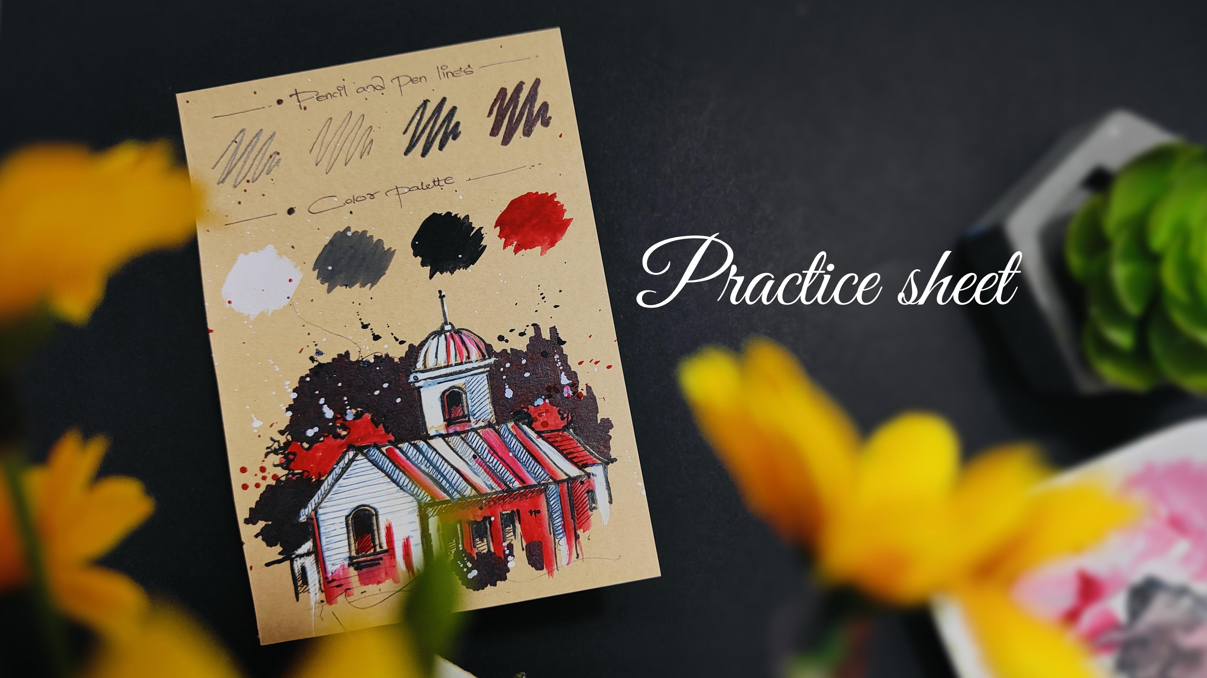
4. Color Palette: Hey, everybody, now,
let us understand the color palette
that we're going to use in the entire
class project. So I'm having a simple
brown paper over here. So I'm using half of my
A five size brown paper. We're going to have
the color palette and our practice sheet
in the same paper. So if you observe the entire
class project carefully, we do not have too
many colors in it. We have four basic colors. I'll be just using
my masking tape to place these small pieces on the corners so that the paper will not move while we're
painting and drawing on it. Now, if you observe the
class project carefully, we have these beautiful
black strokes in it. So let us start with the strokes that we are going to use in
the entire class project, which is basically
pencil and pen lines. So I've given a simple heading
on the topmost portion. So the first step is going to be a basic sketch that we're going to create using a simple pencil. So you can observe how beautiful the gray color is looking
on the brown paper. Now, on that, we're going to use a simple black pen to
create minute details. Now we have another
calligraphy pen, which is a little bit
thicker than the black pen. And the last one is going
to be a solid black marker, which is going to have a nice
intense solid black color. So you can observe
a variation in all the four strokes from
the pencil to the marker. Now apart from this,
we're going to have four basic colors that we're going to use in the
entire class project. I'll be giving a nice heading of color palette
using my black pen. I'll be using my color palette, and we're going
to mix the colors well in the color palette. And one by one, we are going to apply it onto the brown paper. I'll be taking some crimson
red in the color palette. So one by one, we
are going to apply the colors onto the brown
paper so that you'll get an exact idea of how the
color will look once we apply it onto the brown
paper and the color gets dry. I'll be starting with
the solid white color, take your round
brush of size seven. Take some water to loosen the
color up and mix it well. Now you can apply a small
patch of the color onto the brown paper so
that you can observe a beautiful contrast of the
color with the brown paper. Then I'll be adding
the white color in the solid black color to
create a nice gray shade. We do not have a gray shade
in the class project, but you can observe the
beautiful application of this particular
color as well. In case you want to use it
into your class project, it is absolutely fine. Then the next color is
a solid black color, mix it well with water. And then you can
apply a small patch of this color as well. Now the last color
is crimson red, so take some water, mix it
well in the color palette. Make a good composition of
water and color together and apply a small patch of the
color onto the brown paper. So I hope that you
got an exact idea of the color palette that
we're going to use to create this beautiful
class project. Now let us move
towards the next part.
5. Lets Practice the Elements: Hey, everybody, now,
let us practice all the elements
that you are going to need in this
entire class project. It is going to be a simple
and easy practice session. And it will help you
a lot to develop confidence while
drawing and sketching, and the chances of making
mistakes will be very less. So I'm going to create
a simple house element over here using
my simple pencil. You can observe the strokes
that I'm creating right now. No need to worry
about perfection. Just follow these
steps carefully. The pencil line
basically helps us to locate the elements
in the entire sketch, and it is considered as a rough work that we create
for basic sketching. The pencil lines won't
be even visible once we apply an outline using our
solid black marker and pen. So I've created
these tiny windows in the house element,
and you can observe, I'm creating a beautiful
building element on the topmost portion, creating a simple semicircular
shape followed by these two rectangular shapes and a small window in
the middle portion. And I'll be using
my calligraphy pen, which is simple
black marker only, and I'll be adding a nice
outline to the entire sketch. It's a very simple
and easy technique. You just have to follow
the pencil lines. And in case you move
out of the pencil line, it is absolutely fine because it is a part of
abstract sketching. Now, slowly, I'll be moving
towards the bottom portion, applying a beautiful outline to the window and the
building element. Now, one thing that
you can always keep in mind whenever
you're using a pencil order marker is to keep your hand very
much loose and free. This will help your lot to draw in a very
comfortable manner, and let your strokes be
very much rough and random. It is not at all compulsory
to have perfect strokes. Also in case your
marker line goes out of the pencil line,
it is completely fine. Now you can observe that
I have almost covered the entire house with this
beautiful solid black outline. You can add these little solid black patches in
the window area. To make the elements
look a little bit more in contrast with
the paper color. Now, using the tip of my marker, I'll be adding these
beautiful details. These are basically slant
lines in the roof area. You can also add a
little bit of building element in the left hand
portion if you want to. Now, I'll be adding
a few bushes, so it is a very simple
and easy technique. Just use your marker, create this nice random outline, which is basically an outline of a tree element or any bush. You can decide the position of the plantation according
to your convenience. It is completely fine. I'll be using my
black pen to add these minute details
in the entire sketch. This helps us to enhance
the entire sketch. It will look more in detail, and it will also look a
little bit more attractive. So you just have to create these little strokes
combining together, and it is basically creating some nice depth in
the entire sketch. It's a combination of
horizontal and vertical lines together if you
observe carefully. So you can carefully observe
the movement of my hand, the way I'm applying these
little solid black strokes. Once we apply the color
to the entire sketch, these strokes might get a
little bit less saturated, but it is completely fine. We can reapply these strokes again in the entire sketch area. No, I'll be adding these
beautiful horizontal lines where we have this
beautiful huge window, and you can observe
that I am just adding the lines in a very
random and natural manner. There is no specific
way of applying them. So no need to worry about adding it in the exact same way. You can roughly add
these random strokes around your sketch to make it look a little bit
more authentic. Now, let's start with
the first color, which is going to
be solid white. I'll be taking my poster color in the round brush
of size seven. Mix it well in the
color palette, try to have a good combination of water and color together. Now, simply, I'll
be using the tip of my round brush to paint in this beautiful, smaller portion. You can observe
carefully the way I'm leaving some space
in between as well. Now, I'll be slowly applying the color on the roof element. If you observe carefully, the color basically covers the strokes that we created
using our black pen. But it is completely fine. We can reapply the
strokes as well. Also, while you're
using a brush, you can always keep your hand
very much loose and free. This will help you a lot to paint in a very
comfortable manner. No need to make your
hand very much stiff. There is no specific way of applying this beautiful
solid white color. You can just randomly apply the color
wherever you want to. You can leave some spaces
in between to make your entire painting look a little bit more
aesthetically appealing. If you find that
the saturation of the color that you're applying
is a little bit less, you can decrease the amount
of water in your brush, simply dab your brush onto the tissue paper so that axis amount of water
will be removed, and we'll get a nice, highly saturated
solid white color. I'll be taking some crimson
red from the color palette, mix it well with water. Now, we are going to
make a nice combination of crimson red with
this solid white color. I'll be adding this particular
color in the plantation. You just have to
cover the outline and fill the color in
the inner portion. In case your strokes are going out of the line,
it is completely fine. It will look really nice. You can add some nice strokes in the roof element
in a random way. We're going to add
this particular color in the wall of the
entire house element. You can leave the window space, and you can just add
these strokes randomly. In case you find that your color is getting finished
from the brush, you can definitely
take some more color from the color palette. Just try to make a
good combination of color and water together. No need to hurry at all. Try to paint it in a very slow
and steady manner. So we are done with the third step which is
applying the color. Now, let us create a beautiful
abstract background, using our solid black marker
with a very thick tip. You can observe that
I'm just adding a nice solid black patch
in the background area. While you are doing
this particular step, be a little bit
careful, your marker should not go inside
the building structure. So we basically want to create a nice solid black patch
in the background area. Be a little bit careful near
the plantation area as well. Use the tip of your marker. Apply the marker in a very slow and steady
manner so that you do not get your solid black color inside the building structure. Now you can carefully
observe that we have almost created a nice solid black
patch in the background. You can add it in the bottom
portion also if you want to. Now, again, I'll be taking my
round brush of size seven, add some water and mix
it well with the color. Now simply tap your
finger onto the brush to splatter some color
around in a natural way. Similarly, we are going to do this with solid
black color as well. And you'll observe that the
color will get splattered on the paper surface in
this nice dot form. Now, similarly, I'll be taking
some solid white color, mix it well with water, and simply tap your finger onto the brush and splatter
some color around. You can observe a
beautiful contrast of white color with this beautiful
solid black background. So we are done with
the entire painting. Now to increase the
solid black strokes, I'll be reapplying the strokes
using my black pen again, and you can observe
that it will create a nice detailed element to the entire painting
that we have created. You just have to
reapply these strokes, and you'll observe
that it will create a nice contrast with the
color that we have applied. I hope that you've
got an exact idea of all the elements
that we are going to use in the entire
class project. These are three
basic steps which include sketching,
using a pencil. Then we applied inking to the entire sketch using
our black pen marker. Then finally, the last step
which is applying the color. And we are done with the
entire practice sheet and the color palette. The practice sheet
will help you a lot to develop confidence
while painting, and the chances of making
mistakes will be very less. It will be like a
warm up exercise for you before you start
with the class project. Now let us move
towards the next part.
6. Lets Place the Paper: Hey, buddy, now, let us
place the paper onto the desk surface so that it will not move while
you're painting. So here I have my brown paper. It is 180 GSM, and it is A five size
acid free papers. We are going to use
a horizontal format to create the entire
class project. It is a very simple and
easy technique for you to place the paper
onto the desk surface. This will also help you a lot to paint and draw in
a comfortable manner. So you will just need
a simple masking tape, and we are going to place the masking tape on the
corners of the paper. So here I have my masking tape. We are going to take
two small pieces of the masking tape. It is a simple paper tape only. It will get removed easily from the corners once you're done with the entire class project. I'll be taking a small
piece of the masking tape. Place it on one corner. Similarly, I'll be
taking another piece of the masking tape and place it
on the alternative corner. You will need only two pieces. It is absolutely
fine in case you want to place it on
all the four corners. That is also completely okay. So we are done
placing the paper. Now you can easily move your pencil and pens
on the paper surface, and it will not move. This will help you to work
in a comfortable manner. Now let us move
towards the next part.
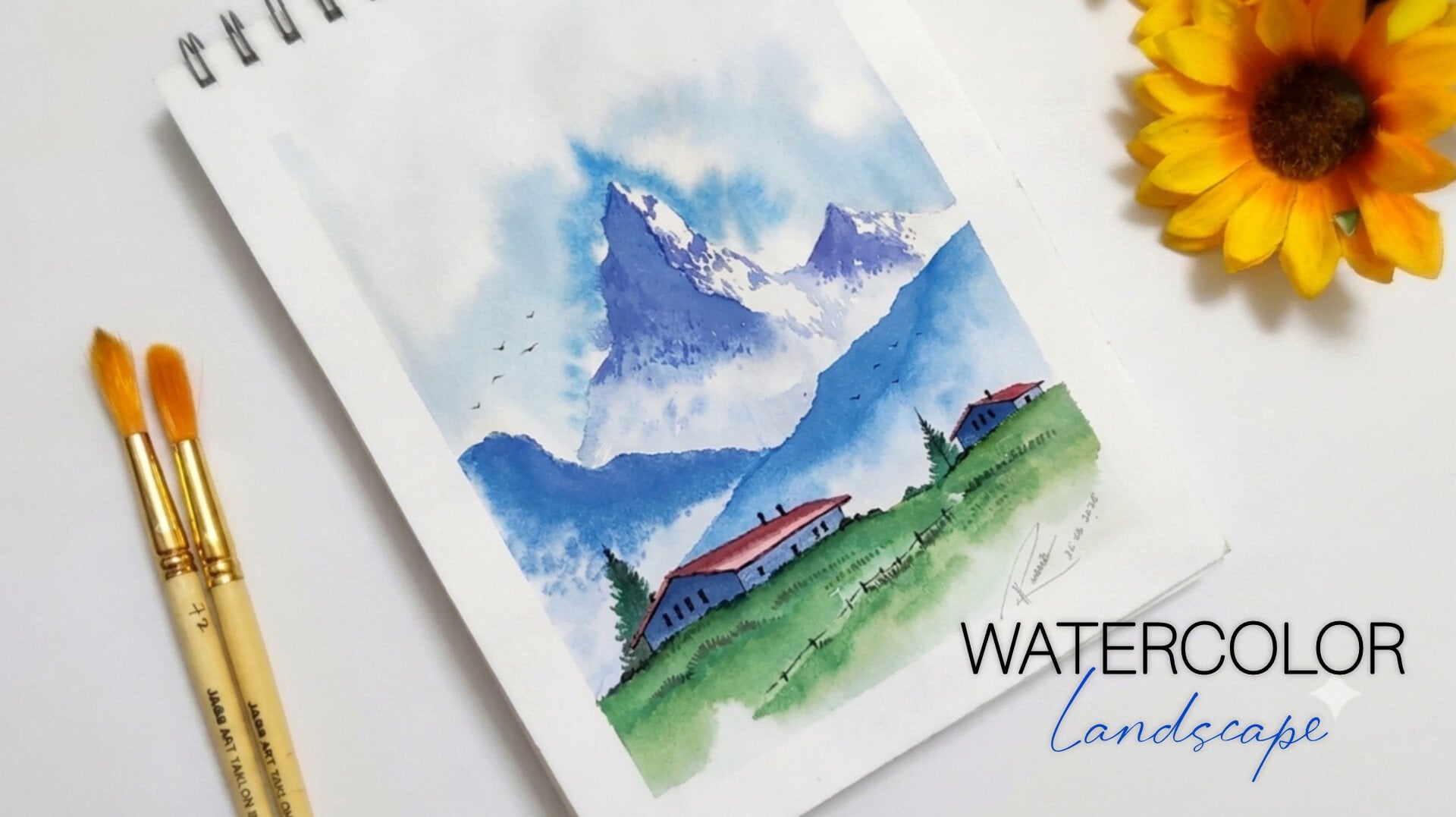
7. Basic Sketch: Hey, everybody, now, let us
start with the class project. The first step is
creating a basic sketch. As you can observe, I'm
ready with my brown paper, a simple color
palette, tissue paper, clear water, and all
our markers nearby. I'll be starting with
a simple pencil. You just have to create a
small semicircular shape. This is a part of a huge tower in the entire sketch that
we are creating right now, and the element is a part
of the entire castle. You can just simply
follow these steps. It is a very simple
and easy technique, combining horizontal and
vertical lines together. You can add these
semicircular shapes to create some nice
attractive elements. Now, similarly, I'll be
adding one more tower, which is going to be on
the left hand portion. You can add these little windows in this rectangular format, having a small semicircular
shape on the topmost portion. So you can observe
that we have created two beautiful towers right now. Now we are going to complete
the structure by adding a nice horizontal line in the bottom portion followed
by the slant roof, which is going to be a
part of a house element. No need to horry at all.
Also, no need to worry about drawing it in the exact same
way I'm drawing right now. Your sketch might be a little
bit different from mine, and it is completely fine. In case you want to create
your own composition, that is also absolutely okay. Now, similarly, I'll be adding these little windows in the bottom portion
of the wall element, and you can add these
little rectangular shapes to create some nice aesthetics. No need to worry about
the pencil sketch because it won't be visible
once we apply the ink. Now we are going to continue the castle element by adding
one more roof structure. You can connect it with
the first structure that we have created on
the left hand portion. You can add these
lines to create some nice details in the entire roof element followed
by these little windows. Now, next up, we have
one more structure just above this beautiful house structure that we have created. So you just have to add these horizontal and
vertical lines together, followed by a nice
semicircular dome on the topmost portion. Whenever you're using a pencil
to create a basic sketch, always try to keep your hand
very much loose and free. No need to make it very stiff. So that you can draw in a
very comfortable manner. No need to worry about
creating perfect strokes. Now, I'll be completing
the entire structure by just adding a few
more building elements. Now there is going to be another house element in the
right hand side, a little bit bigger than all the house elements that we have drawn on the
left hand portion. You can simply observe the
way I'm moving my hand. It is a very random
and natural movement. There is no reference here. So no need to worry about
creating the sketch in the exact same way
I'm drawing right now. You can create your own
composition as well. Whenever you add these little windows in the entire sketch, it creates some
noice aesthetics, and your sketch will look a
little bit more attractive. Now we're going to have a
nice huge dome structure just above this house element.
We are going to draw it. You can observe these
steps carefully. So I'll be adding two slant
lines on either sides followed by one horizontal
line in the middle portion. Then we are going to
add vertical lines, which will create the walls. Now there is going to be
a huge semicircular dome that you can create
using your pencil, and you can add these details. Now we're going to add
these little windows in this particular
structure as well so that we can create
some nice aesthetics. So we are almost done creating a basic sketch using a pencil. Now in order to create
some plantations, you just have to create
these rough outline for the position
of the plantation, and you can decide the position according to your convenience. It is completely fine. So I have added one in
the left hand portion, and you can add a little bit on the right hand side as well. So we are done with
the basic sketch. Now let us move towards the
next part, which is inking.
8. Inking the Basic Sketch: Hey, bay, buddy, you're most
welcome to the second step, which is inking
the basic sketch. Now, once you're done with
your basic pencil sketching, we are going to apply a nice solid black outline
to the entire sketch. You can use your marker
on a rough scrap of paper to check the
thickness of your marker. Now I'll be starting by
applying the marker on the bushes that we have created
on the left hand portion. It's a very simple
and easy technique. You just have to follow
the pencil line. Also, in case you go
out of the pencil line, it is completely fine since
it's abstract sketching. Now, similarly, we are
going to start applying the outline to the
building element as well. No need to hurry at
all. You can use the tip of your marker to
get a nice thin stroke. And if you apply
some more pressure, you'll get a nice thick stroke. The marker that I'm using right now is basically a
calligraphy pen, as you can observe carefully, which is having a tip of 2.0. In case you do not have
a black calligraphy pen, you can go for a
normal marker as well or any good alternative
that suits you. You can observe the thickness of the solid black line that
is being created right now. So we just have to
follow the pencil line, and in case you want to add some additional strokes also using your marker that
is completely fine. The way I'm adding
these little details. You can also double the
window lines so that the window will look a little bit more attractive anesthetic. Now, if you observe carefully, after we apply this beautiful solid black outline
to the entire sketch, it creates a beautiful contrast with the brown paper
in the background. Now, there is this beautiful house element in
the bottom portion. You can observe the way
I'm moving my marker. You just have to leave your hand very much lose and
free whenever you are doing a nice abstract sketching because it is going to be in a very rough and random manner, so no need to worry about
creating perfect strokes. Now, I'll be moving towards
the right hand side as well. You can add these little details for the windows that
we have created. In case you're not that much
confident enough to add the solid black strokes directly towards
your basic sketch. What you can do is that you can take a rough scrape of paper or a practicing journal in which you practice
on a regular basis. You can try to add the solid black strokes to a
basic sketch for practicing, and then you can come towards
your final class project. This will help you a lot
to develop confidence while adding these
beautiful random strokes, and the chances of making
mistakes will be very less. Also, in case you make any mistake while adding these
beautiful random strokes, it is completely
fine because it is going to be a part of
abstract sketching. So there can be
random rough strokes around the entire sketch. It is completely okay. So now you can observe
that I have added this beautiful slid
black outline to a building structure that is in the middle portion as well. Now, let us create the outline in the bottom portion also. You can use the tip of your marker to get these
little thin strokes. The more details you'll
add to your sketch, the more attractive your entire abstract
sketch is going to look. So now we are almost done adding a beautiful solid black
outline to the entire sketch. There is this building portion remaining in the
right hand side. And starting from
the topmost portion, which is this beautiful
dome structure, you can apply the outline in the curves on the
topmost portion. You can also add few more
additional details directly, you have not drawn
it with your pencil, but it is completely fine. You can add it using your. Now, slowly, I'll be moving towards the bottom area as well, connecting these horizontal
and vertical lines together. One thing that I would
like to tell you all is that no need to worry about creating the sketch in the exact same way
I have created. In case you want to
experiment and explore, want to create your
own composition. It is completely fine.
You're free to explore. Also, no need to worry
about making any mistakes. It is a part of learning, so you can just
enjoy the process. Also in case you find few
exciting building elements that you can roughly draw on
that particular spot, you can definitely
do that as well if you carry your sketch book
regularly with yourself. This can also help
you a lot to develop your sketching skills and your hand movement will
definitely improve. Now, I'll be adding
the outline in the bush that we have created
in the right hand side. So we are done adding a beautiful outline
using our marker. Now I'll be using a simple pen to enhance the entire sketch. You can use the pen on a rough scrape of paper
again to check your strokes. Now, it is a very
simple and easy step. To make your sketch
look a little bit more attractive
and aesthetic, you just have to use
your black pen to add these random strokes inside the entire building structure. This will make the
entire sketch look very much attractive
and in detail. So it's a combination of
horizontal vertical strokes. You can add few slant lines
wherever you want to. You can also add curved lines. Again, I'll be telling
you the same thing. No need to worry about adding the strokes in the
exact same way. You can randomly add it
wherever you want to. It is completely fine. Now, slowly, I'll be adding these horizontal lines on the roof structure
of the entire house. You can observe how it creates a noise contrast with
the background color. This particular step
basically enhances your entire sketch from a simple plain outline
of solid black color. Also, whenever you're
using a black pen, always try to keep your hand
very much loose and free, no need to make it
very much stiff. This will help your low to
draw in a comfortable manner. So It comes with a
lot of practice. So no need to worry
in case you're not able to get random
strokes initially. The more you'll practice, the better your hand
moment will get. Now, slowly, I'll be moving towards the building structure
in the right hand side. I'll be applying the
strokes in the window and these beautiful
horizontal strokes in the entire wall area. You can also observe carefully that I'm not covering
the entire area. I'm just applying it in
certain portion only. The strokes that we are applying using the black pen might get a little bit less saturated
when we apply the color, but it is absolutely fine. We can reapply the black strokes again on the entire sketch. Now, we are almost done applying
these beautiful strokes. Let us add the random strokes in the building structure
on the topmost portion, which is this
beautiful huge dome. Now I'll be adding
these vertical lines to enhance the entire sketch, which is also very
much satisfying. Similarly, we are going to add these little strokes in the
windows and the wall element. Now, after we have applied these strokes using
our black pen, the entire sketch
becomes a little bit more live and aesthetic. It creates some nice
depth and details. You can add these random
strokes around to create some noise abstractness
to the entire sketch. So we are done applying the ink to the basic
pencil sketch. Now let us move towards the
next part, which is coloring.
9. Applying the Colors: Hey, everybody, you're most
welcome to the last step, which is applying the colors. So once we are done inking the entire basic sketch that
we created using pencil, now we are going to add
some nice colors to the entire painting so that it looks a little bit more
aesthetic and attractive. So in my color palette, using my round brush
of size seven, I have taken some
solid white color. You can add a little bit of
water to loosen the colora, make a good combination of
water and color together. Now, slowly, we are going to apply it into the
building structure. You can observe the way I'm
moving my hand and the way I'm using the tip of my brush to paint
in smaller portion. I'm starting by
applying the color in the towers in the
left hand portion. Slowly, we'll move towards the semicircular shape
in the bottom portion. No need to cover the entire
area using your brush. You can just leave some
spaces in between as well. It will look really
nice and aesthetic. Make sure that you do not move your brush inside the
solid black window. In case you buy mistake, apply the color in the windows, you can reapply
black color on it. Now, I'll be adding
the color around this beautiful rectangular
window as well. You can observe the way I'm leaving some space
in between also. Now, let us move towards the building structure
in the bottom portion, which is this
beautiful slant roof. As I told you that when we
are going to apply the color, The black strokes
that we created using our black pen will get a
little bit less saturated. But it is absolutely fine. Once the color is dry, we can reapply the
strokes on that. Wherever you find that there is a smaller portion to paint, you can use the tip
of your own rush, apply less pressure
on it so that you can apply the color in
a very nice manner. Also, if you observe carefully, I'm not applying the color
on the entire surface, you can naturally leave
some space in between, and no need to worry
about painting it in the exact same way I'm
painting right now. If you find that your color is getting finished
from the brush, you can definitely take some more color from
the color palette. Also, try to make
a good composition of water and color together. Try to have more amount
of color and less water. This will not decrease
the saturation of your solid white color. In case you find
that the saturation of your white color
is a little bit less, you can reapply the color in
that particular area again. Now, slowly, we will move
towards the entire structure, which is on the right hand side. I'll be applying the color on the roof element by adding
these little strokes. In between the entire structure, if you observe carefully, I have left some spaces in between where we are going
to apply crimson red, so you can naturally leave
some space in between wherever you want to make a
good composition of both the colors together. Now, whenever you are
working with a brush, also, always keep in mind
that try to keep your hand very much loose and
free, no need to make it. This will help your lot to paint in a very
comfortable manner. While you are applying the
white color in the walls, just make sure that you
do not move your brush inside the solid black
windows that we have created. Bi mystic, if you apply the color on that
particular area, let the color dry for a while, and then you can reapply the
black color in the windows. No need to hurry at all, take your time and paint it slowly. 00. Oh. So we have almost applied
solid white color in the entire painting
that we have created. Now, I'll be applying
the color in the remaining portion of the building element on
the right hand side, which is a beautiful
dome structure. In case you find that there is a less saturated
solid white color in any particular area, you can definitely
reapply the strokes. Try to have les amount of water in your brush
and more color. Oh. Now you can carefully observe that we
have certain spaces where we are going to
apply crimson red, and also in the bushes, we are going to apply
this particular color. So you can take some color
in your color palette. In case you want to take a different alternative and
experiment with the color, you can take a different
color as well. Take some crimson red
in your color palette, make a good composition of
water and color together. Try to have less amount of water and more color
so that you can get a highly saturated color.
No need to hurry at all. Use the tip of your brush and slowly apply the color
in the entire surface. If your color gets
out of the line, it is absolutely fine. It is a part of
abstract painting. So you can observe a
beautiful combination of this solid white color and the crimson red color that
we are applying right now. There is a little bit of
bush in the bottom portion. There also, you can apply
this particular color. You can use the tip of
your round brush to apply these little strokes around the outline so that it looks
a little bit more bushy. In case you find that your color is getting finished
from the brush, you can take some more color
from the color palette. So I wanted to add some additional bush to
the entire sketch. So I'm using my marker, and I have created
a little bit of outline near the
building structure, and you can just fill in this crimson red color
in the inner portion. In case you find that you are having axis amount of
water in your brush, you can simply dab it onto
the tissue paper so that axis amount of water
will be removed and you'll get a nice
saturated color. Now in the windows, I'm applying this particular color to
create a nice combination. You can observe the way
I'm using the tip of my round brush to paint in this particular area carefully. Now there is certain portion in the entire building structure where we have left some space where you can apply
the crimson red color. In case you want to spread the
color in a natural manner, you can apply some water
in certain areas as well. Now, while I'm applying
this particular color also, you just have to make
sure that you do not move your brush inside
the solid black color. In case you move your
brush inside the windows, that is absolutely fine. Let the color dry for a while, and then you can reapply the strokes on that
particular area as well. Now, similarly, we'll be adding the crimson red color in the remaining
building structure. You just have to observe
these steps carefully, and no need to worry
about applying the color in the same way
I'm painting right now. There might be a little bit of difference between your
painting and mine, and it is completely fine. In fact, you can create
your own composition of painting the entire castle. So we are almost done adding the crimson red color to
the entire castle as well. Now, I'll be adding the
crimson red color in the plantation that we have created in the right
handside, as well. So slowly just apply
the color and make sure that you do not move the color inside the
building structure. You can slowly dab your brush using the tip of your brush to create some nice strokes in the entire building
structure as well. So now we are almost
done painting the entire castle using
these two beautiful colors. Now we are going to
take our black pen, and we are going to reapply these strokes that we gave
to the entire sketch. Since we apply the
solid white color, the strokes are a little
bit less saturated. Now, no need to worry
about perfection. Just randomly apply
these strokes in the entire castle area. You can just make these
little horizontal strokes wherever you applied
it initially, and no need to worry
about perfection. Apply it in a very
random and subtle way. Now, slowly, I'll be applying it in the middle
structure as well. It's a combination of horizontal
and vertical lines only. You'll observe that
now your strokes will be a little bit more
visible on the color. Now once we are done applying these little strokes
using our black pen, you're going to create a nice abstract solid black background. For that, I'll be taking my
thick solid black marker, and you're going to
start by creating a small patch around the
entire building structure. Now while you're doing
this particular step, you have to be a bit careful. Use the tip of your marker so that you can
apply the color in this smaller portion
and make sure that you do not move inside
the building structure. Here in this particular step, you can be a little bit
careful so that you do not move your marker inside the
entire building structure. Now, slowly, I'll be creating
the entire outline of the solid black patch by just combining these vertical
strokes together. Once you create a nice outline, you can fill in
solid black color in the entire inner portion. You can carefully observe
the way I'm using my marker. Now, slowly, we are going
to cover the entire area. So you can just add the color nearby the
entire building structure, and then you can
apply the marker in the entire remaining portion. Make sure that while you're
applying the marker, you do not leave any
space in between. In case you find that there
is any space left in between, you can reapply the marker
in that particular area. It is absolutely fine. Now, you can carefully observe
a beautiful contrast of this solid black color
that we are applying using our marker and the
entire building structure. We have not covered
the entire paper with this solid black color. It is in a very abstract
and natural manner. So no need to worry about getting it in the
exact same way. You can create your own
abstract background as well. If you observe carefully, I'll be very much careful near the smaller portion where I
have to apply the marker. So you can use the
tip of your marker, apply a little bit
of less pressure. So you can observe
a nice variation of the outline of this
particular solid black color. You can apply it near
the bushes and in the bottom portion as well to create some nice
depth and details. In case you want to enhance
your smaller windows, you can apply the marker
in that particular area as well. No need to hurry at all. Try to apply the marker in a
very slow and steady manner. Try to create a
good composition. So we are almost done
with the entire painting. Now we are going to create some nice abstract effect
in the entire background. And for that, I'll be
using my round rush. And we're going to splatter some color in the
entire painting. So take some good
amount of water and mix it with crimson red
in your color palette. Now simply tap your finger onto the brush and splatter some
color near the bushes. No need to hurry
at all. This step is really very satisfying, and you'll definitely enjoy. There is going to be
a very natural way of splattering the color. So no need to worry
about perfection. You can observe carefully that the color will spread
in this dot forms, having variation in sizes. Now, you can simply
clean your brush, and we are going to take some solid white color
in the color palette. Mix it well with water, and the step is absolutely same. You just have to splatter
the color on the background. You'll observe that these
white dots are creating a beautiful contrast with
solid black background. You can splatter the color
in a very random way, so no need to worry about getting it in the
exact same way. Now, we are going to clean
our round brush again, and we are going to take
some solid black color. Mix it well with water, try to have a nice composition of water and color together. Now, similarly, tap your finger and just splatter
some color around. And you can observe how
beautiful we have combined all the elements together to form a beautiful
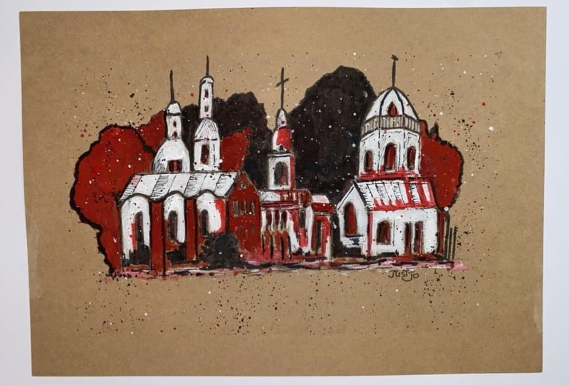
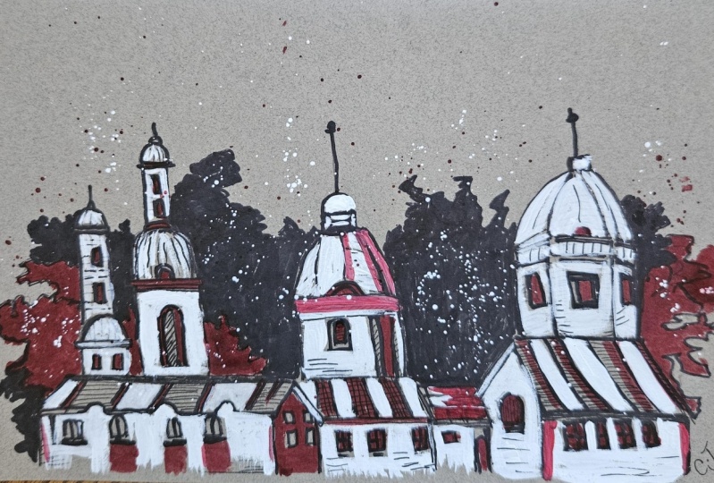
castle painting. The entire painting is
in an abstract manner. Let me take you a little
bit closer so that you can observe all
the details carefully. Using three basic steps
of sketching, inking, and painting, we have created this beautiful abstract
castle painting. I hope that you enjoyed the
entire process of creating this particular class project and got to learn something new. Now let us move
towards the next part.
10. Class Conclusion: When we talk about
abstract painting, you just do not have to
worry about the output. It's a very random way of
creating any painting. Using three easy and simple
techniques of painting, we have created a
beautiful class project that you're definitely
going to enjoy. It is having a very
minimal color palette. While I was creating
this particular class, I made a number of mistakes, and that is something that
I always tell my students. Never to be afraid
of making mistakes. It's a part of learning. The practice sheet will help you a lot to develop
confidence while painting and the chances of making mistakes
will be very less. I will be really excited to see all of your class projects, so do not forget to add them
into the project gallery. Feel free to ask any questions or doubts you have
related to the class, just enjoy the
process of creating. It would be really great
if you leave a review for the class as it
encourages me a lot, and my class can reach many
more students like you. At the end, I would like to say keep learning, keep practicing. No need to worry
about the output, enjoy the process of creating. Thank you so much for joining the class and happy painting.
 Rutvik Patel, Artist and Instructor