Transcripts
1. Welcome To The Class!: Hello everyone. My name is will Elliston. In this class, I'm
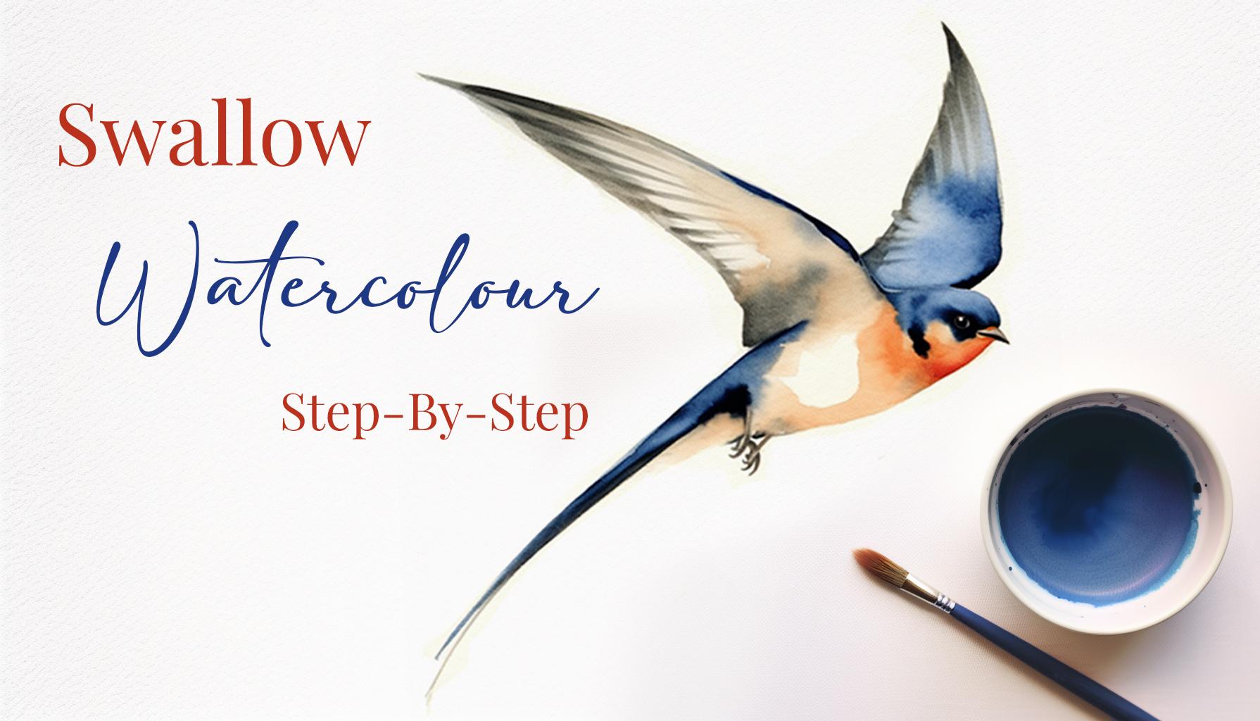
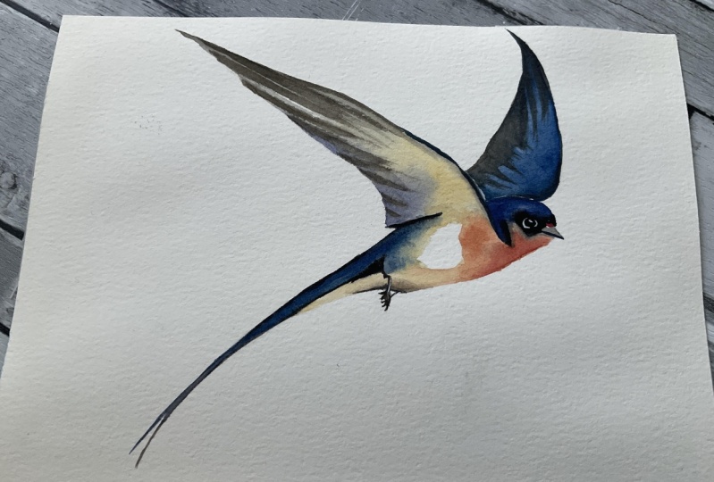
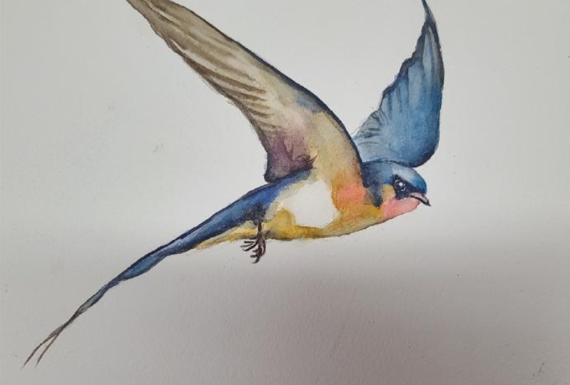
gonna guide you through a painting of a
graceful swallow. These charming buds
and often symbolized freedom and an agility
are great FUN to paint. Today we will capture
that elegant and essence on our paper using the magical
medium of watercolour. Whether you're an
absolute beginner or someone who's looking
to refine your skills. This class is designed to help you grasp the fundamentals of watercolour painting
while creating an exquisite piece of Art, will learn how to control the
flow of water and pigment, creating delicate washes
and vibrant hues. I've been a professional
artist for many years, exploring lots of
different subjects, from wildlife and portraits to cityscapes and
countryside seems. I've always been entranced by the possibilities
of watercolour. But when I started,
I had no idea where to begin or
how to improve. I didn't know what
supplies are needed, how to create the
effects I wanted, or which colors to mix. Now I've taken part in many
worldwide exhibitions, been featured in magazines, and been lucky
enough to win awards from well respected
organisations, such as the International
watercolour society, the Masters of
watercolour alliance, Winsor and Newton, and the SAA. Watercolour can be overwhelming
for those starting out. Which is why my goal
is to help you feel relaxed and enjoy this medium
in a step-by-step manner. Today, I'll be guiding you
through a complete painting, demonstrating a variety
of techniques and explaining how I use all
my supplies and materials. Whether you're just starting out or already have some experience. You'll be able to
follow along at your own pace and improve
your watercolor skills. If this class is too challenging
or too easy for you. I have a variety of classes available at different
skill levels. I like to start off with a free expressive
approach with no fear of making mistakes as we create exciting textures
for the underlayer. As the painting progresses, we'll add more details to bring it to life and
make it stand out. I strive to simplify
complex subjects into easier shapes that
encourages playfulness. Throughout this class, I'll be sharing plenty of
tips and tricks. I'll show you how to turn
mistakes into opportunities, taking the stress out of
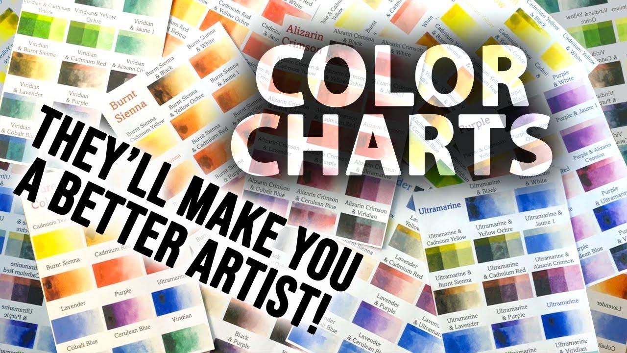
painting in order to have FUN. I'll also provide you with my
Watercolour Mixing Charts, which are an invaluable tool. It comes to choosing
and mixing colors. If you have any questions, you can post them in the
discussion thread down below. I'll be sure to read and
respond to everything he post. Don't forget to follow
me on Skillshare by clicking the Follow
button at the top. This means you'll be the
first to know when I launch a new class
or post giveaways. You can also follow me on Instagram at will Elliston
to see my latest works. So let's spread out
creative wings and dwelled in the Art of
watercolour together. Are you ready to bring a
Swallow to life on paper? Great. Let's begin
2. Your Project: First of all, thank you so
much for choosing this class. I'm very happy that
you're joining me here. By painting a Swallow, we have an opportunity to
explore the beauty of both from watercolour and how to capture the essence of
these joyful birds. Focusing on a wet
on wet approach. This technique involves applying wet paint onto a wet surface, allowing the colours
to blend and create soft flowing transitions. It's a versatile technique that lends itself well to capturing the delicate nuances and the theory will
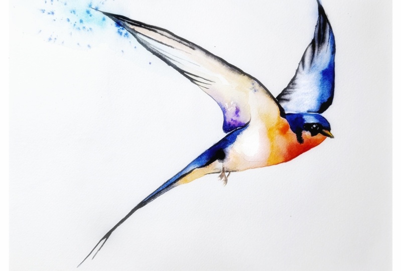
spirit of Swallow is. In the resource section, I've added a
high-resolution image of my finished painting
to help guide you. You're welcome to
follow my painting exactly or experiment with
your own composition. As we're going to be focusing on the painting aspect
of watercolour. I've provided templates
you can use to help transfer or trace the
sketch before you paint. It's fine to trace when using it as a guide for
learning how to paint. It's important to have the
under drawing correct? So that you can relax than have FUN learning the
watercolour medium itself. Whichever direction
you take this class, it would be great
to see your results and the paintings you
create through it. I love giving my
students feedback. Please take a photo
afterwards and share it in the Student Project
Gallery under the project and resource tab. I'm always intrigued to
see how many students have different approaches
and how they progress with each class. I'd love to hear
about your process and what you learned
along the way. Or if you had any difficulties. I strongly recommend
that you take a look at each other's work in the
student project gallery. It's so inspiring to see each
other's work and extremely comforting to get the support
of your fellow students. So don't forget to like and
comment on each other's work
3. Materials & Supplies: Before we start the painting, Let's go over all the materials
and supplies I will use. Having the right materials can greatly impact the
outcome of your artwork. So I'll go over all the supplies I use for this class and beyond. They're very useful to have at your disposal and we'll make it easier for you
to follow along. Let's start with the
paints themselves. Unlike most of the materials
will be using today, it's a lot to do of preference. I have 12 stable
colours in my palette. I fill up from tubes. They are Cadmium
Yellow, Yellow, Ochre, Burnt Sienna, Cadmium
Red, Alizarin Crimson, Ultramarine blue, cobalt blue, Cerulean blue, lavender,
purple, Viridian, Black. And at the end of the painting, I often use White Gouache,
but tiny highlights. I don't use any
particular brand. These colours you can
get from any brand. Although I personally
use Daniel Smith, Winsor, and Newton
for Holbein paints. So let's move on to brushes. The brush I use the most is a synthetic round
brush like this, a Skoda polar brush or
this Van Golf brush. They're very versatile because not only can you use them for detailed work with
that fine tip, but as they can hold
a lot of water, they are good for
washers as well. That also quite affordable. So I have quite a few
in different sizes. Next are the mop brushes. Multiple brushes are good
for broad brushstrokes. Filling in large
areas and creating smooth transitions are washes. They also have a nice tip that can be used for smaller details. But for really small details, Highlights or anything
that needs more precision. I use a synthetic
size zero brush. All brands have them and
they're super cheap. Another useful brush to have is a Chinese calligraphy brush. They tend to have
long bristles and a very pointy tip
that perfect for adding texture or
creating dynamic lines. And you'll paintings. You can even fan them
out like this to achieve for or feather
textures as well. And that's it for
brushes onto paper. The better quality
of your paper, the easier it will be to paint. Cheap paper crinkles easily
and is very unforgiving, not allowing you to
rework mistakes. It's harder to create
appealing effects and apply useful techniques like
rubbing away pigment. Good-quality paper, however,
such as cotton base paper, not only allows you to read
work mistakes multiple times, but because the pigment
reacts much better on it, the chances of
mistakes are a lot lower and you'll be more likely to create
better paintings. I use Arches paper because that's what's available
in my local Art Shop. Award spray is
absolutely essential. By using this. It gives you more time to paint the areas you want
before it dries. It also allows you to
reactivate the paint if you want to add a smooth line
or remove some paint. I also have an old rag or t-shirt which I use
to clean my brush. Cleaning up the paint
before diving is in the water will make the
water last a lot longer. It's always useful to
have a tissue at hand whilst painting to
lift off excess paint. Also, you never know when an unwanted splash or drip might occur that needs
wiping away quickly. I also have a water droplet
to keep the paint is wet. When you paint, it's
important to have them a similar consistency to what
they're like in the tubes. This way, it's easier to
pick up sufficient pigment. A hairdryer is useful to
have a speeding up the drying time and controlling
the dampness of the paper. And lastly, masking tape. And this of course, it's just to hold the paper down still on to the surface to stop it sliding
around whilst Painting. Also, if you plan on
painting to the edge, will allow you to create a
very crisp, clean border. And that's everything
you need to paint along. I encourage you to experiment and find out what
works best for you. Now let's get ready
to start the painting
4. Sketching Out The Main Shapes: So as always with a drawing, I'm using a soft lead and I'm going to
start very lightly. And I'm just going
to lightly block in the spatial areas
where the bird is. Then I'll add the details. When I think it's all correct. Using circles and curves, starting with very lightly. Thinking about the composition. Curves are going zone. Now I'm pressing a bit harder trying to keep my lines
organic and flowing, not really letting allegedly the paper trying to
keep my arm free. Painting with my arm rather
than my wrist at this stage. Feathers on the wings, they're going into the head
with a bit more detail. Still keeping the
lines barely loose. These aren't the final
details right yet. Now of course,
you've got templates that you can use to make
this process a lot quicker. Because once I've done blocking
out nice these shapes, the outline, I'm going to use
the rubber and clean this up and come back. Take my time getting the details dead-on so that we can concentrate
on the painting. That's the outline done. Now, like I said, I'm
going to use the rubber. Go go across a small fine line, make sure everything's
correct and rub out all the unnecessary lines. Ready to start the painting
and I'll see you in a minute.
5. Starting With The Wing: So we've my number eight, round brush, synthetic
round brush. I'm going to start
painting the underlayer. Starting in this top way
and moving across page. It's going to be unmuted. Burnt Sienna as the base color. I'm just wetting up
a pen in my palette. I like wash to begin with. Maybe a bit of yellow ocher. Then turn it down with a bit
of Black or Neutral Tint. I quite like Neutral
Tint to form Daniel Smith because it mixes with other colors in a neutral
way as the name suggests, it doesn't have that
influencing hue. I'll have one very gray here. I can go back and
forth depending how much color I want in there. Make sure to mix enough
paint because I don't want to rollout of paint halfway through the process and then have it dry when I haven't
finished that section. Wetting the area with a
little bit of pigment first. And we can come back and
add more pigment laser. Well, that dropping
some in there. I'm not starting off
with thick pigment by Hadoop and some of my
other paintings day, I'm going for a softer approach. Starting off with light and then working to darker
tones later on. Create a bit of a
soft edge there by wetting the edge and then
they'll bleed out a bit. Then mixing some cobalt
blue with that black, influencing some cool tones into it to contrast a warm
the Burnt Sienna. Then mixing the cell. That's to read it
better that way. And in some cobalt blue, then paint from
the Bolton there. Now that bleeding through it. Hopefully that will dry with a nice effect. Coming across. I think a bit more blue
to that tab there. When the pigments
wet on the paper. It's quite easy to manipulate it certainly when
it starts to dry, that it enters the danger zone. You have to be more cautious. Bringing that up
above here a bit
6. Painting The Body: Now let that dry. Let's say in that bit,
It's a hard edge here. Mixing up my hard
edges with soft edges. Whilst I'm starting
this new area, I'm not forgetting about
the previous area. And it's drying time
because you achieve different effects depending on how wet the paper is and
how close is too dry. The software line is, the better it is, the closer it is to Drawing, the harder it will be. Similar thing. On the bottom here, in
the bottom of the tail. That can connect up there too. A bit darker then it's
just a tad bit there too. This dropping in a little
bit of pigment at a time. And then going to add more blue that just said that it has a nice soft edge. We can take that
to the top as well and hopefully blend it
down to the bottom. Going a bit darker with
this pigment as well. The blue is a nice
complimentary color with the Burnt Sienna. Even though the Burnt
Sienna is quite light and it looks more beige, still works well together. Let it fade out for
the time being. Now I'm gonna get
some pure black here and create some
more soft edges. I want that to be a lot of
soft edges in this painting. And to get soft edges, everything has to stay wet
and merge when it's wet. If it's dry, I'll just
have a hard edge. And again, you have
to be cautious with the drying of the paper because there's a
point of no return. And if it's too dry, it's done and it won't
have that smooth edge. And re-wetting. It can create openly textures or unintentional color flowers, as they're sometimes known. Mix more. Yellow ocher and burnt sienna. Here. I'm going to load my brush up quite full and connect these two sections
from the right, the left. Again, try to achieve
a smooth transition. This way I've painting
with a smooth aesthetic, smooth lines and
smooth textures is actually a fast way
of painting because you're basically doing
it all in one go. Because it's all while it's wet. If you're doing hard lines, you dry your painting
in different stages. So it takes a bit longer but is less than
tenth in this way. Maybe add a bit of
orange. Vibrant orange. Just hear splash of color. Because the color scheme
in this painting, most part I think, will be quite muted. So to have a subtle
touch of color, of vibrant color will help. Give it a little
bit of an impact. We'll orange mixing a bit of red in there actually
with the yellow that's already there to create
a nice strong orange blend into the hair a bit. After painting for awhile
and getting some experience. Your judgment on
drying times and the fact that it achieves will grow and you don't have
to concentrate so much. You can just look at the
paper and guess what look like if you put a stroke in
that manner and that stage
7. Painting The Head: Take a pure red here, makes it a bit of burnt sienna. Paint. This bit here,
right on the edge. Spill out a bit like that. Take a bit of that
Yellow Ochre again. In this section up here. This is one big wash. It's all wet and we're all merging these different sections with different consistencies,
different colors. So drying time is one aspect and the other aspect
is the thickness of the pigment on your brush. If it's very thick, it'll take longer to melt out
and be deeper. If it's very thin and watery, it will really blend out and really push the
pigment or erode unless or wet edge there. And now we can have a
little bit of a rest. Everything's merged and where
we want it for this layer. Okay, we can think about
what we want to do next. Gonna go back to this blue. Bring it down here. You can create little
checkpoints for yourself where once you know you've
finished the section, you can let it dry and
the end of that part. And you can focus on a different section that doesn't directly interact with it. Using the very tip of my brush. Wetting the edge there again, and then going back
to the dark black, the spring to black
splotches right here. So while it's wet, if it dries out and use a water sprayer to make
sure it's wet enough. Now, going to use the brush to suck out some of the pigment on the head to give it
a bit more form. Does that by making sure
there's no water on my brush. By drawing a completely end and stroking what's
already on the paper. Some areas need a
bit more pigment, some areas need less. So you're just given take dark back here where
the hedge meet beak. Then the beak itself course is Black to whether
the I section, sorry, haven't gotten
to the beach yet. Add a bit more
blue to blend that in than that out a
bit soften the edges. I'm using Cobalt blue
as my main base, Blue, but I'm dabbing
into other colors like my Cerulean blue
and ultramarine blue. And you can have your own influence on what
colors you want to use. Your own choice. Anyway. So we've
painted over the eye, but we'll come back
to that later. The beak again. But have a red mark there. Then the rest of
it is quite gray. Paint, the gray ramus of it. Making sure I do this with a lot of finesse because
you've only got one go, as it might be difficult
to wipe out and redo. So I try and take my tie with the delicate part and make sure it's right
on the first attempt
8. Building On The Tones: Now I'm gonna go to the feet, mixing a bit of gray, black with red to make a dark
red grade kind of color. Mainly it's gray, but with
a hint of warmth to it. And just implying some feet. It doesn't have to
be super accurate. Or fiddly just
implying the feet, the general shape, should be enough to
convince the viewer. Rewetting that area
are a bit quite carefully and just
dropping in a bit of pigment just to
add more shading. I'm going to use that
same color here. Just to paint from the
bottom of the tail. Normally have side the blue. There's a slight split
here because of course, Swallow split their tails. Cobalt Blue, Ultramarine blue. Dropping more pigment in there. You can use it better Black. To dial it down a
bit. Just a bit. Make the top a bit darker there. May not align very crisp. That's the tail. Feed,
sorry, right there. Thank bit darker at the bottom
9. Painting The Second Wing: Now I'm going to paint this Wing using the same Blue. It's time to starting. Quite sick. Seem the water flow out. Apple, the top there. It can be a bit more muted. I'll go mixing gray. Just let it blend into that Blue exhibit, more of that blue, that T right on the edge. Then let's again at
the very bottom. Tab over awards are
free to bleed out. Separate the body
from the top Wing. And then really go
back to my dark with very thick strong pigment and just lay it in and
allow it to melt out. From a hard edge on the side to a soft blending
into the Wing. Just having a little
look around trying to get an idea of where to go next. There's quite a few things left. I'm just thinking which
order to do them in. Maybe I can soften up some of the edges because now
some areas are dry. I can go back in a
bit more control. Now I can add a few more dark spots where
I feel like they're needed. Take this and vibrant Ultramarine blue and
apply it quite thickly. Getting it loaded on
my brush and just following it along the
edge of the wing here. Contrasting the soft, you connect it down. Maybe mix a bit of black into that too. Beak
10. Pulling The Painting Together: I'm not doing things in a
specific order. This time. It's a different process
to how I usually paint. I'm always exploring
different ways. Just wetting the
inside of the legs. Just to make it
look a bit more 3D. Now I'm going to go back to
this Wing and add a few, imply a few feathers. I use this board because it's got such dark pigment a lot. I keep the paints
on my palette very wet because I like to
use thick dark pigment. And I use this board
to dry them out of it. Because I don't want while
paint in my palette to be dry. But as he's full, have
some wet pigments. I think a bit of color
to this black pigment. Then maybe I'll get a tissue. I just dried it
with a hairdryer. And I'm going to put
this tissue on top just so that I can
rest my hand now without touching any
of what we've done. And I'm just going to is the
tip of my brush to paint down there. Like that. Trying to keep it simple
with lines, adding too many. Now, similar thing
on the other side. Using a bit of dry brush. Okay. Darker top there. It's like that. Go back up here again. More pigment. Wait for it to dry,
but it's actually blending in some of
those dry brush marks. Create some interests. Just moving it about, smoothing some leading, some
adding some very fine lines.
11. Adding Highlights: Now I'm gonna go to the
eye and I'm going to train to my small pointy brushes. Size zero can be any brand, just the smallest brush. And I'm going to dip it in this White Gouache just to
get the highlight on the I. All it is as a few dabs. One, david Linton,
then maybe I can add few tiny little reflections of light in the
corner of the AI. Taking my time just to make
sure it's absolutely right, then I've got the point
of the brush as sharp as possible because it's be a
pain if I have to redo it, paint over it and redo it. So taking extra concentration
to get it right. I think that looks okay. One final summer of
what's going on. Think that's pretty much it. Maybe I can yes, maybe I can add
another highlight. Just where the Wing and
the top of the head touch. A very small highlight here. Just to divide The
Wing from the top. When I think that's it, I'll just take the tape off and then I'll come back to it. Few days, see if
there's any changes. Maybe I want to soften up
some of the lines. Maybe not. Maybe that's that's done. Maybe I'll call it finished. But always like to just give some time after
I've finished just to make sure I haven't missed anything. We're
going to fresh. I
12. Final Thoughts: Welcome back and congratulations
on finishing the class. I hope you had phone watching. And if you haven't already
given this painting ago. Now the time to put what
you've learned into practice. Throughout this
class, we've explored the magical world
of watercolors, embracing the wet on wet technique to bring
our Swallow as to life. We've learned how to control the flow of water and pigment, creating delicate
washes and vibrant use. We practice blending
and layering techniques giving us well
as depth and texture. With every stroke or the brush, you've honed your
skills and discovered the unique possibilities
of watercolour painting. The process of creating Art is just as important as
the final result. Each brushstroke and
each color choice is a reflection of your own
personal artistic journey. Even the most skilled artists
had to start somewhere. And it's through practice and exploration that they
hone their craft. So continues to paint the experiment and allow
your creativity to soar. Remember, watercolour
painting is not just about technical skills, but also about expressing your creativity and
personal style. I encourage you to continue
exploring, experimenting, and pushing your
boundaries to create your own unique
watercolour masterpieces. As we come to the
end of this class, I hope you feel
more confident and comfortable with your
watercolour painting abilities. Practice is key when it comes
to improving your skills. So keep on painting
and experimenting. I want to express my gratitude for each and every one of you. You'll passion for watercolour
painting is so inspiring. And I'm honored to
be your teacher. If you'd like feedback on your painting, I'd
love to give it. So please share your painting in the student projects
gallery down below. And I'll be sure to respond. If you prefer, you can
share it on Instagram. Tag me at will Elliston as I would love to
see it. Skillshare. I also love seeing
my students work, so tag them as well at Skillshare after putting
so much effort into it, why not share your creation? If you have any questions or comments about today's class, all want any specific advice
related to watercolour? Please reach out to me in
the discussion section. You can also let me
know about any subject. Wildlife will see me
lightly to do a class on. If you found this class useful, I'd really appreciate
getting your feedback on it. Reading your reviews
fills my heart with joy and helped me create the best
experience for my students. Lastly, please click
the follow button up top so you can follow
me on Skillshare. This means that you'll be
the first to know when I launch a new class
or post giveaways. Thank you once again for being part of this Watercolor class. I cannot wait to see that
amazing artwork you'll create Until next
time. Happy painting
 Will Elliston, Award-Winning Watercolour Artist