Transcripts
1. Intro to the Canva Essentials Course: Hello. My name is Dan Scott, and welcome to the Canva
Design Essentials course. During the course, you'll learn how to master all of the tools, but also I'll share all of the design
fundamentals to enable you to create beautiful real world designs easily in Campa. So who am I? I'm Dan Scott. I've been a professional
designer for about 17 years now. I've won multiple
teaching awards, and my both in person
and online courses have been attended by more than 1 million
people, just like you, you'll be given a
brief to create design work for your
own unique store, along with lots of class
projects that you can create all sorts of designs
and graphics to bring your brand to life. We'll start easy and fun with a series of social media posts, working on images, color,
type, and graphics. You'll learn how to use all of Canvas new fancy AI tools like the one click background remover and image generator, you'll develop a professional
logo for your company. Working through all of
the tools, techniques, and shortcuts designers
use to pick a design, color, and type for your logo. You'll master text
heavy documents using Canvas dock feature, utilizing things like
styles and tables. Presentations will
come a breeze. With your customizing teplates or building something
from scratch, you'll learn how to
make consistent eye catching presentations
using layouts, charts, and type animations. You'll bring your
work to life with video editing and
animation and Canva. I'll share all the
tricks of the trade. Now, this course is
aimed at people who are new to Canva and maybe
new to design in general. Whether you're doing work
for yourself or your client, your school, doesn't matter. We're going to start
right at the beginning and work our way
through step by step. Alright, it is time. Don't miss out, sign up and go from Canva Zero to Canva hero. I hope he takes better
care of us than he does that plant
back there. I know. Well, look at it.
I'm sorry, plant. Ah. Talking to
them helps, right? Actually, watering them
probably is better. I'm gonna go water the plant. You sign up for the course.
I'll see you inside.
2. Getting Started with Canva: Alright. You're inside.
Welcome. First things first getting
started is you need to download the exercise files. Okay. There'll be a link on
the page for those just so that you can keep up with everything we're
doing in the course. Inside those exercise files, there is a shortcut sheet. You can download that,
print it up and stick an ST computer and highlight the ones that you think
are really useful. We're not going to go through
every single shortcut in this course. We're
a central link. But there are some ones that are just makes
sense. They're easy. Alright, next up, make sure you install Canva or sign
up for it, at least. You can use the Canva
in the browser, or you can download a separate app and use
it on your desktop. They do the exact same thing.
They look the same thing. It's up to you whether
you want to use Canva in your browser or camera
on the desktop. The same thing. I'm
not sure I'm typing. Now, when you do
sign up for Canva, make sure you use
my ink here because there is a free and a
pro version of Canva. Obviously, the free
version is free. The P, you pay for, and there are some
features that are limited in Canva to pro only. And what I'm going to do is
if you are doing this course, my advice is to even if you're going to
keep the free version, you're like, No, never
gonna pay for it. Okay, do the 30 day trial for the pro version and just cancel it before the end of the 30 days while you're doing
this course because, yeah, I'm not going to hide
from all the pro versions. There's so much you can
do for the free version. So if you're only going
to stick to free, you'll totally be
fine in this course. But sign up for the 30 days, get a sense of what
the pro features are. So you can make a
decision whether you want to go back to
free or stay a free. It's totally up to you, but do it so you get to follow
along with the course. And if you use my Link
here, where is it? See somewhere. If
you do use my Link, Canva does give me
a referral fee. It doesn't cost you
anymore, just so next is, I get excitable and
I talk really fast. I think I talk fast. Some
people think I talk too slow. Either way, you can speed
me up or slow me down. There's a cog over
here in the corner. You click on it, and
you'll be able to change the speed, either slow, slightly drunk sounding Dan or super chuk monk
Dan It's up to you. And lastly, Canva
changes so fast. It's kind of a dynamic,
growing blossoming product, which is a pain in
the butt for me as an instructor because they
keep moving things around. So if there are big changes,
I'll update the videos. If they're small changes, I'll have a little pop up.
Go Taylor with your pop ups. Have a lookout for those, and
Taylor will put those in if there are small little change
but just keep an eye out. You might be the first to see the change when
they roll it out. So, have a look at the comments,
have a look for pop ups. Or I'll cut in and update it, but it is changing, so let
me know in the comments, if you spot something
that's moved. All right. That is it.
We've got it started. Let's get into the
course. All right. Before you go, you know
how I just mentioned, there will be potential updates. They've gone and updated it. While I'm recording this course, I've had to come back here
and just point it out. It's an easy one. But during this first half of this
course, watch this. When I click on something
like text here, watch this. This is a video of me
playing in the course. I can go to just to click on this little double arrow and all the text stuff
would appear over here. This is true for
a lot of things. They appear on this
right hand side. They've decided that it's
better on the left hand side. That's all that's really
changed. So I just kind of moved it from the right hand side
to the left hand side. I'll show you in the
new version of Canva. It is here, if I go
into say text here, can you see it appears on
the left hand side here. Now if I want to go
to effX same thing. They're no longer on the right, they're on the left hand side. No, Biggie, it was on the right. Now it's on the left. The yougo. Those are the kind little
UA updates that Canva is always making that
cause my life pain, but make the product better,
which is good for you. There you go. Now you can
start the course. Let's go.
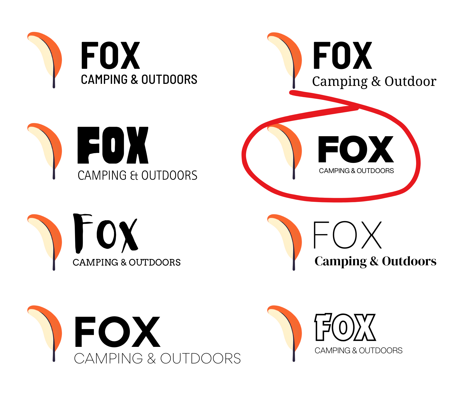
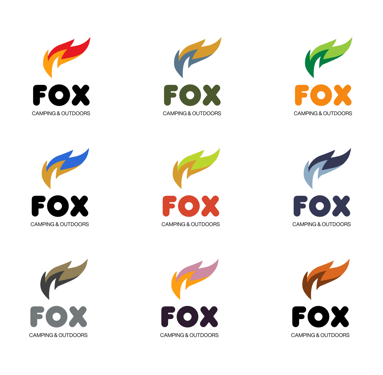
3. Your Canva Design Brief: Alright. Hey, in this video, I'm going to give you a
brief for the course. Everyone's going to
get something unique. That's why it's called the
Random Project generator, but it's all going
to be very similar so that you'll get a new client, and you'll get a
different animal. You'll see why in a second. But you'll be able
then to work on all the class projects
and build something unique for you, for
your portfolio, so that when you do submit your class projects or include
this in your portfolio, everyone doesn't look the same. The first thing is go to
random project generator.com, something that me
and the team made. Okay? Find Canva
design essentials, click on that into your
current city or town. Okay, generate my project,
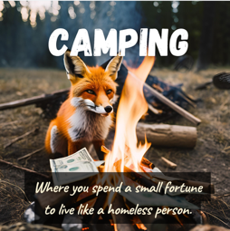
and this is the brief. I ended up with fox
camping and outdoor. Yours will be a
different animal and a different business here. Okay? If there's a retry
button down the bottom, don't use it, especially don't use it more than
three times, okay? And you'll get a different
combination of these. Stick with the one you get.
Clicking the button until you find something you
already know, I don't know. It's not going to push
you as a designer. Everyone's brief is
basically the same, though. So basically, you've
been hired as the do it all marketer designer
for this company. Okay? So it's an old 30 years
of history in your city. It's being taken over by the
dug has got 1 million ideas. Wants to do 1 million
projects all at once. It's really common for it
was one of my first jobs. If you're using the learning
Canva for your own business, you're going to have 1
million different jobs to do. It's going to look after a lot of different
use cases of Canva, if you're a student,
if you're a teacher, there is so much you
end up doing in Canvas. So this is a nice
good overall brief. She is going to make you do a whole bunch of things
through this course. So be prepared for a
whirlwind of creativity. So have a read through it, download it as a PNG here
so that you've got it or copy and paste it out and
get ready for the course. Don't hit retry three
times, I warned you.
4. Creating Designs in Canva: Hello. Hey, in this video, we have been asked to do our first project,
for our clients. It's gonna be an Instagram post. Now, even if you're not
doing social media in Canva, a lot of us are, but
even if you aren't, the skills are the same
that we're going to learn for doing print ready
stuff and video. But I figured Instagram's a
good place to get started. And very excitingly, we're going to create a big blank document. I'll show you how to make
them, and I'll show you how important it is to kind
of pick the format first because then
Canva gives you relevant suggested templates
that you can start from plus a tiny bit of
navigating the system. Let's jump in and make
a big blank document. Very exciting. All right. Let's make our post.
Now, I'm on my home tab, see along the top
here, and I've clicked on the little home
button as well. We're kind of this welcome
screen. This will change. Literally last week, the created design button was over there, so yours might be
moved around as well. And one of the things
that were a little bit confusing for me
when I got started, I want to create an
Instagram square post. Oh, look, there's a button.
Yours might not be there. What happens is they change it depending on your use case. Let's say we do have
it and we click on it, okay it opens up in a tab and gives us a blank
Instagram square box. But if I go back to the home screen there and I go, actually, I want to create a design
this time and to be under social media and I want it to be
Instagram square post, you're like, which
way is better? It doesn't matter. You end
up at the exact same place. There are so many ways of
making a document in Canva, but they all lead to the
same place. Same with this. If I go this little
plus button and I go, Oh, look, Instagram square
post. Is that different? No, same, same. There are a couple
other ways of doing it. But we end up in the
same finish result part. Now, before we get to
make our own stuff, one of the first things
you're shown is templates. What it does is it looks at the size of the page that
you've made and goes, Hey, you want Instagram
post. Guess what? I got loads of templates
that fit that shape and suitable for
an Instagram post. These templates here will change depending on what
you've created. If you said, I want to make
an Instagram post, hey, Presto, we've got
a whole bunch of templates for Instagram posts. If you want something different, you got to just be
very intentional. When you make a new
document, you say, right, I want phone wallpaper. It's going to give you templates
based on what might be a very good phone if you
can't see the templates. If I click on the word design, there is an option to click
on it and close it down. You want to open it back up,
you just hover above it. Or if you click it
once, it opens for good and you got to close it
down with a little cross. If you can't find it, mash away at this. You'll
eventually see it. Now to apply a template, let's go back to one
of these first ones I made. Let's go through. Let's do a search,
let's say cafe, and it's going to give me
templates based on cafe. I'm going to click on
this that looks cool. I've got my cafe template. I can now go through, click on it, start
changing the text too. Our own brand, and we can
start making adjustments. Now, while templates are
great to get started, they can be a little
bit confusing as well because you don't really
know how things are created. We're going to go through,
make stuff ourselves, build it all up from scratch, so that you can make your
own templates and so that you can start using other
people's templates like a boss. Lastly, before we wrap up, let's close down all of the
tabs that we've opened up. You just hit the little cross in the corners here or
Control W on a Mac. Control W on a PC to
close them all down and we should only have
the Canva tab open. I've brought you back
to here because can you see here a whole bunch
of untitled documents. That's because when
I was clicking on Instagram post, a few times, it's gone made a whole bunch of documents and they're just called untitled, not very good. He's going to clean everything
up by going to let's do this first one here is
move to trash button. You can do it all
for the ones that we just created if you
are following along. I'm going to he the ticks
and all the corners to say, I want all of these. These are lots of
things I was messing around with. All of them. Can you see on the bottom here, I'm going to hit the trash can so that all of these
go into the trash. Now we're nice and
tidy again and we can get started. I'll see
you in the next video.
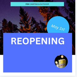
5. Working with free & paid Images in Canva: Hello. In this video, I'm going to show
you how to work with images inside of Canva. We've been asked to
make an Instagram post. It's about a re opening advertising campaign
they're doing. I'll show you how
to find images, find free ones, find paid ones, how much of the paid ones. Am I allowed to use the
free ones commercially? I'll show you how to filter
them and replace them. Then we'll add a
little bit of text. Nothing fancy, but
all good designs start with great
photos, let's jump in. Let's get started by creating our Instagram square post
any which way you can. What we're going to do is we're going to
bring in an image. Design general
overview of things, templates and styles,
we'll get into those. Most of your work though is
done in this elements tab. Hey, there's elements tab has, things like shapes
and graphics and images and loads of
different stuff. They squish them
all into elements. So we're going to break down those parts
as we go through. So we're going to start
with if you scroll down, scroll down, so
click on elements. You want to find the
one that says photos and we're going to go
see all just like, right, gets us into photos. Now, in terms of the photos, you're allowed to use
these commercially, okay? They've gone through
and check them for you. Well, they've come from places, even though they might be free. They do have the
licensing to use them. Campa has filtered them
so that, you know, you're not getting ones
that you're going to get in trouble for. If you
really want to check. Okay, let's first of all, I'm going to type up the
top here and search. I'm going to go camping, because that's kind
of my company, you type in yours, and let's find an image. You're
going to find this one here. I'm going to go to
the little dots. And if you go to here,
the eyeball, it says, licensing Made Simple
What's allowed, and it tells you what's
allowed, what's not. In my case for my company, I'm allowed to use it I'm allowed to use it
for commercial uses. That's perfect. The things
I can't use it for, I can't group these images
and try and resell them. I can't use them
in something that I want to also trademark. That's not what I want to do. I want to create aerial
or commercially viable, good for school. That's
one way to check. The other thing you need
to check for images is this pro versus not P. When you've
got the free account, you can use these images,
but you pay for them. Let me switch, I've got a
free account. You eat there. This is my other
account. Wey, it's using the old layout, things
change all the time. You can still get biking you
see, it's quite different It's dark but elements
are still there. It works the same sort again, elements if I go down to
photos and go see all because I'm using the free
account and I type in camping. The difference is that in the paid version, I
can use all these, whereas the free version, I need to stick to
the ones that don't have the crown on it. I
can add these, no problem. The ones that do have
the crowns on them, so I do want to
use this one here, got to drag it on the page. I can use it, but
you can see it has a watermark. I can't
really use it. I could use it to go to
the client and say, Hey, I'm thinking about using
this image and they'll say, Okay, I really like that image. Get rid of the watermark.
You can see I can remove watermark and it's going to
give me a price to do it. They want me to sign up for
premium, the pro version. Might be the reason to go
over, but you can also often purchase it in
this case, for one euro. Check how much it costs before you go and pitch
it to the client, but know that you can use these pro features if you
want to pay for them. Now, the other weird
thing is the filtering. If I'm in the free account,
I go to filtering. Currently, these are my filters. But if I switch my P one, I'm going to click my
fingers. You're ready? Right I'm back in my
account that I paid for. I got two of them
running. Watch this. I'm going to filters here,
and I can filter by free and P. They took it away
from the free version, which is sneaky. But
that's the way it is. Now I can go through and
filter by free and Pro, only if I'm on the pro version, it would be really handy to do it in the free
version, right? That's part of the
hassle of being on the free version is you got
to scroll, scroll, scroll. Find a good one.
It's a pro version. All right, that's a free. Everyone's got their own budget, so sometimes you have to do free, and that's
just the way it is. But I also respect that these photographers,
they're always better. The good ones, the pro
ones are always nicer. I don't mind paying for them.
I'm looking for clients that can pay for them up to
you. Everyone's different. Regardless of free or paid, these filters are useful. I want quite a dark
background because I want to then put text
over the top of it. We'll go through some of
these basic filtering. I want to pick a color. I
like picking these dark ones. Then to close it down, weirdly, you click on that again.
It's a bit strange. But you can see it's
dark camping ones. There's a lot more,
obviously, dark camping ones because it's let's say
that I'm doing camping and my brand could
really use to match other things on the
page, an orange one. I can close that down
again and look at that. It cuts camping down to
orange flavored tints. That's useful. I use the
dark one quite often. You can see through here, square vertical, horizontal,
depending on the format. Ours is square, but we
can cut it to a square. I'm not too worried
about that. You can't get very specific on the
color that you want. You can click on this
one and say, I really need this shade of blue here, drag this slider
along, apply it, and it's going to give
me images that fit that. It's quite specific. It's done a pretty good job.
Actually, no, it hasn't. There's not a lot of camp sites or camping that has
that color in it. So I'm going to go
back to my dark one. So you type in yours? If you're a tattoo studio or a garden send to type
in along the top there. Find one that you
like either free or pro, I'm going to use. I like this one, you can
either click and drag it out. That's what I tend to do, or you can just click
at once and it page. We won't go through
all the image features here. We'll
go through the basics. You can flip it. I'm going
to flip it horizontal. Rotating, it's done down here. Can you see the
little double arrow here, click and rotate it. If you have something you like and you want to replace it, what you can do is
you can over here, find something else, click
hold and just drag it over the top of the image,
and it will switch it out. I'm going to hit Undo to go backwards because I
liked my original one. The undo key is this
big button up here. You'll see, though,
that's one of the shortcuts that you use the most Command Z on a Mac or Control Z
on a PC. You can go. And B, forward and B. I
use the undo all the time. Couple of things
before we go images, you can actually right
click it and say set as the background image, and it just squishes it
into the background, and it will do that
sometimes on its own. I can't make it do
when I want it, but sometimes it does it and
what you can do is you can right click it and say
detach from the background. Right Clicks plays a pretty
important part in Canva. You can click a lot of things, and it gives you all
the options you need. One of the other
things I want to introduce here, slow
down Dn. All right. Is this Fike select on this,
you'll notice you have this. It's contextual task bar. What it means is if I
have an image selected, it gives me imagyf like the
transparency of the image. Do I want to flip it?
Do I want to crop it? Do I want to border
around the outside of it? Border. Let's go nice big thick
border. That will change. If I've got text selected, it'll give me text things. The one thing that I
find quite useful, though, is see this
little double arrow. I'm the C all guy. I want
all the nerdy stuff. With the image selected,
if I click on this, it gives me lots
and lots of stuff. You can scroll in
here. You can see there's my border,
my transparency. It's just in a bigger box. Do I like it that way? I
prefer it in this bigger way. It is up to you. It'll
default back. Watch this. Click click back on and it goes back to
the small version. I'm forever popping that out,
what you'll find is, look, I can get to adjust
and we'll go through adjusting images a
little bit later on. But I can go to
Magic Studio filters or look, Instagram
style filters. We won't go through
them all here, but I guess I just want
to introduce this here where you can click on
something, can be anything. You get the basics
along the top, and you can go into the
full mode over here, and then I can close it
down with that cross. I want to do is actually
before we go is tidy it up, I want to get rid of the
border weight down to zero. I want to just the
rotation and you're like, you can pretty much
drag it around. Get it back to zero. But
let's say that it's tricky. You can go to the little
flout menu here to see all. Scroll down to the bottom. There's position and you'll
see the Nodi way of doing it. Look, advanced. Rotation is advanced, but I can
set it to zero. Lots of the time, everything you need
along the top there, for anything a bit more
detailed, click on the C A. Goes away if you have
nothing selected. One last thing I
want to do is I'm going to grab it up here. I'm going to drag the si, the bottom right hand
corner, that'll scale it. I'm going to drag
it to the edge. Don't worry if
yours doesn't fit. We'll crop it all
in the next video, but have something like this, and I want to add some
text down the bottom here. We'll do text properly
later on as well, but for the moment, you
can see text is here. Click on it. I'm going
to click Add Text Box. All I'm going to
do is double click on it, and I'm going to type in. You can do this
with me, reopening I just want a big bit
of text, reopening. Let's move it by
grabbing this little cross here is down
the bottom here. It's white on a white
background, which isn't good. I'm going to you see
at the top here? When we had the image selected, we had image stuff when I
have the text selected. Whatever that is.
It is texti stuff. And I click on this A here.
You can hover above them. They'll tell you what they
do. Hey, let's go to text Color and pick anything
from your solid colors. I don't mind what
color it is right now. We'll do colors properly
later on as well, how to pick really
good ones for a brand. For the moment, pick something that you can see
against the background. I'm going to make mine bold.
I'm going to make it bigger. You can use the
little plus here. Ticks bigger. It's loads easier just to grab the
side like we did the image, the bottom right hand
corner and just drag it up and go, reopening. Again, we'll cover
text properly. I just want to get
something on the page. All right. One last
thing that I forgot to mention after I finished
the video, I'm back. If you've got an image
already on the page, we looked at how to
check the licensing of something in the
Elements panel. Something that's already
on the page, just right click it and
go down to Info. You're looking for this eyeball or sorry, the eyeball, the eye. Click on that and it's going to tell me I get to
use it commercially and I get to use it
for my social media. You will find everything in Canva comes with that
kind default level. It's only when you get into
some stranger use cases, we might have to dive in and check a little bit more
about the licensing. But generally
everything you find in Canva you can use for your job, or your school, for your personal projects,
for your business. But again, I'm not a lawyer. Actually, not again.
I didn't say it, but I'm not a lawyer. Double check the fine print, have it checked by a lawyer
if you think you need to. But normally everything
you find in Canva, at least find the elements panel will be something
that you get to use. All right. That's it. I will
see you in the next video.
6. How to crop photos in Canva: Hello. In this video, we're going to look at
cropping images. Watch this. If I go into here,
you can see we have chopped out
parts of the image, so we can only see one
part of the trees. Cropping is pretty
easy. There are some cool smart
cropping features and some automatic
leveling's digging. All right, cropping. We might have stumbled across it already. If you have an image
selected and you use the dots in the corners,
you resize stuff. If you use these lines
on the straight part, any of them, it will crop. You go. Now for a
bit more detail, if I double click on it or use this option here,
it doesn't matter. The crop button gets
you into this mode, which looks a little
confusing. It's not. I'm going to cancel or
you double click on it, you end up in the same spot. It doesn't matter
which way you go. What you'll now see is the
image inside the frame. I click on the background,
I can adjust the frame. If I want to adjust the
image inside of the frame, I want to move it so that
maybe the tint is lower. I'm going to drag this
down, double click on it. Now I can drag the image
inside of this box. So I can do all sorts of stuff. With it's selected, I
can rotate this image. It will try and make sure that the image covers
the whole frame, that square that window. I will get larger,
if you do rotate it. You can rotate it over here, you can rotate it
using this option. You can scale it by
the corners in here. You can only scale
it so that it does not get cut off by theme.
Automatic options. If I hit Auto, in this document, it's going to look at
it and see whether it can find the horizontal plane, the horizon line,
that's what I wanted. I might work. Give
it a Auto ago see if it lines it up and crops
it and rotates it. Try the Smart Crop.
Smart Crop will try and frame your image, and
try and fit it all in. Let's go for something
bigger and go to Smart Crop. It's going to crop it
down to, that's what it thinks all the useful
information in this image is. Yours will change
depending on your image. The one thing you might
see that I don't see at the moment is if you end up messing with your
image for long enough, something called aspect
ratio goes away. I'm going to click
Okay. I've got my bring in another image. I'm going to show you
a cool trick is let's say we like this one,
the client likes it. I flip that one. Oh, it's
because I flipped it. That's probably why.
I bet you if I bring back that image now and
double click on it. Always wondered
why it went away. Now we both know. This
didn't appear before. Aspect ratio doesn't
matter freeform, we can just scale
it how we want. Square is an easy apec ratio. It's one along the top
by one down the side. For video, let's say
going out to YouTube, they 16 by nine. That's that aspect ratio so
that you know that this is the frame for something that will be cropped
perfectly for YouTube. Thumbnail for YouTube or an image still that's going
into your YouTube video. The opposite. 16 by 99 by
16 is just a vertical one. This is normally
your phone size, so good for an
Instagram story or an Instagram or a TikTok
video, that portrait version. Typically a frame, like a photo frame on your I
don't know, above your fire. Where I've got my photos
is four by three. Won't get too far into it, but that's another
thing that you will see that goes away
turns out when you flip it. Done. One of the things
I'll show in here because it's not quite cropping, but let's get rid of that one. If I have it selected,
you've got rounded corners. It's not very exciting,
but it's like cropping. That's the reason I'm
throwing it into this video. I'm going to have none there, but just know that it's there. This cropping works the same if you set it
as the background, so I'm going to click it
and say set as background. You'll notice it's
crop things and you're like, how do we
get the stuff back? Just double click it
like we did before or use the crop tool
and you can say, right, I want to set the
rotation back to zero and I want to
just move it so that it's a better
crop for my background because it just takes a guess or it just sticks it
right in the middle. You can do adjustments that way. The last thing with
cropping is often to keep some symmetry.
We want an image. I'm going to right click and detach it from the background. I'm going to get my frame
up in this corner here. I'm going to resize it to be full width and
what I want to do is drag you'll see that it will snap to the
middle, which is handy. You're unsure what the
middle measurement is. Just keep dragging it
close to it and it will you see, it's
locking it in there. You can do the same with
the height and the width. You'll see it'll
lock it in there. I'm not sure where these
extra lines are coming from. There are new things
since the new change in the layout, but there you go. You can drag these
things and get close to where you need it
to be and it should snap. Now what I want to do for my one is I want to get it actually, three quarters of the way down and you'll notice
that snaps as well. Watch watch he just
goes who gets to there. It's pretty easy to get pretty
aligned inside of Kemba. Dan, how do you crop
it inside of a circle? That is very
interesting and we'll do it in the next video because
it's a different feture. But for now, that's
it for cropping and I'll see you
in the next video.
7. How to crop with Frames in Canva: Hello. Let's talk about frames. Frames are very
similar to cropping, but they're actually
separated out in Canva into a separate
kind of function. So we're going to put
something in a circle. Then we're going to put an image inside this kind of
brushstroke thing. Let me show you another image. You can just drag things
inside of frames. They're super useful.
I'll also at the end, show you a little bit
of document navigation. For those of you who are maybe a little bit new to Canva
and how it all works. I'll share easy
ways of zooming in and moving around at
the end of this one. But let's get started with frames. Let's make frames work. So what we're going
to do is if you haven't already noticed
and watch this, you can either there's two
options when using elements. This panel here
that we use a lot. If I hover over here, it
goes away, comes back. It's up to you whether
you like that or not. If you click on it, it
stays open forever. I'm going to click on
it so it stays open. You can close it down
by hitting the cross. Up to you. What we're looking
for here is an elements. We're looking for
frames. You can either use these
little shortcuts. These do change, and you can
scroll down, scroll down, scroll down stickers, photos, videos, audio, blah
blah blah, blah, blah. We're looking for frames. And we're going to
go to show all. There's the frames.
They like cropping. But in Canva, they've
separated them out. Let's do a circle crop first. First of all, you
put in this thing, basic shapes, I'm going
to start with a circle. Then I'm going to
come out of frame. There's a little arrow here
to come out of frames back into generic everything
elements part. I'm going to go to to see all. I'm going to type
up the top here. We're looking for coffee. What we're going to do is
we're going to give away free coffee as part
of the reopening. Look for a paid or a
free option in here. I'm going to go for this
one because it's free. I'm going to click on
it and nothing happens. Basically, it's just dumped
it on the page bo I I drag it somewhere near close
to it, it will jump in. It's very similar to cropping. Watch this. If I double click on it and you're
like, I know this. There's the frosty
bit on the outside, so I get to re crop it,
I get to rotate it. We end up in the same place. But you start with framing. That's a bit of a I don't know, it's a strange one.'s click Done and remember to adjust
the image inside of it, double click it to
adjust the frame, you start outside,
you're not in here. Come out and then you can
adjust the size of it. You can mess around
with these as well, if you need an oval,
I don't want an oval. I'm going to hit Undo. Remember
your Undo button up here or Command Z on a Mac
control Z on a PC. And there you go. I'm going to put mine here and we'll
adjust it in a little bit. Let's go crazy and add a border to it. Somebe
the border width. I'm going to add
this, a border width. I'm going to go to
this color here, my border color,
and I'm going to pick something, anything bright. Again, we'll look at colors probably a little bit
later in the course. There you go. The next thing
I want to do is let's do another frame because frames
we did a boring circle. There are some really cool
frames in here to add a bit of excitement to our
images rather than just a rectangle
with an image in it. What we're going to
do is something new, we're going to add a page. Can duplicate the page
if I want two of them, and let's say I'm going
to make adjustments. I don't want that, so I'm
going to go to my undo again. Came back to one page. I
just want a blank page. What we're going to do
is go to our frames. Let's go here, scroll
down two frames. Let's click the
button. Frame, it jumps to it in our list. I'm going to go to see
all and I'm going to grab one of these up to you.
Experiment with a couple. I'm going to grab. I like
the little scrubby one. Where's the scrubby
one? There you go. I like this one. I'm
going to click it once. It appears out there. I'm
going to make it nice and big. I want to put text
over the top of it. A really nice way of just having something quite interesting in the background
whilst having text over the top is it selected. If we close, I'm going to
stop the search for frame. I'm going to go back back
back until I find photos. A really nice search term in photos is abstract background. We'll just type in abstract. You'll get interesting
things that will be good for the background that you can put text over the top. They are just
supporting graphics. Find something that's going
to support my camping. Well, I'm going to use this.
I'm going to drag it in. You see there we can add some
text over the top of it, but it'll be interesting
without it being overpowering in terms of being able to read
text over the top. Now I'm going to go to ticks. I'm going to go to add
Tick Box and I will add my quote in a minute
when we get on to text. But I guess I just wanted
to show you frames and I wanted to show you a little hack finding abstract backgrounds. We'll do the same for the
background background. Another handy one is if I go
back to elements and I go to photos or I'm
still in photos. I'm going to go to
another one and go texture is another good one. Texture background
texture paper. Let's do this one.
Pick any one you like. I'm going to go
something simple. What I'm going to
do is right click it and say sits the background. Oh, look at us. Fancy.
Another thing about frames is that if you want
to get this image out, you can select on it
and right click it and say, detach image, and it pops it out and you've
got your and you've got your frame separate
from your image. One other thing I'll show you while we're here,
I've dragged it back in. If I drag this off, I'm like,
you just stay over here, stay over here, stay over it. What? That is gone forever. That's one of the weird
things about Canvas you can't work in
the pasteboard. Hands up who and other
maybe design programs. You end up working all the
way out here on the sides. You can't do that in Canva
because they go away. So I'm going to undo a couple
of times till it's back in. One of the weird
things is that you can detach an image from a frame. But if you go inside of a frame, it looks very much
like cropping, just like we did before. But this image here,
if I right click it, I can't detach from
frame or detach image. I don't know why, but it's
easy to do for frames. Lastly, some basic navigation. If you haven't stumbled
across it already, you can use a side bar up here. I use my page page
down on my keyboard. Not all keyboards have
a page up page down, you might have to do
some scrolling with your mouse scroll wheel or
drag this little slider. Other useful things is
down the bottom here. If you've got lots of
pages, you can say I want to go to page
two and hit Enter, jump down to I be more interesting
if you've got page 20. You can drag the slider here to zoom out or zoom in
depending on what you. Move around in the document, there used to be a hand
tool that's going away. They're assuming a
couple of things is, let's say I zoom in and I
want to go up a little bit. I can use this scroll wheel
and I can use this one here. What they're assuming is
if you're on a laptop, you can use two fingers on the touch pad to move around.
That's what I'm doing. I got a laptop next to
me or on your mouse, you can use the
scroll wheel and if you have a third
button on your mouse, not everyone does, you can
click hold and drag it around. Lots of different
ways of navigating. There's an option for everybody. The problem is it's
not a universal one. If you have got tips on
your specific computer, that's a bit different
than I explained, leave those in the
comments so other people can figure out how to
move around as well. Down the bottom here, probably the most useful
one is if you go to fit, it will fit a whole
page on your screen. You can go to fill
and we'll try and make it as wide as possible
and fill it all up. Fits really good.
Obviously, there are different percentages in
here. I'm going to go to fit. The way for zooming
in is hold down your Command key on
a Mac or Control key on a PC and hit plus. See along the top there, there's a plus, and there's
also a minus. It's command on a Mac, control on a PC and use plus or minus. Last little bit of navigation if you're like, there
was a lot in there. We'll just do it over
and over in the course, but I want to throw
it in here early. Can you see down here there's
thumbnail view, grid view. Let's click on thumbnail view. That gives you a way of
moving between the documents. Less of a scrolling and more
linear, left and right. Up to you which way you work. I'm going to leave
it as it was by default and this scroll option. The other one is you
can go to GridView. You can just go I want
to work on this one. It's handy when you're
working through a larger presentation because it allows you to reorder stuff. I can just drag things
around Power Pointee sq. You go back over
there. I'm going to go back out of GridView. There you go. A little
bonus at the end, frames plus some
basic navigation. All that is it. I will see
you in the next video.
8. How to name your Canva documents right: He serious about a video called naming and saving? Totally am. It is boring but
also interesting. Oh, the paradox. We'll
cover the basics of saving. Then we'll jump into how
to name your documents. We'll give you some
good clear structure for those of you who still have untitled 52 documents show how I do it and a lot
of designers do it. Join me while we
try and make saving naming fun and interesting. Uck. First up saving. Saving just happens all the
time without you asking, even if you don't
name your files. I I got a file here on
the top, there is save. I can click on it feels good. But you can see all
changes are already saved. It's constantly trying to update into the cloud.
It's really robust. There is a little visual cue
here. S this little cloud. If it doesn't have a tick in it, it'll have a little arrow going round and round like it's working and it's trying to save. But it's basically
just always saving. Every time you move if they
do anything, it's saved. For crashes, which it doesn't tend to do, it will be fine. You'll be able to
reopen it where you left off. It's pretty magic. The next thing is
naming your file. So up the top here,
mine's called reopening. I didn't name it reopening. It started off as untitled. Reopening, grabbed
it from there, tries to grab something from your document to give it a name. To replace the name, which is, if I click on it and he delete, click out of it, it's
now called Untitled. How I name my documents is this. This is the structure that
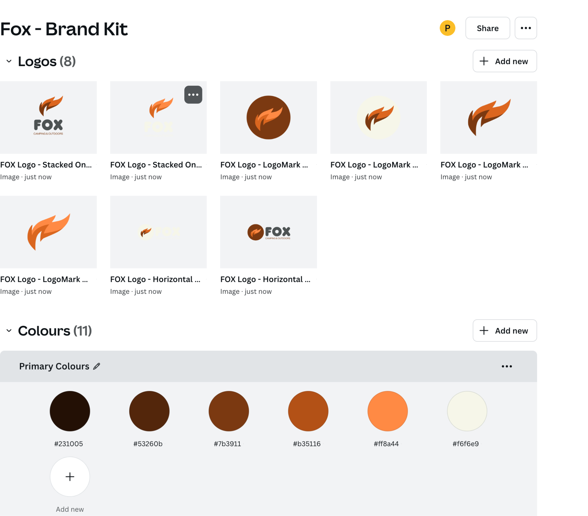
a lot of designers use, the one that I prefer client name campaign project version. In here, I work on
multiple clients. I'll put in my one's Fox at
the moment and I use hyphens to separate the
different chunks of here just so that it's
easy to find later on. I can find the client
that I'm working on. I don't have to
put the full name, something that I understand.
Fox is the client. The campaign that I'm working on is our reopening campaign. The next one might
be the summer sale, it might be launching
the new product. Put a little hyphen
in the project name. This one's Instagram. I'll have another one with a
very similar name. I spell Instagram wrong. Instagram. Then I put
the version of it. Client name easy. I'll have Fox. You might be doing I do a lot of work for my company.
Bring your own laptop. I'll start with bring
your own laptop or BYOL, and then the name
of the campaign. Then this one's interesting
because in other documents, you might have Instagram, Facebook, if you're
using Photoshop, I would keep Instagram,
Facebook, LinkedIn, Pinterest, all the different
social ads that I'm making in the one
Photoshop document. You can't do that in Canva. Mainly because you can't have different pages in one design. I couldn't have a
horizontal long one. I couldn't have US letter A four document in here as well. I have to have separate ones.
I'd have Fox reopening, maybe workbook, if it
was that US letter. I'll have another one that
might say Facebook or Pinterest defending if
the sizes are different. Now, this one here, V one, it's pretty easy version K. I'll send this
off to the client, come back, get Version two, three, Just so that you
don't end up with this. You've done it. Final new new. Okay? So just start off
with a V at the beginning. A version one, it'll just make organizing your
designs a lot easier. You can name your specific
pages here as well, so I'm going to call
this one option one. Okay? And then down here, this one here is going
to be called option two. This will change depending
on the document, whether the versions or concepts or just page one and
page two, that's fine too. All the while, it's
magically saving for us. One thing is, if I close
down this tab here, you can see, I get
back to my home screen here and it'll show me things. See how easy that is then when I'm looking for Fox, I
can go up here and say, everything to do with
Fox, hit Enter and it's only give me my Fox things. Here's one I was
practicing with earlier. There's my mood
board that I use. We'll do a move board
together as well. There's a thing
we're working on. Cuts it all down
through my designs. If I want to get a bit fancier, I can go to reopening. Reopening. And it's
going to give me all the reopening documents
that I've worked on. I'm gonna go back to
home, and I'm going to go to here and you
can do it here as well. I'll rename it. So if you haven't done
it and you're like, Oh, this one here called
Daniel. Is not good. You can click on there and
change the name. All right. Let's reopening our
well named fox, our fox reopening
Instagram V one. Yours is going to be
different. Your client is going to have a
different animal. But there you go, boring
old saving and naming. There are some different
more advanced levels that we will cover later later in the course with
folders and good stuff. But for the moment,
that'll get us going. Even if you do nothing else, your future self will be very happy about you
actually naming things. Final, final. Actually
exciting stuff. All right, that's it. I will see you in
the next video for some actually exciting
things. See you there.
9. Uploading your own images into Canva: Hello. In this video, we are going to upload our own images, rather than relying on the ones built into Canva, we're
going to upload them. I'm going to show you
the official way, and then I'm going to show you the easy way that everyone does. Jump in. All right,
uploading your own images. There's a bar here, click on
uploads and at the top here, it says Upload your files. And if you've downloaded
the exercise files, go and find the one
called Popcorn. It's in your exercise
files. Let's click Open and you'll see it
in little bar there. You'll see this little
upload graphic. It's pretty cool. And
then you just drag it on. You can't drag it
into no man's land because it doesn't
like stuff out here. When you drag it
into the document, it often replaces the
document. I'm just heading do. Do again. I'm going to
drag it so it's down. Even though I don't
want it down here, it really images
coming into Canva, I really wants to try
and think for you. That there is saying,
I'll be the background. You're like, I don't want
to be the background. Undo. I want you to just click at once and it'll
just appear in the middle. Undo that again and let's use little dotted lines to delete them if you do
need to move them, what you'll find is the
official way using the uploads. I'm going to close down uploads. What you tend to do is I just open it up in the finder
with you in a macro PC. I don't really need to add all
three, but let's show you. I'm going to drag all three
of them into my document. What will happen is, you
see they just appear. Appear, you can see
they're uploading there. They go the official way, but it's easy just to
drag them into the file. I want to get rid
of all of them, except this and I
want to switch out you for that one there. Coffee now is going to
be a free popcorn day because popcorn is cheaper
for the reopening. We've worked out.
We've got a cafe quote in and it's
really expensive. I'm going to double
click on it, and I'm going to say, Oh. There you go. Is my popcorn. Notice I can't move it in because there's not enough
edge on the side here. Well, I could expand later on, which you can fake
some background, but for the moment, that'll do. There used to be limits
on uploading images in the free account that seems to have gone away,
that might come back. It was pretty hefty though,
so it was fine. That's it. Uploading your own images, do it the official
way or do what everyone else does and just
drag them onto your document. Either way, that's it. I'll
see you in the next video.
10. Where to get Free photos for Canva: Hello. In this video, we're
going to look at where to get free images that you can use
as part of your business, for your client, for
your class project, for your teaching resources that don't get you into trouble and
that don't cost any money. Main two places is
Unsplash and pixels. Let's dive in.'s have a look. I'm going to go into
elements. I'm going to go down to photos. Let's say that
instead of camping, you got a tattoo studio from your random project know that crown is paid and no crown is free but commercially usable. Where did they come from?
Let's look at tattoo. Let's go to the
little dotted lines. This one here come from
a site called Pixels. Very common for people to use images that
came from pixels. It was shot by Brett
Brett Sales Sales. Anyway, Brett decided to share
his photograph on pixels for free for people to
use and give people the rights to use them.
Pixels is a great place. Let's have a look at
one of these paid ones. Let's have a look at
this one. This one's come from Giddy Images. Giddy Images have licensed this for Canva and is part of
your paid pro account, which is a little crown
I've let you use it, but you actually
have to pay for it. Money is exchanged hands between Canva and your subscription
and Giddy images. Giddy images are great images. They are royalty free, so you don't have to
keep paying for them. You don't have to
pay for them once, and by paying for them, it just means paying for your pro accounts all
wrapped up in there. You don't have to pay
for them separately. So Pixels is a good
place. Let's have a look. Often, it can be easier just to go straight to
pixels to search for images because the problem with the free
account in Canva is that it doesn't allow you
to filter paid and free. When you get the paid
account, you can weirdly. They might change that. Have a look if you're
in the Freed account. If you are in the free
account, it's easy just to go to pixels.com or Unsplash. Some of them crossover between them, some of them
are different. I use both of these places. They just have a different
curation of images. You'll find some
that are on Unsplash and some that are on pixels. There is probably 20 other good places to get
free images from. I know these two, so that's
why I'm sharing them. I like it in here, tattoo
you will find every image in here will be free unless sometimes like this
one here, that's an ad. For a company called
IStock who will sell you images. They're
not very expensive. And there's my tattoo ones. You need to go and double
check the licensing, but you'll find everything
on pixels that's not clearly an ad
is free to use. Unsplash has lots of free stuff. I type in tattoo. The only thing you need to be careful
not be careful of. You should potentially
pay for images. Photographers are
taking their time. There are images that
just can't be got, but sometimes we
need free images. So see this little
plus one here. Anything that is plus is
something you need to pay for. They're very
inexpensive, whereas this one is not doesn't have
the little plus next to it. Just have a look around free, free, free, free, not free, you'll find the ones that have a really serious
composition, man, the lights, the golden hour, it's every likelihood that this tattoo artist is not
actually doing any tattooing. They're just being set up for this composition to get
something really interesting. Handy things for both of
these sites is orientation. You can say I want
portrait stuff. If you're working
primarily on social media, it's really handy to have
this vertical format or portrait to get
started rather than trying to do some weird
cropping later on. All right. Those are two really good
places, Unsplash pixels. If you've got one, you're like, I can't believe he
didn't talk about a, not the Twitter, but another website that
you really like. Leave it in the comments
and other people will see. One last thing is, let's say you do find this one, you're
like, this is cool. If I click on it,
you go inside of it, I can download it
for free, this. You can download a
small version or a big one or original size. Sometimes these
things get massive. Can be really big. You
might get one that's appropriately sized. Up to you. I know that my Instagram
post is I think Instagram post is 1080 by 1080. 1080 wide by 1080 high.
I could use this. But I have Fomo so I end
up getting the big one anyway and just squeezing it into my Instagram post anyway. That's it. That's how to get free images
for your Canva project.
11. There are lots of Workspaces in Canva: Hello. Let's talk about
workspaces. What is workspace? It is the area around your document that
helps you build it. It's the space that
you do work in. The weird thing about Canva
and it took me a little while to realize and help me
when I did figure it out, why I'm sharing with
you is that when you start with Instagram
posts, it looks like this. But if I switch to a
document, it looks different. There's H one and H
two. I can't find that in Canva How do I
turn it on? You can't. I made this other
whiteboard document here. What are all the dots? This one here has video editing. Canva is a huge big tool that can do lots of different things and the workspaces change. Let me show you a
few of the different workspaces just so you get a sense and don't get lost
like I did when I got started. All right, we're
all quite used to now the social post view. Everything looks like
this. Let's open up a few different other ones. Let's go back to
the home screen. Let's create a new design. Basically, they're
grouped over here. You can see these icons, docs, whiteboards,
presentations, et cetera. These all have their
own workspaces. Some of them similar, some
of them quite different. Let's look at say docs. We'll create a doc
in this course. Now, a doc is basically
just a word document, and it has a very
different view. Can you see this one
versus this one? Lots of the elements
are the same, templates brands.
They're all still there. If I close these both down, what you'll notice
is there's this menu along the top here
gives you more like a Word doc style
tools. Same over here. It's all very word docky. Close it down, you scroll, it breaks it into pages. Let's have a look
at another one. Let's look at something that's quite different,
creating new design. We'll do whiteboards as well. Scribe this one. Is whiteboards quite
different. Look at that. So different. I'm going
to close this down. It has all these
dots and guess what? It has an infinity background. You can create things forever on this document
and no menu along the top telling you
what kind of words to use and styles and stuff
like the word Doc. Let's do one more. Let's do video one
because that has a very different look as well. Let's go down to
videos, scrab video. What you'll notice is you
end up with different stuff. You've got a little timeline
down here instead of pages. If I add a video, let me find a video. This one. End up with
different tools. You got editing tool. The reason I show you
this is that when I first started using Canva, I'd be like, Why is their
version so different from mine? Why do I have that button? Why do I have this extra button? It was because there are lots of different formats
here in Canva. I want to give you a
sense of this early on. I didn't want to be the
first boring video, but I feel like it's interesting to know, important to know. There's actually different ways. The interesting thing is
that if I'm in this word Doc style here they call
it a doc inside of Canva. I can't get all that
video editing stuff. It's a different format. What ends up happening is if you end up in
the wrong thing, you start designing in
this whiteboard mode that goes on forever and you want
some of the video stuff, you have to select copy
into a different document. You can't change your workspace. Can't say, enable video features.
Doesn't work like that. That was a revelation for me when I was getting
started with Canva, their actual workspaces
are quite different. Sometimes you can copy
stuff between the two, and sometimes you can't, the stuff here that we've created. If I try and grab all of that
as a group, and I copy it, for some reason, the doc
won't allow me to paste that. I can bring in the
image separately, the text separately, some
things copy, some things don't. The workspace
changes quite a bit. The other part of
the workspace that changes is the side here. Can you see I'm This is
the one we started at. I've got design
elements, text brand, uploads, drawer,
projects, and apps. These things are only here because I've used
them in the past. You won't have any of these? Basically, we'll look
at apps later on. When I add an app or go and
find one that I want to use, it just puts it over there for easy access and
you can't remove them. I try to clear them out before I started the course we
didn't freak anybody out, but didn't work,
so there you go. See this line here, that line is stuff that's normally part
of this. You'll have that. Anything that's below this is unique stuff that you've used. We'll explore it later on. But let's look. See
that line there. Anything above that, if I go to my dock version, you see,
there's that line there. It got rid of you can't do
drawing inside of the dock. All these tiles on
this left hand side are unique for the
workspace as well. Can you see in this one,
look, what else was new? I think this one
is very similar. The video one, very
similar again. You'll find different tiles, different workspaces
for the different kinds of projects you'll be
creating. Last last thing. Get on with it, is if I go to home and I
create new design, down the bottom
here, it says more. You just get a
sense of the scale of things that you
can create in Canvas. Let's go to, I don't know,
personal event planning. Just look at how many things they've thought of. Do
you need a T shirt? You can do it inside Canva, design it, and then
print it from Canvas. It's amazing. Do you
need to create name tag, swing tag for somebody? They've got a workspace and all the tools
that you need to make that happen and a bunch of templates? It's very cool. Way, I wanted to
share that because the different workspaces
freaked me out a little bit at the
beginning until I realized, they're all different. See little icons here. They all do something
quite different. They move Canva around and make it do different stuff.
You can't change it. You can't just say, A I'm
in presentation mode, switch it to video mode. You can copy and paste from it, but you can't actually
just switch up the workspace to be give
me all those tools. They get it then.
Alright, that is it. I will leave you with that. I hope that was helpful,
a bit of a revelation. One last thing before we go is, if I hit the stripy lines here, okay, brings up this. This kind of like your
universal finder. Allows you to correct
new documents, work on recent documents. This changes, you can
add favorites to it, but you can close
it down as well. So if you click on
this instead of File File gives you more
this document settings. If you go to this,
gives you more kind of canvas settings back to
this home kind of document. But takes up a chunk space, you can close it down as well. There you go. That is it. I will see you in
the next video.
12. Squares, Circles + Layers & Position in Canva: Hello, friends.
We're going to draw rectangles. We're
going to draw circles. We're going to put
text inside circles. Then we're going to look at how to just layers
and we'll look at the really cool layers
panel. Let's jump in. Before we get started, I've
got to show you something. By accident because I actually deleted from the last video, I created a whole bunch
of empty documents, and deleted them close it down
when had lunch come back. I'm like, ho lost the
thing we're making. If you have deleted it
by accident, go to home, and you can go to trash and
then there it is there. I can go to this and
I can say restore. Hopefully now I can go back
to Home and there it is. I can open it up. We
couldn't say we design. Let's click Reload. All right, we're back. Carry
on with the video. We came here before
we deleted things to add rectangle inner circle. They're prettyeasy
under elements. They're all called shapes. No kidding, Dan.
There are lots of shapes if you go to see all,
elements, go to shapes. There's a bunch of
them. Let's add a square or it can be
a rectangle watch. One of the defaults for all of these shapes is that can you see there's a cursor
flashing in the middle? Okay. You can put text
in the middle of them. You can leave them
off. I want them off in this case. I'm
going to have it off. I want to manning this
area down the bottom here. This is the look I'm going for. I want to have this there,
but that is below it. Gives me a really good excuse to show you the arrange
and layering. Now, we need to
change that color. Okay, so I'm going to pick
just a lighter color. For the moment, we'll
do colors properly. Just pick default
colors for the moment, white even default colors. I'm going to click
on this, click on them, picking anything, that's going to anyway, now we need to look
at layering because this is too far behind that. We've got a couple
of ways of doing it. You can right click
something, go to layer, and send it to the
back or backwards. There's two of them.
They've got shortcuts, depending on how often
you're using Canva. I often use this one very often
and I don't use that one. I just smash away at command and the square brackets that will be control square
brackets on a PC. Square brackets are often on a Cordy keyboard next to the P key. You can
hit backwards. There you go. If
I go layer again, backwards again, go behind.
I use that quite a bit. I use a shortcut
command or control on a PC and just use
the two brackets. One moves it forward,
one moves it back. I can just keep going
forward, back, back. I find that super helpful.
Let's do a circle. Click on a circle,
it gets added, pick a color, any color as long as it's from
the solid colors. And same with the circle, if you don't add
text, you can add it later on by just
double clicking in it, and we're going to go May 1 is going to be when we're
going to do this opening. We're going to put
that in there. I'm going to pick a big font. Don't worry too much about
the font style at the moment. We're going to do a big
section on how to pick good fonts for a design for the moment,
just picking that. I'm going to rotate
it a little bit. Because I want the
text to be rotated. What I wanted to do
is I want it to pop underneath this but
above the image. I could use the shortcut, but I want to show
you this position. I'm going to click position. I'm going to go to this
one called layers. Arrange is what we did before. Move it forward,
move it to the back. I want to go to layers
because it's quite visual. Can you see it saying,
that's at the tippy top. You can tell it's at the tippy top because
it's above everything. You imagine you're a
bird looking down, you see reopening first,
then this is on top of that. Then the May 1 is on
top of this image, which is on top of the
rectangle, you get the idea. If I want this to be
below the rectangle, I can click hold and
drag it and you can see it smushes around
and you're like, I want to go in
there. There you go. You get in the right position. Sometimes that's more visual. It's really useful when things are a little bit more confusing. This is pretty easy layout, so not terribly hard to go through and use that shortcut
to move it back and forth. But there'll be lots of
times where you're like, I just want to drag it
in the right place. Way we do it is have nothing selected or something selected. It doesn't matter. You can't
have nothing selected. Have something selected,
find position. If you can't see position,
that's a good point. My screen is really big, so I can see quite a few of these adjustments
along the top here. But if you have a
really small laptop, look, position goes away. How do we find all the extra
stuff that's not up there? You remember hit the
little double arrow, and you're like, right
there's position. Then we can go from
range to layers. There's a couple of
ways to get there. You might see it
if your screen is big enough and it just
has a position there, otherwise, hit the double arrow. Give yourself more
space if you are dealing with a small screen
and you're like, Allright. This is not fun. It is tiny. Just make sure that is
also closed at the cross, you can work on this. And when you're finished
with this, close it down, you get all the
screen real estate. I'm going to go to
my big version, scroll up a little
bit. There you go. That's how to add rig
tangles and circles, but text in them, rotate them, and play around with layers. Remember that shortcut sheet that's in your exercise
files, print that out. It has things like the
layer heights in there. It has things like
the move forward, move back with the
different layers. That shortcut we
looked at, which is command square bracket or
control square bracket on a PC. Or you might find just
right clicking stuff and going to layer and moving
it back and forward. Oh, you can jump to show
layers. There you go. I'm just going to reorder
mine a little bit, and then I will see
you in the next video.
13. How to Export a JPG & PNG from Canva: Hello. Hey, in this video, I'm going to show you
how to export a PNG or a JPEG from Instagram post. Doing it this early in
the course so that you can submit class projects
as you go along. I'm going to show you how
to do it. It's pretty easy. But you can also use
this exact method to then download this image. Email it to yourself and
then put it onto Instagram. Pretty easy. Let's jump in.
I'll show you how to do it. Alright, to download them,
let's go up to, first of all, I like to grab the
name that I've called the document
and just copy it. So I sect that all copied it. I'm gonna get to share, and
I'm going to go to Download. I'm going to say what file type? It doesn't really
matter JPG or a PNG. They do put some restrictions
on the free account on how good a quality
JPG, 80% is good. If you crank it up to 100, it says, Hey, it's
a pro feature. It's not going to matter
for what we need, especially for the
class projects and generally to go out to things
like Instagram as well. It's going to be perfect.
We're going to stick with PNG. Just use that. Now
we've got two pages. I want just the first page. I'm going to actually turn
them all off except for this first page here and
I'm going to say download. I've made a folder chord Export, I'm going to put it
in there because I'm good. This is my V one. The very next one I'm going to export is going to be V two, V three, et cetera. That's why I copy
and paste the name. Let's click Save and we have a PNG on our desktop.
There it is. There's my Instagram file ready to upload as a class project. We'll get more and more
nerdy as we go along. Basically, you just need a JPEG or a PNG and that's
all you need to do. But we'll learn more tricks
as we go along. All right. That is how to get a JPG
or a PNG out of Canva. Let's get onto the next video.
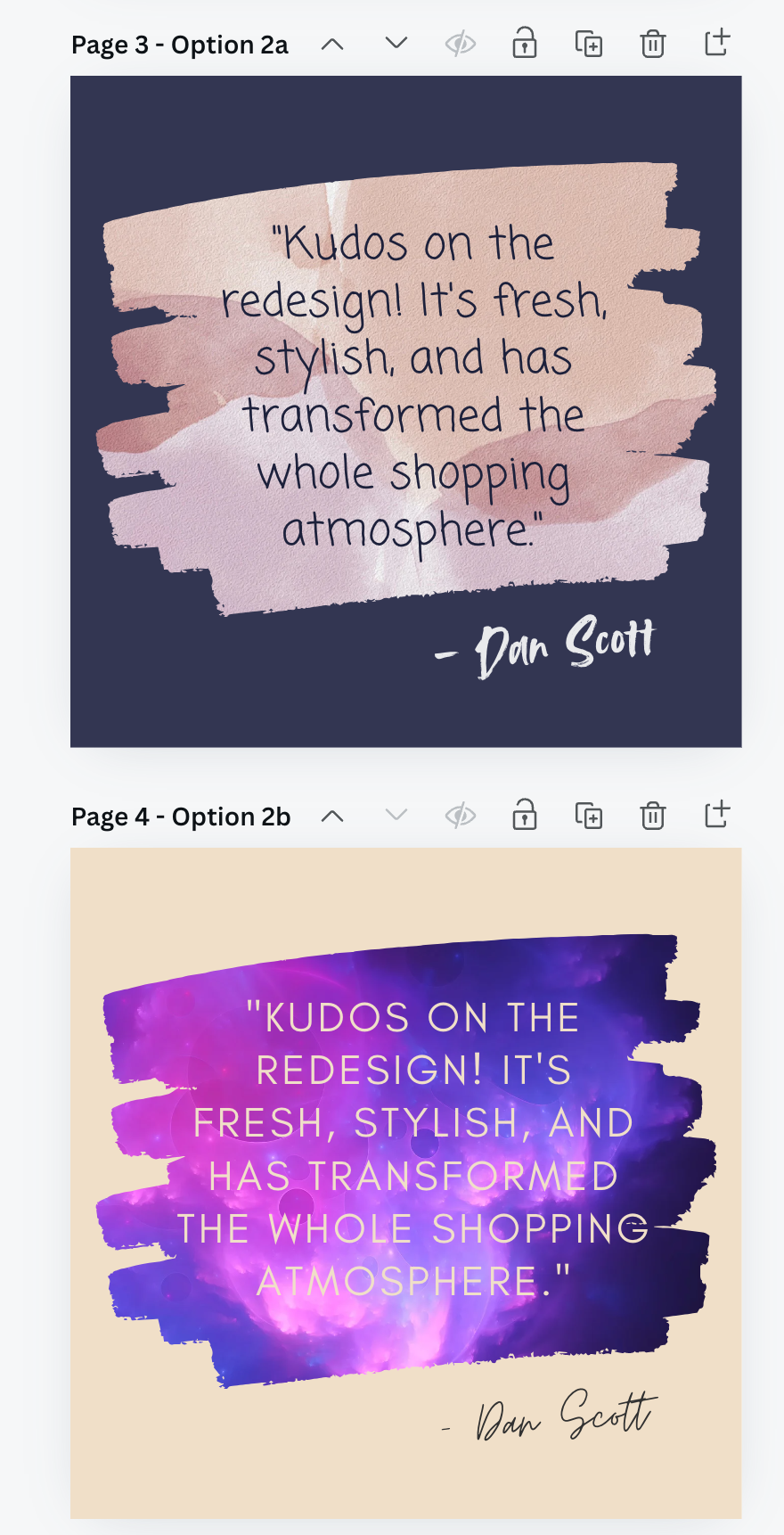
14. Class Project 01 - Images & Shapes: Alright. What is
this? Class projects. What is class projects? They are not homework. They are fun exercises that you can do
throughout the course, just to get your skills up and so that you get to
build something that is kind of alongside the course to work
on your own stuff, practice your skills,
and so you have something the end that you
can put in your portfolio. Watching something's good, doing something yourself is even better. And you'll
learn it better. So what is the first
class project? Basically is what
we've been doing so far plus a little bit of
something else there. Let me go through what
the requirements are. First of all, if you
haven't already, go to random project generator. Get yourself a business and
something that they do. Minus Fox camping and outdoor. Don't you do that?
Do something else. There's plenty of them
that gets generated there, and then you've been asked to make a single square
Instagram post. These are the things that
I want you to include. Two images. One image
is a background. Give me a background
fully or like we've done? I want some cropping going on. Basically, I want you to
practice your cropping. Okay. The second image,
I want it in a frame. I've used a circle, you
don't have to use a circle, but I want you to
put it inside of a frame to practice
that two images. One a background thing, and one is the thing that
we're going to give away. You can do ice cream,
you can do coffee. I've done popcorn, but those are the two images that I want
you to have on there. Hitting, have reopening. I don't want you to pick
fonts at the moment. Just use Canvas sands. That is the most basic of
the fonts. Don't change it. You can see there
I've gone and added bold and then not bold there. I don't know why I tell icized it. Don't
worry about that. We're going to do fonts
properly in a little bit. I just couldn't help
myself. But don't go spending time on fonts. We'll do that in so add the reopening heading.
I'll say it all similar. You don't have to say reopening, something that says
the same thing very boldly and easily. Next is shapes. I'd
like two of them. One is colored box, and that is just going to be the basis for our hitting to
go on top of it, and we're going to
add some body text here, some call to actions. Come join us for our reopening. We'll do that later on,
but just a big colored box and another shape. That's the square shape, and that is the circle and
I want you to go through and add the text to this one
kind of one and the same. You don't have to
rotate yours, but two, one colored box to
the background, and one that has the
date of the reopening. Have the name of your
business as well. Somewhere. I've put
mine at the top in our square shape
that has text in it. It's kind of all joined up
there. Put it somewhere. I don't mind where it
doesn't have to be in a box, have the
name of your business. Want you to experiment
with layering? Show me something in
the class project like this where something's above and below, just so you can work. Ing and layering with us. Don't worry about
colors and fonts at the moment, we'll
do those properly. Just stick to the basic colors. In here, I want colors, stick to the default solid
colors for the moment. I keep calling the basic colors. But just stick to
these for the moment. We'll get a lot better with
color as we go through, but we'll break
it into sections. Next is the name document
like we did earlier, client name campaign
project version. It's this thing up. And then I want you to export a Pange. Export an image. I don't
really mind what kind and then upload it to the class project section on this website. It's how we can work
through the class projects. You'll see these throughout the course, these class projects. Some of them I'll get
to share more widely. Later on, I'll get
you to share in social media and
ask for feedback. For the moment, though,
it's boring old time of just getting
up to this point. There's a lot to do,
especially if you're new, but we're probably not ready for creative feedback
from anybody. We'll do that a little bit
later on as well once we start picking fonts and colors and
doing our own compositions, but do it like this ish. If you decide you want to do it this way and try and do
something interesting, kind of here and sti and lay it out this
way, I don't mind. It's more about
practicing the tools. You can copy me exactly in terms of the layout, but
pick your own images, use your own brand, and
pick your own basic colors. No, they're not basic,
default colors. There go. Now remember, not homework, but I can tell you the
people that do better and learning some of
these projects is the people that follow along
with the class projects. It helps sinks it in everyone
like, Oh, that's easy. I don't need to do that. Do it. You'll bump into problems,
you'll fix them, you'll get better, and it's fun. We're going to build
something together. All right, that's it. That is the first of
the class projects. Enjoy. I'll see you
in the next video.
15. How to mix your own colors in Canva: Hello. Hey, we're
going to go from boring basic colors
that we picked so far on this course to oh this version with some nice colors show you how to mix them, make them brighter,
pick different hues, and then we're going
to go through and pick colors that are
taken from our images, which is a great way to
get started with colour. We're also going to run
into a big problem towards the end where I can't make something work, and then
we fix it together. I'll try and pass it off like
it was part of the course, but really just got stuck. But we fix it. All right,
let's jump in. All right. We're going to
adjust the colors on this option one we did
in the class project. Let's go mess with the colors. You're thinking, Hey, I
spent ages picking colors. I don't want to mess with
them. I did tell you not to, but you did it
anyway, didn't you? First of all, let's have a
look at one of these boxes. This one here, member
is a rectangle with text inside of it.
They're one and the same. You can adjust the text color. And the object color,
they're separate. Now with this color panel open, you'll see document colors. That's anything
that's being used on any of the pages will
appear in this list. This will get longer and longer. Bran kit will do later on
when we build our logo. Let's have a little
look up here. They're actually different. You can see there is this no color option which
you don't have for text, but you do have for a rectangle. All it means is
I'm going to just click on this and
it has no color. There are still text
in there, obviously, but there is no color.
I'm going to undo that. Mixing your own colors
is quite important. That's what this
little guy is here. The way the color system works is you can drag this
left and right. This is the hue. So drag the hue slider back and
forth until you get it in the zone that you
want and I'm just going to pick a greeny blue. Actually, that's
what we were at. Let's go an orange color. Then in here, you
drag this around. This is more what's
called saturated, more and more color, whereas this way here lowers
the saturation. So it's less saturated
color. It's the right color. Then up and down
is how dark it is. Light version, dark version,
saturated not saturated. Really need to know those terms, but just get a sense
of dragging it around. Now, the nice thing you can
do in here is you can start pulling colors from your
images from anything, really. Grab the eyedropper. Let's
go again. Select this. Click on this color swatch here, open the color panel,
go into a new color. Let's grab the eyedropper tool and let's just move around. You'll see it's like
a zoomed inversion. Great for pulling
colors from images. You can see we've pulled that
yellow from the popcorn. You can get back to
this one and go, one of this purple out of here. Once you've done it,
you're like, oh, I like the color, but I want
to change the brightness. All you do is drag this up,
p. It's the same color, but it's just a
brighter version. It to be more saturated?
Right, red, right, right? Less saturated.
You get the idea. The other thing you
might bump into is you might get this
called a hex number. The hex number is the way to
describe this purple here. It's this bit of red, mixed with this little bit of green, which is the two numbers here, and then the last
little bit of blue. Red, green, blue,
make up this color. Once you settle on the if you work for a
brand long enough, you actually start remembering the color or corporate
brand guidelines you might have got from a client and you can
paste it in there. That's the one that I use
for bring your own laptop, for the green, you can paste
it in there if you like. But at this stage, we're
just going to click and drag it around and pick
a color that you like. Then just click out in this area here to close
that all down. If you have a circle with,
say, line around the outside, so I'm going to add a
border style of this, I'm going to crank
it up a little bit. See I've got a color
for the inside, a gala for the border, and now I've got a text color. All right, easy undo, undo. I'm going to get
rid of my border. One of the nice things about
starting with a brand is you don't often have a really
clear brand guidelines. We'll get through that a bit
more specific on how to pick colors to represent a brand when we get to the logo section. But for the moment,
we're going to let the image drive a lot of
the colors that we've used. You might have seen it
already. If I click on this rectangle
in the background, get a color, you'll
see photo colors. It's gone and looked at this image here
that's on this page. Actually, it's looking
at the popcorn, which is not exactly
what I want. I don't want to pull the
colors from the popcorn. Okay, I'm back. You didn't even
know I went, but I spent the last 15
minutes trying to work out and I want to leave it in here in the course because these things happen. Watch this. I want to
change the color of this. I can pick from the popcorn, but what are these great out
ones here that I can't really pick where is this
one in the background? Because that's really
what I want to pick the image colors from
these purples and oranges. But it's not even there.
I tried to uncrop it. I tried all sorts of things. I had to look on the forums, and other people having the and there's not really a solution, but I worked out a workaround. I want to leave this in here just because these
things happen. Cava is always updating,
always changing. It's probably going to be long fixed by the time you
get to it. Watch this. If I add this image now and just move it over here because
I'm not really using it. I just want to pull
the colors from it. So with this box
selected, grab the color. Look, here's my
little image there, it's got rid of
the grade out ones and I can now go
through and say, Alright, I want to pull
colors from this image. The cool thing about
that is that it's looking at this image
and pulling colors from it and often you can
match them a whole lot better. You can get everything to sit in nicely when the
colors that you're using and the fonts
and the boxes are all pulled from the
image you're using, especially if this image is quite a large part
of the design. You can see here already
getting good colors. Picking the purple, it's just decided the colors
that it wants to pick. So I'm going to do is use these but also grab
my eyedropper too. Remember, into the
mixing your own color, eyedropper, I want to get
that purple out of there, and then I want to go
in and just make it a bit brighter and a
bit more saturated, so that I'm starting to connect all these
up to the image. I'm going to get
rid of this now. Actually, I still want it. This is a bug and a workaround. It should pull from it and
it has done for many years. I'm just going to
leave this here and we're we'll delete them when we're finish with
them, ignore him. One of the nice things
about pulling colors from images is we were quite
specific that way. We went, Alright,
pick that color from one of these ones here. What we can do is we can
be a little bit more, I don't know, let
Canva do the work. Especially if we're
new to picking colors. We're going to click
the image here, and we can right click
it and we can say, I want you to apply the colors to this page from this image. Que. Went through and
recolored everything. I can go back into it and
say, I'll do it again. You see it's got this
international shuffle. It's basically the same button, but it's going to go
mix them around again. And the good thing
about it is that it's not just picking
random colors, it's clever enough
to be messing with the background to be picking because that
used to be white, right? Now it's this color.
They've picked this lovely navy here, this gold out of the image, and there's a really
good contrast. So the accessibility of this ad, really nice high contrast so it can be read clearly
against the background. Really love starting
with the image and letting that drive the color
scheme that you're using. Have to stick with it.
It's just a suggestion, and then you can go through
and say, I like that one, but I also want to maybe reuse it up here. I'm
going to say you. I want to grab the
document colors and there's that golden brown down the bottom
there I want to use. Now with a text color, I'm going to say you are too light. I'm going to use that
lighter version down here or maybe just go
straight to white. That's the basics of colors.
We're going to go through. There's going to be a level one, which we're going to
go through now of colors and then we're
going to go through a level two later in the course, especially when we have to
start picking brand colors. We have to have meaning or at least understanding of why to pick different
colors and why not. But that's later
in the course for the moment, look at us. We've done some cool colors
derived from the photograph. We've got some basic colors.
Alright. That is it. I will see you in
the next video.
16. What are Design Styles & Color Palettes in Canva: Hello. In this video, we're going to look
at something called styles in our design template. Basically, it's a way of finding other people's font and color combinations and
experimenting with them, figuring out what
might work for you. It's a great way to get
started with color and fonts. It's really interesting
to understand how Canva works in terms of
how it does combine. Some of these things. Fonts get mixed with
color palettes, which then become
font combinations, which are called styles, which are mixed into templates. Confusing. Don't worry. We're
going to go through it. You're going to be a style
color palette font set master. He's making it sound
hard. Actually, it's not that hard. Let's
just get into it. So where you've got in your
option one color scheme, let's duplicate it
here just so we can compare versions
that we're making. We're going to
duplicate this page on here at the top here we've
we've got two option ones. We're going to have
a colorway A and a colorway B.To different
ways of having color. Let's have a look
at the second one. What we're going to do is just click on anything in here just to let Canva know that we're messing
around with this guy, and then we're going
to go into our design. We spent a lot of time in our elements and we
will in this class. Design wise, we only really
used it for templates. It's fine to start
with a template. Perfect. It's great
way to get started. I end up just making my
own stuff quite often. What I do use under this design tab quite a
lot is the styles option, especially when you're just getting started and
you don't really have a real good sense of color and
font and things like that. Templates, let's go to
styles. What are styles? Templates are colors,
fonts and images, layout, things on the page, plus the colors and fonts. Styles is just the
colors and fonts bits. That's the part
that I really like. What we're going to do is I'm going to click
on it so it stays out. Click on styles. Let's
explain these ones. There's three parts to a style. There is font, there is color, and then there's
font and colors. It's these combinations,
clearly, Dan. If you just want to pick
colors, click on this. If you want to adjust the fonts and colors, click on this. If you just want the fonts,
just here, get the idea. So I'm just scroll
down a little bit. Let's just mess with
colors for the moment. We'll dive into fonts
before we finish. Click on the first one. What
does it do? Look at that. That versus that. It's not
pulling from the image, but it's still a pretty cool
color combination, right? Like this lighter
color. It's kind of like sultana wine color. It's very cool. Let's
click on the next one. Okay? And I'm going to hit. Let's go to S A. So
color palettes, S A. And let's just click
on a few of them. Let's go crazy.
Let's click away. And it's amazing even, I'm a pretty
experienced designer, and often I get trapped by the
same fans same old colors. So it's really handy to
go, Bam, look at me. I never picked
anything that bright. The other nice thing about it is say that you
really like that one. See the little arrows here? That's our international
shuffle sign again. Click it again. And
look, going to keep trying to mix them
up to get them in different color combinations. It's just really clever at
keeping the contrast nice. I can still see the
text on the background. When you've got
one that you like, you can say, I like that one, but I want this
to be the yellow. I can go into it,
slick on the box, click in the text bit. You'll see that this is being used somewhere on the document, that one or let's click on this. We've got
our sweet skills. We can say, I want
to click on this, but I want the eyedropper, I want to pull it from this background color
being used here. Was that the same color? Might
have been the same color. But you get the idea.
Color palettes are really handy premix set of
colors that you can use. Up the top here, there are
some these pill buttons here. You can say, give me
all the vibrant ones. Give me all the bold ones.
You can type in here. Let's type in summer.
There's not too many. I don't know. This
will get bigger. I bet you if you type Summer and now you'll get
more than just three. But that's a handy way
of working as well. You had the little
cross to close it. Back a little arrow here
to come back to styles. So there's the top, going
to come down, come down. We look at color palette. There's font sets. We're going to go into fonts really deep when
we pick our logo. But for the moment, though, it might be really nice just go, A, give me some different fonts. It's going to go through and
there's three sets here. There's a heading,
subheading, and a body copy. Just click on them
and you're like, h that one. I like this one. Oh. Make various noises when that's how you tell if you've
got a good one or not. Don't like that
all caps. But get a sense of some fonts here. We'll do fonts in
the next video, but let's just click
on a few of them. It's really nice to see some combinations that are outside. Oh, I do like that one. Gugin. That's what it is. Yeah, oh, I do like
this combination. One, two, three different fonts. Worked up color palettes are pre mixed kind
of color sets, and same with the font sets, and combinations is both. Somebody's gone through
and said, Alright, these colors with these two
fonts would look pretty cool. If I look on this, it's
going to do the same thing. It's a combination of those two. So for me, often, I will just be picking this
separately from this because I get quite specific about
the color and the font look. But when you're getting
started doing concepts, the combinations is a co both. If I hit a template, I'm going
to add it as a new page. What it's done is
it's gone through, it's given me some physical
videos and images. But it's also given me
a style that style is made up of this combination
here of colors and fonts. I deleted my template,
and I want to show you one last thing before we go
is that down the bottom here, there is image palettes. We just access it
a different way. There is a loads of ways to get into the same place in Canva. I'm going to click on
something in here. Then down here, you can
see it's pulled a bunch of colors from this image and I can click on them
and say, Yeah, you. Then shuffle. Shuffle, shuffle, shuffle, shuffle. I was good. Doesn't really pick the
purples out of there, but hey, it's the same
thing as going in the back. It's the same thing in here
as clicking on the image, right clicking and saying
apply colors to page. Then going back in here and
applying color shuffle. Same, same, but it actually might just be easier over here. I hope that was useful showing you how it all ties together, fonts plus colors,
plus the combinations. They're all smushed
into styles that are used in templates.
He's made it hard. Sorry. We got there, right?
Hopefully we're there. We'll do it more as we
go through the course. Yeah, let's get on
with that course.
17. How to work with text & fonts in Canva: Hello. In this video, we are going to cover everything
you need to know to get started with fonts and
type inside of Campa. Loads to cover. Let's
jump in. All right. Scroll down to the page
that we made earlier, with the watermark
on the background. If you haven't done it, just do any old textbox.
It doesn't matter. Okay, I want to add a textbox. We can click on the Text
and click Add Text Box. I though just the Tiki. The Tiki is a shortcut just to adding textbox,
really common. The one thing though is the Tiki doesn't work if
you're typing. Watch this. If I want to add the
textbox and I hit T, you can see just
types in the textbox. I can hit escape on my
keyboard or just click in the background and then hit the T key, another textbox. I'm going to click off, delete him and grab this one. I'm going to get it so
that we've done resizing. Resizing texts can
be a little tricky when you can't see the corners,
but you can see there. I can get in there
and resize it still, even though the box
was quite small, I'm going to resize it a bit. I'm going to add some text. From exercise files, there's a file in there called
reopening quotes. It looks like this. I've just given you some text to copy. You can type it in, it
doesn't have to be the same. It's God, it's really great. This is it's that Oh, my goodness, this is super good. I can't believe the shop is
so amazing in the redesign. Ed, what if you like? There
are some examples there. The reason I want to show
sizing is I quite often use this just to resize and
it's great for headings, but when you need
it to be a certain width, covering this background, weedy right now, little bug is there's normally a
little move icon there. It's gone away. Gone. If it the Tiki, see that
move thing there? It's normally there.
It's gone away from me. If yours goes away,
I don't know. I bet you it's just a bug for
today while I'm teaching. If that ever happens to
you, you can just click off and just click and drag it. You don't have to
use the move icon. I'm going to get mine because
I want it to be this with, but I don't want
to resize it using this because I want
it to be that with. All we can do is select all the texts. I just
double clicked it. Sometimes you might
have to triple click it, make sure
it's all blue, and we can use this
to make it bigger. There is a really
common shortcut. It's command shift and the greater than or less
than key on a Mac. On a PC, it's control shift, greater than less than. I use the greater
than and less than. They're tied together next to the key with your
comma and full stop. Command Shift, greater than, less than control shift on a PC. They'll be in your
shortcut sheet. I do that. I hold down the key. I'm like, looking for a
good line break where it fits nicely and reads
nicely, that'll do. Those are two good
ways of resizing type. You can type it in obviously. A couple of things I
want to show you is that some fonts are really
elaborate like this one here, Canvas Sands the
default, has bold and italics and underline, has
all sorts of good stuff. I'm undoing that. If I find something else and
I go over here, you can see I was
experimenting already. If I click on this,
go back to here. I pick something else, something looking Ah, come down
and pick Brittany. Okay? Oh, I pick Brittany and fake on Brittany,
and I selected here. You'll notice that
this doesn't have a bold or italic version. You're like, come
on, make it go bold. Not all fonts are
creative equal. Some have bolds, some italics.
This one has an underline. Very gross one, but it
doesn't have these other two. So just know that
sometimes they don't. Some of them just come
as capitals as well. This one here has
uppercase and lowercase. Some of them don't. Some of
them just have uppercase. Going to cover every single
one of these features. But if you want to with the
selectte I can go over here, and I have a lot more
of the text options. We all know bold italic
underline strike through, put a line through
the middle of it. This one here, alignment,
you just toggle. The moment it's
centered, go left align, justified, right line, just cycle through them all.
I'm going to be center. One I like bullet points. The other one you will
bump into is spacing. In this case, the
line spacing here is quite this font Brittany is let's have a look.
It's quite tight. Can you see these descenders? That's the whip down the
bottom here quite long and the acenders descend
the line that it's sitting on and ascend the
line, which is above it. This is quite high, the Gs quite low. It's just this font. You can see here they end up mixing together,
descenders acenders. I'm going to have to go with
this font and say, Ar buddy, you need to be spacing and I can play around
with the line spacing. Go, I probably need
to drag it out to about to fonts though will be perfect the way
they are by default, but you might end
up adjusting them. Letter spacing, not hard. You can put it into negative. I'm just going to get
mine back to what it was. What was it? Zero.
That's what it was zero. The next thing we do with fonts is I'm going
to have it selected, I'm going to click on
the CA click on the word Brittany and I want
to find the filters. I want to find hand drawn fonts. Instead of scrolling forever, you have to scroll all the
way to the top to see these. If you can't find
them, it's because you're scrolled
down a little bit. Either drag this up or use a scroll wheel or
whoever you scroll, get to the top and there's these little buttons
here at the top. Show me only handwriting
fonts, please. It's going to go through
everything that's available inside of Canva and
go, writing ones. You'll notice some
of them have a crown next to it, so that's
for the paid people. There's plenty though that
are part of the free account. It's going to allow me just to cut it down to
these ones here. Now, the trouble with some of the handrawn fonts is they're
a little bit hard to read. You can see this one
here is only uppercase. There's no lowercase
version of it. That is a nice thing you can do. At the top here, I've filtered by handwriting.
You can type it in there. It's easier just to go
through this little one and say display
fonts, hitting fonts, paragraph Sanserf, just a quick little one Uh,
we won't go too much. Headings obviously
good for headings. It's going to be a little
bit more exciting and bold. Okay? Paragraph is going to
be stuff for your body copy. Plain, boring stuff, but
very clear and easy to read. The only other two
that I'll talk about are Sanserf and serf. Serif are basically fonts that have the worldy feet Zoom in. These are seraps. See
this little guy here? He's a Seraph. That's a Seraph. The other one in there,
Sanserf SanserfO Sans is Latin fall without seraps. Sera font, have the feet, Sans seraph without the feet. That's one thing you
will be looking at, and we'll cover more and
more in this course, but sometimes you
want this more, I don't know, formal style font, and then if you want San serif, it's going to give you fonts
that are a little bit more, don't have the serifs,
more modern, less wildi. But anyway, I ended up
finding one that I liked. It's called Coming Soon. You can type in the top. Okay, I was called
coming soon. I liked it. It was kind of Do I like it? I don't like it anymore. I
like it when it's preparing. It's too much comic
Sansi for me, I like it now, but
we're stuck with it now. So find your font. One of the other common
things when you're doing text is you can do, let's say that I type in my name Dan Scott. I'm going
to put a return. Dan Scott is the
speaker of this quote. You can go in here and
change the font and the size of different
parts of the text, but it's very hard to control Dan Scott separately
from this box. You will find and Canva
is really common, especially when we're
working in, say, an Instagram design is I'm
going to get rid of that. It's really common to click
off in the background, hit the Tiki, and just have
it in a separate textbox. I'm going to type
Dan Scott Scott and use that as a separate, he's back as a separate textbox
so that I can rotate it. Then I might go through and say, fonts, I'm going to
say not coming soon. I'm going to say handwriting, I'm going to find something that looks like it was
done with a pen. No, that looks like it
was done with a pen. But you get what I
mean, It is very common to have headings
in separate boxes from your paragraph text, which is separate from this one. The other thing is, I really want to put
a hyphen in here, but I know it does default to trying to make
hyphens, bullet points. There's a little bit of a
workaround, but you can do it. It's a little bit of
a hack to try and put the bullet point in and then
type in another hyphen, delete the bullet point.
That's what I'm looking for. I'm going to rotate this around. I'm going to spend way too long picking your
font, and you wait. Well, it didn't take
very long at all. Really liked that
one. Looks like I did it with my
brush. All right. Another thing while
we're in here with fonts is that once you've picked
one, you're like, I like that. Can I use it over here? You can. What you can do is you can
select on it and you can say, see this little copy
style or over here, it's the same thing where is it copy style? It
doesn't matter. You've copied it from the
thing you have selected. Now you got to rub
it on something. Look, rub it on there. So have it selected, hit copy, and then paste
it on something else. Where are you? It's going to pick the same font
and the same size. I'm going to undo that because
I like them how they were. But if you do find that you've got a font you
like, I like that. Instead of having to go
through and type it in every single time with the
same font and the same size, you can use this thing here, the copy style roller thing. All right. That's going to be enough for fonts for this video. We've covered loads
here. We'll get more and more advanced as
we go through the course, but here you go. I'll see
you in the next video.
18. Class Project 02 - Reopening Quote: Hello. It's class project time. We're going to put
some of our skills into action that we've learned
over the last few videos. Okay, we're going to
create this. It's a quote. So we've been asked by
the client to say, Hey, we want some Instagram
square posts with quotes from our reopening. They're made up for a practice. Obviously, in real life,
you'd have to use real ones, but for the moment, we've
got some practice ones, and here are the requirements. Oh, re opening quote, make sure it's Instagram
square post size. That's what we've been doing so far the post must include. Make sure you've got a frame in the background with an
abstract image in it. Something that's good in
contrast against the text. This is quite light
compared to the dark text. I picked another one,
doesn't read as well. I'll show you a tricks
of fixing that later on, but something it has
quite dark so light text can so you might have to go back and check out
frames earlier on, put an image in it, do that. Use the customer quote
and the customer name. I've got some
examples down here. You can use them. You can create your own one. It's up to you. I just want you to experiment
with colors and fonts and get something
like this going. Then I want you to
do an option B. Basically just duplicate
the page like I've done. I've made a second version, what I've done is
I've experimented with a couple of things. The main one I want
you to experiment with is the design styles. Remember, we did this
section in here. I'm going to wreck my own eye. I'm going to click on it, and I'm going to go into design. I'm going to go into styles and remember there's
the combination it's going to go change all
the colors and the fonts or I can go through color palettes
and fonts separately, or I can pull them
from the image. I want you to experiment
with a second version. You've got two of them.
They are quite distinct. I want to undo mine
because I quite like my original one,
undo, undo, undo. Anyway, you got two options to go
back to the client with. The other thing that
I've gotten there is to experiment
with magic right. I've got the same quoke
see kudos on the redesign. I can click on this. Now, at the moment, this is
free for everybody. You might want to
check. This might be a pro version later on. Magic writes is quite useful. I can click on this
and say, actually, I want you to rewrite it, make it more formal, more fun. It's going to try and match it similarly in terms of length, but it's going to change the tone of it. You
don't have to use this. It's a nice easy
way to experiment with some AI, some
artificial intelligence. Obviously, we
couldn't really use this because it's not the
actual quote from the just experimenting
and working with and have a little write with
I really like rewrite. Often, what I'll do is I'll type something out my
English and grammar, you've probably already noticed in this course, isn't great. So often I'll just
type in something that I feel like it's right,
might be a heading, might be a paragraph,
and then I hit magic write and go rewrite,
and it just cracks it. More formal, more fun. I can
shorten it a little bit. It's pretty amazing what it can do. This will
change a little bit. It's quite new feature, they'll keep changing
the wa it looks. But I have a little
experiment with magic write. If you're on the Pro account. It's not essential in this one. I just want you to
have more than one, something that they
look different. You might have to resize your
textbox and there you go. Do the first option,
duplicate it. I called mine Option two,
so I got two option twos. I got Option two A and
Option two B. I'm going to go to the client
with both of them and say, which one do you like? Then I want you to upload a screenshot of
your two options. So taking a screenshot of two of them is a
little bit tricky. I'm on this not scrollview, I'm on thumbnail view. I'm on Scroll view.
Okay, click it. So you've got you can
scroll up and down, and then you can just
lower this down. Okay, till you can see
both of them and then take a screenshot and upload
that to the class projects. So OomaCs Command Shift four, and I can just drag
a box around it, and it ends up on my desktop. That's Command Shift and four. On a PC, hold down the Windows key and then
hit your print screen. Some older versions of Windows, you might have to double check
what version you're using. If it's new, it might
have a new version. Okay? I'm using Mac in this, but you'll notice that
if you're using PC, the software looks mostly the same except screenshots
are different. On a PC, I'm pretty sure it's Windows key and
hit Print screen. And you should end up with
that screenshot inside your pictures folder in a
folder called screenshots. Onto Mac, it ends up on the
desktop. Big messy desktop. You upload that? Is that
on the class projects? Yeah. For this one, we're going to do it
slightly different. I want you to share on
social media as well. We've got a bit of customization going on. Yours doesn't
look like mine. I'd love to see you two options. Share on social media. Here's my Instagram,
here's my Twitter. Here's the Facebook
group or LinkedIn group. It doesn't matter it could
be all of the places. It could be just
one of the places. It could be none of the places. If you're never
sharing anything ever. You can do that. That's fine. But I do love to
see people's stuff, and it is really
handy, especially because there's lots of
people doing this course. They'll be able to
see your stuff. You'll be able to ask
for a lot of feedback. You can tell them just getting started in
the Canva course. Here's the thing. What do you?
Kind of feels like a lot. Really, I just want you to make a design and experiment
with fonts and color, then do a second one and start playing around with
the design styles, get a sense of how those
work and then share it. One last thing as
I left an example, you'll see they don't really
fit on the same page. I leave the what I
would like you to make. So you can see, you'll
see this one up here. Hey, that's the last one.
This is this one here, it doesn't quite fit on the
page, but you get the idea. I'll put little examples
as we go through so you get a sense of,
am I doing it right? I don't want to
look like mine, but it's the same structure and it'll have the content that I'm asking for in the
words up the top here. You get the idea. All right. I will see you in
the next video.
19. How to add drop shadows to text in Canva: Hey, everyone. Let's explore some of the text
effects in Canva. Basically, they allowed us to add things like drop shadows. Really good when we
want text to really separate from the background,
if it's hard to read. There's some interesting
cool effects and stuff you can do with type. Add a bit of excitement
to your heading text. Let's jump in. All right. First thing is, I'm
going to click on the little Zoom option and say
fit and scroll to the top. I'm going to work on this
first option, option A one. Actually the very
first one we did. What I'm going to do is the
first thing you need to know about text effects is that
they can't apply to all texts. This text here, sitting on top of this rectangle
has text effects. This text that's
inside of a rectangle, we started with a rectangle, we added text inside of
it doesn't have effex. If you did want this to happen, what you'd end up doing
is with a T tool, click T, you'd have a paragraph and clicking
off, moving it there. Then separately, you'd have
an element and you'd go, of photos, go down to shape, and you'd make these
two things separately. Can you see the texts
flashing in there? That works what we
want to do up here. But if we want to
add effect to this, we'd have these two
separate things a text inside of a rectangle,
they are separate. I'm going to delete
you and delete you. We've got this one.
What I want to do is have this up the top. I'm going to move
this down the bottom. I want this to appear on
the background image. Now, mine stands
off pretty well. Yours is probably
not. You've got a different brand,
different font, different color,
double click on mine and move it around
that is less good. We're talking about
rotation back to zero, get it up here. Is that work? Yeah, it's
getting a bit worse. Ticks effects are
really good for not just kind of
like styly effects, but actually making
things legible, especially when there's text against kind of a
model background. It's cake effects, and you probably don't need me
to go through them all. Okay? A shadow adds
a drop shadow. The one thing I will
mention is shadow and lift. For me, they feel they're
kind of the same, but they're I don't know.
They feel different. I feel like this should be good shadow and that
should be called Lift. Lift is, I don't know what I call a
traditional drop shadow. Can you see that kind
of like, you know, they shadow, the drop shadow,
but they call it lift. Shadow is just it replicates the color that's being used in the font and just makes
another copy of it, zumin. Helps it stand off. The one thing about
this is confusing? It's not once you
get used to it. So what happens is,
if I click none, we've got all these
options here. If I click on Shadow,
what happens is all the shadow options open up underneath it
and push this down. They're all still here.
You can switch to spice. You see now splice
has come up and show me my splice
options. Go back to none. If you are just figuring it out and going,
W this one done, and you feel like you
might have lost go back to nun and it'll
clear them all off, and then you can start again
and go, Non intensity. They all have their own options. I'm not going to go
through them all. The one things I do want to show you is some fonts do
some weird stuff. This one here, what
is this one called? This one is called, yeah, Gaglin better way of
pronouncing that. But some of the
effects in this one, let's have a look at
hollow doesn't wed stuff. If your fonts doing
some weird stuff, it's probably not the effects
problem, it's the font. It has some complexity that this doesn't know what
to do with undo it. Going to go back to the
top one here and let's go back to shadow, actually lift. You see here, you
can play around with how well it separates
itself from the background. All of these just
variations of it. One of the ones that are interesting is neon will
wash out your color. If you start with, let's say, black and I click on
Neon and goes weird. What you want to do is
start with a nice color. I'm going to go to my
colors, start with something vibrant and then
not that vibrant, and then go to my effects and then hit that and you'll
see it I don't know, works better when you
start with a color. I want to show you in terms, I'll let you play
around with the effects is one is this one
here, background. That is quite a useful
one. It's doing the same thing, but differently. This one here is a
rectangle with text in it. This is a text box with a
rectangle around the outside. They're actually quite
different. Well, they're not. They look the same. But this one here wraps around the text. The cool thing
about it is that it changes depending on
the size of the text. Was this one is more of a frame and everything tries
to fit within the rectangle. Anyway, very similar. That's the only other
one you might use is that background color
or often I'll end up just drawing a rectangle in
the background because I want it to be a little bit
wider than it is tall. I don't like the
evenness around it. I like my textboxes
to often have a little bit of extra
space left and right. It's not really a rule, my rule. This one here has
roundness I like to pull off and the color
I'm going to adjust. They all have their
own options in terms of what you might
do in addition. Okay? Select them, have a
mess around with these. They're pretty easy
to work through. Roundness, spreads
are weird word, but it's just how far out from the text and you want it
to be transparent or not? Oh, fancy. You've
all probably done. You click on Glitch. Do
love a bit of glitching. Probably the wrong color for
it, but you get the idea. That is text
effects. Really good for getting text to pop
off the background. One last little hack before I go, I end up doing this a lot. Instead of using the rectangle, and trying
transparency, what I'll tend to do is turn it to
none, grab my shape tool. Elements, I'm going to
go to shapes, rectangle, and I'm going to depending on what sort of size you want
it to be, end up doing this. We're doing a similar
sort of thing, but I get to decide the height
and the width. Maybe it's like this, BC, I want it to tidy in
on the edges here. If you hold down
Option key on a mac, key on a PC where you drag
the corners, the sides, it does both the left and the right. I want
something like that. Remember the spread
on the last one, the height was
exactly the same as the width of the box and
then do something like this. I want you to be black and then I'm going to close it down,
play with transparency. This one here, how
see through it is. I find this is a good
way of cheating. Without it being a real
obvious design element, the text separate from the
background quite easily. One last quick thing,
if you have got effects already applied to something or it's
come from a template, just select it, click
on Effex and it should open up with the
effects that are applied. All that is it. Text
Effects in Canva.
20. How do you curve text around a badge in Canva: Everyone, in this video,
we're going to do this. We're going to curve
text around the top and the bottom of our
little badge here. It's easy to do. Let me show you how. Curving text is easy. Scrab the type tool, so hit T on your keyboard and
type in free popcorn. I'll zoom a little bit
and with it selected, go to affix and just down the
bottom here, it says curve. Look, done and all you do is
drag this left and right. The more you drag
it to the right, the more curved it becomes. If you drag it all the way
back to this middle part, it's basically flat
until if you keep going, it curves it the
other way around. I curves it from the up
a little tips for doing curve text is the first one is that you can actually drag. My advice, the short answer
is just use the slider. Feels quite disconnected. I really want to mess
around with it over here. Problem with
dragging the corners here is that the
font size changes, but so does the circle and you're chasing your tail going, I want the circle bigger, but then I want the font smaller. But then now the
circle is smaller. Attached. So get the font size you want. I want it at about 20. I'm going to type in 20, and then I'm going to play with
this curve slider over here. It's just easier that way. I'm going to get you to be you. Other tips. Don't do that, Dan. Alright, let's grab the curve. I want the curve to be bigger. Probably want the font size to be well, do them separately. Do the font size, then play
around with the curve, get it in the right position. One of the other tips
when you are dealing with this badge style logo thing is that lowercase and uppercase, this title case style up the top here is a
pain in the butt. It doesn't work very well,
it doesn't look quite right. It's mainly because of
this see this descender. We talked about them earlier. That's an Ascender pops up above the middle here,
that one's a bit higher. That's the only one low,
makes it hard to line up. If you're finding it's looking just go through with your type. I can't see my cases up there. I'm going to close down this
to make it a bit bigger. There it is. I'm going to go in here
and say uppercase, please. Things just work better
when it's all uppercase. The other thing you
can do with text here is go into your text over here, actually, let's go to this
one here called spacing. If you can't see it
along the top here because your screen is not
big enough remember with the text seleg just go
there and say spacing wise, and go spacing wise. Letter spacing something you
probably need to mess around with with something like
this where it's this badge. You want to make it wrap, you want to make
it still legible. The last thing is
that if you want a line at the top
here, so free popcorn. I make mine a little
bit bigger. Here we go. But you want to line
down the bottom as well. You want free popcorn. I'm going to have all day, like we
saw at the beginning there. They're actually just
two separate boxes. You can't do it all in one go. You can't say,
popcorn into all day. Can you see it just adds it
to the same text blocks. I'm going to undo that.
What I'm going to do is just copy and paste
this. I've got two of them. And I'm going to
change the texts to all day and then I'm going
to go to my effects, and that is what? 63. Come on down. You can read. Just change it to -63 instead of dragging it. It's the opposite. It's the same curve, but the opposite
of what you had. Then lastly, for me, I want to add a circle
around the background. I'm going to go elements.
I'm going to go to find my shapes. Find you might have to go to SEL I'm going to click on the
circle because I can see it, and I'm going to go there. The only problem is the layers. Who remembers where
the layers are? Hands up. You got it position, and then go to layers,
and I'm just going to go, you need to behind the popcorn. Nothing lines up,
Dan. Don't worry. We'll do that in the next
video. But we got there, right? I'm just going to drag
it for the moment. We've got curve at the
top at the bottom. Make sure it's uppercase. Things are just easier that way. If you need to go to the top
and the bottom separately, that is two separate textboxes with the curve effect plight. All right. That's it. And we'll see you
in the next video.
21. How to Group Lock & Aligning things in Canva: Hello. We are going
to group stuff, ungroup stuff, lock stuff, align stuff, shift, click, do all sorts of weird stuff, sounds boring, useful stuff. There'll be a couple
of things in here that you'd be like, There you
go. Didn't know that. As boring as a title sounds is the thing you do
all day every day. Grouping, locking,
aligning, selecting, get on with it, Dan. Let's
get going. All right. So I'm going to my little badge that we've made by just
dragging the sideways. You can use this
little up and down slider to get it
where you need to be. Let's do some selecting
grouping aligning stuff. There's lots of
different combinations. Let's say that I want to select both this and this text
at the bottom here at the same time and
I want to change both the font and the size of them together. I don't
want to group them. I want to select
both of them. You do that by selecting one of them, hold Shift and grab the
second one of them. You see I've done this
it's a group, temporary. I can move them around
together, which is handy. But what's useful here is I can say, you're multiple fonts. I'm like, No, I want you
to be both quicksand. I both want you
to be, let's say, we're using 26, you
get them perfect. Actually, you might
need to be smaller. That's a good way of
selecting two things at once, a little bit bigger.
There we go. The other thing I
want to do with these two is click them both. Hold shift is I want
to go to not fonts, like the little arrow
over here if you can't see it and come
down to position. I want these guys to
be aligned together. Then what I want to do is I
want to group these guys. Group is more like a
permanent these guys, I don't have to shift
click them both now. They just move around
together forever. I can go inside of them
and do small changes, so I don't have to ungroup
them to go through and say, A we're not doing popcorn. Popcorn is too messy,
we're going to do coffee and go through
and change it there. You can do small changes. If you need to ungroup
them, you can hit Ungroup. There is a shortcut.
Command G is to group them. That's Control G on a PC. Ungroup them is Command
Shift G on a Mac. Control Shift G on a PC. Ungroup them or you can hit the button or you can
right click them. There's lots of ways of
grouping where is it? Group there it is there. Group,
right click. Group, easy. Now we're lining these up. These two are going to be easy. I've just shift,
clicked them both. I've got them both selected.
You can tell they're off. I made them off on purpose. I'm going to say I
want you to be middle and center, right in the
middle of each other. These two here, I'm going to group them together
because together, if I shift click, you and you, I've got these
guys, I go middle, middle, they should
all line up nicely. If they were ungrouped
and I did the same thing, shift click, and I try
and go middle, middle. It's not quite what I want. If they're grade out
and you're like, Hey, mine's grade out. Mine grade out? It's
because they're already centered.
I don't know why. They just have it clickable. But anyway, I'm going
to group these two. Command G, control GNPC, select all of these guys, and I'm going to go Center. They're both grade out
because I've already done it. Now, it's probably handy to go through and
group these guys. If yours like mine disappeared, what do you think happened? Didn't actually have
that bit selected. I'm going to undo
Shift click, you You. But I haven't got this,
but it's hard to select that guy because he's
behind everything in there. What do we do? There's the
right way of doing it and then there's the way
that I'd probably end up doing it.
I'll show you both. The right way is I'm
going to select it, I'm going to go position, I'm going to go layers,
I'm going to say, best just be underneath this. Then I can go
select, hold shift, grab the text, and then
grab this, then group them. They're all together. It's
one unit and you're like, what was the way he was going
to do? I normally do this. Instead of messing
around with the layers, what I tend to do is especially when I
work in a document, there's this thing here. I don't want to move it. It's a good segue
to locking things. Like this thing stop moving Because it gets a way of
secting right because I could drag a box
around all of that if this stuff wasn't in the way. So what I tend to do
is once I've got this and this sorted, I
select everything. I just dragged a
box from this edge here going image and you. You could shift click them both. I was going to say you my friend are going to be locked.
How do I do it? Right click it and
say, all it means is, I can't really select it
anymore. I won't move. I can right click it and unlock
it. That's totally cool. But what it means is
now is I can work on this and select all
of these guys. You see? I can group them. Wow, that was a long way of doing
it. What do you think? That's what I end
up doing is I end up getting frustrated
by the background box. I'm like, Hey, stop moving. Background image, stop moving. Lock them, and then you can do all sorts of cool stuff by slicking everything
on the page, but it's not going to click
those background elements. And you can say, I
just want to move you around a little
bit, get the idea. Groups are good.
It allows you to move them around as one
unit and do small changes. I can say free
coffee is now bold, the top and this bottom one now, I'm going to sect it all
and pick a different font. Close it down, click
off in the background. Nice. One last thing I
want to do just to remind you is that what happens if
I drag this all the way off? I still there. No, gone.
Okay. Just remind you. If things disappear, it's
because you drag them off into this pasteboard area and Cam doesn't like that
and just deletes them. All my friends,
that is selecting, aligning, locking,
grouping, ungrouping. We did lots. Is everybody
sick of this down here? Every time I look up, this
thing's doing something. It's distracting.
You're probably doing the same. Go
be off elements. Go away weird dog sticker and I don't know,
who's using these? Anyway, let's close them
down and let's finish up, deep breath and done. I'll
see you in the next video.
22. Dotted & Arrowed Lines with Text in Canva: Hello. Let's talk about lines. It is not as boring
as it sounds. We're going to kind of
do something fancy with dotted lines and the
little ends on it, but then I'll show
you some cool stuff where things are
actually connected, and you can add text
that follows it along. Plus, I'm going
to share with you the super duper most awesomest shortcut
that rules them all. It's basically the only shortcut you're ever going
to need. Let's go. All right. I'm going to
work on the second page. I'm using Page Down
to jump down there. Let's go to elements, and we're looking for the lines.
They're under shapes. Elements, scroll until
you find shapes. Click on see all and you'll
notice that for some reason, shapes also has
lines. That's okay. You can turn any line into any other line
after you've made it, you don't have to really
pick it to start one. I'm going to pick this
little barbel one, and I'm going to
click hold and drag the line or you can drag the little move thing.
Get it to where you want. I want to go across
underneath here, what you'll notice
is that it's really happily snapping to things,
which is mostly good. Sometimes, though,
you just want it to I want it to go
down 45 degrees. It's really hard to get
it to go 45 degrees by you see 41, 39. Come on. What you can do is
hold down the Shifky If you hold the shift key
while I'm still dragging, I'm going
to undo that. I've got it here, I'm
dragging it, hold shift, it'll lock it into the kind numbers that
you probably want, 45, 90, zero, 15, it locks it into
some I don't know, most commonly used angles. We've got it there. Let's
go and change a few things. You can see most of it
along the top here, it doesn't matter whether
you're in here or along here. It doesn't matter. Let's
have a quick little look. End points, those
are the bar beels. I want to make it in
let's say an arrow or more like a dumbbell
with circles on the end. You can see it changes. You
need to click off to see it. Another thing that
ends up happening is let's get rid of
them, none and none. Yeah, none and none. Then they look like they've got arrows, the beginning and the end
of it. It's nothing there. Let's go to the style.
So we're a type. Let's make it dotted,
let's go into stroke under line style here, you can play with
the thickness of it, but also what kind
of line it is? Is it dotted, dashed,
dotted, dashed, and I don't know, the other one. Too dashed. The other thing
that is useful is, let's say, mine's
too big, right? I've just got mine quite big so you can see it there easily. Let's say I want the dots. You can see rounded end
gives you that more dot tot, tot and less square
square square. Up to you. It works for
these ones as well. Can you see if I have a rounded
end or not rounded end? That's also true of
a straight line. Sometimes lines look a bit
funny when they're not when they're I've got what's called a butt cap when it's nice
and flat at the end. This is a rounded
cap. All right, so there's times
where you need both. Often, when it's small, you can't really
tell the difference, so we won't stress over it. Let's have a look at some of the other functionalities of it. I'm going to go just
quickly jump back. Let's go superfast mode. All right, I'm happy
with that line. Next one is I want the arrow
that reaches around here. It's going to show
a few little extras that the line tool can do. The other thing
I'm going to do is show you a sweet shortcut. I'm going to introduce it
more and more in the course. It's the shortcut
to rule them all. It's the best shortcut ever. It is the Ford slash key. You've got two of them,
backslash, leans back, the Ford slash on my keyboard, it's tied in with the question
marks the Ford slash key. Then you can just
type in anything. I'm going to type in line.
What do I want to do? Do I want to change
the line style or do I want to add a line shape? I click on this. The cool thing about that is this thing
here is a little bit clumsy, you're like, Alright I
need a line. All right. It's under elements.
It's scroll, scroll, scroll, getting
distracted by videos. Okay, where is it?
It's under lines. No, it's under shapes. Is it
under shapes? Here it is. What I end up doing and
what you'll find really useful is keeping that
closed and just going, A document up here,
I need a line. I'm just going to
hit forwardslash, type in line and then go there it is, and
then I get a line. Ford slash again and
I'm going to say, I need a square. Spell square right. It's
come under rectangle. Come on, Dan, rectangle.
I get a rectangle. If I hit forward slash now, it's going to type a Ford slash. I have to click
off or hit escape. Hit forward slash and
say, I need a chicken. Not sure why I need chicken. Let's go. Chicken. Here we go. Got a dip dab one of them. That shortcut is super
handy for everything. Need a video of a chicken dabbing dipping,
what everybody's doing? You can just had Forward
slash and type it in. I use it all the time.
It is super helpful. Oh, down here, let's
add another line. So we're going to use our forward slash
forward slash line. Do I need a line chart?
No, just the line. Okay. And what I'm going to do is if you grab
any of these ends, you'll see it snaps to stuff. The weird thing about lines, it's good and bad.This is weird and good
at the same time. What if I put it to here. It's attached to
the end of this. I snapped to the end
of this textbox. What happens when I
move the textbox. Wow. This is going
to be handy when we get into our presentations
part of the course. But we're doing lines, so
let's learn about lines. Yeah, it means that you can
snap them and attach them. Sometimes you're like,
Oh, that's super handy. A lot of the time,
you're like, What are you doing? Why are
you connected? Oh, yeah, Dan said,
It's a feature. Not a bog I'm going to
grab this end and go, A I'm going to connect it. Maybe we're going to connect it. All I'm going to just
snap it in there. And what you'll notice is, it's connected to both sides now. If you're like, stop
it, all you do is click on it and grab
it and break it off, or you can just click on line and hit delete
on your keyboard. Up to you, how you want to
disconnect it. I like it. It's cool and let's dig
in a bit more to line. I'm going to go into here. I always end up this double
arrow. You don't have to. You could use it up here
and say, I want the end to be an arrow and I want to grab the stroke, drag
it up a bit higher. Now what I want to do
is play around with this line type or go into this one where Dan feels
more comfortable and safe. I'm going to go to line
type and I'm going to go to curved. It means
that I can do this. Juke I'm probably going
to need to actually, I want to get mine snapped from the edge of the circle
to this text box here. It still is it connected
to the textbox? Probably not. But it's okay. I want it pointed to the text, not snapping to the edge
of this and you drag this middle part around
to how curve you want it. You want more control with
handles that pop out. If you're an illustrator person, you'll be like, give
me the handles. We don't have the
handles here in Canva. It's kept it simple,
which is good. I'm going to do
something like this. The other thing I want
to do a little trick for lines, if I double click it. Look at that. We can add text. I'm going to say nearly
here exclamation mark. Look at all the text.
I'm going to go Command Shift and use my left
than to make it smaller. That's control shift. Less than. The cool thing about
that and that's going to be better
and better with presentations when
you're trying to do flow charts and Gant
charts and stuff, you see it's connected
to the line, which is super helpful. You can grab it as well and jiggle it around
a little bit, not full control,
but some control. All right, I'm going to
change the color of my line. I'm going to go into here. I'm going to go stroke
color. I'm going to pick one of the colors. Actually, I have no idea, so
I'm just going to mix one, grab the hue, slide along, find something that I
think will work with my yellowy mandarin
and purple vibe. I'm going to go
something like this. Maybe I'm not. I don't know. That'll do. All right. Same thing. You can kind of
format your text in here. I'm going to pig. Let's go to the fonts that
we're using before. He's coming soon. This
one doesn't have a bold. So I'm going to make
it a little bit bigger. Use my sweet shortcut. Alright, that's everything to do with lines. Lot more
than you thought, right? You're like, you just
going to talk about lines? No, look, there's lots of
cool stuff you can do for it. A little kind of
weirdness as well. Last thing I want
to do is I want to. I really like them
having rounded ends. So I'm going to go into here, into my line type, or with a stroke, sorry
and then go and make it rounded for something that nobody's going to
notice but me and you. See the little end there. It's
got a little rounded cap. All right. That's it. Line over. I'll see
you in the next video.
23. How to modify shapes in Canva: Hello. Hey, in this video, we're going to look at
the handy things to know about shapes inside of Canva. And if you hang to the
end, I will also give you some super sweet navigation
shortcuts that you'll find are super
useful now that you are getting a little
bit better in Canva. All right, let's go. All right. So shapes are easy. There
are other elements. We looked at it a second
ago under shapes. These are a bunch
of premade ones. Okay, let's just
add something else. Let's go to anyone. You've got a little bit
of control, but not much. So if you are thinking,
oh, how do I add one more star point
to this? You can't. What you can do is you
can say, right in here, I can see the corners.
Can round them. There's very little you can do, but there are some things you can do like adding
a border to it on the outside and you can decide how rounded
the corners are. The other interesting
thing about shapes is that you can change them. This here was a circle shape. I can go into here and say, Hey, you change to now this
more like I don't know, award winning wine
foil sticker thing. That's cool. You're not forced
to keep it the way it was. Same with this rectangle here. I'm not sure what we'd want to, but you could go
through and say, right, I want it to be well, I can see, you want
it to be this. You can adjust them
obviously slightly. You can make this
thing a it could be elongated and
squished and rotated, but there's not too
much control about what you could do other
than rounding the corners. But it's good to know
you can change them. I'm going to use my undo key. Remember command or Control Z, I'm going to leave that
as a nice little star. I'm going to get rid of you. One last thing about shapes is frames are quite similar to
shapes, they look the same. But obviously, they crop images. You don't have the
ability to go through and change a lot of these options like you
can do with the shapes. They're the same, different. That's one thing I keep
trying to do is like, Alright why don't you be
a square or a star now. You can't do that,
you'd have to go through and detach the image. Separated, add a star. So we're going to use
our supersweet shortcut, the Ford slash key,
and I'm going to type in star star frame. Hit Enter. It does a search,
I'm going to say, which one? I don't know, that
one. I'm going to then go and try and drag it
in, and it's a long way. I'd be great if you could
just change the shape, but you can't, and that's
something to know. And we got to practice
our supersweet shortcut. I'm going to go undo, undo, undo, so I'm back
to where it was. I promised you at the
beginning a couple of other little shortcuts that are just quite handy when you
are using camera a lot. We've been using
this page scroll way of working. Why
have been at least. Times when you're doing posts, sometimes it's easier
just to work in this what do they call it the scroll view versus thumbnail view. Then you can just cycle through these or use your
page page down. We'll cycle through
them. Makes more sense maybe for R Instagram post. The other one is I do
a lot of zooming in. When we were working in here, remember Zoom insommandPlus, or Control plus on
a PC and I'm in there working on my lines
and then I want to zoom out. Often, the best option is to go U and go to Fit. But
there's no shortcut for it. At least it doesn't
say there is one. I'm going to zoom in. Okay. The shortcut is
command option and zero. Control Alt, zero on your PC. I'll make sure that's
in the shortcut sheet, but I use that a lot. It's just a great way of
getting to a nice view. Bit of a weird one, though,
Command option, zero on Mac. Control Alt, zero on a PC. Zero is the one along the
top of your keyboard, with all the numbers, zero. They know what zero is Dan.
All right, that shapes, the things you can
and can't do with them plus some sweet
navigation tricks. All right. I'll see
you in the next video.
24. How to add & change color of Graphics & Collections: All right. This video, we're going to look at
these things graphics. Graphic is universal term
for lots of things in Campa. We're going to look at them.
We're going to look at how to change them, change
the color of them. I'll show you what a collection is and how handy that can be. All right, my friend, let's
jump into graphics in Campa. Graphics is an overall term used for lots of
different things. Elements and there's graphics,
let's go to see all, and it has lots in here. Anything that's not a shape or a line that is something
house is a graphic. Somehow, a gradient is
a graphic, stickers. When you're doing
animated posts, there's all sorts of stuff. So let's have a look. I've got magic recommendations from the chicken
because I don't know how we ended up
with a chicken one of the last videos,
but there you go. What we're going to do is
be a bit more purposeful. I want you to type
in your animal that you've got from your
business. I've got Fox. There are some filter options. I'm going to say I want
static ones, not animated. And you can pick some colors. I'm going to close my filter
down by just clicking on it. Now, when you are
looking for graphics, all you do is click
on one to add it, Big old graphic appears. Or you can click hold
and drag it out. You need to drag it
out to the middle, not onto the sides because
it doesn't like that. Remember, they just delete. The other thing that
is useful for graphics is that there's two things
magic recommendations. Canva uses the word
magic when they are saying things like
artificial intelligence, machine learning. It's going, Hey, you've
clicked on this. Look at we think
might be also useful. I don't need a wolf as well, but sometimes it can be
handy to find other things. Especially when you're
doing things like, all right, let's
do social media. Let's do you want
Instagram logo, and you click on this one, and
let's just click it at it. I'll say, Hey, do you
want these other ones? You like, actually,
that one's cooler. I like the square
one. It's helpful sometimes, not
helpful other times. Let's go back to Fox because some other
things that are quite helpful for it is that
what you're hoping for is, let's say instead of a Fox, I
want a speech bubble, okay? And the cool thing about some of these options that ape, I'm going to try and
pick a free one. Let's go for a paid one because I know it's
probably going to work. The P one here, this
one's quite interesting because what it's doing is it's giving me a shape, awesome. I can kind of scale it. I can
go into these options here. I've got not a lot of options. Okay? But down here under the
basics or up the top there, you can see the colors. This is really handy
because my fox, let's grab the fox
out of there as well. Fox. Which 1:00 A.M. I going to grab? Which
one do I like, Oh, look how happy Okay, so the fox here, I can't change the colors,
but look at this. If I click on the speech bubble. Look I can go through and say, I want to pick my brand colors. In this case, I want
to pick them from my eye jobber tool, I'm
going to use that color. Actually, I'm going
to use my purple. Then instead of the green,
I'm going to click on the green and I'm going
to say not the green, I want you to pick the Is
that background color there. You can get them in line with your brand and working with
other things on the document. They don't all have
that. Just some of the more professional ones. It depends on how they're built. Some of them will,
some of them won't. Just keep an eye on them.
Some of them have lots of different colors you can change. So of them only have one. I'm going to go add some
text to that in a second. Things I want to show
you before I start adding text is collections. What is also handy is
actually before collections. Let's say I want
something else here. I want some other kind of thing. I can we click this and
I can go down to info, and I can say see
more like this and it will show other
things that are quite similar. Like, that's it. But I want the one that is a bit more squary
on the outside. You can see always got
three colors to change. Excellent. That's helpful. Then it's given this
magic recommendations. You can do it from here by
going to the Info one like we just did and going to see more like this or
you can do it over here. I can go to my recently
used this one here. You show me more like this. That's that AI try
have a look at other images within their library to
find something similar. The other cool thing, which
is the same, but different. Instead of letting AI do it, some of the actual images or graphics are part of
what's called a collection. All collection really
means is the designer who made this graphic did a
bunch of different things. Let's have a look. This
all of them have it, but this one here is part of a collection, which is awesome. You can see this
is part of a set. They're all very similar. I can go through and
say this one has very similar styling to this one and I can use
it for different parts. But you can see it's
the same thing. Have a look at one
that's maybe a bit clearer. Let's have
a look at this Fox. Is it part of a
collection? It's not. Boom. I'm going to go
to Fox and just keep clicking on stuff until I find one that's part
of a collection. Fox Graphics see all. Let's go. Are you
part of a collection? Nope. Not all of them
have collections, but when they do,
what you'll find is, look, they're all quite similar. I needed a safari
group of animals. I'm not trying to
match all sorts of different lines and styles
and oh, look at this. I'm not sure what I excited, but I can change
the color of them. Okay? That excites me.
Oh, that's just his eyes. I made his eyes red by
accident. But there you go. Graphics. Some of
them are editable. Collections are really handy because you can find
groups of stuff. Especially when
you're looking for things like social media. You need the Twitter logo
to look like let's go for social media. This
one here, let's go. Let's go for A's part
of a collection. You can see, look, they're
all the same things, and hopefully when
I use them, I can change all the colors
to the brand colors. Great for icons.
Maybe you're doing a website or an app
layout in Canva. Collections are
good. One last thing before you go. I'm going
to look at graphics. If you scroll all the
way to the bottom, there's all these
collections these ones have been curated, let's say. Sometimes it's just really
nice to find something that, that is what we're doing, right? Now I can start. I can judge the colors, side. But I can start using
these super graphics or abstract backgroundi type things that aren't really
essential to the design, but just really elevate what I'm trying to do
in the vibe I'm going for holding my command key down and using the square
brackets to go backwards. I find some of these
things, I don't know. I go from very literal text, logo image to some of these things that just support
the design that are quite nice and often I find them in these collections that somebody else has gone
through and curated. So graphics are exciting, especially when they've got
adjustable colors turns out. I don't know that about
myself. There you go. A couple of last little
shortcuts for navigating. I kind of sprinkling them in
the course as we go around. So I've got this,
and let's say I want to kind just
bump it across a bit. I can just use my rakey. Often, it can be hard to kind
of tries to snap the stuff. Like, stop stop snapping. You kind get it
all you want, get it the size you kind want it. And then you can
use the arrow keys. So select it. Use your arra keys on your keyboard,
just move it around. You can hold shift to
move it in big chunks. Okay, so shift and arrow keys, you can kind of hear me
smashing away at keyboard here. Okay? And then just
without the shift key, just it moves just a little bit. With shift key, a lot. Okay? So I use that quite a lot when I'm trying to just line
things up and you're like, Well, I want it to kind
of be there, but maybe just a little bit behind
a little bit there. Then my command or control backspace is getting
behind everything. Oh. We fancy. We're going to impress
anybody that's walking behind us with our
sweet shortcuts. It's totally half
the reason I learn these things is so
that I can impress people with my sweet
shortcuts. Oh, do I like that? Oh, I kind of like
a bone I read it. Away. The last thing I'm going
to do is you can go now. I'm just going to
add text to this. I guess I want to show you it just because I
want to mention that. Some graphics, can I double clicked it and it
just opened the crop. It's not what I want. I want text inside of this. It was easy to add
it to a shape, but a graphic, like a frame, you need to add a
separate textbox. I said the type key or the
T key and let's type in. Free popcorn, I'm
going to move it. I'm going to click out
of it, click back on it. I'm just going to
click and drag it. Sometimes that thing appears the move key and
sometimes it doesn't. That's what I guess wanted to show you is that all graphics, you have to put a textbox
on the top of it, to go through and pick a font, and I'm going to go back
to my handwriting font. I'm going to find something. That is legible, not legible. I'm using uppercase. Let's
go to title case, Enter. Then I'm going to spend forever going through, picking a font. He's coming soon because
we've already used it. Then I'm going to
go through and say, size wise down a little bit. I'm going to shift
click them both, I got them both selected and I'm going to group them
using the shortcut, which is Command G,
Control G on a PC. Thank you. There we go. Now it's a little unit, I
can move around. That is it. That is graphics in Canva. I'll see you in the next video.
25. Class Project 03 - Instagram Post: All right, time for the
next class project. We've learned loads of skills
for the last few videos, and we're going to
wrap them up in this class project here. We're going to
finish off this one. We started with this
early on in the course. It was one of the
early class projects. If you haven't, you
can rush and catch up. And then I want
you to take it to the next level with all the
skills that we've learned. Okay, what are those skills? I want you to make sure
there's a badge. Okay? I'm calling this
a badge, and it's going to have the
thing you're giving away with the text wrapped
around it or group. Okay, that's what
I want you to do. Use that curve text effects
feature that we learned. I want you to group
it just a practice. I want you to add a call
to action sentence. A CTA or call to action is we're trying to get
people to do something. My one, which is not great is come and see what the
buzz is all about. Do something like that.
I don't mind what it is. It's more just an element that we can lay out here in Canva. I want you to play with
lines, one or more. I've got one there,
go one there. You can put yours wherever. I don't mind. Just
play around with them. Graphics, there's two kinds of graphics I want you to add. I want the animal that you were given during your brief
and then something else. That's my animal. That little house there
with a heart in it, I've used for the address.
That's a graphic. We've got lots of
graphics all over mine. Minimum of two, your animal and something else, and
as many as you like. Add the address on it as well, and I want you to experiment with what we did in
the last project. I want you to good
at this. I want you to duplicate the page and then play around with the
color palettes and fontat. So in this particular
view, remember, we've gone from scroll to
thumb noaw. It's up to you. It's not harder, but different. Look. Scroll view, you've got these duplicate the page option. If I go to thumbnail view. It's in this little flout menu. I can duplicate the page. Okay? I already played with one, and then I want you to
go in here to design styles and have a playound with color palettes,
let's have a look. I'm always amazed at how easy it is to kind of
go through and go, Alright, let's try a different
color method or color way. You're like, Oh, look at this. Some of them are
terrible. I'm not down with that one. Oh, weird. Wasn't into it. Now I'm into it. But have a little
look through here, experiment with it
on a separate page, the same with the font sets. Go through. It's going to
go and try, that was nice. You might have to play around with some of the font sizes. If you like it, you
just want to change it. When you finish, I want
you to either pick the one that you've
been working on or this remodeled one
or combine them, but it's not the one that
you feel like I don't know, it feels like the best option,
one you like the most. Then I want you to take
a screenshot or export a PNG and upload it to the class projects and
share it on social media. Our little upgrade here to the class projects is giving
feedback to other people. So at the moment,
try and get in there and give feedback on
posts. It is tricky. There's literally I don't know, there's thousands a week
getting posted now, so I just can't keep
up with everybody. What we do is the
social contract you signed up for
you didn't know, is that when you post
something, you have to give feedback on two other bits of work. That's how this works. I can't actually check it,
but I hope that's the deal. We do it for two things is that you love getting feedback. It's really important
when you are being creative in Canva that communicating the feedback
on other people's work is often just as important
as doing the work itself, being able to
articulate yourself, practice using the words, trying to work out
why you like things. That is super important.
Go through post yours and then go through to others and it doesn't have to be big. It can be more detailed, but I want you to
practice giving feedback. Often a good method, if you're like, I don't
know how good feedback. A good method is the
sandwich. I got beep deny. Let's call it the
constructive sandwich. So hey, that was great. You might want to try
playing around with maybe some smaller fonts
because they're bigger fonts because
they're hard to read. Great work on your
first project. That is the sandwich.
Nice either side, something constructive
in the inside. Try be quite specific. No that looks good,
because for you as the reviewer giving feedback, that is the bit that
you need to develop and that is super
important being able to kind give constructive
feedback because giving it to other people makes you aware
of your own work and go, okay, that's too small. This is the reason I didn't like that one, so I can do this. That's how you get
better. Anyway, that is the long winded version
of the class project. It's not that big of project. Just make sure
that when you post it, add some feedback
to other people. Enjoy working on your project. That is it. I will see you once you've done your not homework. Bye.
26. How to use the Background Remover tool in Canva: Hello. In this video, we're going
to take this image here and use the background
remover that is built into Canva and then we'll
do some cool stuff where the text overlaps a
little bit above, below. I love doing this in combination with the background remover. Here's some of the
other examples that I did that interaction
with cut out image. It's the background remover,
what we're going to learn. And then mixing it with text it looks like it's
above and below. I don't know, adds
interest, I think. Let's jump in and learn
the background remover. Let's start by
adding a new page. If you're on the
thumbnail view like I am, you can just hit plus
down here to add one. If you're on that scroll
view, it's up here. You can add a blank page. Either way, I'm going to
be in thumbnail view. Click the background. I'm going to pick a
background color that's dark is Color. I'm going
to add an image. We could go to the upload option or we could do it the
quick way and just go, background removal,
just add that one. Just drag it on it uploads. You can see doing
its thing there. All right. Now, the background
remover is a pro tool. If you're on the 30 day trial or the pro version,
this will work. If you're not, it won't. There are free things online. There's a bunch of different
websites that claim Well, they do get rid of a lot of the background. You can
go do a search for those. I'm not going to give
you one because they keep changing and sometimes they get quite popular and then they get lots of ads and SPAMI. So there are sites out there to do this background
remover for free, not as good as Canva, and Canvas not as
good as Photoshop. For a one click option, this is pretty spectacular. I'm amazed. Let's wait
for the amazingness. It's called Magic Stu L at that. Good. It doesn't get
it perfect every time, but every time I use it, it's just a little bit better. Look at that detail in there. So good. It's really good at taking crisp edges and some of the more fluffy ones
like it is here and doing this nice mix of
solid with fluffy edges. It's really good. If
you do find there is something that's
not quite perfect, say you want to cut this part out, maybe it's distracting. In this case is missing a bit. What you can do is you
can go to Broom remover, or you can click on this and see that's little
settings option. You end up in this new view. This is the backroom
remover view. You've got two options. You can erase stuff, ok. If the automatic
feature didn't get it, I'm going to undo or
you can restore stuff. So that's how it works. As restore brush size, the tiny brush to get
into little small spaces. Use as even. And
you're going to use a nice big brush to
get nice curved edges. I find it easier with
a big brush to do nice broad sweeps to try and trim parts up, trim
part of his belt up. Less obvious that you've been chipping away with
a small brush. Show original just shows you a faded version of the original? Not completely. Just
to give you an idea. Sometimes you need to see
what the heck is that? You're like, I'm missing that often you'll be
working in quite small, for some reason, shortcut works. Sometimes the shortcut
wasn't working. Working and now not.
Anyway, my Zoom in, which is Command
plus or Control Plus on a PC wasn't
working a second ago. Anyway, I'm going to go to
a store, see what that is. Say we need this because it's part of the
thing we're selling, so we're going to rub that in and then we're going to
go to a race and say, I don't want this
because it's quite distracting or maybe not part
of what we're going to do. When I'm finished going to close it and it'll jump back in. Zoom out a little bit again, or use our shortcut
Command option zero. Control Alt, zero
on a PC. Awesome. Love it. Scale it
up a little bit. That is a backroomover. Click
it, see how good it is. See if you can touch
it up with a brush. If you need to go into
a lot more detail, imagine that tool is going to
develop as Canva develops. You need to go out to
something like Photoshop, but man, does a pretty good job. What I'm going to do
now is add the text, so it looks like it's
above and below. You can leave now. It's just adding texts and
playing with layers. Up to you if you want
to check it out. You're going to flip
them over horizontally, give me face in that way. And I'm going to grab some type. Now, when you are
dealing with type, I'm going to do
I'm using a quote. It's a token quote. I just Googled cool camping
outdoorsy quotes. When you're doing
this kind of some of it's above, some
of it's below, they need to be in their
own separate type boxes. I messed around. I like that Giglon font, Gaglin I'm going to start with this and I'm
going to aside. There's a lot of messing
around, often, if you're like, Mine doesn't look as good, man, it is tricky to get
it to look good. There's a lot of, like,
can I read that font? I can't, so I'm going
to shrink that down. I just throw it on the page. I'm going to copy
and paste that. Not all those who wander. I want to go and edit
the code as well to fit the design lost. I think it's full stop
in there as well. And let's put in. I'll find an appropriate font and
let's do the layer stuff. Actually, let me find a font
without keeping you here. Not sure why this needs
to be on an angle. There you go. I've got these I'm going to play around with, I want that behind.
Maybe that in front. Good contrast against his here. You don't really want to
put stuff over his face. It's one of the design rules
of why does this look weird? It could be that you have
texts over somebody's face. That's why I'm getting
him facing this way. I've done this before.
I've practiced this before I started the video. That's why I'm just doing but I did spend
some time going, All right. What should be there? Should be there?
Should that be there? I'm using the shortcut Command
F square bracket on a Mac to move it backwards or Control F square bracket
to move it backwards. I'm looking at that. They interactive. We
can still read it. I've lost the quote at
the end, that's okay. I play with the size. Maybe we want to go
for three font sizes. Is that cool? It's interesting. So this goes flying. Up to you. I don't know. What do you think? It's an interesting
technique regardless. We cut people out,
which is pretty easy. Then we did some
cool interactions. Some of the ones that
I was practicing with. That's the one
I practice with. Then I played around with
this one with some trees, some plants that I found. Then I found this guy,
then I found this guy, and then I found this guy, it's been way too long, trying to figure out some
sort of interaction. You see, as well, this
is not who wander lost. There are so many
different layers going on and different sizes. I broke that into two textboxes, so I get this kind
of thing going. It's tricky, but. That's it. I've somehow turned
the background remover, which is one click into a very long video. But
it's kind of cool. Oh, that's what I needed. The line spacing was too
far apart. Did I do it? He needs to be bigger. Oh, for those of
you who hung out this long, you drag the sides. If you hold down the
sides and you hold the option kunomc and canopic, it does it from the center
and makes it bigger. I find it's easier than trying
to drag it this way and then go up and drag it that
way. Can't see the edge now. But if you hold
down the option key onoOnoPC it drags it both ways, keeping it kind of centered. Oh, I feel like that's trick here is there's a
little bit of where you can't quite see it
where somebody like the viewer has worked it out
with even the missing bits, there's a bit of success for the person who's read it and they're like,
I've done that. I've calculated what that says, even though he's
hidden part of it. I think that's the balance
of trying to hide stuff with people being able to still quite read it
without reading it. That is it. Seeing the next video.
27. Class Project 04 - Background Remover: You knew it was coming. It's class project
time. Back in remover. So the client has asked
you to make a concept, and they're thinking
about running like a series of Friday
inspiration posts. Make concept. So it's a post. It's going to include two
things, photo and a quote. Basically what we did
in the last video, but for your own stuff. The photo, you can
either get it from Canva or from another website, like Unsplash or pixels. In terms of the ones from Canva, some of these already
find one that's not. Do a search under the photo
sections so elements, find photos and find something
that might work for you. You might have to
if you're using the free version,
find the free ones. You can use the paid ones if you have access
to the paid ones, but just avoid the ones that
are on a white background. I want you to
experiment with what happens with different ones? Also, even if you get a
really good result like me, I want you to go inside of the background remover and play around with the erase restore. Even if you reset it afterwards, just have a play around with it, get a sense of how it works, and then I want you to
mix it in with a text. We've got photo from Canva, remove the background,
experiment with the tools. Quote, something that
relative to your industry. If you're the tattoo
studio or something else, find do a Google search
for quotes about X, then I want you to
break it into parts. Finding something that is small and short is quite helpful. Then break it into
lines and get it to overlap like we did
in the last video. Just something. Doesn't have
to be super spectacular. Just give it a shot,
play with layers, play with background,
remover, see how it goes. Like I said in the last
one, it can be tricky. If you're finding it really
hard to make this quote work, quote, something
shorter or longer. I'm thinking something that
has a couple more lines to fill up would be nice. What I'm thinking is it's a
different image that I need. I experimented with a bunch of them trying to get
this one working. So yeah, have a play. Don't spend too long, get it going and then I
want you to post it. Share it as part of
your class projects and then share it
on social media, tag me, share it in the groups. I do like seeing this one,
so if you do posting it, make sure you do
share it online and tag me. I love seeing
what you guys make. Again, remember you post one, you give feedback
on two other ones. That's the deal. All right. Enjoy playing with
the backroom remover and then frustratingly jiggling around
text to try and get it to fit and
overlap. Good luck.
28. Ai Image Generator with Magic Media in Canva: Hello. In this video, we are going to generate some artificially
intelligent foxes. Actually, no, we're
just going to tow the artificial intelligence to make some fox style images. Okay, we're going to learn
some prompt designing. Try and get the language to get what we need
out of the AI. It's amazing what it makes. We'll do a mixture of
images and graphics like this one in the
middle all generated with artificial intelligence. Was all right, so I've created a new page and added a
bit of a camping quote. Let's create an AI image. Now, there's a few different
ways you can get to it. It's going to move. I bet you when I'm going to
show it to you now, it's going to be
somewhere different. They're integrating it,
trying to make it work. But you're getting good
now, you should be able to find it. It's
under elements somewhere. They keep changing every time
I log back into this thing. It's called Create Your
Own at the moment. So AI Image generator, okay? Or you might find it
under Graphics, okay? Or sometimes if
you go to photos, it'll have it as a kind of like a recommendation
in here as well. You will find it. So it's
the AI Image generator, but if you click
Create your own, it opens a thing
called Magic Media. So remember, Magic Studio is
the big name they give it. Magic Media i making thing. Let's just get going. It can be hard to know
what to type into this. Being a designer in Canva, part of it is working out how to get what you
want out of AI. They call the term
a prompt designer. Anyway, it's something
you need to get good at. Let's say I just want
to do fox camping. I'm going to leave everything
else and I'm just going to hit generate image, and
let's see what happens. Now, there is a pro
and a free one free. You still get images
at the moment. At the moment if you're
on a free account, you get 50, I think, and if you've got the P
account, you get 5,000. You can use it regardless.
Man, I love it so much. Look how cool that is. Now when you have got it, there's a couple of
things you can do. If you want to add it, you
just add it like an image, and a little click
and be over here. The image is added to
your uploads folder. I can go back into here and
I can go to generate my own. Let's say I like that
one, but I want it to. Let's open it for good. Let's go into generate our own. Which one do we like?
We like this one. You can go in here and say
generate more like this one. You like the style and you can just iterate your
way through that, find something you like, and then get it to
make some more. You will run out eventually if you're
on the free account. But if you're on the
Pro account, you get loads and it does refresh. At that. It's just
different styles. Oh, I think I like that one.
Again, click them the ad. We've got a few
different versions here. Now, when it comes
to prompt designing, the more information
you give it, the better the result. I was going to do this
and I want to say fox camping sitting next to,
I'm going to speed this up. Alright. That was Fox camping, sitting next to a campfire shot from a bird's eye view.
Is this going to work? We'll see. Look how good it is. I'm going to have
to probably Birds eye view is probably too high, I'm going to have
to have elevated. You end up experimenting
like where you want to position the
camera? Do you like that? It's not a fox, though. Is there a fox in
any of these ones? Oh, there he is.
There's a fox. Of. All right. So you get the idea. AI image creation
is I don't know. It's pretty spectacular.
You're allowed to use these commercially,
which is really important. Do check the rules about how you can use them if you're in a
interesting I don't know, in the small business
that we're dealing with, just a local shop, these are
perfectly used commercially. If you are doing something a
little bit more interesting, in your work, you might
have to just double check. You're allowed to use AI images, maybe you need to disclaim
that it's an AI image. Have a little read and realize by the time
you get back to this, it's going to look one of the other things you
can do is styles. So let's say we want to. I'm going to go
back to something a little bit more simple. Let's go Fox fox sitting
next to campfire, and I'm going to say, let's
have a look at the styles. And yeah, let's just pick
one. Oh, go to go with moody. Let's generate it. When I
said 5,000, I meant 500. I just saw it there
for the Pro account. Oh, I like that one. Now trying to work out what to write here
is quite difficult. So if you delete it, there's often an inspiring me option. Okay? It's gone. Let's go back. Let's go back in here. And
there's an inspiring option. Often that's quite helpful. Even if you just click
it a few times to see what kind of prompts
they think is good. C now build up your
design prompt. What is it multipo?
Interior lighting. You want to know
now too, don't you? Let's check it. Oh, my goodness. It is the cutest dog
ex ever that one. Anyway, that was a good
use of my credits. Now, we've been
working on images. There's a graphics
and video option. Graphics is just going to give you less of a photograph option. You get the idea? Alright,
so Fox with hat and monocle, let's go down to
generate Graphics. I didn't pick a style.
See what's going to do. AI doesn't know
what a monocle is. Turns out, but hey, we
got a Fox with a hat. It will get better.
This will change. You find something that's
close, you can go through, generate more like this and then play around with the
different styles. Actually, let's just add
one of them, the scope. Now you can see the
difference in this one. It's more like a graphic. I can't change the colors of
this. Hopefully, that comes. You know how excited I get about changing the colors of graphics. But this one here you can see is less of a image and
more of a graphic. You get the idea. Very cool. Last thing I want to show
you is that down here, you now have an app. It's covered more apps later on. There's this app section.
If I scroll here's apps. Underneath this line of
the apps you've used, you've probably only
got one at the moment, and it's this magic media, which is the other word they
use for AI image generator. You will have that probably up here next to that line now. Instead of having to go into elements and try and find
the image generator, you can click the app, find
it there. There you go. It's amazing what
you can get from AI. You just need to
start working on that prompt design language so you can try and get
what you need out of it. That's it. I'll see
you in the next video.
29. Class Project 05 - Ai Images: Right, it is time to
do a class project. We're going to do
AI image creation. So as part of that inspirational
Friday quote series, you've been asked to make post for Instagram, and it's
the same sort of thing. Quote mixed with an image. This image though, needs
to be AI generated. I want you to use your animal that you were given
in your brief. Use any style you like,
and just somehow get it to match your industry and
your quote up to you. It's mainly around practicing
using the prompts. I want to show you
a little thing that I do when I'm coming up with this is not particularly relevant for it's not
very business heavy, This quote here, how I got my quotes started is I'm
going to hit the Tiki. With it selected, I'm going
to use the magic write. I'm going to say custom prompt. Just like we were prompting
the AI image stuff, I go through and say, give me all in caps. I'm
yelling at the AI. Let me speed this up. See, give me five short camping quotes and generate these are way more appropriate for
what we're doing. I'm going to replace that bit of text with this and
start from here. Then from here, you might
be like, Oh, that's cool, but I want that to
be I don't know, magic write, more
formal, more fun. Have a playound with both AI generated images and then have a little play around with magic
right to get your quotes. You might be more
fluent in TBT or Gemini or any of the
other text based chat AI. Up to you when you're
finished, I'd love to see it. Take a screenshot, share
on the class projects, and make sure you share
on social media as well. Enjoy playing around with AI, look forward to
seeing what you make.
30. How to mockup in Canva: Hello, it is time
to take our designs and mock them up in emoji hand. Ah, on a table. 100%
on a mug. A T shirt. And then spinning on a phone. Ooh. Alright, mocking up your
images in Canva is easy. We're going to use
the mockups app. It's a great way to
impress your clients, your boss, your
teacher, your students. Everything looks better
when it's on a mug. All right, to start
up with the mockups, we go to find the app that
actually creates the mockup. Mockup in this case, is in an apps will hide
in this app option here. What are apps? Basically
apps or anything that are outside the core
functionality of Canva. They put them into apps, and a lot of the apps are designed
by third party people, other people who are like, I'm going to make
an app for Canva. There are lots of
different apps in here. There's featured trending. We're not going to
go through them all, they're grouped down
to the bottom here. There are so many apps. We'll cover some of the
really good important ones, but you can dive in and play
with these on your own. What happens is, I want to
find the one called Mockup. It's called mockup plural. Just do a search
for mockups and you should find it. When you
click it, watch this. You can see apps is the bottom
of my little panel here. Where we go back
here. F, click on it. You'll notice the
little line appears and mockups are underneath it. Now, as you open
up different apps, they will stack underneath. I've only actually just
worked out how to close them. I'm not sure there
was a function. Just had the recent ones here and it was a
little bit messy. Okay, you can hover
over them and just close them to keep it
tidy, if you want. But that's where they appear.
Now that won't go away. I can go to other things
and mockups appears. Alright, now we're going
to apply it to a page. Let's create a new
page here and let's pick one of the ups. I'm just going to
pick the coffee cup because it looks cool.
I'm going to scale it. Okay? They're
really easy to use. If I do this and this, I
need to add an image to it, so I need to drag and drop
an image inside of it. Okay, I'm going to
go to my uploads. And what you'll notice is all the images that I've uploaded, plus the AI ones end up in here. So if I want to add my
little fox from earlier, kind of adds it to the document. Watch this. If I drag
him, you drag him right. Okay? He ends up
inside of the mockup. How cool is this? Hello. It's
all fox without a monocle. Very sophisticated.
It's pretty amazing how realistic the mockups
are. You can edit them. So with it selected,
click on you'll open up this option and you can move it around which if I
drag him to the left, he will move to the
left of the mockup. Actually, go to
hit Apply changes. There he goes. So cool. You've got options you want him to fit, you
want him to fill. If I just want his we can't
really just have his head. All the mockups are
slightly different in terms of the amount that will fit. Ours has got quite a square on the frontier. I'm going
to leave it like that. The mockups also,
we can align them, but you can for some of
them go through and say, I want to pick a different
color from my mug. I'm going to pick
this colored mug. Again, you go to
He apply changes. I do love it. It's very cool. We'll do one more
together, and I'll show you the way you'll
use it a bit more because we've put ours inside of this file called Fox Instagram and it's in the square thing. If I'm going to put this
into a presentation, it's probably not that good, or if I'm going to email
it or it's going to go into don't US letter
or an A four document, it's probably better to start
outside of the project. There's a couple of
things we need to do. Let's close this down. We haven't done that in a while. Back to our little home base, which is the home
at the top here. Click on Home. What
we're going to do is we're going to open up
the mockup from here. You can actually open
up lots of apps. I want to show you this way. It's a differentay
of getting started. Instead of creating design and
opening up the mockup app, we can go to the apps and say, I want to find that mockup app
and I want to click on it. I don't want to use
an existing design. I wanted to create a new design. What kind of design you
can scroll through? Often just to search at the top. I'm here in Europe, so
A four is really good. I want to A four landscape because I'm going to
print it off, let's say, or put it as Monks,
another PDF you might be USetter might be the PowerPoint size,
just pick something. All it's going to
do really is create a new document and open up the mockup app, all
it's really doing. There are lots of
different options in here. We could the most of
them are just static. Nothing's happening. There are some video ones
that are quite interesting. Let's just give that a
go. I'm going to make it. Bigger. And obviously,
I'm printing my video. Forget I said that. We're
going to put this as part of a presentation. By a play. There it is there. What I want
to do is insert our image. Let's give it a go. Now,
this brings up a good point. How do I get my Canva
design in here? You can't just go
import canva design. You actually have to export a PNG or JPEG from your design. So I'm going to go back
to home. I'm going to open up this one here. You might notice I've got lots of versions of the same thing. This is me in this course. I try and save image as I go along in case I need to double
back and change things, ignore all the multiple
versions of my design there. I'm going to do my latest
one. I'm going to go, which page? I want my Fox. Now I need to go to Share, like we do for our
class projects, I'm going to go to download. I'm going to P&G, I'm going
to go not nine pages. I'm going to go, all pages off
and just the current page. This the one I'm up to page eight. You can see the
numbering down there. Settings, all perfectly
fine. Let's download it. I'm going to put mine on
my desktop and Exports. I'm going to save ready got
that one from earlier on. Now I'm going to bring
it into my mockup. Here's my untitled mockup. I'm going to go to Upload. Let's do it the long
way. Exports, you, give it a second. Now I
click and drag it in. The cool thing about
this particular mockup is that it moves. It's good to go. All right, this one's going to need
a little bit of work because it is going full screen. So I'm going to get edit.
I'm going to go to fit, get them to fit in
the middle there, and I'm going to apply,
give it a sec play. Shiny screen. It is. I don't know about you, but I do like when I see
my work outside of the design framing Canva and getting it
into the real world. Video is cool. Often, it's maybe a bit more
work than we need, even though that was
pretty easy, right? Often, it can be just easier to send off stills to the client, especially when doing that
more conceptual stuff and you're trying to know. Maybe it's early times with a client and you're
looking to impress. Okay? It's a little
bit of extra work. Canva does a great job
at making it easy, you just need to remember to
get your Canva document out. Onto a mockup, you need to
first save it as an image. You can't just kind of lump
a Canva design in there. I'm here, if it was a
still, just like before, you'd now go to share and
download and just do a PNG. Because, I just happened
to use a video one here, it's going to be
this MP four format. It suggests it's really clever. Good Wa Amba. We
haven't done this yet. We'll do video more comprehensively
later in the course. But for the moment,
that's going to be good. It's going to play on
most people's computers. This MP four format is
often email it to people. It's going to be quite large.
So what you might do, say, I did want to
present something in this video format and I
want to get it to a client. I'd probably export this before and then upload
it to something like YouTube or VmeoR
good to upload videos, then you only have to share
a link to the client, but we'll cover video more intensely later in the
course. All right. That is the super cool
mockup feature in Canva. It's our first real taste of an is inside Canva,
there are lots of apps. They change. This
one might change. Some of them are built
or bought by Canva, some of them are third party
ones, some require extras. If you do want to upgrade. Some of them will
have things that you can buy within the apps. When you finish this video before we do the class project, have it just look
around the apps. Actually, no, that's
a really good idea for the class project as well. Go back, Dan, make them do
it in the class project. All right. I'll see you in the next
video for class project time.
31. Class Project 06 - Instagram Mockup: Super fun class project time. There's two parts to this one. The first one is to mock
up your Instagram post, you've been asked it's time to pitch your concepts
to the client. The business owner, in my case, it's the Fox camping
and outdoor. Yours will be your
business owner. So we're going to go in
with our concepts and we want to mock them up to get
them as good as we can. Pick any of the Instagram
posts and use any of the one or more for
the mockup app options. Have an experiment
with them. I'm not too worried how appropriate it is. This one here is the
most appropriate ish. I Instagram it's got
Instagram bits on it. I found a mock up in the
option that said Instagram, so but if it ends up being a coffee
cup, that's okay, too. It's more about
experimenting with the tool. The second part of this is I
want you to experiment with one other app in Canva. I
don't care which one it is. You will find that this
is the one that I used. I used one called, I don't
even know what it's called. Character, where is it
wait Character builder. Don't use this one
use another one. Actually, I don't mind. But go through the
apps and have a scroll down and see if you can
find another one to use. The group, this will change. They keep changing I look
at the featured ones, scroll, scroll, scroll popular. You can scroll
through AI powered. The ones that I jump to to I don't make some stuff,
scroll scroll, scroll. So create something
new, it'll make something from nothing
like this guy. We put them together. Some of these other ones you
need an image to start with, which is totally fine too. Just have experiment
with one of them. I want you to sense of them, see that they appear down here. Some of them will
work. Great. Some of them will be really complicated. I just want to get you
started with apps. They will change, some will be easy, some of them won't be. When you're finished,
I want an image of both your mock up one and of the thing that
you made with the. It is one of those
altering images ones, maybe have the
original somewhere on the screenshot or the image just so that we can see
the before and after. That would be cool,
make sure you list what app it is Because
when you post it, people would be like,
Hey, what's that one? It's the first thing
they're going to ask. Just write down
what it was called. A feedback on whether
it was good or bad or hard or you have to
do this one thing or it wouldn't work
with this other thing. That would be cool too.
All right. That's it. Experiment with the
mockup, experiment with another app. Have fun. Be amazed at your
design starting to appear on mock uppi
stuff. I don't know. I love it. I've been
mocking up stuff since forever and I do still
like seeing it in context. It's great seeing it off
the boring old flat page. All right. That is it. Enjoy the class project, and I'll see you
in the next video. Once you've done your
not homework, go do it.
32. Testing & Posting on your Phone for Instagram: Hello. It's me. I'm outside of the computer, more
than just a voice. Normally, you see me
from the other side of the office facing
kind of this away. This is what the other
side looks like. I'm doing this because
I want to show you a quick way of just testing the We're just checking the Instagram post to see what it's going to
look like on a phone, 'cause sometimes you can
design in a really big size, and when you shrink it down,
it doesn't really work. And then I'm going to show
you how to take it from Canva and actually
post it to Instagram. And even if you're
not doing Instagram, it is pretty I don't know, it's important to
see how we get from desktop to uh, phone. I'm waving my hand
around like I'm holding a visible phone. I've got one right here.
So we're gonna go from that cava game to the
camera on your phone, and then out to Instagram,
so we'll do both of those. So let's jump in. And yes, I've grown a bed since
the last time you saw me. Hm. This is about how long it takes between the first video you saw me and the getting started
to now. Takes a long time. About this much bed growth. This is the homeless, Dan.
Get on with it, Dan. Alright. Alright, the first thing
I want to show you is that when I'm
testing on my phone, before I even, like, do the whole hook camera up
to my phone and check it, I like to check things
like the sizes of the fonts and stuff that I'm using while I'm working before
I even get to this point. So long before now, we
should have done this. So I'm going to show
you the, I don't know. Is the caveman way.
It's the way I do it. I'm gonna show you
because instead of downloading it
to their phone, I just grab my slider down
the bottom here, right, that thing we've used
before and drag it down until it's about the
right size of my phone. That's about right, okay? And I know that people hold their phones closer to
their faces, so I do this. This is what I do. And
I just give it a check. Like, Can I read it?
Can this be read? And a lot of it can't, okay? 'Cause I was designing it
at that really big size, and that happens to me a lot. It's definitely
happened to us now because we're only this far through the course
before I brought it up. But that's what you should
be doing all the way through the course,
getting it small, getting it to the size you need, and giving it a check.
So that's for Instagram. Anything that's going
out to the phone or has a phone option. Okay? So I'm going to
show you, like, YouTube. YouTube's the same. Can you
see all the thumbnails here? They are way smaller than I
designed them in Canva. Okay? So design them in
Canva, and then you find out that they're
quite small here. And some of these
writings are quite small. It gets even smaller
on the phone. Where's my what's open up. You see here, okay?
These are all a lot smaller than even
the desktop version. So just keep an eye out when you are making stuff in Canva. They're like, Is this
going to be on the phone? If it's going to be
on the phone, then you probably need to do a quick little test of being
smaller. Can it still be? Enough of the weird caveman
zooming out version. Let's actually get it
from our Where are we? From Canva onto our phone. Alright, let's talk
more specifically about getting it out to
Instagram. Okay? You can obviously go
to Share and go to Download and just
download a JPEG or a PNG. PNGs probably best
for Instagram. Instagram does do
its own resizing, so you can't be very specific. Just upload a good
enough quality, and they'll go and downsize it anyway, because that's
what they like to do. But the official way,
it's a little confusing. That's why I've got
it in here. If I go to Share and I'm
like, Oh, Instagram, or if I go down to more and I find Instagram or
whatever the ones are, if I go to Instagram,
it's going to say, Alright, post immediately. You can do scheduling. It's
a bit more advanced, okay? But let's do it
immediately post onto the mobile app. You're
like, Oh, cool. You're like, Okay, scan me. Alright, this seems
very official. And then you go in here
and you scan it and you have the QR code, if
you know how to work those. And all of it basically
is not needed. Because basically what it's
going to do is it's just opened up the on my
phone for Canva. It has an open up, Instagram
or anything special. Basically, if you don't have
the Canva app installed, if you scan that,
it's going to say, Hey, download the Canva app. That's all it's doing. So this thing is not
really that useful. Okay? I just appears the QR code feels good, but does nothing. Basically, what you need
to do regardless of that is download the
Canva app, okay? That is through your app store, either on Apple or Google, install it, log in
with the same account, and then this will appear. And basically, you're not
posting on Instagram. It's just opened up your
design and the Cava App, which you can fully use. We'll
do that in the next video. But for the moment, you see, it's kind of just like a
version of the desktop version. Okay? Nothing really
different here. They've got this menu
down the bottom. Instead of on the
left hand side, okay? But I can still go to my
share at the top here. I know it's kind of hard to see, but there's an option in here. It says, where is it?
I can download it. It's a JPEG, which might be just as good to post to Instagram. I'm going to shuffle along until I find the Instagram one. And it's going to have that
same thing we had before. Would you like to post
immediately? You say, yes. Well, head continue. And which page? The current page? No,
kind of like what we did when we were
downloading our JPEGs. Okay, so I'm gonna
say, no, I want page. I can't remember. Current page. Actually, let's shuffle
across which ones? Go. Let's do this one. So I'm going to go again. I'm going to go to Instagram. Where are you
Instagram? There it is. Which post? I'm doing it
all again. Current page? Yes, please. You
will have to let Canva have some access
to your document. Does a cool animation
while it's kind of saving out your JPEG and
getting ready doload. And that is Instagram. If you've used Instagram, you'll know what
this looks like. This is the creating a post. So it's just kind of
transferred my JPEG into Instagram ready for me
to add text and post. But you're not
going to Instagram. I wanted to show you this
because often there's lots of features inside
of Canva that says, Hey, do some stuff
on the desktop, and then you can be connected to that thing on your phone. All it does is open
up the Canva app. It does nothing really else. Okay? So you can
skipple of that, and I can just go to my Canva app and just
start from here. Do I want to rate it? I do not. Okay, so I don't have to say export from the desktop,
then open in the phone. Okay? Just straight up. I can go to all my documents
in here. It's very similar. Okay? So I can say, Alright, there's my fox, okay? And I want to go
through and scroll to the page that I want and
then just export it. There you go. Ah, that is it. I'll show you that because that's something
that I ran into. I spent a long time trying to connect my desktop to my phone. And actually, it's basically
the same application, one running over my phone, one running on the desktop. And if you want to
post stuff, you don't even have to open
Canva on your desktop. Just open the Canva app on
your phone and go from there. Or you could just download it from your desktop,
email it to yourself. Do it that way as
well. It's up to you. I thought it'd be
interesting to show you both how I get my kind of, like, testing the font sizes before I get into here 'cause you're
like, that's too small. It's good to test it on
desktop first, okay? And then how to get it out to
something like Instagram or any other social media kind
of phone based applications. Alright, that's it. It
was good to see each other outside the voiceover
from the computer. Sorry for the flickery screen. I need to figure
out a way of making that stop, but you get the idea. Alright, I'll see you
in the next video.
33. Editing Canva Designs on your Phone: Hello. Let's talk about editing your Canva
designs on your phone. Okay? So we've been using
the big old desktop with a keyboard and a mouse and short ca keys and stuff to
design and Canva. We've made everything
so far that way. We're going to now
look at doing some of that stuff on a phone, okay? You can do all of
it on the phone. That's the interesting thing. It's the exact same app that obviously the screen real estate on a phone is very different. First of all, it's
portrait, and it's small. So everything that you've done
so far on the desktop one, you will be able to
find in your app. I'm going to give you
the kind of, like, quick run through
of the things that are slightly different, okay? And that are useful to know when you are using the phone version. Should you be using
the phone version completely instead of
the desktop version? It's up to you. I find it too tricky
to work that small. Okay? Uh, lots of
people do, though. What I find it really handy for is that when you're
designing something, and then you give it to the client for them
to be able to adjust, and they might be just
using their phone, okay, give them a little
run through how to use it. They can change
texts, update images, change dates, simple stuff. You do that kind of heavy
lifting design work, and then they can do some of the adjustments
afterwards in Canva. That's really handy.
And what it's also really good is
same for myself. Like, if I've got
an Instagram post, and it's the same
thing, but next month, I'm like, Oh, hey,
it's the same design. Casually to change
the date on it and then post it. You can
do it on your phone. I still do it on the desktop
because it's easier, I find. But, yeah, it's the same stuff. Let me give you the
quick run through and the dos and don'ts or the interesting things
at our mobile centric, okay? Yeah, let's get in there. I've downloaded the app from the App store Logdom
with my camera account, and it is the exact same account that you have on your desktop. You don't need the desktop open. Okay, you can just work
straight from your phone. The problem with the
phone is that it's a little tricky because
it's quite small. But you might love it this way. So what we're going
to do is I'm going to open up the document
we we're working on. Okay? This one
here, I'm going to scrub across to the pages that this is the one's
the most complex. Okay? This is the one I want
to do my adjustments on. And especially this
little lock up here, the Texas is a bit small, I want to scale it
up a little bit. What I really find the
phone really good for is once you've done the template, we've kind of got the design, and then you need to go
through and say, Hey, I need next week's
months version of it. I just want to do some
text changes on my phone and then send it again
for social media. This is perfect. No,
I'm not going to go through everything because
it's the same as the desktop. They just gonna
move things around. And that's really what
I want to show you, is that down the
bottom here, okay, these are the apps that we
normally head on the desktop. There's design elements. So if I need a photograph to
add to it, I go to elements. You know, I scroll down the same looks the exact
same sort of panel. Okay, and I find my photograph, see all, do a search,
add the photograph. Let's add this. There we go. I'm going to hit
the undo button. It's along the top there. So because we don't have
a keyboard for shortcuts, we have to kind of there's
only a couple of main ones. One of the main ones that
is tricky on a mobile app, if you haven't used it before is the selecting multiple objects. Let's say I want to move
this and this date around. I can do it separately. I can click the once
and just move it. Okay, they move just fine. But if I want to slick both
of those together, you know, so they kind of stay
in relationship, you can click anything and then look for these
three little dots. Those three little
dots here, okay? We'll open other stuff. One I want is called
select multiple. All it does means
is I can pick one, two, I don't know,
and that thing. Okay? And then I can click Hold and drag, all
of them in one go. See? Hey, I'm going
to undo that. The other thing that is useful is obviously text editing
is easy. Click on it. I'm going to actually close down this bottom section here. I'm going to click on, say, let's click off
in the background. Click on the text. I'm going to go down here to edit, okay? And I can do some text editing, so I can rename it. Okay, so text editing is easy. Enough. So selecting
multiple objects is one of the interesting
things on mobile. The other one is
working with layers. It can be really handy
because obviously, it's a little bit tricky here. So I'm going to go on
one of them, okay? And I'm going to come down here and I'm going to scroll along, and I'm going to go too. Layers. This is not only a good way of adjusting
layers. Say I want this above. Now, I can click ahold and drag the little options
on the side here. It's hard with you
guys in front of me. I'm dragging it randomly. Okay? What I use it
for when I'm working on the mobile phone is
actually clicking on layers. So let's say I want to
click on something like the Take a look at that leaf.
It's kind of idden behind. I can just click
on it here. Then I have it selected and I
can close down layers. I've just used it to grab it to be able to
kind of select it. Sometimes it can be
tricky to select things. Other interesting things for the quick run through
is the burger menu. The burger menu in this
top left hand corner here gets you back to
basically your home screen. You can pick other
documents you're working on, start new designs. Exporting stuff is
in the same place. You go up the top
right hand corner. It's got the same
icon, if I click on it with my big fingers,
I can download it. Share a Instagram. I can send a link to my client,
same as the desktop. Two more things I
want to show you is, if I click on the shape here, Okay and you're like,
Alright, shape. What you can do, once
you've got it selected, there will be at the
beginning, we've got Edit. Actually, that's
not what I want. That's editing the text. Select on it. If I go a shape, okay, remember those
shape options we had? Oh, I didn't select
on it. Come on. Okay, I can come into
here and remember we've got those kind of
different shapes we can do. So we can do everything
on the mobile app if you're prepared to
figure out where it is. I can change the color of it, add a line, change the corners. Everything we've learned so far in the course can be
done on the mobile. One last thing so I can
get into some of the, I don't know, more
hardcore things we're learning.
Remember under design. It's one of the apps.
It's down the bottom on mobile. And there was styles. Remember, we did
styles where we went. Alright, color palettes,
see all, okay? You can lower this kind of to be partway
through your design. Okay, so you can see a
bit of your design plus, no case the color palettes. And we can go through and
do that kind of, like, creative stuff we did on the desktle mobile
phone is great. You might be a mobile
first kind of person. I'm more of a desktop
first kind of a person doing adjustments
in the mobile, though, especially small changes,
especially text changes, maybe a simple image change can be done really well
on your mobile phone. And also maybe you
might be designing for your client, okay? And you're doing the
design on desktop, and they might be
making little edits themselves on the mobile app. That's the quick run through
of the mobile app version of Canva. It's the same. All the
skills that we're learning in the desktop version can
be translated to the phone. They're just in slightly
different places because of the
format and the size. And we don't have keyboard,
and I love shortcut, so I end up using the
desktop a lot more than I use the mobile
phone version, but that is it could be a
generational thing, okay, or you might just prefer to use your phone
to do lots of the design, 'cause you like doing it on
the couch with your cat. I don't know. That is it. I will see you in
the next video. I'll go have a
shave. Do it, Dan.
34. How to use Canva Template Logos: Hello. Hey, we are going to build our first logo
inside a Canva. We're going to talk about what Canva is good at in
terms of making logos. We'll discuss the
difference between a logo type and a logo mark, and we'll start
looking at some of the templates inside a Canva. Alright, let's jump
in. All right. To get started, let's close everything down back
to the home screen. We're going to go along the
left here to templates, okay? And we're going to go along
and search them. Okay? This layout will
change, I bet you. Hopefully, it's still
in the top there. Okay, and go to
just type in logo. Let's see what
templates we've got, and there are lots. What you'll notice about
templates inside of Canva is that a lot of them are
word marks or logo types. Essentially, what
that means is that there's a lot of fonts used. Why? Because they're
easily customizable. Something called a logo mark, which we'll discuss the
difference in a second, like the Nike swoosh is
harder to do in Canva. It doesn't have a lot
of drawing tools. There's a lot of font
altering and simple shapes. But you can't do a whole lot
of custom drawing things, not very possible in Canva. Add this feature, I bet you. But at the moment, there's
no real creation tools. So we're relying on
what is a word mark. What is he talking about
Word marks, logo marks? Let's have a look. You've got
these two types of logos. There are mini, but
there's two food groups, Logo type versus logo mark. Forget about that word logo. Just think of type versus
mark that makes it easier. So is obviously type and
a mark is more like that. That's the logo type for Nike has the word
Nike written in it, and this thing here is the
logo mark, the mark, the type. Some people call it to
have a look, same thing, but they'll say a word
mark or a logo mark. In this case, forget the mark, just think word versus logo. It is the exact same
thing, people refer. There are another ten versions of this when you break it down to initials and
combinations and badges. But to get started,
you need to know the difference between
a logo that is basically words and a logo
that is a designed element, see this shell logo here. We couldn't do that in Canva. You'd have to go out
to something else. I use something called
Adobe Illustrator? But that's okay. We're going to stick
into the wordmark slash Logo type zone. That's what Canvas
really good at, especially with the
templates here. There's lots to go through. What we can do is we can say logo and then add
something to it. If we're doing
something food related, you might try and get it
down to something more food. The other thing to know
about using any of the templates in here is that they'll be
tricky to trademark. Trademarking something is
quite tricky in general. Don't worry too much about it. Like, I can't use it because
it's untrademarkable. For a lot of small businesses, they don't end up getting a
trademark or they'll find it quite tricky to
trademark something that is quite simple logo type, but just not everyone else has access to these logos as well. You might find
somebody copying you. I'm using quotes because
we're using a template. But templates are
great to get started, great for clients that just need a professional looking logo. I'm going to type in camping. Actually, you we don't need
to go too far into it. I'm going to tie it
to see if there is a camping one. Oh, there is. Because what I want
to do is I'm going to look at a logo that I
think I can customize. Like, this one here is going
to be tricky because they're using the A out of camp. I want the tent, but I don't
want actually the word camp. So it's going to be tricky
to put mine into what is it Fox outdoor
camping in outdoor. Have a look at both
this one and this one. I should be able to
probably not use this one, but be able to use
this one. Let's go. Let's open up this one. Let's customize this template. You'll notice that this is
a graphic that's come in. And here I can change the C. Okay, I can double click
it and say, Alright well, it's to be Fox. But I can't be Fox because
it's got an A in the middle. This is a trickier
one to start with. I'm going to go
back here, go back into hopefully logo camping, take a look at this one here. This one's going to
be easier because I've separated this from this and this is
going to be a font. I'm just going to
type Fox in here and go through just
the size wise, just like all the stuff
we've been doing now, it's just a matter
of moving it around, jiggling it, and getting it
to fit with what you've got. I've got outdoor and camping. M doesn't quite fit, so
I'm going to option key on a mac key on a
piece and just drag the sides, it goes
out both sides. Fox needs to come up. When you do find a logo that you like, be prepared for a lot of
adjustment and moving it around. One thing you can do is let's duplicate
this page and let's go through and have a look at if you find one
that you really like, mine is quite simple in
terms of the colors. You might find that
has a lot more color. Let's go to design member. We can go to styles
and we know how to use the color palettes
and go through. It's funny. I don't know.
I think it's funny. Just seeing that in
a different color, I like I'm going to do is I'm going to go
back to this one here. Let's say we do like this,
the client likes it. We're going to get
it out of Canva, ready to be used in they might be using it in their email
or in their documents. How do we get it out of Canva? What we're going to do
is going to go to Share. I'm going to download what page? I'll do just page one for the moment because I'm going
to show you this option. We've got PNG is what we want, and one of the things we need is a transparent background. This is one of the limitations
for the free account is you can't have
transparent background. Why is it useful? In this case, it could be fine. Let's do both of them and I'll
show you the differences. Even though you can read
transparent background. Let me just show you the two.
I got Fox camping Stack. I've called it stack. I like
to have a stacked version of the logo and we'll do a left aligned one as well in a second. Let's just have a look at
exporting this for use. Let's go download. We won't turn on transparent background. I just want page one. Let's download it. So I
got one and a two version. So, look, I've got two PNGs. One is see through and one
has a white background. That just runs into problems
later on when I say, A, I'm going to create
a new document. Your client might
be using Canva, you might be using Canva. Cam is going to
create a new design. Let's go to a logo square post. Let's change the
background color. Let's make it dark,
actually light, and let's bring in our image, so we're going to upload
it and upload our files. So bring in both of these. You can see the one
that I was able to move as a
transparent background. I can see the background and the one that doesn't doesn't. So it's one of the
limitations for free. There are ways of finding online websites that can remove
the background or stuff. It won't be as good as exporting it natively with a
transparent background. The thing is, though,
the amount of times you need to have a transparent
background might be small, especially if you're
using a lot of documents. The white version
looks really no different than the
transparent background. White background. The other thing to know is that I've exported it
back into Canva. Okay? So in this instance, let's say it was going out to like Microsoft PowerPoint or Word or Google Docs or something like that,
that would be true. What I can do, though, if your client is
going to use Canva, I can actually just
have this here to be copied and pasted
onto this background. Then when they go and change the background color,
it updates fine. Because it's the working
version from Canva. It's a little hard to share to copy and paste and your
client might be like, copying and pasting is tricky. But it is a way of getting around the transparent
background problem. One last thing
while we're here is often when I'm doing a logo, I'll have the stacked version,
which is really cool. But often you'll need a long version to go down
the bottom of things. I'll have this and I'll
keep that one there. I'll copy and paste
it, and then I'll try and work on another version. That is tidy this up here. That's stacked. Then how to get it to stack, you might decide that
that's quite right for you. I'm going to shrink that down, copy and paste it,
try another version, and might decide that
actually I want that to be there and I'm going
to put a turn in there, it's on two lines, I'm
going to left align it. There's no right or
wrong way of doing it. You can spend ages
trying to work this out. I'm like, I like it like this. I'm going to line that up to
the top of that of the fox. You might end up with that
being the long version or maybe it's like this. Okay? Maybe though, we don't need this
for what we're doing. We've got this version here, and that could be
our long version. What I end up doing is let's show you some of my logos here. You just need a few
different versions. So you need this one here.
That's my long version. Then I have a stacked
version as well. These fit differently
on different designs. Sometimes you need
the stack version, sometimes you need this and on our website here.
Let me show you. You see here on my website, we have this other version, which is broken down
into even smaller texts. This would be
called letter type. We're using letters as the logo. So look, I think I saw one here. There was a good example. S letter mark or letter type. Where using initials to do it. You can see a word mark. They're using letters
to define the logo. You can see here
different people will describe it differently. The big food groups remember are logo type versus logo mark, using text to design your logo, and this one here is more
like the non ki sush then the exact same thing just said differently is word
mark versus logo mark. Words logos. But
for some reason, there's not an absolutely official descriptor
of all of them. So you might have to figure out what it is in your market, and the people around
you might be calling it something slightly
different. But the ego. That's the difference between
logo type and logo mark, and logo type is way easier
to make inside of Canva. You can use pre existing designs that are already in Canva, but we couldn't draw
that from scratch. I say that, but you could with all the lines,
it would be tricky. And cutting them inside of
here, or could you do it? Depends on how good you
are with that line tool. I say it can't be done, and
I know you're rushing off to show me how you can build
it out of the aliments. You can totally do it. Don't let anybody tell you you
can't, especially Dan. But I guess I
wanted to just show you what people use
cara a lot more for, which is logo types
or word marks. There you go. That is logo
templates inside a Canva.
35. Class Project 07 - Template Logo: All right. In this
class project, you want to experiment with
a new logo for your client. You haven't been asked yet, but you know that they're
going to ask soon. So you just want to
get the creativity flowing and you want to experiment with some of
the templates and Canva. I'm telling you what's
going on in your head. You just want to play
around with Canva template, use the brand that you've got, I want you to create three
different logo options. I don't want you to
modify them too much. Just modify them enough that
you can get all your text. Have a look through the
templates, modify them. You can't play around
with the colors. Won't spend too long.
This exercise here is mainly to get you being
able to find templates, make adjustments to them, bump into any of the problems like when I did the last video, remember the CEP and
I couldn't change the A because it was
built into the logo. That's the goal here. Do this quickly because in the
rest of the course, we are actually
going to go through and make our own custom logo, and I'm going to give
you some of the language and the ways of
actually designing your own logos that
you've got a framework to build from rather than
just updating templates. But it can be a great way
to get the ideas started, starting with a go off, find three of them and
take a screenshot of the three and show them both in the class
projects and online. Just make sure that you let everyone know that
these are from the templates inside of Canva and not your complete
own original work. Just to make it clear,
we will be doing our complete own original
stuff in the next few videos. Go have some fun, experiment, find the limitations, and I'll
see you in the next video.
36. What is a MoodBoard WhiteBoard Brainstorm: Hello, it is time to look at
whiteboards inside of Canva. Whiteboards are basically
just a type of page inside of Canva that goes on
forever. Let me zoom out. It has all these
dots everywhere, but it's a great
document type where it is about the ideas part. We're going to focus on a
mood board for our brand. That's what we're going to
use it for. But I'll show you a few different use cases, things that I've used
for in the past. It's the whiteboard
feature in Canva. It's super helpful. Jump in. All right, to find
the whiteboards, let's go to our Home tab. Let's go to home, and
let's go to Whiteboard. Whiteboard is the
universal term that Canva uses for a document that has no real edges and starts with these dots for some
reason, like a pig board. I can scroll. I'm
scrolling up and down. You can't really tell, but
I can scroll for infinity. These things can be really big. You're not constrained to say an Instagram post or a
US letter document size. It can be massive.
Think brainstorm, think moodboard,
think whiteboard. That's what it looks like.
Reason the first thing I want to do is go to file, go to settings, and turn off
the dots. I don't know why. I'm going to turn back on just because that is the
whiteboard feature. Let's start with some of
the templates to give you a better sense of what can be done with the
whiteboard feature. So I'm going to go
down to templates. I'm going to go up
to here and search and I'm going to
put in moodboard. So mood board is it's probably easier to
show you an example. I've typed in
moodboard and Enter. The problem is,
it's giving me all sorts of different stuff, not necessarily
whiteboard mood boards. Okay, so I'm going to
go, Alright, category, I want to find
business whiteboards. It's cut down the search for a moodboard to this
whiteboard format, remember, the infinite
document size. So let's have a look at the I'm going to go
for this one here. I'm going to customize
that template. You can see we've got the dots. We can zoom in and out, okay? Just means there is
a lot of document. So you can move
around as you need. This is a good instance
of a mood board. It's showing us an idea for this looks like
interior design. Oh, it's for somebody's
lounge. Their interior. They've taken some
screenshots of the background of
what they might do for this corner here. They like this wood paneling,
they like this kind of art. You get the idea. There's some color
swatches they might like, some cork or some
sort of wood green. It's posted notes
scribbling ideas. In design, they'll call them a mood board because
it sets the mood. Often, I'll go to a client with a mood board before I
start doing anything. It really depends on the
interactions and they're already an existing client and I know what they want already because we've
worked to each other, I wouldn't go to them
with a moodbard. If it's a new client and there's enough money
in the project, sometimes you're doing it
for your uncles, aunts, brothers, cousins shop, and they don't care
about move board. They just want you
to design a logo or a poster or something. You just go off and
do it. But when I'm setting work with
a larger client, we want to make this a great. They're looking for
a little bit of help and you as a designer don't want to go off and
start making logos because you don't even know what kind of logos they're into. A mood board is a great way
to interact with a client. Even if you don't
go with a client, I create mood boards all the time for basically
any project I do. Let me show you the
one I did for A. Here we go. There's the
move board Frau fox stuff. We started designing the
Fox Fox Instagram post for the beginning
of this course. This is how I started.
It's not very pretty. But I just went through
and I was like, Oh, that's cool. That's cool. For me, I'm trying to
figure out like, Okay, what can be included in a video at the skill level
that we're at a Canva. We're trying to I'm not trying
to make it too hardcore, but I want to make sure all
the basic tools are in there, so everyone's getting good
and feeling confident. I'm doing all this stuff here. So I'm getting my
mood board together. Do it for my courses, I do it for logos that
I'm working on, I do it for everything. I start with a mood board.
That's the whiteboard feature. There's not much to it
other than it just has an infinite
background and it has dots that I showed
you how to turn off. But that is the
whiteboard feature. It is the umbrella term
used for brainstorms, flow charts, pasteboards,
mood boards. They all come under this heading of whiteboard inside of Canva. That's it. I'll see
you in the next video.
37. Class Project 08 - Logo Moodboard: Your hunch was correct.
The very next meeting, your clients come
back and said, Hey, can you design us a logo? You're like, Of course, I
can. But where do you start? Designing a logo, the first kind of starting point
is a mood board, and we're learning how to use whiteboard, so it's perfect. Okay, so there's two things I want you to do.
Well, three things. I want you to create a
whiteboard and I want you to add some image inspiration and
some color inspiration. Is an example that I did
for a different client and it's not so much
focusing just on the logo. It is going through websites and finding inspiration in terms
of things you're like, Oh, because this is
a bird of prey that is local to Ireland
and I quite liked it. I was just looking
for good poses of it. I was like, I like that pose. I like that pose. The
looking back pose. I just threw them on them.
They don't have to be perfect. They don't have to
be logos, either. But I did find a bunch of
logos that I quite like. Just threw them all onto a page just to get
the ideas going. The other thing I
did was I pulled some colors from some of the
logos that I really liked. Let me show you some
places that I like to go for my inspiration
for M Mu boards. There are these places here, so I've broken them into
images and color inspiration. I want you to gather
no less than 12. You need a chunk. You need some stuff in there to
get some ideas going. Use both the animal
and the industry. Yours might be very different. Mine is fox outdoor and camping. They're quite
similar in terms of foxes are outdoor and
gambing. The idea. But use both of
those terms when you are doing searches on
some of these sites. You might have your
own. Let me know in the comments if you have got a site that you like to go to. These are the main ones that
I use dribble with three Bs. Be hunts is another great one. Pinterest, obviously, don't forget about
old Google images. I just typed in Fox Graphic. Then we'll talk about
the color ones in a sec. So I just go through and take a whole bunch of screenshots, make sure I include the name and the artist or the designer. Not trying to steal ideas. I'm here to get my ideas in some sort of order and the moodboard is really
helpful for it. I make sure I take a screenshot
and I grab all of these. In terms of color, there's
a couple of places to go. I love color
dotdobe.com and I like going up to explore
and I like typing in. Camping or Fox or whatever
your industry is. It can be really good to
get some ideas for color. Gain, you can either do a
screenshot of it or you can go inside of it and
go, quite like this. Remember the hex numbers. I can copy it. Just click on it, and I can go into Canva. You don't need to pay to count. Just go to color.adobe.com. I can say, A right, moodboard, I'm going to grab my elements. I'm going to grab a shape. I'm going to grab a square. Come on square, and
I'm going to give it a fill color of that's the
number there, the hex number. To what color did I grab? Looks like black. It's
not. It's a slate color. You can just go
through, copy that. I'm going to duplicate
this square by holding the option key on a Mac. Ok key on a PC before I
start dragging it and you get a duplicate or you can hit this button
above it up to you. I'm going to go through
and just pull those colors in from Adobe
color, paste it in. Another couple of
cool places for color is color d adobe.com, Color Hunt and coolers.co. These are all great
places to go in and find some interesting
colors. They do change. Some of them that I used to love are now just covered in ads. These seem to be still good. They might not be
there when you get there, have a little
look through. See if you've got another good
place for colors as well, let me know in the comments
and you watching this video, check out the comments, see if there are other
good places to go. You can go now.
I'm just going to dump all mine on the page. I'm going to show you
what I do when I'm doing a move board is I'm going
to zoom out a little bit. I'm going to grab all the
mini screenshots that I took while I was looking through all the sites. I
just dump them on the page. Trouble is they end up all on top of each other.
They are there. I zoom out far enough so I can
go. I've got two of those. You can see I try and
include the names so that if I do need
to go back and have a look and see who
the artist was or the designer was, I can go back. There is a tidy up
function inside of Canva. It works. Works Watch this. You can slick them
all, right click and go to SpaceEvenly go tidy up, it never seems to work for me. I like I don't know the
jumbleness of a mood board. The other thing you can
do in a mood board to show even to yourself or
to your client is to say, you can make things
bigger as they are important to how you feel
the brand is going to go. You might decide
that you really like these and this, like this color, So bring it to the front
Member command square bracket or control square bracket. Get it to the front. You can
start doing a hierarchy of, that's cool but not as important as some
of these other things. It's a way of showing that. We have learned before how
to pull colors from it. Let's say that you do
these two colors here. We can grab our elements. We can grab the
square, and I can say. Is a color from I drop it there. I'm going to copy it
and duplicate it, drag it there, and then
grow back into here. You get the idea. Can
I grab that color? It's hard, you're in there. That'll. It's just a great place if you're not sure where to get started for brand for any
project. Good old mood board. The only other thing is to
head it up with a title. I'm going to copy
and paste mine. I'm cheating. I'm going
to call this one. What's mine Fox? Camping. Do the same for yours. I find not getting too
hung up on how it is all some people spend a lot of time on
movebards making them look perfect and then going
to the client, obviously. If it's for yourself, you can just leave it as
rough as you like. But I tend to like
to go to a client with rough stuff like
this as well and do it early in the process
just so that they know this is a
scrappy way of getting started just to
see we heading in the same direction
before I get too far down the design process. Move boards a great way to
connect with the client, get their opinions,
start circling stuff. Oh, they love that.
They really don't think that's going to work or none of this is what
they're looking for. That can be really good
as well, because there's no point to spending a
lot of time designing logos when you're completely off the mark and they're looking for something
completely different. Go to the moodboard. All right, there was a long video. Okay? Basically, what
we want to do is, I just want 12 images of things that are
related to your logo. Stick them in a
document. That is it. Don't share this one.
This is for you only. So just upload it to
the class projects, you don't need to share
this one on social media. This one here. We'll start sharing
stuff publicly via social media again
once we actually have some logos to share rather than just screenshots of
other people's logos. All right. That's it. Happy moodboard making.
38. Markup Tools, Stickies, Comments & Sharing in Canva: Hello, it's you. You're back. Hey, in this video, we
are going to look at marking up our
whiteboard in Canva. Okay, we're going to look
at the drawing tools. We'll look at commenting and sharing with our
customers and clients, how to use stickies, draw
these cool little lines, and love how to MGs. A lot of these are unique for the whiteboarding feature in Canva. So let me show
you how they work. Let's start with a good old fashioned shortcut
that we already know. Anybody remember what
the Zoom to fit is? Right, Command option
zero on a MAC, Control Alt, zero on PC. The good thing about using
that shortcut when you're in whiteboard mode is that it zooms out to everything you've made. So it's extra especially
helpful there. The next thing is that the whiteboard mode has
some special features. You might have bumped
into them already. If you draw a
rectangle or square, so we did elements square. If we add a square, I'm going to put it over
here, you'll notice that you get these arrows by default. When you're in whiteboard
mode. The cool thing about them is I'm going to delete
that one is this guy here, I want to click hold and drag. Can you see the line
that comes out of him? I can snap it to there
just to add a little bit of flow in terms of that's
where that came from. I might do it the other
way around, I might say, might do is turn it
off that way and turn the arrowhead on that
way, so it's pointing up. If you are using the
whiteboard for more, I'm going to duplicate
this. I got two of them. If you are using it
for more flowchart, maybe it's a site map for a
website or some flow process, UX design process, something, you can drag these
lines out and you see, it'll actually give you it'll just duplicate the
box that you made. I didn't do anything, not
holding anything down. That could be handy.
The handy things. I'm going to go back to my
shortcut Command Option zero, control Alt zero on
a PC is stickies. If you go to elements,
you'll notice this thing here. Look at that. He wasn't there
before. Stickies are really useful for
doing mood boards. I just use the Sky and that will just do a
little sticky note. We can stick it above stuff
and we can type things. This might be notes to
ourselves or to the client. Has my name as the author and I can pick a different
post it note color, but post it should be yellow. I'm going to leave
that as yellow. Same thing as the
squares. These post it notes here have lines. White here, can draw that and I can just get it to attach. If you're the reviewer and
somebody sent you something, if I click on this,
I can do a Mojis. I love this idea. Let's look what happens when we do
share it with somebody. Let's say that I'm
going to send this off to my client
as my mood board, and I'm going to say, S, we've got different
levels of access. I could send them a
JPIG but actually, I want them to be able
to comment on it. What I'm going to do
is I'm going to say, everyone with a link has access
or you could email them. You can type in their email here specifically they will
get it up to Okay, anyone with the
link can comment, I'm going to copy that
link and email it to them. Let me show you what
it looks like on their side. I've opened this up. This is what your client
would get if they don't have a Canva account
and it'll depend. Like some clients I know if I send this to them,
they'll be fine. Some of them, they'll
have a meltdown. I'll send them a
PDF and an email. You'll know from your client
which they might prefer. The cool thing
about this though, is that the client
here can have a look, can review it, send
you an email back. If they want to comment,
they'll have to sign up. They can sign up
for a free account. The cool thing about
it, it's interactive. They can see it all,
they can move around. They can see your notes here and they didn't have to log in
or sign up or anything, but if they do want to
comment, they do need to. Look at it if they do comment. I can do commenting,
let's have a look. I've got some notes that I
want to add to my client. We've got a good Canva
working relationship. They know how to use it. What I can do is instead
of using posted notes, I can say, I want to
comment on this thing. You need to have
something selected the comments to attach
itself to something. Have something selected.
Click on this. You can add your
note, tag your client ademojis the good thing about it is that when the person
opens it on the other side, have a look, you can see here
they can see the comments. Again, if they want to
reply, they need to sign in. But you can add a lot
of documentation just using the comments or posted notes, depends
on what you want to do. The one thing I always forget
when I'm doing comments, I'll be like, What
did you think? They're like, About what? Whenever I do it, I hit comments
and I type something in, type something in, and then
I click off and I'm like, done. Looks like there's
a comment there. It's halfway through editing. You've got to hit Enter
or hit submit comment. Otherwise, it doesn't
actually apply just sits there and drafts.
I do that all the time. The other thing
is, if the client has gone through and
left their comments, what you can do on your side is you can click on
this button here. Instead of trying to find
them all and click on the M, you can just hit this
option and it will show you for the current page all
the comments that are on it. The other things that are useful for this ideation phase
and especially in this whiteboard mode
is you get given this draw option and you've
got some basic drawing tools. These two here are
exactly the same. One thin, one's thick. I'm going to go to
this first one here. I'm going to draw something. Actually, I've already
missed around with mine. By default, it's a lot thinner. It's down here somewhere, you just draw like you'd
imagine you'd use it for. We've used fancy arrows. We can just do a
big old arrow here. I wouldn't attempt
to writen this. You can. It's just
tricky with a mouse. Obviously, you can just use your text
element or comments. It is much easier to
draw if you're using Web iPad or your mobile like we did earlier
in the course, you can just use
your finger to draw. Now, this first one here is
the pen, this is the marker. These are the same, except the marker by default is
thicker than the pen. But if you go down here and say the weight is
heavier for the pen, it ends up being exactly
the same as the marker. There's no difference
between these two tools. Not that I can find anyway. Light is basically
the same as these except that they've got the
transparency turned down. They're just some pre made
stuff with different colors, essentially all doing
the same thing. The highlighter here, I'm
going to grab my pen, pick a better brush size, and we might be doing stuff
like this. There you go. The highlighter, the pen
tool, and the marker, basically the same
tool, good for just marking it up and
scribbling over things. Do like keeping the
professionalism out of the mood board here so
that it can do its job. It's just a quick
ideation, quick ideas, quick concepts over to
the client just to make sure we're going in the
same direction and I don't get too far down
the design process and we have completely
different ideas. That is the scary part
when you do get started designing in Canva is like,
how long should I take? That is one of the trickiest
parts when you are getting started designing in Canva
is hiding your designs, waiting too long,
and then the client may be expecting because
you've had it for two weeks, it would be more than what
you actually have delivered. Simple scribbles, notes, comments, get
it over to them early. I do love this move
board function in Canva. The one thing it
doesn't have is, if you go to templates, maybe that Styles panel, it's gone. You can't go through and pick color styles for
this whole thing. That's the interesting
thing about Canva is that some parts have features and that line thing just popping off the side
here is pretty cool, but it's not in an Instagram
post when you start that. You can get to it. We can
make the lines happen. Like this, we can go through
and change the colors, but we don't have that
fancy styles thing in here. There are missing some things, but you do get some
extras like stick. My friend, that's the
markup tools, the stickies, the comments, and sharing your mood board
with your client. That is it. I will see
you in the next video.
39. How to Run Logo Competitor Analysis in Canva: Hello. In this video, we're going to talk about
competitive analysis or competitive
research. Same thing. This video here is a little
bit more theory based, before we go and
start making a logo. So less tools based for Canvas. If you're just here
for show me the tools, Dan, you can skip this video. But if you're new to design
or haven't got a lot of structure around your
design methodologies, this is a really good one. I find it super helpful for me. So yeah, let's dig in.
Hope you find it useful. Well, first up, it's easy. Let's say, we're
designing a logo. We need to figure out what the competitors logos look like. Then we give it a fancy
word called analysis. Put it in a little
bit of a graph here. And it is simple to do. This one here took me, I don't know, 20 minutes, half an hour, you
get good at them. When you're new,
they're amazingly helpful for giving you
some boundaries when you're designing a
logo and also giving you some language
around why you've picked a logo so
that you can talk to your clients about the reasons why we've picked a logo, while we're doing
this, not that, why we're using this colors, not this color, while using
this font, not that font. Otherwise, it's the
curse of the designer. It's like do whatever you want. You're like, no. It's like the worst
instruction ever. It seems like freedom,
but it's not. You're not too sure
where to start. Competive analysis is
really good for that. I'm going to show
you my process. There's people that
do it more in depth. I like this way.
It's the way I use. I find it really good
for students as well. Yeah, let's jump into it. Now, competitive analysis is
different from a mood board. A mood board is this.
We did this already. This is feeling the vibe, the colors, the
fonts that you like. Things that you're
enjoying the client likes, do you think is going to
be good for this project? It's like a creative
inspiration session, fun. Competitive Analysis is a
little bit more analytical. You need to do both. In which
order, it doesn't matter. I like to do both at
the beginning of a job. I often start with the move
board because I'm excited and these are fun bits
and then competive analysis is the boring bit, but it gives me a good framework with working with a client
and how do I do it? Basically, you take
the brand that you're working on either your
own or in this case, the one you've been
given for the course. You go and find competitors.
How do I do it? I go to Google and
type in Camping. Or tattoo parlor or whatever the thing
that you are doing. Okay? And often I'll do it
close. I live in Limeric. Okay, so I'll type in Limeric and I'll go through
and just open up all of these tabs on my MCA hold on Command
and watch what happens. I go, and it just opens up a new tab and I
just go through and go, Woop, and I just keep clicking them Adra sound effect on a PC. I imagine it's control and clicking them, but double check. But open them all up and then just go through and
take screenshots. Now, what we're not doing is remember we did this
in dribble earlier on, looking for the
coolest looking one. If you type in
camping logo here, it's going to give you often
quite aspirational logos, ones that maybe have been designed but not
actually implemented. It's very different. We're looking for logos that are on the sides of buildings
that companies have actually gathered around and
actually done because we're going to try and position our brand amongst
these other logos. That's what's really helpful
about competitive analysis. It's a way of saying, All right, if we want to be in the world, where
is everybody else? How do we compare? Do we want to be the same? Do we
want to be different? If we want to be different, what is out there to be different from? We need to
figure that out first. I go through and often the logos aren't as
fun or exciting. But the practical,
the bean used. I go through and I take
so many screenshots. The other thing is that I run
out of often local shops. So I'll go in and
I tape Amsterdam, London, New York, and
open up all the tabs. That's what I've done. A
big cities they've got brands for this particular thing and take a load of screenshots. Then grab all the screenshots. There's my screenshots. Okay, work out how to
do that on your device. Take all the screenshots,
and then I dump all into Canva like
we did before. I'll show you my
process. I go Sho Dog. Then we'll just in there. I
just just leave them there. I've kept my phases in here.
I don't keep them here. I move them around
into this space. This is the most important step. Dump them all in, then I took a little snapshot
of each step that I do. But really, I'll only
have one in the end. The next snapshot is to do this. Put a little bar
on the top and put simple and radical
along the axis. X axis. Is the Y axis. The axis goes the
horizontal axis. Do that one, then all you do
is drag them from boring. To not I use radical
often radical gets used, but think unconventional
or weird for the industry. Because the thing
is not radical. There's no universal radical. Radical for that brand,
I thought was this, mainly because it's not quite normal for all these
camping stores. They've all got this
kind of I don't know, nordic outdoory I don't know, simple living in vibe going. This one, beach Bum vibe. It's radical for this industry. I'll show you another one that I did for a different client. So the radical on this one,
this is for a bike shop. Radical for them was this stuff. Okay. But if I was
in, let's say, uh, a tattoo parlor, this would
not be radical or if I was a skateboard shop or a
motor sports company. This might not be radical. That might be over here
under quite simple, because it's what everyone does. But in terms of a bike shop, it's quite radical these ones. These ones here, simple. Simple's pretty easy. It's the same on both of these ones. Where are we? That is my most simplest one
was this one here. Okay, it was just text.
It's using Trajan, gay, and that was really simple. Over here, radical, and you just kind of
separate them out. You're like, I've got this box all the way top of everything. Move them to the back. Gay I've got this one as the simple one. Then I grab this one. I'm
like, Where do you fit? You're kind of simple, but they've done
this thing with the plus and it looks like Sweden, like the flag, they've done some stuff with it.
It's not really plain. This one here is really simple. I start just moving them up and down and then up and down. This one here, it's kind of simple, but there's
a bear going on. It's kind of
interlocked. This one here is kind of the same. I end up just kind of
moving them around slowly. I'm like, Okay, this
kind of simplish, but there's a little logo
going on. There's a swan. Duck. There's no
right or wrong here. I spend way too much
time pushing around. Then when you've got
them in the simple versus radical axe, then
you start grouping them. So kind keep them
in the same axe. But then, so this is still
down the simple one, but I've grouped it with
other simple looking ones. There's just tech space. There's
nothing really going on. It down again. This one here, maybe now that I look
at it after doing it, it's together, but this one's
a little bit more radical, but these are little gang. This is called a
word mark. There is actually not a lot
going on at all. It's just text.
There's no logo mark. These ones here I've
grouped together. Because this has the
text plus the logo, a logo type, bit of
text plus a logo, these are all very common. Look how many there
are for this one here, Logo, plus text, logo
plus text, logo text. These kind of all stick
together as a gang. But the one on this side, the Cotswold Cotswold outdoors on the left because
it's very simple. On this group here, this one here is
a little bit more radical, only a little bit. These are all quite similar. Now that I'm looking at these, I'm thinking, this one,
they're all so similar. They're all going
to stick together. Now, down here, I feel
like these need to go up a little bit because these ones here, this one's a word mark. What they've done is it's not just texts like this one here. They've gone and done the text and done something with it. Same with this one here,
they've made stylized texts. This atman Du here
is very extreme. Kind of group them together because they don't fit
in with these guys. You don't have to know
the names of them yet, just group them together. That's part of getting better as a designer is starting to
work out this thing here, either call it an
emblem or a badge. The weird thing about camping,
I only found one of them. I guess that counts.
Now I'm thinking, these probably closer together, still in the same radical. They're more radical than this because there's I don't know, I feel like they're
radical for the brand, and they're grouped together because they're in this
circular badge emblem thing. These ones over here, I've grouped together because there's a lot of type plus
interaction with the logo. You can see here that
tree wouldn't stand on its own by itself because
it's connected to the type. Same with this one here,
same with this one here. There's no symbol to the left that can be broken off
like these ones here. They're all connected and
have to be used together. That's why I group
those together. Group these ones further along radical because
I feel like they are. But these got animals in them, simple one color animals.
I group those together. This one here was radical, just by himself.
He's not up or down. He's just there because
he's radical and this one here had no
real buddy as well. What you'll find is let's
have a look at another one. Can see the big difference
here is in this bike one, there's a lot of word marks compared to in here where
there's very little word marks. Word mark is just the type
by itself, like these guys. For some reason,
camping sites like to have a symbol or a
logo plus the type, whereas in the bike analysis, there's a lot more just
the words, word marks. Still loads of them. It's funny when
you start digging into an industry
and you're like, Okay, there's a very
similar thing going on. See, down here,
there's only a couple of badges for this one as well. But these ones were
super basic in the simple There was one more
over here, but super radical. These are all word
marks, but over here is a very simple wordmark and over here is quite a
radical wordmark. I've smeared that group
quite far across, whereas this group is
a bit more bunched, and these guys are
the weird ones. Now, why do we bother with
competitive analysis? I just find it really useful for me to be able to get involved in an industry that I might
not have worked in before or at least even if
it's an industry I do know, getting the logos on the page
is amazingly you're like, A, look what they all are doing. Okay, and it allows you to give yourself a frame to work from. Because what I
find really useful is where I'm aiming for is in this I don't know,
60%, 70% range. I like building
my logos in here. They're progressive
in this radical scale without being too radical. I can start looking at some of these things
in here and going, Alright, I'm digging this. I'm going to move it over
because I like them. To fit into my 60 to 70% range. I like these ones here. These are fine. Okay?
I do these if I knew the client was very conservative or they're trying to blend in. Say they're a small
shop and they are trying to project sameness. Look at us. We're the
same as everyone else. Then you do this kind of layout. It's what the market knows, it's what consumers know. I go in this one. I wouldn't start designing a
whole lot of badges. I bet you if you're
doing another one, like coffee shop or
a tattoo parlor, I use tattoo parlor a lot. Just trying to think
some of the other ones that are in the random
project generator. You might find a
lot more badges, you might find to fit
going to make a badge. But without this analysis
in front of you, it's hard to frame it. The other thing is, say the
client wants to be radical. You don't know what
the basic stuff is or most of the
industry is doing. It's in these two groups. So if you are going
to be radical, you could do it over here in
the Emblem badge space or in the weird beach bum hand
drawn, sketchy look. You get the idea?
Right, they do, Dan. The other thing is that
you can keep this to yourself or work with
the client on it. I find it's quite a good one of the first couple of meetings is to bring a
committed analysis. It shows that you know
what you're doing, even though you might be new, but also gives you a chance to explain where you're
going to design for A, are we looking to be part
of this existing industry? We're going to stick
to this group here. Client really likes
this word mark here, altered text, simple one, it allows them to point at
it and go, I like that. I don't like this, I don't
like this, I don't like that. It gives you a sense of
where they're liking, where they're feeling before you go off and design a logo. We're going to use this a
bit in the next few videos. It's going to help
us pick fonts and colors and all sorts
of other good stuff. It is to be useful for other
things as well. That is it. There was a long spiel
about comparative analysis. I really like this stuff. It really helps
me as a designer, both in logo design and
all sorts of design, just seeing where
the competition is and where I might sit. Right. That is it. We'll
see you in the next video.
40. Class Project 09 - Competitor Analysis: All right, it's time to make your own competitive analysis
for your own company. Okay, so I want you to create
a whiteboard and name it, go and collect a bunch of
logos from existing companies, not looking for
fictional companies or cool looking designs, looking for actual businesses
that are operating. Kind talked about that
in the last video, then I want you to create a
simple axis, simple, radical, dump all your logos on, and then just move them up
and down that axis, depending on how radical you feel they are or
simple they are. Don't worry too much about,
hm I is this radical? Does he mean this, just
do it for yourself. And by the time you've
done a few of these, you'll have a bit of a like a I get a feeling for what these
are and what they're not. Every time I look at my
comparative analysis, every time I reopen it,
I shuffle things around. There's no absolute
way of doing it. Even when I was talking to you in the last
video, I was like, Move this one, no,
move that one down. Move it up and down
turn radicalness. That's phase one.
Phase two is then see if you can group them into
things that look the same. Now what you might find
is these ones here, I guess, didn't get spread out as much as they should have. I'll show you a different
one, where's the other one. This one here is a better
example where these are all the same type But instead of being a group
together like this, they got smeared
out because this one's quite simple
and this one here, these two here are
quite radical, but they're in the same group. I've just there's
a long thin group. The same kind of
types, some of them are a bit more radical
than the others. It's the same in
this group here. I've kept the radical ones on this right hand side and the
simple ones on this side, even though they're
the same thing, it's a combination mark, a logo, plus text. But this one here, I feel like is a little
bit more radical, so it's on this side of the be tricky to do and you might have to push it around a few times. Again, don't worry if you don't get what you feel is right. Just get it into some order. The other thing I'd like
you to do as part of this is just do a little
bit of research on. I'm not going to go through
all the different names for all the different
kinds of groups, get them into groups and go, I wonder what they call that. The weird thing is,
I call an emblem, but somebody call
it a badge logo. There's different words. I've
put a few of them in here, but just Google
different logo types and just do a little
bit of research. Do 5 minutes. Have a
little look around, have a look at images
from Google images. I'm just like examples
that can be quite good. So Google images. I just
typed in logo types and you can have a little
look, wordmark, letermarkPictorial Mc, abstract and have a little
look what you'll find is, it can be a little confusing
because you're like, Oh, isn't that something else? There's pictorial mark,
similar to abstract mark. There's not hard and fast rules. Often, things can exist
in two parts together, and when people are
separating them out, either might have got them wrong because it happens a bit, there's letter mark here
and there's word mark here, you're like, Oh, could
be in the same group. I don't want to confuse
you, but I also want to let you know
that there's sometimes a little bit of fluidity in exactly what groups
things are going to be in. But I want you to
get your vocabulary up, do at of research, start knowing what
a word mark is, compared to a logotype
just so you can have those better conversations when you are doing design work. Get them all up,
take a screenshot, upload it to your not
of your moodboard, of your compared analysis, and then upload it to
the assignment section. We don't need to share
this one on social media because they're not our logos.
They're not very exciting. For you, not for everyone else. When we start
making stuff again, we'll start sharing it
again in social media. But for now, just
class project time, upload it and get ready
for the next steps. We're going to use this
quite a bit thinking, I might skip this one. I wouldn't, but I'm
the boss of you. So it's up to you, but
I would go and do it. Anyway, that is it class
project competitive analysis. I will see you in
the next video.
41. Designing a Custom Logo in Canva: Hello. We're going to
make our own custom logo. We're not going to rely
on one of the templates. We are going to use some
of the premade graphics inside of Canva
and we're going to look at the magic
media graphics one. We can use AI to generate
our own custom logo. We're going to create
this combination mark, bit of type mixed
with a logo mark, and together, they're
a combination mark. Let's jump in. Quickly,
before we get started, combination mark just to, I don't know, remind ourselves, we've got a logo type
and a logo mark. Forget the word logo.
We've got a type, that is a logo type. It's got type in it, and
a logo mark is this, the thing, sometimes
just called a symbol. I've shared this terminology
with you before. I just want to reiterate and share you the
combination one. In why it's a
little bit mixed up because everyone calls
them all different things. Here we go. Word mark.
These are words. Used on their own, they're stylized, and that
is used on their own. There's no extra symbol
next to the CNN logo. But if I go down, that
is the logo mark. Here they call it symbol. That's okay. We know
word mark and logo mark. Some people call them symbols. If you combine them together, words plus the symbol
or in our case, logo mark, that's
what we call it. Combine these two
together, you get our combination
mark. Regular logo. Anyway, this is the more
typical way of doing things. It takes a lot of
branding and branding dollars to just have
a symbol on its own. It has to be quite well known. If you did this and target wasn't in every
American city store, I'm not from America and I
even know what Target is. There is no target in any of the three countries
I've lived in. But I know what it is
because they spent a lot of money on marketing and branding, it's part of pop culture. Was say this one
here on its own, without this, it's
going to be tricky. This one here might
get away with it because Dropbox is
quite ubiquitous. Same with the three stripes. This one here, not so
much needs the text, it needs this combination to get all right. Quick with
the talking, Dan. Let's get into the
making of the logos. All right, start with, let's go to the home tab along the top. Let's create a new
design. Looking for logo. You might find it, recommended
to you along the top. If you can't find
it, go into more. It doesn't really matter. We're using logo because we want all of these
tools available, and most of the things you
start with have these. But if you started
with, say, Doc, we looked at it earlier, it has a different kind of interface. So it's probably best
starting with logo. We're starting with a
blank one. Okay, what we're going to do
is add our type. I remember T for the type tool. I'm going to go through this
fast and just add my text. All right. I've added
some really plain text. In a little while, we'll look at picking the right
text for your logo. But the moment we're working on this combination logo part. Put in two bits of text just so that we've got
something to balance against. I've made my big and
bold for no good reason. Remember we're going to
pick fonts later on. The first thing we're
going to do is start with a pre made graphic. Okay, so we're going
to go to elements, and we're going to
go down to graphics. Graphics is where you might find something that's
going to work. I'm going to type in Fox and
just have a look at what premade stuff are
in side of Canva. There are lots of pro ones.
I really like this one. Go and the cool thing
about it is I do get to change color of
this one if I need to. So have a look through, and
what I'm going to do is I'm going to select this drag
the box across all of them. I'm going to move
this to the top. Before I start dragging, I'm going to hold
down the option counterclt counter PC so
I can get a duplicate. What I want to do
is actually find a few different versions
of the premade graphics. Now the only problem with the premade graphics is that
everybody gets to use them. You are unlikely to be granted registered logo
trademark on these because you didn't make these. These aren't your original work. Now, this will depend
on your client and who you're working for,
what you're working for. Most logos that are made
in the world aren't gone through the proper
registration process. There's nothing wrong with
using a pre made graphic. If you like it, the client
likes the only trouble is there's not a lot of
customization inside of camera. At the moment, there's just
not a lot of drawing tools. We look at the AI tool and we'll look at
premade graphics. We can change the color of this, but we can't do a
lot outside of that. We are limited a little bit. I should spend some
time going through, see what's in here,
see what might work, or pause. That looks. You are going through these, what you might do now is jump
back to your mood board, see things that you
really enjoyed before. Can I find something
that is a tail? Start searching within the pre made graphics to see if
you can find something that's close to what you want or at least something you
like from your mood board. Same with the
competitor analysis. It is interesting now
to go through and say, what have other people done? Can you see here, this is less of an actual mountain
and an actual tent. But I'm assuming
it's a mountain. But they've gone for something
a bit more symbolic. Now I'm going to stick to
quite the literal fox theme, and go through and pick
a few more graphics. I'll do that at the end because
what I want to show you is some of the tools
we've used earlier on. I'm going to duplicate that,
draw a box around them all, hold down the option
key or old key on a PC, drag them down. I delete that one there, and I'm going to look at graphics. I'm going to look at
the. We're in elements. We're inside of graphics, and we're going to go
to the AI generator. Scrolling down magic
recommendations, no, no. Actually, it was
back one, wasn't it? Graphics, there it
is the AI generator. Let's create our own. And we're going to look
at this option here. You can use an image
if you wanted to. Graphics tend to be the
more I know, iconic. I'm going to say iconic. I mean, iconographic. That's
not a word, Dan. Simple flat vector graphics that might work
better as a logo. So I'm going to type in Fox and Fox I'm going to
put in Fox tail. Oh, that is cool. So I clicked on that, so
it's moved it out here. Let's go back into there. Let's go back into my
generate what you'll find is, let's say this one here. Unfortunately, the
moment, you feel like oh, I just want to pull
the fox out of that. It's smushed in there and
I can't work out a way of getting inside of
it to pull it apart. At the moment it's
a fixed graphic. Hopefully that'll change in the future and you
can pull elements out and get a bit more vector
drawing inside of Canva. For the moment,
we're a little bit limited with what we can do. But when you do
find something you do like, you like this, you're like, feather fox's tail, you can generate more like this. I'll go through and make
another set similarish to this. All right. Those are
all very too similar. I'm going to go Fox's tail
and in the shape of a tent. Logo. Now, one of the things
we're doing as designers these days is there's a
lot of prompt designing, where you're trying
to think of ways of getting AI to help me
as best as it can. It's getting better. Oh, I
do like this. There we go. I'm going to work
my way through now and just do nothing more than type stuff in and see
if I can get a result that I'm thinking
about and remember jumping back to my mood board. Don't worry about
fonts and colors. We're going to do those
in separate videos, but I want you to, I'm going to set a class project now and we're going to type out some basic text and then come up with some versions
of our Fox logo. Earlier on, I said these ones
here would be tricky to get as a registered
trademark because it's not original.
You did not make it. This because it's AI generated and it was human interfaced. I typed it in, I encouraged it to give it
for me this. It's unique. I could go through the
logo registration process and it's totally valid during
the registration process, which very few people unless you're a large company go
through the process of. It just needs to be original, can't be copying anybody else. But just so you know these are unique enough to be used in a process where a larger company might go through and
register the trademark. To learn more, there is a
learn more option here, just about how to use some of these AI generated graphics. All right, so we've
made ourselves a logo mark mixed with some texts, making it a combination mark, which is super typical
if you look at our competitors or at
least most of them there. This part here is the logo mark. Combined with text, though,
is a combination mark. One thing before we go, I notice now if I go in
and change, say my fonts, this edit screen, or this Edit panel is on the
left now, not on the right. It was a change that
just happened last week. Last video I recorded the edit was on the
right hand side here. Now it's all over here.
They've smushed it all on the you go. It happens. They're always trying to upgrade Cava and make it better
and make it more usable, a little bit painful
for a course creator, but there you go. I thought I'd acknowledge it because the beginning
of the course, if I went to effects,
they're all over here. Now, they're over there for
the rest of the course. There you go. All right. That is it. We'll see you
in the next video.
42. Class Project 10 - Combination Logo: Alright. This class project, we're going to be working
on our combination logo. We're going to focus just on the symbol part of it or
the logo mark part of it, like we did in the
last video, add your business name,
in plain text. I don't want you to experiment
with fonts and colors yet. We're going to look at doing
that in an upcoming video. I want you to make a minimum of six logos. You can add more. But three of them using
existing graphics, that one there's an existing
graphic from Canvas. So is that one, and so
is this tail down here. People have access
to the pro version. Some of you have to do a little bit more
scratching around in the free symbols.
But don't worry. The existing graphics
to make up the logo and three using that magic
media graphic feature. The AI, where you type it in and try and get what
you need out of it. There's one on mine, another
one, and another one. What you will notice is my ones is some symbols
lend themselves to being on the left hand side and some of them in
the stacked order. Often you need both
versions for a client, but just at this stage, stack
them if it feels right, put them side by side
if it feels right. I don't like many of these. I haven't spent a lot of
time balancing them out, so I don't want you to either. We're going to refine
this as we go along. It's just a good fun time to go through and just throw things on the page,
see where you end up. Now, make sure you
don't forget about your mood board and your competitive analysis
that you've done. Flick back through them to get inspiration and then when
you're ready, lay them all out, remember, minimum of six, take a screenshot or export a PNG, then upload it to
the class projects. Don't worry about sharing
on social media yet. We'll get the fonts and
colors going first, but definitely make
sure you upload it to your class projects.
All right. That is it. Enjoy making a logo inside
of the limitations of Canva. Sometimes it can
feel a little bit restricting and sometimes
it's quite liberating, only having a certain amount of tools to get where
you need to go. Like little creative blinkers. All right. Enjoy. I'll see
you in the next video.
43. How to Pick Fonts for Your Logo: And in this video,
we're going to look at how to pick fonts for your logo. Now, you can just
pick up any old font. There's no real rules. But there are some guidelines
that I'd like to share, just some rules of
thumb that might help you at least
narrow down the fonts. It can be tricky just scrolling
through all of the fonts and just picking
them all and not having any framework
to work from. My tips and tricks, you might
disagree with some of them. You might do the
opposite what I say. That's totally fine too
because you need to know what the regular way is to be able to do the opposite,
if you get what I mean. Let me share some of the tips
and tricks that I use when I'm picking what is quite an
important font for a brand. It is the font used
in the let's jump in. First thing is, I kip
my first page that has all the different
logo marks all over it. I picked one. Even if you haven't really decided on
one yet, just pick one. I find picking fonts just using the same symbol or logo
mark makes it life easy. Even if you double back and go, I'm going to change this
out to something else. Otherwise, you end up way too many versions and
it's hard to compare. Also duplicated mine a
bunch of different times. I'm going to zoom
out a little bit. Let's talk about how
we're going to go and pick fonts. It can be tricky. You can just click on here, click on this and
just cycle through all the fonts and just go and pick a bunch of them. There's nothing wrong with that. If you want a little bit of
structure and I don't know, some rules to follow,
follow along. The first thing I do is I go and check out my
competitive analysis. What you'll find
is that there will be generally some consistency. Back here, this is where
most of the market is. This is some of the more radical stuff
that I decided member, and this is way out radical. So if you know what
you're trying to do as maybe it's a small brand and you're trying to fit
in with everyone else. You're trying to
look like you are, maybe bigger than you are or more established
than you are, then it's probably best to pick a style of font
that's in here. You can borrow
somebody else's font. There's no trademarks
on actual fonts, something that's
being customized like this, you won't
be able to copy. But I bet you it's
just a standard font with a slightly altered T here. So you can borrow other people's brands by
just using the font. That's why some big companies will design their own fonts. You can other thing to do is that you might
look in here and say, right, is there consistency
around the fonts? Most of these here are what's
called a Sand sera font. You can see one of them
is not, this one here. This one here is a serif font. Seraph of these little feet. See the bottom the here
little feet on the bottom. Those are ser Sanderf Sands is Latin for without,
is without feet. That's like this one
here. This R has no little feet at the
bottom. Serif Sanser. If I was trying to be a
bit more progressive. Some of these ones
here like this one. There's rounded font. What you'll slowly do after
time is you'll start to work out the types of
fonts in their names. Some of the things you
can do to help is, let's click on this one. I'm going to click
on both of these. Chef, click them
both and click on the font over here under fonts, you can go see these
little labels here. They've broke them
into the main groups. Handwriting is easy.
Corporate is corporate. Display is anything
weird and wacky. You'll start to get used
to things like, look, San Serif without feet, Serif with feet, rounded. Discussed that before.
Modern. You get a sense for what the names are kind
of circling through these. If I wanted to fit
in with the rest of the brands and look like I'm
part of the gang already, I click on San Seraf and I'd go through and pick
a San sera font. Now, this is where you spend
ages scrolling and clicking. Nothing gets you past the
scrolling and clicking. The one thing you can do, though, is do yourself a favor. If you're picking a font, whenever I'm looking for a font, I'm less inclined
to pick this one. Actually, I've got
mine set to free just for the people
that are following along using the free version. I'm less likely
to pick this one. Why? There's no
weights to it because a really neat trick for working with fonts and trying to get some separation and a bit of hierarchy is when you've
got different weights. So let's have a look at
Barlow. Where do we go? Oh, Barlow is a good one. I
get excited because I'm like, Oh, look at these
different weights. Whereas this one here? Doesn't have any. This
one here has only two, regular weight and a
bolt, which is good. But what you can
do with something like Barlow here, you can say, right, I want them to be black, but I want the bottom part. It can be the same font
weight, that's totally fine. But what I like to do
is go through and say, Ar, I'm going to
make you medium. I gives you this I don't know, it adds a bit of
hierarchy, says, This is the most important thing and this thing is secondary. I use my rake to tap it around. All fonts need a bit of
lining up afterwards. I find that's probably too heavy and I'm going
to go to bold. I'm digging it. Here's a bump over again. That's
one way of doing it. Look at the competitors, figure out where you want to
be, to be radical. Do you want to be
the classic style, fit in with everyone else? And remember if
that's going to be different for everybody's brand. If you're a tattoo parlor, this logo like that is
going to be very radical. Because tattoo parlors don't do this sensible combination mark. Do you know what I mean?
It's good to know where everybody else is to know
where you want to stand. You want to fit in? Hand
out. Simple, radical. Another trick for picking
a logo or text for a logo is to go for
opposing font style. Up here, if we stick with
Barlow semicondensed, bottom here, it's a
rule, not a rule. The rule is don't use two different Sand
Serafonts together. If you're going to use
B at the top here, use it down the bottom as
well and a different weight. You can totally flout that rule. But if you're looking for a
little bit of structure and a little bit of rules
to pick fonts by, it often can look a little weird when you've
got one font there and that one there is a Sanderf and that
one's also a Sand serf. Often the good trick is, if you're going to
try and do something different in terms
of different fonts is to go completely different. That one there is a San
serapont down the bottom here, we're going to use
handwritten or a serifont. Let's go up the top
here, let's go back from Sanserf Let's go to a serifont and find something it's
going to work in here. Let's go Joy Serif
and another trick is, we've got all cap. There's no reason why it
can't be camping and outdoor. Often that contrast of San serf and Seraph is a nice
combination for the two. There's also the random just clicking and
picking fonts as well. I'm trying to give you a little bit of
structure in the course. If you're like, I just
want to pick a font, Dan, you can pick
any font you like. If you want your font
and cactus shaped, western themed, that is
totally fine as well. Figure out what everybody
else does and either match them or do something
completely on purpose, then pick the font and
a different weight. If you're trying to combine
two different things. If you're just doing
like this, that is easy. Often not. And if you want
to pick two different fonts, it's often best to change
the font category. That is a Sanserf
and this is a Serif or this might be handwriting
that might be Sanserif. Have a look at some of
the compeor analysis. Actually, let's look at
a mood board as well. It's funny how
consistent this is. They've combined the names with no space and just gone uppercase
to break the words up. They've done it there for
Zen camp, there for that. Same for fun camp
there, Hot camp. You can see it here.
That's a good example. There's quite hand drawn or display font at the top
here. It's quite fun. It's not very sensible. Get down the bottom
here is a very clear, simple SNSera font. Look at better analysis. Now, when you're
looking at competitors, some of them are just not nice. I'm not going to
point at anyone, there's some terrible
ones in here. This one here, see, they've
gone for the weight. They've gone for same font, slightly different
size like we've done, and they've gone
for a lower weight. Same font. This
one here, they've gone for two different fonts. This one here is
called a slab serif. It's a seraph, like
we talked about, like this one hand, but
this one here's got a big Baduhi slab on it. They call that a slab serif. Are you meant to know these all? No. But I bet you in Canva, they probably have Canvas sands. Do they have slab seraph? Have a look, look,
look, look, look. Slab, Sarah. There it is there. Fun. Narrow. You'll
find them all in here. And after a little
while, you get a sense of what they're called. Now, the way I've given
you is quite clinical. Another way that
I'm going to show you, oh, I drag that out. You can actually
drag these tabs out from each other if you're
using the Canva app. Okay, it's not what
I wanted to do. Drag them back in is sometimes it can be a little
bit I don't know, I feel happy just going through the boring fonts and just kind of experimenting and
doing combinations. You'll be like, you
might be so boring. Where is the exciting stuff?
I'm not going into font. I'm going into the text tab, and let's just click on. Can you see down here
font combinations. Somebody's gone
through and found some interesting
combinations already, and it might just be a way. Let's click on this one here. Even if you don't
plan on using it, I just like to go through
these guys and go, Al, what is that one,
Dynamo condensed. And there's dynamo down
here, obviously outlined. I think, Oh, no. What
I've done is they've gone and added an effect
to it and gone hollow. Oh, fancy. That can be really
helpful to go through. I'm going to delete
those now. I might go, right, I'm going to try
this one in a dynamo. I'm gonna have to clear
all of that off and just type in dynamo. There is a couple of dynamos. I'm gonna go that one there. But there's no light version. But there's this weird one.
Anyway, you get the idea. You can go through these and
just get a sense of what other designers at Canva
have put together. Otherwise, it can be a little bit tricky going
through and going, A and just picking from this list over here of boring old fonts
where I don't know. It's not very exciting. Sometimes it's better to
see it in situ like here. All right, so I'm going
to go through and pick some other font combinations using some of the rules and maybe breaking
some of the rules. Hopefully, you found
that interesting, maybe give you some ideas
about how to pick fonts. You might have your own
ways that's totally cool. But I thought I'd share some
of the industry standards and some of the ways that I go about picking fonts for quite an important job like
this for picking a logo.
44. Class Project 11 - Logo Fonts: Class project time. I
want you to pick fonts. Go through and look at all your combination
marks from earlier. Pick one of them,
even if it's not your favorite yet. Just
pick one of them. I find it so much easier to pick font when you can have
a consistent logo mark, and then you can
double back later on once you've found a
font that you like and double back and try it against a few of these other logo marks. But for the moment,
grab one combination, duplicate it out eight times and pick fonts. I
like to go further. I feel like I should
only do four, but I always push myself
further than I need to go often sometimes you pick the easy ones and you're like,
that's cool. That's cool. And you're like, I
got to do eight. You end up pushing
through and you're like, ah I often find some of those ones where I've done
too many. Not too many. You don't want 20, but sometimes just
past what you think. You're like, that's good.
I'm going to stop there. Go past the comfortable
stage and you end up having to experiment with fonts
and colors and symbols. Often some of that time can be the most rewarding in terms of, I don't know, finding
the thing that works. Do it eight times.
Experiment with some of the techniques we
learned in the last video. Even if you disagree with all of them or just want to go against
them, it's totally fine. Knowing what some
of the rules are is essential to breaking the
rules, if you know what I mean? Know what we're fighting
against. So go through. Do your eight, circle one
with the markup tool. I've used the markup tools
over here, the drawer. Circle the one that
you like the most. Take a screenshot or share a PNG and upload it to
the class projects. That is it. We're not showing this
one on social media yet. We'll do that next when we get some colors in here.
Stay away from colors. Experiment with some fonts.
Circle the one you like. That is it. Have
fun picking fonts. Which one do you like the most? I do sometimes pick my fonts by the one I dislike
the most science. Anyway, enjoy. I'll see
you in the next video.
45. How to Pick Logo Colors: Hi, everyone. Hey,
in this video, I'm going to share my tips on how to pick
colors for a font. Hey, you can obviously
pick any color you like. But I'm going to show you
the tricks and tips that I use to go off and
explore colors, not only just to find
interesting color combinations, but also to give
you some language that you can go back
to your client with. You can talk about
complimentary and analogous. You can give kind
of a background of the meaning of the color. Okay? So all of
that in this video. But again, you can just
go pick any color, but I wanted to show
you my tips and tricks for how to pick
colors for logos, which is quite important
color selection choice. Oh, and we'll go
through and make some swatches that we can reuse throughout the
course, as well. Let's jump in. All
right. First up, make a new page
and copy and paste the one that you want to
use onto this next one. We're going to do colors.
You'll notice that I circled that one in the
last one and this one, I have a different font
and a different symbol. I just chose different things. The font here, I was looking at. I like this kind of,
like, I don't know, Scandinavian looking
outdoorsy thing. I went with a rounded
font, a bold one. I chose a different
logo mark because this one here was created
with AI and it doesn't give me a lot of options
for recoloring it. I went through and
picked graphic. Not all the graphics either have the ability to
go through and say, I I like this one, I can di it. For some reason, you'll notice I still can't go and
edit the colors easy. Was I found this one and this one has two easy
colors to adjust. Canva will get better at creating stuff from
scratch, but the moment, there's a lot of
using existing stuff, which is great and quick, but sometimes you want to go
and make things yourself. Maybe something like Adobe
Illustrator is what I might use for creating a logo if I wanted to be fully custom. But in Canva, we're going to use AI or use some of the graphics. I found one, let's
adjust the colors. And quickly, I'm going to go
through and select it all, hold down my option key, hold on a PC and
drag out a copy, hit Command D to
give me another one. Same with this one here, select them all, hold on the
option key first, drag it out, and then go Command D. I've got a bunch
of different color options. All right now picking color.
The easy way is, well, the starting ways
to go and look at competitors like we've
done everything else. You can see here, it's
predominantly red and green. No blues. There's one. It's just really
interesting to see. Over here, gets a bit
more over the place, but oranges, green, red, a little bit of blue, I guess. So it's just interesting to
see where everything else is, and it gives you a frame
of reference when you are chatting to your client when you have to
justify your color. They might be like, Oh,
I don't like green. Like, Well, we're trying to
fit in. Trying to fit in. We're trying to
compare ourselves to these other quite
well establis brands. So green is a good
choice in this case. Another thing you
can do actually before is you can go
in here and start. I was trying to get
my change the color of this and I went to elements. I went into my Goto graphics. I'm going to go down to
the AI bit. Where is it? Actually, it's going to
there it is AI generator. I typed in the same
thing I did before, but I typed in green colors. It misinterpreted a little bit because it went and
put some leaves on there, green as in the
eco friendly one, but it actually got me
closer to where I want. You might have an experiment to see if you can
get the colors to do what you want by just typing them in here, that
might be good enough. Anyway, little segue. Another really handy way of
going and picking colors is just going out and typing in pinches is a
really good place. I just typed in color
palette outdoors. You might be like, that's good. Okay? Either take a screenshot
or download the image. So I'm going to save it and
then bring it into Canvas. Let's do the long way. Let's go uploads, upload your files. There it is there.
Where did mine end up? Oh, it's not actually
in there. It's just upload it. I'm going
to drag it out. What we can do is we can say, A, you on that one, you and eyedropper and I want to start with
this and the red. It like those together.
Anyway, the red, you can work your way through other people's color combinations.
Don't like that one. I'm digging that. Either use your favorite
place to go and find colors, it might be printers,
it might be dribble, quite like getting
colors from here, undo that and speed
and pick this from my actual actually, they
didn't sped at all. It was big ran font. The idea stealing colors from other people and other images. We don't use the
word stealing down. We use the word appropriation. I can do the same thing from
my competitive analysis. I can say, A, these two, let's say this is
a big competitor and we're trying to fit in. We're not going to
copy them, copying them. We're going to
see what it looks like. Can we align ourselves without copying by picking
very similar colors? Maybe not exactly the same, but it can be important to at least see what things look like. Yeah, I'm digging it. Oh. All right. Add the orange. We're appropriating
somebody's else's color, but we're mixing our own flavor. Mm. Now, sometimes the
colors kind of fixed. Al Fox really wants to be orange because
that's what foxes are. The other thing is,
you might get a client that already has
a brand color and it's important for the client or you think it's
appropriate to carry it on. Then you're looking for
colors that work with it. A cool little trick you can do is you're looking for mainly
complimentary colors. So Canva has this
really cool resource. It's called canva.com slash Color slash Color Hyphen wheel. I'll leave a link to it
in the class projects. You'll see it under the
upcoming Class Project 12. What's really cool about it is let's say you have
an existing color. Let's go and grab it. Let's say that orange there is something
that you have to use. You don't get to
decide. It's already decided for you. Grab it. Copy the hex code for it. We're going to go
over to Canva and we're going to say we're
going to paste it in here. This little thing down
here is quite useful. Basically, it shows you where
it is on the color wheel. This is helping educate
you as well when you may be dealing with a client about
why we're picking colors. This is a complimentary
color, this blue here. We might get copy that one. Say is. Then the other color I'm
going to use is the red, let's use the add new color
and just paste that in. Those two there complimentary
colors work together. Do I like them? I don't. The word complimentary
is less of a it's going to work together because they're
100% to compliment. It's more they are across each other from the
color wheel. Watch this. If I move this around, whatever the complimentary
color is on the other side. Are differently complimentary,
but I don't know, F 1980s ninja turtle. Not what we need. Can you undo in here?
You can't. All right. I want to go back
to their color. Actually, let's go paste it in. All right. Down here, you can work through
these other ones. Analogous is split
out a little bit, colors that work a little bit further around the
color wheel to the left and a little
bit to the right. These are these
two colors and you might decide, copy this one. Paste it in and go, you are going to be that other
color here. Let's copy it. The color is going to
be that red. All right. How we feel about that? I'm not sure analogus is
going to work for us. Now, it does come down to
really personal preference. A lot of the colors I end
up picking are things that have been successful for me
and clients in the past. Sometimes it's just blending in, doing what everyone else
does because it's hard to do a green energy company
that's not just greens. But I want to give you some
tools to I don't know, explore other colors
meaningfully, I guess. The other tricks for picking
colors is using the styles. Let's just grab one A one. Let's make a new page,
and let's paste it. Let's make it nice and big. We have to put one
per page when we are doing this next one because
if we go to design, go to styles and come
down to color palettes. It changes the whole
page because we do it up here and do
the same thing. It changes the I'm pretty
sure the whole page. That's cool, but it's
not quite what I want. I want to leave those guys and I want to experiment down here. Blue fox. Duplicate it. Let's search for
outdoors. Got no stars. Outdoors ui, then. Anyway, let's go through and see all our color palettes and
just work our way through. And remember, if you click it
again, it'll shuffle them. Who, digging that. Let's do
one more and let's bring in an image and more of it might be a photograph from the store. It might be a brand
that they carry, it might be the coffee they make or something quite
specific for them. For me, I found
this. I really liked something about the
colors in here. I like that one too. I'm
gonna grab that one. I'm going to go
into Canva and I'm going to on my mac I
can just drag it on. Drag in your screenshot. Or you got to drag it right in the
middle of the page, though. Otherwise, it doesn't
work. Let's find this one. Remember the trick
we learnt before about we can say right
click this thing, we can say apply
colors to page. Ooh. The same thing again, but
we can randomize them. Oh. I get very excited.
There's the inspiration. There's what we ended
up with. I like the off white background,
gray background. Now it doesn't have to be
somebody else's design. It could be a photograph
of someone, something, maybe the door of the shop, something quite special, you
can pull the colors from. Might be a great way of
getting your color schemes. One of the things you
need to be armed with, if you go in and say, right, this is the color that
I want. What is it? I'm going to copy
this is you need some reference of explaining why you've
picked this color. You can like it, but often a client needs some verbiage to help them understand why you've gone they might be like,
it's a bit bright. But if they know why you've
picked a bright color, it can often help them
understand the color. And another good resource
from Canva is if you go to, I'll put this link in the
class projects as well. Canva.com slash Color slash
Color Hyphen Meanings. Can't really paste
that in there, but I can put in let's say
it is this color here. Find something
that's quite close. Let's say it is Amber. What it'll do is it'll
give you a bit of Explanation about why
you could use Amber. Then we're talking
about warm undertones, golden hue, could be
the setting sunset, the amber of the fire. If you call it bright yellow, if the client sees
bright yellow, they might not like
it, but if you call it amber, they might love it. It's not so much Amber
always means these things. Often, you can frame Amber
a couple of different ways, but you need to be
able to communicate what you mean by that
color and sometimes it just helps you you'd
be like, like it. Why do I like it? How can
I rationalize what I like? Because it's hard when you're
just like, that's cool. You can't go to a client
with that's cool, even though it
might be just cool. You need to give it some
language so that they can understand it and sometimes they might be just wanting
to pick a really safe color. You might be able
to draw them out into more extreme colors or maybe unconventional
colors because you are able to
explain what it means, what it can and give
your color some voice. The other thing about
this exact same place is you can see it's giving you other colors that are similar to that amber and color
combinations, very handy. One last trick when
we're picking colors. Often you want you've
got your primary colors, but you need some secondary
colors to help you. You can't just use these
two colors forever. Or can be handy if I
had S from my square. Actually, that's
for a sticky note. I can't remember what
square is. What is it? That's right. I took me
a while. Come on, Brain. I like to have a square here. What I'll do is I'll use my eyedropper tool to
pick the first color. Then often what I'll
do is I'll show you I'm going to zoom in
zoom down a little bit is I'm going to use my trick to duplicate
a version, D, D, D. Often five can be good.
Okay, so I'm going to say are my middle color
for this version. This one here I'm going to have. Actually, I can't
go much darker, but I can go into the
slide here and say, actually, I want a darker
version of this color. I don't really need
a lighter color. I don't really need
any darker version, but I do need a
lighter version of it. I'm going to say,
come up a little bit, and do I need a lighter
version? Yeah, why not? It gives me that same color but a few flavors of using it. Sometimes you might
need a lighter version of that color and
a darker version. I like to do that. We'll do
the exact same thing here. Remember holding down
Option on a Mac on a PC before you start
dragging and I'm going to go, probably going to use
four for this one. I'm going to go use my
middle color to grab that. Where is that that. I'm going to say, I actually want all of these to
be that orange color. That is the last color you used. I said, you are going to be. Now I'm going to do the exact
same. I'll speak through. I'm just going to say you
are a darker version. Now when it comes to
lighter versions, you can do one of two things. You can go lighter, but I
bumped into as light as it can. You can actually
desaturate it as well. That's lighter, but still
the same vibrance of color. You can make it
lighter down this way, but you can see I start
washing out the color. There's no real
hard and fast rule, other than I've bumped
into the top there, I'm going to go a
little bit this way to wash it out a little bit. Then this one here,
I'm going to do the same up this way and it's
going to go even further. I'm going to have quite
a washed out color. That might be for some type
against a dark background. Awesome. I find that once you have found your
color is to make a few little color palettes and swatches that you can use
throughout your designs. I'm not sure I'm 100%
loving that colors yet, but it's good to see it out
in those color swatches. You get the idea. All my friends, that's all
I got for picking colors. I hope some usefulness was in there for you, and I'll
see you in the next video.
46. Class Project 12 - Picking Your Logo: It's exciting. We're
going to pick our logo. We need to in this class
project do three things. I looks big. It's not that big.
There's three things. I want you to
experiment with color, pick a color and pull out an
array based on that color. There's a little squares
there, and then I want you to pick a few
versions and share it. Let me go through a
little bit more detail. This first one here should basically just the
last video we did. Pick one of your
font combinations, pick one. Even if you're
not happy with it. Create a your page,
duplicate it nine ish times. It can be eight,
it can be seven, it can be 12. Doesn't
really matter. Go further than you think though sometimes it's the last one
that you end up really. Then I want you to
experiment with these three techniques we
learned in the last video. One is using inspiration
from other people's images, pinterest, any inspiration
pulled from a screenshot. Then go through and
use the styles. You have to put the
logo on its own page and experiment with
that design style. Design styles and look
for color palettes, play around with
that and then go and try on some of the
competitors colors. Go back to your competitive analysis and have
a little look and try on some of the
direct competitors colors for size,
see how they feel. We do something close to it that gets us in
the same category, but that is not
directly copying. Maybe we go for a darker version or a lighter version anyway, you get the idea, try
those three techniques. Any techniques you like, really. Next, pick one of the colors that you either love
or hate the least. I want you to do color array. Basically it's just member, pick the main primary color from the logo and then spread
it out a bit darker, a bit lighter, get a
sense of the color. I've done two here. I
actually did six and five. Really didn't need
to do the grays. I ended up looking very gray. But you can just do
five or you might need four or might need six colors to get a good sense
of it. So do that. Lastly, the fun bit is
create a new page and grab three to six
versions of your logo. What we're looking for
is we're looking for a mixture of we're going to use the same logo mark.
I'll show you mine. Let's use the same mark, but play around with
different fonts and colors so that there's not an array like 1,000 different
logos to pick from. You as the designer decide
on the mark and then go through it and
have a few options in terms of the font
and the color ways. Then I want you to ask
for a bit of feedback. Got to make sure you
number them when people are feeding back to you, they go, I like number two. The colors like the
font. Now, which one I'm actually asking now,
Which one do you guys like? Do you like this more
playful handwritten one or the rounded font or
the San serafont? Any colors digging
it on the comments? I'm a one kind of a guy. But anyway, what I'm
looking for is to do that. Make sure you number them, have about three to six of them, and we're going to upload three pages to our
class projects. What I want you to do
especially around this one, is I want you to give at least two comments
to other people. Remember, I can't
get to them all, and it's super valuable
for you to be able to articulate what you think
is good and bad about them. Remember what do we call it? We call it the
constructive sandwich. If I was doing this, something nice and easy would
be, I love number one. I like the colors that you
used, but I think the font, I think maybe trying a
serifont for that one would really suit that brand and that kind of identity, but
I'm digging the colors. Just something short and simple. It helps you articulate your own work later on when you've done
it for other people. Do it to other people.
I can't check. It's like a secret
handshake deal that we've done. Share
the three pages. One, two, three, and make sure you comment
on other people's stuff. Now for this one here,
share it on social media. I'd love to see
what you're doing. Make sure you tag me in the posts and make sure
you ask for feedback. Say, look, what does
everybody think? If you're new and you're
scared, just say, Look, this is my first
ever logo project. I'd love some
constructive feedback. What do you guys think? Make sure you tag me
in these either in the groups or Instagram
or Twitter, up to you. But yeah, looking forward to
seeing what you're doing. Making logos is fun, but can be scary. Get out
there and share it. A big ish one, but a
fun one. All right. That is it. Enjoy the project, and I'll see you
in the next video.
47. How to use Gradients in Canva: What have we done?
Look at all of this. It's clearly a video
about gradients, but there are some
bad ones in here. I acknowledge. We
go a bit crazy. We create all the gradients. The main part of this
video is to show you that some things are really easy to make in terms of gradients, and some things are actually impossible, which
is handy to know. Let's dig in and figure out
how gradients work in Canva. They're a bit weird.
Start off with. I just made a new page and put my logo on it for
no good reason. Let's talk about gradients
in their wedness. Click on the background, click on the color for background, and if I scroll to the bottom,
nothing weird about this. Look, there's colors
that are all ready to go. Some premade colors. Let's look at adjusting one.
I've picked on this one. If you want to adjust
them, you go all the way back to the
top of this list, and you can click on New
color it says, There you go. If I want to adjust it
to be left to right, I can drag it. Uk. Can I drag it? Yuk. I've
dragged it left to right. If I want it to be top to
bottom, there's a button. Feel like that should
toggle. It doesn't. You need to go, I want
the purple at the top. There you go. I wanted an angle. Do you want
to change your angle? You can't at the
moment. You have to just live with that angle. You can see it's going
from top left to top right. Want
it in the middle? Easy. Want it a little bit off the side, not quite
in the middle. You can't do that currently. There's this one here it's
offset to the top left. You can add another color
if you need a third color. Again, remember you can readjust them to get
them how you want. Now, that seems normal, just a bit limited. Let's say that I've got
this fox logo though, I'm like, Okay, I want
this to be a gradient. I want this dark part of
the top to have a gradient and click on that and
I go Sc scroll down. I've only got basic colors. So things can have it,
some things can't. It depends on how it was made. A lot of these graphics were
created outside of Canva and brought in for us to
use, which is awesome. They didn't come with gradients. So graphics do. Let's
have a look at that. Let me see if I can find one.
I've gone into elements. I'm going to go down to graphics and there is a section
called gradient. There you go. You
can just search for the word gradient or you can
go to this gradient section. There's some pre made
stuff with gradients. So it's a little bit
limiting that way. But let's say that we just want, I don't know, a
circle with one in. There you go. Pre made already
got the gradients going. Oh, that's an interesting one. I'll show you that
one in a sack. Other shapes, this one here. Actually, it's just
a regular old shape. Let's have a look at more
custom, look at this one. This one has gradients
already applied. Some of them have some
textures as well. This one's really cool and
you can see at the top here, I can change the colors of it. Let's go through and just
pick another color for it. It's adjustable,
but I can't really create my own shapes and
then apply it to it. Can't apply it to
text at the moment. Text has a color,
but no gradient. I bet you if this was your life's ambition to
have gradient on it, I bet you you could do it
through one of the apps. There's probably a
gradient applier. I think I've used one
before. Trouble with it, it removes the edibility of the text, but that's
something you might. I wanted to show
you is these guys. These guys have transparency. You can apply it to backgrounds, fine, not to some
of the graphics. But if I grab the R tool
for the rectangle tool, the rectangles, you can see, have the ability to apply them. If I go back to my
regular old shapes, graphics, some of them. Shapes, I'm pretty sure we
can do it to all of them. Let's go to this one, and let's go to and scroll down. So we can do it to these and remember to adjust them
straight to the top, and then we can adjust the angle and pack the colors
and switch the colors. All this is very gradient. Other things,
actually resources. What I do when I'm
looking for gradients is two places I go to one
called grabient.com, a place to go and find
interesting gradients. I know, I go back to
this quite a lot. Let's say we do like this particular. I'm
trying to find one. We like these three. You can
see the if I click on that. I can see U, going to be, we go, it's going to here. Let's going
to that first color. I'm going to paste
that down here, that hexodeimal number,
go back over here, copy, and you can
see we can work our way through and get
gradients from other places. You're wondering how I'm
flicking back between these two, I use Command Tab on my Mac. I think you can
do it with, is it Control tab on a PC to
toggle between applications. There you go. I've
got my colors there. That's how I pull
up from Grabient. The other one I do is
let me go grab one. I'm just scrolling
through dribble and let's say you do
this gradient here. I'm just going to
take a screenshot, je ****** Okay, I'm
going to go to Canva. I'm going to click
drag that out. My mac lets me just drag it straight from this
little side thing here. Not sure everyone can do that,
but let's say I want this. Actually, grab shape,
square speech bubble, and I can U down the bottom. Let's apply just any gradient just so that we can go
to the top here and say, under gradients, I want,
eyedropper to the bottom there. This other color is going
to be from the top part. You can see I can
borrow those colors. We can't do a lot because it's applied a lot more here and then the gradient is not
linear like this one here. We are a little bit
limited that way, but I want it to top to bottom. I'm going to switch these
around and that's how I would get the gradient
colors from this. The only trouble is
I want be here soon. There'll be a button where I
can actually say, all right, I want it to be just a gradient from the bottom to about here, and then I want it to be
mostly that blue color. I want to squished
to the bottom. We don't have that
control at the moment, but I think it's important
for you to know anyway, because it took me a while
to work out that I couldn't do exactly what I want
to do with gradients. There's enough, but
not everything. There was one other thing
actually is these guys. These guys are actually
hollow in the middle. If I bring them to the
front? Using Command on my Mac or controlling your PC and using
the square brackets, bring them to the front,
I can see through them. That is done by it's
got two colors. One of the colors here is
being set to transparent. This one here I could do it too. The blue at the top here, if I want to make that transparent, what I do is I glow
in the colors. I find it not in here,
I can do it in here. Click on this and use the eyedropper tool
to get this blue, and there it is
there, but I can grab this slider here and that's
how transparent it is. Can you see it's
going transparent? D to the bottom, but
you get the idea. Now, the blue color at the top is totally
opaque and the one at the bottom is when it gets right to the bottom here
is completely transparent. They're getting these shapes
here, same with this one. See through them. All
right. That's gradients. I do like gradients.
They're a little quirky inside of Canva,
but that's okay. Now you know. All right. I will see you in
the next video.
48. What is a brand kit: Alright. In this video, we are going to make a brand
kit. What is a brand kit? It is just the collection of the things that you
use in your brand, for your company over and over, like a logo, like
colors, like fonts. We're going to put them
all in a nice place. So working on our documents or templates that we've
got inside of Canva, we can open up a brandkit
and say, on the logo. And I want to shuffle
through the colors, but the colors that I've picked, not just random ones. Same with fonts. We need fonts. It needs to be the right size, the right color,
the right style. Done. It's all in the brand kit. They're super helpful,
and I'm going to show you how to
make. Go make one. Okay. First up this brand
kits is a pro version. If you're on the free version
and you do want to upgrade, remember there is a link at the top of the class projects, that'll get you to my
affiliate link to sign up to the paid Pro account or the
30 day trial, up to you. Okay, first thing is a brand
kit is a pro only feature. You can do very limited stuff inside of the free
version with brand kits. If you don't have
the pro version, you're not ready
to upgrade, you've just got to basically
it's not hard, you just end up copying
and pasting this into a new document and
actually not custom size, put a new Facebook post
and you just paste it in. So it is fine. You can just say, I'm going to copy and paste this from document to document for the rest of eternity.
That's totally fine. It becomes even trickier when you're working
with multiple brands. You got to open up old documents and
copy it and paste it. But also, if you're going to give this to a
client to work from, it's going to be harder
for them to work, whereas a brand kit is
really nice and easy. All right. So first up, let's go and look where
the brand kits are. So with the document open, it's over here. There's
a brand option. You can see in here,
it's got our brand kits. So logos, colors, fonts, a bunch of other stuff as well. But those
are the main ones. Or you can go back to this
home tab and go to brand. Okay? And here it'll show
me the brand kits I have. You might have
something existing. You might have a few already. Okay, so you can have
multiple brands. What we're going
to do is go into this first one and
at the top here, change it to Fox
hyphen brand kit. I just add hyphens.
I don't know. Might have colors
already in here. You can go through and just
delete them and clear it out. You can share them
with other people. You're both working from
the same brand kit that can be really handy for
a larger companies. Even just two of you. It doesn't really matter whether you're working from
here and adding your colors and logos
or within the document. Look, Logo color fonts and
inside of the document, logo color font.
It doesn't matter. Let's work inside of a document because we need
to grab some of the things. What I've done is
credited a new page and I made a version on my logo
and I made it really big. It's better to start with
a big version of it. You can scale it
as you export it, but just make it nice and big. The other thing is to make
sure it's on a page that has no background gradient
or anything on it. Just there is a background, delete it, it's all on its own. Right. Next thing is that
I'm going to go to Share. I'm going to go to download. I'm going to say, actually, I want to show you what This
is kind of weird, right. So I'm in my brand. It's called Fox Brankit If yours
hasn't updated, you can hit Command
R or Control R on a PC just to kind
of reset everything, kind of resets Canva and sometimes you need to
do that kind of say, Hey, go and look at
the new Bankit name, where is it there? So it's Fox Branket and you
say, I'm going to add image. You're like, H, it's
asking for a file. Why can't I just go and go,
you can't at the moment. So what we need to do is
export our logo as a format, we're going to do a PNG, and
then import it afterwards. Okay, so let's go and export it. Go to Share, go to Download. It's defaulted to PNG. That's what I needed
to do because I need it to be transparent. SVG is good but can have problems with transparent
backgrounds and stuff in Canva. Let's use PNG. Let's go transparent background.
And what pages? I'm going to turn them all off and just do
the current page, which is my last page, page eight. Yours
will be different. I'm going to export that one. What size do I need it to be? I can scale it up,
scale it. I've made it an appropriate size, so
I'm all good for that one. Let's go to download. I'm
going to put it into a folder. I've created a Canva downloads folder and I'm going
to call this one. It's not a concept
anymore. This is my final. It's Canva logo, and
this is going to be because at the end here, we'll make one
that is horizontal as well because they
could be handy. We'll do that at the
end. Save this one. Now what we can do is say, find my brand Fox Brand kit, I'm going to go to
add my brand logos. It's going to say, which is it? There it is there. Click open. There we go. We've got our
logo as part of our brand kit. Why this is useful, I showed you the intro here, but it just means now I can say, let's go back to this one. Let's go to some other document. Go to my brand and just say, it's looking at the
very old brand kit, close it down, open it up again. No resetting. Let's
go that command R, control R on a PC.
There it is there. Weird. Hasn't got my brand
in it. Wow. This is weird. Alright, let's have
a little look. It is definitely in there. Oh, Dan have forgot.
You guys saw it. You're like, He hasn't hit Save. I'll leave that in the course cause that might happen to you. Okay. Don't forget to hit Save. Now I can go into these other
ones and show you there go. Look, I can go in
here. Again, reset. Remember that's Command
on Mac Control RPC, there it is there, finally. I can just click and add a logo. Super easy, super quick, unless you forget it safe. All right, let's look at colors. Let's go to this one here. I'm going to use this document because I've got
my colors in it. There they are there. Okay, so I'm going to go back from logos. I'm going to go add our
colors. What colors? We're going to name s. We're
going to have primary. It's really common to
have primary colors and I'm in Europe, primary colors and
secondary colors. It's up to you. I
got two groups here. You might just
have one. I've got my first color. I'm
going to click on it. I drop a tool and I'm going
to click on this first color, and I'm just going to work
my way through and add them. All right, there's
my brand colors. I can go through and say, All right, I want
another color palette. You had a custom palette. I'm going to go and call
this one my secondary. You don't have to have
a secondary color, but I have it because
I already mixed it up and I'm going to go through
and do this in speed mode. And when I'm finished, I'm not going to forget to hit Save. Come on, Dan. Oh, look at us. It looks fancy
having brand colors. The next one is
going to be fonts. So we're going to go fonts, and we're going to pick
our title font. I'm going to click on it, and what font is it going to be? I need to figure out, I got to remember what font I
was using in here, I've grouped mine a double
click to go inside of it. It's called Frank Ferder.
Frankfurter normal. I think it was Frank
Ferder Normal. So let's go in here.
Let's go Frank, there it is Frankfurter
normal recently used, and that's going to
be my title font. There's no reason
you have to use the logo from your
font in your work, but it makes sense. This one here, my bottom one here is going to be H Vertica. What is it H Vertica now? There it is there. Ha
Vtican now display. I'm going to go my
subtitle is going to be hopefully recently used, and it's not there,
so we're going to go, hell Vertica, you got it. HVtican now display. I'm not worried too much about the font sizes now because
I'm going to have to adjust those quite
a bit depending on the use case and I'm
going to hit Save. Now we've got our logos,
we've got our colors, and we've got the fonts that we want to reuse for a project. Let's go show you a
simple use case of actually using these now and
putting them into practice. Let's say that we go,
let's make a new design. I'm going to pick a
new presentation. Now we're at this
point where templates actually become a
lot more useful. I'm going to pick any, this one. Click on it. We've got our template, but it would be nice it was in our brand colors
and brand fonts. I'm going to go
back out of here. In design, we can
go to our styles. Now we've got our
colors. Look at that. Pulling from our
color palette and it goes through and we can do that cool random thing as well, so it readjust them to get
the level that we want. There's our secondary colors. Now, there's not
a font equivalent where you can just
smash away at that. It's a little bit different. You click on the font
and you go up to the font here and you
should see text styles. We've got our brand kit styles, and we've got our
title and here, we've got our subtitle. Or if you want a
new bit of text, you go to your type tool and
you can just click on this. Look, if I click on Title, I've got a new bit of text,
it's in the right font. It's not in the right size. It won't appropriate
the right size. There's always a little
bit of changing that way, but it's just a great way to
keep everything on brand, especially when
you're working with other people rather than going and figuring out and doing the old big slide through this, trying to figure out
where that font is again. Super handy. The
other one is a logo. Actually, let me just
play around with the font. Select it all. Maybe the shortcut, hold
down Command and Shift. Did I tell you the shortcut? Control and Shift on a PC, command and shift
on a mac and use your greater than and
less than buttons. I think I've already done that. Anyway, so you mess
around with the fonts, mess around with
the placement, and then you go, right,
I need a logo. I'm going to go to my brand. I'm going to say, click at once. I'm going to shrink it down. What we'll do in the
coming video is we'll do different layouts of the font. We're going to need a
white version because that's quite dark
against the background, but I was going to hit
the Ciki for a circle. I'm to say going to
be that brand color. Look at that fox brand color, off white color that I
wanted to I'm going to use my command and square
bracket or right click it and say a layer
and bring to the front. I'm going to shring it
down, put it in there. There we go. Se them both. I'm going to group them, and I'm going to
move them down here. Lo, we branded something
super quick and easy. Obviously, there are ways of just going a little
bit longer and copying and pasting colors and just copying logos
from other documents. It's not a deal breaker to
not have the Pro account, but a brand kit can
save you loads of time, especially when you're
working with maybe getting this branding ready and then
handing it off to a client. It's definitely more of a
professional way of work. Alright, that is a brand kit, how to create it and then how to implement it and use
it in other templates. Can you see now the
power of templates. We looked at at the beginning. Gay templates are awesome, but you have to
change quite a bit. Now that we understand
a lot of, you know, cava, how it works, how to create stuff, make
our own things, now templates become like, oh, I can just quickly go through
and just use the template to get started and then change
it to get it all on brand. And we kind of know
what we're doing now. I hope you're feeling that. I'm feeling it. I
feel it for you. I feel like we're getting
there. Right. That's going to be the end of the video. I will see you in the next one.
49. Light Dark & Stacked Versions of Your Logo: Hello. Hey, in this video, we are going to take a logo and turn it from whatever
version that we've got. I've created a stacked
version of my logo, and I'm going to make
the horizontal version. I'll also make just a logo mark on its own and one
that is on light, one that can work on
a dark background. This one can go on
a dark background. This one doesn't work so
well on a dark background. I've got two versions, one with a circle, one
without a circle. I'm going to take you through my process of trying to
get this to work. There's no new
skills in this one, so if you're just
here for the show me Canvas stuff,
you can skip along. But if you are looking
for a way of like, how do I get this brand to
work for me and what are the expectations that maybe if I'm creating a brand
for somebody else to use? Even if it is for
yourself, what kind of things am I going to
need? Stacked horizontal? Then we're going to add them
to our brand library case that we've got them for easy
access when we need them. So if it sounds
interesting, let's jump in. All start off. I'm still in my logo document. I've made a new blank document. I'm going to copy
him over to here. I'm going to shrink
him down so he's a little bit more
appropriately sized. I'll have my stacked
version that is on white. Then I'm going to have
and an on dark version. You might just call
them primary and secondary. It's up to you. I'm going to grab for the rectangle tool
and I'm going to put in a chunk of this
here just so I can see it against
a dark background. Don't like that color. I'm going to go for
black. I'm going to I'm going to copy
and paste them across. We're going to use our trick. I'm going to hold down the
option counter mac counter PC, drag them across.
Can't really see them. Actually, I can't see it
because it's a bit behind, so I'm going to shuffle
them to the back. Command and hit the
first square bracket. Or you can right
click, remember, and line, go to layer
and send it to the back. Cool. This one here,
it's up to you. Do you want to go
full white or do you want off white color?
I'm zooming in. Command plus, Control
plus on a PC. This one here, I'm probably
just going to go for a full on white.
It is there FFF. Same with this one,
this one here, I'm probably going
to keep the red, but this darker color down the bottom. Wo what
are we going to do? All right, what I
might do is go, you are going to be
this color here, and then this color is
going to be what is it? Let's go to my brand colors. Do I go for the lighter version? That version. Oh I know what I'm going to
do. I do like that. And for this, I'm going
to go to my colors. I'm going to go to my
brand color there, and I'm going to use that
off white for both of these. There you go. That's what I'm going to do. You
might go full white. It depends on your
logo, right? Your logo might might just like
to be all white. I'll show you one of my logos. So you might bring
your laptop company. Okay? You can see, I've got this long version here
that is completely white. That's what we use when
it's on dark background. We don't use any color,
and that's what it looks like when it's on a white color. I've got another version
that is stacked. There's the white version, and then there's the
colored version. So often you need a
minimum of those three. The stack version and let's do now, Zoom out a little bit. Let's do a long version. I'm just going to
copy all of these. I'm not going to go
through that shortcut anymore because you know
how to copy and paste. I'm going to say what I might do is I might
just do one of them. I'm going to do Zoom in. I have to shrink this
down just so it fits in. I have to scale it
up again afterwards. I'm going to say Fox.
This is where it's really tricky because
does mine fit like that? Does that look okay? I don't know. What size should it be? There's a lot of back,
playing with it. It's generally always on the left. Should it
be flipped over? Should it be like this?
No. If you do find one that's quite tricky to get
into any sort of spot, a little hack you can
do is you can trap it. I can go see for my
circle and I can say you, my friend, are going to be. Maybe it could have a
stroke around the outside. I might give it a
stroke with no fill. Not what I want to do, I think, but I could
say, All right, I'm going to trap him
inside of a circle like this, send it to the back. You might side that, that's what it's going to
work for this guy. He needs to be trapped
inside of a circle first. I select both of
them, group them, and that might help you out. I'm going to ungroup them
because probably what I might do is go to
this one and say, A, copy you, make that. I'm just now actually, before I start getting
into just messing around trying to figure it out, there's no new skills here. You can skip along, but
it is not easy often. You might have a big long
name along the top here. One of the things you can do
is that if it's uppercase, it's genly easier
to construct it. This might have to be on
two lines to get it to fit. You saw the bring
your laptop logo. This one here is just
super long, a bit awkward. We tried stacking
it in little bits. I just doesn't work,
so it makes it tricky. What I'm going to do is
you can hang around. I'm going to see if
I can get this work and happy with this. Now, I like to tap using my keyboard, going
tap, tap, tap. I might need to make
that font just a tiny bit smaller or is it 3.8, 3.7, squeeze it in, use the
arrow keys again just to get it and tap it
along. It's looking good. What I might do is actually go to my brand colors and say, Oh, I'm doing the stroke, are? I want to go for the fill
color, go my brand colors, this one, and then I'm going
to grab that version of it, the dark version because I
made it brighter, remember, against the darker background,
I might say, actually, you are going to be the
darker version of it. What is Dan doing? Is that dark enough? Yeah,
get rid of that one. There we go. Does
that fit in there a bit nicer? It could
be in a square. Doesn't have to be
in a circle. And now I'm trying to line them up. And now, what am I going to do? I'm going to go, it's
been way too long going. Alright, should that be? I go to group these two now, kind of happy with the size?
Is this going to be smaller? How is he making it
smaller from both sides? You hold down the
option key on a Mac? Oh can of PC when
you're scaling, and it'll scale to the center? Is it very small? Is it
like here, just with the F? Oh, I don't know. There's
no actual official rule. What you'll find
as you'll do one, you'll think, it looks okay. Then you come back
to the next day and go, Oh, what was I doing? Nothing lines up, it's tricky. Don't be afraid to go and
make a new version of it if you're finding it's
giving you problems. Does it need to be
really big like that? All right, which one
do you guys like? Top, middle, bottom? Let
me know the comments? I think this one's
going to work for us. Okay? This one I'm
going to do for now. I'm not going to get rid of
these because I'm a hoarder. I like to keep them around. I'm going to group it.
I'm going to group these guys just to make
them a bit more manageable. This one here, I'm
going to delete, and I'm going to
go Yup should do. I'm going to say good thing about it is I can probably keep using that or maybe not.
Let's get this in order. I'm going to go, you can see how document colors are getting quite long. Yours
might be simpler. But I've just got so many on all the different pages that
it's getting a bit unwieldy. This one here I'm probably
actually going to go and get rid of you. Actually I want you because I want it to be the right size. I'm going to grab
that version of it. It's funny I'm using
the light version on the dark version because
it is inside of a circle. I have to move
backwards a little bit, Command or Control
square bracket, then this one's going to be something from my
brand kit colors. You see how cool the
brand kits are now? Do I like this one? I
think I like that one. I don't want the
stroke on the outside and I didn't realize I had a stroke on the
outside of this one. I'm going to get rid
of that as well. All right, so there's going
to be six things I need. So you guys probably
just do it, Dan. Don't be a hoarder. Okay? So I'm going to have these versions, but I'm also going to
have the logo on its own. I'm going to say copy and
paste this. Group it. I grab you and you group it, copy it, paste it, and then
I'm probably going to go. I want you as well,
copy and paste it. You copy and paste
it, select them both, move a whole new shift to click two things at a time,
scale them down. I want all of these things, I think, added to my brand kit. I'm going to export
them all as images. There's a couple
little tricks to this. Let me show you Let's
make a new page. What I want to do
is I want these two to be the same size. So if I go over
here and copy and paste it and scale it up
onto this page to export it, I need that one to
be the same size. You can get these
guys nice and close, select all of them, deselect the background color
by holding shift and clicking on it. I
just need these guys. I copy them, go over here, paste them, and I make them roughly the same size, you guys. Going to cut this guy,
so I'm going to use my Command X to cut or
Control X on a PC to cut. Make sure he's in the middle
and then go to share, download PNG, like we've done before,
transparent background. Which page current page, which is my page ten,
yours will be different. Let's download it and let's go and do some interesting naming. What am I going to call
this? I've already half created this one,
I did earlier on. I called it stacked and this one's going to be my on white. It goes on to white backgrounds. It's probably I always
call it on white, but on light is probably better. It goes on light
backgrounds. Some will call it just the light logo. I don't know why. I
like to call it Olight. It means I can delete this guy. Actually, it's just
the one on new page. Let's paste him, get him
into his middle part. Areas, same place as the one that's on light.
This is the on dark. You're like, doesn't
have a dark background. We needed to be transparent, so we're not going to put
the background color in. Now we're going to go
share and we're going to go download and
we're going to leave it all the same except I want
it to be the current page, done, return, and this one's
going to be called on dark. I'm going to click on this
just to steal the naming, this one's going to be on dark. Like we did before, I'm
going to go to my brand. I'm going to go to
logos, let's edit it. Let's upload them. Let's find my delete that one there, delete
that one there. I'm going to say just
these two so far. There they are ready
to go. It means when I have a dark
background like this one, I can say, right, brand. Remember, it's not
appearing there? Who remembers how to rejig it? Command R, you got it. Control R on a PC. We didn't say. I pretend I'm going to do that on purpose because you guys will forget, it was a looning experience. I totally forgot. Now I can hit Command art still not in
there, there they are. I could say, bam, ready to go
on a nice dark background. We've got our on dark version
of the logo. Look at us. Now what I'm going to do is do the same thing is
I'm going to go to a new page and I'm going to say YouTube and do
the exact same thing. I'm going to make
them the right size, make sure they're
right in the middle of the page and do it
for all of these. Now, was this helpful? I hope there's no new skills, but it is a bit tricky
if you are doing somebody's logo or
your own logo to try and find different
use cases of it, and it by itself is what
we know as the logo mark. We haven't really got a word mark because we haven't
really customized that. It's really hard to
do inside of Canva. We've got a font, but together, we know that they're
called combination marks. They're all lumped into that
they're just logos and mix it with colors and your brand voice and the
vision for the company. Then you're starting to get a brand together. Is
the big fluffy one. Logo is the thing you make and within that there's
different kinds of logos, and we're learning
some of the language for that like combination mark. All right, I'm going
to stop talking. I hope there was something
useful in there. Yeah. That was
fun. I don't know. I think we're making
something cool. Hope you enjoyed. Hope you found some tips
in there for you. That's it. I'll see
you in the next video.
50. Class Project 13 - Branding: Right. It is class project
time, it is branding time. We're going to create some
of our branding elements. The main one is I want a couple
of versions of your logo, like we did in the
last video there. There's three main
ones, dark and white, horizontal version, a stacked
version on white on dark, the same for horizontal,
and then the same for your logo mark or
your symbol, your icon. There's not a hard and fast rule for that name. I've done two. You don't have to.
You can just do. Main one and then take a
screenshot and share it. The people that are
on the Pro account. I want you to then add it to your brand kit and take a screenshot of that.
You'll see my example there. That's for the pro users only. If you're on the free version, just make the different
logo layouts and share it. Share it both in
the class projects and share it online and make
sure you tag me in socials. I do love to see what
everyone creates with their unique Alright,
so go fourth. See if you can work
out logo layout if your symbol is just really
tricky to get it to layout. Like, it stacks
really good, but it doesn't work really
good horizontally. Sometimes it's just really
hard and it's like, Oh, man. And that's really
important to learn because sometimes you design a logo, you might like it,
and you're like, This is going to be
horrendous to use across different materials and
different projects. So A if it doesn't
work out, that's good. It's good to learn the things
that are tricky to do. I didn't really practice
mine beforehand. I was going with the
flow for this course, and I feel like mine's
come out right. I circlized mine, trapped it, like I said earlier, in a circle to make it a
little bit more usable. Just a little tip for you there. You might give that a go. Anyway, have fun making all the different versions of your logo. Is this exciting? I don't know. I
find it exciting. You're like, no more
logos. Don't worry. We're getting to the end of
that part of the course, but go do your not
homework and enjoy it. I'll see you in the
next video. Bye.
51. Working with a word style doc in Canva: Hello. Hey, in this document, we're going to look at
the difference between a document and a document. Some documents have a lot
of this Microsoft Word, Google Docs style
formatting and tools. While some documents,
even though we created a document,
this is US letter, it has more of the
design side of Canva, like the Instagram post
we've created already. They're both documents,
but one has a lot more of the tools used for text heavy
content might be an essay. We're going to be
doing a proposal for some paid marketing
for our company, but it can be anything that
you'd normally use maybe Microsoft Word for
or Google Docs. Can do it too. All
right. Let's jump in. All right to start with,
I've got everything closed. I'm at my home tab here, this home icon on the top, and I'm going to
create two documents. Let's go to credit design, and let's go to Doc. The thing you're looking
for, the word is Autosize. That's going to give you
all the Microsoft Word, Google Docs formatting, if we create something
that seems very similar, so I'm going to create this
it's just a blank document. If I go to another
one and I say, right, I'm going to credit
design, but I'm looking for, let's say, a document,
but I want it to be US letter or there we go. USetterO maybe a four. Let's click on this one here. What's going to happen
is this one here, you can see the icon
at the top here. This is the icon for I
meant that it just keep going on and on and have this type of formatting
along the top. Remember that Microsoft
Word style formatting. Was this a four or US
letter document is basically like our
Instagram post has all the same
features as that. It's more of you construct it from scratch in a
really custom way. Was this has some rules to it. It has fixed margins, it has a type box ready to go hover over in
this gap over here, you can do this plus
button and it has lots of other things
like headings, tables, dividers, page breaks, all the normal word
processing things. We can do tables and columns. We're going to do all of that
in the coming up videos. But I just wanted to
call out that you might end up in a document
that you think is a document, but really it's more
like a design page. We're looking for this
auto size document. You can't convert it later on. You just need to start
a new document and copy and paste anything you
might have got started with. What we're going to do
is just give it a title. Okay, Fox proposal, paid
marketing. There you go. Nice simple video, but we
need to start off correctly, looking for auto size. That's it. I'll see
you in the next video.
52. Font Combinations & Pairing in Canva: Hello. Hey, in this video, we're going to look
at something called font pairing or font
combinations. Same thing. It's just a way of finding a font and finding another
font that pairs with it, combinations with it very well. It's really good if
you're new to design, you're going to get things
that work nicely together. I'm really experienced and
I still go through and look for font pairing when
I'm working on a new project. I'll give you some
tips, some tricks. There's no hard and fast rules. I'll give you some places
to go look and find them. We're going to choose a heading, subheading, and body copy. I'll give you some tips
on how to pick them, how to not cause future
headaches for yourself. Let's dive in. Font pairing
or font combinations. All right. To get started, let's type in the word heating. Let's call this one heading one. Select it all, make sure
it's got heading one applied to it. Whatever
the default is. Yours will be different
from mine, and then I'm going to put
it in subheading and I'm going to
select it all and go to heading to go to this H two. Heading one, heading two,
hitting slash subheading. It's really typical for designs, you probably bumped
into that before. Now, when we're picking fonts, you could use your heading, could be the same font that
you've used for your logo. I could go into here,
I could go from font to textiles and then
hopefully in your brand kit, if you're using the pro version, you should see whichever one
we make for our brand kit. What I'm going to do is
not use it for my heading. I'm just going to leave
that special for my brand. Why? Because it's quite
distinctive and this one, the font that I picked ends up only having upper case,
which is a bit of a pain. I'm going to prick a
different heading font and a different subheading font. All right. Now we
can go to fonts and just pick fonts
from this list. That's totally fine.
Okay, I've decided I'm going to use a San sera font
and I was looking through, and I really like this
one called Playfair. Play fair. I'm going to use
Playfair Display. I'm going to I like the
headings and semi bold. Now the problem is I need a
subheading that matches it. That's actually
right, Canvas Sands. But a really nice trick is once you've got a font
that you do like, whether it's the subheading
or the heading or you're using the one from your
brand, it doesn't matter. Is the word Playfair
display. I can do that. Go to Google and type
in font pairing. That's the term that we want. Okay? Either font pairing
or font combination. Font pairing is probably
more common and I've typed in fair play display and
I did an image search, and I'm just looking
through I'm going, A there's Playfair, and I'm not even
going into them, I'm just looking to see what
fonts are going with it. I can see tiny there. It says Moserat's
being used with it. This one here to click
into but this one here? Nunam down here, SourandsP. It's just a really
helpful way of going. All, I've got a font. I need some support of what fonts
going to go with it. You can just borrow
from other designers. Canva has a really good one. If you type in
Canva font pairing, they call them
font combinations. They've got a pretty
cool document here of giving you
some examples. Even if you don't have
one to start with, you might be like, Oh, I do like how
those work together. What are these two? Where is it at the top? Oh, no, it's these two case they've used League Spun and
Libra Baskerville. That's what it is. You're like, I like to see those in action. You might decide to
use those fonts. Site I like is fonts in use. You can type in
basically any font in here and it'll
go through and find you use cases of it because sometimes you're like,
do I like the font? You see it on other
people's stuff, you like, that's
it. It's awesome. Funny, you see my
Frankfurter one. I didn't realize how
ancient the font was. Now that I see it, I'm like, Oh, I had that game, all
of these things. It was big in the 80s. But I'm not going to
use it. I went and clicked on a few of the links
that appeared in Google. You can see I've never been
to this site in my life here, but I just hadn't
had to look through and tried to find playfair mixed with a few
different fonts, try to work out what they were. I just be a handy trick if you are new to
design, and even me, I've been designing
forever, and I'll still go off and have a look to
see if I can find a font. You can find a cool combination. I went through and picked
sauce sands for mine. There's another reason I like sauce sands it's
because it looked cool, and it's pretty simple looking. This is quite extreme Playfair, and this is quite a simple one. We've got this serif version
with a sand seraph balance. I liked it. The other
thing you can do is subheading at 18 is going
to be my supe heading. I can use the same font and change the weight
for my body copy, so I don't have to go
pick a third font. I could use Playfair
because Playfair, I think has a bold
and let's go bold. Playfair. Okay, it has a bowl. Oh, it has lots of
different sizes. I do like that. Okay, what I'm going to do is for my body copy. I'm going to still
pick sauce sands, font, sauce Sands Pro, but I'm going to use
the regular version. Now, there is no actual
rules for fonts, but I'm just I guess
trying to give you some I don't know,
structure to work from. It's really common to
have the body copy the same as one of
the two fonts that you've used for either
the heading or the title and just play around with
the weight and the size. Most important, I
am big and bold. Second most important
on the page. Subheading, I am smaller,
but I'm also bold. Body copy is a lightweight font, we've gone for
regular because it's less important than subheadings. Size and weight can help. It's called the
hierarchy of fonts. What's the most
important to the reader? Can they skim and just figure out what the documents about by skimming the heading and get a bit more detail
from the subheadings, then get into the details
with the body copy. The other thing to do
with your body copy is just to run your finger along all the scientific things on your keyboard just to
make sure it's got it all. So fonts, like my Frankfurter doesn't even have lowercase. They're not a very
good body copy, but also some of them won't have things like amphisans and percentages and
dollar signs because they might be small free ones. Just double check you got some
flexibility in the fonts. That's why a lot of people
end up using saucands, canvas sands, what is it
Roboto, Calibri, Inter? I'm trying to think off
the top of my head, what are the really common ones. But those are the main ones. The main ones I can think
about right now anyway. All right. I hope that
was helpful rules. Let's go and turn them into character styles
in the next video.
53. How to Change Text Styles in Canva: Hello. Hey, we're going to
look at something called text styles inside of Canva. Basically, they are
pre made styles, heading, subheading, body copy, so that you can wrestle
a nice big document, okay and get it to be
all similar fonts. Let's do this. Okay?
I'll go through the whole document and change them all through the document. Okay? Body copy headings so that they all
become this new font. I'll show you how to do with
the free version first, and then I'll show you
some of the benefits of the pro version using
your branding kits. And if you know textiles from
some of the other programs like Word or any of the
adobe programs, guess what? Works nothing like
that. So let's jump in and show you
how it works in Canva. Right, so textles. Let's highlight this first
bit along the top here. I renamed it sample
to make it clearer. Because what happens
is if I go into and I pick my font and I am in fonts, I'm going to go to Text Styles and you'll
be like, Oh, look, I've already got
some document styles for me. There's two parts. There's document
styles, this document, and then there's
the fonts that have come from our brand kit. Look at that at the
end of the video. A, basically we get to
be it it's a bit easier. We're using brand kit fonts, consistency across
documents, but there's ways we can make the document
styles work for us as well. We've just got to
change every time we open a new document,
pick the right fonts. It's not a huge
deal, but knowing how document styles
work is weird. Well, it took me a
little while anyway. They're very intuitive. I didn't realize how
intuitive they were because I didn't create
any of these styles. They're just here.
You're like, how do we get those? It
just magically knows. If I type in something,
let's go here, something here, and I pick
font going back to my fonts. I'm going to pick something
quite visually different. If I go back to my textyle now, it doesn't update very well. Sometimes you hit Command R, Control R on a PC or close
down Canva reopen it. Now I can go in
here and I can see there's a C all that
wasn't there before. Now, look, there's
two body textiles. I didn't make any of them.
That's what got me I was like, Where are these coming
from? It's Canva. Canva goes, Alright,
it's 12 point, which is a body copy size. I'm going to make a style
for you called body copy. You're going to have
two of them now. If you make something in the subheading size, Okay, so as long as it's
smaller than the title, if it gets bigger
than the title, it'll assume it's a
title or a heading. But if I make
something smaller than this heading size, the, again, let's pick a font, Frankfurter, it's going to
guess under tech styles. I can come back out of styles, go to C or look, we've got two subheading fonts. We are. That took me a while
to get my head around. But now, you know, it
makes them on your behalf. The trick now is being able to update other ones so make
it change at the moment, I got two of them, two
different subheadings. I really want to do is just
go, All right, sample, you go to this one and click in there and just change the font and they
all go and change. It doesn't work like
that at the moment. I feel like that's got to be
the future. Come on, Cava. For the moment, though, let's
do a real world change. I'm going to start
from a template. I'm going to go to plus,
I'm going to go to a doc, might have to type
in doc Remember, you're looking for the auto size one where you can go
back to your home page. I'm going to create a blank
doc going to go my templates. I'm going to go
to Doc templates. I'm going to scroll
down and find one. We can all use this
one here. Sco. Just looking for one
that has a really clear font structure in there. I'm going to click on this
one. Oh, that one looks good. Doesn't really matter
which one it is. I'm just looking at one that
has a really strong font. Let's have a look.
No our document. We're going to go
into this looks like a heading,
Let's click on it. Let's see what from
font to textiles. Canva thinks it's a heading. Perfect. I want to
change my heading. I want to go poof.
Here. But I can't. What I'm going to do
is I'm going to put in new fancy heading style. I'm going to select it all, I'm going to pick
something very. Click on there, back to font. I'm going to pick something
completely different. And we're going to see
what Canva has called it. Let's have a look.
Back to textiles, I'm going to go to CO. Look, I've got two heading styles
now and says, Hey, look, it was big and was the same
size as the other things. It was probably also a heading. What I can do is now
all right thing that already exists as a
heading that's all the way through the document.
Can you see it there? I can say you are now this
and see down the bottom here, it says, Oh, would
you like to change all of these? Yes, please. Now through the document,
it's gone and change it. That's how you can
wrangle in either one of your projects or one of the templates to change
everything in the document. You can do it for the body
copy here, any subheadings. You just got to get a
sense for what Canva has decided to call them and make sure you click
on the CO to see. There's three
different body copies. It's trying to keep it
simple, saying just one, but we know that there's
a few different ones. There's a italicized body copy, there's a non
italicized version. If I want to change all
the italicized ones to be something else,
let's pick a font. I don't like it, but I've done
it because it's different, I'm going to go to see what just make sure
it's ended up in here. There it is there. It's
become a body copy font. I'm going to say you grab you. I'm going to say under
CO and now going to be this new one and it's going to say, Would you
like to change more? And it has. Look, here we go. Wrestling, getting it
to do what we want. It gets a little easier when you are dealing
with brand fonts. You don't have to
pick them every time. Can go a couple of ways. We can go into here and say you. Let's go from font to textiles. Let's look at our fonts up here. I've only got a couple
and I can edit them here or the exact same thing, but I can go and
go to my home tab, go to brand, find the brand
kit that you're working from. Where's my brand kit fox. Scroll down, and you end
up at the same place. It doesn't really matter.
I'm going to go the hittings that I've decided is
I'm using clay fear. Size wise, go through
and pick one of these that are predefined.
You can pick 31. There's no problem with
that, but often these are good breaks in terms of
the sizings they've used. 36 is a nice clear difference between 32 if you want it to be, say, heading and subheading. I'm going to use
that and I'm going to use bold, not sure. This is going to be my heading. Perfect, and I'm going to
do a subheading as well. I'm using sour sands. Now for sources,
I'm using the bold, 24 is perfect and I'm going
to change my body copy. To source sands, but it's going to be make sure
it's the regular. Now when it comes to
body copy sizings, it's somewhere in
between here 12 and 16. 16 generally works better for things that are going
to happen on a display, web stuff, Instagram stuff, anything that's going
to be printed out generally is a
better size at 12. Nice and legible, looks appropriate for a
printed document. For some reason, 16 just feels better when
it's on a display. Okay, and let's go
do the same thing. Let's create a new document. Let's create a doc,
pick a template. I'm going to apply this
one here and I'm going to find something that's
in there that's probably reused
throughout the document. I'm going to go to my font. I'm going to go from font to textiles and I got
all these handy ones. I'm going to say you
are now my hitting. Apply them all and it should be changed
throughout the document. The thing that got me that
was a bit strange is that I thought you would change,
let's say, what's this? That's probably a
body copy that you create another one
and apply it to an existing style in a
document and then go and update and replace
it. It's a little bit. I can see the benefit of why
it's good to get started, but then Controller Dan wants to go through and just be
quite literal and specific. Aren't. The other
thing to be careful of is that there are more in here. You can see there's quite a
few in the document styles, but you can only see a
couple of them here. It's trying to be very helpful. One last time I want to
change this to be bold. What I'm going to do is
I'm going to copy it. I'm going to just
paste it somewhere, and I'm going to say,
you're going to be bold. Now, hopefully there'll be
another body copy style. Let's go in. Let's or where is it
there it is there. I'm going to say you
now are this one. Would you like to change more? Yes. Look at us. We're doing it. Mastering the textiles
inside of Canva. They are a little bit strange, but now we know we can
join in the strangeness. All my friend, that is
textiles inside of Canva. Document styles
for the document. And for those who have
the pro version of Canva, you can go a little bit
further and have a bit more. Brand consistency
using BranchidFonts. All right. That is it. I'll
see you in the next video.
54. How to Style Tables in Canva: It's now time for the
most exciting part of the course. You've
been waiting for it. It is how to make a table
and Canva. Hi, Mark. We need to know mainly around the styling because it
is a little bit strange. Okay? We'll look at that. We'll just quickly
go over the basics, Edding, removing, merging,
the way to select things. It's a little bit
unique for Canva, but if you know tables,
is going to be easy, where it gets a little bit more nuanced is kind of how
to do the styling. Yes, we make a brown
on brown table. It's with the
tutorial went anyway. And right at the
dang round, I'll show you how I use
Magic write to kind of use AI to generate a bit of placeholder
text. Here you go. It is Tables time. But Dan tries to make it exciting by talking
enthusiastically. Well, let's do it. All right.
Adding a table is easy. I put a return in. We're looking for this little
plus button here. If this doesn't appear, it wasn't appearing for
me for a little while because this help thing
was open from Canvas. They were like, Hey,
tell us how we're going, and I couldn't get
the plus thing to work. Took me a while. I ended up having
to default too. You can see it there and the
shortcut is the Ford slash. That's the quick action.
The quick action here just means I can
type in whatever I want. So I type in table and enter it that way or hit the
little plus button, if we're going to decide on
what kind of tables we need. I'm going to have
two rows across and I'm going to have four
down for my table. Now, adjusting them is
easy, just drag them. We won't go through
all the details of how to work with tables,
skim over the basics. If we need another column, hit the little plus but another
top. I'm going to hit Undo. The other way to do
it is to click in the cell and then you
get these little dots. Either the ones that represent the columns and one that
represents the rows. The top of the columns
here gives you a lot of that detail,
but listed out. You'll be like, I
want to add a column or you can use the
little shortcut, undo. The other things hiding in
there are things like merge. If I want to merge all this
big group here or if I want to merge I select this. This thing here at the end,
is a little three dots. It's really great way of
selecting that entire row. I merge cells that way. Undo removing cells is the same. You can delete a whole
column in there. You can once you've got content, I go to type in If you have got columns that
need to be moved around, you select the whole thing and you can move it
up or down a row, or you can just drag
this thing afterwards. You click on it and pops out, you can pop it back
in and then just drag these things around to move to different parts of your table. Another helpful thing if you
have got anything selected, you'll see this
other option here. Obviously, there's
the easy delete, but you can see in
the more, basically, you get the same list
as you did over here. Same features, just different
ways of accessing it. To select the whole project, I find it's easy to
grab the move option. You can't really
move it. You can. You can obviously drag the
table around using the move. But it's in the
flow of document, more like a word
document, so you can't move it down
a couple of pixels. You've got to be in
line with the text. But I find grabbing that move one is a great way either
this way or this way to grab the whole table because what I want to do is
look at some of the styling. Let's stop with the
boring table stuff. Let's start with the styling. Overall, now that I've
got everything selected, you can go up the
top here and say, All right, I'm going
to do some styling. You got to be quite purposeful. I'll demo and it makes sense. If I say all of the squares, even the ones in between, are this other color,
they'll all change. Now if I'm like, actually, I want to change maybe just the top and
the bottom of this. I just want top and bottom,
but I don't want the sides. I can say, Ro, you are
up here going to be just top and bottom and sides just because there's
no exact top and bottom one. I want you to be
this other color. I'm going to pick a real
crazy color so we can see it. I also want it to
be really thick. What you notice
is, it's done it, but it left the guy in between. So now if I want to
get rid of that, I select the whole
thing and I say, right lines in between, going vertical,
horizontal, vertical. Go then. As I want you down to a border weight of none,
and now that'll go. There's still two
cells there. You can still see there's two cells.
I can have two things. Do you get the idea? You do. It's a one way street. You don't change
the whole thing. You don't say,
right, I want them all just to have the tops, you do the tops, and then you remove the bits
you don't want. So what I want is what
you saw at the beginning. I'm going to kind of get
it back to some sort of normalness I could undo, but I'm going to show
you let's go to be, all are going to be
this gray color, and they're all going to be. When it's got these dotted
lines in here, it's like, I've got a couple
of things selected, so I'm not sure what you mean. So you just have to
type it in. So now we're kind of back to square. Lines everywhere are two.
Before I starle this column, let's look at the
whole thing again and we've been doing the border. Have a look at spacing.
We'll give you table spacing and cell spacing. It
depends on what you need. Generally you just
need cell spacing. Table spacing will obviously separate the cells and have
a gap in between them. It's not what I
want. In this case, I want to maybe open
up the spacing. At the moment, you might
be able to figure it out, but I can't figure out how to do it individually for cells. It's quite a global one. Now I want to style this
column separate from this one. What I'm going to do
is I'm going to select the whole column and then I'm going to go into my borders. This is where you can get a
little bit lost you're like, I want the tops, the middles, and the bottoms to be
a dark brown and I don't want these horizontal,
vertical. Come on down. Vertical lines to be anything. I want them to be you do? You can either make
them all blank and then add the
tops and bottoms, tops, bottoms and middles, or you can do it the other way around, add
the tops, bottoms, and middles and
remove the outsides afterwards because you
can slick more than one. Watch this. Let's
do it one way, Dan. Show them one way. I
want to go the top. If I just do the top, I could
do the bottom afterwards, but you could do the tops and the bottoms at the same time. Can you see the highlighted? I can say the middles as well, because I want the
middles to all be a brown color and
I'd like them all to be a heavier weight
and going to five. Cool. Now I've got these
sides. I forgot the sides. It's a two step process.
I want to clear these off now to select all
that whole column. To go into here and
I'm going to say, I want the outsides to be a weight of zero.
And there we go. What I also want is
with it all selected. I would like to
have a fill color, where the moment it
is this whole row is filled with no fill color. I'm going to pick one
of my primary colors. Let's go in and change all of the text. I'm going to
select the whole thing. This whole column to say, instead of doing it
individually, I can see, I'm going to see you're all bold and you're all going to be the color of one of my
primary colors and bold, just so you know a
shortcut is Command B. Okay, can you see Command B? Auto Mac, Control B on a PC and command onto MAC control
on a PC, I isalxs. Underline is Command or
Control U. There's a few. If you're using these strike
through, or what is it? I can't remember what
strike through is. I don't use that
enough, but there are shortcuts for a lot of the
kind of really common, uh, font changes like bold
underline and italics. Doing over here,
I'm going to click this whole column and I'm
just going to remove it all. I'm going to say, all of the bits are going to
be a weight of zero, and I'm just going to have them listed on this
right hand side here. Is this a great table design? It's one that shows
you all the features. Let's just call it
that. It's good enough. One of the last things I want
to show you is seeing here, if you want to slick the cell
you're in, you can get it. It's not super hard,
but a real common way across multiple programs is
curse is flashing in here, and you hit the escape
key on your keyboard, it will select the
entire cell you're in. That works in every
program that uses tables. Gates are really common
to hit escape on your keyboard, top
left of your keyboard. This one here is not
too hard to grab. You can generally just grab
the cell and work on its own. Why? For no good
reason to make it an uglier table. There you go. Thing I wanted to show you
was in this cell here, we want some draft copy. I'm not a very good at writing. I find yeah, I'm
not a wordsmith. Magic write. We've bumped
into it earlier on. Let's have a little look
at it. It's AI writing. It might not be in this
prominent position by now, but you're looking
for Magic write, and this is what
I told her to do. I said, give me a
paragraph about the objectives we should
hit for Black Friday, paid ad campaign for a camping
store, and head Generate. And I got something at least
it's a good first draft. It's a way for me
to get started. You might be using other
AI tools for this. Magic is Canvas version of it. What I find it mostly
good for is falling in bulk copy just
to fill a copy, knowing that we'll go back and spend a bit
more time on this. As such, we're going to
go through and just make it how long we want it to be. There you go. Yes,
we're probably going to need some lines in between, Dan, because that's not good. You bought a weight of one, and I'm going to pick
one of the light colors. There we go. Little bit of separation.
Alright, that's it. That is boring old tables, but are useful in canva, and we style them, you too can make one
that is brown on brown. You get the idea,
though, hopefully. Let's make something
prettier in the next video, I promise. See you then.
55. Design Header Banners in Canva Docs: In this video, we're going to
look at these things here. They're called design or I
call them hitter banners. They're cool because
you can insert them into this kind of flowing dock. This little mini world where you get to go
back and kind of design all the things that use all the design tools
that you know from, say, earlier in the course
and put things, logos and fonts and brand colors all to work in this
little micro world, and then throw them into a
document, make them reusable. It's the best of both worlds. Documents stuff along documents with styles and all sorts
of word processing stuff. But also, we can throw in
some good design bits. Through this thing called
design, AKA hitter banner. Let's temp Alright, so we're going to replace
it up the top here, so we're just going
to delete that we're looking for the plus again, or maybe you can use
the quick actions, which is the Ford slash
key and type in design. And either way it leads to this. You're like, What
is this? This is like a mini Canva
inside a Canva. Can you kind of see
appear on its own. It's like a little
design that we can embed inside of a doc. So we kind of get a
best of both worlds. We get that kind of interface
where we're working with Instagram earlier where we have all this kind of extra
stuff over here. We're not confined by, you know, some of the limitations
where we've got things like, you know, it has to be
in the flow of texts. Text can be anywhere.
The other cool thing is that we can use templates. Okay, so I can say
this fine one. This one, we like this
one here, awesome. And for the people who
have got the Pro account, you can go back and say, Look, I've got styles, and
I've got my own styles. My Bankit styles, boom. I got brand fonts, boom. Look at us. I do like this
part of the course where we start using stuff and then clicking a few
buttons and being awesome. This is the real power
of Canva when you start having a few
resources around. Even if you don't
have brand kits, knowing how things work, it's not hard to
change the colors and fonts, but it is handy. All right, so we've
got this in here. I'm going to change
that to that. We can just I'm going to adjust this to
suit our needs now. Going to ungroup it. I'm going to grab this part and delete it. We know how to ungroup stuff. That's cool, but I don't
know what's there for. This thing here, this
would be cool to be the logo. Let's ungroup that. Let's grab this. There's a little hole
there on the image. You're going to delete
that and I'm going to say, I've got elements. Actually, I've got brands
and I've got a logo that's in a circle, which one? No one? No one. Undo that
one. I want this one. Good. I'm going to
fit that in there. Oh, I actually replaces my
image. That's not what I want. So sometimes that'll happen, and what I tend to
do is try and be deliberate and kind
of get it next to the image, but not over it. Okay? And then I use my rakes. By dragging it, it kind
of tries to be helpful. So go to the right
size, and now I'm using my rake and
if you hold shift, and use your down
arrow, left arrow, right arrow, you
select it first, and then just use your arrow
keys to move it around. Holding Shift makes
it jump a little bit. Now it's not trying to
do stuff and connect up. I'm just adjusting the
size. That looks cool. Let's pick one of our images. So replacing images,
we did ages ago. I'm going to go to my uploads. I'm going to scroll down,
be messing with all sorts of stuff and we can do a search. I'm going to go down and find one of the AI things
that I was working on. There we young, and
to grab that's cool. Just dump it on the
page or drag it out, and then you're just
trying to drag it to do what we did with that logo
and just switch that. Same thing with the colors. We can manually go in and change them because there's a
gradient already built in. What I can do, though,
is go back to here, go to design, go to styles. And even if it's not
my own brand colors, you could go through
combinations, color palettes. But I've got my primary colors, and I'm just going
to smash away this to get something that I like. Basically where I
started. This, I want to use my off white, so I'm going to go up to here
and go to my brand colors. I think they're already
my brand color. Excellent. Font
size, select it all. I'm going to hold my
command and shift key down. I'm looking at my period and comma or greater
than or less than. On a PC, it's control shift and use the
greater than or less than or on my keyboarts down with my full stop period
comic keys, those two. That's looking good. That is going to be
what I'm going to do. That's it, save basically just throws it in like
a little document. I can't adjust the text here. I can't say, let's get in there. You've got to double
click it to open it and then go in and do it. I realized my font is not big enough because
it's bigger here, but it's getting shrunk
down on my page. I'm going to hold
down those keys again and and there's going to be a lot of towing and
frowing to kind of go. Alright, is that better,
save back in. That's better. The other thing is
that it's quite determined by the margins, okay? You can write click
and say expand it to full width to
kind of go across. Now, they're kind of
referred to as designs. I call them header banners. You'll note from
the title of this. There's not a really
specific name for them. You can start with a blank one. We jump to a template, but you could literally go in
here and say, Alright, I want another one, I want
it to be designed and just start designing
your own one, like you do for everything. Don't need a template. Go
away, 'cause I'm boss. I know what I want, and you
can design it. Here you go. Alright, I feel like
the design that design the niceness of this. Somebody else designed it is
kind of maybe dragging this. You notice I add some colors and stuff to it. It's
still pretty bad. It's right. A table
should be really plain, but I'm trying to make
it all designery. Anyway, that is
the design, Okay, little mini designs inside
of documents that give you that kind of flexibility of moving stuff
wherever you like. Whereas this in this text flow, we know from Word
Docs or Google Docs, is that there's kind
of, like, this flow, everything kind of
flows after each other, and it's quite tricky to get
things into the right place. Alright, my friend. That is it. I will see you in
the next video.
56. Highlight Block & Dividers & Quotes in Canva Docs: Hey, in this video,
we're going to throw everything into one video. It's all the little
stuff that is unique for Canva docs that
is not quite normal. We won't do the normal stuff. You can figure out how to add
bullet points on your own. But I'm going to show
you things like this. What is this thing? It's a
nice little highlight panel. Same with this quote
here. We do page breaks, we'll do links and dates. We'll try to use an app called Laurenipsm to add
bulk text here. This is the Everything video. Everything that's left for Canva Doc's like a
second draw down. Does everybody
have one of those? Just everything's in there. It's a little bit messy,
but you know where to go. I just get on with
the video, Dan. Geez all right, before
we get started, I'm coming back from
the future to add this because it's a significant thing that I forgot
to pay it in. Once you actually have got your doc ready and
you want to print it, you go to File and you go
to there's not a print. What you need to do if you
want to print this out, you need to go to
share and you need to download it first as
either a PDF or a Docx, whichever makes
more sense for you. No editable, editable. Sometimes you not editable. You just want to send
it off in an email and have people print it
without changing it. Docx is more of a if somebody
who doesn't have Canva, they can be using Microsoft
Word to make adjustments. Either way, you'll know
which one is better for your system to be
able to download and then hit the
print from that. If I open up my PDF
on my computer, it'll open up in Preview on
a Mac or Acrobat on a PC. Everyone's got
different software and you print from that. If you are looking
for the print button, there's no print
button. There you go. Let's carry on with
the regular course. Let's jump into the video. All of those things
are hiding in here or the forward slash
key, the quick actions. I'm not going to cover
everything in here because most of them you'll be able to
work out on your own, and that's boring, checklist, bullet points, number
list you can do. Let's cover the things that are interesting and that might be
a stumbling block for you. Let's start with most
interesting quicky ones. Let's go to highlight. Basically, it's a highlight buck you
saw at the beginning. Let's put in the success one, and I'm going to be tracking
the success metrics. Win for this project
is going to be 20% year on year growth
from last November. Now, all it is is basically a two column grid
that's got added. Like a table,
slightly different. You can adjust By doing
the normal stuff, you can add another one. If you need it to be a
table, don't use this. Put a table in. It
has more controls. This more column based thing
is a simpler version of it. But the cool thing
about it is you can do the things like
styling it. Watch this. If I click in here
and I hit escape, I select just that column
can grab the whole thing. Click off, click in here, I can say, right, I want the whole thing,
and then I can say, I want the color to be not this, I want to adjust it
and maybe make it a little bit more saturated
by dragging it this way. Let's go really
high, get the idea. And similarly, we can
add border styles. It's a little bit more
cut down than the tables. Okay, so it's just a
border around the outside, but a lot of the same
skills will work. And that's what this
little thing is. It's just a little
block of text. I find them really
juicy for projects that have a lot of
boring details. You just need something
to kind of, I don't know, some more easily digestible,
skimmable content. And there are a couple of other ones basically
the same thing. Let's have a look. Quote. Okay? So let's have a look. There's quotes in here,
exactly the same thing. It's just basically putting in three columns now
instead of just two. We could do the same
thing here by going, Alright you are grab the plus. Okay? I've got now
three columns like. They're just putting in
pre formatted columns, like a table, slightly cut down. They, in this case,
have put big quotes in the corners to help you
out, but they are helpful. If you need to design some of these little pullosR
I don't know, can make some pretty
heavy annual reports or newsletters, a little
bit more exciting. Other things I want to show
you is we've got start dates, there is adding a date. What I find though
is adding them into a table you do it?
I'm not sure how. What I end up doing is just
putting them here and say, I want this date thing,
which is in here. I'm just going to type it
in date. There it is there. I'm going to select a date,
I'm going to go this date, and then I can copy it
and paste it in here. Other things that are useful, if I select something,
I can add a hyperlink. All right, done. Okay,
Hyperlinks easy. Other interesting
things is page breaks. So you might not
know the kind of international Breaker
page shortcut is hold down the Kaman
key and a MAC Control K PC and return. You can just a page break, puts a space in your
page because otherwise, Canva does like to go on
forever and ever and ever. I'm going to get rid
of the page break. What you can do is you
can enter it in here. There is an option
in here or are you Page Break. It's up to
you how you want to do it. There is a shortcut to
get into logos as well. If any white logo in here, you might have a logo that you run at the
bottom of a page. We don't really have one. We've got a
horizontal one, okay? But anyway, is that a shortcut? Everything else I'll let
you work on on your own. The last thing I
want to show you is sometimes when you're
designing a larger document, which this isn't
this particular one, but we're learning the
skills for it with our character styles and
tables and things like that. But let's say we do
just need a whole bunch of block text to make this thing longer so we can start styling a long document. You add something
called Lenips Some of you'll know it,
some of you won't. Basically, it's just mixed up
Latin words that looks like English and you can style it but doesn't have
actual content in it. Let's have a look
at bringing it in. We're going to use
an app in your apps, type in Lorim so. I'm
going to search for that. There's a bunch of
different apps. This one here works. Not all of them work in this
separate document format, so quick Lorim does. It's just really handy to say, I need 50 words because I'm
going to put it in here. I'm going to go to paragraphs
and I need five paragraphs, or I need a bunch of paragraphs. Hm. Only have five. Anyway, what I want is down the bottom here I want
to add it to the design. Can you see? It's
just a bunch of text. It's something that I can style. So I'm going to copy and
paste it a few times. If I'm designing this and I
don't have the content yet, or I'm going to the client and we're looking at the
design, not the content. Sometimes it can be problematic when you grab last
year's content. You end up spending in the
meeting going, somebody going, you can't write that
or we don't write that anymore or that's last
year's stuff you're like, no, no, no, we're
looking at the design. What you can do is you
can say, Heading three. I'm using my heading two style, but you get the idea I can go through and style this thing. But I'm using Latin. I can go in here and say, what would the first
paragraph look like? Maybe I'm going to
do bold, Command B. That's why I'm going
to do first paragraphs to help separate it out. What I might do for
headings as well, I might go into spacing and I'm going to say I'm going
to do line spacing, headings are going
to be a little bit taller than everything
else for a bit of a break. But anyway, Lauren Epsom is a really common thing for designers to throw
into websites, ads where you don't
actually have the copy yet or you want to remove that
from the conversation. You want to be designing
visual design, visual communication, but not the actual specific content. Because we looked at
magic right before people have I think it's a pro only
version of AI creation. You can use Chat JBT
or Google's Gemini, whatever the hot thing
is at the moment. But sometimes that can be just as bad where you're
like, that's not right. That does make
sense. Laurenxm can be really useful that way. Anyway, I don't want to
cover too much more. Basically, now it's just a word processor, wrapping it up. It is used for longer documents. It's a replacement for word
or Google Docs. Is it better? It is better than
the fact that I have all of my design elements. If you need your documents to have a really specific look, we all know when we make a
design and send it off to a client and they start using word and it becomes,
I don't know. They start destroying it, using half of it and
stretching it sideways, Canva can be the right
kind restriction for maybe a client to use,
even for your own stuff. There you go. That is it. I will see you in
the next video.
57. Class Project 14 - Proposal: When he's going to give
us another class project? It's been Angers. Oh, I heard you, and I'm ready. It is time to make
your own proposal. Basically, what we've created
so far through the course, I want to make your
own version for your own client if you haven't been kind of moving it along step by step. So now's the time. So basically we're
here the requirement. So you're going to your client and you're going to
pitch them on an idea. So you've got an
existing client, which is in my case, the fox camping in outdoors I'm going to go to
them and have an upsee' like, Hey, guys, what are you
doing for Black Friday? They'd be like, I don't know. I'm going to pitch them on
my Black Friday proposal, but paid marketing, I think it's going to
work well for them. So I'm going to make a little pitch for them or a proposal. Okay? And I want you guys to
make one for your company, and it's going to be
in the doc format. We're using that kind
of word style format. You don't have to
do it like mine. Mine's an example, but you might just look at other
templates and go, Oh, I'm going to use
this kind of style. I don't want you to start
with a template, though. I want you to make
your own stuff. I want you to bump into
some of the issues, figure them out, make
something on your own. A big part of this is going
to be picking some fonts. So look at that font pairing. You might jump back
to that video. But remember, we've
got a heading, subheading, and body copy that need
to kind work together. Happy for you to just jump
out and copy somebody else's. Or maybe find your font
that you've used on your brand and decide
to find something that matches that
or pairs with it. Once you've got it, I'd like
you to add some content, use either Laurenipsum or AI. I don't mind where you get
it, whether it's magic right from Canva or Chat TBT. Just some placeholder
text that you've got something to style. It
doesn't have to be heavy. I just want to see one page. You can do multiple
pages if you like. But I want you to design
the header. Remember that? It's called design. I call it a header banner. That's that
thing at the top there. There you go head a
banner and I want you to style it
based on your brand, and I want you to have titles. There's going to be two titles, the overview and the details, the details is going to have the table that I
want you to style, and overview just
has a block of text. Somewhere on there, I
would like you to use either a highlight
block or a quote block, whatever you would like to use. That's a success metric down
the bottom here up to you. When you finish, I
want you to take a screenshot of your first page. You might have to put
that page break in. You talked about page
breaks, without them, sometimes they can
get a little bit kind not knowing
where to finish. So remember, instead
of page break, command return on your keyboard or control return on a PC, the little in there as
well. Separates it out. Mine's not a perfect A four
or US letter, that's okay. Because it's harder to
go through and say, share download and
give me a JPEG or a Peng just do a
screenshot and upload it, upload it both to the class
projects and on social media. It's this weird stuff
where it's where the rubber meets the
road Branding is fun, but a lot of this is what we end up doing a lot as designers, a lot more anodying simple
things that it's these small touches where the
brand is consistent across them all, which
gives journalism. I actually makes it quicker because we know
what colors to use, what fonts to use, and what color images I've
been using in the past. Brain consistency is awesome. Anyway, go make that and enjoy and I'll see
you in the next video.
58. Presentation Templates & Styles in Canva: Hi, everyone. In this video, we are going to look at
presentations inside of Canva. Oh, they have animations. We're going to
start by looking at a template and just run through all the perks for the presentation feature
inside of Canva. It's different from some of the other workspaces
that we've used. The tools are really focused around a PowerPoint alternative. They're very intuitive
and they're a little bit different from some
of the things we've done. Let's dig in, check it out. Let's get started. Let's
start with a template. Either click Create a design, hit the plus button, go there. There's lots of ways
of getting. That now. We are looking for a
presentation format to start with because it has some
secret hidden awesomeness. In terms of the presentations, I'm going to click Show. I'm going to find one that's
free that you can look at. Doesn't really matter
which one we start with, and we're going to say, we're
going to customize this. The first thing we can do
is if you're a pro account, you can go to design,
go back and say, right styles, and then I can come down to my brand
guidelines and say, everything in this current presentation,
that's pretty cool. I need it to be on
brand. Look at that. I need to be the
colors. Not that color. I want it to be a Light version. It's quite distinctive first
page, but you get the idea. If you are not a pro version, you're like, Geez, Dan, quick
with all the pro stuff. You can actually go down
the bottom and say, Hey, that thing you did recently,
recent design styles, you can cycle through, and L. Look at that. That's the Google Doc we did. It's gone through
and it's picked the styles from
it, which is cool. Shuffle the styles,
shuffle the colors. So it's picking the
styles that we did. Remember the textiles
and all the colors that were used in that doc we did. It's tiny. I can't even read it. Digital Marketing
proposal. That's right. But you can go through
all and you will find the stuff we
did way back in the early course with our Instagram posts
as well and use. And then it's just
a matter of going, and if you're a free
account now going and copying and pasting the
logo from an earlier doc. If you're on the
Pro account, you know that you can go
along here and say, right, in my brand here, I want to throw in the white logo. Background is not dark enough. I'm actually going
to use this across the document. I'm just
going to put that there. The one thing to note is that the first thing
I started looking for is like a master page or kind of a
templated background, so you get at it once and
it goes across all of them. They don't have that feature. You can do a brand template. It's a little advanced
for this course. But basically the goal
here is to go you copy, paste, and just click on all of these and just paste
the elements along. Good thing about it is remember, I've got this here and
let's say I want to use the darker logo against this background is I
can click and drag it. And if I get it on top,
can you see replaced it? It was the light version. Now it's on. Other things that
make presentations super different is
list of the templates. Templades are great
because there's loads of good stuff
already in here. It's done some funny things
with some of the text. It's decided that it's going to use my hitting
font for this one. There's a little bit
of messing around to tidy them up and often you
need to change your text, then you need to make
the font smaller. All that regular stuff happens. Now, the other things
that are different about presentation is
obviously, you can present. You can present
straight from Canvas. It's pretty handy you can
present from a browser. You don't have to use the actual app. I can
present full screen. Let's go and do that. So we're presenting our m presentation, I can use my error
keys or my clicker. You'll see the
animations we'll do as well, page transitions. Not very exciting
transitions, but animations. Let's go. I can hit
Escape to come out. The other difference
is I can add notes. See down the bottom
here, it's quite different down the bottom here. So I can say notes
and I can say, A, these are the key
points for me to hit. I can my own notes so that the audience can see this and I can read this on
another screen. That's why here there
is a presenter view so that the presentation
on my screen, but I can also see my notes. But the data
projector only sees. Can you see this two
versions of this going now? I'm going to close down my
presenter window. There's two. The audience is seeing this
version on a data projector. I can't do it obviously here
with the screen recording, this is my version so I can
see my notes to myself. All the regular
presentation stuff. In terms of getting it out, you can present
straight from Canva, which is super easy
and convenient and has extra features. But sometimes you do need
to go through and say, say you're part of
a team presenting, you might need to go
and download PDF, probably a Power this depends
on your organization. I find when I'm helping people, often they want PowerPoint,
everyone's using PowerPoint. You can use a PDF. I'm not sure why that's
the suggested one. I guess if you are emailing it to somebody, it's
a presentation. It's just to go out as part
of an email, welcome email. Here's our presentation
as part of it. I guess that's why
they've got it there. But if it's going out to be part of an actual presentation, maybe a PowerPoint
document, PPT. There's an overview
of presentations. Let's go and make some of the things ourselves
we are going to make our own one because we know now templates are amazing. Now that we know how to make
stuff, right, you're like, I can make good
looking presentations, and I can edit them. We won't obviously go through how to ungroup and group
and work with text. I'm just going to
show you a few of the things step by step
that are unique to presentations to give you the kind skills
that you can make your own and adjust
your own and get them ready for either
yourself or your client. I've had a lot of caffeine.
Can anybody tell? That is the presentation
function inside of Canva and starting looking at
templates using our styles. Let's dig in a bit more
in the next video.
59. Production Video - Creating & Adding Content: Hello. Welcome to this
production video. You're like, What is
a production video? Well, production
video is just a video that I need to actually throw some content on the page for us to how to
use in the course. And you can totally
skip this one. Okay? It's just going
to be me adding text. I'm going to talk
about how I use a bit of AI to kind of get my presentations into kind of some sort of order
to get started. I'm going to bring in some
bullet points, okay? Images. It's all stuff you
already know how to do. So there's nothing new to
learn in here, skip along. If you want to hang out
and kind of there's always some sort of
interesting stuff in these things, hang out. But you have permission
to skip over. We make these four. Alright,
let's go. All right. To get started, I'm going to try a different way. I'm
going to go this way. I just type in present and the 16 by nine here is the
real traditional basic one. That 16 by nine is
an aspect ratio. It's kind of like 16 across
the top and nine high. You can see there that's
the pixel dimensions. So this real typical for a presentation. I'm
going to name it. Now, for me, for
presentations, okay, the company name, presentation, and then the thing that it
is and a version of it. It's just so that
I can go through all my Fox presentations
pretty easily, and just kind of compare the end part of it to
see what unique is. If you kind of mess it around, you end up looking
through all sorts of stuff trying to
find presentations. Anyway, one of the things
that I like to do when I am creating a presentation is it's hard to know
what goes in them. This is a little
thing that I use. I'm using JGBT. You might be using something
else in the future. But I just like to you
can see here, I'm like, I'm going to make a
five page presentation. I quite limit it. I tell exactly what I
want, how many pages. You can see here I want why we should
upgrade our website. I've asked what the title and content for each page should be. I don't know, it's a
really good place to start in terms of titles. You don't have to use it. I go through and
change everything. I'm like, Okay, not
on that, but that, I find it's a good
place to get started. You can do things like I don't know why I'm
so polite to JTGBT, but anyway, I want
two bullets only, see if I can cut it down
and be more efficient. It's gone through things
like shorter titles. There we go. I don't know. You might find it
helpful, you might not, is what I'm going to use to get this
presentation started. If you want to use
the text that I'm using just as placeholder text, it's in here in your
exercise files, there's two versions
of it, either a PDF or a rich text file depending on which one you find easier
to cut and paste out of. What I find is often
it's just a good start. I'm like, Okay, enhancing
online ordering efficiency, a website upgrade I know everyone's got a
different take on AI. I find it's just a
good start point. I knew they end up
using the thing, but I do find it a good
way for me to get started. Some people are better at
this. I'm not so good. All right, background
here, I'm going to go, actually, I'm going to
use my brand colors. You can use any color you like. I'm using brand
colors because I can. Not everyone can because obviously on the free
version, I do like that. Actually, I'm going
to go back to that. All right let's
make another page, and you'll notice that
presentations use that kind of more
thumbnail view, which is probably more
appropriate for presentation. I'm going to go and copy
and paste my where is it? Bullet points from my second slide, the
current challenges. Bullet points are easy.
I'm going to number them just in case maybe in the
presentation, it's easier. In terms of the alignment, it just cycles through them all. So I'm going to go left aligned. In terms of the sizes, you
really need to present as a test to kind see
how big these are, but often it needs
to be a lot bigger. Okay. We're going to try and
be consistent across slides. The other thing
that's quite nice is when you play around
with the spacing, we're going to
play with the line spacing on this one here. In terms of colors, I'm going to make one light, one dark, I'm going to mix
around with the colors just for a bit of
visual interest. It might help me as well
when I'm presenting to know which slide I'm on. I do like this line option
here that I was using. Actually, let's
create another one. I just appeared that on you.
So remember it's our line. I'm going to pick
Yeah, that color. I'm going to go to my text. I'm going to use my Bankit. Now, I know not everyone has the kind of Bankit because
they're on the free version, but if you have to
do the long way, you can go through
and just type it out. I'm going to go through
and pick a font size. Again, I'm going to
stick to these and try and get some
consistency from here on. All right, remember the
other thing is, wow, we've done that, we
drag across everything, let it all one go, C group it. And I'm going to put in I want to put an
image in the big circle. So remember, who remembers
from earlier on? Remember, we're going to use
a frame. It's not a crop. We'll go. I'm going to try
and make something super big. If you hold down the
option KanakonaPC, it drags from the center. I'm going to go
something like this, and then I'm going to
go to my elements. I'm going to go to photos. I don't know about you, but
for this part of the course, I feel like we've got to a place where we can do
anything we want. I know there's some interesting things about presentations, but we're like, I can
do anything I want. Look at me. Building stuff. It's looking good.
I'm going to type in. I'm going to type in
frustrations because I want to try and
match the titles, and that guy looks good, drag him into the right spot. He doesn't fit. I want to
go make an AI version, probably not going
to spend the time. Now, I got to find
that frustrated without looking like
they've lost it all. Mild frustration.
That's what I need. She mildly frustrated? Let's go and flip it around, see if we can get her
Oh, yeah, perfect. Oh, she got a coffee.
I thought it was a cell phone. Anyway,
you at there. Yeah, that guy feels
mildly frustrated. I'm gonna work on my logo again, brand, and I'm just going
to do the logo hint game. No, I don't want to
swap it over, remember, tries to swap it out,
who remembers? You do. Get it the right size first. Hold shift, and use
your arrow keys. Do, do, do, do, do, do. Was that painful for everyone? What am I doing
this one as well as lower the transparency on
this and then copy it, go to this first
one, go to paste. Now what I wanted, copy, paste, switch it out. That one probably
doesn't need to be transparent. Why am I singing? What I might do just
to speed things up is instead of making
new ones thing again, I'm going to say
duplicate this one and I'm going to go through,
grab this next bit. Copy some texts, you wit there. Okay, got the text in. I'm going to throw
in three images just that we can play with
the layout function later on. I found three images and I
just duplicated the shape, and you can see here I've been quite really rough with this. This is what I'll
do is I won't spend too much time designing
it because I'm going to rely on the presentation
layout features we looked at maybe earlier on. I'm just dumping the things
that have to go on the page. Bullets are there, titles there. I like the line, three images. Not worrying about colors,
not worrying about layout. We're going to do
that when we get to the next video with Layouts. I'm going to make my home page
look like my finish page. There should be five pages. I'm just cutting to the chase. All right, thank you, Page. I'm just throwing
this all in here, so we've got some
stuff to work from, and if you're following along,
get to do the same thing. We'll turn this into
a class project at the end once we run
through everything, but for the moment, I'm
just clicking on pages. Everything is in. All right.
Thanks for hanging out. Let me know the comments.
Did you hang out? I do wonder who actually hangs
around for these things. Anyway, I got to stop giving permission to skip
them at the beginning. All right. I'll see
you in the next video.
60. How to use Layouts in Presentations in Canva: Hello, everyone. We're going to look at a feature
called layouts. It's the secret
little tab here that appears only when you're
doing presentations, and what's really cool
about it is watch this. I can just click. All my
content, all my images, just get reshuffled around in different ideas.
They're endless. Ish, one of my favorite
things of all of Canva. Boring, but I find it very
useful. Let's dig in. So get layouts inside of
presentations inside of Canva. Okay, so we're going to
start with a new page, and I'm going to drag
it along so it's for my finished page here. It's a great way to get started. I know that I want to do
something around there where we up to slide four
proposed features and benefits. Okay, but I'm looking
for a layout, and this thing here is new. So under design, you'll notice that we've always had
templates and styles. What is this guy? This guy is
special for presentations. So if I click on
him, look at that. It's a whole bunch of really well thought out presentations. The reason I really like it is that they're very light on text, which is one of
the I don't know, fundamentals of a
good presentation. There should be lots of
talking information, but not so much presentation. Keep it short, be concise, and these are a nice, good starting point
for all of these. So you just click on them and it just adds it to the page. What you'll notice is something
weird happens over here, you're like, What happened? An going to delete it all? It'll go back to this.
You're like, is it doing? Basically what it's
trying to it's trying to be clever,
and it is very clever. Let's say that I know
I want an image, and I've got a few
bullet points. I might decide that
scrolling down, scrolling down is Alright
go back to the top. I'm going to pick the
one I already picked. Okay, so it gives
you this kind of overview of all the
different layouts. But once you go into
one, it says, Alright, you like an image with
a heading and stuff. I've got some other ones, some alternatives within there. I've got headings with an image. Okay? I've got ones with
the image down the bottom. Okay, this one here has just the heading in the
text without the image. Come on with a line on
it. I just gives you lots of versions of the thing you already
have on the page, gives you other flavors of that. Let's say I go back to
this one here that I did, which has a title, a line, some bullet points,
and three images. Can you see it
changed over here? It says, Hey, looking
at your page, and you're on the
layouts tab here, it says, I might do this. Look at this. Oh, look at that. I decided that I'm going to make your heading
a bit bigger. I'm gonna move
your bullet points over here, put images over here. What about this? Super handy. I, I find this the bets feature because you're
like, Oh, thanks. You know. That's why I said earlier
the last video, I was like, I just dump everything
on the page and then work out layout later. 'Cause what we're looking
for is maybe a little bit of difference between these pages.
Okay? What we'll do here? Oh. Okay, look at that one. All right. Come down, Dan. I want to go back to
the one I designed. But I don't know, I find this one of the really
cool features in Canva is having a bit of flavor throughout
the presentation, not just the same one. You can go and make adjustments and once you get the layout, then you can go into your
styles and either use, if you're on the free
account to look at pre recent design styles or if you're using the brand
kit, you can say, actually, I want to go through
and mess around with this to try and get it
different from this one, just to get a bit of difference. I'm going to go to
my secondary colors. Oh, I do like layouts. One thing I forgot to
mention is you can break it. So I'm going to throw
in a bunch of stuff. You at there? Alright,
coping and pastes, lots of stuff let's
if I can break it. Layouts. We couldn't find any layouts that match
you a crazy mad thing. Hey, so you can see it doesn't handle complex
designs very well yet. So you might be that person, and it's just part of it. Okay, so what you
might do is kind of cut it down to something more manageable and then add all your other more
complex things. Afterwards, sometimes grouping
things can help as well. So it's not trying to
rearrange everything. You've got a lump that
you've grouped together, and it can rearrange it as a when I do find
students struggle a little bit with starting with
a template completely and then trying to throw
their stuff into it. That can be helpful for
design kind of styles, but I find easy for myself is actually just start
with a blank doc, throw in the content that I
think needs to go on there, an image to the bullet points, maybe an intro
paragraph or a title and just throw them all on there and then look the other way. Start using the templates,
but with your content. I find that's I don't
know, easier way to do it. Throw in your brand
colors, and you're away. All right. That is me very
excited about what is, I guess, a really
simple feature. But if you've wrestled
your way through Keynote or PowerPoint or any of
those, I don't know, this is. Right, I will see you
in the next video.
61. Page Transitions in Presentations: It's time to look at transitions between
pages. It's easy to do. Here we go. Got cool flows, we've got dissolves, we've got slide ins and
we've got chops. You're never allowed
to use a chop. They're easy to do. It's a
quick video. Let's dive in. Define transitions,
what we're going to do is you need to click
on the background. Whatever that happens to
be, and you will find them. Over here, there's a transition
option. No, they're not. They went and move
them. So there's a little update for the video
transitions have moved. So you be able to click
on the background and I will in the rest of the course, if I do jump back into it. I think I've caught them all,
but if I do do it again, there might be transitions on
the top there in the video, but they're not
there in real life. What they've done now is you've got to click on the page here, and there's
a couple of ways. If I want to transition
between these two, what I can do is just hover in between, and
then that appears. Little icon, that's the
add transition button. Then you'll get to where I am
in the video ad transition. I'm going to turn
it off to none. Show you a couple of
other ways. I don't know. They've taken away one
way and three new ways. What you can do is
click on this and say, see this little dots here,
and you say, you. Transition. End up in the same place, add it dissolve. There's a
little icon in there. You want to get rid
of it, click on it. Down here, this opens and you can see none, close it down. If you've got one
existing already, you can click on the
icon and back into here. They've gone and removed it from this contextual taskbar on top. There's a third way.
There is a third way. You can click on the page
and say Add transition. Lots of ways now, three
ways instead of a one way, but it's not the way I
recorded the coursing. All right. Good
luck. Don't worry. Transitions are still easy. They just went and move them. Enjoy the rest of the video. Click on the page, click
on the background, and click on transition.
You've got transitions. I get this first one
here and I'm going to go dissolve I'm just going to work through a couple of
them and add them. What you'll see down
the bottom here is can you see the
transitions start appearing so you can click on them to bring them
up to edit them, and you'll see that previews it, which is I good, bad, I know it's doing it. You can see they're all
slightly different. This one here obviously
has direction and duration and
the dissolve here, let's go to the
first one dissolve only has how long it
takes to dissolve. The defaults are
all pretty good. Once you've found
one you like, you can go through and say, I want them all to dissolve and just go to
apply to all pages, and it will go through,
can you see and just apply the dissolve
to all the pages. Different line wipe.
They're good enough. These are all nice and simple. They can get a little bit jazzy. Okay? I really don't like circle wipe, but they
could just be me. I find they're a
little bit distracting from, you know, the chop. It's a bit distracting
from the presentation. You might find, they
don't have barn doors and hands up for who knows ban
doors from PowerPoint. That's the worst
one in the world. Or the blind one. You
remember that one? Anyway, they've got
nice ones in here, so you might find that actually flow is it's kind of a Jesy. I'm using Jezzy and using my
hands, but it's not too bad. And you'll see it's just
simple controls from them all. Ps. Remember just to
preview your presentation. You can present full screen, I'm going to go present,
and I'm going to use my arrow keys
on my keyboard. Just to cycle through and
see which ones I picked. Lots of dissolves. All right, so we won't labor over
this and this is easy. Just make sure we click on
the background, apply it. You can apply to
all. Don't use chop. All right. I'll see
you in the next video.
62. Class Project 15 - Presentation: My friend, it's time
to do a class project. I wanted to get your
presentation up and running. It looks heavy
going, but it's not. Basically, make what we've made in the course already
if you haven't. I want you to use a
presentation format. I would like you to start with a blank document rather
than a template. The content, it's up to you. You can just write
out your own content. You could use
placeholder content doesn't actually have
to say anything. Remember the Loren Ipsum
app we used earlier, or you could use AI to create
the titles and bullets. Have a minimum of five pages, I want you to use
two plus images. I'm giving these restrictions just to make it
easier and quicker. If you end up with one image
or 20 images, I don't mind. I guess experimenting
with this format, finding the limitations with it. So once you've got
some stuff in, I want you to make
sure it's branded, using your logo,
your fonts, colors. This is the main bit. I want you to play around
with this layout feature, and see if you can
add stuff, change it, see where it breaks, see
where it looks good, and then I want
you to experiment with the page
transitions as well. Doesn't have to be much,
it could be super quick. When you've done
it, I want you to upload your class project.
I want you to do this. In Canva. Actually,
before we do that. We think about presentations? What's this? Want to
click to open it. Half opens. You're
like, it's open. You're like, because
that's what I was doing. I was like add a new
page. Can I add page? Why can't I add new pages now? Presentations allow you to
present straight from here rather than going more
into the editing function. You can go into it by clicking this open tab, or you
can just click on it. Watch what happens to
the side over here, jumps into editing
mode where we've got all the stuff and I can add pages now and I
can delete pages. I don't know why I shed
that, but I don't know. I stumped me when
I first saw it. I was like, why not the same? Presentations just
work a little bit. Uh, okay, the thing
I want to show you for taking a screenshot
is over here, go to Good view, just take a screenshot of your
five or more pages. You can't have blank ones
like that, Style them all, do as they say, not as they do. Again, they don't
have to be heavy going, make them quick. Take a screenshot of those
five pages, upload them. Share them on social
media as well. It's interesting to
see if everybody's take on a good presentation. Like, you might be screaming
at your computer going. He's doing it wrong. I'm
totally doing it wrong. Like, I done lots of
presentations and I've got some general rules
that I folded into this, but you might be way
better at it than me. There are loads of
people out there with way more kind of
presentation experience. Right, so enjoy making
your presentation. There's just really three bits. Add some stuff to the page and experiment with the layouts
and the transitions. Those are the main things to do. All right. I'll see
you in the next video.
63. Animating Pages & Page Elements: And in this video,
we're going to look at animation inside of Canva. We're going to focus on doing it inside of our
presentation. Watch this. When we load a page, instead
of it just swiping on, watch things load.
Go to the next page. Things individually do stuff like that slid in,
what did that do? That typewriter in,
no, just faded in. So we're looking
at, things moved. Images are moving. It's a little different from
a page transition. It's basically
animating the elements on the page rather than
the page movement. Instead of sliding
across the whole page, it starts animating little
bits as the page loads. Call it animations
rather than transitions, and the cool thing about
it is once we learn it, we can apply it
to old stuff like Instagram posts to add
animation in life to those. All right, let's jump
in, get started. To get started, we're
going to click on the page itself like
we did for transition. What you'll notice is
the word transition now is called whatever
one you've picked. Mine happens to be flow,
yours will be something else, either transition or one
of these other names. The one we're looking
for now though, is click on the background. Instead of this, this guy,
Animate. Very similar. It's a page transition, but it's like a page build. Everything's going to animate
on the page, you can do it. Let's click on this.
You can do it for the entire page or you
can do it for the thing. Page text. If you have
nothing selected, it just gives you the page ones and you can
hover above them. If you click them,
you apply them. If you hover above them, I'm
not clicking these things, it's just giving me a preview. You can just work your
way through and say, A I like simple and we'll give you some
extra options on them. Do I want it to animate both in and out of the
presentation slide. When the page loads, and
when you leave the page, do you want it to animate
or just one of these? Some of them are
a bit more like, let's have a look at hill. You'll find some
of them that have a few more details
like this one here. Wipe has both on Into on exit, but you can play around
with speed and direction. You see these crown
options here. These are pro only
features, but luckily, all of these animations, they're all really
good by default. Some programs, you load
them up and you're like, man, that's bad, but I
think I can make it good. These are by default good. So once I've clicked on
it, I've applied it. I can remove all animations from this page, or I can
apply it again. I can apply to all
pages. Easy, easy. They're very similar
to the transitions, but they are more
to do with what happens to the
elements on that page. You can still see
here, it has a flow. I'm going to change it to maybe slide in. This is going
to try and do both. It's going to slide plus all the animations that
I put on this one. Watchs close this down. Let's go to you, click
on the background, go to Wipe. I'm using wipe. See how both of them look.
Let's present, present. Okay. So there's that wipe. It's deconstructing and
wiping. Can you see it there? It's like animating off
using that what was it wipe. But it was also using this
one here, which was slide. It was sliding and click
on the background wipe. That got me a little
confused at the beginning. I like those feel like the same. See where they've
broken them up. The reason is that we
can do it per element. Let's do that now.
We're done to the page. Let's go to this
next one and say, I want this image
now to animate. Not the page. I'm going
to work on the photo. Page just guesses and
does it all for you, whereas I'm going
to say this photo or can you see
changes to this text. This photo, I'd like to
do one of these things. Do I want to breathe? Little
baseline slide in, blur in. Okay, looking for
something simple. Wow. Don't use Pop. You can see some of the
features in here as well. P only pen. All I want to do fun stuff now. The same thing as before,
once you've applied one, you've selected it,
you've clicked on it. Remember, you can hover
without applying it. Once you've clicked on it,
you can remove the animation. Now you can work your
way through and say, I want this to slide in, I want this to do
something else. I want this to type in. Oh I hate that one. Okay.
I don't hate it as much. Hates a strong word. It's a lot. You can see this
one here typewriter has quite a few
extra little bits. Do you type in by word,
by character, shift? That's probably a bit much,
huh? You get the idea. Well, last thing I
want to show you is if I go back to my home, you don't have to be
back at the home page, but I feel like I should.
I'm going to go to this one. I'm going to go to
remove all animations, and I'm going to go to
the top of this one. I got the page selected. I'm on Animate. There's this one here
called Magic Animate. It's pro option. Basically, it's going to go through
your whole document. Its a little wild
minds already done because I was
practicing and it goes through and decides what is a good option for all the different elements.
Let's change it all to. Let's go to this one. Let's
go to. Let's go to handmade. And they've decided
handmade is a chop. My least favorite transition. Here we go. Handmade.
There you go. Do I like it? I think I just like being a little
bit more purposeful. They're trying to use
AI for everything. It was cool when
I first used it, the professional one, just throw the data in, get
some layouts going. The magic animate and
keep it at professional, I don't know, things
just look good. Super quick, and that is the real big benefit
of using Cava. You can do things,
get it on brand, get it out to your client, and look like a
superstar, super quick. Now, remember this can be
applied to we're doing it in presentations at the moment because it's quite appropriate, but you could use it for
our earlier Instagram doc. There's a lot going on that one. Let's have a look
at this one here. I can decide that this text
here can be animated as well. We can't do the page transitions,
but we can do animate. We can say, I would like to
get it to slide this way. The big change
will be is that it can't be just the JPEG
you export it at, so I'm going to do this,
and I'm going to do that. Awesome. What you'll find
is now if I go to share, this now needs to be a video, more appropriate for
a real or a story. I go to share and
I go to download, it's going to
default to MP four. That's just a really
generic video format. Instead of your
PNG or your JPEG. That is good because it will
keep the animation in there. You can do animated gifts, a little bit jumpier and
the file size is quite big. Depends what you're using
it for. If you're trying to go out to say an email banner, you want a bit of
animation in there. Animated gift is better
than an MP four, but if you're going
out to social media, MP four is the go. If it's going to be
a plain old post, needs to be a JPEG or a
PNG. We go. Look at us. Animating our presentation and now being able to animate
anything in the past. Oh. Good point. Can you see in here? All right. I want this table to animate
in. Doesn't have the option. It's a good highlight of picking
the format first because there are some features
that are more appropriate for longer documents and some
better for presentations, some better for graphic design, print, you get the idea. One of the key things
that I finally worked out when I started
with Cava is like, every time I open a
different document, things are different and
animate is just one of them. All my friend, that is
animating inside of Canva. Awesome. I will see
you in the next video.
64. How to Create Charts in Canva: My friend, it is time to look
at charts inside of Canva. Boring. Actually, they're not. If you've ever struggled
with charts and graphs, look at these, look
at them animate. They're really easy to
make inside of Canva. There's just some tricks
with working with them. It's easy to do, and they come out the box looking
great, which is awesome. All right, let's
get our chart on. All right, let's
make a new page. I'm going to drag it to
not quite the last one. Number five. Let's
go to elements, and let's go down to charts. There it is there.
Let's go to see all. We'll make a basic one together. We'll just put in
the data and then we'll import the data. Let's start with a doughnut. I do like a doughnut.
Kind. Very good. So there's two
parts. There's parts along the left hand
side here for the data, and some styling along the top. Now, one of the things
that happens is you'll get out of the data. Gain, you'll click on this
and you'll lose the data. Gain you're like,
where did it go? You click on this again
to open a backup. You can go in a bit further
and go to Expand Data Table. If you've got a lot
more rows and columns, you might need to see
in this larger view. You get a few extra
details in here as well. Just going to use this smaller
view here for the moment. I'm going to click
in this cell here, hold Shift and click this out to select them all,
delete on your keyboard. Super intuitive. We're
going to put in two items. We're going to put in one
that is in store sales. And this is going to
be 70 and this one here is going to
be online sales. And this is going to be
30 to back up my whole. Now, ours is set to percentages. I think that's just
what it is by default. And if you need to go
and change any of this, there's a couple of
ways of tackling it. We looked at this when I
click on my actual graph, I've got data, which is
open that window or edit. It's overall stuff and data
is the data in the graph. Okay, so you can see in here
numbers versus percentages, depending on what
you want to show. What you'll find though
is if I go to data and I end up at this Expand table
that I showed you earlier on, this is the full view,
you get a bit of both. So we'll get our data, but
also percentages and numbers, doesn't really matter
which way you go. Let's go to Edit here and I'm going to show legend
and you might decide to toggle these going to show the representative
colors along the top, and then I can turn
off the labels here. Probably don't
need them both on. What's really cool about camera as well is
you can decide that, A, I don't want to donut chart. I want a pie chart and you can see it even
animates between them. Makes me happy. Okay, so you can flick between
different graphs, depending on your needs. Oh, no, my colors
have gone weird. Colors, that brings
up a good point. How do I go through
and change the colors? You can do it up here or in the data, you can
do it along here. You can right click
and say Edit Color. Wrong. There we go. Alright, let's look at
bringing in some data. So let's make another chart, and let's bring it in over here. And I'm going to start
with a bar chart. Okay? I got all bar charts, and the one I want is this one. Now, in this one, it's
got a comparative chart. I've got some data in your
files here. You'll see. I've got this, just
some real simple stuff. There's a more
harder one here if you want to play around
with, I left it in there. But there's a CSF or
an Excel file really common for any sort
of simple data. But mine's only got one column, so I'm not doing comparative. It's more just over time. I'm going to say, am I
going to do it here? Let's go in the expanded
table. It works the same. This is just a
bigger view. I can click on this guy
here and hit trash. I want to get rid of that
column and you see it updates. Let's go in and port data, which you can't do
from this view. You do it from
here, upload data, and we're going to go
either one of these two. Let's use the
smaller one, the CSV because it's a
little manageable. You can see in here as well,
is I had leave it in there. I've got this data and it's got US dollar signs in there and
it's not working it out. I can try and fix it.
I can say, right, if I could at the
top of the column, what kind of data is
it? It's a number. Did it work it out? It
did. Sometimes it doesn't. Sometimes if you've
got messy data, that's where something
like AI is really helpful. If I got a big CS fee, you can actually copy and
paste it into SGBT and say, Could you clean this up
and remove the things? It's really good at
tidying up data if you are ungod at x Alright. I'm back from a couple of videos and I was just
thinking about charts. I was like, I didn't
tell them that. I'm back to tell you.
That's only a simple thing. So when I click on my
graph, I can go to data. What I tend to do
instead of using the upload data or typing it in, I end up just
copying and pasting it. I've got some
chart data here. I just going to
grab a chunk of it, copy it, go back in here, and I can just click in
this top left corner, hit Paste and magically just overrides everything
and adds the new data. Often, that's what I tend to do, especially with stuff
that's like say, it's a monthly reporting, you've just you got
it all styled nicely. You've got it all in nice graph. You just need to
update it, update the month, update the stats. It might just be this column. Maybe the prices have changed. Copy and paste is your friend. All right. Back with the video. I'm not going to go
through too much about how to work with data. There's 1 million
different things that you might be unique to you. The big ones is that if you go to things like expand
the data table, you get a little bit more
control, you can say, can colt this column
and I can say, let's go this one here,
insert a column before. Afterwards, delete columns, sort them, play with a format, but know that you
might have to go off and clean it up
somewhere else in Excel or get somebody
else to work on the project to get it to
a day that you can use. Design wise, that's what I like is you can do a few
things in here as well. You can see along
here, I can play with the colors. Let's do that. You can play around with
the roundness of the graph, how rounded do you
want it to be? Fun but not very
accurate. Column spacing. You can play around
with the fonts. You can see here,
I can say, you now play fair display, do that. What's really cool is it's
really easy to resize them and get them to fit into
your document how you want. I might have to do
some tiding up of the actual items because
that's quite long. Would you get the idea? Last one is that
once you've got it, you can go back through. Click off, click back again, go into charts and you can say, charts, you are now a
different kind of chart. You're a line chart. Will
this work as a line chart? I actually just
created a new one. How to swap it is
actually different. Let's come out of that. Let's
go into the Edit and then go into here and do it.
Not different enough. Last one. I like this one? Doesn't make any
sense for our data, but it's cool. All right. That is charts inside of Canva relatively intuitive and they come out the box looking good, which is the best bit
about all of Canva. Everything starts
looking good and you can make it more on brand
to make it even better. That is it. I will see
you in the next video.
65. How to add QR Code App in Canva: Hi, everyone. We're
going to look at an app. For QR codes, we're going
to generate this one here, make it a cool color system,
make it some cool colors, and mainly just to
fold back in this idea of apps that extend
the ability of Canvas. It's not really built
into it. They're just separate apps. So over here. I'm going to show you
how I go through and decide which apps
that I might use, how to pick good
ones from bad ones, and we'll add a QR code,
which is the easy. Friend, let's get in there. All right on my last slide here, I've made space for my QR code, and I've added this little
title here that people can use their phones
to use the QR code to download the
prospectus or it might be this presentation
specifically. You know what QR codes are, you probably could find
the app on your own. I just want to show
you just to get us back to using apps because there's some really cool
ones in here and I'll show you a few little
tips on using them. If I type in QR, QR code, code generator. Sure. What I do when
I'm looking for apps is I'm looking for one that's
potentially made by Canva. This one here, if I
click on the dots, it's made by QR toga. I
don't know who you are. This one here made by Canva. I'm going to use the
Canva one just because I know that this Bitly
one that I've used. It's good if you've used Bitly
but you got to login with your account and
you've got to sign up for a free account
and it does cool things, itt tracks your links and stuff. But I'm like, often, I'm just
looking for Canva make one? Because often it's quite simple. It's not trying to get you
to sign up for anything. Often, that's what
I'm looking for. This one is made by Canva. Let's give it a U. They're really easy to
generate, okay? Generate code. QR codes can be any size, especially on a big screen, this one is going to be
presented on a data screen. They'll be able to
use their phones. When they use their phone camera to take a picture of this, it will show them the link
to bring your laptop. But you knew that. Some of
the things you can do with QR codes that are interesting is this one here
you can customize. When I say this is really
good because it's from Canva, one thing it doesn't do
it have eye drop at tool. I really want the eye drop
at all. Come on, Canva. Because I want that
background color because I want to try and
remove the white. You can actually have a QR code. As long as there's
enough contrast, it doesn't matter
what colors they are. I know that this color back here is what is it? F nine, F nine. F six, hang on. F six, F six, E nine. There you go. The
weird thing about it is hit Enter and
it hasn't changed. I'm like, why
haven't you changed. Let's click on it again, type it again. Got to
click on it first. It's still not changed.
What ends up happening with this particular one
you go to click Update code. Foreground color. Again, I don't know
what my brown is. I remember what
the cream was for some reason, but I don't
know what the brown is. I should go and check
that. But for the moment, took a guess. It's pretty close. The other thing to
remind you about apps is you can tidy
them up by hitting a little cross in the corner
just so that you've got a nice little toolbar
here to come out of that. That is how to do a QR code. More importantly, kind
of see if you can find an app that
it's 1,000 QR codes, see if you can find the
Canva version of it, or a brand that you
know. Alright. Easy one. That's it. I'll see
you in the next video.
66. Class Project 16 - Presentation Polishing: Class project time, we're going to take the
presentation that we made in the
last class project and just take a
little bit further. Add some polish, and it's
going to be two things. I want you to experiment
with the animation, and I want you to
add two charts. So the charts are easy, okay? Figure two bits of data, you can make it up, or you
can do what I tend to do. And I'm trying to have
placeholder information or find interesting stuff. Okay, you can go off and just like I do
this all the time. Like, it's just placeholder
interesting statistics about. If you add your brand there, it's surprising how many
reports have been out there, interesting facts and
infographic style stuff. Lots and lots you can
find and particularly good for this course because it doesn't have to be
all that serious. The other one is if you add the word fun statistics
about camping, you get these sorts of things. The world's smallest
camper is called Cramp. All right. I didn't
actually read that. We all need to find
that out, right? All right. We need a picture
of the cramp wait there. That is awesome. Camping bicycle. I wouldn't want it to be windy, but anyway, that's how I go off and got to get some
placeholder stats. Because this is something
for your portfolio, you might find something that's
relative to your industry rather than just
typing and I got wholesale prices that
don't make any sense. Dot charts, experiment with
the animation parts of Canva. Now, not the transitions. If we go on a Canva,
remember there's two parts. If I click on the page, there's a transition, and then
there's this one. Mine's called professional
now because we've already added an animation to the
page. You remember these? But I want you to play around
with these page animations and experiment with if I click on the text,
maybe the text. I want you to play around with just individual animations. Maybe pick one for
the whole page and then the next one, just
do it individually. Just so that you've had some
practice, made some things, move it around, see
what can be done, see what can't be done.
Even this graph here. The graph is called an
element instead of, remember, there's
text and images. You can even animate the graph here. They call that an element. So experiment with animations, create two charts when you're
sharing your class project, basically, I just want
to see the two charts. It's really hard to see how much you've experimented
with animation. So don't worry
about that. Do it. I'll know. But really, I just
want to see the two charts. To two screenshots
of your charts, make sure they're
on brand colors and upload to the class project. Upload them to social media only if you've done
something interesting. As in something I
don't know, fun, creative with the actual graphs
or the data that's in it. Something humorous
maybe. If it's a boring graph like
wholesale prices, you can just upload it
to the class projects. It's maybe not a
social media thing. It's a challenge
now who can make the most interesting
graph and share it with me and tag me
on social media. All right, happy playing
with your presentation, and I will see you
in the next video.
67. How to Adjust Images in Canva: Hi, everyone. Hey, we're going to look at
adjusting images. This is the before and
this is the after, the before, the after. Canva can do many things, including really good
image correction. There's lots you can do. Let
me show you how to get the most from image adjustments
inside a Canva. To get started, can
you create a poster? I'm looking for a portrait
poster. I don't mind. I just typed in poster up
here in the Little plus, and I don't mind
if it's in inches or in the Asizes metric. Just make a portrait one for me, and then I want you
to import two images. They're in your exercise files, they're called Image
adjust one and Image adjust two. Put
them on the page. What I want you to do is
I want you to duplicate. We're going to start
with this one. I'm going to have two of them. We'll leave this one
down the bottom as before and we'll do this one as an after after we
work our magic. Now, using two images of mine. There are just shots I
took of my local village. There's some really
cool features in there, that cottages. What we're going to
do though, is because I've shot my own images, I didn't have all the
settings perfect in the camera and they're a
little bit, not perfect. If you are using images
from stock library site, somebody's already
corrected them, but there's lots of times you have to use your own images. Let's get the best
we can out of them. I'm going to zoom in Okay,
I've got it selected. We can go to this edit option here and there's this
one here called adjust. What we're going to do,
you can hit Auto adjust, stand back and it's pretty
good. You might only do that. I'm going to undo
that just to give you a few tips on how to
edit your own images. Often, if I don't care
that much about it, I'll just hit Auto and off I go. If it's a really important
shot, I'll spend more time. Trick I'm going to
give you, my tricks are is this order of how to adjust them isn't necessarily start with this
and start with that and that. I'll give you the way
that I get it into shape the quickest is
down the bottom here, under this texture,
I mess around with clarity and
sharpness first. Don't worry too much about
what they actually mean. Why does blacks versus shadows. What you need to understand is the effect on the image.
I've got it selected. Over here, sharpness and
clarity are very similar, but you can words. They just different algorithm in the background that is
trying to adjust the image. Clarity is probably
the most exciting one. You can get so much out of an image with just a
little bit of clarity. Then deciding on how
much gets applied. The trick with all
of these sliders is don't worry about
where the number is. Click Hold your mouse and don't be looking at the slide. I'll
be looking at your image. Then I just I do
this all the time, just going back and
forth and I io, go until I find
something, I'm like, that seems good. Then
I'll look at the number. I'm like, Yeah, 29.
Sometimes I've lived, it's gone to negative and
sometimes it's gone to positive because you
can go liss and above. What was that out about 29. Same with sharpness, I'm
just going back and forth. Oh. It's amazing what you
can get out of an image. I've gone quite
high on sharpness. Not because sharpness
needs to be high, just because me dragging
it back and forth. I start with these two and then I'll jump back up
to this group of light. I feel like this is the next
best group to deal with. Again, don't worry too much
about brightness versus highlights versus whites because
they all the same thing. They're dealing with
different parts of the white spectrum. More again, start
at the top here, click Hold drag and then
look at your image and go, do I want it there?
Is it too much? Touch back decided it needs to be brighter and
then left and right here. Okay? Where do I want it to be? Nothing. I'm looking at it. I'm like, I look back.
I'm like, three. Okay, so I'm going to work
my way through these. I'll speed through
them. There you go. There wasn't much done to it, but if you can kind of see the difference between
this one and this one, I don't know, it's
quite significant. Next one I'll look at is
probably temperature. Okay? Temperature it's just a really gloomy day, and
it was a gloomy day. And it's pretty typical filing, I'm just going to warm it up. Not much. I'm not
going for that one, but I'm just going
to warm it up. You might live in a really
sunny part of the world or it might be shot indoors. Again, you need to warm it up. Tint, something's
going wrong with your camera if you're
dealing with tint too much, which happens, especially
if you're shooting inside with some funny
lights going on. I don't often use it. The
next one is these two. They basically do the same
thing in this program. They should be very different, but they're quite
similar. Watch this. Crank up vibrant, back
down to zero saturation, doing very similar work. What you'll find is
just use vibrant. Vibrance tends to, but it doesn't seem to be
as extreme in Canva, that normally when
you crank this up, it will raise up the colors. I'll raise up the saturation of colors that are
currently not saturated. Looks at all the colors that are quite weak and bumps them up, and that often gives
you a good look. Whereas saturation
generally just grabs them all and
yanks them up. But in this, it's so subtle
that just use vibrant. Now, we could sit here and
discuss them all forever. You can reset them
there. But I don't know. I feel like you can get
some really good results, dragging the sliders
back and forth, not worrying too much about what the sliders mean and more
about the end product. Not going to make
it a class project, but what I'd like to
do is this option here I've left for you
to experiment with, do the exact same
thing I just did. Make sure you go to
edit, go to adjust, and you can work
anyway you want. There's no right way. I'll
just give you the ways that I've done this
1 million times, so I start down here. I know I get the big results
out of a couple of things, that gives me my
good starting point. Alright, have fun playing around with the This is actually
a school near me. I've got such the cool building. If you do this kind of editing
stuff, and you're like, Well, this is pretty
cool, wish she did more, you might
want to check out. I've got a light room course or a photoshop course as well. You can check those out
where you found this course. But yeah, cross over. Enjoy playing around with the
school, using the colors. Make sure you have a before and after as well, so you
can see your handiwork. This doesn't need to be
supplied as a class project, just something for you
to play around with. All right. Enjoy. I'll see
you in the next video.
68. How to Darken Images for Text Over the Top: Hello. Hey. In this video, we are going to take our
image adjustment skills and take this image here, turn it into a background
image where we can actually read the
text over the top. We're going to darken it
up because you can see there the text kicks
lost in the background. It's a neat trick
for case poster, but it might be social media, paydds, posters, business cards, anything where you need text or an image or a badge
to step out from the background and you want
to turn the background into more of an abstracte Plus, I'll show you how
we go and tint it. One's warm here and one's cool. All right. Let's jump in. To get started, I
created a new page, gave it a colored background, added some text down the bottom, and I've brought in an image
from my exercise files. It's called Image adjust three, what I'm going to do is
I'm just going to move it down here and crop
it quite heavily. Okay, remember, you
can't use the corners, you to use the sides
to do the cropping. I'm going to do
something like this roughly and this I'm
going to make white text. You white. That works. You can see it
disappears in and out. I picked an image purposely that is quite consistently dark. It is really tricky if
you've got an image that is really bright on
one side and really dark on the other side,
doesn't really work. I'm going to show you
two tricks to doing it. The first one is actually I'm going to duplicate
it because I'm going to show two
different ways. This first way is basically
what we did before. But instead of making
the image perfect, so we're going to edit,
we're going to go to adjust. Instead of making it look great, we're going to make
it look dark and basically just grow
anything that sounds bright and drag it down and the ones that sound darkish
like shadows and black. So let's have a little look. Brightness down,
highlights down. You can see already it's good enough for what
I need it to be. Then you can just work around. I picked an image that well, the image that I ended up
picking was pretty easy to do, but you might have to
play around with a little bit more like, do I
crank up the shadows? Maybe the contrast generally
coming down is better. It makes it more
consistent. Just play around with do I need these up? But mainly just the whites down. That's white highlights
and brightness. Difference between
them all whites are the pure whites that
are in the image. High lights are in
the light ish zone, not pure white like
this one here. You're just in a lot more of the color or
the bright colors. Brightness is overall.
What do we do with all the colors or
make them all bright. You don't have to
remember that, but sometimes it is weird
that they're all. They all sound like they're
doing the same thing. Pure whites light colors. Everything, make them
brighter or lighter. All the other trick that I do
is depending on the image. I'm going to drag that
up there as well. I'm holding down my
option key to get a duplicate. A key on a PC. What I do is I go, All I want to go to my elements. I'm going to grab a
square or rectangle. I'm going to drag it to
be the exact same size. It should snap to this. And because it's not an
image, I can use the corner. It's not snapping to the bottom, so I'm going to use this.
So it all snaps to it. Then what I do is I
put it behind it. Actually, I'm going
to pick a color. Often, what I like to
do is tint the image. If I use pure
black, that's fine. It's going to just be
a gray scale stuff. What I tend to do is I go, Alright here, I'm going
to go into my colors. Instead of just pure black, which is down in the
bottom corner here, I can grab this hue
slider and say, I want it to be a midnight
blue black color. You just drag it up this
way into this sense here. Can you see it's a
different color? I'll do two with them.
Let's do this one, but we're going to
do a warmer black. So we're going to
say Hue ug do do. It's generally just these two. You can mix any color. You can have a purple
black. That's cool. But generally, I just
work with a warm black. It's a little hard
to see on screen. You don't want it
to be brown, I want it to be black still. Dragging it down. Do
I want it to be rich? Yeah, somewhere around
there. What it means is you can see the difference in
the comparison here, warm. This one here is probably not rich enough. I'm going
to bring it down here. When I say rich,
I mean saturated, I want it to be dark but have a good strong blue in it.
It was too light before. Then what we do is we
say send to the back, which is Command F square bracket or Control
first square bracket on a PC or you can right click it and say layer sender back. Now what I do is I just play around with
the transparency. Can you do more
than one at a time? Oh, you can. Chef
collected both of those, and I can just lower the pacity. I'm getting to the same result, but can you see it's
quite a different color? This one here is quite
cool mid nighty blue, a cool mid night color, whereas this one here
is a lot warmer. Is that important? I don't know. I think this might be like,
heck is he talking about? I find this a good way
of doing it as well. Do I have one or the other? It depends if I want
to tint it or not or just pull the
colors out of it. I don't really have a
specific hard and fast rule, but there you go. The other thing we
might do as well is with them all selected, we can. We can go to effet and use
either lift or shadow. I'm going to use Lift and just separates a little
bit from the background. You can't really see it
right, but there's a little dropshado on it
now. Can you see there? Probably not enough.
Only because mine's probably perfectly
good the way it is. I don't really need
the drop shadow, but that's another
trick you can do. I'm going to go to lift,
tensity, crank it up. I was going to be
quite dark now behind it, separating from
the background. All that is how to
darken images so that we can put text and graphics and logos all
over the top of it, using it more as an
abstract background. My friend, I'll see
you in the next video.
69. What is the Magic Eraser in Canva: We are going to look at something called
the magic eraser. Basically, when Canva uses
the word magic, they mean AI. And AI eraser does that. You kind of just see this
chair here, BM gone. See this canoe here, Bam gone. See this prius here with a tent? Bam. It's super easy to use. It's pretty good.
It's a pro feature, so some of you will be
only able to watch. Some of you will be
able to do it with me. Let's jump in. All
right. First up. I want you to bring in
magic eraser, one, two, and three from your
exercise files and put them on
your poster page. I'm going to zoom in on
this guy, Command plus. Control plus on a PC
to move up the page. With it selected,
I'm going to go to Edit and I'm going to
go to the magic studio. This is remember
the general term they use for all
of their AI stuff. The one I want is magic eraser. Let's click on it. There's two options. You
can brush something out. You can say jug. You can be
relatively rough with it. That's probably a little rough, but let's go to go.
It's pretty good. The other way is if I undo it, the other thing
before I move on, you can play with
your brush size. If you've got something
big or small. But it's pretty good. You just be relatively
rough with it. Click. We'll spend a little bit of time analyzing it and go, Hey, do you mean these guys? I'm going to say, yep, that
guy. I'm going to hit a race. What I find is it's good
at getting most of it, and then I get the
brush tool to actually, let me show you. Okay, take it back.
It's done a great job. Often, I do that then switch the brush tool and grab anything that it
might have missed. Sometimes it misses just a
little something that might be you know as a human that
it's not part of the scene, but the computer has missed it because it looks, part of
the background or something. Sometimes you need a
bit of both. All right. Let's close that down
and scroll down. Let's do it on this one
here. Let's go to Edit. I'm going to try
and break it so I can show you ways
of unbreaking it. I'm going to go to Magic race. I'm going to go to click and
show you what I mean by it. It's good. Watch this. I want to be able to click it and use the brush tool before it goes and process because it takes a bit of a time. You
see what it did there? What it tried to do is that it saw the shadow
there and went, I'm just going to smooh
the shadow around. I'm going to undo using
Command Z, troll Z and a PC. I'm going to go to brush. Again, I'm probably just going to use the
brush for this one. I'm going to find
something appropriate because I want the shadow gone. I want this part, kind
of footsteps from it. I want to get that bit
of the shadow as well, I'm going to try
and grab it all, and again, I'm pretty
loose with it. Only because I'm like,
Make new stuff of this because that's kind
of an anomaly that maybe, I don't know, makes it easy to see that something's
been kind of doctored. All right, pretty good. Sands ended up in the water. The weird thing
about some of these is that it's getting
better and better. I bet you when you're
doing it right now, go and do it. Yours
will be better. AI, these AI models are all
getting so good so quickly. A year ago, AI was
really bad funny. Now, it's really usable in a lot of other
design programs. The one in Canva now is not quite up to some
of the other ones, but only just behind these
different models and the different AI
algorithms end up leapfrogging each other
and then next week, Canvas is better than anybody else. I play around with it. Hopefully, when you're doing it, there'll be other options. You can go, I want Option
one, two, and three. It comes up with more than just one thing to
play around with. But that's what it
is at the moment. Let's do one more. I'm going
to close this one down. Let's look at this guy. This one's a little
bit more tricky. I'm trying to get harder and harder things
as we go through. I'm going to say you, magic
studio, magic eraser. Let's go to the click and it's
going to really struggle. Looks grab a chair,
let's grab the car. But if you remove the
car, go to half a tent. In this case, just
from my experience, is that just grab a
bigger brush size and just go jib db db
and grab it all. It's so much better at grabbing a big chunk than trying to spin ages go around it with try
and get it all perfect. AI in general, works better with a broader kind of brush
pattern. You got it. Oh, I was good. That's
the best one I've done. I've practiced this a few times before recording just to
kind of test some things. There's some weird junk, but
I don't think you'd notice. All right, I'm going to
zoom all the way out. Who remembers the shortcut is? It is Command Option zero, which doesn't work if you're halfway through the
magic arrasatol. A lot of things aren't
going to work. Okay, so you got to close it down now. I can hold Command Option zero, Control 00 on a PC to come out to full screen who's getting
sick of all these shortcuts? Hands up. I'll slowly stop doing. Ah, this
is essential course. I got to beat them
into here. All right, because what I want to do is I'm not going to use
them. There was a test. There was a test. I want to
use this at the top here, and I want to go and
crop it at the top. I want to use this for
my top of my poster. Two things before I go,
I just wanted to double check that everybody remembers
if you double click on it, you get all the cropping
tools, we've been using the edges just so that if
you do want to move this up, you can double click it
and just drag it around. Click off. So you just
need to double click on the image or use
this cropping tool. While since we did that. I thought I'd remind you.
The other thing is that I've given you some exercise
files to play around with. So we've done one, two,
and three together. There is four, five, six, seven, 89, just to have
a play around with. I know not everyone
has the Pro account. I'm not going to
show the features a bunch of you will have them. But also, I don't
want to turn it into a class project where you've got the free
account you're kind. But I also want to give
you some practice stuff. Bring these into
Canva and just have a mess about with them and
find out the limitations. I've given you some ones
that we played around in this lesson that actually
work pretty good, I guess, to get you
excited by the tool, but also show you some
of the limitations like this sand here. It can get worse. I've given
you some examples that go from pretty easy
through to really tricky, just so that you can get a
sense so that you're like, Alright, some of them are
hard, some of them are easy. You don't have to share
them with me. I just want you to have a little mess
around with them. All right. So that is the magic
eraser, pretty magic. It's getting better.
Play with the examples, and I will see you
in the next video.
70. What is Magic Edit in Canva: Hi, everyone. We're going
to look at something called magic Edit
inside of Canva. It's a way of taking an image and adding things that
weren't there before. See my sea shells down
the bottom there? They look great. See my Seagull? You can get varied results. It's still really useful and it's free at the moment
inside of Canva. I'm going to show you
the dos and don'ts. It works sometimes occasionally, instead of a man
crossing the road, it gave me a pile
of Cinda blocks. There were some better options, but I thought that was funny. Anyway, let's jump in and look at Magic Edit inside of Canva, where we get to
manipulate photographs. All right. To get started,
import two files, one called Major get it one
and one Magic Get a two. Let's zoom in on this first
one. I've selected it. I'm going to go Command plus
plus plus plus plus and use my scroll word to move up or
the little slide bar here. When you do select
a poster every time I open it, it's like,
do you want to print it? I do not want to print
it. It's a cool feature. You can go off and use
Canvas your printing, but what I need for now. We're
going to close that down. With it selected, let's go
to Edit. Let's find the app. It's not a magic studio.
It's along here. It's called Magic Edit. Now, like before, you can
either brush it on or click. We're going to brush it
on. I'm going to put in some shells about there. Let's go. Going to
type in shells. With Canvas Magic Edit, you sometimes need to be a
little bit more explicit. So you don't. Okay, I was messing
around with this before and I was
getting mixed results as I had to say shows on a beach because I was getting
some weird results, but this is the best
one I've got so far. I guess why I want
to include this in this course is that it's
good is at the moment. In a year from now,
six months from now, it's going to be amazingly
better in Canva. These are los and
the wrong scale. It's getting so
much better at it. Let's click Done, and let's go to Magic get it and
go back in and go, Alright, I want this
time to put in. See you girl. It's pretty good. A taxi gull, okay? Yeah. It's there. You can see it's
picking up the light. It's almost there, okay? Oh, but not quite. I look forward to
coming back and redoing this video when it
is more advanced and gives you some layers and
some more consistent ones. The thing is, if you
keep hitting generate, it'll keep doing it and you'll get something that'll
work for you. Or, uh, a bird in a bottle. Not quite a seagull. All right. The one thing it
does say down here is before you start, it says, try not to do things like nobody's going to know that
that's not a real seashell, but things like people,
especially hands and feet, AO finds it tricky
at the moment, but it was always
getting improved. Let's look at this
other one here and bump into one of the other
issues I'm having zooming out. Let's have this one.
It is good ish. Same thing. Go to Magic Edit. Let's say I want to put
something in there. I want to put a person, I want gaming, walking
across the street. What I'm finding is
that it keeps thinking, I said, the first time I did it, I said he was in a
coat, like a long coat, a change coat and he said
that was inappropriate. I'm not sure why. I can kind of see where they're
going with it, but there's a lot of
times where it just says, Hey, this does not
match our values. At the moment, there's a lot
of things where I can say person rather than man or woman that seems to get
around a few things, but you might end up bumping into against their
terms and conditions. Oh, they did it. I don't know. Why man in a coat is different. Ah, look at that guy. He's walking into
the next dimension. Block. Man walking
across the street. So it hallucinates a
little bit at the moment. And when I say a
little bit, a lot. But again, this thing
is going very fast. The same technology and a lot of other similar design
apps that I use, and it is miles ahead, and I doubt Canva is actually
doing it themselves. I imagine they're
licensing it and that company is busy trying to make it really, really good. Maybe Canva doing it, but this stuff has come along
even just this year. I bet you your results will be. Still, magic edit is great
for adding things to it. You do have to play around a
little bit to get something that you want and at the right
depth and the right focus. Really good at the stage,
more for idea generation, ideation concepts, maybe
not the final product, but using it for
the final product is only just around the corner. All right, so that is Magic Edit inside of Canva. I'll see
you in the next video.
71. Class Project 17 - Magic Edit: Hello, everyone, it's
time for a class project. It's going to be a fun
one, and we're going to let's have a look
at the class project. So I want you to practice with a magic edit
tool, basically. Find an image that's
related to industry. It can be pretty vague like me. I went for kind of
outdoorsy stuff. But to be honest, that's not
what's really important. I want you to add and
adjust something. Just get the hang of magic edit, see what it can do well,
what it does badly. So experiment with
one or more images, and I want you to pick
out your best result, okay, and post it with
a before and after. Okay, so we can see what it
started with, and we went. Extra points if it is humorous. Okay? So what I'm
looking for is like, I don't know, a contradiction doesn't have to be
super professional. It can be super professional.
It doesn't matter. And when I say extra points, there's no extra
points. It's made up. But if you want to do something a little bit more interesting, I've gone for the
safe option, okay. You can be a little
bit more edgy, but please don't be rude and nothing that's going to
cause any controversy. It just causes me trouble
on social media and the comments and moderation
and all that stuff. So keep it clean, people.
But have some fun. Think of something that
can be I don't know, opposite, contrasting,
interesting. If you can't think of anything, don't worry. Just do something. I want to see it before. After, you can't really
see the ones I did. Obviously, a
dinosaur with a Nas, good work done.
And this one here. I put a city in a lake. I'm so creative. You
can be more creative. I'm going to pretend
I did this lame one here so that you feel
better about yours. That's what I'm going to tell
myself anyway. All right. Have fun playing with magic. Edit. It will be getting better. This one here
doesn't quite work. It was the best one I
could pick out of the lot. But it's still pretty
good. Going to get better. When you're finished,
upload it to the assignments and share
it on social media as well. I'd love to see
what you guys do. Make sure you tag me or
share in the groups. All right, heavy magic editing.
72. What is Magic Expand in Canva: Hier. In this video, we are going to look at
something called magic Expand. It's when you've got an image and you need it to be wider. You need to invent
background using AI. We can drag it out and
say, I need more beach. Go. And bam, it invents
a new part of the beach. Okay? You can cycle through
the different options. One of them somehow has
a magical castle on it. That's okay. Some of them don't. It's a great way when you've got a photograph and you need to extend it to add
text or in this case, to kind of extend it
for a Facebook banner. Just a really weird
aspect ratio. Magic expand is really helpful. So let's jump in and figure out how to get
the best from it. And if you thought
the castle was weird, you wait till you see the people running on the beach. Let's go. All right. To get
started, what I did was I created a new Facebook cover. It doesn't really
matter what you create. I just want to have
something that's kind of like long letterbox shape, okay? And I have imported the image. Okay? It is called
Magic Extend 01. And with the image
selected, we're going to go to Edit
and we're going to go along to our magic
studio. On the end here. Okay, Magic expand, it's a pro feature, and
it works okay. One of those ones
where it's getting better and it's
going to be great. I'm going to leave
it at freeform and just drag out the side here. How big? If you try and
do this whole thing, let's just see. I'll do okay. Small parts, it does
better for larger parts, it's a bit tricky. Trying to invent a lot
of new background here. Let's click Magic Expand,
let it do its thing. Okay, pretty impressive, but I can see the
thumbnail of here. A, it is. AI in its infancy
and with these natural, we ignore those people. Wow. Creepy. With natural
kind of nature, that's why I pick
the shot because it tends to do well with, you know, things that aren't really buildings and
stuff, is tricky. The geometry gets a bit weird, but with natural stuff, it does a better
job. Look at that. That's pretty good.
We'll all ignore that one. I'm going to hit Done. Let's look at another one. B onto our posters, I've imported the second
image from the exercise file. It's called Magic Extend two, and I don't need you now. Remember, you can drag stuff
off the side to delete it. And what we're going to do
is the exact same thing. It's going to work
good for the sky. Oh, let's give it a
go. I'll show you. Um and you can compare
how yours is working, 'cause I bet you
it'll be different. Okay? So if I want
more sky here, say, I need some text,
I need that kind of weird gradient in there. Okay? It should do that okay. Alright, it's done
a brilliant job. Like, sometimes trying
to mimic that kind of weird gradient in the
sky can be tricky. Somehow, we've got
trees up there. That's still kind of cool. Kind of see the line
there. Try it on your one. I bet you. By the time
you're doing this, it'll be even better. So just so you know,
it's not you if you are doing it and you're
getting some strange results, it's just this thing
getting better. And like before, I know
the underlying technology is actually better than what's being produced
here in Canva, so Campbell will make a
big leap soon as well. Alright, so magic extend, great for those times
where you just need something that's longer
than it should have been. We've exaggerated it here. Okay, I do a lot for
paid banner ads, though just a weird shape, like these, kind
of leaderboards. Or like this, the
Facebook banner, same with YouTube has a really long kind of litter box shape. And for a lot of things that
are things like stories, where you might have an
image that's landscape, but you want to move
it to portrait, you can drag these
things around and let AI create some of the background
using magic expand. Alright. That is it. I will see you in
the next video.
73. Class Project 18 - Poster: And it is class project time. We're going to put into practice some of the tools that
we've learned and we're going to make a poster for
a workshop that's coming up at the business that you're working on
for this course. Here are the
requirements. I want the post dimensions
I'm not worried about. I've got minus A three portrait. Yours can be a US letter size, landscape that's
totally up to you. I don't mind what
the dimensions are. I want you to experiment
with these tools here. Not everyone has
the Pro account, so I'm not going to force
you to do all of you get it. Everyone, I think, has
access to it at the moment. It's a free tool. Play
around with the other ones. We've worked with them
already in the course, have a little practice with
a new banner image here, see if you can stretch it
out using magic Expand, see if you can delete
parts from it. Just get a sense for
what the tools do. I want you to adjust one image, even if it's not your own image, and it's reasonably good anyway. Just practice like
we did earlier on. When we adjusted some of
the images that I made, remember these ones?
Why I made, I shot. These here were raw images and we made them a bit different. You can practice with images
that are out of Canva, that tend to be good already. Just have a play around
with the adjustment settings of the images. Remember that's in here, Edit
and under this one here. Just play around with lightness, darkness, brightness, get
a sense for that as well. I want you to have one part of your
poster where we've got this dark image with the lighter text over the top. Okay, make
sure we include that. The details for the
poster, have your logo, have a title for your workshop, have a workshop overview. Now I've got an overview that I got Chat GBT
to make for me. Up to you. You could have
Lauren ops in there as well. If you prefer not to use
it, that's totally fine. Come up with a fake heading.
I realize now looking at it. Recording this video, leave no trace in the
sunset over there. It was meant to be a
environmental thing, but I think it might be like, when you die and go to the
light, leave no trace. Anyway, come up with a title and have the workshop overview,
have two plus images. Remember experimenting
with the adjustments or any of these
magic studio tools. Have a web address,
date, time, location. These aren't hugely important to submitting the class project, but I just want to give you some structure to make a poster. Can be fancy. It can be simple. It's mainly about
practicing the tools here, when you're done, upload it to the class projects and
share it on social media. Make sure you tag me,
share it in the groups. Love to see what you make, it'll be interesting. Leave a comment. Like, how is AI
working for you now? It's probably going to be more flawless than it is now for me. If you do get any interesting, I don't know, that wedding
couple, share that as well. That's always fun. See
where the thing is hallucinating and we'll
just see over time, those things will go away.
That's my prediction anyway. Alr, Have fun making a poster. Practice the tools
that we've learned in this last section and I will
see you in the next video. Once you've done
your poster, make the poster. All
right. See it a bit.
74. How to Trim Video in Canva: In this video, we are going
to look at editing video. We're going to stitch a couple of different videos together. I'm going to show you how to trim them up with
the bits we want. We're going to make an
Instagram story video, but the exact same principles
will work if you're making a YouTube
video or Instagram reel or maybe Pintrespin,
LinkedIn, project animations. Canva isn't great for
super long form video, but for short form video, wherever it's going, it's
really good. Let's jump in. Okay, let's get started.
Let's get started again. You don't know it, but I've
already recorded this video, and I recorded the wrong screen. It's just like my notes for
recording whole way through. Anyway, let's do it again. It'd be better the
second time, Dan? All let's go to create Design, and we are going to
start with video. Now, video here is going
to give us a bunch of blank templates and a bunch
of premade templates. Let's start with a
blank thing I want to point out is often the video, a lot of the options here are just the same measurement,
1920 by 1080. You see this one here
is also 1920 by 1080. Don't worry if you haven't
done video much before. They are the exact
same thing. They call this one a YouTube thumb now, ten ADP, this one here is video ten eDP.
They're the same thing. It's much the same
for video for mobile. It's just flipped
around. It's ten ADP by 1920. It's just vertical. Also, if you're
going to do video, you have to learn the lingo, you have to be 1080, not 1080. I'm not sure why,
but that's the rule. It doesn't really matter
if you start with this one or the TikTok video. I'm going to start with
just mobile video. Just because. Let's
be good and name it. I am going to bring in a video. We've got two of them. You
can either drag them on or go to uploads, upload files. I want you to find on the
bottom of your exercise files, these two, Video
one and Video two. They will upload and you'll
end up in this videos tab. I've already done mine
because we've already. Done this video already, Dan. All I'm going to start
by dragging in this one here with the feet on the beach
or the legs on the beach. You'll notice it just plays
by default. We can hit pause. It will come in,
even though this is a much bigger size, actually, it should be almost
around this sort of size, but they squeeze
it in to make it appropriate to the page,
you can make it bigger. I'm going to make
mine bigger so it fits and I'm going to be
vaguely in the middle. There's a lot of
horizontal video out here that I end
up having to just crop lots of because we need it for this
vertical format. All right. So in terms of editing, I can play it here or I can play it down here. It
doesn't really matter. And to trim it up, what you can do is you can
just say, right, I don't want the beginning
bit and you can slide it along until you get to the bit where you
want it to start. Then grab this part as
well and trim up the end. It'll depend on the footage, how much you need to trim up. What I find really helpful is, let's say, I'm going to
expand that all back out. It doesn't go away. You can just drag it back
out if you need to. I find this playhead really
good just to scrub along. So scrub along to like
we want you like, Okay, I want it to there. Rather than watching in real
time, it can be tricky. I'm like, Okay, I want to
get it about there before. Yeah, I don't know.
I want it there. What happens is if you
drag the end now watch it. You see it just snaps
to that playhead. I find that a really
easy way to edit. Drag the playhead along
here and I go, Okay, I want it to start when it's
on the left hand side there. I just drag my end. I'm going to have to
drag that along again. Yeah, then drag that
along, and it should snap. The other thing is that a lot of formats will have time limit. Instead of trying
to drag it out, say that I know Instagram
stories needs 60 seconds. You might be doing an intro for YouTube channel or
something else, and you want it to be a
certain amount of time. What you can do is watch this. I can click on it. Actually click on it over here. What you can do is you can
edit it up at the top. No difference at the top here. I'm going to have pause is we've been dragging these edges here. You can actually drag
them up here as well. Click on the video, go
up to this trim option, and we get a very
similar interface here. You can either drag it down
the bottom here or you can drag it along the top.
It's the same thing. You don't get the
playhead, which I find useful, but it
doesn't really matter. The cool thing about
this one is you can see the ghosting of
what's being trimmed off. The other nice feature up
the top here is you can say, I don't want to be 25 seconds. If you type in 25, it'll expand this box to be 25 seconds and you can move
it along to say, right, I've got to pick a
25 section slot of this. It might be a couple
of minutes long. You might have to pick
the first 60 seconds. You just type it in
terms of other trimming, there is auto trim
and highlights. Auto trim tries to guess
the beginning and the end. I don't find it that useful. It might be great. Give
it a go for your footage. It's a pro version, but it tries to look at
the footage and go, that's the beginning
and that's the end. I'm always, it doesn't seem
to work what I want to do. The other thing is highlights. If you click
highlights, what it'll try and do is try and chop up your footage into the interesting parts
from the footage. The moment it's just got
one scrolling from a beach. Strolling on a
beach. The second, the time I forgot to record the right screen and
it gave me two parts. It's cool that it's
giving names and stuff. I find that not particularly. It's very I like the idea
of it. I don't know. Maybe I'm just too picky about what footage I want.
I've undone all of that. I'm going to get rid of the Can I get rid of the
order highlights? I can't. I go back
to 25 seconds. Now, when it comes to
adding other video, you can do one of two
things, hit Okay. Basically, down
the bottom, we've got they're calling them pages. They're like a page,
but basically, it's going to play through
this to this next page. Actually do both
of them. You can have two videos going at once. I might decide that
actually, I'm going to have three videos
on this home page, really common Instagram style. I actually do two because
I've only got two videos. But you might have three all
playing at the same time. I'm going to go,
go to my uploads. I've got this other
one, a feet and I'm going to here and you can have two videos
together on this one page. When I hit play down the bottom, they both play simultaneously. It's really cool when
you've got different angles of the same footage.
That can be really cool. The other thing you
can do is I can cut this and go back to this one being full screen and you can actually string videos together. Doing long form video editing inside of Canva
is really tricky. But for short form
stuff, it's perfect. Especially stringing
together a few seconds here, I'm going to add another page. I'm going to paste
it on here, to make this full screen as well. What it'll do, even
though the pages, if I get the right
size and I hit play. Actually, I want it to drag
the playhead back to here. Watch actually let's get it
so plays there. Watch this. When it plays across, it
just stitches them together, it doesn't stop, they
just keep playing. You can string a lot
of videos together. So you're doing
some basic editing. Thing you can do is lean on some of the tools we
learned earlier on, where we were using remember the presentation when
we hit left and right, we did a page transition, and we went from
which one did I ban? I can't remember which
one. Let's find out. Wait, wait, wait, wait,
week, week, wait. Remember earlier on we did the transitions
went and changed. I figured I'd update this video too. You already
know it, though. I'm going to say, click
on the timeline and then up here, you've
got transitions. You don't have those anymore,
they've moved them around. Remember what we can do
is we can say we can hover in between two videos
and say you add transition, get you to the same point
as the rest of this video, or you can hit the
little three little dots and say at transition. You can also right click down here and say
Add transition. S of ways of doing
it now, but you can't do it along the
top at the moment. They went and moved
it. And spoiler alert. The one I banned was hop. I remember now. I've
watched the video. A B and D that video. Update O. What we could do dissolve, really
simple dissolve. Now if I hit play,
walking, walking. Can you see the dissolve there?
Ready? Go go look at us. Awesome. It's easy
to trim up edges, either using the trim option at the top or just
dragging it down on the timeline and you can do transition between
two sets of videos. By using transitions that we
used earlier on, not chop. The other thing I want to
show you before we move on is the presentation
we had earlier. Let's go to this one is I'm going to go to this
last page here and I can add a video this one we started
with a video and look, it's got a little
video icon. Oh. I keep forgetting
with this one now. You've got to hit This is new. You need to open it and
then hit Open a New tab. Is that catching
anyone else out? Anyway, I'm going to
be on page eight. I'm going to go to uploads.
I'm going to go to my videos. I'm going to bring
in, let's say, the walking on the
beach one again, you see here, it's like,
I've still got my chart. I've still got this
thing. I got my video. I can decide whether
this thing under playback is autoplay When
I get to this slide, I guess what I'm trying to show you is you can have videos within presentations as
well as making a video. This one here is a video to
get export for social media. Or is this one just a video
amongst a presentation? Okay. And you can do a
lot of the same things. You can go to trim, in here. You can trim it up
like you did before. Okay? It just operates
a little differently. This thing is going to stay on this page, until you
move to the next one. It's kind of has
to get around it, but most of the time,
that's all you need it for. You either have it as playback, auto playback or maybe you
want the presentation to be the person who's kind
of maybe viewing the presentation
to be able to turn it on and off. It's up to you. All right, so that's
the basics of doing some basic video editing
inside of Canva. You can either start
with a video format, which gives you some slightly different
options or you can add video inside of
previous presentation. All right, that is it.
The second time around, I'm going to go
check now whether I actually recorded
the right screen. Fingers cross. If
you watching this, I did work. Hey. I'll see you in the next video.
75. How to Apply Video Filters & Adjustments: This video, we're
going to look at the filters that you
can apply to video. We'll look at the adjustment
panel as well and how it's different and
very similar to images. We can either fix our images or give it a cool effect
for our video. All right. Let's jump
in and check it out. All right, so let's cover
the main adjustments that you can do with
the video selected. You can go into Edit like we
do with images and you get a lot of the same features.
Filters are easy. I'm not going to
go through them. They Instagram style
filters that you can put in before you go out
to something like Instagram. Some really cool ones in there. Once you've found one you like, you can decide on how much
of that filter gets applied, the intensity, right there. Actually, I'm going
to remove mine? Because I'm going to show you
another thing you can do. You can do the adjustments
like we did with the images. We're going to adjust
and we get much of the same features as before. We can play around with
contrast and brightness. We want to darken
it down, remember, we can remove these two
highlights and brightness. Maybe get some white text
moving over the top. Now, it's slightly
different in here. We've got this other one fade. It's kind of just a
really common effect. You can decide on
how much you want that old school retro fade look. Other one is process. It's just a real exaggeration
of color and contrast. It's cross processing is I
think it's a photography term, but they use it
on video as well. It's an effect. Don't worry too much
about what it's doing. It's just a look. A lot of
people just bump it up. The other one
vignette, sometimes I'm like, why isn't
that working? It's because this
one here is cropped so much, the vignettes in there, but we just cropped
it so much in the middle here that
we're not actually seeing it, so that's not
going to work for us. We're going to see
that back to zero. But everything else
is the same as we did with images, so we
won't go through it. This one here though, I
noticed that really needed. Not clicking on the
timeline, clicking on the image and going to edit then going adjustment and
the warmth in this one. I feel like needs to come out. It's way too orange. Anyway, if you
have played around with it for a while and
you want to go back, you can have the reset button to reset all the adjustments. The other things that
we'll just throw in here as well is if I click off, click back on my
image, go to Edit. There's some other
features in here we won't cover too much. How much volume do you want? Do you need to
enhance the voice? It's a pro feature, tidies
it up a little bit. Do you want to slow
down the playback? Do you want to get this thing
to just play on repeat? And we looked at
this earlier, play automatically when
this page loads or it gets to lights here is the same as the one when
we're looking at trim. Okay? We can look at
all the highlights, and the background remover, I haven't had a lot of
success with for video. Okay, you need to
have a really perfect kind of thing for that to work, but give it a go, depending on what kind
of look you want, you can play around with that
in your own time as well. Alright, so video is a
lot like the images. Okay? There's a few little extra
features in the adjust panel. And because we did
all that image editing earlier on,
it's no problem for us. It's just moving images. Alright. I'll see you
in the next video.
76. How to Animate Text & Change the Timing in Canva: Hi, everyone. We're
going to look at animating text in a video. Look at our texts, all appears, all the different
timing as well, which is probably
the important part. It's going to utilize
a lot of the skills that we already know, waiting
for the last bit of text. Come on, is it going
to appear? It's not there it is. Don't miss out. We're trying to play
around with timing so it's not all just
starting at the beginning. It utilizes a lot of the
skills that we already know, which is awesome,
which makes us easy. Let's jump in and start
animating text in. All right. I've just added
two lumps of text here, using the Playfair, and I
found another font Avalon. If you just type it on
the page and I have play, it just hangs around
for the whole thing. It's maybe what you want,
we're going to animate out. What we're going to do
is I'm going to get my playhead right
at the beginning. I'm right at the beginning
of my animation. Click on Summer and
we just add animate. We've done this before,
we did our presentation. We did it for objects appearing
when we're presenting, we're going to do
it during a video. It's the exact same function. That's why it's easy. Someone's going to pick
blur for this one, and like before, you can just play around with things like speed if you've got
the Pro account. You can decide on whether
it's word or element. I'm going to go for per word
that feeds in like that. You can see if I hover
above it, previews it. I can also hit play on
my playhead to see it. My video is finding it a
little bit tricky to play. If it does a bit jumpy, it might be that
your machines just struggling a little bit. Maybe it's really high
quality video, very long. It will export okay, which we'll get to in
a bit, there you go. Do one more, and then I'll
show you how to do the timing. I'm going to say,
you, my friend, I'm going to animate, I'm
going to pick or succession. Go over this kind breezy, slow kind look how summary and good it is.
You get the idea. One thing is, though,
this thing they all appear at the beginning and they stay for
the whole thing. What we want to do is get it so that it plays for a little bit, then summer starts,
then weekend. What you need to do
is pick any of them, right click them and say, I would like you to
show the timing. This is where it gets a
little bit more complicated. You're like, it's this. You've got now the video
separate from the text, which means I can say the text can start a little
bit further along. In this case, it's
the summer sale text. I'm going to might play
headba. Watch this. It's going to play for a
while until it gets to this timeline and
then Summer sale. All right. How do you get the second one to
do it? Same thing. You, my friend, this
weekend only. There it is. We didn't even need to
turn on the show timing. Now I can say that
appears just afterwards. We've got a bit
of a build going, so it's telling a
story a bit more. Summer sale, then this weekend, you can build the
different elements up. You can drag them from
the other end as well. So you might want to
get them to stop. Then grab some text. I'm going to add textbox, and I'm going to
say, don't miss out. You can see I've been
playing around with the line spacing here. We're
not letter spacing. Back to zero and the line spacing on this font is
a little bit different, and what I want to
do is get this to kind of appear after this. And you'll notice
that it kind of jumps down onto
the next timeline. It goes, Oh, I want
to be down here now, just to make it a little
bit more usable here. What's going to happen now
is it's going to play. And then these guys
are going to go away, and then this one will start. Excellent. The way
that these ones run out is you can decide on it. When you are using your
animation, you can say, is it animating on Enter
on exit or on both? I've got mine on both.
Well, it's not playing, they're all on the page. But when it starts
playing, they'll all come in and time in. You can turn this off
down the bottom here. They can get quite complicated. You can say, right, I want you right click to hide the timing. All right, now it's just
kind of one big lump. The timing is still
in there, hasn't forced it in because you can go in there and just show timing again and
it all comes out. I'm going to pick my last
animation and then let you go. Now, just a reminder
that there are some basic ones in
terms of animations, but text specifically has its own set that aren't
for inanimate objects. Well, non text objects, sorry. Things like squares and images don't have these
writing ones here. So don't forget that these ones are in here that you
might want to check out. Ah, look at that.
Clarify. But slower speed it up. Here we go. And that's going to be
us. Alright, that's animating text. Don't miss out. Where we go. Clarify. It's going to only appear right
in the middle. That took way too
long to come in, so I'm gonna mess
around with that. But the cool thing about it
is that the tools that we learned earlier on we were doing our presentation all apply here. So we're playing around
with that animation. The only difference now is we have a bit of a timeline going. Oh, one thing I just thought
of is grab an lement let's say I grab rectangle
and I make it nice and big. You'll notice that it's above let's have a look.
Let's move it over here. You see it is underneath
the summersail but it is above don't miss
out. You can see it here. What you can do is you
can get a position and use your normal
layering so I can move it backwards or move it forwards a
bit and you can see, you I can move forwards
above summer as well, and it moves up this list here. Above weekends, I need
to be above that, four, foot, four, here we go. You can adjust the layers. You can't drag them
here. Feel like I want to drag them
on that player list. But you just drag them in
the normal position way. You can go to layers if
that's easier and just drag it in between them
just like we did before. Except now we're doing a video. That is definitely it. All right, I'll see
you in the next video.
77. How to Change Stickers & Add Motion Effects: Hi, everyone. In this video, we're going to look at stickies, this arrow down the bottom here. It's a pre made
animation that is done inside of Canva
and we can get it. We can figure out what we can change, what
we can't change. And if we don't
have premade ones, we can get this thing
to wiggle about. You can take inanimate objects, add some motion effects to it, and now get it to jiggle around. Let me show you how Alright,
let's start with stickers. Let's go to elements and let's scroll down
to find stickers. Let's go to CO and let's have a look at
the arrow stickers. There's a bunch in here. What you'll find is that
there's not a huge amount here. I thought there would be
more often what people do, they'll add stickers via
the app that they're using. So maybe Instagram or
whatever app you're using on your phone will have
a lot of stickies as well. Let's have a look
at the arrow ones. Some of them like this one here, it's P one, you can't
control the colors. You can't control
the timing either of these animations,
they're just fixed. Things you can change
like this arrow here. This arrow has some
color changes in it. I can go through and
pick off white there. In terms of the
timing, I can't do a lot to anything else in here. Let's close that
down there annoying. You can obviously rotate them. You can't play around with
timing, I can scale them. Okay. You can't do the
timing within the animation, but you can do the timing with the timing that
we've already learned. We can go down here and say,
actually, let's show timing. This one here
doesn't even have a name doesn't know what
to call this thing. Sometimes it does,
sometimes it doesn't. And I want it to be appearing here and I can add the
effect like I did before. With it selected
here on the page, I can say, I want to animate
you and I can say, actually, let's look at a other than
just these animations, there's these other
ones down the bottom here, called motion effects. They're similar. They're more I don't know, they're like a group
of effects together. I don't know why they
separate them, but they do. They have motion effects.
I like the wiggle one. I like the pulse one,
like the flicker one. You can decide. You can
animate the whole thing, but you can't change
your animation inside of stickers. You got it. What you can do, though, is let's say that we do want to add something that's not
a sticky and animated. That's where those animation
effects come in handy. Let's say I like looking
for the thing like blob. If I type in blob, you
can get some interesting. Let's have a look at the blobs.
You can find a free one. I use this one here.
It has the colors, so I can go and change
those to brand colors. But the cool thing about
it, it is not animated. I want it down over here is. Actually, I'm going
to get mine to appear a little bit later
in my animation. You're going to appear after all of this and the
don't miss out part. What we can do
though, is with it selected on the video as
we can go to animate, go down to those motion effects. Something like
wiggle can be quite interesting here.
Just give it a play. You can see turn something
that's not a sticky or an animation into
an animation by giving it some of
these motion effects. The other thing you
can do is pause. I'm going to go
there add my logo. You might have to copy and
paste yours if you're on the free account from
a different document. I got my brand kit. What you can do is
you can say, you two guys going to
grab this back one, which I've added the wiggle. Going to go into wiggle and
say, down the bottom here, I'm going to say wiggle I had to click it again to
get remove animation. Normally, that's appeared there. Anyway, I had to click it
again to go remove animation. And what I can do is I
can group these two. ComanG, Control G on a
PC, then wiggle them. Now I'll show you this
just because you can obviously get things to animate together
if you group them. The other thing you can do
is if you've grouped stuff, there's something
interesting about that. Anyway, you can actually
separate them in here just to see what's in
the group, Toggle them in, toggle them out if
you need to select on one and not the
other and obviously, you can right click and ungroup them. There you go.
Just a quick one. There are pre made animations
in stickies and you can get things animated yourself that aren't naturally animated by
adding motion effects to it. All right. That is it. I'll
see you in the next video.
78. How do you Animate Photos in Canva: Hello. In this video, we are
going to animate images. We're going to try and
get them to do stuff to kind of make them
feel like videos. We do slow stuff,
we'll do fast stuff. I just kind of a bit of
movement specific for videos, and now that we know how
to use that timeline, we can do interesting stuff. All right, let's animate photos. Alright, to get
started, I've created a blank video mobile document like we did
for that first one, and I've thrown three
images on there. They're in your exercise
files called Image Video oh one oh two oh three. Just
dump them on the page. Now, we'll do it
the easy way and I'll show the
hardway at the end, only because you'll bump
into other people and templates that have made using the hardware and I don't want you to be
surprised about them. Let's start with easyway.
All we're going to do is have three pages and
we're going to have one image on every page
and I'm going to make them really big so
they cover the pages. Wait, the I'm just going to cut these and put them
on the next page. Three separate pages. We can play around with
the timing of these pages. I can select the page
down here and I can say you are going to be they're
all going to be 3 seconds. Let's say, let's apply
to all the pages. Now if I hit play,
it feels a bit long. We'll play through them
more. Okay, 1 second long to all the pages
to all the pages. All right. Now to get the bit of movement in
there, it's pretty easy. When I select on an image, let's go to this
first page here. I play he along, click on
it. You can go to animate. And when you're
animating images, you actually get
a special set of animations here that we
didn't have before when we were playing with video.
It's just photo movement. It's the same as these ones. They've just separated
them out to I don't know, give you some good
options for videos. I'm going to do
this slow Zoom for these guys and because
I got the pro version, I can slow it down. For this one here, I'm going to do the photo rise
and this one here, I'm going to do the PhotoFlow. Let's preview. We've
been playing in here. You can actually hit
the preview button and it'll separate them on
a different screen. It's a bit fast going. But you get the idea. I'm
going to slow these down. I'm going to play
with the timing. I thought 1 second was going
to be perfect. It's not. It's a bit fast. I'm going to close it down and
play around with that. But that's essentially
it. That's the easy way. Separate pages, give
those pages a timing. Apply to them all,
preview them again. There you go. A little
bit more patient. I might go longer
as well in terms of the timing and I might go
individually one of these, play around with Photo
Zoom and play around with the different options in here,
whether it's scaling it. It's not such a big scale
when it does do the zoom in or the speed and pace
of the different options. I promise you would do the
hard way and the easy way. Let's do the hard way
only because I've bumped into templates
that have done it this way and you'll be
like, how does that work? I'm going to go
into here and it's not hard now that we know
how to do it with video, I'm going to grab you and I'm going to go to
this page here. I'm going to say this page
is going to be a bit longer, it's going to make
it 10 seconds. I'm going to paste it on here. What I'm going to do is I'm going to right click and say
show Timing. Remember this? It's just a different way
of doing the same thing. I'm going to use the same page, but I'm going to have
this image going there. I'm going to grab
this image from. Copy it, go to this
page, hit paste, and I'm going to shrink it up so that it occupies in there. So we're going to get to
the exact same point. If I copy this last one, copy you, go to this page, go to paste, make it shorter. As long as we can
see that timing, we drag them so that we're
going in between here. We're transitioning
within one page these three different images. It doesn't really matter. The end product
will be the same, but you will find ones
that you'll get and you open it up and it'll be
the timing will be hidden, you'll be like, How the
heck are they doing this? It's because they've just
gone and viewed the timing and shrink them up so they fit one after the other.
Matter which one. All right. The other thing we can do is
we can do page transitions. We can say, Ar over here, I can say I'm on this
page here and I can say, not the actual image, but if I click on the
timeline down here, remember. Yes, do remember. Remember, it's not up here. Okay, remember,
transitions have moved. It's like the third
time I've told you, you're like, stop
telling us, Dan. But I want to remind you
and I've got a bonus. So you can click down here.
Transitions doesn't appear, but you can right click down
here and say transition. Add a transition or change one if there is an existing one. Remember, you can hover in
between stuff to get that one, and this is where
the bonus comes in. You can't hover in between these because they're really
tightly squished. What you can do over here is the thing I've
learned in between making this course you little thing that I
didn't know existed. You can zoom in on
the thing at the top. Watch this Folklick at once, can you see it toggles to the
timeline down the bottom? I was very happy finding that. I'm sharing it. There you go. Now you can hover in
between them and go transition because we can stretch it out if
you want to go back, can you see them
toggling there to making this bigger
and smaller? Yeah. Remember, hover between them. Go to the little three
little dots that I avoided in the last
course from clicking, change transition, or you can right click it. All
right. There you go. The last of the
transition updates. I handed back to past Dan. Bye. Transition is going to
be a slide between them all. Now we're going to have
a bit of both going. It's going to fade in and
then transition across. It's like a jewel thing going. The image itself
has an animation and the transition
between the pages. You get some interesting combos. Maybe you only just
want one of them. That's animating images
that we can create videos when we might not
actually have footage. We can turn images into video. All right, that is it. I'll
see you in the next video.
79. Where to get Free Videos to use in Canva: One. Hey, in this
video, I'm going to show you the places I go and get commercially usable free videos
for your Canva projects. I share the good places at
the beginning of the video, and then I waffle on a little
bit about I don't know, things about free and commercial
use and royalty free. Hang around if you do want all the waffle about free video, but otherwise, let me show
you my favorite spots. Places that I go to.
I've made a list at the bottom of our
class project stock. Right down the bottom,
there's a new title that I've just added right down the bottom called free Stock Video, and it's these ones
that I use the most. There are loads of places
to get this stuff from. These are the ones that I use. Let me know in the comments. If you've got another great
place that isn't here, let us know in the comments,
share your great spot. I use the most pixels.com. There's a video option
and under Pixel Bay, and there's a video
option as well. I sometimes end up
in these places here, Verivo and Verisi. Verisi starting to be
jam packed with ads. Hey, with all of them, there are some free ones
and some paid ones. You can see here on VIEs,
there's a pro ones. Now, of course, there
are free videos baked into Canva,
Canva elements. If I go into and scroll down and find video,
I can go to see all. There's a bunch of
videos in here. There's some pro ones and some not pro ones,
some free ones. The only reason I jump out to
some of the other sites is the search function inside
of Canva is not great. Whereas in some of
these other websites, there's just a lot more
where you can go through and you can get a bit
better with your searching. There's often a
lot of filters and extra stuff in here and it's just bigger and easier to use. The thing you're looking for,
the one thing I'll share with you is you're looking
for free stock video. Stock just means it's in stock, and it's ready to be used. The other term is,
where's another one. Free stock footage
is what you want. What you don't want don't want, where's one? There's
one in here. Can I find it? It's
not here anywhere? Called Royalty Free. Royalty free sounds like
it might be actually free, but it just means you
don't have to pay a royalty whenever you use it. Royalty free often still
means a paid video for some videos and
especially in the days of gones you used to have to buy a video and pay for royalties
every time you played it. Depending on what depending
on where it ended up and how many times you played it and how big
the audience was, it was a sliding scale of fees. Then there was content
that was royalty free. You paid for it once and you got to use it as many
times as you like. That now there's commercial
free stock photographs, which is free free, and you're allowed to use
it as much as you like. The one thing you will
have to do though, is just double check
the licensing for it. Have a look at one of this
one. What I'm looking for is I'm trying to find
out this is free to use, let's see what the terms
and conditions say. Pixels here are super clear. What's allowed,
what's not allowed. Basically, you can use
them for anything. You just can't use them
especially if people are visible, you can see their
faces, you can't use them in a bad light,
that's offensive. There's some dos and don'ts that pretty clear and understandable. You can dive in further
if you need to. Generally, especially
for the work that we're doing in this course, they're
totally allowed to be. Just out of interest,
what I like to do sometimes is when I'm going through and
I'm finding videos, I'm like, Oh, I like this
one or this one here. Where is this one from? You can see this is
a Canva original. You're not going to
find this on, say, Pixel Bay, but there'll be stuff on Pixel Bay
that's not here. Let's have a look at this one. This one is Canva original. There's some not
Canva originals. You wait there. You
can see this one here is a Pixel Bay one. I just like to look where
they're coming from. I think Canva try and push their own originals so they don't have to pay these
licensing to these other people. So here you go. Always interesting to know where your videos
are coming from, especially because you
can trace it back. You can find out what
website it came from, who the videographer was, and then you might be
able to find more in that series if you've
got a person on a phone. But you want that
person to have a phone. Sick around, have a look,
see what website it's from, see who the artist was, see who the creator was, and then see if there's
another version of that. Often they'll shoot a bunch of different videos
at the same time, cut them all up and share
them on some of these sites. Somehow I turned that into
a long video. There we go. We to find free videos online outside of Canva. There you go. These four. I'll see
you in the next video.
80. How to Exporting Video for Social Media in Canva: Everyone. I'm going to show
you how to export video from Cava both on the desktop and on the mobile phone.
Alright, let's jump in. Right. To get started
exporting a video, just go to share,
go to Download, and basically head download. You'll get this MP four format. It should have chosen
it by default. Okay? If you're on
the free account, that's basically all you can do. If you're on the pro account. All you can do is you
can adjust the quality. We want it to be It
says social media, but just upload ten ADP. We
know how to say that now. Okay? So ten ADP is kind of a really good size for social media and then that
one says social media. Do that. And if you're
on all you can do. If you're on the Pro
account, you can go smaller, but you
can also go bigger. If you have started with
a four K size image, you need to really start
your video that size. You can't just scale it up here. The other thing you can do on
the Pro account is you can download the separate
pages is different files. Now, I'm going to hit the download option and give
it a place on hard drive. You can see everybody
done it. So it takes quite a while to format. Producing video, even though
you can preview it here, it takes a little
while for Canva to do. Does it in the Cloud and then
it will download for you. So kind processes it and
starts downloading it. It's kind of mixing the two up. So it has to make the video
and then download it. So it takes a little while depending on the
length of the video. Let me cut to a
finished download. Right, there is downloading
and you can give it a name. There it is. It is 67 megabytes. It's a lot bigger than an image. So getting it onto your phone, you can either use what I use is to use Dropbox
or you can use Google Drive or whatever the kind file sharing thing you use is to share
to your phone. Because email doesn't really
work with that big a file. Platforms let you post
straight from the browser, Instagram now lets you, but Tik Tok does or doesn't. I can't remember. Often, there's a lot better tools using your phone if you're
going to social media. But if you're going
to YouTube, you can obviously go straight from here, straight into YouTube studio. But if you're going
to use your phone, it's probably instead of using the download computer and
then share it to your phone, let's go straight to your phone. And we did this earlier, but let's say we
want to go and let's say we're going to Instagram or one of the other platforms. If I click on Instagram, it's going to say, I want to post it immediately via the app. It's going to give
you this QR code, which we hinted at earlier, but it's a good reminder.
This does nothing. Opens up the Canva app, and then you have to start doing things. You can just not do that and go straight to
your Canva app. No exporting, no nothing. They're tied together, they're both accessing
the same files. Let's jump over to the phone
and do that real quick. Alright, so let's open
up the app, okay? And it should be kind of, like, the most recent design. And then you just go to the top right hand corner,
the little Share button. Okay, you can either download it if you're going
to share it across lots of different social
media accounts, okay? Or if you've got the one along the top here that you want X, Facebook, I want Instagram. Where are you?
There it is there. And like we saw on the
desktop app, there's, like, immediately post and continue, and it's going to
again, create it in the cloud and start
downloading it onto my phone. We've got these kind
of, like, cool, weavy lines that I do like. Alright, there you go. And it has just dumped it
straight into Instagram, opened up Instagram for me, and I can add a lot
of the details, okay, that I need things
like stickers and dates and votes and polls
and all that sort of stuff. There are so much more options
on the mobile device of social media apps than using the browser version,
but there you go. Um, yeah, ready to go. Uh, you don't even need to
export from your desktop. Just open up Canva on your phone and start
doing it from there. It's also really
cool I don't know, see your video on
little tiny device. I don't know. I find it exciting anyway.
Alright, that is it. Exporting a video out of Canva. And that is Dan's hairy
hands. Yes, they are. These hands will see
you in the next video. Alright. See you there.
81. Class Project 19 - Video: It's class project
time. We're going to connect all the things that
we've learned about video, we've been following along. Is going to be easy if
you've been watching, waiting for the class
project, now's the time. You've been asked
to create a ten plus second video
for your client. Make sure it's on brand, fonts, colors, logo,
that type of thing. I don't mind what
the video is about. It could be an ad like we've
built. Here's some examples. You might have a good
idea for a video already, could be humorous, it could be more on brand and ready for your
portfolio. I don't mind. Brain awareness, educate inform. These are high level topics that might spark
some ideas for you. Not too worried
about the concept. It's more about
practicing the tools in this requirements are
user brand elements. A orientation,
landscape or portrait. I don't mind if it's not going for social media, maybe
for I don't know. YouTube or TV. I don't mind. I want you to use two or
more video clips either from Canva or from some of those free sites
that I showed you. I want you to edit
them in some way, just to practice editing. Experiment with the
filters and adjustments. It might be that you add some filters and
adjustments to add consistency across the
two separate video clips. That's a good way of using it. Be small, can be big, want you to experiment
with it, really. Want two or more
text animations. It's like these things here. Where my two text animations. So I say tech fades in differently from
the Don't Miss out. We're doing two different.
Okay, one more sticker. Mine ended up being that arrow that appears down
the bottom here. You're not allowed to use my
arrow. Use your own arrow. You can use whatever
you like, but use it from the stickers
that are built in Tucanva then I want you to animate one more
static graphic. That just means
we did it earlier on when we did it with the logo that appears
down the bottom here. See, we animated this to make it look like a sticker,
even though it wasn't. It was just a flat graphic
from the graphics. So I want you to
animate that as well, and I want you to have
one or more photos. Now, I've said 10 seconds, but you can have it
as long as you like. The big one in this
one is sharing it. We're going to export an
MP four and sharing the MP four can be a little tricky
on the different sites. We need to upload it
somewhere and share the link. Either sign up for YouTube,
if you don't have an account, you can upload videos
there quite easily, keep them unlisted, and you
can share the link to it. Vimeo does a very similar thing. That's often what people
use for these courses. They're just sign
up for a free Vimeo account, upload the video, and then input the URL
when they're finished the shared so instead of uploading the MP four to the
class projects, upload a link from your video that you've uploaded
to YouTube Vmeo. Another one you can do if
you're a pro account user is you can try and do a GIF. The gifts never look super
great, but that'll work. If I go to GIF. Sorry, go to
Share and go to Download. I can share a gift as an option. We're not going to
have any sound, it's going to be a little bit jumpy, but that'll work as
well, and you can upload that directly, as long
as it's not too big. If it's huge megabytes, it might find problems, but you might want
to give that a go. The other alternative
is to upload a link to something you've
uploaded to your social media. Could stick it up on your
account and just say, Hey, practicing this
course and link to that. If you do upload it
to your socials, take me at the pointy
end of the class. I always find it
interesting to see where people get to after
doing these videos. There you go.
Reasonably big one. If you've been
following along, it's just the things
we've been stepping through so far this one here can be a little
tricky for some people. Hopefully, one of these ways of sharing will work for you. Enjoy making your video.
Be proud of what you make. It is really fun when you
do see it on your phone, like I did in the last video. I was like, I made
that. I was awesome. All right. I will see
you in the next video.
82. Whats Next after you Canva Course: Oh, no. It's the end. Oh, yes, it's the end. It's kind of like a bit of both. It is kind of it's amazing
that we've got to the end, and I don't know. Feels good. You're like, huh, man,
I did that thing. Okay? It's a big course. Good work for
making it this far. And, oh, no, because we don't
get to hang out anymore. It's been fun hanging
out with you for the last set of videos. It's a long time
together. I know I know you're kind of mostly a camera, but I can feel you back there. Hi five finishing. Here you go. We'll do it to air together. You did it. I saw you. Hey, E, this video is
all about what is next. What can you do
after this course to kind of set yourself
up? So let's do that. Now, the best thing for
you to get better in camera and in design is just
to keep doing more stuff. Trying to find a project to work on challenges online,
competitions. Friends or friends, family
that you can do work for, okay, and kind of
practice these things. Work on your own product,
tackle anything you can because it's basically reps from now on. You kind
of know the tools. You just need to actually put them into practice. And that's the best
thing you can do. Now, in terms of courses
that you might do next, it's kind of five strains. Now, I don't know you exactly, so I don't know exactly
what you want to do next. So let me give you
some for instances, especially if you want to carry
on with training with me. It's kind of a photo
design, video UX web. Those are the kind
of four parts. So if you're more in
the photography thing, you're like, Oh, that's
what I need to do next. I've got a light room course and a photoshop course, okay? They focus on around
photography and especially light room about retouching and getting
photos up and amazing. And the crossover for
both photo and say, graphic design, getting
more kind of, like, Canvaesque in the
graphic design sense is Photoshop is good for photos, but also used heavily
for graphic designers. Okay? We can do some
things in Canva, but often you need to go out
to something like Photoshop, and do more advanced things. So Photoshop, Illustrator
and design is kind of professional
tools for graphic design. Not the Canva is not, but
that's kind of a lot of what, you know, if you're looking
for a job in the industry, a lot of work is
around those tools, and I got courses on those, both centrals and advanced, if
you want to jump in those. The other one is UX design
is a design kind of pathway. The biggest tool at
the moment is Canva. I've got courses on Canva and Adobe exxty if you want
to go check out those, the web option, if that's
something you can, you know, you want to get
more into, there is a no code kind of web flow
course that I've got, okay? So you can, it's
more drag and drop. Yeah, it's kind of professional
web design creation for more designers. So check that out. Or if you
want to go into the kind of more code version
of creating websites, I've got essential web
essentials HTRCSS JavaScript. And the last one is video. If you were digging the kind of motion graphics at
the end and kind of felt there's some
cool things in Canva, but if you want to do
more custom stuff, I've got a premiere
pro and after effects courses
on those as well, if you want to go
down the video route. So those are the
kind of next steps depending on which
way you want to go, but also like a round for pause for the editors for this course. Taylor Com and Jason Hummels. They spent a lot of time getting this thing ready for you guys. Also for the reviews
from Pedjo Almeta, he helps out with that as
well. So thanks, team. Now, a little ask from me for you at the end
here is referrals. That's how I kind of the
lifeblood of what I do. So if you like this
course and you can figure out a way of sharing
it with anybody everywhere, anyhow, whatever
your industry is, I'd love a link back to the course, referral
to the course. Anything like that really
helps grow what I'm doing. Keeps me doing what I
do, keeps me employed. And that is it. That is us. We are done, Cava
essentials, done and dusted. It was a lot of work,
a lot of videos. I hope you learned a lot, had some fun along
the way, enjoyed it. But this is it. This is the
sad goodbye ending part. Where does us. Bye. I'll see you in another course,
probably, though, right? Don't be sad. Alright. Bye. Two hands. Feet black.