Transcripts
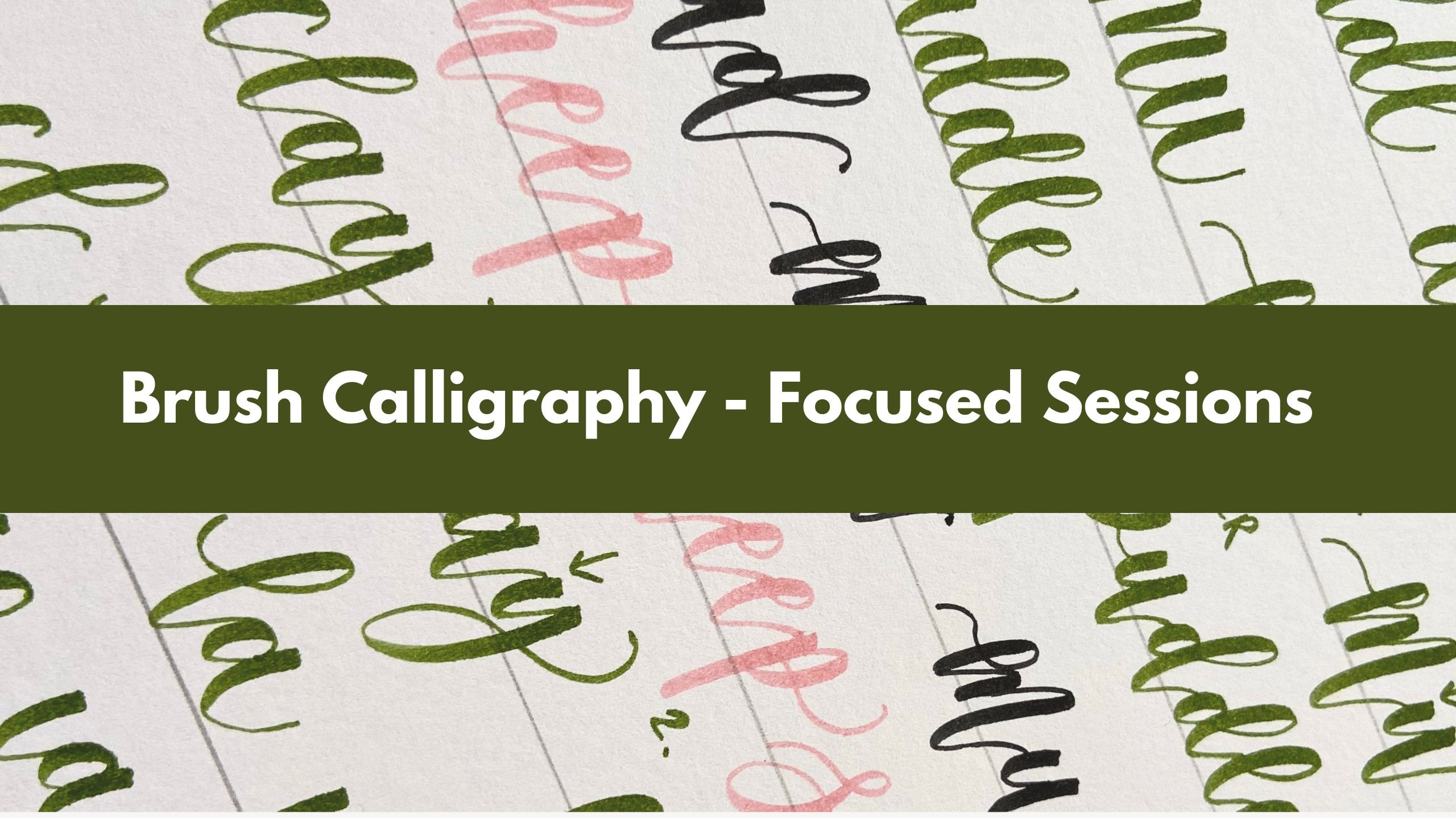
1. Welcome!: Hello, I'm Alena from
Creative Field Designs. Welcome to my calligraphy
greeting card course. I always said that it's
so much more fun to practice when you're
making some projects, where you're making
some end result. And that's what this
course is all about. We'll create some really
beautiful card designs. I'll walk you
through the process. It's going to be step by step. And you walk away
with some really, really beautiful cards in
your portfolio that you can create again and again for so many different occasions. So we'll mainly be focusing on dip pen calligraphy
and brush calligraphy. We'll do a bit of
watercolor and, like, hand drawn elements in
the background as well. So get all of your
creative tools ready. It's going to be a good
mix of different supplies. So I hope you enjoy it. I hope this allows you to get creative and just do something
relaxing for yourself. So grab your supplies
and let's get started.
2. Birthday Card: Sweet Pea Design: Hello, everybody. Today, I'll be sharing this super fun tutorial. We're going to create this
beautiful birthday card. We're going to do some sweet
pea drawing and coloring. There's going to be a
bit of flourishing, a bit of coloring. It's going to look beautiful. So probably take
around 25 minutes, I'd say, depends on how
much you want to add to it. It's really up to you.
And also depending on what size you're doing
it in. So mine's quite big. It's an A five. You
could also do this. A bit smaller, if you like. It's such a wonderful
card. I hope you enjoy it. I've loved love, loved
making it. And I com it. Yeah. So let's get started. So just getting all
of the tools ready, I'll be using my pen holder
with a nip and some ink. I'll make sure to
add all the links for all of the supplies. We'll also need some colorful pencils and also just, like, a regular pencil, just
to draw some guidelines, and that's actually going to
be the first thing we do. So whenever I have,
like, a blank card, I love adding some sort of line or a few lines to kind of
give me a bit of guidance. So maybe I'll just do the center line just so we
know where the middle is. And let's also do these
little lines on each side. So again, just to help us keep everything a
bit more balanced. So let's start
drafting our pray. So we're going to let
a happy birthday. And let's just focus on having our entry and
exit strokes really, really long because those will be the stems for our flowers. So I've done the first word, and you can see how
long those strokes are. I'm doing the second word, and I'm just focusing on that
really long stroke again. It is the fast draft. You can always erase
and try again. I'm just looking
at my second word, and I'm not quite happy
with the word bath day. I think there's something
odd about letter H and D. I'm just going to make this entry stroke
a bit more straight. So it's going to be like
a stem of the flower, and I want it to look
quite horizontal. So there we go. I might
also just check my lettuce. I'm not 100% happy
with my bottom word. So I'm just eraising
the end of it, and I will reposition my
letter So I'll just make a bigger gap between lettuce D and and this is going
to help the position, the letter D, a
better spot as well, and just make this ward
look a bit more balanced. So there we go. So I'm just erasing some previous
lines I had there. And I'm going to get rid of
these center lines as well. So I'm trying to erase as
much as I can at this point. I actually love doing this one. I just run over everything
with my eraser, and this will kind of keep
the guidelines there, obviously, but they won't
be like in your face. So it'll be just so much
easier to erase later. And now, I want you to
take your time here because everyone's pace
is really different. I'll speed this up a little bit, just so you can see
the process and, you know, so you can refer to
each letter if you need to. But I want you to remember to dip your pen
probably a bit more, especially if you're doing
this in quite big calligraphy. So I also noticed that I'm
not dipping enough here. I mean, I am dipping
enough, but it's quite hard to do,
like, big calligraphy. So, yeah, you just want to pay attention on your ink flow. My ink, I think is a
little bit too thick. I've been lettering a lot, and I think I've left
it out for too long. So it has definitely
become a little bit thick. So I'm struggling with
ink flour a little bit. You know, you can always
go back and color windows, blank strokes that you get
when you run out of ink. So yeah, I'm going to speed
this up so you can refer to the finished look of
this, but take your time. So once your
calligraphy is done, it's time to draw some
beautiful sweet pea flowers. So I'm going to start
with this right side. I'm going to use
this exit stroke as a stem of the flower. So I'm starting by drawing these little leaves at the base. And then I'm doing
this big fast petal. So let's try and keep the
drawings fairly thin. So once you do your first petal, you can then build on it. So you can do another
one kind of at the back and then do the
third one like this, maybe squeeze in one
on the side as well. So this one's quite buffy looking. I think it
looks quite good. Now, you can also
just kind of add in some little kind of
spirals. I love these. So, you know, sweet bees,
they've got these beautiful, like, spiral stems coming out. They look really
kind of like light. They are very delicate
and light flowers. So these are really beautiful. You can also add some leaves. So I'm just drawing some
really simplistic leaves. I'm doing the outline of the
leaf and then adding in a little a little line in the middle just for
a bit more detail. And I'm just adding more
of these little swirls. They look so fun,
like so much fun. Remember to keep them thin. You want to try and focus quite
hard on your pen control. Obviously, I love thinking of my index finger when I do it. I feel like my index finger
is like guiding my pen. That helps me see if
it helps you at all. Now I'm just adding
in some lines, trying to think of
the actual flower and maybe how the
shadowing would look. And I'm just adding these
little lines on each petal. We are going to color them in, so don't worry too much
about the detail right now, but it's just nice to
show a little bit. Now, let's continue. So I'm just adding
more of these leaves, and I'm going to start thinking about maybe doing
another flower. So you could extend
some flower heads from this main stroke or you could
start like another stroke. So I'm just adding, like, a line here and then starting to do a tiny little
flower head here. So this time I'm starting
from the center, and I'm just doing these, like, wiggiy lines around it and trying to
represent like a bud. So this flower hasn't opened just yet. I think it
looks really good. And again, more of
these little spirals. So see if you can make
them really light looking. So very quick movement. Try to keep them really thin. They should look really airy. Remember to add some maybe
leaves at the base of the flower head.
Let's keep going. I'm just extending
another little stem, and I might draw
another flower here. So drawing with the
name is so much fun. I love, love, love it so much. So I'm just doing
another flower, and I think I'm just going to do three petals for this one. So one on each side,
and then one in the middle and just
adding some leaves again, kind of at the bottom at
the base of the flower. And just kind of
decorating again with these really thin
delicate lines, adding in some leaves. Don't be afraid to go quite close to your lettering as well. So you want to make it
look quite balanced. So from time to time,
just kind of check in, have a look where you're at, see if you need to
add anything else or which direction
you need to, like, stretch your strokes into to make it look a bit
more balanced. So there. So I'm just adding some little lines at the
bottom of each petal here. And I'm starting to think
about the other side. So we're going to do pretty
much the same thing. You can, of course, position
your flowers differently, like, from different
perspectives. So I'm also trying to vary them so they don't
all look the same. So I'm starting with this
little petal in the middle. Then I'm doing,
like, a really soft thin like wavy
line on the right, and then something on the
top here, just building, building on and seeing
where else I can add some lovely strokes. So doing another one now, so focusing on the
ward birthday, and I'm going to do
another little bud. So this is going to
be quite closed. And I just think it looks quite pretty this way.
And there we go. So we're just going
to decorate this side in exactly not
exactly the same way, but in a very similar way. So just adding some
spirals, some leaves. And we're going to
do something else at the top and the
bottom of, you know, the actual phrase as well, just to fill in the
card a little bit more, and I'll come back to that. So keep going, keep
adding more leaves, more of these kind of, like, question mark shapes. I love calling them
that and just keep going until you're happy
with the way it looks. So once you're finished with
your entry and exit strokes, let's add in some
little florihes at the bottom of the phrase. So the trick here is to try and make them
look like they're open. So just notice how I'm doing one of these question mark shapes on the left and then doing another one on the right,
and then one in the middle. So that's kind of like the shape you want to try and follow. You can also do it
differently, of course, but I think this
just works so well. It looks so pretty.
So have a go. So I did add some thickness
there on my down strokes, and I'm just blending in, like, a thicker, like a mirror stroke inside or the outside of
each of these shapes. Also, some dots can
look really pretty. So just experiment a little bit. So you can add some dots
around the flowers as well. You can also use a metallic pen. Oh, I'm actually thinking
that would be really nice to decorate with some
gold or copper. Ink, that'll look really pretty. I'm thinking about the top now, so I'm just trying to
decide and obviously, be careful, try not
to smudge anything. So I'm just checking
that my flowers are dry before putting my hand there because that could
be quite dangerous. So if you do smudge
anything DeVore, you know, you can always
draw something on them. But I'm trying to
do this little kind of like a flourish
again at the top, and I'm just going to continue
in a similar way, really. And you can use a
pencil to, like, plan it out a little bit, or you can just follow
my example here. But I am kind of
thinking on the go, Oh, no, I did manage to
smudge it on the right. We'll see what I
can do about that. But yeah, we'll see.
It's not too bad. I might actually
just trim my card. So that's one way of doing it. But I think we've
all been there. Oh, my goodness,
just let me know if you tend to smudge
your work as well. It's quite annoying, isn't it? But it is what it is. So I'm going to speed this up again. So you try to get creative here. You can refer a little bit. And just now how I am thickening my downstrokes
here a little bit. So see if you want
to do the same, add a bit more
dimension to this, especially to the
top and bottom part. Once your collector
fy is completely dry, we can start coloring
in the flowers. So I'm just using
some colored pencils, and I'm starting with
this lovely purple color. And my pencil isn't,
like, 100% sharp. It does want to be
a little bit blunt, so you can do a bit of
mixing and so that you can control the saturation
of your pencil. And I'm trying to do the
top part of each petal, a little bit darker here, and try my best to gradually blend like a lighter
lighter purple at the bottom of each petal. So try to kind of press harder
and then transition into, like, lighter
pressure to achieve, like, a more of a
translucent look. But I think this
looks really good. And I'm just kind
of going with it, trying to think of the
flower itself as a whole, and maybe adding a bit of
shadowing here and there. But yeah, generally, I'm
just kind of doing, like, the top of the bet bit
darker at the moment, and it looks really good
with the black line details. We've added that, I think. So that looks quite nice. I'm going to do this
little bud in red, and I might actually blend in some other pencils kind
of on top later on. I'm thinking of orange. I think that'll look quite nice. So keep coloring in, play
with pressure. Keep going. You can do different colors, but I think purple, red, maybe orange and yellow just look
really, really good. So I'm trying to stick
with this combination, but I would love to see what
pencils you end up using. I really hope you'll share this. This is such a beautiful design,
and I'm actually really, really pleased that I'll have our little birthday card undergo because I always
run out of them. And even though, you know,
you might be thinking that I probably have hundreds of
them lying around, I don't. They do run out really quickly, so I feel like birthday
cards are just wonderful. They're such a
wonderful project, and I'll try to do more of
these with you guys as well. So I'm just moving
on to the next side. So for the previous flower, I tried to do like, a darker middle of the flower. So try to vary, again, like adding a bit
of translucency and a bit more saturation. At certain places
will definitely make your coloring look a bit
more professional here. Have a go yourself. So take
your time here, of course. I'm just showing you that
I'm also doing some leaves. I'm just using this,
like, brighter green, but also going over
some darker greens. You can definitely
blend pencils, and you might want to, like, very gently go over
your little flourishes, your little spiral shapes. So I'm just doing
it really gently. It doesn't even have to
be on the black line. I just want to show
some more lightness and more movement and keep
them really delicate and airy. And that's what I'm
trying to kind of show. So by adding some really
translucent lines down, you'll not only get a bit
of color do, but yeah, it'll also add a
bit more buffiness like softness, I'd say. There we go. So I'm just
coloring in all the leaves, and that's been much,
you know, the last step. You can take as far as you like. You can keep adding
in more green. You can even do some more
flower heads if you like. I actually like that this is
a bit simplistic in a way. You know, it's not
like overloaded with flowers and overloaded
with flourishes. Although, let's be honest, you can't have too many flowers. So yes, I do love this, and I think it's a perfect, you know, it doesn't take a
to make, which is also nice. You can still enjoy it. It's not going to tire you out. But the end result is
really, really pretty. Just to show you remember
when I said about blending, so I'm just adding a bit
of red into my purple, and this just adds a
whole new look to it. So when you combine two
pencil colors together, it's just so beautiful. I definitely just looks a bit
more illustrated in a way. So it doesn't just look like, you know, it's a children's book and
you've done some coloring. It definitely adds a bit
more dimension in there, and I think it's a
really good trick. So pencil blending isn't something you probably
think about a lot. So I was also surprised to kind of learn
these techniques, but I really, really love it, and I think you
should try it, too. You can blend some orange
maybe or some red into orange, actually, that might
look really good. Obviously, you
don't want to blend two colors that are
really contrasting. You do want to stay within, like, similar hues, and that's going to make
it look really good. So adding some maybe yellow into orange there and a bit of
red into yellow as well. Devi Co guys. I hope you
enjoyed this at Torville. I loved filming this so much. It's definitely
one of my favorite probably projects of the month, and I hope you feel the same. And I would love, love, love, love, love to see your work. So please share I
always say this. Just remember that
our Facebook group is such a safe and friendly
community to share with, and it might just, you know, make someone else's day. It might inspire someone else
to pick up their supplies. So yeah, it's just
nice to share. So I can't wait to see yours. Don't forget to
raise your pencil lines when everything is dry. And Devi GoGuys I really
hope you enjoyed it.
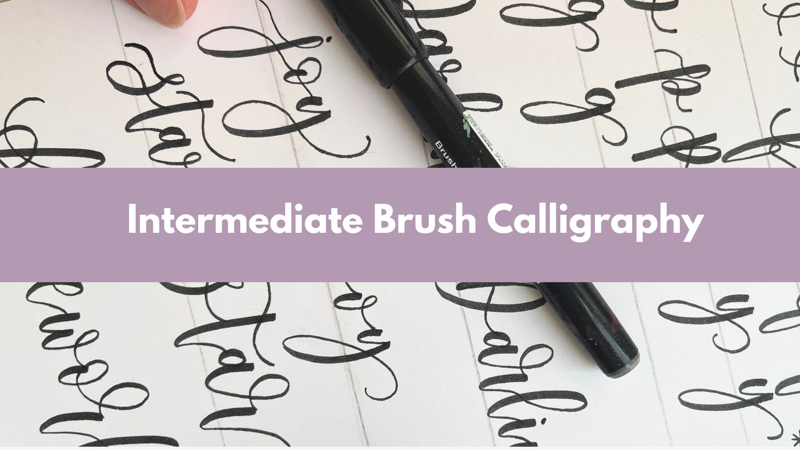
3. Birthday Card: Floral Design: Hi, guys. So I just
dropped into the studio to make a last minute
birthday card for my niece, and it's looking really pretty. So she's just turning 16, so I wanted to go for
something really, really bright and pretty. And I think this
will do it a job. So, it says, Let's
celebrate you. So I think I'm a
bit bored of just, like, doing the regular
happy birthday. So I'm trying to
do, like, different phrases that are birthday
related, as well. So yes, so come along
and let's do some drawing together and create this beautiful, beautiful,
beautiful card. I hope you enjoy the process. Let's get started. So let's just quickly run
through the supplies. So we'll need some sort of a fine liner pen to draw the flowers with,
and I'll have two. So one's a bit chunkier. So this one here, I'll
add the link to this. And the other one is a micron pen, and
it's a bit thinner. We'll need some pencils
and, of course, some sort of a pen
like a brush pen that you'll do calligraphy with. And a pencil will
be helpful as well, just so you can do a
nice draft together. So let's start by using a pencil and just plan out our design. So the freddo letta
is, let's celebrate. And I'm thinking of
doing it on two light. So the flag just going
to say, let's celebrate, and then we can do a
nice underneath, okay? So just doing it in pencil, adding a bit of
bound or red a just focusing on the style
of the lettuce, but obviously not
doing calligraphy. Now for the flowers, we are just going to draw a
couple of circles and ovals. So we're going to
do a little circle. And then do like an
oval shape next to it. You can do it in a corners
like I'm doing here. And maybe you can
squeeze in, like, a third one at the bottom. And we're going to start filling in this circle with petals. So we're thinking
of the center of the flower being in the
middle. And then there we go. And then we are just kind of
working around the center. And the reason we have an oval, as well is because we can create different
perspectives of the flower. So for the center of this
one, I've done, like, a half circle and kept some
of the petals be shorter. So the petals at the front
are definitely shorter, and it just creates like
a different perspective. It can look really, really good. And I'm quite tempted to just add another little
circle in there. So I'll do another one,
maybe a bit bigger. And you just fill it
in with four petals. You can also do five if
you have enough room. And then from there, we can
start decorating with leaves. So you can just do a few
branches and do like an oval, like a round kind of
shape with, like, a pointed tip, so
like a leafy shape. They don't have to be super
accurate or anything. And remember, this
is your first draft that we can always build upon. So it will definitely
be probably a bit different from
your actual pencil, sorry, your actual pen drawing. So there we go. You just do a couple of leaves, a couple of branches, kind of facing different directions. And if you did go a bit too close to your
lettering, don't worry. We can always change
the lettering as well. Now, I'm going to do the
same thing at the bottom, so just filling in the
circle with petals. I'm thinking maybe to
do, like, a really, really short one here at
the front and then build a pon so I could maybe do some bigger petals
in the background. So I'm just really
thinking about the process and,
like, going around, imagining how this
flower position. You know, when I look at it,
I imagine all the details. So there we go. So we could do
something like this, so this is a bigger flower. I'll look really nice. Now, let's do this oval one. So starting with a half circle, doing some shorter
petals here and there to create a
different perspective. And let's just do this
little circle, as well. So I might actually just do, like, a closed off flower. So I'm just doing,
like, longer petals that connect at the same
base at the bottom. And then filling it all
in with some more leaves, this is going to look
really pretty when we go over the pen and color it in it's going to be really nice. So having this plan, having this like, little
pencil sketch is so helpful. And it also makes the process so much more fun because, you know, you've done it once
now, and then when you go over with the pen next, you can actually refine. I'm going to actually erase. I'm going to rub out
my calligraphy here because it was a bit too high. So this is also great because you get to redo it as
many times as you need. So I'm going to do that
celebrate a bit lower and do the underneath. So I think this looks a bit more proportional in my example. See if you can add in some more leaves just to fill in the
background a bit more. You can also add some, like, extra petals in
your first flower. Some more leaves, like, really, really natural
looking leaves. I'm not spending too much time and thinking about
the shape of them, do these, like, rubbly lines, really. There we go. So I think we're ready to
go over with a brush pen. So I'm using my tumble
for the Nuke brush pen, and I'm just going to pretty
much trace the pencil lines. So again, if you feel like going over your pencil
lines a little bit, that's absolutely fine.
Feel free to do that. If it makes more
sense, and obviously, your lettering is a bit thicker
when you use a brush pen, so it might actually shift to the right a bit
more naturally. So that's absolutely fine. It doesn't have to follow the pencil line.
Like completely. So, take your time here. Make it look all
pretty. There we go. Don't forget to maybe finish the line with a
nice exit stroke. So I'm finishing the letter like a nice little half,
oval shape, almost. That looks good, so I'm
going to grab my fine liner, and we can start
filling in circles, so going over the petals. I'll start with this
one, this lava flower. So I'm just starting by going
around the petal shapes. And for the center,
we can, like, add lots of dots in the middle and also it lines.
So it's really up to you. We just want to dark in the
area. It wants to look dark. Everything is very
compact there, so quite close together. Let's do another one. So going over the petal lined doing the
circle in the middle. It's a lot and lots of dots
or little lines so dark in the area. Keep going. So the moles you do that
the darker will look. And let's do this bigger one. So we're starting with these
initial petals that we drew, and we're going to do
the outer ones as well. So these are definitely be
thinner and like longer. And the center again. So noise little circle, lots and lots of dots. To make it look
like there's a bit of dextra there, lovely. So now the next step, we're going to start
going over the leaves, and it's so much easier I find to do leaves when you have, like, a rough plan. And you know where
you're stretching them, how you're positioning them. So I can truly relax. I feel like I can
truly relax into just thinking about the flow
of the leaves, the shape. So I'm just doing
these fairly quickly. I find that they flow a bit better off and you
go a bit faster. So they're definitely
quite natural looking. I try to keep them
fairly big and round. And do a little line detail in the middle as well,
draw the center. See if you can draw them
as if they're one line. So when you do a leaf,
just go back and do the line in the
middle in one motion. There we go. So that
starts to look quite nice. Lovely. Let's see if you
need to pop in a few more, even if you don't have
pencil lines for it. So your composition
will start to evolve, you know, when you
might find it. Actually, you need
something else there. Now, I've grabbed my fine liner that's a bit smaller,
so a bit thinner. The tip is a bit thinner. And I'm going to
do some shading. So we want to add, like, lots of lines. We want to draw some
lines around the center. Imagining these lines, these
shadows are coming out of the center of the flower and stretching into each petal. So lots and lots of thin lines. All of them kind of go
back to the same base. So you get this little, like,
a triangle shape almost. Okay, so you can go over them a few times so you want
to shade even more. So they want to be,
like, positioned really closely together. And be really, really thin. If you don't have a
different size vine liner, you can also just use the
one you drew with before. But just make sure that
these lines are really thin, otherwise, you're just
going to look a bit harsh. So for this bigger flower, it can be a bit difficult to determine where do you
want to add shading. So again, think of
each individual petal and imagine that these lines are still coming from the
center of the flower. So where do you need to
position them so that they appear as if they are
coming from the center. Even if the leaf is behind, you might just see a little bit, like the top of those
lines, which is fine. I'm also just really
carefully going over the outline of each
petal. I love doing this. I feel like it just gives
a bit more contrast, and this looks really nice. Even if you don't go over
the same kind of point, it still creates,
like, little layers. So even if you just go over
your initial petal lines, it'll create a nice
little fold effect. If you know what I mean,
give it to go and C. If you like that, too. So there we go. So this
sars look really nice now. You can also add some nice
little lines on each leaf, just so that they
appear a bit smoother, a bit more detailed as well. Lots of thin lines in each leaf. Take your time here. So
this gonna look really, really effective as well. So I might speed this up, so I'm just going to
finish the leaves, and they'll be the last
step for this top part. If you really wanted to, you
could add even more shading, so more.in the middle. So make sure that that center, the flower will really,
really stand out. So it will just make
it look really, really good that way. So you might even add
some more lines that are shorter and closer
to the center, and then just make sure that the center is
looking quite dark. So I'm just doing some
final touches there, and this is it, really. So I'm going to do exactly same thing to the
bottom of the card as well. And we have different size
flowers here as well. So you just work with
each individually. And that's pretty
much the same thing. So let's do that. Try to do it at your own pace, and I'll come back
and show you how to colour everything
nicely with pencils. So feel free to
pause the video to finish this step
before we continue. I So this is starting to look so pretty. I hope you managed to
finish yours as well. So I'm still going
back and trying to, like, darken the center. I can never stop, so make
sure you finish yours, and we can start
colouring them in. So I'm just going to use, like, really simple basic pencils, and I've got this
lovely orange color. And the idea is when
you colour them in, you want to try and play with
pressure of your coloring. So some of the areas
can be darker, you can press down be harder. Some of the areas
can be lighter. So if you play with that,
that will look really good. Also, you can get rid
of any pencil lines. If you still see any pencil
lines poking through, I think we can just rub them out so we don't get distracted, and so it starts to
look a bit more neat. Also behind your calligraphy,
just really gently. Get rid of all the pencil
lines before we continue. So I'm back to
doing the coloring. So I'm going to do this
fat flower in orange. You can do any colors
you like, of course. And I will also blend a
little bit of red into that. So blending pencils is so
much fun, and, you know, you can really show those two different colours merging together, being
blended together. And it can create this really,
really beautiful effect. It can look really,
really professional. And I think I'll do the yellow. I'll do the center in yellow, so you might need to
press down really hard in the middle to get that
scena nicely yellow. Now I'm going to do
another flower in purple. So getting plumes, pressure, trying to keep some of the basil super light while adding, like, a lot of color. To the other ones and doing the center in yellow
again, keep playing. I really love this purple color. I think I'll do this big
one in purple, as well. So this pencil actually
is really, really blunt, and I find that coloring is so much easier when your
pencils are blond. So if they're really sharp, I think everything just
appears quite dark. So it's quite hard to get
that really soft look. So see if you have any
blunt ones as well. And try to use those
really love this color. I will try and go a bit harder, maybe on the edges
of each petal. So kind of, you know,
we've the shading with the lines with some lines, but you can also
play with coloring and do some darker areas. Maybe at the top of each petal, that can look really good or
like a side of some petals. Why I min do the
swinging yellow, just to spice it
up a little bit, try to use different colors. So we got orange, kind
of purplish pink, yellow, and I'm also thinking
of doing some in blue. I think that'll
look really good. And I'm just focusing
on those warmer colors. So red, yellow,
orange pink, purple. They're wonderful
to blend together. So you can definitely
just go over some parts of each of these
flowers in different color. Not being too harsh
with red hair, so it's just really,
really gentle. Doing just like a
part of a petal, in a different color,
doing a bit of blending. So I'm just thinking I'm really thinking of doing some in blue. So I'm trying to
find a blue pen. So I'm going to do this
little one in blue. So take your time,
take your time. Try to think of colors, try to blend some of them. Try to think of the pressure you apply when
you're coloring in, and just try to relax into it. It's quite a nice
process to color up. So I'll let you do
it at your own pace. I might speed this up, and we'll do some of the leaves
together in a minute. So when you do leaves, try to choose a darker green. So if you have a darker green, I feel like you'll
just look better, or if you have two
shades of green, you can mix them together. So I really wish I had, like, a dark darker green that's got like a bluish tone
to it, but I don't really. So I've got this like lighter, lighter green and
a darker green. And I think so I'm starting
with the darker one, but I might actually blend in some slightly different
different shades of green as well. So just in the same way,
we did the flowers, try to vary the pressure, keep some of the
areas a bit lighter. I've still got
some pencil lines. I'm just really carefully,
getting rid of some of them, try not to try not to raise
my petals. There you go. I think that looks really
good, so blending, blending and doing
each leaf at a time, really focusing on its
translucency, really. So we want to keep some
of them really light. And I'm doing this
front one really, really dark, so making
them quite dark here. So keep going. Have fun with it. See if you want to use two
different shades of green. And this will be pretty
much the last step, so I've got a
different green here. So I'm going to do
a few individually, but then also you can
just go back in with a different green on
top of this green. So blend them together. This can look really,
really good, as well. Keep going. This is
also quite relaxing. So try to just go at your
own pace and relax into it. There we go. I'm just doing
some final finishing touches, erasing some pencil marks, and seeing if I need to go
back in with a fine line or to just make that shading
pop a little bit more, checking my calligraphy as well, if I need to go over
with a tip of the brush, or some lettuce, just to kind of perfect them,
correct them a little bit. I mean, it's not about
perfection, but, you know, sometimes you'll just need to make sure that your strokes
look a bit more smooth. So there we go. I hope
you enjoyed this. This was so lovely to make. I've really, really enjoyed
sharing this with you, and I can't wait. I can't wait to
see your results, so I'm just going over with the fine liner to
correct a few bits. Sometimes those detail
those details can get lost when you use when you
color in with pencils, so it's really nice to just go back and refine a little bit. But yes, this is
the finished look. It's really hard to stop
because I feel like there's always something more
you want to add in. But I hope you
enjoy the process. Please, please, please share in the group or tag
me on Instagram, share this card I would
really love to see. What you made out
of it and how you approached it and what
composition you came up with, and whether it's looking similar to mine or slightly different, I would really,
really love to see. Thank you so much, guys, and I'll see you in
the next tutorial.
4. Thank You Card: Climbing Rose Watercolour: Hello, lovely
members. Today, we'll be painting something
really beautiful. We're going to make this
thank you card together. We're going to paint
a lovely climbing rose and do a bit of
lettering, as well. So if you do need a
card for somebody for a birthday or a thank you
card, this is perfect timing. I know that I do, for sure. So you can find all
of the links and all the supplies
below this video. And when you're feeling
ready, let's get started. And I'll be using like an
A five piece of paper. So I've just torn
A four into half, and now I'm going to use this and fold this
into half again. And when you fold, try
to be really quick, then the fold would
look a bit more smooth. Yeah, love it a little cute. Like a fairly small
size card for today. There we go. So we can do
a bit of lecturing here so we can write something
like, thank you, maybe. And then we're going
to do a climbing rose design around the card. I use this Tambo for the
silky, fine tip brush. And this is something we can
start with. So have a bot. We just do a little thank you or happy birthday or whatever it
is that you want to write. So I'm going to do thank you, so just doing a downstroke, a little cross line. I might merge T and H
together like this. I might do a little
flourishing on the edge letter H like that. Then continue with letter A
that's a little bit smaller. And we could detach the
letter A like this. That always looks really good. And then also do like a drop. When we finish the w, just making it look a bit
more interesting. There we go. I'm doing the, doing Y O and. And I just do it
kind of simplistic, so it doesn't it doesn't overpower the whole
look to that. I think that looks quite
nice, just really simple. I use a black pen because
I think it's going to contrast quite nicely with
what we're going to paint. So we're going to paint a
lovely climbing rose design, and I'm going to use a
number ten brush for this. And we're going to start
by so wetting our brush. I just make sure my
brush is nice and wet. And now I'm going to pick up
some red from my palette. So just find a
nice shade of red. So he wants to be fairly
bright like this, and we're going to
squeeze in some white, so I'm just using a tube, but surely you have white in your palate,
I'll just ran out. So I'm mixing red and white
and adding more water, so I get this lovely kind
of like a pinkish ton, and I'm just going to transfer a little
bit of this paint into another kind of
place on my palette because I don't really want a
lot of paint at this point. I want it to be so watery. And this is what we're
going to start with. The first thing
we're going to do is just paint like
big blobs of pink. So just imagining that
the rose will kind of come this way and then
also here at the top. So just imagining that maybe
one big rose will be here. So I'm kind of painting this, like, circle Sackle shape, but it doesn't really it doesn't really look anything
like couse at the moment, so I'm going to do quite a few. Some of them can be
in clusters together, especially here where the
branch will probably kind of go this way, and then maybe
you'll have a branch that kind of goes this way. So lots and lots. Maybe a little cluster here. This is kind of like a simple, fairly easy loose
watercolor technique, but it's going to look
really lovely at the end. So yeah, just make
sure that your paint is super, super watery. And obviously,
everything that is closer to us will be bigger. So these front ones
can be really big, then we can cluster them
together a bit more. So just try to make these
blobs fairly circular. So they do want
to be quite round looking for best results. So we're focusing
on this area and then the middle and
here in between, we can just have
a lot of leaves, and I think that's going
to look really good. Maybe let's do a
couple small ones here at the bottom as well. So I'm just going to
let these dry now. So just like little
circles like this. Okay. Now, whilst we
wait for this to dry, we can prepare our green. So I'm gonna be using
this dark green for my palette and I'm just going to transfer the tiny
bit into my palette. And I'll add a little
bit of yellow to this. So this I just brighten
this up slightly. So I'm dipping my yellow, trying to scrape
some paint out of that cause I'm kind of running out. So that's a bit too bright. I'll add a bit of green again. So you're just going
for this, like, really kind of
bright green look. This will look really,
really good with pink. And notice how I don't really
have a lot of paint here. It's all quite
minimal, you know, I don't have much at all,
and it's also very watery. So just add a bit more water. To make yours look
quite similar. So this ones to be so watery. And again, you can take
this water version, pop it into another
place in your palette, and this will create an
even more watery version, and I might just work
with this, to be honest. So super, super light. Okay. Now, I'm just
starting to kind of paint the background in these very
kind of careless strops. They don't have to be in any particular size or,
you know, style. They don't have to go in
any particular place, but we just want to show some green at this
point in the background. And that's all I'm doing, and it's going to
start to look really pretty when we fill it in more. And here at the bottom, so yeah, just kind of try to make
a natural transition. So you just paint a bit
of a background there. So it'll stretch this way. So yeah, it will look
nice. There we go. So that's, like, a
really fast layer, and this should
dry really quickly because we weren't actually
using a lot of paint. I mean, it is very watery, but there wasn't a
lot on my brush, so so just going in between. And if you see some white areas, that's also fine ovary, you can definitely leave
some white gaps in between. So yeah, walking with
a bigger brush number ten will be great for this because you can really flatten it and just wak your way around. Lovely. So that looks great. Now, we're going to pick
up some more green, and I'm going to add
it to this first, well that I mixed in. So let's do it together.
And this time, I'm going to add a
little bit of brown. So instead of yellow, I'm adding some brown to just
like really darken. So just really dark in this existing green
that I have here. I definitely turns really dark. I'm just going to add a bit more green again to balance it out. And this looks great. So now I'm going to grab my
number seven brush. I'm going to grab my number
seven brush, dip into here. And I'm just going to
start like stamping. So I'm just adding like a
stamp off my brush like this. It creates like a
little leaf shape, and I'm going to do this
just like around all of these little pink buds just kind of randomly
here and there. It doesn't have to be
in any particular way, we do want to show a
little bit of movement. You're gonna fix this because I dab a bit of green into them. You want to show a
bit of movement, and some of them can
be so, so small. This will just look great when we add in some bigger
leaves as well. So just do a bit of
stamping with, like, really dark green here and there, especially
here, remember? So we're doing this
middle part quite leafy. So it's going to be super leafy. So you can be quite
generous with that. You can then go
back to your number ten brush and just
do the same thing. So maybe adding
some bigger stamps. In between. So obviously, we want the background
to be fairly dry. It doesn't really want to bleed, but as I said, it kind
of dries really quickly. So hopefully, yours
is dry as well. If it isn't just
give it a minute. And also the pink flowers are like most of them
are dry at this point. So I'm just adding
lots and lots of these floffy stamped leaves. You can rotate your brush as well to kind of
get a good angle. Maybe some of the leaves will get quite close to your
lettering as well. Gonna some big leaves here
near the big flowers. So there we go. That starts
to look quite interesting. Now, I'm going to go back
to my number seven brush, and we're going to pick
up some red again. So I'm just adding some
red to this pink again, so just darkening this pink up, making it more saturated. And I'm going to
start to go in to these roses and just do
like little see shapes, especially towards the middle. So all I'm doing is, I'm going to show
you on another page. So we're just doing sea
caves, like thin, thick, thin, but then, like,
a little carve. So I'm just going
around and trying to do a lot of these
petals that look like little sea calves in this, like, circle circular movement. So starting with the middle, it's quite dense in the middle. And then the more strokes. You can make them a
bit fluffier towards the like the outside
of the rows. You can also add
more white to this, so it does look a bit more pink. Mine's definitely a bit more
red than pink at this point, but we want it to be
really saturated. So you either dip
in red or just add more white and red
to your palette, it creates this darker, more saturated pink, and
that's what I've done here. Some of them can be so small, it could just be like a
little blob in the middle. This can definitely look
really pretty and effective, but still quite loose. You know, we're not showing a tremendous amount of detail, but we're definitely adding more structure to these
individual pink blobs that they've created here. So this is fairly I don't want to say
easy, but, you know, fairly quick technique,
I'll probably say. You know, you could
definitely paint much more detailed rows, but this is so beautiful and it just looks amazing
when it's all done. You don't need to be a
watercolor prow to do this. And I think that's
what I love about it. You can everybody can do it, even if you're not very
experienced with the paints. I'm just painting
these sea calfs all around. I'm being quite quick. I'm not like, looking at
each blob and thinking, Oh, you know, where
should I position this? So I'm just going in and
trusting the process, and I highly recommend
for you to do the same. I trusted you we'll make the strokes where
they need to be in a way. And if your green
background is quite dry, you can also just add in
some smaller blobs of pink. Here and there, you
can just do like little buds or just turn
them into, like, more roses. You might want to add some more maybe next to,
like, existing ones. They'll do look really
good in clusters. So all I'm doing is
just like lot lot of sea calves and seeing
if I want to blend in, create another circle next
to these existing ones. So there we go. On walls,
this is fairly wet. Let's dip into red
again and just maybe dab a bit more like
saturated red in the middle. So this will be just for
the center of the flour, but this will just create, like, a nice shadow in there because it does want
to be dark in the middle. This one's still
drying because I got to fix it, so
I'm gonna let it be. So we can always come
back to this and do it again because sometimes
it might take more than, you know, one layer to do this. There we go. I think it
starts to look quite pretty. So now is the time where we
add in maybe a couple of branches and just show show everything a
little bit more like add more structure to it. So let's dip our number
seven brush or, like, a smaller brush, whatever
side you're using into brown. And I'm actually going to
go for this darker brown. And it doesn't need
to be very watery. So this wants to be
fairly saturated. And this is where
we're going to walk with super super light pressure. I'm going to make sure
that nothing is too wet. So we're not going to
touch the actual roses, but just make sure
that your leaves and everything in the background
isn't too wet at this point. We're just going to kind of
create these little branches. We're going to paint
these really thin strokes and kind of see where we can attach these little individual flower heads, try to imagine how they would
be coming out of, like, the side or how
these branches would be growing out of the
other branches as well, and how would they hang out? Just try your best kind of
adding in these thin lines to show that there are some
branches, basically. So A lot of it wants
to kind of hang down, so you'll probably do
a lot of these, like, horizontal looking lines
that kind of are, like, quite straight like
this, but then you just connect to other parts. And some of the branches can
just be empty for now and we can just add on some
leaves onto them. So just try to show some
thin lines here and there. And sometimes, you
know, they don't all have to make a lot of sense. That's I think what I'm
trying to say that they can definitely just be a bit
randomly positioned. And when we add more leaves, it will all look more
natural anyway, I promise. So So you just adding
some nice detail. And this will make it look like we've spent so
much time on this, but in reality, you know, it is a fairly quick
little project. So I know it can be hard to do those thin
strokes, just try your best. Definitely gets
easier with practice. So really quick and thin is
what we're going for them. Okay, so this is a time
where I'm going to add even more kind of
saturated green to my existing green and try to do some more
detailed leaves and maybe just start to look at these branches and
try to start filling the mince and do a
little outline of the leaf and then color it in. And this is what I
love doing when I work with something
really small like this. So just with the
tip of the brush, just do a little outline. And then coloring it's much easier to do the
shape of the leaf. With the tip of the
brush and then just color it in rather
than rely on, like, pressure changes and you know, you can also do your
leave like this you go. But you got thin, thick thin, thin, thick, thin,
and then do it again. But sometimes it's
just nice to do this, where you do the outline
and you just color it in. So that could be especially
for small leaves, as I said, you can continue
with those branches. I know that you use brown, but you can also just
extend some green branches. Imagine that those are
like little leafy ones. So I'm definitely going
over some of the brown with green and adding lots and lots and lots
of these branches. And from time to time I
might dip into darker green, pick up some more like
darker green color. And the ones here are
kind of going upwards. And we just want to fill
in this little bottom one, especially with lots
and lots of leaves, making it all look quite busy. And just keep going
like this, really. So that's that's going to
make your design look full. And that's the trick to it. So to add as many leaves as you can and try to change and maybe add a bit
more brown here and there. They do want to look
slightly different because Obviously, you know, they are
different in nature. So having some really
dark ones can make everything look especially good. And, you know, the
more you do this, the more you start to see that your background
starts to disappear through the green background
that we've painted, but you might see
the peek through, and you might also see some, like, white areas here
and there. That's fine. You can definitely
have some white areas, and that would be
just a little gap in between your branches. But yeah, this is
quite relaxing to do. I might actually speed this up, so you can do it
at your own pace. It's nice and relaxing, so keep adding leaves in the most natural way you can kind of show them,
show the movement. Yeah, don't forget to kind of change your green
from time to time. But yeah, just don't
forget to change the shade of your
green from time to time and also show some thinner thinner
branches here and there. Okay, so now I'm just adding in, like, another layer of, like, dark or red and just dabbing some paint into the middle
of each of these roses. And that'll be like one of
the last steps, really. So we made the
leaves really dark, but now we just need to add a bit more contrast
into those roses, working with these
sea cups and adding more paint in the
middle of the flower, especially we'll create
this beautiful deep look and there we go. So that's pretty much the end. You can also fluff them up a little bit if you
want to do, like, some lighter color in
the background again. So if you have a
lot of white space, you can definitely
just use your pink to kind of go around and make your rouses
look a bit fluffier. But then again, I think it's
nice to have a bit of white, so don't get rid of all of it. I'd say. So yeah, there we go. I hope you enjoy this tutorial. And if you really wanted to,
you could add in some, like, really light pink strokes just like around your lecturing, and that might look quite
dreamy, as well, I think. So I might just do a little
bit of that just to kind of make it all come together
a bit more. So there. So that's the end result. I really hope you enjoyed
it. I love it so much. It makes such a nice card. So, yeah, I can't wait to see your version of this,
well than everybody.
5. Cherry Blossom Drawing: Card Design: Hello, everybody.
In this tutorial, I'm going to share this
beautiful, beautiful, fairly easy cherry blossom card that we can
all draw together. We're not going to do any watercolor painting or anything, but we will do a
bit of blending on brush pens to kind of achieve
this beautiful background. But it's such a lovely card. I'll definitely definitely be
gifting this to my friend. I did need a birthday card, and I think you can
never have too many. Like, birthday cards
is something you always always want
to have lots of. So this tutorial is going
to be so, so spring themed. We're going to do this
beautiful beautiful blossom, cherry blossom tree, and I hope you enjoy
it. Let's get started. It's fairly easy to do, and I would love
for you to join in. So let's try this together. I'll be using these supplies, so I try to get out all of my
all of my like most of my, like, pale pink colored pens. I think, well, I intend
to use this one for sure, which is a tombo Brush, this is the town 817. And I'll use this green pentel brush sign pen for lettering. I think it's just going
to add really nice. Natural, like a spring, I'm touch to it. We'll need brown, so I'll be using this brown color,
which is fairly light. You could also use a darker
brown if you've got it. So I'm going to be
using this again, by tumbo and it's in shade 947. And then we'll also need a
light like a pale pink color. I've got a couple
here, so I've got this fine tip brush sign
penned by Pentel again, and also this Ecoline brush pen, and I might actually use this. I also kind of plan to blend
my paint a little bit. So I've got a pot of
water on a little brush. It can be any brush as
long as it's round. And also paper. So I got this blank
greeting card that I just bought in
hobby Craft, I think. You don't want it
to be too thin. So you can do a little
test before you begin. But if you use watercolor
paper, you'll always be safe. So yes, as long as it's
a little bit thicker. So this is, I think, 250 GSM. Let's do a birthday card,
so I'm just going to let a happy birthday in two lines. You can use a pencil to, like, plan out your lecturing, and I might actually do
a quick draft as well. So I'm doing it super, super lightly, so you might actually not
be able to see much. So actually, I want to go for a small scale lettering because a lot of the
background will be taken up by drawings of cherry blossoms and I might
start somewhere here, which is quite close
to the center line. I'm going to redo
it and do it a bit more to the right
to balance it out. So that's why using a pencil
is really, really helpful. So the first draft you do, just do it really,
really lightly. Okay. And then I'm
keeping it simple. It's fairly short entry strokes. The wide bath is quite long, so I'm just making
sure to start it a bit more to the left. I'm going to keep
my asenda shapes, so these are the ones that
stretch up without a loop. So I want them to be
quite simplistic. So yeah, in general, I'm
just going for this, like, small scale. Simplistic lettering
because our main focus is going to be kind
of on the background. So this looks quite nice. And when you are confident and happy with the way it looks, go ahead and go over it
with your brush pen, so I'm going to use this
lovely green colour. And honestly, it just takes
so much stress away when you have some
guidelines to go over. So having a draft in
pencil is super handy, and most of the time
you're not even going to see the pencil underneath. So just focusing here to get
my strokes thick and thin, going fairly slowly.
Take your time. So once you have your
draft, your pencil draft, it's just so much easier to
focus on the technique a bit more without having to think about the
guidelines as much. I might divide this
last up stroke because it's quite long,
so I've done half of it, and I might just have a little pause before I
stretch this to the right. And I finish off by doing a cross line on the letter T and a little dot on the letter I. And this just looks lovely. I'm really happy
with it, so super, super simple, but gets
the message across. Lovely. So now, with
my brown color, I'm going to start
drawing branches. And some of these will
be quite thick looking, and some of them will be
like, really, really thin. And we're going to
try and resemble, like, a cherry blossom branch. So I'm going to do
one that kind of starts here and
stretches to the right. And I might do actually one that starts here and also like
stretches to the right. So let's see what happens, but I'm going to start by just drawing like a little stem. And I'm going to do a
parallel line to it. So I'm just kind of
following this fast line and just going the same direction. And then from there, I
will do another branch, and I'll start drawing
lots and lots of branches coming out
of that one stem, and some of them can
definitely be quite um you know,
interesting looking. So this one here is going to be quite natural
looking like that. Some of them can
be thin or thick. So I'm just doing this. It's a lot and lot of
continuous branches. And when I finish them off, they're not really pointy, but I do go to
finish off properly. So all of these interesting
shapes And here at the end, try to do like little ones. So like tiny ones will go at the end of the branches
towards the right side. So again, just do
as many as you can. Stretching them nicely.
And you can also color in your stem in places, but also leave some,
like, white detail. I think that will
look quite nice. Just add a bit of variety there. And don't be afraid to finish your branches quite
abruptly like this. So we often see this
on cherry blossoms, so the branches are quite blunt. I would say that's how
I would describe them. I can't go wrong here, you know, as long as you keep adding
on branches upon branches, you will get a
lovely look and you can then reassess and see once you get
this far, let's say, you can reassess and
see if you want to go over some of those thin strokes again to thicken them
up a little bit, because we don't want,
like, a huge contrast. We still want them to look
like they're part of the tree. So something like
this might be nice, might extend this branch
kind of hanging down. And they are very often
kind of like angled. So now is how I'm adding a beautiful angle there and maybe starting to go
in a different direction. And again, let's
do some tiny ones. Lovely. Hanging down like
this looks quite pretty. And again, I might go
back into here and adding some more of these
thicker stronger ones. I might even do some here. Might go over the base branch again and just thicken it up a little bit because it is kind of the main one here, isn't it? And then I might stretch
another one kind of underneath going this way. And again, this will
be a thicker one. So I'm definitely adding a parallel line to thicken
this up right away. I'm coloring in but not
being super precise, just kind of doing
these quick strokes. And let's say this one's
kind of going this way. I know about you, but I love
cherry blossoms so much. I've been telling
my partner already that I got where to go on
a cherry blossom walk. We've got this lovely park here in Brighton and every year. Um, it's called Hove Park,
and they've got this, like, beautiful, beautiful street with a
lot of cherry blossoms. Right, I'm just stretching
them more and more. And again, might do
some little ones to kind of meet this branch, not positioning it
too close because I'm aware that there'll be
some flowers, right? So we don't really
want to overdo it, but I might just do some of these thicker ones
here at the front. And everything's kind of
bigger here at the bottom, kind of at the front because
imagine that you're looking at your trees from
this perspective. So obviously, everything
that is closer to you, like these bottom branches
will be naturally bigger. And that's just,
you know, kind of, if you think about the
perspective and all that. So quite handy and just see where you might
want to add something else or if you're happy with
the way your branches look, you can leave it there for now, but I'm just going to
color in this one. And I think I might
just add a couple more on the fast one here. So you can definitely
just kind of do it on your own or
follow me if you want to be quite precise and do it in exactly
the same way. I know it can be hard to
kind of imagine how would a tree grow out
of its main stem, but I think there's no
right or wrong, as I said. It's really hard to not make it look like a tree
if you know what I mean? So Right. So this is great. I feel like I could add in
some like really tiny ones. Like, you know,
like, a tiny detail. Maybe when the branch is about to start to
grow, but it hasn't. I'm sure there's a
name for it. I forgot. Not a bud, but you
get what I mean, like a little little branch. And this just adds, like, a
really nice detail, I think. Definitely, definitely. Oh, it's like a nice contrast, even on your little branches. I think I'm quite
happy with this. Once you start drawing
these branches, it's like you can't stop, so I'm literally
going to stop myself. So I'm just going to go over
some of the areas again. So I want some of the
areas to be quite dark, and it's really
it really doesn't matter where you choose to
have those darker areas. But by just going over even your thick part or even the thin ones
again and again, you'll be able to darken them, take them shade further and
just darken them slightly. So it does look a bit more
natural because obviously, you know, all of them
can't be the same color. And you're trying to avoid shopping or making
them look superficial. So having some darker areas will definitely definitely
make it all look more realistic
and more interesting. I'm quite happy with this, I might darken this one. So just kind of go over
and over with my fine tip. That looks to be
better, I think. Definitely adds to it. So now I'm just going to take
my e cola and brush pen. So this wants to be
super, super light. So whatever pen you use, it wants to be really,
really light. And remember, when we did
these little shorter branches, I'm going to start by attaching
little flowers there, so and they want to try and do them in
different perspectives. So I might just start
by drawing the outline, so doing one petal. So we're aiming for
like five petals here, and five or four, see
how many you can fit in. And then I get this,
little blob of pink, and I might dip my brush
into water and just go over this little blob to kind of expand it a bit
more to make it, like, a bit more fluffy. So this will be the first part. And I'm going to do that, too. Lots and lots of
these little places. So you might want
to choose to draw a few and then go over with your brush pen
so you don't have to, like, pick up and put your
pen down all the time. So just like little blobs. They can be really loose, but
you do kind of want to show those four or five petals. So you're definitely
fluffing it all up. You might also want
to do a few buds. So literally just like drawing
a little tear tear shape. Tear drop. Shape here and there, but mostly, I'm definitely
kind of focusing on the blossoms itself. And we don't need
a lot of water. I'll literally
mean just a little bit because this will just
add this little background, little background element to it. Like a little wash. So
these pens are water base, and they are wonderful
for blending with water. And this is just
a really lovely, perfect project to try that out. So I'm just adding on lots and lots and lots
of these and as I said, don't worry too much
about the shape. So we're going for
quantity here. So try to do quite a
few because, you know, when you look at when you look
at these cherry blossoms, they're quite
packed, aren't they? So I'm definitely just
adding load before I go over with my pen with my water
pen with my water brush. So again, some of them can just have three petals and kind of have this sort of look to it. And when we use darker pen, we can then add a bit
more detail to them. And again, fluffing up. So actually, it starts to look like a little
blob, which is fine. We are going to use a darker pen to go to go over everything. And play with the
size, obviously, they can't all be the same size. So you can also just
add some randomly, like in the middle
of the branch. That's really doesn't matter where where they are positioned. I just pressing
down with my brush and adding these shapes, blending in some buds
from time to time. Going over with my paint brush
with some water to again, fluff them up slightly. You don't want to wait
too long because once the paint dries, it's
a bit hard to do. But yeah, we definitely
want to add some of that wash to make it
look a bit more dreamy, and it does. It really does. Oh, the really nice effect that's super easy to
achieve, actually, isn't it? Takes a bit of time blending. See, I'm just
pressing down quite hard to really get
that blended look, so don't be afraid
to press down. If you don't see
anything happen, just press down to be harder. I just, like, move your brush
around quite quickly or add even more water to see
see that effect happen. So I'm gonna do a couple
more of these big ones, and then we're gonna
try something else. I love this. So if you do add a lot of water,
so this can happen. So you can then just
dab it with a piece of paper or a bit of tissue to kind of get rid
of the excess water. But honestly, I do love a little bit of that
blended effect, as well, so I don't mind. But this can happen if you do kind of use a lot
and a lot of water, so try not to overdo it. Right. And now, so
we've done quite a few, let's just let them dry
so they are absolutely perfectly dry before we go in again to add
a bit more detail. And whilst we wait
for them to dry, I think it will be really, really nice if we add in some little ones here and there that are a bit more detailed. And if we grab our
smaller brush, we can just go around
and add in these, like, mini ones that actually have
more of a proper shape. So again, I'm kind of
focusing on five petals here. So I'm still using a light pen. It's very similar color, but it's a fine tip pen this time. So it's a little bit
easier to work with. I'm not going to add
any water to this. So this will just be like perfect little five
petal flowers, see where you can
blend these in. And again, they can be from
different perspectives. You can do you can do one that's a bit more
tucked in. Let's say here. It might start with this shape where it's
kind of still blossoming, but it hasn't he hasn't
blossomed perfectly just yet. So you're doing like three
petals that connect to the same base. And
then coloring in. So I'm pressing down quite
hard to color these. So I really want to show
the shape and the color. And we'll still add some
more detail in there. So while the fast ones kind
of kind of looked a bit like big blobs of paint. For these, we want to be a bit more intentional
with the way we position them with the
way we do the actual petals. See if you can try and show them from
different perspectives. You can even blend in some
of these really tiny buds. So we've done a few
that are quite big. But you can also just do some
small buds here and there, and that might look
quite good as well. If you have a big card, mine's
quite big. My day five. I'll definitely
take a bit of time, but I think it's
definitely worth it. It looks quite pretty. The
end result is really nice. See, keep going
with a smaller pen. Keep hoarding in.
What of flowers. So doing the outline fast and
then call the in its shape. Okay, so once you've done a few, we can now check that
our flowers are dry, and I'm going to take this
darker version of pink. And with a fine tip, I'm just going to start adding
in like little lines in the middle of each of these lighter blobs
and also a little dot. So when you look in
the middle of these, you always see
these little dots, like a really dense dense looking middle center
of the flower. So I'm doing really
thin, quick dots in the middle of each and also
just adding some dots. And this also doesn't
have to be super precise or, you know, neat. It can definitely be quite natural looking. So some of these won't even
have the whole center. So you might just do like
three or four lines. Again, quite depends on the
perspective of the flower. And also on the smaller ones,
you can do the same thing, so your pen should
still look contrasting. You can also just
do a lot of dots in the little ones
without any lines. I need to try and keep
my lines quite small. And all these bad ones, you can just do a little base. So just make the base
a little bit darker. So like a couple of lines
there where you can actually use the brush tip to just show a little bit of a base in darker pink that
might look quite good. Again, dot dots look
really, really good. So play with dots more
than oint, I would say. You can even add some
dots everywhere around, and this is just going to
create a really beautiful, beautiful look and art to
the whole composition. So I'm just doing, like, clusters of three
dots everywhere. So clusters of three
just look really nice. I don't know what it is,
but it definitely does. And this will definitely brighten up the composition. If some of the darker pen
drawings became a bit too, like, dark, you would say, you can just blend it all out again with a bit more water, just to take away that contrast stuff
like super light pink, and then super, super dark pink so the fast ones I did
vary a little bit. A little bit to um, dark, I'd say, so I'm just
gonna blend them out, maybe replace them with, like, more dots or just blend them
out a bit more in general, but I think this
looks so pretty. Um, I would love to receive
this as a card, for sure. I think I'll just
leave it there. I think it looks quite pretty. And if anything again
looks a bit too harsh or you find that the
contrast is too big, grab your water pen, your brush, and blend it out a
little bit more. Not that hard to do. Takes a bit of time, but
it's definitely worth it, and I hope you agree. Thanks so much for
watching, everybody.
6. Valentine’s Day: Card Design: Hello, everybody. I thought I'd share how I made this really, really lovely
Wellentine day card, and I just use brush pens,
nothing else, really. And a fine tip pen. So if you've got some lovely
brush pen colors, you can use any color
combinations here. Follow me along, and let's create something
beautiful together. So I'll be using this
A six size card. It's just a blank card. And these are all the pens. So I'm going to use this
red Tambo jewel brush pen. I'll also use this
kind of a Burgundy. You can see all the
color codes on the pens. But you can also just use
similar colors or, you know, they can also be a bit darker or lighter. So I've got red. I've got some Burgundy. I'll also use this kind
of a pinkish color. And I've got this
art studio brush that's very, very light. So I'm going to use that and
just a fine tip brush pen. We'll need a pencil, maybe
a bit of a gold pen, and also a fine tip
pen, just any pen. I'm going to be
using this UI pin. Black pen. So this is what we're going to start to draw the rose with. So let's get started, really. It's such a fun process. I'm sure you're
going to enjoy this, and anybody can do it. So to begin your rose, we're going to start at
the top of the page, and we're just going to draw
a circle to start with. Now, we're going
to work in three. So we're going to draw
three petals at a time. And notice how I am kind
of curving them slightly. They are very kind
of natural looking, and just keep ning on these
petals around the center, kind of focusing
on a circle shape. Just do imagine
that you are making your rows quite round and keep going three
petals at a time. Keep walking around. And as you start doing
the outer petals, you can make them much bigger. So you just notice how I'm definitely definitely
making them look fuller and keep going until you're happy with
the size of your rows. I want mine to be kind
of in the middle, so I feel like I need to add a bit more on
the right side. So I'm just doing
the same thing, really just adding them on, seeing where I can
fit a few more. And they're definitely
quite natural looking. They don't have to be perfect. They are a bit wobbly and
definitely not straight. So we are adding a
lot of movement. In these thin, thin
lines as we go around, so I'm definitely
making mine quite big. No, I think I'm quite
happy with this. Just have a look at your shape and see if you
like what you see, because that's going to be the
biggest part of your card. So there we go. My rose is ready in terms
of its outlines. Now we're going to
start adding in color. And I'm just grabbing
my brush pen, and I'm going to
start with a red. So so the first
thing we're going to do is focus on each
petal individually. So it should be quite easy to determine where the top
and bottom part of it is. And we want to color. We want to add a brush stroke inside the top part
of each petal. So I've done the fast wrong, actually, but I
have a look here. So I'm just adding a brush stroke inside each
individual petal, but kind of focusing
on the top part. So we're leaving the
outside of the petal blank. Just adding a thick
brush stroke, but leaving plenty of
room for more strokes. And we're leaving
the outer side, so kind of like the
bottom side of the petal, blank for now. So try to do this for
every single petal. So a nice thick line. Again, a lot of movement here. It doesn't need to be straight. Follow the natural curves
of your drawings there. Some of them can be really long. Really depends on the shape
and size of each petal. So it does take a bit of focus, really, to kind of
get this step right. It's quite easy to get lost, especially right in the center. So I do like to start
kind of from the middle. So yeah, just check
that every petal is done before we grab
another color. And the next color
you're going to use is this darker bag and D
color I've got here. And I'm just going to add
another line underneath. Each red line. So another brush stroke
underneath each of the red ones. So be careful here. So
we're going underneath, even if you have some of the petals kind of
on top of this rows. Try to think of each
petal individually again and find each petal
distinct where it kind of starts and where it
top and bottom is and then add another red
stroke underneath. The red stroke. So we are working towards
the outside of the petal. So we've got the red
line at the top, and now we can add another
kind of darker red. So there'll still be room
for some other layers, so there should definitely
be some blank white space. You can go over your
red a little bit, kind of try to get this kind
of like a blending effect. Just keep working your
way around each patel. Try to fill in any blank
spaces between your two lines. So there should be wide gaps on the outside of each pateau. But if you see any
gaps between your red, try to fill them
in. There we go. Now I'm going to
grab a pink color. So this dark pink, and I'm going to
do another brush stroke underneath
my burgundy line. So again, it's so
easy to get lost. But as long as you've done
your red lines correctly, then we are just kind of
layering from there and adding on another line
underneath the previous line. So underneath the burgundy, we are just adding like a
dark pink brush stroke. And again, you can use a
different shade, of course. Try to work with what you have, and maybe or maybe only
have two reddish tone pens. That's all so far, and you
can still make it work. There we go. It starts to look quite
interesting. I do love. I do love the way
it looks, so far. And again, quite tricky
around the middle, especially, but try your best. Lovely. So now I'm just
going to grab the light pen. You can also kind of leave
some white spaces there. But if you do have,
like, a very, very light armstranslucent, pink pen or like
peach colour pen, you can color in all
of those white areas. So that's what I'm doing here, being really careful not
to leave any white spaces. Again, this step probably takes the longest,
take your time. Keep coloring in. And there's just one last step to add. And I'll show you in a minute. That definitely transforms the
whole look of it, I think. There we go. So now the out, so the very, very outer petals, if you have a look, so we want to kind of finish each
petal with a nice bow dot. So what I'm going to do,
I'm actually going to grab my darker pen again and just do a little outline around each petal to finish off. So We're just using this bag and they pen
to draw around petals, kind of going over
the black line again. I've tried a few
versions of this rouse, and this is the one
I like the most. I just love the way the way
the layering works here. And I think it looks
really pretty. So you can also add, like, a darker center for the
middle of the flower, maybe a bit of black or, again, dark dark red. And I'm just going to
check that I don't have any white gaps
because I do have a few, and I'm just going to very
gently color them in. And again, maybe blend
everything out a little bit. I'm just working with
my light brush here, fixing any white areas, making sure everything
is nicely colored in, so it looks quite nice and detailed when you
look up close, as well. Not just from distance. But now, that looks
all good to me. Quite lovely outs. A lot
of di mentioned there. Now, we are going to add
some lovely lettering. So we're going to do something really,
really interesting. We're going to work with lines, and we're going to substitute some of the lines
with lettering. So I recommend planning this
step out in pencil fast. So I'm working with my pencil, and I'm just writing
the word happy, and you can write
anything you like, but I'm just going to do
happy Valentine's Day. And so that's the stem. I was just ordiing
the word happy. And then the idea I had is to
add the rest of the words. Um in leaves. So I'm just checking out. Okay, I'm trying this
out on the go, really. I haven't planned
it out properly, but I think this
might work, actually. So happy Valentine's,
and I'm going to do the Barda on another leaf. I just had this
image in my head, and I thought this
might look really, really nice, and I
think it really does. I might just play around a
little bit with, you know, the way my pencil
lettering is done here. So I might actually do
the leaf a bit higher up and connect it to
the actual stem rather than my lattice P
because I didn't connect them to the actual
word happy previously. So I think this looks
a bit more neat. So actually just play around a little bit, but
you get the idea. So once you're happy
with the way it looks, you can go over
with the brush pen. So I might just
speed up this step because I'm just going to try to position it
right in the middle, play with the size of
the words as well. So try different versions, so play around a little bit. I There we go. I'm just going in with
my fine tip brush pen, and I'm going to go
over the pencil lines. So I try to keep lettering
fairly small because, you know, we've got a huge
rose on the page already. So lettering can be just like
a small little addition, just add more meaning. So I think this
looks really lovely. And because some of the words
are quite long, anyway, so we do have to be careful, especially with the
word Valentines. So I'm definitely making
it a bit smaller. A lot of precision
there, trying my best. See if I can squeeze it in. But I think it's
such a lovely idea, and you can use this
technique for anything, you know, for any occasions or even bath deards or
anything, really. I love the idea of kind of substituting some
of the elements of a drawing with lettering.
I think it's a lot of fun. So I'm just going
to do the word day. So I'm kind of starting with a nice entry stroke
that's part of a leaf and then ironing on
the bottom part of the leaf kind of individually. There we go. So
when it's all dry, just erase all the pencil lines. And if you want to add
anything gold here, I might just draw
a little heart. A cheeky little heart. Why not? I think it
will look quite nice. And there we go. A card done. I'll definitely give
this to my partner. I hope he likes it. So, yeah, I hope you enjoyed it. And as I said, this can
be used for any occasion. So have fun with
it, play around, and well done for
doing this with me. Well done, everybody,
I would love to see your version of this. Thanks for watching,
and I'll see you soon.
7. Gingerbread Card Design: For this little card project, we are going to draw and
decorate these cards so that they look like
little gingerbread houses. It's really sweet. What we've got to do
first is make the roof. We are going to find the center. Maybe grab a roll up so we
can measure the card and you'll see that it's 10.5
centimeters roughly. We need to find the
center which would be like 5.25 or something. Again, it doesn't have
to be super precise but 50.25 is kind of
somewhere here for me. I'm just going to mark that
this is where the center is. Okay. So once we know
our center line, we can also just mark
it here at the top, so we know that it's there. Okay. Great. Now you can also do it
freehand, to be honest. We can just draw a
little line that will, um, become like a little roof. We're trying to keep these
triangles the same size. Lovely. You can't see much, but I'm definitely
just doing a line. You can also just
hold your rule of maybe some down here and then
draw your lines from there. This way, they'll
be more similar. Once you've done that,
we just want to cut these lines so that we
get a nice roof shape. Love later, looks cute. Let's just get rid of
any pencilon we've done so that they don't
distract us, really. Beautiful. And we're just
going to start decorating it with these lovely
white gel pens. I absolutely love these pens. They are great. You'll
see you can try them out. You'll see how opaque they look and they're
just really lovely. When you know, working on darker backgrounds like this.
I absolutely love them. So try them out, get used to them a little bit, and they can start drawing. So I'm going to show
you one design, but just know that
you can get creative. You have three
cards. But I'll just show you the one I like. So we will do a
little line here. Remember when we were measuring, so we were going to
do a line there, but let's just do it in
this white pen so that it This is just going to detach the roof from
the rest of the house, so we know that it's de. It's just a straight line. You can go over maybe more
than once if you like. Sometimes this pen
needs layering, but most of the time, it's
actually really good. Lovely we're just going
to start decorating. We're going to do this
really lovely roof details, we can start from the top. And just do it it's
like scallop shapes like half of the circle. I just go all the
way down one side. Let's do it on the
other side as well. One thing I'll say that
this pen can smudge. Obviously, it takes a
bit of time to dry, try to be mindful of that. You can see I'm moving my
hand really carefully. Lovely. We can also just do little circles for
some extra detail. These could maybe be some
Christmas lights as such. This doesn't have to be
super intricate or anything. I'll look good if
it's a little bit messy, don't worry about that. Then maybe you could
do a little hot here with the top and
we can color it in. This looks very good,
where we change. The contrast, so we color
some of the elements in and just leave some of them
just like outlines. Yeah, this will
look really good. Maybe here at the top, you
do a little snowflakes. We're going to start by just doing this
where we do a cross. Then let's just have two lines
going through diagonally. You can just join these up, so it forms like a
little starry shape in them. That looks quite nice. We can maybe add little circles
at the end of each line. And then just have a
classic pine tree. Pine tree? You know what
I mean like a snowflake. Just There we go. See how many you can fill in. Oh, I'm tempted to color in
this center here as well. See just contrast it
builds up nicely. We could just do some leafy
detail here on one side, so I'm doing the branch, and just doing the
outlines of the leaves. And let's do it the other
side to balance it out. I might just leave these
as they are as outlines. Lovely. That looks pretty, and I might just do some little
dots here at the bottom, and the same thing here. Just kind of coloring
in really these little circles, little dots. Okay, that looks
quite quite cute. A, let's work our way down. Here we're going to
continue with this sort of scallop shape design. It's like a bit of a snow
build up, really cozy. Okay. And here in the middle, let's do another heart,
maybe a bit bigger. This one's to be
right in the center. Then we can call this one in. And I do love this pen very much. You can use this on anything. You can do some gift tags or you can even do these
designs on your gift wrap. If you just buy a craft paper, like a roll of craft paper in post office or hobby
craft or such and you can decorate your gift wrap in this way. That could
look really good. I'm just going to do these
little flourished lines. I don't know I just feel like
doing a couple of these. One side and then
the other side. Maybe you could add
a few dots there, maybe an extra line
there as well. And some dots around. There we go. Right. Let's walk our way down and we're
going to do some windows. So we're going to try and make
them out on the same line. So we're going to do one here. Around another one there. Okay, remember, it
doesn't have to be 100% or 100% perfect. Now, let's do the
scallop shape detail around here as well. Now let's add in
some detail there. We're going to do a line through the center and then
two horizontal lines. Let's do that for each of them. Line through the center,
two horizontal lines. We can even add in
some cartoon details. We can do two lines there, and then imagine
they're hanging down. This can just add
quite a lot of detail, which is nice and
maybe same here. Okay. That's really cozy. We can do some scarlop shape here with the bottom as well, and maybe colour it
in for contrast. Lovely. Okay, shall
we do the door? So the doors gonna go
kind of in the middle. Are we gonna do something
with the bottom part. So kind of imagine
that your door will be um sitting on here. We can do a little
wreath underdog. Let's do a circle. A door handle and we can decorate the wreath
with these pine. You can just do a lot
of pine branches. You can extend some
little ones out of this circle and just do a
lot of lines basically. Just try to think
of a wreath and how all these branches just go
in different directions. You can even add some
berries in there. If there's room. It's
quite hard to do. It's just the same color. I might lose it. Shape a bit. We do want to leave a lot of brown space in there as well. I'm just going to leave it
there. It looks like a wreath. Okay. So there's a door handle. Here on each side, we could do, again, just be mindful of this. Maybe we
can do it already. So just grab a roller and we can just do a little
line here at the bottom. Make sure it's a
nice straight line. And we can just do some detail there so we can
do some of these. Just like a little
decoration detail, really. Okay. And then we can do
some Christmas trees. We can do under the window
so close to the door. We can do a little Christmas
tree a bit like this. I'm just doing a
line and then adding on just adding on a little
branches like this. And then I also want
to do some sort of leafy details I might do
some leafy detail there, kind of stretching
from each side. Maybe do a round leaf. That can look good,
something different. I'm waiting for this
to do a little bit. I might make it a bit more contrasting by going over again. Because I don't want to
slide my hand over it, but we'll do the same thing on the other side and maybe I
can color in one of these. Again, it just adds
a bit more contrast. Maybe you've been adding
some dots here and there. We can actually do the
same scallopy detail here on the side
whilst we're at it. Then I'm just going to
wait for this to dry slightly because I know I just feel that I'm going
to smudge it if I go over, and I'm going to do the same
thing on the other side. Okay, so there comes the tree. Here come some leafy branches. And maybe another one here. I just need to be careful, someone to do this. Lovely. Okay. This is fun. I just love. I mean, it looks. Super effective. You can see how
contrasting is the brown. Sorry, the white on
browns just amazing. It's hard to find
a pen like this. I honestly, I only come
across this one recently and I love using it
for just artworks generally when you paint
something as well, and you want to highlight
something, it's super useful. Okay, so I mean, you can just keep going
for as long as you like, but I might just leave it down. If you wanted to make some
certain details pop even more, layering is something
the Span loves. So just wait for it to dry. Like for example, here,
I'm just going over the snowy details a
bit more so they'll be even more white
and it'll just look even more effective
or even this hard, but it does need to
dry before you do it. So yeah, you can take it as
far as you like, really. I hope you enjoyed
it. Please share. I would really love to
see your version of this. And I really, really hope you enjoyed it. Thank
you so much, guys. See? This is dangerous
because I will never stop. I just felt like I wanted to add in like a little branch there. I think it's nice to
leave a bit of a space. Also, if you're like me and
you just really want to fill it up, you can never stop. You can also add in
this brand detail. I think that'll
look really good. Really pretty. There we go. Now it's complete for
me. Thank you, guys.
8. Christmas Card Design: This tutorial, I recommend using some dark
colored cards like dark green or navy or like burgundy might
look really nice. And I also have some white
card as well for like gold colors or maybe slightly
dark or metallic colors. And I'll be using my
Cleo percol palettes. Your favorite
palette is this one. So you can tell I've been using this quite a lot recently. So I've run out of my favorite, um gold, which is gold pearl. I just highly recommend this palette for,
like, beginners. If you want to start using these colors and you don't
know what palette to get, I think this one's really, really useful because
you've got gold, silver, kind of this
bronze color as well. Like this lovely
kind of moon gold, so it's, like, really subtle, but can look really
nice and dark or cd. So yeah, highly recommend
this one in particular. I'll add the link to everything, so I'm not going to spend too
much time talking about it. So you can find
everything description, and let's get cracking with some lovely Christmas designs. And I'll start with
this green card. I thought I'll show
you three different designs and three of my favorite things to do with these paints to get
like, really amazing result. So I'll start with
this green one, and we're going to draw a
lovely little wreath design and letter on the inside. So we're going to need a pencil and some sort of round object. I'm just going to use my tape. It's a good little trick. So I'm just going to place it here. Just be kind of careful. You do want it to
be fairly aligned. And when you're ready, grab your pencil, and I'm
just going to lightly, lightly sketch it here. With my pencil. Oh, can't see that. I'm gonna do it again. So I might need to go a bit heavier. Yeah,
that's much better. So you can see there's, like,
a nice little pencil line, which I can erase later. I think it's actually
going to disappear. I'm going to, like,
draw over it, so let's see what happens. And I think I'm
going to be using this gold color just
'cause I have a lot of it. So it's ink or gold. I hope I'm pronouncing that correctly. So yeah, I'll be
using this mainly. I think even even looking
at these together, I think they look really
lovely and contrasting. So, the main thing
to remember about these paints is that we want to dilute them
very, very well. So you'll need a little pot
of water, which I have here. And I'm just dipping
my brush into water. And I'm going to start diluting this paint by
adding water to it. And it might take a
bit of mixing around and kind of waiting for this
paint to activate in a way. So yeah, take your time there. You do want to mix it for
about a minute, I would say, or just let it kind of
be there for a while, for like a minute, so
it activates fully. So I think this one's ready, you can see the consistency
is nice and creamy. And I'll also get ready
maybe some of these. So maybe this lovely red. So I can add some
berries into my wreath. That's going to
look really lovely, maybe even a little bit
of this bronzi color. I've got on both of these. I'm not sure where this
design is going to take me. I think this one's going to
be better because it's going to contrast really,
really well with green. So yeah, I think I'm
going to give this a go, mixing, mixing, mixing,
getting it ready. Do take your time here. Right. And I'm just going to
let it be there for a bit. And so we're going
to be topping up our nib and then letter.
So we're not going to dip. We have nothing to dip into, but we're going to use
a nice little brush. Doesn't have to be really big, kind of medium size. So this one is number four. Can be like number
five or six, as well. And I'm going to start but I think using this
lovely color here, so I'm going to top up my
nib by kind of doing this, just like applying
pressure on my brush, and then the paint
kind of glides into my nib naturally like that. Like just using the
side to kind of, like, squeeze all the
paint out of my brush. I always say this. It's really useful to just
have a little page next to you where you can test your nip from time to time, I'm going to be
keeping mine here. Right. So I'm just going
to start by kind of going around my circle and
starting to add, like, really simple leaves or
berries or little branches. Let's see if what happens. So I'm going to start by kind of tracing the shape
of my wreath first. And then making like additional branches
to come out of it. So I'm starting with
this lovely shape, which is kind of like
little berry branch. It looks quite lovely. You can keep your strouse as thick
or thin as you like. I'm going to pick up this
different color now. This like lighter one. I need to add more water right
before I start using it. Why do these sort of leaves. Doing the outline of the leaf first and then coloring it in. I don't have to be
perfectly shaped. It actually looks
really nice when it's a bit messy in a way. It looks a bit more handmade. So the outline first, and
then you can colour them all in by applying a
bit more pressure. So, like, a lot of thing comes in when you're kind of
trying to color it in. It's going to look really
nice when it dries, you might not see the
effect of it right away. Okay, now I'm going
to use this kind of red colour and maybe
blend in a few berries. So like little circles
in clusters of fray. I think they're going to
look really nice. Let's see. Kind of wherever you
have a bit of room. You can just blend some in. Maybe will be bigger
clusters, I'll be smaller. And I didn't plan to use silver, but I think it might
actually look really nice. I'm going to prepare
my silver here. Or just make sure that
your brush is clean, otherwise, you'll pick
up a bit of red with it. So I think this is going to
look like almost as white. I'm just gonna wipe my
nip to get the red off. Yeah, let's see
what happens here. Okay, let's give
it a go. So again, I'm going to follow this
circle as much as I can. So just do, like, a
little base stem, and then I'll start just
adding on it's, like, messy strokes very quick and kind of thick in
a way on each side. So it looks like
a little branch. Imagine that it's been
snowed on, so it's white. So that's the idea
we're going for. And I'll blend a few more. We don't have too much room
here, but maybe, like, I can have some coming out of these berries here that
might look quite nice. Yeah. And all that's left to do is just let to
something in the middle. And if you notice, for example, mine is kind of leaning
to the right a bit more. So I might actually
add some more of these branches like
align it a bit better, so I might have some
coming out of here. Lovely. And just make sure that your lettering on the
inside is nicely aligned. If you're going to
use a pencil fast, and we're going to do
something really simple, we're just going to
letter happy holidays, and I'm gonna do happy in, like, small block capital
letters and then do holidays in a
lovely calligraphy. You can't really see
much, but it's there. And I'm just gonna go over with this lovely gold
colote see what happens. I did, like, a little flourish
here because I had, like, a little gap left here in
between these two words. You don't have to do it,
but I just wanted to, like, fill it in so
it's not as visible. So yeah, I could have
aligned my lettering a bit better with my pencil,
but you know what? It doesn't have to be perfect. I think this is a
lovely card as it is, even if it's a bit off center, try not to worry
about it too much. And once this dry, it's just
going to look so, so pretty. And then you can use
your eraser very carefully just to erase any
pencil until you see there. So there we go. That could be a card you try
yourself this year. Next, I'm going to
do this blue one. And again, I'm
trying to look for the most contrasting
color I can think of. So I'm going to letter
with this color, and then I'm going to show
you something really, really fun you can do with these paints to make like a
lovely splatter background. So it's a really fun technique. So you can try to get that. I am adding a bit of
flourishing here. Give it a go with me if you feel like you want to add some
flourishing to your cards. You can also practice this just on paper before doing
it on your card. So I'll just extended the
exit stroke of the letter Y and just kind of flourished it wherever
my pen was guiding me. So all the way here, then a little loop here
and all the way up. There we go, it is going to look quite nice when it dries. I try not to overthink this card just to kind of
show you the technique, really, but you can
letter anything you like. It doesn't have
to be flourished, but I just wanted
to show you this. So when you do finish
your lettering, ideally, you would let this dry. And if this is draw, you can then grab another
contrasting color, and I'm going to go for
this silver this time. And if you have,
like, a bigger brush, I recommend using a
bigger brush for this. And what I'm going to
do, I'm just going to do this little splatter effect. So I'm soaking my
brush in this paint, and then I'm going to grab
like a pen or pencil and just start tapping my pen, and you'll see that the brush is like
spraying everywhere, creating this really nice
little splatter effect. I like to go around my words, not necessarily on my lecturing, so making sure I get
all the corners. And this is just really simple and can look
so, so effective. And just, like,
make your card pop, basically, just transform
it, to be honest. So, you know, once this dries, it's just going to look really
dreamy, very Christmasy. So, yeah, that's definitely
something to try. And this last one, I'm just going to do, like,
fairly simple. I'm just going to
letter the word joy. I might actually use
this darker gold, so it's a bit more
contrasting and white. And I'm going to let the
word Joy kind of coming from here and finishing on
the other side of the card. So start with this kind
of straight entry stroke. And then try to
position the letter O in the middle of the card. So if you find the center, that's where you want your letter O to be because
it's the middle of the word. When you're finishing,
just kind of stretch it again all the way to the
other side of the card. There we are fairly simple, and I'm just going to decorate the background with
some little snowflakes, maybe blend in a few
branches or berries. Not sure, but I'll start
with snowflakes in this lovely, grayish blue color. And then just do
lots of snowflakes. I'm not even going to
do any fancy snowflake, kind of the I think is going to look quite nice
when it all dries. Yeah, very simple, but I
think, very effective. You might even want to
add like three dots kind of around them just so they
look like they're shining. And what I've also
decided to do is to add in these little
gold circles. I don't know. I
just feel like they might resemble little stars, for example, might look
even more effective. So yeah, I'll do that and
wait for this to dry. So this is still drying, but I think it just
looks really cozy. I don't know. What do you think? So, yeah, I highly
encourage you to try these three card
designs with me. Let me know if you give it a go on which
one's your favorite, and I would love to
see how it turns out.
9. Well done!: Thanks so much for
creating with me. I hope you enjoyed this course. I would love to see your
efforts, your creations. You can always tag
me on Instagram at creative Field designs. I would absolutely love
seeing the end result. Thank you so much again, and I'm wishing you the best of luck with your
calligraphy journey. I hope you're feeling
proud of your cards. If you'd like to learn more
calligraphy techniques, have a look at my other courses. Thanks so much, and I
hope to see you soon.
 Alina Snepste