Transcripts
1. Trailer Calligraphy for Beginners 4: Hi, guys. My name is Jackson Office. A calligraphy and lettering artists from Brazil. I come back with my own line. Calligraphic allies number four from the class sequence College calligraphy for beginners This class is about the Gothika letters. I will teach you the basis off extra card data on alphabet from the 13th and 15th country. In this class, I will teach you a whole to design each about the letters based on a skeleton off that a technique that makes learning process easier. Also, you should know how to write a word and how I created composition from my work, using the traditional way and the modern way. So dry me. Just 30 got ticket letters. See you there.
2. Class 01 – Introduction: I'm assuming you watching my privates curse from the Siri's calendar for beginners, right? So all the basics lessons like use your pin preparing the surface or why me of exercise will be skipping. So if you are a beginner and didn't watch the less curse, I recommend you to watch the Preval's courses at least the first class religion for beginners once the foundational styles off calligraphy after, watch that classes come back with me and let's talk about defense.
3. Class 02 – Choosing your pen: I like to show you only depend. I recommend for disc less. You could use the planet like most. But because of the workbook a great for dis class. You should use a pen with 38 millimeters widening. I think the best choice for disc less is this parallel. Open this one. This one has 38 millimeters widen. If you would like to see other option off them, I recommend you to watch my own wine. Cursed number two the in against off italics. The lesson number. Truth is about 10 models. I know that depends on the country. Where are you from? Maybe this pen is a little bit expensive, but the way
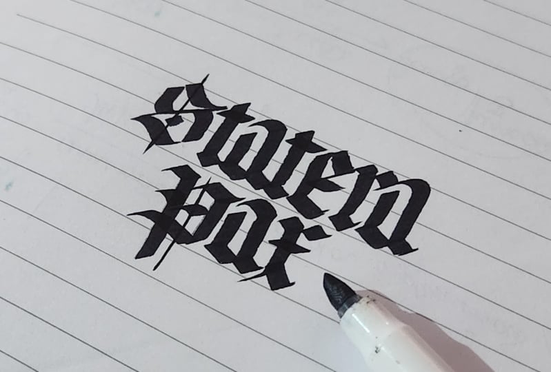
4. Class 03 – The skeleton of the gothics: like the premise courses, we use a skeleton to make our journey on the graphic studies a little bit easier. This is a skeletal this off about the style that we will follow. He's the texture of card, and don't forget it because they're more a lot of styles off ethics. So if you haven't done it yet, I recommended. Don't load the workbook. Pdf and print enough. I'd sides equate this workbook in eight for four months and legal for months. Choose the one you prefer to use. The skeleton I recommended to use a thin sheet of paper are tracing paper unless you have a light bulbs like me. So before we start, I'd like to talk a little bit more about this style, and it's capital as the other styles. These style has five nude for the height of the letters remembering previous curses. The big stroke off the foundational off about something like this and the basic strokes off the ecstatic letters is something like this and the basic stroke off the breast script. The alphabet we made with Breast man isn't like this. So for this style, the texture Kurata, the gulf letters we use these days Stroke. We have a little diamond on the top, a straight line and then another diamond Little diamond on the bottom. Take a look. And like all the basic strokes, we used these to start another letters like this one to create the letter and are created letter. You watch this other DK I used to callers to explain better this part. This straight line on the middle you don't touch the line on the top And don't touch the life on the bottom which keep these lines this stroke on the middle off this x height. And then you complete the basic stroke with this with these two little diamonds. So the scan, it'll is this line we have exactly on the middle off the stroke, bailed by depend. This is the skeleton. We also called this doctors. So for the skeleton for the letter in would have something like this. The structure off the got the letters is like this. We have 12345 We have 500 with for the minuscule the ex high and we have plus tuning booth for the senders. And this enders and capitals has around six cigarettes So this is a style we will learn on this curse. If you would like to make some warming up exercise, you can do this. You only to repeat this big stroke. Actually, this basic strokes is a letter I after do these warming up exercise, we can go to the next class. The minuscule Oh, I almost for that. These off of that. This style I create is Ben's it on the work off closing Major Villa and Julie Waters and is alphabet from detective and fictive centers.
5. Class 04 – The minuscules: for this last. Take our guidelines. Shit, and put your blend sheet of paper on top of it to start writing. As I told you, you should be able to sit through the paper. The height off the minuscule is five. Me. Do it. It should be tracing the skeleton guide as close as possible. And by doing this, you will to understand the correct shape of the letters before we start, I'd like to explain better how you use this capital for this dotted line. You to follow. Use the side off. Depends natural. Take dependent little bit like this. This another daughter line is about the angle off different. You follow this to take the correct angle off depends to start tracing the lines. And this regular line is the X skeletal. You should drawing a letter trying to keep this skeleton this regular line exactly on the middle off the stroke. So that's it. Let's start our minuscule
6. Class 05 – The capitals: It's time variety capitals behind off the capitals a six neighborly Take your capital skedline shit and started exercise like this.
7. Class 06 – The numbers: That's the tricky part off the Gothic numbers, because in the third century they didn't use erratic figures, only Roman numerals. But as for use Roman numerals, you only tried the letters that we already learned. I prefer for you some Arabic numbers based on the work off Hammond's up in the high road road. They actually don't look like the letters. But do you see that they match the letters in the text?
8. Class 07 – The words: Asai told you in the last class. It's very important to practice writing words instead off only practice the alphabet because off the letter spacing but different from the other curses. This time we will make a composition. And when I make the composition, we were right. Practicing right awards. I will show you hire right words on this list, but we'll keep our focus on the next class. The composition class. I recommend you have a guideline shit like this. You can use the guideline. I live on the workbook. So put ur tracing paper over the guideline and then stocks. Right, Skeletal. You can use your workbook as a model. After designed to scuttle by a pencil, you can take a parallel pen and start to write your ward in the Gothic style.
9. Class 08 – Composition 1: I usually use two methods off composition a traditional and the modern with the traditional way is like this. Choose your cold. Make the guy right. The skeleton off letters with expensive like this user broad add need then to write a sentence. But right each word on separate paper way . Okay, - now , after right, it'll work on separate sheet of paper. You can create a composition right again to create our peace. Maybe it could be necessary. Repeated steps several times to get a great file. Opie's sometimes a shooter, right around 15 times To get the perfect final piece, you could have a light box. You can create the final piece on better sheet of paper, and not only on the tracing paper. Thank you.
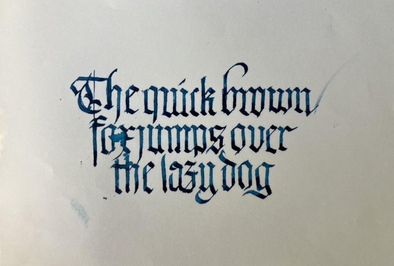
10. Class 09 – Composition 2: I think Modern Way is using the computer with graphic design software like Adobe Illustrator, for example and the typeface I created especially for it. This way we can skip the first steps off the less class and start straight on Step five. This technique save Miss a lot of time when I have a tight deadline. There's something very part that was about this great anti face is a hard job, Usually takes more than a month work exclusively on it. So the phone is not for free. Unfortunately, you know what you purchase a listens to get and use it. So if you don't want to spend any money with you can use a traditional way off Create a composition. I thought you in the last class I teach you how to do this in a computer Anyway, don't worry the fronts not expensive and they also buy a list Since you can use it for all your life isn't cool all our life, choose this. That face so is if you think like this. I think the price is very, very cheap. But pay irritation. The listen is only for you personal for you. You are not allowed to share it with anybody. If a friend ask you as a cop of this phone, you to tell him to buy his only since it's illegal to share a cop off phone tile. Okay, you can buy this phone on the lead time put below the video. Check this out. So let's start. Choose your quotes or phrase. So after purchasing the phones and the load in the file, you need to start. If I own a computer, you could take the fire. You just don't load it and double click on it. We open on phone book and then you just need to click. Start. You need to do this for the true files. Skeletal on depend style for the windows is very similar off this process. Double click on fire, just don't know and then you can stop. Then open the Adobe illustrator application. Are the design or another similar softer to create design in the computer. Then create a new file. I will show you how I would create the last composition I showed in the last class, using the traditional way Now how I was great using this modern technique. So what did you type something here like the first word. Don't and then you choose the typeface. The phone. I've just stalling Michael Cooter and use the style. Yes, we use the parallel open green 38 millimeter size to create the last composition for emulate that bends the size of that in your computer, you need to set size off the phone to 97 point. This is the same size off the green part open with when you princes on a paper. So I duplicated words, added words and change for the correct word like don't stop believing. And then we just need to create a composition off course. This would be much faster than the last second. After having copious already, you can test some options for letters, depends up the ladder to select. And if you're using on Adobe illustrator or adobe enzyme, when a selection letter, the softer will show you. If these that have another option after this, we just need to change the style off the phone from pen to skeletal like this, and then you could prefer to have. The guideline is also I recommend you should duplicate the layer like this and then for this new layer, You added the text and changes typing several underlines. And if you open the window, often type in the illustrator. You can use this future, the ligatures, and when I click on this bottom, the softer we'll change the underlying for the guidelines like this. Also, if you prefer to have the scale off the letter like this, you just need to type the key bar in your keyboard, and then you have this scale off, and after that you just need to print in a paper. And then it was the tracing paper to write again, Like with this in the last class. Did you like it? Now I will show a new composition, as this technique is much faster than the last one. So for this class we will create a longer sentence. Convicted steps chooser quote this time will be the quick brown fox jumps over the lazy dog . Then we'll write this on the computer and then created composition and then printed. After that, we'll go to the less steps to he was a new paper ship like tracing paper to create a new piece and repeat the steps. How many times you need to get a good final piece. So let's do it. I will create the box off type. You're right. Afraid Here. Okay. I need to change for the style, Ben. And then a statue. Right. But before that for this composition, are you changed a pen I used instead off use the parallel opened green. The 38 millimeters I use the brew parlor opens the six millimeter the size off the phone. To emulate the group I open. The six meeting leader is ah 153 points. Take a look off this stable off the size off the phone. Travelling defense in case you with life choose another. Okay, I also asked I'm using a larger pin. Have changed size off the paper for a tree. A lighter paper. So you create another file. And on this fire, I pretend other textbooks and start to write the new sentence. After that, we just need to create a composition using the futures off the computer and the graphic design application. After have this composition ready, we can test some futures like this. Watch bottom in the open type window in the illustrator I create for some letters. Some options with source. With flourish like this, you can select the one you like most after everything is ready. I need to change the style from the pen for skeletons to duplicate layer and changed it, fixed for underlines for have the guidelines and then put into the composition on this case on a paper with the size a tree. And let's leave this computer ward and going to the handmade word to create this piece with our calligraphy pen. I prefer to use a better sheet of paper instead off the tracing paper. So I use my light box and s A, Reid said. Another parlor opened, the blue ones, the six millimeter widening, and we just need to follow the skeleton we just created in computer and printed on paper. - Oh , and that's it. We have our piece ready with longer sentence and just just signed a peace and have the final piece. Freddie
11. See you soon: Well, guys, thank you for joining me today and I hope enjoy and disk less. Now I think you already understood the base off calligraphy and know that you need to always keep it. Brexit, improve your work. Don't forget to publish your projects on the project gallery so we can share our progress with each other. You might even get a message for me about how you can prove stating on my social media channels. Maybe can go teach a class close to you soon. And that's love to meet you in person. They care. And I hope See you soon. Bye bye.
 Jackson Alves, Letterer, calligrapher and teacher.