Transcripts
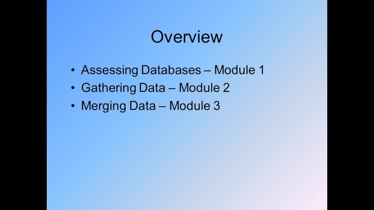
1. Structuring Data for Business Intelligence: Hi. Welcome to business Intelligence structuring data for analysis. My name is Dr Michael McDonald. Today I'm gonna be talking with you about this topic and what you need to know. As you're preparing for business intelligence projects with your firm, let me start with an overview For those who might have missed my past business intelligence classes, we're gonna run through several different sections in module one. We'll talk about an overview of data structure, the basics and what you need to know about business intelligence that the rest of this sessional make sense in module to We'll talk about assessing data accuracy. If you're given a data set, how do we go through and figure out if it's what we in fact need in order to proceed with the project in Module three will go through and look at ratios and key metrics in data and how we can use those to make sure that we're optimizing our data analysis in Montreuil four will look at using categorical variables. What are categorical variables? How are they formed? How are they useful in our analysis, Montreuil five will look at imputing data one of the big challenges and business intelligence is often missing. Data data imputation is one way around this problem in module five, we'll talk about how we condemn eel with different missing pieces of data. And then finally, in module six, I'll give you a preview of the data analysis section that will be coming up in the next course. Lets get started, shall we?
2. Overview of Structuring Data for Analysis: data structure. Overview module one. What is business intelligence? Well, for those who miss past classes, let me just explain to you what exactly were talking about when we refer to business intelligence. Essentially, business intelligence enables a business to make intelligent, fact based decisions. Eliminating guesswork involves four steps. First gathering in cleaning data. Second, analyzing data. Third, testing our choices with data and fourth making decision based on that data, today's class structuring data falls at the end of the gathering Clean data section. And just before you start on analyzing data, how do we use business intelligence? Well, business intelligence is useful in a variety of different circumstances. In particular its best used answer. The type of quantitative questions that come up often times for companies when they're looking at questions that involve predicting something or analyzing the current performance , etcetera. Some examples of business intelligence questions include things like which of our customers should be offered discounts on a product in order to induce those customers to buy mawr, which borrowers from our bank are most likely to default. Given trends and economy, what will our sales or cash flows be next period? Where should a new store office be located in order to maximize our draw for new customers . All of these are examples of questions that could be answered using data and using a business intelligence framework. So, as I said, the first step in business intelligence is gathering data. So where do you get that data? Well, there's three different ways that you might gather the data for your project. You can use any one of thes three, or you might use a combination off them. First, you can buy data. This includes things like names and addresses. For instance, for customers that's commonly bought financial data on publicly traded stocks. Natural resource state of things like satellite imagery for oil companies, etcetera. All of this data is generally gonna have to be purchased through 1/3 party. Second, you might build your own data. Set data on your customers is often the most valuable to your firm. If you're trying to predict what your customers are going to do, you probably have better data than anyone else on your own customers, and then third, you can gather it for free. In this case, the federal government has reams of data available this is particularly true when we're talking about saying macroeconomic conditions or surveys of the US cut consumer things that are generally related to the overall economy. There's no you can buy that data. But oftentimes is just Azizi to download it from the Fed through one of the Federal Reserve databases or through the U. S. Census Bureau are one of the other many government organizations out there that collect data and make it freely available to the public again for more data, firm or information on all of these different aspects of gathering data for business intelligence projects. See my past class on this topic. Next, after we've gathered our data, we need to go about building a database. To do that, we're gonna need to pull multiple sets of data variables together. Occasionally you have all of the data neatly organized in one day to set, and you don't have to do anything with it. But that's pretty unusual. And frankly, it only happens if we're trying to answer a very simplistic question like say, what is the address of customer X y Z? Well, we'd probably just look at our customer database. That's not really a business intelligence type question. Most of the time, we're gonna need to pull together different sets of data. For instance, data on the overall economy combined with data on our customers and match those two up to see, for instance, how the overall economy and its conditions impact our customer sales, perhaps letting us forecast sales for our company in the future. Putting together these different data sets sounds easy, right? Just take two different data pieces and meld them together. In fact, it's not, For instance, there's a few problems you might run into. One of the first problems is that economic data has different frequencies. Oil prices are reported on a daily basis. GDP is reported on a quarterly basis. Home sales are reported on a monthly basis. Unemployment claims are reported on either a weekly or monthly basis, depending on what specific statistics we're gonna look at so often times, it's difficult to merge these different sets together in order to figure out how to merge them together. We need to figure out what the relationships are between databases to most effectively merge them. Once we've done that, we can go about structuring our data. Structuring data is the topic for today's class data needs to be structured properly, nor to facilitate analysis. In particular, this means determining which variables to use in our data analysis on what types of changes have to be made to the data or to maximize its effectiveness. Poor data structure could be a really significant problem. For example, I recently ran a training session for employees with a Fortune 500 company where they've been assigned an initial project by one of the higher level managers. And after one of things we did in this training is what they brought the project to the course. We kind of went through and looked at some of the analysis that we they done when I discovered pretty quickly, is that they had failed to properly quantify the effects of macro changes on sales for their company because they didn't structure the data properly at all. Failure to structure the data and put those variables into the correct type makes for a big problem when it comes to predicting different effects in this case, the sales for the company. So if we don't structure our data properly, were building a very weak foundation for future business intelligence questions. Now, when it comes to data analysis, that's gonna be the subject for a future course. But in brief, if we've structured our data properly, we can use statistical tools to predict in analyze business questions. These tools include, among other things, regression analysis, decision trees, scenario analysis, Monte Carlo simulations, etcetera. You can look for a future course on these topics.
3. Assessing Data Accuracy: module two. Assessing data to start with one recessing data we need to go through and evaluated, decide whether or not we have any problems with our databases. In particular, databases in business settings are often generated automatically or almost automatically. For instance, data from sales reports or investment statistics could be downloaded directly from a different part of the company. Data from retail locations, perhaps with our company, is often automatically generated by software. For instance, on a point of sale system. It's important to evaluate this data and its accuracy before we move on to analyze it. Data that's automatically generated often hasn't had a sanity check by any human being, and so as a result, it might contain errors or omissions or problems that we can overlook. If we move on to quickly. When we're evaluating data, there's a few key issues we want to start by looking at first, does the date appear to have any kind of out liars? Second, does the date appear to be accurate? Third, are the data construct around variables that make economic sense. For instance, we might have debt as one variable and assets is another. If we're looking at for instance, different companies that might be competitors of ours, or just different companies that are publicly traded. Well, if we look at the aggregate amount of debt held by a company that doesn't tell us very much in the aggregate, all it really get does is give us a proxy for size. Bigger companies, on average, should hold more debt. I'd expect that as an example, General Electric holds a lot more debt than, say, Ah, very small industrial manufacturer. G E is large. They can afford to support a lot more debt, so debt by itself isn't very useful. The same thing holds true with assets. It's not really clear that assets by itself tells us anything other than giving us a proxy for size of the firm. On the other hand, if we take a ratio of debt assets now we have something more meaningful. In this case, Debt assets is gonna give us some sort of an indication of the riskiness of the firm. Further and finally, we might be interested in looking at other gaps or discontinuities in the data. These are all key points that we should look at more first going through a data set. When it comes to date out liars, we have to ask ourselves whats the data look like? Does it seem like the data is symmetric test? This will need to run calculations term. The mean and median on each variable of interest are the meat we might ask ourselves Are the mean and median about the same? If not, we decide of skew Nissen. The data is a problem. If the mean and median differ dramatically, that tells us that our data are skewed. We can also run calculations term in the top and bottom percentiles the top 1% the top 5% the top 10% and compare these against the mean and median. If, for instance, were looking at, say, sales for some of our customers, if the top 1% of our customer sales records are safe for 100 times the average sales, maybe those metrics aren't very are very significant. Maybe those metrics are gonna throw off our analysis, perhaps, for instance, it's simply a bookkeeping error. Whatever the issue, we need to go through and decide if those top and bottom percentiles belong in our data. Set it all to compute means medians and percentiles. There's a few different tools we can use. I'm gonna talk briefly about SAS, Stada and Excel. Excel is probably one that almost everyone is familiar with. To calculate means medians and percentiles and Excel will simply use the following functions. Average median and percentile dot Inc Each of these air pretty straightforward, and they'll let us go through and figure out some of the questions we want to look at in Excel. The problem with Excel, however, is that Excel only allows us to look at a very small subset of data, relatively speaking, depending on what version of Excel you're using. It's anywhere from perhaps 65,000 rows of data up to maybe a 1,000,000 rows of data. Frankly, even if you have more recent versions of Excel that allow you to analyze upto a 1,000,000 rows of data, Excel often has problems dealing with big data bases like that sorts Congar wrong v lookups . Things like that you can have serious problems with Excel for very large data sets more than about 50,000 data points or so. As a result, I'm not saying you shouldn't use excel, but you should be very cautious with it. Now if you don't want to use Excel, one of the alternative programs that I really like, this state state A is very nice because it has two benefits. Number one. It's inexpensive. Ist software packages go. You can get a perpetual license for some between a few 100 perhaps $1000 depending on what type of organization you are. State is also very user friendly, not quite as user friendly as excel. But it's much more powerful where Excel gets stuck in about 50,000 data points and just a few variables and starts to produce questionable output or output. That, in fact, is actually downright wrong. And you have no way of knowing if it's wrong or not, because Excel doesn't give you any kind of warning. Stada avoids all of these problems. State of still relies on a spreadsheet input, which is nice because you can go through in view your data in the same type of framework that you do with Excel bought. It gives you more tools to go through an analyze your data in a more robust way. You can see some of the basic code that I've written for some analysis below now in state, if we wanted to look at means medians and percentiles, we'd simply use the following functions. For instance, some variable one variable to etcetera. If we simply type that and put in our variable names, state will spit out our means. If we type some variable one variable to variable, three etcetera and then comma detail at the end, it'll spit out. Not only are means but our medians and our percentiles at various points in the data set, so state is very simple and easy to use. And the nice thing is that once you've written a program, you can take that same program and apply it to multiple data sets, so it might be more work up front. Compared to Excel. Once you've done the work up front, it's very easy to rerun it over and over again. Again. It's a little more expensive than programs like, say are, which are open source. But I think it's more user friendly, and so it's often dollars well spent. That's up to you, of course, to each person is owned now as an alternative. If you don't like state of for whatever reason, SAS is another great choice. Stated does have much more powerful data analysis tools than Excel does. But if you start looking at 5 10 2030 million observations state, it can often get slowed down. In this case, you'll need a different software program. Sass is a great choice now. Sass is often bought on a license. It's a little bit more expensive than Stada, but it's still a good choice in general, just like State of the Oh SAS involves writing a piece of code, which entails, of course, upfront work. But then, once you've written that program, you can use it over and over and over again. So upfront work. But then, once the program is written, it's very easy to apply it to a myriad array of different data sets with only minor changes . So in this particular case, I've written this program, which goes through and shows us our returns. In particular, the pertinent set of code here is at the bottom. Prock means data. This shows us for our specific data set. In this case, work dot s and P 500 returns are mean median percentile for the 90th percentile, the 10th percentile the men and the max in the data set, all with max decimals of three. We could, of course, change this. But the point is that the coding is relatively straightforward to go through and figure out these different data indicators, they're gonna let us establish whether or not our data set is proper, correct and well constructed. Next, When we're looking at data accuracy, one of the big concerns is always fake data. Ben, for God's law is one of the best tests for fake data. If you're concerned about your company getting data that has been falsified for some reason , I'd highly recommend going through and using Benford's law. Ben Friends Law simply says that in real data, the number one should be the most common number. The number two should be a next, most common etcetera. This sounds unbelievable, but in fact it works over and over again with many different data sets. To illustrate why this is the case. Think about the stock market. It took much longer for the Dow Jones to go from 1000 to 2000 points than from 17,000 points. The nature of the growth in Siris of numbers is that one will always be the most common number in a real data set to should be the next most common etcetera. The chart below shows us the frequency of each number in genuine data. Now bear in mind, of course, there's some variation from this in any given data sample. But on average for a data set, we should find that the number one represents about 30.1% off all digits in real data. The number two represents about 17.6% of all digits. Number three, about 12.5% etcetera. So you can use this is a tool to establish whether or not your data is genuine. Genuine data doesn't guarantee that there's no problems with the data. For instance, the data might have missing observations or the data might simply be too small of a sample size. But it does tell us it does give us an indication at least that the data hasn't been tampered with.
4. Ratios and Key Metrics in Data Analytics: module two. Assessing data to start with one recessing data we need to go through and evaluated, decide whether or not we have any problems with our databases. In particular, databases in business settings are often generated automatically or almost automatically. For instance, data from sales reports or investment statistics could be downloaded directly from a different part of the company. Data from retail locations, perhaps with our company, is often automatically generated by software. For instance, on a point of sale system. It's important to evaluate this data and its accuracy before we move on to analyze it. Data that's automatically generated often hasn't had a sanity check by any human being, and so as a result, it might contain errors or omissions or problems that we can overlook. If we move on to quickly. When we're evaluating data, there's a few key issues we want to start by looking at first, does the date appear to have any kind of out liars? Second, does the date appear to be accurate? Third, are the data construct around variables that make economic sense. For instance, we might have debt as one variable and assets is another. If we're looking at for instance, different companies that might be competitors of ours, or just different companies that are publicly traded. Well, if we look at the aggregate amount of debt held by a company that doesn't tell us very much in the aggregate, all it really get does is give us a proxy for size. Bigger companies, on average, should hold more debt. I'd expect that as an example, General Electric holds a lot more debt than, say, Ah, very small industrial manufacturer. G E is large. They can afford to support a lot more debt, so debt by itself isn't very useful. The same thing holds true with assets. It's not really clear that assets by itself tells us anything other than giving us a proxy for size of the firm. On the other hand, if we take a ratio of debt assets now we have something more meaningful. In this case, Debt assets is gonna give us some sort of an indication of the riskiness of the firm. Further and finally, we might be interested in looking at other gaps or discontinuities in the data. These are all key points that we should look at more first going through a data set. When it comes to date out liars, we have to ask ourselves whats the data look like? Does it seem like the data is symmetric test? This will need to run calculations term. The mean and median on each variable of interest are the meat we might ask ourselves Are the mean and median about the same? If not, we decide of skew Nissen. The data is a problem. If the mean and median differ dramatically, that tells us that our data are skewed. We can also run calculations term in the top and bottom percentiles the top 1% the top 5% the top 10% and compare these against the mean and median. If, for instance, were looking at, say, sales for some of our customers, if the top 1% of our customer sales records are safe for 100 times the average sales, maybe those metrics aren't very are very significant. Maybe those metrics are gonna throw off our analysis, perhaps, for instance, it's simply a bookkeeping error. Whatever the issue, we need to go through and decide if those top and bottom percentiles belong in our data. Set it all to compute means medians and percentiles. There's a few different tools we can use. I'm gonna talk briefly about SAS, Stada and Excel. Excel is probably one that almost everyone is familiar with. To calculate means medians and percentiles and Excel will simply use the following functions. Average median and percentile dot Inc Each of these air pretty straightforward, and they'll let us go through and figure out some of the questions we want to look at in Excel. The problem with Excel, however, is that Excel only allows us to look at a very small subset of data, relatively speaking, depending on what version of Excel you're using. It's anywhere from perhaps 65,000 rows of data up to maybe a 1,000,000 rows of data. Frankly, even if you have more recent versions of Excel that allow you to analyze upto a 1,000,000 rows of data, Excel often has problems dealing with big data bases like that sorts Congar wrong v lookups . Things like that you can have serious problems with Excel for very large data sets more than about 50,000 data points or so. As a result, I'm not saying you shouldn't use excel, but you should be very cautious with it. Now if you don't want to use Excel, one of the alternative programs that I really like, this state state A is very nice because it has two benefits. Number one. It's inexpensive. Ist software packages go. You can get a perpetual license for some between a few 100 perhaps $1000 depending on what type of organization you are. State is also very user friendly, not quite as user friendly as excel. But it's much more powerful where Excel gets stuck in about 50,000 data points and just a few variables and starts to produce questionable output or output. That, in fact, is actually downright wrong. And you have no way of knowing if it's wrong or not, because Excel doesn't give you any kind of warning. Stada avoids all of these problems. State of still relies on a spreadsheet input, which is nice because you can go through in view your data in the same type of framework that you do with Excel bought. It gives you more tools to go through an analyze your data in a more robust way. You can see some of the basic code that I've written for some analysis below now in state, if we wanted to look at means medians and percentiles, we'd simply use the following functions. For instance, some variable one variable to etcetera. If we simply type that and put in our variable names, state will spit out our means. If we type some variable one variable to variable, three etcetera and then comma detail at the end, it'll spit out. Not only are means but our medians and our percentiles at various points in the data set, so state is very simple and easy to use. And the nice thing is that once you've written a program, you can take that same program and apply it to multiple data sets, so it might be more work up front. Compared to Excel. Once you've done the work up front, it's very easy to rerun it over and over again. Again. It's a little more expensive than programs like, say are, which are open source. But I think it's more user friendly, and so it's often dollars well spent. That's up to you, of course, to each person is owned now as an alternative. If you don't like state of for whatever reason, SAS is another great choice. Stated does have much more powerful data analysis tools than Excel does. But if you start looking at 5 10 2030 million observations state, it can often get slowed down. In this case, you'll need a different software program. Sass is a great choice now. Sass is often bought on a license. It's a little bit more expensive than Stada, but it's still a good choice in general, just like State of the Oh SAS involves writing a piece of code, which entails, of course, upfront work. But then, once you've written that program, you can use it over and over and over again. So upfront work. But then, once the program is written, it's very easy to apply it to a myriad array of different data sets with only minor changes . So in this particular case, I've written this program, which goes through and shows us our returns. In particular, the pertinent set of code here is at the bottom. Prock means data. This shows us for our specific data set. In this case, work dot s and P 500 returns are mean median percentile for the 90th percentile, the 10th percentile the men and the max in the data set, all with max decimals of three. We could, of course, change this. But the point is that the coding is relatively straightforward to go through and figure out these different data indicators, they're gonna let us establish whether or not our data set is proper, correct and well constructed. Next, When we're looking at data accuracy, one of the big concerns is always fake data. Ben, for God's law is one of the best tests for fake data. If you're concerned about your company getting data that has been falsified for some reason , I'd highly recommend going through and using Benford's law. Ben Friends Law simply says that in real data, the number one should be the most common number. The number two should be a next, most common etcetera. This sounds unbelievable, but in fact it works over and over again with many different data sets. To illustrate why this is the case. Think about the stock market. It took much longer for the Dow Jones to go from 1000 to 2000 points than from 17,000 points. The nature of the growth in Siris of numbers is that one will always be the most common number in a real data set to should be the next most common etcetera. The chart below shows us the frequency of each number in genuine data. Now bear in mind, of course, there's some variation from this in any given data sample. But on average for a data set, we should find that the number one represents about 30.1% off all digits in real data. The number two represents about 17.6% of all digits. Number three, about 12.5% etcetera. So you can use this is a tool to establish whether or not your data is genuine. Genuine data doesn't guarantee that there's no problems with the data. For instance, the data might have missing observations or the data might simply be too small of a sample size. But it does tell us it does give us an indication at least that the data hasn't been tampered with.
5. Categorical Variables in Business Intelligence: module, three ratios and key metrics. Now, when we're going through and looking at data in my experience, the number one problem that people have when they're doing data analysis is using the wrong variables. They tend to use the variables that seem like they produce the result they want, even if they don't economically make sense. Just having good data or a tool that lets you analyze empirical relationships is not enough . You need the right variables. There's an old story at which is probably apocryphal, but bears repeating nonetheless that there's a very strong correlation between the birth rate in India and the wind speeds in Chicago. This is a perfect example of spurious correlation. There is no rational reason why the number of people born in India should have any relationship to the speed of the wind in Chicago bought. If we look at enough pieces of data for us given sample size, we will find these correlations. Whether or not they're meaningful is something we have to gauge independent of the actual correlations themselves. So it's important to go through and take a look at what variables were using and make sure that we're using variables that makes sense in the context of the problem that we're trying to solve. For instance, think back to our variables, debt, assets and debt to assets. As I noted earlier, debt and assets themselves aren't necessarily all that meaningful. At best, they're different proxies for the size of company. Debt to assets, however, is meaningful as a metric for riskiness of a firm. Now, in many cases, what this tells us is that raw variables need to be modified in order to have strong relationships in data, but also strong relationships that are economically meaningful over and above just having a statistical correlation with variables that we care about. As I noted, neither debt nor assets are good. Proxy for risk debt to assets is, however, now variable modifications are gonna fall into three basic categories. Forming ratios, taking rates of change in data rather than levels off those data and categorical variables . Ratios are one of the most useful tools we confined. When building data sets. Raw business data is not usually all that good at predicting future outcomes. It's often noisy. It has a lot of variation within the data that makes it difficult to protected things and then, as we saw with debt in assets, sometimes it's not particularly meaningful It all if we're trying to measure more abstract concepts like the level of riskiness of a firm. Instead, it's often a good idea to compute ratios based on the metrics we care about. For instance, we see here a diagram showing intrinsic value using ratio analysis we might be interested in, say, the value of a company bought if we're given data on profit required investments in operating capital and free cash flow. Those alone don't tell us very much about the firm. Instead, we need to go through and count end. Combine those data with, in this case weighted average cost of capital. We form a ratio, and that ratio forms the basis for a discounted cash flow model, which in turn gives us evaluation on the firm. The point here is that simple free cash flow by itself isn't all that useful for figuring out the value of firm weighted. Average cost of capital by itself is again not all that useful for figuring out the value of the firm. Put these concepts together, though, and we get something that's much more useful and meaningful ratios could be similarly useful in your organization ratios. They're gonna let us facilitate comparison for one company over time for one company versus other companies as well. Ratios are gonna be used by, for instance, lenders determine creditworthiness stockholders to estimate future cash flows and risk managers when we're trying to identify weaknesses and strengths in an organization. So let's go through and take a look at some of the different ratios that you might use in your organization when you're building data sense. In particular, there's five categories of financial ratios. Liquidity ratios, asset management ratios, debt management ratios, profitability ratios and market value ratios. Each of these ratios is gonna be useful in different circumstances, depending on what it is that we're looking to analyze. In particular, we need to go through, and we need to make sure that we have the right data in our database toe. Let us compute these ratios. Depending on the question we're asking, liquidity ratios are gonna measure our ability to meet current obligations. Asset management ratios tell us something about the proper and effective use of assets, whether the company is doing a good job and managing those assets, etcetera. So asset management ratios might include things like asset utilization. For instance, total asset turnover ratios. That's simply going to be total asset turnovers. Equal sales divided by total assets. Debt management ratios are gonna tell us something about the extent of debt at the firm in the level of safety that's gonna be afforded to creditors. For instance, debt utilization Equity multipliers equity multiplier ratio is just total assets divided by total equity Profitability ratios are going to tell us something about the effects of liquidity, asset management and debt on operating results. This includes things like expense control, profit margin profit margin, of course, is just net income divided by sales. Finally, market value ratios were going to give us an indication of what investors think of a firm's past results. What the future prospects of the company look like when we're dealing with liquidity ratios were asking a series of fundamental questions about whether the company can meet its short term obligations using the resource is it currently has on hand. There's a few different, particularly relevant ratios. The first of these simply the current ratio current assets divided by current liabilities. Similarly, the quick ratio is gonna be current assets minus inventory over current liabilities. So if we're going through were trying to forecast, for instance, something about cash management or the likelihood of a supplier or customer defaulting on some sort of an obligation, we'd be interested in using these types of ratios, and we should make sure that they're included in our database for forecasting purposes. Next up, if we look at asset management ratios were asking, How efficiently does the firm use its assets? How much does the firm have tied up in its assets for each dollars of sales? We can measure this using the inventory turnover ratio, so that's simply equal to sales divided by inventories. Similarly, we might be interested in our efficiency of fixed assets. To compute this, we can use our fixed assets turnover. That's going to be sales divided by net fixed assets. Total asset turnover, in contrast, is just sales divided by total assets. So again, each of these ratios is measuring different aspects of our asset management strategy bought . If we're interested in predicting how well the company is doing and what sales might look like in the future, we'd probably want to ensure that these air included in our database debt management ratios . If we're asking questions about how much debt the company has, and whether that that is too much for the firm to handle and whether the company's earnings can meet its debt servicing requirements, we might be interested in something like the debt ratio. The debt ratio is just total at total liabilities divided by total assets. Or you might be interested in the tie times interest earned, which is simply e but divided by interest expense. The point here with each of these ratios is that we may not have these ratios in our database to begin with. If we're simply drawing, say, financial data from a financial database that's out there, let's say from campy, stat or crisp, we might have total liabilities in total assets for our firm or for competitors firms. But we need to go through and compute the debt ratio as shown here in the database itself. We need to take the following. We need to take mathematical operators that will give us that and declaring new variable for the debt ratio. Similarly, when we're looking at profitability ratios, you might be interested in things like the net profit margin, which simply profit margin equals net income divided by sales. If we're looking at what the company's rate of return is, we might be interested in the operating profit margin, which is simply Ebert divided by sales. If we're interested in metrics for how well the company is using its assets, we might be interested in turn on assets and return on equity return on assets simply net income divided by total assets where return on equity Is that income divided by common equity? One of my favorite ratios, and it's not really a ratio. To be fair, it's more of, Ah, mathematical operator is the Altman Z score. The Altman Z score is gonna predict the probability of front of a given firm going bankrupt within two years. The model shown here is for Industrial Companies Point. This is also applicable to any type of company that's producing or manufacturing a good in general. Beyond that, though, there are variations on the Altman Z score. They've been optimized for, say, software firms or retailers, firms that have kind of more asset light business model. The Altman Z score is gonna be based on five different ratios all put together to form this single metric. The first ratio that we're gonna need is working capital divided by total assets. That's going to give us a metric for how liquid the firm is. Ratio two x two In armed formula is Retained. Earnings Divide About total assets ratio. Three Is earnings before interest in taxes divided by total assets. So as we see ratio two years giving us a metric for the financial flexibility off the firm and its valuation ratio three is giving us a metric for its profitability ratio. Four is gonna tell us something about the valuation of the firm. Overall, it's simply the market value of equity divided by total liabilities and ratio. Five is sales to total assets. That's telling us, in essence, how efficient is the company with its assets we go through, use each of these coefficients shown here and multiply them by the ratios. So, for instance, we compute ratio x one and multiply it by 1.2. Then we add to that ratio x two times 1.4 etcetera. Go through perform all of those mathematical functions and we get a Z if Z for the company is over 2.99 That's a safe company. The probability of the firm going bankrupt within two years is quite low. If the ratio if the Z score I'm sorry, falls within the range of 1.8122 point 99 that's what we call the gray Zone. There's some risk here. And finally, if the ratio is below 1.81 that is the distress zone. There is a high probability of the firm going bankrupt within two years. Next, we might care about internal growth rate. Maybe we want to go through and perform some sort of forecast about the company's earnings in the future. To do that, we need a database that lets us go through and calculate our internal growth rate. Internal growth rate is simply equal. The return on assets times are pretended retention percentage. That retention percentage is the amount of profit that we're keeping retained within the company as opposed to paying out to investors in the form of a dividend. So the internal growth rate is our away times retention percentage divided by one minus are away times retention percentage. We might also be interested in the sustainable growth rate. The sustainable growth rate is gonna tell us how much the firm can grow by using its internally generated funds and issuing debt to maintain a constant debt ratio over time. That sustainable growth rate is just equal to our A We times our attention percentage divided by one minus are we times our attention percentage. Finally, we might be interested in market value ratios. Market value ratios give management an indication of what investors think of the company's past performance. And future prospects, including market value ratios, is often useful. If we're trying to forecast actions we could take that might improve the value of our firm . For instance, we go through and build a database that looks our firm and competing firms in the same industry and has a whole bunch of data related to decisions. We've made decisions they've made. We can then compute market value ratios to give us an idea of the relative value of each of these companies, and we can use that relative value as our prediction variable for the future. Next, let's talk about rates of change. So as I noted, rates of change can often be useful if the levels of a given data point are not useful. So even if a ratio is not as obvious a substitute for raw data, it's often a good idea to try using rates of change in place of levels, data by levels data. We're talking about different points. For instance, going back to my debt in assets example. We could look at the amount of debt held by General Electric or the amount of assets held by General Electric. Alternatively, we could look at the rate of change in debt or assets, and that tells us something about how fast the firm is growing. The level of profitability, for instance, is less likely to be useful than the rate of change in profitability. For a company again, profitability, at least in dollar terms, is just gonna be a crude metric for size. We can put it in the form of a ratio and tells us something about how effectively the company is run. But even if we're not interested in doing that, we might be interested in the rate of growth of profitability for a firm over time. When we're computing rates of change, it's useful generally to go through a computer range of change rate of change for every major variable that we plan to include in our analysis, just a good rule of thumb. Go through and compute those rates of change up front and then decide later on. If they're useful in your analysis or not based on economic considerations now we might be interested in figuring out whether or not rates of change makes sense for us. Given our date will do that. We need to start by running a correlation between our levels and our rates of change and the variable or trying to predict or examine and that will tell us whether rates or levels are both are more useful. We want to pick the variable type in each case with the higher correlation. That's just a general rule of thumb. It's not always the case. There could be an instance where you have spurious correlation and again it's important to go through and think about the economic significance behind each of these different types of variables. But in general it's usually better to look and see whether the level or the rate is more closely correlated with the variable. We're looking to predict now beyond rates of change. Sometimes looking at a natural long is a good choice to. For instance, if we're looking at data with wide variation in value like, say, assets size on different competitors, Natural Log can make a lot of sense very difficult to compare a firm that has this example $1 billion in assets toe one with 100 million on some level, a firm with a $1,000,000,000 in assets is pretty similar to affirm, with 900 billion in assets, even though there's 100 million indifference between them. Those two firms the one with a $1,000,000,000 in assets and with 900 million in assets, have a much greater similarity than, say, a firm with 100 million in assets versus 200 million NASA's. That differential in both cases is 100 million, but the percentage difference is significant. Going from 900 million to a 1,000,000,000 is only a 10% growth in assets. Growing from 100,000,200 million is a doubling of assets. Natural logs can help us avoid these problems taking their natural log of assets. Then let's a scale this more appropriately
6. Imputing Data in a Dataset: module. Four Categorical variables When we're doing analysis, it often makes sense to group clustered of clusters of data together using a categorical variable. For instance. Rather than worrying about a precise Altman Z score, we might simply lump suppliers or customers into one of three categories, as we noted earlier, Danger Zone, Gray Zone and safe For the purpose of our data analysis, we could label these values 12 and three one being the danger zone to being gray zone and three being the safe zone. And we might, for instance, predict what it takes to move from one category to another, or what impact each of these different values has on some other metric that we care about. Alternatively, Byeon Eri variables are special type of categorical variables. In particular, binary variables have only two possible outcomes. One or a zero. For instance, going back to our Altman Z example. We could represent the score as three different Byeon Eri variables with a one or zero value in each case. So a firm would have is an example in Altman Z score, and they would either be in the safe zone, the gray zone or the danger zone. We create three binary variables. Safe, gray and danger. If the company falls into the safe zone, they get a one for the safe zone value. If they don't fall into the safe zone, they get a zero. If they fall into the gray zone, they get a one for that variable. Otherwise, they get a zero. Predictably, as you might expect, you could only have a one in one of thes three categories. That is, if we have a one in the safe zone for a given company, it should be zero in the greys in the gray zone and zero in the danger zone. General Electric can only fall into one of those three categories. Byeon Eri Variables, then, are useful for going through in breaking up our data into different digestible pieces. That'll make it easier for us to predict values in the future. So why do we use categorical variables? Will categorical variables are going to serve two purposes? First, they let us represent qualitative data in empirical manner. For instance, the gender race or veteran status for employees is all qualitative data. You're either a male or a female. You're not 12345 That's not a gender. So instead we go through and we could have a buy in Eri Variable simply saying male one or zero If it's a one, we know that particular employees is a male. If it's a zero, we know there are female second categorical variables. Also let us avoid getting bogged down with meaningless differences, and they let us focus on the big picture when using statistical techniques to analyse data . For instance, if we have to competitors with a 1,000,000,000 plus and sales, they should both be classified as large firms. Whether one is at 1.11 billion, or 1.14 billion really is in material overall. Instead, we want to stay focused on the big picture analysis, and so he could simply classify these as large companies in each case, on Alternative Way, instead of using binary variables to calculate data and group together is to use death. Seiler Quintile variables the's air percentile type variables that are categorical in nature. For instance, it's often useful look, the percentile rank for piece of data rather than the absolute value. That's especially true when we're dealing with time series data, for instance, we might want to be able to identify our top 10% of customers in any given year, regardless of how much their actual sales volume is. If we're trying to compare our top customers in the year 1990 versus the year 2010 we'd expect just given the nature inflation that the value of sales and each year would have grown so he could scale this and put it into C $1990 to adjust for inflation. Or we could simply use a percentile type categorical variable again by doing the ladder. Using these percentile type variables, say, death styles or Quintiles, it's gonna let us avoid issues with inflation, price changes, etcetera. Death styles and quintiles are usually good categorical variables to calculate for key variables. Decile rank variables are gonna break data up into 10% intervals, for instance, 0 10% 10 20% etcetera. The idea here is that we're taking all of the values forgiven variable on. We're breaking it up into even chunks, so we'd look it, for instance, our top 10% of customers and they would be in the top decile the next 10% of customers would be in the ninth. Decile, etcetera. Quintiles are gonna rank variables by breaking them up into 20% intervals 0 20% 20% 40% etcetera. Now we might compute the decile ranking for each customer in a given quarter and then look at what drives the behavior of customers in the top or bottom decile as an example. This lets us go through and focus on the type of customers we care about, because it's quite possible that customers in the top decile behave differently than customers in the bottom. Decile Our death Seiler Quintile variables generally be labeled 1 to 10 or 125 respectively . Doing this is gonna let us figure out the marginal, effective moving between categories. In other words, are top quintile customers affected differently by an advertising effort than, say, bottom quintile customers are. It's also gonna make it easy for us to calculate differences between data segments. For instance, what's the difference in profitability between the top decile and the bottom decile firms based on their total assets size? Categorical variables based around these percent house are most useful when we're dealing with data that varies a lot over time, for instance, are a We and our away are often more effective as predictive variables. If they're in the form of categorical variables rather than ratios, it is important not to have too many deaths. Seiler Quintile variables So some of you may be familiar with the farm in French. Four. Factor Model Eugene Fama is a Nobel Prize winning economist and working together with Ken French of Dartmouth to develop this model, and it's useful for predicting stock returns based on different types of variables. But rather than using absolute values for, say, profitability or P E ratios or things like that, instead it uses Death Siles and Quintiles in some cases. But it also uses even broader categorizations like Ter Siles. Why does it do this? Well, if we only use death sales or Quintiles, we often start to break up our data set too much. For instance, if we have four different deaths, I'll variables. There's four different variables used in the four factor model, as the name implies. Well, if we had four different decile variables, that would mean that once we segmented the 5000 stocks down into groupings that fit with each of these death Siles. We'd have groupings of five stocks in each portfolio that is 5000 stocks divided by 10 raised to the fourth. Alternatively, by using Ter Siles by using Quintiles things like that, it lets us get larger portfolios and hence gives us more accurate predictive power within each portfolio that we're trying to predict.
7. Basics of Data Analysis: module, five imputing data. Now, when we're talking about the issues that are involved with structuring a data set, there's often a few common concerns that come up. One of the most common is missing data. Missing data can sometimes be inferred, though based on existing available data. For instance, if assets are recorders $1000 in January and then 1300 April, it's probably reasonable to fill in missing values for February and March that falls between the two data points. This is called imputing data. There are a number of techniques that we can use from puting data. The three most common are the last available value method, the linear interpolation method and the Regression Prediction method. The last available meth, the last available value method of imputing data, is simply going to use the last valid data point in place of missing data points based on whatever method of data sorting is appropriate. For instance, if our assets our record, is $1000 in January and then 1300 in April, the last available value method filling $1000 for assets for February and March, the method has an obvious drawback, though it creates stepwise discontinuities. In our data, we go from $1000 in January, $1000 in February, $2000 in March 2 spiking up to 1300 in April so that sometimes be a problem. On the positive side, we make less assumptions about the rate of growth over time using that method. Alternatively, the linear interpolation method of imputing data is going to use a Grady int in place that missing data based on whatever method of data sorting is appropriate. For instance, if our assets are $1000 in January and 1300 April, the linear interpolation method would fill in 1112 100 for our asset values in February and March, respectively. The problem with this method is that can create the appearance of stable growth in values for missing variables. Over time, it avoids those discontinuities discussed with the last value method bought. It creates an artificial smoothing of data growth over time. That's not necessarily a good thing again, depending on the issues that were trying to address in the data. Finally, the regression prediction method of imputing data uses predicted values based on our aggression in place off missing data points based on whatever method of data sorting is appropriate again, let's pretend we have $1000 in assets in January and 1300 in April. The regression prediction method would predict assets for February and March based on other available data like, say, sales and number of employees. The method is more accurate, but unfortunately it's also more complex and time consuming. The alternative to imputing data is to simply drop the data whenever there's a missing value. Dropping data points can be good or bad, depending on our choices. As we noted with imputing, data were making assumptions in each case, and there are drawbacks to each of the methods bought. Dropping data points isn't a perfect solution, either. It's gonna lead us to have a smaller sample size with less predictive power. If the missing data is not random, also, by dropping data points that could bias any conclusions that we're gonna draw from the data . For instance, if we're trying to examine competitor behavior were most likely to be missing data on small firms versus large firms. So, for instance, interested in front since the profitability off our competitors, well small firms may not have profitability Information available where large firms that are publicly traded would have that information available. By dropping, all the small firms were systematically excluding an entire set of competitors. And those might be the most relevant competitors for us, perhaps of the fastest growing competitors, for instance. Thus, we need to be careful about dropping data points and the biases that can create now. Another problem that we might have in data is with noisy data. Sometimes data is too noisy to be useful in predictive analysis. Time series data is particularly problematic in this respect. If there's a high degree of variation, it could make predictions very difficult because of the random fluctuations. Smoothing our data then can lead to better outcomes. One of the best methods for smoothing data is using a moving average. An example of this is, say, flow of funds data. So I was recently working on a project with a consulting client where we're trying to predict investor demand for bond issues for the company. The problem is that when you look at flow of funds data from the data that's available out there, it's very, very random. There's a lot of movement in any given month based on invention, investor sentiment and things like that. As a result, trends in actual data variation over time could be obscured by the noise data. Smoothing with a moving average helps us to avoid this problem. This could be done easily and excel, SAS Data or many other statistical programs that are out there. The key issue here is just to be sure that we're creating a new, smooth variable rather than overriding the original variable module six. Preview of data analysis. Okay, we're nearing the end of this lesson, but I want to go through in preview what we'll see in a future lesson when we're dealing with data analysis. Once we've built a completed data set and structured the data based on the questions we care about, it's time to start our data analysis. Data Analysis requires looking for relationships in the data to evaluate current business performance and predict future business performance. This can be done using ah variety of different tools. In particular, simple means, medians and pretend percentiles could be easily calculated from a well structured set of data. For instance, it's gonna be very easy to go through and calculate the level of sales required for salesman in, say, California to be in the top 25% of peers if we've structure or data properly. If we haven't, it could be very difficult. Answer even a basic question like this. But it's often useful to go beyond this and try to predict the future, though, for instance, how much is that salesman in California gonna sell next month? Well, the answer this question, we're going to need to use a more sophisticated form of data analysis. Regression analysis in this case is probably the simplest and most intuitive method for answering this particular question. That's gonna be the focus for our next course. I hope to see you then. Thanks for watching and keep an eye out for future courses in business intelligence techniques, which will be coming soon. Talk to you then. Bye bye.
 Michael McDonald, Business Intelligence and Finance