Transcripts
1. Course Intro: Hey, there. Welcome to the
Build AI Apps VAST course. My name is Nima Tahami, and over the past few years, I've been lucky
enough to teach over 18,000 students and
build dozens of apps. You see, most people
give up on their idea before they even actually start building and launching it. They start overthinking
all the parts or get stuck in the code. You don't need to actually
have any coding skills to bring your ideas to life
anymore. Thanks to AI. Throughout this course,
I'm going to show you the exact steps that
I take to bring an idea from just an idea
to designs to live product. No coding experience necessary, and you walk away with
an app that's actually live on the Internet and
people can use and pay for. So whether you're a designer
once you get past designing just screens or you're a product manager who wants
to bring their ideas to life, then this course is
exactly for you. And you're not going to be
just watching this course. You can actually
build alongside with me and bringing your
own idea to life and learn how to use
tools like Claude and Cursor to help you
build your app way faster. This is a super hands on course. I hope you come ready
to actually execute and finally bring your idea
to life. Let's get started.
2. Behind the Scenes Note: Before continuing
with the lectures, I want to take a really quick
pause here just to show you the brief behind the scenes of how these lectures
are actually made, a ton of time goes into planning the lectures and actually
filming and editing them. I built a tool called clip that now I do all
of my recording on, including the lectures
you were about to watch. I'm really excited about it, so that's why I'm
showing it to you. I essentially drop the footage that I have for the lectures, and instead of having
to spend, you know, dozens of hours side of the editor editing
the entire course, I now have the AI
inside of this tool, do the editing for. If you're remotely
thinking about doing any tutorials or YouTube
or sort of course content, for that matter, or educational talking head type of content, this to might be super helpful. So right now it's
going through it and cleaning up all
the mistakes that I made so that when
you're watching the lectures, you know,
it's professional, it's smooth, it's clean, and you're not sitting there
wasting your time watching lecture that makes no sense or just random pauses
throughout the video. So do check it out. There's
a link here if, again, you're interested in
filming content or just to kind of poke
around and see if it's something you can use
for your own sort of daily use. Enjoy the
rest of the course.
3. Designing with Speed: So this is an exciting
week where we actually get to
build our product, but not just any product or
any version of our product, the minimum viable product, which I'm sure you've
heard of meaning the most valuable part of the product or the value that our company
is going to have, we're going to package
it into one small app or product and sell that
specifically, right? Um, so, of course, I
know you might have tons of features in
mind and tons of ways you want to execute on
your idea, and, you know, same thing for me and
the app on building, but I'm not going
to jump to writing a list of 20 features and then going about building
each one, right. Unless I'm guaranteed that I'm going to get
customers for my product, that's going to be
potentially a waste of time. But what's going to be
helpful is narrowing down what features
or what parts of the sort of the values
we talked about the user wants out of the product and focusing
specifically on that. Um, so with that set, we're going to design for speed and not for perfection. So
I'll give you an example. This is the very first version of my editing app
clip that I built. It wasn't a full scale
editor just yet. First, I actually built just
one feature of that product. And this feature is
actually to turn long lectures or longer videos
into short sort of reels. So it will take
your longer video, and we'll turn it into
smaller ones based on the transcript and what's
interesting from it. And so as you can see, the
designs are also super simple. There's no fancy, like, design, even though I could
have probably spent more time designing this. I went with the simplest
version I could. You just drop your videos. And at the time, actually,
even in the designs, I allowed people to
drop multiple videos, but eventually I resorted
to just one video. So again, you want to narrow
down your features to the most core value that
you want to drive to users. Go with that. Same thing. Here I have an onboarding
for the video. Once you drop the
video, it will ask you, is this about Figma course. Again, I designed this
Figma, but in reality, I actually even took this step out and made it so that you simply just choose the topics
that you want exported. Once it analyzed the transcript, instead of asking you what
this course is about, it will just have
you checkmark which one of the topics
you want to export. Um, so super simple.
Again, all of this is probably like three
screens in total, maybe four. This is all part of
the same screen. It's just like a loading screen. And again, although I am a designer and I
seek for perfection, I try not to go too deep
into the design details and just go with the simplest
part of this product. And so then you can
see their videos, and from here, they can
again, it says edit. There was no editing ability
in the first version. All you can do is just
open it, see the footages, export it, delete it, and
then go to the next one. So super simple again. And here I even had it
so that you can have, again, folders for each project, and you can go into projects. And so for the first version, it was super simple, and I
encourage you to do the same. Don't design to perfection, designed for sort of MVP or
feature compilation, right? So focus on what's the
most important feature of your app actually solves the pinpoint for people
and focus on that. Forget all the other
features, right? And so to help you do that, I really recommend you also
use the community section in Figma if you're doing your designs in Figma,
which I highly encourage. They have tons of UI kits already in there that people
have already designed. I highly encourage you if you're using a design
library like ShatCN. That's a great one as well. Many companies use it, especially if you're designing
something that might have a dashboard screen or something a little bit
more sophisticated. They have tons of
components like graphs that you can
use and dashboards. So definitely refer
to this one here. Again, if you open any of them, so let's say I opened
this first one over here. Again, this is a
design library that's open by Verso that you can use. So you can see all the
components they already have. Like, you don't need to design an input component from scratch, just drag one from here. They have colors type, and there's more
extensive versions of these as well, I believe. So if you look at
this one, they have, like all the components
broken down by pages. So you have alert dialogues, um, avatars, badges,
breadcrumb navigation, button groups, so
on and so forth. So do explore what you have available to you and don't try to invent
from scratch. And you'll see as we start to
actually build our product, we will leverage these libraries instead of doing
everything from scratch. So as you go on about designing the product
and we'll come back and actually use ChatGPT to help us narrow down
our feature set, do keep this in mind that you want to use
external libraries. You want to keep it simple minimum number of pages that you
need for your app. You don't need fancy settings or profile features
just at, you know. So those little details matter
at scale, but initially, when you're just starting out,
you don't actually need to spend time crafting all
the individual pages. Come back and then start actually planning, what
are we going to build? I'm going to talk about my
product, but obviously, as I do this, you do the
same thing for your product.
4. Using ChatGPT to Plan Our App: Right, so we're getting ready to start working on
our first version of our app before
actually going and building it and even drafting
the features that we want. We want to leverage
AI, of course, to help us decide some
of those features. And one of my
favorite exercises to do is to chat with
ChatGPT about, you know, the first
version of our product. So here, I've written a prompt, help me plan the first
version of an MVP of an app. For an app that helps users keep track of expenses
and easily split bills on trips and only write the features that will
drive value for users most. Research into what
competitors like split wise are missing
in their product or what users are complaining about online. This
does two things. One is that it gives us some features that are
most important that we're going to build instead of just everything
that we can build. Then it's going to
also take a look into sort of a
little bit online, maybe on reedit
and other sources. So it will actually look into those resources
when you tell it to research something to see online what are their
complaints from those products, if you want, you can be
more specific and say, Look on reedit and
websites like G two, which is the review
platform for apps. So we're going to hit Enter and see what it comes up with. And as you can see,
it will search the web and then come up with MVP plan based on real
user complaints from Redt, review Trust pilot and
app feedback boards. So based on that, I came back with artificial
friction and paywalls, biggest pain. This makes sense. Every time I use Blitwise, like, you can only add certain
number of transactions. As it says here, there's three a day that you
can actually add, and then it forces you into
paying for the app, right? So this could be an
interesting one for us to leverage and actually make
a product that's maybe, you know, pay once, like a lifetime deal or
something like that. Pay, I don't know,
20, 30, 40 bucks. Again, we're going to
come up with the pricing, but pay X amount of dollars. You get the product, you don't need to worry about every time it asking you for
a payment, right? And so I believe, split wide charges a couple
bucks a month. But again, it could
be annoying to always get hit with that screen, and I know it happened
to me before. Any friction feels unacceptable. So we're going to build
with that, right? Although that's not
a feature, it's a user experience
that we're going to build upon and build
better version of it. Too much setup friction makes
sense. I've done this too. There's groups involved, and
invitations can be messy. So if we invite friends, we're going to make
it super simple. In fact, we're
going to make it so that you don't even need
to enter their emails, maybe just share a link
and people can auto join trips without having to know their emails
ahead of time. So if we're going to build
this, we're going to build it in a way where users can take the least number
of steps to invite friends, right? So we're going
to keep that in. Not a feature necessarily. Again, it's a user
experience improvement, but I'm building this with
design as a differentiator, and you want to do the same. So let's go ahead and
keep that in mind. And as you go through
this, also note, whether it's on piece of
paper or on your computer, note down what you want to do
that's different from what the competitors out
there are doing so that that helps you
differentiate yourself. Confusing settle up
mental model, right? So when you try to
settle up, people don't necessarily understand
how it works, unclear who should pay who too many micro transfers,
emotional awkwardness. And so we can bake that into
the product, too, right? Once the trip is over, why don't we make
it super simple to figure out who needs
to pay how much? Maybe even send them email reminders or something
like that, right? I noticed on split wise, I haven't received any reminders when I need to pay someone. It does send me like
monthly statements, but that's different
than, you know, when you need to kind of nudge
your friend to, hey, like, can you pay me this
like 100 bucks for whatever this
like Airbnb, right? So those could be
like awkward moments, and so that could
be another angle to differentiate our
product from split wise. So yeah, there's
tons of things in here that I won't go
too much into detail, but I will keep in mind
for my design process. So core opportunity, users
don't want a financial tool. They want a trip
coordination helper that handles money
automatically. We're on a trip, just
make this effort list. MVP only features that drive real value instant
trip creation, right? So this is saying no accounts. Create a trip, generate share Link exactly what
I had in mind as well. People join via Link. There's no sign up required. I'm not 100% sure on the sign up part and
just because of the fact that we do still need users
to authenticate themselves. But I could see that
potentially working as well. So at least one person needs to create an account
to create the trip, but potentially the
guests don't need to. And again, these are right
now, we're just brainstorming. When we come down to the
actual building part, which is going to
happen soon after, we will actually define these
before we move forward. Even comes up with
a bunch of features that you ChatGPT says, for sure, don't put these in the MVP, and we're going to
keep that in mind, like, you know,
bank integration, subscriptions, et cetera. So here's what it came up with. It says, Cor loop, create
a trip, share link, add expenses instantly,
see balance, clearly, settle with
minimal payments. I think that's great, right? So this is a little
bit more simple than all the other
features it set up here. But if we build an
easy version of this, really the feature
is just one thing. And that's, you
know, being able to settle up on your trip
based on expenses, right? We're not building even
though it's telling us this loop of different sort
of screens we might need, you might need one screen
for creating a trip. The same screen you
can share link. Adding expense would be
part of the same screen, seeing balance,
again, same screen. A minimal payments, we're going to come up
with just a wave from the exact same
screen that you can actually see who owns what. Obviously, the screen
is going to have different states and
different components, but we're going to keep
this as clean as possible. Obviously, you'll
need a home screen as well to be able to
create trips from. So you have a home screen
to see all your trips. Um, then inside of
the trips page, you don't need to navigate
to different places, a super simple place
to see what's a total, what's the running
balance, who owns what? And then an ability to
add sort of expenses, and we're going to keep
it as clean as possible and go with as few screens
as possible, again. So with that in mind, I'm going to get started
with the designs. You do the same in
the next lecture, I'll come back to
explain how I've done my design and what are
the decisions I've made around the pages that
I just explained right now. So I'm going to design those first two or three main screens, authentication, all the trips and then specific
individual trip pages. So I'm going to design that. You design your
essential screens, keep it down to three or
four at most, if you can. I know some products might be a little bit more
complicated than others, but again, try to keep it to the minimum and the
most important screens. I'll see you in a minute and looking forward to also
seeing your design.
5. Deciding on the Device: Before actually starting
your design process, you might be wondering, should
I build a web application? Should I build a
mobile application? Should I build a
desktop application. There's tons of questions
there in terms of what to build and also
what stack to build with. The stack is all the tools and the softwares that
we're going to use in order to actually
build out our app. Now, my take on this
is super simple. In general, I just go with a web application
that's mobile friendly, that users can access it on
the web on their browser unless now here's where the native applications
come into play. Unless you're doing
something specific, such as video editing, something that involves
the user's stop machine. Want to utilize some of that
memory or power or storage. For my clip desktop Editor, I decided to actually
make it for desktop only, but it's locally processing
all the video editing, and the rendering, and I don't have to do that on a server, which could be expensive,
especially to start with. Now, for a simple
web application like Bitwise petitor
friends on trips, be able to split bills. A web application is
sufficient enough. Now, I might lean towards doing a native
application later, which I can submit
to the app stores and users can download
it on their phone. Will be handy if my
ENS is going to be using this app on a
daily or weekly basis, especially if I go
b2b routes and I have users who might be traveling
on a weekly basis for work. That's a place where doing a mobile native application
makes the most sense. Or your case, if you're building an app that involves the user to interact with that app on a daily or weekly
basis and frequently, it might be a better experience to build it as a native app. Of course, they all come
with their challenges. If you do a native
app, then you got to submit it to the app store and Apple has to review
it before you can actually see it
live on the app store. The app store can be super
competitive as well. But also if you're
doing a Web App, you'll also face that challenge. But there are pros and cons to. You got to decide for
yourself based on that, what makes the most sense. Again, generally, I
would just go with a web application that's
accessible on the browser. Everyone has a browser on their phone and you have
to really think about it. Is your application
a SAS that might be only accessed on the
web on a computer, then in that case,
it's an easy choice. But if you're building
something where people might use
it more on mobile, then the choice becomes a
little bit more tricky. But again, I lean
towards a web app unless you have specific cases where
the user will need to A, use the device's machine
power to the extent, for example, a game, or if you want to build an app that users will use on a daily
or weekly basis, for example, let's
say, a shopping app. Now, keep in mind, later on, you can always
change your stack. You can always make your
web app also a mobile app. Just start with the basics, start with whatever's
the fastest, and that's why I suggest
a web app for most ideas.
6. Getting Inspiration: All right, now that we've
decided what we want to build and what are the features that we want to build
around it for our MVP, we need some inspiration from
other tools that already exist out there to actually
put together our own app. The best way to
do that is to use this platform called Mobiin that has screenshots of literally thousands of
different applications, and they even show animations
as part of it as well. This is a great tool to look at what other
apps are doing. So up here, you can actually
search by the specific app. You can also filter by
whether you're looking for web designs or the
IOS or mobile. So up here, I'm going to
search for split wise because that's a similar tool to what I'm going
to be building. If I open it up, you can see all the split wise
screens show up here. You can actually go
ahead and save it. I'm going to save
that one. You can see all the individual
screens here. Here we have add and expense. I'm going to be using some of this to actually
be able to design. You can see exactly how
you can do the splits. How they display their
transaction page and even have some
additional pages down here. As you go about that,
you can actually go ahead and select
individual screens. I like to select these screens over here for the
add in expense flow. I'm going to go ahead
and copy these three. They have this plug
in that you can install and then head on over to the app, hit Run. Then from here, you can actually paste the screens. I'm
going to hit Command V. And it's gone ahead and
pasted those screens in here. While I'm designing my app, I'm going to be taking a look at these screens for inspiration. You can do that, of course,
with multiple different apps. If you search on Mobiin, you'll definitely find the screenshots for your competitors and use that as an inspiration
for your own designs. There's one more
super helpful way to use mobiin and that's
the flows tab over here. From the screens, if you
actually switch over to flows, you can search
screens more easily. For example, I want
to take a look at how people add expenses
on split wise. I can see the category of flows. So here we're going to
go to add and Expense, and we have all the
screens related to adding an expense side by side,
which is super helpful. Now when I'm
designing my own app, I make sure that I don't miss
anything from this flow. Again, I can either save this
to my mobile collection, call it Trip expenses app, hit Create, or again, I can copy it to Figma.
7. Planning Our Features: Now that we saw some examples of apps that do a
similar functionality, I'm going to run down through the mockups or now it's mostly wireframes
that I put together. Not even wireframes, but mostly just requirements,
I would say. For the authentication page, I pulled out of the
ShatsN library Figma, simple sign up screen. Or login screen in this case, I'm going to keep the
sign up screen looking very similar with an image here, input on the left, and then potentially an email verification
that looks like this. Again, I pulled this directly off of that chat CN library. Now I'm going to have a
welcome page that quickly ask for the user's name and potentially even to
make their first trip. This would be three
quick fields in order to get the name from them as
well as their first trip, which will involve the name
of the trip and dates, but the dates, I'm thinking
to just have it instead. Then once they go
to their dashboard, which is the main home screen, they see all their trips. They can create a
new trip from there, click a button to create a
new trip. They see a Navbar. Then under each trip
or for each trip card, there's going to be
a name inside of it, dates potentially who've joined, and you can see who
and how many statuses. I be if the trips completed, all paid or it's still in progress, let's
say, total cost. Now, this might be
an optional one. Again, none of this
is set in stone for now and the
cost to the user. To the user who's viewing
it from their dashboard, the cost of this trip to them. Then a quick copy link would be nice that you
don't even have to go into the trip if you want to quickly invite
someone else to it. That's going to be the
dashboard, super simple again. Then finally, the trip page. The trip page is going to have all the details about the trip. It's going to be
the name, dates, again, potentially optional. All the information
from the card, all the way up until here, where the user can
actually leave the trip or delete it
if they created it, they can settle up and it gives you a simple breakdown
of who owes, how much to who
if a public or if a user who's not authenticated
or logged in visits, they can see a button
to join the trip and then they'll be prompted
to sign up and join, super simple two clicks Max. If user is creating a trip, then all they need to do is
add a name dates will be optional and then just simply
hit Copy Link to share. To add an expense, there's
going to be a simple flow. I'm thinking again,
on the same page, I don't think I
want to show even a pop up or another page, but once I get designing, I'll figure those out in detail. Then we have the expense name. What was this expense?
What was the total? Who was involved, and
then some split types. Was it equal? Was it specific amounts or
percentages between people, or even potentially, I'm
thinking this is a new one. I haven't seen this on
other tools, but days. Imagine something like
Airbnb if someone stayed for 20 days
versus 30 days, just simply put how many days or how many nights
someone stayed compared to everyone else and this way you can
calculate that easily. These are nice to have but probably we're going to
keep it out of the MVP, at least for myself. The tags that tags could be types of
categories of fences, was it a meal cost or was
it B&B, housing, et cetera? Then also currency selection. If you want to have
multiple currencies, that would be nice too
because as you can imagine, if you have multiple
currencies in the app, it might get a little
bit more complicated. For now MVP, first version, the users come and
complain later about this. But for now, we just want to get as fast as possible
the first version out. So there's going to
be just one currency, whatever currency you know, use in your country or the user's country, we're
going to go with that. Then these are all set now. Again, any of this
could change and will change in the actual
design and development process. You don't need to have a crystal
clear picture of it just yet in the salt wire
framing or planning stage. We've looked at some examples. We put together a
list of what we want on each page. Super simple. Again, aside from
authentication, which is two pages here, everything else is just
one welcome screen and two other screens. This is what truly an MVP is. You could even take it a step
further and make it less, but I would say this would be
the minimum viable product that's also valuable. We
want it to be valuable. We don't want to make it too MVP either where it's too little to charge for
because remember, we're charging for this product and it's not going to be freeze. We also want to make
sure that it drives value and it looks
professional and clean. But not necessarily
do you need thousands of features to charge users, one simple one is enough. Yeah, I'm going to get designing now with all these screens. Come back and explain my design process and I
hope you do the same.
8. Reviewing Designs: All right, so I'm done
designing my first version. And again, I'm not
super proud of this because this is
supposed to be MVP. I put these designs together
in maybe less than, I would say, four or 5 hours. The key here is speed and that's what you want
for your first version. Um, so again, I have
authentication here. A lot of these
components, you see, I pulled off of the
ShatsN library on Figma. You can find that in
the community section. I pasted verification
screen from there, and then this is a very simple just what's your name page? Looks a little bit plain,
so maybe in the actual MVP, I'll make it a
little bit better. And then we have
the MitripsPage. I have my trips here. Uh, Bali with seven friends, and this is how much
is owed to you. So right away, you get an
idea for all your trips, how much you're owed
or how much you owe. So in this case,
I'm owed something and add this nice little
sort of touch here, just like, you know, stamp you get on a passport. So little design touches
like that is still, um important, I would say. So MVP doesn't mean you
should make something ugly. Um, you know, not user friendly. It just means the
simplest version that you can put out there that doesn't cost you weeks
of development time. Quick copy link here, so users can quickly copy the trip and send it
to their friends. They can create a
new trip and if they're on this page and they
don't have any trips yet, they have a little
empty state like this. Again, I pulled this template
off of the Chat CN library, made some tweaks to
it, and here we are. Uh then the most important page. I started with two versions. First, I started
with this version and I started
putting it together, and it was a little
bit all over the place and it reminded
me of split wise. This is where ChatGPT
comes into play. I actually, first of all, asked it, how can I
make my app different? From design perspective, what are the things
that I differently. One of the things that
it emphasize is to tell a story and make it easy to understand exactly where you
stand with your balance. Instead of leading
with transactions, we lead with how much do users owe me and they
can easily understand. I gave the first design to it and I said, What do
you think about this? This is what I have so far. Again, it iterated with me. I told me, have a more
clear summary for users. As I started updating the
design more and more and more, kept sending versions
and getting some ideas. Obviously, I didn't implement all of this, but at some point, it said, you're good enough for launching this as an
MVP. This was V one. I designed this to come up
with something like this. Now here in the trips page, I have invite friends up here. That's the main CTA, all trips so you can go back to all trips, and then down here, have some quick info who
created the trip, when and how many
people are involved. I'm thinking maybe if
you hover over it, you can see the actual list of people or
something like that. Again, those little
interactions we deal with in the actual
development process. You don't need to go super
in depth with your designs. Then you have a list of balances like who owes
you how much right away, you know how much
is owed to you in total and who has to pay you. Quick mark paid. You
don't need to do a whole settle up in other apps. We see trip activity here, then you can see all the
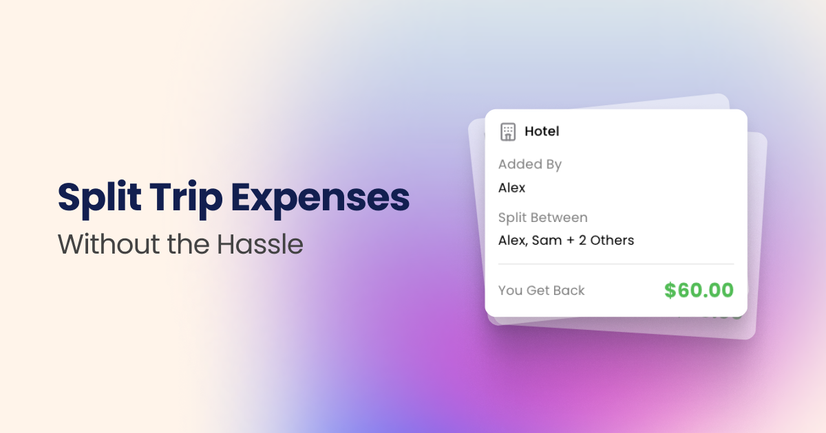
transactions listed one by one. What was the transactions? Title, who addit it, and who was it between? Most importantly, how
much do you get back or how much do you owe if you
have to pay for something? Again, super simple, doesn't
add an expense here. I haven't worked on that piece just yet for adding an expense. That's my design. I hope you did something similar
for your app. Again, keep it to minimum number of screens if you
haven't started this process and do leverage ChatGPT
and other AI tools to give you some feedback on it, but don't rely fully on it because again,
it's not perfect, it's not a designer, sometimes
it will tell you what you want to hear or it will tell you some extra stuff that
might not be relevant. That's where you as a designer also or your designer
side can come out and fight back or challenge back with
AI a little bit here. Um, so yeah, there we have it and time to get
started building this. So before we jump into the actual Cursor and
building out this app, let's go over what stack
we'll actually use.
9. Picking a Stack: All right, finally get
to the exciting part, building our first
version, our MVP app. We're going to go over
the stack that we're going to be using or at
least I'm going to be using. If you want to follow along, use the same stack, please
by all means do so. If you already have a
stack that you prefer, do the same stack
essentially refers to all the tools and
what you're using in order to code your
application or bring it to life. Right now we're just
designing Figma, it's one application which allows us to design our screens. But to actually turn
that design into a real functional
web application and have it live
for people to use, pay for, get emails
for, et cetera, we need to use a stack to essentially make
everything work, both in terms of the front end, which is the design
part and the back end, which is all the
server part that handles all the
information and data. So really quickly, let's
go over what I'll be using and then you
decide for yourself if you want to follow along with
this or use another stag. The top tools that
I'll be using in order to code this project
will be Cursor, which is the AI coding tool. It has an AI agent built in that you can chat with,
and of course, it uses models like
Cloud as well as GPT. Um, and other ones to
bring the idea to life. Then we have the code
repository on Github. This is where the
code will be stored. Every time you update the code, it will eventually push
it live to users as well, which we'll discuss in a
second how that works. For the stack, the
actual web app will be built with NexGS
which allows us to create both front end and back end applications and APIs, and then for the database, how we'll be storing the data or where we'll be
storing the data, it will be via Mongo DEB, which is a super
easy one to set up. That's where I'll be using to store my user and trip data. Next ATJS is essentially allowing us to
authenticate users, so they allow them
to simply sign up, have some simple
sign up options like sign in with Google,
email, et cetera. Versal is what we'll
use to deploy our code. Once our code on
GitHub is deployed, it will go and sit
on Versal which essentially hosts the
application and the back end. From there we can
even see things like analytics and logs
and things like that. Stripe will be the
payment company to help us process
payments for this app. Again, we'll decide how to
price our app, but once we do, Stripe is the tool we'll use
to process those payments. Resend is an email sending tool. For both notifications
and sign in emails, we'll be using Resend
to send it pretty much all of this is
free to start with. They all have paid plans, of course, and
things like Stripe, Stripe just charges
the percentage of the transactions so
you don't need to worry about any other
payment from them. Again, all the other ones, either it's free or free to. These are some optional ones. AW is for storage. If you want to store user
images or receipt uploads, in my case, I will be
doing that using AWS. Again, for MVP, probably
leaving that out. Google Analytics
is a good one to keep track of visitor
and user data. Another good analytics tool is PostHG where you can even
get more information like heat maps and how users are interacting and what
they're looking at when they're
interacting with your app. Very good for
debugging and things like that to figure out
where problems are. So definitely a good useful one. But again, optional
Super base censorship replaces off and database, so you won't need
Next JS and Mongo DB. If you use Super
Base and I believe even for some emails
sign in emails, you probably won't
need it either. I will replace some stuff. But again, I haven't really used it because
I don't really see that much need we already
have a stack figure it out. If you're studying out and
you want to try it out, it's not a bad option
either from what I know. This is the stack
we'll be using. We're going to now get started
by jumping into Cursor. Before that, we're going to actually set up our project in the next video and then come
back to start working on it.
10. Setting up Our Project: All right. Before
getting started, you want to install NojS. Head on over to
nojs.org and hit Genjs. You'll need this in order to
be able to actually create a new app using the
stack that we discussed. Again, if you don't
want to follow that stack and you already have your own or you already
figured no JS out, you don't need to
follow this obviously. This is if you're just doing
this for the first time and you've never created a NojS app. Once you're done, you want to
go ahead and open terminal. So from your machine or from
your application folder, go ahead and find the
app called terminal. It looks something
like this, and then you can actually
go ahead and create a folder on your
desktop or wherever you already keep maybe code or other projects for yourself. If you have a folder, it's best to navigate to that folder. I already have a
folder called code. I'm just going to do CD code
like this. There we go. I'm inside the code folder. Obviously, if you have a folder for yourself, do that there. You don't need to. This is
just more for organization. Then you want to write NPX, create Next App, had Enter, and it's going to ask you, what's the name of the project. For now, I'm going
to call this Trips app and hit Enter there. I'm going to actually
customize the settings, so I'm going to choose
my own preferences, just go down here. I'm not going to use TypeScript, I'm going to use yes int, hit no to this one,
yes to that one. The rest, I'm going
to keep default. Yes, no. There we go
now, it's installing. Again, this is the way
I set up projects, you don't have to
follow this, but this is how I would do. It's going and creating
that project right now. Now inside that folder, I have this trip expense app and it's gone ahead and
created all the files. What I want to do
now is actually open this folder inside of Cursor. I have Cursor already installed. If you don't have it installed,
go ahead and do that. Then once I open it Cursor, I see I get this interface here. I like to have the
side bar over here, the primary side bar. You can also do Command B. And now you can see all the folders here,
which is perfect. You can even go ahead
and run this project. I'm going to open a new terminal by going to the tab up in the status bar or the menu bar and hit terminal and
hit New terminal. Over here, if you
run NPM run Dev So, it will go ahead
and actually run the project and it will
open in a new browser. Like this. If you have this, that means that you've created a no JS app and
it's working fine. This is going to act
as our basebon for the code or the project
that we'll use. Let's come back in the
next lecture to push this on to GitHub
or code repository.
11. Using Git: All right. We want to actually put our code
that we just created, even though it's
a base right now onto Git Hub so that the
code is stored there. This way, when we make
updates to our code, we can push it to there so that it's saved
with all the changes. Then later when we
connect the versal, which if you remember is
the hosting platform, it will automatically take the latest code from
GitHub and deploy that to users or online on your domain so users can
use your product easily. Um, it's super simple to set up Git through Inside of Cursor. Obviously, you can do that
through github.com and go through the sign up there so create an account if you
already don't have one. But over here, if you just go to the Git essentially
tab over here, you can create your
first, you know, Commit. I'm just going to
do initial Commit like this and
publish this branch. Now, right now, it's telling me, do you want to make this
a public repository? Meaning everyone
on GitHub can see my code or a private one? For most cases, you want to
create a private repository unless you're doing something
of an open source project. But otherwise, you're
going to choose private and right away, it will publish to that. Then you can even
open it on GitHub. If you hit Open on GitHub, it's created in
my GitHub account this trip expense app as a private repository with
all the code in here. Uh, and so now if you make
any changes to the code, just as an example, I'm
going to go to page dot JS, which is, you know, that
initial screen that we saw. So first of all, I'm going to make sure
that the app is running. So this initial
screen, let's say, I just want to update the
text here to get started, um, you know, and change
this to trip expense. Er hit Save that automatically, by the way, updates
this. Now we have this. Then we can see if you head
on over to the Git tab, we can see there's changes
in the page dot JS, and we can see if you click
on it exactly what changed, this line change to
this, which is right, and then we can actually make
this Commit text change. So we'll hit Commit and
then sync these changes. This change is now available on GitHub as well.
If you go on your If I open this Git Hub repo, again, you can see just now there was a commit and I can
see all the commits here. That keeps it easy in
order to keep track of all the changes you've
done to your code over time, in case you made a
mistake somewhere, you can always revert back
to one of these commits. That's why we use Git throughout the project as I'm making it, you're going to see me use
it multiple times between each feature or
implementation or screen so that I keep track of the progress in case
there's any again issues, I can go back or roll
back to previous commit.
12. Choosing Cursor Model: I wanted to briefly touch
on the differences between the different models and agent
modes and how I use them. In terms of the modes,
you have Agent mode, which we've been using
in order to give tasks for Cursor to
complete for us. But we also have plan mode which before the agent actually takes action on
changing the code, we're asking you to plan things out and tell us
about what it's going to do and how it would
implement something so that we can review a document
before it actually implements. There's also debug mode, which you can ask to specifically
tackle bugs and also ask mode if you just want
to ask questions about your code or how your
app functions right now. From the models, you
can actually turn off Auto if you don't
want and you can turn on Max mode if you
want the maximum amount of tokens used for that task. Composer is cursor's own
model that works pretty well. I've tried that plenty of times. Ops is a great one as
well, including Sont. I typically don't work
with the GPT models, but they are available
here as well. My personal favorite is Sonnet
or ops composer as well. But keep in mind that it's not necessary unless
you're giving some more complex
or complicated task that the automde would
typically struggle with. Once you have a little
bit more complication or complicated task
to give to Cursor, that's when I would
use those models, keeping in mind that of course, it cost more tokens and
credits to use those.
13. Adding Homepage: Of course, there's multiple
things you can do from here. Either set up the API
routes for the backend, you can do the database
and set up MongoDB. You can set up the
UI and the designs. What I like to do
personally is to set up the designs first and then get into the
functionality of the app, one of the most
biggest mistakes I see in vibe coding is giving the app everything
to do at once. Once you do that,
you technically lose control of everything and you have to then go
back and tell it to make changes all
over the place. But if you keep the whole vibe coding aspect
of it controlled, where you just give one task, one thing at a time to work on, not only can we control it
and contain it because we can see what it's doing
each page at a time, but it's also better
because it's more organized and there's less
chances of bugs happening. Although I'm pretty
sure there's still bugs that are going to come oh, I'm going to start with the UI. I'm going to start
with the homepage. Here, back in the designs, we have the
authentication pages, and I'm sure you might need authentication
pages for yourself too. But my main page is
a dashboard page, and if you have a dashboard
page or homepage like this, you can always
start with that one and that's what I
encourage you to do. Um, and we're going
to use what's called Figma MCP server, which essentially creates
a connection between Figma and Cursor in
order to be able to do that or easily do that so that we can
copy a link from Figma, paste it into Cursor, and we'll actually take all the properties from the screen, not just screenshots and
implement a very close, clean version of
this design or UI. Uh, so to do that,
you'll need Figma Pro, you need the professional level account and then you're going to switch over to the
Dev mode over here. Over here, you can see
the MCP on this panel. If you don't see it, you
might have MCP disabled. If you have MCP disabled, you'll see this enabled desktop MCP server.
You're going to hit that. Then you'll get MCP enabled on this URL and you're going to go
ahead and copy that. Once you copy that
back in Cursor, if you're using other tools, they do have MCP as
well for most of them, do a bit of research on your
tool and how to set up MCP. For Cursor, you go to settings, you go to tools and MCP, and then you hit new MCP server, and then you replace this URL with the one you got from FICMA. I already have it set up, so
I'm not going to do that, but make sure you hit
save once you do that. Then if you did it
right, you should see FICMA the number of tools enabled and it's
enabled over here. Make sure of that
before you continue. This way, what you
can do is you can simply click on the
page that you want. I want the dashboard page. Copy this prompt over here, although we're going to
make some changes to it and then bring it back into the new chat
over here in Cursor. Paste it in. I'm going to use just an auto
model for this one. But of course,
there's other models that you can use and we'll talk a little bit
about the models and how to choose one later. But for now, an auto moode
should be sufficient. We're going to write a
few notes below this. We're going to make sure to turn each card into a component. And make sure to turn
Navbar into a component. What I'm telling Cursor to
do is to take the Navbar and these cards and make them into components so we can easily make changes to those later
and our code is cleaner. We're just going to
do that, hit Enter. I will start doing that. Now, if you got MTP going right, you should see it ask you for some permissions in just
a minute. There you go. You see it's running get
design context Figma. You can see the screenshots. Again, it might ask you for some permissions if you
haven't run this before. We'll give that a
minute. In the meantime, I'm going to head back over
to the homepage and see what changes it makes or the actual file
browser, I should say. Now it's getting started
creating each component, it's creating a NAVR component, trip card component,
and updating the page with NAVR
and trip card usage. Again, we're focusing
with design first, then going into the actual
feature implementation, database, and functionality of the real trip creation and such. It's all done. It gave us
a summary of everything it did with those components and it's updated
the page that JS. We're going to keep all changes, head back over to our browser
that's running this app. There we have it.
This is the design, it's copied over from
Figma. It's pretty decent. Obviously, it has issues like
this icons to stretched, but it's very close to what
we want it to be eventually. I'm going to do one more thing
and I'm going to have it install ChadsN to use components from
there in the future. As I'm using ShatsN library, I want to make sure
that it has access to the Shad CN components. It should go ahead and
install that and it will look for the Shad
CNUI and install it and hopefully make
some updates so that those buttons are actually coming from Shad CN as opposed
to custom coded buttons. I'll let it do that. You
can do the same thing, and then we'll come back
in the next lecture to polish that up and
move on to our trip page.
14. Design Refinements: I did a few things here to make the design a little bit better. I'm just going to show you here. I fixed the issues with the ellipse and the text
inside which wasn't there and this SVG that was
stretched for the plane. In order to do that, I
wrote a few prompts. I'm going to really quickly
go over them because again, I don't want to
emphasize too much on the building phase or this
part of the building, but rather just quickly say what kind of prompts
I gave the AI. I made sure that it makes
the text ellipse bigger. But actually before that, let me start with what I initially did. I initially gave it
two fixes to make. I said, Make sure there's a
text layer around the ellipse inside and repeat the city names just like in the Figma design. You want to refer back
to the Figma design that you gave it and the
plain logo is squished, can you make sure it
preserves the aspect ratio? It didn't do a great
job of that one. Then what I did is
I went over Figma, selected this plain layer, and then exported
it out as an SVG. As an SBG here. Once you export
that, make sure you paste that in the public folder. If you go inside of your folders where your
file your project is, make sure you paste inside
of this public folder, any icon you want because that's where the icons
should be stored. You can even create folders inside of here and
that's good practice. If you want to create
an icons folder and then store all
your icons there. I'm going to keep it simple and just place everything inside. So then I did a decent job. The text was a
little bit too small compared to the ellipse that was already there, the circle. I made sure that
it's the right size. I just asked it to make it so that it follows the same path. One was more circular than oval, so I made sure that that's matched and it did
a great job of that and I told it use the
SPG for the plane. Um, and again, some small tweaks make the texts a
little bit bigger. So if you have to
make any adjustments, just tell it slightly
smaller or bigger, rotate the plane SPG because
it was facing the wrong way. So make sure you give it those specific 90 degree
rotation, et cetera. Again, then the
date stamp was off. So you can see in
the designs here, it looks pretty good. But initially in
the app, it didn't. But then I asked it to make
sure that it's center. So now it looks pretty good. Again, some micro adjustments, bring the text lower, try one oh five, give
it some changes. You told me this is
the 110 pixel padding, instead of 100, I said try one oh five because
it was too much. Do give specific
numbers when you can. Next up, we're
going to come back and work on the trip page.
15. Trips Page: So before continuing, I'm
going to make sure that I write updated trip card design
and commit this change. Again, between your
changes that you make, you want to push to
Github every once in a while so that you can keep track of everything and
all the changes you made. Just in case you
need to roll back, it makes it a lot easier too. Onto our next page, which is the trip page for
me, I guess, this one here. This is the updated one. I'm going to switch
over to Dev mode, copy the MCP link, minimize it. Again, make sure
whatever you select, that goes to Figma. Make sure Cursor.
Make sure from Figma, you select the entire frame. Right so be sure between
your changes that you make, you create a new chat
in your AI chat section here so that it doesn't use too much credit or you're not
making one chat super long, which could be inefficient for the changes as well as
credit basis as well. You want to make sure
you create a new chat, hit Command or
Control on Windows, and then I'm going to go ahead
and paste that link from Figma for that trips page, and I'm going to give
it some information. I'm going to say, add
a new trips page. Based on the designs below, the user navigates
to this page via clicking on the trip
card from the homepage. Let me take another look at the designs and see if
there's anything else. Again, I'm going to have it
so that balance cards into components as well as turn expense cards
into components. The rest look good. One more thing I
want to do is make sure this is on download, so that it downloads the icons. Sometimes this
doesn't work though, we may need to manually export the icons and imagery
into our project. But let's see how this
does on first go. I'm going to pause and
come back when it's done. All right. It's done and giving me a summary of
everything it's done, including balance card
component expense card and the trips page, as
well as the routes. The routes are how
people navigate in your NextGS app and so
it's handled all that. Now we can try it and even
created the link here. Trips Slug is essentially
the ID for that trip. It's even setting up some of the foundation for our back
end later, which is amazing. So far, we haven't had any back end or server integration. But we will soon and this
will be super helpful. In the process, it's
messed up a little bit of the design here
for the trip cards. We'll fix that in just a second. But let's see if
we click on one. We have an error. This is super common when
you're working with AI. If you get an error like this, just copy the error
info over here, pass it back into
your coding agent. Just let it look at
that error and fix it. Most times it's either
some logical mistake or it forgot to define a variable or
something like that where it's usually small and it
will be fixed right away. Give it some time. And
while it's doing that, we can go back here
and there we go. It's fixed, and it looks
great, to be honest. It's right off the bat, it's as close as we can
get to the Figma designs. Again, that's the beauty of MCP. This would have
taken me at least a couple of days to do before. But now we have all of this. Of course, it hasn't done
anything that you didn't tell it to adding in
expense doesn't work yet. All trips works, goes
back to all trips. Invite Friends doesn't
do anything yet, neither does these
three dots here. And you can see it's created
two different versions. There's this version
here for Tokyo. But if I go back, there's
also this version for Bali, they look different. These are not buttons yet, so of course, we have
some things to fix. I'm going to make a note of these things and so should you. As you go through putting
each page together, make a note of what's wrong. I'm going to make a note of the button here
needing to be fixed. Make a note of the
add in expense, but also for that one,
I'm going to create a new prompt for it. Um the rest looks okay, but of course, there's issues
like this alignment issues. You see this one
here is on align. Little things like
that, make a note of it and pass it back to the AI. There's no gradient here behind the arrow like I
have it in my designs. It's really small subtle stuff. I'm going to do
those fixes because they're smaller ones
and then come back and continue with the
rest of the flow, which is going to be
adding in expense. Then also, I'm going to work
on creating a new trip. Those are two things I'm
going to work on next. Um, and again, for your
app, follow along. But if you're making
exactly the same thing, you know, you can
follow along exactly.
16. Routing to Dashboard: All right. My Cursor
is now making small changes like the gradient over here that I
was talking about. Now, one thing I want to say is one small change I want to make and make sure you
make in your project is that project in
your app folder, your page dot JS is initially the original
page that shows up. So in our case, right now, it's just local host, 3,000. There's no sort of
slash, sum page. When you're over
here, hiplah Bali, then basically
you're looking at, inside of this app
folder, the trips page. That's where you
have this trip ID. We want to also move our page here right
now, this one here. If you have a dashboard page
like this one that I have, you don't want that to
be your page dot JS because that's actually meant to be for your landing page. When people land on your
website, the marketing page, the first page that
shows up for example, here for the current version
of QClip it's this page, then I have a dashboard page. Slash dashboard is actually
the dashboard page. One small change, I'm going to have it and I'm going to
do this in a new chat. Make sure the current page
JS becomes a dashboard page. And change the page dot JS to just have a placeholder
text for our landing page. We don't want it to make
a landing page right now. We're going to do that in a bit. But for now, I just want to make sure that that page becomes a dashboard page so that
there's no confusion later on. Make sure you do something
like that as well if you haven't as it makes a change, if we go back here, landing
page coming soon and then if you go to slash
Dashboard, there we go. We have a dashboard page here. Just for simplicity, I'm
going to say add a button on the landing page that
takes me to the dashboard. So that every time we launch the project because by default, we land on the landing page, which is currently here. We
want to have just a button. Again, this is temporary just for us to get to
this page quickly. So I'll continue making
small changes mostly to the design and functionality like this one here
for the design side. Then once things are ready, we will proceed or I
will proceed with adding an expense and
adding a trip flow. One more thing I'm going
to do is, um, you know, change the links for
all buttons that were previously linked to Page
JS to go to porta JS, on the Trips page. Just want to make
sure that it also changes this link here. All trips should go back
to Dashboard instead of the homepage or
again, landing page. Make sure you make that change. Just something subtle to note.
17. Adding Expenses: All right, things
are starting to look good and much cleaner, so I'm going to go ahead
and commit the changes. Change cards and
added trips page. I'm going to sync these
changes now going back, I want to add my
add expense flow. I already designed it over
here because I figured why not it's easier to
pass this to Cursor. Here, I'm going to
double click to select this card that basically
adds an expense and then head on over to MCP to copy the link or the Dev mode
back here in Cursor. Going to create a new chat,
paste that in and say, add a card to allow users to add expenses once they
click on the add expense. But in the trips page, you want to be
specific like that, give the example of where it is, although most likely we'll
probably figure it out too, but this makes it a
little bit easier. Make sure to fade this blog in and if the user clicks
Cancel, then close it. If there are changes made inside or numbers added
in the input fields, show an alert, first, then cancel or close
it. All right. Gave it some instructions
there and the main one was if the user clicks
to cancel this expense, make sure that they
actually get prompted, do they actually want
to close that or not? This way they don't
lose some data. Just really quick rundown. Here I have an amount field, so user puts the amount. It tells them what was it for. This is where the category
shows up over here. Or the expense name. Then
this is how it splits. Usually it's split
by default is equal, so equal between everyone. But then if they want, they
can actually go in and change the numbers and dynamically
it will update. If they want to go percentage
basis, they can do that. If they go dollar
basis by dollar, they can do that, or if they want by day, they
can also do that. Then if you remember, it will calculate how many
days from the total trip, did this person sleep at this Airbnb therefore charges the right amount and
then add expense. So pretty simple
straightforward. It will start doing
that and let's see what it does in a
minute. All right. It's done working and
let's see at an expense. So it's obvious it didn't
access the Figma designs. I can tell by the design, just not following exactly
what it should look like. I'm going to ask
it, did you follow exactly the FICMA
designs and ask it that? We didn't have access, fetching the designs now.
Sometimes this happens. It makes mistakes, it doesn't actually access it
for whatever reason, you might need to repmpt it. Just just a friendly reminder, you might need to do that multiple times if it doesn't happen the
first time around. Let's see what it does
this time around. This time around, it fixed it. In fact, I input
some numbers $20 automatically calculates
everything to $30, there you go. You can remove people from it. These are probably
not the right states, so I just need to update
those little things. You can do percentage basis. And this doesn't quite
look right either. Again, I might need to make a few changes here
and there to make sure that for the
specifics, it updates it. But the base design is decent. The placement of
these, of course, not right, but at
least it asks us, do we want to actually
discard them, at an expense, and then you can't now it's letting
you add empty expenses. Little things like
that need fixing. But we'll make those changes and continue on in
the next ecture.
18. Authentication Pages: All right, we're getting
into the meat of the course, the building phase, and
getting more real with it. I changed the light setup
behind me to match that vibe. But basically, we're going to actually start working on
our authentication now. So I'm going to run
the project and sort of review one more
time where we're at. I have my dashboard page set up. Obviously, these are
test data and not real, so we'll get to creating
real trips and real data. For now, these are
all just tests, but I have a working,
first UI going. Obviously, there's still
improvements to make, but we won't go down
into the details. In fact, making your MVP, you should be prioritizing
momentum and getting it out fast rather than the small
details that as a designer, I sometimes go down
that rabbit hole of fixing small
design details too, and to some degree,
they matter for sure. Yeah, I have the expense flow also added over here for myself. Again, not perfect. There's
still tweaks to make. But I think this is a
good time to actually get started working
on authentication. In other words,
letting users actually sign in and create an account. For that, we're going
to use two tools. We're going to use ATJS which is this library
that allows you to sign in your users using
different applications, even like Github and Google, Twitter, Apple, as well
as Email, of course. Again, we're going to do MVP and we're going to stick
with just email for now. But obviously, to
set up these ones, you can go through that as well. They just take a little
bit more time and a little bit more setup per se. You can actually go through
the instructions for those ones on how to
set up, for example, Google, so for now, we'll start with
just email sign in, so users will put
in their email. I will send them a
magic link to sign in. And for that magic link, we need to actually send emails. To send emails, we're going to use this tool called Resend and this resend essentially allows you to send up to 3,000
emails per month for free. This is a great
option. So go ahead and get started for creating
an account for Resend. I'm going to do the
same thing over here. All right. So once you're in, you can create an API key for your accounts, go
ahead and do that. And make sure you copy it. Now what you're going to want to do is you're going
to come back in your Cursor or wherever you have your files and you're going
to create a new file, and you're going to
call it exactly spelled dot ENV dot Local. So this is an
environment file where all your API keys will
be stored so that these API keys can be used to authenticate your app with
resend for sending emails. This is a super private file. You don't want to post or
publish this on GitHub. That's why it's actually
automatically in the Ignore file which will
ignore uploading that file. This file actually defines
what will be pushed onto GitHub versus what's not and
dot ENV files will not be. These are secret.
You want to keep it a secret and on your machine. Um, so for here, you can really type
it however you want, but I like to just do Resend underscore API underscore key, equals, and then paste
in your value there. Once you paste your value, hit Save, close that file. Now, we want to set
up Auth JS as well. So we're going to
tell, you know, Cursor to help us with that. But first, I'm going
to actually copy the design for our
authentication screens. So I'm going to just
do this one here. I'm going to go over
here. There we go. Let's implement this
login screen from Figma. First, let's go ahead
and actually implement the design before we actually
integrate the login screen. I'm going to just be sure
to use Shad CN elements. And this page should
be slash Login. I'm telling you what
name to create it, although probably you would
have figured it out anyways, but I'm telling you
explicitly make a login page under our app. When you go to your
app.com slash Login, people and on this page. We'll get started
with that. We'll come back in a second to
see how it does. Let's go to slash Login. And there we go. Not bad at all, very
close to what we have. We'll worry about the graphic here later once we
have our app going. But this is great. There are minor stuff again to fix when I'm hovering
over the buttons, this login button is not
showing the right Cursor. Again, for those little things, just make sure you let it
know on the login button, the correct link Cursor
type is not showing up. That's how you want to approach your fix set small
and one at a time. Then we see we have a sign up. We don't have a sign
up screen just yet, so I'm going to also ask
it to duplicate this page and also make a sign up
version on slash sign up. I Queue that. Next up,
it will work on that. And while it's doing that
and wrapping that up, let's come back in the
next lecture to continue with our authentication setup.
19. Database: All right, I have a
sign up page going to and before we actually can make our authentication
truly work, we need to set up a database. So database is where
the data gets stored. So once a user puts
in their email, the password and wants
to create an account, this is where in the database, essentially an account
record will be created, and anytime we need to
make updates to that user or we need to add trips or
we need to add expenses. All those have to be separate. You can think of
them as tables or separate categories of documents that we need using a database. For our database, we're
going to be using MongoDB. Of course, there's
other options like Postgres and Neon and
a bunch of others. If you're already
used to one, pick it. If not, getting started
with Mongo DB is simple. Head on over to
mongodb.com, get started. Already have an account,
I'm going to log in. Once you're logged in, make sure you go to create a new project. I'm just going to
name my project trip Expense app for now. Again, you can change
this later. Hit next. Hit Create Project.
Then once you're here, you want to go ahead
and create a cluster. Cluster is essentially a
container for your database. This is where some
options will show up. I'm going to choose the free one it's good enough to start with, and then as you get
more and more users, you might want to upgrade
to the other ones. Just to leave it cluster
zero for the name and then leave these with the default
settings, create deployment. Now, right away, you'll see
some username password here. You're going to go ahead and
hit Create database user. You're going to choose
a connection method and I'm going to choose compass. So Compass is this
application that lives on your machine and you can manage essentially the data through there you
can see the data. You don't have to log into mongodb.com every
time on your browser. In fact, you can just use this MongoDB Compass app
in order to do that. Go ahead and download it. Take a second to do that
if you don't have it. I already have it,
so I'm going to hit I have Compass installed. Then down here, you'll
get some string for your connection. You need this string again to have it inside of your code. Make sure you copy
that. Hit done here. Go back to your code and inside of dot dot
Local that we created, you're going to
create a new line, Mongo underscore URI equals, and then paste in that string
that you got from Mongo DB. Hit Save and Close that. Now, once you inside
MongoDB compass, you can add a new connection, paste in that URI that you got. I'm going to change the name to Trip expense app here and
then save and connect. So I'm inside of here now. There's no data yet, so there's nothing
here that you can see. We're going to do
one more thing. You're going to go
back to your on local at the end of your
string here where it says mongodb.net slash, you're going to write Dev DEV. Doesn't necessarily
matter how you write it or even if you write
development or such. That's all just to
create a folder here called Dev or a container, you can think of it that
basically separates your Dev of testing database
from your production. Once we go live and other
users can use this, you want that to typically
stay on another container on your database or in your cluster so that
it's not all mixed up. This is more for organization
and best practices. Once we get to the
real production, you'll see how to do that. But for now, make sure you add that slash Dev. We're
all set up here. Let's come back now
in the next lecture to actually start
authenticating users.
20. Finishing Authentication: To get to creating users. One thing I do want to note is that right
now inside of my app, we have this email and password. I'm going to choose not
to go with password and just keep it simple so
users just put their email in, get a link to actually
sign into the app easily. This way, it's much simpler and they don't need to remember password and so on. Obviously, you can choose
to do that if you want. Of course, these buttons probably won't work
to begin with. Later, if we get the time,
we can always set that up. But for now, let's just focus on getting users signed
in with email. To do that, I'm going to go
over here and in a new chat. We're going to install next auth and implement
authentication, it works and also add a user model and the
necessary files for Mongo. You're going to write that and basically all
you're telling you to do is to install that next off JS library that
we talked about, and then it will go ahead
and create a user model. Every time we talk about
something like a model, it means basically defining what are the parameters
of a user, for example, a user has an email
have a password, they have first name, they have trips that
they created and trips are those could be linked to
another model, essentially. You want to think of it
as what are the data related to the user or whatever other model
we're creating. Once we get started creating
the trip model, similarly, we're going to need date fields from which day to which day. Um, how many people
are part of this, who is part of this trip? What expenses are
under this trip. We can see Cursor already put one together for
our user dot js. This is what it
looks like, right? We have the name, we have the email, we
have the password. It added password
because it saw it in the designs, but
again, we won't need. This is timestamps,
which basically just shows when was
this user created? When were they last updated or when was their
data last updated? Just by default, they should be there. We're going
to keep this file. I made a mistake here and I forgot to tell it
to actually remove password and use resend for
sending verification emails. That's what I'm doing
exactly right now, telling it to remove password from the app and
authentication and instead use the email field
and resend for verification. I'm going to wait for this to
finish and then come back. More thing you got to do for Next Auth to work
is that we need this auth secret key
in order to be able to integrate or add it to our on local file or
environment file. Just copy this NPXOTsecret from over here and then
run it in your terminal. I'm going to open a new terminal here and then just run that. You do the same. Then it might tell you to
install a new package, so just type Y and
hit Enter as for yes. I will give you some value. Just make sure you
copy that and put it in your on local file. Cursor has even put
together example for me to see what are the
things that I need. I also need this
recent from email. Make sure you add
that. For testing, you can just keep it like this. Once we buy a domain, we want to actually use the real domain. Going to restart my
server by hitting Control C and then going up
here to run NPM Run Dev. I'm just using the
up arrow key to go back to the last command
I've written in there, hit Enter, and then open
my project one more time. We have this email.
Welcome back. Now, I don't have an account,
so I'm going to do sign up. Make sure here you put the email address
that you signed up with Resend for testing
purposes. There we go. When I check my email, I
get something like this. Seems like we didn't paste
the next of secret correctly, just like it has it
in this example file. So let's test that
one more time, click to sign in, and there
we have it. We're logged in. We actually have a user now. It says our email here, we can sign out from here. If I go to our Mongo DB Compass and refresh this
trip expense app, we can see we have
this folder now Dev because we put
that slash Dev. Then if I go over here, we
have users, and there we go. That's my user, so it's showed up there. We don't
have a name here. Perhaps in the sign up page, we can have it so that the user fills in their first name there. Originally, my design, I thought I'll make
a separate page, but it's silly to just
have one field here. I'm going to create a new
chat and ask Cursor to add a new name field
to the signup page above email the
user's first name is also saved to the
DB short for database. I'm going to let that run and pretty much we have our
authentication completed. Now we have users,
we have a database, and we're one step closer to actually making
this app fully functional. Let's come back next to actually focus on allowing
users to create trips.
21. Creating Trips: All right. I think I'm
ready to start making the create a new trip here so that people can
hit Create a new trip. I'm thinking MVP,
keep it simple, quick alert model
screen that shows up, asks them for the
name of the trip, and the dates, the dates will be optional, but
I'll keep that there. And I'll make sure to
use hat CN components because they already have
date pickers figured out, so you don't need
to figure that out. Then for the rest, we don't really need
anything else from the user. So maybe I'll just have
a quick create trip and ink, copy invite link. They just do that
and then they can send it to whoever they
want to join their trip. Let's get that started. I'm going to go back and create a new chat here and say, um, let's make adding a
trip functional users can add a new trip. Be sure to add it
to the user model. Be sure to create
a new trip model. So again, model over here is how we keep track of
different types of data, a trip should have its own
separate data from the user, and the trip will
include things like, as we talked about before
the name of the trip, um, the number of expenses or
the expenses under it, who's part of this trip so
that we can actually show or allow users to see the right trips and
so on and so forth. So as part of that trip model, so I'll just write as
part of the trip model, be sure to add the
following name owner, so who created this trip
users that are part of it. Later we'll add expenses. We don't have an expense model, so we'll just leave that out. Start date, end
date of the trips. We don't really need a location, that would just be the name. What else do we need? I think
that's good to start with. Then we're going to have it
create a new model using Shad CN the components that
will show up when user hits, create a new trip
and only ask for the name and dates
and start dates. Make dates optional, but name is required and make the primary
CTA or call to action, create trip and copy invite link with a secondary
CTA to just create trip. We're going to run
that, give it a second and come back
to see what it does. It's important to know
what's going on in the background as it's doing
this thing and adding that. I want to make sure
that you understand what the AI agent is doing in the background because again, I believe it's important to also have some background info. It's doing a few
things. It's creating a model for our trip. If we go on here, we
see all the data that we told it that we want. I even added some extra ones like Invite code that I
didn't tell it to add, but it is doing that such
that it can generate a trip code that people
can send to each other. It's also created an API route. API route is essentially
a way for the front end to talk to the back end and do things such
as create new trips. If we go in here, it
does a few things by checking first to see if
the user is authenticated. It does some initial checks, making sure that the
trip name is added. If the user doesn't add those and tries to create a new trip, essentially this API route
will block them from doing so. But if everything seems right, then it will go ahead
and let it create the trip with the following
information with the name, who it belongs to,
who's part of it, where the users,
when's the start date? When's the end date. Essentially, all this
code is doing is allowing the front end to talk to the back end
using this API route. Um, obviously it's making
some assumptions on its own. So the AI will do that if you don't give it
enough info or context. I believe I didn't fully talk about what we want to
do on the trips page, whether it's going to
replace those sort of empty cards or fake cards
that we created so far. Let's see what it does
and then go from there. All right, so it looks like
right now I have no trips. It didn't implement
the empty page yet that I already designed, but I haven't given
it that page yet. That's next in the things to do. But let's try
creating a new trip. Let's name it Bali
2025. Start date. Let's pick March 2, let's do the sixth, create trip and copy invite
ink, fail to create Trip. Something happened.
Let's see what's gone. Over here in your terminal, you'll always see any errors
that may have happened. It looks like there
was some error with something to do with the next over here that it's written. What you can do over here in the Cursor is you
can actually do at and then go to the terminals and you can select this
is the node terminal, so you can select the
node terminal and say, we got an error and
let it figure it out. Looks like it's fixed it. Let's try that one more time.
And there's still an issue. Again, repeat the
exact same process. There's another error, it looks like the error
is somewhere else now. Let's see if we can fix
it. Times the charm. Let's hit Create trip
and copy Invite ink. Boom, still an error. Make sure every once in
a while after fixes, you stop the server, so hit Control C
in your terminal and run your Dev
environment again, run your app again, and then
let's do that one more time. Bali 2025 and we're
going to set some dates, even though it's not
necessary. And there we go. We're inside of Bali 2025. It's even created
this link over here. Now, I'm not sure if it
actually did copy the link. Let's try it's creating
an invite ink by itself and we run it outside. We don't actually have
the right link here, so it didn't implement the
invitation part correctly, but that's just because we
rushed into creating the trip and we didn't give more
details about how it's going to handle the invitation
of friends and so on. So my logic is, let's get trip creation
first completed. Let's get expense creation
and all that figured out. Then we're going to work on how the users can actually
invite friends to join. For now, this is amazing. If we go back over here, the trip has been created, and this is not just fake, but this has actually
gone through our bagend and if we refresh
our Mongo DB compass, we can see we have this
trips folder over here now with all the trip
that we created, this one trip that we created, we can see who's part of it. Ever you see object
ID that refers to another table
on another folder. This is the user that
I have over here. That's the object ID here. It matches the user or the owner and as
part of the users, it's also my account. I'm both the owner of this trip and the user,
which makes sense. We have the start date end date. It's created some invite code. Again, we didn't give more information about
how invites should work, but we will do that later again, once I finish the
entire flow for a trip. Let's come back and
actually work on expenses. Um, and then get
into invitations.
22. Expense Flow: So it looks like
we're on a roll here. So why don't we keep it moving forward by making expenses real? So let's add functionality
to expenses, create an expense model with
all the parameters needed, and be sure to make sure to add expenses
to trips model, if not already there. Make sure expenses actually calculate balances
from different users. There we go. We're
sending that through. Time to test our expense flow. Let's add an expense. Let's say it was $20 and
it was for groceries. And obviously I only have one person added to
the trip myself, so it doesn't really make sense. But let's just go ahead and
put it and see if that works. There we go. It's been added. Obviously, it needs
some work right now is showing the email here
instead of the first name. I'm guessing somewhere
in the code, it's showing the email if
there's no name for the user, let's actually test that. I'm going to go to
Mongo DB Compass and instead of the name here
being empty or null, let's go ahead and actually
make a change to this. If we hit Update,
let's set name. To Nima Tahami. This set is essentially changing
this name to Nima Tommy. Usually, you can edit
it directly in there, but because it was null, we had to actually
do it like this. Now if we fresh, we have a name. If I refresh in the
app, and there we go. I was right the code is
substituting email for name. If the user doesn't have a
name, it will show this. But I made sure
that from now on, I collect name from the
users in the sign up flow to see that if we go back
to all trips and sign out. Let's go to sign up now. I will ask for full name, unless you put your full name, I won't actually
let you sign up, you got to put
your full name in. There we go. Expense
flow is working too. If we refresh our database here, I should see expenses as a separate table,
and there we go. We have the trip
that it belongs to, um, paid by, who actually
paid for this trip? What was the amount?
What's the description? How is it split? It actually kept
all that in mind, as well as the splits as
well. Who owes how much? This is looking pretty
good. I'm not going to lie. Obviously, there's still
improvements that I can make to this allowing users
to delete expenses, making sure that this
split between works right. In the future, I'm going
to do some testing to actually make
sure this works. Next step, I'm going to
make the Invite friends flow work so that users can actually copy
a link over here, hit Invite Friends,
copy a link and then be able to invite other
friends to the app. The issue is that right
now we can't create multiple accounts because
Resend only allows us to send emails
from domains that we own and we haven't really branded this app or found a
domain or anything like that. We do need to take a pause, talk a little bit about branding and coming up with a
name and all that. Once we are done
with that, we can actually continue
testing this flow. For now, I don't need
to worry about that. That's more in the
testing phase. For now, I'm going to
make sure that first, it's implemented, this
Invite friends works. Users who are not authenticated
can see the page, just the trip
information over here, and then maybe a
button to join the.
23. Branding: So we need to come up with
a brand before we continue. You know, at some
point in your project, you got to do this. It's one of those things that takes a little bit of time
sometimes to come up with, especially picking
the right name, the right logo, you know, fonts, colors, et cetera. I face that issue many
times, as you can imagine, um, building, I don't
know, 16 plus apps. And so come up with an application myself
to actually help with that. Now, of course, alternatively, you can do this in ChatGPT. You don't need to do it
exactly in this tool, but I essentially put this tool together to be able to
give you a quick brand, including colors, domain ideas, name ideas, and so on. So I already own a
domain tripvela.com, and because I had this for a previous project that
never actually came to life, I want to use that
for this project because it's very relevant, but I don't have a
logo for it and I don't really have specific
fonts and colors. So I'm going to use Brand
kit for coming up with that. You're going to
write the brand or, you know, the idea here, an app to help friends
split expenses on trips. Because I already have a name, I'm going to say it's
called Tripvela. I don't need the name
D. I just need logo and maybe some font colors. It'll take a second here. Obviously, it's showing
Tripvela as a name. Here's a simple logo I can use. This is a basic logo, but you can also
get premium one. I'm going to try premium logo. This color schemes not bad, but I'm going to
switch it up and try seeing what else
we can get here. This is a decent one. This gray is nice, too. I might
use some of these colors. But for now, let's see, this is the premium logo
it came up with. Let's give that one more spin. Obviously, tripl.com is taken because that's the
domain that I have, but it shows you other
domains available as well. If you want other names,
you can shuffle it. You don't have to bring your
own name into the tool. Anything comes up with an
email signature for you, so you can use that
for your email. Feel free to play
around with this, come up with a name idea, come up with some
fonts and colors. Again, you can use
this or you can chat with ChatGPT
to come up with it, and then go ahead and
purchase a domain. Make sure you purchase
a domain and then come back to integrate
your domain into Resend just so that we can
create multiple users so we can actually test our Invite flow or at least
for my application. If your application is different and you
don't need to do this, you can leave this
until the end. I'll see you in a minute.
24. Connecting Domain to Resend: I hope by now you've purchased the domain that you're going
to use for your project. Once you do so, now I'm
using Namechep here, so you might be using Go Daddy,
Namechep or another one. Make sure you find the
Advanced DNS section so that you can add
some records here. These records will allow us to send emails from
resend to users. We need to go under
domains here in resend.com at a domain. Write your domain. You
can also make add domain. You can send emails from, for example, notification
dotdmain.com. I'm going to do the same. I'm going to do
notifications.tripvela.com, which is my domain. And then we're going
to do add domain. Then I'll give you some
instructions here. You can even watch a
video if you want. But it's pretty simple. All you need to do is copy
these records into your DNS, in your domain provider. You're going to
add a new record. If you look back,
this is a TXT record, you want to select TXT record. For the host, again, paste whatever you see in here. For the value, paste
what you see in here, you can just easily copy
it and just make sure that you're doing this right.
Take your time with it. You're going to also
do an MX record. MC records are
actually over here. I already have send
dot notifications. Then I want to copy
this one over here. Going to add another
MX record, in fact, or actually, this is a TXT
record, not an MX record, but another TXT record up here, paste the host and paste
this one here, the value. We've done these ones now here, and this one is optional, but I recommend you do it. Another TXT record. So and hit Enter. The only one that I want to make sure that you do as well is to set the priority here
to ten for the MX record. Because we're not going to
receive emails from this, it's just going to be sent
for people to log in. We don't need to
enable receiving. I've added the records and
then it will check the DNS. Just give it some time. If
you've done this right, it will all be green flag soon. Then you know that you
got this setup and you can start sending emails
from this domain. Times this might
take a little bit longer than usual,
give it some time. It might take up to a
few hours or minutes, but typically this is
done instantly and we're verified.
We're good to go. Now, all we need to do
is head back over to our code base and
make sure that in the code base in
your on dot local, just like we have in the
on dot example here, change the resend from email to that email
that you just created. But of course, you
just created a domain. Mine was notification,
dot tripvela.com, but you need a beginning for
the email and for this one, typically, you can do just
something like no reply at. No reply at
notifications.tripvela.com. Going to just double check
that that's what I have here. Make sure you replace that email resend from email so that it knows and it
sends from the right email. I'm just testing this now from another email to
see if it works. I see it does work. Now I'm getting it from Tripvela notifications
at tribella.com, send to me, and
then I can sign it. Now we've created another user, I can create trips
under that user. But what I'm interested
in is being able to join a trip that
someone else already has. Let's come back and work on that flow in
the next lecture.
25. Invite Friends Setup: So from the user
that I just created, which is a different user that I created the initial trip with, I tried to access the same link that that user has
for that trip. This is the link for that trip. But now what I see is that I don't have
access to this trip. Because I'm not the
creator of the trip and I'm not one of the
users inside of the trip, I can't have access to it. But what we want is
we want to actually show some information
about the trip, perhaps just this
top portion here, that this is a trip to Bali, this is the owner, these are the dates and how many
people are going. Uh, and then instead of seeing all the other
information like the balances and trip activity because it's not relevant to me yet, I haven't joined the trip. What we can do is we can have a button that says
join this trip to see activity or something like that. They
click the button. Then if they don't
have an account or if they're logged out, it will ask them to then
create an account or login. Once they've done that, then they should be able to
automatically be part of this strip and then see all the balances
and trip activity. For now, we're going
to go ahead and tell Cursor or Cursor AI agent. We want to allow users both public anonymous or logged in, but are not part of a trip, to be able to see high level
information about the trip. That includes just the top part, not the balance or trip
activity sections. Instead, there should be a
button to join the trip. If a user clicks on it, they should be brought
to the login page, and if they are not
part of the trip, they should then become part of the trip and see
all the relevant info. What we're telling you to do is we're telling it that we want people on the Internet to be able to find this
strip by this link. If you have this link, it
means you can access the trip. So someone shared it with you that has access
to that link. So it's not publicly
accessible link that everyone knows about. It's some unique link. As you see here, it has some ID here that typically
people won't find. Unless someone shared
this link with you, similar to how a Google Dog
or Figma link also works. People can go to this page, but they can't see any
of the data until they actually create an account
and join the trip. That's how we'll see
friends joining the trip. Me as a trip owner, I'll send this link to
my friends and then allow them to create
an account or login if they already have
one to be able to join this trip and
participate in adding expenses and seeing balances
that they owe or owe to. I'll let that finish and
then we'll come back to see how it looks from there.
26. Testing Invite Links: Um, I passed one more prompt
to Cursor once it's done, and I said when a user
clicks on Invite Friends, show it toast, which
in other words, this means a little
message that comes up to show success, et cetera, or errors, and say copied link, send
it to a friend or two, that's just a friendly
message and then copy it to their clipboard
so they can send it out. Because I noticed when
I go to Invite Friends, it doesn't work, so I made sure that it also adds
functionality for that. Feel free to always send
multiple prompts to be able to add stuff in the queue so that once the AI
agent is done one thing, it also works on another. Of course, you can run agents
in parallel by creating a new agent and having
multiple ones run in parallel. I like to do that
if I'm working on something a little
bit more complicated. This project is simple enough that we can just
run one at a time. All right. Let's test it out. We're going to go over here
and take a look right away, even though this is not my trip, it's a trip that I accessed on another user
account that I have. I can in fact join the trip. So if I hit Joint Trip Boom, I can see all the
info and I can even add an expense. There we go. This user is called Tim Cook, so I can actually see
the expense here. If I add 20 here, you can see it's split equally
beautiful if I do percentage. The percentage is
not working right. It's got to figure
out by percentage, so it's going to change
these fields to percentage. Same thing for the
dollar and same thing by the day. Obviously,
it needs some work. We're not here to perfect
anything just yet. We're here just to make sure
the base works and then we'll start making
small adjustments. If I do add expense, Okay, this one gets added. Beautiful. It's shown split between this person
and this person. Again, little adjustments
here and there to make. I can see $10 is owed to me, so that's nice and I
can mark it as paid, but that doesn't
work because so far, we don't have this implemented. We're going to make
sure that also balances are implemented properly. So we'll go ahead
and do that as well. But for now, we can see
everything's working nicely so other users
can join the trips. We have two issues that Next JS is Anytime you have some errors, just copy them over
to Cursor like this and open a
new chat and just share the error and
hopefully we'll fix it. Same thing with this one. I'm going to do
that in a new chat. I'm going to have it
fix those errors. You work on your
features as well and then we'll come back
in the next lecture to work on balances
so that people can actually see she's balances and it's smart and calculates automatically or
simplifies the debt similar to what Spitwise does. Then once that's ready, I'm going to make a
few small changes. I'll come back and explain
the changes I made. We can see those errors are gone by the way, so that's nice. But for now, I think
we're pretty much set. If I go to all trips, I can see this trip here. This is not right because
it says just you, but it should in fact say how many people are part of this trip because
not just me now, there's three members, it says, although it should be two. Again, little errors
here and there. Note all the errors
that you see. When you're testing
your app like this, note all the issues that
come up so that you can fix them one by one. Um,
that's the best thing to do. Don't try to fix all
the issues at once. Cursor might mess
things up more, um, but I have a list of things
to do, including, you know, a better format to show split
between a better icon here, so this icon could change
based on the expense name, um, you know, right now, it allowed me to add an expense without
saying what was it for. So, quite a bit of stuff to fix here looking into issues such as why it chose
three members. I'm going to come back and make those changes at the very end. Then lastly, I want to also
make sure before we wrap up our MVP that the app is also mobile friendly in case users try to access
it on mobile, which I'm sure they will
for an app like this. We might need to make some
adjustments to that too. Let's come back,
work on balances, make sure that
functionality works, and then proceed to little
fixes and mobile displays.
27. Adding Balances: Back in the app, I created another user and added
another expense there. Now my balance is zero
because one user owes me $10, the other one, I owe $10. Now I want to make sure that
this balance feature works and people can actually
mark things as paid. I want to make sure that
simplified debts happens so that if users owe each other, it simplifies who has to pay who so people all
over don't have to make transactions or transfers and it just simplifies it to who owes to who in order to keep the number of
transactions required less. Obviously, there's other
things that I want to fix up, but before that, I'm going
to go over here to Cursor, open a new chat and
we're going to say, I want to make balances
work and be functional. Such that users can use it
to keep track of Mark as paid for each user that they
owe money to or owed to. I also want the calculation
of balances to be simplified such that it automatically calculates who should
pay what amount to favor the least number of transactions or transfers users in the trip have to
make to each other. Add a toggle to the top
right of the balances, saying, Auto calculate is on. If they turn it off, then show how much each individual user is
owed or owes to the user. Plain and simple,
I'm telling you to make this functional, keep track of it
in the database, who's paid who so that it could be visible here
to the user, that, for example, if I paid um this user here, it
keeps track of that. Or I guess, in this case, if the user has paid me,
I can say Mark has paid. Same thing with this one, keep track of that and make it live, and then also
simplify the debts so that if users owe
each other, again, it does the least number
of transfers required, just like it does in split wise. Those are two changes I
made. Let's see how they do. An eye out on Cursor as
it's doing something because sometimes I notice that it tries to
do something new. I asked it to make sure that the paid button here works and I wanted to create a new list that we
don't even need. Now we see Auto calculators on and if I see on
this other user, it does work because
right now it's off and I see these two people
owe me $10 each. But if I do Auto calculate, this person pays me 20
bucks and I'm settled. This works, that's good, but we've got to make sure
that the mark paid works too. It's saying it works
now, let's see. It just disappeared from there. That's interesting. We're going to make
sure that the cards don't disappear. I
spoke too soon there. It's still working
on this feature, so we're going to give
it some time now. We see this works now. I can revert these payments,
mark them as paid. There's some issues going on where it's duplicating
the cards. I'm going to make sure
that it's actually keeping the same card and just
changing the this. Going through this process,
I'm also realizing that there's a UX gap here
that could be improved. I've used split wise
countless of times and one of the things is
you never know when to act. When should you actually
start paying other people. What I'm thinking
to do is to add a settle button that the owner of the trip can engage with. They have a button
that says, um, settle that will close the trip activity so people
can't add expenses anymore. Then it will send an
email to each participant and saying how much they owe
to exactly who this way, they don't even need to
come to the app to see it and they can just
have a simple button in the email that
says Mark paid. I'm going to work on that
next lecture and then make sure that whole loop is closed before coming back and
actually just fixing a few more issues
that are in the app, and then we should
be ready to go.
28. Wrapping Up: All right. Here's
where we're at. I told Cursor to add that
ready to settle button. Now as the owner of this trip, I can mark this as
ready to settle. There we go. It's
ready to settle. I can't add transactions anymore here and neither
can anyone else in the trip and participants
saying what they need to do. Here's one user saying
you're all settled up. Amazing. Here's
another one that says, you owe $20 to this user. There we go. This works pretty good now for an
MVP, it's very good. We have an undo button
if you need to here. Next up, I compiled a list of all the little and bigger
fixes that I want to work on. Obviously, this would
be too much for me to do, for us to do this together, and it's a little bit redundant because I'm going
to be just feeding these UI UX notes into Cursor to have it fix
these one by one by one. Then I'm going to do
testing, make sure it works, and try not to spend
too much time on this. Of course, it's important
not to ship buggy product. But for me, probably these are going to
take a few hours at most, such that by the end of today, I have a working
version of Tripvela working and then
we're going to come back and learn how
we can actually push our app through Verso to live on production so that people
can actually visit our domain and see our application and
sign up for it as well. Now one important
thing we haven't implemented yet,
it's also payment. The ability to allow users
to pay for this product. What we're going to do is
we're going to actually work on that when we put
together our landing page in the following lectures or module so that the user
can pay at that point on the landing page
and then we'll make the integration essentially
work at that point instead. It will be a little
bit too much to do it currently as we're also
putting together the app. So do the same thing, wrap up your pages that you have and your functionality is the main ones and
then start making notes of little things that
you notice along the way. You can also show your app to a friend or two on
your machine for now to also get their feedback and maybe one of them notes
something that you've missed. But it's also a good
exercise as well. Then once you're
ready, come back and we'll continue into
our next section, which is going to be landing page, marketing and payments.
29. Final App Review: All right. I spent a
couple hours getting this all fixed up and ready
to actually ship. So I'm going to go over
a few changes I made. I added some loading
states over here. I had Cursor actually make a skeleton loading of this card. So when it's loading,
it looks nice. I have an empty
state now as well, so when users go into
the dashboard and they don't have any trips similar
to how I had it in Figma. I also created a logo as well. I placed the logo up
here and the name. Creating a new trip is
pretty much the same except I changed the
date field here to make it a little bit nicer and let's go into a trip
that already exists. So I added a few things here, the ability to see all the
people as part of the trip, the balance cards all work now, and the expenses all have custom icons based
on the expense. If you can't find an icon, it will just do the
dollar sign like this. Adding expense works now. I added who paid, so you can actually change
the user that paid. You can change the date and now all of these
work properly. The splits make sense. If I do $20, all of these make sense. You can even do by day. This is good for
things like hotels, Airbnbs, where you want
to split it by day. Yeah, and then you
can add that expense. If you added expense, you got to make sure you
say what it was for. Let's say I spent
$200 on a hotel ad, and then I get 150 back and
I can see who was between. All those little changes I added the total
spent on this trip, I adjusted the Snavbr a little bit and added
a drop down for the profile here or
the profile dropdown. Then I also made some
changes for mobile. On mobile, it also
looks good now and let me just show you this is just to show you on mobile,
what it looks like. It's mobile friendly now. Again, I gave each individual
things bit by bit. I said for mobile,
do the following and now you can see all
the cards look good. In terms of the app
itself, it's ready. Um although we don't have
a landing page just yet, and we need a landing
page before we push this through production and
allow users to use it. That's what we're going to do in the next module to come back and actually start putting together more of the marketing assets, including the landing page, and including the ability to collect payments
from users for this app before we can actually push it live for people to use. But overall, I tested the app. It works well and I encourage you to do the
same with your app, and once you're ready to get started with more
of the marketing stuff, then I'll see you in
the next lecture.
30. Landing Page Review: Put together my
landing page that I'm going to be using for Tripvela, my trip expense tracking app. I put aside about a day
to put this together, and I'll go through how
I followed the template that I presented and how I decided on the elements
that I have here. First things first,
I went ahead and added really catchy H one text, and that's what I
recommend you to do again. Your hero section is one of
the most important sections, so you want to make
sure you mention exactly the pain point that
you're solving for customers. Um, so, you know, I wrote my H one in
a way to talk about the sort of hassle of
splitting expenses on trips. So I wrote split trip
expenses without the hassle. And then the sub text is where you explain a
little bit more about, you know, um, what
this product does. So I have track shared
expenses and settle up instantly so everyone
can focus on enjoying the. And then you can plan
your first trip. That's the main call to action. It will actually take users to the sign up page to
create an account. A nice graphic here on the side, a nice little Her
animation here to show different trips over here you can see people
spending on a trip. I really talks to exactly what the product is
and what the problem is. Then you go down here and you
read the problem statement. Go on a group Expenses
pile up fast, one person pays for dinner, another books tickets,
someone else pays the Uber and so no one
remembers who owes what. This is a true thing that happens a lot
on trips and so it really talks to the emotion of the user and the
experience that they have. Then I have the
solution statement. TripLla helps you keep track
so you can enjoy the trip. Again, the app helps
you keep track, so you focus on
the trip instead. Here's how you invite
friends to your trip, set up a trip, and share the link with your
friends and family. There's a sample trip here
and I'll show you that in a second, add expenses. Here's a sample expense here. Add expenses to your trip and
keep track of transactions, and then down here, settle up. Again, nice little
hover animations. You don't have to do this in your landing page, but again, because I'm using design as a differentiator
from my product, um, I'm applying some
nice um animations and microinteractions here. Again, settle up,
see who owes what, Mark paid when you're squared
and keep the trip tidy. Before I show you a
sample trip here, I'm going to go down here
and show you the rest. Again, a little break section,
split cost, settle up, no awkward IOU chats, and then another call to
action, create your first trip. As you can see, the
call to actions are very aligned with each other. Plan your first trip, create your first trip all around
one main call to action. I don't have 1 million
different ones. This one that you see in
the navigation board, go to my trips is only showing because I'm already
logged in as a user, otherwise it would just
say sign up or login. And then I came up with the pricing based on
what we chat about. I decided to do two
plans, one per trip. So if there's customers who want to just use this and try it out, they can pay simply ten
bucks a trip and then have unlimited expenses unlike the other competitors
in the market, um, and then split with as
many friends as possible. There's no limit on that,
or they just pay $40 once, then they have unlimited
trips forever, everything in this plan, plus no per trip fees, unlimited again, expenses,
so this is a great value. Someone who's looking at this and travels a lot is
probably thinking, if I travel more than
four times my lifetime and split expenses with friends, which talks exactly to the
target audience that I want, then for sure they'll get this
deal instead of this one. And then I'm closing based on some frequently asked questions. So again, I came up with a
few questions that might be on top of people's
you know, minds. When do I mark someone as paid? Do others people or do other
people need to pay to join? Is there a free trial? And so I answered all those one by one. I encourage you to do the
same for your FAQ section. There's, of course,
a terms page, privacy page, those ones
I haven't set up yet, but you could utilize different
resources for that one, including looking
at competitor terms or consulting with
ChatGPT on that as well. I leave that completely
up to you because those are fine prints and they
do matter a little bit, for some a lot depending on what type of app
you're building. I'll leave those up to you and I'm going to go
ahead and do those. Um, there's only one more
thing other than that that's needed for
this landing page in order to make it functional or actually two more things. One is setting up favicon and social share image so that users see the metadata
and everything correctly. Right now, just says
Tripvela which is great. But again, the icon is generic, it's just a versal logo. We're going to set those up in the next lecture because it will for sure apply to your project, as well as a social share image, which is an image that shows up anytime you send your link to people I message or on
LinkedIn and social media. Because we're going to
do some marketing later, it's important for you
to set those up right. And then once we do that, we're
going to actually connect Stripe so that we can
actually charge users. Right now, we have
this payment thing, but we can't actually
charge users yet. These don't really do anything, so we'll actually hook those up to Stripe later on as well. I promise to show
you the sample trip. I put the sample Barcelona trip over here that
users can go into, and it looks just like
a real trip would, it gives them a taste of
what they can expect, especially because I
don't have a free plan. They can get an idea of how
adding expense looks like, and they can even play
around with it and like add expenses as well just like they would
in the real app. But of course, this is not
connected to the back end. All of this I had Cursor
do as a mock website, nothing here is getting saved. It's just mostly
for people to play around with and get an idea
of what the app looks like. I think that's really
important to give them a taste of the app. We're going to
come back and talk about the final touches
to the landing page required before moving on and starting our marketing
and distribution.
31. Stripe Setup: Select payments on
our landing page, we're going to use Stripe in
order to process payments. It's the simplest way
to make this work. When it comes to
setting up an account, it's the fastest and again, easiest way to handle
payments online. So once you create an
account through stripe.com, it might ask you questions
like this to set things up. You don't
have to answer them. You can skip them, but
you can choose if you have recurring payments
or non recrring payments. Our payments are not
subscription based, so we're going to
go ahead and choose non recurring payments
and then hit Continue, and we're going
to continue here. Now, it asked you, do you want to go to
Sandbox or Live account? Live account is your
production account for your actually app when
it's live for users. Sandbox is for
testing environment. We're going to go
to Sandbox for now. Then you're going to go ahead and search for
developer API keys. Typically, this is also
shown on your homepage here. So go ahead and get two pieces of key from there to add to your
environment file. One is the API key. The other one is secret. Again, you want to make
sure that those are protected and added only
to your environment file. In the example file here, I'm going to have
Stripe API key. You have Stripe API key and then Stripe name
it Stripe secret. You want to go ahead and make sure that these are added in your actual environment
file and then you add those values in
so that this works. Take a moment to do that. Now
that I've added those keys, I'm going to ask Cursor to
implement Stripe to process payments for the two plans
present on our homepage. I'm just going to explain
to it that the per trip plan is per trip and cost 999 allowing users to create just
one single trip. If users try to
create more trips, direct them to the
Stripe payment page, make sure to keep track of the per trip credits as
part of the user model. So here what I'm telling you is information about
the first plan, which is per trip plan, and it costs 999 and allows the user just to
create one single trip. And if they try to
create more trips, it will open that payment page
again for them to pay and, you know, buy another trip. I'm telling you to
make sure to keep track of the trip credit. So how many trips people
can make based on that as part of the user model. Then the other plan one plan
is lifetime and costs 39 99 and allows users to create unlimited trips
on their account. Make sure to keep track of this in the user model as well. I'm going to just make
sure that it knows users can't create trips without having credits or
a lifetime access. All right. I'm going
to send that and just again briefly talk
about what I did. I explained the two
plans that I have, the pricing for them, and I asked it to implement
Stripe for those. I gave specific instructions to make sure to update
the user model, which is again,
how we're storing information about the users and you can see that
in the models here. So the user model
and right away, you can see it updated it, so it added trip credits. So per trip would update
this number here. So we know how many trips people can create because of how
many credits they have. Or if they have a
lifetime access, it's a Boolean value
here that it created, which is true or false and allows you to
keep track of that. I'm going to go ahead and
keep this file and make sure when the app
is changing models, you actually stop the server
and then run it again later. So I'm going to wait until it's done and then run it again. It told me, make sure you
add your Stripe values. We've already done
that, so that's good. Then we'll go ahead and add
the API scripts for that. It looks like the
implementation is ready. I'm going to go ahead and
test the implementation now. As a user who doesn't
have any credits, I'm going to try to
create a new trip. Let's do Bali and
just hit Create Trip. You need a plan
to create a trip, purchase per trip
or lifetime access. The only downside with that is that it realistically show me the options here instead of just telling me that I need
the trip credits. Now, let's test from the
actual homepage if these work. There was an error,
so I'm going to go ahead and make sure I
pass that error back. What about getting
lifetime? Same thing. Again, any errors,
pass it back to Cursor and have
it analyze those. So it looks like it's fixed it. Looks like the error
was actually on my end. I asked me to set the
Stripe price ID per trip and also price ID lifetime to the
environment local file. We actually need to create
these plans in Stripe. It gives you the instructions, go to the Stripe dashboard, product catalog ad product. We're going to do
that. We're going to go to product catalog, create product, and
name this one per trip. It's a one off payment of
999 and we're going to go ahead and add product and make sure you go inside of
that product and actually copy the price ID over here. Just like it did in my
example file over here. I'm going to copy that and
make sure that I paste that price ID in that
environment file. Take a second to do
that. Back in Stripe, I'm also going to create
a product for lifetime and make it a one off of 39 99. Product, same idea. Copy price ID and back
in Environment file, I'm going to paste
it in, making sure your values start with
price underscore. Now that that's in place,
I'm going to try this out. There we go. Anytime you're doing testing with
a Stripe account, you can just put 42,
four, two, four, two repeat it multiple
times for the credit card, put some random expiry
and CVC pay now. Here's the thing. Right now, we've connected the Stripe
account and we've connected the price or the plans that we have to the Stripe
account and to our product. Now our product can
actually generate that link for people
to purchase the plan. But we need what's called a webhook or Stripe
webhook in order to be able to actually
understand or have our application and our
applications back end, understand and listen to when
Stripe tells it that yes, in fact, this person
did purchase a plan. So we've connected
the first step. We need to now come back
and actually connect the webhook which is also
mentioned over here, as you see, at a
webhook endpoint, it should look
something like this. And add this event to it, and you need to also
set a Stripe webhook secret in your
environment, local file. Since we're testing this
locally on our machine and we don't have our production
server just yet, we also need to use the
webhook listener locally in indications back
from Stripe that a user has actually created
or purchased plans. Let's come back in
the next secture to implement the Stripe webhook.
32. Stripe Webhook: So we've connected Stripe, and now we need to actually
connect to the webhook, which is essentially how
our back end will know when users purchase
plans through Stripe. Because right now, when we actually allow people
to create a plan, we redirecting them to Stripe, and this is actually
Stripe's website. It's not our website.
We don't know when a user's payment
actually goes through until Stripe tells us to that happens through what's
called a webhook. If you go over here
to developers on Stripe, go to the webhooks. You can actually set
up a webhook from here or you can test
with a local listener. For now, we're going to
test with a local listener. Follow the instructions
here and make sure you log in and you can do all that through your
terminal down here. Follow the link from the
terminal and hit Allow Access. Then make sure you
copy this line over here and drop it into
your terminal as well. Now when you paste that
into your terminal, you'll get a webhook secret. You want to make sure
that you also add a Stripe webhook secret
like so equals, and then enter your
webhook secret that starts like this
WHSECUnderscore, et cetera. Take a moment to
locate and do that. Once I've done that, I
ran into an issue here. So if you run into any issues, simply find this Stripe
terminal and send it and say there were
errors to Cursor. It will ask you to go
ahead and understand what went wrong and tell you
what you need to do from. Yet another issue, but it did explain that we need
to actually make sure it's localhost dot Colon
3,000 slash APISISH webhook. Make sure you follow
exactly this. Let's try that one more time. I've updated my secret again, and we're going to go ahead and create this yet another time. Let's see if it will
work this time. You see, we got a 200 back from our API SIPESASh webhook
means that it worked locally. You can see in our
user data on Mongo, I have this trip
credit now of one. That only happened because
the Stripe webhook worked, meaning now you can actually create a trip. Let's try that. Just going to put Bali two
create and there you go. Now I have this trip created
because I had credits. I refresh the credits or if
I refresh my user database, as you can see that
trip credit is gone. That's working correctly now. If I go back and try to create yet another trip
like Bali three, it knows that I'm out
of credits and will navigate me back to
the checkout page. I know that works now. I'm going to also test
my lifetime plan, same setup, but
with the lifetime, I should be able to
create multiple trips. I'll let you do that
for your own setup. You might have subscription, follow the instructions
and Cursor to set that up. Mind you, that so far
we've only set up the Stripe webhook to work locally and not
on our production yet. We do need to come back once
we push our application to production to actually connect our production
Stripe to the app. Once we do that, we need to hit Switch to Live
account and actually copy our pricing over from
test into the production. We'll do that in a second when we get ready to push our app.
33. Security Settings: We're getting ready
to push our app to production and allow anyone
in the world to use it. We need to do two
more small things here, but really important. The first thing is in
your project on MongoDB, you want to go ahead and
login, go to your project. Then over here under
the Security tab, you want to go under
database and network access. Then access the IP access list. This is essentially the list of IP addresses that can
access the database. Right now, your IP
address is included here, which is allowing you to,
from your local machine, make changes to
the database, um, but the thing is
once we go live, users with different
IP addresses all over the world is going
to be using your application. Um, so that wouldn't
necessarily work because then the database won't work and allow new entries or deletions from
different IP addresses. So that's why you need
to go ahead and add an IP address over
here and make sure you type in Access List entry
zero dot zero dot zero. So four zeros and then zero. You want to go ahead and confirm that and then it should be
added over here and active. Now, this of course,
has a bit of security risk with it and there are other
ways to do this, but this is the easiest
way to set it up. Just make sure that
your database password and username is secure. The one that was given to you by Mongo Di B when you
set up this cluster. That's the most important thing is to make sure that that's protected so no one can actually
hike into your database. One more thing we're going
to do back in the code base for our app to make it
secure is we're going to do a security audit to make
sure nothing is publicly exposed or incorrect and be sure to implement API rate limiting to prevent against abusers do a thorough security check of all Bend functions
and had enter. This is just to make
sure that Cursor will do one more final check
of the security of your project and it will
review your code base, make sure there's some
rate limiting in effect, which essentially
prevents people from spamming your server or spamming
your API multiple times. Again, out there,
there are many users and some of them might try to take advantage of your platform. Now, this happens
to any developer, so make sure you actually run
this prompt and of course, there's probably other
prompts that you can run as well to
make sure of that. But this is the one that
IE typically use right now it's checking everything
in terms of authentication, middleware, API routes, let it do its thing so that
your code is more secure. But before we come back
and actually push our app live on our domain so that
other users can use it.
34. Pushing to Production: All right. This is
exciting times. We're finally ready to push our application that
we worked so hard on onto the web publicly allowing anyone in the
world to actually use it. So this is exciting and we're going to be
doing this again, as explained in our stack, we're using Versal to
deploy our application. So essentially, Versal is the platform that's
hosting our project, and it's a great platform. You can get started for free
and also keep track of, you know, logs that
are coming in. So make sure you do a final
test of your application, make sure it works push
to Github if you haven't. You sign up on Verso,
create a new project, and then we'll ask you
to connect your Github. Make sure you connect your
Github so that you can actually connect
your application or import it into Verso with just a click of a button.
I've already done that. I'm going to go ahead and
rename this one Tripvela. Then here's another important
thing you need to do. You need to actually
add the environment variables over here so that once your app is
pushed, this will work. I'm going to take a pause
here just to quickly explain. You want to actually go
in your environment, the local file, copy each one of these
individual strings. Mongo URI, for example, you're going to paste that in the key and then for the value, you're going to paste the value which comes after the
equal sign over here. Take your time with this one because it's very easy to make a mistake and you do need to also update some of these
to be slightly different. For example, for the Mongo one, if you remember for
our developer site or our dev site, we created Dev. In your production, you
want to actually do slash Prod or production so that your user data from real world users
are being stored in a different part of the
cluster than the test data. And then you're going to
go ahead and add more. Again, keeping in mind, some of these will be different. Mong will stay the same, except for that last
part instead of Dev, make sure it's slash Prod. Next Auth Secret
will stay the same. Next Auth URL will be your URL where people
will access this website. Make sure you put HTTPS, so make sure you
include the S for secure and then Colin
forward slash forward slash, and then put your
actual website there. For my case, this will be
tripvelala.com, HTTPS. Tripvela.com. You don't need
to put any slash at the end. Resend key will be the same because you're sending emails
from the same account. The from email should
also stay the same. You don't need to change
it. Now, the Stripe API, Stripe secret and Stripe
webhook will be different. This one, you'll need
to actually switch over to Stripe switch
to your live account. If you have any agreements, just make sure you review it
in the Stripe live document, and then you can
actually copy stuff over. Choose what to copy. We want to copy our products
over, hit Continue. Then you have your
keys over here that you can copy for
the live account, that should again go
inside of here on Versll. Now, leave the
webhook secret out. We'll do that one together
in the next lecture. Your Stripe price ID
per trip or whatever Stripe ID you have for your type of payment will
also be different. Make sure that you
also copy those directly from the
live version of your Stripe so make sure you click inside of here,
copy those correctly. Again, the only other
one that should be different is a Stripe
webhook secret, which we'll do that in the
next lecture together. Go ahead and input those
variables correctly. I'll take a minute to
do that, review them, make sure you have them properly set up, and I'll see
you in a minute. Once you copied
all of those over, make sure you hit Deploy. Once you hit Deploy, then you can see the app starts to actually build
or Versa will start to build your next project on its own servers and it will give you a summary
of what it's done. There's a chance,
sometimes a big chance that you'll get or you'll
run into any errors. If you do, just go
ahead and expand this, copy those errors and
feed it into Cursor to make sure that it updates
or makes changes there. If you've done this right,
everything is good, you should have a
live deployment. Now, keep in mind, we haven't connected
our domain just yet. Another nice thing about
Versll is that every time you push to your
Github main branch, it will actually
update your live app, so you don't need to do anything else additionally to do that. If you make any
changes to your app, any feature updates and such, and you push to GitHub, automatically your app
will be updated for users. Do make sure that they're tested before you push
anything to GitHub. Meantime, let's
go to domains and actually add existing
domain to this project, trilala.com, and we're going
to hit save over here. I already have this
domain in another app, I'm just going to move the
domains over to this project. The only thing you've
got to do from here is to make sure you go to your domain register. If you have name
chip or Go Daddy, make sure you go over
there and head on over to the advanced DNS and
add these values, just like we've done so
for the resend keys. Follow these instructions in your domain provider and
then meet me back here. Now, make sure you update
those settings for both the version without WWW and the version
with done so already. Then you can try hitting
refresh once you've done that, you've configured it correctly. There we go. I have some issues here going on with the design on the homepage, so I'm going to feed those
into Cursor to fix them. I hope you don't have
any issues or if you do, take your time to fix those issues and then we'll
come back to actually set up Stripe webhook correctly so that the entire app
works properly. But congrats on pushing
your app public.
35. Finishing Stripe Integration: One last step to set up our app so that it's ready
for accepting payments, and that is to set up our
Stripe webhook on production. Now, if you remember
the webhook is what allows us to understand
if a user has actually paid and then give
them the subscription or give them the benefit,
the plan, et cetera. An Cursor or AI agent, go ahead and ask it to give
you instructions on how to set up webhook for
production for your app. Give you step by step based
on what you need to do. For my case, it's gone
ahead and told me, I need to follow this step, go to Stripe Dashboard. Here's a Stripe dashboard, go to developers and then hit webhooks then you want
to add destination. Once you add the destination, this is the link that you want, but we'll need that in a second. For my app, I only need
Checkout session completed. I'm going to search for checkout dot session dot Completed, and it will come up already. For your app, this
might be different. This is the event that the
webhook will listen to. In my case, whenever a checkout session was
successfully completed, then we want to go ahead and listen on this
endpoint for that. The endpoint URL is the one you got from
the app, but of course, you want to replace
this with your domain minus trip.com slash
APIsIS webhook, and then I'm going to
hit Create Destination and make sure you copy this secret and then go
back to your Deployment, go to settings on erslls. Make sure you select your
project, go to your settings, go to environment variables, and then you want to go ahead and add environment variable. Now, if you remember
in your code, it should be like this, Stripe underscore webhook
underscore secret. Make sure you copy
that and then paste that value that you
got from Stripe. Hit save and then hit redeploy. Anytime you make changes to
your environment variables, you want to go ahead
and redeploy so that your latest deployment has that environment
key added to it. Then in your project,
you can keep track of your deployments, we see that's now being built. Now, once you do push, the only way to know
that this Stripe webhook works is to actually go
ahead and do a test payment. You can either actually pull out your credit card and use it or you can go to create
a coupon here in Stripe, set up a coupon for 100% off, and then make sure
you tell Cursor to enable promotion codes. And once you do that, you
can actually just plug in your coupon code and
then just test that your app subscription
or pricing works. So now with that out of the way, we have our app up and running. You can share this with friends. Now, I promise to show you what the OG image and the metadata
we set up looks like. So if you paste your link to your app in let's say I message, you can see over here we have Tripvela slit trip expenses
without the hassle. So anytime anyone
shares tripvela.com, it will show it like
this, which looked great. I might in the future
make the change instead of just having
the name over here, maybe have a description
of what the product does. That wraps up putting
together our product. The next step is
to actually tell people about it and
start getting sales.
36. What's Next?: Congrats on making it
this far in the course. I want to talk a
little bit about what happens from
here. Where do we go? What do you do
with your product, and how do you make sure
you stay on track with your success and what success even looks like
from here on out? A lot of people assume just because they
launch a product, they're going to get thousands of users using it right away. Reality, the numbers are a lot less than that and
it takes more time. Beyond just needing more
patients with your progress, you need to
understand that right now for the next few
weeks or months, your goal is to get as
much feedback as possible from those early 50 to 100
users that you can get. Don't focus on going for
the thousands just yet. Talk to those 50 to 100 users, make sure that you improve your product and listen to them and improve based on the feedback that they
actually provide you. The real goal is to share your product in its most
current version with people and leverage the feedback in order to build
a product that you can then scale to thousands
of users down the road. Ing feedback from real users is a huge leverage and a lot
of founders ignore this, but if you leverage
it correctly, you will build a product for a certain segment
of the audience or the target market that you can scale and grow
fast over time. Right now, we're making some assumptions
around our product, but we put it in front of users, we actually learn who's our real customer and what do they truly care
about from our product. Once we get those answers, we can double down on the
marketing and we can double down on building the right
feature sets for them. You also learn what marketing
methods work best for you. Is it video, or is it blog post, or is it partnership or
perhaps it's direct outreach. Through experimenting
and learning what method works the best, you'll learn what to
double down on so that when you get to spending
money on your marketing, you're not wasting your
dollars and you're spending it correctly on the right
marketing channels. Looking for good signals from your product such as users
sharing your product, talking about your product, replying to you and giving
you feedback on your product. Sometimes you may need to get out of your own
way to be able to talk to customers and get some feedback
directly from them. Sometimes customers
might not care enough to share feedback with you
unless you ask for it. So make sure you reach out to them and ask about
their experience. Some of these could be set up as automatic emails that
go out from your app, be sure to leverage
emails a lot, especially to your
existing user base. Going to be continuing to share my product
Tripvela throughout the different travel
communities as well as direct outreach in order to
get the first hundred users and from there explore
ways that I can target perhaps digital nomads who have a following
on social media to create content to
promote it for me. That's going to be my
next few weeks and months and I hope you
leverage all the tools and marketing methods
that we talked about and grow your product to well over thousands of
users and wishing you all the best with it. Thanks
for joining the course.
 Nima Tahami, Entrepreneur & Product Designer