Transcripts
1. Introduction: welcome to the prototyping course with Sigma. In this course, we're gonna learn how we can create Riel interactive prototypes using the free online design software called Sigma. Hi, My name is Neema and I'm your instructor for this course over the last 10 years are worked on dozens of mobile and Web applications for both start ups of my own and also client projects as well. And in this course, I'm gonna show you how you can actually create a full working prototype. They can show off to colleagues, friends, investors and so on. First, we're gonna think Project that we've already designed called Clean Kangaroo, which is a mobile application for a laundry delivery service. We're gonna take the designs for the mobile application and actually create a usable prototype with riel, transitions, states and even smart animations. We're going to test our prototype in the fig map itself, and we're also going to check out Sigma's Mirror app where you can see prototypes, life, and also see your designs change life as you're working on them in figment as a bonus will also learn how teams work in sigma, how we can actually create a team invite team members to our project and work with them within the same design. I'm also learned how to share an export, our projects with clients, colleagues and so on. So if you're ready to learn how to create beautiful prototype for your designs using fake mom, then jump right in and I'll see you in this course.
2. Before Jumping In: Before continuing
with the lectures, I want to take a really quick
pause here just to show you the brief behind the scenes of how these lectures
are actually made, a ton of time goes into planning the lectures and actually
filming and editing them. I built a tool called clip that now I do all
of my recording on, including the lectures
you were about to watch. I'm really excited about it, so that's why I'm
showing it to you. I essentially drop the footage that I have for the lectures, and instead of having
to spend, you know, dozens of hours side of the editor editing
the entire course, I now have the AI
inside of this tool, do the editing for. If you're remotely
thinking about doing any tutorials or YouTube
or sort of course content, for that matter, or educational talking head type of content, this to might be super helpful. So right now it's
going through it and cleaning up all
the mistakes that I made so that when
you're watching the lectures, you know,
it's professional, it's smooth, it's clean, and you're not sitting there
wasting your time watching lecture that makes no sense or just random pauses
throughout the video. So do check it out. There's
a link here if, again, you're interested in
filming content or just to kind of poke
around and see if it's something you can use
for your own sort of daily use. Enjoy the
rest of the course.
3. Importing the Mobile UI: All right, So without further ado, let's jump right into creating a prototype out of this mobile application that we have over here. This is a mobile design for an application called Clean Kangaroo, which is essentially provides. Ah, laundry delivery service. People can have their laundry. I picked up and dropped off nice and clean. And I actually have a course where I show you how you can design a full mobile mockup like this. Um, in another course called Learn Sigma designed a full mobile, you aux. So feel free to check out that course as well, if you want to learn how to actually design mobile mockups that look something like this. But for the purpose of this course, we're gonna focus mostly on just how to create an actual prototype out of this. So before moving forward, please go ahead and download the stigma file for this project right here, which will be available under the project and resource is tab over here. You click that and then find the resource that you can download from there. So once you have that downloaded, just go ahead and open up your figment. App doesn't matter if you're on a desktop or Web, you can create prototypes on both. Now, if this is your first time using fig MMA, then head on over to fig. Medog come from bro. You'll be able to sign up for the service and then go ahead and follow along with us. So once you're in fig ma, you can just go to your drafts folder or anywhere where you keep your designs and then go ahead and just simply drag our dot fix file that you downloaded. So it should be a file called Clean Kangaroo Mobile. You y dot fake, so simply go ahead and drag that over. It's a bit of a larger file, so it might take some time to import to give it some time, and that once it's imported, you'll see it says File imported successfully to go ahead and click done and then go ahead and just open it up by double clicking on the file. Perfect. And the next lesson. We'll learn how the presentation mode and prototyping works and Sigma
4. Creating Prototypes: all right. So as I mentioned in the intro of this course, one of the really power tools in fig MMA is its prototyping. So prototyping allows us to bring our designs to life so that we can actually see all the pages year in action. So right now, if you go to this button and hit present, which allows us to see what our designs would actually look like on a device like here. And while this is cool, as you can see right now, there's really no order and I'm using the left and right keyboard keys to actually toggle between those pages. But if you want to go ahead and actually create a prototype for this design with prototyping tool, we can actually take this project to the next level and create a prototype out of it. So let's go ahead and close that right there. Ah, and then go ahead and open up. The prototype panel here, as you see, gives us a little preview. Here we have the device of iPhone 11 pro because our screen sizes or frame sizes are matching with iPhone 11 probe. Um, and then we can even change the background color of our presentation mode from here. And so now that we're in the prototyping mode, make sure that you select the prototyping mode here. Ah, you can actually go ahead and create connections between pages. And here's what I mean, if you go over here, we can actually connect this frame over here if we selected to, let's say this frame over here. And so now these two frames are connected. Ah, and if I tap anywhere on this frame in my preview mode, it will go to this page and I can demonstrate that by again going to preview mode. Now, if I tap anywhere on the page, it will take me to that tutorial page. Of course, that's not what we want in this case. In this case, we want to actually apply that prototype option to the button here so you can do that in prototype mode as well. If I go back in here, you'll see I get a bunch of different options as well, so you can choose the animation to be instant, dissolve smart, animate, move in, move out eso. Depending on how you want your animation to happen, you can go ahead and tweet and play around with those here. I won't get too much into the details of the different animations, but feel free to play around with it and see what feels right. And then here, you can actually go ahead and change how you want to actually trigger that paid change over there, whether it's on top, which is what we have originally or on drag. So if you're dragging something on the screen while hovering or pressing on a bunch of other options, here is well, you can use the delete key to actually get rid of prototype connections here and then Now what we want to do is actually create a prototype connection between our but in here and the tutorial steps and then connect these buttons to go to the next tutorial step and so forth. And then from here, we want to, of course, jump to our payment page here and from our payment page to our map page and you get the idea. Then we'll go ahead and connect the top bars. Here is also it takes us to the correct page as we're clicking and maybe finally connect this log out button back to our first page here and really create a nice prototype for our designs here
5. Adding Connections between Frames: all right. So now that we have an idea of how presentation on prototypes work, let's go ahead and create an actual prototype out of our designs. So go ahead and first connect this but in to connect button simply go and click on them on in this little circle in the middle. Um, is what allows you to go ahead and connected to different screens. So we'll do that. And then we'll go ahead and connect our log in button, too. The request beach here because we don't have a sign up with email or Senate, but Google option here or designing our page, we won't worry about that. Um, so we'll just go ahead and create those two connections here for now and then from here. We want this button here to connect us to the tutorial. Step two page and then the button here to connect us to the story will Step three page. And then finally, I'm just double clicking into here to select buttons. I want this page to take me or this button to take me to the payment base year on the payment page. I want to go ahead and connect my at court, but in two than my page. And then the save addressed finally, to my request based here. And so we have the connection set up here. Now let's go ahead and select our request page here and then select the tab are from the profile here. We want to go ahead and go to the profile page and our services to the services page, and we'll just have to do that in the other pages as well. Also here in the top bar for the profile page, we want request to take us back to here services to take us to hear. And then lastly and here we want profile to take us here and request to take us here. Make sure you select the whole tap box here. Otherwise it might be hard to click. I think we have everything connected here. The only thing we are missing in terms of the connection is this map page here or this map section here. We're gonna go ahead and just link that into here again so that the user can tap and change their address. Now let's go ahead and present. That here might take a second to load here. But once you're in here, we can do the tutorial. And that works. Next. Cool. So just two things I'm gonna fix over here, uh, we're gonna go ahead and delete this connection and actually go ahead and change the done button to actually go back to our lug and page instead. And let's go ahead and also connect the log out button here too. The log in page here and then our payments, but in to go to this payment page in the profile, and then we're gonna connect the map to the map here is low. And so now I think we have everything connected properly. Let's go ahead and do that again. So once we're in here, let's test our tutorial. Step one, browse to request school. Three clean clothes. Awesome. That takes us back here. We do log in. That takes us to here. That's pretty cool. You go to our profile page, we can go to our services. We can even go back to our payment here. Now, this will take us through the my page again and we can actually log out from here a swell that would lock us out. So I think that's pretty cool. We've made a prototype out of our project here, so let's take a quick pause and then in the next lesson, we're gonna come back and see how we can actually add scrolling content to it.
6. Scrolling in Prototypes: All right, so our prototype works, But there's a small issue here. We can't actually use any content that scroll herbal. So this. Listen, we're gonna learn how we can apply inscrutable content. I just want to show you one thing in the services here. Um, let's go ahead and actually make this page longer. Let's go back to our design mode here. So first, let's go ahead and make sure our service page here has the right constraints. When do left, right and center for all of these options here, and then this one should be left and right. And bottom soon. Our frame should be responsive. Actually, for these ones, we want to do top instead of center. Cool. So now my services page should have a nice, nice constraints apply to it. Um, So all they want to do here is actually go ahead and stretch our services page. And then let's go ahead and just, um, select all these and use command D to make another copy. Just place them here and then let's go ahead and just make sure our tap or is on top of all of this. It should be. So now, if I go back to my prototype my presentation mode here and go to the services tab. You'll see here something odd is happening. My tab bar is at the very bottom. However, this should stay on the page no matter how you scroll. And also same thing for my navigation bar here at the top and the other pages. That's not a problem, because we're not going off the screen. There's no scrolling here. Ah, but here because we have a scroll option. Now we see that some of the things on here it can be problematic, but figure it gives you the ability to go ahead and actually lock things in place. So if you go and select your status bar and then hold shift and select your navigation and also the top options here, go ahead and check this box where it says fixed position when scrolling. And so now, if you go ahead and go into presentation mode again Now you see, we don't have that problem anymore. And we're scrolling on Lee on this list option here. Of course, the only problem with that is that some of the, um, text here is hidden. So you can always go ahead and add maybe a little bit of white space or a white rectangle below the last option here. We're not going to do that here together, but feel free to do it as an exercise for yourself. One thing you might notice in our presentation mode here is that there's no strolling between the stores or the store cards here right now, So let's go ahead and add that to let's go ahead and close this. Go back to our designs in order to add horizontal scrolling options here for these cards, we need to go ahead and actually make thes selections airframe. So let's go ahead and drag this out of here. So let's go ahead and actually select all my store cards here. And then we can use option Command G to frame these selections and then go to the prototype tool and then, from the overflow behavior, choose horizontal scrolling. But we also need to go ahead and change the size of this frame to match or parent frame here, and then now, if I go ahead and go into the presentation mode now, we can scroll between these options. However, this is not very ideal right now, because, ah, we've made this one bigger because it's the one that we're looking at. So, ideally, in an actual prototype, you'd wanna resize thes other cards to become bigger and smaller as you have them in the frame here. But again, this tool is just to create some basic prototype that we can show, too. Maybe clients or colleagues just kind of test out our ideas for the design here. So one thing I do want to mention when you're in the prototype mode, you'll see this little icon here, which essentially represents what the first page of your prototype will be. So if you want to change this and actually have this request page, let's say be your main page for the prototype. You can do that. And now if I go into the presentation mode, it will automatically start on this page instead of the log in page. Or if you go ahead and make that change back to the log in page here, it will actually show the log in page here as my first frame. Cool. So that's prototyping for us. And the next lesson we're gonna actually go ahead and display this prototype on an actual mobile device
7. Testing on a Real Device: All right. So in the last lesson, we learned how we can actually create prototypes and preview them right here in our fig map . So so far, we've been able to present our mock up here and the desktop up of Sigma. But what if you want to actually get a good feel for your prototype on our actual mobile application? We can simply do that by heading over to the present mode here, and I'm clicking on share prototype. So from here, we can actually copy a link and then move that link over to our mobile device so you can either email it to yourself or texted to yourself. So as you can see here, you can just head on over to safari paste that link in there, and then you can actually go ahead and preview your prototype Here is Well, um, although it is in ah website interface year, so it doesn't look mobile. Doesn't look as good and clean as we wanted to. You see, all the pages here worked fine, but figure actually has an application themselves as well. So if you head on over to the app store, um, and then go ahead and just go ahead and search for fig MMA mirror and then the first application there that you see Go ahead and download that. So once you open the app, Bob, you just need to log in with the same account that you're using for your designs and fig MMA. Once you log in, you should be able to now see your application in a really nice prototype way. And if you're just designing single frames, you can also view your obligations. Um, this fig mom, your app actually helps us a prototype and browse our designs as we're designing them. Life. Even if you were designing a single frame and you want to see it live on your application, you could just keep your phone right next to your computer and start designing and see those changes come to life right in the fig. Mom, you're apus Well, so that's another way that you can actually browse your preview here for your designs on your actual device. Pretty cool
8. Sharing Our Files: so sharing your figment files, it's super simple. If you go up here right beside where your own avatar is, you can actually go ahead and click the share button on from here. You can actually invite someone directly in. Here s if you type their email and send an invite, it will send the link to them. Um and then from here, based on who you've invited, you can actually go ahead and choose what sort of permission they have, whether they can just view. Or they can also edit the designs as well. So if you're just sending it to a client, maybe you just want them to view it. But if you're sending it to another designer working on this project, you can go ahead and choose edit for their permission. Keep in mind that this setting belongs to sharing the link so you can actually get a link to your project that you can give to anyone by just going in copying the link from here. And so once you do that, the link has been copied to your clipboard. So just as an example, I've opened up ah Firefox page here and hit enter once it does load, I'll be able to actually see the project and browse it from here. Um, right now, I don't have any permission to edit or see any of the layers or anything like that. All the conduce Oh is switch between my pages here and see different pages and just browse the designs. So this would be great if you're sending it to a client to just share that link with them and then choose the view option. I can even see other people currently on this document editing get. It's just showing me my desktop app. Here being open is low and even shows you other people open on this page. You can even go ahead and present the designs from here as well as if that will work just as expected. So again, you can share your projects from here, and you can even select an individual frame eso if, for example, I just want to share this log in page here. I can go to Aiken selected and then go to share and then choose linked to selected frame, which is automatically chosen right now because I have just one frame. But if you want to share the whole project like we did before. Just go ahead and click on anywhere outside of your campus here, Um, And then you can use the share, but and I will share your fame a file with anyone that you'd like. You always more than welcome to share your projects with me. And I'll be happy to jump in and leave some feedback and comments for you to help improve your designs. Now, in the next listen, we're gonna explore how you can actually work with teams in Fig MMA as well.
9. Working with Teams: So as we mentioned before, Sigma's really powerful in terms of working with a team. So if you want to work with a team on this project or any other project, in fact again, you can go to the share option over here and then type that person's email in on. They'll get a link where they can actually work with you on this project. But before we do that, let's say you're working with a team on multiple projects and you want to actually set that team up for multiple projects in your fig MMA. So to do that, first we have to go to the fake my home page I get on the Web app. You just have to go to the menu option and choose back to files. And then from here. If I go down here, I'll see there's an option to create a new team, so that's what I'm going to do. It will ask you to give your team and name. Um, so let's imagine we're working with a clean kangaroo team on this project. Create team, and then you can go ahead and add your collaborators from here by simply putting their email in. So I'm gonna go ahead and invite one of my colleagues to join me on this project. So I'm gonna put their email in here. Go ahead and continue. And now it will ask you to choose your team plans. So if you're working with multiple people, um, you might want to go with a professional or organization plant, but the free plan actually gives you access to up to two editors and three projects. So let's go ahead and choose this starter for now. And then we have a team here where we can actually assign the logo. We can change the name and description and everything here as well. And you can even add more people to your team from right over here. Once during your team, you can go ahead and create a new project. Here s so let's go ahead and create a project. And let's call it IOS mock up. And then you can choose what kind of permission level people at clean kangaroo team will have so I can choose. They can either edit it or they can view it, or you can make it invite only I'm gonna leave it at everyone at Clean Kangaroo can edit, and I'm gonna go ahead and create project. And once I created my project, I can either create a new file were just drag files from the from outside into here. Or since we already have a draft for the Clean Kangaroo project here, I'm gonna go ahead and actually drag this right into my clean kangaroo rus Marca project here. And so now if I go into here and open it up, we have access to it here, and then my colleague will be able to also join end on this project. And now, from here, you can even see a little avatar that they've joined in on the project on. So now, while I'm doing my own tweaks to the design, they can jump in and start making changes to other pages as low. So Well, I'm here, maybe making my own edits. Ah, they'll be working on the project with me on maybe another page. And I can see their work here if I click on their avatar up here. And so now from here, I can actually see them work. Life s so if you have multiple people working with you this, but you can see exactly who's doing who is working on what right now. Observe them as well. And then you can even go ahead and leave comments for them as well. So if you remember we talked about this common tool you can also actually said, by just hitting C on your keyboard, I can go ahead and leave a comment here and say, Maybe we can tell them when the payment will be charged on. Leave that comment for them and they will be able to actually reply to me a swell directly in fig MMA on again with a common stool. You can go to any part of the page and leave a comment for that part of the page s so that the other designers know exactly what you're talking about. If you also tapped this comment option here from the side, you can also see all the comments and browse them and leave replies and quickly jumped to the comments that you want to maybe reply to or to see the replies that your team has made so again very powerful. And he can use the escape key to get out of that common tool. Cool. So that's teams for you and figure again. It's super powerful, and it really helps you become more productive with your designs and with in your team's.
10. Using Overlays for Tutorial: all right. So, so far, we've been able to put together a pretty basic prototype that works really well. And we've tested both on Sigma and on our actual mobile devices as well. So now we're gonna take things a little bit further on and explore some of the more advanced tools that we have access to in prototyping for your own design projects and prototypes is well, I encourage you to use some of these tools to really make your prototype look and feel, riel. So first thing we're gonna do is actually go ahead and explore what overlays are in prototyping. We're going to do that by creating a new way to go through our tutorial. Step 12 and three over here. So as you can see over here, we hooked up these three pages, um, using the next buttons and then using our tutorial, but in our log in page. But what signal also laws you to do is actually open and overlay on top of the page that's already open. So essentially, that would give us a better way to actually present these tutorial cards, as opposed to presenting new pages for each one of them. So to demonstrate that we're gonna go ahead and actually duplicate each of these thrill cards out of these pages on, then place them somewhere up here. And then we're gonna go ahead and change our connections to go through that tutorial card over there. So first things first, let's go ahead and select our tutorial. Step one page selected tutorial card. Make sure you have everything selected, um, inside of our tutorial card instance over here. And then while holding old, you can go ahead and drag a copy outside of here, which is what we want to do. And I go ahead and do the same thing for two. To Rocard. Step two, drag a copy out here. And last but not least, let's go ahead and do the same thing for our tutorial. Step three card. And I'm just gonna go ahead and make sure these air lined up properly just to keep them organized. All right, So first things first, let's go ahead and select this main connection from the tutorial button over here. Let me just go ahead and zoom in a little bit over here. Cool. So instead of going over here, we're gonna go ahead and delete this specific connection between the thrill button and this page. Simply select this connection and then quick delete on your keyboard that will go ahead and just remove that connection. And then we're gonna go ahead and drag a new connection to this tutorial card, the 1st 1 over here that we have and now on the right side, instead of navigate to I'm gonna go ahead and select, open overly and again that will let us stay on the page that were on and just go ahead and open. These has overlays on top of the page, and you will see how that works in just a second. Next, what we want to do is just go ahead and link these buttons properly as well. Let's go ahead and select this 1st 1 over here. Let's remove this connection for the button and let's go ahead and dragon new connection to the next step. And instead of navigate to, we want to go ahead and actually strangeness to swap with. Make sure you select that, because otherwise the overlay wouldn't work properly. Let's go ahead and do the exact same thing over here. Let's select this connection and delete over here and drag it to this page over here and again. You wanna change it to stop with. And lastly, for this button that we have over here the done button instead of navigating back to this page? Because we're already on this page and we've just opened and overly, we can actually change Navigate to just close overlay and double pretty much closed this right there. So not let's go ahead and test it by pressing the present mode button here. We just think it's second to refresh, and then we'll go ahead and click our tutorial card, but in and then, as you can see, the editorial card is up here and everything works as expected. Not the only thing here that you might have noticed is that we don't have that same dark background. And so the overlays kind of blending in with the background. Let's go ahead and work on that right now, so let's just close this and then what we want to do is we want to go ahead and select this first card over here, select the connection over here that we have, and then over here it gives us a bunch of options, which will go through. So firstly, you'll have an option of selecting where you want the overly to be. So, for example, if you have a menu as opposed to a card over here that you want to show, you could select something like the top left. Or if you have something that's gonna present from the bottom, you can do bottom center. So these options work well for, like, menus or tab bars and things like that that you want to temporarily open on your page. And then you have two options over here. One is closed. When clicking outside. We're gonna go ahead and select that, and I'll explain in second what that does. And then let's go ahead and add background behind overlay, which is what we want. Over here, we give you the color option, which we want to just leave us black. And then we want to go ahead and said they will pay city to Let's write 45%. So now, if I presented will notice two new things happened here. Let's go ahead and open the tutorial card. So now, as you can see, I have a bit of a dark background. Now, um, you can go ahead and make it darker if you want, but I think this is pretty good for now. Impress next. Next that works. And then, if you remember, we selected an option that lets us close the overly by tapping outside. So essentially, what that means is that if you tap anywhere outside of the overly visible automatically close. So let's try that over here. Let's click were here, and that works as well. So now the user has the option to just quit out of the tutorial at any point. But just clicking on the outside, or they can go through it and quick done as usual. That's pretty cool. And it's simplified our work log. You can even go ahead and remove these tutorial Step one step two step three pages. But for now, I'm not gonna do that. So that's how you utilize overlays in prototyping
11. Openning Links: I want to show you another really cool thing that you can do with prototyping. So let's say for the log in page over here, we want to go ahead and link this button over here, or this terms of service and privacy policy to actually open up a Web page when a user clicks on it. Typically, that's what happens in a lot of applications. When you click on this link, it will go ahead and open their terms of service and privacy policy. Now you can go ahead and separate these into two different links if you want. But for now, for the purpose of the lesson, I'm just going to connect this to one link. So what you want to do is go ahead and select the text and make sure you're on prototyping mode. Let's go ahead and add an interaction of on tap. So again, what that means is that when the user taps on this button or the text over here, then do something, and in this case, instead of navigating or doing anything else, what we want to select is open link, and what this allows us to do is actually put in a U R L over here from where a webpage in a separate window will open up where the user will be taken to. So in this case, I've just put in google dot com, but you can replace it with whatever project you're working on, um, to really apply it to whatever the use cases. In your case, Let's go ahead and present that. And now, if you want to test this, we just click on it over here and you'll notice another webpage will open up. We'll lay you click and continue to that link. I know this isn't a super ideal for a prototype, but it's really the closest thing we can get at this point to opening links directly from a prototype. Pretty cool. I want to show you one last thing in this lesson as well. Let's see you decide at some point to present your prototype in a different device. Um, you can simply go ahead and click anywhere outside in your canvas where there's an empty area, and then on the side over here again. While you're in the prototyping panel, you'll see that you have a device list over here. They can select from, So you definitely go ahead and play around with that, um and even go ahead and change the model of your iPhone or device that you have. So you can change the color of this iPhone, for example, to midnight green or silver and space gray. And you can even go as far as changing the background in your prototype to maybe a lighter color as well, eh? So that when it presents, it will be pretty unique to your project.
12. Adding Animations: One thing you might have noticed is that so far we've been using the instant animation, which essentially just means instantly switch between pages or navigate between pages or open overlays instead of getting more complex and adding animations to it. But what's great in Fig Mayes that you can add some really a realistic and nice looking animations to your projects as well? So that's what we're going to explore in this lesson. So first thing I want to show you is that you can actually go ahead and select the tutorial option over here where we created a connection to open an overly and then you can go ahead and select the animation, too. Let's do move in. So what movement does is that it? Instead of just showing this overlay instantly on top of the page, we'll go ahead and actually animate it into our page, so show you how that works. In a 2nd 1st let's go through a bunch of options over here. When you select the move in, you have a bunch of options in terms of where the object will animate in from, so you can do from the right side to the left side from the left to right, top to bottom and bottom to top. So for something like this, I think it bought into top work really well. And then I won't get too much into the details of what the's options mean. But essentially, this is how the animation will play out. If you select season, the animation curve will be smoother on the opening. If you select ease out, the animation will be more smooth on the closing or the ending of that animation. And then, if you select he's in and out, it will go ahead and actually do a smooth transition in and a smooth transition out linear will just go ahead and keep it very basic. So this is the most basic type of animation that you can have. I think the best looking one is the easy in and out because it will create. It's really smooth transition. Both wall of the shape is coming in, and when it's stopping and slowing down, this is the amount of time it will take for that animation to complete. So essentially, if you want to slow down an animation, you could just increase this number. It's represented in Mili seconds. So right now it's on 300 milliseconds, so 1000 milliseconds would be a second. So this is technically 1/3 of a second. Why don't we go ahead and change this to half a second? I think for something like this, it would look better and you'll notice again. Down here, you'll get kind of a sample animation as low. If you go ahead and hover and click on it, it will replay and show you what that speed will look like. So for one second or 1000 milliseconds, it will play out an animation like this. And if you do 500 milliseconds, we'll do a bit of a quicker animation, so it's actually see that inaction. So now if you play this, you'll see the card will come in from the bottom very nicely. I can go through it and it would disappear from the bottom where it came from. Pretty cool, very smooth, very realistic.
13. Page Transitions: All right, so now we have a nice animation applied for are overly over here. Let's go ahead and create something nice for the rest of the pages. Over here is well, so it looks a little bit more realistic and interactive. So let's select our log in page over here. And then what I want to do is create a new connection from the sign up with email but in over here to my payment page. And over here I want to actually go ahead and select. Push. Essentially, what that will do is just go ahead and slight from page eight page be so from this page, it will go ahead and slide into this page, which is what we want. Typically, in a case like this, then we want to replace this one instead of instant. We want to do push as well and again that will do the same thing and from the map. Put it over here, go ahead and select this connection over here between the save address and a request beach here and instead of instant what we try, move in and do from the top. We'll go ahead and try that and see how it looks. I think for the rest of the pages it looks pretty realistic. So we don't really need to go ahead and change anything around there. Something else that you can do as an exercise is go ahead and create more connections and more animations between, Let's say, the map but in over here and the payment in the log out button Zaslow. So leave that as an exercise for you to do. Let's go ahead and now play this. So now if we do the sign up with email, it will slide into that page, as you can see, will do at Card pretty nice save address, and it will take us to this new page over here. On second thought, maybe it would be nicer if you do move in from the bottom to the top. So I'm gonna go ahead and just make that change. And really, with things like this is all about experimenting and trying different things, Um, there's no kind of 100% right or wrong answer here. That's really what looks more realistic and more user friendly. I would say so now if I do save address, I think that looks better. And between my other pages, it works as expected as well, Pretty cool
14. Interactive Maps: so forget it will be nice to show you a really cooked way. You can turn a map or an image of a map like this into an actual prototype that looks and feels real. So to do so first as always, make sure you're in the prototype mode over here and then go ahead and select the map. Uh, rectangle over here. So this option over here, where you see rectangle, which represents the map over here, and I'm going to go ahead and wall holding shift and Ault, Um and it's important that you do these together. So holding, shifting cult, we're gonna go ahead and hold the corner over here and just make it a little bit bigger. Not too much, because otherwise it will distort the image. Me, That's good. So now you want to do is go ahead and select the map frame over here all together. Go to the site over here, right side over here, where it says overflow behavior. Let's switch that to horizontal and vertical scrolling, and you'll see how that works in just a second. But before we do that, we don't want anything other than the map itself to be moving here, so we don't want the search and the buttons over here to be moving. Let's go ahead and add some restrictions to all these elements. So something you could do is go ahead and select the status bar over here and then, while holding shifts like the search bar, then select the cursor icon over here and also the save address. I think that's all we want to have staying on this page. So now head on over to the design panel and I go ahead and select this option fixed position when scrolling. So now, if you present this prototype, you'll see I'll be able to actually scroll around and the map and it looks pretty realistic . It works. So yeah, that's how you create an interactive map using fig mas prototyping tool.
15. Playing GIFs: I thought a prototype being course that wouldn't be complete until I can show you a way to actually at animated GIFs into your project to really make your designs feel modern and complete. So, of course, you can drag any Jif from outside from your downloads folder or anywhere else onto your figure project, and you can go ahead and place it just like an image anywhere on the screen. And it will just go ahead and work, as expected when you go ahead and present it in a really useful animation tool that I came across not too long ago. Eyes this right here called bloody. It's actually designed by Airbnb, and as they explain it, it lets you easily add high quality animations to any native app. Of course, here we're just adding it to a prototype. But you get the idea. It will really help us create more interactive in real prototypes out of Sigma. I'm not gonna go through the sign up process, but ah, you will need to create an account. If you want to use Lottie, they do have a plug in on fig ma, so you can go ahead and search for Lottie files in the plug ins tap and then go ahead and install it. And again, if you're completely new to fig MMA and you want to learn all these things, such as how to use plug ins and what they can do for your project, I definitely recommend checking out my complete mobile. You are you X courses low. But for the purpose of this lesson, let's go ahead and install that plug in. So if it's your first time in Soling plug ins, simply head on over to the managed plug ins button over here and then search for lawdy files and go ahead and install it. Once you have it installed, you can go ahead and find it over here. So I have a ton of plug ins over here. I love using plug ins because it just makes my life easier. On. As you can see, I can find a lot of files over here. I'm gonna go ahead and open it. And then again, if you don't have any count, it might ask you to long in over here. So simply take a pause over here. If you need to log in and then come back to the lesson, and then once you're back in, you can go to search. And as you can see, they have a bunch of nice looking animated gifs that you can use in your project, which is super cool. So just for demonstration purposes, I'm just gonna go ahead and select one of these, um Jeffs over here, so I don't know. Let's do this one over here. He looks cool. And make sure you converted to Jeff over here. So now let's go ahead and select our payment frame over here. I want to go ahead and just put it over here just to demonstrate and then go ahead and click at two Fig MMA. And as you can see, it added it right there. So now he could simply go ahead and added, Anywhere you want, let's see. Gonna put it over here and you can resize it if you want us well so we can make it full screen. We can go as far as even cropping it. And if you want to crop it, you can do so from here. Now make sure you don't actually crop any part of the animation out. Let's go ahead and presented. And now, as you can see, you will go ahead and play that animation over here. It's not super relevant in this case, but if you do have a page, for example, where you want to explain something or show off your pricing or advertise something, adding a nice just like this might be a nice way to impress your users. Cool. So feel free to play around with that and add different animations to your design as you work with prototypes.
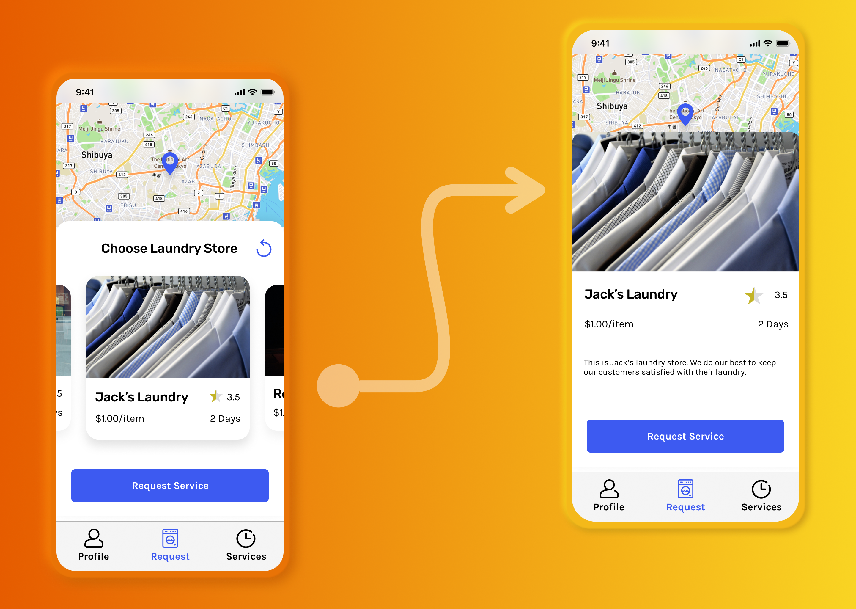
16. Smart Animate: all right. So before we wrap up the prototype course here, I want to show you one more really cool thing in fig MMA, using the prototype to and that's called smart, animate, smart, animate really allows you to create some of those really smooth transitions between a page that looks similar or between different states of the same page. And so what that really means is that let's say you have a page and you want to show something expand or collapse. Those would be really great examples of how you can use smart, animate toe, make them look riel and feel real to users using the prototype tool. So to demonstrate, I'm gonna actually create another copy of the request page here. And then what we're gonna do is we're gonna create a state where if the user taps on, let's say this Jax Laundry store card over here, it will expand and show maybe more detail or a description or something like that. That's pretty typical in an application like this, where you have maybe multiple cards that you're looking at because it lets you browse mawr information. So let's say you want to find out more about this Jax laundry store. Maybe read some of the ratings, learn more about the pricing and so on, but they keep it simple. I'm just gonna create another state of this card and then add maybe a description text to it as well. So what I want to do is I'm gonna go ahead and duplicate this request page over here by just holding cult and then dragging a copy down here. That's good. Right there. So now let's go to this page over here. Feel free to follow along if you want. First things first. I'm gonna move Thies to store cards out of the way by just holding shift and doing the arrow key bunch of times the same thing over here. Now, one thing I really want to emphasize here is that if you want to use animate or smart animate properly in sigma, you need to make sure that you keep things in the same layer and in the same hierarchy over here. So if you change the layers over here, the animation will probably not work as you expected. I've made that mistake multiple times myself. Just want to make sure that you don't make the same mistake and then try to figure out what the problem is. So now I want to go ahead and move this main card over here that I'm looking at to the corner. Or actually, let's maybe drag this up a little bit over here to add more species and then go ahead and just move that up there and I'm gonna go ahead and hold shift and expand that throughout the whole width. And let's go ahead and just delete this. Choose your laundry store text here and then select the card over here. Let's go back to design and let's go ahead and just hide the drop shot over here. We don't want it in the state unless I'm gonna add a text books by clicking tea and then dragging textbooks over here. I don't just typing with a left the line. This is Jack's laundry store. We do our best to keep our customers satisfied with their laundry. I'm just writing completely random texts over here on. Then I'm gonna go ahead and just detach the style of the text over here. And select body Carla 14 means better for a description, text and just going to make sure that it's aligned properly is low, and I think everything else looks good now again, you can add a bunch of other stuff underneath this later and maybe even make this scroll herbal if you want. But just to keep this same poll, I'm gonna do a smart animate with just what we have over here so that I feel the user wants to read more information about Jack's laundry. They can just click on it on, and then it will smart animate into this frame over here where they will read more on. And maybe if they top on the image again, it will go back to the state. So, just like any other connection, let's go ahead and select this card over here. Go to prototype and I create a connection to this page over here and now, instead of an instant animation you want to choose smart, animate, you'll see figure gives you a nice kind of animation over here to explain what smart animate does as low over here is just collapsing or expanding this card over here just similar to what we're doing. We're expanding this card to show more information So I have eased in and out selected over here. And then instead of 700 milliseconds, maybe you can do 300. Um, it's better. Serve it quicker transition over here. And then, lastly, I want to select this door guard here and then draw a connection into this page over here and then do the same thing. Smart, animate. I don't want to mention for the option over a year you can select navigate to and then same thing over here. So now if you presented, you'll see I have my laundry cards through over here, and then if I click on it, it will expand and give me more options to read. If I top on it again, it will go away. Not again if you want to create a quicker transact transition because I think it's a little bit slow right now, we can do 200 milliseconds, and then for this one as well. Let's do 200 milliseconds now. If he tested, I think that looks pretty good. Cool. So that's one example of a smart enemy. I've set up another example over here myself, where essentially we go from this profile option to this one over here. If they click on the map over here so that the user clicks on this map over here, it would just go ahead and expand. And then I think quick again, we'll go to the map page that we had pretty cool.
17. Button Hover Animations: Okay. Lastly, I want to show you how you can use smart enemy on buttons as well. This might not be super relevant to a mobile app where you don't really have a hover state for buttons. But let's say you're working on a Web application and you want to create a hover setting or hover status for your buttons. Um, so you could definitely use smart animate for that option is low, um, of social over to my components page over here in my clean can group project. So what we're gonna do is go ahead and first find this button slash enabled, um, component over here. And then I'm gonna go ahead and just create an instance out of it by holding old and dragging it away. And let's go ahead and right click on that and actually do detach instance and create a new component out of that because we wanted to look separate from this component over here, we also rename it, but in forward slash hover like this. And then I'm going to select the background over here, or the background of the button, go to design on and go ahead and detached the style and make the fill maybe a little bit darker is all so that it looks like we're hovering on top of it. So now I can simply go to the button slash enabled option. Go to prototype and I go ahead and dry and create a connection to this button over here and now, instead of click, you want to go ahead and select while hovering, and that will do as you expected while you hover on top of this button will go ahead and navigate to this, but in instead. And what we want to use is, of course, the smart, animate option, so that it smooths the transition between this and this over here, and you'll see how that works in just a second. But first, let's go ahead and do. He's in and out, and I think 300 milliseconds probably good enough over here. So now if you go ahead and just select our button, slash enabled and do present and then as expected, while a hover, it will go ahead and change color, and it will smart animate into that button forward slash hover component here. Pretty cool. Pretty handy for a project like this. So there you go. That's how you apply smart animations in Sigma
18. Interactive Components: All right, so one cool thing I want to show you in Figma and in the prototyping tool is that now you can actually create interactive components, which means you can now create interactions between components such as buttons or even different tutorial cards based on how the users interacting with it. Number four, the interactive components was launched as a feature. You have to create multiple pages with different states of those buttons. And that will mean having lots of duplicate frames just to show your components changing between. But now it's as simple as creating a new variant button and in creating connection between those variants based on how the users interacting with that component. So for my case, I'm going to show you how you can actually animate your button so that when the user is tapping on it in the mobile app, it will go ahead and reflect that tab with a darker color, which mimics what a button usually looks like when a user presses it, so it gives them some sort of feedback. So first things first, I mean my components page over here. I'm gonna go ahead and select both the buttons, like so. And then on the right side I'm going to go ahead and combine them as variance. Now, go ahead and follow this step if you haven't done so already, so that we have variants of this button. And I'm going to go ahead and rename the property 1 to state. So again, we have a disabled but in state and then enabled button state. And I'm gonna go ahead and actually duplicate this enabled one by pressing Command D. And I'm going to create a third state called tapped, like so. And hit Enter over there. And for this tab button, I'm going to double-click and select my background color over here. And remove this primary and change it to a bit of a darker color of a similar shade. Just to kind of show that this button's being tapped when the user actually taps on it in the prototype. Let's go ahead and close that and head on over to your Prototype tab. And then what you wanna do is go ahead and create an interaction between this button here, which is the enabled state and the tab. See it over here. And you can simply do that by drawing a connection just like our frames. But now with our components down here, and on the right side we'll get a bunch of options so we can do it on click so that when the user clicks that button, it will go ahead and swap it or change it with that tapped state. Or we can do on drag while hovering, while pressing. And if you have some sort of game that you're designing, you can use key slash gamepad, bunch of other options as well. Now for our case, we want to do while pressing, because that means that as soon as the user taps on that button, it will go ahead and change to this state. And then as soon as they let go, it will go ahead and change back to the state over here. Now by default, you might have an instant animate option over here. So you could definitely do an instant one, which makes the most sense for this option here. But keep in mind that you can definitely do smart animate if you have things such as checkboxes or on and off toggles, where you can actually show an animation as the user clicks on those components. And you can see that change in your prototype. So now just to kinda see how this works, I'm going to head on over to my mock-ups page. We're gonna go ahead and run it. I want to go ahead and tap on Login. And as you can see as a tab, it will go ahead and change that color or that state to that state. And then when I let go, it will go ahead and return to the enabled state, which is awesome. Now you can do that with every button. But keep in mind that for example, for this button over here, it's probably best to create another variant so that we have a white version of our button and then a wide tap version of our button as well. But I'll leave that as an exercise for you to do. And as you can see, this new interaction works with all of our buttons. As long as they're the button component, it will go ahead and work across all of my pages and frames in Figma, which is beautiful because this was really hard to do before interactive components. Now of course, you can use interactive components between multiple different components. It doesn't have to be only button. You can use it wherever you have an interaction with a component that repeats itself all over the frames, such as the buttons. I'll give you an exercise to do for the interactive components. And so on our Services page, typically, when a user taps on one of these rows in an iOS app, usually you show this interaction by changing the background color to a slightly gray, light gray color. So I'll leave that as an exercise and we'll do it together in the next lecture.
19. Interactive Components Exercise Solution: All right. I hope you've been following along so far and you've been able to create that interactive components for our services rose over here. So as mentioned in the previous lecture, in an iPhone app or an iOS app, typically when a user taps on a row in a table such as this, it will go ahead and change to a slightly different color, usually late gray, just to indicate to the user which row exactly they're tapping on. So right now if I tap on my rows, nothing will happen as expected. But if we head on back to our mock up and go to our components page where we have our rows. We can go ahead and create a tap version where we can show this feedback to the user. So let's go ahead and click on the service list and head on over to the design tab up here. And let's add varied over here. And we'll go ahead and call it tapped. For this other one will leave it as default. I'll just go ahead and click on the entire variant of the service list and change this property wanted to stay. So we know what this is all for. And now as mentioned, for this background color, we want to go ahead and just choose a slightly darker, light gray color. Nothing too crazy. Just to kind of show that feedback of the user tapping on that row or that cell. And now, as we did in the previous lecture, we'll head on over to the Prototype tab and create a connection between this default state to the tab S8. And change the onclick to, you guessed it, wall pressing. We'll go ahead and change it to the state tapped. And we want the animation to be instant. So we'll go ahead and close that. And now if he head on over to our prototype again, we don't need to refresh or relaunch the prototype. We can just use it in the same one. And as you can see now, as I'm tapping on that row, we'll go ahead and change that color, which looks very realistic to a mobile iPhone app.
20. Creating New Prototype Flows: Ever since Figma announce some new features for the prototyping feature, they also announced some new ways where you can guide users or viewers through your prototype and then includes creating different flows. Now, a flow and a prototype defines what that user will go through as they go through the prototype. When will they start? And as they go through the application, where do they end up? By default, they've named our prototype flow one. So if we go ahead and play this flow one will take us through the prototype that we've created, which will start us at the login screen. And then if we go ahead and click on Sign up and will take us through each signup step until it gets us to the main page. But now with Figma is prototyping feature. You can actually go ahead and create multiple flows so that if you want to showcase your app, let's see if the user is already logged in. You can showcase a different flow by creating multiple different flows, allows us to save time when it comes to presenting our prototype to our colleagues or clients to showcase different results or different outcomes. And to save time in terms of having to click through multiple pages to get to where you want to get to. So I'm going to go ahead and create a second flow. But before I do that, let's go ahead and name this flow one new user. And this is just giving it a new name. Nothing really changes with a prototype. But now we have this new user flow starting point. Now make sure you're in the Prototype tab so that you can actually see your flows. But essentially, I wanted to name this new users so that we know that this is the flow when a new user signs up or actually even opens the clean kangaroo app. And now I want to create a new flow called logged in user. So essentially a user who's already logged in, we only see this flow instead of the new user flow. And so to do that, I'm going to go ahead to the request page because essentially this is our main page that we want are already signup users to go to when they first open the app. And simply by having this request piece selected, I'm gonna go ahead and click on the plus sign besides the flow starting point to add a starting point. And let's rename this to signed signed up user. And so now we have two different floors, one for a new user and one for a sign-up user. And if you click on the Sign-up User Flow by clicking this play icon over here. As you would expect, the prototype would start in this frame and allow us to interact just as before, but now with a different starting point. And now in this left panel side over here we can see we have different floors that we can take our viewers are users through. So if you want to now browse when a new user flow would look like we can go to the new user flow and go from there. Or if you want to jump to a sign-up user flow, we can go to our sign-up user flow and go from there. And the beauty of this is that when you do share your prototype, people who have access to it, we'll be able to also see the flows that you have and go through the different flows as well. Now one thing I do recommend if you do want to share your prototype with other people, especially people who might not be in your team. You can actually go ahead and write a little description about your flow so that people understand what this floor is all about. So in the description here, I'm just going to go ahead and write. This flow is for RD signed up users with clean, clean, clean kangaroo. And we're gonna go ahead and close that. And so now, if I go back here, you'll see the description is also in my prototype, which is cool. And there you have it that's having different flows in your prototypes.
21. Exporting Our Designs: all right. I think we're ready to give this project to our client now. So I think we're now ready to export our frames here. Now, there's a bunch of ways you can export things in fig MMA. Um, so the 1st 1 is you can export the frames, of course. And to do so, you can go to the layers and let's go ahead and collapse all the layers using option l and so that will just collapse everything. So it's nice here, and I can go ahead and just select one frame and then we're holding shift, select my very last frame here, and so that will select all the frames in between. Make sure you have the frame selected and nothing that you don't want to export it. And then from here, you can find the next four tap and go ahead and quick plus, And if you scroll here, you'll see we're exporting nine layers here with a resolution of one X. If you want to increase the resolution to two X, you can do that from here. You can go ahead and actually choose what, four months? You want your export to be in you can select PNG, there's J Peg SPG and PdF. So with those frames selected, you can do export nine layers on. Once you do that, it will ask. You get ready to export that, and I will ask you where you want your export to be made. Once you do that, it will open up this file browser here, from where you can select the folder that you want to export your layers into or your frames into. And then if you go ahead and click, save it will go ahead and place them there. And so if I dragged that folder over, as you can see, it's gone ahead and exported all of my frames in separate PNG four months for me here, which is nice. I can send us to my client, So that's one way to export if you want to export certain things. So let's for example, Go ahead and zoom into here and let's say you want to export just this icon over here. Ah, you can go ahead and select it, and while having its selected, make sure over here in the layers panel it is selected indeed and then go to export and hit the plus icon, you'll get a nice preview of your export. Here is long, and then you can even go ahead and add multiple exports. So if you want one of the icons to be just one extra resolution, another one to have two extra resolution and you can keep going here and add more resolutions and MAWR exports here, it will add a nice Suffolk's to my file. Here's so this will export zero zero one dash shop because this is the name of that layer or that frame here that I'm exporting. So if you want to change the name of your export simply, you'll have to change the name of your layer here. So if I do, let's a shop icon here. You can see now it will say Export shop icon. And so if I export that, it will export three versions of it, one with one ex resolution, another with two X and three x. This is common in a lot of APS, where you'll need multiple resolution based on the screen size. So this way you can go ahead and export your shop icon that once you do save it again. If I opened my folder here, you'll see there's three different copies, one with one extra resolution. So this one's one x two X and three x So that's pretty cool. Very handy. Just gonna delete that. From there. You can also hit command shift E and that will just open up this export tab. And that will just show you some of the exports that you can make from here. Ah, that you probably previously made before. So from here, I can go ahead and choose what I want to export, and then go ahead and export from here as well. So again, you bring that up using command shift E. And so that's how you exports and figure.
22. Code Handoff: another time saving tool in fig. MMA eyes this code panel right here. We haven't really talked about it, but it kind of works like magic. And I'll show you why. Let's go ahead and zoom into our payment page for example here by clicking any object inside and going to my code tap here. I can actually get the code for the styling of that object here. So if you are familiar with CSS or you're designing for an IOS or Android project here on this code panel will actually help you recreate exactly what we've created here but within an actual development environment. So if you are working with developers and you want them to actually jump in and be able to turn these designs into live riel applications, the easiest thing you can do is to invite them and then tell them about this code panel to go and actually copy and paste. Ah, exactly the code that they need to get this certain elements again. If I change this, you'll see, based on what I have selected, it will go ahead and show me the code for that object. If isolate just the entire frame, it will show the code for just my frame here. So, like the background color of whites, the width and height and things like that. So that could be super useful. And I encourage you to take advantage of that if you are developing an app or if you have developers working with you
23. What's Next?: all right. Congrats on finishing the prototyping course here. We learned a ton from how we can actually add a super basic prototype all the way to more advanced applications by adding in animations, out transitions using smart, animate to transition between different states and how we can actually share our project with friends, Kali's investors and so on. So what's next for you? Well, there's a lot you can do from here. Of course, I recommend that you create more prototypes, practice with it, share with your friends and really show it off to people, especially if you're working with clients. This would be a great place where you can show them a prototype of what their application would look like. If you're working on an application of your own or a design of your own, you can really show off this prototype that you have for your own project to develop her and really make it easier for them to understand what you want out of the product. Feel free to also share your prototype with me. I'd be hiding to shake it out and provide some feedback. If that's something you're looking for, you can even try applying prototypes to Web projects as well, eh? So if you are working on Web projects or reviewing projects that you've been wanting to work on, this would be a perfect time to do that. I really create nice, usable prototypes for that as well. And again, as always, feel free to send me any questions or designs for feedback. My email is how clever at gmail dot com And next week here on Skill Shirt will also be sharing a course on how you can create a U. Y design for a Web application for our clean kangaroo project here as well. So thanks again for taking this course and looking forward to seeing you in a future, of course.
 Nima Tahami, Entrepreneur & Product Designer