Transcripts
1. Intro: And welcome back to another awesome Elementor
class with me, Ken. Now, in this class, you're going to learn
Elementor by building a single-page personal
brand website to promote your
professional services to potential customers. The goal is to teach
you Elementor, but we're going to
do it practically. We're going to start from a
black WordPress installation and gradually turn
it into a complete, fully working,
responsive website. Now, the idea behind this
class is very simple. Rather than teaching you random Elementor widgets
and elements and features, we're going to use Elementor
to practically build a real website that you could
use to present yourself, your work, and your
services online. This means we'll build the
side section by section, including a hero section, a navigation header
that sticks to the top when you scroll a
services section, portfolio section, testimonials, a contact
form, and the footer. We'll also make sure
everything looks and works properly across desktop, tablet and mobile devices. Throughout the class,
I'll walk you through the entire process step by step, including the tiny
details that help turn a basic WordPress page into something that
feels professional. By the end of this class, you will have a deeper
understanding of WordPress and Elementor and a complete website you can continue to customize. If you're a freelancer,
designer, creative professional, or a service provider looking to create a personal
website for yourself, let me show you how to
do it with Elementor. So, if you're excited to
get started, let's go. See you in the next lesson.
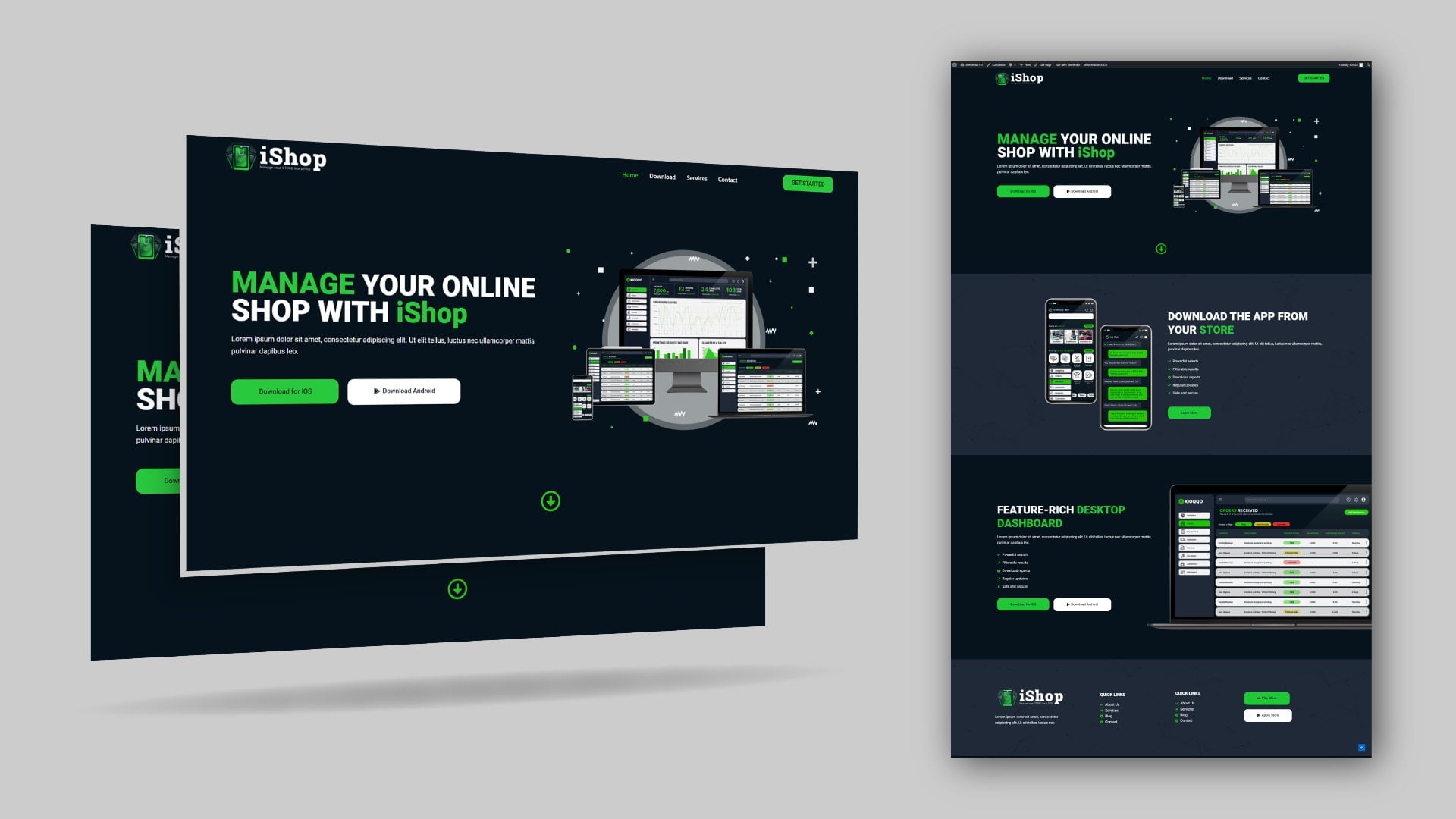
2. Project Overview: Welcome back. So I
just want to show you exactly what you're going to
be creating in this class. This is your class project. So let me refresh the page. So as you can see, we
have a hero section with that nice entrance animation. We're going to see how to
do that scrolling downward. We have this counter section. We have a services section. Previous work section,
which is where you will showcase some
of your past work, and someone can click this and
open up more of your work. As you can see, when
you click this, it opens up your portfolio. In this case, it
opens up my portfolio on hands.net client
testimonials. You can set a time on how fast or slow you want
these to scroll. The visitor can also
manually navigate or scroll to read the
different testimonials. Then we have a
book me section or contact section where the
user can choose a service, maybe even two services, and then describe the project
as clearly as possible, then provide their name
and email address, and then request a quote. When you receive this,
you will be able to read and then get back to them or
email them for more details. And then we have a footer. The viewer can also click this to open up your work once again. If we go back to the top, because this is a
single-page website, these links navigate
within this page, but to the right section. So if I click Services, it goes to the services
section portfolio. It goes to the
previous work section. Contact, it goes to
the contact section. I go back to the top. We also have a services button here. We're just giving the visitor as many calls-to-action
as possible. Our goal is to
allow them to click buttons and go to take
an action that we want. So that's a quick overview of what you're going to be
creating in this class. Now we're ready to go
and start working on it. So I'll see you in
the next lesson.
3. Install WordPress: It's time to install WordPress. And the way to do that
is through the C panel. Every WordPress web host
will provide you with a C panel for you to
install WordPress, find out how to get to your C panel depending
on your web host. So I'm going to
click Go to C Panel. So here we are
inside the C panel. And one of the tabs inside
C panel is going to be the Sof tacular apps installer,
which has WordPress. So just click WordPress. And you'll be taken right here where you can install WordPress. So I'm going to click
Install Now right here, we need to choose a URL. Now, because you
bought a domain name, it's going to be
listed right here. If you have several,
they're going to be in this drop down menu. And another thing right here, I like choosing this prefix, HTTPs www dot your domain name. So when I click outside, it's going to check if I
have an SSL certificate. If I don't have an
SL certificate, it's going to go
with HTTP or HDTP. So make sure you have
an SSL certificate to tell visitors that your
website is secure. Don't add anything here. So your website is going to be www dot your domain
dot your extension. Let's get the website a name. I'm going to call it a Alex Dow. Professional visual designer. It's a portfolio website. These are the login credentials you will need to log in to WordPress directly instead of
going through the C panel. So make sure you say
these somewhere. I'm just going to copy these
and open up a notepad, paste that right there,
copy the password. You don't need to
copy this email, but I'm just going to copy it anyway. You don't
need to copy that. And you will have some
pre selected plugins that will be installed with web press depending
on your web host. Some web host don't have these. So I don't need any of these
went to check all of them. If you're going into Advance, you might want to change the database backups that are kept by your web
host on a weekly basis. Now, I don't typically
change this, I just leave it at the default. So these are the only settings you need to really look at. Then I'll hit the install. There we go. So WordPress is
now successfully installed, and we have the
administrative URL. If we click that
will be taken to the WordPress dashboard
of your website. As you can see, here we are, the website we
created was Alex Doe. Yeah, so congratulations. You've installed WordPress. Now, remember the
login credentials we just put in this notepad. If we log out of this website, we will be asked for
the login credentials. So that's where we will use, copy that, paste the
username and the password. Paste that. Remember me. Then let's login.
And so there we go. So that's how to
install WordPress. And now we're ready to
move on to the next step, which is installing
a WordPress pin. I'll see you shortly.
4. Install a WordPress Theme: With WordPress installed, it's time to install our
WordPress theme. So let's go to
appearance themes. And I'll go to Add New. These are the
default themes that come with every
installation of Wordpress. Now, we're in 2026, but the latest active thing that comes with Wordpress
by default is 2025. It seems they've not
created a new one in 2026. So I'm just going to say
Add thing because we want to use a custom
thing called Astra. This is one of the best things you can ever use in WordPress. So I'll say install, Activate. And now Astra is active. These are just advertisements
from them. Close that. And so Astra is now
our active theme. Now, in the next lesson, let's install a lamentor. I'll see you shortly.
5. Install Elementor: Now it's time to
install elementor, which is the plugin
we're going to use as our drag and drop page builder. So let's go to plugins. First of all, let's just
click plugins to see the list of the default plugins that come with every
installation of WordPress. And that's this chisme
and Hello Dolly. I'm just going to select all
of them, then delete them. Apply. We don't need them. Then I'll say add plugin. In here, let's search
for Elementor. It's going to be
the first choice with more than 10 million
active installations. I'm going to say install now. Let's go ahead and activate it. And now Elementor is
active on our website. Once you've installed
it, you will see this elementor right here. But you don't need to go
in and change anything. We don't need to mess with it. Now, let's go to pages. We have some default pages here. I'm going to delete them, so select all of them, and move to trash. Apply that. Now, in the next lesson,
let's discourage indexing. I'll tell you what
it is shortly.
6. Discourage Indexing: Ready to start
building our website. But there's one thing we need to make sure we do
before we proceed, which is to discourage
search engines from indexing the
website as it is. Google, Bing and
other search engines send their spiders or their bots to look for new websites and add them to their database to make
them available to people. You don't want Google
to make your website available just yet because
you've not built it. So that has a negative
effect on your SEO. So we want to tell
search engines, do not index this
website just yet. It's not ready for the public. So let's go to settings, reading, discourage
search engines from indexing this site. And let's save
changes. There we go. In the next lesson,
let's now start building our single
page website. I'll see you shortly.
7. Create a Single Web Page: Now it's time for us to
create our single webpage. So let's go to pages. And remember we
deleted we trashed the two default pages that came with Webpress.
We don't need them. Let's just say, first of all, let's get rid of this
and let's add a page. Let's give it a name.
I'll just call it home. Let's first of all set this
template as a full we page. And now that we're
done with that, let's go into and by the way, that is this template setting
is an elemental setting. It's not a wordpress setting, just as a by the way. Now, let's go to
the Astro settings, and for the container, we want a full width container. Sidebar, we do not want a
sidebar, so no sidebar. And these elements, we need
to disable these elements. Before I disable them, let's publish this web page
and see what they are. So I'll say publish publish. And now, if we view
the page on a new tab, this is the let me close this. This is the header right here because this
is an Astra theme. It comes with default, header and footer, and what is this other
thing, banner area. There is a banner area here
that comes by default. We do not want any of these
because we want to build this page from scratch using drag and drop
features of Elementor. So let's go back in here and disable all of them and
then save. Is it saved? Yeah, let's view the page. And now it's a blank canvas. So let's close all these down. And now that our
page is created, let's go back to the
list of pages we have. And as you can see, we
have the homepage here. Another thing we want to do is when you visit the
domain of any website, it should go to the homepage. So right now, if we
take the domain, copy this, open a new tab, and paste that, this
is the equivalent of your domain.com
or.net, whatever. If you go there right now, there is a different page. This is not the
default page we want. We want that page
we've just created to be the destination
of our domain. So we need to tell
WordPress which page we want to make our
default homepage. So let's go to
settings, reading. Homepage displays your
latest posts currently. So that's why we see this. But we want to tell it no, let's choose a static
page as our homepage. Which homepage? This is our homepage. The page we just
created, Save changes. And now, if we reload this, in the root domain points
to our blank page, which we're going to
populate with our design. So I think we're
going to stop here. In the next lesson, let's now start creating our hero section.
8. Create a Hero Section: Now here we are on the
reference website. I just want us to see the hero section we're
going to create. This is what it looks like.
So how do we do this? Let's switch to our project. Now, let's go to the pages, and we've installed elementor, but we haven't made
this an elementor page. So let's say edit. And here we have
edit with Elementor. So click that. This will turn the page into an
element editable page. So here we are inside elementor. So the first thing
you will notice here is we have atomic elements. I'm going to collapse all these. These are new elements created in the latest
version of elementor, but they're very limited because the most important features
are hidden behind a paywall. So for example, the button, if you drop a
button here and you want to add hover effects, if I hover over it, I
want it to change color. If I want to create
an interaction, as you can see, hover effects
are behind a paywall. So, we can't work like that. If I can't have access to basic effects like
hover effects, then I don't want to
use this new system. I just wanted to show you
that. Let's get rid of this. So we're not going to use
atomic elements at all. We want to use the original
popular free elements that we've always been using. That's the container system instead of the atomic
elements system. So we're going to drop
a container here. And as you can see, this
container here has two columns, the text block and
the image block. So we need two
columns inside of it. So I'm going to say plus,
add an element again. I'm going to drop a
container in there. And in this container, I'm going to drop
two more containers. This container is
going to be the one to set our width content with. As you can see, this content
is not touching the edges. So there's an invisible
single container that has two more
containers inside of it, one container and
another container. So how do we do that? So we've placed our container there. Now we go back again, add elements, drop
another container here. And I'm going to right click and duplicate
that container. Now we have two containers
inside this outer container. I'm going to select that outer
container, go to layout. Under direction. I'm going
to say we want it to be a row instead of what
is this vertical. So we're going to
say horizontal, and that's going to arrange
everything in a row. Right. So now, as you can
see, we're almost there, but we want to set a
specific width that we like. So first of all,
I'm going to select the outermost
container and say we want to switch to percentage
in terms of width. And we want you to occupy 100% of any screen you're
viewing the website on. Now, with that, I want to go to this other container that's
holding the two columns. And I want to say I want
that to occupy 80% of this outer container because this outer container
is occupying 100% if we switch here,
it's occupying 100%. But inside, remember, we have this other container here
that's holding the two columns. We want it to be 80% of
the outermost container. So with this elected and with
this as percentage, 80%. Now notice everything has been pushed to the right to the left. So I'm going to select
this outermost container. And right here, we're going to say align everything
to the center. That's going to push
this container that's held inside by this
to the center. And now we're ready going
to say publish that. If I pick say Add element, text heading and
drop it in there, go back to add element. Text Editor is a
paragraph. Drop it. Now, we want to drop it in here, right below the heading
and go back to add element and add a button.
Drop it right below there. Go back in here and say under layout still image.
Publish that. Preview what we just created. And now, as you can
see, everything is structurally correct. We're going to style
everything to look awesome. So now we're going to
end this lesson here. In the next lesson, let's
now style this hero section.
9. Style Hero Section: Now it's time to style our page. But one thing you will notice on the reference
website is that we have this gradient background
that starts from a dark blue all the
way to a bright blue. So how do we set that? So let's go back
here to Elementor. Let's add a background color. So I'll go to this drop
down menu, side settings. Let's go to sit background, and this is where we set it. Let's choose gradient. Now we have these two colors. I'm going to open
up my explorer. I'm going to provide
this download assets folder that's
going to contain everything you need to recreate this website exactly as it is. So that also includes
the colors I used. So we have this background
colors section. So I'm going to select
this color, copy that. Let's go back in here. The first color is
going to be this blue. And the second color is
going to be this light blue. But you can choose any
other colors you want. So for the second color, let's base that as
that. Save changes. And let's leave that area. Now the next thing is to
align these vertically to the center of this column
container holding them. So I'll select this container, and right here, justify content. Let's say center,
just like that. I'm going to select
this right click and duplicate it because we
need to have this text. You will have to type, but I'm just going
to copy paste. I'll select this
going in here and the content paste that Alex Do. So I'll select this. Paste that. Copy, select this body of text. Control A, Control Shift
V if you're pasting from somewhere to make sure you don't paste any styling from
wherever you copied it. So Control Shift V.
And there we have it. So publish that. First of
all, let's have a look at it. It's much better now. So now, select this, and I'm going to select this
yellow color from the texts, notebook, notepad,
copy that yellow. While this is selected, I'm going to go into
style text color. Yellow. Now, you will
notice this has two colors, and I'll show you
how to do that. This is courtesy of a plug
in cold elements kit Light. First of all, let's
publish that. And I want us to go
into the dashboard. Let's go to plugins, add plugin. We want to add a plugin
called Elements kit Light, which we're going to use
all over the website. So right here, I'm going
to type elements Kit. Elements kit elementor add ons. This just provides us with
more cool elements right here that Elementor does not provide us with or Elementor
has in the pro paid version. So now that we have
Elements kit active, If we click elements kit, we're going to have
to activate it. I like choosing advanced
here just to make sure more options are selected
by default, so advanced. These are just elements
that will show up right here like these. So advanced. Then next, next, don't
select any of these. You don't need them. Next
step, complete setup. Now if I go back here and make sure you already
published the page, Control R to refresh the page. Now if I collapse atomic, all these panels,
general link in bio, you're going to see
elements kit elements. These are additional
cool add ons we need to create what
we want to create. So let's close this now, this heading belongs
to element natively, but we want to use elements kit heading.
I'll type heading. And as you can see, we have the default heading
that we have, and we also have a heading
from the elements kit. So this is the one we want. Drop it in there,
and let's delete this right click delete. So with this selected, I'm going to type Alex and inside
these brackets, do. And now it's a matter of
styling. Go to style. We have the title,
which is the Alex, and the focus title is the do the one inside the brackets. So first of all, let's go to title
and typography, increase the size to
whatever size we want. Let's select a 900
black font weight to make it much bolder. And let's give it which color? White. So title, color, white. Collapse that. Let's go
to the focused title. Let's go to color. We want it this orange color. So copy this orange. Color paste that orange. When you hover, it
changes to that yellow. So we want to copy this yellow. And on hover, paste that. So on hover, it's going
to be that yellow. But notice it's still not thick. In fact, let's go to typography. Font weight black. And in fact, right here on the contents Yeah,
we have spacing. So while it's still selected, let's go to Style again,
Style and typography. We want it to be understyle, we want it to be
Italic, just like that. And notice we have
this separator, so collapse the
title, separator. Let's go to content, collapse title, separator
and disable that. Select this text.
Let's make it white. And we want to avoid
it being too long. So while it's still selected, let's go to Advanced
with custom. And let's give it maybe
75%. Publish that. And let's preview what we have. Great improvement,
but we want to reduce the spacing between them. That's the margins. So with this selected, upgrade
your communication. Let's go to advanced margin. Break this link because if
you change anything here, it's going to affect top,
right, bottom, and left. We want to just reduce
the bottom margin. Let's also select
this Alex Doug, advanced margin, reduce
the bottom margin. Publish that. And let's go and see what we have.
Great improvement. So we'll stop there. In the next lesson,
let's see how to create these buttons. I'll see you shortly.
10. Style Hero CTA Buttons: Now it's time to
starle our button to look like our
reference buttons. So how do we do that?
Switching back. Let's go in here.
Now, of course, we have two buttons, and if we want to place
them side by side, we have to do what we did
with these two columns here. So we want to add a
container below this text. Add element. Let's go to basic. This is a layout. This is where we
have the container. Let's drop it right below
that paragraph and let's drag our button in there and
right click duplicate, select the container
holding them, change the direction
to horizontal. Now, one thing you will notice
if I publish this is that these buttons are not aligned
with the text right here because of the default padding that comes with every container. As you can see we have
some padding all around. We want to remove this padding. So while the container
is selected, let's go to advanced. Let's go to padding
and remove that. Now we can add some top padding, maybe ten and bottom ten, but leave the left
padding intact. Publish that. Now, as you can see, they
are properly aligned. Another thing we
want to do is now select there is too much space. So we can select this text,
advanced margin bottom. Let's reduce it maybe up to
that spot. Publish that. Select the button, go to style. First of all, we can
change what it says. Services and the other one says portfolio Or view my work. View my work. Now, selecting this button
right here, go to style. And I want us to edit the
padding. So break that. I like giving it a left
padding of 40 or 50, right padding of 50, and top and bottom
padding of 15 15. Same case applies to that style, padding left 40, right, 40, then 15, 15. Okay. For this, let's give
it a background color of gray and a text color black. Selecting this, we want to
give it a gradient color because our gradient
always plays between these two colors
yellow and orange. So while it's selected, let's go to background
type gradient. I'm going to copy
our colors here. Yellow, copy that. Use it as the second color. But copy the orange, paste that. Then here for the angle, we want to rotate it. Rather than 180 degrees, it should be 90 degrees. Let's make the text color black. On hover for this
button on hover, because we were setting
for the normal state. On hover, we want it to have
the same gradient color. So I'll select that. And
let's go back in here, copy that orange.
Paste it there. Copy the yellow. Paste
that, just like that. But we want to change
this to 90 degrees, the angle, just like that. And this on hover, selected. On hover, we want it to have a gray background,
not a gradient, but just a color
classic gray background with black texts. I'm not going to try
and keep it consistent. Wait, why isn't tips working? Publish that. Let's go here. I don't know. Is this a bug? On on normal, it's a
gradient, but on normal. I don't know why
we have that bug. So elemental needs
to look into that, but let's proceed. Preview that. Now, because the hover effect here isn't working for this, we can add an animation,
so I'll select it. On hover, we want
a hover animation. Maybe grow. Yeah, like that. Let's do the same
for this on hover, it should also grow. So publish that let's
see what we have Yeah. So there we go. In
the next lesson, let's now add this image
together with the background. If I load this page, as you can see, there
are two separate
11. Hero Image: So it's time to work on
the hero section image. So because you already
added the image element. Now, first of all,
before we go far, there is something you've
noticed me doing all the time. When I want to
duplicate something, I have to right
click and duplicate. Those are two steps I
have to take every time. So to avoid that, I always like going to
this drop down menu, user preferences, and
quick edit options. That just allows
me to hover over that and just click this to duplicate whatever I
want to duplicate. So with the image
element selected, I'm going to select
that upload images. And as I promised, I'm going to provide
this folder right here. This download assets folder, so it's going to have
everything you need. So the first thing
we're going to input is this image with this
fading bottom edge, professional guy image
zero or your own image. Now, this is my web host
complaining about my server, so I'm just going to save
this and refresh this page. Close that. So selecting
this and this go to upload. If I double click that,
it's now going to work. So with the image selected, I'm going to say select,
and there we go. Now, for this image, this yellow image right here, we're going to add that to the column as the
column background. So this column
holding the image, let's go to style,
background type. Let's select image,
then upload files. And inside our folder, we have the hero background
brush going to open that. And select. Now, it's there, but we need to do a few things. First of all, let's
say the position should be center center. We want to say we don't
want it to repeat. Then for the display size, we want to say contain. And what's going to
allow us to position it properly is this actual
image of this guy. With the image selected, let's go to W. And let's just play
around with it like that. I think that's a nice size. And let's say publish. And let's preview it.
We're getting somewhere. So let's see if we can
improve anything now, first of all, we can
select this text column. And for the width, we want it to occupy remember, this column and this column are inside this container here. So how much of this container should each column occupy?
Let's select that. We want it to occupy 40%. Percent, not pixels. Now, this is height
and do that. 40%. And we want this to occupy 60%. So layout 60%. Publish that. And let's view. Yeah, that's
a much bigger improvement. So I think now we
can start with that. We will make more
improvements as we proceed. So what else is remaining? So the only thing
remaining here is this background pattern with
these geometric shapes. So let's go ahead and add that. And that we're going to add to the whole hero section container
holding everything else. So this pink container here, go to style background type. Let's select we have these hero section
background patterns. Open that and select
it, and there we go. So I prepared those images
using Adobe Illustrator, so you're going to have to prepare whatever patterns
you want to use. Now, just like we
did, we want to go here and say position
center center. We want to say no repeats. And for the display
size contain publish, and let's see what we have. There we go. What about cover? Yeah, cover is better for this. Let's go here because I want it to cover all
the way to the edges. So there you have it. We're done with
the hero section. The rest of the sections
are going to be a repetition of what we just
done on the hero section. But of course, there are some unique things we're going to do. So I'll see you in
the next lesson.
12. Create Header: Now it's time to create a header for our website
because right now, of course, as you can see,
we don't have a header, and we want something
that looks like this. So how do we create that?
Switching back here. Let's go inside our dashboard. I want to go to dashboard. And remember, we added
elements kit light. So under elements kit, we have a header footer option. So let's click that. We're
going to add a new template, and we're going to
call it header. It's our header. And we want it to be
displayed on the entire site. If you had multiple webpages, you would want it displayed
on all the web pages. Then we want to have it active. Then let's go to Edit content. We'll be redirected to
Elementor to create a header. Now in here, we want to say, let's add a container, collapse all these panels
that we never need. Let's go to layout and
add a container here. And just like we did before, we want to be able to contain our header to
80% of the screen. So this outer container
should be 100% width. And this inner one should
be 80% of the outer one. And with that, we want to go to the outer one and
push the inner one, align it to the
center like that. And now in here, we
want three columns. In fact, we don't
need three columns. We just need three items. We need an image and
the basic image. We also need a nerve. So I'm going to type nerve. Now, we have different
nerves here, but the one we want is
elements kids nerve menu. We place it below the image, but still within this
inner container. And we also want to add
a button still under basic never atomic elements unless you have the pro
version of Elementor. And let's place the
button right below that. Now, let's select the container
itself and change to row. Now, those are three
elements arranged as a row. I want to select the image. Let's select the logo. I created this fictional logo. It doesn't belong
to a real person. So double click that
and let's select it. Now it's already
small enough size, but I want to make sure we're very specific
about its width. So with advanced, let's
go to custom and say maybe 20 or 25% of this container that
is accommodating it. Let's select the nerve. Now, when we select
the nerve element, it will ask us for a menu. If we have a menu, it will be listed here, but we've not created
a WordPress menu yet. So first of all, let
me publish that. And let's go back
into I want to have an always available
dashboard right here. So inside here, let's
go to appearance menu. And we want to create a menu. So let me just call it my menu, and let's make it the primary
menu, then create menu. Now, since we already
have the homepage, let's select it and
add it to the menu. It's going to be listed here. And we want to create
additional elements, additional menu items,
services, portfolio contact. So let's go to custom Links. Let's just put a
hash right there, call it services
added to the menu. We're going to come
back later and make these links actually
lead somewhere. So let's add another hash beer, portfolio to menu,
and finally contacts. Contact, add to menu. Then let's say save menu. So we've created my
menu WordPress menu with four menu items. Going back in here,
that's the page. Let's go back to
the header editor. And because it's published, let's refresh this page. And now if I selepse
where is that nerve? Alright, let me
Where's the nerve? If I hit Control E, we can see an overview of everything we
have on the editor. Nerve. So it's collapsed into
a very tiny element. But here we can select the
my menu we've just created. So selecting that now as
you can see, it's visible. Now, we already say this
should be 20% of the width. Let's also make the button
occupy 20% of the container. And let's align it to the right. And now for the nerve element, let's make sure it occupies
the remaining 80%. Oh, 60% because this
is 2020, 40, so 60%. And while it's still selected, let's go to content
Align Center, just like that. Publish that. And we want to change
these to color white. While it's still selected, let's go to style menu item. Under normal circumstances,
let's make it white on Hover. Let's make it orange. Item takes color
on hover, orange. And when we're on
the specific page, when it's active,
let's make it orange. That means when we're on
that specific page or section that is linked to by the item, let's
make it yellow. Publish. Now, let's
preview that. Now, as you can see, it's
not properly aligned. This button is too elevated
compared to everything else. So let's go back in here. And with this selected
this container here, let's make sure items are aligned center
vertically like that. Let's close that. And let's go to this editor right here and
select this button, right leak copy, go back
to our editor here, select the button,
right leak paste style. So we don't have to repeat
that except now it's been We need to now reset this 20% whip There we go. So now going back in
here to our editor, I'm going to control
R to reload the page. And now our webpage
has the header. So let's preview the header with everything
else. There we go. It's looking good already. But for some reason,
this spacing right here is bigger than
this. I don't know why. We're going to look
into that later. But right now let me just
close it down including that. Now, I like reducing this
margin at the top right here. So, in fact, if you want
to edit your header, you can hover over this part
right here and click header, but I want to open
it in a new tab, so I'm going to use
my mouse wheel, press the mouse wheel to
open it in a new tab. Now, as I mentioned earlier, every container comes
with default padding. So I'm going to select this
container holding everything, go to Advanced and break the default
padding just like that. And the outer container also
has its own default padding. As you can see,
we've drastically reduced the margin at the top. And now if we reload this
page, observe the header. Now, everything is much
closer to the top. There we go. All right. So now I understand
what the problem was. So selecting this button, when we pasted the styles
of this button right here, we replaced the settings
we had set right here for the button, align,
write, publish. Below this. There we go. So now our header
is looking awesome, except we still need
to select the button, go to content, and change this
to book me, publish that. Then let's close it down. We can reload the editor here. Now we can preview
it once again. Yeah. So now, that's the
end of the header. In the next lesson, let's now see how to create the
remaining sections. I'll see you shortly.
13. Counter Section: Now we want to add this
counter section right here. So let's see how to do that. Going in here, I want
to say add element, and I want to
collapse all these. And scrolling
downwards, we want to add a layout
container right here. Now, this layout
container should have another container to
hold the actual content, so I'll drop back in there, and this should occupy
100% of the width, while this should occupy
80% of the outer container. Let's go back to
the outer container and align items to the center. Now, in here, we want to duplicate this text
so we can reuse it. It's a header. And in fact, something I forgot to do here is select this Alex dog is
supposed to be an H one. This is an H two. Yeah, it's an H two already. And in fact, we had because we just
duplicated it from here, it has that margin
setting, we've removed it. And notice one thing here, this is actually a column, and this is another column. So what we need is a container. And put this in the container that's inside that
other container. And below it, we also
want to place a button. So I'll duplicate
that button and place it below the text. Then I'll duplicate
this container and select the outer container
and switch to roll. So we have two columns. And in here, I want to
remove these two Alright, this is not removable, so rightly can delete. And I want to add a counter. So drag and drop the
counter in there. Select the counter,
duplicate it twice. Select the container holding
them, switch to row. We want to go to
justify content to the center and space
between the elements. Publish that. Let's
preview the changes. Preview the changes.
Exactly, like that. But now each of these should have Let's give it a background. Let's go to Advanced. Select
one of these counters. Advanced. First of all, let's give it some
padding, maybe 20. Then let's go to its
background. Background color. I'm going to select
this dark blue or whatever color
you want to use. Paste that there. Let's go to style number. Let's give it color white, and title White as well for now. For the number, you can
choose a heavier font, so font weight, black. You can even say
a different font, maybe monserat Yeah,
something heavy like that. Then let's go to advanced
border border radius of 20. Then let's write leak,
copy right leak, face style, right leak, paste style, publish that. Right here, I'm going
to copy this text. We're going to have to type it, select this, go to content. I'm going to paste
it in there and change it to white Publish. Going here. Just like that. Now, as you can see right here, the spacing is awesome on this. But ours here is not that good. So let's not have
any space between. Let's just align them
to the center and publish we can give each of these some width. First of all, let's give
this column a width of maybe 40% and this one 60%. Custom, 33%. Copy, right leak, paste style, copy paste style, publish
that. There we go. So now let's change the details. This here could be
55 clients served. So what's the title? Clients served. This here could be
What do we have here? Projects completed. 329 projects completed. And this here could be 100%, so suffix percent acts faction, guarantee. Then if we preclude
that exactly. Get in touch publish that There we go. So that's how to
create that section, and it's too close
to the hero section. What I want to do is go back in here and select the
container holding the entire hero
section and go to the height and change it to VH. That's view height, and
we want to give it 100. We want to say, make it
occupy the whole screen. The hero section should occupy the whole screen, publish that. Just like that. We also want to select this and maybe this container
holding this section, give it a top margin of 50
to separate it from the top. All right. Now, we
don't want it to touch the lower section. So maybe we could reduce
the width of this image. Publish that. Just like that. Yeah, they're
properly separated. So that's where we're going
to reach in this lesson. In the next lesson,
let's see how to create this section
right here, my services. So I'll see you shortly.
14. Sticky Header Effects: Now, before we move on to
this section right here, you will notice when
we start scrolling, the header is sticky, and when we're not scrolling, the background patterns are
all the way to the top. This is the reference website, but on the website we're
currently working on, if we start scrolling, the header is disappearing, and this pattern is not
all the way to the top, so we need to solve
that right now. And to do that, to make
the header sticky, we need to use a plugin called sticky header
effects for element. Let's go inside the dashboard. Plugins, add plugin. Let's add sticky. Just type sticky header header. So sticky header effects
for elementor install now. Then let's activate that.
And now here it is. So going back in here, let's just hover over
this and say right link, open link in New tab. And so what we need to do is
select the container holding the entire header and go to
advanced collapse layout, go to sticky header
effects, and enable it. Close this pro advertisement. Right now, it's already sticky. We've enabled it, so it's
going to be sticky at the top. But what we want is to
have a transparent header, and that means Now, if we go here and
refresh this editor, look at the pattern
behind the hero section. Now, as you can see the patterns are all the way to the top. If I preview this,
as you can see, they are all the way to the top. But now one problem you will notice is when we
start scrolling, there is no background
on the header. Everything becomes
all cluttered. So going back in here, right below transparent header, we can choose a background color to change too after scrolling. So we're going to go
back in here and select this dark blue, go back in here, background color, select that, and then paste that
in there and publish. Close these down,
go to the editor and refresh this preview. Now when we start scrolling, it will change to blue,
keeping everything visible. When we scroll up, the
background disappears. So that's how to do that. In the next lesson,
let's now see how to create the services section.
15. Services Section: Now it's time to create
the services section. So let's see what we have here. We have these four
boxes and this guy. So let's go back in here. We're going to reuse a few of the things we've
already created. So I'm just going to
duplicate this section. And Yeah, we already
have these two. Because notice here, this is one column and another column. So let's just add a heading
and some text above it. So above this container, we're going to duplicate
this Alex doll. And I want to place it
right above this section. And I also want to select
to duplicate this text. It's all about reusing
stuff you've already styled right below Alex Dow. Then let's go to style. Align to the center,
select this. We want to change
this to age two, and go to style Title. Typography reduce the size, maybe to back size. That's reasonable. And notice
here it has this separator. So let's go to content
separator enable. But now we need to get rid of that bottom margin like that. And I want to copy this text. Select this, go to content
all Control Shift VL. Notice here, this has
a constrained width. So while it's selected, I want to go to advanced
custom Width I wanted to occupy 60% of the
available width of this container
that's holding it. Change the separator,
select these texts. Separator should be white. And they should be my services. My services. Now, I want it to be the ras, the colors should be
yellow on normal. Copy that go in here, going to select here,
space, paste it in there, cut this, remove that space, go here on hover, like that. Now, inside these two
columns we already created. First of all, I want to select this column and say it should occupy 40% and these 60%. Want to remove
everything from here. And from here. All
right. There is a bug. This isn't working, so
right click delete. So we have these two
columns published. Let's say, yeah, this is 60
40 just by looking at it. Or we could just make
it 50 50 or 45 55. Now, in here, we also need to add we need to add a few containers, one container above, and
another one below it. And then in each
of these two rows, we're going to have yet
another pair of containers. So duplicate that. But
now selecting this, we're going to switch
to row, so one, two. So, in fact, let me
just delete this, select this and duplicate it so that it's one,
two, three, four. Duplicate this and
let's drop it in here. Go to style, title, typography and reduce the size. Let's go to content. Wait, style, Align center. And the separator should
be above. Let's see. Separator B. Let's say top. I'm going to duplicate that. Place it in there, duplicate
it again. Place it in there. I'm also going to duplicate
can just duplicate this or this and drop it right below that Aline center. It has a width. So
let's just say default. And I want to copy this. Select this, go to content,
paste it in there. It's the same text, so I'm just going
to duplicate that. No, right below that. What we have here is one
container that has two columns. That is this column
and this column. And in this column, we have one container holding two columns
of two containers. Now what we want to
do is style this. Just give it this
dark blue color. I'll select this
to copy its color, go to its background. Copy that. Select this container, go
to advanced Background. Color, taste that there. Let's go to the padding. Let's give it a padding of 20. And let's go to its
border style, border 20. Select this. Alright, let's just select while it's still selected,
right click copy. Select this right
lik paste style. Select this right lik
paste style. Paste style. Now, you will notice there
is too much space here, and that's because of the default padding of the container that's
holding the two. So let's go to advanced, break the padding there. Let's select this one as well. This container. Advanced, remove that padding, publish that And now I don't like the way this
is close to the top. We could select this heading, go to advanced margin top
ten, right lack copy. Select that, right click
paste style, select that, right click paste style, paste style, publish there. Now, you will also notice we have these decorations
right here. If you need them, we can
just go to one of them, go to style, background overlay
and give it a gradient. And the gradient is going to use this light blue And the dark blue for
the second color. And we want to switch to radio. So, in fact, this blue should be This blue right here
should be the second color. And the dark blue here
should be the first color. Then let's say
bottom left Opacity. Let's push the location to 80%. So do what I just did. Radio, radiant type,
position bottom left. You can change opacity if you
want and location at 80%. Now I'll just select this copy. Paste style. Paste
style and paste style. Now, it also has a border. So let's go to the style. Border solid. And let's make the
border color a blue. Let's give it some
blue like that. Border color of one. No, let's say two,
border with Yeah, so copy paste style, select, right leak paste style, select right leak, paste
style, publish that. Now, if we preview
that, there we go. So in the next lesson, let's go ahead and
add this image. I'll see you shortly.
16. Services Image: So now it's time to create
the services image. But before we do that, I've
just noticed I forgot to give this section a dark
blue background. So let's go ahead and select
the dark blue background, copy that, and go
back to our editor, select the section, go to style. Is this selected?
All right, style. Background tight. Let's
give it that dark blue. Now, right here,
what we want to do is give the light blue color. So I'll select this. Select this column, go to style. Background blue. Let's also give it a
border radius of 20. In fact, the background
should not be blue. I should have a gradient. So let's go back to
background color gradient. And let's give it
the same light blue but make it darker. And then change this to radio. We can move the location slightly or reduce
this blue like that. So now what we want to
do here is simply add an image and the basic image. Select that. Let's go and
upload whatever image we want. This is the one I used. At the end of the
day, we're just learning how to use Elementor. You should feel free to create whatever type
of website you want. Now, let's add a
divider right below it. So add. Still under basic, we have the divider element. Let's drop it right
below the image. All right, it seems this column
is set to row by default. Yes, we should switch
to vertical column. And now let's add that divider. Just like that. With
the divider selected, I'll go to width and reduce it to let's just say 50%
and align it center, go to advanced margin top. Up to there, then style. First of all, let's
switch these to slashes, but you can change it
to whatever you want. In case it doesn't
look like slashes, just go here to amount. Yours might appear. Let's see. All right. Let's increase
the weight of each slash. Increase that size like that. Reduce the weight slightly. So play around with these
settings until you have the right slash or just choose whatever other
option you want here. You could also go with
curly, which, no, curved. I like this one, as well. In fact, let me keep
that and then wait. Size. Oh, that's
the height, amount. And I want to choose
this yellow color. And give it that yellow color. If you switch to slashes, let's play around with the gap, reduce the width again
and then publish. This image is a little bit
taller than the text boxes. It's not bad, but we want to make sure everything is a
little bit more compact. This section is also too wide. So I want to select the entire container holding
them and change this to 70%. Publish that. And let's
see what we have next. Yeah, it's a bit more balanced. So you just play around
with those settings and see how you can make
this more creative. Now, I haven't updated
these services. For example, this could be, let's go to content. Let's remove that M. Then change services to
graphic space design, select this, remove the M web space design modeling. Publish that. You can
also play around with the separator type if you go to separator. Where do
you change that? I think it's under
content separator. It can change to maybe
solid solid with star Yeah, just play around with that and see the best results
you can get. I'll go with a default dotted. Publish. One more time. Yeah, I think it looks good now. This should be more convat. Let's select the text. Go to advanced
with, I'll say 50%. Publish, and let's go here. Yeah, you can even
go 40% of the width. 40% of this. So this is where we're
going to end this lesson. Now, one more thing. We need some padding below and above the content
of the container. So the padding should be
on the container itself, container selected,
advanced, break that, then top margin of
50 padding of 50, bottom padding of 60 publish. Just like that. So I'll see you in
the next lesson.
17. Portfolio Section: Hey, welcome back. So
now it's time to create the previous work or
portfolio section. So how do you create this? Switching back to this.
Let's go to our editor. I'm just going to
duplicate this. Like that now we have two. Selecting the container itself, going to go to style
and remove the color. Select background and then remove that. What
else do we need? We need to remove these
containers, all of them. In fact, let's just
create a container. Let's just add a
container right below. Yeah. And let's select
the container itself, and let's make it
60% of the width. In fact, 50 or 40%. 50%. Now, what we want to do
is add an image box in here. So image box. And we want to use don't use the image box from
Elementor itself. Use the image box
from elements kid. Going to drop that in there. And I'm going to
duplicate it twice, one, two, then select the container
itself and switch to row. Now we have three image boxes. Now I want to now, I want to copy
this project name, select the first image box. Let's go to move that. Let's go to the body,
change the heading. Let's go to the description,
paste it in there, and the button should save
view project. Collapse that. Let's go to the image.
I want to select an image, upload files. I'll select this as the
first image. Select that. Now with the content done, let's go to the styling. Let's go to the image and
give it a border radius. Of top 20. So that's top left. Let's go to the right, 20. Yeah. Let's go to the body. Border radius, break
that bottom 20. All right, let's give
it a background first. Background type. Let's give it a Let's give it
this color for now. So now when we gave it
a bottle radius of 20, it gave it on this side. So let's go to left 20. Let's go to the button. All right. Let's give
it this dark color. So background type that
dark color like that. And on hover, we want it
to have a gradient color. So let's pick our
yellow and orange. It should be yellow. Let's speak orange
as the first color. And now let's switch these to
90 degrees, just like that. We can also change
this color under the body Title
typography, color. Let's give it that Title typography over color. Should be a lighter gray. Yeah, settled light gray. Copy this, select
this pastetyle, select this paste style. Select this choose an
image project image. I'll select that. Now, try and make sure all the images project
images are the same size. Because it's the image
size that will determine. As you can see right now, they look a little bit weird, but I just didn't have time to prepare the two different to prepare all the
project images, but try and make
them the same size, same dimensions so
that all of them look identical like this. As you can see, these are more presentable than
having one tall, one short, but that's
up to you publish that. So let me just copy this
description, select this, go to the content,
body paste that. Copy this, go here, body, paste it Z culture
magazine is the title. Barton should read
View Projects. Publish that View. Scrolling downwards. There we go. A nice
my portfolio section. My portfolio. I'm going to paste
that in there. And I think now we're ready to move on
to the next section, which is the client
testimonials section. What are people saying
about your business? I'll see you shortly.
18. Client Testimonials: Now it's time to create this
client testimonials section, and this is what we
want to achieve. So switching to our editor. Right here. I'm just going
to duplicate this section. So duplicate that. And now we have it down here. And I'm just going to delete
everything that's inside this container because it already has the
settings we need. Now, I'll say add
elements, testimonials. And as you can see, we have
a testimonial free with Elementor and another one
free with elements kit. This is the one we
need elements kit. So I'll drop that there. And as you can see, it
has several styles. The one I chose for the
reference is this one. So I'll choose style five. So there we have it. And I'll go inside settings, and we want to show two slides at any given moment,
so one, two. While this is selected,
I'll go collapse settings, expand testimonial,
and these are the default testimonial
placeholders. So I'm going to expand
testimonial one. So I'm just going
to pick some texts, maybe This is just
a placeholder text because I don't want to
type this, paste it there. That's what the
first client said. And I'm going to give this client's name Clark Kent. Designation is maybe bounder. Metro Goldwine. The second one, maybe collapse Clark Kent and
go to testimonium two. Let's say Jennifer Anniston with an E designation CFO Green Goblin Association. I'm just going to grab
some text right here. Maybe this. And paste it
inside the testimonial review, expand the third ones. So we at least have a
basic testimonial section, but we can do better. So first of all, let's go to this and change the portfolio to testimonials. And let's start here with clients testimonials.
There we go. Collapsing the title again and selecting this for
the testimonial here, we can choose to give a rating. Maybe this guy gave us
a four star rating, and the others gave us two. So I'm just going
to publish that. Go inside style because
now we want to style this. We can also go back
in here testimonial, expand each testimonial,
and add a client Avatar. So I'm going to
select that and go to upload Let's say this is clock. Select. And now there we go. So I'll do the same
for these other two. Publish that and let's
preview the changes. Scrolling downwards.
There we go. So now we can give them some rounded corners
if you prefer that. So while it's still selected, I'll go to style,
layout border radius. Let's see, 20, just
like that. Publish. We don't have to go deep,
but as you can see, we can edit different
parts of the testimonials. For example, these quotes, quote icon, we can
change its color. As you can see, we can give
it whatever color we want. Right now, it's red, but
that doesn't make sense. So I'm just going to
leave it at some blue, very Let's say right there, but we can reduce the opacity
to make it less visible, maybe up to that spot
and publish that. Preview the changes.
And there we go. You can also go back in here to the content settings
and set the speed. If you want it to stay
longer before scrolling, you can maybe say we want
to take 2000 milliseconds. That's 2 seconds. You can also decide to show
dots, for example. So I'm going to show dots
right here so that I'm able to click
buttons to navigate. And you can edit
the dot dot color. I think it's background type. You can give it
that yellow color. All right, let's give it
white and when it's active, we can give it
that yellow color. When it's active, let
me select this style, go to it focus title, copy that, go back to this, go to dot, go to active
background, give it that color. So now the active one
is the yellow one. Publish that. Preview the changes.
There we go. So that's how to create
the testimonials section.
19. Motion Effects: Now it's time to work
on the motion effects. If I refresh the page, you will notice the
elements moving smoothly. So let me just refresh
this page just like that. Motion these motion effects really improve the
user experience. When I scroll, we have that entrance right
there. We also have that. So how do we create that? Going to our editor
Let's go back in here. I'm just going to close that. Because we have the
header right here, and the hero section
has columns that now go all the way to the top because this is a sticky header. Selecting these columns inside the hero section
is a bit tricky. So I'll hit Control I to
bring up the structure. And now we can go inside
these containers. Now, let's select that container with everything inside it, and let's go to advanced
collapsed layout, go to motion defects. Let's go to entrance animation. I love fading left. That's going to bring
it in from the left. And of course, I'm going
to select this other one, the one holding the image. Go to advanced collapse layout, go to motion effects, entrance animation, fade
in right, just like that. But now, this image is
separate from the background. So we want a short delay
on this image of the guy. So expanding this, in fact, I can just select
the guy element, then go to advanced
layout, motion effects. Entrance animation,
fading right, but we want to delay
the animation, animation delay maybe
by 300 milliseconds. So that means because the
column itself has that fading right without any delay, it's going to come in first, and then the image has a
delay of 300 milliseconds. It's going to come
in slightly later. So let's just publish
that and preview the changes. Review that. Exactly like that.
But now we need to do the same for this text block. Let's just refresh
this page and see. They're all coming
in because we only animated the container
holding them. If we go into the
individual elements like this text first, we can give it the
same treatment, each element, the
same treatment. So in fact that can come in by default
with the container, then this is where
we start our delay. Alex though, go to advanced, layout motion effects, fading left with a delay of
200 milliseconds. Then this collapse
layout motion effects, fading left, 300 milliseconds. Maybe let's select this entire container
holding these two, lay out motion effects, fade in left 400 milliseconds. You can get as
creative as you want. As you've noticed right here, we have several other
types of animations. You don't have to do fade in. You can also do zoom in or
bounce in whichever you want. So let's preview
the changes now. Exactly like that. Let's
refresh the page again. There we go. I love that. So now, this is the same
thing we're going to repeat all over
anywhere else we want. We're going to do this now, and I will leave this to
you to do as an assignment. So same case applies to this. I'm going to select this. Collapse that motion
effects, fading left. Select this, lay out motion
effects, fading right. I'm going to select this one, the button, give it a delay. Fading left with a delay
of 300 milliseconds. I'm also going to
give this by default, this container brings in
everything at the same time. I want you to just
bring in this first, then this will have a
delay of 200 and this 300. So with this selected, let's go here fading right, delay of 200 and
this delay of 300. Okay. Fade in right. Okay. There we go. So preview that. Exactly. So if I switch to our reference,
if I refresh this. Look at how these come in. So think about how to achieve
a similar result as me. That's your assignment. I hope you understood what
we did up here. It's an interesting assignment that I think you will enjoy.
20. Links: Now it's time to make sure
our website is navigable. When people click Link, they have to be taken somewhere. On our reference website, when you click Services, it'll scroll down to
my services section. If you click portfolio, it'll scroll downwards
to my previous work. If we go to contact, it goes to the contact section. How do we add links
and how do we make sure every link click takes
you to the right place? Let's see how to do that. Here we are inside
our work area. If I click, let's
go to the editor. If I select the services button, as you see, we have
a placeholder here. But what we want to do is make
sure when you click this, it scrolls down to
this my services area. So what we want to use
is an anchor link. So I'm going to say Add
element, anchor, menu anchor. And what this does is you
place it exactly where you want the button
click to take you. So we want it to take us here. So I'm going to drag this
anchor element right here. And this is not the right place, but I want to illustrate why
it's not the right place. So we placed it right there, and now it's the selected item. So what we want to do
here is give it a name, whatever name we're going to use in the link
field of the button. So this is services. It could be any name. So because we've given it the
name services, this is the destination. So when we go to the button
here in the link field, we want to give it
that destination name. So services. And that means when we
click it, it will take us. I will scroll down to
the services section. But now the problem is, it'll take us here. What it does is it scrolls and puts this anchor element
at the very top. So if I publish this and
preview the changes. If we click these
services, as you can see, it's hiding the heading of where we want to be,
and we don't want there. That's why I said it's not
correct to put it there. This is just a bug based on
the design of the software. And so what we want
to do is place it a little bit higher so
that when it's clicked, the services, the heading
is slightly lower. So we want to drag
this out and place it maybe right there inside
the previous section. It doesn't matter
what section it's in. What we want to think about is this anchor element will
be placed at the very top. And if the heading you
want is too close to it, it's going to be hidden
by this floating header. So we want it to be further away from our target section heading. So now that it's there, let's publish and preview the changes. Now when we click that it's placed this thing
at the very top. And because there is this gap right here between
this and the heading, at least it's pushed
the heading down. So that's the gist of
what we want to achieve. The next thing we want
to do is view my work. So because we now know about
the destination naming, what we can do is just give it the portfolio as a
name, portfolio. And so I'll duplicate
this anchor. And drag it down I unable
to keep scrolling, so let me just delete that and
go here, then type anchor. I want to drop it right here
in this previous section. While it's still selected, let's give it that
name portfolio. And because our
button already has the hash portfolio
published we go in here, click this will be taken
to my portfolio section. Now, the big question is, what about these
ones at the top. If I click Services, it
doesn't go anywhere. How did we create this menu? We went inside the dashboard. So let's go inside
appearance menus. And remember how we created
these custom links. So if I expand this custom link, remember it has a
URL. We used hash. While we were creating
it, we added a hash. This is it. So this is services. Collapse that, and this is
portfolio. Collapse there. Then of course, by
the same token, let's say that's
contact and save menu. Now, we'll go back
in here and refresh this editor to make it aware of the changes
we've made in the dashboard. Now let's preview the changes. Now, if you click Services, we'll be taken their
portfolio right there. And contact, we haven't
added an anchor element. Let me just close that
down and back down. If we scroll down, we only have up to testimonials. Let me just duplicate
this now we have this. We can say, let's delete this
client, say contact space, M. And now we can
say add anchor, and let's place it right
in this previous section. Contact, publish. And because we already
gave it this hash contact, if we go here and click contact, we're going to be taken here. Now, we're going to be
working on this contact form. If we go to the
reference website, we have a contact form
we need to create, and that's for a later lesson. So don't worry about that. We just wanted to
get the links right. Now, we also have this book me. So of course, we're going
to go to Elementor, right, link,
Openlink in New tap. I want to edit this book me. And it's redundant,
but it's just to show you that you can
have a button out here, but it's going to lead us to
the contact form as well, because if someone
wants to book you, they'll go to the contact form. So book M is the button. So contact, publish. Alright, so going back
to the editor, refresh. And also refresh this page
here and say Book me. It'll take us to the
Contact me page. So I think that's the
end of this lesson. I'll see you in the next one.
21. Footer Section: Now it's time to create the fer. Let's go to our
editor right here. So now we're not going to
create the footer right here. This is now reserved
for the contact form. We're going to
leave that editor. We're also not going to
work in the header section. We're going to go inside the dashboard and
remember how we created the header using
elements kit, header and footer. So going back to the
dashboard elements kit, header footer. Now
we have a header. Let's say add new templates
footer, choose footer here. Let's make it visible
on the entire side, and let's say edit
content. Here we are. Now, this allows us to also learn something else
about Elementor, which is you can use
premade templates. You don't have to create
everything yourself. These are Elementor templates, and these are elements
kit templates. So I'm going to click that, and this is going to
open up this pop up. As you can see, we
have all pages. Complete page, you
can just click and install instead of spending hours creating the
page yourself. But of course, you wanted
to learn how to build web pages from scratch before
you start using templates. Now, let's go to the
category and choose footer. Yeah, let's go to
Footer right here. And the one I chose is
this one right here. So I'm just going to say
insert and it's been inserted. Now, remember, our website is occupying the main container
is occupying 100%, and the container holding the content within the
outer container is 80%. So let's make sure that's
the case with this template. If I select this,
as you can see, this is Fitzels, we
want to make sure it's percentage and it's 100%. And this inner Control I so I can select this
container holding the content. I want it to be 80% of
the outer container, and now selecting
the outer container, let's align everything center. Publish that and let's
review the changes. Review that. There we go. Now, we can click
this to add a logo. Just going to select
our logo, select. I'm going to go to the
reference website and select copy the
photo message here. Paste that in there.
No, that's the heading. W the title description. Control Shift. Going
back to the reference, crafting timeless
communication materials, and go to the title
description, A, Control Shift. And select this button. View my work. And I want to make
this an external link. So let's say, in fact, if we go to my reference website right here, this
is the reference. If I click this, it's
going to open up a new tab and go to my B hands
portfolio. That's my work. So view my work, opens up my work in a new
tab. So how do we do that? Going back in here, let me just copy this
from the reference. Now, going back in here, we have the button selected. I'm going to paste
it in the URL field, and to open in a new tab, I'm going to click this and say open in New Window.
Then publish that. Review that. Now,
if I click this, it's going to open up
my Behans portfolio. So as you can see, this all rights reserved and N bar here
needs some editing. We want the container
holding them to also be 80% of the outer container. This is not in line
with our color scheme. So I want to go inside our page here and select one of the
elements with the color. Let's go and copy this yellow, go back to the footer editor, select this element, go
to style, focused title. Is the same heading element. Publish that. If I select this,
as you can see, the color scheme is
also not the same. This is an icon list. So, going to the style text, Hover, paste that
color right there. On hover, it should
be that brand yellow. The same case applies
to this button style. Text color on H should
be our brand color. Publish. Let's check
it out. There we go. But now we need to update the buttons because
they don't go anywhere. These came in with the
template. We did not set them. So selecting the
elements content, let's go to the B. A should just go to the URL, the homepage, collapse
above, go to portfolio. Portfolio should go to HH, portfolio Remember the anchor, services should go
to hash Services. Services, and contact
should go to hash Contact. Publish that, and let's
preview the changes. In fact, it should
be on this page. Let me just refresh the page
for the footer to reflect. Now, if I click portfolio,
it'll go there. If I go to contact,
go down there, if I go down here, services,
it'll scroll upwards. Very good. You can also
click this to go to the top, just like that. I think the footer
is now covered. Now, there's this
social icons element, which is probably
something now easy for you to do based on everything
we've been able to do so far. So first of all, if we
expand the Facebook icon, we can go to the
color and say custom and change it to that
color that we want. I don't have it in my clipboard. But that's something you can do. If you want to
change the color to the brand color so
that when you hover, it changes to this
orange or yellow, that's an assignment
for you to do. But otherwise, everything
else is now covered. We can also select this and
change this content 2027. And change this photo
pin to Alex Doe. Your name now. Publish that. Alex Doe ARs Reserve.
22. Contact Section: Time to create a contact form for our single page website. So going to our
editor right here, we had already created
a contact section. What's missing here
is a contact form. So as I mentioned earlier, to create a form, we will need a plugin,
a form plugin. There are many types
of form plugins. My favorite and the one
I use is forminator. So let's go inside
our dashboard. I'm just going to
because we're done with the FUTA, exit to Wordpress. That will take us
to the dashboard. I'll go to plugins, add plugin. And I'll type in here. Let
me just dismiss all these. In here, I'll type Ominator. Here we are formatorFms
installed now Activate. It will show up right here. I can just go directly to Forms. Or let me just click
dashboard to take us to the homepage of the plugin.
Here's the homepage. In here, I want to
choose quote request because essentially what we want here is for someone
to request a quote. If you look at the reference
website I created, where is the reference website? Here we want someone to be able to choose a service web
design card modeling, maybe choose video editing, then type some project details, then their first name
and email address and request a quote for this
project they've just described. So how do we do that? Going back in here, we can
create a form from scratch, but that's a lesson
for a future class. Right now we can just use a
template. So create form. And so these are the
fields, services, additional nodes, first name, email address, phone number. If you don't want
the phone number, you can just remove that field. If you want to rename any field, just click it and change it. So describe your project. Project apply. So now it's describe
your project. For the first name here, you can expand it to
disable the prefix, the middle name, and last name because we just want
the first name. We don't want several fields. And for the email,
it's looking good. So I'm just going to say publish and we're going to
get this short code, which we're going to paste
in front and the form will show up wherever we
paste this short code. So I'll copy the short code. Close this, go to our editor, add element, short code element. It's just a placeholder to paste any short
code you have in. So drop it there. And now
we paste the short code. We just copy it from
the dashboard in there. And the form should show up
right here, publish. Okay. Let's just apply to refresh
the editor and see the form. Scrolling downwards. Here's the form. Now, these
services is a select. No, this is a checkbox type of element, and that's
not what we want. But before we change that, let me just go back here and
let's preview the changes. Go to contact, and this is
what it looks like right now. Now, I want to close these down because we're not
using them anymore. Let's see how to style this. So going back to our form
in the forminator area, first of all, I mentioned that
this is a checkbox field. We don't want a checkbox field. We want to drop down field. So I'm going to delete this
and say insert form fields. What we just deleted is a
checkbox type of field. What we want is a
select insert field. Now we need options here. What services are we offering? Graphic design, web design, add option, video editing, add option, card modeling. If you want someone to be able to select multiple choices, like I showed you, you
can select this multiple. If you want someone to
be able to just select one service and describe
what they want, then you can just
leave it at single. Let's see what else?
Select Service type. Apply. Now we can drag this
and place it above there. It's the first in,
publish changes. Now if we go to our editor
and select the element, the short code
element and apply, it will reflect the
changes we just made in the back end
in the dashboard. Preview the changes, and let's
see what we have contact. Now here we have a drop down, and someone can only
choose one service type. Let's see how to
style this form in the next lesson because you don't want this
lesson to be too long, so I'll see you shortly.
23. Style the Form: Now it's time to
starle our form. So let me first of all, click Preview so we can see what we have
or go to contact. We noticed it shrunk
and pushed to the left. So first of all,
going back in here, we want to select the form
itself, go to Advanced, and for the width, we want
to say full width so that it occupies the full width of the container containing it. So publish that and let's
preview the changes. Go into contact. Now it's occupying
the full width, but we want this
width to be 50%. I like it narrow. Going down here. I think
that's a better form size. Now, the next thing
we want to do is edit this select field. Now, remember, we have
different types of fields here. This is a name field. This is an email field. This is what is this
text area field. And there are different
types of fields here, and formuator provides
us with a way to edit each type of
field you've used. So that happens in
this panel appearance. So first of all, we
can go to style. You can choose to leave
it as the default. As you can see, we have
these narrow borders. That's what we have. Can say flat, and
that will get rid of the borders if we publish
the and go to here, while this is selected, apply and preview,
go to contact. You will notice now that
there are no borders. You can also make it bold. That means bold borders. And as you can guess,
if I go here and just refresh this
page, it has borders. So that's that. So let me just say we want it to
remain at the default. And what we are really
interested in is the colors. We want to use custom colors. That expands all these
types of fields. This here is a select field, so we can style the select. For example, we can say we want the border color to be white, and the border color
color will be white. So if I say publish changes
and go here and refresh, this border will be white. So as you can see,
it's white now. So what I want is to give it a shade because we're
working with that light blue, we want to give it a
shade of dark blue, but slightly different
to make it settle. So we want to select that blue. I'll go to side settings. Remember, we use this light
blue as part of a gradient. So if you go to background, it was the second color. The upper color was dark blue. So I want to select
this light blue. Go back in here and say
the border color should be dark blue, but
slightly lighter. Maybe that color, publish that. But now, feel free to play around with whatever
colors you want. And at the same time,
this is to show you the versatility
of this plugin. If I refresh this page, Now, as you can see, we
have that light blue. This is not about making things
very beautiful right now. Now, we can also edit
this icon and the text. So for example, we can
make this text white. So text color. That's the field text color. That's this color, but
we want the label color. Let's publish that and
preview the changes refresh. Yeah, so that's that color. I'm looking for the Let's go to field Basics
and change the label. So the label of all the fields, we want it to be maybe
dark gray, publish that. Now if we go here
and refresh this, yes, we wanted the labels
to be white in color. Now if we drop down, you can also change
this border color of the active element. Collapse field basics. Let's go inside the select. Remember, there is Select, and the select has another menu called
Dropdown List here. Container border. Yes. This here can change to this gray publish that, and let's review the changes. Refresh. No, that's
not the color. I want us to change
this navy blue. Is it hover drop down list? Outline color. Focus. Yes, this. Whatever element we're
focusing on should have let's say this color. Now, let's update that. Yeah, as you can see, you can change every
aspect of this form. Now, we also want this now is the focus selected
background color, because this is the
current selected. If we select this and
expand, now it's blue. So the selected field should be maybe let's say this gray. Refresh that. There we go. So as you can see, you can
play around with this. I want us to change this. Selected, focus
hover. Option color. Let's give it that gray
instead of that dark black. So the option here is
this color, I think. Okay, that's not it.
Oh, these options, I think that's what we changed. It should be dark dark color. Hover. We can also change
this icon color. When it's in default, we want it to be white,
Publish changes. This icon right
here, refresh that. Yeah, it's white and
on hover, it's blue. White and on hover. Blue. Alright, so yeah, so I want you guys to
change this color. You see this ugly blue
border right here. I think this is
where we change it. I want it to be white or
this light gray, purplish. And let's refresh this. Yeah. So I just wanted to show you
how to edit every field. Now, this was just
a select field that we were focusing on. We can collapse it and go
to the input and text area. This is a text area, and these are input field. Because if we go
back to form field, if I select this,
this is a name field, and it's an input
field. Close that. This here is a text area field. So these are input fields, and this is a text
area. This is a select. So going back to
appearance and colors, we want to go to
input and text area, and this is where we
can affect these three. So that's your assignments. Take some time and
play around with the input and text area of
this form. You can also Work on the submit button, which is the request
quote button. You can give it a
background color of maybe this dark background
color, and there you go. But yeah, let's give
it this yellow color. I want us to go in here, select this go into exit from here from
the side settings, select this dough
style, focus title, select this yellow, copy that, go back in here, give it. On default, let's give
it that yellow color. And on hover, we want to give it the orange color. Copy that. On hover, we want to give it
that orange color like that. Publish changes,
and let's preview. In fact, let's go here. Click click Select the form and apply all the changes we made and preview the changes. Now, it's up to you to
go to YouTube and watch more videos on forminator to understand how to use
this awesome form plugin. It's a very powerful
form plugin. Learn how to start your form
exactly as you want it. We don't want to make
this lesson too long. So contact web design. So options here, and
then request quote. Now, a quick update on something I remembered while
editing this lesson. I did not show you that
you can also change the background color of
this container here. So I'm going to select
this container right here. Go to Style, copy this color. Select this container
style background type and paste that there. Then go to border radius
of 20. Publish that. In fact, we can also
go to Advanced and give it a padding of 20. Publish that, and let's
preview the changes. Go to contact. There we go. I
24. Responsive Header: Now it's time to finish
strong by making the page responsive
on different devices. So as you can see up here, we have the tablet
portrait view, and we have a mobile view. So our job is to go downwards, making
everything responsive. But the first thing
we want to do is start with the header. And remember, we created
the header separately. So let's go to edit with
Elementor, then header. And in fact, I'm going to
close this editor down because we're going to come back there in the next lesson. Right now we're
focusing on the header. So here is the header editor. Going to close that. So let's switch to
tablet portrait, and it will inherit the settings we had
set for the desktop. So as you can see, this
inner container holding all the three columns is 80% of the outer
outer pink container. So we want to make this 90%. The outermost one is 100%. If we expand to desktop
mode, we have this. So let's duplicate this
to have two headers, and I'll hit Control
I collapse there. Now we have two headers. We have the original header
and the one we duplicate it. Now, I want to hide the original and work on
the duplicated one, which is the let me double click that and
call it the tablet. Double click that tablet header. Double click that. This
is the desk top header. That's hidden for now. So
we're working on this. And what we want to do is remove that button and expand that,
expand this container. In fact, select a
container holding them. And let's say we want
space between them. That's going to push everything apart inside the container. So space between the local
and the menu element. And the reason we duplicated the header is if we
delete the button, if we had just kept one header
and deleted the button, it would be deleted on all devices, including
the desktop. So we want to have a separate
header without the button. So now that we have that we can click
this and expand this. As you can see, we
have a side menu here. And what we want to do is
go to mobile menu settings and go here to the
mobile menu logo, and we want to add this
logo, select that. Now if we expand it, the logo is there, but
the background is white. So let's go to style, menu wrapper mobile
wrapper background. We want to give it that
dark blue background. In fact, let's see. I want us to go to side
settings pretty quickly. We want to beat that dark blue. From the side background, this blue, copy that,
exit from here. Let's hide this for a second. Go back to the tablet
header, go to style. In fact, let's go to this. Click the Burger Menu, go in here and paste that there. Collapse the menu wrapper, go to menu item. Let's give it a white
color item text color. On Hover, we can give
it that yellow color. But on Hover, already has
some nice hover color. We can also go to
the menu wrapper and determine the width we want. Let's say percentage here. And we want it to
just be narrow, not too wide, right there. Now, notice this togo
icon is too dark. So collapse this. Want to go to hamburger menu. Hamburger There's
the hamburger togo and there's also
this closed togo. This is the closed togo. We want to go to background
type background type. Where is the background type? And give it a white
color, just like that. Then there's the icon. We can give it whatever
color we want. Right now, I've just
given it a random yellow, and I think that's good enough. Now, going back here, while this is selected, we also want to now go
to the Hamburger togo, and we want to go to
the background type and give it a white colour. Background type. Publish that. You can give it whatever
color you want. Now, if we preview it, right now we're previewing it. And we forgot to give
this logo a link. So select the logo,
link, custom URL, and let's give it the
domain URL, publish. Going back in here so
that when we select this, we're able to go
to the homepage. And if I hit Control Shift I, now we can go to this togo here to enable the
responsive tools, and we want to switch
these to tablets. IPad mini, for example, and now this is how it looks. Now notice we have
the two headers, the original desktop header
and the tablet header. We want to hide
the tablet header. We want to hide the desktop
header when we're viewing the website on a tablet.
So how do we do that? Going back in here,
we want to select this and go to Advance. Select the desktop header, go to Advance, collapse layout, go to Responsive and hide
on tablet and mobile. So it's only going to
be visible on desktop. Then let's select
this tablet header, go to Advanced, do the opposite. Responsive, hide on desktop, the tablet header because we're also going to reuse it
for the mobile phones. So it's only going to be visible on mobile and tablet.
Publish that. You know, if we go back
here and let's click home. Now because we're
in tablet mode, we can only see
the tablet header. Now, if we click this,
there's our menu. So I think it looks
good already. Going back in here, let's
go to mobile phone. And it also looks
good on mobile phone, but we need to push
it in a little bit. So select a container holding
them, go to Advanced, and I want to break
this padding, then add a padding left of 20. Now, let's say ten and
adding right of ten Publish. Now, let's review
that. Let's say home, go to let's say HL ten. Yeah, so that's how it looks. And now we want to edit
this on mobile phone. So selecting that, as you can see on mobile, it's too wide. So with on mobile, we want it to be wider, maybe up to the publish. Going back in here, home, Select that. Now
it's looking good. Don't worry about
this. Of course, this will not show up.
This is wordpress. These are Wordpress tools. So basically, we're
done with the headers. That's how to make
them responsive.
25. Responsive Body: Now it's time to make
the body responsive. So let's go ahead and do that. I'm just going to exit from responsive tools
and close that. And because we're
down with the header, I'm also going to close that. Now, let's go and
click Edit with Elementor to edit the page, and let's switch to tablet. And now, as you can see, there's already a
big problem here, we want to select
the top container. Expand it, select the
container inside it. And let's go to advanced margin. In fact, let's break
the padding as well. And first of all,
let's go to the width, and let's make it 100% or 95% of the width of the
outermost pink container. Then let's just give
it a top margin of 50. Let's say 60 or 70. And now, while it's still
selected, remember, it's still two columns, one column, two columns. We can change from
a row setup to a vertical setup where the two columns are
no longer columns. They just start. So
let's switch to no, we're supposed to select this. Go to layout and switch to that. And now let's select
this first container, and let's give it 100% width, 100% width inside
this container. Let's also select this
and give it 100% width. Now it's occupying 100%. And because this is 100%,
let's centralize everything. So right here like that, let's also select this
and arrange everything in the center that
justify center like that. Publish that. If we preview it, control shift I to
bring up dev tools. Let's toggle this
and go to tablet, iPad Mini. Yeah,
that's how it looks. Let's increase the top margin
again on this container, holding them to
100 publish that. I think that's a better
position scrolling downwards. Very good. Now, going down, we can do the same here. We can select this
container holding everything and
switch to a column. Then select this,
make it 100% width, and align everything
to the center. Select this text, go to
style, alignment center. Select this, make it 100%. And in fact, I want to
select this and make it also 100% like that so that
everything fits perfectly. Publish that. Let's preview
it. Just like that. We can do the same here. I'm going to select
this, go to Advanced. While this is selected, I'll
go to Advanced and give it. No, I want percentage 80% width. Select this container holding
all these containers, give it 100% width. But advanced. Let's give it some padding of 20 all round to give it
breathing room on the sides. In fact, I think we can also we can do the same
thing we did here. I prefer it stacked. So we have that. Then we have this container.
Holding everything. So go to layout, and let's stack everything. Select the container holding
these four and make it 100% wide like that. Select this one
holding the image, and let's make it 100%
or let's say 60%, 80%. And let's make sure
this container itself holding them has everything aligned to the center like that. By now, you already
get the gist. Selecting this, let's go to Advanced width in
percentage, let's say, 80%, select this container here, and let's just make it 100% but go to Advanced
and give it 20 padding. Same thing applies here. 80%. Select this container. Let's go 90%. I think that's a good
width. Publish that. And then contact me section. Advanced, advanced 80%. Let's select this container
holding the form. I'll give it maybe 90%. Nothing much needed there. Publish there. Let's
review everything. Scrolling downwards. I love it. So the only thing remaining is now to
switch to mobile view. Okay. And repeat the same work but
now for mobile. So the only additional
thing you're going to do is reduce the size of
various elements on mobile. For example, this heading, let's go to style, title. As you can see, whenever
we're in responsive mode, there will always elements that can be edited for
different devices. We'll always have these icons. If we switch to tablet, this will change to
tablet and desktop. So since we already did tablet, now we're doing mobile. We can set a size typography. We can set a size
for mobile devices, maybe up to that spot. And in fact, we forgot to even set this to align
it to the center. Once we do it like that, it will be inherited
by the mobile view. For this one on mobile, we need to switch to start design and select
each one of these, go to Advanced with 100%. I can write this, copy, write this, paste style, write this, paste style. I can copy. No, there
is the main header. Select this, go to Style, title, typography reduce
the size there. What else? Now, I can
copy this. Paste style. Right click paste style. This is still too long, but we can align it to
the center like that. Right click paste style. And I think we're done there. So the only thing that's
remaining is the footer, but that's an
assignment you can take care of based on
everything we've learned. So scrolling all the
way to the bottom, I think everything's
looking good. If we switch to Pixel P. I think everything is
now looking much better. You can take your time updating every single thing
to look pristine. So I think we're going
to stop here for now. In the next lesson, we'll see
what else needs to be done. So I'll see you shortly.
26. Final Thoughts: And congratulations on making it to the very end
of this class. You've not only
learned how some of the most popular free
Elementor features work, but you've also ended up
with a fully working, responsive personal
brand website. Hopefully, you now have a
better understanding of how these individual
tools can be used to create a website
with a real purpose. Now, a quick reminder. As always, don't forget to
share your class project. Once you're done creating
your single-page website, take a full page screenshot of the finished site and upload
it to the project gallery. I'd love to see what you've
been able to come up with, and your project might also inspire other students
in the class. If you enjoyed this class
and found it useful, the best way you can
support my work is by taking a moment to leave
a rating and a review. Your feedback helps
make this class more discoverable by other students who might be looking
to learn web design. So just take a moment
and go down to the review tab below this
video player and let me and the entire community know if this is a class you
would recommend to anyone who wants to learn a lamenter that would
really be helpful, and I appreciate you. Now, thank you so much
for learning with me, and until next time, keep
creating. See you soon.
 Ken Mbesa, Web Designer | 3D Artist