Transcripts
1. Welcome!: Hand lettering is hot right now. I'm not sure how the Zoolander jokes fair on Skillshare, but that's why I'm starting with this. Hi, everybody. My name is Cindy Guentert-Baldo. I'm an author, I'm a podcaster, I'm a YouTuber, I'm a hand-letterer, and I'm an illustrator. I've been working for myself for four years now and building my business for probably six or seven years at this point, and I also have had a couple of classes here on Skillshare. Now, while I was joking around at the very beginning of this video, I'm actually not really hand-lettering is hot right now. It is a hobby that has taken off. So many people want to learn how to hand letter, so many people want to make money doing hand lettering, there are so many things you can do with it. So much of the focus has been on modern calligraphy, that bouncy brush lettering that you see all over Instagram, all over the signs in the craft stores. The ones that say things like live, laugh, love. I think it's pretty, I think it's whimsical, and I am somewhat proficient at it, but in my years of hand-lettering, my favorite style has been almost the polar opposite of that and that is bubble lettering. I love bubble lettering. I think it is fun, I think it is cartoony, I think it injects a sense of child-like fun, reminds me of the '80s, reminds me of the early '90s when I would bubble-letter on my binders and everything else. I use it in my bullet journal, I've used it in my planners, I have had stickers made out of it. I just love it and to me, it doesn't get enough. It is the unsung hero of hand lettering that doesn't get the play that it deserves. So for my first in-depth Skillshare class on lettering, I decided to make the focus, my favorite bubble lettering all day, every day, and so we're calling this bubble lettering Bootcamp. We're going to take you from an absolute newb at it to feeling proficient enough that with some practice you'll be able to freehand it, eventually. It takes time, don't expect to come out of this class magically freehanding it unless you have a lot of experience with lettering. Otherwise, but after taking this class, you will feel confident that with some practice you will be able to freehand it and be able to bubble letter all the things just like I did right after I learned how to do it. In this class, we're going to talk about the difference between hand-lettering and handwriting. We will establish some practicing best practices. We will learn the basic bubble lettering alphabet, how to overlap letters so that you can create a more 3D effect. We will talk about how to correctly place drop shadows, and how to have some fun with the drop shadows, and we will talk about some different embellishments and highlights that you can use both in the letters, and in the drop shadows to make them more fun and more personalized. By the end of this, you should have a thorough understanding of how to bubble letter, and how to continue to practice it to get to a point where you can freehand it however you want to, including overlapping, which is always fun to figure out. If you're interested in learning bubble lettering, it's for you. You could be a beginner at lettering, you could be an old hat at it, you could do it as a profession, you could do it for a hobby, you could be wanting to turn it into a side hustle and make some money off of it. If you want to get better at bubble lettering, I invite you to join me in this bubble lettering Bootcamp, and I think we're going to have a lot of fun together. So I'll see you in the first lesson.
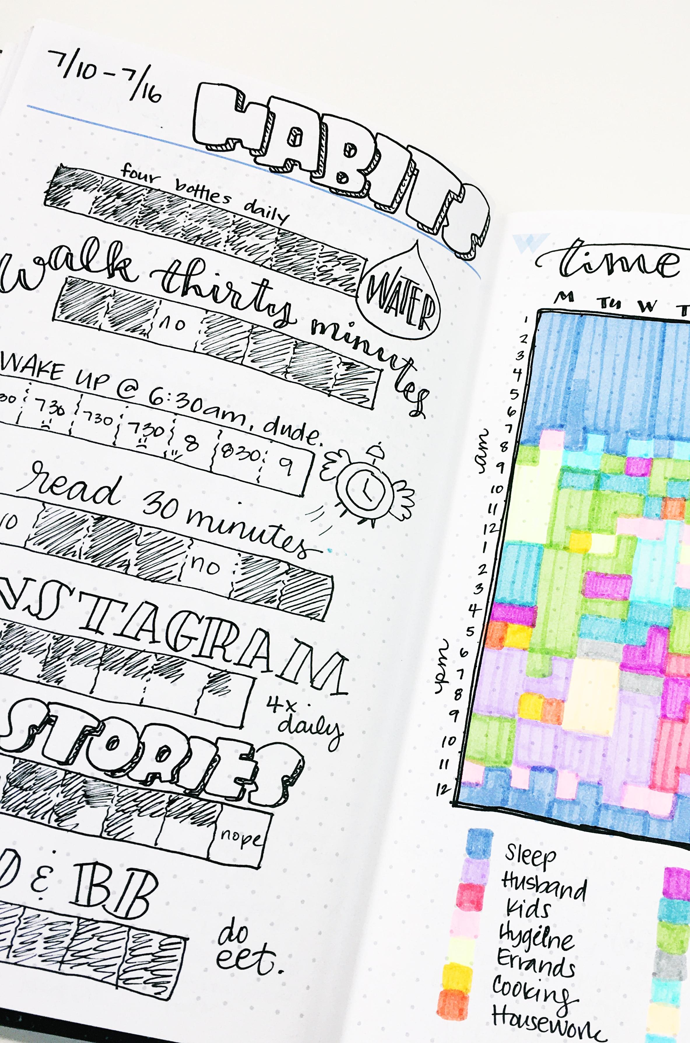
2. Supplies: Let's talk about the materials that you're going to need in this bootcamp. First and foremost, there are three packets of worksheets. I told you it was a bootcamp. In the Projects and Resources section, there is a basics for alphabet, there is an overlapping alphabet, and then there is a bunch of worksheets on drop shadows. You're going to want to print those out. If you are working digitally with an iPad and a pencil in Procreate, then you can download those and upload them into Procreate and use them there. Otherwise, you're going to want to have them to use as reference and practice, both for tracing, and to check back and see if there's anything that you need a little bit of extra work on. I will be using a pencil, an eraser, a fine line pen, and I will be using some markers. You can use highlighters markers, whatever you've got. I will be using Crayola Super Tips because they are a very inexpensive option for adding color and shadows to your bubble letters. A sketchbook can come in handy, as well as some cards doc for your final piece. Print out as many practice worksheet pages as much as you want. Or if it helps you out, you can utilize graph paper for your practicing to work on consistency of sizing. I don't suggest you go out and buy a whole bunch of new things, use the materials you already have to practice this. One of the greatest things about bubble lettering is you don't need fancy pens to do it. I do suggest, for the fine line marker, using something with a slightly broader tip. If you use something with a super fine tip, the wobbliness of your hand will show up a little bit more, whereas a broader tipped marker, I tend to like a medium point felt tipped marker. That tends to camouflage some of the shakiness when you're first learning how to do this. Now that we've gone over the materials, gather them up, get your worksheets, and let's jump into the next lesson.
3. Handwriting Vs. Hand Lettering: I want to take a couple minutes here before we get into the actual nuts and bolts of lettering to talk about the difference between handwriting and hand lettering. I think it is a bit of a paradigm shift that you have to make in your mind when you are learning how to hand letter, that helps break down some of the struggles that a lot of people have when they first get started. That is, hand lettering is not writing. Hand lettering is drawing. Simple as that. With handwriting, you're picking up a book, you're writing down, whether you're using your nicest handwriting or your scribbly doctor's handwriting, you're writing. That's the method that you're doing. But when you draw something, you're no longer thinking about the words that you're putting on paper, you're thinking about the shape and the form of the thing that you're drawing or doodling. That is how letters are constructed, especially bubble letters. Because bubble letters are not created with the same motion that you use when you handwrite. When you're learning brush lettering, when you're learning other kinds of lettering, you do have some amount of the motion, the muscle memory that comes from handwriting. But with bubble lettering, it is completely different. You are not drawing the letter, you are drawing around the letter. You are drawing a bubble around the inside skeleton of the letter. If you can keep that in your head when you're working on this, that you're learning new muscle memory to draw 26 new shapes that you did not necessarily know how to draw on the first place, that will help you when it comes to struggling with, this should be easy, I already know how to write, but you're not writing, your drawing. Just keep that in mind. It'll help you, I promise.
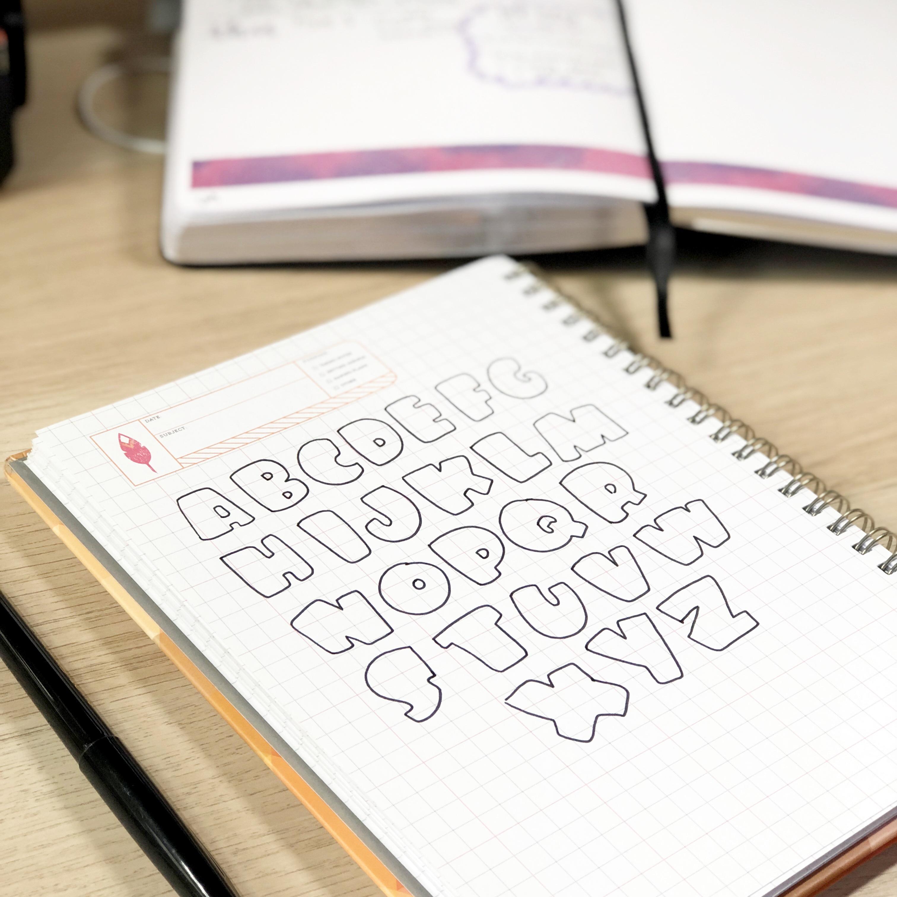
4. Create a basic Bubble Letter: In this lesson, we're going to talk about how to create a basic bubble letter. You will be able to follow along with this lesson on the very first page of the basics worksheet that you can find in the resources section. Like I said in earlier lessons, to create a bubble letter you are tracing around. The easiest way to go about that is to draw your initial letter, which I'm going to refer to as the skeleton with pencil, and you want to give it some extra space. Instead of just a standard A, you want to open it up to make sure that there's enough room to trace around it. One way to create a bubble letter would then be to just trace around it like this, which you can totally do. My favorite way to make bubble letters and the way that we're going to be doing them in this particular Skillshare class is to make one side puffier than the other. It gives it a stylized look. Instead of just tracing around it, there's an easier way to be able to gauge what shape you want the letter to be. I usually tend to make the left side of my letters puffy. You'll notice that with the lettering practice you'll get in these worksheets, but you can pick either side, sometimes you have to pick a specific side because of the shape of the letter. It's not a big deal. If you have a choice, make sure to stay consistent and for me, that's the left. To start, what I want to do is draw a fat rectangle around the left branch here of the letter and I'm going to keep the edges of it soft and rounded. I'm going to do the same thing except I'm going to make the rectangle surrounding this branch of the A skinnier. Now you'll notice I started it inside the letter because eventually, we're going to be tracing around it, that's why we're doing this in pencil so that you can go back and erase all of the lines. Now finally, what I'm going to do is create this section here, which is called a crossbar. I'm going to put the rectangle around that, but I want to be able to leave some of this space to create the gap for the A. I'm going to do it around the bottom here and that's something that you just have to feel out as you're working on bubble letters is to give yourself the space that you need. It's a learning process, you'll get better at it the more you practice it. But you need to remember to keep the features of the letter that make it what it is and for an A, you want to have that little opening in the middle, you don't want to lose that. Then what you can do is take your fine liner and trace around the edges of it. Pro tip when it comes to bubble letters is especially comes into play with rounded letters like C or S, but it matters pretty much with all of them. To maintain the rounded look do not start on a corner because you will be more inclined to make the corner pointy. Instead, what you want to do is start somewhere in the middle and then work your way around. Remember what I said about keeping your corners rounded, it doesn't have to be perfect you're just following it as a guideline and then you meet up there. If you feel like this little section here where the pen lines crossover is a problem for you, we will talk more about how to camouflage that a little bit easier in the drop shadow section. Then I will just go round here to create that center, I will erase the pencil lines and you will see a bubble letter. There we have it, a bubble letter A, created with the skeleton and you can follow those same techniques for any letter that you want. I will only be demonstrating uppercase bubble letters in this class because I really hate the look of lowercase bubble letters but you can follow the same techniques with lowercase if that's what you want. Now for a rounded letter, we're going to use a C as an example. Again, you want to give it some extra space. Instead of drawing a rectangle to create your wide and you're skinny spots, I use lines. Up here at the top will be my wide line, and down here at the bottom will be my skinny line, it'll get skinnier as we go along to the other side of it. Then here in the middle, I will draw another wide line because this can serve as a guide to draw my way around. Now if you are not confident, you can add more guides, just make sure that they get skinnier as they hit the skinnier side of the C and then you can draw your way around and follow the guides as best as you can. It's okay if you have a little bit of pointy corners there, just remember to round them when you go around like a record baby, round, round. Start somewhere that's not a corner and follow it, remembering to stay rounded. You can change the thickness of it based on what it is that you want. One of the things I find really funny with a C is if you're not careful, you want to flatten this out. I didn't do that, but I normally would have it be like this. Because the more it curves up, the more it looks like it can be like a little shrimp and that cracks me up. Happy face is going to stay there, I should've done that in pencil. Then you have your bubble letters. That's how to create basic bubble letters, both like line-style letters and rounded letters. In the next lesson, I will be drawing every single letter in the English alphabet so that you can see how I do them as bubble letters and the worksheets will also guide you through creating them in the same method that we created these two. Hope to see you there.
5. Basic Bubble Letters A-Z: In this lesson, I will be going through the entire alphabet in real time, following the worksheets that you can find in the resources section in the basics worksheets. Now, each letter is broken down in the method that we worked on in the previous lesson. Here you can see me working on the A. You'll be able to follow the same technique for every single letter with the guidelines that are on the worksheets. I'm going to be pointing out some things to keep an eye out for. For example, with letters B and D, where there's that innermost hole, you want to line it up with your big fat drawn rectangle, and you want to make sure to keep them on the lower end of the letter. We'll talk a little bit more about that during the O. But you want to just keep those inner circle, those intersections consistent from letter to letter. Again, consistency is the key with everything we've talked about. One way that you can make the letter look more puffy and less shrimp like we talked about, for curved letters is to flatten the curve out a little bit. Again, we'll talk more about that when we get to the S. But the flatter the initial curve is, the more poufy you can make the letter look. Here with the D, we're going to do what I was talking about before with the B. I'm going to make sure that that opening is a little lower on the letter. It's going to be an arch from the side of that initial big rectangle that creates the backbone of the letter. Now with the E, I actually like to fatten up one of the little crossbars that comes out of the side, but I tend to make it the middle one. I found that if you make the top of those three crossbars, the fat one, it creates that same shrimp looking situation that we had with the C earlier. I find it just aesthetically, for me, looks better with the middle one. With the F, I can go either way. Both ways look good to me if the middle one or if the one on top is the fatter. I believe here, I'm doing the middle one being the fatter, just to keep it again, consistent. But that doesn't bother me quite as much as the E does, when the top is super fat. Now with the G, you're going to be doing the same thing as the C. But you're adding this extra little piece here on top for that little crossbar that's part of the G. Then you're going around the center section to just bring it right up underneath that crossbar to create the look of the G. You don't need to exaggerate that section too much, just enough to make it distinct from a C. Now with the H, super, super easy. You're just doing one fat rectangle, one skinny rectangle, and connecting them with that crossbar in the middle. The biggest issue I run into with H, is somehow my H's wind up being bigger than every other letters. So I do have to keep an eye on sizing when it comes to that. I's just a quick fat rectangle around it. You might give it a little taper at the bottom. That's what I usually do, so it doesn't just look like a rectangle. J's are one of the letters where it's actually going to be a little puffy here on the right-hand side, purely because of the shape of the letter. Now, you could do it the other way if you wanted to. But I have found that making a little short end of the J, the puffy part, tends to look a little bit awkward. Let's talk about the K pants. I have noticed that if you make a K and you create this little tight corner here with a bubble letter, it winds up looking really strange. You want to open up that little junction with that bottom line going down. We're going to demonstrate it here. First, you're going to just do the little tight corner. Then we're going to do it with the open corner. This is what I call the K pants. You wanted to be like the crotch of a pair of pants. You don't want it to be super tight. You want it to be nice and open because otherwise, it doesn't have that good bubble letter look. Whenever you're making a K, just remind yourself of the K pants. Now, even if you don't give yourself a lot of room for the K pants, like I did right here, you could still create it by just going horizontal for hot second when you're creating that junction in the lower part of the K. This is going to pop up again when you work on the letter R as well. But K pants to me sounds better than R pants. Working on the L, I just do the same thing as the I, except then I add that little bottom section to make it an L instead of an I. Now, building an M means utilizing four different angled rectangles. You can try and make some of them poufy. I would personally, decide to either make the center of the M poufy, or two parallel rectangles poufy. Now when you're making your corners, keep them a little bit soft and lower or shallow. You could see here. You don't want them to go super deep because it'll make the letter look more narrow and less puffy. I have found that the N looks better, if you make the center puffy. It doesn't really matter if you're doing left or right side puffy. For the N, I keep it in the middle. That just means to narrow vertical rectangles, and then the angled one is nice and fat. Then again, keeping those junctions shallow. With the O, you can see the difference here between putting the circle lower or putting the center circle higher, the same with the D or the B, or anything like that. I tend to like that inner circle lower, and so I tried to keep that consistent throughout all of my letters. You won't see a lot of O's with that upper circle in my lettering unless I'm doing it on purpose. See here with the P, putting the little center section lower in the P, same situation. Q can be a little bit tricky. What I do is I draw a rectangle around the little section that crosses the Q. Then I do my inner circle to give it that little bump. Then I go around it completely to make the O. Then when I trace it, I trace around again, only the parts on the outside and the most inside of the letter. It takes a little bit of practice to not look awkward before free handing. Q is one of the more difficult ones to freehand. Again, with the R, you've seen the combination of putting that little inside section lower, and remembering to create the, R pants, the K paths inside of the R, to keep it from looking super awkward. Like I talked about earlier with the C, creating a curved bubble letter can be a lot easier if you flatten out the curve a little bit. You can see on the left, you've got the super standard S. On the right, you have one that's been stretched out like taffy. Then I find going around it to create my bubble letter, is a lot easier and it looks a lot puffier than having to follow them much more rigid curves of the S. I still add the guidelines when I'm practicing like I would with the C. But starting with that initial skeleton being a little stretched out can be a lot more helpful. Much like L and I, T is pretty simple. You might want to taper that vertical line, if you want to. But generally speaking, I keep the middle line fat and that top line more skinny. Now, when it comes to U and V, we're going to go back to those shallow indents into the letter, like what I talked about with M. To make it look really good as a bubble letter, you want that indent in the U or in the V to be more shallow. The deeper it is, the more divided the letter looks, which removes some of that puffy situation. Basically, with these letters you want to think about them being full of air. If they're full of air, there may not be a lot of those deep crevasses, like you might see in a block letter versus a bubble letter. W, much like M, is a bunch of angled rectangles. Much like M also, I tend to make the center look more puffy. You don't even have to try that hard. You can do the same width of rectangles and a center is going to look puffy regardless. Then again, when you're tracing around, just remember to keep those indents on the letter shallow, so that it keeps that poufy bubble letter look. X is my hardest letter to free hand. But it's one of the easiest letters to trace. The key is that the edges that stick out on either side of the X, they need to just look like they're part of one long piece, rather than four little sticking out points. Otherwise, it won't look much like an S. You can see here, I'm demonstrating where invisibly they should be overlapping each other. With the Y, I tend to keep the left-hand side poufy and the right-hand side narrow. I'm never quite happy with my Y's. I feel like they usually look awkward regardless how I make them. So if you come up with a better one, show me in the project section below. Then Z is basically, repeating the N, just on its side. Z is one I know a lot of people struggle with. If you think about it like an N, it might make things a little bit easier for you. Now that we've gone through all of these, let's go to the next lesson to talk about your project.
6. Best Tips for Practicing + Start Your Project!: We just finished the bubble lettering alphabet. In [inaudible] itself, you have just gotten through probably the hardest part of learning how to do this, and that is trying for the first time, giving it the old first try. Whether you've tried it before or not, you have worked through it with me and I am proud of you. But before we move on to the other parts, the overlapping, all of that good stuff, I might take a second here and talk to you about practicing. You'd have to build muscle memory and in order to do that, you have to practice. I wanted to talk about that here before we move on to the rest to remind you that while you're learning about overlapping, while you're learning about drop shadows and all of those other things to keep practicing in the back of your mind, to practice the basics. While you're doing these other things, you're going to be practicing, even if you're going to be learning different skills at once. I want to give you a couple of my best tips for practicing lettering, bubble lettering specifically, but any lettering to help you so that you can not only learn this skill from this Skillshare class, but actually make the skill something that is part of your everyday lettering toolbox. The first tip that I have is to practice a little bit every day. If you only practice once or twice a week, that's better than nothing. But the muscle memory will get built with even 10 minutes of practice every single day. Number 2 is try not to practice 85 different styles of lettering at once. Now I'm biased. I think you should practice bubble lettering. But if bubble lettering is not your personal gym right now and someone else's then practice that. The more you add different styles to your daily practice when you're still new at most of them, the more you're spreading out that muscle memory and it's not going to have as much impact when you are practicing. So picking one thing for a month or for a certain amount of time is going to absolutely help you get better at it faster. Then you can focus on the next one. Help bubble lettering is first though. Tip number 3, this to me is one of the most important tips is to save your practice work. I know it's easy to throw it away, especially if you feel like it looks junky, but if you use a notebook or something, hang on to it today you might try it, and then tomorrow you might try it, and you might not see that much of a difference. But what you did today and what you did 30 days from now, if you practiced a little bit every day, you are going to see a difference. So by hanging on to at least some of your everyday practice, you will be able to look back to see and celebrate the progress that you've made, and it'll feel really good and it will give you the confidence to continue to both practice that and to try something new. Those are some of my best practices for practicing, which I just think is really fun to say. Now that we've talked about those, before you move on, I've already said that our project in the Skillshare classes to end up with a really well lettered, fun bubble lettered word. But right now why don't you pick that word, whatever word it is, it could be significant to you, it could just be something that you see on a piece of junk mail that's on your counter. Doesn't matter. Pick the word and I want you to just bubble letter using the basic alphabet we just learned as a opening practice. At the end of this course, you're going to use everything you've learned to make it super fancy. But I will love if you put up one of your attempts in the project section of your word with just regular bubble letters. If you think it doesn't look that great, that is more reason to put it in the project section. Getting encouragement from other people will be really helpful for you. By putting it out there, you're saying, "Look at me, I'm trying. " and that is also important. Go ahead, pick your word, give it a letter with the basic bubble lettering, and when you've done that and you've posted it, we can move on to the fun stuff.
7. Overlapping Bubble Letters: In this lesson, we are going to talk about overlapping bubble letters, which is my favorite way to draw bubble letters. I almost never draw them separated from each other, although that's the easiest way to learn them. I will not be going over every single letter here, just the basic technique, but in the overlapping worksheets, you have examples of every single letter overlapping every single other letter. It's a lot of worksheets, you can use these as reference, you can use these for practice. The basic way to draw an overlapping bubble letter is to first start with your initial letter skeleton, and then next to it but pretty close to it, put in your next letter. We'll do a D for the fun of it here, so they're close. If I was going to be drawing them separate from each other, I would have given them more room because bubble letters require a lot of room. Now what I'm going to do is I'm going to just draw. Now, imagine I'm doing all of the aspects of drawing a bubble letter here. The way we've talked about it already, but for the sake of time, I'm just going to be free handing them. You draw the one bubble letter in pencil, and then you draw the other bubble letter in pencil and you should have at least a small amount of overlap. That's where you're going to get rid of some of the bubble letter with the covering. Now to draw the overlap, I want the A to be in front and the D to be behind it. I will trace around my A with my fine liner and trace the entire A. Then for the D, I'm going to start where the A begins, and go around and anytime I touch the A, I stop, instead of tracing this part of the D that's underneath the A. When you erase, you have the overlap. This work is for every single letter. The closer you put them together, the more of an overlap they'll be. You want to make sure that they are not so close together that you're hiding the features of a letter. If this A was so close to the D that you couldn't see this little inside circle here, or so that you couldn't see this mark straighter edge here which differentiates it from an O, you won't really know what it says. For legibility, you want to make sure that the parts of the letter that are showing really hammer home what the letter is. Now if you want to make them a little bit closer, or if you want to create the illusion of the letter being behind it, to draw my skeleton here. There's an O and I guess we'll just draw this here, this will be where the little circle is going to be. Then next to it, I'm going to draw an M. I'm going to make my M like this. So that when I go around it, you'll see that part of the M goes through the little hole in the O right here, so keep an eye on that. Like I did before, I'm going to trace the O in its entirety. Now again, I'm going to go around the M in the parts that are visible outside of the O, but that also is going to include adding the line on the inside of the Os circle. One way to really nail this home is to utilize drop shadows, which we will talk about in a later lesson to create some dimension. But that's how you can make the letter legible, but still show a little bit of it behind to really create that illusion of overlapping. Now when it comes to overlapping, you have a few different choices. Everything that I have in the worksheets has the letter that's on the left in front of the letter that's on the right, so that every letter next to it is behind the letter on the left of it. You can also do it the opposite direction. But if you're going to do that, you have to work backwards, which is where this whole drawing instead of writing thing really comes into play. So you could do it like that as you can tell I'm awkward freehanding it because I very rarely do that. Or you can alternate which letters are popping out in the front so that it can look a little bit more jumble. The way to do that would be, I'd start with my B here, and I did some corners because again, I'm just being sloppy with this. That makes the B in the front, and then you can keep going and alternate it in different ways, so you can experiment with it. All of the examples I have, have the left-hand letter in the front, but you can feel free to follow this same technique. There's no real rule here, the key is, if you're going to be keeping everything with the left in the front, then if you change it or if you forget what you're doing and you suddenly have one in front where it wouldn't normally be, it will look awkward unless you're looking for that style. Just consistency is the thing to pay attention to here. While you practice this, I would certainly suggest creating your own bubble letters using the techniques that we talked about in the previous lesson. But if you would like a real good practice for your muscle memory, then take the worksheet and trace every single overlapping combination there. There is 26 times 26, it's a lot of combinations. Tracing all of the different overlapping pairs is an excellent way to start building that muscle memory. Especially since with each page, you will be repeating one letter 26 times and then the other letters each once, and then you'll be rotating through the letter. Make sure to spend some time practicing your overlapping letters so that you can get the hang of it. Overlapping letters will look great with highlights and drop shadows, which will be the focus of our next couple of lessons.
8. Highlights & Fill Ins: In this next lesson, we will be talking about different ways to fill in and highlight your bubble letters to make them look a little bit more fun. The very last page of the drop shadow worksheet has a practice page that I will be using to demonstrate this. You can print as many copies of this as you want, if you want to play with highlighting and filling in without drawing the actual bubble letters. We'll just be running through several different styles of filling in, and this is by no means an exhaustive list. Feel free to let your creativity go all the way. I'm using Crayola SuperTips and my fine liner. But you can use quick colored pencils, you can use paints, you can do all different things with these. This is meant to be a jumping off point for you and your creativity, not an exhaustive list or a set of rules. I don't believe in rules when it comes to bubble letters except to try and keep the corners round and remember the k pants. Now, one of my favorite things to do with a bubble letter is to highlight it in some way or another to make it look like the light is shining on it, to give it like a little bit of oomph, and it's the super easiest way. If you're going to highlight your bubble letters, make sure to do it in the same general place on each letter so it doesn't look weird. One of my favorite highlights is so simple. It's just a little curved line around the upper top of the letter. That's it, and I will just do that on every single letter in the situation. I love how it looks. I think it just makes it look a little bit fancy. If it's a letter like M that has multiple upper corners, then I will do the same line twice. I would do the same with an N, I would do the same with the W. Another thing you can do when you add these little highlights here is you can add them in similar spots like I will put one here and then one here underneath the B, like that. But generally speaking, I actually just prefer with the one upper highlight. I think simplicity is best. Now if you want to give it more of a balloony look, then you start with your little highlight like that. Then what I do is I open up one end and then I draw it down to a point, to give it like that look of like light on a balloon, I will do it here on the D, which is brewing the point down and that creates that sense like with a balloon of a grounded light being shone on it. Now when you fill in your letters, there's plenty of ways to do it. One way that you can do it is to just take your color and just color the whole letter in. Super simple. Especially if you have like a word spelled out and you alternate the full solid color or you do multiple, you can do a rainbow of colors. Solid colors can be a lot of fun. If you add one of these highlights, that has an entire like section to it, you can color around it and leave it open with white that makes it pop. Or you can add a different color to it if you want to make it pop in a different way. You can add like a little bit of a shade to it or whatever. One fun way to add a little extra oomph after you've colored it in, is to grab a darker color. It could be a darker version of the same color or it could be some that is just dark enough to show up. You could outline the inside of the letter to give it like a shadowed look, that's always a lot of fun. Another way you can do it is to go around the outside of it to create a shadow like that. That's also a fun way to just make the letters look interesting. You can also choose to do just the outline of the inside with no color on the inside, if you want to, doing like a reverse drop shadow on the letter. If you wanted to take two colors and color it in, you could color in half and half, one-half, like vertically or horizontally. This would be the horizontal way to fill it in. Just do half in one color and half in another. Your biggest key when you do something like this is to just make sure that you like how the colors look together. Test out the colors before you start coloring them in. Here's a vertical version of coloring them next to each other. But one of my favorite things to do is a dipped letter. What I would do is I will take the darker color and I will draw a wavy line, and it can be super wavy like that. It can be very lightly wavy like this or it could be like drippy. However you want to do it, pick a different way, you can make a jaggedy, you can use sharp edges. But I like to use more smooth like wavy edges because it looks to me like it was dipped in paint. Then you color in one side of it, the one color, and then you color in the upper part in the different color, and it looks like you've dipped your letters in a paint or whatever the case may be. That's a lot of fun to experiment with. You can do multiple layers of this if you want to. You could add embellishments to make it look like a cake, that could be a lot of fun. Another simple way to color in is polka dots. Polka dots are fun, the key with polka dots is you don't just want to do dots like this, that's fun in all, but you also want to add some like little half circles coming off the sides to make it look like there's like overlapping of dots. Again, you can do that with the dots and then add like a lighter color as a background. This makes it look like a giraffe. I wasn't even go in for that, but hey, animal print man, instead of round dots, you can make the dots look like this. Make them more wavy like that with a darker brown color. You can do like cheetah print, if you want to. Speaking of that, there's always good old stripes. You could do the stripes diagonally. You can do them up and down, however you want to, you have an opening or you have somewhere where the letter is interrupted, you want to continue the stripe on the next side of it, like it hadn't stopped. It just avoided the hole. That's the biggest key to making the stripes look pro, is to make sure they look like they've continued regardless of where the letter starts and stops. Now if you want to create an inner glow to the letter where it looks like it's glowing on the inside, take a lighter color and very gently go around. We already talked a little bit about this, but if you use a very light color and go around the inside like that, it just gives it that like slight glow to it and leave the rest of it white. Little sloppier with a dark color but with a lot of like pale colors, it can add a tiny bit of interest. We already talked a little bit how to make a balloon looking highlight like this. But if you want to go full balloon, then go to the bottom of the letter, put a couple of diagonal lines going outwards like a V, and then just do a little jaggedy line underneath, and a little string, and you have a balloon. You could do any of those fillings to make it look a lot of fun. Now if you have one, like a W, you don't want to put it right in the middle because it makes it look a little awkward. What I usually do is I just pick a side and I do a balloon like that. You can do it however you want to, just know that any of the letters were like this crevasse here is right in the center. If you add the little balloon spout to it, it's going to look a little weird. Go ahead and print yourself some copies of this practice page, grab some markers, use some highlighters and start experimenting with different fillings. If you come in up with something different than the ones I talked about or combination you really like, post it in the project section so that other people can give it a try as well. In our next lesson we are going to be talking about the basics of drop shadowing, which is the key to super interesting looking bubble letters.
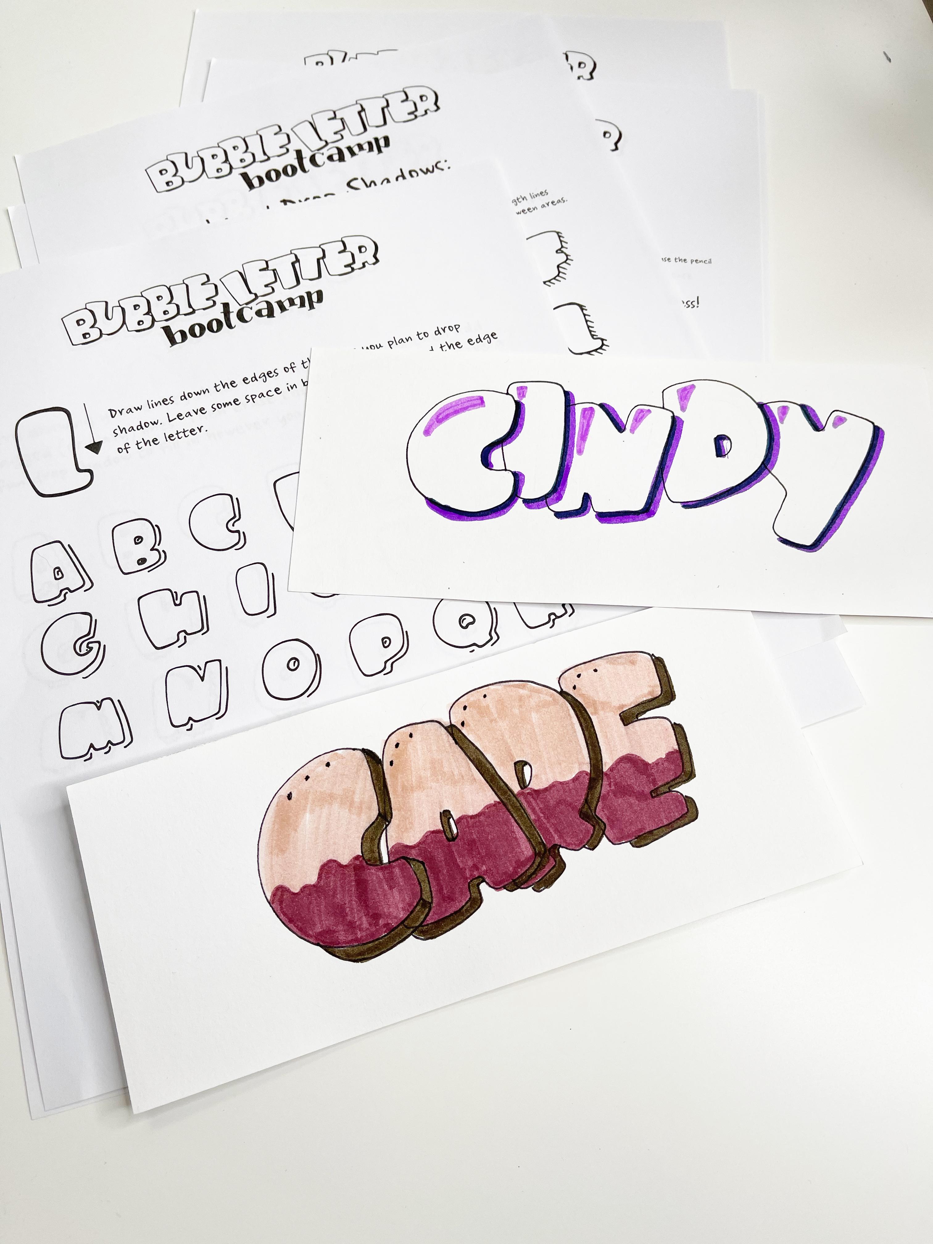
9. How to Place Drop Shadows: In this lesson, we are going to be talking about the basics of how to place a drop shadow. When you cast a shadow, it happens because a source of light is hitting you, and the shadow is cast behind you. Importantly, when you're doing a drop shadow, you need to determine where the light is coming from. I generally put my drop shadows in the same place, every single time I do lettering out of habit. The key here is that you want to be consistent. If the source of light is hitting one letter in your piece, that way, then you want to make sure that, that source of light is hitting all of the letters in the same way. Unless you're going for a different kind of stylized look, but in general, my suggestion is to pick a light source for whatever you're working on, and stick to it. We're going to imagine here, that the source of light is right here, going down on this letter, in this direction. If the shadow is being cast from this direction, the shadow is going to be thrown over here, because that's the way that shadows work. All of your drop shadows will be on the back sides of your letter, and the undersides of your letter. Now, note here with the A, that the underside, is the underside of this top part of the A, not the bottom of this hole. So you want it to be the bottom edges, of every part of your letter if the light is shining on it this way, and so then, any other letter you draw in this style will have the drop shadows on the side, and on the underside of that letter. Let's try a different direction with a curved letter. Let's say here that the source of light is below, and it's shining upwards, then your shadows would be thrown over in this area. I would be doing a shadow here, and a shadow here, maybe even a shadow here, if you think about the light being on this side to be thrown in that direction. That is the key for doing any drop shadow, you want to figure out where you want your source of light to be, and then you place your shadows accordingly. Now for overlapping letters, drop shadows can offer a lot of dimension. Imagine, once again that we have the light up here, same direction that I usually drop mine in. I'm going to take my marker, and I'm going to add my drop shadow on the underside, and the right-side edges of the letter. I'm going to just draw them right on top of the letter, that's underneath. You can imagine that your two letters, instead of being connected to each other, because that's how you drew them, you imagine this is your top letter, and this paper underneath, it is your bottom letter. If you lift, then right here would be where the shadow would be thrown, if there was a little space in between them. That's generally why I add drop shadows to overlapping letters, is because it adds that little bit of dimension. I'm going to add the same shadows here, and I'll just let them overlap each other when they touch. This can make your overlapping letters look a lot more 3D, especially if you don't use a super dark color, but you use a lighter color, a subtle color. We'll do it here with this lighter gray, and it just adds a little bit of dimension to your overlapping letters. Now, the key with overlapping letters is, I would add a drop shadow anywhere that the letter would be shadowing on top of a letter, I would not, generally speaking, do my drop shadows on this side, just because it doesn't quite add the same effect, if you want to place your light down here. You can, but often with drop shadows, I like to place my light wherever the top letter is going to be shadowing on to the letter beneath it. Practice drawing light sources and throwing shadows. If you would like to make it a little bit more simple before you really practice with bubble letters, then draw yourself a source of light, and throw your shadows on some simple shapes like a circle, or a square, or a triangle, or something. Practice that, do a bunch of practicing with different shapes and things, throwing the light from different directions, so you can get the hang of how to throw some drop shadows and how to place them, because in the next video we'll be talking about some ways to make different looking, decorative drop shadows.
10. Fun with Drop Shadows: In this lesson, we're going to be going over some different ways to create interesting looking drop shadows. There is an entire workbook called Drop Shadow that is in the resources section, and we will be going through each of these methods, and each worksheet page has a full alphabets worth of examples for you to utilize. One other note, I will be placing all of my drop shadows on the right-hand side, and the underside as if the light source was up here in the upper left-hand corner because that is my favorite spot to place drop shadows. For the full edge drop shadow, you're going to basically be covering the entire edge of every edge that's going to have a shadow. You draw it out with a little bit of an angled down line because drop shadows don't go straight out. They're being thrown in a direction. Since they're being thrown downwards, you want to make sure that the line goes a little bit downwards. I'm just going to draw the lines here, and then connect them so that they cover every edge of the letter. Then I'm just going to color them in. That is a full edge drop shadow. With a rounded letter you want to stop the edge as it's beginning to hit the underside. You want to curve it downwards like that for the full edge, but you still want to cover the basic bottom of the letter. If the full edge drop shadow is giving the full shadow of the letter, imagine with the partial edge that the letter is sitting a little higher above the surface that the shadow is being cast on. So you're not seeing the entire shadow, you're seeing a smaller version of the shadow. The key here, and the key with all of these is to just be consistent when you're drawing your shadows so that they look like they belong to each other. But the key for this will be to start your shadow a little lower on the edge. Instead of here at the top, you go a little bit lower. On your other edge, you come a little bit inward so that instead of going all the way to the full edge, like in the full edge shadow, you're basically reducing the amount of space that the shadow has to fill in. Also remember to keep your edges smooth. You want your edges to mimic the edges of the letters. The shadow is a little bit fatter, and a little bit condensed. Now when it comes to the insides of letters like this, for the D or for the A or the B, I just keep it the same for both the full edge, and the partial edge. Unless you're drawing a gigantic letter, there isn't really enough space to differentiate. Now, if we went along the same lines as we did for say, the full edge or for the partial edge you can do this with either. We can do what I call the boxy edge drop shadow. We'll do it on the H here. Basically we're going to draw those same diagonal lines that we did for the full edge drop shadow. But for the boxy drop shadow, we're going to connect those lines but we're not going to fill them in, so it makes it look like the letter is a box. Now for a rounded letter, there may not be a lot of lines to connect. For the P, as an example, I would draw a line here, a line here, these lines, and I would just round it to here, and then down. Then for the O, I would put my line here, and my line here. I would round them trying to keep the corners a little bit rounded. That was gunky. Then just draw a little inside curve. That's how to create the boxy effect. Now if you do the boxy effect with pencil, redraw your lines down with a pencil, and then connect them with pen, but avoid drawing any of the inside lines. That'll create the empty drop shadow. For the P we would avoid this line here, and this line, we draw down like that. It's basically the edge of the letter, but with none of those lines that make it look like a box, the difference between this letter, and this letter. Now, I have included in your worksheets a practice page that has a bunch of letters with a open empty drop shadow like I just demonstrated. Because you can fill this up using the same techniques we talked about in the previous lesson where we filled in the bubble letters. You can do the same things with the drop shadows. One of my favorite ones to do, and I have an entire worksheet in the packet with this style is to just add stripes. You're basically just drawing lines in the same direction that you drew the initial lines to form the drop shadow. Leave the black outlines but fill it in with a different color. That's always fun. You can fill it in with polka dots, just color in dots along the sides. You can do the dip situation that we talked about, creating a dip with one color, and then another color in the shadows. There's a lot of funny things that you can do. You can utilize this worksheet to experiment filling in the empty drop shadow with different colors, with different patterns. One of my favorite basic things to do with the drop shadow is to color the letter in with a light color. We'll use a light gray here. Take a darker color like this darker gray to fill in the drop shadow. Now you can also just draw the drop shadow with the darker color. But I actually think adding the outline makes it look a little bit neater. You can do this for whole whole bunch of things. This practice sheet is for you to experiment with, and decide if there are things you would like to do. Now, moving forward into some other fun drop shadow things to try, we can start with the lines that we talked about to create the boxy drop shadow or just the basic drop shadow. But then instead of connecting the lines, we just draw a bunch of lines that are parallel to it. That creates a lined drop shadow. Gives it a centipede look, which could be fun or gross depending on what you are cool with. Now if you take your drop shadow, and you do a pencil drop shadow to draw it in like your boxy or whatever but then you take your pen, and instead of covering it with a straight line, you can use a wavy line or a jagged line. It can give you a super fun, wacky looking drop shadow. We'll do one here on this E with jagged lines. Again, you can fill it in with a different color. If you were going to make your letters into animals like do an L to make it look like a lion. You have your jaggedy drop shadow, and you can color the drop shadow in with a dark main color. Then color in this part, so many puns. Then you have a little lion, and you can put a little face in there. There's fun that you can have with these letters. I'm showing you the jagged, and the wavy drop shadows. Not because I use them very often, but because they're fun if you're looking for something fun to do. Remember, we talked about the highlight inside of the letter, just a simple line. Now, there's also a way you can do a drop shadow with just a simple line to make it look very simple but very cool. That is to just draw a quick line in all of the spots the drop shadow would be. As you notice here, placing this highlight, you're still on the underside. You can do the same thing just inside the letter on the underside, and the right-hand side of all of the letter. For example, with the W would be like this underside. I tend to not go down the entire side if I'm doing these inside highlight. I tend to keep it a little bit shorter. But if you wanted to just draw lines for a highlight, that's a really fun thing to do, and it just makes it pop a little bit more. I like this more when the letters are not overlapped, I think it stands out more. When the letters are overlapped, it starts to look a little jumbled, and confusing. Then finally, the same as when we did the highlights that looked like this. If you draw this in here as your highlight, you can also draw your lines down, and draw your drop shadow, like a stylized situation on the other side. This is harder to do when the letters are small but when the letters are not small, it can look really sick, especially if you add some colors to it. Look at that. That can look really neat if you add colors to it, but the smaller the letter is, the more jumbled it is. That is my ultimate tip. The biggest tip I can give you when it comes to embellishing your bubble letters, whether with drop shadows or with highlights or with all of the things, is that the smaller the letters are, the simpler you want to go. It'll be easier to read, and it won't look quite so cluttered, and mush together. You won't be able to tell the interesting things that you did if the letters are super small. If you want to do a lot of fun stuff, make them bigger. I tend to recommend that people practice bubble letters bigger anyway, because it's a little easier to learn than going super small. In the next lesson, I am going to tell you about your final class project, and demonstrate it for you myself.
11. Class Project - Real Time Examples: For your final project, I would like you to take the word that you already practiced earlier in the Skillshare course and I would like you to draw it out and make it fancy using all of the things we just talked about. One thing you'll notice me doing right here is that I am staggering the letters, I'm putting some lower and some higher and alternating. When you do this especially with overlapping bubble letters, you can create a look of bouncing. It's not that difficult, you do the same thing as you've already learned, you just make the letters, instead of on a straight line you put some higher and some lower. The more high or the more low you put them, the more bouncy they'll look. I tend to like a subtler bounce. Now, I'm actually leaving this in real-time, cutting out the pauses to take drinks of water and stuff so that you can see me do two of these. The first one is my name and that's the word I did earlier in the lesson and the second word is care, my word of the year. You'll notice me making choices, making changes throughout this, deciding what I'm going to do as I'm working on it and I would love it if you do the same thing and post a picture of it in the project section down below. I'm going to let this mellow music play while I do these in real-time. You can just watch and get inspired and maybe work on your own at the same time. But if I make a choice like right here, deciding to just put a full-blown drop shadow with a darker marker and then I realized I didn't like quite how it stood out so I decide to grab my fine liner and thicken the edge of the letter and when that didn't work, I grabbed a darker marker and that was what I was looking for. Those little changes that I make, I'll point them out throughout but I do want you to just relax and work on your own project while you watch me work on the same. I would like you to note while I'm working on outlining my letter, my word of the year right here that I am remembering the k pants. Technically it's the r pants because there's no k in my word, but it's the k pants. Just want to point that out. Remember, most important part of a bubble letter is the k pants. One thing that happened here is that I thought I was going to do a boxy drop shadow and then I changed my mind, so there's only the one line. Now, with that one line or maybe two lines, however many lines I put there. But with those lines there and the overlapping lines with my tracing over, I thought to myself how am I going to cover this up and still have it look cool? I decided to grab a darker colored marker to fill it in. You might still see the lines a little bit in there, but I try not to sweat the small stuff when it comes to creating bubble letters. It's not going to be perfect but every attempt that you make is going to be one more thing on your step towards getting better at it. Practicing, making sure that you're building muscle memory. If you try to be perfect every single time, you're not going to practice as much because it gets demoralizing. If you practice a little bit and you screw up a lot, those screw-ups will get you closer to getting better at it over time. I say embrace the screw-ups, like I did here. One other thing to note while the erasing is going on, make sure and I think I said this already but make sure you let your fine liner dry before you erase. The worst thing in the world is to get some clean line work and be excited with it and then go to erase and smear it everywhere because you weren't patient. I decided to go with one of my favorite things to do when it comes to bubble lettering which is that whole dip letter look we talked about in a previous lesson. I love it so much. I thought that there might be a lot going on here with all the different colors I wanted to be using but I also made my letters really big so that if I did use a lot of colors, you can still see everything that was going on. I highly recommend working large. If you want to test out different styles of filling in and everything else, it just makes it a little easier to see what you're doing and the finish product look a little less cluttered. As I was finishing this, I thought it needed a little something extra. In the area that I would normally draw a quick inside line highlight, I decide to add a few dots. Dots are always a great substitute for lines, you can use them when it comes to any lines we've talked about in this entire Skillshare course. Dots are like my go to rajas things up. Now that I've demonstrated these for you, I would love to see what you've been working on, so please make sure to post them, no matter how you feel about them, in the project section below, because I think that you are doing great and even trying is a really, really important step.
12. Great Job!: Well, you've done it. You've gotten through the entire class. You have tried bubble letters in so many different forms, and at this point you should have posted your project in the project section, and I cannot wait to see it. I'm proud of you. I am proud of you for giving something to try. Hand lettering is fun, but it does take time to master. Bubble lettering is one of those styles that can be a little bit more daunting because like I said at the beginning, you are not writing a word, you are drawing around a word, and that is a completely new skill to master. But I know that you can do it. If it is something that you really love, then remember what we said about practicing because it will eventually become second nature to you. I can freehand bubble lettering without even thinking about it now, but I've been doing it for years. If you're looking for places to use it, I love it on my planner, on my bullet journal, I love it in notes to my kids, I love it on my grocery list, I love it to organize my closet. I love it in all sorts of places. I think it is fun and it surprises people when they find it. Somebody come in and they might expect some of that bouncy hand lettering and instead they see some bubble letters and you're going to have impressed them, I guarantee it. Now if you like this class, I hope that you follow me here on Skillshare, so that the next time I post the lettering in our planning class you will get notified of it. You can also go find me on Instagram at llamaletters, or on YouTube it's Cindy Guentert-Baldor, to find other lettering tutorials as well as planner and bullet journal videos, art videos and all sorts of other hot takes in topics. I would love to see you there. Once again, I'm so very, very proud of you. I cannot wait to see the projects that you come up with in the project section. Until next time my friends. Have a wonderful day. Stay safe, and peace out.
 Cindy Guentert-Baldo, Planner/Artist/YouTuber