Transcripts
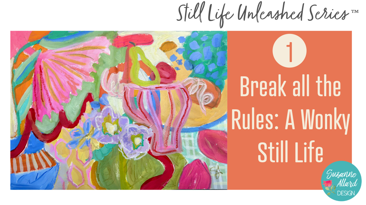
1. Wonky Still Life Intro: Welcome to Break All the
Rules A Wonky still life. Now, before you jump
into this class, if you haven't already taken
my designing still life, freedom, confidence, and choice class, I
would do that first. It's the I'm learning class
in the still life series. So where we loosen habits, practice making choices, and step away from trying
to be correct. So you'll get more out of these painting classes that follow if you do that one first. In this wonky class, we're going to
create a still life, but not in the traditional way, not what you might think of. It's going to be wonky
and kind of wild. This is a design first
rule breaking approach where realism is optional, and experimentation
is the point. It's an intentionally
freeing class. We focus on shape, color, and overall design, and we let go of the pressure to try
to make things look real. And for many of us,
that shift alone can feel incredibly liberating.
It does for me. This is a great
place to start in this series because
it helps break any preciousness
or rigid thinking that we might be
and probably are, I still do it,
bringing to our work. We're exercising
those experimenting and exploring muscles, and learning what it takes
to feel like to really trust ourselves instead of second guessing
or fixing things. And really, it's about
giving ourselves permission. The goal here is not a finished or polished painting,
necessarily. Success in this class
is feeling freer, less precious and
more willing to try things and listen to that
voice that wants to do. Try this little thing
or that little thing, even if it feels a
little uncomfortable. If you're new here,
I'm Suzanne Allard, and I didn't start
painting until my early 50s. I know
I look young, right? And I learned almost everything I know through online
classes like this. Today, I licensed my art. In fact, this is a
licensed kimono, which is so fun to wear. And I love teaching because creativity lives in all of us. Sometimes we just
need permission or new ideas or a new approach. So before you start painting, please check the
class downloads. You'll find reference photos, a cheat sheet of
tips specific to this class, and a
supply list there. So make sure to get
that all downloaded and ready to be handy
while you work. Alright, let's get started.
2. Supplies: Still Life Unleashed Series: Okay, let's talk
about supplies for this Still Life Unleashed
series of classes. I in general, when it
comes to supplies, I definitely have a problem. I am addicted to art supplies. So bear that in mind. You know, you do not need
all of these supplies. I just am an art supply junkie, and I love experimenting
with things. But I did try to keep it
under control, 'cause, you know, limits are good. So let's start with here, let me flip us down
to this camera, and let's start with what
I painted on in the class. I used these three sketchbooks
and a canvas board. But, of course, you
can also use paper. So I'll just quickly
go through them. And by the way, I
painted this cover, so it doesn't come like this. This is the Stillman and Burn. And I have all of this
in the supplies list. I work really hard on
my supplies list to make sure they have
everything I reference. So you can let me know
if I leave anything out. But I have links to everything, and I just really love
the paper in this, and I like an off white paper. Just a personal preference. And then this is the Moleskin
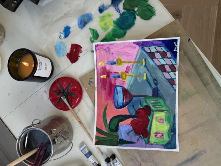
Art Journal the Large. It's probably two thirds full. This is, let's see, one of the paintings that we're
going to do in the class. Yeah, that's one. That's
one I did outside of class. This is one of the
class paintings. I love this sketchbook,
as well, moleskin. And then the third one
we use is the fabriano. This is called I think
that's in the back of Ansia. Yeah, Vensia. And it's
just a little bit larger. The paper is also
a nice thickness, and it is, like, a more white color, but it, you know, takes pretty much
everything I do to it. So I give you a sneak peek ala
This was a class painting. That was a warm up
to a class painting. Well, really, the I can't
remember which one. I love doing those fruit ones. Okay. So those are the
sketchbooks I used, and I would say they are
three of my favorite brands. Down because they're so heavy. I also use the canvas panel
in one of the classes, and I love these as well. I provided a link for them. They frame up just like
paper wood, you know, in a frame, but they're
already treated and they have, you know, some
substance to them. And they're more expensive than paper, of course, but not. Ridiculous. And
they're just easier to handle for me than a big canvas. If I'm on the easel,
then I use a canvas, usually, or one of those panels. For paper, I would say a
watercolor or mixed media paper, definitely something
heavier, 140 pound or more. And the Europe, you
guys call that 300 GSM. I would prime the paper, and I also prime my
sketchbook pages, and I'll show you how I do that, or I'll show you what I
use because the reason and I do have a YouTube on why I do this kind of in more depth, but the bottom line is
that paper like this is, you know, especially
watercolor paper is meant to absorb
the paint, right? Makes sense. And
if you're going to use watercolors on
it, that's great. You get that bleed
effect and so forth. Or even if you're going to use acrylic with a watery wash, then you're going to
get that bleed effect. So it really depends
on what you want. If you're using a more
watery consistency in this class and you
want to have um, that washy look, then don't
prime the watercolor paper. But if you're going to work
the way I did in the class, which is acrylic and
kind of juicy paint, you want it to sit on top, not get absorbed in.
Does that make sense? So we prime the surface
with something, and you can use I use
them interchangeably, depending on what I want. I use a fluid map medium if I just want to kind of
have a more slick surface, and if I want that kind
of crunchy, toothy feel, I use gesso, and you just
brush it on and let it dry. And that's enough. That way, when you paint, your paint won't get sucked
up by the paper. Before I learned
to do this, I was trying to paint with acrylic,
and, you know, you'd paint, and the kind of paint
would disappear and then paint another
layer and disappear. And you waste a
lot of paint that. Again, if you're
gonna do the wash heathing where you want
the bleed and so forth, then you would not
prime the paper. And the same thing applies
to the sketchbooks. So I usually prime them with the MT medium or the gesso
for the same reasons. Okay, so that's surfaces. For palette, I either use, you know, a piece of plexi. I think I have an old
piece of Plexiglass here. I usually use palette paper. I just like to be able to
use it easily quickly. And then sometimes you get some nice pieces to use for collage, or some people use them as inspiration for
abstract paintings. But that's disposable palette. Basically, you tear off the
sheet and throw it out. For brushes in this
series of classes, I used my Suzanne Allard design
juicy brushstroke series, and they are they just came out. Um and I think I only used I might have used
one more smaller brush. So but any flat, if you wanted to get
the same effects, a flat number six, and maybe for the occasional
detail of flat number four, and maybe sometimes a Filbert, and that's what
this shape is here and it's kind of
rounded at the top. But I would say any
good quality brush, what I would be
careful of is just don't get anything
that's too smushy, like, super, super soft. You're not going to have maybe the effect and control
that you want. And on the other hand, don't
get anything too stiff. Like for this. Anyway, or just understand that brushes will
change the effect. So there's no wrong brush. But if you're trying to get certain effects, learning
what they do, like, these Princeton catalysts
are really, really stiff. And so you're gonna get
a different effect. You're gonna more,
like, push the paint, and it's kind of
better for oils. So just understand
if you're getting if you're not getting
the result you want, might be the brushes. Of course, it might
be the paint, too. Speaking of paint, I use in this Still Life
Unleashed series, basically two types of paint. I use the Acro gouache, and my favorite
brands are the Hbain. That's what these two
are and the Turner. And I put them both in a palette the same way I do the acrylics, which
I'll show you in a second. And then the acrylics I'm
using are the Nova color. These are the paints that are available only via
their website. They don't sell in
stores and they're artist quality paints for
a student grade price, but they really only a good
deal in the US because the shipping is too much to make it worth getting out of the country is what
people tell me. Anyway, I have a Suzanne Allard
design bundle with them. You do not need to
buy Nova Colors. You do not need to buy
the Turner or the Hbin. You can use what
you have. Just try to buy the best quality
that you can afford. I would rather have you have fewer colors and
a better quality. So if you'll see I use a limited
palette of the acrylics, which is what's often called
the split primary palette, which is really
just two yellows, two reds and two blues. But within each of
those, you have a warm yellow and a cool yellow, a warm red and a cool red, and a warm blue and a cool blue. So really that and maybe
a few really fun colors like fluorescent magenda,
which I'm obsessed with. And maybe, you know, you can make almost every color from that split primary palette. So I would rather see you get
a good brand and just get those six colors plus white and then get some cheap brand
and get a bunch of colors. You'll learn so much more
about color and you'll like the result
of your paintings better because the
cheaper paints don't have much pigment in them. They have a lot of
fillers, so you just you're not getting that, you know, kind of rich look that you probably want.
Alright, so that's paint. For sketching, I
sketch my compositions in usually three or
so different ways, always very casually. And in the designing
still life class, I talk about how you can use really anything.
You can use a pencil. You can use a colored pencil. You can use sometimes
I like to use this fun fluorescent pink
solid marker by sakura. Or one of these pencils by Well, this I would use for
actually something that's going to show
because they're pricey, these luminant
carinash luminants. And I've got all that
in the supply list. But I often will just take
a little bit of paint, water down on my brush
and sketch with that. So I also love sketching
with neoclor crayons. And, you know, these
are the neocolor twos, so that means that they
are water soluble. So if I sketch
with one of these, I can it'll dissolve with
the paint that goes on it. It doesn't really show, and I kind of like when
some of it does show. So that's those are the different sketching
tools that I use. All right. And let me
show you the paint, and then I'll show you a couple of sort of paint related,
I guess, things. So quickly, I put my for me, success in painting means I can just get my stuff
out and start painting. I don't have to squeeze
a lot and work a lot. It just helps me to
be more on the go. So for the gouache and you could actually use these containers
for either acrylic, there's no rhyme
or reason to why I just I'm using them this way. But I put the acro gouache
in these containers and then I can kind of see the split
primary there a little bit. The warm yellow, cool
yellow, warm red, cool red. And some blues. There's a couple of other
things like an opera pink, which is another color that I buy because
you can't make it. So these guys, I keep
them with wrapped in a wet paper towel like you just saw me take off in the fridge, and they have lasted months, months, months,
months. It's amazing. Sometimes the silicone
rubbery cover is a little tricky
to get back on, especially 'cause I
probably have some paint in there, but that's it. That's how easy it
is to get them out, start painting and
put them back. And then I if I find that
they're drying too fast, I will add sometimes a slow
dry medium by liquitex. And so they're just it's so convenient.
They're ready to go. And same with my novas. I have a small one and
a big one of these. Is my wet paper towel. And, um, it took a while to find the right container
to do what I wanted, but I did. And, yeah. So again, you know, now, if I notice,
like, that one looks a little dry when I'm painting, I will use my I think
it was originally a makeup like a face
hydrating spray. But I use it this way. You know, I don't like them too, you know, over the watery, but if they need a spray, then I'll do that. But again, I bet you I've had this in the fridge for six
months. And that incredible. So it's a great way to save save paint and make
them convenient. And it's fun because you can
mix some of the colors that you really like right in
the little wells. Okay. Last thing I want to show
you, I think some people ask, let me get my sketchbook. You know, how do you
keep the pages from sticking if sometimes
like this one, we paint in the class. I
love how this turned out. But, well, the acrylic
is not too bad, but sometimes they will stick. Let me see if I can
get one to stick. Oh, you hear that? That
was a sticky sound. And so I will use
this fixative Um, if I want to use something
non toxic in the house, like in the winter, this
is the Dega spectra fix. It's completely natural.
I can do it right now. No issues. If I want
to use something, this one's a little pricey. So if I want to just do it outside in the garage, I use my Okay, I think we're
okay. If I okay, using, you know, going
out in the garage, I can use the crylon
workable fixative, which does not smell good,
but in the garage, it's fine. But I don't and it doesn't linger too much on
the sketchbook pages, 'cause I don't want my
sketchbooks to smell. Well, I don't mind if they smell good. But I don't want
them to smell bad. Alright, I think I've
covered everything, and we are gonna have so
much fun in this class. I can't wait to get
started with you.
3. Gathering Inspiration: Alright, let's gather
some inspiration for our Wonky Still Life. Now, I have some
Pinterest boards that you are welcome to look at, and I go through these in
more detail in the kind of foundation class at the
beginning of this series. But within still life art, I just wanted to make a
whole separate board for Wonky Still Life because
I just love the wonky, break all the rules
kind of still life. So I've got three
of mine in here, but let's look at
some other folks. And it's always
hard with Pinters. Some people put the
artist's name on the pin. Like, here we have Brian Miller, but some people don't, you know, that's why I'm
leaving it in Pinters because I don't
want to take it out and take any attribution
there might be a way. But anyway, we're
just looking to see how people break the
rules in still life. And so we have, let's see. Let's look at a few
different ones. So you can see
something like this. And the thing about
Pinterest is, you know, I'm not gonna get into
There's a name down here, but I don't know if
that's the artist or not. In fact, I can see it's not. That's just the
person who pinned it. There's a signature
down here, maybe AH. I think I might know.
That might be Ann. Anyway, we will just
look at the artwork. So this is just so fun. Everything is like, well, almost everything is kind
of crooked or lopsided. The textures yummy. You've got sort of some things that you can tell what they are, and some things you're not quite sure like this shape here, these shapes back here, we can see that that's cornflakes
because it says it, but look how big
the mug is here. So there's just a lot
there that's fun. Yeah, that's what
I'm wondering if the AH was this artist.
I think it is Aunt. So now we can give her credit, Anna Hymes because
there's another AH here. Same thing here, the way
she's using her lines and very loose and just organic, not overly finished or polished. Um, I know who this is
because I love her work. Emily Powell. Also someone who just does these very
look at the forms here. There's, you know,
they're not shaded and not made to look straight or correct or
anything like that. So definitely goes in
the Wonky category. This one's kind of fun. I don't know who this artist is, but there's some writing up here and then
just some bits here. I mean, isn't it amazing
the variety of still life, um you know,
interpretations there are. I love this artist, Megan Grant. She's Australian. And
look at these fun colors. She has a thing in
almost all her paintings that they slant kind
of to the right. And so you can see that
that's still life. Let's see if I find
another one of hers. There's shapes in here, but nothing is really formed or any relationships
between different shapes, you know, are just kind of
unconventional, a lot of fun. Let's take a look
at a couple more. I mean, look at this
as fun because you have this flatness here, and then the vase is this way. It looks like a collage, but it's very wonky. Let's find one more that
kind of gives This is just a good one for showing
how something can be crooked, off center, and simplified
and kind of hold its own. So, you know, you can
take your time looking at things like this
to inspire you. Look how wonky, this
is just a vase, so maybe it's not
quite still life, but this artist is
another Hope Olson, another wonderful
kind of wonky artist. And then I put my
three paintings here that I'm going to show
you closer up here. So what we're doing here is
we look at these artists to get ideas and to get sort
of in the mood to create, but we're not copying anyone. You know, we're not taking
any one painting and saying, Oh, we're going to do that. Now, of course, you can
do that on your own, in your sketchbook or
wherever you want. That's a great way to learn. But what I'm showing you how to do here is get
sort of guidance and ideas from these things
and then going to our references and
creating original artwork. So let's jump to the photos that I've
included in this class. I created these paintings with these photos and just a couple more for
some vessel shapes. But let's look at
why I chose these. These are all photos
that I've either taken in travel,
except for this one. This one here is a
Pinterest photo. But you'll see notice
this checkered vase that appears in one of
the paintings that I did. So this is something
I took traveling, and I really encourage
you to do this now. You're going to turn into. Like me, I go into these shops. This was in Paris,
and I just thought, Oh, my gosh, look
at these shapes. Look at that vace.
Look at this lamp, even this little glass
thing, the candlestick. I went crazy in this shop. I think I took, I don't
know, a bunch of pictures. And then there was
a farmers market in this was in the
south of France. And this was a wonderful potter. And so I loved these shapes
and colors, so I took that. And then this was
in another shop actually here in
Charlottesville. But look at that yummy shape. And these things are everywhere. So you can, of course, get on Pinterest,
but it's really fun to capture your own shapes. Then these are some just fun sort of still
life setups I was playing with in my in my
basement light box area. I was arranging things, and then I just
took some pictures, and I thought, you know, we might use a pattern in there, and I got silly and thought, Oh, maybe these bananas will stand up and I can prop
a flower against them. Who knows? It was just fun. And then this was from
I did the same thing, sort of a makeshift light box at my parents' house with their
little frog prints there. You'll see this pot shows up
in one of these paintings. So yeah, and then
the Pintres photo. So I did three different wonkies to kind of show you
what I'm talking about, and then we'll use these
pictures to put together one. So my first wonky was, I would call mild wonky, and because the shapes are a little off kilter and
kind of there's movement, but they're still kind
of all in a line, and then there's a clear
pattern in the back. So it's wonkyish, but I
called it wonky mild. And then I took, do you remember this beautiful
bowl here with the grapes? Okay, you'll see how
that shows up here. There it is and reimagined
with the grapes. And then these, I
was looking across the room at my snake plant,
and I threw those in. Then I grabbed this jar from that still life that I did
at my parents, the clay jar. And then I love pears, so I threw a pear
in here's a lemon. And I just I wanted shapes
to just go off kilter, and I just played with
different mistakes. And then I said, Well,
let's get even wilder. Let's get even more wonky. And I took shapes in the background and
in the foreground, and I really enjoyed
working this way. So I think this
is the way that I will design the class to paint with you along in
this way and show you this. So I'm just giving
you some ideas. And so now let's
move to the table, and we can look at
these paintings in, you know, better than a picture. We'll look at them
in the sketchbook and talk about a
couple more ideas, and then we'll get
painting. Woohoo.
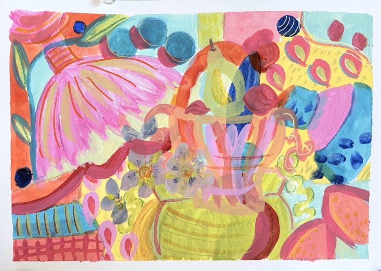
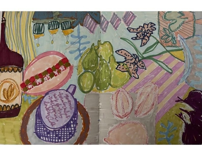
4. More Inspiration!: Okay, so let's take a look at these paintings that I just
showed you in picture format. So this was my Wonky mild. It's still a little
too well behaved. Then, I did the next Wonky and it's definitely more wonky. Things don't make sense. You know, you've got
different things happening, some things going sideways, some shapes, some
different size bits, not making sense with others. And, um, then I did this one. I didn't even mean to
do the same colors, but I must be into
these colors because I did the very similar colors. And this one ended up being
more abstract and just more, I guess shape oriented,
which was a lot of fun. So I'm going to work in the sketchbook that
does not mean you need to. I didn't for this first one. So grab whatever surface paper. This is just a I think a piece of watercolor
paper or acrylic paper. I would use something
with some body to it. And if you use a
sketchbook page, make sure that it
is a sketchbook that paper is
designed for media. Wet media. See how
this is a bit thicker. This sketchbook is
the moleskin Large. Let's see. I don't think it's or might be
called extra large. And I do pre prime these
pages with either, you know, just some
color or gesso, sometimes both, often both. Or you can use matte medium, something to keep the paint from sinking down into
the paper too much. I've already prepared this. You can hear that texture
of the gesso on there. Gesso is just a primer. You can use white and
mix a color with it. Or you can use a matte medium, which will give you kind
of a smoother surface. Sometimes I mix the two. I just like playing
and experimenting. And I often will take
one or the other and put the paint the color right on there and
do a background. And this one we'll paint
the background together. So I'm going to start with
a clean sheet like this. I'm going to get some
paints out on my palette, and I'm just going to get
a a split primary palate, which means two yellows, two reds and two blues, but they're going to be
warm and cool of each. Just a quick lesson on that is a cool yellow, a warm yellow. And a cool red and a warmer red. So these are all part of the Nova Suzanne Allard bundle that I have through
Nova Color paint, which is wonderful, artist quality paint at kind of
a student quality price. And, boy, I've gotten
paint all over these. So these are all colors
that are in that bundle. And then warm and cool
Blues, Cerlemblues the warm. Ultramarine, I think is cool. Some people disagree about that. And then just in case it wasn't clear, this
is the cooler red. You get to where you
can just kind of tell by looking at them. But in general, on
the color wheel, these are the warm colors, and these are the cool colors. But within each color, there's a warmer and a cooler version. Really easy to see
with the yellow. Because it just
looks warmer, right? This one looks
warmer. So anyway, I can't go too deep into
color in the class. I do have a color mixing
class that is available. You can just email
me for the link to that it's a free class
that I give away. So that's paint. I'm gonna get the paints out. I will start with brush wise. Probably just gonna use one of these brushes
from a newer brush set. That I made for
juicy brushstrokes. Just sketch it out,
I will probably use. Sometimes I just use the
bigger one, the size six. But we'll play with
those, decide then. And the only other thing
I wanted to show you is this book that has so
much good inspiration. You can see, I'm not gonna
show you all these pages. It would take too long, but Frances Palmer
Life in the studio. So I love pots, and
I love flowers. And it was actually a student who recommended this book to me, and I was like, Oh, my gosh, here's, you know, like, worlds colliding of
things that I love. And so she's a beautiful potter, and what I love
about her vessels is some of them are wonky. I want to find some in particular that are
actually sort of tilting. Or just unusual in some way. There, look at that. How fun are these? No, maybe
maybe those are fails. I don't know. I don't
know if she thinks those are fails or not. But these are pretty wonky. And that's fun. Yeah, see these kind of
very creative vessels. And then, of course,
there are flowers. Oh, that's a recipe I
thought looked good. She has a couple of
recipes in here, too. But you can use a book like this just to get inspiration, I mean, to get inspiration
for so many paintings because of the
floors and the pots. So I just wanted
to show it to you. Um, here, look at these. That one's kind of going.
It's definitely uneven. This one's a little bit
crooked. I just love that. So maybe I will
keep this page out and include it in
class resources just in case we want to. And look at these handles on
this. See these squigglies. And I love putting
squigglies in my work. I'll show you I know I did
some in this last painting. Yeah, here's some squigglies. There's some kind of
that kind of mark. So that's just
something I enjoy. Um, so yeah, I'll
include this picture, and you have the other pictures. So let's get our photos out, and let's I'm going
to get my paints out, and then we'll get
started designing this. Probably gonna design it. You know, I either
start with a crayon, like a neo color
crayon to draw things out or a paint brush
or both. We'll see.
5. Designing & Sketching: Okay. I think I want to
sketch this one out with a crayon or you
could use pencil, pen. You could just use
paint because it doesn't matter because
we're going to cover it up. But sometimes I just
start painting, but I think I want to do a
little designing on this. So we're going to
play with remember, we're breaking all the rules, and we're just going
wild and wonky. So first, I'm going
to just turn this and do one of these shapes this way. I love these pots. So let's see here. Here comes the handle,
something like that. And we're not trying to get
anything correct clearly. So make sure this
is done quickly. Do that shape there. Oh, that's a pretty
shape right there. I just want to make sure
you can see it. Come on. Hmm. Not letting me well,
probably user error. Well, anyway, it's over. I'm gonna put that like
coming off intentionally. Let's make it coming off. I'll just put that
there as kind of a reminder to me that
I liked how that went. And I'll pick a
different colored cream just because why not? I say that a lot,
don't I? Why not? Let's Oh, let's look at one
of these. These are so fun. Let's do this funny thing. I'm gonna It has all these fun beady things here. It has some kind of
stripes here that might just remind me if I
want to keep those. Oh, that is fun, isn't it? And this thing with
the squiggles, I try not to do
anything just in this exactly in the center
'cause of composition. So let's try making
this really big here, and then maybe making
some exaggerated. I think Francis would like what we're doing with her pots. Okay, let's look at another
picture. Maybe some fruit. Let's see. I'm just
switching colors for fun. We could put lemon over here. Maybe a couple. And
I do love this. I'm starting to overthink. So I'm gonna go look
at another picture. That's pretty that shape there. Oh, I know the picture. I
want to look at the one in Paris. The candlestick. Yes. So what if I want to make
it coming down this way? Maybe you can draw upside down, but I need to turn
the thing around. This is This has spiral,
something like that. See how freeing this is? Um, this shape is
really fun, too. So this one here. So I'm just gonna kind
of goes like this. And you can see that it
literally does not matter what, you know, shape I put there. So there's no point in
trying to get it right. We're definitely gonna use this pattern, this
thing Somewhere. Maybe we'll just put
some in right now. Just to make a note of it. And the red dot
can be over here. And I want some
more red somewhere. I turn it back around. Not that it has a right
side or a wrong side. Okay. Well, we got a lot
of stuff in here, don't we? Let's see. The only other place I want something here is here, maybe, and maybe some leafy something. These are the watercolor
No Color 2 grays. So they're just gonna
dissolve in the paint, which you have to keep
in mind, if you use, like, this dark color and I end up painting
a something light, I might not want that, so
I'm gonna switch to a gray. Trying to think what I
want here. I don't know. Maybe just something
that comes like this. And Maybe it's coming
out of that pot. Maybe it isn't. Alright, well, that's enough. Definitely wonky,
breaking the rules. And then we have to keep
remembering as we're painting to not try to. Like, even this, look, I
made this pretty even. So I'm gonna try
to remind myself. And let me let me wonkify
that. Is that a word? I can just use water
to remove this. So that it's a
little more wonky. Alright, so and even this
one was a little too even. I'm trying to exaggerate these
things so that and look, I made this perfectly straight. See. I want it to go this way. So I'll just come in there
and do a little racing. As long as I have enough of a mark to know where I'm going, that's all I need.
We're going this way. That's what the water's
doing on the page where maybe there
wasn't some gesso. And let's see if there's anything else I want to
intentionally mess up. We can we still have time to
mess up a lot when we paint. Alright. Sketch is done.
6. Let's get Painting!: All right. So I do have my Nova
colors in here. There's a lot more
colors here than I showed you. We're not
gonna use them all. But since I have this put together, I thought
I would use it. I'm standing up 'cause this
is a larger sketchbook, so I want to make sure
you can see everything. And Let's get pening. I've been using, like I
showed you in the sketchbook, these sort of dark
orangy colors. So I want to make this
one lighter and brighter and just a little bit
different color palette. I haven't really selected
a color palette, but I like these colors
and these colors. Let's see if we can
maybe have that in mind. First, I'm just going
to paint some shapes. Some of these are just
background shapes, and some of this may
disappear. I definitely will. First, I'm going to come in with the bigger background shapes. It can help too, by the way, to take a picture of your
sketch because that way when you start painting
over parts of it, if you want to refer back to, oh, yeah, I wanted to put
those squigglies there. It's just a nice to
have. All right. Well, that thing that happens
sometimes when we teach happened where my
camera stopped filming. But I really like
where this is going, so I want to just tell
you what I just did. After I painted this shape, I looked for where else
I could put this color. And then I started, want to keep these
colors light and bright. I started with a pink and I used my fluorescent magenta,
which I'm obsessed with. I wanted to say also, these
are the Nova color paints, but you can use any
good quality acrylic or gouache or acrylic wash, or oil for that matter, the
layering would be trickier. Just try to stick with
a good student grade or an artist grade. I think the liquitex basis is a pretty good student grade. I came through and I am
looking for balance. So when I put in a color
and I said, You know what? We're breaking all the rules,
let's make pink lemons. See, I was telling you
all this wonderful stuff. Then I came through
and made some green. And in my six colors,
there is no green. I just used some
ultramarine blue and some warm yellow and came up with this nice
warm green that you see here. I haven't put that
anywhere else yet. But then I got excited
about turquoise, and I showed you how to make
turquoise with these colors, which is the lemon yellow, Hansa yellow is the
name of this one, and a serlem blue, and you get these
beautiful turquoises. Just you can change it
to warmer or cooler. And then I came through and
did these turquoise bits. Then I've been really
interested in orange lately. I usually like to have some
bit of orange in my painting. I took the warm red, which
is the napthal crimson, and this Indian yellow,
my warm yellow, and I made an orange and
I put it here and here, then I warmed it up here.
No rhyme or reason to that. I just like to have the same
colors appearing throughout, but also change them slightly. You'll notice this orange, these are darker than this one. This turquoise is a
bit lighter than this, and then I wanted to do
light turquoise in here. And did the Wonky candlestick that no one will know is a candlestick and it
doesn't really matter. That's why this way of
working is so fun and free. And where I am now, then I came in and made this one
of my favorite colors, which is just ultramarine blue, still wet and white. And it just makes this
sort of French blue, and I intentionally made
these brush strokes. I just didn't mix the
paint real well on my palette so that you
get this kind of texture. Then I said, wouldn't it
be breaking the rules to put spots marks on this vessel, which can't even tell
it's a vessel and then have them go off of
it, breaking a rule, right? Because it doesn't make sense. This is wonky. It's
kind of tilting. I mean, when we're done
with this, no one is gonna know what we did on here and where we
got our inspiration. And, of course, we
aren't copying anything. So I think at this point, I want to paint
this candlestick. We'll still call it
that. Even though it's just not going to be
that in the painting, is it? I'm trying to think
about what color. I think, you know,
I'll go back to pink with the
florescent magenta, but then maybe take it in
a bit warmer direction and add some of the Indian yellow. So that it doesn't
match that too much because I often, redo colors. So being very I'm being
very imprecise on purpose. I'm wondering about
these red shapes. Do I want them red
like they were in the inspiration photo? Or do I just want let's see what happens if I just
grab my cad red and mix it with what I just had and
get basically I don't know. I'm not usually a fire
engine red person, but I am trying to do some
things to change it up. So let's do it. Who knows? We can always repaint. Cover them. I might not
like the whole thing at all in terms of
how they are here, but I have a feeling it's
going to add some fun. We do need some neutrals in this thing because
it's. It's a lot of fun. But when you have a
lot of bright colors, it's almost like having
too many stars in a show. So I will be doing we might tone those down in a different
way once they dry. I think this soft yellow we made would be good for
this little bit here. And that was just a yellow opre which was not in
my six and white. I do love yellow ochre. In fact, feeling like I want to come over here and do that. Just maybe on the one side. Now, for a while
now we've departed from references and just
making choices about color, shape, what we enjoy,
what's pleasing. Which is a personal thing. What's funny is I'm
noticing this was a negative shape
right here, remember? Because this was
a shape we drew, this was a shape we drew, but doesn't this look
like its own vessel. That's fun. Shape the
negative space vessel. What color? Now I'm
thinking about do I want a color in here and
then something in there? Do I want them the
same or different? Either way, they're going to be more tone down, they're
going to be more neutral. They're not going to be
another super bright color. They're going to be a
mix of some of these. I think I want something
maybe warm here. Maybe the green. We haven't
done much of that green. So let's I've already got
this ochre on my brush. I can grab a little of the ultramarine and see what we end up with.
It's gonna be too. No, it's not kind of
green I was thinking of, so let's do cerulean and the warm yellow and
see what that gives us. No, that's too intense. I had a little pink
to tone it down. A little more white.
We're getting closer. I just wanted this similar
to this, a little warmer. Let's see how that is. I
don't think it's too bright. I want to tones
down a little bit. Some white, maybe
a little pink pink or red really tones down green. Can go even lighter
because remember that acrylics dry darker. So you have to lighten
up anything that you want to be lighter. This is we found to
cut around this thing. It's going to end up looking
like a flower, probably. Is this a kind of
thing I like to do? That was the original
color IMX, leave it. We're going for
imprecision here. Character. Sort of like an old
house, that's not perfect. The floors are slanted. I mean, as long
as they're not so slanted that you
lose your balance, that's part of the character of an old house among other things. I think I might want that even lighter in places a
little more white. Just touch it,
doesn't have to be all filled in and I'm
feeling like I don't know. All of a sudden this feels
too in my face torque wise. So ton some of that down. Maybe bring a bit of this
color here because why not? I actually like how this
off white color looks. So I'm going to
clean out my brush because I need a bit cleaner
to make an off white. Not completely clean because that'll help me
make the off white. Off white is white with
the other primaries. I usually just start somewhere. I already have some orange in my my white, so there you go. It's already partly there. I added a little bit
of yellow ochre. It's a little pinky. So let's go maybe
grab a little green. Seeing if that's maybe take a
tiny bit of blue direction. It's more of a super light gray. Let's see how that works. One of the things
I love, do you see how I painted over
that line there? I love that. I'm
definitely leaving that. I do not want to
correct correct that. Same thing here. I'm just discovering that I really enjoy that cran mark coming through. And I'm still finding
myself leaving some of those cray outlines,
so that's fun. Oh, we haven't done this. It's fun to squiggle
in the wet paint, but I missed most of them. Here we go. There's a good one. You can see the
yellow through there. I just wanted a bit of this. I like taking a bit of color
and putting it elsewhere. Alright, we are a good
place to let this dry.
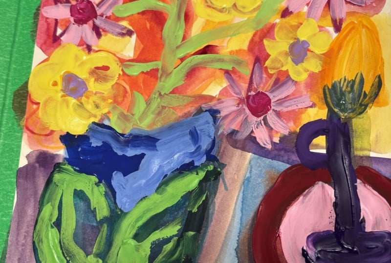
7. Adding Elements: Okay, so this is a good
place to do, like, a check on our chee che and what we're trying
to achieve here, and I had to laugh when I saw begin with a layout
that feels uncomfortable. And I do love the colors, but I'm in that, what is this
and uncomfortable place. And we've done a lot
of this, you know, objects obviously are tilting, floating, definitely
breaking the rules on this. Wrong scale, wrong tilt,
broken perspective. So I just included this
because I think it's great to read at the beginning of the
class and then check it, especially if you
start feeling like, awkward, unresolved, and
unstable are all valid outcomes. Then this is important. Success in this class
is not a good painting. It's feeling looser, less precious and more
willing to experiment. When we're doing a
class like this, we're really trying to break molds in our heads about what
we should and shouldn't do. And, you know, then we can, in other classes, put some
things back together, but it's sort of like, maybe undoing and unlearning
some things, and we want to avoid
overworking or too much fixing. So I just wanted to
review some of that. Resist the urge to explain
or justify the painting. Hmm. Maybe I just did that. So I wanted to do that, and then I wanted to think
about where I want to go next. And I do want, you know, some still life shapes so that it's recognizable
as a still life, even though it's a
very abstracted wonky, but I want a wonky vase in
there, even an outline. And this was done
as a background, so we can decide what
to keep or take away. Obviously, we can do
anything we want. So that I was also thinking about some pattern
here and there, maybe. And just in the composition, not really a fan of this,
but I do like this. So I was thinking of maybe some maybe an outline of a vase with some flowers that kind of just go over that. We'll see. We'll
just experiment. Knowing that our
objective here is to let ourselves play It's
hard, isn't it? To feel like. I do
love the colors. So let me think about let's
find a shape that we like in our pictures for maybe
kind of right here. And then I can have
some flowers cascading over. I like that round one. Of course, we can make
up any shape we want. This is fun. This's
shape. Let's do that one. So sometimes it really
helps me to just sketch it with a
crayon first so that, um, I'm thinking I don't want it to cover up
too much of my red squiggly. Well, let's see who
let's see what happens. I'm gonna make it
wonky and come down here and come up here like this. Something like that, maybe. And do we want handles on it? We could put those
squiggly handles back in. Then maybe I have some flowers coming out. They don't
have to come out, right? They can just be
here. Flower shapes. Alright, let's get that outline in so we can see where we are. And I want to do a very
off whitey type outline. Just using white with
some yellow ochre. And Oh, yeah, let's take
it in a pink direction. Grab a little bit of
my quinacridone red. Makes it really nice pink. Maybe a little bit more. There's something so
satisfying about doing that. I can tell I'm gonna want
that to be more bold. So it would have to be
either lighter or darker, but we'll and it's mixing
in with the crayon. So we'll let that dry can
always do another coat. Well, that's fun. I'm
just using the filbert. I thought the round at the end would help
with these squigglies. I love flat brushes, but they can make squigglies
a bit challenging. I love this color. I'm gonna
darken it a little bit. Okay. And some
flower stuff here. I'm feeling. Let me see. I'm gonna do a paper
towel, wipe my brush. Maybe like a lavender flower. So I've got the pink already. I'll throw in some
Altamarneblue. I'd say, maybe a tad of the florescent
magenta to give it a little pop a
little more white. Some squishy, juicy,
brush druggy flowers. Lighten it a little bit more. I just vary the
color a little bit so that you can distinguish
one from the other. Remembering always that the
acrylic is gonna dry darker. Then let's add little
more blue and do, like, some little bits of flowers. Maybe they're just a little
cascading something. So noticing, you know, that the flowers are not
coming out of the vase, getting another paper
towel and leaving that, not fixing it, seeing
where we go with it. I love these pink lemons. It's probably my favorite
part right there. In fact, I was thinking last night that if I
were to name this, I would call it pink lemonade. Um Okay, not that we want
to get attached to anything. Here, listen to me. I'm talking about naming a painting that is supposed
to be just experimentation. So forget that, Suzanne. All that does is
create pressure. I kind of like that
the way it was. That's what's fun about
acrylic once it's dried. These are baby wipes, but
you could use a paper towel. You can just wipe right on it. Alright. Um, do I want to do? Oh, yeah. I was
talking about pattern. Okay. Let's grab a little more. Well, that's too much of
the fluorescent magenta. I want to keep this
pattern subtle. So it's still too bright. And do, like, do some sort of shape which we aren't gonna worry about being
correct or anything. Just sort of a suggestion
of it up there.
8. More Experimenting: Looking around. This funny thing
is too straight. I'll just I'm fixing it
in the sense that I'm um, changing it, but
I'm not fixing it, like, trying to make it
look like something. I just didn't like
how straight it was. And I I like that shade. It might soften some of
this red a little bit. So when I say in the
chichi, not fixing, I mean, don't try to make things look too
much like a vase. Oh, you know, it's fun?
This is starting to look like some fruit. So maybe we add a little more. Like, um, a pear. I love pears. Okay. I think a bright green
pear would be nice there. Well, let's make a
green. Use the lemon. I've still got pink on my brush, which is gonna tone
it down a lot, so it might take some
of that pink off. Getting the hands of yellow. And I want some more little tiny bit ultramarine
to make more green. Maybe a little bit of white, but I want it really
lime looking. So let's go with more
hands of yellow. And let's put it right here. Well, that's fun. Do I fill it in or leave it? I think I leave it. I'm just gonna take my
crayon and make a stem. Probably need a little,
let's make it blue. I could paint it,
but it's just so easy to stick the stem in
there with the crayon. I like those kind
of little details. Ooh. And then we're gonna
take this lime color, maybe even make it more
limey and come in here. I want a little
more yellow to it. And do these do some flower centers.
This is fun. Just getting another
coat on there. I want it to really at least
part of it to really pop. You know what else we could do. We could break up
that shape with a slightly tone
down limey color. So I added just some of the
red I had to knock it back, and maybe we'll water
it a little to make it smooth and come in
here and do these. Lines. All right. Do I want
pattern anywhere else? Yeah, I think I do. I think I want some I could
do it with a crayon, too. I want some more off white. And I'm thinking about in here. I'm wondering if I
want to do a tribe. Let's look at our photos, see if there's any inspiration there. Mm. Maybe we'll just do Well, I've already
got spots there. I was gonna say spots, but, you know, I like the
grapes that are here. But I don't want to
put them over there. What would happen if we did, like, a little check mark? We don't normally do that,
so let's experiment with it. Of course, we're not trying to make
these lines follow exactly, but I'm not sure I've
ever down at Check Mark, so that is a good experiment. Gosh, pin is drying fast. That's 'cause it's wintertime
and the heat's running. That's kind of fun. I brighten that up. Maybe do it here too. I want some
brightness over here. Let me put something
underneath here. So I don't paint
on my other pages. It's the back of
the cheat sheet, which it's appropriate
that it would have paint on it. Yeah, I like that. Oh, and now I want to do maybe a little bit
of pattern here with that same color. Or not mate powder,
some stripes. When you let the paint dry a little bit you can get
that scumbly effect. Hmm. It's definitely wacky. I'm just looking at it
going, Maybe we're done. I like to come in with oil
pasto or crayon afterwards, so you never know, but we might be done
with the paint part. Well I think I want to cut in on some
of this pattern here. So I made the same
color just so it doesn't look so perfect. I want it to look
a little more Um to with the edges not so matchy. So cutting in allows you to
get some really nice shapes. Same with these little
flowery things. I just like the shapes you get
left with with cutting in. So I try to find a
place to do it in, um, you know, a lot of my work. Alright, well, you know, as you get further
along in a painting, you spend more time
looking at it. Um, but the goal wasn't
to finish painting, even though I can't help myself. So I'm gonna walk away
and look at a little bit, see if there's
anything else I want to experiment with on this. Oh
9. Final Details: Okay, now, the key is here to not overwork this to stop
when it feels alive. And so that's what I'm thinking about as
I go back in here. See how much darker this that practically looked white dried. And so I'm looking at design, color, composition,
those kind of things. I'm not looking at does this
shape look like a vase? In fact, this was
just a fun thing that this shape emerged that
looked like a vessel to me. And it kind of comes like
that. So I love that. I love this cute
little thing here. I still love my pink lemons. And so, yeah, I'm just going to come in maybe
with some crayon and oil or oil pasta. And make some of the things pop that I could
come in with paint. You don't need It's just it's a handy way to,
that's not light enough. To add marks without paint. If you have the
right color, if you don't you have to use paint. I'm looking for
something lighter to kind of bring these
out a little bit more. We might have to use paint. I don't have anything
light enough. 'cause I want to kind
of bring this out a little more. I really like it. Let's see here. Let's
try doing this. Just to kind of bring it
forward a little bit. That helps. Okay, so let's play a little
bit more. Let's see. Sometimes I just like to
take that doesn't show much, but for texture, let me
show you an example. Um, what do I want? I like to take basically a
similar color. So let's see. Sometimes it doesn't show up, but if you find the
right similar color, This is gonna show up
too much, I think. No, maybe not. I like to
just make texture marks. With a similar color. Let's see. Is this the
same? It's a little darker. Outlining, sometimes
bits and pieces. And, you know, your
outlines don't have to be red on the thing. It can look kind of cool
to not have it that way. Maybe coming through making
that color a little stronger. Get time to sign. Let's try this. So the thing about these crayons is these are water soluble. So if I made a mark
and didn't like it, I could just wet a paper
towel and get rid of it. But the oil pastels,
that's a commitment. So sometimes what I'll
do, but they're richer. So sometimes what I'll
do is try a mark with the crayon and
decide if I like it, and then go in with
the oil pastel or not, you know, but just giving
you a little tip there. A paint pen like a pasca
or an acrylic marker, those you can also kind
of experiment with, but then you have to be ready to wipe them off
quickly before they dry. I'm just playing here with some design elements and color. You're like that. There's really not a lot more
that I want to do. So you see how you
think of yourself as a designer with the color and objects and shapes,
not even objects. These aren't really objects. I mean, you could say
these are objects, you know, but mostly
we have shapes. All right, well, we can just
add a little bit of spice, even though this is very
colorful with my fluorescent. Scil let's see. This is acrylic, but you can a little
goes a long way. So I kind of just
maybe highlight. It's just a little
something some Might be fun to
deepen this lavender. Yeah. See, they're just
so creamy, the pastels. And if you do, let's say you make some pastlemrks
that you don't like, you can rub them
and soften them. You can, um, you can actually
take underd acrylic. You could take, like,
some sort of oil, like, even hand lotion and
get some removed, too. So it's not like
they're not removable, but it's just a
little more tricky. Alright, one more thing I'm
feeling like I want to do, which is probably
better done to paint because I don't really
have the color. I got these peaches,
but oh, here's one. That's that's what we did then I just want
to come down here and maybe make it a
little more pronounced. Varying the color of these
guys. Yeah, I like that. Maybe putting some
of this peachy in here. Well, that's pretty. Alright, let's stop
before we overdo it. That was fun. That
was really fun. I'm glad I suffered through the awkward stage and didn't throw on the towel.
I thought about it.
10. Wonky Class Wrap Up: Well, I hope you enjoyed
and painting this wonky still life and giving yourself permission to work in a freer, more experimental way.
I love doing that. In this class, we
focused on letting go realism and correctness, releasing the need to
make things look right, or even make sense, and instead paying
attention to shape, color, and overall design. We intentionally broke rules about proportion,
perspective, accuracy, and we practiced
responding to what felt interesting that
was showing up in our painting rather
than what felt safe. I love about this approach
is how freeing it can be. It helps break any preciousness we might
bring into our work and reminds us that painting doesn't have to prove anything, and it translates to
other work that you do, too, other types
of subject matter. It's about experimenting,
exploring, and learning to trust yourself, even when things feel awkward or unresolved, especially then. This kind of freedom is such
an important foundation because once you experience it, it becomes much
easier to carry it into other painting approaches,
too, like I was saying. You start to notice that when you're fixing
something out of a habit and you have more choice about whether to do that or not. I also want to
remind you to check the class downloads if
you haven't already, especially for the
cheat sheet of tips so that you can continue to kind of play with these ideas. And these are great resources to come back to the
reference photos, you know, if you want
to repeat this exercise or push it even further. I also have some additional
resources for you. I have a Facebook
only student group, and the link to join should
be in your welcome email, or you can always email me
at heart with suzanne.com, and I'm happy to send it to you. You can also find me on YouTube, Instagram and Facebook for
more Learning and Inspiration. And I send out a
monthly sometimes every two months newsletter called Your Creative Adventure, where I share creative
insights, studio happenings, and just kind of
what's happening, what I'm learning on
the creative journey. Most of all, I'm just so glad
you painted along with me. I love working this
way, letting go, and praising the wonkiness and allowing the painting
to be what it wanted to be. And I hope you did, too. I'll see you in the next class.
 Suzanne Allard, Landscape, Floral, Abstract Painting Teacher