Transcripts
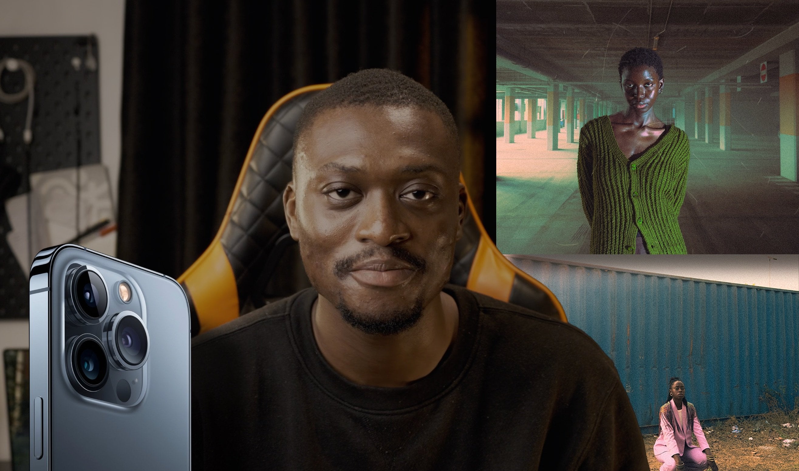
1. Introduction: Hello everyone. I'm I'm an International good art photographer and unprofessional reduction. Today I will be teaching you everything you need to know about skin retouching techniques in color grading used in portrait and with our photography. I will be presenting you my very own workflow perfected over 10 years of shooting and retouching, optimized to save your time, spike your passion and help you create outstanding qualities of your clients. I will guide you through the full from start to finish workflow, starting from the initial raw photo coerced sterilization to a high-end professional retouched photo ready to be published. Having spent most of my recent years offering private education, I have noticed a growing trend of photographers possessing basic post-processing knowledge that is more often than not, a confusing mess of half-baked information, techniques and advice picked from various YouTube channels. Photographers, both young and we older than me, had been reaching out to me, stressed and confused over the right techniques they should be using. Pointing out that they've been wasting incredible amount of time trying to learn with no actual benefits for most of them All that has resulted in a lot of waste the time. Poodle detached work and unfortunately, a loss of passion for this beautiful art and craft and create a discourse into the Mississippi, retouching, Bringing clarity, simplicity, and finding to the process that many photographers struggled with, allowing you to explore what truly matters your creativity. A strong point of my workflow is that it's applicable to all kinds of portrait photography. Not only go to art, but Studio, family, lifestyle, glamour, commercial, business, wedding and more. A significant portion of the course focuses on color work. That is besides skin work and other key factor that makes a photo stand out. I will teach you what to look for, how to analyze and find the strong points of your photo. And use those to make it stand out. Even though very basic for the shop experiences recommended, you will be able to follow and learn even as a beginner, I will teach you how to set up your photo editing software and provide it with study material in a raw file you can use to follow along with action bags, retouching guys examples and more. By the end of this course, you will understand where and how color harmonies are being created. How to post-process euro file and pull out the most out of their own data. How to retouch skin for any kind of professional publication or commercial work. How to add depth and dimension to your photos, making the polar plot. In creating that sought-after subjects separation, famously known as the 3D effect. I can't wait to get started and show you the recording process that taking creative control over your photo can be. Once you see the true potential your images hold, you will be hooked on it. Thank you for choosing me as your teacher. I look forward to see your work.
2. Lightroom Color Correction & Stylization: Hello and welcome to the first chapter of our retouching tutorial. In this chapter, we will be dealing with the initial color toning and how to get the best out of aero file. I will base this tutorial on Lightroom Classic. However, you can also work in Adobe Camera Raw since the last update, they are the same application in terms of the panels that we'll be using. The only thing that we need to make sure is that our color space is accurately set. To do this, we will go to edit, then preferences. And here we will go to the external editing tab. We need to make sure that Lightroom recognizes that our editor will be the current version of the shot we use here you see it's at editing. Adobe Photoshop 2021. I chose that file format will be PSD. However, you can set the tip if you prefer. The most important thing is to choose where and how you're going to be displaying your photo. If we're editing for the web, in that case, our color space will be set to sRGB. You can see here there are a couple of choices. Adobe RGB will be, I think, the best for printing profile to visiting the White discourse space. I'm not exactly sure if it's used for printing or not, but in our case it will be the sRGB color profile Press. Okay, Just to make sure that this is set. And if you decide to edit in camera, you need to make sure also that that profile is set correctly. So we'll put the photo in a, in a Camera Raw editor and wait a moment until it opens. Yeah, so down below you can see that the color space is set to sRGB. This is just something to make sure before we go into further editing. Now that we made sure that our color space is set correctly, we can move into further editing. This part of retouching or so to say, the color correction is something I'm very passionate about. It's also my favorite part of editing a photo because this is the part where you can see all those different ways. You can reattach your photo just different colors that you can pull out from your raw file. Today's cameras, they really allow you quite a lot. This photo is something I'd taken in 2017 to a shutter, my Canon 6D. Nowadays cameras have way more in terms of dynamic range, in terms of the overall resolution and the megapixel count and so on. However, I think this photo will be able to represent that you can still pull out quite a lot from your file, even if the camera is not the newest theme on the market. What they usually advise my students before playing with any color. So before moving any sliders is to give a quick check to their preset list. I assume that most of us today use some kind of presets. Go through the preset list in order to get some kind of basic ideas of how our photo could end up looking. Of course, that only applies if you don't have a specific idea already or that you will have a specific request. You can go through your preset list just to see water. The color combinations that you can get in maybe two will give you some ideas in terms of where you're going to take your photo on the line when you are going to be editing and color correcting the photo, vote in Lightroom and Photoshop. You will find a lot of people today speaking against the use of three sets in, I understand why it is. So you see a lot of younger photographers or people who are new to Photoshop and camera at 0 and all the color grading stuff. And they are choosing to use the presets as a certain pack to avoid learning the color grading process, the curves, the various color wheels that we have, the camera calibration sliders and understand well, if asked, we don't really have time to call radar photos. This is the reason why I also use presses myself, why I made them for myself in the first place. However, I think it's useful to learn how the sliders work and how they interact with each other. I advise my students to go through their preset lists to get a certain kind of idea of the look that they would, they would go for or even select the preset and work from there. This is also something that I use 80 percent of time. The purpose of this tutorial we should try to get as Luke ourselves, we could be inspired by a certain preset look. However, we will try to make it ourselves. So let's start here on the left side of the developmental in Lightroom Classic, you will find the list of presets. I have my own set pretty high up, so they are always there when I need them. And it will take a look what they can give us. So you'll see some are kind of dare Summer Almost there. For example, this one looks too dark. We can go to this exposure slider, lift it up a bit. And as you can see, it's already gives that kind of complimentary color palette. It's too strong at the moment. But you can see the background is stolen to blue. The module is stone into, into orange. It is too strong. I agree with this, but it's a good start. We can check what else we have there at our disposal. Some are darker, some are more blue, some are more silver. I crafted this preset set mostly for using with outer photos. However, you can take a look what they can give you here. This is a second preset set more inspired by Doug, kinda brown look darker one and so on. You don't have to really stick to any of those. You can check bunch of the pressures by the other makers and so on. As you can see, they don't really fit perfectly. They are all kind of there, there, there are giving you certain look, but they're not really perfect for this PFAD. I think I liked how this precinct looks like. It's too dark, of course, but you can see maybe just a couple of touches we will order to get their exposure. We can, we can make higher, we can reduce the contrast. We can open up the shadows a bit. We can raise the levels of whites. We can also put down a bit the highlights and the lights overall. And you can see we already kind of getting there. The photo already looks much softer. The contrast is not too strong. And we're getting that complimentary color look that most people like about their photos. I think we are calling this look the teal and orange. It's popular, it's a popular color production in the video. And I like to use it with my voltage as well. My preset packs are more or less based on that kind of color palette. Even though these presets are made for outdoor photos, it was a perfect starter with the inner photo as well. As I've mentioned earlier, we will try to craft a looker cells. So we'll press Reset to bring the photo to its default values. So this is how the file looks like straight out of camera, we would check the temperature sliders. I would cool down the photo just a tiny bit, bring out a bit more of the drinks. Currently it looks a bit colorless. I will raise the exposure. So kind of picture or they starts coming alive. The contrast to this point, I think I'll crank a bit higher. Highlights. I think I like them a bit lower because as you can see the photo is overblown those 60. It doesn't have such a dynamic range like the newer cameras. So I will put the highlights just a bit down. Of course, this will never be able to recover fully the background and we don't need really, I like this look even with the blown out highlights, we will try to do some effect further on to make that who you made the use of the overblown highlights you will see. So okay, Well, we can do further. We can open up the shadows a bit. We can see what the whites, white slider is giving us is you can see It's kind of allowing certain tones in her skin to pop up. Those ones here, these ones here as well, those ones there. So we will try to find a craft. A bit more stronger contrasts will try to open up the dynamic range of the photo to expose for all those darker areas and stuff, but at the same time, retain the contrast in the model itself. So we will play a bit further on this image to see what we can get. As you see, there is another recipe, what should be using here? This pretty much dependent on a photo for the basis. So you should be playing with your photo in general when it comes to the texture clarity and dehaze sliders. Texture slider, we'll give a bit of, you'll see when we zoom in, we'll add a bit of texture to the skin of your model. You should, however, try not to go overboard with this setting because sometimes it's going to introduce a lot of noise into your image and you will very hardly get rid of this down the line when you will be touching also, it's going to make your job a bit harder because the skin that has a lot of those like dots, as you can see here in the noise is present in these darker areas. This will make your retouching a bit harder in case there is a lot of that going on with the skin as well. So we will put a texture just a bit, just a notch higher clarity, the same. You can easily go overboard with this setting, so it's better to zoom in on a photo when you're doing this. Check how the flutter looks like. Zoomed out. So we put a bit of contrast in a model, decays. In this case, there is no really haze on this photo, so we don't need to use it too much. We can leave it on 0. So 0. Crank a bit higher, not too much. If you want to introduce more color into your shot, you can use the vibrance and saturation sliders. I advise using vibrance slider first and saturation sliders second. Vibrance is the kind of slightly that will give you the color. It will introduce a lot of color into your photo, but at the same time, it will not make the colors look overblown. Traditional, mostly look oversaturated. If you even, even by tiny bit. If you lift it higher, as you can see, the model is already becoming kind of green, orange. I didn't like that, so I will revert and we will press controls that to unwire settings. So vibrant slider. As I mentioned, we'll give you just a bit of that. As you can see here when we pull the vibrant slider, it makes this purples here present in the floor. It makes them a bit more purple. Now, of course, it's not something that I like. I will switch those purposes for some other color. Moving on from the basic panel, it's time to see what the tone curve Balkin do. The Tone Curve panel is a very powerful battle inside both Photoshop and camera. Oh, it's divided into a couple of subcategories. The first one is called parametric curve. It divides your photos into highlights, lights, darks, and shadows as you can see here. The second one is just a curve that has no limits in terms of where we can push. As you can see this one, if we put a loop play with the highlights, highlights are only going to be affected in that little area which is selected by that strange shape. I'm not exactly sure how to call it. The light section is this one. The dark section is the one here. And the shadow section is that for the kind of tiny portion in that left corner of the curves. Now, as you can see, it's almost locked. And here you can select what are those ranges that were considered to be highlights, the midtones and shadows. However, the second panel, the point curve, is the one that basically has no limits in terms of where we can take it. So as you can see, we can absolutely push our curve left-right wherever we want. Before moving on to working with curves, I will show you here you have the curve for the colored red. So red channel, the green channel curve, and the blue channel curve. What I like to do with curves is to create a certain kind of S shape. This shape will allow us to get more color contrast and more contrast in general, the telephoto, I will start firstly with blue channel. Here I will raise just a tiny bit, the blues. I will put the mid-tones somewhere where they've been, and I will drop down the shadows just a bit, making them a bit softer. The reason why I do this is that I'm trying to get the complimentary color palette. I will go for teal and orange look with the skin tone being more warmer and with the background being blue. Now the 3D that it's time to move to the red channel, I will more or less do the same thing like I did before. Raising the highlights and dropping down the mid tones and trying to push the shadows a bit more towards down. Same with the red channel. The mid-tones lower, and the blue highlights, as you can see now that will drop the shadow into blue. The shadows here became software and bluer in this whole area, wherever we had shadows, they're there. And so I will do the same for the similar thing to the point curve. I'll drop down the highlights first, giving me that kind of software look. I'll raise the lights, the light lights and General. Who's this down? And I'll try maybe to raise the shadows just to see what are we getting here. Okay, Now that we've finished with the point curve, it's time to check the parametric curve and the options it gives us. So as I mentioned, we can firstly tune the highlights up. As you see, it only deals with a very, very small portions with the highlights that are in these areas with the windows and here around the Florida, around the hands and so on. We can drop them down a tiny bit, not too much. We can see the lights also give us something similar. The darks. We can open them up just a tiny bit more. Shadows you as well. I'm just trying to create a bit less contrast because the curve added quite a lot of it. Okay, now it's time to move to the HSL or the color balance. So here what we have, we have the photo divided into many kind of subsections. You'll see the red channel, the orange one, the elements on and so on. So the first three are mostly the ones that deal with the skin tones of our models. The other ones are mostly the color channels that deal with the bedroom. However, if you are shooting in a certain area which has different colored lights, it will be different, but in this case it will mostly be distributed. We're going to be dealing with the color of our model. So let's see what we can get with the Red channel. I'll move it slightly to the left, letting this red tones appear here in those areas. I'll try to saturate them bit more as you can see by default here, they're almost, almost grayish, so I will put a bit more. Just tiny bit. The luminance is the slider that introduces lightness into certain color or like more light into certain code. I often use luminance slider with orange channel because it allows my model to pop up, that allows her skin to pop up. Mostly the skin tones in a normal conditions are, are found in this kind of orange a channel. So you will see instantly when I put the aluminum, the model will suddenly lighten up. Yeah, that's exactly what whatever. However, we don't need her to be much lighter. I can even drop them down. Maybe. Saturation, she's already quite saturated, so I think just a tiny bit. And he'll, I'll try pushing it a bit towards the left, towards the red. There is not a lot of yellow hearing in the photo, maybe only with the plants. We'll see how this affects them. We are so the turning into, into orange, however, here in this bed frame, I think pushing towards the red tones towards the left gives a much more pleasing tone of the world than the one pushing the right. And the green one will of course affect the plants. It's a bit too green right now, optical drop is dominant. The luminance smell, I guess we can, we can leave it more or less as it was. However, right now, since we have so many of these kind of pink tones in our photo, it's time to fix that. So mostly those pink tones will be somewhere in this area, the aqua tones, the blue toes, and purple tones. So we will see how we can get the blue out of those stones because purple is generally quite close to the blue. And I will try to shift those stones in such a way so we will get a lot of that teal and orange look, you'll see right now, probably we will get there slowly. The acquirer, in this case mostly dealing with a color of plants in the background. There is not too drastic difference playing with this. In this case, as you see, illuminance mostly is the one that creates the most drastic effect. Blue channel in this case, I think will be the one, as you can see here. We have the purples, here we have this kind of teal tones. And probably once we pull this to the left, all these purples are going to transform into this nice till tones. Yeah, exactly. As you can see, they're being affected until this area here. This area here already belongs to the purple channels, so we'll move them as well. You see, we're already getting that kind of blue tone out the folders. Saturation, we will of course introduce more colors into this new channel. And I will drop down the luminance is it will allow this texture of the VO2 comma. Same with the purpose, but was actually we can raise a tiny bit. We can drop down their situation because they still seem quite white, pink to me. And the last one here will be the magenta general. I don't believe the result of magentas here in this photo and most of them are going to be located here. We'll see in a moment, Yes, exactly. So as you can see, there's not a lot of change happening anywhere in Twitter photos there. I will push for this lighter tone because it brings out the texture much more than cobra. However, as you can see, there is a lot of this tones appearing here in the background. We could deal with those later, or we can also kill those tones right now. And later on play with this one's allowing them to pop more. I think this will be better because this is, this is much smaller area and then all those purples existing human are shot. Saturation. We can, we can actually just a tiny bit. However, as you can see here, this purple due to our color corrections here, they're getting a popping up quite, quite a lot. So we will have to deal with this later in the post. And the luminance is the slide that it will, of course introduce lightness, as you can see right now, she popped up quite a lot. Can also press yourself to see the original look. And as you can see already, we did quite a lot to Arafat. I will go back to the heaters, the history panel, and you can check all this history states everything what we did so far. You can return, you can revise certain ended so we can press step back to be returned to where we started. So now that we've finished with the HSL, we can move on to quality rating panel. Elevating panel divides our photo into three sections, into mid-tones, into highlights and shadows. This one here is the midtones. Here, this little sliders, they're allowing us to introduce more. It's like a luminance slider. It allows us to introduce more light into those areas. So this will, this slider will allow us to introduce more highlights, more, more brightness into highlights or less if we pull them the other way. Same with adults and with me thumbs. So before we do anything, we can check how they, how they work. Firstly, here, this panel is already giving us all creative same time. Here, as you can see, will only be dealing with shadows, only with the midtones, only with the highlights. This allows us more precision as we can fine tune our quality is much better than if we were using this kind of smaller color wheels. So to begin with, I will start with the shadows. I will try to see and further color tone the shadows into blue, allowing our photo to get more of that teal and orange. Look, Let's see what we can do. So if you move around the circle, around that middle of the color wheel, the colors are not going to be that intense if you move them further on, as you can see, the intensity of the color began to appear much more and it's much more stronger. So I will be making very small adjustments to this area. I will try to tone the shadows into something that's more of a teal toned and the purple tone, like maybe somewhere around here. This is like some tone between the green and blue. So I'm telling that just a moment. So I think something like this would be good. Here you have the luminance slider. I will put down a bit in order to gain more contrast. And just a bit, you say minus 5. We're moving on to the midtones. Midtones there in this case, they're going to affect quite a lot. I think with our photo, as you can see it affect pretty much the overall look. I would be careful with this slider. I'll just see what are the possibilities. I like. It's somewhere around in this area. Let's check the luminous liner. As you can see, the luminous active here in the same way how the orange here are the HSL panel when we check the luminance sliders more or less and behaves in a similar way. We could crank it up a bit higher. And the last one will be our highlights column. Okay? And the down there you see there are two sliders, blending and balance. Blending allows us to blend in all those toning that we did right now with the original photos, as you say, if we drop it down to the left side, there'll be almost no color toning present. If we push to the other side, it will introduce more and more of that coordinate. We just need. So this, our original tone was kinda warmer. We tried to cool them down a bit. I will put it just a bit like kind of around here. The difference is not major as you can see. But it helped to polish all told those red's present in her legs and her skin tone. So I like it this way a bit more. And the balance one also allows the shift from shadows to highlight will be able to select exactly which is this side. It will take the dominance in terms of color. Here it's in the fault itself in the middle, something like this. So that seems fine so far. Next panel we're going to be dealing with is the Detail panel. As you can see. This one, just assuming it's called sharpening here. This one allows us to sharpen our photo and pull out the most in terms of sharpness from our profile, you should be cautious with this one. It depends pretty much on a kind of file that we have. It depends on the camera that we have. Some cameras are going to tolerate more of that sharpness summer gonna tolerate less. It depends on the megapixel count and alter things. So you can zoom in on your model scheme and see how it behaves right now that we're pushing the sharpening here you can see the noise being way more present than before. So you can just put it somewhere like this. When it comes to radius slider. I like my gliders too big. More like steps as you can see, I like to arrange them in this way. The amount will be the highest, followed by the radius and followed by the Detail slider here. One of the more important things here of detail panel is the masking panels. So in order to see how it works, we should press the button. And right now hold that slider and pull it to the right. As you can see what happens right now, everything which is highlighted in white will be the places where sharpening will be applied. Everything that has the black color black, those would be the areas on which sharpening would not be applied. So why, why are we doing this? I, in order to raise the contrast, we are sharpening Only the areas that are edges. It functions based on the Edge Detection. And those are also the points on which our eye focuses. So for example, if we would introduce here, you see this area here. There is not a lot going on. It's pretty much like background. And this places have to remain soft. We don't need to really enhance them so much. So this is the reason why is you can see here, if there would be no masking present will be a lot of sharpens supply to those areas. If we push it to the right, more or less, where sharpness will be applied are going to be the edges, the edges of the suitcase in the background, the edges of her lips, eyes, the body lines and so on, the plants in the background and so on and so on. So we can crank the masking quite a lot, allowing us to retain the softness of those areas while at the same time getting these areas one sharp, the lips, the eyes, all those little things here. Okay. So when it comes to noise reduction, this authority has some noise present. However, I think assuming that we are going to be displaying this fault and internet, it doesn't really matter all that much. Later on even apply some, some noise to the photo, which we'll use as an artistic effect. So in this case, we don't need to really do nothing with the noise reduction. If you want. The way it works, you can see it right? Knowledge, zoom-in, maybe move to some area that has some noise present. If you push it here, you will see it starting to make our fourth of see much more software. It almost looks like some kind of battery touch. I don't like to do it this way. If I need to deal with the noise, I will deal with the noise later on in Photoshop. So for now I will keep it here. However, something that I use quite a lot, and it's something that's also set by default on luck, I think 25 percent is the color noise reduction. You see most of the older cameras have that pretty ugly color pattern dot. It's called a color noise, I think. And this color noise, you'll see right now once I've put it back, you see once we cannot call a crop that image, there is a lot of those pink, blue, all those various pixels of color that really shouldn't be there. So once we crank the color slider to the right, you will see a lot of those will disappear. And also what is the problem with the slider? If we push it too much, you already start losing code is in the areas that you would like to retain color like here, here in her skin tones on. So because it's with this slider, don't push it too much. Now, push it as much as I did it right now. Usually around 25 percent will be just enough to take care of all those extra color pixels that we see in the background. Okay, Now that we've finished with this, we can move to the last productions. And Lens Correction panel is something that we don't need to really use all the time. It's more like a technical to them done an actual tool used for calibrating. You can see, so if we enable this profile corrections here, what the software will do, it's going to recognize our camera, is going to recognize their lands. And we're going to try to apply some correction, fixing for all those operations that camera originally has. I don't really like always how it looks. Sometimes I feel that it opens up those edges quite a lot. So we can put the vignetting back to retain natural vignette that the lens usually has. And we usually like that because when we should think people, if they are set in the middle of our photo, like in this case. Usually that vignette will help us point our eyes to the center of the frame. So you can see, for example, right now assuming that we put the vignette back, what this will do is just try to correct for some crooked lines that usually lenses have. The wider the lens the more of this or it will have time. Not sure if I'm really using it, I'm using it more with wider lenses in the limit 50 millimeter. In this case, you see we shot on a 50 STM. I'm not using it that often because I have a feeling it sometimes takes away from the sharpness of the image once it does the corrections, so I will switch it off. However, here in the manual, this is something that I use quite a lot in manual settings. You see this, the fringe, here is this slider or the section. The fringe will take care of all those pixels of pink tones that are appearing on the edges of our fought. Very often they will appear here. See here there's some green fringing apparent as well. So we can try to see, once we raise these greens, you see the instantly went away, which is what? This will help us kind of take care of all those deliberations that there's something's unwanted in our photos. So I will also put it here and also should take care if you didn't eat up too much of the purples present here. Yeah, sadly ended. So we will not be playing with this slider right now. We will, if we need to remove the aberrations, we will remove them further up. So currently I will switch all of those. Because as you can see, our model has a lot of this purple in cobra. It will be very hard to reintroduce the color back into, into her quotes. So we will switch it off and later deal with it in Photoshop. Okay, Transform panel. I'm not really touching this too much on us. It's white wide-angle lens. So for the time being, we're going to leave it. When it comes to effect. Here we have the vignette. I will show you a better way how you can control your vignettes. And for the shop, Currently we are going to leave everything as default. Same with grain. This is all this is useful once we are editing photo only in Camera Raw and Lightroom and exporting and publishing it as it is. For example, if it will be a travel photo that you don't want to do some additional manipulations to. In case of our portraits, it's better to leave the grain off. It will be much easier for us to attach the photo later on, and then you reintroduce the grain as an effect further. So currently we are going to be switching this off. Moving on to the calibration sliders. This is one of my favorite tools in Photoshop. People really rarely use this one. I'm not sure why. It's one of my favorites because it allows us pretty good control over the skin tones, over the background and so on. And usually this is what I find tuned for that teal and orange palette that I was mentioning before. It's usually where I'm setting those stones to separate the background from the model. I will show you how I do this. So firstly, I, I'm playing with this blue primary color sliders section. You'll see how does it behave. So usually when we move the slider to the left, the skin tone becomes a red. You'll see right now, and the bedroom becomes more teal. This is maybe a bit too red, so we will fix for that. Later on. I can put the saturation a bit longer as well. A green will also deal with the skin tones. We can move it more towards the orange, but not to make it a bit too green. So you can see something like this. The red primary, mostly it's going to affect skin here too. So as you can see, this is pretty powerful tool when it comes to editing skin tone. I would say it's more powerful than all the other ones that we've been dealing before. And here we can introduce tinting inner shadows. It's going to be there, either magenta, I guess, or green. In this case, I would go more for imagined a tiny bit. So right now that we're finished with most of this color corrections, we can revise or edit. We can go back and fine tune once again those highlights, those shadows or someone trying to get the max out of our profile. Okay, So right now I will start again with contrast with the basic panel and give it a quick rundown of all the settings that you can see once we start playing with the curve and adding more contrast here, we could go back above and reduce the overall contrast of the photo. Hold it goes to show that there is no set recipe when it comes to how you should be approaching the Colorado process. It's something that you should be playing with. This is also what I advise my students. Move sliders left and right, see how they interact with one another. And simply try to see what are the color combinations you can get out of your file. As you can see, this is a pretty extensive edit. We started with a more or less colorless photo trying to get something that looks very vibrant. And we will, of course, pores that even more once we enter Photoshop. But at the moment, what I'm trying to do is just expand the whole range of colors and trying to spend the dynamic range as much as I can. And using this row file to the max. Why this is important is because at this stage, while we are in Lightroom profile and you can get the most out to the file at this stage, once you try to real photo further on into Photoshop, you can of course, manipulate colors more. But this is the stage that allows you the most in terms of quality, the most in terms of not losing that same quality once you move your sliders quite extreme, I will once again go to my settings, just revise quickly. Maybe I'll speed this process up and tried to see what they can get. I will do now a quick edit of one more photo. This time it's going to be an outer shell. So you can see the before and after as well. Here you can see how the photo looks like after we apply the local connections and how the photo looks at original state, we are going to be back to our original photo and move on to Photoshop. Here you can see how the photo looks like before and how it looks after. I'm quite happy with how this looks like. I think it's time to move on to Photoshop where we'll be taking our colors even more and started the retouching process.
3. Distraction Removal & Skin Work: So here we are in Photoshop. Before we start, I will show you a couple of things that I usually do before starting my retouching process. I do this only to keep my layers organized. You don't have to do this, but I strongly advise because it will help you down the line, seeing where your layers are and being able to organize within your file. So before I'm starting on the undocking this layer, so it doesn't mess up with my actual intel, be using further. I will name it Lightroom. I will duplicate this layer. I could call it, for example, retention. Just for the demonstration purpose, I will bring in the original photo, the unedited photo from Lightroom and place it underneath all of those layers. To do this, I will go back to Lightroom. I will find my photo that has no edit applied. I will go to edit in editing adobe Photoshop 2021 is going to export the photo again. As you can see, I will press Control a to select our press control C to copy. And then I will based layer. Here. You see here in the Layer window, the photo appeared first, so you will move it down below. So right now you see the layer one, we can call it total genome. We have the light firm called corrected version. And this is going to be the layer that we're going to start touching on. Before we go further with the retouching process, I will take care of the purple fringing that is apparent in this area and the green fringing apparent in these areas here. To do this, I will go to Filter. I will select Camera Raw Filter is, you can see right now, Camera Raw will be used as a filter, not as a overall editing program that we're going to be editing are all valid. So you can also use the camera as a filter as well. To do this, we will go to the optics panel. We will zoom in first so that we can see what exactly are the pixels that I want to get rid of. We will select this purple amount and you bring it up to a half, let's say 10. We'll do the same for the green amount. Now we will expand the range trying to hunt for all of those rows pixel that we have here. And same, we're going to do with the green hue as well. So right now what happens, photoshop to clear of all of those pink areas. Hear him, you can see right now some of the reds, warm red ones go towards taking care of. But at the same time. Once we move here, you will see that Photoshop also made that mistake. It's selected certain areas of blue and green that we actually would like to keep in our foot. Same happens with here that partners with the edges as you can see here. We can check for an afternoon. We will exactly see what I mean. So what are we going to do? We're going to press okay. Cuz going to apply the effect on the overall photo. Then I'm going to choose the History Brush. You can access it by pressing the letter Y on the keyboard. Will return one history step back before we apply the camera raw filter and set the history state here. So we will press on this little square, as you can see here next to the camera raw filter. So what is happening right now, instead of using the history brush to return to the original state of our image, will be commanding the history brush to take us only to that stage that we have selected. So as you can see, we went back one step. The Camera Raw Filter is not yet applied. However, the history brush is going to be taking us through that stage here.
4. Working With Skin: So now we can group those two layers. Color fixing. We can press here to visualize our before and after results. It's time to move on to the liquefying part. To do this, we will once again create a new layer, shift Control N. And the pressing Shift Control Alt V will paste all of the previously visible layers onto this one. All right, now this layer contains all the data from all the previous layers. We'll name this one liquefied. We will press Filter Liquify. Here we are going to shape our model and fix some uneven lines. Through this. I will press this first tool here in the liquefied bar. I'll raise this one just a tiny bit as it's something that we did mess up before. And here in the background and notice some of those uneven lines I would like to fix as well. I could do this using a clone stamp as well, but I would maybe try to meet them will get straight or using liquefied tool as well. I think it would be smart to go over this with the clone stamp tool as well. Okay, we're moving on to the model. I will make the size of the brush a bit bigger. Pressure set from 30 to 50 percent. Usually you don't need much more than this density also around 50. In this case, it will make our Moves be not as strong and it will be easier for you to work with. You can just round up certain areas that look a bit a bit slim are a bit too thick, so we'll make all the nice little lines look very pleasing. Hello. Apart from using the default tools available in the liquefy panel, you can also try the face aware liquefy. However, this time, like if I didn't manage the detective phase, as you can see, it says select phase, no phase detected. This is due to our modal laying down the way she is. However, there is a legal work around it will help us this time. We can go to the Image, Image Rotation and then 90 degrees counterclockwise. What this will do is it will orient the face closer to what liquify is usually recognizing as a face. We'll go back to liquefy. And as you can see it right now, face aware liquefy, manage the select phase. We'll zoom in and try to make some additional corrections. Here. This little chain icon that you see here is going to link the left and the right side of model space. We will label those. And now you'll see what happens once we press I size, the eyes are starting to become bigger. I will slightly enlarge the eyes, giving her more of that. Don't it? Look. I'll reduce the nodes with just a tiny bit. I'll make her smile just a bit. Lifting those sides of the ellipse always gives a much more pleasing appearance. Alone like to be up and pick slightly older one. Overall lips a bit bigger. And the height. Not exactly sure if we even touch this one. Maybe just a bit. Forehead, we can drink a bit lower. We can play around with control line slider. I like what it does to this side, but not to the left side of the face. So I will be tweaking it just a bit. Face with a nose and the chin height. I actually decided to go to the left and largely just a bit so it will fit together with that reduction that we get from this side as well. So depressing the Preview button, you can see the changes. I like what we managed to achieve by larger d i's. And we can press Okay. Now we can go back to image, image rotation and press 90 degrees. Always. Now that we're done with the Liquify tool, we can check and fix all the areas in the background and got worked by oscillate with a model. To do this, we will place a mask over the Liquify layer. Select the black brush here in this area. Or we can do with the way how I showed you before. You can press the default and then tax and simply paint with a black brush over those areas. In order to return them to their previous state, you should set the opacity to 100% and simply paint away. Similar like you see here, will be using the clone stamp to fix this area here. I'll go further and quote, I've put all the lows, edited them with water. Remember we'll be fixing those, that clone stamp. It's time to move to the clone stamp tool will once again create an empty layer and place all of those layers on top of it. To do this, I will press Shift. Alt E, will go back to the most time to simply select an area which has not worked to paste over those areas that flood changed after we did the liquefied. What they will look to make sure is that my essence, it wasn't 100%. I'm simply paint. If we made a mistake in the way that we can always use the history of inertia by selecting a state that we would like to return to rescue y equal benefits to crash and simply put x. Now, when I go back to the post temporal tasks here, duplicate this temperature. And here as well, while we're using Liquify tool, we can fix those candidates that I mentioned previously. Those little disruption in the background. You can check if anyone else touches a little bit. Once again, I'll use history to go back into here to look for, as you can see the line here also, what, what did we find? We can sample an area above. And I think that's it. I think we managed to 0 plus one is also I notice here there are some that are like intercepted cycled also tried to eliminate some of the clone stamp tool. And now using the history brush, we can turn those areas and the neck. Okay. We can group these two layers and fight. And this concludes the second chapter of 5 tutorial.
5. Holy Grail of Retouch: Frequency Separation Explained: This is the third chapter of our tutorial. In this chapter we are going to be dealing with the advanced skin reduction techniques, precisely frequency separation. Before we dive in into further editing, I would like to explain the way frequency separation works. As the name suggests, Frequency Separation separates our image into two frequencies, the frequencies of color and the frequencies of texture. Those two frequencies are going to be displayed as layers. The lower layer will contain the color, the upper layer will contain the texture. The main benefit of this technique is preserving the texture of our photo. Retouching. Frequency Separation is a complex technique that I've tried to make it simple by recording everything into an action. You can find it here in the action panel. And I mapped my action two keys Control plus F5. As the frequency separation splices the image into its color layer, into a texture layer. We will once again use the clone stamp visible layer that will paste all the visible information on that exact layer. To do this, we will press Shift Control Alt E. And here as you can see, we've got a new layer. We'll name it Frequency Separation. Now that we did that, we will activate the frequency separation button right here. Our image got divided into a low-frequency layer. In high-frequency layer, one containing color, the other containing texture. We can remove the layer we previously created, so it doesn't confuse us later on, as we already have the divided layers. To see the information belonging to only one layer, we will press the Alt key and press him on the I icon in the menu. This layer looks blurry, and this is our layer that contains all the color. Once we zoom in, you'll see that there is almost no texture anywhere. Everything that is contained in this layer is the color. We can press the Alt key on the high-frequency layer, all the texture not mapped to this layer. So these two layers make our image. Once we turned on the low-frequency layer, the image will start looking like the one we got used to seeing. To retouch our image, we will be using most of the low-frequency layer containing color. There is a reason why we took care of the spots and blemishes on the skin of our model before starting the frequency separation action, Frequency Separation duplicates those into two layers. Removing them would require additional job removing the color layer and they're moving them further on, on the texture layer. We took care of all the hardware blemishes. And suppose that we had leaving only software blemishes and color inaccuracy is to be taken care of in the color layer. Initially, we will be working with the Patch Tool and we will be applying later touches with the mixer brush. Now, I will show you how I work with the Patch Tool. So first I'm going to select the patch tool. We will zoom in summer and the skin of our model and try to find those larger areas that would need correcting. As you can see here, there is a darker spot right here. I will try to select it and move it elsewhere. As you can see, the skin became lighter. When we zoom in, you will see that all the texture got preserved. The way we are going to be working with the frequency separation is that we are going to be lightening up the darker areas of the skin that look kinda messy here. There are a lot of coloring consistencies here as well. A lot of those things so special here, especially in this area. So we're going to be taken care of with this by moving the darker areas to the lighter area are trying to blend them in. We'll be doing this in two ways. First way, we will be selecting the darker area and simply moving it to a lighter one. The second way, we'll be selecting a darker area, moving it to a lighter one, and then pressing the F 11 key to fade by 50 percent. When we press the F1 key, it activates the action, the Patch Tool fade, as you can see here. This will allow us to fade transitions and make it softer transitions between the lighter and darker tones. I will show you right here. We'll select this, will move it onto a lighter spot, and we're pressing F11, blend those in. We'll do this here as well. We'll move into a lighter area. Pressing F 11 will blend those in. We will continue doing this for all the areas of the skin that have some coloring consistencies or blemishes. Even when the video is sped up, you will be able to track through the history, what are my presence. So in this case, if I'm using the Fade Edge Selection, I will press the F1 key and you'll instantly see fade paired selection. So right now, I will be using only two techniques. The moving of darker areas to the lighter ones in fading them by 50 percent using the F1 key. You can also try to use the F ten key by selecting a darker area. You'll press the FM, allowing Photoshop to find the decent replacement for this area. This is usually not the best idea. So I would advise going the manual load. I will keep searching for all the darker blemishes, trying to blend them in and make them appear softer. And this will be the part it'll probably speed up at, as I mentioned before, you will be able to see what am I doing. We can press on the I icon to see the changes, our frequency separation, we're good so far. You can already see that in some areas the picture already adults by dashed. However, this is not the end of our frequency separation of work. The next tool that we're going to be covering is going to be the mixer brush. To simple way to explain the mixer brush will be imagining, get as much tool. You see to demonstrate this, I will create a new layer. I'll put it above the frequency separation. I will draw a black circle here, this white area. And by choosing the smudge tool, gearing the left side of our Photoshop, you will see how it behaves. You see pulling out slowly. Imagine if you had like a wet finger and start the pooling on those edges of that circle. Something like a water brush annually. So our mixer brush operates in the same way. We will select the mixer brush here, and then we can give it a go. We'll see how it works. Similar to the way Apple just march tool works as well. You can select, of course, the opacity. You can select the size of the brush and all those finances, but the principal will be pretty much the same. We will erase this black circle that we use for demonstration. We'll go back to our color layer of our frequency separation, will make the brush bigger. In order to use the mixer brush the way I do, you need to make sure that you are mixing brushes set up the same way as minus. So your mixer brush needs to be transparent. It should not add any color into the image and just work with the order the present columns of the image. When it comes to those numbers here, you can try what works for you. I've set my mixer brush this way. However, there is no set recipe. The only thing that is important that this square is selected, this one is not and adhere to seizures a transparent box. I will demonstrate once again how a transparent mixer brush works. There is this beige tone of the skin. If I make my brush a bit bigger and pull from that area elsewhere, you'll see what happens. If I take this stone and pull inwards. You see what happens. So the transparent brush will be working only with the colors present in the photo itself. It's not going to be adding any new color into our image. I will zoom in and show you how it works. And whenever we have the glowing lines, I'll be pulling those ones further and further, cleaning up all of those uneven tones in the way. I could also use it to lighten up certain areas, or I could use it to darken certain areas this week. You could also use the mixer brush is a weak dodge and burn your model. You'll be pulling on those lighter areas, extending them further on. It has seen the lines and the lights present. The normal. However, be careful not to overdo. It makes brushwork as it can often make your image look quite flat. It's the best using the big brush set on itself to Settings. You see here, I'm using mixer brush to add color into that colorless area. By pulling on from the colored area to the end. It doesn't have so much color information. It's a simple tool, is you can see even without doing any dodging and burning, our model already started to look like we did some dodging and burning on it. Those lines that we're cleaning out right now are going to help us later on when we actually start dodging and burning our model. Because we are going to be following those lines of light and following those lines of dark as well. Now let's zoom into the face. I'm going to try to do here is using mixed some graphs to soften those oily skin areas. As you probably saw, I use the mix of graphs, the sulfur and all those darker transitions and to extend those lines in her belly. I'm trying to enhance the lines and points to our eyes to the areas that I can see. They're important in this image. She's already polish to this stage. So we will finish with the mixer brush piace. Don't worry too much about overdoing it with the mixer brush is you can always not omega the settings by putting a mask on the Frequency Separation Group. And then with the black brush, simply painting older. This way you can reduce all that attaches if we did so far using the Mexican Russian Patch Tool on our Frequency Separation Group. I will demonstrate, I will press the brush. I will select a dark brown, black brush here. And simply when I press on an area, you'll see we'll institute in bringing back those that attaches with it. This is why frequency separation is superior to any other technique when it comes to retouching skin. We polish the skin of our model. However, there is still so much texture present. I will zoom in so you can see all the texture got preserved wherever we didn't edit, either heavily or not. The textured still remains as much as it was before we started this process. Eating of texture in some areas, you will notice that the texture is still more embedded compared to the other areas. This we will take care by switching on to the high-frequency layer. Now, we can use both the mixer brush, the patch tool, and all the other techniques like clone stamp the healing brush to fix those areas that still seem to have so much texture more than they shouldn't have. To do this. I will go to mixer brush and try to soften those transitions by simply pulling slightly. As you can see here. And what are the softening some areas. Just by pressing and pulling. Also, what you can do is switching on to the patch tool. You can select an area which you would like to correct. Now, there is an interesting thing I forgot to mention before. You can press Shift F6. This is something the time map as well into my Photoshop. And this will give me the option to feather my selection, as you can see currently in the feather radius is three pixels. I could set it to 10 and see what happens once they press Okay, the selection becomes much more software. I will compare once again, you'll see the edges of our selection are becoming software. Once they move this selection, you'll see that it's edges are very soft compared to how it would look like if I wouldn't that the edges are quite harsh. So once again, I will go to Select, I'll go to Modify, then feather. In my case it's mapped to shift F6. I will feather the selection by 10 pixels, and I will simply move it to another area that also has the texture, but not as much as the area we're trying to clear. Then we can press F11 to fade our selection by 50 percent. This will still retain quite a lot of texture, but at the same time, softening those areas. As you can see, the face and the skin on the face starts to appear much more pleasing. Hello, once again, select here. I'll go to Shift F6 to feather. My selection. Can then move it again, top area that has some texture present. This way, I'm able to retain texture at the same time. Solve that it up. Same goes for this area here. I'll press the Shift F6 combination. It will allow me to offend them once again, and I will simply move it to another area. Then I will repeat the same for the color layer. And as you can see, we've managed to preserve quite a lot of texture here and clean DOD addressed it. You can always do it a bit better. You can always go and repeat the process again. I will try to solve in these areas. This is soil could be using a couple of tools to make this happen. You can use the patch tool, you can use the mixer brush, can use the clone stamp tool as well. I'll demonstrate to you how the clone stamp tool will be used, in this case ss. And we will sample a texture from Andrea, let's say this one here and paste it over the darker texture that so peer reviewed under the knee. And you see what happens, we instantly smooth out this area or the same time we preserved a lot of texture here. Now we'll go back to PESTEL. I'll press Shift that six months again. And I'll move this area here. I'll follow the same with the color there. If you have a 50 per cent stacked, would take a look what we did with the Frequency Separation, prepared to be amazed. Quite drastic. Now we can bring back some of the ovary touched areas. Will put the mask on our Frequency Separation Group, will activate the brush tool. We'll make sure that black color is collected. We don't have to use the 100% capacity here. We can try it 20 percent, 30 percent. In my case, I will eventing and I will press and return the areas that were a bit over retouched. So as you can see, once you press here, the texture and the color starts to become embed. This is also one great thing about the masks in Photoshop. Using the R key, I will rotate the Fontan. And Jack called the face looks like. Now I see better that some areas still need for their volition. I will go back to the color layer. I will select my mixer brush and work on those areas. Okay, this seems to be it. I will go back to them. I'll press the reset view. Overall facial retouched looks much cleaner. What you can also do is select an area onto the column layer, selecting a certain area. Feathering to selection by anti percent, let's say are actually 20 pixels and then go into the Filter. Blur, Gaussian Blur. And you can see how it's often death area right now. You should be careful not to go overboard with this setting is just a tiny bit in certain areas will be of great help. You can repeat the same for the face Shift F6. And now you can go to the blur again. Filter Blur, Gaussian Blur, and selecting a value that looks good. In my case, that will be 27 percent. We can compare the results of fire any touching so far. And just looks pretty good. This concludes the frequency separation section of our tutorial to Chapter 3. And now we prepare their photo, photo dodging and burning part.
6. Adding Depth and Dimension: Dodge & Burn: In Chapter 4 of this tutorial, we're going to be taking a look at the dodging and burning techniques and how they affect the depth of our image. The technique will also help us separate the model from the background. And to add the 3D effect to our photo. We can divide the dodging and burning techniques into three groups. The global dodge and burn, the local dodge and burn, and the microdata number. Now global dodge and burn deals with the overall thought. We're going to be darkening the background and lightening or subject further to separate it from the background. Local Dodge and Burn helps us create a 3D effect. We are going to be enhancing the lines where the light touches the model skin, allowing it to appear more 3D. The micro gothenburg is reserved for detail work. Using the micronutrient burn, we will enhance the facial features, the details, the eyes, mouth, lips, and all of those tiny skin details. Microdata and burn is also used in beauty close up photography, where most of the research is being done this way. There are a couple of rules to follow, and some of those are used by the makeup artists every day when applying makeup to their models. As you can see here. These are the light areas, these are the dark areas. And this is how we are going to be enhancing those lines as well. Once we finish with dodging and burning process, you will see how the image comes alive. In order to successfully mastered this technique, you will need to practice your hand. You will notice that the total assembles drawing quite a lot. Tsunami to know the basics of how dodging and burning functions. We can dive in into our lesson. To start dodging and burning, we will select the Dodge and Burn action from the actions panel. The action creates and transparent gray layer that we're going to be doing, dodging and burning on. You can duplicate the layer using one as a dodge layer and using the other as a burn layer. To do this, we will press control J, name, the lower layer dodge. And the upper layer burn. There are multiple ways you can dodge and burn your photo. You can use the panel and the dodging and burning tools. You can use the gray layer. You can use the curve method or the method using selections. However, the method that uses the gray layers is the most intuitive and the most simplest one. It's also offers couple of additional benefits over the other methods for the global dodging and burning. We're going to be using a plug-in in one of our following chapters for the local dodging and burning, we're going to be using those two gray layers. We've finished with this. I will create yet another layer that is going to be reserved for the micro dodging and burning. To start, we will select the brush from the Tools panel and make sure that our brush is soft. The hardness should be 0%. We'll move to our dodge layer and select the wide brush. To do this, we'll press the d key and then X to revert those two colors. Now, we have a white brush to work with who will be dodging along the light trails on the skin of our model. As you can see here, those are the lighter areas. Those are as well. In order to better visualize where the dark and light areas are, you can create a little visual aid for yourself. This image really doesn't require any visual aid, is the light lines are already quite apparent. However, for some other photos, the ones that are washed in life, you might find this useful, clueless. We will press here, we'll press the solid color. We'll fill it with black. Then we're gonna go to the blending mode and select Color. Then what we're going to do is to press this Menu button again, select the curves and bring our curve just a bit down. Right now you can better see where are those light areas? Wherever those dark areas, we will be dodging and burning along those lines. You can group these two layers and a visual aid. To do this, press Control G. In the name of the layer. Visually. The settings for our brush will depend on a photo per photo basis. In this case, I will be using the opacity 10 brush at the softest settings. Remember, you're always going to be using the software settings of the brush. However, the opacity might change from a photo default. Now, I will draw the dotted lines. I will speed up this process continuing to dodge Armando. Now we will do the same for burning, will select the Burn layer. The only difference this time is a good way to be using the black brush to select the black brush, press X. Now we can turn off the visual aid layer and see what we did so far. We can group these two layers, the burn and dodge layer, by holding Shift, selecting this tool, and pressing Control V. Now we can name this group Gothenburg. By pressing on the I icon, we can see how our photo looks like before and after we did the dodging and burning. However, this is still pretty rough. We can fine tune our dodging and burning by placing a mask over the Dodge and Burn group and using all of the tools that we previously worked with. To do this, we'll press on the dodging and burning group and press a mask. Now, we can take away from the areas that we did overwritten. We will select the black brush and simply paint away. Now using the mixer brush, we can smooth some transitions even more. We'll go to our large layer, select the mixer brush. And simplest looking those transitions. We can do the same with the burn lines as well. Remember, you can also apply the border on those lines to smoothen them out even more. We can go to dodge Filter, Blur, Gaussian Blur, and simply choose the value of the full. Make the lines look smoother. Same for the burn layer. Instead of going the long route this time we can go to Filter and simply select the last use filter from above. Now, we can check the before and after results of our dodging and burning. You can always further fine tune this process by playing with the mixer brush or using the brush on the mask or the Dodge and Burn group. If you don't want to repeat this process that need more dodging and burning in some areas, you can duplicate either sum of those two layers or the whole group altogether. Now, we'll jump into the micro dodging and burning. To do this, we will choose the dodging and burning action in the action panel or press the F7 that this action is mapped to. We can name this layer micro dodge and burn in order to make it easier for us to work with the details, it will be better to press the R key and rotate our image in the upright position. Now we can zoom in on the face and work with those tiny details. Let us once again remind ourselves of the dodging and burning rules. As you can see here. Those are the same lines that we're going to be applying in enhancing on our model's face using the same technique, same brush, same everything as we used before. You can separate the micro dodge and burn into two layers, just like we did before. However, I will be choosing only one. And soon you'll see why I will choose the 5% capacity for our brush room revenue. You are now. Remember one thing. It's always better to overdo dodging and burning them to repeat the process twice. You can always easily go back using the mask and painting with a black brush over the areas you need retouched too much. We can use the same technique to enhance the details in our models here. However, this time we'll be using another blending mode. To do this, we will select the Dodge and Burn action once again from our action panel. We will name this layer here and switch the blending mode to overlay. Now, we will add some shine import models here. So now we can soften the already touched areas. To do this, we'll go back to our Dodge and Burn group, the mask more precisely and select the black brush. Once again, we can select the opacity to be somewhere around 10, 20 percent. I'll choose 15, and simply paint away. Now, what I want to show you is how the Dodge and Burn looks on our model's face. Take a look at this. Let's press Alt and select the eye icon on the micro Dodge and Burn layer. As you can see, we almost drew the model all over again. This is the reason why I wanted to do everything in one layer so we can better visualize how Dodge and Burn works. These transparent areas are the areas that will soften using our mask. Once I press shift, the softening will disappear. Revealing only what we did to our model's face using the dodge and burn technique. To go back, we will reactivate our mask by pressing Shift and clicking on the mask once again and holding the ALT key and pressing on the I icon next to the Dodge and Burn poop. Now we are back. We can also activate the visual aid once again to help us see what we did so far, we can zoom out, press the R key and the reset due to reset our view to the default position and now activate and deactivate to dodge and burn groups. So you can see the difference. I would say that her face is still a bit over attaching the cheek area. So I will soften this further on. I'll zoom in and soften those areas. The thing I like to do following the dodging and burning process is pasting everything once again a new layer and activating the frequency separation action. Once again. To do this, I will have to rename the previous frequency separation action in its layers. So these two actions will not be conflicting with each other. To do this, I will rename the frequency separation layer. And both of these layers within the group, we'll name the Frequency Separation something like frequency. The higher layer I put names to texture. The lower one could named color. However you can name these however you want. Now we need to remove the visual aid, turn it off for a moment. Then pressing Shift Control out. As you can see, all the information got paste in that layer. We can bring back the visual aid layer later on. Right now what we need to do is go once again for the frequency separation action and select it once again. Now we can apply the finishing touches using all the techniques that we use before the mixer brush the batch told the bashful fading clone stamp and others. And we can bring bend the visual aid in order to help us better see our dodge and burn lines once again. Switch off the visual aid once again and compare the before and after results. Using the mask, we can once again fix the audit touched areas. We activate the mask, select the black brush, and press on those areas that we consider an older edition. Using the Shift key, we will select the Frequency Separation Group together with the dodging and burning rope, will press Control G to group them together. And now pressing the I icon, you can visualize all we did in this part of the tutorial. I will name the group layers, dodging and burning. This concludes the dodging and burning part of our tutorial.
7. Details and Why They Matter?: In this chapter of our tutorial, we are going to be taking a look at the details and finding all the best ways to enhance them. By further enhancing the details on our image, we are going to be adding even more of that 3D effect. In order to start, we'll need to move our visual aid group back. To do this, we will press and drag down below. We're going to press the Shift Control Alt key combination in order to create the clone stamp visible layer. The action pet I have provided you with contains all kinds of tools and brushes that are going to be very helpful when it comes to working with details. The first tool in our list is going to be the white teeth brush. We can click on it from the Action menu or press the F3 key in order to start the action. Now we can zoom in and whiten the teeth of our model. We will select the white brush. Make it soft, and simply paint over that. Eat. As you can see, it's quite white. I will reduce the opacity of this action. The action consists of two layers. First being the hue and saturation layer, and the second one being the channels layer. The hue and saturation layer is going to help us take away all the yellow tones present in the teeth. While the second one, the channel layer, is going to boost the wife tones. Our model's teeth are already wide. I will switch off the boost channel. Now I will go back to the hue and saturation layer. To expand its range, I will double-click on the icon next to the channel. In order to open its menu. I will go to channels, select the yellow channel, and expanded even further. As you can see, when I'm expanding the channel, the teeth are becoming whiter. The range becomes bigger as well. I will now move the sliders quite vigorous lit so you can see what I mean. You can find Eunice according to your own liking. Some of the white-collar spilled over onto the lips. To fix that, I will go to the mask, select the black brush, and simply paint over the lips. Will zoom out and take a look. We can use the same technique to correct for all of those blues present in the eyes of our model. To do this, we will go again to the hue and saturation layer, select the blue channel, expand its range, and bring the saturation down. Now, we can go back to that mask and simply paint over the whites. Now we can repeat the same process for all of those cyan tones. To do this, we will go here, choose the sands, expand the range once again, and bring the saturation down. Looks much better. Now what we can do is bringing back that boost channel down below. However, we should do it carefully. Reducing the opacity quite a lot. In painting with a black brush over the teeth using the mask, of course. Now using the same action, we managed to save a lot of time by fixing both the teeth and the eyes of our model. We can zoom out and compare it much better. The next tool in our Action menu is going to be the clarity brush. We can press the F2 key or simply press on it from the Action menu. This actually works in a similar way to how frequency separation works. The only difference is this contains only the texture layer. To visualize how it works, we'll press Shift to the activate the black mask. Then we'll pull the Alt key and pressing on the I icon next to this layer. As you can see, only the texture got copied on this layer will press the Alt key once again to return and call the Shift key. Clicking on the mask to activated once again. Now we can zoom in. Take the white brush, press on the mask, and paint on the areas we would like to enhance the details. I will choose all of those striking points such as the Vera, the lips, the eyes, the eyebrows, the nails. If the modal would have any jewelry or tattoos, I wouldn't have those this way. This technique works especially well with the 2s. If the background contains any points of interest, you can enhance those details as well. We can press the I icon for visualize the difference. The next tool in the Action Pack is going to be the add noise or the texture that we can access by pressing the F4 or clicking it from the menu. This action also uses a gray layer. However, is point of this layer is to add a texture or noise. We can use it to fix the overhead touched areas, bringing back some texture into them. It operates on the same principle is declarative brush. It has the black mask over. So in order to activate the layer and see the results, will need to choose the white brush, make it soft, and simply paint. As you can see, we had quite a lot of texture in this area. Maybe a bit too much. So I will solve them in by pressing the black brush, choosing the capacity of 50 percent and life than brushing on top. Now you can see the difference. I will zoom in, managed to bring back quite a lot of texture. I will do the same for the background. There is an area here I retouched quite heavily and therefore lost some texture. To fix this, I will go black to the white brush and simply add more texture into those areas. The next tool that we're going to be using is something that you should already be familiar with. It's an empty layer with a color blending mode. Will press Shift Control M. We can move this layer on top and add the blending mode color. We'll use this layer to fix all the coloring consistencies that we can find on our model, we need to zoom in first and take a look. As you can see, there is a lot of blue present in the here, here, here, here. And even the corner, as in her eyebrows as well. By choosing the brush, pressing the Alt key, we will sample the color we want and simply paint over those areas that we would like to fix. We will be using a soft brush again. We do our best to somewhere around 20% We can use the same technique to fix the colors of the leaves in the hair as well. We can compare the before and after results. Remember, you can also set the mask on this layer and takeaway from the areas that you seem to have painted too much. You'll press on the mask with the brush. Check the black brush and paint. While working with fresh air. I've noticed that due to the liquefying that we did early on, there is some texture loss. So fix this. I will go back in and go back to my texture layer. Press on the brush, choose a wide brush and add a bit of texture back into this area. We can name these layers accordingly, so we will stay organized. This is going to be the texture layer. The clarity brush already has its own name. And this one, the empty layer with a color blending mode. We can simply named color things. Speaking of details, I have noticed something in the background and bothers me. Swell, take care of it right now. I'll go to the vegetal, make a selection and press F, then it's gone. Now, this image is much easier to look at. In addition to the color fixed layer, the one using an empty layer with the color blending mode, you can use multiple tools to correct for the coloring consistencies. All of those you will find right here. The one that I often use is going to be the Selective Color. Selective Color allow you to choose a channel and fine tune all the colors, making that tone, I will demonstrate it on a suitable area. I'll zoom in here. As you can see, there's a lot of color present here, here, here, but this area right here seems a bit gray. So to fix this, we will use the selective color, select the mask, press Control plus I in order to invert the mask. Now, we can go back to the brushes, select a white brush, paint over the area. And now we can check the selected color menu. To force it to open. We will press here and tweak those sliders. As you can see, we managed to add quite a lot of color in this area. You can use this technique to add color anywhere where you need or correct for the tones if they're off. I often use this technique to remove the redness from the tips of the fingers of my models or the red feet in case there were standing for quite a long time. I'll show you how this works. I will open one more selective color layer by choosing it from the menu. This one we can name hand, the other one we can name leg and fixing the color tones in that area. We'll do the same. Press on the mask, press the Control I combination. This will invert the mask, making it black. Then we will go to the brushes, choose a simple white brush, and paint over the tips of the fingers. Now, we can press right here. We can go to the red channel. Hopefully this is going to belong to the red channel. Full those sliders and see how it affected the image. Let's compare o. This is much better. We can use the same technique here, here, and here. In this case, I will set my brush to 20 percent and paint over the areas and tie considered to orange. Much better. You can experiment with all those adjustment layers I want of them will give you similar results. However, you can find the one that you are most comfortable working with. In my case, those are the selective color, the color channel mixer to Color Lookup. Color balance, curves. And that's pretty much it. They all work on the same basis. Once you press on them, you will get the layer followed with the mask and the good parameters dealing with the colors. I would like to show you one more tool that deals with the colors. This tool is called the boost color brush number 1 and boost color brush number 2 that you can find in the Actions panel in order to activate them, press on the last clone stamp visible layer and activate one of them. Press continue to group. We got Pressman, our action contains multiple layers inside. You can press on a black mask, choose the white brush and enhance the color in the areas you would like. You can compare the before and after results. The second boost polymer brush works in a similar way. In order to activate it, we should go to the last clone stamp visible layer, press the boost color brush tool. We can move it on top. And let's see how it works. It also contains couple of layers within the group. We can choose the white brush and simply paint over. This brush is adding a bit of texture and the color at the same time. We can reduce the opacity on the lips by choosing the black brush. Some 30 to 40 percent strength. Simply painting load. I encourage you to experiment with the tools I've provided you with in the action panel. There are a lot of them and we don't have time to check all of them today. However, you can play around and see how they work. In order to keep our PSD file organised, we can select and group all of those layers that we've been creating during this tutorial. To do this, we'll select the first one and it will go to the last one. Holding shift will click. We'll select them all together. We should press the Control plus G key combination. We will group them again and the name them details. We can see right now the difference in the detail work made. Having an has the details on our image. It's time to move on to the next chapter.
8. Creating Atmosphere in Your Photos: This chapter we're going to be taking a look at the plugins, the time using her touching my portraits. I'm keeping my list rather simple. However, there are some critical plugins I use almost every day when retouching there in no means necessary for the final result. However, they can add a creative, artistic touch to your image. Before we check out those plug-ins, we will once again create the clone stamp visible layer by holding Shift Control Alt E key combination. Now we will go to the filter drop-down menu and check its last section. What I often use are the unique collection plug-ins, especially the analog affects, the color effects, and then we'll add supply again. In addition to those, I often use the image gnomic portraiture plugin. I will show you how it works. The portraiture plugin allows you to quickly soften the skin of your model. However, this is a destructive type of editing. Detection destroys the pixel data of the image. You can use it only when necessary, only when you don't have time, when your client doesn't pay you too much, or when you just want to touch up some small areas without going in depth with the Frequency Separation Tool. Once again, the plugin allows you to create a skin tone mask. By choosing the color sampler tool and sampling the skin tone, you can expand the color range, but pressing on the color sampler tool with the plus next to it. As you will see in the right corner, are Models, legs, the body, the phase is being recognized, well, nothing else is being selected. This way, the softening will only be applied to the skin tone. Another drawback of this plugin is that it often select the hair as it recognizes those stones similar to the tones in the skin. When it's applies, softening of the softening will be applied here as well. However, there is a little work around. I will show you. We can press Okay. We can zoom in and simply switch between the two history states to see the difference portraiture made with our photo. As you can see the softening apply the isn't really too bad. But once when you zoom out, you will notice that it made the image quite flat, especially in these areas here. We can zoom in onto the hair and to check if there are any softening applied to it as well. This time is not a lot, but you can see in this area here, there is a significant softening happening. The way I use portraiture plugin is selecting it, making it do its magic. And then going one step back in the history panel, then I will choose the history brush by pressing the Y key. So here's the regression. Being a brush will allow me to control its opacity. I will set it at some 70 percent. Zoom in and paint the areas I want to soften. As I mentioned earlier, you should be cautious when using this tool. Is this is a destructive type of thing that actually softens the pixels and kills the pixel data. On the other hand, it's a dirty little trick that you should keep away from your clients. If you're underpaid, this is a great way to detach their images. The next plugin I will be showing you is the events of blogging belonging to a new collection grew. To choose. It will go to the filter drop-down menu, press Nick collection, and then go to the vet. I really like about this plugin is the amount of control it gives me when it comes to brightness and contrast of my image. It allows you to globally and in the image enhancing the contrast, brightness, saturation and all of those sliders you see below, as well as adding counterpoint. I will show how they work. Then a collection plugins utilize our viewpoints. Technology, will press the control point, will select an area. We can select those bright areas on the mother's legs. And once we start pulling on those brightness sliders, you'll instantly see the change. Now we can add one more control point for the dark areas. We can pull the brightness down. And effectively, we did do dodging and burning using only the control points on our image. You can use the control points on the model itself, on the background for anywhere where you see fit. I will show you how it works, adding the control points and the background. The edge detection that Nick collection plugins are based on are being called by the company. You point technology. Viewpoints technology allows us to take control over certain areas. Adding brightness, contrast, saturation, structure, different color toning while avoiding the other areas of our image. It works almost like a simple mask detecting the edges. It's suitable for all of those times where you don't have too much time to work manual, I will now remove the contact points and show you how prevents a functions as a global editing tool. In its most basic form, events or reminds us of the camera roll or light from basic panel. With my photos, I'm using the vessel to add brightness and contrast. Consider this program to be superior over the brightness and contrast options found in the Camera Raw editor. I will bring a couple of sliders up a notch and show you the next plug-in. Soon. I will place the mascot of events, a layer, choosing a black mask, then go into the brush, choosing the large soft brush and painting over my model. To further separate our model from the background. I will play around with the next plug-in. To do this, I will select the layer once again, then go to the filter drop-down menu, choose new collection, and then color effects. Color effects consists of various filters. And I encourage you to explore them all. However, I'm using only a couple of them, and I mark them with a little star next to their names. One of them is the cross processing filter. The second one is the dark enlightened Center. Third one is the detail extractor. The fourth one is the film grain. The fifth one, the glamour glow. The sixth one, the Indian summer. And the last one I use is going to be the ink filter. Now I will show you what is so special about this filters. The first one, the cross process and filter we're going to activate by pressing on it and pressing on the checkmark. Now, we can change the strength of the filter and we can also control it using the contour points that we previously mentioned with the events of filter. This is just for demonstration purpose, but you can see that it allows you quite a lot of control over the areas using the technology. You can also choose various kinds of filters that you can find the drop-down menu. You can control its strength. You can control the highlights and the shadows and the type of filter you want to use. For this image. We're not going to be using the cross processing field, so we can remove it from our list. The next filter is going to be the dark enlightened center. Darken, lighten Center is one of my favorites. Filters in the color effects panel allows me to creatively control the vignette of my image. If you recall, I told you not to use the vignetting found in the camera roll or light from panels is we can find a much better vignette control for their own during our editing phase. This is that linear controller was talking about to activate it will press the check mark. We can select the center size, could be a bit smaller. We could hear change the shape of our vignette for this image, the second one is going to be the suitable one. We will click on the place center button in place the center ourselves. Now we can select the central luminosity, the strength of the center luminosity, and the strength of the border luminosity. When pressing the checkmark, once again, you can see the before and after results. We manage to point our eyes even more to the center of our image, to the model. Using the control points. You can remove the darkened areas like her legs and restored the brightness in them. We can press on a minus control point for us right here. As you can see, we restored the brightness of this area. Same with the second leg. Same with the area here. Now when we present darken, lighten center, we can notice how the background became darker. Well, our model pretty much stayed the same. You can press here once again, see the before and after results. Next filter we're going to be taking a look at is the detail extractor. A detailed extract and looks like a strange field turn initially. However, it allows us to brighten up certain areas, revealing a lot of details in them. To have creative control over this filter will be using the control points once again. This time, the control point. We can place the control point on the suitcase in the background. You'll see right now when we activate the detail extractor check mark, it only revealed the details in those areas in a bit in the surrounding areas as well. If we want to pinpoint the detail only to the suitcase itself will reduce the size of our control point. Here we can also find various controls in regards to the detail extractor, like contrast at saturation and the amount of the detail extraction. You can select the effect radius and you will have the control over the shadows and highlights. I'll reduce the opacity of the detail extractor. We can try placing the detail extract or somewhere else in the background to see what kind of results we could get. In this case, the enhanced all of those uneven surfaces in the bed sheets, which isn't really that bad. We want the bed sheets to look wrinkled. And it also restored a lot of color. As you can see, the whole area became way bluer than it was something that I like. So I think I will retain this filter here. We can also try to see how the plants are going to behave once we put the detail extractor on them. What we've got is a bit more detail. The shadows got opened up. The next filter we're going to check out is going to be the film grain filter. Is the name suggests film grain filter simulates the film grain associated with the film development process. We can select the amount. We can control the softness and the contrast as well. Note that film contrasts and a bit of color as well to our image. The reason I use film grain with my digital images is to give them that feeling of being printed in a real paper, even when you watch from a display. However, I keep my film grain setting much lower. The film grain can also help to bring back some texture as we did previously when we did work with the details adding texture using noise, you can as well control the control points. What I often do is using the minus control point, reducing the opacity of the grain on my model space. Next color I'm going to be showing you is going to be the glamour glow filter. And glamour glow filtered simulates that soft focus effect associated with vintage photographs. The Indian summer filter is a filter I often use with my outdoor photography. I don't believe that it's going to affect this image a lot, but I will try it anyways. The last filter I'm going to show you is going to be the ink filter. The infield third, simply tones the shadows in a color that we will choose from this drop-down menu, I often use the blue Tony. You can select the strength. You will have all the control over shadows and highlights. And the control points is usual for our today's image. I'm going to be using the darken, lighten center, the detail extractor for those areas here and the area here. The film grain effect. And that will be it. I'll press Okay to apply all those filters. All the filters that we just applied merged into this layer here, the color effects profile. You can click to see the before and after. And you can also add a mask layer to further control the strength of the effect before applying the next plug-in, I'll create once again the home stamp visible layer pressing Shift Control Alt E. This will paste all the information from the layers down below onto a new layer. Now, we will select the filter drop-down menu, choose Open. And then the facts for this plugin is a very extensive plugging consistent of hundreds of effects. Arrangement for various color affects. The diffusion filters share those lines effects and so on. For this photo, I would like to use the promised filter, simulating the effect that the promised filter would give you will select the promised. I will check the promised nine or 10. To apply. The filter will press here. The promise defect got applied to the layer we previously created. As you can see, the diffusion is quite strong. All throughout the image. I would like to gain some more control over it. To do this, I will activate the mask. I will press the Control plus cy keyboard shortcut. And this will create the Black Mask. Now, we'll go to the brush, will select the white brush. Soft settings in paint around these areas. This is how you can combine the masks and the filters in a creative way, applying the effect only on certain areas. Before we finish this chapter, I would like to show you one more plug-in. We will go to the filter drop-down menu, go once again to the new collection and choose the analogue effects under look effects is applied in this simulates various vintage camera effects. However, instead of choosing the classic camera options that we were provided with, we can build their own camera using the camera kit. Now, we are offered all the filters that analogue effects pro consists of. We can tweak them all manually switching them off, switching them on, replacing their orders and so on. In order to see what all this effects can do. Well first the switch them all off. Now, I will explain you what some of them do. The ones that I often use. The first one is the basic adjustment panel. It allows you the basic control over the details of brightness, contrast, and saturation. The next module, but the last distortion, it allows you to distort your image as if you were using a wide angle lens or something similar. It also allows you control over the dramatic shift, giving you that famous 3D effect. The next one is going to be the zoom and rotate blower. This one gives that dramatic zooming. In fact, you can control the center, how big the center point to one and b to zoom strength and the rotate strand. The next one is going to be the classic motion blur filter. Followed by the double exposure effect. Double exposure allows you to load in a second photo and overlay one on top the other. You can play around with this filter, making all kinds of crazy effects. The next one is one of my favorite filters found in the analogue effects Pro. And those are the likely it is that it offers. You can choose between three types of light leaks, the soft ones that corresponds in dynamic ones. You'll see how they work very soon. You can select the strength, select them location, and you have so many to choose from. The next one is going to be the dirt and scratches. This one is pretty much self-explanatory. You can select all of those various scratches and dirt marks and so on and see how they work. Setting the slide there on 100% to the right will give you the black scratches and dirt, setting it to the opposite side, the left one is going to make them all look white. You can choose between a couple of types of dust and leaned only scratches, organic ones, or eroded. The next one is going to be the photo plate. The photo plane simulates the local for those very, very old photographs. You can also choose between the couple of types, adjusting their strength and the control points. Then you will have the lens vignette. I'm not really using this one. The field type is the interesting one is it allows you to simulate various films to grain and so on. The MovieLens as a filter, you can have a lot of fun with whoever I'm not using it that toughen. The next one is going to be the frames filter, and it is the one that I use quite a lot. You can select all those kinds of frames from this menu right here, simulating those vintage frames from the cameras, camcorders and so on. And you can choose the white ones, light box, select their scale, and so on. I'm not going to be applying any on this image, but it's good to know what is filter can do. I will group all the layers we have created during this chapter into one group and give it a name. Plugins. Not know everything about the filters are frequently use. I hope you'll find them useful too.
9. Final Color Stylization and Optimization: In the final chapter of our tutorial, we are going to be applying some final touches to our image. We will make the necessary check before uploading our image, resizing it, and giving it one last final color correction. I would like to show you now my retouching checklist. I often open this checklist and take a look simply to see if I haven't forgotten something. When you're doing an extensive edit like this, it's easy to overlook some steps to forget certain things and so on. This is why having a checklist comes handy. I divided the checklist into different chapters that are going to be inline with the chapters provided with this tutorial. Here are some of the things you should look for when finishing your edits. Once you have completed those steps, it's time to give your photo or less correction. To do this, we will open the adjustment layer panel and select the color balance. The color balance divides our picture into three different tones, then Midtones, the shadows and the highlights, allowing us to fine tune the qualities even more. The point of the final color correction is obtaining the maximum color contrast when working with the color balance adjustments, I often start with metals. I will tweak the sliders trying to squeeze out even more color contrast from our image. I tiny bit here and goes along way. The sliders are quite sensitive and all the changes that are made are not really that big. However, once we turn off and on the layer, you will see how important the color balance correction is. Using it to manage to reduce a lot of that haze, but who are not even aware that it was present. You can use the color balance slider in two ways. The technical one, which is going to be consisting of us trying to clear that Hayes and push even more contrast out of our image. And the second way of using the color balance will be the creative on the creative ways of using the color balance adjustment layer are limitless. You can play around, you can create that false color effect and so on. This is one of my favorite tools in Photoshop. One more thing the light to do with my image before calling it a day, is once again creating a clone stamp visible layer using the Shift Control Alt key combination and go into the Filter, camera Raw Filter. Then I will go through the camera calibration sliders found down below. And simply tweaking those sliders a bit. This way we will squeeze out that last drop of color contrast entire image has to offer. We can group these layers together and see the before and after results. There is one additional thing I like to do before exporting my photo from Photoshop. I will press Control J to duplicate our last layer. Then I will go to Filter Other High Pass, selecting the value of around 0.2 to 0.4, pressing Okay. And then choosing the blending mode to soft light. This will sharpen our image and prepare it for expert. I will zoom in and show you. I'm not even sure if you're going to be able to see the difference in the video, however, I see the difference, It's tiny but effective. Remember that you can also color code all of your layers, giving the groups are distinctive color to remember them by. These are the before and after results. A fiery touch. We came a long way since we important than photo into Lightroom. This tutorial lasts for approximately three hours. However, you will be able to build yourself up to speed and complete total steps in less than one hour. Usually a photo like this takes me approximately 30 to 45 minutes. In order to use your time in the most effective manner, I would advise buying a tablet and a pen. Hope this tutorial serves you well and that you haven't learned a lot of things in the way.
10. 2025 Update: Retouch Revision+Sky Replacement: Hello, guys, Mark here again. I hope that everything
you have been learning in the course so far
has been useful to you. I wanted to show you a few
things that I have done to this image after the completion of the course. I have
done two things. I have replaced the sky,
giving it a bit more detail, and I have reduced the retouch
on the face of our model. All of these changes
I have grouped into this revision group
that you can see here. We can expand this channel group to show the two changes I did. The upper layer
will be containing the revision of the retouch. You can see it by pressing the eye icon to the
left of the layer. Then you can see what I've
done in the meantime. I have pretty much returned
some of the original texture, some of the original look because I thought
it looked better. And the second thing that I have done is the sky replacement, which you can see here. To do my skin
retouching revision, I have grouped all of the
layers into one group. I've simply placed the mask
over the group and with a black brush tapped
a few times onto the face revealing the
original image below. That's quite simple. We've been using masks many times so far. However, to do the
sky replacement, I have been using Photoshop's very own sky replacement tool, which I will show you right now. We will switch off
the revision group and create a clone
stamp visible layer, pressing Shift Control Alt E, just as we used to do before. And in order to proceed
with sky replacement, we will go to the Edit panel and then press Sky replacement. Sky Replacement tool
offers us a few options. First one, this box right
here is where we are going to be choosing between different skies that sky
replacement offers us. They are all divided into a
few categories with clouds, with no clouds,
sunsets and the like. You can see here. Those are the few categories
you can choose from. And also, you can install your own clouds to
use with this tool. I will pick a skybox that I think would look
good with this photo. Let's say this one. And I will show you some
further adjustments that will help it blend
with the original image. This is also the
reason why I have chosen an underexposed
skybox for this image. The first group of sliders, the shift edge and fade edge, allows you to fine tune the edges of the automatic
sky selection. And the second group, the
sky adjustments group, allows you to select
the temperature, which is what am I doing
right now trying to better adapt this skybox
to the original image. And the slider above
is, of course, brightens that allows us
to brighten the skybox. I'll bring it up, of course, we can almost maximize here on the brightness and another
important slider here is the scale slider
that allows us to enlarge or reduce the
size of the skybox. Something like
this will be good, and we can move on to the
fade edge slider above. This slider softens the edge of the automatic sky selection, and the shift edge slider pushes the selection
inward or outwards. I think the selection of the sky has been done quite well, so shift touch doesn't need
to be changed too much. However, fade edge
will be giving us a softer look so we
can increase it a bit. Now we can press Okay, and the sky replacement group will
be automatically created. Within this group, you will
find contrast settings, brightness settings,
the replacement, including the automatic
mask selection, and various other
adjustments that were created once
we pressed Okay. In order to further fine tune this sky replacement selection, we will add a mask on top of
this sky replacement group. We can invert the color of the mask to black by
pressing Control I. And now using the
big white brush set onto its softest settings, we can bring in the details only in the areas where
we would want them. Later using a somewhat
smaller black brush, we will remove this effect
from the edges of the window, from the pots and the plants, and from the legs and the rest
of the body of our model. But before we do that, I
would like to brighten the whole sky replacement group and match it better
with our image. To do this, I will be using brightness and contrast
adjustment layer found in the right corner, just as we used to do before. We can pull it outside of
the group and clip it to it using the key or from
the drop down menu. And now we can tweak
the brightness and contrast
settings as we like. The goal is simply to
match the original image, so it looks natural. And yeah, as you can see,
it already looks better. We have added some details
behind the windows. And now we will take away
this effect from the plans, pots, and the edges of the
windows, as I told you before. And we shouldn't
forget to take away the effect from the
body of our model. Quickest way to do that
is to press on any of the image layers and then go to select and select subject. Photoshop has recognized what is the subject on our image, which is the model
here, and we will use this selection to paint with
a black brush over the mask. So the effect gets taken away from wherever the
selection has been made. You will see once
I press here with a black brush that
I will now select, the effect will be
taken away returning the original contrast
back into the image. We can take a look
at the before and after using the eye icon. Yeah, so now you can
clearly see we need to remove some of this
effect from the plants, the pots, and the
edges of the wind. We'll use, again, a black brush, though smaller this
time and paint over the areas where we would
like to remove the effect. We the pots and plants, we would need to be a
bit more precise, so we will reduce the size and tap around the
center of the pot. We shouldn't go too
far over the edges of the plants because
that will take away from the sky effect, so we will keep it
close to the pots only. And I will repeat the same
for the edges of the window. A we can take a look at the before and
after results as well. And now with a
bigger black brush, we can take away some of the effect where the sky
seems to be too blue, for example, here around
the legs of the model, brightening it up slightly. So there are still some
details in the image. However, in such a way where the sky would look
natural and not overpowering. We could probably have gone with any other sky option within
the sky replacement tool, as I have gone in my
original revision, this was just a demonstration
on how you can do that, not only with this image,
but any other one as well. You can use sky replacement not only with
portrait photography, but of course, travel or any
other photography genre, especially where this is useful is with real estate photography, where the windows very
often get overblown, and this skye replacement
tool can very often save. Now you have learned
yet another trick that I sometimes use
with my photography, and we can go back to
my original revision. This is the version
of the photo that is currently uploaded
to my website, to all my social
media, et cetera. I have done a few
prints of it so far, it's hanging in some
people's homes. It hangs in one private
gallery at the moment, and it's probably one of my
favorite images as well. We have edited it
together. I have never edited this photo
before the course, and I'm glad that you have
been with me on board. The only difference
between my revision and the one we have done
here together is that I have chosen a different skybox and that my white balance
for it was a bit warmer. I even like the version
that we did together more because the
clouds seem white, whereas in my version here, they're somewhat yellowish, or at least this is how
they look on video. And that will be
it when it comes to retouching of this image. If you would like to
check my color presets and my other products for
Photoshop in Lightroom, I will link my website here
on the screen right now. You can search me up
on Google as well. You'll probably find my
Instagram, my website, all my social media, and I will happily give
you a discount, assuming that you
have been my student. Just hit me up and
I will give you a 20% discount on
all my products. You can also contact
me directly and ask me any questions in
regards to your photography. If you need some advice, if you would like something to
be explained further, please anytime, use
the contact form, find me through
Google or anywhere, I would be very happy to
get in contact with you, explain anything,
be it regards to this course or when it comes
to your general photography, you can come to me anytime. Thank you once again
for taking the course, and I hope our PADs
will cross again. I wish you the best of luck on your retouching adventures. Bye.
 Marko Smiljanic, Boudoir Photographer and Retoucher