Transcripts
1. Welcome to My Course! : Welcome to botanical watercolor series. My name is Yana. I'm a professional musical artists were more than experience. And I understand that my big challenging for people who just start painting a watercolor to jump right in into all this classes and paint flowers in and work on oldest techniques. That's why I decided to offer this series specifically on painting flowers and plants. Where first I will explain how to paint one or another flower in a very simple way for beginner level and build up your skill, knowledge, and experience. And then I will follow it up with another class where we will paint exactly the same follower, but in a more challenging technique. So today, we are painting these two lovely tulips for beginners. And we will explore how to work in wasn't wet technique. How to use layering technique to achieve a nice dark tones. How to create realistic flowers, how to work on shadows, how to make this look three-dimensional and not flat or cut out or cartoonish. And after we finish working on this to two lips, I will move you to another course where we will learn how to paint tulips, but in a more difficult techniques, stay tuned and let's paint.
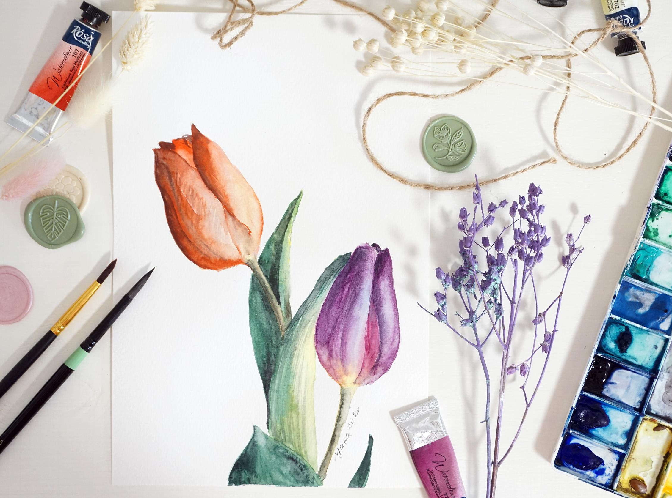
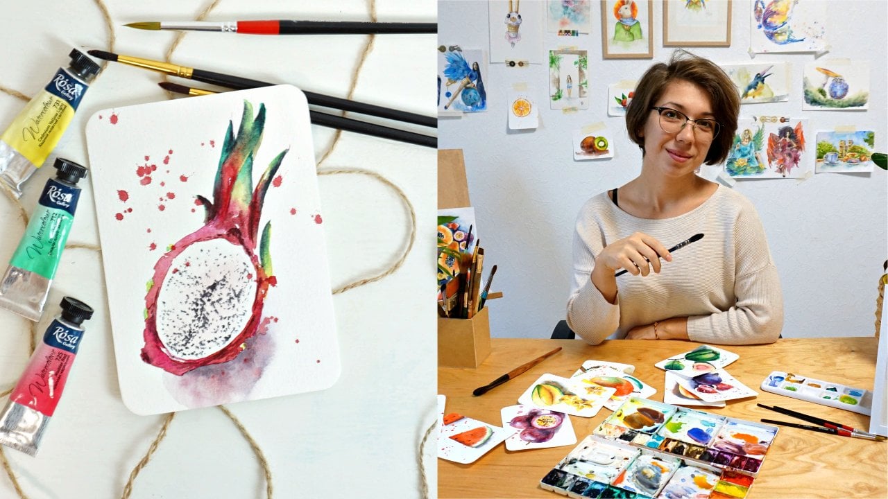
2. Art materials to paint tulips: A few words about materials. So for this class, you will need a pretty simple paper. I'm using, Renaissance. It's well, 200 GSM purchasing. With noticeable lecture. I will suggest when you work in botanical art, you would want to use paper without a texture. So the one that says hot press, whoever, if I flip the paper sheet on the other side, the texture will be pretty much goes to 0. So I do prefer called breast papers in rough papers. That's why I'm using textured paper in this class. But you feel free to have a hot press paper. You will need a few brushes. Nothing crazy. Synthetic brush with sharp tip. So we can work in details. Size number three or four. However, different brands have different ways of writing down their numbers. So for example, these two have the number 810. However, you can see that they are not really big. So make sure that you find the best size for your painting compared to paper sheet that you're using. And also have a super tiny brush number one or even 0. For the extra details. You will of course need pencil and eraser. I would suggest you also use a very thin sharp pencil or even ultimately pencil, and do not worry, I will provide you with an outline of tulips, which you can download AN trace on your paper directly so you don't have to even sketch anything. Now, two colours, we are going to need a few different colors. That many colors that represent two lips. So reds being and different ton of banks or I use hymnic ridden, magenta, cadmium red. I will also add some bits of blue. Trend. When I want to make color deeper. For Eichengreen can use migraine by myself, mixing yellow and blue, or just use a pre-made green color. I will also need some yellows bushes here and there. So I'm taking gunmen lemon for my painting. And that's about it. I have my fans already squeezed my beloved. So it's going to be ready for my painting. Of course, I have tissues, a lot of dishes to rinse the water and clean the brush. Big bucket of clean water, some books of extra tissues and my coffee. So let's start painting.
3. Let's sketch tulips!: Let us work on sketch of our tulips. So we need to remember that our scales should be very little light. We should not push the pencil hard. Because the stronger you pushed the pencil, the more difficult it will be to get rid of the pencil line and then the pencil will shine through the water column layers. So I will be sketching very lightly and you probably will not even see my trace. That's why I'm offering a outline of my drawing so that you can print it and trace it on your watercolor sheet by yourself. And you can even skip this lesson if you want to. Or you can just watch me draw and we will pick up some trypsin. Thinks. Alright, phillips, Phillips are pretty simple shapes that we break it down to something very simple. It's like an egg. It's a little bit thinner at the top and goes wider here at the bottom. Of course, we work with petals. So here we need to separate one petals and here will be another petaled slightly over. There's something here in the middle. So now we turn our ad into an actual flower bud. And of course, there is a spam that grows over here that we will have to paint realistically as well. So today we are working in very simple shapes of flowers. That's why I'm not going into explaining complicated details here and trying to work in a simple shapes as possible. Here's the second turnip. I'm separate and one petal from another. And here you have, of course I'm not going to draw an actual sketch, this heart. So I'm going to be that visible now to our original paper. I need to think about composition, right? I can't just locate followers in random way. My total number, sorry, my tulip number one will be over here. To number two will be a little bit like slightly lower. So there isn't the same level. They're in the same frame. They're not like going outside of my paper sheet and stuff like that. So the first time locating the follower button over here, and the second one will be somewhere here. From there, I can go into details and explain what this would have presented. The more you use the eraser on your paper, The more you damage the surface of your paper and that will affect your final painted with actual watercolors. So try to not use arrays are erasing final lines that are not serving me. Also, it's always a good idea to take a razor and go over your painting or your trawling, excuse me. Erase the pencil line as much as possible so it is pretty much invisible on your paper. The less you see the pencil line, the better for watercolor. And one. In attachments to this class, you can find this exact sketch, but with more thicker lines that you can use as an inspiration or download, print and trace on your paper to make the process easier. Alright, so let's move to the next lesson.
4. First watercolor layer: red tulip: In watercolor, we always work from the lightest color, lightest tone to the darkest ones. So we kind of build this tone the depth by adding one layer on top of another, which is called layering, all glazing. Alright, so that's why I want to start with the lightest color that we see on our photo reference and apply very light, almost transparent, yellowish tone here in the bottom of my tulip. And then add a little bit of transparent red color and then darker color. So this way, slowly, step by step, we will build up the colors. First, I would like to. And pure clean water on the area of mine, tulip, but only the, only the follower. And understand not the petal. Only the flower. Then I'm picking up my lemon yellow. But the very light, very light. Like this, almost transparent, almost invisible light color. I am placing this, paint them bottom of my two literate. And I push it upwards. And even though this is going to be red, I start from the lightest color, yellow. I also take a little bit of cadmium, which is warmer, yellow, cadmium yellow. And I added on and just noted the for awhile. After that I clean my brush, pick some codename run. In applied. From the top down. I allow my colors to blend altogether with the previous yellow tone that I added. And since the paper, the paper is still wet, my colors are blending smoothly without creating any sharp lines or edges. And this is happening because of the technique that we just used, which is wet and wet technique. I applied pure water first, making my paper wet, and then I added a color paint with a wet brush. And then another color with also what brush. And this way achieved nice soft transitions. This is one of the most commonly used important WaterGuard techniques. What and what? As you can see, my layer is very light, very light, translucent, transparent. The colors are non-private, not crazy. And this is on, on purpose. I did it on purpose because this is just the first layer which you also can call under painting. Later on we will add another layer and make the color deeper. Meanwhile, I am moving to the second tulip.
5. First watercolor layer: purple tulip: Well, the second tulip are going to do exactly the same thing. First, I'm applying clean water on the area of the tulip, just the flour mixture. Your brush is clean and you don't hold any previous paint. And it's just pure water. Now I'm going to end the same yellow color here in the bottom. And even a tiny bit of orange, which I'm mixing by myself using red and yellow colors. And here I want to add dependent bit of orange tone. You can use a pre-made orange color from your palate and unnecessarily mixing it by yourself. But if you feel like experimenting, feel free to mix your own colors. Now here, I would like to go with my blue. And again, I take a very, very light, almost invisible tone of blue, so it's diluted with water. And I applied here. And the area of the pedal where I see light. So the light is dropping here and it looks like a reflection or something that has a different tone compared to purple. And this way we create this infection. And now I'm taking some magenta to it. So it looks more juicy. Color. In the area where you see we are purple on the reference. You can carefully go on top of the blue. The goal here is to achieve a smooth connection between purple and blue. We don't want to see the edge of two colors. So if you need to, you can take a Samy with brush and I get treated that connection. Over here, you see drastic difference between one color, purple and blue over here. So what I'm doing is I clean my brush on a tissue, moving this line. So it becomes smooth. Pretty bright. Changed the color to magenta, cyan and magenta them. And edit here in the center. Okay, so under painting of our second tip is ready. And now we need to let them dry weight until the paper is fully dry. You might notice that it goes a little bit wavy like this. And form a little bit. That's totally fine. Is gonna get back to straight, especially if you're working on sticker paper like 300 GSM. If not, you might need to well structured with the tape. But most of the time it goes back to normal. So let's leave it to dry. And meanwhile, we can work on stamps.
6. Working on stems and leaves: So while we're waiting for the tulips to get dry and we can slowly work on stamps. I picked up some lemon, lemon yellow. And without deploying clean water before, like we did with tulips. And just go straight ahead and paint my stem. First. I do it with the yellow because yellow is lighter than green. And I want to leave the space for that nice translucent yellow color that I see on our stem. I'm gonna do the same with the other stem too. Then right away I'm going to prepare a little bit of green. I think green and my end, a tiny, tiny dot of rent into my green to make green darker. Why we do this? Because if you look at the color wheel, you will find out that green is a complementary color to red and traverse. So if you want to make one color darker, you just add the complementary to it. This is what I did and I achieved a nice dark tone of Green. I also inject a tiny, tiny drop of brown colored hearing to my stem. Just to make it more interesting, different. I need to make sure that the color of the stem onto left side over here is darker than the right side. So it gives volume to my stem. Meanwhile, this spam is probably already drive, so I just add clean water without any colour and interest. Clean water. The water might become the color slightly because we are working on cellulose paper, which is normal normal behavior for it's a little less paper. And if you feel like you picked up way too much of your basic color and the yellow one, you can just add yellow. If not, you can do what I do and continue with the shadows. I'm ending my shadow onto the left side. Gets some brown here and there. Just to play with the variety. And we're here. Now. We can move to painting their leaves. I'll take my green that's already premade, comes in tube at some red to it to make it slightly darker with a pretty wild branch with this green color that I just mixed. I am applying the color. I'm very careful not to damage my stem colored accidentally. I'm also kind of infusing very light layer of lemon yellow, picks up too much Sony to dilute it. Also. I don't like the tone of migraine, so I want a little bit different. If you're enjoying the color that you receive. We are almost done with our first. I want to prepare some yellow area. First on my second leaf. So I convert the whole area with the yellow, kind of preparing for the next layer. And also very careful here not to touch my tuner. Do the same thing. I'm mixed my green, red to make it darker in deeper. Also some interesting kind of tone. So there's no sharp connections anywhere over here as well. For now, that's what we need to wait for the leaves as well to get fully dry before we continue working on the shadows, making this painting flats and more realistic. I feel like one missing here. Alright, let's leave this to try and get back to it. When it's fully, fully dry and straight.
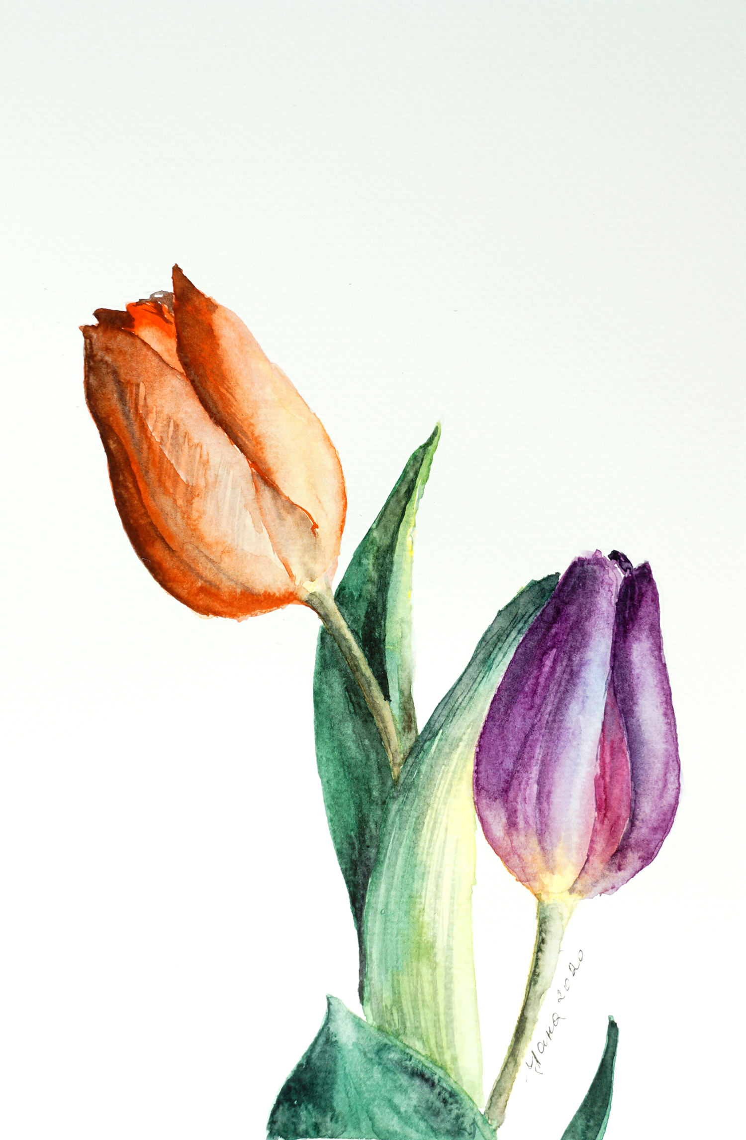
7. Creating volume: red tulip: Alright, so when you're sure your paper is fully dry and paper is tricky, so it might look dry, but actually sometimes deep in its layers, it's still holds water and actually still wet. So a good way to test it is to flip your hand and very carefully touch your paper. And if it feels cold, it means it's still wet and you should leave it to rest for a little bit longer. If it's normal temperature that it means is fully dry. Also, if your paper is still formed, it also indicates that it's still what my paper is wet in the area of the leaf. That's why I'm not going to touch it and I'm going to work on the tulip and it's more interested anyway. So now we need to discuss how we're going to create volume, how we're gonna make the two lips look realistic. We know that the light is coming from here, which automatically makes the left side of both lips darker, so we need to mix those dark colors. Let's start from right. I take my cadmium, cadmium red and it's beautiful, bright color, but we need a darker. So as I mentioned before, if you add a complimentary color, you will achieve a darker tone. So complimentary color for red is green. I'm Ed in green, and here we go and get darker tone. I do feel like this Dr. tone is a little kind of muddy and i would prefer cleaner color for my tulips. So here on the side I'm going to make some other darker tone. And this time I take another type of green that I have in my solid just to see how we're going to look like. And it looks rather Brown and then the dark red. And traveling, we can try the simple way. The red with a little bit of black. I need to note that WaterGuard artist usually do not use black as way to achieve darker tone because it gives you more of a flat, unrealistic. But sometimes for the sake of the artwork is exactly what you need. So you need to feel your painting and make your own choices. Also, I could have add little bit of blue to see how that's going to look like. And actually my first option, my first green, red and a little bit of blue. I'm going to give me the color that I like the most. So this is the color I'm going to use. I'm going to prepare it on my palette over here. So I don't spend time on mixing colors when I have to actually bend. Here we go. Remember, my tulip is fully dry. Darker tone in the area where I see shadow. Wash my brush, brings the water and now I am diluting the edge, making it softer. Also important to note that watercolour paint tends to lose its intensity after it gets dried. So I feel like it would be nice to add a much brighter red once again over my tulip. Not everywhere, but at least here. And my petal left battle to make it brighter. All the way down where placed some of the yellow and orange before. And know so right away I'm darker, tone mixed for the shadow. Also there are separate. That's what I'm doing now. I see on a photo, but I didn't draw it with my pencil and just carefully pointed out with the tip of my brush. Here in the center, I would like to make my petals brighter, so I add another layer of nice bright red color. And also my petal on the right over here make it brighter. But I did not cover the whole petal. And just do one stroke. Then I dilute the edge to make it softer. And then in that area, dark tone. And because the area is still wet, dark color kind of blends nicely. I create some very tiny, tiny parts of the petals that I see on the back. Don't go into details. I'm kind of just making you guess what I'm doing so that we don't distract our view or from the more important parts of the petal. Some of the petals have much darker edge. It looks almost black. So I added this darker edge now and another layer of red and I diluted right away to blended in with the rest of the petal. Just trying to recreate the texture of our Petal, the tulip. If you want. You can try to use dry brush when they're sharp, tip and repeat the texture of petals. But make sure that your tip is super, super, super, super saying otherwise your strokes will be noticeable and stick. It will not do you a favor. In this painting. In the bottom over here were two petals are separated but it's almost invisible. So I would like to make this distinction. Notice involve adding a tone of bread. Darker tone here in the center, and just allow it to blend itself. Don't forget that your flower is actually connected to the stem. So make sure that there is no separation between the stem flower. But now I think we can leave this flour to dry. Just the final touch of the shadow. Make sure every time when you do a line you actually diluted. So it doesn't look cartoon engine doesn't look like you outline the flower like in the coloring book. The same goes for the other side of the diluted when the semi whether branch, make sure the water doesn't drip from your brush. And now we are ready to move to live on the right side.
8. Creating volume: purple tulip: Now let's find out what color we need to create a shadow on the tulip. So we remember that we used with a little bit of magenta to make it more interesting. And if we look at the color wheel, which I have over here, the complimentary color for purple is yellow. So how about we add cadmium, cadmium yield to our mix to see how that looks like. Well, that makes it more interesting, but not darker than this because our purple color was it didn't have didn't have violet in its paint. So if you look at the components of your pigment, if it doesn't have violet, then it's not going to work this way. So our color is leaning towards pink. However, if I add a little bit of blue, it immediately gets darker. So this is the combo I'm going to use. I'm still going to stick to yellow because we already have yellow here. So it's going to look harmonious. And it's definitely not a mistake. Mixing up and good chunk of paint, making it darker. Let's apply our darker town on the left side of the edge so that this troll gives not noticeable. Remember that those are separated somewhere over here as well, so it doesn't fall. I would also like to point out that texture that we see. Of course, I'm going to leave this line just hanging there and making it soft brush. And we're going to do the same. On the right side. Even add a tiny drop of black over here and on the back for more expressive shadow. And I blended right up. If you have too much water on your brush and you tried to blend the color, it is going to create a colleague our efforts. So it's going to push the paint way and create sort of spots on your paper than do not look nice. So make sure that your fresh is always relatively dry so water doesn't drop from it. Over here. We never leave it like this, all this sharp edges we need to very carefully. It will look like. Here I'm marking the area where one petal is separated from the ones that are inside. Take another type of thing. To point out this. Also with the dark tone that I used here and there. I still want to define this texture on my petal here. The line turned out to be very sharp right into an old movie by diluting the edge carefully. Trying to not become the previous layer of my tulip. Alright, the tulips already under few final touches that we need to do with the leaves and the stem. And we're going to be done for today.
9. Final strokes: So I went to loops, look realistic now, but the leaves and stems, not really. That's why we need to first analyze what we can do to make both look nice and realistic. So let's start from leaf over there. It looks pretty flat. So first we need to define a shadow inside the leaf because this leaf is kind of bended like this. So there is a part that we see and another part is kind of banded and hiding behind and that part should be darker. So we will apply shadow over here in this area to separate the parts of the leaf that's bended from the one that's in the shadow. Then over here, it's going to be the same story. We will add some shadow on the left side of the leaf to define that the source of light coming from here. And I skipped another leaf because I felt like it would be too much of dark paint on our artwork. But if you feel like it, you can add another leaf over here, like you see it on the reference. Also interesting part that with the Law of perspective and everything that's closer to you as a viewer is darker and stuff that's further away from you is lighter. As why this frontal leaf, which I did in darker color on purpose, looks more like standing out to us. It looks closer to us visually. And that's one of the tricks that artists use in when painting in perspective. So let's work on our shells. I'm taking Green added to my old mix that we already used before. It's pretty dark. Also pretty dry. And carefully. Starting from the top, I am drawing this line. And now I am creating the shadow, rinsed brush and the edge. So basically the same approach as we used for the petals of the tulip, we're doing here with our shadows on the leaf. Make sure that the colour goes all the way close to the stem. There is no white area between the stem and leaf. Otherwise it will look a bit weird. And we continue working with the shadow. Makes sure you do not touch the stem. Just yet. We will get back to it, but not now. Also the color of your shadow. The tone should be exactly the same here below as oppose here above. Because it's still the same. The conscious changed the color all of a sudden. And as we go down and gets even darker, add a little bit more green to define the shape like this. And create a tiny bit of shadow here on the part that spended. And now you can see how automatically pulled up and created this feeling of often leave being bended like this. Just because we create a shadow. I'm not going to touch this live right now because they're too close to each other and the collar might lead somebody to work on this one. Nothing fancy, just 20 bit of shadow over here on the left. And a tiny drop over here. To define the shape. Even at the drop of yellow at the edge. The more you touch your previous layer, the more your branch will be kept the old being mental, trying not to dig into your old layers and uses less water on your brush is possible, otherwise you just dilute previous layers. This is the specialty of this particular paper, telling those paper. If you work on cotton paper, all the layers will go deep. All the paint will go deep into the layers of your paper sheet. And it will work in a different way. This I will explain in more detail in our next class where we will paint this exact, well, not exactly, but similar tulips, but as a bouquet with the background. And in a bit more complicated technique. Meanwhile, we're practicing painting realistic tulips. Right away with the same mix of dark green. I will add shadow on the stem, sharp, diluted a little bit. And also pay attention that when I work on the stamp, I'm trying to not make everything perfect. Actually, the more, the more imperfect your strokes are, the more realistic the stem looks like. Because it's nature thinner, it can have perfectly straight shadow, perfectly straight stroke. So I'm trying to replicate the texture of a real stem. In our final leaf over here, a conflict that is very bright. So I'm not going to create a very dark shadow like over there. I will keep it light. Just define the shape over here. Separate leaf from the tulip. And with this exact color with a very sharp strokes and rapid moves, I am creating the texture of the leaf itself. If you have a brush with the pointy end on another side of it, like for example, I have over here sprig shop. This you can use as a tool to kind of scratch paper and create the texture that you need. But it's only going to work on what's paper that has pigment on it? On the dry paper, nothing's going to happen, just like here. Alright, so this is a very simple painting for our tulips to look realistic and three-dimensional without any background and anything special. Today we used buttonwood technique first to create the first under painting for both turnips. After the layer got dry, we started adding more layers to create the depths and darker tones that would make our flowers look more realistic. And finally, we end some touch with a small details here and there to recreate the texture of tulips and leaves to make it look realistic. Stay tuned as I will release the next course where I will teach you how to paint a bouquet of beautiful tulips with the background and different more advanced techniques.
 Yana Shvets, Professional watercolor artist