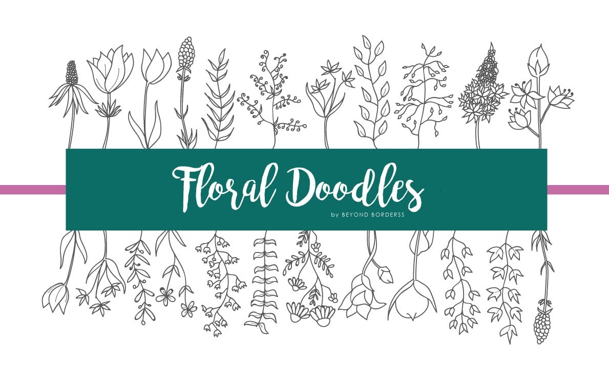
Transcripts
1. Introduction: Remember the world's made you feel free of pressure to create something perfect. There is no right or wrong way to create an amazing program. Drawn. Here we are to express ourselves the way we want. Hello, I'm Catalina and do cervicitis and self-taught illustrator. I am here to create a law with you, amazing floral Dora using paint markers. Numeral if you are a beginner or abroad. This class is for anyone that wants to get fun creating colorful floral compositions and patterns that could be even become in a unique poster gifts. In this class, we will start from the beginning. You will learn how to use a paint marker there. Learn how to create a floral style and to eat integrate pattern. Finally, you will learn how to create an amazing postcard from a different kind of composition. Along with the class, we will use some templates that I create, especially like a guide for your floral do recomposition designs. And I will share with you a plural, plural leverage that is perfect if you need some.
2. Class project: If you want to create an amazing Flourens, really saying like this is the base state. This is a class for you. You will learn how to create a floral tiny like these, and then you will choose your favorite one to create an amazing pattern with these tidally signed. We will do all the process from creating the doodle to color your design with a beautiful color palette using Posca markers. At the end of this class in the project, you will create a poster with an amazing colorful floral composition. Together we will create a step-by-step and amazing composition with our floral doodle patterns. If at the end of this class you like so much the projects and the result div you have an extraordinarily you can create a second composition based on the guideline template from 0. Create a floral doodles composition from the beginning, draw you, do laws, choose your color button, and finally, have a great result. I will show you the process behind this awesome postcards. You are free to choose which do not Do you want to create, and what color palette is more ability to you. I hope you enjoyed doing these amazing project at the end of this class, I would love to see your awesome creations in the project section down below.
3. Here is what you need: In this lesson, I will show you the materials you need the service to us. We need any mechanical pencil or any HB pencil is good. A ruler and an eraser. The biggest star here is the Posca markers or any acrylic marker will do. It is not mandatory. This brand, you can find it in almost every art store or buy it online. I will use our one unique posca. You can use a different size. Any marker between one AM to five m will do. Posca are water-based markers with stable pigments that can be applied to all materials. The surface we will work on is paper. This might be very tricky because the paper in contact with pain mercury usually peels off or damaged a little bit away. You are tolerating with them. I recommend using a thicker, smooth paper like Bristol. The idea is to avoid textured paper or a theme one, if you have a sketchbook where you can practice, it is okay as well. I will use some loose paper because my idea is to create amazing partners or use it as a handmade greeting card, postcard, or gift card. If you want to create an amazing are unique if you can do it the same Jasmine. Along with the lessons, we will be using some templates that I designed, especially for this class. These templates are a guide for you to create a unique for a dollar pattern. You can create your own guidelines if you prefer. These templates are a great way to start on half the first idea. I will share, we'll use some of my floral dural library to load your creativity. The DAs, to feel free to draw the dural we, your unique style. But here I bring these options like a tool to have more ideas in your hands. Finally, if you decide to use my Kayla's template for your composition, you can use either a lighter color to see through it and don't make any marks on your paper or murky directly from a window. Okay, that is all that you need to start creating a colorful designs. We will continue with the first steps very how to start with Posca markers.
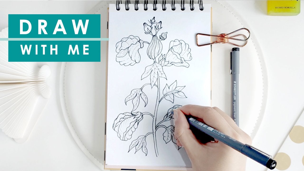
4. How to start with POSCA: In this lesson, you will learn how the bandwidth posca. Now we are going to get into paint markers by seeing how to start with a brand new posca. We need an extra paper they usually use, never used the original paper on which you are going to draw your final design because maybe you can have an accident is flushing some paint in your paper, okay, to start, take a brand new posca and twist a little bit to kill off the plastic. With a brand new posca, you will see the white teeth showing that there is not enough. You need all the paint is in the chamber. So we need to activate the marker. To activate the posca shaky, energetic lean with the cap on, you will listen to the sound. This is the bone inside to need the paint to ensure a consistent texture. Then take the cap off and gently press the nib into the page with two or three times it is enough. Now the income flow down through the pain and until the page. I have had different experiences when a prime for the first time my posca, there are times like this one that they were one-off paint is big. So I tried to spur eat. Or if the scholar is that I am using in my design, I let the paint there and deep my marker now and then to entertain the team for don't waste the paint. I will show you again the same process with another market. You can see that these one limitless amount of paint on my page, this is ideal weight of the way you paint marker. Here I have very thick paper so you can see that the paint doesn't blink fewer paper. Now, the most common thing is to run out of pain in your tip. It can be due to lack of use or due to the continue using the same drawing. So you've run out of paint. So you will see your brand look a little bit watery, in this case will be the same process to shake it ideally with a cap on because there are times that the market is splashed some paint. Finally, gently press your name into the base. The marker will activate immediately as you can see here. With another marker, I will show you why so important to avoid the tissue paper when you are filling in some blank space in fiber per week posca, you are going to see how the paper is. Good enough. Then some paper will be in your tape and lead some freezes or fiber in the paper. Some people like the station and make it part of their side. You can decide what do you prefer to create your own poster style if you use these kinds of papers tried to learn, drop back over the same spot or you will all work the paper. Here, I will show you with the same market, but on a different kind of paper are premium glossy 120 grams. You will see that this paper and diversities of it is idea. Forget about a result. I wonder you experiment with your paint marker on different kinds of paper and you will see the difference. One of them is sensation in your hands. In five-year paper you will feel a listen the rough diabetes. And in the glossy one, you can feel the softness with the post campaign agree device is to try to draw against the fiber of the TP because you will splash out the paint. If you are a right-handed like me, try to draw left to right or right to left arm for the left handed to the opposite, and for both, the movement up and down is okay. Here I will show you, I think the best use your about posca pens. He's, they lay it out. Well, Fuzhou, that's great. This on a bug fix. Their colors can be applied over light colors and light colors over dark colors. Here I will show you both cases. I will draw some circles to indoor color and to enlight color as I am showing here, you will see all the amazing future that have this technique. I will wait until the paint dries to avoid blending my colors, I will embed the dark blue on the light-blue and vice versa. Finally, the purple on the ACO, and they'll go into the purple you can see the amazing dense and opaque effect they create. These are ideal for laboring thanks to the files drying time. Usually we use a pencil for our first lines and sketches. So here you need to be careful because we use row, we use paint marker over your pencil line. You can't erase this layer, same as water color. So in most cases, it doesn't matter because the darker and APOC color will cover the pencil line, but with a lighter one as I am showing here with this pink, all the lines can be seen. So you decide what do you prefer. This is only to keep in mind. Now, I will show you the importance of letting your paint dry if you want to create an amazing leader. And F8 I am drawing here are red dot and immediately without waiting the paint to dry, I draw a green circle on it. You can see the dark color that this combination creates so differently than the other examples. This is one technique that other artists use. They blend the colors and create an amazing design. In these cases, we will use the layering technique. So it is important to let your paint dry. This doesn't take a long time. Finally, I invite you to experiment with your poster on a different kind of paper to understand the movement of flow that the market gave you. Here, I took our red colored paper and I see unfilled with my hand the movement that goes against the deep fiber draw up, drop down, right, left, and understand their best way to do it. When you get these, continue with the next lesson where you're going to start with the sketch of our first design.
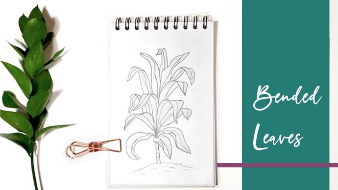
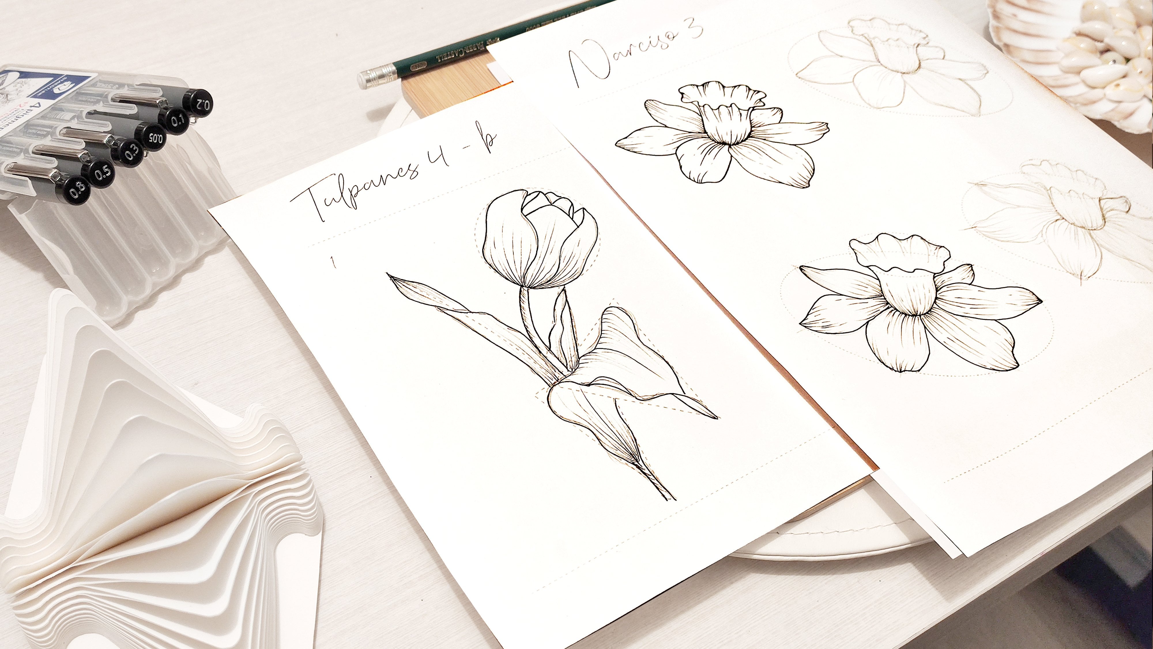
5. Draw a floral tile: In this lesson, we will decide the minimum part of a pattern. We are going to go a step-by-step drawing different kinds of file. From the beginning. We will assign some tiles in different shapes, like I am showing here. The idea is to design your own style and bay you can replicate this one that times that you want to create an awesome pattern. So in this lesson, we will draw Trio sketches in pencil based on different shapes. Draw this sketch in the final paper you want to use. Remember to use a thicker on glossy paper and recommend the use a tissue paper. We are is to descend first the tire and then you can, with this template, will create the tile as many times as you want to create a colorful pattern. The second template we will be using it in the next lesson to show you a different way to create a pattern design. For the first time, I will draw a circle as my reference. You can use the tool you prefer to do it. Try to use a light pencil like the age ones. Now that I have my circumference, I will start drawing my doodles inside. I will take my floral dollar library and have it as a reference when I run out of ideas. To create a beautiful design, I always use symmetry as our role in that way, I can create an attractive design for the viewer. Depend on the size of the market or you have, you can create a smaller and bigger design than me. Along with this class, I will use paper with a postcard size in my design. In this slide, you will see the Illustrate to find symmetry. So in order designs, I will replicate the design like a mirror. And I will create a center element Android in both sides of the tile. In other designs, I combine different shapes among flowers, branches and leaves, or with a rounded designed to make it softer. You don't need to follow settling what I'm doing here. You can experiment as much as you want. Okay? I would say Dale, their reference template to finish may work. You can see that these dollars are very simple to draw. When you shake each one separately, they lose. So simple. But when you start creating your retailer week, all the dura sukha at the base are blending on creating IE, make a state. When you finish your first tile design, it is time to continue with the second one. Here we will only sketch our designs. The next lesson, I will show you how to pick your color palette and how to color it to make an attractive. Finally, sign. The second one will be a triangle in which I will repeating the same steps. Look for the center uninstalled Rowan from it, then carefully create a mirror effect. This kind of design half infinity ways to create them. You can try it with different shapes and different doodles inside. As I told you from the beginning, my style is symmetrical. So in the 3D science, I do it with this structure. Okay? The smallest space it does, maybe you are reassure what do you want to join it? The water you can make the Darr and the moment always carried. You will see clearly we shape and color will look great in there. Here is Sonya guide for us. But the moment we will start coloring, we go our pain markers. Finally, we'll create a diamond shape for our last design where you start practicing these with the time it became easier to little floral Delos from during imagination. All right, hello. Now that you have used tree descends ready in the next layer is somebody who is show you how to show your color palette.
6. Choose a color palette: Phosphate comes in 55 different colors. It is as more variety of colors if you compare it with other materials, but I think is perfect for the purpose of this class, I prefer to illustrate with a minimal range of colors. I created some combination of colors or you can start using right now in your design that will look static. The first one is an option of two groups of complimentary colors, green and red, blue and orange, and violet and yellow. The second one is an option week four groups of monochromatic colors combination, the darker and the lighter of each one. The monochromatic color scheme is one color scheme that is created using different tones of that one color. Finally, option tree is a complimentary color, but in the passing range of colors, with the pastel green light being the older, the sky blue with the coral pink. And there was one there, pastel purple with the puzzle orange. So create the best color palette depend on the marker you have available. Remember that the monochromatic colors are all the colors of a single hue. You only use the same color but in the dark, unlike versions. In this case, I have the green and light green, the blue and light blue, the violet, and purple, and pink, light pink. So here I will show you circle the market. I use a nice group of colors and some examples. For the first example, we have the monochromatic design that they are, the simple one to identify them. If you want to have a little bit more of color, you can add another market that is in the same hue range but with a different tone IN showing here some of the possibility that you can create. Finally, there is one more that you can use. It is the orange range. The second color palette option is the complimentary colors. Complimentary colors convert tend to be bought saw you can use them depending on what do you want to transmit in your design. Those are two colors that are opposite sides of the color wheel. But there are some examples of the tile with a complimentary color design. I really like the brightness that the scholar give to the design. The last one is a complimentary color with the pastor range of colors. Here, I will show you the parallel between the two complimentary groups. And let the pastel color that postcard brings, you can create a softness version of your design like this one. The idea is to play with these groups and create a colorful composition with the colors like this example that I am showing here. There are two pastors with wonder root that gives a nice contrast. Other possibility is to monochrome combinations, the blue one with the purple one, or this one that is the green combination, adding some yellow. You can repeat the combinations as you want. And always they will look so different. Like here I am using again the blue and purple combo. Play with your colors and create an infinity combination that brings life to your design. In the next lesson, we will bring these grammatic to our designs.
7. Color the tiles: It is time to finally color our tally sign. In the last lesson, I showed the trade different color categories. So the idea is to use one group in each design. So I will choose which group of color I want to use from each category and then assign it to one designed. This triangle we'll be coloring in monochromatic color. The color issues is the blue one. The circle will be in complimentary pastel color, combining the green and pink. And finally, the diameter will be colored in bright complimentary colors, blue and orange. Okay, let's start with the complimentary, dark blue and light blue. Keep in mind all the tips I gave you in the third lesson on how to start with Posca. Before I use the mark is always a second allele little bit, I usually prefer to start with the dark color and the style drawing some key points I wanted to highlight. Remember when you feel that your color looks a little bit watery, shaky on primate in a different paper to be sure we are not going to damage our work. To make my world more attractive, I tried to interval the colors always for each branch or flower. I used the two colors in each one to create a contrast. I try to color match as a kind of with the first color and then tried to balance the colors. Not even one element in the composition is unipolar, or you always mix the colors in each Durham. It is also important to create a balance between the colors. I always tried to give 5050 ratio of each color in each design. If I see that the color is taking a lot of prominence, I begin to surround it with the other color because we are making a monochromatic design. If you want, you can add other kinds of blue in it to make it powerful. When I read the, the first layer and start adding the details with the layering technique that we learned at the beginning is I'm making some base on dots in it. At the end. If you have a smallest space that you want to feel, but there is not enough space for a fluoride doodle. Make some simple shapes like triangles or a small silicons. As I am right now, here you can let your style printed in. You can add as many details as you want. Keep in mind that if you made a small mistake or half-an-hour spot, you can correct. You can use the white marker if you see the layering works the same as the other colors. Only make sure it is not watery. As you see the result ArrayList of attractive. Now it is time to go. We yawn and you start with the complimentary colors. We will take our diamond design and our blue and orange posca. In this design, I will start with the brighter color because I want to highlight first the dura leaf in the middle. My coloring process with paint markers always start with the silhouette and then I fill the shape trying to don't pay twice in the same place where you are called Arabic dura light. This one tried to Don Rob back and forth. It works differently than a color pencil from Rob back over the same spot or you will peel off your paper. So if you need to pain again the same area. Wait until it's dry and then color again. The same as the first sign is element we colored in blue and orange. Some will have elements in different colors. But if the element is only one shape like these two big leaf, I will add the other color with the small details as a new layer. Remember the basics of using posca. Don't overwork your paper and tried to don't draw against the tip fibers to avoid the spread of your brain all over your work. And finally, don't put too much paint in only one place to avoid paper rippling. At the end of each design, you can erase the pencil lines to shake the result. Finally, I will add color to our circle that will be colored with two compartments, very pastel colors, repeating the same process done before. Because these core satellite, I prefer first to raise leader alli little bit the pencil lines. The idea is that I can barely see the lines. I will repeat the same mistakes as the previous two examples. Always in my head I have the idea to create a harmonious designed. The exercise is to create an amazing dural, the sign with the minimal color palette, but made them look so attractive. Drawing style is not only the shapes, it is also in the color palette you use the most, but the best way to find your style is to try as many combinations as you can. There are times that we don't like a certain kind of colors. But in the final result may be you will see something that you like. Try to draw as much as you can. Don't feel afraid for the results, agree, drawing result has behind hundreds of tries. In the next lesson, I will make a more complex design and add more color to it.
8. Draw a floral pattern: Now it is time to take one step further with our floral design. In this lesson, we will make a floral composition. Here, I will use my template as a guide for my composition. And we use a light tablet to Don Mar my paper with guidelines in pencil. I will directories I myself with the line that I see through the base. If you don't have a light tablet, you can use your window as a tool to see through and mark the key lines to guide yourself. Or if you prefer, you can draw the guts directly on your page with a ruler as we did in the previous lesson, I will choose the third guideline, that half are rather design. So the idea is to start drawing directly the dural following the lines to create symmetry, I use the same size of paper. I intend to don't keep this in a sketchbook. I prefer to create amazing postcard that I can give as a gift to my family or friends. This is a great way to share with your loved ones. You're amazing creations. Try to create some elements from your imagination to start forcing your brain to create new shapes that are time that the sound source simple by the VCC to get stuck with no ideas on what to draw. If you need some inspiration, you can check again the floor of the library I lead in the resources below, you can draw the same doodles or you can make some changes to make it look like a different element. Try to do the mirror effect in the design. In this design, I will replicate the things that are in the right on the layer. And the elements on the top will be mirrored on the bottom. And the foreign lines that go to the edge will have the same element. You need to draw each element you want to mirror perfectly. They need to look similar but not the same. It is impossible to do it. The idea is to create the illusion that they are the same. This is the beautiful thing about doing buttons by one the same as the other. Hello. There we go. Now you can save your tablet to continue. When you finish, it is time to choose a color palette and color.
9. Color the floral pattern: Now that we have finished this case, it is time to color it. For this design, we will use more than two markers. The idea is to use two monochromatic groups and combine them in the design. You can choose the combination you prefer. I will choose one of my favorite combination, use the purples and the two blue. In this design, I'm going to erase the guidelines a bit. I will start with the dark purple, the same as the drawing mirroring, I will Miro might color as well. The way a color one element, I immediately go and color the mirror of this one. Remember, don't overwork your paper and wait until it's dry to draw on. Or near eight. I will add first my dark purple color in the principal shapes. I think this will look better. When I finish it on both sides, I will start immediately with a light purple, adding the details. I want in the rectangle that is in the center to make the right angle left with purple. And the dural that are placed up and down in blue. And then on the outside, insert the colors, the blue on the right and left side, and the purple up and down. With the symmetry design is very easy because when you finish one side, I know exactly what to do in the next one. Okay. Now, in my life and I will start with the blue. I found that the flower is going to look better if I use a blue dot is in the middle of the light and dark color. And they're blue in the combination for these big shape. Then I'm going to add the two colors to combine and contrast this part of the design. Then go into can be colored in blue or purple because this color with the consultation. So I decide to split the leaf, the side that goes near to the purple, color it with light blue and then replicate it in the order three edges on the side of the leaf that goes close to the blue, I will color with a light purple to create some contrasts and balanced between the composition. Okay, finally, I will add some details on each side, we did darker version of this column 4 gave a little bit of life. Okay. I am so happy with the result. If you want, you can share with me not only the project that comes in the next lesson, but also these exercises that are like mini-projects. I like a dean at some small details to create more contrast to make it look more interesting. Now that you finish, you can continue in the next lesson to make an amazing project.
10. Project time!: Now it is time to create our project. The idea is to create amazing postcard shows one of the type that you created for, shows one of the tile designs that you created before. And the idea is to replicate it the times that the templates show us. I will choose one of the circles have I create with two complimentary colors, orange and blue saw in this project, my pattern design is this one. If you want, do a new tidy sign, do it from the beginning and then replicate it. Or it is possible to have a tile that you already dropped. But for the Fourier tried, a new group of colors. Feel free to do it in the way you feel more comfortable. Here. There is no right or wrong way to do it. So the Europe rebuilt and lead your design be near to you as a reference and you start drawing. For me, this is a very relaxing exercise. I will do one by one. The sketch inside the silicons always find in first the center. And then from this point and start drawing. Remember, don't feel pressured to make it the same as the reference. The idea is to make it unique. You can make some shapes on the way you can improvise. It is your design, it is your decision. For example, in this case, I realised meditation, my reference are hard to replicate in my postcard. So I will change some of the test to make it look better and more symbol. All these decisions depend on the size of your paper or the size of youth deep, maybe you need to add more details or erase some others. Hi. Okay. When you finish, erase the guidelines and then Thank you. Hey, Marcus. And he started before. I only started with one color and draw as much as I can here. And we do the opposite and dissolving process. I always call it a Y shape and then color the same shape in all the circles and so on. Well, you start with though they're feeding the magic that of course then you can see how they complement each other. Don't forget to use your white collars to correct any mistake you have. Yes. Yes. Sorry. Hi. At the end, erase the pencil marks on age-old you design the way you want to do it. I hope you enjoyed this class as much as I did. It would be amazing if you share with me the result of your project. If you have any questions, don't hesitate to ask me. I will be happy to talk with you.
 Canava, Industrial Designer / Illustrator