Transcripts
1. Introduction : Do you like to paint botanical flowers, but you're just not sure where to start? Then this class is for you as a Botanical Floral 101. Hi, I'm Helen, I'm a textile designer and a floral artist, and I've been painting flowers for over 20 years working as a textile designer. I've sold my design all over the world to fashion brands and I've worked for longtime professional retailers within their textile design departments creating lots of prints for fashion textiles and also interiors. In 2018, I founded my own brand, Helen Loveday, and I run my brand full time, as well as teaching how to paint florals. I sell silk scarf, silk Kimono's and silk eye masks and also notebooks. My work is regularly featured in magazines. In the early days of my career, I really wasn't very competent painting flowers, and that is quite a key part of textile designs as you can imagine. I used to paint from reference books and I always wanted my work to be very special. Over time, I developed a technique which I'll share with you. It's a combination of botanical artwork and surface pattern design, and it's a really great way to paint eye-catching designs in just a few hours work. One of the most important skills you'll learn in this lesson is how to emphasize some parts of your subject and even to use your imagination to bring out some elements in the flower that are barely there to create a really super real magnificent botanical flower. I'm so excited to start this class. I absolutely love painting peonies, they are the most beautiful flower to paint. I cannot wait to see what you can create. See you in the next lesson where I'll introduce you to the project.
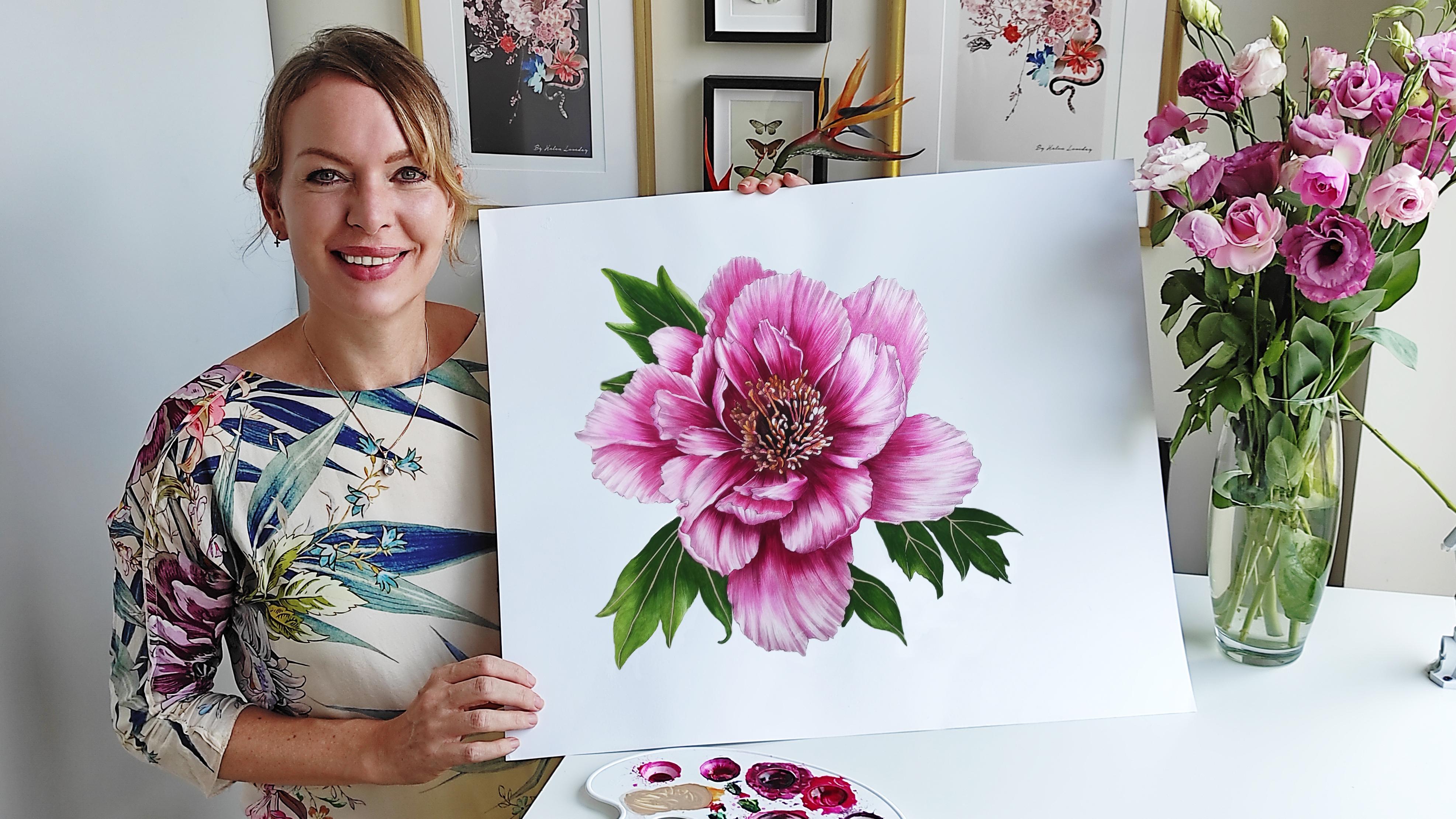
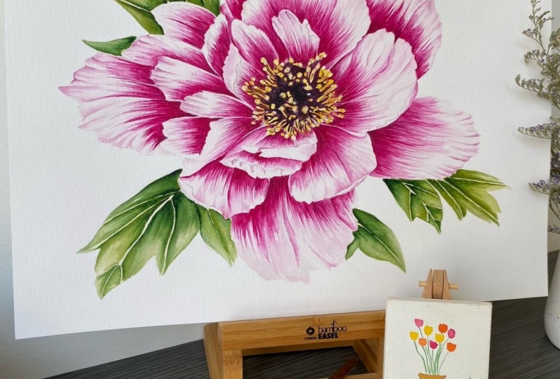
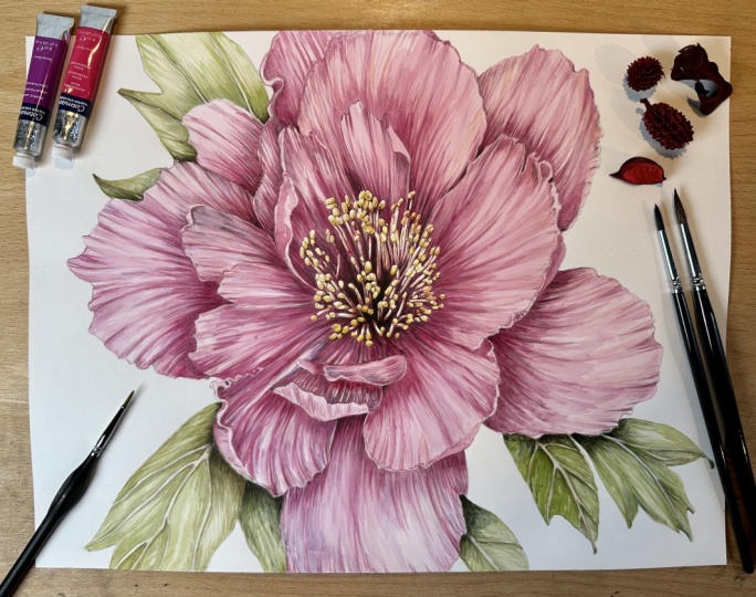
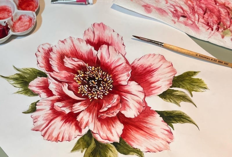
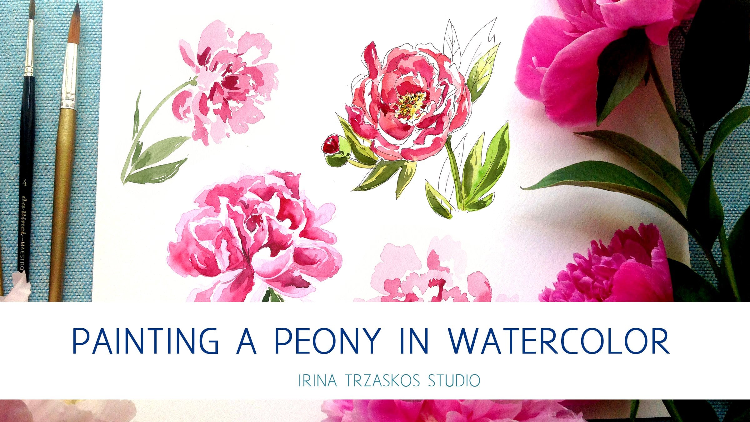
2. Class Project: Welcome. This is the orientation lesson where I'm going to be taking you through step-by-step, the project that we're going to be completing today. In this lesson, we'll be covering how to paint a beautiful pink peony flower similar to this one. We'll be going through each stage step-by-step. I selected this particular pink peony reference flower because of its beautiful colors and shape. You are welcome to print this out, or you can view this on your screen or tablet and use it as a reference as we paint along. I've also created this very simple outline drawing for you to use to help you out when you're tracing your image to your paper. This is also printable and you can print this out in A4 sections which we'll be covering in a later lesson. I've put together a materials guide which is printable so you can print this out and take it with you when you go shopping to an art supply store. We'll also be covering materials in depth in a later lesson as well. By the end of our lesson, we should have a beautiful flower painted similar to this one. Of course yours is going to be completely different to this and unique to you, but it should have a similar theme to this. We'll be looking to try to create the form and the depths and the colors as we see on our reference flower. This is a unique perspective between textile and botanical art. Now that we've run through the class project, in the next lesson, I'm going to be showing you how to choose your own reference flower for each project. I'm going to be showing you why I've selected this particular reference flower for our project today. I'll see you in the next lesson.
3. Choosing a Reference Flower: In this lesson we're going to discuss how to choose your own reference flower to help you with projects once you complete this one. Basically, I suggest picking a reference which is really inspiring to you from the colors, to textures to the shape of the flower, something that you really just can't wait to paint. Another tip would be, watercolors are really, really beautiful when you start layering colors up. What I would suggest is choosing a reference that has a variety of colors in it. What I mean by that it doesn't have to be pink, blue, and red, it can just be pink, but it would be really nice if there's a kind of gradient from the middle of the flower to the edge of the petal because it really shows off the watercolor paints. It makes a really beautiful gradients and it brings it to life. I would suggest either picking flowers that have beautiful like yellow, orange tones or anywhere where you can make a gradient out of those color paints. I've selected for this lesson a really beautiful pink peony which is one of my favorite flowers. I really love this flower because it's quite a simple shape, it's asymmetrical which works really well and it's also got quite a simple petal layout. I would consider this quite good for a beginner because there's not too many layers to get confused with. Also it's got quite a nice depth in the sun coming out to the outside, which is going to sit on the page nicely. I love peonies, I think they're the most beautiful flowers. I think what I really love about peonies actually is the fact that they are not stiff and bunchy. All their petals aren't tightly pressed together. I really love the loose openness of the petals, the petals is going to fall away. It's very romantic and it's loose and give some movement and I think with my textile design head-on, that is the flower that I would select for my designs. Because once you're doing a tightly budget of rose or something like that, it can be very stiff, which looks may be nice as a botanical accurate drawing, but on a fabric it just looks a bit stiff. Something with open petals, asymmetric petals that looks a little bit more casual, relaxed, and flowing really works best. For this lesson, we're going to be painting just from a photo but once you move on to your own projects, I would suggest that you may be select them. If you can a fresh flower and take your own photos as I would do. I would tend to take, get a really beautiful bunch of fresh flowers, choose one or two I love and take lots of close up images of the them at different angles just to capture the colors, the textures, and the form. Then I would go through my photographs and I would select a really nice angle to start my drawing from. This way, you're creating something really original that no one else has done before, which is really important. But for the purposes of this test is because we want to be painting together. I've just selected a photo to work with. Go ahead and download your peony reference flower and I'll see you in the next lesson where we'll be discussing materials.
4. Materials Guide: Welcome. In this lesson, we're going to be covering what materials you need to start your project. I suggest buying the best materials you can afford, because obviously there is a difference in quality. However, I would say as a beginner, it probably won't matter that much and probably as your skills increase, you really notice the difference between good quality materials and student quality materials. Download your materials guide now. Firstly, we'll need some smooth 200 or 300 GSM cartridge paper. The smooth finish is really important, so you don't have one bumpy texture on your paper, nice and thick. We need a range of paint brushes with nice pointy tips, anything from a 5/0 to an eight and everything in between. We definitely want a nice sharp pencil, and 3B and an HB and a rubber. Some masking fluid which is liquid plastic to paint out masked out areas on your paper, and an old paintbrush, which should be quite fine so you can get some nice detail with the masking fluid. Some paint palettes with some deep well, so you can batch makeup, mix up your paints. It's really good, even if their paints dry, you can add some water and reuse the paint. Some clean water and some kitchen roll to block your paper and also protect your paper with your hand. Paints are the other most important thing. Obviously, more expensive paints have more pigment in them. You've probably noticed the difference, but for practice you can use a student quality. I have actually a mix of both. I would just suggest having a really nice mix of hues, big ranges for you to select. I'd pick up all the pinks, might have a little go, and play with all of their different shades just to see what you like and what you can use in your flower. These will be all the materials you'll need to complete this project and I'll see you in the next lesson where we'll be covering how to trace your image reference flower on to your paper.
5. Drawing & Tracing: Welcome. In this lesson, I'm going to be showing you how to get a perfect drawing of your reference flower onto your paper. I find drawing flowers from scratch with a pencil and just the flower, very time-consuming. Sometimes it doesn't yield the results that you're after. For the purposes of this session, I'm going to suggest that we take an outline tracing, which I've already prepared, and trace that onto your paper to give you basically a map of the flower that's going to be accurate for you then to go in and shade and paint, because this is really a painting lesson, not a drawing lesson. If you're really confident with drawing and just want to learn how to paint, then go ahead by all means and draw your drawing from scratch. But if you're not so confident and you're just wanting to concentrate on a really beautiful result with your painting, just go ahead and download the tracing, an outline that I've made and I'll just show you how to transfer that accurately to your paper now. Here we are on a nice sunny day at a windowpane. This is probably the best way to trace out your drawing. The actual drawing is around A2 size. That's going to take four sheets of printouts to make up the flower. Print them out on an A4 printer like I've done and stick your sheets together. You're printing out each corner of the flower on a separate sheet and you combine them to make the whole flower and we'll just use sellotape to stick them together. Blue tack that to a window. On top of that, you're going to put your cartridge paper, blue tack that on securely, and then with an HB pencil very lightly and finally trace out all the lines you can see careful not to press too hard on your paper. You can also do this on a computer screen if you put a large enough screen in a dark room, and if you have your own reference, you can trace straight from your photograph, which will come out nicely as well. Now you should have your outline drawing traced onto your painting paper. We'll move on to color mixing. I'll see you in the next lesson.
6. Color Mixing: In this lesson, we're going to be covering how to mix up our paints. We're going to be making some batch colors that we can use later on to make more accurate colors. We're going to be using our palette and we're going to be using some nice clean water. We're just going to be taking a look at our reference flower. Here's a few paints and I've printed my reference flower onto the Epson archival matte paper to bring out the colors. But you are welcome to paint from your screen, an iPad or a computer screen is fine because you can see the colors well. You can see in the center of the flower there's a darker rose color, magenta. Little pops of color coming out in some of the petals and some lovely very light pale pink around the edges of where the light shines on the flower and some grays, which gives it shape and form, the leaves are very dark. Then there's also some very deep plummy red colors. The very darkest part of the flower is the center, and some pretty yellow stamen as well. We're just trying to capture the beauty of a real life peony flower. Just keep that in mind as you're mixing your colors. I'm going to speed the footage up now because this takes quite a while. I'm having a really good play around. I've taken out lots of different chips of paint from my collection. Just put on that very magenta paint, which is very pinky pink. I've got lots of deep red, scarlet red and they're going on the palette. A scarlet red is quite an orangey red with a bit of yellow in it. I've just got a couple of yellows there for the stamen of the flower. Also I'm going to put a bit of purple there as well because that will make the scarlet a bit more plummy. This is my range of colors and I'm just going to have a quick go now. Putting some water on them, I'm just seeing what those colors look like on my page, that's really important. I'm just looking now, seeing which colors match best with my reference flower. The colors I picked to start with actually work the best, the very magenta tones. I'm going to be using lots of those, I can tell already. One top tip is to always try your color out on some scrap paper and let it dry before you decide to apply it to your painting. Because colors look really different when they're wet in your palettes, to wet on your page, and when they dry, they look different again. It's really good idea to always test out the color on your scrap piece of paper. Just really quickly, just blow on it, let it dry before you decide if that's going to be the right colors to apply to your painting. Now I've got my paints in my palette. I'm going to start mixing up some base colors. What I mean by that is some really prevalent colors in the flower. I'm going to mix up three or four shades of pinks so that I can dip into these and use them as I go forward trying to mix up accurate colors. I've just mixed up magenta ray, rosy color pink, which I think works really well for this peony. It covers probably 80 percent of the flower. I'm quite happy with that one. Next, I'm trying to go for one of the slightly deeper shades in the center of the flower. I'm just having a look at that now. This magenta pink really covers so much of the flower, apart from maybe the lighter shades around the edges. I'm just now trying to mix up the shade in the center of the flower, which is a bit deeper. Then after that I'll be mixing up the very palest pink too. I'm just going to have a little go putting this on my page to let the paint dry and see how it's looking. I'm actually realized that this color now it's looking a bit red and not plummy enough and not dark enough. I'm going to add a bit of black, which I didn't originally have in my palette, it can be useful. I feel like I've maybe add a little bit too much black now, but let's have a look. Actually, once I start adding water, that's actually looking quite pretty, so I maybe didn't add too much black. As you can see, the color above is looking too red. The color below is looking nice and plummy and quite similar. Just keep looking back at your reference. Don't worry if the color isn't looking right, you can just stir a new color. Then I'm now trying to mix very pale shades for the right-hand side and outer edges of the petal. I'm just having a go with a few different colors there. Now we have our three base pinks to work with. That's it for color mixing right now, as we go along, we're going to be mixing up more shades and we're going to be matching the colors to our painting. But that's just mixing up the base colors to start the painting with. In the next lesson, we're going to be practicing some gradients.
7. Painting Techniques: Welcome. In this lesson, we're going to be doing a little practice with some gradients. Gradients are really important because I love the way vintage botanicals have this beautiful hatching technique that's so fine and gorgeous. It just really gives a lovely form to your flower. What we're going to do is practice a little bit with pencil, getting some lines correct. We're going to practice with a paintbrush doing our little lines and making a really beautiful smooth gradient, which is going to make your flower look really professional. I'll start off, say this is the center of the flower, and here's the edge of the petal or something like that. We're going to go from dark here to light in the tip. But I'll start off with my pale color. As you can see, I'm just making little lines with my paintbrush, and I put the lines in the direction that the petal will go. Hope that makes sense. I'll start building up a bit of pattern and texture with my paintbrush, so I'll just go along. Now I've dipped my paintbrush in some water, just blotting it dry and I'm just going to pull this paint down, it is still a little bit wet so I can pull a little bit of the paint down. I'm just making lines. I've just dipped my paintbrush in the paint again. The lines are still actually visible even if they're not stripy lines, they're just faint lines because I'm doing a mixture of watering it down so that the lines blur into each other, but I still see a little bit of the line effect. I just dipped my paintbrush in water again. I'm just going over these paints now so that it's blurred into each other, but you can still see a little bit of the lines. I'm just going to zoom in a bit. Just so you can see clearly what I'm doing here. This would be the first layer of the paint which we'd work on, and I let that dry so that we still got a little bit of the right texture. Then I just go in and I'd use my mid-tone here. I'm actually not going to wait for it to completely dry because I'm in a bit of a rush, but normally I would let it completely dry. I'll start back again and my center will be the darkest area. Here I go again with my little lines. As you can see, this stroke is just really careful, really fine. Probably depending on what kind of petal you're painting, that if you do slightly longer strokes because they can have a nice curve to them. It just really gives a nice shape to the petal. I've got a little bit too much paint on my paintbrush here. I think you can see, just pay close attention to what shape your lines are making. It's a good idea to have a nice practice first to make sure that you've got control over the paintbrush, and you can do nice lines without making it very stripy because if you start doing lines like this, it's not going to be a nice gradient, is just going to be stripy. If you do lines very close together, then it's not lines too, it's actually just one solid area. As you can see here, we're getting the best of both worlds and we're getting solid areas, and you can also see the details. This is something you probably want to practice because this result will end up looking really lovely vintage flower that looks like a hatching, which is what we're trying to achieve. I'm going to go back, it's quite important to keep blotting your paintbrush on your kitchen roll on occasional just to get off any excess paint otherwise it pools. I'm just going to go around the edge. Obviously, if I had a reference for this, I'd be looking at my reference carefully and just making sure that I wasn't going over any white area that I shouldn't be. As you can see, the little lines are showing. Just washing my paintbrush off and drying it off. Now I'm going to go back and I'm going to get my deepest tone here, this darkest tone, and this is going to be for the middle of the petal. Once again, I would probably let this dry quite a bit but I'm not going to as I'm doing a demonstration. I'm just going to start off again with my dark shade. Sometimes you'll notice with the shape of your paintbrush and you really want a fine point on your paintbrush. You should really practice just doing some fine lines because if you press too hard, they're not going to be very fine and if you press too lightly they can be really thin. You just want something in the middle, so have a really good go at practicing. Make fine lines like this, try and make them as long as you can without blobbing the brush. Just try this hatching technique again and again. This is the gradient we're after, and this is the practice. I would spend a good 10 to 15 minutes, maybe longer going over this technique and trying to get control of your paintbrush. Just experimenting with some different paintbrushes, experimenting with how much ink you've got on the end of your paintbrush, and seeing how long you can get the strokes. If you can get a nice shape and if you can get them close together, just have a little go and practice. Just to show you on our reference that the direction of the gradient and the little lines that you're going to be creating should come from the very center of the flower outwards on each petal. I'm just showing you here. You must keep the lines in the same direction throughout the flower. In this lesson, we've done little practice and painting some gradients without water in the paint. In the next lesson, we are going to be covering how to use your pencil to start shading. We'll do the practice at the beginning and then we'll actually start to do some shading onto our outline drawing on our [inaudible] paper. See you in the next lesson.
8. Shading & Masking: In this lesson, we're going to be doing a little bit of practice with a pencil doing some shading, and then we're going to tackle our actual image or outline tracing on paper. We're going to start bringing out the contours and the shading using a hatching technique with a pencil, and after that, we're going to be masking out some of the delicate center areas of the flower. Just start having a go at doing some practice shading and creating some lines. As you see, I'm going from top to bottom and lifting my pencil off the page. I'm not going up and down with my pencil still on the page because that leaves a visible line. What you want is a bit more of a feathery gradient. It's not like a hard edge where you're shading. Imagine that you're trying to draw fur and something like that. We'll be practicing going left and then we'll practice all strokes going right. This technique, if you can practice getting your hand to do these lines delicately as if that is fur is really going to help give your petals some form. Just have a go with your HB pencil and also try with a 3B pencil or a 4B pencil. Just see what you can come up with because this is going to help once you start shading your petals and your leaves. Once you've had a little practice, have a really close look at your reference and we'll move on to your traced outline. As you can see, I've spent a little while already starting to shade some contours with my pencil into my flower carefully looking at my reference. This is really going to help guide my painting once I get into using my watercolors. As you can see, I'm using my long strokes there. I'm starting from the center of the petal and center of the flower outwards. As you can see, I've carefully left the edges of the petals free so they're quite white and the center of the flower has the shading on. I'll just speed up the footage a little bit now because this is going to take a little while. Just go carefully. Feel free if you feel like you've covered too much of your white paper to use the rubber to take away any excess pencil. Just really carefully go around outlining your traced outline, making sure that you're putting in the shading where you see it on your reference, and you can see I'm now moving into the center of the flower. This is the darkest area and I'm actually going really carefully now around the center. I'm just being super careful not to draw over any details that I've traced off. This is really important that the center looks perfect. Now, moving on to the leaves, this is just as important. I'm just carefully going over the leaves. The leaves are actually quite dark, so you can afford to go quite dark on this. I'm leaving the lines of the leaves clear as you can see, and I'm just shading in carefully where I see the darker detail, and I'm just working my way around all the leaves around the edge of the flower. I tend to leave them till last after I've done my flower. I'm just working my way around now. Nearly finished with that. Once I finish with my shading and my leaves and I'm happy with how that's looking, which I am, I'm going to carefully look at my reference. You see the center of the flower is very very detailed and complicated. It's really going to matter that this looks accurate. What I suggest is that we mask out with our masking fluid the center of the flower and the lightest areas, because that means that we can add in all our dark colors and then later let it dry and come back and add the very lightest detail back into this parts of the flower without ruining any of the detail. Because otherwise it's going to be extremely awkward to be painting around with a dark color all the detail. We're going to use our masking fluid and a very pointy little fine old brush. I've poured some of my masking fluid into an old paint palette. This takes quite a while to dry, so don't be afraid to put it into a palette. Then very carefully, start applying your masking fluid to the light areas or the areas that are completely free of shading. For example, the most lightest part of the stamen. Because this is going to basically preserve the white paper for us to go in and paint later. So, just be so careful. Go around really with a detailed eye and catch all the bits of detail that you can find. This is taking me a little while. As you can see, this is how it's looking when I finish it. I haven't covered any of the shaded area. In this lesson, we've shaded our flower and we've learned how to mask out some of the delicate detailed areas of the center of the flower. In the next lesson, we're going to be covering how to do our first washes of what's paints on the flower and also on the leaves. See you in the next lesson.
9. First Wash: Welcome. In this lesson, we're going to be learning how to put a very light wash of our first layer of watercolor paint onto our painting. Here we have our pencil outline drawing. As you can see here on the right, I'm mixing a very pale first wash of color. I've been using the original paint that I painted out, so the first three shades of pinks, and I've just been mixing them further. You can see in the middle section the magentaly first wash that I originally mixed. I have been further refining that and mixing a little bit more red into it, so it's not quite so purply. I've gone even lighter. It's a really good idea to keep practicing your colors on your scrap paper before you apply it to your paper. I've decided this is a good color. All I'm doing with quite a large brush is very, very carefully going around the edges. I'm painting in my first watercolor color. This is to take the absolute white off the paper because no flower really has any absolute white in it even if it's very reflective. This is just going to help it look more natural. As you can see, I am painting from the outside edge inwards. That is because some of the pencil lines, if I paint over them, are going to slightly smudge and slightly dirty my color. What I'm trying to do is paint from the outside past of where there's less pencil lines in towards the middle so that I don't get lots of smudged pencil dirtying the lighter shapes of my petal. I just speeded up the footage to show you how I'm completing painting the whole image. Now, I'm going to start covering the leaves also with the first wash of color. Haven't actually mixed up a green color yet, I'm going to do that now. I'm going to take a bit of yellow from my palette which I was going to use for the center of the flower. Tiny bit of purple to make it a bit brown. Then I'm going to be adding a little bit of green. I'm adding lots of water also as I go because this is going to be a very, very light color. This absolutely should be very watery and light because this is going to be the very lightest color on your flower. I've just picked a standard quite bright green. You can imagine, if I painted this onto the leaves as it is, it would look very unrealistic. Now, I've mixed in with my yellow and purple. It's looking a little bit duller and a bit more natural. I'm even mixing in more purple. You could add black, but I find purple is quite a nice color to add in. I'm adding a bit more water now because this shade must be very, very light. Lots of water. Soon I'm going to just test this out on my paper. That is coming out very light indeed, but I think that's okay. Once again, I'm applying it to the outside edge even if there's lots of shading on this leaf. But because the leaf is quite dark, it won't matter that much if there's a little bit of smudging on the pencil. Just the same here again with your large brush, carefully go around the edges because you don't really want to overpaint your outlines, but you also want to be able to cover quite a bit of the paper with your paintbrush because there's a lot to do. Now, I'm just going round carefully all the leaves covering it with the first wash. In this lesson, we learnt how to, first, wash off watercolor paint onto our painting. In the next lesson, we're going to be tackling the first layer of detail with a slightly darker shade.
10. First Layer of Detail: Welcome. In this lesson, we're going to be putting on another layer of detail with a slightly darker shade, and it's going to be very detailed work using a fine little lines that we've learned how to paint, so I look forward to seeing you in the lesson. Now we have here our painting which has its first very pale washes of watercolor paint on them. As you can see here, the shades have been mixing on my scrap paper. Here's the three pink shades. Now I'm going to start using these to mix up the next shade, which is going to be one shade or three shades darker than my very pale wash. Right now, I'm taking out some of the very pale wash from the palate because it's very watery. I'm actually going to use this as a basis to do my next color pop which is going to be slightly darker. I'm adding in an extra boost of a mix of the three shades which I previously mixed up. I'm just testing this on my paper. What I'm doing is, on my scrap paper, I'm actually putting this paint next to the pale wash just to see the comparison to see if I can make it just the right shade darker, not too dark, not too light. I'm just having another go now, just getting it right, adding a bit more water, adding a little bit of green, which is toning it down a little bit. It's really worthwhile getting this right because you can end up starting to paint and realizing that your shade is too light, which is a waste of time because it's not adding any depth, or it can be too dark and then it will look quite harsh, and you'll spend quite a bit of time trying to feather it in. Now I think I've got the right shade, which is just to my right-hand side on the scrap paper, and I've got my size 4 brush, and I'm very carefully painting my fine lines in the direction of the petal. I've got my kitchen roll underneath my hand protecting the paper for many crease or paint on my skin. I'm going up from the center of the flower with the fine lines and I'm coming down from the tip to define a little bit of the fully edges of the petal. Very careful work, I want to speed this up a little bit now because as you can imagine this is going to take a little while. I'm using the same technique, I'm going up from the center of the petal with the next shade petal by petal. Here is a little close-up of how this is looking. Starting at the center, working my way out was with the fine lines, making sure that piece of paper is in the right direction for you to be able to do nice fine lines as we practiced. As you can see, is really a dynamic active contouring to the petals, so you can start to imagine the shape of them, and it's really helping to accent the fully edges of the petals. I'm just going very carefully with this color, is really important to get this right so that it doesn't look too dark, because it will look quite harsh, and on the other hand, it would be a waste of time if you are painting on too lighter color because you'll end up having to go over so it again with a darker color. Something like this will work well. Careful not to over paint too much if the white. Just keep checking your reference really carefully and make sure that you're not taking away some of that light areas. I'm really carefully working just round the edges of the petal now, just making sure I've captured all the bits of contouring I can. Working my way over just a little bit more depth around the areas that might be shading underneath the petals. It's really worthwhile taking your time at this stage because he's going to add the base layer for all the colors that come on top, and if you overdo this painting, then is going to look quite heavy, so there we go. This is how it's looking now. I'm just going to continue with this until I've got my first layer of detail onto all the petals. I just put the footage up again so you can see I'm closely looking at my reference all the time, just making sure that I'm capturing the right shading, and I've understood where the petals lie and which part of the petal lies over and which is in shadow. I'm always careful to make sure that my love of fine lines going in the right direction, giving shape to the petals. Nearly finished now with this first layer of detail. There. That's how my flowers looking with the first layer of detail. In this lesson, we've covered how to do another layer of detail with a slightly darker shade going very carefully overall painting, and in the next lesson we're going to put in even deeper shade on to really bring out some of the fold of the flower.
11. Second Layer of Detail: Welcome. In this lesson, we're going to be going even darker with our shading and we're going to put even more tones into our flower to bring out the form. I look forward to seeing you in the lesson. Here I'm mixing up my paint for my second layer of detail and I'm going to test this paint color out on my scrap paper that I'm going to use the shades underneath just to check what the color looks like on top of the pale wash in the first layer of detail color. I've gone a bit dark there, so I'm going to just water it down a little bit. I'm just testing out my strips now with a couple of different size brushes. I've got my six and my size 4 there and I'm just working out what size brush is going to work best for these lines. I think I'm going to stick with the six for now but I might swap over to the four because it's a bit slimmer. What I'm going to be doing is using this batch of color to go around from the very center of the flower again and check my reference carefully. I'm going to be going from the center of the flower using my fine stretched outwards in this direction. I'm going to be doing this shaded layer you can see. Dubbing off my paintbrush now and I'm going to put my kitchen roll on the page to protect the paper. I'm always going to start from the center of the flower which is the darkest. Because this way, if my paint is a bit too dark then it won't matter because it's the darkest area anyway, so I won't ruin my painting. I'm just going around carefully using my fine lines going in the direction of all the strokes underneath. I'm doing my feathery strokes outwards. I'm going to speed up the footage again because it's going to take a little while. As you can see, I'm working from the center of the flower outwards. As I work my way out towards the edge of the petal I'm actually dipping my paintbrush in a little bit of water and I'm pulling out the color, so that it gets a nice gradient and it's darker center of the petal and little bit light through the edge. I'm checking my references as I go, making sure my strokes are really nice and fine and looking really nice like a little gradient. I'm also edging the petals a little bit. At a later stage, we'll discuss how to add shadow to make the edges fully. As of this stage, I'm even adding a little bit of shadow on the edges of the petals where I can see the darker colors coming in to give the petal some shape and some movement. As I go around where the petals overlap, I do a little line to make sure it's neat and then I pull the paint out into the fine lines, just working my way around the flower in a clockwise direction. Careful not to put your kitchen roll and hand over a wet area of your petal. Work your way around, so that you're working over a dry area. You don't want to smash your painting. I'm always checking my reference, making sure I'm not painting over any white areas or any areas that should stay light. Because you can go on to auto drive when you do this painting. Now I've got another suggestion. My painting, it's looking a little bit tonal at the moment. I always think it looks nice if you have a few pops of different hues coming out. Even if it's not particularly obvious in the flower. I think it just adds a little bit [inaudible] to a painting. What I've done is I've taken out some pure magenta and I've actually used this color almost straight from the cheap, to start at a few other colors and I'm going to start working this color around, you can see it's really quite bright, it's even brighter in real life. I'm going to add this to my flower onto the right hand side, where the flower's the lightest. Because I noticed that this magenta color is coming through a little bit and I'm going to heighten that color using my imagination to bring out elements which are valid there in the painting because it's going to look more interesting. It's going to catch your eye. If you see a flower painting that's all monotonously one one is a little bit boring. I think it's nice if you add in some different tones, you could add in maybe one or two different tones to your painting. As I said, not all over, I'm just adding this into areas to give a little pop, so it's going to be on the right-hand side of my painting. In the video, it looks a little bit dull but in real life it looks a little bit brighter. There we go. That's nearly finished now. I'll be moving on to the next stage. In this lesson, we brought out even more shape in the flower using deep tones to bring out the form. In the next lesson, we'll be going even deeper to bring out the details and we'll be starting to look at the center of the flower, starting to paint those details in.
12. Deeper Tones: Welcome. In this lesson we're going to be covering how to know, not exactly the final touches but we're really going to be bringing out the flower now in all it's depth. We're going to be adding even darker magenta tones and we're going to be also covering how to put the detail into the center of the flower. Here I've mixed up one shade darker and not only darker but also richer as well and I'm going to be working my way round very carefully now. You can see I'm just going to do a line before I start doing my feathery strokes and that's just to make sure that the outline of petal is crisp. You don't want to outline your whole petal like that just in the areas where there's a deeper shade going to be applied. I'm looking carefully at my reference once again and I'm adding this deeper shade where I see the darkest, most riches colors. Working my way up from the center of the flower outwards, where I see the petals overlapping in the shade falling. As you can see on the right-hand side, I've mixed up, this is all my tests of different pinks too use. I'm just going to do a close up now so you can see how the brush strokes are working. I'm down to my size 4 brush and I've got a nice pointy size 4 brush which is lovely thin strokes. I'm just carefully bringing the color up from the center and as you can say, the strokes are darker at the beginning and then they fade away which adds to that feathery look that we're after. Just to give a nice smooth gradient. I'm always checking my reference to make sure that I'm not over painting too much and losing too much of my knife's light shade. I'm going to work my way round now. Careful not to paint over a wet area of your page. Working my way round clockwise, covering all the areas where it needs shade. I noticed that the left-hand side of the flower is in more shadow than the right-hand side. That is important to make sure that you see overall the shading of the flower. Now that layer is complete. I'm going to be mixing up an even darker shade. I'm making it my reference again and I'm adding some black and some purple and I'm just testing out now because we need to go even darker in the center just to really bring out some depth in the flower. I'm making sure I've got the right tone here. It doesn't want to be too dark or black because I'm going to leave black for the very center of the flower. I think I've got the right shade now. It's a darkish brownie and red color. I'm going to go round now once again in a clockwise direction adding depth into the flower starting from the center and using the fine feathery strokes to add the depths and shading. I'm also very carefully adding a little bit of detail to the edge of the petals as well as I'm going. Be careful not to go round an outline of the flower because that's going to connect. You just want to be adding a little bit of detail only in the darkest area, so you must leave part of your outline free of any line. As you can see, I'm using my tinniest little brush, it's just the size four zeros. It absolutely tie to the finest line. You really want to be detailed and delicate with this, otherwise it will look quite heavy. After you've painted the darkest shade in the center of the flower, let it dry, completely dry, and then you can rub away a masking fluid with a rubber. Once that's all gone, dab in some yellow paint with a small paint brush, just dab into certain areas and leave other areas very pale. I didn't manage to capture this on film, but you can see the result here. Now what I'm doing is just very carefully with a very fine brush going round some of the areas that need even darkening more. Just in the very center of the flower. I'm going round so carefully and I'm making sure not to outline each stamen completely. Just outline the very darkest areas and use tiniest little brush so that this looks very, very fine. You don't want the lines to be very obvious, they want to be so fine, you can hardly see them. I'm just adding a little bit of shading in now too because I have actually gone a little bit heavy with my line. I've added a bit of water to my brush and I'm just slightly washing them away and blending them in a little bit so they're not so heavy. It's very easy to do. I'm wiping it away just a little bit more and adding a little bit more shadow in, so it selects bit more natural. I'm looking really carefully at my reference now and this is why it's a good idea to trace out your reference carefully so that when you try to paint it back in, you can see exactly what needs doing. I'm just going around now with a really fine brush and a very light brown color, adding in a little bit of shading where the depths needs to go, adding a little bit of detail where the stamen need picking out and separating. Now I'm just adding a little bit pink in where I see some shading. This is a little bit lacking in color. Just go very carefully looking your reference. I've mixed this very pale pink shade up and then I've mixed this slightly darker red shade up. I'm just adding in this color where I think it need a bit of shading. Nearly complete now. Tiny bit more dark or I think it is darkening. Just to add that real depths to the center of the flower and this is going to look quite impactful. Tiny bit of outlining around the edge just to separate it from the flower. In this lesson, we really brought out the shape of the flower, we've added lots of deep dark tone spring out center, and we've painted in some detail in the center of the flower. In the next lesson, we're going to be covering how to do some added shadow which is really going to help nuance the petals and give them a little bit more shape.
13. Adding Shadow: In this lesson we're going to be covering how to add shadow to your flower. We're going to paint it out with very pale grays and we're going to be adding the color very carefully to bring out the shape of the flower. As you can see, we've actually gone back a stage. I've done this on purpose because I wanted to give this shading a whole lesson of its own, because it's actually very important and this can go wrong if it goes too heavy. What I've done a stage before the darker shaded magenta is start mixing up a very pale, pinky gray. I'm going to add lots of water to this shade. I'm going to add pinks, purples, and blacks together. As you can see, this is the color it's going to look like a shadow where the light is missing from the flower. I'm adding lots of water to make sure that it's going to be very light. I'm going to start painting now. As I said, this stage will be off to the second layer of detail before you go in with the really dark tones of magenta. But I just wanted to give it a whole separate lesson because this is actually a very important stage. Really carefully look at your reference flower and make sure that you are contouring the petals and the shape of the flower. So you're picking out the very detailed little edges of the petals where they're contoured freely and you're giving a bit of shape to them. You're using your fine strokes with a size 4 brush. Definitely bloating your paint brush off and going in and around the edges of the flower. Just adding in little strokes where you see the shadow falling, so that you're getting a frail effect. I'm going to go round quite a bit of a petal like this. I'm also going to add the layer of shading where I see the petals overlapping each other where the petal is lying under another, because this is going to add another layer of depth. It brings out the form and makes the top petals stand out away from the petals underneath. It's going to make it look much more realistic. This is a key part of making your illustration look super real. Because these elements aren't as obvious in the real flower photo, you're going to bring out these elements to make it even more real, even more life like that it looks 3D. Do it very carefully. You don't need to do means do any outlining of such. Just use your feathery strokes and just keep checking your reference, as you go along and make sure you're not overdoing or painting over any white areas. In this lesson, we carefully added shadow to our flower to bring out the form. In the next lesson, we're going to be looking at how to paint our leaves. These leaves did go a little bit wrong. I'll be showing you how to, when you make a mistake, how to correct it. I look forward to seeing you in the next lesson.
14. Leaves Right & Wrong: In this lesson, we're going to learn all about how to paint leaves. Here I go with my three shades of green mixed up the bright yellowy green and mid- tone and a dark shape. I'm going round to now my painting. I have an admission to make, paintings don't always go completely smoothly even when you've done hundreds of them like I have. With this painting, I started painting the lines in the leaves and I actually found it look quite ugly and I really didn't like them very much and it ruined the painting for me because I loved the flower. What I decided to do, which you can do quite easily with watercolors, is go back in, and I've taken off some of the detail by adding water to my painting very carefully and blotting it off with a tissue. Then I've gone back in and repainted it. What I'm doing here is using my large paintbrush with water on my kitchen row and I'm going round washing off the parts I didn't like and then blotting away with the kitchen roll. Now, I'm going back in, the color was actually fine, it was just the detail I didn't like. I'm going to do away with the detail and I'm going to use my file lines using a gradient going from the lightest greeny green and to the mid-tone and then I'm going to add this darker green on top. Now, I'm actually going to add back in a very pale mix with gouache white paint for my lines. In this lesson, we've learned how not to paint your leaves and how to paint your leaves and in the next lesson, we'll be taking a step back and evaluating our painting.
15. Finishing Touches: Congratulations, you've reached the final stage of your painting. How is it looking? Now, it's a chance to evaluate our painting. At this stage, I really like to take a step back from my painting, have a break, or you can come back to it another day. When you come back to your painting with fresh eyes, you can often see some elements which haven't quite worked or if you were looking carefully or reference overall, you can see areas that may need a little bit of work, something that might need retouching. But it's really kind of delicate job to go back in and not over paint your painting and not ruin it. This is how my painting turned out, and I'm quite pleased with it. As you can see, if you compare it with the reference photo, it's not actually that similar. I've really made it quite imaginative, so I've brought up quite a lot of the detail. I've added much darker tones in to the flower and quite a richer color than it actually visible in the reference flower. I did this on purpose because I think it makes the flower let more impactful. It looks more eye-catching, and I think it lifts off the page, which is what I'm aiming for. But your interpretation can be completely different and personal to you. The only one that's really judging it will be you, so it can be any way you'd like it to look. When I'm evaluating a flower reference, I hold the reference very close to my painting, and I'm looking over all to see, as a comparison, how my flower is looking. What I'm looking at is overall where the light is shining on the reference flower, and have I captured that with the weight of my paper or my own painting? I'm also looking at the depth of the flower where the dark areas lie, how the petals lie over each other. I'm also looking at the details of the way the shadows fall on the edges of the petals and the frills, and whether I've managed to capture that detail on my painting. Just remember, there is no right or wrong, it's completely personal interpretation of the reference flower. After evaluating your painting carefully, and you think that your painting needs a little bit of adjustment, you can go back in and make some additions now.
16. Conclusion: I hope you feel more confident now tackling a floral subject now you've completed your own peony painting. I'd love to see what subjects you want to tackle next. Peonies are my favorite flower because there's so many different varieties. But there's many other flowers that can look absolutely beautiful in watercolors. Lotuses are gorgeous, as are magnolias which are another of my favorites. There's so many gorgeous flowers just waiting to be painted. Just to recap, we've covered how to choose a reference flower, what materials you'll need to complete a project. We've covered how to trace your image onto your paper, we've covered how to mix your paints. We've also covered how to do your first washes of your painting, how to go back in and add detail, and how to do the very fine details, and also how to evaluate your painting once you've finished. Most importantly, you've now had practice learning the technique to basically transform your floral subject in your own imagination to create a super real botanical flower. Please feel free to share your work with the class, it'll be amazing to see what you've achieved. If you'd like to see more of my work, please consider following me on Instagram @helenlovedaydesign where I post quite a lot of my works in progress, and also my website is helenloveday.com. Goodbye for now, and I hope to see you again soon.
 Helen Turner, Floral Artist & Surface Pattern Designer