Transcripts
1. Blender Materials: Welcome back. Aaron
Ross here, once again, with part two of Blender
Basics, bouncing ball. And Part two, we will look
at materials and textures, also known as shaders. This is a very strong
area in Blender. It's very well developed, and they've made it
really easy for you to apply materials and
shaders onto surfaces. I've used Blender in a professional capacity as a product visualization artist, and I want to tell you, blender really made my job a lot easier. So let's get started with materials and
textures in Blender.
2. Using the exercise files: Let's take a look at
the exercise files. I provided with this
series of courses. You should have already done the first course at this point, and so you should have already downloaded the exercise
files and extracted them. Let's take a look, once
again, what's in there. We've got a folder
for three D scenes. Those are the blender scenes, and they're numbered according
to their course number, chapter number,
and movie number. And they generally flow
from one to the next. The scene file is the begin
state of the current movie, and in many cases,
the scene file is also the end state of
the previous movie. Okay, so those are
the scene files. For this course on materials, we're also going to be looking at textures or image files. There's a folder
for input textures, and we can view
those by icons and see there are a bunch
of images in there. Some of them are high
dynamic range environments, some of them are just
ordinary textures. All right, go back to
our project folder root. There's also a folder
for output renderings. We won't get to that until the last course in the series
on production rendering.
3. Previewing physically-based materials: Before we can even begin to start developing the
look of our materials, we need to set up the
scene environment. This is because Blender, like all three D
programs nowadays, uses a physically
based rendering model. That means that the
materials, the lighting, and the camera all
work together to simulate the way that light actually operates
in the real world. And that's what makes
it so easy for us to get very convincing
photorealistic results. But we have to set this
up in advance in order to have what you see is
what you get scenario. What we're looking at
in the Viewport now is a scene that has
some materials set up, but is using the
default environment for the material preview mode. That's up here in
the upper right. We're in material preview mode. This is what we'll
see by default. And this is actually not an accurate representation
of our materials. And this may cause you to
scratch your head a little bit. Why would the developers set up something that is not
actually accurate? I don't have an answer for that. But we can easily fix it. We have to follow
some steps to do so, and we'll be covering
that in this chapter. But first, I want to
show you the difference. This is, again, a scene
that's set up with all the default parameters
for material preview. Up here in the upper right, we have something that
will be labeled SN, and I've named this
one Scene default. This is the scene pull down, and it is very
unique to blender. Normally, you have a scene
file and it has a scene in it. Period. That's the
end of the story. But in blender, you're allowed
to have multiple scenes in each scene file. I
don't recommend that. It's going to complicate
your life massively. But in this special case, it will allow me
to easily switch between different settings so
we can see the difference. So this is the default condition of the material preview window. I'm going to go up to
this pulldown list, and I'm going to
choose scene finished. In this scene, I have set
up all of those parameters in order to give us what you see is what you get situation. When we design a material, we will see a very
faithful representation of that material in our viewport so that we
will be able to make accurate art direction
decisions about our materials. I can't stress this enough.
This is super important. We need to set this up before we start doing any
work on materials. Otherwise, we're
essentially flying blind. If we switch back
to scene default, everything looks
dull and lifeless. There's no saturation.
There's low contrast. And this is actually by design. And again, it defies
all explanation, but this is the way it's set up. And it's not just
blender, by the way, it's all three D programs. They all have this issue, and you will always need
to take steps in order to restore your environment
back to neutral. And if we switch back to
scene finished, again, this is the result that we will achieve at the end
of this course, and we'll be able to make accurate art
direction decisions, and that will directly translate into the visual appearance that we see in our
final rendering. Let's get started on adding
new materials to our scene.
4. Adding new materials: Adding new materials to the
scene can be done through the shader editor or from
the Properties panel. The Properties panel is simpler. Let's take a look at that first. Now at the very bottom of the
Properties panel currently, I see a red checkered spear. That's the material properties. If I select something
such as the ball, we see the name of the object, but there's no
material assigned yet. We can click on
the big new button here to create a new material. And it's created with
the default parameters. It's a material of the
type principle BSDF. We'll talk more about
what that means later. It's got a name which
is just material. And at the top, we have an area for different
material slots. We could potentially have
multiple materials assigned to the same object and swap them out by choosing
their various slots. And I don't think
it's very useful. In fact, it really just
complicates our lives. I don't recommend that
you add more slots. Just keep one slot
per object that's populated with just one material in order to preserve
your sanity. I am going to rename
the material, and we can call it ball after the object to
which it's assigned. But we might want to give a
little bit more information. Maybe we could put
the word material. At the end of that,
or maybe the type of material, which is, again, this principle BSDF we
could call this ball BSDF. And that really gives a clear indicator of what
we're dealing with. We can change the properties. We've got the base
color. Click on that. It opens up a color picker, and we can use Hue
saturation value or red green and blue in
order to pick our colors. I can, for example, increase the saturation and maybe send this over to
a different color, but we won't see any
result in our viewport unless we have material
preview mode enabled. And that's in the
upper right here. We've got our various
viewport shading modes. Material preview mode uses
the EV renderer spelled EVEE and that gives us fast
performance in the viewport, but also gives us a
pretty good approximation of the lighting and materials. We do have the overlays still enabled from
the previous course. I'm going to turn those off
so we don't see these wires, go into the overlays and
turn the wire frames off. Okay, so there's one
material assigned. Let's assign a material to some other object like
this ground plane. I can create a new
material there. And I do want to
immediately give it a name. And you can name your
materials whatever you want. You can name it based upon
the object to which it's assigned or based upon what
type of material it is. In other words, what is
it trying to represent? This is going to be
a sidewalk material, so maybe I'll name this
material sidewalk. BSDF. So again, I know exactly
what I'm dealing with. And we can change that
base color again, maybe go to RGB mode and
set this to a solid red, red value of one, and a green
and blue value of zero. And we also need a
material for the backdrop. I'll select that. Click
to create a new material. Immediately rename
it, and I'll call it fence BSDF because it's going to have a
fence texture on it. And again, change the base
color so we can see that, in fact, that
material is assigned. Maybe I'll give this 100% blue. So I've got three
different materials. They all have absolute red, green or blue colors, 100% red, 100% green, or 100% blue. If we look closely, we'll
notice that the colors don't actually correspond to
those pure RGB primaries, we'll deal with that
in a subsequent movie.
5. Protecting Orphan Data-blocks: Blender developed
essentially in isolation, completely separated
from the rest of the software industry. And as a result, Blender
has many unique quirks and idiosyncrasies
that don't conform to our ordinary expectations. One of those quirks is
that Blender has an extremely over aggressive
garbage collection policy. Garbage collection is
what it sounds like. It's taking out the trash in any software program
or data structure. So we want to clear
out the craft or the unnecessary data, but Blender is way too
aggressive about this. And specifically, if
we have a material in our scene that is not assigned
to any surface or object, then when we save the scene, that material will be deleted. This can be a big
problem for new users. They create a material, and then they save their scene. They open their scene later, and that material is gone. It's actually been
intentionally deleted. We need to protect against
this because it's very, very common that we want to
have a library of materials that are not necessarily
currently assigned to anything. One example of that is, I often like to have
a test material called an ideal
diffuse material, and its purpose is to allow
me to evaluate whether the lighting and camera
exposure is optimal or not. That ideal diffuse material is simply a purely
white material that reflects all of the
light that hits it and scatters all of
the light that hits it. We can easily create an
ideal diffuse material. I can select the
ball in the scene. And in the material
properties currently, I've got a material
assigned called ball BSDF. I can create a new material just by clicking on this button
over here, new material. And notice that that creates
a duplicate material, but it does not create
another slot up here. Again, I recommend
that you only have one material slot per object
just to keep your sanity. And I'm going to change
the name of this. I'm going to call
it ideal diffuse. And I'm going to change
the material type. In the surface section here, we see the surface field. This is the type of material, and it's currently something
called a principled BSDF. Click on that. I
want to set this to a diffuse BSDF meaning that it's not going to have any shiny highlights
or reflections. I want to change the color, set that to 100% white. And the roughness, I'll set
all the way up to 100%. We'll talk about
roughness later. But basically, it's how shiny
or glossy the surface is. It's not going to make a lot
of difference in this case, but I'm just going to turn
that up to its maximum of one. And now I've got an
ideal diffuse material that's suitable for
testing exposure. Now, if I save my scene now, the original ball
material will be erased, and I will not be able to get it back because it's not currently
assigned to anything. We can reassign it by going
to this pulldown list. This allows us to browse the materials that are
currently in the scene, and I can set that
to ball, BSDF. And now the ball material
will be saved in my scene, but the ideal diffuse
material will not because it's not currently
assigned to anything. So in order to protect your
materials from being deleted, you want to click on
this shield icon, and it has the extremely
amusing name of fake user. Turn that on. When that's on, then whatever you're
looking at, in this case, a material will not be subject to that overly aggressive
garbage collection policy. And the words fake
user really are extremely problematic
because they don't communicate what's
really happening. In blender, again, because
it developed in isolation, a lot of the generic
terms from computing have been hijacked and used to mean something
completely different. The word user in blender
doesn't mean user. In every other computer context, a user is a person who
uses the software. Well, in blender, a
user is some part of blender that's connected to
some other part of blender. The user needs that other
thing in order to operate. Okay, so in the
case of a material, the object needs to have
a link to the material. And in that context,
the object is the user. So when we enable fake user, we're setting a placeholder. It's not a real user, but it's a user that exists
really as a placeholder for a real user to prevent that thing from getting deleted
when we save the scene. Now I know all of this is crazy. And again, it's just because of the unique circumstances of blenders, birth and development. It doesn't conform to many
of our normal expectations. We don't expect that when
we create something, it's going to get erased without ever asking
us or telling us. But, in fact, in blender,
that is exactly what happens. So if you want to preserve
something from being erased, you enable fake user. Another term you'll commonly see in Blender is data blocks. As the name indicates,
a data block is just some chunk
of information. You'll also see the
phrase orphan data block. That refers to some data block
that does not have a user. So if we create a material and then deassign
it from an object, that material doesn't
have any users, and it's considered
an orphan data block. And orphan data blocks will be erased when we save the scene. So this is an issue. In this case, I can go back to my ideal diffuse material and enable fake user
for that as well. So now if I go back to
the ball BSDF material, the ball now has this
green material assigned, and the ideal diffuse
material will not be erased when
we save the scene, because, again, that ideal
diffuse material has a so called quote fake user.
6. Viewport Material Preview in EEVEE: Material previews in Blender
use the EV renderer. This is a preview renderer that's designed for real
time interactivity, but it's very high quality. In fact, EV is the
highest quality of any preview renderer in any major three D program,
commercial or otherwise. EV is such high quality
that we can even sometimes use it as the
final output renderer. I want to show you how to control the viewport
preview in order to get the most accurate previews so that you have a what you see is what you get situation. When you make changes
to your materials, what you see in the
viewport is an accurate, faithful reproduction
of that material. Let's start by assigning some test materials
to these objects. I've already got materials
assigned to these. I want to make sure I
don't lose them all. So I'm going to select
the backdrop object. You can select it in the
viewport or in the outliner. And in the material properties, I want to make sure that
I've turned on fake user, which is the shield icon. That means this fence
BSDF will not be deleted if it's not
assigned to an object. I'm going to assign the
ideal diffuse material I created earlier. Choose that from the
brows pull down, set the backdrop to use the ideal diffuse material.
Same thing with the ground. I'll select that ground, enable the fake user and assign it
to ideal diffuse material. For the ball, I need
a new material. I want to make a really
glossy black surface that's going to reflect
the environment. So I'll start by
creating a new material. I'll rename it. I'll
call it black, glossy. And again, enable fake user
so it won't get deleted. I'll set the base
color to black. And now I can see
some highlights, but they're kind of blurry. We can change that by
adjusting the roughness. If the roughness is low, that means it's going to be
a polished glossy surface. I'll bring the roughness
all the way down to zero. And now we can actually see a
reflection in that surface. There's an environment in EV. It's kind of built
into the renderer. There's an image
file somewhere in the program files
directory of blender, and that is a high
dynamic range panorama. So this is a special
kind of file. It's providing
illumination to the scene. And it's able to do that
based upon two things. Number one, it's an
all over environment. It's the entire environment, 360 degrees around and 180
degrees from top to bottom. That's known as a
spherical environment or an equirectangular
projection. It's the entire environment
stored in a single file. And additionally, that file is a high dynamic range image. That means it can store all of the possible brightnesses
that the human eye can even see so that means
it can actually store the brightness of
the sun or if anything. That allows that image
to actually project light into the scene.
Very cool stuff. So we've got this environment
that's built into E V, and we can access that if we go to the material preview options. We have a pull down list
on the very far right. And we see that same image here. That's a preview of
this environment. We see it here in
the reflections, and we see it here
in this test sphere. If we click on that,
then we can choose some other built in image that's going to provide illumination to the scene with this high
dynamic range format. So if we choose one of
these other images, we get a different reflection, and we get different
lighting, different color. If I choose this one here
that's a green field, that's a pretty clear example. The backdrop object is
rendering as slightly green, and the ground object is
rendering as slightly blue because the ground is mostly capturing
light from the blue sky, and the backdrop is mostly capturing light from
the green field. So this just tells us that
any color that's inherent in that high dynamic range image is going to affect the scene. Well, when we're
testing materials, we actually don't want
color in our environment. If we go back up here,
we can choose this one, which is a studio lighting
setup, and it is neutral. There's no color in that, but it's actually not
suitable for testing our materials because most of the environment
is solid black. So we don't get much in the
way of reflections here. This doesn't give us a
good impression of what our highly polished material
actually looks like. So, in fact, none of these
are actually suitable. We're never going to
use any of these. We need to use something
that we can control. We'll look at assigning a custom environment to the
world in the following movie.
7. Setting up a World Environment: In the previous
movie, we saw that the EV material preview mode has an environment
inherent in it, and we can choose among
different environments. We can go back up to the material preview
shading options, and we can click
on the environment sphere and choose a
different environment there. But unfortunately, none
of these are actually suitable for proper
material testing. To test materials, we want an environment that
is both completely monochrome or color neutral and also has detail
in the environment, so we can see reflections. Well, none of these satisfy
both of these conditions. We do have one that
is neutral lighting, the studio lighting setup, but it doesn't really
have any environment, and so we don't really see much in the way of reflections. We need to supply our own
high dynamic range image, and I provided that with
the exercise files. We want to go into those
viewport shading options and enable the checkbox
that says seen world. When we turn that
on, the lighting in our viewport is
now derived from the actual scene file and not from the blender
program files images. Again, we have some stock images that are provided with Blender, and those are in a way,
kind of built into EV. We need to enable SN
world in order to properly supply our own high dynamic range
image in the environment. You'll also see scene lights. Turning that on and off
has no effect right now because there are
no lights in the scene. But if I did have
lights in the scene and I wanted to see their effect
in material preview mode, I would need to
enable scene lights. Our next step is just to evaluate what's going
on in our viewport. If we dolly back with
Control middle mouse, we see something
kind of strange. We do have our black sphere, but now our backdrop and
our ground plane are nearly or completely invisible because they're exactly matching the
color of the background. That's happening because
that backdrop object and the ground plane object have an ideal diffuse
material assigned. We can see that in the
material properties. This ideal diffuse
material reflects 100% of the light that hits it and it
scatters that light. So the color of the
object is going to be exactly the same as the color of the environment if
the environment is just a flat color,
which is the case. The default world in blender is a neutral
gray, flat color. You want to go into
the world properties. Looks like a globe.
Click on that. And in blender terminology, the world is synonymous
with the environment. The environment is
an invisible sphere that surrounds our scene. And we see it's labeled
as a surface here, but that's technically
not accurate. A surface is really something
that can accept light. This is not something
that can accept light. We can't shine a
light onto this. So it's not actually a surface. It's an invisible sphere
that surrounds our universe. And by default, it's just
a neutral gray color. If I click on that color
swatch, I can, for example, increase the red component, and now I'm flooding the
world with red light. Okay, I don't actually
want to do that. I want to assign some
image to this color. And I provided that with
the exercise files. If we click on the dot to the immediate left of
that color swatch, that will allow us to
browse for some image or map or texture that's going
to be applied to this color. Click on that dot to the left of the color swatch,
and we get a pop up. We need to choose what we're going to assign
to this color. And in this case, it's an environment
texture. Click on that. Now our viewport turns into this really hot
pink or magenta color. And in blender, that's an
indicator that there's no map or no file assigned. That's an indicator that
there's something missing. So when you see your objects render in this hot
pink or magenta, that means that the link to whatever texture
file is not working. Well, it's not working now
because there is no link yet. We haven't actually
established a link. We want to go back over to our world properties and
click on Open to browse. We want to navigate to our current projects Textures folder, wherever that may be. And in this case, I've placed it one level up from
the Scenes folder. I'm currently in the
three D Scenes folder. I want to go up one level. Now I'm at my project root. And actually, while I'm here, I'm going to add a bookmark. Click on that, so I'll always be able to easily
get back to this. Then I'll go into
input textures, and there are a bunch
of files in here. If I choose ENV modern buildings dot HDR and click Open Image. Now I've got a high dynamic
range image in my background. And if I orbit around
with middle mouse, we can see that
it's a photograph, but it's a photograph
that encompasses the entire environment
in every direction. This is the color
version of this image. I downloaded that from a
website called plyhaven.com. They have many free resources, including many high
dynamic range panoramas. But, again, I want
this to be neutral. I don't want it to
actually color my scene. So I created a version of this where I desaturated
all the color. I took this image into Photoshop and I removed
all saturation, and then I saved it
back out without changing the actual
type of file. This is important. This is
a high dynamic range image. It's a special type of image. It's not like an ordinary JPEG, which is a standard
dynamic range. So I made certain that
when I saved out, I did not change
the color mode or the bit depth of the
file in Photoshop. I just removed saturation. So I've got another
file for that. Click to browse, and it's called ENV Modern Buildings
k monochrome dot HDR. Click Open Image. And now that is a
black and white image that's not actually
providing any color, but it is providing a very detailed environment
that we can see very clearly in this glossy
black reflection. Alright, very cool.
That is how to assign a high dynamic range
environment to the world.
8. Correcting Color Management: We're almost at a place
where we can make accurate decisions on
art directing materials. We're almost at a place
where what we see in our viewport is what we're actually getting
in our material. And we're not quite
there yet because there's a couple other
things we need to deal with. Most importantly,
color management. Color management is a system whereby we can control colors. If you're used to two D
graphic design or photography, you might be familiar with
the idea of ICC profiles, where a document may have some associated
color profile that allows it to
faithfully reproduce colors on a particular device such as a printer or a monitor. So in three D CGI, we've got a similar system OCIO, which is the open color
input output standard. So when we have a three D scene, we can actually represent any possible lighting intensity
in that three D scene, and that can be measured
in exposure values, and they correspond to
F stops on a camera. So we can represent up
to 20 stops of latitude. And that means we can represent any possible light intensity that the human eye can even
see, which is fantastic. But what the designers of all the three D programs have
done is they've set this up so that those 20 stops
of exposure that cannot be represented on a
monitor or printed on a page, those 20 stops have
been crammed into a limited standard dynamic range that can be displayed
on a monitor, and that is a bad thing because it actually
distorts all of our colors. So let's investigate this. I'm going to go back
to my backdrop object. Back to the material properties, I'm going to reassign
the fence material, and that's a solid blue. I'll select my ground plane, and I'll reassign the
sidewalk material. And that's a solid red. We can see that this
color here does not correspond to the
color in the viewport. I'll back out with
Control middle mouse. And that's partly due to the fact that we've got
some shiny highlights here. I can disable those
highlights by setting this IOR or index of a
fraction to a value of one. We'll talk more about
what IOR means later. But basically, now we have an ideal diffuse material
that is solid red, but it's not rendering a
solid red in our viewport. So we're not getting what
you see is what you get. We can't make accurate art
direction decisions because we are just operating in a completely uncalibrated
environment. Okay, so our next step is we need to go into
color management, and that's going to be in
the render properties. Looks like an old school
television, L on that. And you need to scroll way
down to the very bottom. This is a super
critical setting. It really determines the color
of all of your renderings, but it's buried way down
here in the bottom. We need to open that up, okay? And we have the display, which is set to SRGB. That's what we want.
Your computer monitor is using the SRGB color space. So display is what we want.
Look, it's set to none, which means it's
not actually making any changes to the lighting. If we set this to
something else, we'll see, for example, we can get a
really high contrast shot. That's something that
you want to control in post production,
not at render time. So we do want the look
to be set to none. Also have exposure
controls in here, and this is just like the
exposure on a camera, except it works
in whole numbers. If we bring the exposure
up by one integer, that's going to double the
amount of light coming in. Well, if we crank this exposure up enough, it'll blast out. Okay, so we want to set this
back to its default of zero, meaning there's no change
made to the exposure. The setting that we
really care about here is the view transform. It's labeled view,
and it's set to apply this tone mapping
profile called AGX. This is really,
really important. We want to set this to standard. Nothing else. No other setting. The only setting that actually tells us what our material
actually looks like, and the only setting
that's going to give us control over our
lighting and rendering. Is standard, which actually
means no view transform. And that's what
we want. We don't want our colors to get mangled. So I can't stress this enough. You need to do this in
every single scene. It's not the default. So I do recommend
that you create a template scene with the view
transform set to standard. And to refresh your memory, if you go into the
file menu to default, you can save a startup file. I'm not going to do
that now because it would save a startup file that includes all this geometry and this world and
everything else. Okay, so our color management
is now finally sorted out. If we go back to selecting this ground plane, for example, and back to the
material properties, we want to go back up to the
top here, scroll back up. I've got this base color. If I hover my mouse over that, we get a larger preview, and we can see that
it's solid red, and we're getting solid
red in our viewport. What we see is what we get. Okay, so back to our sphere. I want to zoom in on that
with Control Middle mouse. And I want to assign that to the ideal diffuse material
we created earlier, because that's going to
allow me to see if there are any issues with the
brightness of my environment. And there are some issues. With color management
set to no transform, the view setting
set to standard. Now, we can see that this
sphere is actually overexposed. And if I orbit around
with middle mouse, we can see there's
this gradient here, and everything
beyond that gradient is blasted out to pure white. That's telling me
that my environment is too intense or too bright. And in fact, if we control
middle mouse dolly out, we can see that in the
environment itself. It's overexposed. And it was overexposed
previously, but the color management
setting was masking that fact. Again, it was cramming all the possible brightness
values into a limited range. Okay, so this is telling me my environment
is overexposed. That in turn tells me
I want to go back to my world properties and
reduce the strength. And I don't know how much I
need to reduce that strength. So I want to go back to
seeing my sphere very large. I can control middle
mouse drag on there. So I can see the entire sphere. I can see all the
brightness values from the brightest point
to the darkest point, and then I can
adjust my strength so that we're not getting
any clipping or distortion. And in this scene, it looks
like a value of maybe 0.5. Actually a little bit
lower. Let's give it 0.4. And so now I'm not getting any
really dreadful hot spots, except maybe a little bit there. I'm gonna bring that
down even more. 0.3. Okay. So now I'm
not seeing any hotspots, maybe a little bit more, 0.35. I just got to dial that in until I'm not seeing
any distortion. And it might be
difficult to see. Maybe it takes a trained
eye to see that, but now I've got this
dialed in so that my shot is not overexposed
and it's not underexposed. I've set the brightness of
my environment correctly. I've got correct color
management settings, and now I can actually make accurate decisions going
forward to design my materials.
9. Physically-based material properties: Now that we've got our
environment set up for accurate material previews for look development of materials, we can start to investigate the base properties of a
physically based material. I'll select the ball object, go to the material properties. I'm going to reassign
the ball BSDF material. Let's start to talk about the surface type we're seeing here. It's of the type
principled BSDF. And if we click on that,
as we saw previously, there are a lot of other shaders or materials from
which to choose. Many of them have the
letters BSDF after them. Those are all components of this Uber shader or
this meta shader, which is the principle BSDF. You might want to use one of those separate components if you've got a very
simple material. But the principled BSDF being the Uber shader is going
to be the most versatile, and you're going to use
that most of the time. The word principled
means that it follows the principles of
physically based rendering. And basically, all renderers today are physically
based on some level. They have different levels of
fidelity to the real world. The EV renderer in the viewport does not
support bounce light, so we can't have
light bounce off one surface and illuminate
a nearby surface. For that, you would need to use the cycles offline renderer. BSDF is an acronym standing for bidirectional scattering
distribution function. It's simply the algorithm that calculates the way light
bounces off of the surface. We saw the base
color previously. That's pretty self explanatory. That's the dominant
color of the material. I'll click on that. And for
the purposes of illustration, I'm going to bring
that down to black. It's going to give
us a better sense of what roughness does. Roughness is the second most
important parameter here. It determines whether
the surface is glossy, shiny, and highly polished, or whether it has
microscale deviations in its surface that give it a rough appearance that
scatters the light. With a default roughness of 0.5, we have some broad highlights. If we bring the roughness down, those highlights
will start to come into focus until eventually, with a roughness of zero, we have a perfectly
polished surface, almost like a mirror,
but not a mirror because a mirror is going to reflect all of the
light equally. And here we see that it's not reflecting the same
across that surface. It's reflecting hotter or
more intense reflections on the edges and less
intense reflections where the surface is pointed
towards our point of view. And again, that's
physically accurate. That's the way that
real materials work. If we bring the roughness
up to its maximum of one, we get a very diffuse or
matte finished surface. It still has highlights, though. We can see that
it's a little bit brighter here than it is over here because the light is coming from this direction. So even though we have a base
color of absolutely black, it's not rendering
as absolutely black. And again, that is
physically accurate because a rough surface
in the real world, even if it has a
totally black surface, it's going to scatter light. So that's the way things
actually really work. Okay, so I'm going to bring that roughness
down to zero again because I next want to illustrate
the metallic parameter. Metallic will fade between a non metal material shader
and a metal material shader. And there are two different
material shaders because metals operate differently
from other types of materials. We'll only see this if we bring our base color up to
a non black value. So I'm going to bring it
all the way up to white. But here's a non
metallic surface. It's like a shiny plastic
or maybe a billiard ball. It's very highly polished, we can see that it
has reflections, but it also has a high albedo or a high diffuse reflectivity. But if we bring the
metallic parameter up, we'll start to see
reflections dominate. And with a metallic value
of one, essentially, we've got a ball
made of chrome or silver or stainless
steel or aluminum, a non colored metal. And that means it's
going to reflect its environment equally
in all directions. If we wanted colored metal, then of course, we would
change the base color, and we could make it gold or copper or whatever we wanted. Okay, so I'm going to bring
that back down to black. And bring my metallic back
down to zero because I also want to talk about IOR
or index of refraction. And that's a real
world metric that measures the density
of a material. A more dense material is going to reflect its environment
more strongly, and a more dense material
is also going to bend light as it travels through
a transparent material. So the default IOR or index
of refraction is 1.5, which corresponds to
ordinary window glass. And we're not seeing
any refractions here because it's not a
transparent material. It's an opaque material. But IOR also affects
the reflections. If we reduce the IOR, if we bring that down, then we're going to see less
intense reflections. Let's say I set my IOR to 1.2. We still have intense hot
reflections on the edges of that surface where the surface is basically aligned
with our line of sight. We've got a line of sight
going into this view, and the surface in the
center of the sphere here is at right angles to
the line of sight. The surface on the edge of the sphere is parallel
to the line of sight. So this is a material
that's not very dense, and so the reflectivity is
most intense on the edges. If we bring the IOR up, then we're going to actually
achieve a metallic effect. Now, the real world metrics
here range from one, which is air to 2.3,
which is diamond. And if I bring IOR down to one, then we get no reflections. This is as if it was a material that has a density of zero. So that's one way that
you can just turn off the highlights or
reflections on a surface. It's just said it's IOR to one. And we are allowed to
bring this up beyond the density of real
world materials. And if we bring that up to a
value of ten or something, it's actually going to be
hotter than really possible, a metal that's beyond metal. And that might be useful if you want to do
motion graphics with super highly reflective logos
or something like that. But for photorealistic
renderings, we want an IOR that ranges
between one and about 2.3. I'll set this back to
its default of 1.5. For a ball, I want to have
a non black base color, and we'll map this color later, but I'm just going to set
this to a neutral gray, and I want some
amount of roughness. It's going to be a plastic ball, so it's going to
be pretty shiny, pretty highly
polished or glossy, but not a perfect mirror. So I'll bring that roughness
up to, let's say, 0.15. And now I do have some
reflections there, but they're kind of blurry. Alright, so those are the
most important parameters of a physically based material.
10. Working with nodes in the Shader Editor: Previously, we saw how
to start building out a material or shader network by adding something
to a material. That's known as a node. It's some part of a material. To refresh your memory, what
we did was we went into the world properties and we added an environment
texture to the world. And the process there
was to click on the little dot to the immediate
left of a color swatch. And that allowed us to add an environment texture and then subsequently browse
for that file on disk. So we could build a
Shader network or a material definition from this material properties panel, but that's only going
to be effective in a really trivial case, such as we saw with that
world Shader network. A real Shader network is going to have more
complexity to it. It's going to have
more moving parts. You want to be able to see
all those parts at once. You want to be able to make and break connections
really easily, and you want to be able
to select any part of that Shader network
and immediately access its parameters. The way to do all that is
through the Shader Editor. It's a separate window
that's dedicated simply to designing shader networks
or material definitions. We can get to that from
the shading workspace. If we click on shading, it opens up the Shader
Editor down here. But it does a bunch of other stuff that I
don't actually want. It opens up a browser. I don't need that
because I've already got a browser in my
operating system. It opens up an image viewer.
I don't need that either. It opens up a viewport that's set to material
preview mode, but it's not the settings
that I have in my world, and it's not the actual
framing that I've established. This is actually not helpful. It has undone much of the work that I've meticulously
undertaken to set up my environment for
accurate material previews. So I'm not going to use
that shading workspace, and I actually don't recommend
that you use it either. I'm going to stay in
the layout workspace and open the shader editor
in a floating window. I can go to the Window menu
and choose new window. Within that new window
on the upper left, I'm going to choose
the editor type, and that's going to
be the shader editor. We're in the default context, which is object up here. So we're going to see
the Shader network for the selected object or the
most recently selected object. If I select the backdrop
in my viewport, I see its Shader network. We see it's a principled BSDF
with a base color of blue. We can navigate in here
with a middle mouse button. We can zoom in and out
with Control Middle mouse. The Shader network also
has a side bar up here, which is sometimes useful, but we don't actually
need it most of the time because all
of the parameters for materials and texture nodes are going to be found
directly on those nodes. This is an extremely
helpful part of blender. They made it really
easy for us to quickly and efficiently
set up a Shader network. We don't need a
separate property panel in order to do that. I don't need that sidebar, so I can hide it using
the key on the keyboard. So again, I'm in object context. If I select an object, I'll see its shading network. There's also up here
different context. We can choose the world. And now we're seeing
the Shader network for the world that we
created in a previous movie. And it's a very simple
Shader network. It's just got three nodes. And the flow goes
from left to right. So a node is going to flow into a node directly
to the right of it. The outputs are
on the right, and the inputs are on the left. These things are color coded. Green indicates a shader output. Yellow indicates an RGB color, and these are
different data types. That's a basic overview
of the shader editor. Going to go back
to object context, and in the next movie,
we'll start to build out a Shader network for
an object material.
11. Adding Image Textures: Now we're ready to
start building out a simple shading network
for an object material. I've got my shader editor open, and I've selected
the backdrop object so I can see its
shading network. We see the name of the
material listed up here. It's currently fence BSDF. So we just want to connect
something to this base color, and I've got a fence texture
already stored on disk. I've provided that with
the exercise files. We need a new node here, which is an image texture. We can add that by going to the menus in the Shader Editor. We can choose ad. Look
through the categories here, and we can see under texture,
there's an image texture. If we click on that,
then that node is created and we're dropped
into a move tool. We need to position
that node somewhere and then click and that'll actually finish the
creation process. I'll navigate with
the middle mouse button push that
over to the side. I want to position
this image texture, and I want to connect
the RGB color output of the image texture to the base color input of that principled BSDF
shader or material. Now, in my viewport,
the object turns black because I've not
assigned a texture file yet. To create a link
to a texture file, I want to click on
the button labeled open and then browse. We previously saw that our current directory where three D scenes is
stored is here, and we want to go to
the image Textures folder for this project. And I previously created a bookmark for that, so
I can click on that. Or you can just go up one
level to the parent directory. Now we're at the root
level of our project. And then the input
Textures folder is where the source
images are stored. Go in there, and
we want to choose the file wood planks
weathered base dot png, base meaning the base color. Just like that and
click Open Image. And that image is now loaded
into this texture node, and we see there's an image
applied onto the surface. Cool. So we haven't dealt with the placement
of that image. We'll look at that
in the next movie. But we got an image there. Let's do that for the
ground plane as well. Select that ground plane, and this is the sidewalk
BSDF material. And once again, we
want to connect an image texture
to the base color. We can also do that
by just dragging out from the input
to that base color. Just click and hold the
mouse button down on that base color input port and then drag out when you
release the mouse, you'll get a pop up window with a list of possible nodes
that you could connect here. And anything that
you've recently created is going to be
at the top of that list. So in this case, I could
just click on Image texture. But for the sake of
argument, let's say, I don't have image texture
at the top of the list. I can search for it. I need
to know the name of it. I could also scroll
through this long list, but basically, you want to know the name of what
you're looking for. I can type in TEXT, and I see a lot of hits here. These are all the various
types of textures. The one I want is
an image texture, which in blender
means a file texture, some image that's on disk. The rest of these are all so
called procedural textures, and they're generated by
algorithms within blender. I'll click on Image texture. The node is created,
and once again, I'm dropped into a move tool. And if I move my mouse without
clicking and dragging, I can position that
newly created node. When I have it where I want it, I can click the mouse button, and that completes
the operation. The image texture
node is created and automatically connected
to the base color. Once again, I'll need to browse. Click on the open button. And once again, I'll
need to browse to my current projects image files where I've got my source images. And again, I can click
on the parent directory, go up one level from
the scenes folder, and I can go down
into input textures. And because I'm
probably going to want to go in here a lot, I'm going to click
on the plus sign here to create another
bookmark there. And in this case,
we want to choose the sidewalk base color, sidewalkbs dot png,
and click Open Image. Now we've got an
image applied there. Again, a very simple
Shader network. We can minimize or close
the shader editor, navigate around in the
viewport with Middle Mouse, and we can see that we've applied a couple
of textures there. In the following
movie, we'll see how to assign mapping
coordinates within the Shader network
in order to position and scale those textures
properly on those surfaces.
12. Adjusting mapping coordinates: We've applied image textures onto a couple of the surfaces. We now need to control the placement of those
textures on those surfaces. Let's look at this
from the top you. That's going to give
us a clear indicator. We're seeing the ground plane here in the top
orthographic view. Let's dolly out a little bit, Control middle mouse and position this with
shift middle mouse, because I want to compare that ground plane object to the original texture file
that's applied to it. I need another window for that. Go to the Window menu, new window on the upper left, choose the editor
type image editor. And then go to the image
menu and choose open. Go to the current
projects Textures folder, input textures, and the file
is sidewalk based dot PNG. Open that up. Zoom out, control middle mouse, make that a lot smaller and also
make the window smaller. We want to do a side
by side comparison of the original image file versus what we get in
our actual object, the placement of the
texture on the object. We want to size these up so they are
approximately the same. And we can see that they're
not the same proportion. The tiles on the sidewalk on the actual image file
are mostly square. But on our ground plane object, the tiles are much wider
than they are tall. That's happening because the UV coordinates for a
primitive such as this non destructive
plane are set up so that they're going to stretch across the entire surface
of the object. The texture just gets stretched to fill the available area. And if the aspect ratio
or proportions of the plane don't match
that of the texture file, then we're going to get some
stretching and distortion. We can correct that by just changing the proportions
of the object itself. If I select that ground plane, go to the modifier properties, I can adjust size X or size Y and get that into
the same proportion. And in fact, if I put in a
value of 2.67 for size Y, I would have the
same aspect ratio. Now, the object has an
aspect ratio of 1.5, which matches that
of the chekre file. But this is not a good solution because we've
changed our layout. I want size Y to be 2 meters
and to set that back. We need to be able to control
the size, proportion, and placement of a texture independently of the proportions
of the object itself. To do that, we'll go
into the shader editor. I've got that minimized. Bring that back, and I've set it up so that it's just taking up the bottom half of
my screen here. Here is the Shader network for the sidewalk BSDF material. And we've got an
image texture here. We want to supply new
mapping coordinates. That means we want to plug a mapping node into
this vector input. A vector data type
has three values. We're only using two of those. We're using the U and V U
is the width of an image, and V is the height of an image. And each point on a polygon
mesh object has got U and V coordinates that correspond to some point on
the actual texture file. We're going to supply
new UV coordinates. Or more precisely,
we're going to take the UV coordinates
that are already on the object and stretch them and position them to
get the result we want. We'll need to connect
a mapping node to this vector input. Click and drag on that,
release the mouse and do a search for mapping and then
choose the mapping node. Position that node and click
to complete the operation. We can navigate with
control in middle mouse, zoom in and out, middle
mouse to position. So the mapping node is
actually erasing the UVs. Mapping is there to
transform something, to change some values, but we're not
supplying any values. And so the result
is we've actually erased the UVs in
the shading network. We also need to grab
the UVs from the scene. On the mapping node, we've
got multiple inputs. We're concerned with
the vector input. Click and Drag on
that vector input and then drag out and release the mouse. We do another search. We're looking for
texture coordinate, and we can type in CORD. We see multiple entries
for texture coordinate. These are all the
various outputs of the texture coordinate node. If we choose one of
these, that output will be automatically connected. And that's we want the UVs to
be automatically connected. So I'll click on
texture coordinate UV, position that node, and click
to complete the operation. Now we're back to zero. We're back to where we
were when we started. We have the UVs that
are on the object. They're going through this
transform mapping node that's not doing anything
to the information, and then that's getting
passed to the texture node. Okay, so we want to make some changes to the
scale and location. And I've already
investigated this. I already have done the math. I want to change
the scale X or Y. If we click and drag on scale Y, we see that we're
stretching and basically, I want to take the
original image file aspect ratio and then divide it by the aspect ratio of the plane object
or the grid object. The original file has
an aspect of 1.5. Is height is one and
its width is 1.5. The object itself has
an aspect of two. The height is one, and then the width is two. So I want to take 1.5,
divide it by two. That gives me a value of 0.75. That's the scale factor here. Put in 0.75. Now the proportions are correct. And if we dolly out
a little bit here, control and middle mouse, we can see that the shape of
those squares is the same. The height is not
the same, though. So we can see if we position this again with shift
and middle mouse, the height of this object, compared to the image
here is not the same. Again, they have
different aspect ratios. So in order to analyze this and more clearly
see what's going on, I'm going to position
these over one another because the constant here is going to be our width. So that's the X dimension. And again, I'm just
going to position these. Okay, so now we can see a
little bit more clearly that the aspect ratio of
these squares is the same, and now we just want to
change the position. And that is the Y position here. And if I drag my
mouse across that, we're seeing we're shifting
that image on the surface. And the value I want for this is 0.25 because I basically want the image to be larger than the available area of this object in this
particular case. And so I've basically
got what I want now. I've set the scale and
I've set the position. So we're basically
where we want to be. Cool. So that's
all we need to do. In this particular case, I can close or minimize
these windows, and I can middle mouse drag and go back to a three
D perspective. I can shift middle mouse to change my position and control middle mouse to zoom back in. I've dealt with my ground
plane, and in the next movie, we'll look at combining
this image file with another image file
in order to give the illusion of
relief or a bump map.
13. Bump mapping: We've seen how to apply a color map to vary the
base color of a material. Now let's look at a bump map, which is a type of relief map. The purpose of a relief map
is to deviate a surface so that it has some large
scale bumpy texture to it. And a bump map doesn't actually change the underlying geometry. It's just a lighting effect
that's going to give the impression of a
bumpy rough surface. This will be really easy
to see if we do this on the backdrop object
first. I'll select that. And we've got the
shading network, which is the fence BSDF, and it's got a color
map applied to it. We want to now
connect something to the normal input
of the material. Now the word normal in
CGI has many meanings. In this case, it's referring to something called
the shading normal. Every pixel in a rendered image, including this viewport, is going to point
at some surface. And where our line of sight or where that pixel intersects
with that surface, the renderer is going to test the orientation of that surface in order to determine
the lighting, and that's known as
the shading normal. What we want to do with
a bump map is to deviate that shading normal so
that at that location, the surface is going to be point in a
different direction. And that's going to
give the illusion of a very large scale,
rough, bumpy surface. So that's why we
need to connect to the so called normal input. So we'll click on
normal and drag out, release the mouse, and we
want to connect a bump node. So we can type that in
and then click bump, position that node and click
to complete that operation. But we haven't connected
any image yet. There's no texture
connected to this, and we'll need to connect
to the height input. It'll be easiest to see this
if there's no color map. So I'm going to just
briefly disconnect the base color texture and set the base color to white by reducing its
saturation down to zero. Now connect something
to this height input, click and drag on that,
release the mouse, and it's just going
to be image texture. You can search for that
if it's not showing up. We want to connect to the color output of
the image texture. And again, position that and click to complete the operation. We can zoom in our view port and get really close. This
will be easier to see. We want to browse for
our image texture, click Open and as always navigate to the current
projects Textures folder, which is input textures, in this case, and select
the file texture, and that is wood
planks weathered bump dot PNG. And click Open. And we can see now that
there's a bump map applied. We can exaggerate that by
increasing the strength amount. So in the bump
node, I'll increase the strength up to
a factor of ten. Now, it's really
clear that we've got a bumpy fence texture. I'll reconnect the
color image texture to the base color
of the material. And now we've got a nice
material that's got both a color and a bump map. But I do want to
control the size and placement of those textures just as we saw in
the previous movie. So I'll back out here, and I'll just grab the nodes that I created on the other objects material and copy those over.
Select the ground plane. I want to select the
texture coordinate node, shift, select the mapping node, copy those with Control C, go back to the backdrop object, and then Control V
to paste those in. And let's set these values to neutral before we
connect anything. We'll set the Y location to
zero and the Y scale to one. So now this mapping
node is just passing the existing texture coordinates
through transparently. We'll connect that mapping
nodes vector output to the vector input
of the color texture, and also to the vector
input of the bump texture. So now that mapping is
feeding both the textures, and so they will remain
aligned with one another as I change these
mapping coordinate values. All I really want to do
here is adjust the scale. I can set the scale
X to a value of two, and that's going to cause
the texture to tile twice in the X direction or it's actually the U dimension
of the texture. Cool. So now that's actually
just exactly what I want. I can also add a bump
map to the ground. That'll enhance its realism. I can select this bump node, select that and also select
the image texture node. Shift click on that
and copy Control C, go back to the ground plane
and Control V to paste. Move those around. We
just want to connect the bump normal output to
the materials normal input. And we also want to connect
the vector output of this mapping node to the vector input of
the bump texture node. And then finally, we want
to browse just as before, and we want to connect to
the sidewalk bump dot png, and a link to that file. Click Openimage. Now, I've
got a bump map applied onto both of those materials,
and I can check this. I can get in real close
on that ground plane. Just set up my view, and again, disconnect the
base color and again, set that base color to no saturation so we
can verify that, in fact, there is a
bump effect applied. Cool. I'll reconnect
the color output of that sidewalk base dot png file to the base color
input of the material. And now we've got color and bump maps applied to both
of those surfaces.
14. Remapping colors: To wrap up this course on
materials and mapping, I want to show you how
to use a color ramp. This is one of the
most useful nodes in the entire Shader library. It can do many, many
different things. In this case, I'm going to take a grayscale image that
I've prepared in advance and remap those grayscale colors onto entirely new RGB colors. This gives me the
ability to change or art direct those colors
directly within blender. I don't have to go back to an
image editing program like Photoshop in order to
change a particular color. It's all editable directly
within the Shader Network. And it's through the magic
of the color ramp node. Let's start by adding the image texture that
I previously prepared. I've got the ball selected. Got the shader editor open. Here's the principal
BSDF material that's assigned onto that ball. I want to connect something
to the base color. Click and drag on the
base color input. Release the mouse. We want
to add an image texture, and if it's not in the list, you can start typing in IMAGE. Connect the image
texture color output. Click on Image texture color, position that node, and then click to complete
that operation. Of course, we need to browse for the image. Click on Open. Go to the current projects
input Textures folder, and it's called ball
remap Colors dot png. Click Open Image. And now if we orbit around, we can see that we've got a series of grayscale
bands applied. Now, this is a
special case here. I'm not going to use
these colors directly. I'm going to use their
raw pixel values, and I'm going to
take those values and map them onto
something else. So this is a special
case where I'm not actually using a
color as a color, but I'm using a color
as a mechanism. And in that case, I want to set the color space of the image
texture node to non color. The default is SRGB, which is going to gamma
correct the image. But I want to choose non
color from the list here. Again, this is a special case. And now we see there's
less contrast. Okay, now we need a
ramp gradient node. And one of the cool things about the blender Shader Editor is I can drop a node on top
of a connection wire, and that'll cause
those connections to be made automatically. I'll move these nodes away from one another, create some space. And I want to create
that ramp node. One way to do that is
from the search engine. Just use the hot key Shift
A and then start typing in. In this case, it'll be
amp RAMP and there it is. We want to connect
to the color ramp. Lick on that. Now the nodes
created, and as always, I'm moving the node around without pressing the
mouse button down, position that node over that connection wire and then click and that connections made. The output of the file node
is going into the color ramp. The output of the color ramp
is going into the material. And right now, it's
not doing anything. It's got a linear ramp here. So it's just turning black
into black and white into white and anything in between to whatever the original
grayscale value was. And if I move these
color stops around, we can see that we're
able to cause that to occur on different
locations based upon the original texture file. And if we move the other stop
around, we can see, Okay, we're determining where we want these black and white colors
to be placed on the surface. In this case, I don't actually
want any interpolation. I want to just have a
bunch of solid colors. I'm going to select
the first stop on the left at stop number zero, and I've got an
interpolation type up here, which is set to linear. I'll set that to constant. And now as I move
these stops around, we can see we're only
getting solid black and solid white,
nothing in between. Okay, I'll move this one all the way over to its position of one and this one all the way over to its
position of zero. And if I orbit around, we'll see the entire
surface is now black. And that's because this
black value is being held until it reaches
the very end here, and then it's transitioning
to white instantaneously. If we set this to some
value other than one, then we will see that, Okay, we are getting some
amount of white there. Okay, so now we want to create a bunch
more of these stops. The way we do that is just
control click Control click, and that creates a new stop. It's automatically
selected, and we can plug in its position numerically
here. So let's do that. We'll set this one to a value of 0.1 and then Control
click again, set that new one to
a position of 0.2. Control click, and just
repeat that process, incrementing that
position value by 0.1 for each
successive color stop. Okay, now I've got actually
11 stops inserted here. I've got a total of 11. The first one is number zero, and the last one is number ten. So that's a total of 11. We actually don't need this last one, so we can remove it. Select that stop and
click the minus sign. Then we'll just go around and give color values
to all of these. I can select that first one, Color Ramp zero, and click
on its color down here. It's black currently, and
I can set it to white. And if I orbit around, we'll see that we've got some
white at the bottom here. It's a little easier to see
if I select the object, and then I can orbit around
that selected object. Okay, so I've done
the first one, then I'll select the second one, and we'll just start plugging
in some colors here. I can make this first one red. And then stop number two, we'll make it yellow. And so that's going to be red
plus green. The third one. Let's set that one to blue. Bring the blue amount
up. And just keep repeating that process and art directing all these colors. I'm just using these primary
colors because it's easy. I'm not actually making a
beautiful work of art here, but I'm just demonstrating how we can reassign
these colors, but they can be any
color you want. Okay, now I've assigned colors to all ten of those color stops, and this is looking pretty good. Again, I haven't done
a beautiful job here. I haven't made this
into a work of art, but I've now reassigned those grayscale
values to RGB colors, and I can change those
again at any point. If we get in really close
with Control Middle Mouse, just position this so that we can see this
really clearly. We will see some fringing here. So right where
there's a transition, you might see a
little line there, and that's happening
because blender is doing internal filtering on this texture directly within
the image texture node. So it's actually softening
up the transition there, and we don't actually
want that to happen. We can disable that
at the very top here, we've got the interpolation or the blending
of nearby pixels. You want to set that instead
of linear to closest. And now we don't have any of that fringing
artifact. Very cool. So now we've got this fully art directable remapped color
scheme on this ball. And that concludes our course
on materials and textures.
15. Next Steps: Alright, we've got materials applied onto our
objects in blender, and we've learned the
importance of setting up a neutral environment
for material testing, including the all important
color management settings. So now we've got objects
with materials on them, but we need to also frame our scene with a camera and
apply some basic lighting. And that's what part three of this course sequence
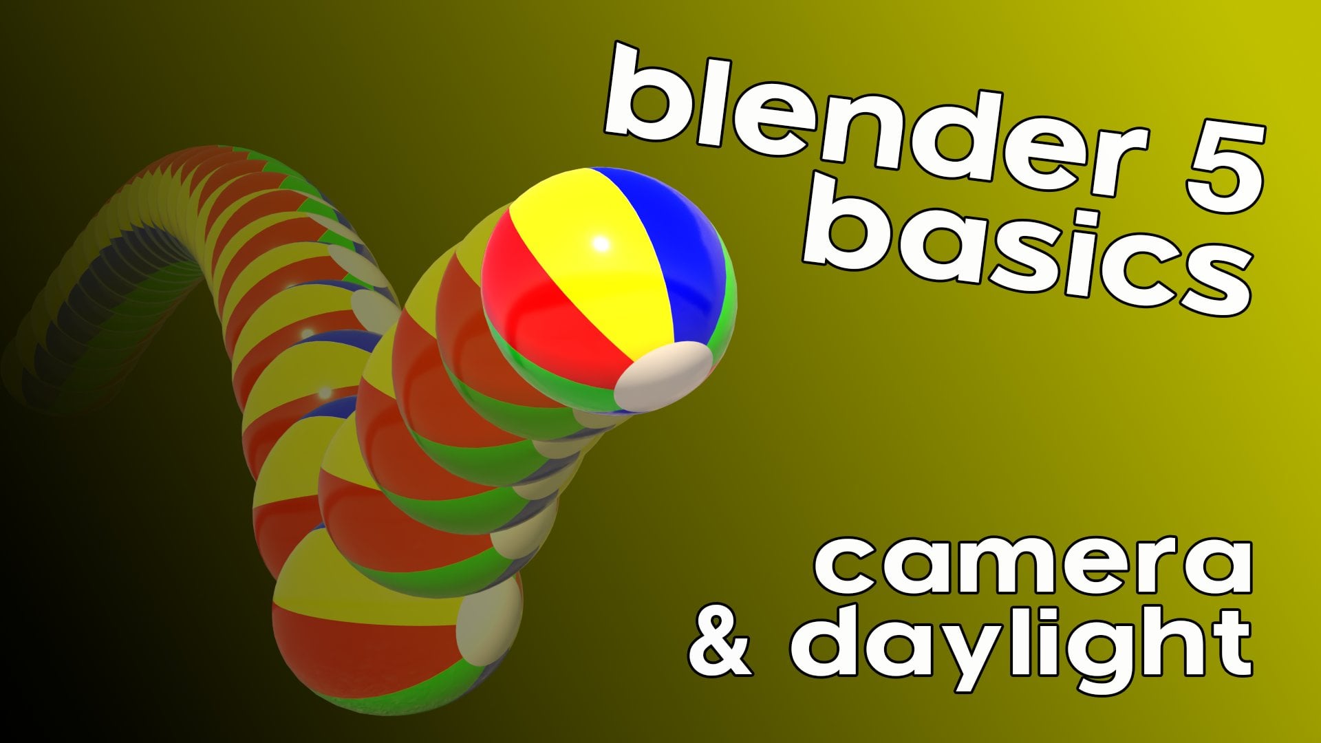
is going to be all about camera and daylighting.
I'll see you in part three.
 Aaron Ross, Artist, author, educator