Transcripts
1. Introduction: This course is part of the Blender three D version for essential series in this course. You will learn three topics, material, texturing
and UV mapping. I know that all of these
topics might look complicated, but trust me, this course
will make it easy for you. I have carefully crafted
the curriculum so that students can gain the skills gradually with no
friction at all. If you follow this course in order in Shao law,
by the end of it, you will feel comfortable
and confident working with textures and
U V maps inside Bnder. A Salam Molcum my
name is Wide Motakin, founder of Expos Studio. For more than 20 years, I have created thousands of TD renderings like this
for architectural, interior and master
plan projects. I have worked with many
clients all over the world. I have clients on almost
every continent in the world. Besides doing projects, I
have also been teaching Tweed and computer graphics academically at various
schools since the year 2000. In short, I have real world
professional expertise in Tweed and
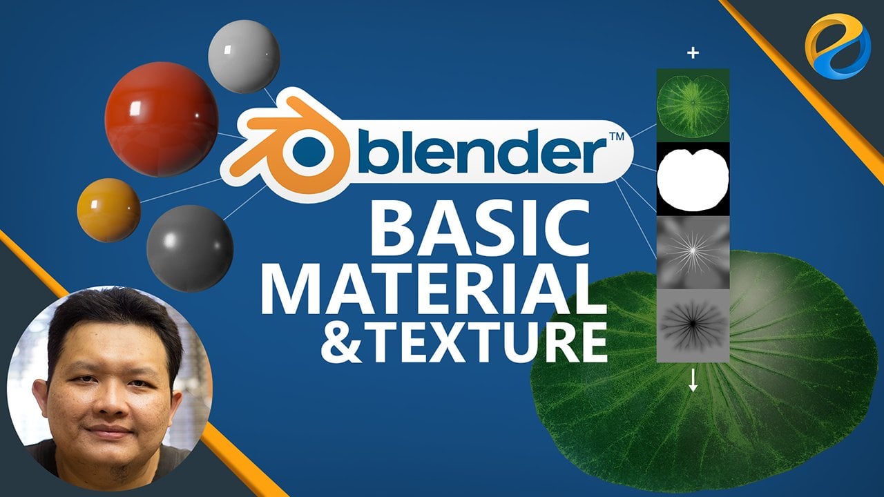
teaching experience. In the material chapter, you will learn all the basics of working with
materials in lender. From assigning and
managing materials, learn some CG fundamentals such as color models
and color codes. Learn the difference between metal and electric materials and learn all the features
and potentials of the principal BSDF Shader. By the end of the chapter, you will have hands on
projects composing materials for Ietin product and also
some architectural objects. Next, in the texturing chapter, you will learn the fundamentals
of Shader and texture. You will understand
the difference between procedural and image
textures and know how and when to use both we will then cover PBR
textures in detail. At the end of the chapter, you will have hands on
projects where you create texture for Avis model
completely procedural. After that, you will
create materials for a snowman model also
completely procedural. In last chapter, you will
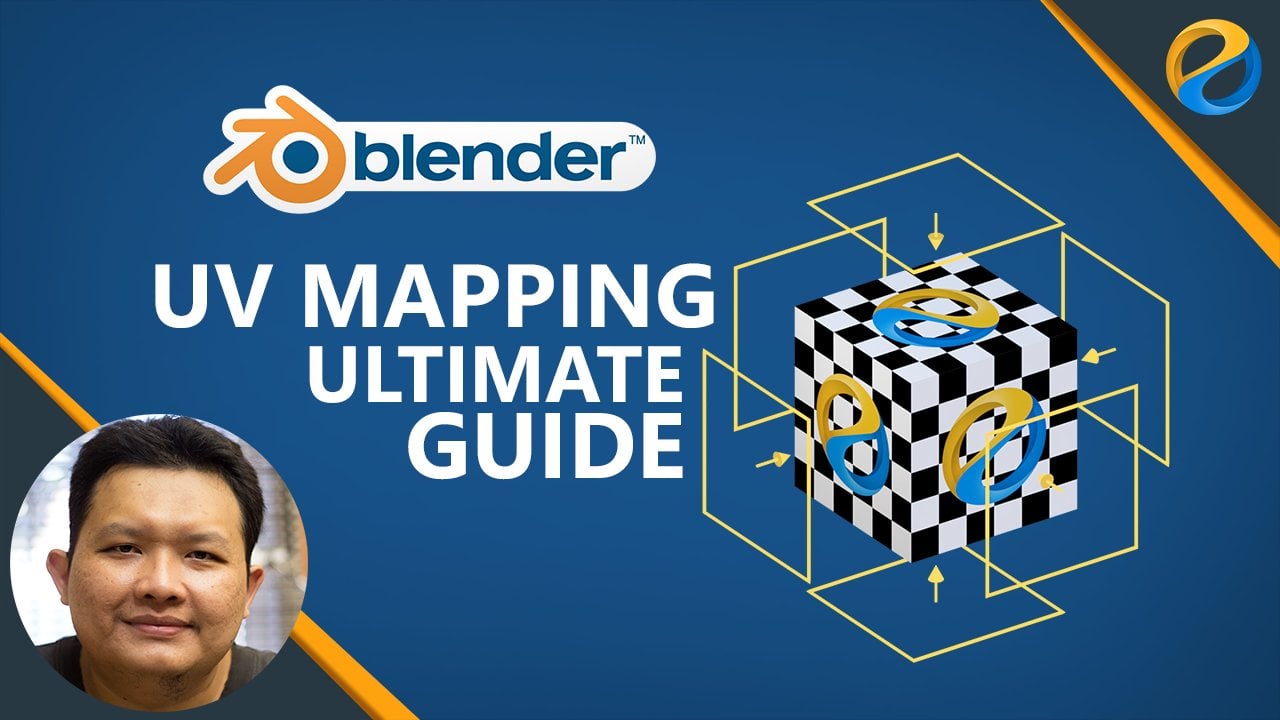
learn UV mapping in depth, you learn different techniques
of UV mapping and know how to use them and when to use them against
different scenarios. You'll also learn UV
editing, such as tweaking, splitting, stitching,
UV sculpting, straightening, and so on. By the end of the chapter, you will have four
hands on projects. First, you will add a texture
to side table product, then you will work on
previous nightstand model. But this time with
a wood texture, and then you will add textures to this problem
through the model. And finally, you will work on UV mapping un chair product. So join now and take your tudio skills with
Blender to the next level. Have fun learning Wala Malekum.
2. Exercise files and other information: Welcome to the course.
Before moving on, there are several
important things I need to mention
about the course. This course is the second
course in a blender for essential series
that I published on Skillshare in first course. We went deep into TD modeling. While on this course, we will
focus on material creation, texturing, UV mapping, and
a leader unitor course. You will learn lighting, camera, rendering, and post processing using cycles rendering engine. Although you can take
this course directly, I strongly recommend
that you take the first course before
taking this one, especially if you are
very new to vendor, because most of the time, I assume that you
already know things that I already explained
in first course. Just keep in mind that
if you find something confusing and I don't
explain it in detail, it might be that you miss out on lessons from the
previous course. Next is about the
exercise files. You can download all the
exercise files for the course in the resources section of this lesson in case
there is a problem, as a backup, you can also download the files from
the following link. Please pay attention to the capitalization
of the letters, as this link is case sensitive. You can download the
files one by one, but it will be easier
if you just click this download button to download them all
in one zip file. The text you see here depends on where you are or your
language preference. It says, download Samoa
because I am in Indonesia. You will see the text
download all if you are in US or UK or English
speaking countries. As you can see, the
files are named based on lesson with additional
chapter code in front. If lesson has multiple
exercise files, then I put them in a folder with the same
name as the lesson. Next, it's about the
structure of the course. I have carefully
crafted the curriculum so that everything is
spaced sequentially. Each lesson you take on
one level will become the foundation of the
lessons in the next levels. Therefore, it is important
that you take the course in order step by step,
not jumping around. If you take the course
by jumping around, most likely you'll get
confused at some point. The second thing
I need to mention is that you need to practice. For each video, please try out the lesson yourself
at least once. The course is not
just about theories. Most of the lessons
are practical skills. So again, you need
to practice if you really want this online
course to benefit you. In this course, I'll be using a PC computer with a Windows
ten operating system. So every shortcut I mentioned in the video will be for
PC and Windows OS. If you are using Linux OS, most likely, you won't find any difference in terms
of keyboard shortcuts. However, if you are a Mac user, you will find some differences. I believe most Mac users
already understand that the command key in Mac is often used to replace
the Control key in PC. And the option key in Mac is often used to replace
the key in PC. But the thing is about vendor. I found that most of the
control shortcuts in PC in Mac mostly become
this control key and not this command key, although there are some
shortcuts still use dommand key. Essentially, if you are
using a Mac computer, you may need to check the menu or the preferences window or the official vendor's
online documentation for the keyboard shortcuts. In this course, I will
use vendor version for 0.2 and an upgrade to version
for 0.3 in the middle. So ADI features and shortcuts are related
to these two versions. If you are watching
this video and have vendor version five
or six or higher, you might find some
differences here and there. In such a case, I recommend
you to check my course list, as I might have already
released a new version of this course that is better suited for the version
of vendor you are using. There are at least two
things that you need to have if you want to work
in vendor comfortably. First, you need a standard
mouse with a scroll wheel. Usually, if a mouse
has a scroll wheel, you can press on
the scroll wheel to activate the
middle mouse button. We will use the scroll wheel and also the middle mouse button a lot for viewport navigation. You want to avoid using minimalistic mouse
products that do not have any scroll
wheel or middle button. The second thing that you
need is a full size keyboard. What I mean by full size is that the keyboard should
have a numpad area. This is important
because a lot of vendors navigation shortcuts are placed in the numpad area. Yes, there is an
option in lenders preferences window to
simulate the numpad keys, but that will be at the cost of overriding other
important shortcuts related to three D modeling. So again, you really
want to invest in a decent full size keyboard if you want to use
bender for long term. Throughout the course, I may
display images and videos. Some of these contents
are not made by me. Please note that I am using them merely as references
or for inspiration. I never claim that these images
or videos are made by me. If I can find the owner's name, I will credit him or her by putting their names on
top of the content. Otherwise, I will
display image or video with the URL link
of where I found them. As for stock images or videos, if I don't specifically state
that they are made by me, most likely the copyrights belong to the respective
owners, okay?
3. Blender UI settings: In this video, I want to discuss several blender
settings that I use throughout the course.
First is the theme. As you can see,
unlike most users, my UI has bright colors. Personally speaking, the PI is much more comfortable on
the eyes in the long run. But I find that it is a bit
harder for my students to see what is going on on the screen if the
screen is mostly dark. That is why when teaching, I set the theme to
a bright theme. You do not have to
follow the setting, but if you are curious
how to set it up, you can open the preferences
window and then open the theme tab and here you can select the
blender light team. Okay. The second thing that I need to mention is
about the world unit. I always prefer to use
centimeters for measurement unit, as this is not too
small and not too big for most interior and
architectural projects. This unit setting is not an
application level setting, but it is a profile setting. To set this up, you can go
to the properties editor, then open the scene tab. Make sure this
unit system option is set to metric, not imperial. And then this is the important part in
the length parameter, we need to set this
to centimeters. With this option, every
time I type in line value, Blender will consider the
value of centimeters. That is, if I don't put
any unit codes behind it, Blender still respects
other unit inputs. If we type in unit
codes after the number, such as M M and KM or even imperial codes such as a single code for fit and
a double code for inch, everything will
automatically be converted to meters by blender,
which is great. Sometimes though
some add ons and some features still disrespect
this unit parameter. So even if you set
these 2 centimeters, we still need to input
the value as middles. This does not happen often, but it is just something that
you need to be aware of. Next, you may also
notice that I have a square color picker instead of theaul
circular car picker. This is just my
personal preference because I use Photoshop
for a very long time. I just don't feel comfortable using the default color picker. If you want to use
this square type also, you can head over to the
preferences no again. And then in the interface tab, you can find the option
for the color picker type. I just square SV H. Okay? Now, while you are
in this window, you may also notice that my resolution scale
value is set to 1.2. Essentially, this is so you guys can see text much
better in the video. If I set this to the default, one, the text becomes
a bit harder to read. The last thing that I need to mention is how to reset values. Thenar has a lot of primeters. Sometimes after
experimenting with features, you want to set them all
back to the defaults. It will be too hard to memorize all the default values
of each priameter. One way to reset a value
is to right click on it. And it's like reset
to default value. However, this
method is too slow. Note that you can also
use the backspace key. To use this method, you do
not need to click anything. Simply move the mouse over the parameter or field that you want to reset and then press the backspace key
on your keyboard. Just as an example, say, you play around with
this roughness value, and then you want to set
it back to its default, but forget what the
number was simply move the mouse cursor over the slider and then
press back space. Now you know that the
default value is 0.5. Again, you can use this technique for all
parameters in vender.
4. Viewport modes in Blender: In this video, we will discuss the viewport modes and how to fix missing texture
errors in bender. Bender has four types
of viewpot modes. You can see all of the icons on the top right corner
of the T viewpod. The first one is
the wireframe mode. This mode displays
everything in wireframes, which is basically edges or
vertices with no solid faces. This mode is useful
when we need to select intricate vertices
or hidden elements. The second mode is
the solid mode. This mode displays the
objects with solid faces. This mode is perfect
for modeling tasks, as we only need to
focus on the shape of the objects and don't want
to be bothered with colors, textures, or lighting yet. Now, because this course focuses on materials
and textures, the next two modes will be
the ones we use most often. The third mode is the
material preview mode. It displays textures and
material effects on a viewpoint. But not so much of
the lighting effects. So it is best for working
on texture and UV maps. The fourth mode is the
rendered view mode. This is the most complete and
yet the most demanding mode in terms of computer
performance. It displays all the textures, material effects,
and even lighting. Mostly, you need this mode
to preview the lighting or the overlook of the scene before rendering any
images or videos. We may also need this mode
to preview the materials if the materials have advanced lighting effects
such as emission, subsurface, shin, et cetera. One thing that is unique
about the rendered view mode is that it depends on
rendered settings. These are the settings
that you can access via the properties panel
inside the render tab. By default, it uses the
cycles rendering engine. And so what you see in the viewport now is
rendered by cycles. If you change the setting
to EV, for example, now it is DV rendering engine that renders rendered view mode. This will make the
visual quality the same as the
material preview mode. So yes, the material preview is always using V
rendering engine. And if you change this to
workbench rendering engine, now rendered view mode looks just like the
solid view mode. For this course, you should
always set these two cycles. And if you have a
capable graphics card, set this also to GPU compute, so the rendering can be
done faster. All right. Now, in certain workspaces, such as the UV
Editing workspace, you may see a thinner version of the three viewport Editor. It becomes hard to access
the four viewport modes. You have to direct
the editor divider to the left to see
the viewport icons. In such a case, you
can use the Z shortcut instead to open up the
viewport rendering by menu. So this is the WRFrame mode. This is the solid mode. This is the material
preview mode. And lastly, this is
the rendered mode. Now, although we are not going to discuss lighting
in this course, I still need to explain the lighting setup
that I used throughout the course in all of the
exercise files that I provide, if you open the shader editor
and activate the root mode, you can see that I created a Shader network for
environment lighting. Essentially, it is
a combination of a procedural sky texture
and an EXR image texture. If you're rendering
turn pink like this, this means that vender cannot find the
appropriate texture. I provided the texture
in a folder named EXR. It is just a free XR file that you can download
from pohaven.com. So to fix the pin
rendering result, simply click the open button here and select the
EXR file I provided, feel free to also use other EXR or HGRI
files if you want to.
5. Creating and assigning materials: In this video, we
are going to learn how to create side
materials in vendor. Please note that although
benders materials are interchangeable between its different
rendering engines, the parameters you see in a
material panel are different. So for example, let's
say you created a material called black metal with cycles rendering
engine active. If you later switch the
rendering engine to EV or bench, the material will still work. And some of the
properties will be transferred automatically,
which is great. It's just that the settings you see on each rendering
engine will be different, even though you are still
working on the same material. Throughout this course,
I will be using cycles, so to avoid confusion, make sure that you
also use cycles as the active rendering
engine, all right. To create a new
material in blender, you need to select the object to which you want the
material to attach. Let's say we want to create a material for the
default cube object. Make sure it is selected. Then in the properties editor, you need to open
the material tab. Remember, it is the one
with the bull icon, not the one with the globe icon. They may look similar at a glns, but the one with the globe
icon is the wall tab. This is where we control
the environment lighting. What we want to access
now is the material tab. In this tab, we can see a list. This is the material list. Basically, all
materials belonging to the selected object
will be listed here. Currently, it is empty
because we haven't created or assigned any material
yet to the cube object. Now, if you switch the viewport to the
rendering view mode, you can see that this cube
object has a white color. So even though it does
not have any material, blender is still
able to render it. How is that possible? Well, that is because
all objects that do not have any material will be given a default
material automatically. This default material
has a white base color. Once we send a material
to that object, then the default white material will not be used
anymore. All right? To create a new material, you can click on
this new button. The new material will
be placed at the top or as the first material
on the material list. Notice that now we can see
material parameters down here. Basically, everything
that we see down here depends on the material
that we select up here. You can rename a
material simply by double clicking on
its name in list, or you can also do that by
editing it in this field. For now, let's name
this material red. Of course, if you are
doing real project, you do not want to name
your materials with just the name of the color
more about this leader. We call it red for now,
just for simplicity. Next, to change the
color of a material, you need to click
on this color box in base color property. Let's change this to red
so it matches the name. Alright in lender, as with other to the
software or game engines, materials to the objects
are different entities. They are not part of each other. So a material is not
part of an object, and vice versa, an object
is not part of a material. The way we use materials through the objects is by creating
connections between them. We can link material
to many objects, and we can also link one
object to many materials. So for example, even though we created this red material
inside the cube object, after the material is created, it exists in the scene and
can be used by other objects. Let's say we want to use the same red material on the
swear object to do that, simply select the Spear object. Then in material tab, you do not want to press the new button as this will
create a new material. Tosign an existing material, you can click on this
probe down button. Here, render this place all
the available materials. If you already have a lot
of materials in your scin, the list will be very
long in such a case. You may want to use
the search feature, so you can easily find and filter materials
with specific names. Currently, we only have one material which is
this red material. You can use a material
simply by clicking on it. As you may notice, the sphere
object is now red also, as it uses the same material as the cube object because both objects are now linked
to the same material. Any changes to the material will be reflected
in both of them. Just to prove this, if I change the red material based color
while in sphere object, Now the color of the cube object also
change automatically. Again, this is because they are both linked to
the same material. All right. Until now, we know how to assign one
material to many objects. But what if we want to have multiple materials linked
to a single object? Let's say we want to add a green colored material on
the sides of the cube object. For this, make sure the
cube object is selected, and then in the material list, you need to click on
this Bruce button. Basically, the Plus button will create a new
empty material slot. You can add as many
material slots as you want by clicking
on the Plus button. Although you can do this,
it is better to populate the material list with only material slots and
materials that you need. Why? Well, first, it will consume your computer's
memory needlessly. And second, it will
either confuse you or your teammates if you
are working as a team. To remove a material slot, simply select the
one you want to remove and then click
on the minus button. Now, these material slots
are useless unless you fill them with materials to fill a material
slot with a material. You can click on a new button if you want to create
a new material. If you only want to use
an existing material, you can click on a
drop down button and then choose the material
that you want to use. We don't have many options
to choose from now. So let's create a new
material instead. Let's name this one green and then change to
be color to green. Notice that although
we have just created a new slot
and a new material, nothing happened to the
cube object. Why is that? Well, to assign
multiple materials to single object besides
creating the material, you also need to assign
the phases manually. For this, you need
to go to edit mode. Make sure you are
in a phase mode. You can select a phase or multiple phases
depending on your needs. Notice that in edit mode, the materials panel now shows three buttons that we didn't see before when we were
in the object mode. To assign this material
to the selected phases, you need to press
the assign button. As you can see, the
cube object now has two different materials
red and green. From these examples, we can conclude that the first
material we sign or the first one list
will automatically be applied to all phases
belonging to the object. But for the material on the
second slot and beyond, they will not be
applied automatically. For these slots, you
need to manually select the phases and then
press this sign button.
6. Managing materials: After we learn how to create side materials in this video, we will learn more techniques to manage existing materials. First, let's discuss how
to replace materials. For example, we want to replace the material
of the sphere object. For this, make sure the
sphere object is selected, then go to the material tab. Here, you can see a number
which is currently two. This number indicates
the number of users. In other words, the number of objects that use
the red material. If you want to replace the red material with
other existing material, you can click on a rope down button and then choose another
material from the list. But if you want to
create a new material, you can click on
the button here. Remember that this button is not for bleeding
the material. It is just for removing it
from the material slot. So red material still
exists in the scene. Now that the slot is empty, we can create a new material
by pressing the new button. Let's name this one
blue, just for example, and let's also changed the
base color to blue. All right. Now, if you select
the cube object again and then
select did material, the number displayed
here is now gone. This is because currently only the cube object
uses direct material. No other object in
scene is using it. I am sure you get the idea. Up to this point, you
may be wondering, how can we delete
materials in lender then? The only button that
seems to be for deleting material is not actually
for deleting materials. Well, in Blender,
there are actually two methods that you can
use to delete materials. The first is the
automatic method, and the second one is
the manual method. The first method or the automatic method is
always on by default. Blender takes care of this
for you in the background, so you don't have to
worry about essentially, if you have a material
with zero users, then that material
will get perched or deleted the next time you
close and reopen the file. For example, let's say
we change our mind. We want to use the green
material for the sphere object. We can select the sphere object, then in the material tab, we can switch the material
to the green material. At this moment,
the blue material still exists in a scene, although no object is using it. In vendor's terms,
it has zero users. If you save enclose this file and then
later open it again, don't be surprised if you
cannot find the blue material. So to recap, most of the time, you don't need to bother
the leading materials. Why? Because vendor will do
this automatically, Allright? The next question will be, what if we want to
force vendor to delete certain
materials right away? We do not want to wait for the next time we work on a file. For this, you can use
the second approach, which is the manual approach. There are two ways that you can delete materials
manually in vendor. The first is using
the perch command, and the second is
via the outliner. To use the perch command, you need to make sure that
the material has zero users. You cannot porch materials that are still being
used by an object. So in our case, we can only perform perch on
the blue material. To perform the perch command, we can open a file menu, then go to the cleanup sub menu and then oe porch unused data. Please note that this method
will perch all unused data, not just the materials, assets such as textures or images, brushes, word lighting. Fonts and so on, will also get deleted. That is, if they do
not have any users. The second manual
method for deleting materials is through
the Outliner editor. Please be cautious when
using this method, as it can remove any assets regardless of whether they
are being used or not. In the previous class, we learned how to work with collections using
the Outliner editor. Well, all this time, we only have been using a display mode called
the view layer. In this mode, we can show
and hide objects in SN. So essentially, we use
this mode for controlling visible objects or objects
that have TD coordinates, such as meshes, lights,
bones, et cetera. This mode is not useful for managing non TD objects
such as materials. If you want to manage materials, then you should use another
mode called Blender file. Now, the outliner displays all assets belonging
to the current file. Blender neatly
categorized the assets in a folder like structure. If you open the
materials folder, you see a list of all
materials in the file. You can even see how many users the material has
in this view mode. To delete the material, simply right click
on the material. And then choose Delete. You can also select
multiple materials using the shift or control keys, just like you normally select
files in a file explorer, and then Right click on one of the selections and then choose
delete to delete them all. Again, I need to remind you
that this method will delete the materials regardless of
how many users they have. If you are not careful, you may end up with three
objects with missing materials. Now, you might be wondering, what if we went the
other way around? What if we want to
preserve certain materials from getting perched by vendor
when we close the file, perhaps you don't need
the material now, but you have plans to use it later to preserve a material, you need to add a
fake user to it. You can do this either via the outliner or the
properties editor. You are still in the outliner, you can simply click on the material and then
choose add fake user. Notice how the
shelled icon becomes active when the material
has a fake user. In this condition,
Blender will not remove this material when re
close and reopen the file. If for some reason, you want to return the
material to its normal state, you can Right click again and then choose clear fake user. You can tell that a
material does not have any fake user from its sheld
icon that looks hollow. If you prefer to do this
in a properties editor, then you need to load
the material first. For example, you want to
preserve the blue material. Temporarily, we can switch this green material
to the blue material. Then simply click on
the shield icon to add a fake user and to protect
it from getting purge. After you are done, you can switch the material
back to its original, which is in our case,
the green material. As you can see, the
result is the same as adding a fake user
through the Outliner Editor.
7. Color models: In this lesson video
and the next one, we will cover the
basics of color models. When you click on color
box inside bender, you will see these steps are
fail or GB, HSV, and hex. If you are wondering
what they are, well, these two lessons will
try to give you the answer. Although we will be using bender for most of the examples, the insight you gain from these
lessons will also benefit you later when using other Tweet or CD
software in general. Color is perhaps the
most important aspect in creating beautiful
art and design. There are so many colors and
color variations in wold. For centuries,
people have tried so hard to uncover the
secrets behind colors. Why is this so important for us? Because by knowing how
colors actually work, we can capture them, store, energitize them, reproduce them, or display them precisely. Essentially, we need to
simplify the colors to their basic components which
are called the key colors. Using the combination
of these key colors, we can reproduce any
color that we want. This is what we call
the color model. So basically, color models
are methods of describing colors using a combination of key colors or using
a set of parameters. There are two types
of color models, light based color models, and pigment based color models. Light base color models use
lights as the color producer. All devices that produce
light use this color model. For example, computer monitors, smartphone screens, televisions,
projectors, et cetera. There are two light
base color models. We are going to discuss
in this lesson video. They are RGB and HSV. The next type is the
pigment based color model. Unlike the light
base color model, the pigment based
color model uses inks or pins to
produce the color. Everything that is printed
uses this color model. The most common pigment
based color model is CMYK. Let's discuss the light
base color models first, and then later the pigment
based color model. RGB, as I mentioned earlier, is the color model for lights. RGB stands for red,
green, and blue. By using these three key colors, we can produce any
colors that we like. If all of the colors, red, green, and blue turned on
to their maximum strength, the output color will be white, and if none of the RGB
colors are turned on, then the output
color will be black. So basically, in the
RGB color model, black means or no lights at all. If only the red and green
colors are turned on, then the output color
will be yellow. If the green and
blue are turned on, and the red is off, then the output
color will be cyan. If the red and blue
colors are turned on, while the green
color is turned off, then the output color
will be purple color. If the strength of each
channel is uniform, then the output color will
be gray scale colors. Other colors can be produced by controlling the strength
of each channel. Okay, so that is the
RGB color model. Now, although RGB is the
true color model of light, using RGB sliders to pick a
color is very unintuitive. We need to do a lot of
guessing or trial and error. That is why another type of Light B color model was
invented called HSV. HSV stands for hue,
saturation and value. It is light base color
model derived from the RGB color model,
but unlike RGB, which divides the color
into three main key colors, HSV uses color characteristics
to define color output. The first is hue, which is basically
a color wheel. It is called a color
wheel because it is rotation value 0-360 degrees. In blender, however,
the value is converted to a
zero to one scale. You can see this
better efficient the color picker back
to the circular type. If you scrap the hue slider, you can see how the
pointer rotates. Zero is basically the
same red color as one. Next is saturation,
which controls how much color is present as opposed to gray scale colors. If you set this to
the maximum value, the color will be at the
strongest saturation. And if you set this to zero, there will be no color at all or basically makes everything
in a gray scale spectrum. Changing this saturation
slider is the same as dragging the color pointer up here from the center
to the border area. The more we move the
pointer toward the center, the less saturated
the color will be. Okay? The last one is for value. Please note that
in other software, sometimes it is called, which stands for brightness
and L for level. So basically, the terms HSB, HSV, and HSL all refer
to the same color model. Yes, some software may implement this three
a bit differently, but we can assume that
they are the same as the way we use them are
practically identical. Essentially, the value component controls how much light is
being emitted from the color. Changing this value
slider is the same as dragging this
slider up and down. If you set this all
the way to zero, we will have black color
because in light color model, as I mentioned earlier, black means rock or
no lights at all. Now, if you are
wondering what Alpha is, this is an additional
channel that controls the opacity or how
transparent the color is. If you're using cycles or AV, this Alpha value
does not matter. It will not change the
opacity of the object. You can use the colors of a
channel to control objects opacity if you're using the
workbench rendering engine. Okay? So to recap, if you are using the
circular color bicker, rotating the pointer is the same as changing
the hue parameter. Moving the pointer
closer or further from the center is the same as changing the
saturation primeter. Finally, dragging the slider is the same as changing
the value primeter. All right. Let's change the color picker back to
the square as we age. If you are me and prefer
the square color picker, you can find a hue
using the slider. Then to set the saturation, you can drag the
pointer left and right. And finally, to set the
brightness or the value, you can move the
pointer up and down. So that is basically
how you can select a color using the HSV
color model in ender. Let's continue our
discussion on color models. The third color model is
the CM ike color model. Unlike the two color models
we have just discussed, CM wiki is a pigment
based color model. If you own a color printer, most likely you are already
familiar with CM ik because the ink cartridges of the color printer are
based on this color model. Long time ago, we
used to think that the key colors of pigman
or paints were red, blue and yellow because a lot of colors can be produced by
mixing these three colors. Some art schools even still
teach this concept until now. Although you can
achieve a lot of color variations with red, blue and yellow paints, you cannot produce all of them. Scientists have
already discovered that Bigman ki colors
are more likely to be C white C for sine color
and formgenta color. Y for yellow color and K. Well, K actually stands for key color. But because most
of the key colors are considered to be black
in the printing industry, we can safely assume
that K is for black. We need the black color
because cyan magenta, and yellow colors,
when mixed together, can only achieve a
brownish mud color. They can never achieve through black without a
dedicated back ink. Now, you might be wondering, are there any other
Bigman based color models besides hike? Actually, there are, but mostly, they are not commonly
used color models, and they are proprietary to
certain printer companies. Some printer
manufacturers release color printers that use more
than four color components. They have unique
color models but are still based on the
same Waike color model. For example, a six
colors hexacron printer uses Sim Waike inks plus
dedicated orange and green inks. Another type of
six color printer uses the dark light
method, meaning, besides the Sim Waike inks, it adds a lighter sheade of cyan and a lighter
shade of magenta. There are also
digital printers that use eight or more base
color inns and so on. In this course, because we are focusing on three D
computer graphics, we are not going to use
the same Wiki color model. As we all know, three
graphics are always displayed on screens that all use light base color models. Yes, you can render
an image and then print the image using
a same Wiki printer. But commonly, you do this through a two Di
graphic software. This is the reason why
in dender you won't find a simoke car
model or car picker, like the one you can find in For Shop or other Tod
graphic software.
8. Hexadecimal color code: When working with colors, you will often see
people sharing colors using hexodeimal codes, especially if you are doing
web design, most likely, you already use these
hexadecimal codes to define colors in
HTML or CSS codes. If you open Vendors
color picker, you can see the hex field here. This is basically the
hexodeimal version of the active color. Usually, we can tell that
a code is in hexodeimal because it is preceded by a hash mark or shop
symbol like this. In this video, we
are going to discuss the underlying structure of
these hexodeimal color codes. Hopefully, after this,
you can use them confidently and be able to change the color just
tweaking the numbers. Quick explanation first, these hexodeimal codes are
used to represent RGB colors. The code can be divided
into three groups, each with double digits. The first two digits are
for red color component. The second two digits
are for the green color. Lastly, the third two digits
are for the blue color. In Lender, however,
you can see that the hexadecimal codes are
eight digits, not six digits. Well, the last two
digits are for the Alpha channel or
the opacity level. You don't need to
worry about this because if you copy
a x color code from other source with the standard six digits and
then paste it in this field, then we'll put
additional FF code behind it automatically. So you will get your color correctly and will not
produce any error. FF means that the color
is fully opaque, right. Now, you might be wondering, how come we have these numbers and letters all
mixed up like this? Well, the most standard form of digital images is in RGB
eight bits per channel. We call it eight
bits per channel because each channel gets
eight slots or digits. And in each slot or digit, we can have a binary
value of zero or one. Now, if we divide these eight bits into
left wing and right wing, we have four digits on left
and four digits on right because we have four
probable spaces and each with two
possible values, we can calculate
the maximum number of variations we can have, and that will be two powers by four equals to 16
variations each. Okay? So each wing can
have a value 1-16. But if we start from zero, then we get zero to 15 values. The idea here is, how can we write each of these
wings with only one digit? Not for digits like this as
when we are using binaries or not using two digits like this as when we are
using the symbol. The answer is by writing
a value in hexodecimal. So what is actually
hexodeimal well, we all know about
decimals, right? We count from zero, one, two, three, up until nine. Then after we reach
ten, we are doing loop, we are back in zero, then 11, 12, 13, et cetera. Basically, using the decimal
system for each tenth value, we are looping the
counting order. This behavior exists mostly because we as humans
have ten fingers. Now, let's imagine
this for a second. Let's say you encounter
an alien race that has 16 fingers
instead of ten. How do you think they will count numbers using decimal system? Not likely big chance. They will use
hexardisimal system. The hexariimal system
looks the counting order, not when it reaches
the amount of ten, but when it reaches 16, now, if we borrow this system, we can use only one digit for referring to the value
of each of these wing. But wait, we still
have a problem. We don't have number
symbols greater than nine. How can we symbolize
numbers like ten, 11, 12, until 15 in hexadiimal
then well, we can hack it. We can use letters instead. So as decimal goes like this, one, two, three, four, until we reach nine. After that, we have
ten, 11, and so on. In hexadecimal, we
have one, two, three. Up until nine, we still
have the same symbols here. But when we reach ten, we use letter A then B 411, C for 12, and so on, until F for 15. When we reach 16,
then we have ten. So ten in hexadecimal
value is equal to the amount of 16 in
decimal values. Okay? So by using the system
at one digit space, we can have a minimum
value of zero, which is equal to the amount
of zero also in decimal. And a maximum value of F, which is equal to the
amount of 15 in decimal. Now, with only six digits, we can define any RGB
colors that we like. Sometimes you may also encounter three digit color values or also known as the
web save colors. Please don't be confused
with these codes, as basically they
are double values. For example, if you
have 37 A like this, the real value of this code
is actually 3377 AA so three, double seven and A. Please note that the websaf
color is a legacy of the old days standards
when computers still have limited colors and
also limited bandwidth. Nowadays, they are really
not important at all. Sepal hints when working
with hexadiimal values, when all of the values are zero, either six digits like zero, zero, zero, zero, zero, zero, or just 000 using the
websaf color format, both of these
numbers mean black. As in your RGB color model, no light means black if we
have all the values set to F, such as FFF or FF FF, FF, this means that
the color is white. White is the strongest
color as all of the RGB channels are set
to their maximum values. Next, we also can tell if
the color is gray scale, and that is when each number
of GNB values are identical. So for example, 12, 12, 12 like this or E E or CCC, all of these are gray
scale color values.
9. Shader basic concepts: In this lesson video, we will discuss the basic
concepts of shaders, principled BSDF and materials. When you create a new material
in blender, by default, the material will
have a shader type called principled BSDF. This is the standard shader
that you can use for almost all of your needs when creating a
scene in blender. We have created
materials before, but we haven't touched on
what a shader actually is and why the default shader
is called principled BSDF. A shader is actually a
program or code that tells computers how to render to the objects
on the screen. Please note that you
don't need to write a single code to use
shaders in blender. You can, but you don't have to. Most of the programming
works for common types of shaders are already done
by the Blender Foundation, and this course also does not
cover shader programming. Again, most likely, you
will only need to use the principal BSD of shader for almost all
materials in your scene. The only reason you want
to create or compose your own shader is because you want to achieve nonstandard
rendering effects. For this, there are two
approaches that you can take. The first approach, which
is easier and faster, is mixing the existing
shaders using nodes. If you click on Shader name, you can see that there are
about two dozen shaders available in blender, other than the principal BSDF. You can find different
shaders for different needs. There is a glass shader that
can generate reflections, a glossy shader that can
generate reflections, a hold out shader
that can create fully transparent pixels
in rendering image, a metallic shader for generating colored
reflection and so on. You can mix different types of shaders using a special shader
called the mixed shader. This is just the
tip of the iceberg. There are still many
shader features that are not listed here. For mixing or altering
shaders using nodes, you need to use a special editor called the Shader Editor. Although it seems too simple to alter
shaders using nodes, you'd be surprised at how
powerful this technique is. Essentially, Shader node editing can mimic how shedder
programming works. It is just that you are
doing it visually like an artist instead of typing the codes directly
like a programmer. We will cover more about
Shader node editing in later lessons in halo. The second approach, which we won't be covering
in this course, is to write your own
shader using codes. Again, you only need to do this if you have very
specific needs that are not covered yet in
standard shaders and cannot be done just
by using the nodes. In general, you can write shaders using
different languages. Different software may have different ways of
creating shedders, but the easiest way
to write a shedder is using a specialized shed
language such as SL. YSL stands for open
Shading language, which was developed by
Sony Pictures Image Works. Currently, SL is the only shedding language
supported by blender. Next, let's discuss
what principal BSDF is. As I mentioned earlier, the principal BSDF is
basically a shader. It is the default
shader in vendor, as it can accommodate
almost all our needs. It can create
reflections, reflections, simulate roughness,
metallic effects, glow effects, you name it. One of the biggest
benefits is that it can be exported seamlessly
to other software such as game engines. I use and rear engine
a lot for creating real time or the animation for architectural visualization. Believe it or not,
although I render this to the animation using
real engine 5.5. Most of the materials you see here are not created
in Unreal engine. I created them in vendor
using the principled BSDF. Almost all of them transferred to real engine with no issue. The only two materials they
don't need to recreate in real engine are
the glass material, and glo effect
material also known as emissive materials,
and that's it. So again, you should
always try to stick to principle BSDF if you do have plans to export your project to game engines
such as real engine. Until this point, you might be wondering why on earth is
it called principle BSDF? Why not just call
it default material or other similar
user friendly names? Well, the BSDF itself stands for bidirectional scattering
distribution function. Long story short, it is called
bidirectional because it calculates both
reflected light rays and reflected light rays. For those who don't know, fraction is the
term for when light gets reflected or bonds
off of a surface, while refraction is the
term for when light goes through a transparent surface and then gets bent
along the way. Every shader that
uses the words BSDF means that the shader
handles both effects, okay? Now the word principle
is used because the shader was created based on reward
physical principles. The origin of these
principles is actually a research paper released by Disney animation
studios back in 2012, and then in 2014, you can still read the paper
by following this link. Essentially, the
paper describes how shaders should behave if we
want them to look realistic. This paper also popularized
the terms PBS or physically based shading and TBR or physically
based rendering. This paper is currently
a decade old. Nowadays, almost all
texture providers are using the PBR standards, and so the textures we get
from these sites can be easily used with the principal
SDF Shader, all right? So what is the difference between shaders and
materials then? Simply put, materials are bigger in scope
compared to shaders. We name them materials
because that is we like to think about them as compared
to real world materials. We can create a material
for certain wood type, marble, metal, glass,
liquid, et cetera. For a material to work, it needs at least one shader. A material is impossible to exist without working
shader behind it, and on the other side, you can create a material that
contains multiple shaders. Now, besides shaders, material
can also contain textures. The term textures into the computer graphics
are basically images. They can be in JPEG, PNG, TV, UXR or any other image file
formats supported by Blender. We call them textures because these images usually represent
the look of an object. Note that having textures is not must for material to exist, so you can have materials
without any textures, just like how we
created the red, green, and blue
materials before.
10. Metallic parameter: Starting from this video, we will discuss basic
parameters that exist in a default material or one that uses the principle BSDF shader. But before we discuss
the material, let's create a
monkey head model, press Control two
to automatically add a two level
subdivision modifier. Basically, a subdivision
modifier smooths out a mesh model by
dividing its faces. We can also change
the shading mode to smooth to make it
look even smoother. Next, we can activate the
Renred viewport mode. But turn off the SIM vote
option so that vendor just uses the default HDRI image
to light up the viewport. Finally, let's create
a new material for the monkey head
object. All right. Note that we can preview how the material will look like
in the preview section, but we will close
it for now since we are already using rendered
mode in the viewport. Previously, we learned how to pick a color for
the base color. We even discussed RGB, HSV and hex codes in depth. For now, let's make it red. And let's turn down
roughness to around 0.2. Don't worry. We will discuss the roughness parameter
in the next video. We are now going to focus
on this metallic parameter. We briefly talk about PVR or physically based
rendering principles in the previous lesson, based on a PBR principle. All materials involved are
divided into two categories, metal and nonmetal, also
known as dielectric. There are no materials that sit between these
two categories. I mean, there are no materials that are half metal
and half dielectric. It simply does not exist. So ideally you only need to set the metallic value
all the way to the left for
dielectric materials, and all the way to the right
for metallic materials, there are minor cases where you can set
the value half way, but we'll cover that
leader in a video. I believe we all know
what metal materials are. Several examples of metal
are iron, aluminum. Gold, silver, brass, and so on. And for the electric materials, pretty much everything that we see in this
world that are not metals are examples of
them materials like wood, dirt, water, fabric, rubber, plastic, ceramic,
marble, you name it. So likely, more than 90% of materials in this world
are dielectric materials. There are many specific traits that differentiate
between the two groups. Not all of them are related to how we compose
materials, though. For example, all
metals are conductors. In other words, they are good at transferring
electricity, while the electrics are
the other way around. They are called insulators or are very bad at
transferring electricity. You can search
online to learn more about these differences
if you are interested. What we want to focus on now is only their visual properties
in terms of color. Only dielectric materials
have diffuse colors. Diffuse color means
the true color of a surface without any zeros, highlights, reflections and refractions
affecting the surface. Metallic materials do not
have any diffuse color. You may be wondering now, but what about gold and silver? We can clearly see
that gold is yellow, and silver is white. Well, the colors that we see on metal materials are actually
tinted reflections. They are not diffuse colors. So a gold, for example, receives light from
the surrounding and then reflects them back to our eyes while adding a yellow color
to the reflection. We cannot see the
gold's diffuse color as it does not have any. In lender, however, implementing color in a default
material is quite simple, regardless of if they
are metals or not, we only need to set
the base color. If the material is a dielectric, then the base color will
act as a diffuse color. But if we set the
metallic to one, which makes it a metal material, the base color now acts as
thin color for the reflection. What I want to emphasize now
is that we determine whether the surface is
metal or non metal is not based on a
volume of the object, but only on the surface of the object or what is
visible in rendering. For example, if you paint on iron fence with
normal paints, then the surface of the
fence is no longer metal. So when you create a
material for the fence, you should set the
metallic value to zero. Another example is a mirror. You might think that a
mirror is not a metal because it is made of
glass. This is not true. The reflection we
see in a mirror comes from the metal sheet
behind the glass layer, not from the glass itself. So when you create a
material for a mirror, you should set the
metallic value to one. And for a clear mirror, you want to change the
base color to white. Also, turn the roughness
all the way to zero or very low, such as 0.1. You can use the
same settings also for chrome or stainless steel. I mentioned earlier,
there is no such things as half metal or half
electric materials. But visually speaking,
we can put layers of the electrics on top of metal
or the other way around. We can layer metals
on top of a electric. For example, if we have a
metal surface covered in dust, regular dust is not metal. It will be nearly
impossible to model each of the dust and give them
a electric material. In such a case, it
is a lot easier to just die out the metallic
slider a bit to the left. As you can see,
now it looks that the metal is dirty due to dust. Another example is carve paints. Although card bodies are
mostly made of metal, the paints we put on card
bodies are not metal. This is true for
common car paints. So you should set the
metallic value to zero. Let's try black or a very
dark gray color. Okay. Now, when you put
metallic car pain, this will be a different story. Let's try a purple color now. The way people manufacture metallic paint is
usually by mixing ordinary paint with speckles of aluminum or other
reflective metals. This is what actually makes the pain look more
shiny or reflective. But still, it is not as reflective as the
full metal surface. So if you are creating a
material for metallic paints, you can use a value 0-1 for the metallic parameter
depending on how strong the metallic
effect of the pain is. I
11. Roughness, Alpha, Transmission, and IOR: In this video, we are
going to discuss for more material parameters
which are roughness, transmission, Alpha, and IOR. First, is the
roughness primeter. As the name suggests, the roughness
primeter determines how rough or how
smooth a surface is. Before the PBR standard, most the software use separate values to control the roughness and
the reflection. This is not physically correct. In the real world, all objects
are actually reflective. That is why we can see them. We can see objects
because they receive lights and then bounce the
lights off to our eyes. The real reason why we
perceive an object as reflective is because at
the microscopic level, the object surface
is almost flat, and so light rays can travel
and bounce off almost uniformly because the
reflection forms a clear image, we categorize the
object as reflective. On the other hand, when an
object has a rough surface, meaning that at the
microscopic level, the surface has a lot of
tiny mountains and valleys. The light rays that hit the surface will bounce
off more randomly. Because the reflection does
not form a clear image, we categorize the object
as nonreflective. So again, in the real world, reflection and
roughness are tied together because
the PBR standards are based on real physics. It is easier than before, as we only need to control
the roughness slider. We do not need to control two different
values like before. If we need to create a
reflective or glossy surface, then we lower the
roughness value zero means that the surface
is perfectly glossy. You may want to use
this zero value only on glossy
things like glasses, diamonds, mirrors, and so on. No so the reflection is very strong on low roughness values. Vice versa, if you want
to create rough surface, then you should increase
roughness value. You want to use high
roughness values on rocks, walls, dirt, carpets, et cetera. Again, this is just how
they work commonly. On a case by case level, you can polish a wall or cut a stone to make it
glossy, for example. Notice that when
roughness value is high, the surface becomes
less reflective. Now, besides
dielectrics, you can also use the roughness
value for metallic objects. In real world with
certain treatments, we can make metals look rough. For example, brushed metal. Another example is when we paint a metallic pane to rough or
porous surface, et cetera. On certain electronic
devices or furniture, you can spot metal
surfaces that are rough so even though
they are metal, you cannot see clear
reflections on their surfaces. If we want to make a material
transparent or through, we can use either
the Alpha primeter or the transmission primeter. What makes them different is that transmission is
physically correct, while Alpha is not. Essentially, the Alpha
value will just make the object disappear without adding any refraction effect. So this is more suitable
for visual effect purposes, such as when you need
to render a ghost or three holographic
projections like the ones you see in
Star Wars movies, one is the default value, which makes the material
fully opaque while zero is the minimum value
that makes the object fully transparent or
practically invisible. Besides physical effects, Alpha is often used
to create cutouts. For example, we can make a simple plain
object to look like a tree leaf using
an Alpha texture. We will cover how
to do this leader when we discuss
textures, all right? If we want to make a material transparent while correctly
simulating refraction, then what you should use is the transmission primeter
not the Alpha primeter. For example, when you
need to create glasses, liquids, diamonds, et cetera, if the value is at zero, which is the default, then the material is
basically fully opaque. And if the value is set to one, which is the highest value, then the material is
fully refractive. For a clear glass,
you want to use white for the base color
and set roughness, all the way to zero
or of very low value. Please note that the
transmission slider tends to **** the
volume of the object. That is why personally, if I want to simulate
a tinted glass, I prefer to leave the
transmission value at one and just play around
with the base color. For example, we can
set the base color to dark gray to create the black tinted glass
of a car window, or you can set it to green to simulate the glass of a
green battle and so on. All right, let's bring this
all the way to zero again. Now, because transmission
is physically correct, other physical priameters will also affect or defund
the end result. For example, if you set
the metallic value to one, it seems that now the transmission primeter
does not work. The object is not
transparent at all. Why is that? Well,
this is because there is no transparent metallic material
in the real old. Blender will nullify
the transmission effect if you set the
material to metal. So in the real world, if you ever see a
transparent material, then you can be sure that it is a dielectric material,
not a metal. Another physical parameter that affects transmission
is roughness value. If you increase the
roughness value, the refraction will be affected and become
more and more blurry. You can use roughness
setting on glass material to simulate frosted or sand
blasted glass materials. Okay? Of all the
physical parameters, IOR is perhaps the
most important value that works in conjunction with the transmission parameter. IOR stands for index
of refraction. Essentially, it is a physical
property that affects how much light bends when it enters or exits the
object's volume. You can easily search online
for the correct IOR values. As you can see,
the vacuum is one, air is almost one. Water is roughly at 1.3. Diamond is about 2.4, and common glass is about 1.5, which is the default
value used by bender. You can follow these
values if you want to be perfectly accurate or physically correct in your rendering. But personally, I only use two IOR values most of the time. I set the IOR to one. If I want to make a
balloon or anything that is transparent but
filled with only air, and for the rest, I just
leave the value to 1.5. The reason for this is that
human eyes cannot really tell the difference
between IOR values of 1.3, 1.5, and even 2.4. If a material has a reflection
effect with IR 1.5, it looks good enough to represent the other
common values.
12. Coat and Sheen: In this video, we
are going to discuss the code engine primeters first, is the code primeter. Use the code primeter to
add an additional layer of transparent coating on top
of the existing material. This is very useful to simulate effects
such as thin films, car policies, or waxes, wood, veneers, and the like. You can search online
to understand in detail how each of these effects
works in the real world. Long story short, using the
code primeter is like having a thin transmissive slab that sits on top of our
base material, which can have its own
independent roughness, color, and IOR. The top parameter which is weight controls how
strong the effect is, lower values make the
code less visible, while higher values make it
more prominent or visible. Now, before we continue, there is one important
thing that I haven't mentioned yet about
vendors sliders, especially the sliders
on material parameters. You see, although these sliders cap the values to a
certain maximum number, you can actually type in a value that is way
higher than that. In this case, although
the weight parameter is apt at one if you type in two, you get twice the strength. You can try five
or ten, et cetera. At this point, you
may be wondering. So what is the point of setting maximum number if we can still have a value
higher than that? Well, the default maximum
number is here for two reasons. The first reason is to keep the material
physically correct, as you can see in the code
example with value that is too high will result in a strange looking material that is impossible to exist
in the real world. Essentially, if you want the material to be
physically correct, then you should stay
inside the slider values. As an artist, though, we do not always need to create things in photorealistic style. Sometimes we need to bend reality to create
stylized artworks. That is why we have these options in lender
if you ever need them. The second reason why the default maximum
number exists is because values higher than that will not produce
any different results. For example, we can type in
ten for the Alpha value, but it will not produce
anything different than one because when an object
is already fully opaque, it won't get more
opic than that. Another example is if you set the metallic value
to ten or even 100, you won't see any difference
from the value of one because the material will not become more metallic
than what it already is. So again, if you want to create
a photo realistic result, then you should stick with the numbers provided in sliders. But when you need to create stylised artwork and want to exaggerate certain
effects in your material, blender allows you to do that also on some of the parameters. Let's continue with the
other code primeters. The roughness and
the IR primeters here are basically the same as the roughness and
the IOR parameters we discussed on
the base material. It's just that these two are
applied to the code layer, not the base layer. So these settings sit on
top of these settings. In real world, most coating
layer implementations are usually applied on top of rough surface or at least rougher
than coating layer. So ideally, the base material
has a high roughness value, while the coating is glossier or has lower roughness value. The last one is the
thin perimeter. If you set this to white, which is the default, there will be no other color on
the coating layer. But if you choose
a different color, you will get an additional color mixed thin with the base color. The stronger the saturation and or the lower the brightness, the stronger the color tinting
effect will get all white. Next is the sin perimeter. If you look closely at fabric materials in real
wood, especially velvets, you will notice that its
borders or surfaces that are perpendicular to
our viewing angle tend to have brighter colors. Why is this happening? Well, this is due to
the small fur like particles that exist
across the fabric surface. Our eyes can pick up light rays that bounce
off of these particles when they are positioned closer to a perpendicular
or 90 degree angle. Other particles actually
also reflect lights, but they are going in
other directions as the particles are more aligned with our
eyes line of sight. If you want to create this age brightening
effect on your material, then you can use
the shin primeter. So to recap, we use the shin primeter to add
bright areas on the border or edges of the surface when the faces are perpendicular
to our viewing angles. This is very useful for simulating clothes
fuzziness or dust, for example, to see the
shin effect much better, we may need to use a
darker Bish color. Notice that we can use the weight parameter to control
how strong the effect is. Just like the code weight
we discussed before, we can also crank
this value up beyond the fault maximum number by
typing in a value manually. But again, if you want
a realistic result, you should stick with the
values in a slider. All right? Now, for the roughness
parameter initen category, the name can be a
bit confusing as this is not like the roughness
values we used before. Essentially, this
value controls how white the shin color spreads from the
borders or the edges. Higher values will
cover more surfaces. While lower values will shrink the coverage area finally,
the tin perimeter. This is basically the
color of Lucien effect. In practice, you want to keep the color not far away
from the base color. You can keep using white as this is a safe
and neutral color. But if you prefer colors other
than white, for example, if you have a green base color, you should pick a
light green color, for lucen tin color. If you use other
colors in your will, such as blue or
red, for example, the result will not
look realistic, but you may need
this to simulate visual effects such as
ghosts or holograms. That is, if you use Shen together with
the Alpha parameter,
13. Specular and Anisotropy: In this video, we will discuss the specular and
asotropy primeters. You can access both primeters by opening the specular group
in the material panel. But before we tweak
the material, let's create two new objects so we can see the
changes much better. First, let's add a cylinder. I think what meter
radius is to be, let's try 50 centimeter radius. Move this to the side, change the seating
mode to smooth, and let's supply the caterial
to the cylinder object. Next, let's add a U V spare
object. Move it here. Change the shading
mode to smooth, and let's supply the same
material also. Okay. First is the specular. In computer graphics, the
term specular refers to the bright highlight
that we usually see on round glossy surfaces. Please note that
in the real world, there is actually no
such thing as speculars. What we perceive as speculars are actually reflections
of light sources, such as the sun or the land. So most of the time, if you want to achieve
photo realistic results, you do not need to touch
most of the settings in a specular group
except the isotropy. You only need to access
the settings when you want to exaggerate the highlights
in rendering result. The first option is
the algorithm which controls how the speculars
are being calculated. DGX is faster, but
less accurate, while multi scattered DGX is
slower, but more accurate. The difference between
the two is very subtle, so you notice it. Next is the IOR level. It is called level because this value is not
a real IOR value, but actually a multiplier
that will override the original IOR and roughness
value we set up here. This value will spread or shrink the region
of the highlights. In Lander 4.3, this IOR
number is a bit confusing. You see the default
value is 0.5. In this value, the original
settings we have up here will be used as Is
without any overrides. If you set this to zero, all highlights or
reflections will be gone. If you set this to one, the effect will be doubled. If you set this to two, the highlights are
four times stronger. If you set this to a very
high value such as ten, then you may see that all of the surface becomes the
highlights, all right? Let me bring this back to one. Now, the tint color below will add additional
color to the highlights. You can make it yellow
or red, et cetera. Again, I need to
warn you that you should leave these two
settings to their defaults, if you want to after
realistic results. We can set the values back to the defaults by
hovering the mouse over the field or slider and then press big space
on the keyboard. Next is the anisotropy,
simply put. Nasotropy is a stretching effect that happens on highlights
in the real world. You can see this phenomenon on reflective surfaces that have
long and uniform scratches, such as brush metals. There are two values of
anasotropy that we can control. The strength of it
and its orientation. But before we tweak
these settings, please note that the
esotropy effect will be more visible if roughness is
not too low or too high. I found that values around
0.2 to 0.3 work best. Okay. Notice, as you increase
the ansotropic value, the highlights become
more and more stretch, and as we change the
asotropic rotation, the stretch highlight rotates. Please note that this value is a scaled version of
the degree value. The value of one is
equal to 360 degrees. So one and zero are basically
the same orientation. 0.75 means 270 degrees, 0.5 means 180 degrees and
0.25 means 90 degrees. Most of the time for
long cylindrical models, you need to set this
value either to 0.25 or 0.75 to create nice looking
isotropic effects, right? One last thing that I need to mention is that the orientation of the anisotropy is not
based on a global coordinate, but it is based on the
object's local coordinate. That is why if you rotate
the object around, the asotropy orientation
will not break. It stays with the object. This concept is very
important to understand, especially when
troubleshooting materials isotropy for example, let's say we downloaded a model and then tried
to apply a 90 degree or 0.25 aotropy If the
effect does not show, this could be due to
the object having the wrong local coordinate
or orientation. Ideally, you want the
elongated part of the object lined with the
local Xaxis coordinate. If this is not the case, you can take the origin
point by rotating it or alternatively use zero or 0.5 instead for the
anisotropic rotation.
14. Emission and Subsurface: In this video, we will discuss emission and subsurface
parameters to save time, we will be using glassine where we already have three
objects side by side. To see the emission
effect better, let's add a floor
using a plane object. Make the size 10
meters by 10 meters. And let's place this slightly touching the bottom parts
of the three objects. And lastly, let's supply a new material for
the plane object. Make the base color light gray. Okay? First is the
emission parameter. Simply put, the
emission perimeter will make the material
emit light into the scene. This is suitable for
creating light bulbs, AED, strips, monitors,
screens, et cetera. You can find the perimeter
in the emission group. This is for controlling
the strength, and this is for
controlling the color. Unlike most sliders
in material panel, Blender does not keep the strength slider to any
default maximum number. So you can drag the slider and keep increasing
the value as you want. Now to see the emission effect
on neighboring objects, let's apply the emission
only on the center object. Let's bring the value back to zero by pressing
the backspace key. Then make sure the
center cylinder object is selected to duplicate
an existing material, we can click on this
duplicate icon. Now, although the cylinder still looks similar to
the other two objects, it actually uses a new
independent material. Let's rename this to glow so we can easily
tell which one is which. Now we can try increasing the emission strength of
this material as before. You can see how
the light affects the surrounding objects. Let's set this to 50 for now. You can try using
other colors such as purple blue or yellow. Please note that
currently in bender 4.3, only the cycles rendering engine supports
emissive material. EV and of course wage rendering engines will not
process the emissive lighting. In EV, you can still see the
bright colored material, but no lights are produced from the material that affects
the scene. All right. Let's switch the rendering
engine back to cycles. Next is the
subsurface perimeter. The name subsurface is
actually a short version of the term subsurface
scattering or just referred to as SSS or even
a shorter version. Subsurface scattering
is a visual phenomenon that we can see on human skin, wax, certain marble, stones, and milk or other dense fluids. Essentially, these materials
have surfaces that are slightly transmissive but have a lot of particles
inside their volumes. Most of the time, we
cannot see the effect, but when these materials are exposed to a strong
enough light, the light rays can travel
inside the volume, bonds around or scatter
inside the volume due to the particles inside it and
finally go out of the object. So what makes this
effect different from the ordinary transmissive
material is the particles inside the volume that randomize
or scattered light rays. This is why our skin looks red when placed
behind light soles. The red color comes from the
particles inside our skin, which are our blood cells. You can mix and match subsurface
with other primeters, but to see the effect better, you want to use hyogos
values such as 0.8. And also set Alpha and
transmission values to their defaults so
the object is solid. And finally, make sure that
we rotate the camera so that the object is in front of a
strong light source. Okay? The first parameter
is the method or the algorithm used to
calculate the effect. Christensen bully is faster, but less accurate, while random walk is slower,
but more accurate. There is also a
special version of random walk that is optimized
to simulate skin surfaces. For now, let's try this
random walk skin method. Now, because subsurface
scattering is heavy on the system and
tends to generate noises, you may need to increase
the noise threshold or the cycles rendering. For now, let's just set the viewport noise threshold
to 0.2, all right? Let's go back to the
subsurface material settings. Now, you may be thinking that this weight value is for controlling the
strength of the effect. Well, it is actually not. This slider is like the
metallic slider up here. If you want to achieve
realistic results, you either set this to zero for a full diffuse mode or set this to one for a full
subsurface scattering mode. Setting the value higher such as ten or 100 will have no effect. The results will be
just the same as one. So again, don't think of
this value as strength, but rather a blending
value between diffuse and subsurface modes. Next, are these two primeters
the scale and the radius. We need to discuss them together because they
work hand in hand. In short, the radius
values control the color. So this is for the
red color component. This is the green
color component, and this is the blue
color component. The scale value will
multiply these three values. Let's say we want a
full red color for now, so you can see it better
against the green color. For this, we can set
all components to zero except the red
component and for the scale. Noice it is measured in
a real world scale unit. Currently, it uses centimeters because that is the unit
I used in this scene. We know for sure that the monkey head object is about two meter
square in dimension. So if you set these
two to meter, almost the entire monkey
head model becomes red. If we set this to 100
centimeters, for example, or just 30 centimeters, then let's area or volume
of the model becomes red. Let's bring this to 200
centimeters again, right? The IOR value in a subsurface
category works the same as the IOR value up here
or in transmissive mode. If you set this to one, we can almost see the
object as hollow object. We can see the front eyes, even from this angle, just like the IR value
in transmissive. Most of the time,
it is enough to use a value of 1.5 or default 1.4, as our eyes won't be able
to tell the difference. Finally, is the
anisotropy primeter. This value controls
how spread or how linear light ray scatters
inside the volume. Zero scatters the light
uniformly in all directions, while higher values scatter the light more strongly forward. Human skins, for example, have been measured to
have an isotropy of 0.8. You can use measured
values if you want to be very precise or
scientifically correct, but just like the IOR, mostly, you can just leave the
value to the default as our eyes are hardly able
to spot the difference.
15. Project: White-colored nightstand: In this exercise lesson, we are going to add materials
to the nightstand to the model that we created
in our first course. We will use white paint color for all the wood
parts of the model. But for the handle part, we are going to use a metal material. More or less like this
preference photo, although I think the handle for this variants is gray,
stainless steel. We'll use brass, so at least we have a bit of warm
color in our model. All right? Currently, the model
consists of many objects. Let's join them all. Press
A to select all of them. Make sure we select
the main body part less as it has the origin
already at the center. Then press Control
J to join them or make all of them become
part of the main body object. Now, when creating three models, especially furniture,
you want to place the origin point
precisely at the bottom. This is so that leader, we can position it on the ground or the
floor surface easier. For this, we can press Control period to activate
the origin editing mode, move the origin down, and hold control to snap it
to the bottom verticies. Don't forget to turn off the origin editing mode by
pressing Control period again. Now we have the origin point
nicely placed at the bottom. Let's rename this object to
something more meaningful. I'll name it nightstand. You can use any name you like that makes sense to you. Okay. Let's start with the wood color as it is to dominant material. We can start by picking
the color from reference. You may use any
method that you like. Personally, I use a Windows app called Power Toys.
With this app. I simply hold the shift
Windows key and letter C on a keyboard to bring up
the color picker window. Then I use the pick feature. What we're trying to pick
is the neutral color. This is the highlight color. And this is the shadow color. So I guess the middle
color is the neutral one. Then press this icon to copy the color to the clipboard
as a hexadecimal code. Yes, the color is not fully
white because as you can see, it is a bit darker than this
white book cover. All right. Let's go back to blender. Open the materials panel, and create a new material. I'll name this one
with painted of white. Feel free to name the material with any
other name that you like. Click on B color field
and pass the color code. Now, if you look at the preview, the default material
is not glossy, so let's change the roughness
value to around 0.3. Let's activate under view mode to see how the material
looks on the three model. I think the material is
already looking nice. You can see the highlights
on the curved surface area. Finally, we can add the
material for the handle part, create a new slot and then
create a new material. Let's name this one
metal brass glossy. For the color, we can again
rely on reference images. I already search for metal bred color in browser of record. I want to pick this
color in the middle. Again, I am using the Power toys color
picker for this task. After we have the color
code in clipboard, we can go back to blender and paste the color as the
materials base color. Because this is
supposed to be metal, we need to increase the metallic value all the way to one, and to make it look glossier, we should decrease
the roughness value to a very low number, say 0.1. I think this is enough to
sign the brat material, we need to go to phase
mode out A to this. Then hover the mouse
on the handle part and press L. Now that the
faces are selected, we can go back to
the metal material and click the sign button. And there you go. We just finish adding materials to the
nightstand through the model.
16. Project: Window materials: In this exercise video, we are going to add materials to the wall and window
objects that we created before during the
basic modeling course. Make sure we are in
a rendered view mode so we can see the materials
directly in the viewport. Let's start with
the wall object. Create a new material
for the wall. Name this one wal dot Big. Then change the base
color to a beige color. Notice that in the
preview panel, the material has highlights. Some wall paints do have
highlights or are a bit glossy. But for this wall, we want to create
rough material, so maximize the
roughness value to one. This way, we won't see any highlights or
reflections on the wall. All right. The wall
material is done. Let's move on to the material
of the window frame. Let's say we want to
use a black aluminum, also known as aluminum
depending on where you live. Make sure the frame object is selected and then create
a new material for it. The name the material to
metal aluminum black. Set the color to black, but drag the pointer up a bit
so it is not fully black. Now, the real color of
aluminum is sulfure gray. I am not an expert
in metallurgy, but we can tell for sure that if a metal does not
possess its real color, it is coated or painted. Aluminum with non gray
colors such as black, brown, red, blue, et cetera, is created through a coating
process known as anodizing. Because of this,
we do not want to use a full one for
the metallic value. Let's make this 0.8. And for the roughness value, let's make this 0.3
to make it glossy. After you are done,
you can apply the same material to
the such objects. Now, if you only have one model, you can simply click on
the material drop down list and then choose the
material from the list. However, this method only
affects the active object, not all selected objects. If you want to affect all selected objects, let
me and do this first. You need to select all objects, you want to apply
the material to, and then lastly,
select the object, you want to copy
the material from. After that, press Control L, and then choose link
materials. Okay. Next is the glass material. Make sure the
object is selected, create a new material for it. We name this to
glass window clear. Then increase the
transmission value all the way to one to
make it fully reflective. Currently, it looks like a frosted glass because
of roughness value. For a super glassy glass, we can just set
roughness value to zero. You can see in the preview panel that the highlights
are now very sharp. Next, we want to add an
extra detail to the model, and that is adding a black rubber seal around
the border of the glass. For this, we can
activate wireframe mode, go to face mode, and then
select the center faces, both the front and the back, perform an inset by pressing I and then type one
for 1 centimeter. Currently, the center
faces are selected. What we want to select
now are the border faces. So press Control I to
invert the selection. After that, we need
to create a new slot. We can assign this
slot right away to the selected pass even without
any material created yet. Then we can create a new
material in the slot named the material Rubber
dot Bg For the color, we can set this to almost black. For the roughness value, I think the current 0.5
value is already enough. Let's go back to the
rendered view mode. As you can see, now we have a black rubber seal
around the glass object. Finally, for the
left glass object, because the size is the
same as the right one, we can make the left an
instance of the right glass. This will copy not
only the material, but also the geometry, including the border faces. For this, we need to
select glapGlass first, and then select the glass glass, press Control L, and then
choose link object data. As you can see, glap one
now has rubber border also. So again, with this method, not only the material but also the geometry gets transferred, and Alhamdla materials for our wall and window
objects are now done.
17. Shader Editor basics: In this video, we are going to discuss how to work
with the shader editor. When composing
materials in Lander, besides using the material panel in the properties editor, you can also use Shader nodes, which you can access through a special editor called
the Shader Editor. In Lender 4.3, the shader
editor has three modes. Object word line style, as the name implies, this one is for
creating line style, which will be useful
if you want to create two D or sel
shading style renderings. This is for controlling the word lighting and or
the background color. And this one is the one we need, which is for controlling
the object materials. So for now, make sure you set
the editor to object mode. This is important
because otherwise, you won't see any material nodes in shader editor. All right. Now, if it's like an
object in TV viewpoint, the shader editor
will automatically display the shedder
nodes of its material. If the object has
multiple materials, you can switch
between them through the material list in
a material panel. Essentially, if the material is displayed in a
properties editor, the nodes will be displayed
in the Sher editor. Alternatively, you can also
access the material list by clicking on the slot button on top of the Seder editor. Now, if you look at the nodes, notice so the default material
actually has two nodes, the material output node and
the principal BSDF node. Most of the time, you'll be
using the surface output. You may need to use this
volume output leader when you want to simulate volumetric objects such as fire, smoke, fog, clouds,
and like, okay? Now inside the
principle BSDF node, you can find all the parameters that we have discussed before, such as the base color, metallic slider,
roughness, IOR, and so on. If you change a value
here or a color, for example, the changes reflect automatically
in the material panel. Essentially, they are both referring to the
same data block. We will discuss how to
compose materials later. For now, let's focus on how to navigate
the shader editor. The way we navigate
the shader editor is practically the same as we
navigate the three viewport. You can press and to show
or hide the side panel, you can scroll the mouse to zoom in and out to open the view, you can use the shave
and middle mouse drag. But because you cannot rotate the view like
the TD viewport, you can use the middle
moouse button drag instead to pen the editor. So again, rotate the scroll
wheel to zoom in and out and drag the middle mouse
button to pen the view. One less shortcut, which I think is important
is the home key. Just like in a
three D view port, the home key will
automatically frame the view so that all
the nodes are visible. This is important because
sometimes when you open a material in a schedule
editor, nothing is visible. This happens because
the editor view was zoomed or pinned
too far from the nodes. If this ever happens to you, simply press the home key on your keyboard to see
all the nodes again. All right. To move a node, you can simply click drag
the header area of the node. Please avoid click dragging
on the center area because you might accidentally click on parameters
that you don't need. If you have a node selected, which is indicated
by white border, you can also use the G shortcut
to move the node around. If you want to move
multiple nodes together, you need to set them first. You can hold Shift and then keep clicking on the nodes
you want to set. Or you can also select them by click backing on an empty area
to create a selection box. After we have them selected, we can then move them together as if they are a single node. You can duplicate a node
by pressing the shortcut, and to delete a node, you can press X or
delete on a keyboard. To create a new node, you can use the ad menu on top. Or you can use the
shift a show card. As you can see, Blender provides a lot of different
nodes that we can use. We will discuss some of these
nodes in later lessons. For now, let's create a
brightness contrast node. Another way to delete a node is by clicking on
a node and then choosing led from all
of these explanations, I believe you already
see the pattern. Basically, most of the
object operations in the TD viewport also work
in the Sedar editor. This is great news, as we will need to switch
back and forth between the TD Viewport and Shedar
Editor quite often.
18. Texture fundamentals: In this video, we are going to start using textures
in our materials. Let's start with the definition. So what is a texture? In computer graphics,
a texture is basically an image that we
use to enrich our materials. Some people and even
some todo software like to call textures as maps. So don't get confused
when you see the words diffuse map instead
of diffuse texture, for example, they basically
mean the same thing. Okay? A simple cube
object, for example, can look like a brick if we put a brick texture
on its material. Or it can look like a stone if you apply a stone
texture and so on. In general, there are
two types of textures, procedural texture and file image texture or just
image texture for short. So what is the difference
between the two? Well, procedural textures are images that are produced
dynamically through programming. So usually, we can
easily control how they look simply by
tweaking their parameters. Most of the procedural textures are generated into this space. This means that it can
be easily applied to three D objects without
the need of UV mapping. We will discuss UV mapping
in more detail later. In short, UV mapping
is a method to place the images onto
the object surfaces. The downside of
procedural textures is that they do not
look realistic, or at least it is harder to make them look realistic
if we compare them against image textures that were taken from photographs
of real material. The less downside of procedural textures is that it is almost impossible to transfer them to other software
because they are basically a program generated specifically for a certain TD application. We can, however, bake them into image textures if we need to transfer them to
other applications, but that will be for
lesson or not recurse. The second type of texture
is image textures. Unlike procedural texture,
image textures are stored as image file
formats such as JPEG, PNG, X are HDR, et cetera, most of them are captured from real world materials through
photographs or other means. So in most cases, they look more realistic
than procedural textures because they are to the images that we need to place
onto the objects. We need a way to
map them correctly. This mapping method is
what we call UV mapping. Again, we cannot
use image textures if the three D models do
not have proper UV maps. The nice thing about
image textures is that they are accepted globally or can be used
across different do software. Let's discuss the
procedural texture first, and then later discuss image textures and
finally UV mapping. To create a procedural
texture, in shader editor, you can press Chief A and then
open the texture sub menu. As you can see, Blender provides more than a
dozen texture nodes. Almost all of these are
procedural textures, except, of course,
the image texture. Besides image texture, this
environment texture and IS texture are also not procedural textures as they
need external fit to work. We will discuss them later. For now, let's create a procedural texture node
called the brick texture. As the name suggests, this texture node
generates brick texture. But as you may notice, having a node inside shaded editor does not
automatically affect the material. We need to connect this
node to our main material, which is using the
principal BSDF shader. In blender, the way
nodes work is like this. The left side is the input, and the right side
is the output. So the data flows from
left to right, okay? In the brick node, these
two dots are the outputs, and these dots on the
left are the inputs. To use this big node, we need to connect the
output that generates the colors to the input.in
our main material node. If we drag this color dot and connect it to
the base color dot, now the original base
color we had before is overridden by the color
output from the brick texture. If we check the material panel, so we cannot access the
color box like we used to. Instead, it is now replaced by this card button
that we can use to expand or hide the brick
texture priameters. So again, the parameters
you see here now are basically the same primeters
you see in a brick node. Let's say we want to change the first color of
the brick to red, change the second color
variation to a brownish color. As for the mortar, we can
try a light gray color. Besides colors, there are plenty of parameters
that we can twig. We can control the
scale of the texture or control the size or the width
of the mortar, and so on. Feel free to experiment with the rest of the
primeters if you want. Essentially, as I
mentioned before, procedural textures allow us to choose the way they look
dynamically, right? Now, nose as I
disconnect the dots. The original control for
the base color is back. This basic working concept applies to the other
dots or primeters. For example, if we connect the color dot to the
metallic dot instead, now the original
metallic slider is gone replaced by
the brick texture. Please note that the
metallic slider is one channel value while a color
is a three channel value. Remember our lesson
on the color model, a color contains red, green, and blue values. The reason why we can
plug color data into metalnas data is because bender automatically
convert the color into a single channel. Or in other words, a gray
scale version of it. In this condition, in areas where there are bright
colors or near white, the surface becomes
closer to metal, while in areas where the
color is dark or near black, the surface becomes
more directric, okay? If we connect this to
the roughness dot, no the Brick texture controls the roughness
of the material. White becomes rough and black becomes glossy
or reflective. Another example, if we connect this to the
Alpha perimeter, all black colors become transparent while white
colors become opaque. From this example, I believe
you already started to see the big picture of how a complex material can be
composed using textures. Without texture,
you can only define a single value for the entire
surface of the object. But if we use texture, we can vary the value on
different areas of the surface, and we can do this on each
of the material parameters. This gives us more
detailed controls over how the object should look. In theory, you can convert one output dot to multiple
input dots at the same time. But in most cases, you do not want to do this. To achieve the best result, you should provide
each primeter with specific textures designed to
be used with that primeter. We will cover this in more depth leader when we
discuss the BR textures. One last step that I
want to mention is that when you need to disconnect a lot of connectors like this, click dragging each of them one by one can be time consuming. In such a case,
you can just hold the Control key and then
using the right mouse button, perform a drag across these connectors to
cut them all at once.
19. Image texture basics: In this video, we will learn the basics of using image
textures in Blender. Previously, we discussed
procedural textures, which is the first
type of texture. The second type of texture
is the image texture. As I mentioned before, there are textures stored in image file formats such as PNG, JPEG, and so on. There are multiple ways to bring an image
texture into blender. If you are in Shader Editor, you can use the ad menu up here, then choose the texture sub
menu and then image texture. Or you can also press Shift A textures,
then image texture. For faster workflow, you can make use of the
search feature. So after you press Shift A, just type image or just
three letters IMA. In Cnion you can use your mouse to select
the image texture node. But because the item is
already highlighted, you can just press Enter
to confirm. All right? If you already have the image
opened by Blender before, you can click this icon to
open the image drop down list. Here, you can also use
the search feature. But if the image has
not yet opened before, you can click on
this folder icon to browse your computer
to find the image. Just for example, I
want to use this image. Feel free to use any image that you have on your computer. The image is now
loaded into Blender. Nothing has happened yet because we haven't connected the
node to the main material. Let's connect the color
output to the base color. Now you can see the image
in a three D model. At this point, you
may be wondering, we are currently using
an image texture, even though we haven't applied
any UV map to our model. How is that possible? Well, this is possible because all newly created primitive
objects such as cubes, spheres, planes, et cetera, all have default
UV maps built in. But once you start modeling
using these objects, the UV map will start to break. Just to prove this, if we create a cube and then apply the same material we have
for the plane object, you can see that
the default UV map of the cube object
is working fine. But as we start
modeling on the object, such as performing extrude or tweaking the vertex
position and so on, you will see how the UV
map starts to break down. So most of the time, after you create a
custom TD model, you need to take care
of the UV mapping. That is, if you want to use
image texture on that model, all right, we will discuss UV mapping techniques
in later lessons. For now, we will stick with basic TD objects and
their default UV maps. When applying a
texture to an object, it is very common
that we don't get the perfect placement
out of the box. One way to control
texture placement is by using the mapping and
texture coordinate nodes. These two nodes
work hand in hand, so you always see them together. Let's add the
mapping node first. Press Shift A, then type
MAPP, then hit Enter. You want to place this
next to the image texture. Now on the CV plug
the vector output dot into the vector
input of image texture. This node actually
breaks the UV map if we don't use it together with the texture
coordinate node. So let's add the node. But now I want to show you yet another method
to add a new node. This method is quick, but you need to know in advance where you want
to connect the node, I know that we will be using
the texture coordinate node by connecting it from the UV
output to the vector input. So I click reg the vector.in the mapping node and then just release it
on an empty area. If you do this, Blender will automatically open the
node search panel. We can type in CR
and then choose texture coordinate UV UV is the output dot that we want
to use, and there you go. Now you can see the image
texture on the object again. I know that this can be a
bit confusing at first, but trust me, things will
get easier from now on. Also, I need to remind you again that these two
nodes are optional. You only need them if
you want to control the texture placement from
meeting the shader editor. Most of the time, you
don't need these nodes. Without them, Blender uses the objects active
UV map by default, which is what most people need. If we have the setup, we can tweak the
texture placement using these parameters
in the mapping node. The location X
value is for moving the texture left or right
relative to the image. The Y value is for moving
the texture up or down. Now, Z value is only useful to control three
procedural texture. This has no effect if we
use the image texture. Contrast with the texture
rotation for to the images, you only want to rotate the
texture using the image Zaxs. Rotating the texture using the X or Y axis may result
in a distorted texture. Finally, you can scale the
texture using these values. Again, because we are
using to the image, only the scale X and
Y values matter. You can only see the effect of the scale Z value if you are
using procedural texture. But to quickly change
all of the values, you can click Reg
like this to select them all and then
type in a new value. Please note that if you
have the point mode active, the scale value actually
works in reverse. It is like defining
the amount of tiling. The value of two
means that there will be two tiles horizontally
and vertically. 0.5 means that there will be half of the image
tile, and so on. Essentially, lower values
mean larger image texture, while higher values
mean a smaller texture. If you prefer the
other way around, you can change the
type to texture. In mode, smaller scale values
mean smaller texture sizes, while bigger values mean
bigger texture sizes. Okay. Besides tweaking
the texture placement, you may also need
these two nodes set up for more
advanced scenarios. We won't be discussing these
techniques in this course, but just for an insight, if you are using the
particular system to instantiate objects such
as grass or pebbles, et cetera, you can
make them extract the UV mapping from the emitter
object using this option. Another example is
the camera mode. This mode uses the active view or camera as the
texture projection, which can be useful for compositing or merging
printings into the scene. We have the object
mode where we can use the local coordinate of the object or another
object as the reference. This can be very useful
for architectural models. The generated mode uses
the bonding box of the object to project
the texture and so on. We will discuss them
in later videos. Essentially, Blender
provides many different ways to map image textures into
our scenes or objects, and UV map is just one of them. All of these can be accessed through the
texture coordinate node.
20. Installing Node and UV add-ons: Before moving on with lessons, there are two add
ons that you need to install as you are going
to use them later. First is the no wranglar add on, and second, is the
magic UV add on. These add ons are
official add ons, so you don't need to search
outside the blender app. Simply open the
preferences window. I already have the install. So when I go to the add on
step and search for node, you can see the add
on not wranglar. And if I search for magic UV, here is the magic UV add on. If you haven't installed them, you can go to the
Get extension step. Search Not wrangler
search field with for it, as this could take a while depending on the
Internet connection. After you see the No wrangle addon with an active
Install button, just click on Install button. It is the same process
for the magic UV add on. Search for the name
and then press the Install button
when it is ready. From this point forward, I will assume you already
installed both add ons, okay? Let's discuss the Nod
wranglar add on first. Essentially, this
addon gives you a lot more methods and shortcuts when working
with nodes in Blender. If you click on Show
Hot Kells button, you can see dozens of
shortcuts added to blender. Please note that
the schedule editor is not the only editor
that works with nodes. The compositor and geometry
nodes also work with nodes. And so the Nod wranglar
add on benefits you also if you often need
to work with these editors. You can throw each
of these shortcuts, or you can also check the online documentation if you want to learn more
about the add on features. Besides shortcuts, if you open the shader editor and then press N to open the side panel, you can see a new tab
called Node Wrangler. You can access some
of its features here. If you prefer to
use Pop up menus, you may also access the tools by pressing the Shift W shortcut. All right. The top two features of the node wrangler
addon that I used all the time are
the texture setup and the ad principle setup. The two lone can save
you hours of time, especially when you
need to work with large scenes with a lot
of different textures. We will cover the
principal setup leader when discussing PBR textures. For now, we can check what
the texture setup does. Essentially, this will add all the necessary nodes to
compose an image texture. Currently, it is not active as we don't have any
material nodes selected. If we select this
principled BSDF node, for example, and then
click on this button. You'll get the
image texture node, the mapping node, and the texture coordinate node already connected
and ready to use. You only need to
select the image file using this open button. We have discussed this
in a previous lesson. But suddenly, I really use the side panel or the pop
up menu boxes this feature. What I prefer to use is the shortcut Control as it
is way faster to perform. Again, this shortcut is
rangular add on feature. So pressing Control T will do nothing if you don't have the
wrangular add on installed. The next add on is
the magic UV add on. You can already tell
by the name that this add on is focusing on
UV mapping features. We will discuss some of its features when we
later discuss UV mapping. But just to clarify what has changed when you
install the add on. The first is in a TD viewport. If you select a mesh object
and then go to the edit mode, you can see a menu
called the UV. The original vendors menu for UV is from the top until
this reset command. Below it, all of these commands are from
the magic UV add on. Besides the menu, if you press to bring up the side
panel and open the Edit tab, here, you can also see a lot
of the magic UV features, which you can turn on or off
depending on your needs. But that is not all. If
you open the UV editor, you can see even
more tools both in the UV menu and also on
the side panel area. Again, we won't be discussing all the magic UV features as
there is too much to cover, but we will discuss some of
the most important ones. Hopefully, with this,
you'll be able to try and experiment with the rest
of the features yourself.
21. Assigning PBR textures: Starting with this lesson, we will discuss PBR
textures in depth. As for this video, we will
learn the basics of assigning PBR textures using the
node wrangler addon and using the import
USD material feature. We will also cover
several techniques for organizing the
nodes in shader editor. There are many websites that provide textures
for three usage. Some of these websites
provide textures for free, such as blenderk.com,
boyhaven.com, vincg.com, and so on. Some websites provide paid textures with several free ones. For example, polygon.com,
textures.com, gametexts.com,
fab.com, and so on. If you download a texture
from these websites, you will get not just one
file, but multiple files. This is because currently, they all follow the PBR standard or physically based
rendering principle. For practice purposes, I already downloaded
this Stonewall texture set from ambientcg.com
called Tiles 093. To use this texture
set in lender, you can do it manually by importing each of the
textures one by one, but it will be a lot faster if you use the not
wrangular add on for this, as it can import a whole
texture set in one go. First, make sure the main
material node is selected, and then you can click
on this button that says at principal setup or simply use the
shortcut Shift Control T. I suggest that you
memorize the shortcut, as you will need
to do this often when working with blender
and BBR textures. Notice that this command
opens up the file browser. In this condition, you need
to select not just one image, but multiple images at once belonging to the
same texture set. If you activate the list view, you can see the type of texture at the end of their names. For example, color,
displacement, normal, et cetera. We will discuss these texture
types in a later lesson. For now, just hold Control and then
select the color file, the normal GL file, and finally the roughness file, and then click on this
button to confirm the input. As you can see, all of
the texture files have been assigned automatically
to our main material node. The add on also created the mapping and texture
coordinate nodes for us and already shared it
across the texture nodes. So they all use the same UV map. Let's check the
rendering result. We can try rotating
the viewport to see the material against
the light source. It seems everything is okay. Now, you might ask, how does the No
wrangular addon know exactly which files
go into which slots? Does it use AI? Unfortunately, no,
I just recognizes certain keywords that are
present in file names. If you open the
preferences window, and open the node
wrangular options, you'll see button that says Edit tags for auto
texture detection. If you click on it,
you'll see the list of keywords or tags
used by the add on. For example, if the add on
detects diffuse, df Albedo, and so on, the texture
will be used as color texture of writing the materials based
color or write. Before we discuss what just
happened in shader editor, let's go back and see the
other files that we don't use. For this, you can use
the file browser editor upon the folder where the
texture set is. All right. This image serves
only as a preview. This way, we can see what the material looks
like when browsing the files before we input them into blender or other TD apps. Basically, this file
is not a texture. Next, are the normal map files. We will discuss normal map in greater detail in a lady lesson. Long story short, they are used to define the bumpiness
of the material. As you can see, ambiencg.com provides two types
of normal map files. The DX version is for direct X, and the GL version
is for OpenGL. Most of the time, you only need to use the OpenGL version. If you find a normal map without the DX or GL letters
behind its names, you can be sure that it
is an open GL version. The DX version is only useful in game engines
when you want to target PC or Windows
based machines that use direct X API. Okay. Finally, these two files. These are also not a texture. This one is a
material definition in the material X format, and this one is a same
definition in the USD format. You can search online
what material X is and what the USD
file format is. Ner supports importing and
exporting USD file formats. Although I prefer then
wrangular method, let's see how we can import textures in the form
of USD material. First, go to the file
menu, then import, and then choose Universal
scene description or USD. Select the file. Now this is important. Before you click on
Import USD button, you need to open the
material section on the right panel and then turn on this import all
materials option. If you don't have this enabled, bender will ignore materials that are not linked
to any geometry, and because the USD file we are about to import does not
contain any geometry. It will ignore the material unless we have this turned on. Okay? Now we can click
the Import USD button. Material and the needed
textures are already imported, but no object is using it yet. To check the material, you can select any object, and then upon the
material drop down list, and here is the material. The reason why I prefer to
use then wrangle radon over this import method
is that the results can vary depending on the
person composing the material. For example, it uses a specific UVMp name that
does not exist on the object. We need to remove
the name first for the material to use the
default UVMp instead. Also, we don't actually need to use this separate color node, as the texture is
in gray scale and already has the color space
option set to non color. If you are still
confused, don't worry. We will discuss
this nonclor value and separate color
node in later lessons. All right. Let's go back to our previous material with nodes created by the
node wrangler add on. Besides using the material panel in the properties editor, you can also quickly
swap materials via the drop down list at the
top of the shader editor. Now, looking at
these shader nodes, there are a few things that
might spark your curiosity. First of all, there is
this connection junction. Is little dot that makes the connection branch
is called a re root. If you are wondering
how to create this, there are several ways to do it. But first, you need
to understand that this re root node
is not mandatory. I mean, you can just
branch directly from the output point like this, the re root node is useful
to keep things organized, especially if you need
to connect to nodes that are far apart or are
blocked by other nodes. The first method, which is my
favorite method is to hold the Shift key and
then click drag using the right mouse button
across a connector. As you can see, Bender creates a new reroute node at the location where
the cut happened. The other two methods are using the ad menu up here or using the Shift A shortcut Joe layout menu and
then use re root. Place the node in any
location that you like. After that, you can connect to or from this reroot
node to other nodes. Okay. Please note
that you cannot move reroot node simply
by clicking and dragging like you normally
do with other nodes. Why? Because click dragging will create connectors instead. To move this node, you need to select it first
and then press G Okay, to delete a reroot node, you can just select it and
then press the delete button. However, if the node has two in and out branches and you do not want to
break the connection, you should press Control
X instead, right? Let me set the reroot
node back as before. The last thing that
I want to mention in this video is these black boxes. These are called frames. The main function
of these frames is just for layout purposes. So you don't actually
alter the nodes or the rendering result in
any way with frames, you can easily move
all the nodes inside it together as if they
are a single node. To put a node inside a frame, for example, is reroot node. Simply move and release the node where it is
inside that frame area. If done correctly, the frame now will automatically
try to wrap the node. To create a new frame, my preferred method is to
use the shortcut Control J. But first, you need to select the nodes that
you want to include. Just, for example, we can select these two nodes,
press Control J. Now, we are both inside a
new frame to delete a frame, simply select the frame
and then press delete. Deleting of frame will not
delete the nodes inside it. The alternative method
of creating frames is through the shift a shortcut
or the d menu up here. Can go to the layout sub
menu and then choose frame. Just place the new frame in
any location that you like. If the frame is empty, we can change its size
by dragging its border, but this one automatically put the nodes in the
area as its member. You need to select the node
or several nodes and then release them inside the area to make them members
of the frame. As you can see,
this method takes too many steps compared to
the Control G shortcut. The last technique
I want to cover is adding label to a
frame to do this. Make sure the frame is selected. Then inside panel
in the node tab. Just type the text you want
to appear in label field. You will see the label text
at the top of the frame.
22. Basic PBR textures: In this video, we
are going to discuss the three basic textures
in PBR standard. They are color,
roughness, and metalness. As the name suggests, we put the color texture
in a base color slot. We put roughness texture
in roughness slot, and we put the
metalness texture in a metallic slot. Easy, right? Especially if we are using
the no wrangular add on, all textures will
automatically go to the slots where they
are supposed to go. The thing is, when you download older three D files or
older texture sets, you may not be able to find roughness or the
metalness textures. Instead, what you can find are the specular and
glossiness textures. The color textures are
also sometimes called diffuse and other times
are called a video. This condition can
lead to a lot of confusion for beginners,
but no worries. Hopefully, after this video, you will understand why they are different
naming conventions, and also you will
know how to deal with them confidently in Shallow. At the beginning of
the PBR adoption, there were two
different approaches for composing PBR textures, the metallic workflow, and
the specular workflow. The metallic workflow uses a combination of
albedo, roughness, and metallic textures
to define the material, while the specular
workflow uses diffuse, glossiness, and specular
textures to define the material. Both workflows have
pros and cons. Years ago, people like to
debate which one was better. But as time goes by, more and more artists
and studios prefer the metallic workflow and
abandon the specular workflow. Nowadays, most of the time, you'll get this set of textures when you download
or process textures, although you may still encounter this set of textures
from time to time, especially if you
are downloading 33d models that are quite old. So what is the difference
between the two? Long story short, the
metallic approach puts all the color information
in the albedo texture. This makes roughness
and metallic textures are always one channel
or in gray scale color. Where the metallic
texture is white, then that area of the surface is metal and where the
metallic texture is black, then that area of the surface is the electric when the
material is metal, the reflection color is taken from the color in
your video texture. So it is that simple. On the other hand,
the specular workflow divides the colors into two. One is in the diffuse texture to define the
surface base color, and the other one is in the specular texture to
define the reflection color. But you will only see colors in the specular texture if
the material is metal. For the electric materials, the specular textures will
only have sky colors, right? The reason why people eventually prefer the metallic workflow is because it is less demanding on memory and
computer performance. The metallic workflow only
needs five channels in total. That is three channels or
RGB channels for the color, which we call it albedo, one channel for roughness and
one channel for metalness, while the specular workflow needs seven channels in total. There is three channels or
RGB channels for the color, which we call it diffuse, one channel for glossiness, and another three channels or RGB channels
for the specular. Another issue is
also the amount of image processing for
the color texture to be used in a
specular workflow. For the PBR standards, color textures usually
still contained shadows, highlights, and reflection
colors. Most of the time. We want to avoid these colors as they can make the
material look fake. With special processing,
the shadow and highlight colors can be
removed from the image, leaving only the pure
color of the surface. The result is what we
call the albido texture. This is the type
of color texture needed in a metallic workflow. However, this is not enough
for the specular workflow, as we still need to take out the reflection colors and move that color to the
specular texture. The result of this process is what we call the
diffuse texture. So again, the diffuse
texture is basically a color texture where the shadow highlights and reflection color are
taken out from it. Now, don't be surprised
if you find 99% of read materials
have no difference in terms of their
diffuse and do textures. Why? Because only metals
have reflection color, and even in a metal family, you will only find two colored
reflections, yellowish, such as gold and
brass and reddish, such as copper and bronze. And that's it. Other metals
like aluminum, platinum, chromium, sulfur, and so on, they all have no noticeable
colors in the reflection. Essentially, you will only see the difference between
diffuse and do textures when you mix the electric
materials with colored metals such as gold or copper on a
single texture set. Of course, this will be a different story in non
realistic scenarios. For example, if you
create a sci fi or fantasy world in
video games or movies, when you are bound to
create realistic rendering, you are free to
create any type of colored metal that does not
exist in the real world. Okay? So now you understand why there are so many different
names for these textures. The way we deal with these
textures is as follows. For color textures and their variants such
as di fuse and do, you just need to plug them into the Base color slot. All right. Please note that
for color textures, you want to make sure that
the color space option is set to as RGB, as RGB stands for
standard red green blue. This is the default option, so you don't need to do anything about it
most of the time. Essentially, if you set
this as the standard RGB, lender will process
the data that goes out the node
as three channels, each eight bits wide
or 24 bits in total. The next texture
type is roughness. Again, to use these textures, we just need to plug them
into the roughness slot. White colors mean fully rough and black
colors mean fully glossy. Now, one thing that you
need to be aware of when using this texture is
the color space option. You need to set
this to non color. This tells bender
to process it as a single channel data and
not a three channel data. Personally, I hate that we need to set this
manually because sometimes you forget to set this correctly and end up messing
up the rendering result. I hope in future versions, the image texture node can detect and output the
data automatically, but at least we do
not wrangle add on, this kind of mistake can be avoided or at least minimized. Now, sometimes you cannot find roughness texture and can only find the glossiness
or glossy texture. As I explained before, these are textures from
the specular workflow. What is unique about
these textures is that they are the opposite
of roughness textures, meaning that white
is fully glossy, while black is fully rough. So if you want to use
this type of texture, then you need to revert
the effect using a special node
called invert color. We don't have a glossiness
texture currently, but let's assume that this roughness is a
glossiness texture. To create an invert color node, just press Shift A and then type invert, and
here is the node. With this node, we need to intercept the color
output data from the image texture and then plug the inverted result into
the roughness slot. Again, this is what
you need to do if the image is a glossiness
texture, right? The next texture type is
the metals or metallic because we are using stonewall texture that does
not contain any metals. There is no metallic
texture in a texture set. This is another reason why people prefer the
metallic workflow. It is if the material
is not a metal, then there is no need to
create a metal texture. This saves yet one more channel from being processed
by the computer. For now, just imagine that this roughness texture
is a metallic texture. If so, you need to make sure that the node is
set to non color, and then you have to plug
this into the metallic slot. Again, white colors in the texture would be
considered fully metal, and black colors mean
fully dielectric. Okay? Now, if you find that the texture set still uses
the specular wow flow, meaning that instead
of metallic, it uses specular texture, you can still use it in lender. You can plug the texture into the tint color slot in
specular group parameters. What makes the specular
workflow a bit tricky to work with is that if
the material is metal, the specular texture
will contain RGB color. So in such a case, you need to set
the color space to a RGB and not known
color, all right?
23. Displacement texture: Next, we will discuss textures
related to surface height. Essentially, these are
textures that can create bumpinous effects on object
surfaces in rendering result. We can divide this
type of texture into two categories,
displacement and normal. Nowadays, the normal map usage is more common
than displacement, but let's discuss
the displacement first, and then after that, the normal map as displacement is older
and has fewer channels. Unlike the normal map
that has RGB channels, the displacement texture is
a single channel texture. Meaning that it can
be represented as a grayscale image a long time ago when computer graphics
were quite young. We could only use this kind of texture to fix the shading. We can make the surfaces
look bumpy at facing angles. But when we move the camera to a more perpendicular angle, we can start to see the
surface is actually flat. That is why back then it
was called a bomb map as it is only capable of generating fake bomb
effects on a model. Nowadays, we can use
these textures to actually generate polygons that appear in rendering results. This process is what
we call displacement. Since the technology exists, people have started naming these textures displacement
or height map. Now, because eight
bit progenel images are limited to only 256 levels, a lot of people prefer to use high dynamic range images to store more height
information in the texture. High dynamic range
images are basically images that can store more
than eight bits per channel, such as HDR and HR. Special variants of PNG and TV can also contain more
than eight bits per channel. So again, usually bump texture has only the standard
eight bits per channel, while displacement
and high texture usually has more than
eight bits per channel, and so commonly they are
larger in file size. But there is nothing
preventing people from naming eight bit images as displacement or naming higher
bid images as bump. Essentially, we
handle these textures the same way inside vendor, as they are all single
channel images. For our practice, I have
downloaded this free texture set from polyhaven.com called
Large square pattern 01. I pick this one because it has both normal and displacement
maps in one texture set. That's assign this
texture set to our plane object in vendor
using the no wrangularidon. First, let me just delete all of these nodes from the
previous lesson. Then while you have the
principal node selected, press Shift Control T
to import the textures, select all of them, and then press this button to
confirm the import. If we look at the result, we can see that the
displacement texture is unique instead of being connected
to the principal BSDF node, it connects to the
main material output. Why is that? Well, this is because the
displacement texture needs more access to alter the geometry and not just to control how the
surface looks. Also notice that it uses non color data for
the color space, and it has to go through a special processing node
called displacement. Inside this node, we can
see a scale value that we can use to control the strength of the
displacement effect. For now, let's unplug
the normal map so we can just focus on previewing
the displacement effect. All right. The default
scale value is one. If we set this to zero, the bumpiness effect
is completely gone. If we set this very
high like ten, the effect will look
unrealistically strong. Let's just use one for now. This mid level value controls the overall height
level of the surface, but you can only see the
effect in displacement mode, so let's leave it for now. Before we do anything, I think
currently the lighting is distributed evenly to see
the bump effect better. Let's open the
viewpoint rendering options and drag this
down to around 0.2. Next, I know we haven't
discussed lighting yet, but let's add a
simple point light really quickly by
pressing Shi A, then type point and Enter, increase the power
to about 1,000 watt and move this up
a bit a finally, I think we should
hide the floor grid and also this axis. Okay. Now, if we move the
point light around, you can see subtle shadows on the surface
reacting to the light, mimicking the bumpiness of the original material
in the real world. But if we rotate the view to see the
surface from the side, we quickly realize that the surface is just
a flat surface. Essentially, by default,
Blender only performs the bump effect and does not use real geometry or so
called displacement. The reason for this is that displacement effects require more memory
and processing power. They are only
suitable for creating large noticeable objects such as terrain or very
close up objects. Again, this is why normal maps are more commonly used than
the displacement maps. To activate the
displacement effect, there are two things
that you need to do. First, the model needs to have enough polygons to
accommodate the effect. Second, you need to
switch the bump mode to displacement mode manually
in material settings. Let's tackle these
requirements one by one. First, we need to add
faces to the plane object. For this, we can go to
the solid view mode, then activate the edit mode, select the pace, white click, and then choose subdivide. Let's make this all
the way to ten. Let's divide again once by pressing Shift R to
repeat the command. Let's go back to
the rendering mode. The next requirement is
the material settings. You can find this in
the settings category. Remember, not the displacement
but the settings category. At least, it is how it is
in Leonard version 4.3. In a surface subcategory, you can find a
displacement option. Notice that currently
it is set to bump only. This is the reason why we only see bump effects
on the surface. To activate displacement, you can either activate
the displacement only mode or better use both displacement and bump
for a more pronounced effect. In this condition, if we
rotate the viewport round, we can see that this is
not just a shading effect. Real geometry is being used here to define the
bumpiness effect. Now we can try tweaking
the mid level value. As you can see, we can control the overall height of the
surface using this value.
24. Normal Map: Let us continue our discussion on the height
information textures. Previously, we discussed
displacement texture. We will now cover
the normal map. For practice, we will be using the file from
the previous lesson. For now, let's unplug the displacement texture so we can focus only
on the normal map. All right. As mentioned
in the previous video, unlike the displacement map, the normal map is a
three channel image, so it makes use of red, green, and blue channels. At this point, you
may be wondering, why do we even need
three channels just to define the height? Isn't one channel enough? Well, the problem with
one channel data like bum textures is that they can
only define flat surfaces. To give you a better
understanding, let's look at this diagram. Imagine we have. So for pixels, we want to give height
information too. We can set a height value of
100 for pixel number one, then 120 for pixel number two, then 150 for pixel
number three and so on. Notice how the
surface created by these pixels is
jagged or stepped. It cannot create smooth
diagonal slopes. Yes, we can provide
more pixels like thousands or even millions of pixels so that when
they are combined, the surface looks
like smooth slopes. It is like looking at a minecraft world that has
blocky mountains and valleys, but from a distance, this can be done for terrain
or large objects. However, using high
resolution images for every bomb effect
is not a good idea, as they can consume a lot
of VMs quite quickly. In general, this is not
always the best approach. To solve this issue, instead of just
using one channel, we can add two more channels to define the detail
of the surface. This is the basic
idea of a normal map. So how does this actually work? Well, the first element
of the normal map, which I think is the
most important one is the third channel
or the blue channel. Basically, this channel works like the classic
bump or height map. This means that bright colors produce high elevation surfaces, and dark colors produce
low elevation surfaces. In other words, how the
surface is placed in a Zapis direction
until this point, the normal map is exactly
like the bump map, okay? What makes thermal map unique is the red
and green channels. The red channel
is used to define the surface tilting against
the X axis direction. High values mean
that the surface is tilting towards the
positive X axis, while low values
mean it is tilting more towards the
negative X axis. As for the green channel, this channel works
exactly like the red one, but in the Y axis direction, so higher values mean facing
towards the positive Y axis, and lower values mean facing
towards the negative Y axis. So in short, a pixel can have height information
controlled by the blue channel
and also tilting information controlled by
the red and green channels. This is why normal
maps can deliver more believable bomb effects compared to classic
one channel bomb maps. With normal maps, a surface
or an object can look way more sophisticated than
its original geometry, right? In blender, if you want
to use a normal map, we need to use
image texture node. Please note that although normal map uses
three channels, red, green, and blue, the way it use color channels is not
like the color texture. So you should use the non color option in
a color space parameter. Next, you need to plug the color output into a special
node called normal map, and finally, send
the normal output to the normal input slot in
the principled BSDF node. Again, if you have
not wranglear add on, all of this setup is done
for you automatically. Okay? Now, if you already have
something like this, you can control the
bumpiness strength using this strength slider. One is the default value. Zero means that the
bumpiness effect is off. If you set the strength
quite high like ten or 100, you can get even
stronger bump effects. You can also put
a negative value. Notice that negative values
reverse the bump effect. Now, the tile blocks are going down while the
gaps are going up. I think we can see the
effect better if we unplug the color texture
and also roughness texture. Again, you can see
how the effect is reversed due to negative
strength value. Okay. So that is basically how
you can use normal map. Let's set this back
to one for now. There are at least
three limitations that you should know
regarding the normal map. The first is that normal map can only produce
fake bump effects, meaning that it cannot alter the geometry as the
displacement effect does. If we see the object
from the site, we will just see a flat surface. The next limitation, which I think is the biggest downside is that you cannot rotate normal
maps via the mapping node. Why is that this is because normal maps are specifically
built for certain X, Y, and Z orientations. So rotating it away from its original orientation
will break the effect. Just to prove this, let's
rotate the texture 180 degrees. As you can see, now the
bomb effect is reverse. The tiles are going down
while the gaps are going up, it is like having a
negative strength value. Please note that this is not a problem specific to blender, as all the software
have this problem also. But still, I really hope
that in the future, blender developers find
ways to automatically fix normal maps when the
mapping node is rotated. For now, the work around to this issue is to avoid rotating the texture via the mapping node and use the UV editor instead. I know we haven't
discussed UV mapping, but just to give you an
insight into how it works. If you rotate the vices in VVter and then check the
rendering result again, as you can see, the shading autobum
effect is perfectly fine. Although we have the texture
rotated, alternatively, if you really need to
use the rotation slider, such as for creating
an emission, then you can always use the displacement map
instead of normal map. Okay? One less important thing that I need to
mention before I end this video is that
you should not use normal map together
with displacement map. Why you see the most
common method to create normal maps is through
process called baking. Essentially, we first create
a high resolution version of the model and then project the surface information into
a low resolution model. In other words, normal maps are built for specific
to the models, and because most available
textures on the Internet are general textures that
are built for flat surfaces, when we displace the surface and then apply a
normal map to it, the result can be unexpected. So again, although technically, you can use both together, it is better to choose
just one whether you use the displacement
map or the normal map.
25. Alpha textures: In this video, we will
discuss Alpha textures, also commonly known
as opacity textures. You may already
guess the function of these textures
just by the names. Essentially, they are one
channel images that we use to control the opacity or the
transparency of materials. White color means fully opaque while black color
means fully transparent. The most common use
of the alpha texture is for foliage,
especially tree leaves. There are two common
methods of how people use or store
alpha textures. The first is as an independent file apart
from the color texture. And the second method is by combining it inside the
color texture file. So in the first method, you will have two files, one for the color texture consisting of three
channels, red, green, and blue,
and another file for the Alpha texture
in Glascale color. While in the second method, you'll have one file consisting of four
channels in total, three channels for the
color information, and one channel for the Alpha. Please note that not
all image file formats support the Alpha channel. JPP format, for example, does not support
the Alpha channel. Therefore, you can only use the Vs method if you
prefer the JP file format. On the other hand, PNG, EXR, TV, and TGA, all
support Alpha channel. So if you are using
these file formats, you are free to choose either the first method or
the second method. All right. For practice, I'll be using the file from
the previous lesson. But to see the
transparency effect better on the viewpoard, let's first open the
viewport rendering panel and then bring the strength
value back to one. Also, set the opacity
value all the way to one. Currently, the geometry of the plane object that we
have here is too dense. So let's just hide it for now. Let's create a new plane object which is still a single phase. Finally, let's create
a new material for it. Okay, if you open mbmcg.com
and search for if, you can find this texture
set called Leaf 001. As you can see, it provides
JPEG versions in one K to Fk resolution and also pin the versions in one
K to Fk resolution. Let's download the
one K PNG texture set so that later we can
compare the two methods. Okay? After you download
the texture set, you can see that this
texture set contains an Alpha texture with the
word opacity behind its name. At the same time,
the color texture also has a transparent
background. This indicates that Dimag actually contains Alpha
information inside it. To use the texture set quickly
and easily, as always, we can rely on a
node wrangle add on, select the principal
vis DF node, then press Shift
Control T. For now, we want to see the first method, select the color texture, normal GL, opacity,
and roughness and then click this button to
confirm and here is the result. As you can see, with just a single phase or
four Vertoss in total, we can simulate a complex silhouette veraging
the Apha texture. Imagine if you have to
model this leaf manually, it will take dozens of ertoss just to get
the leaf shape right. From this example also, you can learn that to
use an Alpha texture, you need to set image
texture node to non color and then block the color output into
the Alpha input slot. All right? The second
method of using the Alpha texture
is by making use of the Alpha channel
stored in color texture. Again, I need to remind
you that this is only possible if the color texture does contain an Alpha channel. If, for example, you have a JPEG file for
the color texture, then this method is
not applicable. Okay? Let's first unplug
the Alpha texture. You can see the material
now becomes fully opaque. Now notice that besides
the color output, the image texture also
has an Alpha output. This is what we need
to use to connect to the Alpha input slot in
a Princip pod DF node. As you can see, we get the same transparent
effect as before. Okay, guys, so that is basically how we can use Alpha
textures in blender.
26. Emission texture: In this video, we will discuss the emissive
or emission texture. Basically, it is a
texture that controls which area of the surface emits light and which area does not, pure black will turn off
the emission effect, while other colors will generate light based
on their brightness. What is so great about the
emission effect is that you can also use RGB
or colored images. If you use a colored image, then the color of light will follow the
color in the image. The most common usage
of emissive texture is for simulating display
devices such as smartphones, TVs, computer monitors,
neon signage, and so on. Besides that, you can also find people using
emissive textures for simulating windows on buildings at night
or spaceships, for example, or Sci Fi panels
that have a lot of running, ED lights, et cetera. Essentially, when
you need to control the lights that are coming
out of the material, then you have to use
emissive texture, all right. One downside of using emission texture is that it will only work
if you use cycles. You want see effect
if you are using IV, at least not in version
I am currently using, which is 4.3. Who knows
perhaps in the future, IV will also support it. For practice, I have already prepared a file that you can
download and use right away. This is just a basic scene
where I put two plane objects vertically and
added two boxes at the sides and another
plane for the floor. I am sure you can create
something like this, so I just created
them off record. To use demissive texture, you just need to plug the
texture into the missive color of slot and then control the
strength value as needed. Now, if you only want to
simulate display devices, you don't actually need
a separate texture. You can just plug the
existing color texture into the initial color slot. Just, for example, imagine that this spin object is
monitored or a neon signage. Currently, it already
has a color texture. What we want now is to make it shine and brighten
up its surroundings. Now, if you just increase the strength value in
emissive category, the light will just be one color which is
currently set to white. This can work for single
color light bulbs or the filter objects, for example, but this does not give a realistic result
for screens or monitors. So to fix this, simply create another connection from
the color output of the color texture to the emission color input,
and there you have it. Again, you need to remember to increase the strength
value to see the effect. If you have this value at zero, the emissive effect
will be completely off. All right. Another
approach to using the missive texture is to use an independent texture separated
from the color texture. For this example, I have
downloaded this texture set from threerepbar.com called
the Si fi panel one. I am sure by now, you already know how to set
up a texture set like this. The challenge is that
now we want to add AID lights running through some of the duck channels
shown in a texture. So what I did is I
created this texture in Photoshop using the original
texture as the reference. As you can see, I use
a bright blue color because there is the color of light that I want to produce, and for graphs, I set
them all to pure black. This is important because no matter how high the
emission strength value is, if the color is black, it will nullify the
emissive effect. Okay, so let's add this in and see what it looks
like in rendering. Let's move these two nodes to the right so we
have more room. Press Shift A, n type image, and create a new
image texture node. Click on the open button, select the missive
texture I provided, and then make sure that the
color space is set to SRGB, as we do want to send the color out and then blog this into
the mission color slot. Let me move these notes again so we can see clearly where
the connection is going. Don't forget to increase the strength value as high
as you need it to be. Notice how the blue lines that I drew in Frisia start glowing. The higher the strength value, the stronger the light
coming out of the material. Notice also that the
areas where there are pure black colors do not
change no matter how high, we increase the strength value. So that is how you can use emissive textures inside bender.
27. AO and ARM/ORM textures: In this video, we will discuss the AO or ambient
occlusion texture, and after that, the
arm or arm textures. First, is the AO or
ambient occlusion. In computer graphics, the term ambient occlusion
is used to describe small subtle shadows that appear on corners, gaps, and crevices. You usually see these shadows in anoraqes skylight and hardly
see them in bright sunlight. This is where the word
ambient originated. The term ambient or ambient
lighting is a condition where lights are coming
from all directions in a uniform strength, while the term occlusion means areas that are occluded
or blocked from lighting. This is due to the surface that forms holes, gaps, and kernels. So how can we use this
o texture then well, the answer is you
don't use them. That is, if you're using cycles to render
your image. Why? There are three
reasons for this. First, if you use
cycles for rendering, all shadows will be
calculated automatically, whether they are
from direct lighting or indirect lighting. Adding static Ao textures to
your rendering will make it look fake as they will appear even under bright
light conditions. The second reason is that cycles does not
support AO texture. There is no input
slot available for the indian occlusion
texture for a good reason. Remember our discussion on our video and the fuse textures. People tried so hard to take away the shadows from
the color texture. So why in the world do we
want to put them back in? Third reason is that if
you do want to achieve faster rendering time
by sacrificing realism, Cycles already provides
its own AO system called fast GI
approximation. Okay? So again, if you are using lender and cycles for rendering, just ignore the AO textures. Most people who are using AO textures are using them
for game development. Game engines such as real engine support the use of ambient
oclusion textures. The way these game engines work with AO texture is that they display the texture only when the surface is not hit
by direct lighting. They only show up when the
lighting conditions is in shadow or overcast or in
indirect lighting condition. In other words, it knows
exactly when to use them and when to turn them off to make the rendering
results look believable. Personally, I use Unreal engine a lot to make architectural
to the animation. But because our course is
not about unreal engine, we will just leave it at that. The last one is
the arm textures, sometimes referred
to as M textures. In recent years, there have been more and more people using a strange new texture
type that looks like the normal map
texture, but they are not. If you see this type of
texture, don't be confused. Basically, there
are three textures combined into a single image. This method is known
as channel packing, and the textures are called
channel pack textures. As in the case of
arm or RM textures, the first texture is the
ABN occlusion texture stored in the first
channel or red channel. The second is the
roughness texture stored in a green channel. And the third is the
metallic texture stored in a blue channel. So unlike the color texture, this texture is not intended
to be viewed as es. Please note that this type
of texture is mostly used in game development to make packing the game data easier or less
complicated to maintain. We rarely see these textures
for non game usage, but in case you receive a texture set that
uses this approach, you can still use it in vendor by first
separating the channels. For practice, unfortunately,
I couldn't find any m texture that is copyright free that I can
share in the course. So I created this
texture myself from a texture set provided by
cgbooks.com. All right? For this workflow,
you cannot use Not wrangler as it does not support Channel pack
textures like this, at least not in version
I am currently using. Hopefully Not wrangler will
support it in the future. For now, we have to assign
the texture manually. Now, because the
arm texture does not contain any do and
normal map information, we still need to
use these textures in different image
texture nodes, and for this, we can still
use Donald Wangler addon. So let's start with these
two textures first. We want to use the floor
pan object for this, so make sure it is selected. Then select the
principal BSDF node, then press Shift Control T. Select only the color
and the normal textures. You can try selecting
the m texture also, but it will get ignored. Click this button to
confirm. All right. We now have the color and
a normal map assigned. Next, to use the m texture, you can create a new
image texture node, or we can also duplicate this color texture
node by pressing **** D. Let's organize these nodes so we can see their
connections better. Now, click on a folder
icon to load the texture. Make sure it is set to as RGB as we want all three
channels to get outputted. Now, this is the important part. To split the RGB channels
into individual channels, we need to use a special node
called the separate color. So press Shift A and
type in separate. Then use the separate
color node. Plug this in. Now we can use each of the red, green, and channel separately. The first one is the
Ambien occlusion data. Remember, we don't need
this texture if we are rendering with cycles,
so we can ignore it. The second channel
or the green channel is for roughness value. So we need to plug this into
the roughness input slot. Lastly, the blue channel is
for the metalness value. So we plug this into
the metallic slider. And there you have it. After you understand how to
use this separate color node, you should be able to handle different types of
channel packed extures. For example, if someone
decided to create an image file containing
roughness of emission, you can easily use that
image in your material. All you need to know is
the order of the textures. The first texture should
be at the red channel. The second is at
the green channel, and the third is at
the blue channel.
28. Project: Vase procedural texturing: In this exercise video, we are going to add a
material and a texture to a vase model that we created before in a
three D modeling course. For now, let's activate the material preview mode
so we can see the texture, but not to heavy on system. Make sure the vase
subject is selected, and let's create a new material. I'll name it vase, but you can name it
any name you want. For this material, we are not going to use
an image texture, but rather a procedural texture to replace the base color. In this case, what I want to use is a procedural
texture called Gabor. So just press Shift A. Then in a texture sub
menu, use Gabor texture. If we plug the value output into our min material based
color input slot, you can see the texture in a VportGabr texture
is commonly used for simulating wavy surfaces such as dissu sand
or ocean water, et cetera, by default. The texture is in two D mode. What we want to use now is
the three D version of it. So change this to three D. The scale value defines
the size of the texture. I think I want to set
this to seven for now. You can always adjust
the leader if you want. Next is the frequency. As you can see the
higher the value, the denser the texture is. Let's set this to five Notice that currently the pattern
is almost vertical, which is not suitable
for our waste model. We want the pattern to be a
bit tilted to tweak ddation, you can click and
react this sphere. But I find that this method
is a bit too hard to control. I prefer to use numerical values that we can get from the mapping and actual
coordinate nodes. So let's set this back to the default by hovering
the mouse on top of it and then pressing the big space key on the
keyboard. All right. Now to create the
nodes that we need, we can just select the
main material node and then press Control Again, we can do this because of
the node wrangular addon. We don't need the
image texture node, and we only need the
object orientation as we are working with
three procedural texture. I prefer to use the texture
type for the mapping, and let's plug this into the vector input slot of
the gibber texture node. Now that we have the
rotation parameter, we can try rotating
the texture in axis coordinate to find
the angle that we like. I think I'll just use
90 degrees for now. Next, we want the pattern
to be more dense, Let's try tweaking
the scale value. I believe 0.5 is
enough for our needs. Okay. Up to this point,
you may be wondering. What if we want to
use other colors, then just black and white. There aren't any parameters
to control the colors. Well, to map the color to
any color that we like, we can use a special
node called color AMP. We can just type AMP to
search for the node, and here is the node. If we put a node on an
existing connector, vendor will automatically
place the node in between with all the
connectors already plugged in. But let me move these nodes. So you guys can see
the connectors better. And let's side the side panel by pressing and so we
have more space. Okay. So basically, the color ramp node
maps the darkest until the brightest input colors with any color that you like. For example, we can change the darkest color
to purple color. So black is no purple and replace the white color
with an orange color. The reason why the
node is called ramp is because it works
like a gradient. If you drag the first
node to the right, the purple color
becomes more dominant. Vice versa, if we drag the
white node to the left, the orange color
becomes more dominant. For now, let's make the purple color
slightly more dominant. All right. Lastly,
we want to use the Gabber texture to also control the normal
map of the material. For this, we need a
node called bump. Connect the value output
to the height input slot. And then output the normal
to the normal input slot. Currently, the bomb
effect is too strong. We need to turn it
down quite a bit. For this, we can pay around
with the strength value. I think 0.2 is
enough for our case. This is the result so far. Let me tweak the purple color again so it is slightly
more prominent. We can try switching to the rendered view mode for
more realistic lighting. I believe we already have
a nice looking material. Remember that we are using
a procedural texture, so we can always change the
settings if we want to, for example, changing
the scale value or other values, et cetera.
29. Project: Snowman procedural texturing: In this exercise video, we are going to add materials
to the snowman model we created before in
basic TD modeling course. Just as the previous lesson, we will only be using procedural textures
for this project. Let's activate the
rendered view mode. You may also use the
material preview mode if you feel your computer
is getting too slow. Select the two head objects and then create a new material, name it head or other
names you like. For the color, let's
set this to purple, but a dark one more
towards black. Let me drag this up a bit. We want to simulate
a rough fabric, so drag this roughness
value all the way to one. Next, to add a velvet
effect on the border area, we can use the shin parameters. Perhaps increase
the weight value to I think 0.3 is fine for now. For the sin color or thin, we do not want to
use white as it looks too bright against
the dark purple color. We can use a color that is
closer to the base color. So we can hover the mouse over the base color and then press Control C to
copy the color, then hover on the shin color or thin and press Control
V to paste the color. But make the color
much brighter. I guess this is enough. Lastly, to make the
bottom head object follow the material
of the active object, we can press Control L, and then choose link materials, and the head material is done. Next, we want to add the
material for the is. Create a new material
and name it e. Imagine that the eyes are basically just
pebbles or stones. So let's just use a gray
color similar to stone, but a bit towards blue. I think the blue is too much. Feel free to tweak the color
until you like how it looks. After that, for the
roughness value, we can try 0.6. Sorry, I changed my mind. Let's make this 0.4, so it is glossier. This way, we can see
speculars on the eyes. Okay? So this is
what we have so far. Let's move on to
the snow material. Select all spare objects that make up the
body and the head. Create a new material. Name this one snow. I don't think we need
to change the color, but for the roughness, we can just set this
all the way to one. What makes this snow
material unique is that we want to add a bumpiness
effect throughout its surface, but don't forget tooling
the material first. So all three objects use the
same snow material, right. Now we can open
the shadow editor. For the bump effect,
we want to use a procedural texture noise. Shift A, and just type in noise. Remember that we will
use this texture, not for the color, but
rather for the displacement. For this to work properly, we need a special node called displacement because now the stexture node works
as a height map. We need to connect
the factor of slot to the height slot and then the displacement to
the displacement slot. Now we can start to see the
bum effects on a three model. It is still not perfect yet. First let's tweak
the scale value It should be a nice
starting point. And to reduce the strength, we can turn down the
scale value also, but the one which exists
in a displacement node, is one of the reasons why we
use the displacement node, so we can easily control
the strength of it. I think 0.1 is enough, or sorry, let's make
it 0.05 for now. I believe this raw material
already looks nicer. But let's reduce the
detail value to one. This way, we only have large clums and less
of the smaller ones. And let's bring
this back to 0.1. Okay, finally, we have
nice looking snow. Next, let's create the
material for the nose. We can name this one nose. Imagine that the nose
is actually a carrot. So for the roughness value, I think 0.4 is enough. And to simulate
the carrot color, we want to use a procedural
texture called wave. Connect the color output to
the base color input dot. Notice how ientation
is still not correct. Now, what makes D texture
unique is that it already provides a parameter to control orientation based on the
objects local coordinate. So we do not need any
additional nodes. Simply change this to Y, for example, let's try
Z, Z is the correct one. Then we can try tweaking the scale value I
think toe is enough. Next, we want to reduce the black color at
the tip of the nose. To move the texture position, we can drag the face
upset down here. Just drag it until you
like how it looks. Personally, I want to have a bit of black on the
base of the nose. I think this is enough, okay? To add colors to the
current wave pattern, just like in the last lesson, we can use the color ramp node. Replace the black color with a dark orange or brown color. As for the white color, we can start by picking less dark color and
make it brighter, so it looks more like a carrot. Lastly, we want the
bright orange color to be more dominant compared to the dark one. All right. The rest material that we need to create is the wooden arms, select all the objects, but make sure one of them
is the active object, create a new material and then name this
material arm or hand. The arms are basically
made of dry wooden sticks. So roughness value
is quite high. Around 0.9 should be good. As for the base color, we can pick a dark wood color, but more towards gray. And don't forget to
press Control L and link the materials so all the objects use
the same material. Okay? For this material, I don't want to overwrite
the base color. I want to use a texture only for controlling
the normal map. For the texture itself, we will be using the wave
texture just like the nose. But before we plug this
into the normal map, let's first plug this into the base color so we
can review it better. For the orientation, I
want to use DY axis, and for the wave profile, I prefer to use triangle. You may not see the
difference right away, as currently, the
pattern is quite small. Next, we can change the scale value let's
make this two for now. The key parameter here
is the distortion value. Notice, side wack this value up, the more chaotic the pattern is. And so the more it looks like
a three bark orward grout. Let's just set this to 15. You can see how nice
the pattern looks now. You can keep tweaking the
settings if you like. But I will go with
this one for now. As I mentioned earlier, we are going to use this
not for the base color, but rather for the normal map. We discussed how to generate
a normal map before. Basically, you need a bump
node and then wag the factor to height and the
normal to normal. Currently, the bomb
effect is way too strong. We can try turning the
strength value down. I think 0.5 should be good. Al halla or snowman model now has all the
materials that it needs. Yes, I think we can still tweak the settings here and there to make the materials
look better, but I believe you should be able to do that by
yourself by now.
30. Texture mapping basics: Starting with this video, we will cover different
techniques of texture mapping. Image textures are
always two dimensional. They only have X
and Y coordinates. This is different from three
D models which have X, Y, and Z coordinates. Now, if we have a three D model, say this typod object
and we have a texture, say this big texture, we can imagine that this
tree model is a gift that we want to wrap using this paper with a brick texture. There are so many
scenarios that we can use to wrap the
gift with this paper. We can wrap the gift
like this or like this or like this and so on. There are almost endless
possibilities of how we can go about these
methods of placing the images onto three D
models are what we call UV mapping or actual mapping
or just mapping for short. Now, besides image textures, several procedural textures
are also two dimensional, so they also need texture
mapping for correctly. If we create a mapping
for a certain TD object, that information is stored
within the object itself using a special data block called the UV map channel in blender. You can check the UV channels in the data tab inside
the UV Maps category. By default, it is named UV Map. You can have more
than one UV channel, and you can rename them also
with any name you like. We will work with
this UV Mb channel in the upcoming videos. Because there can be
so many scenarios, Bender also provides many different techniques
for texture mapping. It may be confusing to some beginners as these
techniques can be accessed in different parts of Blender to make sense of all
of these techniques, I group them into three
different categories. They are dynamic projection, UV projection, and
finally, UV and grab. We are going to
dive into each of these categories one by one
in the following videos. But just to give you
a quick insight, out of these three categories, the dynamic projection is unique because it does not require
a UV map channel to work, as the name implies, the mapping is generated dynamically based on the
objects local coordinate. So you can just plug a material into any object
without any hassle. The downside though is
technique only works inside vendor or the
software that generates it. If you try to export the TD
model to other software, the texture will break. The other downside is
that it only works for simple projection
types such as flat, box, sphere, et cetera. It is useless for complex
models with complex structures. The second category is
the UV projection method. Basically, it is a projection
method like before, but the result of
the projection is bit or stored inside a
UV channel of the model. So you can export the model to a new software
without any problem. The last one is the
UVM rep method. This is the most
advanced method that can be used on complex models
with complex textures. This method also stores the mapping information inside the UV channel of the model. Unlike the previous
two categories, this method requires us
to define the seams. In short, the seams
are edges that we mark or take to tell Blender
where to cut the model. If you are still
confused, don't worry, we'll get to that
in later lessons in holo to prepare for
the upcoming lessons, let's create an image texture. For this, we are not going
to use Photoshop or Krita, but we will create the
image inside bender. So yes, bender can do that. First, open the image editor
or just open rendering tab. As you can see, this window
is actually the image editor. To create a new image, simply open the image menu, and then choose new. Let's name our new image as my texture or any
names that you like. Lift the width and
height to 1024 pixels, and also leave the color black as we are going to
generate the texture, turn off the Alpha option
as we don't need it. Now, this is the important part in the generated dropdown list, choose color grade and then
click the new image button. And here is your image. If you want to save this
image to an external file, you can do so by opening
theimage menu again. Then use saves. You can specify the
file format here. And the file name
here or you can also have the image saved within the blend file
when you save it. But in order to do this, you need to click
this shield icon to create a fake user for it. Remember, flag materials. Images will also get perched when we close
and reopen vender. That is, if the image is not being used by any
materials in the scene, by turning on the
fake user ruption, Blender will keep the image and prevent it from
being perched. All right. Next, we can select
the default cube object, create a material for it. And then while the principal
BSDF node is selected, press Control T to add
nodes for image texture. As a reminder,
this shortcut only works if you have not
wrangular add on active. Okay. Now, to load the
image we just created, you don't need to
click the open button, simply click on
this dropdown list and then select my texture, which is the name we give
to the image before. Now, if you activate the material preview mode
or the rendered mode, you can see the new texture on the surface of the cube object. You need to save this file, as we will be using it
again in future lessons.
31. Dynamic projection mapping: In this video, we will discuss dynamic
projection mapping. Previously, we
discussed that there are three categories
of texture mapping, and the dynamic projection
mapping is the first category. This category is
unique because it does not use or does not require
any UV map channel. In other words,
you can just plug your material into any
object and it will work. In this category, we can find three methods
that we can use. First is the object method. Second, is the generated method, and third, is the camera method. All of these methods can be activated via the
schedule editor. It is in the texture
coordinate node. So this is the object method. This is the generated method, and this is the camera method. Besides this node,
you will also need the mapping node and
the image texture node. All of these are
very easy to set up if you already have the
node wrangular add on. Let's discuss each of
the methods one by one. The first is the object method. If you are doing
architectural projects, this may be the only
method that you will need or use to use this method. First, you need to plug the object output into the vector input of
the mapping node. Then you may want to change the projection type in
the image texture node. By default, it is set to flat. That is the reason why
the image is projected in one direction from positive Z to the negative Z direction. If you look at the
bottom surface, you can see how all of
the texts are reversed. This is very different
compared to the upper part. Again, this is because the image is projected
from the top. Before we continue,
I think we need to increase the roughness
of the material so that we can see the texture
better and also turn off the scene vt ation so that the background is
not too distracting. Or you can also just use
the material view mode, which uses V rendering engine. We can see the texture
better in this mode, okay? Let's continue with
our discussion. Now, if you change the
projection type to box, the texture is projected from
six different directions, top, bottom, right,
left, front and back. That is why if you look at
the cube from any direction, all the tags look normal, none of them are flipped. Besides box, there is
also this eruption. This is like wrapping
the cube with paper and then tying up the
upper and bottom parts. That is why you can see polar stretching at the top area as well as the bottom area. Usually, you do not want to
use this unless the texture you have is intentionally designed to have a
polar coordinate. The last one is the
tube projection mode, which wraps the texture
around just like a tube. You also only want to do this if you have a special
texture that is prepared specifically to have the correct width to
height ratio. All right. Let me change this to box. The next thing that
you may want to change is the mapping type. Please note that this
is not mandatory. Personally, I prefer to use the texture mode and
not the point mode. Why? Well, we
discussed this before, but just to refresh our memory, you see the point mode
actually works in reverse. I mean, large scale values
mean smaller textual sizes, while small scale values
mean larger textual sizes. To me, this is a bit
confusing or less convenient. If you use the texture mode, the scale values you
see down here can be aligned with the metric
size of the texture, provided that the
object is not scaled. This gives another reason
why you should always apply this scale after
tweaking the dimension values. So if the object has to default scale values of one and
you set this to texture, then these scale values are
actually equal to a middle. So the value of one means
that the projected texture will be exactly 1 meter
by 1 meter in size. What we are talking about here is a single tile of the texture, not the whole surface
of the object. I think you can
see this better if you turn off the
tiling to do that, you can change the
repeat option to clip. So again, the single
texture size is 1 meter. If we change the
scale values to 0.5, then this texture tile size
is 50 centimeter square. Now, if you change the
scale values to two, the texture gets cut
off. Why is that? The default cube size
is two meter square, but why does a middle
sized texture not fit? Well, if you turn on
the tiling again, we can see that this is not
about fitting the size, but more about the position. By default, the origin
point of the object is used as the reference point
for the texture placement. If you press control period and move the origin
point around, the texture coordinate will
be affected if you hold control and step the origin
point to a corner vertex. Now we can see the full
size of one texture tile. From this example,
we can conclude that the projection is not based
on a global coordinate, but instead it is based on the objects own or
local coordinate. If you rotate the origin, the texture will be
rotated as well. For correct results,
you should always align the original orientation with the objects surface orientation. Otherwise, you will get visible squash or
stretch lectures. This is something to remember when you are doing a project, especially if part of the
buildings are tilted. For example, this is
one of my projects, a house design for my
client in California USA. If you have a building
like this and you want to use dynamic projection
mapping for the material, you do not want to have one
object for the whole wall. You want to split the
wall in this line. The left part and
right part walls should have different origins, each aligned with the
direction of the wall, right? Now, in some cases, you may want to use
the origin point of another object
as the reference. Perhaps you want to easily
animate the texture or control multiple tilted objects to follow certain
object, et cetera. For this, simply select the
object from the list or use the Picker icon to pick the object directly
in a treat viewport. Currently, we don't
have any other objects, so let's create one,
say UV spear object. Let's go back to
the cube object. Now, we can use
the pick icon and click on a sphere
object. I condition. If, for example, we
rotate the sphere object, the texture will also rotate. If you want to
disconnect the object, simply click on this X button. Okay, guys. So that is how you can use the object
projection method. The next method is
the generated method. Essentially, this is like the object method because
it is projected based on local coordinate
and also makes use of the projection type
in image texture node. What makes it different is that the texture size is not fixed. The size is always relative to the boning
box of the object. So you almost always
get stretched or squash texture unless you use a perfect cube model to
show you what I mean if I extrude this part it looks
like the texture is fine, but once we go back
to the object mode, the bonding box of the
object gets updated, and so does the texture size. As you can see, the
texture looks so stretch. We can compare this
with the object method, which has a fixed texture
size ratio, right? The last one is the
camera projection method. Although it is named camera, this mode also works on the active viewport even
without the camera. Essentially, it uses the view as the coordinate for
the image texture. Usually, you want to use the fret projection
for this mode, and let's make the texture bigger to see the effect better. Now notice side deck
the viewport round. Or if I dig the object around, the texture just stays in place as it is now not
based on the object, but rather on the view. You may need this
projection type for certain visual
effects, for example, for making dimensional
portal or the like, because I mostly work with
architectural projects. I rarely need to use this
camera projection method.
32. UV projection: In this video, we
are going to discuss the second category of
texture mapping techniques, and that is UV projection. As we discussed before, the methods in this category work like the previous
projection category. But instead of generating
the map dynamically, it makes the result
into a UV map channel. Because of this, we can export
the TD model along with the UV map to other TD software
such as scheme engines. In this category, Bender
provides five different methods. They are project from view, project from view bonds, projection cylinder projection,
lastly sphere projection. For practice, we will use the file from the
previous lesson. But let's delete
these two objects and create a new cube object. The forget to apply
the same material as before that already has the
grid texture as the B color. We will be using UV maps. So change this back to UV
White click on scale value, then choose reset all two
default values and just make sure we have flat and
repeat options active. Okay? Use these methods, you need to go to
the phase mode, then select the
phases that you want to be affected by
the UV operation. If you only select
one or two phases, then vendor will only process these phases and
leave rest untouched. For now, we want to work
on all of the phases. So press E to select them all. After that, open the UV menu. Remember that this UV menu do not appear if you
are in the object mode. From this menu, you can
access all of the methods. These two are the project
from view methods. Then in the unwrapped sub menu, you can find the Q projection, the cylinder projection,
and sphere projection. Let's discuss the project
from view methods first, as the name implies. These methods we project the texture based on
our viewing angle. So they are like the camera projection method we discussed before in a dynamic category because they use
the active view. Normally, you want to use these two methods in
excess view modes, such as the top view, the front view or the
side view, et cetera. Really, do you want to do this in a perspective view mode. But just to demonstrate the difference between this
command and a que projection, we will just be using
the perspective view. Click to use the command. It seems that nothing
has happened, but we actually just created a UV map on the
active UV channel. To prove this, if you activate the UV editor or simply open
the UV Editing workspace, you can see that the UV
mapping result looks exactly like how we viewed the T model in the
viewport before. Notice that this workspace
also has a TD viewport editor. Let's press Z and choose the material preview mode so we can clearly see
the texture here. This way, we don't
need to go back and forth to the layout
workspace, all right. Now, before we try the second command or the
project from view bounds, you need to know that
performing UV operation on the same channel will
allrte existing UV map. So this mapping result will be gone if you perform
another UV operation. If we want to
compare the results, we need to create
another UV channel. As we discussed before, we can create a
new UV map channel by going to the properties editor data tab and then
opening the UV maps category. Notice that in
vender by default, all newly created objects will have one UV map
channel called UV Map. Let's create the second one
by pressing this Blus button. To make them more organized, we can doublick on first
channel and change the name to UV map A then double
click on the second one, rename it to UV Map B. All right? We can switch between the two channels
from this list, or you can also switch between
them from the UV editor, but we need to drag and
expand the window first. Okay? So this is
the first channel, and this is the second channel. Currently, they both look identical because when
we create a new channel, it will copy the UV
map in less channel, while the second
channel is active and you have all
the faces selected. Open the UV menu and
then choose project from view bounds.
Notice the result. What makes the two
operation different is that the leader will automatically
scale the UV map, so it makes use of the
texture space optimally. So this is the first method, project from view, and this is the project from V Bs method. Now, at this point,
you may be wondering, why does the texture dpd
in a viewport not change, even though we switch the
UV map back and forth? Well, that is because
what is being used in a viewport or rendering is
defined by this camera icon. The one that has the icon active is the one being
used in a viewport. Personally, when I select
a channel to activate it, I also activate the camera
icon so that what I see in the UV editor is aligned with what I
see in a TV viewport. Next, let's discuss
the projection method. Essentially, this is like the box projection method in the dynamic category
we discussed before. What makes this method great is that we can
define the size. Please note that this
value is not in thousand, but it is 0.000. And also, this is not in
centimeters, but in meters. Currently, this field
does not care about what you said in line
primeter syne property. It only cares about the
original unit system. I'm not sure if this
is a bug or not, but I hope in the
future, this gets fixed. So it is more aligned with this in length setting for now, because it is in meters. If we set the value to one, the texture size will
be in 1 meter square. If we set this to 0.5, the texture size will be
50 centimeter square. I am sure you get the idea. And just like the previous
dynamic projection, this size can only
be accurate if the TD model has a default
scale value of one. No rest, the UV map change
because of the size we said, the texture of tile size is no much smaller compared
to the three D model. Yes, we can directly scale
the model in the UV iter, but we will cover that leader in a different lesson, right? Now let's discuss the sphere and the cylinder projections. Essentially, this is
the sphere projection in a dynamic category. While this one is like
the tube projection. Now, if you try to use
one of these methods, you may get unexpected results. Why is this happening? Well, this is
because by default, the direction value is
based on a current view. This value defines the axis
or the pole direction. To get the correct result, you need to be in the front
view or the side view. That is, if you want the pole to align with the z coordinate, as you can see, now the edges
in the UV map are straight. Another way to fix
the tilting issue is by changing the direction
option to line to object. With this option, Benno will not use the view port as
the pole reference, but instead uses the
local Xaxis direction.
33. Automatic UV Unwrapping: In this video and the next, we will discuss category
of factual mapping, and that is UVN wrapping. Previously, I explained that for this category
to work properly, it needs the seams
to be defined first. What I haven't
explained in detail is that there are methods
in this category, you can generate the
sims automatically. Because of this, I
divide the methods into two subcategories,
manual and automatic. Manual means that you still need to define the sims by hand. If not, then these methods will just generate
an error message. In this manual subcategory, there are three methods that
you can use angle based, conform and minimum stretch. So these are manual methods. In contrast, the
automatic methods can generate the sims on a fly. So these methods
will work regardless of whether the model has
the SIMs defined or not. Due to this, some might argue that these are not
U Van wrapping methods, but are projection methods. Personally, I still
think they are part of unwrapping methods and not projection methods because the algorithms are based on the angles formed by the faces, not projection from certain
directions in space. But anyway, the categorization
is not that important. It is more important to know and understand how
to use the methods. In this subcategory, we have the Smart UV project and
light Map pack methods. Let's discuss your
aromatic methods first, and then after that,
the manual methods. For practice, let's create something more
complex than a cube. We can select the phase
at the top, then press E, then 2 miles, then press Enter, press Shift R to
repeat the extrude. Next, select this
phase and then Shift R. Select the phase
at this side, then shift R again. Basically, we just created a simple T shape
through the model. So clearly existing UV map, you can just read the channel
and then recreate it again. Okay. Next, we will also need a more organic
like model for this. Let's create a
monkey head model. Move this to the side
so we can see it. And let's supply the same
grid texture material. Finally, we can lead
the UV map channel and recreate it again so we
have a fresh start, right? The first method in your aromatic subcategory
is the Smart UV project. Essentially, this method will split the pass based on
the angle threshold. Pieces that form an angle larger than the threshold
value will be split, while pass that form
an angle smaller than the threshold value will be joined together as a UV island. Now, you might be wondering
what is a UV island? Basically, it is an
independent structure of mesh elements
inside a UV map. If that is still
confusing, don't worry. I will show you in a moment. For now, let's site the T shaped model so it
doesn't get in the way. Then select the
monkey head model, select all the faces, then open the UV menu and then use the Command
Smart UV project. Here, you can define
the angle limit. For now, let's just
leave the value to the default and
here is the result. These groups of elements are
what we call UV islands. I think we can see them
better if we close the image. We can do that by pressing
the X button on top. Don't worry. We can always
load the image again either. Now, if you revise the angle, for example, we can make
it smaller like ten. The UV islands are now
smaller than before, that's making their
number increase. If you set the angle
to 90 degrees, which is the maximum value
allowed in this case, we can see larger sizes of UV islands but fewer in number. So this is how the
smart UV project works. The next method is the
light map pack method. As the name implies, this method is suitable
for creating light maps. So what is light map? Simply put, it is a special texture for
storing light information. Light maps are generally used in video games and animations to improve performance
or rendering time. Essentially, instead of
using real light objects and having the computer perform redressing calculations
per frame, the lighting information
is baked into textures. This way, although the scene
looks similar to before, the computer does not need to perform lighting calculations
per frame again. The downside of this method is that it cannot be used
for moving objects, so this is mostly useful for static environments
or backgrounds where the lights do
not change over time. Another downside is that, unlike regular textures that
can be repeated or tiled, light maps cannot be overlap. Each of the faces needs to have a unique area
in the UV map. That is why most of the time, lightmap needs a
special UV map channel, so it does not disrupt the
main texture UVMp channel. We are not going
to discuss how to make light maps in the course, but we can try using the UV method just to see what the result
looks as you can see, this method creates
non overlapping phases and also makes use of the
texture space very optimally. Again, usually you want to do this in a special
UV map channel, and then after that,
use the UV map as the basis to make lighting
information into an image. All right? Because the overall video
duration becomes too long, we will discuss the manual
subcategory in the next video.
34. Manual UV Unwrapping: In this video, we will continue our discussion on UVN
wrapping methods. Previously, we covered
your automatic methods. Now, we will cover
the manual methods. As I mentioned earlier, there are three manual
UVN wrapping methods. They are angle based, conformal, and minimum stretch. What I haven't explained is that these three methods actually
come from the same command, so we can easily switch between the three using
less action tunnel. Let's see how they all
compare to each other. Remember that these
are manual methods, meaning that you need to
define the SIMS first before you can use them
without any proper SIMs. If you select all
of the phases right away and then try to run
any of these commands, then will only display
an error message. Now, if your model
is not watertight, in other words, it has
holes and borders. You can perform
manual UVwrap on it. Just to prove this, if I select these phases and then split them performing unwrap on this model will not
result in an error. It is why you can unwrap the monkey head model because of the holes in the ice area. But in most cases, you do not want to
break your model, just so you can unwrap it. This is what the SIEMs are for. It is a virtual way of splitting the model without
actually splitting them up. The model will only split
inside the UV Map editor, not in a three viewport. To the final SIM, simply
go to the age mode, strike the edge that
you want to take. Right click and then
choose Mark SIM. Remember, it is not Mark shop or other edge tagging
commands, but Mark SM. If you do this correctly, you should see the
edge turn into red. I think we should switch to sod viewport now so we can
see the sims better. If somehow it does not turn red, you may need to
check the viewport setting by clicking
on this button, and then make sure
this button is active. Otherwise, all the sims will be hidden in
a viewport, okay? Until this point,
you may still feel confused or not sure about
where to put the seams. Well, you can imagine workflow of how stuffed
dolls are created. When a doll maker needs to
design a new stuffed doll, she has to create a sewing
pattern for a doll. Basically, she has to
imagine how the tree form of the doll will look like by creating the two
layout of its surface. Well, as a TD artist, when defining the sims
for UV and wrapping, we need to think like a
doll maker, but in reverse. We need to imagine what
the two D layout will look like from an
existing T model. Now, you may be wondering, why not just make all of the edges as the
SIMs? Will that work? Technically, yes, but that will make further
UV editing almost impossible or creating
custom textures from the UV map
becomes a nightmare. The challenge of defining
the SIMs is to balance the output between UVLen
size and UV stretching. What I mean by that is we
need to think about how we can get UV island sizes
as large as possible, but at the same time, with the most minimal
stretching, right? For practice, let's take all the edges in a corner
of the front area as sims. Make sure we are in edge mode. You can use the
shift key technique to select multiple edges. But in this scenario, using the control key
is more suitable. Essentially, if you
select an edge, hold control and
select another edge. The edges between the two edges will get selected automatically. Note that bender does this using a shortest path
finding algorithm. So if you want to select
the edges around this path, you do not want to
just select this edge, hold control, and
select this edge. This will only get you
three edges selected. Instead, try to select the
nearest edge when the path is turning or when there is a junction to better
guide the algorithm. After we have all
these edges selected, we can click and choose Mark SM. Now, I know we
haven't finished yet, but at least with these SIMs, if we try to perform any
of the UVN rep methods, it won't display any error. As you can see, the T shaped UV island here is created due to the area formed by
the SeaMs while the other faces become
heavily distorted or stretch. This is because endo just has a hard time flattening them
up due to existing corners. Besides the menu,
you can switch or revise the method via
the action panel. This is the val based method. This is the conformal method. And this is the minimum
stretch method. As you can see, the minimum
stretch method is not that good at handling rigid or
geometrical forms. All right. Let's add some more
seams to the model. But now I want to show you yet another faster method
to take edges as SIMs. You see, holding control and
selecting edges actually perform a special command called B shortest path by default. It will just perform
each selection. But if you change this
option to take SIMs, when you perform selection
again using the Control key, then we'll take the edges
as seems right away. This can save us time as we don't need to access
the right click menu. But if you are not using the Control key and only
using the Shift key, then you still need to
take the edges manually. Now, let's unwrap
the model again. This is the result we have. Right now, all the UV islands look like they are connected. We can see the
separation better if you have margin value, say, 0.1. Sometimes having
gaps like this can be helpful if you plan
to paint the texture by hand because they can prevent the brush strokes from spilling over to other
neighboring UV islands. All right. Lastly, let's try UV and wrapping
the monkey head model. Go to the edge mode besides
using Shift or control. If the edges for an he loop, we can use the alky
method to select them. Take these edges as SIMs. Then select this He loop. You can hold Shift and together to select
multiple edge loops. We can select this He loop at the ear and do the same
with the other ear. Now we can Right click and
take them all as SIMs. Don't forget also to take these edges on the
right and left side, so the SIMs are
connected Finally, we can select this
edge at the top, hold control, and select
these center edges. Until it is connected, we do see line at
the chin, all right? After that, we can try
unwrapping the model. This is the angle based
method, as you can see, although not perfectly straight, at least, it gets the front
face almost symmetrical. This is the conformal method. Notice how the phase
gets heavily distorted towards one side or
becomes not symmetrical. And this is the minimum
stretch method, which now looks better
compared to how it bends and distorts the
previous T shaped model. In conclusion, the
depth of method, which is called the angle Bs is the best as it
is more accurate. That is, if you have
a more rigid model, especially if the
model is symmetrical, the minimum stretch method is more suitable for
organic shaped models, especially if they
are not symmetrical. And for the conformable method, this method is almost similar to the angle based method,
but less accurate. If you have a symmetrical model, most likely, the algorithm will fail to make
it symmetrical. Personally, I prefer to
use the angle based method all the time unless when the
result looks to stretch, then I try the minimum
stretch method. If I still don't get
the result that I want, I usually just add more seams to the model or edit the
UV map afterward. We will discuss how to edit
UV maps in an extrasen video.
35. UV editing basics: In this lesson video, we will cover the basics of
UV editing from navigation, selection, and finally
transformation. We will be using the file
from the last lesson. For now, we can go
to Object mode, hide the monkey head model, and then hide the T shape model, go to the face mode
and select all of the pass so we can see the
elements in the UV Editor. All right. First, let's cover how to navigate
the UV editor. I believe this topic should be quite easy as the
way we navigate the UV editor is practically the same as how we navigate
the other editors. You can use the
middlemost button to pen the viewport and we can rotate the scroll wheel
to zoom in and out. If you pen or zoom out too
much, you may get lost. In this condition, you can
automatically zoom back to see all the UV islands by pressing the home key
on the keyboard, right? Next, let's discuss the
selection techniques. You select the editing
mode or mesh objects. You can switch between mesh element types using
these buttons on top. This is the vertex mode. In this mode, you
can select vertices. This is the edge mode where
you can select edges. This is the phase mode where
you can select phases. And finally, this is the island
mode where you can select UVolans and you like
selecting the mesh object. You also need to be aware of
the active selection mode. If you want to select
using rectangular region, then make sure you set
this to select box. Okay? Now, sometimes you
want to cross check the location of an
element between the UV editor and a TV viewport. For this, you can activate the sync selection
button if this is on. Whenever you select an
element in the UV Editor, the corresponding element in a three viewport
gets selected also. This works both ways. So if you select an element
in a three viewport, the element in the UVditor
will be selected also. Please note that
this sync feature will disable the
island selection mode. As you can see, you cannot find the button to select
UV islands anymore. At this point, you
may be wondering, what if we want to use
the instruction feature, but still need to
select violence weekly? Well, you can still do that using the key
on your keyboard. To use this method in vividitor, you can hover your
mouse cursor on an island and then press
L on the keyboard. So remember, you do not need to press any mouse button
for this method. You can see that the UV island beneath the mouse
cursor gets selected. Please note that this method uses the ad behavior by default. This means that if
you keep doing it, more islands will be selected. If you want to de an island, what you need to use is
the Shift L shortcut. So again, L to strike an
island and Shift to disected. And you do all of these without pressing any of
the mouse buttons. All right? What
is so great about these two shortcuts is that they also work in
a three viewpoint. So you can press L to
strike an island or to be precise elements inside the
area enclosed by the seams, and you can press Shift L
to select the elements. Another approach for selecting violence is to select one
of the elements first, and then press Control
L on the keyboard. This method also works
in a DD viewport. For example, you can
select this phase, then press Control L to select other phases inside
the same border. To dsletO or slack, you can use the standard
endro shortcuts that is using the letter Ak press
A once to select, then press twice or double
tap the letter Ak to diselO. If you hit double tapping, you can also press out A to
disel all elements, right? After we have an element or
multiple elements selected, we can perform
transformations such as move, rotate, and scale
to those elements. The way we transform elements
inside the UV editor is also similar to how we transform elements
inside the TD viewpoard. We can use either
the tools on the left or using
keyboard shortcuts. With the tool, we can move
the selected elements. With the rotate tool, we
can rotate the elements. And with the scale tool, we can scale the elements. What is unique inside the UV editor is this
tool called Transform. Basically, it mimics the
transform tools that exist into the graphic
software such as Photoshop, Krita or GIMP, et cetera. Essentially, with this one tool, we can perform all of
the transformations. We can move the elements by click dragging the
middle X indicator. We can scale the elements by dragging the square
handles on the right, left, top and bottom sides. And we can also rotate the elements now for
rotation, it is a bit tricky. You need to hover the mouse
cursor past this small line. Until the cursor changes
into a plus like symbol. In this condition, you can click and to rotate the
selected elements. So those are the tools. If you prefer
keyboard shortcuts, you can use all the
common shortcuts for transformation that you
are already familiar with, such as G for moving R for
rotation and S for scaling. One important thing
that you need to remember is that in UV editor, there is no Z axis. We only have the X axis, which is the horizontal
direction and the Y axis, which is the vertical direction. And so after pressing,
for example, you can press X to
constrain the movement horizontally or press Y to constrain the
movement vertically. If you press Z, it
will not do anything.
36. Tweaking, Splitting, and Stitching UVs: In this video, we
are going to discuss more UV editing techniques which are tweaking, splitting,
and stitching. We will be using the same
file as the previous lesson. First is tweaking. The term tweaking is
basically a process of selecting and transforming
elements in one go. So instead of selecting and transforming using
two step commands, the tweak tools
can save us time, especially if we have to repeat the process multiple times
on many different elements. Then provides tools for tweaking elements
inside the UV editor. You can use the Twig tool, the grab tool, the relax
tool, and the pinch tool. Please note that the grab
relax and pinch tools are officially called UV sculpting
tools, not taking tools, but we discuss them together because their functions
are very similar, and that is to reposition vertices or other UV
elements in one go. You may already be familiar
with the twig tool, as this tool also exists
in a three D viewport. Essentially, using this tool, you can quickly select and
move an element in one go. Just click and drag the element.
You want to move around. Now, if your model is more complex or has more
dense vertices, you may want to tweak
multiple vertices at once. For this, you can still
use the twig tool, but with the proportional
editing mode turned on. Notice, if I drag one vertex, the neighboring vertices
follow as well. To control the radius or
the range of influence, you can click on this button and then change the value here. Or you can also hold
the left mouse button, and without releasing it, rotate the scroll
wheel back and forth. The radius is indicated by the circle around
mouse cursor. Smaller radiuses mean
fewer neighboring verthess will be affected
by the movement. Another way to tweak
multiple elements is by using the scope tools. But before we continue, don't forget to turn this
feature off and also change the selection tool mode back to the
select box tool. Okay. Please note that all
of the sculpting tools share the same size and
strength primeters the size primeter controls
the radius of the influence. While the strength primeter controls how strong
the influence is. You can set the
values directly on these fields at the top
area of the editor. Or you can also
use the shortcuts. To control the size, you can press the F
key on the keyboard, then you can move the mouse left and right to
control the size value, and after that,
click to confirm. For controlling the strength, the shortcut is Shift
F. In this condition, you can move the mouse left
or right for the strength. The maximum value is one, while the minimum value is zero. As the name suggests, the grab tool lets you move
multiple elements at once. But unlike the Twig tool
which selects the element, the grab tool does not
change the selection at all, so it just moves them while ignoring whether
they are selected or not. But notice that it can only
move one island at a time. If you want to grab to to
move multiple Uvilans, you need to open the
options menu and then activate the sculpt
or islands option. With this, all elements within
range will be affected, even if they are on
different UV islands. Now to test these two tools, we need to use a model that
has a lot more elements. So let's use the monkey
head model instead. Currently, these tools
do not work very well on a border
area of UV islands. I hope this gets
fixed in the future. For now, if you need
to use these tools, you need to avoid touching
the border areas. Just to show you what
will happen if you click on a border area
instead of expanding, the elements will just
string. Let me undo this. You may also need to reduce the size to avoid
touching the border area. Okay, essentially, we use the relax tool to
spread dense elements. So they space out more evenly. If it doesn't do anything, this means that the elements
are already relaxed. We can try the pinch
tool first to pull in or compress the elements to the center of the
most cursor location. Now we can try to expand them
again using the relax tool. So it is basically how you use the relax tool and the
pinch tool, right? Next, we will discuss how to
split elements in a U Vd. One thing that you need to
keep in mind is that splitting only works if you turn off
the sing selection mode. So turn off the sing button. And select all phases in
a TD viewport so that we can see all of the elements
inside the UV editor. The second thing
that you need to remember when spitting UV map is that although you can be
in any of the element types, I found that working with phases is much easier and
more predictable. Let's say we want to spit
this island at this age line. First, you need to select either the phases at this
site or at this side. For complex UV maps, you may want to
use the SlacksoTol you can activate it via
the selection tool, but I prefer to leave this as the slack box mode and just
use the shortcut instead. For this, you can hold the Control key and then click drag with the rightmost button. Remember, not the
leftmost button, but the rightmost button. Just draw a shape that then close the faces you
want to select. After you have the
faces selected, right click and choose
split, and then selection. Or you may also use
the shortcut Y. Now you can press G and move the pass as a new
separated UVolon. Another way to spit
elements is by using this tool called
the Rib Regent tool. The way to use this tool is almost the same as
the spit command. First, you need to select
a phase or phases. Then while the tool is active, you can click and direct
the selected phases to detach them from their original
UVolen the reverse of splitting is stitching. Essentially, stitching
is a process of combining two separate islands
so they become one island. For this, you can use either the stage command
or merge command. Let's say, you want to stitch this UV island to
this UV island. If you want to use
the stage command, you need to pick
which island should be moving just for example, we want to move this island
so it's attached to this one. In such a case,
you need to select the vertices or
edges on the island. After that, white click
and choose stage, or you can also use the
shortcut at V. Now, if it attracts more
islands than you need, this is due to verticies sharing more than
two UV islands. You can and this first and
try reducing the number of vertices that you select and then try the
stage command again. Another way to stage elements is to use
the merge command. But please note that this method only relocates to vertices at a time, not the whole island. Let's say you want to stage
this vertex and its vertex, you select both verte
cis and then right click and use merge
then at center. You can also use the shortcut, which is the letter M. On this how the two vertices
are joined together. One important thing
that you need to remember is that
only vertices that are originally the
same vertex in a three D viewport can
truly merge together. If you pick random vertices, you can still perform merge. But when later you try to
select and move the vertex, you soon realize that there are still two separated vertices. Now you may be wondering
how can then we tell the two vertices are
actually the same vertex? Well, the easiest way to
tell them and even select them automatically is by turning
on using selection mode. While this mode is active, when you select a vertex, the other vertices belonging
to the same actual vertex will also be selected because
they are already selected, you can simply press M and then choose Center to
merge them together.
37. Straightening UV maps: In this lesson video, we are going to discuss techniques for
straightening UV maps. Usually, if the model
is not complicated, most Bundle UV and
wrapping techniques can produce nice
straight results. But if the models are complex, sometimes you don't get
exactly what you want. This is where you need to manually straighten the UV maps. Are at least five
methods that you can use in bender to
straighten UV maps. First is the manual scaling. The second is the line command. The third is the
straighten command, the fourth is the pin method, and finally, the follow
active quartz method. Let's discuss each of
these methods one by one. The first is using manual
scale tensor missions. The key here is to scale the
vertices using zero value. For example, you can select
these four vertices. If you want to align
them horizontally, you can scale them in Y axis, but with zero value. So press then Y, and then zero then enter. As you can see, they are
no flat horizontally. Vice versa, if you want
to align them vertically, you can use the X axis
scale with a value of zero. So press, then X, and then zero, then enter. The vertices are no
straight vertically. Now, I know that pressing then X or Y and then number zero
is not that convenient. That is why vendor
provides deline method. Basically, these methods work just like the manual
scale method, but in only just one step
to access the line method, you can go to the UV menu and then open the line sub menu. Here are relige commands. So yes, there are actually three variances of
reline command. A faster way to access these commands is a
right click menu. You can see all
line commands here. To use them, you need to
select the vertices first. For example, we want to make these vertices
straight vertically. Just select them. White click, and then Joe line vertically. For another example, we
can select these vertices. White click and then
joe line horizontally. Now, if the vertices
you want to align are already close to a vertical
or horizontal alignment, you can simply use
deline auto command. Blender will smartly choose the closest alignment for you. For example, if we select these vertices because they tend to form a horizontal line, performing deline
auto command will result in vertices being
aligned horizontally. But if you select these
vertices, for example, and perform line auto, the result is a
vertical alignment. The third is the
straightened command. This command can
also be accessed via the menu or via the
click pop up menu. Basically, this
command allows you to align vertosis in any
direction that you want, so it does not have to be vertical or
horizontal to use it, you only need to set the
first vertex position and the end vertex position. Bender will then align all the selected vertoses in a line formed by
the two vertoss. For example, I can move this vertex here and
then move this one here. Now if I select all these vertices using the
Control and click method, and then right click
and choose straighten, all the selected
vertices will move to the line formed by the two
end points or vertices. The nice thing about
straighten is that the vertices automatically move perpendicular to the line. In certain cases, you
may want the Vertosis to only move on the
X axis, or Y axis. In such a case, you can use either the straightened X or
straightened why commands. Let me undo this first. So here is the straightened X command. As you can see, the
ertosis can only move sideways to
intersect the line, and here is the
straighten Y command. In this case, the
vertosis can only move up or down to intersect
the line, all right? The fourth method
is the Pin method. Essentially, with this method, you can lock certain vertoss in place and then force bender to recalculate UVN wrapping while respecting the positions
of locked vertoses. For example, let's
say we want to straighten up the UV
ison of the fish area. For this, you can move
the top vertex here. And then the bottom vertex here, you can perform line outvo so they are perfectly straight. After that, while you
have both selected, you can wide click
and choose pin. You can tell that vertex is
pinned through its red color. Now in this condition, if you perform Vin
wrapping again, Noice the face is now almost
perfectly symmetrical. You can repeat the process, for example, by selecting
these two vertices, use the align Auto force, and then pin them to perform UV and wrapping besides
the three D viewport. You can also do that directly
from within the UV editor. As you can see, the result is an even more symmetrical
front face UV island. The last method that we want to discuss is to follow
active quads. Now, this method is unique because it is actually
a U VN rep command. Basically, you need to select an active quad phase for the
rest of the pass to follow. So yes, it works on phases. The limitation of this
method is that it only works best if your actual model
consists of parallel edges, and all of the phases are quads. So the monkey head is really not a good fit for this method. Just to prove this, first, you need to be in a phase mode. So like all the phases,
you want to be affected. Just make sure you select the reference phase the less so it becomes the active phase. In this condition, you
can open the UVNrep menu. And then follow active
quads and just click Okay. As you can see,
Blender try to align all these edges to the
edges in the active phase. Notice also how this
triangle gets left behind because it is
not a quard phase. To really see the
benefit of this method, we can switch to
our T shape model. Let's say our model consists of all quad pass and has
nice parallel edges. But somehow the UV map
result is screwed. All you need to do is to fix
one phase using the align or straighten commands and then select all the phases
you want to recalculate. Make sure the correct one is selected as less or
as the active phase. And then perform
follow active quads. As you can see, other pass nicely follow the active phase, and this also works if the
active quad phase is tilted. For example, we can rotate the active phase like
this, select the island, and perform another
follow active quads, and here is the result.
38. Magic UV add-on: In this video, we will discuss how to use
the magic UVAdon. We already installed
this add on before. So just make sure you
already have it active. Please note that the magic
Uvadon has a lot of features. There are just too many to cover all of them in a single video, and probably you won't be
reading all of them, also. If you are curious
to learn more, you can open this link to
access to documentation. As you can see, it is a very, very long list to the bottom. This video, I will only be demonstrating two of
my favorite features, which I use all the
time for my projects. For practice, I already modeled this very simple house or
band of record to save time. As always, if you want to work
in real measurement units, the model should have
default scale values. So if you decide to
use your own TD model, just make sure you have
applied the scale. As for the textures, I already downloaded two sets of textures from ambiencg.com. One set is for the
roof and another set is wooden pang texture
for the walls. All right. Let's say we want to texture this Brnhouse model with
a wooden bang texture. Make sure the
object is selected, and then create a new material, namely material wall or wood. And then open the shadow editor. Make sure we are in object
mode, not the word mode. Now, select the main
principle BSDF node. Then press **** Control T. Let's select all of the
wooden pen texture, except for this one, as this
is just a preview image. Click this button to confirm. Let's switch to the material preview mode to see the texture. Currently, the texture
does not show up because the three D model does
not have a proper UV map. In fact, it doesn't even
have a UV channel yet. We are going to use the magic UV addon for projecting the
texture and at the same time, create the UV channel. First, you need to
be in the face mode. And then like all the phases you want to sign the UV map too. I know that the roof will
have a different texture, but that's like all
of the pass for now. Then in the side panel, you will find a tab
that says edit. Here, you will see three panels belonging to the magic UV done. Please note that these panels only appear when you
are in edit mode. They do not appear when you
are in the object mode, except for the copying
paste UV map panel. Okay? As you can see
in these panels, you can find checkboxes that control the visibility
of the parameters. What we are interested in now is the third one that
says UV mapping. Here, you can find the
two commands that we are going to discuss box
and the spanner. Now, notice this option here. If this is on, the magic UVdon will create a new UV
map channel for us. If this is off, it will
just use or overwrite the existing channel because currently we don't
have any UV channels. You want to make sure that
this option is turned on. Okay? Now, let's click on this
box button right the way, you can see the wooden pen
structure on the model. Now, if these yellow selection
highlights bothering you, you can actually turn it off. You can do so by clicking
on this icon and then turn off the faces
option, right? After you click this box button, you can access the
less action panel on the bottom left corner
of the CD viewport. Notice there is a
size field here. Currently, it is set as one, meaning that it projects one texture tile in
the size of 1 meter. So again, this number
is not 10,000, but one with four decimal
numbers behind it. If you want to make the
texture size to meter, simply type two here
and then enter. Until this point, you
may be wondering, doesn't this feature already exist when we use the
Q projection mapping? Yes, that is correct. But magic Q Vaden provides
more parameters to work with. You can rotate the texture
based on local axis, and we can also
offset the texture. Just for example, let's say
you want to texture projected Yaxs direction to be aligned
vertically not horizontally. For this, you can simply
type 90 IY axis rotation. I know that this is not
the correct orientation, but you get the idea, or perhaps we want to rotate the texture
in Z axis direction. We can input 90 here and so on. One thing that I
don't like about magic UVAdon at least
in the current version, is that it does not use the standard way of
naming the UV channel. As you can see, it's giving
a name for the UV channel. This is not a problem if you
are just working in lender. But when you export the model, other software or game
engines sometimes are devoted to f UV channels
by the name of UV Map, but at least you can rename
the UV channel quite easily. For now, we will just
leave it as is, okay? So that is how you use the box projection
method using the magic UVAdon the next feature is
the best sanar command. The box method is great
for straight surfaces or surfaces that are perfectly aligned with local
axis orientations. But for slopping or tilted
surfaces like the roof here, the texture actually gets distorted if you
use the box method. This is where we need the
best spanner command. But before we use it, make sure the two faces in
roof area are selected. And let's create a
new material slot and then create a material. Rename it to roof, for example, and then click this
sign button to assign the selected
faces to this material. Next, initiate the editor. You can select the
main material node and then press Shift Control T. We want to select
all the files from the roof texture set
except the preview image. Okay. To use the
best Pinar command, you need to select
only one phase or multiple phases as long as they are facing
the same direction. In this case, you do not want to select these two
phases together. As the projection result, we just be using the average
angle of both phases. So select this phase only and then click
the best Pinar button. Now the texture is correctly projected based
on a phase angle, but we still need to fix the
size and the orientation, which we can easily do by accessing the
last action panel. Let's make the size
also 2 meters. As for the rotation, we should turn the texture
90 degrees. All right. Next, we can select the
pace on the other side. Click the best
Panner button again. As you can see,
the magic UV addon will use the settings from the last time
we use the command. The size is already correct, but the rotation is flip. This should be -90 degrees,
and there you have it. Because the magic UV add on does not use the mapping node
to rotate the texture, but it rotates the UV
islands inside the UV map. It will not break the
normal map directions, so it is a very safe, quick, and precise way of projecting
texture onto our TD models. That is, if your model consists
of mainly flat surfaces,
39. Project: Side table texturing: In this project video, we will add wood texture
to side table model. If you remember, we modeled this side table before in
basic tree modeling class. Let's have a look at
the references first. As you can see, the
wood grains are all aligned to the length
direction of each table part. We can control its
texture orientation quite easily using the
magic you will on. Let's start with creating
new material for the model. We can name this material
wood dot Walnut. You open shaded editor,
select the main node, and then press
Shift Control T. I already prepared
this Walnut texture set that you can use right away. This is the free texture that you can get from
the blender kit, you select all of the files. Then click on this
button to confirm. Next, activate the
material preview mode so we can see the texture. Notice that, because we model
it from the fault cubes, it already has a recent UV map but not exactly like
the photo reference. You can fix this using
the magic UV add on. So go to Phase mode, press A to strike all the faces. Then press and to
open the side panel. In the Edit tab, open the UV mapping section and then activate the
UVW parameters. Click on the books button
to use the command. The first thing
that we need to do is decide on the
texture of size, but sorry, let's first hide the phase selection highlight so it doesn't get in the way. Okay? For the size, I think I
will go with 1.5 meters. Next, for the top
part orientation, we can rotate the Z axis
rotation to 90 degrees. And then for the sides of
the X and Y rotations, let's make all of them
90 degrees as well. With this setting, basically, the top and bottom
parts are done. What is left are
the middle parts. For this, first, we
select all faces, and then select only the
faces of the middle parts. We can do this
using the shortcut, then we click the
box button again. But now we revise the values of DY NX rotation back to zero. Zero rotation will not be
visible in these parts, so we can just leave it
as is. And that's it. We are done texturing
this table model.
40. Project: Wood nightstand: In this video, we
are going to add a natural wood texture to our
previous nightstand model. Before we only use an
off white base color, so there is no need
to create any UV map, but now we will need it
because we want to create the other variants of the product which
uses wood texture. For the UV mapping process, you might be thinking of using the magic UV box
projection method. Yes, you can do that, but because some of the
surfaces are round, it is better to use other methods to prevent
unwanted distortion. Let's start by
renaming the material to Wood Walnut to save time. We will just use
the Walnut texture we used in a previous lesson. I don't think I need to
explain this process again as we have done
this about a dozen times. Okay. Now, if we go to
the Vent view mode, let me turn this off for now
so we have less reflection. Notice that we can
already see the texture. So some of the phases
are already UV mapped because they were
created from a cube object, but other parts still
need some work. Let's go to the UV
editing workspace, press the home key to zoom in. Press A to select
all of the fissures. So here is the existing UV map. Now, if all of the fissures
are already mapped like this, you don't actually need the
Sims to perform UVM wrapping. Benner will just use the island borders for
the same information. Unfortunately, not all
of them are mapped yet, while we also have not tagged any edges a SIMs
in a TD viewport, performing UVM wrap in this condition will just
result in an error. At least partial error. Just to prove this, if you open the UV menu and then proof
the angle based method, you will get this error message. In such a case, you
actually have two options, either tag the edges as SEMs manually or just use your
aromatic projection method. Let's use the later option. So we will use the
Smart UV project method as the starting point, click unwrap and here
is the UV map result. Let's change the TD viewport
mode to material preview. And also hide the
face highlights. Alright. The result is quite
good. We are getting there. But if you remember
the reference, the wood grout in this
area should go sideways. To fix this issue, simply disiye all
faces and inselet only the pass belonging to
the parts we want to edit. You can use the Her and Aa
turkey technique for this. Now you can rotate the UV map. Oh, sorry, I missed this part. Okay? To rotate the UV map, make sure your mouse is
inside the UV editor, not the three viewpoint. Remember, all blender shortcuts are contextual to the
most cursor location. Press A first to select all the visible elements
inside the UV editor. Then press R for rotation. Then type 90 and enter. The texture is getting better. All the large flat
surfaces are done, but you may notice that the corner area
still looks broken. Make a seamless texture
at the round corner, you need to select all
the faces in this area. You can see that these faces are supposed to be joined
together as a single island. To fix this, we can
perform the stage command. Let's do the same with
all of the round corners. Basically, you need to
select one face at one end, then Control click the
face at the other end and then click inside the
UVEdior and choose stage. And this is last corner. Perform stage so the texture looks nice and seamless, right? H. I think this part
and this part are good. For the back part, we need to select all the straight edges at the border and then rotate
them inside the UV editor. Select the back part.
You also need to fix the border edges
at the front area. Now, selecting these front faces is more challenging
than faces at the back because it has a curve profile that consists
of multiple segments. You need to press
Shift and click to select a new phase
in a different region, but then followed
by Control click, we use the shortest
path selection method. Keep doing this until all
of the tisses are selected. Okay. Now in UV Editor, press A first to make
sure all are selected. Then press R A A
90 to rotate them. Now that we have all the
orientations correct, we can scale them all together to make the
texture size smaller. For this, we can press
A in a TD viewport, then press A also in
a UVEditor then press for scale and just type two to make everything twice
the size as before. At Hana, it is done. We can go back to the
layout workspace to see the model in
rendered view mode. I
41. Project: Floor lamp: In this video, we
are going to add materials and textures
to a floor line model. This floor line model is
actually resins product manufactured by a
furniture company called Dicen Fournier. It is quite an old release, so I don't think you can find this product unless
it is second hand. Basically, the base
of lamb is a stone, and rod is wood or at least
made to look like wood. Let's start with adding the material for the
most intricate part, which is the shade arms. We want it to be copper, so create a new material. And in this one copper. Pick a color that
resembles copper. Turn the metallic
value all the weight one and set roughness
to only 0.1. Next, let's create the
material for base. Go to phase mode, press L to
select only the base part. Then create a new slot and then assign the
pass to the slot, create a new material in
the slot and name it base. This should be a stone. I downloaded all
the textures for this project from ambiencg.com. For the base, you
need to choose the alzo texture set. All right? Next, for the wood material. Dile all faces first, and then select the
middle wood part, then the top part
as it is also wood. Create a new slot,
click the sign button, and then create a new material. Let's name this wood. For texture, you can use these
three wood texture files. Okay. Next is the
shaded material. Strike all the faces
belonging to the shared part. Create yet another slot
and unassigned material, create a new material
and name this one shade. As for the texture
of this material, we can use three
fabric texture files. Finally, we need to create a material to
simulate light bulb. For this, we can
hold out and select this top phase loop Control
plus to expand the selection. Then create a new slot and
assign the slot to the phases, create a new material
in the slot, and let's name it glow. To make the material emit light, you need to increase
the emission strength to around 200 or 300. Now, for the light color, we do not want to
use a custom color. You see in real world, lamps produce a unique
spectrum of light which is measured in gal fin for
the realistic results. We want all colors to
follow this spectrum. If you select colors
outside the spectrum, the rendering may look too fake. Now, to produce this
color in vendor, you can simply use a
special node called B Body. As you can see, it's not
uses vin as the unit. Most people consider white
to be at 6,500 kelvin. Lower than that makes the
color warmer or hotter, such as orange and red. And larger than that value, we make the color more
cool, such as blue. In our case, we want the color to be white
but slightly yellow. So let's just use
5,000 kelvin for now. As you can see, it
is now a bit yellow. Okay? So the material
setup is all done. We can now move on to
fixing the UV map. But let's preview the model
first in random view. I already looks quite
nice from afar. Let's open the editor workspace. And then press Z and switch the view mode
to material preview. First, let's focus
on the base part. As you can see, when
viewed up close, the textures are not
properly distributed. Go to He mode, hold out and
click on the top H loop. Then while holding safe and out, we can select the
bottom He loop and also one H loop in the middle
to break up the circle. Next, right click and
then oe Mark CM right. Next, make sure all of the
base part phases are selected. You can use the
shortcut technique. But you can also quickly select
the pass the material is. Make sure you have
the base material selected and then click
on the Select button. As you can see, now all the
base paces are selected. Next, because we have the
seams already defined. We can use any of
the unwrapped means, either the angle
base or the minimum stretch because the model
is round or more organic, I think I will go with the
minimum stretch command, and here is the UV map result. Now, sometimes
bender does not show the correct or
current texture in the background. Don't worry. I will affect the
rendering result, but you can trigger blender
to display the texture simply by selecting one of the fishes
again in the TD viewport. I believe this is
a bug in blender, and I hope it is already fixed by the time you
watch this video. Okay? You can perform any transformations on
the UV map as you like. For now, I just want to scale this up so that the
texture looks smaller. Next is the word part. Go to age mode, and click on this edge at
the center of the hole. Right click and then mark in. Do the same with the top hole. Mark them also as SIMs. Next, we can select
the outer edge loop. This edge loop goes all
the way to the other side. Make these edges a SIMs also. But notice that the edge loop does not go all the
way to the bottom. So let's fix that.
Select the top edge. Hold Control and click
the bottom edge. Mark these edges as SIMs and let's do the
same with the other side. Select the edges using
the Control key. And then mark SM. Don't forget that the top part of
the lamp is also wood, so hold out and
click on this edge. And then select
using the control method to connect the SIMs. After that, mark them
as SIMS. All right. Now go to phase mode. Let's select just one phase to trigger the texture display, select all the pass
using the select button. And because the model
also looks more organic, I prefer to use the minimum stretch method
and we have the UV map. Let's go back to object mode to check the rendition
and the size. Currently, the size is too big and it is going
horizontally. We want it to go vertically. So go back to phase mode, press A to select, and then press the 90, and then press S and make
it to about this big. Let's go back to object mode again to preview the texture. Okay, I like how it looks. Next is the UV map for the shared part because the shape is almost
a perfect cylinder. We can just use the cylinder
projection mapping. So I'll go to phase mode and
select everything for now. Then select the pass
via the materialist. Remember, we do not need any seams for
projection mapping. So this is enough.
Open the UV menu and choose cylinder projection. The texture looks ugly
because by default, it uses our viewing angle
as the axis reference. We just need to change
this to align to object, so it uses the axis direction. All right. The texture
is still too big. We can select all of
the faces and scale them up until the texture
size looks decent. Again, with this bug, you need to select
the face to trigger the texture this way and hdulla. I think we are done texturing
this floor lamp model. There is only one last
thing that we need to do before we can
call this wrap. We should see this better
in wended view mode. Notice how the lighting from the light bulb does not
pass through the shade. To make the shade
look more realistic, you can select it and then
open the shad editor. Essentially, we want to
increase the subsurface effect. And I think I'll go with 0.4. Currently, the color
looks reddish. This is because the red channel is stronger
than the rest. I think I just want to
even these values to one so the shade does not
produce any wet color. What I want to do instead is to revise the glow color
to be more warm. You can do this by lowering
the black body value. I think 4,500 Kelvin is enough. Okay? To see the
lighting effect better, we can create a simple
wool object just behind the floor lamp
using the AD cube tool. As you can see, our front
lein model is able to emit realistic lighting
just by relying on materials without any
real light object.
42. Project: Lounge chair texturing: In this exercise video, we are going to texture
a long chair to remodel. For your information,
I modeled this from an actual chair
product called Hermanohair, which was manufactured by a well known furniture
company called Baker. I already did the UV mapping, but I intentionally
remove the UV channel so we can practice creating
the UV map from scratch. Up to this point, I believe
you already know how to set up multiple materials and
how to assign PBR textures. Because of that, I have prepared the material assignments and PBR textures of
record to save time. This way, we can focus
more on UV mapping. Let's review the materials. The first material is the wood material
for the front feed. Then we have a good material
at the bottom of each foot. And then this fabric is
the dominant material. Now, you may be wondering, why do I put a normal
map in a color slot? No, this is not a normal map. The color of the fabric
texture is blue. I downloaded this texture
from htexturs.com. Leader will remap the
colors to something else. And finally, we have the
fabric for the pillow, right? Now, if you receive a single object model like this and you need to
work on a UV map, it will be easier if you
first break the object apart. Later, you can join
them again when it is done because we already have
the materials assigned. There are two ways to
break apart the model. But first, select all the
pass and then press P. So the options are either
to break the model apart based on the loose parts
or based on the materials. In this case, I prefer
to use loose parts because the chair model has some intricate stitches
that we need to work with. As you can see, energy created these objects to contain
each of loose parts. This will make our job easier as we can focus on
one part at a time. First, let's walk
on the front feet. We can select and work with both objects at the same time. Just make sure
both are selected. Then to focus only
on these objects, we can press Shift H. This
command hides all objects, except the selected ones. Let's open the UV editing
workspace, and then press home. Now, we want to define
the seam for the leg. The strategy to define the
seams is not to create them in areas where people
can see them directly, because there is a big
chance that the texture does not flow correctly at the
edges where the seams are. Note that this is the
front of the chair, so it should pick an edge on
the other side of the feet, rotate the view, and
define the seams here. It doesn't have to
be perfectly at the center as long as they
are not visible directly. White click and
choose mark seam. After that, we can use the minimum stretch
command to unwrap it, and here is the UV map result. Let's go back to object mode and then activate the
material preview mode. Currently, the wood grout
is going horizontally. If you like this orientation,
then that is fine. But for now, I want
to rotate the UV map, so the wood grout is
going vertically. Go back to phase mode, make sure all the UV
islands are selected, and then press the 90, then N. Go back to object mode. And I think we are done
with the fee texture. To any other objects, you can manually click
on your icons in the Outliner or simply
press out H on a keyboard. Next, we want to focus
on a pillow UV map. The pillow actually
consists of two objects, the stage and the main body. For the stage, we
can go to He mode. Out and click this middle age, and then Shift and out
and click on this page. Right click and then Mark ZM. Now, let's focus
on the main part. Besides pressing Shift H, which hides the other objects, we can also use the
local view mode to focus on certain objects. For this, we can press the
fords key on a numpad area. Go to ge mode and select
the edge loop at the side. And then click and
then choose Mark C. To go back out of
the local view mode, simply press the fourth
slash key again. Next, select both the
stage and the body part, then activate the face mode, press A to select. And then for the UV
and wrapping method, because this object
is symmetrical, it is better to choose
the angle based method. Here is the result. The
orientation is fine. We only need to make the UV bigger so that the
texture looks smaller. And the set, the pillow is done. Next, we want to
define the seams for the stitches of the
main fabric first. We need to select all of them. So after selecting one, hold sheaf then keep clicking
to select the others also. Okay. Go to the local view mode. Then press Shift Z for the
wireframe mode and then press seven to activate the top view because we want to
hide the seams. We want all of them to be located at the back
side of the chair. You can do this easier
in vertex mode. Select all these center
vertices at the back, and then switch
to the edge mode, white click and then mark SM. Next, we need to set
the edge loops that go along the stitches
out shaft and out, and just click on one of
the edges of each stitch. Make sure none is left behind. And then mark them all as seems. Okay. Let's go back
to object mode. Then go out of local view mode. Now, we want to focus
on the cushions, select the bottom one first, activate the local view mode, and then go to the edge
mode, rotate the view. So you see the backside, select the edge loops where there are supposed
to be the stitches, the one at the top, and
also the one at the bottom. Next, we need to select one edge loop at the
center from the top seam, all the way to the bottom seam. Again, this is useful
to break the circle so that the UV map can be
created perfectly flat. Mark them all as seams. For percussion, the process
is pretty much the same, so I'm speeding up the
video to save time. The last part is the back rest. It may seem complicated, but if you model the
object correctly, you should be able to
select new seams easily, simply select the edges
where the stitches are. Now, we need to
backtrack careful in this area as there is
one small edge here. I can get easily missed. I think the rest is
pretty self explanatory. So I am spinning up
the video again. All right. Now that all
the seams are tagged, we can press A to select all the objects and then press Control J
to join them all. Now we are back only
having a single object. Next, go to phase mode. The select all of the faces and then select
only the ones with the fabric chair material because the object
is symmetrical. It is better to use the
angle based UVM web method. So here is the result. For the orientation,
I think all of the fabric lines are going
in the wrong direction. I want them to go from back to front and also go vertically. This back part also
goes horizontally, which should be vertically. So let's just select all of the UVolins and then
rotate them 90 degrees. And then let's scale them all so that the texture
of size makes sense. All right, I believe we
are done with UV mapping. The last step is to fix the fabric material so the
color is more aligned. We do with gold colors. Let's go back to the
layout workspace. We should see the changes better if we are in
random view mode, hide the edges for now. And sorry, I think we can hide the scene word so we
don't see any background. To change or map the blue
color to other colors, we can use the color ramp node. We used this before, so I'm sure you already
know what it does. By the way, the color becomes gray scale because of the default black and
white color nodes. Change the black color
node to a brown color. And then change the
white color node to a beige or cream color. And because it is fabric, it should look better if we
add a bit of shin effect. Let's try 0.3. I think this is too strong. Let's just use 0.2. As for the shin color, we can change it
to be more beige. Finally, I think we
should also add a in effect to the pillow,
select the material, and then set the sin strength to 0.2 and make the shin
color to be a bit blue. Okay, so this is
the final result. Oh, sorry, guys. This area is still not correct. The fabric lines should go
vertically, not sideways. Let's fix this quickly. We can select the feces using the shortcut, the
right side also. And then in the view Veritor, we can route it both
islands for 90 degrees. Ah Lila, I believe it
is really done now. Let's go back to the
rendered view mode again. So here is the final result. I
 Widhi Muttaqien, CG expert & entrepreneur