Transcripts
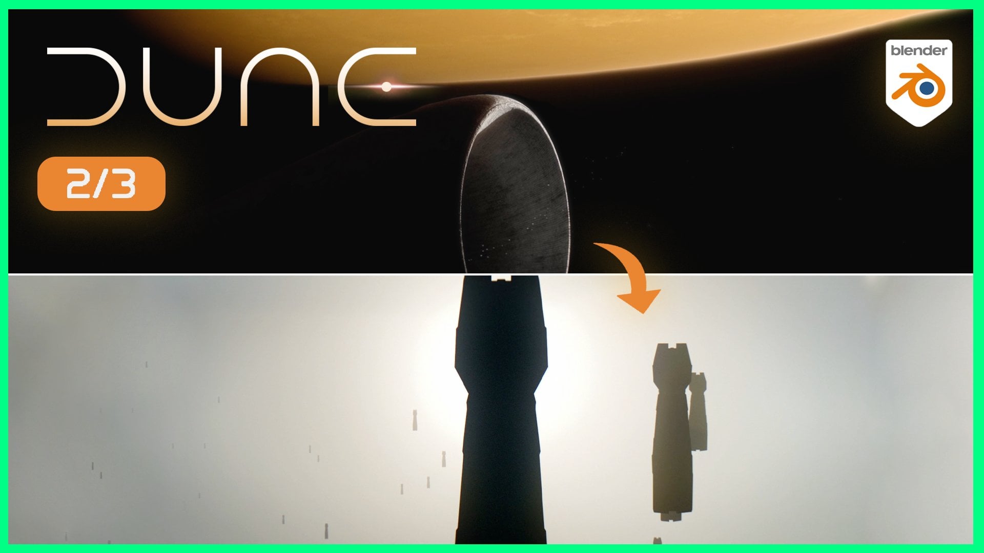
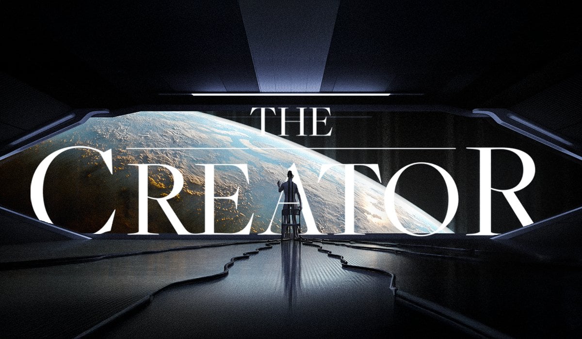
1. Intro to the Course: This is it. Welcome to the final part of the
Dune Master class series. In P one, we start our journey with the
Highlander in space. We then moved into the
atmosphere of planet Irakus, and now we'll build our
third shot where we have the carrier ship casting
its shadow on the Freman. Additionally, at the
end of this course, we'll actually tie all
three shots together into one single sequence
with a matching soundtrack. Just like from the movie.
Same as in part one and two. Everything in this course
is completely built from scratch with
one minor exception. But it's free. We start
off first by breaking down our shot and then
working on the composition. From there, we'll move into
modeling the entrance, lighting up our scene, expanding our knowledge of
procedural textures, and probably two of
my favorite parts, animating the
soldier's movement and creating a crowd system
using geometry notes. Once the scene is rendered, we'll jump into after effects, or any other composing
tool of your choice. The goal here is to add those
camera imperfections to help us bridge the gap
between three D and realism, and, of course, adjust
our scene colors. So with all that out of
the way, let's begin.
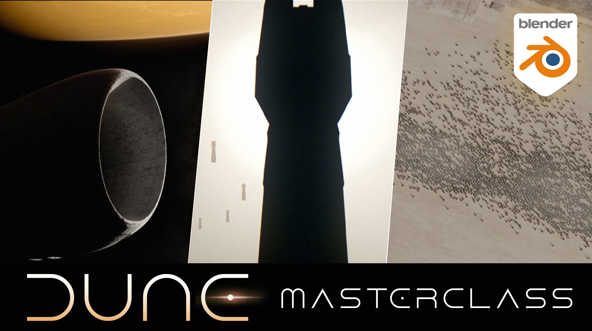
2. Scene Breakdown: There. I welcome
to part three of the Dune Masterclass series. In the same fashion, as in
the previous two courses, I want to start off
this video by doing a quick breakdown and analysis of the shot that
we'll be creating, while also talking
a little bit about the whole story line that
we've had so far, as well. With that being said, if this is your first time coming to
this Masterclass series, And you're wondering
whether you need to watch P one or P two in order
to complete P three. Each works as its
own standalone, so you don't necessarily
need to do that. While that being said, I
do also recommend maybe checking out P one and P two before jumping
into part three, especially if you want to
have the entire sequence that we have shown in here created for yourself as well
to be able to showcase it. So with that said, before now, I jump into
talking about the shot. I also suggest that you maybe turn on YouTube
and just type in on YouTube arrival to Iraqis and four K. So like arrival
to Iraqis four K, you'll be able to find
this exact sequence that we're now
trying to recreate. That was from the
movie Dune Part one. So, now with all
that out of the way, let's start talking about our final shot that
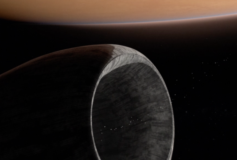
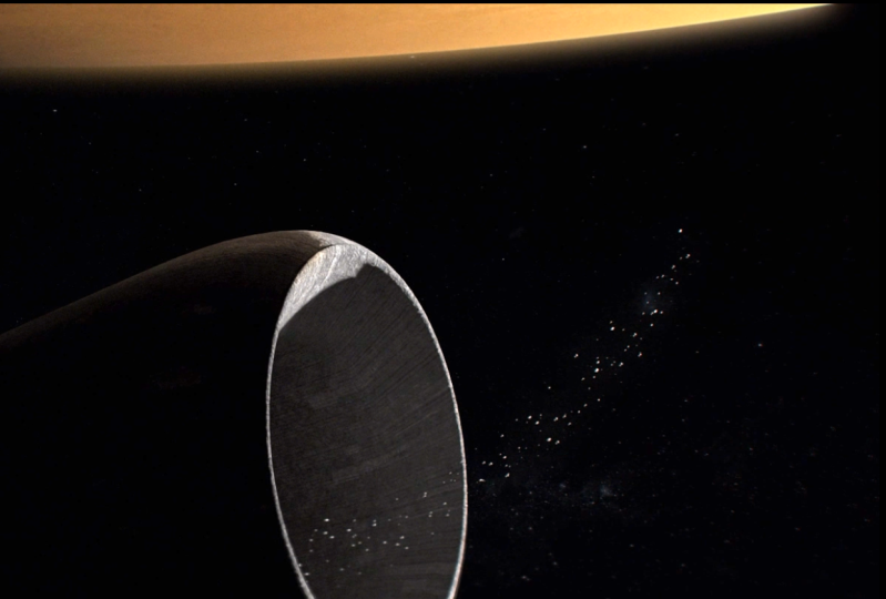
we see in here. O. So previously, we finished
off this shot where we had the ship enter the atmosphere from
the highlander that we created in part one. We entered the atmosphere. We saw the primary
ship right here, and now we see the
shadow being cast away by that ship
onto the Freman, which are the natives
of the planet, Irakus. And right off the bat, like, the big hallmark
of the movie Dune, something that I've already
mentioned a couple of times in terms of its cinematography is
that sense of scale. We see just how big now this ship here actually
is compared to all of these people and how big of
a shadow it is that it's casting onto them as
we see over here. And then additionally,
what's very unique about this shot is
its composition. And that's something that
we're going to be focused on getting right throughout
the entire video. And as a matter of fact,
it's going to be one of the primary things that we're going to start off, because, as you can see in
here, this line right here is being cast
away on purpose, right? The amount of people
that are being here coming from this
entrance of the Freman being held by the
Iraqi soldiers that we have right in here,
all being static. And then holding
that line of Freman goes exactly from almost one
corner of the screen two. So that's not an accident.
That was on purpose, done. Because otherwise, if we
didn't now have the shadow, this area that I'm drawing right now would be
completely empty, and the scene would
feel off balance. But because Now we have
an empty space here, we can utilize this shadow
or the shadow is being utilized to c of create a very nice and
balanced composition. So this whole scene feels very, very balanced because of it. So that's something that
we're going to be recreating. And in terms of,
like, the whole shot and the movement of it, unlike in the
previous two videos where we had camera
movement happening, you'll notice if you look
on the YouTube video, that there is actually no
camera movement in this shot. The camera here is
static completely. That being said,
though, there are other moving pieces
within the scene. As a matter of fact,
I believe there's around four different
moving pieces that we're going to have
to be keeping in mind. So we first have this soldier right here moving
in this direction. And then we have another one right here moving
in this direction. So we're going to be having to animate the movement
of these soldiers while all of the other ones here are standing perfectly still. Then we have a
secondary movement where we're going to have
the people from here going in all of these directions coming out
and landing all the way here. On this line. And then lastly, the final piece of the
movement is the shadow itself being cast
this part right here, that's going to be
moving slightly towards this direction. So three or four, depending on how you
look at these two guys that are moving inversely
towards each other, three to four different
movement types we're going to have
going along the scene, and we can see that also
in the second screenshot comparing the positioning
of the shadow versus here. And so, those are all
the little details that we're going to have to kind of keep in mind
when building off the shot. Again, the camera, the position of the camera is also going to be very important. So that's going to be like
one of the primary things that we need to figure
out how to work, because you can see that
the camera is definitely behind the people here. So it's a little because we can see their legs a
little bit there, and then the shadow
is cast this way. It's a little bit behind, it's also like how far away is it. So in order to kind of get
this as close to as possible, unlike in the previous
video where we kind of like cheated the idea of
distance and scale, here we're going to be
trying to use as close to as possible to real life size
values to achieve this. L. Then lastly, in terms
of our composition, we also have this
part right here, which we can't really
tell how it looks like. So we're going to have
to use some parts of our imagination to visualize
what the rest of it is, whereas the key and most important part
obviously is going to be this right here
of the entrance. Lastly, in terms of texturing, we're going to be creating the
primary texture that we're going to be focused on
creating is this ground floor, almost like, I'm not even, like, tileable blocks of stone, marble or something
because you can see these lines right
here going like that, and then over there. But then some of the lines are going to be a little bit dusty, not dustier actually because
we are in the desert. Like, they're going to
be covered with sand, and we can also see some
remnants of sand as well over here
covering some area. So all of these little details, we're going to be
trying to replicate as close to as possible. And then obviously,
the C D L Cm is going to be creating
a scattering system that's going to help us animate all of
these people coming out and finishing
off on this line. So, that pretty much breaks down the entirety of this
course and what's to come. And so I'm going to
conclude this video here, right at almost slightly
before eight minute mark. And I'll see you in the next
one where we're going to immediately jump into
our composition.
3. Composition pt1: Mentioned earlier in
the introductory video, I want to kick
this course off by first working on
the composition. So that's exactly what we're going to be doing in
this first lesson. So there's not going
to be any modeling, texturing, or anything
of that sort. Primarily, we're just
going to be trying to get our positioning
of the camera as close to as possible as on the example that we have right here on my bottom right corner. So, as per usual, on the left side here
in the left corner, you'll have all my
screen cast keys, so all of the buttons
that I'm pressing. And I've just opened a completely
new fresh blender file. Additionally, I'm
using the version 4.1. I think 4.2 came out yesterday or two days
ago, something like that. But for this, for this course, in particular, I'm going
to be sticking to 4.1. So, to begin, I'm just
going to start off by completely removing
everything from my scene. And before I even start working on the
composition itself, I actually want to
add what's going to be used for the trade soldiers. So all of these like soldiers or officers that we have
standing here in this line, I actually found a model that is going to be
perfect for our use case. While it has no similarity whatsoever with the De universe, it's going to be fitting
perfectly because we can obviously barely see what's going on here as they
look a little dots. So, if you go to mixamo.com and you press
here on characters, can scroll all the way
down to number two. And then somewhere
here, you'll be able to find a gas mask model. Or if you don't want to go
through all of this trouble, you can just use it from the resources folder that's
going to be attached, included with this
course as well. So once you download it,
just save it somewhere. And then once you're in blender, just go under file
import FPX here, and then just find a location
where you download it. For me, I have it right here. And then I'm going to go and press import FPX,
and there we go. Now it's going to take a second, and here we have our FPX model. And I'm just going to
press the letter in and then go on the item to
see how tall this guy is. So right now he
is 2 meters tall. That is fairly tall,
I would say, am. But for the purposes
of this course, I'm just going to keep
it in that height. The thing that I am going
to change is going to be its positioning,
its armature. We can barely see what's
going on here, like, what kind of position it
is that they're standing, but if you're looking at the
video reference on YouTube, you can kind of,
like, make it out. Their legs are
obviously a little bit spread in the arms
are kind of like holding a weapon or a gun or something in between
right here in the middle. So that's exactly what
we're going to be doing. So if you press with your
mouse here on this joint that's sticking right above the head and then
press control and tab, I should open the pose mode. Alternatively, you
can just go with your mouse here once you
have the joint selected, click on the pose mode, and then press old and Z
to go into the x ray mode, and this is going
to enable you to pretty much click on
these individual joints. Additionally, you can
see that we have already some keyframes here presented, so we don't really want that. We want to go here where it says animation under armature. Right click, clear all of the animation data.
We don't need that. So now, what I want to do
is just take this like R, move it a little bit
here, take this one, move it a little bit like
that, take the ankle, move it slightly there, take this one, move
it slightly here. Not too much, but maybe
something like that, maybe move this one a
little bit more inside. A little bit more
inside like that. And then for the hands,
I'm going to move this shoulder all the way down, this one all the way down. So I'm imagining like, if
you're holding your weapon, your hands are like relatively around your stomach like this. So what I'm going to do here is move this one slightly here, move this one r, just
slightly like that. And that pretty much
gives me a good position, I would say, overall. Like I said, we're barely going to be able to
see them whatsoever. So if I just go now back
into the object mode, this is kind of like
the standing position that we have for this soldier. And this is going to
be more than good enough as a matter of fact
when it comes to that. So, m here now, what we want to do
next is just use an array modifier to duplicate these
soldiers along a line. So I'm just going to
start off by having the soldier here selected, and then going modifier, add modifier, type in array. I can have it here
right at the very top. And I already know
ahead that I have 21 soldiers that I will
be using for this shot. So I already did accounting so that I could save you
from having to do that. And then once in here, what I'm going to do
next is click on here on the armature and
then just rotate R Z by 180 to have all of them rotate it in
that direction like this. And then additionally,
I'm going to add a factor here for some kind of
offset of around 25. So now they're pretty
much 25 meters, I believe, in distance
from one another. Kind of like what
we have over here, we might need to
do some tweaking later on, but we'll see. The thing is now that
we can start off by adding a plane that these guys are going
to be positioned. So I'm going to go shift
A and then mesh plane, and I'm going to scale
this plane by 200. This is going to
give me 400 by 400. I'm actually going to go
500 as a matter of fact, so here I'm going
to type in 500 500. And then I'm going to click
on the Armature and just go Gx and try to put them roughly here in the center
so I can better see, you know, what's
going on and such. Additionally, what I might
actually do Actually, let's keep it for now
and see if we need to. I was going to
propose to actually invert the number
here to negative 25, so that we have the main one on the left side,
whereas right now, the main one being selected
here is on the right side, but we can also go
this way as well. And in case we need to invert, invert it, we can do that later. So what I want to
do now next is if I start scrolling
out with my mouse, we can see that we're
getting that clipping issue. So if I go here under
n and then view, I just need to add
an extra zero, and I need to change my clip
start to one that way now, we have no more clipping. And the next thing
that would make sense now to do is add a camera, go shift a step in here camera. There we go. G Z. We can barely see the camera
because we're so far away. And as I mentioned, in
the introductory video that we're going
to be using close to real life scale sizes. So I'm going to
scale this camera because it is going
to be very high up. I don't know exactly
how much up yet. I didn't want to use exact numbers that I had saved up from my
previous attendance, but I wanted to show you
the whole process of getting to this type of
composition through kind of, like, brainstorming,
thinking out loud and such. So what I know I need
to do here next is just wrote reset kind of
like my camera settings, so I'm just going to go
here under rotation, change the rotation
purely to zero, so it looks all the way down. And then additionally here, under camera focal length, I'm going to use 85. So that number I actually
did memorize, and will, I have no idea if they used
85 millimeters for this shot, in my previous attempts,
I used that value, and it turned out pretty good, so I'm just going to
go stick with it. They could potentially
use 125 and. I encourage you to try a higher focal length if you
want to go with that way. In my case, this one had the best results
while experimenting. So I'm going to start moving the camera
a little bit more up, and now I need to preview what
I see within this camera. So I'm going to move this window actually to my external screen right here to the right side, and then I might be
dropping it in and out on the need basis, and I'm just going to move
this window all the way up and change it from the timeline
into A three D viewpoard. So this is going to be
for my camera view, the screen right here. So I'm going to go Tilta
and then view camera. And then while I have the
camera here settings, I'm going to go on
review for a display and change a passport
all the way to one so that I don't have that camera overlay
showing around there. And additionally, if
we look at our image, the current aspect ratio that we have here within Blender doesn't match the one that is used in the reference image. So we need to also
change the aspect ratio of our output to match
the one that's here, and that's going
to be 1920 by 816, which is the exact
same aspect ratio that we use in part
one and part two, which is that
cinematic 2.35 ratio. And if you're
interested more about kind of how to get
to different ratios. I talk a little bit about
that in P one of the course, where I also show you a
cheat sheet on how to calculate how to find out which aspect ratios go
for which resolutions. So if you're interested in that, be sure to check it
out in part one. Now, sticking with
here, what I want to do next is just take this
camera and just go up up all the way until
I can start seeing and now you see kind
of the issue of working with real life scale like everything is
becoming so small, so I'm going to try
to scale up here as much as I can to help me
figure out where is what? Additionally, what I can
also do is go here under viewpoint shading and add
a cavity and add a shadow. This is going to
help me kind of like figure out where these guys are because now I
can see all their little shadows that
are being left behind. And so if I scroll a
little bit more up now, I just want to make
sure that I have all of them in my shot. There we go. And another issue that we also have is we need to go under our data here for the camera and change a clip
here as well to one, and then also add an
end here to zero, so we don't have any clipping happening on that end, as well. Now, From here, we can
barely see these soldiers. So what I want to do is, let's see where my camera is. I want to start zooming
in a little bit. Maybe around here, and
then moving camera, let's see how many soldiers
we have over there. So RDs I think this is
roughly all of them. So from one end to another, this is roughly all of them. And I'm very, how would I say? I'm very calm about
having to move my camera. I'm not worried about
it because, remember, I mentioned at the intracourse, intra video, we won't be doing any camera
movement whatsoever. So I don't care if
my camera is offset in a different location or even rotation as
a matter of fact. That's exactly what I'm
going to be now doing. So what I want to
do next is right now my camera is
around 900 meters. I think that's really
tall. So I'm gonna go maybe 750 as a matter of fact. Because right now my camera is looking right directly
at these soldiers. And in this image, it's not really looking
directly at them. It's looking to the side
of them behind them. So I know that my camera needs
to be behind the soldiers. So that's exactly
what I'm going to be now playing around with first. I'm just going to go click on the camera and then just go G, and then y and just start
moving it a little bit more towards the
back here like this. And then additionally,
I'm going to go press r and then x and
then just rotate it towards the soldiers kind
of let's see around here. But then from here, I can actually rotate it
now on the Z axis, so I can try and start getting the look exactly the same
look that we have over here, where we see that
the last soldier on the top left corner is right below this 90 degree
cut of the angle. And then the soldier in the bottom right corner is right above the 90 degree angle. So this one is above
this one is right below. So I know that this
one needs to be below, and this one here
is right above. And this kind of
is already getting me that result that I'm
trying to accomplish here. So let's see, and like I said, we don't really need
to move these guys. They can all be static in
terms of their direction, because, again, if we look at our reference image right here. We see that the grid here is
kind of like all of the grid is moving in the same direction
looking as the soldiers. They're all looking in the
same direction, as well. They're perpendicular
perfectly with the entrance that we have
at the top right corner. So we don't need
to do any changes to the positioning
of these things. Everything can be pretty
much straight up, perpendicular with one another. And the only rotation
that we need to actually mess around with is
the camera itself. So from here, I'm
just going to move my camera a little
bit more back GY. And this is going
to be a trial and error process where you're going to have to move the
camera and rotate it again. Until you get the results
that are working for you. So, for me, let's see. This is actually
looking pretty good. The question only I have
right now is whether or not I actually need to rotate my camera just a
little bit more. Kind of Let's see I'm using this image
here as a reference. Let me drop it down a little bit more so we can
see a bit better. I'm going to put it.
Let's see where it works best for me
to put this image. It's kind of tricky.
I actually need mostly these things
here right now. So I want this guy here
to be a little bit more. Let's go like this
to top of you. View camera. So I want him to be let's go over here to top
you as a matter of fact. He needs to be just
a little bit more lower and closer to this
corner closer, just lower. So let's go click Armature, and then G Y, moving it slightly lower, and then G X,
moving it slightly. Further, just like small
increments of how I'm moving it. And I think this is
more or less okay. And then let's see what else
we are remaining over here. Let's just take a look.
The top left corner. Let's see how that
one's looking. The question here I have now is whether or not my camera
has all of them or not, so I'm just going to zoom out a little bit to see
if I'm missing any. No. Those are pretty
much accurate. And here is actually
very, very close. The only thing I would
do probably here, maybe is just do a very, very slight rotation of
the camera. Let's see. Maybe something He needs to be a bit more
closer to the corner. So around here, and
then maybe G X movement over the camera closer to here. And I think that pretty
much gets me very close to how we have it in this
diagonal right there. All right. So we pretty much
added all of these guys. And now we can just add a temporary placeholder
that's going to be used for the
entrance part over here. So we can kind of have an
idea where it needs to be. So I'm just going to
go on my top screen add a cube like that and just scale this cube by pressing
S and then shift and z. So I only scale it in these two axis of x and y.
I'm just going to scale it. Let's see. Roughly, let's see how much it's taking
from this screen. It's taking very little, so I'm going to go
start moving it now. Let's go move this here. And then let's move this guy this S shifZ a little bit more, so I can start
getting that look. I don't need to remember, I don't need to
rotate it that much. I can just put it
exactly like this. And I think overall, this is going to be
kind of how it fits. I can actually rotate it just a little bit because
I can notice that it's more present on this left side than it
is on the right side. But right about, I would say, G y, Gx x. Right about here, shift as Z, scale it a little bit more, G X. I'd say right about
here is how we have it. It is a bit more perpendicular and in line also
with these guys. I might actually just reset
its rotation to zero, and then just move
it There we go. So I think this, we have this shape right here, and then we have these guys, and then in between
here is going to be our crowd that's going to
be coming out everywhere. So I think for now, we pretty much have our
composition set up. One last thing before closing this video that I
recommend doing is, let's just add our timeline over here in the bottom window. Go timeline. And what I want to do next
is simply a key frames for my current camera position so that I don't lose it in case I do some rapid movement
or something with it. So what I'm going to do
here is just go here under location and then press
letter I to insert, and now I have key frames. So in case,
hypothetically speaking, you accidentally go and you move your camera somewhere or,
you know, you go like this. You can always press shift
and arrow to the left, and it's going to
reset the camera to the position key frame
that we just added. So that way, we have
now our camera saved, in case anything
goes haywire for us. There is our initial
composition. Perfect. So this
pretty much concludes the composition
section of the video. It's taken quite a while, but it's a longer
process, and that's why I wanted to
get it off first. But we've done pretty
good progress so far, and I'll see you guys in
the next video. Cheers.
4. Composition pt2: As I stopped recording
the previous video, I took a second and I was just going to close off
my blender file, and I looked at my camera view over here and compared it to the one on my
reference image and I realized how far off it was. I apologize because I got
startled by the 18 minute mark, not realizing that we still got a little
bit more work to do. So in this video,
we're just going to be tweaking our composition
a little bit. So one key indicator immediately that got me realizing how not correct the composition was
was the if I zoomed in here and I see that I'm
directly still above my soldier versus
zooming in here. Not just behind him, but I'm also towards
the right side of it because of the angle
where I'm looking at, I'm looking more towards his right side of his shoulder and everything here,
as you can see. So I know that I need to move my camera towards
the right side, and I know that I need
to move my camera back and further back and also below. So what I'm going to do simply on my top view here is
I'm going to press G, to move my camera. And also, I need to clear
these key frames right here. So I'm going to
click on the camera, press G like this, and then I'm going to press shift
and the letter x, and this is going to allow
me to basically kind of move my camera between
these two positions. And I think the camera should go maybe somewhere around here. And then I'm going to
press R and x just to rotate it like this. And then I'm also going to move my camera a little bit
more towards this side. I'm going to change the Y
angle not to be so steep, so something around
negative one like this. And now I just need to
continue positioning it. Let's see G y, slightly
more here. Let's see. And then maybe I take
these guys armature, push them G X a little bit
more towards your right side. Kind of like how I
have it over there. Go take the camera, move it, let's see, a little bit more. I guess around here, and then move a G
y further back, like this, and then rXle
bit more of this rotation. Rx X. I should have been
pressing rx x there we go. Now, if I zoom in to my soldier, I'm starting to get a much closer angle to
what I have in here. So I might need to maybe
R Z, just a little bit. R Z Z. Let's go R Z, Z. Just a little bit. Think if I compare
this one to this one, they match pretty good overall. So I would say this
is kind of the angle, almost, but now we need to kind of mess around
with the positioning. So we still need
to move this up. We need to move this X, a little bit more G a
little bit towards here. We can see we have
so many soldiers. And remember, we need to
have our soldier right up here as we have it in here. So we need to move
this G Y further. Up. And then this one
needs to be below here, so I might need to rotate
it a bit more G Y, Gx until I find
perfect composition. And I think this is very close
to what I'm looking for. So just maybe moving the camera, slightly more back, slightly
more towards the right, to get this kind of angle,
and then over here, I just need to rotate it a
little bit more. Let's see. Closer to here, G Y R z, and then G Z, maybe just you
make it match fit closer. There we go. All right. Let's take a quick
comparison look. And let's do a Zooming. So this zooming looks much closer to the one
that we have in here. There we go. And the reason I don't know if I've
mentioned this already, but the reason why I'm
being so nit picky around the angle and
positioning of all of this has to also do with the
entrance that we're going to be building
here because the door needs to be visible, and the only way the door
is going to be visible is depending on the angle
that we are looking at. So I'm just going
to now position this a little bit
more to this side. Go back, try to get it
closer to. There we go. S, shift, Z, scale it, G Y, move it a little bit. There we go, and then moving this also slightly
more like that. And I think overall, this gives me a very close idea of how this shot
needs to look like. I think this is really close. So if you want, you
can pretty much take my numbers that I
have already in here. So these are my
location coordinates that you can see over there. And then this is my armature, also location, rotation,
and everything else. And I would probably also
need to apply their scale. You see that there's
some kind of small movement by the
application of the scale, just in case I'm
going to apply it. I don't think it
bothers me that much. That is perfectly fine. Let's see if we zoom
in really close. This is how our
soldier is looking. Very, very close to what
we have over there. Similar direction that
they're looking. Yep. Think we pretty much got
the right angle now. And while this is now a
little bit less visible, if I make this larger
and now increase, now as you're starting to see, we can see the soldiers,
we can see their legs. It's still small, but it's
just noticeable enough. So there we go. We pretty much
have our soldiers, and here are also my
plane coordinates, by the way, so you
can see those, location 36, and then scale,
I'm going to apply it. My current size is 500 by 500, mature. There we go. Rotation, location. You can just pause here and copy these position items if
you want. There we go. So now we have our
composition set and ready, and then I'll see you guys
in the next video. Cheers.
5. Modelling the entrance: That we actually have our
composition completed. In this video, we're going
to be working on the top, right corner entrance construction
that we have going on. So we're going to be
doing some modeling. Up until now, we pretty
much try to as much as possible employ like
best practices of modeling, but because this is so far off, so distant, I think
we can kind of cheat our way a little bit
and do it in a dirty, but relatively fast
and efficient manner. So I'm just going to reorganize
my layout a little bit. I'm going to push
this slightly lower. I'm gonna zoom out a little
bit from my camera view. I'm going to move the
camera view by pressing shift and middle click with
my mouse to the right side, leaving the space here
on the left kind of half half so I can take a look at my composition
at the same time, but also have an eye on this entrance part that I'm
going to need to build. Additionally, as I was kind of like going through
my stuff here. One thing I noticed is
that these soldiers were a little bit above
ground level, you can see. So I'm just going to press
here on my armature and press G Z to move them
slightly down like this. And then additionally,
what I can do is also double check
if everything is okay. We're here, I can move this G Z, all the way here,
so it's leveled up nicely with the plane. And then lastly, I'm
going to need like a dummy for the Freman people here to kind of get an idea of the proportions
of this entrance. So what I'm going to do next
is going into my top view, shift A at a cube because I'm going to use this cube to help me with the proportions. I'm going to match
the cube roughly to the same dimensions of
this soldier by pressing S to scale and then shift
and z to scale only in the X and Y axis
without scaling the z, just so I can get roughly
these dimensions going on and then S and y to
scale on the y axis. We can get this
kind of dimension. And then additionally, G Z moving it guess this
is about right. I'm going to go into
my top view and just try to scale it
in the z axis until I can get roughly
something about this, because our soldiers were, if
I remember correctly, 1.79. Let's see, our
matures are 2 meters, and the soldiers
actual dimensions are 1.8 meter in height. So, not too bad. Okay. From here now, what I need to do is just
take this dummy and move it closer to our entrance placeholder
that we have currently. And we can pretty much from
here, start off modeling. But before moving any further, I guess maybe it
would make sense or we could apply the
scale slightly later. Let's just double check everything else
here has the scale. Let's check our soldiers
that they have the scale on. They don't. So let's just apply the scale here for our soldiers. O armature, everything
here is fine. Okay. Now, what I want to
do is kind of like separate this entrance into
three individual parts because we have this part
on the right corner. We have the entrance part that spreads roughly up until here, where my mouse is right now, and then we have the
this part that is similar as the one
on the right side. So I'm going to first
start off with the height. And looking right now, the current height of
this is says here, 2 meters, which is slightly
smaller than our guy. I'm going to change this
to let's try 8 meters. I think that should
work fine for us, so G Z, and then
moving it up again. And I think overall the height should be
more or less fine. We can change it later
on if we need to, but for now, this
should be pretty okay. Next, I'm just going to
scale this in D x xs, make it smaller to, let's see, roughly about
this much for now. I'm going to change it later. So then I'm going
to duplicate it, shift D, G X, and move it one here
to the right side so that it is nicely right
next to this guy, I can go Gx, move
it slightly more, a little bit more increments. Doesn't have to be
perfect. We go, and then I'm going to
go into the edit mode, press the bottom edge
right here and just G Y to extend this part, so I can start getting this
little design going on. And I think in terms of, like, how much we are
going to have it. This more or less matches it. I might do some
changes later on. But then I'm going to
shift the G GX, sorry, to move it to the right side, and let's just get it closer to our main entrance
right around here. And there we go. Just
by looking at it, I am going to extend the
edges a little bit more, so shift going to the Ed mode
while having both selected, so I can select both edges
and just extend them slightly more to about this much. But looking at this
entrance here, the entrance itself
is way too long, so I'm going to
also either, well, starting off first,
I'm going to move it a little more to the
right just by looking how much space here I
have for the right side versus how little I have
for the right element. So I'm just going
to start moving it until I get
something similar. So my right side
now is much closer. And then I'm additionally, I'm going to going in
to the edit mode, going to x ray, so I
can get a better view, select this face
right here and just start moving it to I would say, let's try this much
for now and then move this element
all the way here. Let's take a look.
Um, still not there. And definitely we have way too much of the other
elements shown. So we might need to move
everything actually a b mod until we
get closer to here. And I would even guess that
we need to go even further, roughly maybe this
something like this. I would say we're still
a little bit to too far. So that makes me think
that maybe we need to move this element a little
bit more to the right, and then this
entrance a little bit more to the left, like this. And so additionally,
one thing with this entrance that is
important to mention, as we look at the entrance, as I zoom in here on my
reference image, is the entrance is a bit
more towards the right side, as you can see right here
versus the left side has an extra space going on where
we have this extra kind of, like, baggage or something
not really sure what that is. So what I'm going to do
is just add a loop cut, and this look cut is going to
be used to kind of help me separate the two parts
two pieces of it. So I would say
roughly the entrance is going to be up to here. And then the rest of the
other side is going to be just where we have all of
the storage and, et cetera. Additionally, looking
at everything, I'm just going to move
slightly more to the left, and this is a little bit now
Net Picky. I'm fully aware. What's also going to help me a lot is just knowing
the fact that part of the entrance here on the top side here is cut off. And so, later on, that's
going to also help me whether I need to get the
right proportions or not. So from here now, what I want to do next is kind of I want to be
able to inset this part. And this is now where the
scaling is going to be important because if
I were to go here, press on this face and press I, the scaling of the inset
isn't going to work properly. So I need to go and
select everything here, press Control A, type in scale. That way, now I have a scale
all the way to one and I can do the same for
all of them like this. And then from here,
I'm going to press I, and now the inside is working, but if I were to press B to have the inside
go on the border, it's still not going
to work because we technically don't have a border. And in order to do that,
we need to actually remove the bottom surface. So selecting these two faces, pressing x, face, and
now we have them remove. G G Z, move it backwards
to where it was initially, roughly, I'd say here. And now, if I were
to press here inset, and then let her B, I get this. And that's exactly
what I need to kind of start helping
me create this door. So we have, let's see
how many levels we have. We have one small level, and then two larger levels
of insets and extrusions. So I'm just going to go and
start off kind of like this. This is going to
be like my first level by pressing also B, so it only moves up the border. Okay, so I'm just going to go here. And then
I'm going to press. I. So this is going to be my first level, very
slight extrusion. Then it is going to
be my second level, slightly bigger extrusion
roughly up until I'd say here. And then this is going to
be my largest extrusion, probably around this much, and I'm going to need to also
double check some stuff. And this is why we have
our little guy over here, so I can press now
G and shift and Z, so I can move it in
these x and y xs. I'm just going to put it
right next to as close to possible to the door.
So I can double check. Yeah. He passes
through the door, and I would say the height
is relatively more or less, looking at my image here
from a camera angle, more or less is accurate
to what I need. So, now that I have everything, I'm going to select this
entire set of faces, holding shift and lt and
clicking and going like this. And now we're just going to
be doing some extrusions. Before even doing that, we can also go in here and just delete this face so that we have a nice little entrance going on for us. And then pressing here, let's select t, shift,
and go like this. So, from here, I'm
just going to go press E to extrude
just a little bit. So just this much. This is going to be
for my first level. Actually, I might even
push it backwards, so G and Y, just a little
bit more, kind of like this. Then I'm going to select these two guys and then
do the same thing. So E and y and extrude it
slightly more, maybe this much. And then e and Y to move this guy a little
bit bigger than the rest. Also going to need to do
some extra adjustments. For instance, I can pretty
much right off the bat tell that this height of the bigger one is closer
to the top corner, so I'm going to
select this part, and I'm going to select this
part and just press G Y, move it a little bit more up. So it matches this kind of look. Maybe I went a
little bit too hard, I'm just going to move
it slightly more down. I'd say right about there is kind of where
we want to have it. And now I'm going to also
organize my collection. I've been kind of
delaying on doing that. So from here, I'm just going to start organizing
my collection. So, let's do that now. Let's go start with, let's see. Let's go with what we
have. Armature here. I'm going to go new collection, and I'm going to call
this Atrads soldiers. And I'm going to put
it in color green cause green is the
color of Atrads. And then I'm also,
let's see what we have. We have our ground planes. Let's call this ground. We have our entrance
here. Let's call this. Let's go here. Let's call this entrance. Let's call now this
entrance right. And let's see what
else we have this one called entrance left. Okay, I'm going to select
all of three of them, Press, M to move into
a new collection. I'm going to call
this one entrance. And we have ground. This is our placeholder. We need to also take
our soldiers from here, drag them. There we go. Let's call this ure static. Okay. And the
ground that's fine, and this is just
our placeholder, and then here we
have our camera. So we're a little bit
more organized now. What I would do next is, since we have this entrance, I would create a backup because now we're
going to be doing also some destructive workflow for modeling by adding
bevels and such. And so just in case
something goes wrong or we need to take a
step back and see if, you know, if it wasn't working, we can kind of like, have it. So I'm going to go shift to
here to create a backup. And I'm going to call
this one entrance backup. And just hide everything. So I have it like that. And then from here, now we need to start doing
some extra changes. So first things first,
I would say, as I said, looking at the entrance
and looking at everything, this part here needs to be kind of cut off,
as you can see. So either I need to extend this entrance or I need to move everything a little
bit more backwards. Let's just first start by
extending this entrance. Roughly, I would say
around this much. And then selecting everything, starting to move it a little
bit more backwards till we get closer to here and maybe even extending
the entrance a little bit more until I get
right about there. And that kind of
creates this little cut similar to how we
have it right over there, ops, zooming on the wrong part. So let's just zoom in here, push this on the right side. And additionally, now because we're going to be
adding bevels and such, we can go here under
viewport shading. Let's add a shadow,
let's add a cavity, so you can better see what's
going on on our side here. And I'm going to start by simply adding here right in this part. Or we can go from
a top down view as a matter of fact by simply
adding some bevels. So first selecting all
of the edges here, we don't maybe need
to have that one, but let's actually
deselect this part. So we only want to have some
cuts right in this area, so I'm just going
to press control B. And add some very, very small bevel, three levels, super small, might even
go just two levels, because it's barely
going to be visible. Let's just take a
look. Like this. Let's see thee segments.
Let's add one extra. I think that's perfectly fine. Now I'm going to
select this part. Let's just make sure everything
is properly selected. I could probably select all
of them at the same time. So this way, they're
all the same amount, and then press
control B and just add three levels,
just like that. Perfect. And then from here, I can pretty much
select everything except I don't need this part. Let's just deselect this. Do we have deselect
the bottom part. Actually do this another way, which is actually much
more appropriate, I would guess, by going on the first part that we want
to select, so this one here. And then just
pressing control all the way to the part that
we want to get up to, which is roughly, let's
see this one right here. I would say. So from there, and then having that one selected, going
all the way here, pressing control, clicking, and that's going to
select this entire edge. Let's just do a test so
we can probably undo it, but I just want to see how
everything here is going to look like. I think this is Pretty good with the fact that I would probably add
even more bevel. But then if we go more, that's just going
to ruin everything. So if we go more in there, it is going to ruin everything, so we just want to go maybe around here. Let's
just take a look. If we can do customs, that would that could
probably potentially help us, but we're not going to
be messing with that. So t's just have the other part also selected while we're at it, go in here, pressing
on this edge, holding then to move around and then going to
the edge that we want, which is, in this case, going to be this one here. There we go. And
pressing control B. Let's just take
another extra look. So to make this work properly, we probably need one extra edge or to figure this out because right now
it's being cut off. So maybe I'm just going
to pull it up until here. Let's see. That should
give me a better way. Let's just do the same, I guess in here so that they
are similar up until there. Yeah. And let's just do a
little bevel on everything. Like this. We're going to be so far that this is
barely going to be visible. But some of the things are still kind of nice to have. All right. So additionally, on
top of all of that, what I want to do here is move two corners slightly
more upwards. So I'm going to do a cut that's
going to go all the way, let's see from here, and we need to do this
part manually now. So I'm going to add another
extra cut from here, pressing letter K. Let's go add a cut one
more cut over there. Then these two, we
want to join them by pressing J, like this. And the reason why I did
this is so now from here, I can go press control B. And just spread this roughly. I'm going to say, I would
say right about there. It's going to be enough. And that's going to give
me these two points. I can actually go and select
inside, just to be sure. Let's go select like this. Let's go here and
select like that. And with these two points now, I can go and press G Z to
move this slightly upwards. I'd say right about there, but I also want to then go
and move these guys slightly downwards because I see that I need a little bit
more space going on. So I'll just move this now altogether slightly
more downwards. So G Z to get something
closer to this. And then I'm going to
select this part A Z, just make sure that
everything here is selected. Then go on this part, make sure that everything
here is selected. S X, move it closer to
make it a bit thicker. Let's just take a look
at the whole entrance. From above, this looks
pretty good, I would say, and overall matches
the look and field that we have in our
reference image. So once we have all
of that completed, we can additionally
probably go and add some bevels to
these two guys, so let's go and create a backup. We can just make
one backup since they're pretty much duplicates. So I'm just going
to call this one. Let's go shift D entrance, entrance, secondary
or entrance support. Let's call a support.
Backup. And since I've been capitalizing
the first letters, I'm just going to
stick to it like that. We have entrance support backup. I'm just going to
hide that one, and I'm going to give it
a little number zero, so it kind of stands on top. I'm going to this
one a number zero, so it stands on top of this. Okay. So that pretty much
solves our entrance apart. I would say, and
in the next video, we're probably going to be
moving to some turing next.
6. Adding sky texture: A pretty quick and
straightforward video. In the previous
one, we completed building our entrance over here. And now there are
two more little details that I forgot to add to it that we can use the extra little time that
we have in this video. And additionally,
the second thing that I want to do is add a light source for which we're going to be using
a sky texture for. So to start off with the two little details
that I'm talking about, at the very corners, there are like
these little lines here that I want to
do actually manually, and additionally,
this part here. It's almost like an
inside extrusion. That we can see going on here. And so, just to
create those lines, what I can do is take this
right entrance part element, and then I'm just
going to go into my edit mode, press control R, and just go and add a loop cut somewhere roughly just
by looking at it. I would say, just so
at least it's visible, so right about here is fine. And then additionally, on the other side, I'm going
to do the same thing. Control R, add a loop cut, and just drag it something
something closer to here. And now I can just
select both of them at it one more time. And then while I have both
of these edges now selected, I can just press
Control B to Bevel. And I'll say two levels, so just one, two levels here of
subdivision is good enough. Then I'll just add
roughly around. I think this much is going to be okay in terms of the indentation that
we're going to build. So once you have this
selected and created, don't click anything else, but go here under, let's see, extrude and then click
extrude along normals. And I should create
this little this line here that we see in general. Let me just double check. Ah. We also have these things at the bottom here selected. So
we don't really want those. So what I'm going to do
is press three to go into my face select and just
deselect that part. Let me see if I need to deselect everything else going on here. I would say, we don't need
this part here to be extruded, so I'm just going to
deselect that as well. I'm going to do the
same over here. And I'm going to
deselect this one here while holding shift
and just clicking. And so now from here, I can pretty much
just use this and, you know, press on
it and move it. I'm going to move it
inward. I'm going to hold shift to kind of do
it in increments. And I can already see how
much of it it's been created. And I think this is perfectly. Okay. Additionally,
what I can do now is kind of like the
opposite of what I just did, where I'm going to
go and now select, I would say, these faces over here and just push
them slightly upwards. So not like anything
extreme, just just a very, very tad little bit to give some extra detail
to the entrance. Nothing too fancy or extreme. But this is pretty much
already good enough. Overall. And then additionally,
if you really want, you can go in here and add some bevels to both
of these sides, and you can do the same,
I guess over here. So select both of these corners, Alt, shift, left clicking. And then holding shift, Alt, and then clicking
on these individually. They should open now having all these four edges selected. In control B, and
then just very, very subtly giving it a
little bit of a loop. Sorry, not loop of bevel. I'm I'm going to stick
with two levels of bevels. I don't think we
need more than that. I can go and scroll in here just to see how it
looks like currently. And I think this is more than
enough, one extra segment. Yeah. It will be okay, but I don't think it's
gonna be visible, so it's just
unnecessary geometry. But that pretty much solves it. And I would say maybe we
could also add one more bevel to this edge and one more
to this edge right here. So just selecting these
two and then pressing Control B and just sticking it to two levels for Bevel and just changing
maybe the width, making it slightly thinner. Right about there is
more than enough, ok, maybe a little bit more, but something around here is really more than
enough than we need. So that pretty much gets us going with
everything over here. And as I said,
these are like not the best practices for modeling. It's a very dirty and quick
way of building this. But we don't really
need to follow best practices for this part because this is going
to be a static object, and we're going to be
using procedural textures. We're not going to be unwrapping this to the extent
of my knowledge. So it should pretty much work
everything as is right now. And, you know, just in case, if something does go bad, that's why we still have
that entrance backup that we've created a while back, if anything goes, hey wire. So, now with all
of that created. Well, let's just use a couple of more extra minutes to
go here under color, where we have the world. And we can just go and add
a sky texture right now, it's not really visible for me because I have everything
in here. Let's see. I'm going to need to move this
guy a little bit here just so I can go and
add a sky texture. But before moving anywhere else further within this sky texture, because if we were pressing
render here or on our camera, we wouldn't be able to see
anything considering that we still have our render
engine here set EV. So let's just go and
change from EV into cycles. I'm going to be using
my viewport around. For now, I'm going to
stick with 200 samples. You can go even lower
than that probably. And here, I'm just
going to put it 400 for when I do do some rendering. And I'm going to turn on
also some de noising in case there is some extra noise happening even at 200 samples, although I don't think that
there should be anything. Since I'm using a NVD GPU, I'm also going to
change this to Optic X. Optic X Optics. Ably Optics. Then I'm going to also change to start sample Abdo and normal. Start sample here. I'm
going to go to 200. So once it gets up to 200, I'm just going to do
some extra de noising to get rid of any noise that
maybe remains. All right. So that pretty much gets
everything here ready. So what I can do
next is just go Z, press rendered over here. And so show me and I
can go do the same just over here to see how my top view is going
to look like now, everything is super
bright, obviously, because everything
is white's here, so I'm just going to
take this one as a solid and just rely on the
one that I have over here. First thing that I
could probably work on is just like the
rotation of my sun to try to figure out where it needs to be in terms of
like casting its shadow. So I'm just going to go and
push this maybe I don't know I'm thinking maybe 150 is just going to do
the trick for me. And I think 150 kind of does hit it around the spot more or
less to what we have in here. And then also the next will be maybe the elevation of the sun, considering how what kind of
shadow we have over here. So if I'm to raise
the sun up, maybe, let's see 30 since
we're already there, that's going to cast
a shadow like this. Then the sun size, I could
probably have over here. You can probably increase
the size to make the shadow slightly softer. This is maybe pushing
the shadow softness way too and we still see the shadow, I guess, but the softness
is way too much. Let's just reduce the intensity, so it's not going to
be so super bright, so let's go with like 0.20 Maybe let's go
increase that number to 23, just a tad bit. Let's go lower 0.1. I think that's a bit
more of a flatter light, kind of like how
we have in here. The light is relatively flat. Altitude. Altitude, we're going to keep the same for the air. I'm probably going
to push the air to zero. Let's see over here. And then Uh, the
dust, let's see, I could probably have
the dust maybe go around two point
something maybe 2.9. So it's a bit dusty around it. And let me just see if
I did anything else. Now that pretty much solves it. We can also push
our ozone to zero. And I'm going to also reduce my strength here just
to go maybe 0.28, something or maybe even more. Let's see 0.35 These
seem to be values, similar values that
I used before. And then obviously, we're going to be
maybe changing them, so we don't need to get married to these values right now. But as long as we have
some kind of a flat, but also, like dusty
light going on here, that's going to help us
now when we jump into the texturing of our
surface over here. So in case later on, we do decide to maybe change
the light a little bit. Maybe, for instance,
we can reduce the size of our sun if we want
to have a sharper shadow, as you can see,
them the sun size, the smaller the source
of light in general, they're sharp, they're
shadow over there. I'm just going to
stick it now to 23. That pretty much
concludes this video at the ten minute mark, and I'll see you guys in the next one where
we're going to be starting to texture this play
7. Texturing the ground pt1: I first glance, the ground might look quite
simple to achieve. You just take a couple
of noise textures, put them together and you
get the final result. There is some thought
that we're going to need to put behind in order
to get this look. For instance, obviously, we have these grids
that are going on. But if we look further deeper
into it, for instance, these lines, we can
see that not all of the lines are
equally as visible. For instance, look at this
horizontal one that I'm hovering with my mouse versus the one that is going like this, sorry, vertical one
versus horizontal one. Then additionally, let's see
if we have similar examples. Then there's some extra
dirt. Look at this corner. There's a little bit of extra dirt going
on in here that's slightly different color than
anything else everywhere. And then when I
look at the shadow here, in this shadowy part, there's an accumulation of
sand because we can see everything a little
bit more wider here kind of paled out. And then additionally, going
more further to the left. There's some extra detail here where we can kind of see
these little stretch marks and stuff going horizontally
just around here. There's a lot of
different applications of the noise textures that we are going to need to do in order to get
this kind of look, and it's all about stacking
them on top of each other, calibrating them and just doing small altercations as
we go further along. The goal of this texturing phase is obviously going to
be to set everything together so that we can
later on once we go pre render the last
steps, be very nit picky. But for this video, we're just going to do a couple
of texturing parts. We're going to kind
of split this video into multiple takes. So, let's jump into
the texturing itself. I'm going to just rearrange
some of my stuff in here, so I'm going to push this a little bit more towards
the right side. And then additionally, I'm going to move this not slightly up, but just enough so that
I can zoom in here. There we go. Just enough zoom in so I can kind of see and
then use this real estate, I guess, for my PRF. That
should be pretty fine. Right? I'm going to
go here Z rendered. And then on turn on my screen cast keys,
they're already turned on. But let me just put them if it's possible on the top left
corner there we go. That's exactly what I wanted. And then for this
part, I'm going to use this area to go under
my Shader editor. Now, just make sure that you
have your ground selected, and let's press new
to add a new texture. We're going to be
working primarily off of the base color because
everything else is just going to be a
derivative off of it. So for the base color, there is one texture within
Blender that's going to allow us to get this
grid like look. And so that's going
to be called a brick. There we go. And immediately, you can see kind of
how it looks like. So we're going to start off with a couple of these settings, and then we're going to jump
into the color later on. So for starters, we see here
that we have the offset, which controls now horizontally the positioning of these lines. And then the frequency
shows us how many, you know, these lines we want. So it kind of creates a
little bit of randomness. And that's not
really what we want. We want to go completely
opposite of randomness. So we're going to
go here und 0.5, which is its default setting, and we're going to change
the frequency here to one. Additionally, for squash, which is kind of
like the same thing. Just on a different area. We want to do 0.5, and then change this
one to one as well. For the vector itself, we can pretty much just
press control and t to add our texture coordinate
and our mapping note, and I'm going to push this
above so that I can have some space for both my color
one and two and mortar. Mortar is basically the color of these
lines that you see, and we'll deal with
that as well later on. Now for my scale. I want to change the
scale of these cubes now, so I'm just going to go push this number a little bit more to something that I used on my initial test,
which is around 7.5. And then lastly, what I
need also is now control the mortar size and
mortar smoothness. So, as I said, mortar is
this lines that we see here. So if I go under size, you can see it
becomes like barely visible or super large. And I just wanted to
be super super thin. So I just need to go some
really, really small amount. So I'm going to try, like 0.002. And I think that's roughly around the number that
I used initially. And then I need to do the same
thing for the smoothness, which kind of controls how
sharp these lines are. Just want it to be
something barely maybe around 0.7 is going
to be perfectly fine. I think I use that I used 0.66, but 0.7 is just okay, as well. Then we have bias,
and the easiest way to kind of like to show
you what Bias does is you can already
notice that some of these colors are black
and white and so on. So Bias, if I were to turn this color red and if I were
to turn this one green, Bias does exactly that. Kind of like blends
the two colors on a random positioning. So you can see if I go negative one, everything is red. If I go One, everything is green, which is color two, and
then if it goes zero, it kind of does in between and also combines
them in between, which gives us this color. We have a couple of
different variants. So in our use case, actually, we're going to primarily use only one color versus
all of the other ones. We're going to have
some color two as well, but not that much. So as a matter of fact, what
we can do with our bias is just push it to like
a negative 0.9, which is primarily
going to be color one with just a few parts of it, as you can see here, having
elements of color two. There we go. Alright.
And while we're at it, we can actually just
adjust our color two to be something close
to this image. What better way to
kind of take it, but then to take it
from the actual image. So I'm just going
to go color two, rest here on the eye
dropper tool and just drag it somewhere around here, and it's going to
give me this color. And for now, I'm going to go and copy this color as
well under color one, even though later, and we're
gonna change just so we get like a decel look of
what's going on here. Order we're going
to deal with later. And then we have
also the last part, which is the brick
width and brick height. So here, I think we if
I keep it as it is, it's going to be pretty
much the same result. What I did in my test is I
used value of six and three. But I think that
should pretty much give me exactly the same result. If I look at these two soldiers, how they're standing here. And if we had five and 0.25, or we had 2.5, sorry. It is actually way bigger, so I'm not really sure
what just happened here. We had 0.5 and 0.25. There we go. Oh, it is
actually slightly smaller. So what I'm going
to do here is push this to a six and a 0.3, which is going to give me
slightly bigger increase of these lines, where almost each soldier has its own little grid under which it stands with the
exception, I think. With the exception
of these two guys, each soldier is in its own grid. So that's pretty good. There's also again, these
two guys here somewhere. So we can maybe change
play around with the with, let's see, modifier
here and change the relative offset to maybe be a little bit
different number. Maybe 27. But again, this is something that
you could do later on, doesn't need to be done now. So maybe I'll just
push it back to its original value of 25. In any case. Now, moving
on to the next step, we're going to start
working now on Color one. And the first goal that we
want to achieve with Color one is going to be getting this kind of like stretch
mark combination of this little stretches and some extra grunge
going on in here. So I'm going to start off
with a simple noise texture. I'm going to take the color one, go here under noise. Just use a noise texture. I'm going to press control and letter T. And additionally, I'm going to go shift a
at a color ramp in here. Just push it a
little bit more so I can see better what's
going to be going on. Let's go drag this a little
bit more to the side. Let's now just start changing some of these noise settings. I'm going to change the
scale to roughly 3.2, so I can start seeing some
noise going on in here. And then detail, I'm going
to increase the detail to maybe around 8.2 roughness. I'm going to push
all the way knury. I'm going to keep as is. And now the most important
part in helping us get this little stretch mark is actually here under
scale of the Y. If we start increasing it, it's going to start, like
squishing it all together. So I'm going to go to around
77.5 is I think what I use. So that kind of
gives me that little stretchy look right
there that I want. But then additionally,
as I mentioned, we need to do we need to stack a lot of layers of
noise on top of each other. And so this is just going
to be the beginning. What I want to do next is
just take this noise stture. Keep the settings exactly as
they are, shifty duplicated, press control t to
add another mapping, and this one is going to
be fully resettd with 111. Then take another
color ramp like this. Take the factor, combine it. Let's just preview it to
see what we have going on. I'm going to push
this one a little bit more in here
and push this one, maybe actually keep it as is, but then just add a
little bit more extra. And now I want to combine these two together. So I'm
going to mix them. I'm going to press
control, shift on my keyboard, right
click on my mouse, so I get this two
dots with a line in between and just drag it until both of them get
highlighted with the green color. So now they're pretty much mixed together
once I release it. And for our mixing,
what we're going to do is go all the way to one. So now we see only Layer two, but we want layer
one to be stacked using multiply so all the
dark values get on top. And that's when we get
this kind of look, which is exactly what
we're going for. So the last thing
that we now need to do is kind of like
add it some color. And so we can just go under let's actually just
take this color rim that we have from here and then drag it into this one that's
connected to the color one. And for the colors themselves actually have have
them saved over here, so I'm just going
to add on this one, the color that I used
in my initial test, which is 7b6f 64. And then I'm going to take
this one and try it a little bit more here
and use this value, and let's now preview how is
this supposed to look like. I'm going to drag
these a little bit more to start
getting there we go. And now it's starting to
look much much better. We might need to do some
little extra tweaks later on, but as a baseline, this is a pretty
good starting point, I would say, for our color, so we kind of we're
going to be adding more layers now, by
the way, to color one. We're not done with color one
yet, as a matter of fact. This is just kind of
like the first step. But while we're at it,
we can actually also we can pretty much also go
here under our mortar color. And let's just add a gradient. Here, let's just preview
the prick txture for now, and we want to just add
some kind of a color that's going to be
used for these lines, but that's going to
blend enough so that not all of the lines
are equally as visible. So for the colors here, I'm going to use,
let me just see, I have them saved in here. So on the left one, and on the right one, let's
just split them like this. I'm going to go 88074. Again, all of the colors
are very similar, and most of the
colors are actually extruded in myself just by
you know, clicking here, going here and then clicking
on certain elements to get as close to as possible, similar to the use cases. And then the second
color is going to be one that's going
to go in here. There we go. And then I'm going to connect this to the mortar. And then additionally,
what I want to do next is press control T so that I can kind of add an image not an image
texture but a noise texture. Sorry. So let's go shift A. Typing noise, noise texture. And I want this noise texture
to be four D so that I can also play around with the
W value if I don't like it. So once I combine
everything here, I just put it under generated. And if I mess around
with the W later on, that's going to be giving me We can barely see
it here, obviously. But you can see some
changes now going on once I zoom in closer and
start moving the W value, which just moves the
texture a little bit. So if I were to preview it, here's what will be
going on. There we go. So for the W, I'll
just put it under one. I'll just preview
the brick texture one more time. Perfect. And then what I want to do now is just change these
values a little bit extra. So for scale, I'm
going to decrease the scale to let's
go around 0.3. Let's actually take a
closer look what's going on with this texture.
Once we're in here. Let's change the detail. Increase the detail
a little bit. And then like arity, we can push it all the
way to ten, maybe. Now as we're starting to
get these little dots. And then additionally,
I'm going to just change the distortion just slightly
to get something like this. Let's try to preview the color, see how it looks like
and go into here. And now we can see that some
of these lines are being blended while others are
kind of a bit more visible. And again, this is
where now you can play around with these two. If we push the darker one, it's going to be
slightly less visible, as you can see versus if we
go with the lighter one, it's going to be a
bit more visible. And then if you want to change with the kind of like
which areas are, which areas are and you can
play around with the W, which is going to
just manipulate the noise a little bit extra. And there we go. So this pretty much concludes the
first part of texturing. In the next video,
we're going to continue adding some extra
layers to our ground. I'll see you guys there. Cheers.
8. Texturing the ground pt2: This video, we're going to be adding one more layer of detail onto our ground texture in
order to be able to add, but also control this group
level of sand that we see, for instance, under this shadow. So not just the detail that we have currently
right now that we have but I also want to be able to add a larger sum of sand
onto specific areas to cover these lines
and such and also be able to control the level
of detail on that as well. And so That means that
we're going to be adding another noise texture into our here combination
that we have going on. So for starters,
I'm just going to move every to the
left so that I have a little bit more extra room on my screen to play
a route with it. So to start off, I'm
just going to go here, typing in Lois texture. I'm going to press control T. And also I can
add a color ramp. I think I can pretty
much use this one from here as a starting
point for my factor, and then press
control shift left click on it to start
playing around. So I want this to kind of
be evened out a route here. And the goal of it is to, like, see these little smudges that we have
currently right now, to just add a little bit
of detail to those smudges and make them look almost
like sand accumulations. So to start off first, I'm just going to maybe increase
them a little bit more. And then I'm going to crank up the detail to maybe around six. I can keep the roughness
roughly where it is, but then I think the real
magic is going to come once I add some
extra lacinarity. Two, maybe around, let's see, three or I think
three is too much, so maybe let's go 2.6. That's pretty good. And so then sometimes when wind blows, like, it can move sand in
almost like wavy shapes. And so for that,
I'm going to add also a little bit of
distortion to give it kind of like that wavy look like
here as we have right now. Okay? And then lastly, you can also play
around with your scale, kind of maybe stretch
stretch it out in one direction and stretch it
out in the other direction. And now on top of all of that, you kind of want to
be able to, you know, if you don't like this
version, to have another one. And so this is where our four D is going to come into place
so that we can, you know, play around until
we get some kind of variation of these darker
shades that we kind of like. And I think this is a pretty good starting position
for me personally. What I want to do
next is just go here and remap different colors
through my color ramp. So I'm going to go into my project file here that
I have on my other screen. And just start copy
pasting these values from it because I can pretty much rely that these
are the good ones. So for the left one, I use C 6b4e2, and then on the right
one, I use, let's see. 7c71 66. And as mentioned way way before, you know, the way I
came across these, is just by using
kind of like the eye dropper tool and
testing it out on certain surfaces
throughout this area and then just manipulated them a
little bit here and there. So now we need to kind of clamp these two guys together to
get a bit of a better result. And now I can start seeing
some shading going on. Let's move this one
a little bit more. Let's move this one a little
bit back. There we go. We're starting to see
some accumulations right around this area, so that's pretty good. Overall, I would say. And
some darkness right here. Perfect. So now I
want to also add another layer of detail of sin, but this one is going to be more granular on top of the one. So I'm going to go noise
texture right here. And I can immediately just
add it for D, press control. T. There we go. And for this, again, I'm I'm going to use the
same color round from here. All right, plug it
in here. Preview it. I'm going to clap
it roughly around here and then boost the scale all the way to like
56 and super large. Add all the detail, add
some roughness, like that. Let's see, keep the lacuarity, or increase it or decrease it. Let's see. For the lacarity. I'm just going to go
around 1.4 for now, no distortion need on my end. And let's just use the same
colors as we did over here. I'm going to click on this
one. Add a color in here. Click on this one. I
guess I missed the color, so let me just add
one on the left side. And there we go. Perfect. So now I'm
getting a little bit of this nice little granular detail going on and you can even push this a little
bit more to the side. So next thing I'm going to do is combine these two together. So I'm going to press
control, shift, and then bright click so I get these two dots with the line, move it downwards so that
I can get a mixture, and then from here, I'm going to add them together. And move everything
here to the side. I can kind of see some levels of detail being added
here granularly. I need to mess around
with these values. But additionally, what
I want to do also is map these colors out to
something slightly different. So I'm going to go search
color ramp one more time, and I'm going to use
another pack of colors, similar to this one,
but slightly off. So for that one, I'm just
going to go in here, copy taste them. Here we go. I'm going to move
this one all the way here so I can clamp
it with the one. And then on click
on the other color. Again, these are very very similar to the
one that we used previously just slightly
darker and lighter. But here we go.
This is giving us some extra little detail you
can see. Right around here. And so now, You can pretty much control all
of this just by playing around how big you want the sand mass being here
or how big and greater, and then how big you want it as well through this one there. And additionally, what I
want to do finally now is to mix these two textures
together. Matter of fact. So I'm going to go
control shift and then right click, mix
the two together. But I want to use this noise
here that I have marked. Has my mask to
dictate which one, which area is going to be
covered by the top texture, which area is going to be
covered by the bottom texture. I'm just going to
take this factor, lie it all the way in here, and then use a color ramp. L et's previate what
we have going on. Let's actually
previate this noise. We want to clamp down this
noise a little bit more. So everything that's going to be black is going to
be the top texture, and then everything that's
going to be white is going to be the bottom texture
that we have going on. So let's just try or something like this and see how
it's gonna look, right? Let's go mess around with
it just a little bit. So if I move everything
to the left, you can see that we're kind
of losing the top texture, and it's probably going
to be the right one, and then if I move
everything to the right, we have more top texture. So I would go
somewhere around here. But then for instance,
if you're thinking that there's too much of
this darker area, you can I think pretty much go if I'm not mistaken
this part here or we could even
move there we go to control how much of the
darver area you want to have, but I'm going to stick
with the current values. And then later on, once
we're dealt with adding all of the detail onto
our principal BSDF, we're going to come
back for a final round of being very nit picky and controlling all of our
settings to something else. But even with this right now, I'm pretty satisfied
because I know that these results have
worked for me previously. And one more thing that
we could also do is going here under the color
ramp and noise structure. I'm going to actually add more
detail to our lines here. And as well, let me just go and add a little bit
more roughness actually. So detail, I'm going to
go roughly was it before. It was three, so I'm
just going to push it slightly higher
in there broughnes. Is go all the way there. And now I'm going to plump
these two together so that we kind of start getting
more of these smogs, coA like that on those lines. Not too much 'cause then,
something like this. I blads really nicely also
with the sands right below it. Perfect. So I think that pretty much concludes this video, and as mentioned
in the next one, we're jumping onto other
channels for our principal BSDF. So I'll see you
guys there. Cheers.
9. Texturing the ground pt3: We're pretty much done
with the base color. We can jump into
the other channels or our principal PSDF. The only two actually being our roughness and the
bubble map itself. So for the roughness,
there's really not much work that
needs to be done. What we can do is
just take this p a little bit to the side
at a color ramp because we need to convert
our pre tture here into a black and white value for our roughness map to work. So now that we have this, we can plug it into the roughness. And so everything that is darker is going to be
a bit more shiner, everything that is lighter, is going to be more
rougher, and actually, we want the majority of our scene to be
actually quite rough, so we're just going
to drag this all the way to get pretty
much everything almost rough to something. I drag it even more, something like this and then we have
a little bit of these, like, slightly darker areas that might be a little
bit more shiny, but I would probably even
track this up to make them slightly lighter
because we don't need nothing to be shiny since we are obviously in the desert and
there's no water. All right. So that really pretty much
concludes the roughness. So the rest of this video, we're just going to now
jump into our normal map. And for that, we're
going to combine two of these color ramps
that we have over here. So to start off, let's go
first and go into our normal, drag it down here and
type in bump so that we can add a normal bump node here. And then we can go and
take this color ramp the top one right here and
drag it into the height. But we also need to convert. And even though we can
see some of the things actually already
happening over here, we do need to convert this color ramp it's better into a black and white
value for a bump. So going into the color ramp, black and white, and now
we kind of have this, so we can maybe clamp out the
values just a little bit. Going on here. But
one thing that you might notice if you scroll
further down is that, okay, this is obviously
way too much, so we want to change it
to maybe, I don't know, 0.3 and here 0.16 or something. But if I were to
preview my pop nose, so Control shift left click, you'll notice that
everything here goes also over these lines that we have created if by
zooming really close. Now obviously, we're
going to be really far, so you're not going
to be able to see it, but from, you know,
practice a standpoint, let's just call it that way. You don't necessarily
maybe don't need to, but I do want these lies to have a little bit of an indentation, kind of like how
here they have it. And so to do that, I'm
going to pretty much copy or duplicate this
pretexure above while keeping all of the
settings pretty much the same. The only thing I'm
going to change is actually the colors
one and two here, you're going to use a lighter
variant for the color. So let me just go in here. Can take this value
and go F ff25, base it over here. There we go. And then let's see, I'm going to basically
combine these two together. So control shift
right with my mouse, drag it downwards,
go into the mix. And now I have my
multiply in here. So the reason you
can already see, even before, let's just go on. Now we have an indentation. So this is what's
going on right now. Everything that's darker is
going to be pushed inside. Everything that's brighter,
is going to create the illusion like it's
sticking outside. And so now if I go
under multiply, we are having this color ramp being overlaid on top
of this brick texture, and so if I push it all the way, now, it's going
to be pure black, and that also means it's
going to be nice like this. Obviously, we don't even
need to go full pure black, we can mix it up a
little bit if you want. I think I'm going to stick with I'm going to stick with you're black actually
as a matter of fact. And then I'm going to
maybe clamp up this value. Let's just preview the
bump map a little bit. I'm going to clamp this
up a little bit more. But overall, these numbers
seem to be pretty good for me. Now we're going to also add a secondary bump map so
that we can, you know, combine these two and also use this bottom color mp
that we have created. And so for that,
I'm just going to go take this or actually, I'm going to add a
fresh bump map right here. T up and bump. This one is going to be
one and one like that, and then I'm going to plug this all the way
into the height, while also additionally,
I do need to add a color ramp that's
going to give me this black and white value. And from here now, I can just take this bump map. I'll just preview it by
adding it into here. For now, And let's see how
this is looking, so right now. It's not really looking
like much because we Oh, there is something
definitely going on, let's actually zoom in here. There we go. So it is looking quite
interesting altogether. So if we were to, you know, move this values a
little bit more, we would either decrease or increase all of the
stuff going on in here. I'm pretty much going to
keep it roughly around here. And now what we want is to
combine these two together. So control shift right
click, go into add. Like this and then
push it like that. But one thing additionally that I want to do here
now with all of this kind of creative is I'll
just push this slightly lower is also tell blender to have this secondary one only in the areas as we
have it split and here. So that means I'm going to use the same color ramp that I
used for the factor to split these two textures to
do the same pretty much and just drive it
into the factor here. Of the add one that
we just created. So that way, it's splitting this as well in the same manner. So now I'm moving these two together and previewing
this stucture. This is kind of what
we're getting so far. And I might even lower
this just a tiny bit. In terms of its values, maybe go like roughly
somewhere around here. Let's just zoom out. Let's move this to this side so we have a little bit more real estate. And here we go. Now, obviously, as I said, we're going to be having
a whole separate video to kind of like tweak
tture once we're done. We might even do
that in the next one since this is pretty much it for adding anymore. We don't need to
do anything else on our material for our ground. And I actually didn't name it, so let me just nate
material clothes ground while we're add it. And Yeah, I would say, let's actually call it
a day at this part, and then in the next video, we're going to be tweaking all of these values
a little bit to our liking to see if there's any changes that we want
to do additionally.
10. Texturing the ground pt4: Video, we're going
to do two things. One of which I kind of do
recommend that you do, whereas the second one is more a matter of a
personal preference, so you don't necessarily
need to unless you want to. The first one being
is going to be very short if we really zoom
in close, and again, I don't know if we will
be probably we won't be able to see the fact that
it says swat on these guys, but just for I don't know, I just kind of want to
get rid of it personally. So What are you
going to do here? If you go under CH 35 body, I believe that's the one
that has the texture, so if I cut off the
base color here by control directly with muscle
when I get the s knife. It's going to cut off this. So if I go here, let me just go at a color ramp. Plug the color ramp in here, and let's also have a
little small noise texture. Let's move this
little to the side, plug it in here as well. And have this color B. Let me just get it from here. Slightly brownish. So 231 f1c. And then over here, I'm going to have pretty much
a similar color, just got to drive
it slightly more up to make it a
little bit brighter. So something like that. And then just, you know,
Mr. Row will hit this, crack up the detail, maybe
crack up the roughness. And pretty much hit him. There you go. Like I said, he can barely got to
be able to see this. So I'm already
satisfied with how it looks like as long as
we don't see the swat. And like I said, when
you zoom out really far, I don't know if you're
going to be able to see this or not, but, you know, just for
the sake of it, I'm going to have it that way. Now, the second part, the one that you don't necessarily need
to do is if you're satisfied with how your ground texture
is already looking, you can pretty much
skip to the next video. The second phase of this
video, essentially, I'm just going to go
through some of my settings here that I want to kind
of a little bit tweak. For instance, you know,
my color ramp here, my W values for the
noise textures, and also going to,
increased sites slightly. I'm going to add here 0.17. This was the value
that I used in my initial first take
when doing this video. So starting off, I'm just
going to go now here. And like I said, you don't
necessarily need to do this. This is like I said, a matter
of a personal preference. I'm just going to push this
slide in more to the left, which is going to
decrease the amount of these slides
that are visible. Then additionally, I'm going to go all the way in here and just start playing with my W
value to see what kind of variation of this kind
of sand cover I can get. This is already way too much,
so I'm going to, you know, change it, but something
something along. Let's see. Let's go. Well, I kind of, like, kind of, like, something. Like this where you
have a little bit of sand accumulated over here and some extra sand being
accumulated on this side. So I'm going to stick to this kind of version,
pretty much like it. And then over here, I also
have a W value. I can change. This is a little bit
more incremental. Changes a few details
going on in here. Additionally, I believe if we
were to push these values, you would increase the strength you could see a little bit more extra white sand being accumulated here on these dots that we were just
changing the W value. If you were to push it stronger, it's going to be even more
visible as you see here, but I think this sand
is too strong for MT. I'm going to make it a
little bit more subtler. Something maybe closer to what I have right now is
actually pretty good, where you can kind
of see it being accumulated right around
here in small amounts. And so that's going to
be pretty good for me. And then the only thing left remaining here
for me as well is, I guess, the bump maps
that I want to kind of slightly alter. Not too much. I think the strength. I want to see what happens if I push
it all the way to one. It does get a little bit
stronger here on the side, so I might actually
keep it like that. Keep both of them
here under one. I just preview itecture, and then zoom in slightly. You see how everything looks
like as final results. And now that I
think about it from a common sense standpoint, you wouldn't be
really able to see all these details here if
you were so far up high. And so what I'm going to do
actually is lower this down. So that lower this down to, like, somewhere
midway, like this. And then also might
actually push my strength lower to 0.8 on both ends
because like I said, if you're really high
up, I really don't think you would be able to
see so many details. It would all look very kind of, like, less stdlity
in that sense. And so that additionally, for instance, if I go here, if I do a little
bit of a spreading, make the sledding grayer, let's just take a look. Okay. That looks a bit flattering now. I'm pretty satisfied with
this kind of result. And then obviously
in post production, we can add also some extra
blur to clean everything up. But I think overall, I am pretty happy with how my ground texture
now has come about. And then in the next video, we're going to start working on turing this front entrance.
11. Texturing the entrance pt1: Back with our regular audio, and I apologize for the
previous three videos. In case they were
unbearable to watch, please let me know
in the comments or any way possible so that I
can then re record them. I try my very best to
kind of save them. So hopefully, it did work. But like I said, in case they
are unbearable to watch, let me know, and the
first chance I get, I will re record them. Um, but, yeah, for some
reason, my microphone, even though it was working,
OBS wasn't picking it up. Anyway, let's get
jump into this video. So in this one, we're
going to be starting to work on the entrance itself. Primarily, on the left
side, in this video, we're going to first
work on the base color, and then in the next one, we'll jump onto the other things. But these two elements are pretty much gonna be
using the same texture, and this one is going
to be using maybe a little bit of an
extra difference. Just also because of
its shape as well. But pretty much everything in terms of how the
texturing phase for these three things is
going to be very similar to what you've
seen done in here, because as you
might notice if we zoom in really close
onto our shape, it also uses a grid like
texture structure going on. So what we're going to do
in here, press on new, and I'm just going to call
this one entrance secondary. So I have it like that, and
I'm going to zoom in very close here to my
principles BSDF. I'm going to start off
with a brick texture because it's going to be exactly similar to how goes in here. So for color, I'm going to go
into the base color as set. And now, in terms of the
settings that I'm going to use, I'll first work on pretty much using the same frequency of one, and then everything
here being also 0.5, so I get it very similar. Then I'm going to jump into the mortar size here and just change it by
adding an extra zero, which is the exact
same size that we use for these lines in here. I believe 0.002, as you can see. U, in terms of the scale. So for the scale itself, I kind of want to use a
number that let's see 0.3 I think 0.37 0.36. Let's see 0.3 So I want to use a number basically that's
going to There it is. It's almost there. Ah, perfect. 3.08. So like a number
that's going to push this line right in between the extrusion
that we did inside. And then for the brick height, I'm going to lower it to, let's see. So we had 0.25. I'm going to use 0.2, so
it's not way to extended. Now, additionally, I can also
see this slide right here. What I'm thinking of
doing with this one is, let me just see how many,
is there a way to tell? We have 12 I guess these guys are a little
bit longer than I thought. So maybe 0.25 is actually
more appropriate. Which in my case, actually
puts it exactly around here, which is also pretty
cool, I would say. I'm going to keep it like that. And then additionally, let's
see, we have our bias. So for that, I'm going to go around negative negative six, so it's primarily going
to be this top color. The color over here, I'm
going to keep the same, and then the smooth, I'm
going to use, I think six. I want to say six in
cortan. Sorry for that. And let me see. This is the one that I think
that we use also in here. We use 0.7 here a 0.6. I don't think it's going
to matter that much, let's just keep it as is. Row height, everything else
seems to be pretty good. And now I'm just going
to add the color one example that I used from the example
I used initially. So going in here, let me
just find a color one. Okay, here it is. Control C. And let me zoom in here so you guys can see once I add it. Let's just put it in here. 6a5e 55. And here is our first element. Now, it's very clean,
so immediately, right off the bat,
also, let me just go control T to add a
mapping coordinate. But what I was going to
say, right off the bat, I'm going to add a noise texture to just add a little bit
of dirt going into it. So I'm going to go here
tapping in a noise texture. I'm going to preview this noise texture Control
shift left click. You can see it looks
a little bit iffy, and that has to do because of the way that we created
this structure overload. And we also didn't
obviously U V on wrap it or anything if we
were to use the UV. But I'm going to use objects. I'm going to click
here under object, drag it down, put
it into the vector. And then I'm going
to use, let's see, I think 0.1 for the scale is
going to be fine. Yeah, 0.1. And then detail. I'm
going to push all the way to 15 roughness
around here for now. And additionally, I'm going to add a color ramp to kind of help me clamp up these two values together just so I can take
a better look of what's On. And then lastly, I'm going to mix
these two textures. So control shift right click
when I get these two lines, going into the color
rimp, having the mix, and I'm going to use
multiply in here. So let's just preview
what do we have going on? We have a little bit of dirt, you can see being accumulated. I don't know if that's too much. So maybe I want to
drop the roughness, and I maybe drop the detail just a little bit and maybe
push the lacerity. Let's go three. Let's
see what happens now. Around this area, let's
just take a look. Okay, we have a little bit
of smudgess happening now, but what matters mostly is once I now go
into my view camera, and I take a look at this area. Does it match in terms of color similar to
the one in here? I would say it's almost there, maybe a little bit
more brighter, so I can probably push this slightly more up and
then this slightly more Now I would say a
little bit more darker somewhere Somewhere around here seems to be the right amount, but something that I
don't like now that I'm noticing it is, if I scroll all the way here, you'll notice that one
of these lines is at the very very corner
right in here, and I don't like that one bit because it's
very noticeable. So, but I actually might
need to not worry about it. Now that I think of it
because now we are going to add this dirt accumulated
at the very top part. And now even funny,
looking at this, you can see that there is
an extra line also there, which is, I guess, kind
of funny in that regard. So what we're going
to do now is just add another noise texture. So it's going to be a little bit separate from this one here. So I'm going to
have the multiply also go all the
way to factor one, and this is going to obviously
give me now better result. So let's go back into
our view camera, just take a look,
compare these two, and then see if we need to do anything in this domain to
kind of improve it slightly, but I think this looks very close to what
we have in here, so I'm going to keep it as is. And then now, I'm going to go and add
another noise texture. In here. And this one is
going to be again, object. And let's get in close here, and we're going to need to
preview this noise teture. Also while I'm at it, looking at here for my bias, I might push this bias
slightly more just so to get rid of some of
these colors a little bit. So I'm going to go negative negative seven seems to
be a little bit better. Right. So what I was
going to say is, I'm going to use
this noise texture that I just created in here. And I'm going to
add a color ramp, and I'm going to now preview it to take a look at what's going on.
I'm going to go here. Again, I guess 0.1 seems
to be the best amount. And what I want to get
here are now, like, similar smudges to
what we see here, like shapes that are
roughly similar to that. So medial. I'm just
going to clamp that up. Obviously, this is way too soft, so we need to add
bit more detail. I would go roughly around here. Let's add a bit more roughness. And I think this is already
starting to look fairly good. Let's maybe add some
lacunarity, not too much. And then just a tiny pinch, I would say, quite literally, just a pinch of distortion. And so now, additionally, I'm going to use the
colors from my project. So on the left side, I'm going to go this one here. Let me just zoom in so you guys can see a
little bit better. That's nice positioning
right there. There we go, 796 f66. And then on the right side, I'm going to use the
following color. A 69 d94. There we go. Let's go now preview
this texture. Well, we can't really see much. This is pretty much
how it looks like. But the way to
preview it is going to be by mixing
these two together. So let's go start that. So going here on
the multiply one, control shift right click
until I get these plus, drag it down until it combines with the color
rim, and now I have a mix. The problem now is though that if I preview this,
now it's, you know, 50% the top texture, 50% the bottom texture,
and we don't want that. We need to now give it a mask. That's going to tell
it essentially. To only to use this noise
texture, but only up to, like, roughly here on the very
bottom area of everything. Now, luckily, if you
remember in part one, but I also think in part two, we used what was called
a gradient texture, and that's exactly
what's going to kind of help us with
this situation. So if I move this a
little bit more up, and then I go in here, type in gradient texture. And then add control
T to map this out. And let's just add a color ramp to preview this gradient
ture slightly better. So let's just go and press control shift left click
on this gradient texture. Right now it's operating
from the left side. And so in here under
rotation, I believe under Y, if I changed this to 90, now you can see it, it's
getting darker from the bottom. But the only issue though is, if I were to preview
my principal BS DF, you'll see that on the top, we have the bottom
texture, which is B. On the bottom, we have the
texture that's on top. So we actually need
to replace B into A, and then A needs to
go into B over here. And now we're getting this. The only issue though is we
need to probably clamp up our values a little
bit so that we can get proper smudginess, and now we can kind of
already start seeing it. All right. Let's start taking
a look at this smudginess. Perfect. And then additionally, I don't want it to
be all the way up, so I'm going to
start dragging this Roughly up to this area here, I'd say is enough. So then we can kind of
play around with this. Let's go and add extra detail. Maybe add some not
too much roughness, but just around here, I think is going to
be perfectly fine. And let's go now into
our camera view to see how everything looks
and fits altogether, because I can
immediately tell that the color here
that's being used is way too different from the one that is here
and way too strong. So I might need to go in
here and just overall change this color into
either darker. Let's see. Or just more yellowish
overall or pinkish. Let me just try to use the color picking tool here and try to get something
closer to the one, but this one is way too bright. I don't think it's
getting the right amount, so let's try to lower it. What we really want though
is this color here to match as closely as possible to the one
that's on the ground. So that way, you know, the story actually does make sense in terms
of sand accumulation. So let's see because
this one here, if we push it darker, could probably push this
one slightly darker, I guess, and that's
going to help us. And now we're starting to get this look, which is overall, I would say, pretty good, how it goes in here. Perfect. Now, one last thing
I'm still seeing this line. So what I'm going to do
here for my y value, I believe, or maybe even x is, let's see, x is that one. So no. Is it y? Yeah. So for the y, I'm
just going to type in 0.01, and I just think that
that's going to push the line exactly away. So there's that. And then let's just
take a look in here. So Additionally, what could we do to kind
of help us with this? I wouldn't use any of
these mapping ways. So I would probably
keep it out on mix, and then this one
maybe drop it lower. This one, drop it
higher, let's see. I think what I had previously
was already fairly good. Just maybe changing the
color here a tad bit. Or I guess the darker one does seem to work
a little better. Let's something around here. There we go. Gets the job done. As long as these two are relatively close, we
should be pretty good. So maybe just a
little bit darker. Which also then
means that this one here needs to be slightly
darker so that that one stands out a little bit more because that's what we
want at the end of the day. So I guess something
closer to here. Now, maybe it's a
little bit too dark. But again, this is now
the Net picky Park. So I would even say,
you know, if you're already happy with
how your looks like, you can skip to the next one. I'm just going to clean
this up a little bit 'til I get some result that I'm
more or less satisfied here. I'm going to try to use the
eye dropper tool to get this kind of look and then
just drop this slightly down. And this seems to
be more or less, I'd say, okay for me. Let me just take a final
look now in here and then compare these two
like this overall. I would say the
only thing really that remains is trying to get the right value for
that over there. But I would say I'm
getting relatively close. Let's keep it around
here for now. Additionally, I might want
to add a bit more noise. So I'm going to go here,
go here under four D, and just see what this
noise here has to offer me. Let's try to move
it location wise. Okay, and then clamp these two get maybe move this one a little bit
more to the left. Let's try There we go. So this is kind of like the final result that
I decided to go with after a lot of back and forth
experimentation testing, let me just show you
some of the stuff. So for instance, if for
the color ramp here, I changed the color slightly
to be this 1584 e47. And then over here, I
used AE eight ea379. And then for the noise, I did some small changes here. You can see all of
these final results. And then in terms
of the position, this one is at 0.451. This one is at 0.629. Lastly, I also tweaked these
numbers just a little bit. So you can see this one is
all the way to the left. This one is at 0.607. And did I do any
changes in here? I don't think I did
anything in these parts. Everything else here pretty
much remains the same. So this pretty much concludes the first part of
texturing here. And then in the next video, we're going to move on to the roughness and the normal map. So I'll see you
guys there. Cheers.
12. Texturing the entrance pt2: This video, we're going
to add a bump map to architecture that we've created for the side entrance part. And then additionally, we're
also going to be working on the right part of
it here as well. So to start off, what we really
just need to do is go here under our mix and simply sps shift A to add a color ramp and then
take this color ramp. We can plug it into
the roughness. Let's just go here, take a quick look how
this looks like. Can pretty much just
drive this all the way almost up to here, so pressing control shift, clicking on it to
preview detecture, so that pretty much
everything is light so that there's no shininess happening. And then I'm just going to shift D to duplicate this color ramp, going to click on
this bottom arrow, reset the color ramp, and then drag from here
one more time into here. And then I'm going to
push everything here to the right side of this
principle BSDF so that I can add a pump node and then connect the color
socket into the height, and then the normal
into the normal itself. And from here, really want
to do is just drag this to maybe 0.5 in terms of strength and play around
with these two values, maybe clamp up here a little bit and then clamp up over here, and I'll preview this bump
map to see how it looks like. So maybe I want a
little bit more. So I'm just going to push this
darker one slightly back. But that's pretty much
how I'd like it to work. And then lastly, It'll
just take a look from the top and see
how everything is. Let me just take this up and zoom in here a little closer. I would say it does work
pretty good overall, so I'm going to keep it as is. And then what I can do next
is just going in here, tell it to use the
entrance secondary. But you might notice
a slight issue, where we're going
to need to slightly remap this part in here. So what I'm going to do
is just click here under, let's see, new material, which is going to make
a copy out of this one. And I'll just call
this secondary right, which also that means
I'm going to call this one secondary left.
Organizations sake. And then under right one,
I want to do two things. I first want to move this so
it matches with this line, and I think I can do that
with the x value right here. So let's see if I move
it, I just had it. There it is. So 0.13. And then additionally,
I want to add some extra dirt coming. As you can see here, right now, there's almost none of it. So I think I'll be able to do it just by taking this
gradient texture. Let's take a preview of it, and then moving it further
more up. Kind of like this. Let's take a look
now what's going on. I guess I don't have enough
noise going on in here. So I might need to,
let's take a look, move some of this noise. So let's just go
maybe here under location so that I can get some extra noise going in here. And additionally, I might
even just lower down the detail to make it bigger, drop the roughness slightly. Okay. This should be pretty much a decent amount of
noise going on. Let me just play around
also with the scale. Oh, I think this is
going to be pretty good. I maybe just lowered the distortion slightly because I might have overdone it there. Now let's preview this noise. There it is. Looks pretty
good, I would say overall. One thing I could
do with it is play around now with the
color ramp. Let's see. I want to push these
values slightly stronger. Let's go into our bump. Okay? We have a lot of
it going on in here. So this should now pretty
much work, and there it is. So now let's go and
preview this from our sky up. There it is. It looks a bit
iffy, I would say, so maybe we need to add
a little bit more of that detail that we
took off from here. Now it's starting to
look a little better. Let's just keep
adding that detail. Maybe. Add a little
roughness just not too much. I guess, let's see, how much do we have
in the previous one? 0.8. Let's just take this value. Copy it here onto this one. 0.83. Let's take
a one more look, see what we could do to kind
of increase this noise. You could potentially just bump this up a little bit more, bump this down, kind
of do it like this. So let's just I'll preview
again. And there it is. There's a little bit more extra sand accumulated over there. And while we're at it,
we could, you know, just push it a little
bit here as well to add some extra little sand
or here kind of matches. And I think this looks
now very good overall. Pushing that extra little send now that kind of got me hooked. But I would say overall, this is pretty darn good. So maybe you play and figure out which values
kind of work for you, but in my case, this is
I'm pretty satisfied. The only thing maybe
that is a little too strong is this extra. Bump that I pushed in here, so maybe I would lower it to soften it up just
ever so slightly, but I think now it does
a pretty good job. So that's pretty much
it for this video. And additionally, you know, while we're at it, since we are only at the
six minute mark, there is one thing that
we could potentially add so that we don't keep
this full super short, and that is these bags in here. So what I can do for them is
simply just start modeling. I'm going to go here
under the solid view. And let's see I could
actually probably just take this little
guy that we have. And from him, I'm just
going to duplicate shift D, G, Y, and then I'm going to
put it into the entrance. I'm going to call this bag
or something like that. Let's see, what do we have
going on here with him? We don't have pretty
much anything. I'm going to add
a bevel modifier. So from here, I'm going to scale it a little bit to be like this. Front, move it slightly lower, and then shift and then S scale shift z
to go in like this. Let's take a look if
it's at the bottom. Should be pretty good. And
let's go apply the scale. Let's apply a few
segments for subdivision. I would say somewhere around here should be perfectly fine. Let's go top view, and with that one, let's see. That one's going to go roughly
S shift Z one more time. Slightly bigger. There we go. Let's go into our camera view
to see how it looks like. That one's going to go roughly. Let's say around there. That looks pretty good to me pushing it slightly
more towards here inside. Maybe slightly smaller. Now, it's a little bit too big. So roughly I guess something
like this works fine, and then pushing it here. And then I'm just going to
duplicate it to add two more, which are going to be
right next to each other. So shifty G Y for starters and then Sx to kind of make it a
bit more squarish, and I can actually check
out the dimensions right around here. Let's see. So I want to have the dimensions here be exactly
roughly the same. So that now when I scale it, It's way smaller and push it
slightly lower around here. And then I go one
right around here, and then put the other one
similar to how it is in this image with some extra
space coming from this guy, shift as, and just
pushing it like here. I think that pretty much
does the job overall. And then on top of this
one, you can see that we have a couple of
more smaller ones. So what I could do is
just duplicate this one, shift the GY relick G
Z a little bit GX G Z. There we go. Then I'm going
to squish this one S Y to get kind of So
something around here. Geez pulling shift,
just slowly moving it. Let's go into the front
view, take a look. That looks okay. What I could do here either is use
an array modifier. I feel like I one, two,
three, four, five, I guess an error modifier
could do the job in here, but I'm just going to
do it lazy way where I just copy them all
one next to another. Kind of like this, and maybe
I squish them a little bit. And then I'm going to shift D it and then G x to
put it over here. And then there's one
extra that I'm going to just shift D from here. And then S X is going to
squish into this kind of look. And I think that pretty much gives us the ones
that are over here. So just make sure to apply
the scale for everything now. So select all of the guys
that you have in here. Ply scale, and then
ply scale as well. Now that everything
has the scale applied. Over here, we can
pretty much change our bevel just ever so slightly. So it's not so much. And I guess then
we can pretty much select all of these
guys like this. And then using the copy atropres Control C. And let's see. Copy modifier shod do the trick. There we go. So now all of them have
exactly the same one, and then this one, I
can do the same trick. So copy modifier, the
other way around. Sorry. L et's go and control. It doesn't work like this.
So I need to take this one, take this one copy modifier, and then take this one, take this one, copy modifier,
and there we go. So now we have all
of that created. And lastly, there is, I think one more bag that's
around here on this side. And so I can just
pretty much take this part and just shift, put it roughly around here. Let me see if that's
going to be visible. Something. Something like
here is going to be fine. It looks a little bit different. There's like a cylinder
right next to it. I don't think we need to
go into that much detail. We could probably just take one of these guys
and then just G, G X here, and then G Y add
it somewhere on to here. And then just R Z rotated, but let's just make sure
that we're rotating it using the active element. So R Z by 90 degrees
by holding control, putting it somewhere here in
the middle should be okay, now I'm going to
scale it in S Z. Sorry, not z, S Y. There we go. So going to the
top view, previewing it. It looks fairly good. I could add a little bit
more rotation to it, and that should kind of help me. Sorry, I'm the amount of this. And if I press apply scale, that should give me a little
bit more of a rounder shape, so that kind of matches this
look, but I think overall, this is going to be perfectly
fine for that look. Let's just take a quick review
of it inside of rendered. All right. Go in here.
What happened here. I think we duplicated
the ground accidentally, so I'll just delete
this one extra ground, ok. And now we can pretty much
add a quick texture to it, which I think is
going to be fairly super straightforward. Or since we're now at
the 13 minute mark, I'll just use that
for the next video. So in the next video, we're going to then continue our texturing
of the entrance. And we're also
probably going to name these backs because right now they're a little
bit disorganized. So I'll see you guys there.
13. Texturing the entrance pt3: Starting to texture the bags, let's just first organize our outliner here on the right side because we
have quite a lot of them. So I'm going to do is just select all of
these guys over here, so there's, like, one, two, three, four, five, six of them. As we see, I'm just going to press actually click
on this one as well while holding shift
and just press Control J to join all of them into one. Then we have this large one. And then these two I'm going
to join into one as well. And I think if I take
these guys on this side, that should pretty much leave me with three or four
back, let's see. So we have one, two, let's see. We have 12, three, and four. Alright. That should
be pretty okay. It looks a little bit more
organized, so that's good. That's what matters.
Alright, let's start now texturing this part. So there's two key
things to keep in mind, even though it's
like barely visible, it's nice little detail
on the scene to have. So, what is this
kind of made up of? I can see that even
the primary one, the big one here is kind of made up of little lines as well. And these ones as well. So immediately, I'm
thinking, Okay, I could potentially use
a brick texture in here. Additionally, we see that sand
has build up on top of it, obviously from the
wind blowing and such. So on top of this, we can also kind of like add using noise a
little bit of sand. So to start off, I'm just
going to go here under new and type in here
material C coal bag. I'm going to click
the Tilda key so I can frame my principal BSDF. And under base color, I'm
going to plug in a brick. Texture. There we go. And
for district texture, I'm going to press control T so I have my texture coordinate. I'll be using object
because I don't want to use any U V on wrapping here to kind of like
make this work. Instead, I'm just going to
cheat my way through it. Not sure what just happened now, but I'm going to click on my
view selected. There we go. So, as I said, I'm
going to cheat my way through
this by basically, let's see, I'm gonna keep
the frequency as is. But squash. I'm
going to put on 0.5. And then I'm going to play
around with the scale until I get I guess something
similar to this. And then motor size, I'm going
to add here an extra zero. And I think this is a
little too much detail. I'm going to even scale
it a little bit more to round 0.2, there we go. And the motor size
is pretty much the same as we used on this ground. What else? We have the
brick width, brick high? Everything here is
pretty much good. The only thing I would
change is the color one, and so I'm going to
use this one here. So let me just align this a little better so it
doesn't block the view. So 918 c88, re enter. We go. And I'm going to mix
it with the one that's currently here, so
that's perfectly fine. Now on top of it, obviously, this is looking way too clean. So what I'm going to
do next is also add a noise texture to
mix this with kind of similar to how we did it
with the entrance itself. So for that, let me just arrange myself a little
bit, stretch out a little. And then I'm going
to go shift A, tap in here, noise texture. There we go. I'm going
to use pretty much the same object here and
put it onto the vector. And then for this noise texture, I'm also going to add a color ramp that's going to be used to kind of clamp down the values and see
better what's going on. Once I plug this, or actually, I'm going to skip
one step and just merge these two guys
together immediately. So pressing on the brick
texture control shift, direct click with my mouse, drag it down, and there we go. We have our mix
texture going on. And for the mix,
I'm going to use multiply, put this together. Can already see some of the
detail going on in here. While I'm at it, I can make some room for principal as yet, because later on we're going to be using also our bump map here. So, to start off, what I want to go here
under is, let's see. I'm going to use pretty much the same color that
we had from before, and I'm going to add that color
into both of these parts. So this one here. And this one here, so 918, c88. And now I'm going to make
this one slightly darker. L et's go all the way, maybe up until now. And then I'm going to
start changing the scaling here until I get some
interesting variation going on, pushing the detail a little bit. Let's see roughness. Let's go preview this so we can see better what's going on. And let's then clamp down
these two values together. Add some variety going on. Let's add more detail, even a bit more
roughness and then clamp it down
really, really hard. So so we had a wide
range of color going on. Perfect. Let's preview this now. Okay? And let's change our roughness over here so that we don't have
this shine happening. And this is what we have
currently going on. Got you. Okay, so we need to kind of
match this color a little bit more closer to what we have going on here. So this
one is way too dark. I'm going to push it
slightly more up. I just want some variety, maybe even make it brighter. Let's see. Mm. Something like this,
and then I'm going to drop the details in here, so I'm going to make these let's just drop this
down so that we can see. I was going to say I will
drop this detail to make it a little bit more mushy
kind of kind of like this. Yeah. Let's take a look now. Okay, a little better. I'm gonna push this
slightly more. Brighter. Maybe this
one slightly darker. There we go. This is
looking pretty good. Okay, so on top of this, what I want now is to add an extra layer that's going
to be for the sand itself. So I'm going to use another
noise texture. From here. I'm going to use also the object and then plug
it into the vector. And I can add pretty much another color ramp by just
taking this one shift D, and then plug it here
into the factor, but I'm going to reset it by
clicking on this drop down, going reset color ramp, and then here, I'm
going to select. Let's see. For color, I'm going to go with
this one that I have, and then for this one, I'm going to choose
the one that's over here that kind of matches
the color of the sand. Let's just plug in these two, clamp down very close together. Kind of like,
somewhere around here. Now let's try to recreate sand that would be on top of it. So I would imagine
it would kind of look almost what I had
just a second ago. So something like this would
maybe a little bit more, I guess maybe less
reference right here, but a little bit more detail. So around here around five. And would I add any
distortion to it? Maybe just a tiny pinch of distortion around
0.1. Do the job. So now, let's just preview
what we have going on here. And let's go here, mix these two together
by control shift, right click with our
mouse dragging it. So we get this mix
node. All right. Let's push this over here. Let's just zoom in over here. And let's previw
what's going on here. So if for mixing, the
way I'm going to do this as a matter of fact is, let's just preview the texture because right now it looks iffy. Uh, I'm going to use
darken, I believe. And so or Lighten. Let me just check.
I think lighten. So that would mean
that now here, we need to just take this
one, make it full dark. And that way, it's only going
to take the brighter value, which is this one over here. And on the other side, everything else is going
to remain from before. So now we have kind of like
our sand accumulation. But I think I'm kind of missing maybe just a little bit
tiny pinch of, let's see, either detail, and just a tiny pinch of
roughness. There we go. That's much better. Now, in terms of the color,
let's just take a look, how does this match, because
I think we're going to need to change the colors
that are being used. Here, because these ones are
a bit too dark for my taste, and let's just go
under our view camera, scroll all the way up so we
can see the whole thing. I would say, it is definitely
on the darker end. So what I would do here
is just go in here, start pushing this color, slightly more up. There we go. And then the other
one is for the sand. I might even drop the sand or push this one
slightly more like this. And then the color of the sand, might drop it
slightly more down. Let me just preview now on my big screen,
kind of like that. Alright, I think that looks much better and overall
closer to what we need. So additionally, what we
can do next after I press control space to
leave this view is just getting closer
here on the action. And pretty much
just start applying the same texture all around. So these guys are going
to have the back texture. These two are going to also
have the back texture, and then clicking on over here. They're also going to
have the back texture. There we go. So now, everybody has pretty
much the back texture. I do think I would
wish to kind of make it maybe slightly brighter so I could
take this part, push it slightly more up. Kind of like this.
And also don't forget we can add a
normal map to it. So from here from the Lighting, I'm going to add a color ramp. And then I'm going
to add a bump map. I'm going to plug
this into here, plug this into the height, and then normal into normal. Now obviously, this
is way too much, so I'm going to lower
this to around 0.5. I might even go here as well, point just to add some
shadow in terms of detail. And I might even go back
on my detail here for the actual noise sture and
just drag it. Let's see. Sticking around with five seems to be a good idea, I would say. Let's go now again,
preview everything. So Tilda view camera, Zoom out, and you might even,
if you want to go see it on your full screen, breast control and space. And let's zoom in as much as we can until nothing
gets cut off. And let's just wait a second. I think right now I'm
on 20 out of 200. I'm just going to wait
a little bit for it to load. And there we go. Rendering is done. Couple of things that are kind of like
bugging me a little bit. I think I need a little bit
more of spread of sand. So what I would say
is going into here, clicking on this and then just spreading this
out a little bit more. That is maybe way too much. Maybe spreading this
out a little bit more, but then spreading this
one out a little bit here. Let's just take a look
how everything is now. Okay. So we can see that
there's a little bit of sand, because I don't want
it to be too strong, is basically what
I'm trying to say. So maybe I could just go
something closer to this, which is a bit more
natural looking, I would say, altogether. And then additionally,
just lowering here, the strength to maybe 0.2, and then this one
can stay as is. Let's just take an r look and
then put it right in here. I think this so pretty
much do the trick. Overall, I'd say that
does about solve it. One thing, kind of,
like, if you wish, you could potentially
make those lines that you had a little bit
more visible, you know, just by going in
here and playing around with the thickness
of the mortar size. So you can change
this one to maybe one and that should make the mortars a
little bit thicker, but you can see they're like
covered by that actual sand. So maybe it's going to be a little tougher because
they are over here. So maybe if you were, you know, changing the lighting or something that could
potentially work. But overall, I think I'm
pretty okay with all of it, even though we do lose some of the detail that's over here. Maybe by just clamping
this a little bit, we do kind of get
to save some of it. Overall, not too much, but still it's okay. We do have a little
issue going on here, so that would
probably have to be mitigated by playing
around with this location. Or you could probably,
you know, have to change it, but,
you know what, since it's barely
going to be visible, I think we can
pretty much survive. All right. So the only thing
now that remains actually is the grand entrance that we're going to be doing
in the next video. Till D, guys, cheer.
14. Texturing the entrance pt4: Was done with the entrance. The only piece
remaining being the, well, main entrance,
so to speak. So doing it, I think it should be pretty easy
as a matter of fact, because we already
have the texture here. We just need to modify
it a little bit to meet the needs of
the main entrance. For instance, here, we can
see there are some lines on. But I think we can pretty much avoid not using them
because as you see, this part here doesn't
really have any of them. So I don't know, we'll
see now as we go along. But for starters, what
we can really do is just take one of the
already existing textures, for instance, entrance
secondary left, and then just duplicate
it so that we rename it. Let's see new material, entrance main, like
this. Perfect. So from here, the
first thing that I really want to do
is, as you can see, we kind of have the desert, the dust being
accumulated over here. We wanted to be
on top primarily. So the way I would do this
is simply, if we just go, let's go preview our gradient
here that we have going on, And even I was going to say we could probably
remap these two values, but let's just do it
this way instead. And now from here, we just start messing around where everything
is going to be perfect. And so pushing this, let's see, like that, should make the black
black values be on top, and the other one be at the
bottom less double chick. We go. So we have now
our noise at the top, and then we have
these lines in front. But we don't really
want these lines to be in front as
a matter of fact. We can actually just go
in here and tell it, hey, take these lines, and let's
see d d d, motor size. Let's just use zero instead. So now we have no lines, but we do have some
noise going on. Around here, and
then also we have this accumulation
of sand as well. And we can pretty much change, I would say, and I would recommend changing it
just a little bit. So let's just take a look
here how this is looking. And then in terms
of, like, roughness just adding a little bit
more for granularity. Let's take another preview,
how this is looking now. Uh, maybe just a
little less roughness. So some granularity is not
that bad as a matter of fact, but then maybe less details. And then I would push pretty
much everything here, maybe a little bit more to
the side kind of over here. So it's not too much too aggressive is what
I'm trying to say. We're probably going to need to change the color of it, though. So we're going to need to
play with this value to kind of match it on the
one that's in front, but I think that should
be pretty straightforward and easy to get something close. Here. So now if I
were to preview it, going under my camera view, checking here in the corner.
There we have everything. Let me even go
rest control space to preview it even
in more detail. There we have our
little entrance. And we can even add more sand if we want just by going here, moving this one closer. Let's go preview the top
right corner like this. So if we want to add
more sand to it, we can just move this
more to the left, and then just more sand is
going to start being added, and then pushing this one even more to the left is just
going to, you know, decrease the blend or increase it depending
which way you go. But yeah, now we're pretty
much adding some sand. Overall And then just
looks really nice, especially going like a round. Makes it look very realistic. I was going to say
we could also add potentially the lines
if we really want. But the way we would
go about this is now here under the mix that
we currently have. We would want to mix this
one with this over here. So we take this shift the
bush it here at the bottom. And then go mix like this. And then for the
mix, let's just take a look if we go on this side, and then we change
this here to be 0.002. Now we have the lines, and then we can push
it like halfway, kind of start getting this. And so you could probably,
you know, just say, Hey, I want to have some lines
be visible a little bit, so you can go around
this, or you could go, you know, multiply and
push it all the way, but I don't think
that's going to work. So maybe Lighten would
work. There it is. So Lighten does
pretty decent job. Of combining those two together. But you are still going to, you know, do a little
bit extra grount work. So I would probably
maybe even push it halfway to get a little bit of lines here and there visible. You can kind of see
them as a leftover, but then also the sand
being accumulated on top. I would still probably go somewhere even lower. Let's see. If we go maybe screen. Screen also does a pretty
good job as a matter of fact. But like I said, I
would probably go slightly lower on the factor. So it's like just barely
visible. Kind of like this. And then I would play
with the noise itself, trying to see what would
work for this on top. I think the one that I actually originally had was
relatively good. Needed some extra changes, mixture both on here on
this side, there we go. So we can still see
that there's, you know, the base texture, but then
also the sand being on top. And I think this pretty
much settles it already. 6 minutes in personal record. You could say for this course. And let's just
preview everything, how it looks like one more time. And I am pretty much satisfied with our
entrance altogether. One thing that does come to
mind looking at it maybe is, let's see, all of these
colors should be these ones, maybe should be slightly darker. This part should be
slightly darker. Let's just go, maybe
push the colors here a little bit
darker on the end, so just taking this one,
dragging it slightly down. Maybe taking the sand as well. Dragging it a little bit
darker, so it's not so bright. But that's pretty much
it what I just did now. It does set solve it perfectly. Now, obviously,
there's much less sand in this image than this one. So, you know, if that's the direction you want
to go, just take this, drag it more to the right side so that the
darker color is more dominant, and that should
kind of help out. And then once you
start clamping them, finding the right balance right around here, there you go. There's a little bit less sand, and you pretty much have
the exact same result. What we can see here from the kind of like this
angle that we're getting, it's relatively similar, but if you want,
you can, you know, change the sun rotation just a little bit to kind of
have that being pushed to, add a little bit
of extra shadow. I might just do that go like 145 for the sun
rotation in here. And you could potentially,
you can see how sharp it is, so you could potentially
use that also to change uh, the sharpness of the shadow, but I wouldn't play
with that one yet, because I'm 100% sure if we're going to be able
to do that considering how we also need to
mess around with this element here
that's going to be later for our shadow as well. So we'll see that
later on as we go. But for now, I'll
keep it as is here. And then in the next video, we're going to
start pretty much, I think we're ready to
work on our crowd element. So a lot of new things still to
15. Modelling the crowd: Challenge completed,
and another one begins. So in this video, we're going to start
working on our crowd. For this specific one, we're
just going to be modeling a couple of variations so
that we can scatter it. Now, if you thought
that we're going to be using similarly to how we have here like
these cops to also actually use models of people that resemble
the Freman No way. Because, I mean, if you have
a device that can actually handle such a large crowd
simulation, I'm jealous of you. But for simplicity's sake, and also in terms of
optimization, like, if I scroll or zoom in really, really closely
here, you can like, barely see how they look
like they, you know, wear rope over them
almost like a burka. And so we don't really need to go into too much detail when it comes to modeling them, but we do need to create
some kind of an illusion that resembles all of these
guys that we've seen here. So, how are we going to do it? Well, it's going to be
a little bit silly, but it worked in my case, so I'm going to share with you. I'm going to actually now move this here to
the side because there's really nothing
in this reference that I could use as a source. This is more of an idea
for my imagination. We can pretty much leave
the rendered mode and going to solid and just
pull this all the way up. We just need this entire window. And pretty much we can
also just leave from here. What I want to do first is
simply go and add a cube. It's going to go right
here to my origin point. And while we're at it here, I'm going to take
this cube out of the Atras soldier's
collection and just move it into my
scene collection. And I'm going to call this one. Gosh, what I'm gonna call this? I'm gonna say crew,
but doesn't make sense to call it crew Crowd. I'm going to call
this Crowd Model one. There we go. And then
I'm going to also press M to add it to
a new collection. This collection is going
to be called Crowd. Collection. Just to be
a little bit organized. All right, I'm going to
go into my front view and then just put this cube, so it's like nicely
leveled with my x axis. So GZ, and then a couple of steps increments
all the way there. And while I'm at it, I can
also pretty much just press R click to set my origin point exactly to the three d cursor. So it's right here
at the bottom. And what I want to
do next is just go into my top view,
take this cube. Put it roughly around here. Let's go press all the z to
get into our x ray mode. I can see perfectly aligned
roughly with the soldier. And I just want to
use kind of like the natural proportion
dimensions of the soldier to kind
of help me create a dummy for our crowd elements. So from here, I'm just going
to go press S to scale, shift and z to scale in both the x and the y xs without having
scaling it in the z one, and then just go around here, press S and y now to
scale in this direction. Not too much, but
something like this, and then additionally, I'm
going to press S and Z. And because my origin
point is all the way down, I can now kind of like move
it until I get roughly, I want to make it a
little bit smaller, so almost like this
kind of head level. Perfect. So G Y or G X here, just so I can put it
right next to it for now. And then while I'm at it, I'm going to go press
control and one. To add one level of subdivision.
Let's try one more time. Nothing happened there we
go and then go to control and two to add two
levels of subdivision. I'm going to press right
click to shade smooth. And from here, now I'm going
to go press Control R, to add, let's see
one around here, one here at the bottom, and then two here
in the middle cuts, and then press Control R, to add one more
cut roughly there. And I might take these
faces that I have in here. And just let's see. I might slightly just move them S and y or S
and X, like this, but now for some reason, they're only moving
from one point, so I need to go
change a development, use medium point S and X to get I guess something
close to this here. This is going to be
my starting position. From here, what I
want to do next is actually select this
entire bottom part. I'm going to go press t so that I can
actually go away from ext long nomers and
going into my box select and then select
this entire bottom part, everything that I have in here. There we go. And I can
pretty much actually, I'm going to take this cut way, so I don't want
to have this cut. So I'm going to dissolve
this one, dissolve edge. So I have it like this.
It's a little bit easier. And then this one here, I'm going to scale in
the basically Shift Z, again, x and y axis, I can make it a
little bit larger. I'm going to take this one
here at the end and just G, y, move it a little bit
further. There we go. And now we need
to kind of create a head here. That's right. So this part here is not
going to be our head. So for this element, I'm going to maybe push
it a little bit lower. And then Shift Z, actually, let's go Shift Z, to kind of compress it a
little bit, like this. Add another cut
roughly around here, and then push this slightly up. And then here add, maybe, let's go. We need to cut here. Let's go move these two
G. Let's go S and X and just move them roughly around here so we started getting a little bit
of a head shape. But obviously we need to now scale these
two guys as well. So S and Y, atle bit starting to get
some rough head shape, even though it looks very
weird. I'm fully aware. So we can select pretty
much everything now, and then just scale it slightly. And then additionally,
I do want to kind of I guess we do want to have shoulders over here
so we could take this entire ring by lt
and left clicking on it, and then Shiv Z to kind of
add they're more like this. Let's go see, take a look
what's going on here. Let's add another cut
here. There we go. And then in between here, I'm going to take this part,
move it slightly more up. Take this element,
and press to inset, and then press e to extrude. I'm going to press y to extrude into y axis, push it inside. E one more time, push y. And then in here, let me just zoom out. To press kind of control and R, when I have, let's go Z,
it's going to be easier. So pressing on this edge here, pressing control and r just
moving us slightly forward. This is kind of like our
little head right now. Obviously looks a bit wonky, so we can still modify
it a little bit. But in terms of its like core, this is really how
it's going to be. We can push this led one a
little bit more forward. Uh, I don't even know if
we need this edge here, so I might even
just take it out. So dissolve this edge. This looks a little bit better. And then taking these
elements S and X, kind of scaling them
a little bit more. It looks kind of like a
weird, scary among us. But yeah, this is pretty
much how I did it. We can push this one maybe
slightly, more like that. It looks like candy from
South Park also to a degree. Let's say a top look. Yeah, you could pretty
much, you know, imagine this to be a human from a distance looking
at it, like that, right? Like, you could kind of
imagine this being a human. One thing maybe that
I would add here is, let me just see, would I
push this all the way down? Maybe, or we could probably have it kind of like
this. I don't know. We'll see how it's going
to look once we render it. Yeah, this is going to be
like my first variant. And then for the
second one, let's see. Maybe I'm going to push
this all the way down. So what I'm going to do is
just this entire edge, Z, go down as much as
possible or I can just select this edge
and just do that, and I should pretty much
put it all the way down. There we go. So we have that. Then on top of this,
while we're also add it, before we start adding variants, because we will be adding also variants in terms of
like size and stuff. I'm going to add a modifier, and this isn't necessary. So if you want, you can kind
of skip this part and just jump into a part where we start kind of like adding
variants and changing them. But I'm also going to add
a displacement modifier. And obviously, right now, it is too much, so I'm
going to change it. And the reason why I'm adding
a displacement modifier is all going to make sense
in a few minutes. Let me just change
the mid level here and change this one to be
like 0.2 or something. Let's go here under new. Go here under show
texture and tab. And then for image
or movie here, I'm going to choose wood. And then for blender original, I'm going to change
to, let's see improve Perlin, and then rings. And let's go try. And let's see. Additionally, if I now go into the modifier here, if I change now the
direction from let's see, local coordinates to
use actually global, if I start moving it, you see, like, it starts to get
a little bit animated. So what I'm trying to do,
essentially is kind of like animate the movement
of the cloth, since obviously, these people are wearing
some kind of cloth. Now, additionally, there are some extra settings that
I need to change here, but I see that I'm not
getting any options. Let's try ring
noise. There we go. This one seems to be the
one that's being activated. And so now in terms of side of, I'm just going to increase
here to turbulence. There we go. So now if
this one starts moving, let's increase the size
to make it bigger. There we go. And then,
depending on you know how we were going to
animate it later, it's going to dictate
how much and how fast this cloth is
going to be moving. I don't want too
much turbulence. I just want decent amount
and interms of color here. I can also change the
brightness and such, but I'm going to
keep this as is. I'm going to go back
into my modifier here, trying to change the strength, and then maybe mid level
to kind of balance it out, but as you can see
this is like goes very quickly, very crazy. But, yeah, this is
kind of the result. It almost looks like
a little ghost. So we do need to be
careful with the amount. The question is, like, how much of it is going to be visible? I can't really give
you an honest answer. That's why I said it's
also going to be variable. You don't necessarily
need to do it. But if you like,
you definitely can, and I'm going to push these
guys a little bit more back. Then maybe just give it a little bit more,
maybe shoulders. A. So something like that, and maybe a bit more front. Okay, it's going to be
like my first attempt, and additionally, I guess
what I could do here. Even though I know that
this part is barely, and that's a big if this
is going to be visible. But what I was going
to say is just adjusting the view here. So making all of
these be kind of like nicely aligned S y and then zero and pushing these ones to be a little bit more forward. So they're like that. I
guess I need to also, then, that means adjust this area, so maybe make it
slightly larger. That's going to fix the
issue that I have in here, making this one
slightly smaller. There we go. Again, these are
like small little details. Like I said, I
don't know if this is going to be visible or not, but just having something like that will kind of help us out. So let's now create a couple
of more extra variants. So I'm going to go
into my top of you, press shift D. For instance, for this one, I don't want it to have this long of a
cape or anything. I'm just going to push this. But here, as a matter of fact, I might even completely dissolve
these extra rings here, dissolve these edges and
just keep it like that, push this one slightly
more to the bottom. It almost looks like
some kind of racula. Really sure. Maybe add just a little bit of a
cape here, much shorter. And then additionally,
let's see, in terms of a height, I might
make it slightly smaller. And then maybe slightly wider. Looking this is too wide. Something around here. And then let's see,
in terms of the head. Maybe I want to make the head
slightly smaller as well. So I'll just select let's
see, everything around here. And just squish it, make it slightly smaller. So that my head is a little
bit of a different shape. Now I'm fully aware how ridiculously funny
this looks like. I might even select this ring, just make it slightly bigger, select the couple
of ones internally. Me dose also slightly bigger. I guess I need to
also. Let's see. Do I need to select
anything else? There is something else
that I need to select which is this part
here. There we go. So, again, like I said,
super weird looking, but it should do the
trick once we animate it. So we have two variants
right now for this one, I might even lower his
shoulders just a little bit. That? Let's go now
onto a third variant. And really, we also remember
that onto these variants, we're going to be
adding clothes. So you can also decide whether you want to go
from scratch or not. I kind of don't want
to go from scratch. I'd rather go from here,
so shifty G Y or Gx, just to add it right here. And I think, let me see how many variants did
I use initially, one, two, three, four, five. So I use five variants
in my test when I did, so we could pretty
much try to stick to that number. This
one, let me see. I'm going to try to do
head a little differently, so I'm just going to delete
everything from here, delete all the vertices. So now I'm kind of
left with this part. And I'm going to go, let's see, A Z, and I'm pressing or
that's not going to work. Let's go E and then S to
kind of scale in here. And then E G to move up, z, G, to kind of get this
little neck going on, and then E, and then S to
scale out E to move up. And then I would say, let's go keep moving up and
E inner, move slightly up. Get this and then
press F to close it. Now obviously, this
is a huge head, so I'm going to press S and then x to push
this little lower. Kind of like this, maybe
lower more, vers this side. Let's go a little bit more back, G X, G Y. There we go. To get this. So this is kind of
like the current result that I'm getting. It's not overall bad. What I might do additionally is just add that hole in here, so pressing I to inset, E to extrude inner, S, maybe to scale a little bit. Now we have Kenny going on. And then for this, I'm going to select
everything here to move everything slightly
more backwards. And then I can do maybe bevel
to kind of split it into two pieces like this and have an extra cut
right there at the end. And then selecting pretty much everything that I can in
these edges by pressing, you know, ult and left
clicking. So let's see. We have this edge here, but it's not really working, so I need to sometimes
do this manually. Sure that you have
everything selected? Let me change here, keyboard
language for some reason, you get switched so Alt left click Alt left
click, and there we go. Some of these, like I said,
aren't fully working, so we need to adjust them
and this one here as well. I think this line is going to be moving once we press now S and X to squish this
a little bit more. There we go. Then the top part, we can also squish
a little bit more. Do we need to have
this big of a head? Rowbly not, we can like
I said, again, go, select these two S X to
get a bit more like this. You know, for a desert, we are quite winter
dressed, I would say. Let's see what we could do else. I think this looks
overall pretty good. Maybe just a little broader
shoulders, I would say. Let's go with a little
broader shoulders. So S and X. There we go. And we want to do anything
differently for this one. We could maybe, you know, add a little bit more
thickness here. Or just a little wider, I guess, in this case. Then this part here. Keeping
it a little f flatter. And again, I don't want to
have this much over here, but I still want to have some. Let me just see on
the examples I used. Oh, so what I could do instead now is let's go move these
guys a little bit here, but then take this one, move it slightly more backwards, so
it kind of looks like this. So there's a little bit
more of our variance, and what we could do
initially, also, additionally, is take these two edges, vertices actually
and then press S and Y and kind of just give
it a bit of it like that. There we go. Okay, now these shoulders are
a bit two square, so I'm going to take these
two parts and just S and X kind of make it a little
rounded, like this. This looks pretty good. I could probably
take these parts and maybe make them differently. But I know you
know what, I think this is going to be just fine, especially if I go and
look from the distance. I think those look
overall, pretty good. You can notice their
heads and everything. So that is looking
pretty amazing. I think for the next one,
I'm going to kind of create a blend where you can
barely notice the head. And so I could also pretty
much start, let's see. I pretty much start
with this one. And then just let's go shift D, and then G, and x. And I think this one needs
to be a little bit lower. Maybe with all of his hisings. So I'm just going
to take everything here and just put
it slightly lower. Like that. All right. And so for this one, I'm
going to take out his head. I might even scale it
slightly a bit more up. So a little bit more upscaled. I'm gonna take out
the head part. So late old the vertices. Now I'm pretty much only
left with this part. And what I can do here is just start taking this a
little bit more up, and then scaling it. Let's see around the height. This is pretty much the height that I need it to be, right? So in that sense, I'm just going to pretty
much press F to close it. Then for this one, I'm going
to scale this one also. And try to just make this altogether look
like a cover head. There's like one image of the Benet getter where she was wearing
something very similar. So I guess I'm kind of
going in that direction. Okay. This one looks
like super weird. I'm fully aware,
but then let's just give it like a
entrance over here, p this maybe a little bit
lower. Make this one here. A little bit bigger
so S shift z. Just go like that. There we go. And so this is kind
of like our head. And this one here, we could probably
lower this end. Bh. No, let's just
go with this part, extend it, extend
extend this part. Then this part, let's see, do we want to have
this part extended? We just want to have, part of it a little bit
extended, there we go. And also, for all of them, I'm going to change a little bit of the displacement setting, so that's another part to
kind of keep in mind as well. And we're already,
like, 22 minutes in. So let's just go and speed
this up a little bit. So for this, I'm going to go now in set the face like this. And then press, let's see, e to extrude inside, scale it. And I'm going to also take this part and just
move it slightly more inside and then press control B to kind of have two of them. But it's not really working because I didn't
apply my scale yet, so apply the scale,
now go, control B. Now it's slightly better,
but's still not there. So if I take this
part, I want to move it inside, there we go. If I take this part, I want to move it slightly
more inside, and there we go. And then potentially, you know, you would want to kind of
go and add one in here, but I don't think we want
to worry ourselves with too much topology as
a matter of fact. So I would pretty much
call it a day here. Maybe add, not that one, but resting on this
edge right here. L et's go. And then adding
one here would kind of allow us to do
exactly this thing. But do we really need
it? I don't think so. So I'm just going to stick to what we have so far created, pushing this a little
bit more back. There we go. And additionally, I would probably
take these guys and level all of them
on the same line. So S z and then zero
and then just push them all a little bit
backwards around here. And doing the same
with these guys, G, Y. Let's go. Select. This edge,
Do we really need this one? I would say, no, so I'm just
going to dissolve this edge. And here we have another one where we can kind of
see here to stuff. I might even push this face
slightly closer because it looks a little weird
with that huge, you know. But, yeah, this one
looks pretty good. I might want to just move this part slightly or it's
actually this part here, slightly down, and
then a little bit forward, then slightly down. Like, it's almost in
the scale a little bit. It's like almost covering
its face a little bit extra. So yeah, this one is looking
pretty good altogether. I'd say four is
going to be enough. And so now for the last
part, I would just say, go into the displacement
settings of each of these so that they're
not exactly the same. So, for instance, for this one, you know, just change
slightly the turbulence. You can also try, you know, mess around with different
types of noise if you want. Because we have two
of these together, we don't want them to move
exactly synchronously. So each one of
these needs to have its own texture for noise. So you see here where
it says, texture. We just need to go
and press this here. This one is going
to be called let's see which model we are. This one is going
to be called crowd Model two crowd model three crowd Model four. So we have one,
two, three, four. And so now for this one
is going to be four, this one's going to be three
This one needs to be two, and then this one
here needs to be one. And so each one of these is not going to be its own
individual one, and we need to change it, so do some maybe small changes. And like I said,
you can also try different variation
if you'd like, just so that they're an old
knot, exactly the same. Changing some of these
values so that you get a different shape
here is going to impact how this is going to
be animated once it moves. So for this one, maybe,
I might even try. I'm going to stick to wood,
but I'm just going to go maybe four on F three, and then just try to get
something slightly different. So now when all four
of them, let's say, are going to be animated
later on when they move, they're going to have
slightly different type. Of movement going. But as I said, this
is also, you know, whether this is going to
be super visible or not, I don't think it might
just leave some mark, which is, you know, still good. But yeah, I think
this one is also way too noticeable because
of how long it is. So I would also suggest just
not making it that long, maybe making
actually a duplicate where we have one
with super long. And actually, we can
pretty much do that. So just take this one. And then going here and I'll make this one super longish
a little more. Let's call this 15. There we go. And then in here, we can change this to let's see
222. There we go. New one. Let's call it five. And size. The bigger the size, usually the bigger the
change. There we go. If we push the turbulence
is going to be, as you can see as it moves, but we don't want it that big. We want somewhere around
here so that it's a bit more noticeable, so
a little bit larger. Let's try simp original peeling. This one looks
interesting. There we go. This one looks pretty cool. Perfect. And so
in terms of size, I'm also going to make this
one maybe a little shorter. But yeah, now we pretty
much have our crowd. And so in the next video, what we need to do is
start modeling or not, sorry, not modeling, but
adding texture to these guys
16. Texturing the crowd: Share crowd elements,
we're not going to go too much into
detail because all we really need to do is
add a little bit of noise and increase that roughness to get because we can't
really see much detail. So as long as we
have colors that are roughly similar to
these ones in here, we're going to be
pretty much okay. One thing I do suggest, just looking at my
models here is, I think we're just going to make their head slightly smaller. So I'm just going
to go all z here, select these parts of
their head and just go make it overall. Just tiny bit smaller, and then the same over here, selecting the top part first, just making everything
just a pinch smaller. For this one, I might
even go a little bit here, make this one smaller, and then maybe just
increase a little bit of these shoulders,
p them slightly up. There we go. Almost
looks like a nun, or one who is hard core
into the Bengestert. But yeah, there we go. So this looks a little
bit better now overall. And so what we're going to do next is just start texturing. So from left to right,
I'm going to go. And each one is going to have
going to have pretty much the same variation
of the texture that we're going to be creating
for this one in here. So I'm going to
press new material here for the base color. I will use a noise. And then I'm going to
change this into 40 so that I can kind of
create iterations for all of them later on. And then I'm going
to press control T here for my mapping and
texture coordinate. And in between, I'm going to add a color ramp that's going to now be used for
obviously color, and I'm going to remap
colors that I used earlier. And then we might
even experiment a little bit and try
different colors as well. So the one on the left. Is going to be 433 f37. Let me just check,
and then the one on the right is going to be seven 6a5e. There we go. Alright. So from
here, I'm just going to clam down this one
a little bit more to the left and make sure that your roughness is pretty
much all almost all the way. So just a little bit, I guess, diffusion or a little bit of
glossiness, not too much. And so now in terms
of the scale, I'm just going to drop
the scale lower that I get a bit of a bigger
smudge when it comes to, you can see these little
things bearing around here. There we go. And what
I'm going to do also is I'm going to duplicate
the color ramp here. And this one is going to
be just kind of like for my color picker so I can
take some colors from here and just see what colors
I have here on disposal. So I'm going to add a couple
of more just in here. And then I'm going to
click on this one. Now I'm just going to click
on a random member of the audience. Click on this one. L on somebody else in the
audience, and then click here. Let's look a somebody darker. There we go. So these
are kind of like the colors that are
being used over there. And so from here, I'll just let's go. Let's add a little bit of
variety of these two elements. So I can see some sand
smudges here and there. Detail. I don't need to push it that much roughness,
maybe a little bit. That candy can stay as is,
and this is, you know, already more than enough, I would say, for the first one. I might need to or want to just drop this color slightly lower. To somewhere around here. All right. And then
for the other guy, I'm just going to call
this one Crowd one. Now for the other guy, I'm going to go here
under crowd one. I'm going to duplicate
this material. I'm going to call it
Crowd two for him. I'm going to use probably a little different
color variation. I'm going to take
something from here. Put it here. There we go, so it's a little bit brighter. And then for this element, I might even go change the W. Change the scale
a little bit more. So it's slightly bigger.
Change the detail. Let's clamp it up a little bit. Detail a little bit more. And let's see if
we can if there is any thing actually
going on in here. Let's go W one
more time until we get some sand showing up. Let's go breath you the
color ramp right here. There is now some sand
showing up at the very top. That's actually pretty good. So it's a little bit slightly
different color variation. Then let's go to this one. Let's this one,
let's click on it, and let's have it be Color one. Crowd one that we had,
call it Crowd three. And then I'm going to pick
another color from here. Let's go with Let's go with
the brighter one over here. There we go. And then for the sand, instead, I'm going to pick like
color from the floor, so it's a little bit brighter. I might make it just
a bench darker. So it's not super super
bright standoffish, but something around here, and I think this kind
of color actually, if I zoom out, it's going
to be way too bright. So I might need to make
this one slightly. Around there. And then
let's just play with W. This one is still way
too bright for the sand. So I might just take
a color from here. So it matches more of
the color palette, and make it a little softer. So it's not so clamped
up. There we go. Okay. And then the next one. I'm going to go
back to Color one. And here I'm just
going to create an iteration I
guess of this guy. So I'm going to just go and let's see do ale bit of
W. I see if I do here it, they're both
connected right now, so I need to change
it to Crowd four. And I'm might add a little
bit more extra detail. A little bit drop scale, and then push this a little bit more to guess
something like that. A little softer, a little
more roughness. There we go. That should add a little bit
of extra variety to them. And now we have the
last one over here. Let's go and add a crowd. I'm going to use Crowd
four as its base, and then I'm going to obviously make its own
separate texture, Crowd five. And then for him,
I don't want it to be too different from
the rest in a way. So in this case, I'm just going to go, like,
play around with the W bit. And then maybe
push this slightly lower so it blends
a little bit more. I think we're going to do
the same with this one, so it just blends
a little bit more, so it's not so aggressive. And I might do the same
with this one here. Lends a little bit more and lower the scale
just a little bit, so the smudges are
somewhat bigger. There we go. And I think these colors, what we have right now here is going to be perfectly fine. We might need to tweak them, but the only way
to kind of, like, see how it's going to look like is to actually scatter them. So that's exactly what we're going to be doing
in the next video. See you guys there. Cheers.
17. Scattering the crowd: Watch part one or part two
of the master class series, you should be pretty
familiar with how to scatter things across an object. But as you'll notice as we
go along in this part now, we will have some other unique
challenges that we haven't yet had to figure out
our way around before. So to start off, let's go with something that
we're already familiar, and that is creating
our scatter system. So I'm going to go here
clicking on my face, make sure that you
have your face selected for the ground, and then go under
H under Shader, go under geometry note, and simply click New. We go. This is actually
the only geometry node system that we're
going to need to build, so I'm not going to
rename it or anything. And I'm noticing that
I have some clipping issue here on this lower window, so I'm just going to
change that by going here, tapping in one, adding a zero. And then what I
want to do next is simply change this
face in two points. So I'm going to go shift A, tap in distribute
points on faces. There we go. And
you can see that we have way too many
points showing out. So what I would suggest is changing this number to
something really small like either 0.001 or 0.01 depending on how
strong your device is. I'm going to stick to a much smaller value because you'll see later on
how this is going to work. For now, once we have that, we have kind of lost our face or ground, and we want
to bring it back. So we're going to
use a joint geometry that's going to basically combine these
attribute points and faces and our previous
input altogether. So I'm just going to plug
this in here. There we go. And so now we again have our
good old ground going on, and we can still
see these points that we've created. Alright. Next thing to do is now
we need to tell Blender, again, to take this crowd
collection that we created. I'm just going to hide this because we don't
need to see it, and then basically turn it into these points
that we have. So distribute it onto these
points that we created. So to do that, I'm
going to go add here a node called Instance on
points. This one right here. Plug it right here, onto the distribute
points on faces. I can actually lower
this part even down. So it's a bit more
easier to see. And then in here, we
have an instance. So I'm just going to take
this crowd collection. Put it in here.
It's going to give me a collection info node. I'm going to take the
collection infra node and plug it into instances. Now, you see it has started
scattering all these guys, but we need to tell
it to just pick one. And then in here, we
say separate children, and let's reset our children. Additionally, let's change the rotation of our guys so that they're actually turning
around in proper direction, so 180 should pretty much do the trick.
And now we have it. But here we encounter
our very first issue. And that is, well, now we need to tell
Blender to only have them distribute it around a
specific area to be specific, the area that we have in here. This one over there. Let me just actually
make this maybe slightly bigger because
we are going to be using this now as a reference
quite a lot. There we go. So I'm not even sure where
to put it, but for now, I'm going to put it on my
secondary monitor right here. There we go. So we need to make sure that we get this kind of line
and everything else. And the way we're
going to do it is by painting what's
called a weight map. And that weight map is
going to serve kind of like as an indicator or
where to distribute. So I'll show you that
in a quick second. So first, before we
even go into painting, we need to add more
subdivision levels or more faces onto
our ground because our ground right now
only consists of one. So if I go right click and
I click here on subdivide, I'm going to do it a couple of times this is going to be enough because the
more subdivisions it has, the more detail our way paint is going to be able to have, and that means also more
control for us to distribute, but we also don't
want to overdo it. So the amount that
I've created here, I think is going to
be more than enough. I think it's even
slightly bigger than what I initially used. So you know, you can even go one step backwards,
if you want. For my case, I'm going
to keep it as is. Alright. So now that we have it, let me just show you
what we need to do next. So I'm going to press
Control and tab. And while I'm at it, let
me just also turn on my screen cast keys over
here so you can see, press Control and tab,
and this is going to give me my wave pain
here under number seven. Once I enter the
way pain, you'll see everything that's
turned to blue. Whatever is blue, you
can think of it as zero. So that means that
nothing is going to be distributed over kind of
like has a heat vision or, you know, from the
movie predator, or if you're familiar
with heat maps, if you're into web
design and such. So everything that is blue
means basically zero, and nothing's going to
be scattered there. Whereas, let's say, if I have this area that's
slightly brighter, also if you press right click, you can kind of
control the weight. For now, I would suggest stick
to a number around here. And then you can also
control the size. So this is pretty much,
I think the strength. Let me see. Yeah,
this is the strength, so shift and F is the
strength. And then F is the size. And I think control
F is the weight. So control F is weight,
scaling the weight. So for instance, if I go here, you'll see it's going
to be super red. And then if I go
here, control F, and I press, let's say F, make it smaller, it's going
to be like super blue. So, in theory, what's
going to happen is a large majority is going
to be distributed here, nothing is going to be
distributed in the blue, and then some people are going
to be distributed in here. So let me just show you quickly how this
is going to look. And we do want to start off
very small because we're not going to be able
to control our density the way we can control
it right here. Instead, it's going to be now controlled by the color red, and color red means, put the
most amount of people there. So let's go here. And you'll notice
here we have what's called now a group in our
vertex groups created. We're going to rename
this one and call it Weight Map. There we go. And you see it's been
renamed over here. And so now in here, If we plug this socket into our density and then go right
here under our modifiers. You'll see that we
have, if we click here on the input
attribute toggle, we click on the Toggle,
we change it now, and we say use weight map
that we just created. And now it has scattered
all of these guys here. So this is exactly how we're
now going to be doing. So if I start drawing now, you'll see that they kind of
slowly start auto populate. Now, that being said, I would
first recommend to go into your camera view so
that we only paint the areas that are actually
going to be visible to us. We don't paint anything else, as you can see, I kind of
painted this area of here. And so if you want
to delete an area, you just press
control, and then ooh, that didn't work. Let me see. Then maybe Alt. Mm. I guess we could do
it this way where we just press control and F, reduce this to zero, and then just start
painting over it, and that should
pretty much delete all of them over there. So I guess that's going
to be the easiest way. And as while I'm at it, I'm just going to remove pretty
much everything. So while I have
everything at zero. And also, I have this little guy over here that I can
pretty much no delete. I don't really need
this cube anymore. So I'm just going
to remove the cube. And now I'm going to go into
my camera because I only need to paint the areas
that are within my camera. And then in here,
I'm going to take a look and use this
as my reference. So this is why having this guy here as a reference
is going to be important. And I would say, start off not with Control F.
Let's just go here. Don't start off with a 100. In terms of strength, start
off with roughly around 0.5 in terms of weight. And I'm going to go here, change my radius to make
it slightly smaller. Just going to start
painting people. And one other thing I would
suggest, potentially, once we get into if you're
having issues with your lag, I would go here and just turn everything off and
just start painting first. And then you can go and
preview, see how it looks like. So I think the easiest
thing to do first is going to be creating
this line right here. We want all of these people
to be within this line. So I'm just going to drag
this line around here. Let's go preview them. Perfect. And so now from here, I'm going to continue
adding them. You see, the more that you add, the messier it's going to
start becoming essentially. And the slower your
device is going to be. So if your device
is running slower, I do recommend I do recommend
first going in here, painting and then kind
of showcasing them. I'm also going to draw a few
of them right around there. Now I want to scatter
a few of them here. I'm going to add some of
them around this area. And then just click
a few times in certain spots just
to add a bit more. But the largest
accumulation needs to be definitely
on the front line. And now, for instance, for me
it's getting really laggy, so I'm just going
to turn this off. I'm going to make this
super super small, and then I'm going to increase
my strength just a little bit to and then use this area. Try to paint on this
area right here. Let's see if I increase it
and maybe a little bit more. So this is going to
give me a red line, so I'm just going to go
around here because I want the front part to have the most amount of people
crowded around it. And then everything else
is going to be less. Let me just preview
how this is going to look like. There we go. This looks overall pretty good. One thing I would probably go is take out a few people from here. I'm just going to
decrease my weight, increase my size, and just
slowly start clicking in here. Let's just turn this
off one more time. Decrease my weight, start clicking in here and it
is going to pretty much decrease the amount of
people that are being scattered around this area, and then I'm going to just
maybe increase it ever so slightly to add a few
people right around here. And then I'm going to
decrease this area. Let's just take a look
now how it's going to be. There we go. This
is looking overall, I would say, pretty good. I'm going to scatter some area around here as
well a little bit, just by pressing
down here because I have my strength to 0.2. So, as you can see,
my weight is at 0.2. So I'm just going
to scatter to get a little bit of these
holes going on. And just overall, less people. And then this part,
this area here, I do need to add a
little bit more of them. So I might do that, and
I'm just going to scatter some extra area areas here and just continue
adding those details. There we go. And then for this part, I'm going
to go all the way. I'm going to hide it
because that way, it's just going to be a little
bit quicker and just add, scatter them right around here. Clicking with my mouse
a couple of times. There we go here.
Perfect. Let's just preview one more
time now. Excellent. All right. Let me go into now my object mode and just
see how this is looking. Overall, I'd say
this is pretty good. And so now obviously,
if this is, you know, way too laggy for you, you can always reduce the amount of people that are being
scattered in here. In my case, I'm going to
keep it for now as is. Let me just now, take a look, how this is going to
be in the render view. And then if I go under my
camera, this is our group. And I can see this line is
being a little too strong. And so I'm going to
need to change it. And also, I'm going
to need to take out a little bit of the
guys from here. So this is why also
going back into the, you know, rendered view is
actually kind of useful, so I'm going to go back
into the weight paint and start basically just
taking some areas out, for instance, I'm going to
take the guys out from here. Let's just speed this up by just taking out this area, okay? So just making some holes here so that there's
no guys showing up. Let's take a look now. And then we still have some people
here. That's pretty good. I do think that I'm going
to take these ones out, but then I'm going
to add like a very small group just around here. Let's see if that's
going to work perfect, and then I'm going to, I guess, take that group partially
make it super smaller. Press. Now, this is where the
faces are important because more faces you
have on your mesh, the more precise your map is
going to be versus the one, for instance that
I have right now, because it's basically using
the faces to paint on this. Let me go now and
change the strength. Okay? Let's just start writing
out these guys from here. And then in here, I'm
going to I don't want everything to be super red. So I'm going to make it slightly just by going
kind of like this. So these are my current
settings that I'm using. Let me just preview this now. Case, it's a little
bit more scattered. Then some smaller areas, I'm just going to go
all the way to zero, and then increase
the strength of it. Like this part here. I'm going to go all
the way to zero, so that should give me like
a little hole around there. Let's see if I can create
another one somewhere around here. There we go. Just a couple of extra holes to make it feel a little
bit more natural. Perfect. That also
does go in our favor because we are
reducing the amount of crowd that is going to
be on our space here. Let's just now
take another look. Let's go into rendered view. Let's go object mode. Still see the line over here. So we still need to fix
that line that's going, but overall it is
starting to look pretty cool and very
close to what we have. I would maybe just push the crowd a little
bit more forward. I'm not 100% sure, but
we could probably do that once we get into the
animation mode as well. So I'll keep it as it is for
now as a matter of fact. Let's just try to get rid
of this line that we have. This is obviously way too much. Okay. And you know what? I'm going to add a little bit more to kind of
spice things up. I'm just going to add a
little hot spot around here. Connected maybe. Let's see. Let's see how that's going to reflect in the rendered view. There we go. So now we don't really see that line anymore. It's much weaker. And then
also once we animate it, it's going to be a
little bit better even. So we could add maybe a
little bit of cut couple of holes right here to really
get super nit picky. You know, but you
don't need to do it exactly as I do, also. Keep that in mind, so you
can do your own version. Okay. And then over here, I would definitely like to add a little bit more of a crowd. Like that. All right. Let's take a look. Object
mode. There we go. Now, if you do want to
push these guys a bit for, the best and easiest quickest way to do that would
probably then be, just going into the map one
more time, hiding the crowd. Let's go wait map, go in here and then
just make sure that you move everything
a bit more forward. But I think if I go and move everything just a
little bit more forward, not 100% sure how
that's going to be. Let's just take a
look over there. Yeah, they're going
to be way too close. So in my case, let's
go and take that out. Control F. I the crowd. Pushing this all the way
back, make sure that there's no light blue areas around the parts where
our police guys are. I think we are going to
be able to just move them just by playing with the set position as a matter of fact. So if we go in here
and we go into, let's see, O object mode
is going to be fine. And then we push
this on the side. L just move this ale bit so we can take a look at our
geometry note set up. And let's see. We have
an instance on point. Let's add a set
position right around. Let's hide this for now. Let's go here, set position,
and then we put it in here. And if we start messing with
the offset, there we go, this offset is basically
going to we can just use this offset to kind
of push them closer. You can see already the issue
that I caused over there, we now need to go and clean up a little bit of my
previous setup. Alright? I don't think there
should be any people now. We have a few of them
pushing past the wall, so I'm going to need to
clean them up. There we go. Took those guys out, and let's take this one
out here as well. Perfect. Okay. So now, we pretty much have our scene. Let's go into rendered mode
one more time and just take a final look at how everything
looks once it is rendered. So let's press Z. Every you can see everything is
super laggy right now, rendered, and then control
in space. Zooming. Let's hide our selection.
And here we go. Now we kind of have our crowd
being added into the shot, and then next thing is we're going to need to start
working on our animation, which is going to be its
own very unique challenge. So I'll see you
guys there. Cheers.
18. Adding the walking soldiers: We jump into the animation, there's still two
more elements that we need to bring into our shot. The first one being obviously this larger shadow
that is still missing, and then the second one being these soldiers that are kind of walking
towards each other. So if I go here and press play, you kind of see
these two soldiers walking slowly towards
each other like this. So in this video, we're actually going to be focused on
the soldiers first, and then in the next
one, we're going to be adding the shadow itself. So, to start off first, all we really need to do
to add our soldiers is to go back onto our Mixamo
that we had in here. You can already see I already have kind of
everything set up. So if you don't want
to do this manual, if you don't want
to learn this part, you can just go under
the resources folder and use the soldier that's being
added there titled Walking. If not, you can just go in here. Find a soldier that you
added here under characters. And then once you have him
here, go under animation. And in here, I just
typed in walk. So that immediately
kind of filtered all of these moving presets into
the ones that are walking. And here you can see there's a bunch of different
variations from walking backwards to walking
like a zombie, and such. So there's a lot of
cool stuff that, you know, you can implement
in your own time. But the one that
we're looking for is kind of like the one that gives
us a walk. This one here. I was kind of thinking
of using this one, but his hand movement
is a little bit kind of too flamboyant a little
bit, almost aggressive. So I wanted to do
something that's a little bit more calmer, like a standard walk,
this one right here. So I'm going to be using
the standard walk. And then once you have
everything here selected, just make sure that here
you have it being in place. That's like the most
important part. And so you can see it is very, very nicely looped as well. So that's something
that we want. And additionally,
one other thing that we need to do is just once
you go press download, make sure that here you have 24 frames per second with
skin, keyframe reduction none. So all of these settings
kind of like match the ones that you have
seen in my screen. And once you're done with
all of that, press download, and you're pretty
much good to go to import it into blender. So to start importing
into blender, I'm just going to
pause this one here. I'm going to go and open
up my blender window. And then I'm going to close off this real time display so that my scene runs much smoother. Once I have that completa, the next thing I want to do
is go here under Import FBX, and then find the folder
where I have it downloaded. In my case, it's going to be right here called Standard Walk. So in your case, you might have renamed it
a little bit differently, but I'm going to have it
selected and import FBX. We're going to wait a
couple of seconds for it to import, but
then once we have it, I can go, Tilda, selected, and here is my little guy. And then from here, once
I have him selected, there's a couple of little
things that we need to do. First one being, if I go
under my rendered mode, I want to match the color of his jacket to be similar to the one from that
guy over there. So all we need to do
go here under our, let's see, Shader editor, and then clicking here. Me sure that you have
slot two selected. This is the one that's
for his body part. So this one called body. And then under here, we can go CH 35 body, and
that should rename it. I kind of memorize
this a little bit now, but usually best practice is to rename this
properly so that you don't get lost in another situation doing
something like this. So once we have that completed, we can pretty much
leave this window and keep it as our
geometry notes for later. And then I'm going to
move this little bit top and go into my solid view. So I'm going to drag out my timeline that I have
here at the bottom. And when I click
on this armature, you'll see that we have key
frames all the way here to 29 so far added. So we need to now loop these keyframes somehow so
that it looks continuous. Now, dirty way that some
people would do it, they would probably select everything and then go shift D, and then kind of
have it like this, and I think it's going to work, but I wouldn't recommend
doing it that way. The way I would recommend the
way you should probably go about it is clicking
here under the timeline, going under the graph
editor, And in here, you'll see that you also have
the tab for the modifiers. And when you click
on it, there's a bunch of different
modifiers to use. But the one that
we really want is called cycles because that's going to now create an endless
loop for our movement. And since the movement
itself was already kind of like seamless,
it was already pre loop. Once you kind of duplicate it, it fits perfectly
with one another. Another thing is that if
you're not satisfied with the speed that he is
moving right now, all you need to do
is just press A to make sure that all your
keyframes are selected, and then press S and then
x and either, you know, compress it like this, and now it's going
to move faster or make it like this
so it moves slower. In my case, I'm
going to just undo this so that I have it moving in its original speed
because I think that was pretty much what
worked good for me. Alright. Now, once
we have it looped, all that's really
remaining is to kind of position it to where we want it. Let me just go back
here in my timeline, and let's move this down. Lastly, one more thing
before positioning. Let's make sure that we are
doing this in 240 frames, which is going to be 10 seconds, which is exactly the
same duration as this animation that
I created earlier. All right. So now that
we have all of that, let's just position him in the same place that we had
it in the original shot. So this is my example that's
based on the original shot, and we can see that
he's starting from kind of matched exactly
where this one, two, three, four, fifth
guy is, so right here. So that's exactly what
we're going to do as well. I'm going to go here under
my top view, and just fine. So, one, two, three, four, five. So is this one right here. I can press G move him roughly. Somewhere around here,
doesn't have to be, you know, exact perfect, but
just something like this. And then additionally, I'm
going to rotate him to, let's see, let's see if
it's 90, 90 degrees. So he is now kind of moving
in that direction of, I guess, the G x of the x axis. So he's going to be
going like that. Let me see if he's kind of
pointing the right direction. I would say, I'm not even
sure if I need to maybe go just a tiny pinch
85 seems to be a little bit more accurate
for some reason, maybe because of his body
rotation or something. But yeah, I'm going to go like, 85 in this case. And then we'll see maybe
if it looks weird, we can change that later on. But for now, I'm also
going to take him and drag all the way here
under a Trady' soldier. And then also we have this
CH 35 being left out. We also need to drag that
into a Trady soldier, so it's all here. And then I'm going to rename
this one from mature. I'm going to call it a Tradis. Animated left, because
also we're going to be duplicating it and adding one to the right
side, but not yet. The first thing I'm
going to do before doing that is I want to
add almost like a empty that's going to be parent this is going
to be parented to because that way I can kind of animate the empty
to move left to right, and that's going to create
the illusion of movement, because we still need to make this guy go from left to right. Now it's static.
And so to do that, we're going to be using
a parented empty. Go to go press Shift A, empty, go here under sphere,
go under my top of you. Take this empty right above
his head around here. Doesn't have to be perfect. Just something like
this. And then move it. Let's see, a little
bit more above. Scale it slightly. Just put it around here is good enough. When I have this animated, this joint here selected, select now the empty so that the empty is kind of like
the active element, and then press Control P, and then click object
keep transform. Now if I move the empty, you can see, the way we do this is kind of
like the empty now, and then he is moving like this, obviously in a more
linear fashion. Anyway, now that we have that, we can pretty much go here, drag this empty, put it
into the A Trades soldier. Let's call this empty
Trades Rig left. And then have everything
here selected, select hierarchy, and
then press Shift D, G x. There we go. And here
we have the other one, and I'm going to call
this one a Treatis Rig. Let's see a Treaties Rig. Right. X most sense. Now, we don't want
these guys to be perfectly, perfectly in sync. So I think what we
could potentially do, this is going to be
a little bit now improvisation on my end. If not, we're going to do it in the later video once
we start animating. But if we go here under
let's see graph editor, and we have this here selected, and I move everything
here, G x slightly. Can create a bit of an offset. And so now they are
not exactly in sync, but they're still moving. And so that is pretty good. But we can see that yeah, everything seems to
be working pretty good as a matter of fact
now that I look at it, and their hands are
not in sync. At all. Perfect. That was kind of improvisation
on my hand right now. I wasn't sure if that
was going to work 100%. But yeah, anyway,
now we can take this guy from here and
just move him anywhere. And we can also
rename this one to be animated right so that we
do stay kind of organized. Okay? And if you want if
it's going to be easier, I think under viewport display, we can also add this
for each of them. So it's going to be
easier to kind of see them later on if we need to, because we are going to be
zoomed out really far out. So let's check out where this guy is going
to be positioned. For the starting position here on the right side
is going to be one, two, three, four, five, six, seven, eight, nine.'s 8-9, roughly a little bit there. Okay. So let's just put
him similar to that. I'm going to go into my
view camera like this. And then while I have
the Rig selected, I'm going to press G to move. And then let's see, I'm going to press shift and Z. L's go to lock him
in the direction. So let's see. We have
one, two, three, four, five, six, seven,
eight, and nine. And then we want him to
be roughly around here. Let's go now into the
top of you to kind of see How are they relatively
similarly aligned? I would say more or less, they do seem to be very
close to one another. Like, because we do
want this one to be very close to this
one. Let's see. I think I moved it a
little bit too close. This was well, let's
see, one, two, three, four, five, six,
seven, eight, nine. So I do need to move this
guy little bit more here. Then I'm going to
go press R z and then 100 to rotate
them over there. So they're looking right
at eachother like that. So this looks pretty good. Let's go under our view camera. Perfect. Let's hide
everything. All right. So I would probably want to
maybe move this one a little bit more just a little bit
more here. There we go. So there's a little
bit more distance between each of them. I would say even more now
looking at my image in here, so I would go let's
go G, Y, like that. Let me see if there's an
exact number negative 15803. So let's just go
here, type it in. And so now they're nicely
towards each other like that. I can maybe just do a little bit of an offset so that, you know, it's not an exact math so that we don't want
to have them perfectly, but that pretty much works. Now that I have
that, I can press on my plane just to preview
how everything looks like, go in, and then pretty
much just, let's see. We can just preview render. Let's go press z and see how everything's going
to look when it's rendered. There we go. Overall,
looking pretty good. I think that we still
need to clean up a little bit of our
crowd over here. But for this video, I'm going to keep it as is
and then maybe later on, do some extra cleanup by
changing my weight map, just a little bit to add a little bit more variety into the crowd as we see
I have it similar here, left right, left right, so it's not a perfectly straight line. In any case, this pretty much
concludes the video now, and then in the next one, we're going to be adding our shadow. I'll see you guys there. Cheers.
19. Adding the ship shadow: Since this video is going to be pretty easy to add this shadow, we're going to have
also some extra time that we can then use to also adjust what we have
going on here with our crowd, you know, maybe
changing our wait map, adding a little bit more
variance to it and such. And also additionally, what I would what I'm
probably thinking of doing is maybe changing a
little bit of the colors that I have going
on for my crowd, because some of them, I think, are a little bit too bright looking at them here versus
the ones that I have, here, we're here are a
little bit more darker. So these ones are blending
too much with the sand. All of this is going to be
now in this video, I think. But starting off first, let's just hide our crowd, and let's start off by
creating our shadow. I'm going to drag
this window down. I'm going to drag this
one down as well. Zoom out a little bit. And then I'm going
to use the top one here for the creation
of my shadow. It's all really going to start
off with a simple plane. And while I'm at it,
I'm going to try to use this area right around here
to have it as a reference. So that we can kind of keep
an eye on on everything. Actually, let me move this here. Move this one, a little bit more like this and then zoom in so that we can pretty
much see as close to or as much to as
possible going on. There we go. Ah will pretty
much solve it. Perfect. So, to start off, we can just add a simple plane. So shift A and then plane. And here, we have it right over here, we can barely see it. We don't need to
texture it or anything. We can just go and
scale it by let's go S 50 so we have something
larger going on on our screen. And then from here,
what I'm going to do next is simply try to start modeling this plane
to have it match the look of what we
have going on in here. So, for instance, the
first thing I'm going to do is just tab, and then add a cut right
here in the middle. There we go, and then push this part a little more towards the front because you can see that we have this
line right here. Then additionally, I'm
going to move this slightly here like this. And then on top of it, I'm going to drag
this all the way back to get it like that. Now, let me see how
much do we need to have this thing cover up our area. Looks like it needs
to be much wider, so somewhere around there, pushing this line a little
bit more even sharper up. And then adding one
more extra cut in here, what I'm going to do is make
this part a little thicker, also, not too much,
but just a little bit. Right. Now, obviously, we have this large thing now kind
of blocking our view. So what we need to do next is simply go in here under object, and then viewport display here. You see, right now we
have it here as shadow. But also under visibility, we can just toggle everything here off and just leave shadow. Additionally, in
here, just make sure that only your
shadow is selected. And that pretty much kind of is going to help us to
only have the shadow. One more thing, I would
say is if we go in here, I'm my dust to like 2.17, that's going to give me a
little bit of extra darkness. And then later on
in post production, we can also adjust it. Additionally, you
can see that if you move your shadow
closer to the ground, the shadow is going to be much stronger in
terms of sharper, or if you move it up
up from the ground, it's going to be
a little softer. So that part is going to
purely depend on you. For now, what I need
to do is just take, let's see, this part right here. Move it a little bit more up. In comparison to what I
have in this example, and also I need to stretch it out a little bit
more on the side, looking at this one here. Let's see, where does the
right left side start? Around one, two, three. So on the fourth soldier, my left shadow needs to be
covering the Ford soldier, so that's going to be roughly I think the fourth soldier
is right around here. I'm going to make my
shadow slightly softer by moving it a little bit
more up. So there we go. So it's kind of like barely
covering the fourth soldier. And then within that shadow, we have one, two, three, four, five, six, seven, eight, nine, ten. Ten soldiers. So I have, let's see, one, two, three, four, five, six,
seven, eight, nine. I already almost have ten. We can see that this one is very close to the
end of this part. So I'm just going to take it, take these three elements, or let's just push this
first up so that we get that nice little angle
similar to the one in here. And then let's see if
we take everything, S X and just scale it
a little bit more. Actually, I don't want
to have it like that. Mm. I'm just thinking of maybe
taking this side and then just pushing it more towards this corner so that now I have Let's see. One, two, three, four, five, six, seven,
eight, nine, ten. So it's like right next to
the 11th one, one, two, three, four, five, six, seven, eight, nine, ten. It needs to be
right a little bit more closer to this guy, still but still not covering this walker that goes into
the shadow, and there we go. We now pretty much
have it. We can also rotate it a little bit. I would probably suggest
kind of doing it, giving it a little
bit of an angle. Not too much just a little bit kind of because we can see
how it is on this side. So we could probably
do that also just by going in here and just ph, let's see pushing this
It's not perfect, right? So we can push this
kind of like that. Then let's see one, two, and
then push it G. Let's see G when we have all
G G there we go. And yeah, pushing it
something closer to here. R Z, kind of rotating
a little bit, G X, pushing it a little bit
more closing down that area. Right about there.
Looking at it, I think my soldiers are
a little bit too spread out in comparison to
what we have in here, but now I wouldn't probably want to change that, so I'll
just live with it. And then this one, I'm going to move slightly more upwards. To get a little bit of this. And there we go.
We can pretty much enunciate a little bit more
at this corner right here. I would say, kind of
how it is over here. It's a bit sharper, and there is our shadow now
add into the scene. If it's also easier, you can always go and
hide it like this. But for now, I'm
just going to go and drag it into
this collection. And I'm going to call
this one shadow. Perfect. So now that we
have our shadow added, what I'm going to do next
for the remainder of this video is two things. First, let's do this. And I
recommend you do it as well, which is going here
into our crowd. Let's see where do we have
our crowd collection. Here they are. Let's
go zoom into them. I can now move this away. Let's see the ones that
are a bit brighter, these two guys, I want
to make them darker. So I'm going to go here
under my Shader editor. And just let's see, this one here, too bright. I'm gonna make him darker. To match more the
colors that are here. But this one doesn't seem
to give me a good result. So I'm going to push this
even darker. There we go. Again, you can see
that over here, we have these colors here, so maybe like something
around here for this guy. Let's go and try to select something from there.
Is it going to give me? I think the one that
it has given me is a little bit too like this, maybe a little bit more olvish. And just like this
part here, go in here. Make this one like that
and then push it darker. Take this one, push it
slightly darker as well. Or actually, this one
should be brighter because this is the sand being left off, and then just clamp this
one a little bit more. Let's see, pushing this one
a little bit more darker. Just so it's closer to let's
try to find a brighter one. So if I click on here, I do think the one that it does give me is a little too bright. Like, obviously, this is way brighter than what
we see around here. So if I just try to, like, eyeball it a little bit, I think this is
the closest to it. Yeah. So from here, let's just now go
and hide our crowd, go into our camera view, and then go into here and
make our crowd visible. Rest control space. Let's take a look at them now. Alright, I think
these colors now are better matching
for our crowd. All right. So for the
remainder of this video, I'm just going to
spend some time cleaning up my weight map. You don't need to
do this if you want you can pret much
skip to the next one. And then you can pretty much stand stay here if you
want to do it yourself, and also join me in the cleanup of the
weight map a little, but just to, for instance, add a little bit more
diversity into this line. I don't want it to be perfectly
nicely straight line. You can see kind of how in here, we have some people
stepping up forward, some people stepping
up outward, and such. So if you're already happy, you can stick to it as you want, or you know, join me here in
changing that. So for now, Going to go hide this, go
here under the solid view, enable my view and then press control shift.
Weight paint. Additionally, I'm
going to go into the edit mode and just add one more level of subdivision,
so I get more detail. Go back into the weight paint, and just start, let's see. Just start adding a little
bit more variety around here. Just going to go like this,
and then go all the way, make it smaller, then go a
little bit more like this. So it's a little
bit more thicker, and there we go. Certain areas. It's not like a nice little perfect
straight line. Then we're going to change
this to like one like this, and then just start adding
some people here at the front. Maybe this is all
I even need to do. Maybe this is going
to fix all my issues. Let's figure it. Let's see. Let's go here and add a few more
crowds at the end. Let's review our crowd. Okay, so we are getting nice
variety now everywhere, not just a perfectly straight
line, which is good. The only issue is
there are a few people that are sticking out, so I'm just going to try
to click on them and click around this area
to take them out. Oh, that sounded
wrong. There we go. A few more in here, and
then the same over here. Let's just close the
map and see if I can get a better look what's
causing one of them here. So maybe there's this
part that's causing him. So overall, I'd say
this looks pretty good. One thing I would
change looking here is make the people coming out of the entrance
slightly thinner. There we go. That's
a little better. I would just add a little bit
of people just around here. And make this smaller. Go back to zero, clean up a bit. There we go,
something like that. Let's take a look now
on our rendered view. So let's just go here
under object mode. Rendered hide this. So we have a large group of
people scattered around here, and then some over here. So overall, I think
this looks good. And then let's also
where is our shadow, make our shadow visible. Covering a decent
amount of our scene. That looks overall pretty cool. One thing bugging me
a little bit now, are these lines around here, so I'm just going to
go and tweak them. Let's see if I go in here and just maybe mess around
with my W value from here. That should kind of help me
hide some of these lines. Let's go here, W value. Okay? And then let's go
into the lines themselves. Right around here. I'll just try to drop this one down slightly. Again also take out our crowd, so that's a bit
quicker to render. This looks pretty good
overall, I would say. We have accumulations of sand. We have the lines,
we have the smudges. We have pretty much
everything going on in here. You could probably
maybe just lower down some of the strengths
here, just a tiny bit. But I mean, overall,
this looks pretty good, especially now when you add
also the crowd on top of it. Yeah, I with how everything
20. Animating the soldier and shadow: Video, we're going to animate both our shadow and our
two soldiers as well. I'm going to start off first
with the shadow because looking at the reference here
that I created way back, shadow really only has, like, subtle movement
from left to right. And the amount of that movement, as you can see, where
it is currently here, at the end of the
shadow, and then where it moves barely anything. So we can pretty much
just go here and hide our hide our audience
as a matter of fact, so that our scene runs a
little bit more smoothly. Let's just preview everything. And then what else
can we do here? Actually, we just hit pretty much everything for some reason. Ah. Let me just let's show
our entrance. There we go. And let's also show
our soldiers that. Kinda got hit and accidentally. So going into my camera view, and then I'm going to
go into nerd mode, move everything here so that I rearrange my layout a little
bit for the animation. Perfect. I can pretty
much merge this two together so I
have the extra space. All right. So for my
shadow, basically, I just wanted to start
roughly around here. I'm going to press
n here under the x. I'm going to insert
a single key frame. And then I'm going to go shift directly go all the
way to the final one, press G x, and
then just move it. I feel like roughly around here, and then insert
single key frame. So it starts off from
almost like one end, here, almost like in between
of these two soldiers. And then it moves roughly
to the end over here, sledge play it to
see how it goes. There we go, we can
see the shadow moving. The only thing is, now, if we need to go
under frame all, we can see that our movement is currently using easy
and interpolation. So we want it to be pure linear. So right clicking in here, and then going under
interpolation mode, clicking linear, and that
should solve our issue. Go shift left click
one more time, bricing space, and just
prev our animation. And here is our ship moving. I would either even reduce the amount of
movement of the ship, make it slightly less. So I'm just going to
take this key frame right here, G and then Z, just move it slightly
lower. Like that. So now the movement
is even smaller. It's just this. So
that's going to be my ship animation,
pretty much. Alright, that leaves us now
with the soldier itself. And so for the soldier, we are going to go
into our solid view. I can hide my shadow because
I don't need to see it. And I'm going to
click on my soldier right here. View selected. There we go. And for him, I'm also going to be only
animating him in the axes. So I'm going to have
him go from here all the way to this
guy, because, again, based on my first
attempt at doing this, you can see where
the soldier starts. It's like perpendicular
to the one over here. And then where it ends, is it arrived to the second
one right over there. So that's exactly
what I'm going to do. I'm going to go here, location, insert single key frame, press G X, have him move all the way,
roughly around here. And then, let's see. It looks like it didn't
add my key frame. It added a keyframe
here or it did not. Let's go delete
single key frame. Let's go a couple
of steps backwards. Just to double check if
everything is correct. Okay? So we have our shadow. That's fine. Let's
hide our shadow. Click on the soldier.
There we go. Insert single key frame. Here. All right, frame all. And then moving to the
final stage right here, let's G x, move him all the
way roughly around here, and then insert single
key frame one more time. Frame all everything. Make
sure that it's linear. So interpolation mode linear, Shift left click to start. Let's just preview
our movement here. And there is our
soldier going at it. That looks pretty
believable, I would say, in terms of the speed and
everything else. Perfect. Let's do the same thing now to our other soldier here.
Go to click on it. Go shift left click for
its starting position, rect click, insert
single key frame, and then have him go all the
way G X, right about here, I would say, and then insert single
keyframe one more time, Framew and then
interpolation mode linear. Let's preview. That
looks also pretty good. Let's go into our camera view, just to see the two soldiers,
hide everything from here. Overall, that looks pretty good. Awesome. Let's see our
shadow. Also move here. Let's just take it like this. Review the shadow movement. We can hide our two
soldiers moving for now. And I guess to kind of speed up everything
we can also hide. Treaty static seems to
not move from here, maybe a press need press shift. There we go. So
shift left click. We can see the speed of
the ship also moving here. I think that's also
pretty okay on my end. So I'm going to press
Shift left click. Make sure that all of
these are visible. Hold shift while you click
on all of these eyes so that everything that's
also underneath it gets shown otherwise. If you only click like
this, only the top one is going to be the
parent visible. So we want everything. Just
make sure that that is done. And let's go into
our rendered mode. Perfect. And here is our scene, working, and we can go back and add also our audience as well. That pretty much solves it. This is a very short
but quick video. And then in the next one now, we're going to need to start
animating our audience, our crowd, as a matter of fact. So I'll see you
guys there. Cheers.
21. Animating the crowd: Video, we're finally going
to be animating our crowd. And for that, we're going to be using something
that's a little bit outside of my own
conference zone called simulation notes, but more on that in
a little bit later. Now, if you've been a little
bit very nitpick and, you would look into your crowd a little bit here and there,
you might notice that, especially around
this areas where we have let's see,
like, these groups, some like little clusters
of them put together, you'll find that there is a little bit of clipping
going on, such as in here. And so this is one of the
issues or limitations of our current geometry node
setup that we've created. So what we need to do
is we need to create a system that's
basically going to give almost like a shield
or a radius around each one of them so that
when they're really close to one another,
they push apart. I Cinema four D, this is called a
push apart effector. It comes natively with it. But within blender
because, you know, Blender has so
much possibilities in terms of its
own configuration, we can build that exact
same thing quite similarly. So that's exactly what
we're going to be doing using simulation nodes. But to mention, the system that we are going to be using
isn't actually done by me. You'll see. It's created
by somebody else. So we're going to be integrating somebody else's
system into our own. In any case, let's first tailor our current setup to be a
bit more appropriate and easier to integrate with
the one from before. So, to start off first, I'm just going to go here
and change this to my, let's see, geometry note editor. Going to push this
all the way up. And then within my
geometry note editor, I'm going to change
my distribute points and phases from random
to poison disk. But before you do this,
I recommend turning off the real time display modifier so that nothing crashes
because once we do this, our density factor is
going to be reset. And so that also
means that basically, you know, we have
this huge number. So if this was connected now in terms of the density
and this was shown, it will be like
crowded with people and more likely than not
my device would crash, and you would potentially
crash as well. So just be sure now to plug in the density factor.
Change these numbers. So the distance mint
kind of dictates how far now from one another are
the instances going to be. So for instance, I'm going
to put in here 0.95. It just means that 0.95
meters from one another, the objects are going to be
distance from one another. And then the radius
is going to be like the radius around
the object itself, which is going to
be added later on. So then we have the density max, and the density max is literally going to be the density itself. I'm going to start off with
a smaller value of like 0.6, and then progressively
maybe increase it. In your case, I potentially recommend starting with even
a lower value yourself, so just go maybe with 0.4 and then turn this
real time display on. So two things you'll notice. The first one is that right now our crowd is quite a
lot less populated. Let me just double
check if my audience is being picked up, a, it is. I got scared there for a second. So our crowd is a
little less populated. But on the other side,
you'll see that we have no clipping
happening between them. They're all being separated by this distance mint
from one another. And now if I start just
increasing the density, you'll see that I
get more people. I'm going to stick to
around 0.8 in this video. Additionally, if you're
in the same boat as me, you might notice that there's
a couple of, you know, these guys that are
a bit too close, at least for my personal
taste to our trades soldiers. So what you could do is maybe
mess around with the seed until you get something
that's a little bit better. Let's try maybe I guess this
is a little bit better, but we still have
some cleanup to do. So I'm just going to jump
quickly into my wait map here, and then going to clean these up and I recommend you do the same. So I'll just click
here. Try to remove it. And I might speed up this
part of the video to save up some time because we
still got ways to go. Alright, I think
this is pretty good. I did also like some
minor adjustments to the density of my crowd. We can do that also later on. But for now, let's just focus on creating our animation system. So I'm going to leave here
going to object mode, as long as you don't have any of the strays kind of
pushing really, really close to these guys, because we are going
to need to animate them going forward, so we do want to have
some of that extra space. So now that we have
pretty much everything prepared for our
simulation nodes, let me actually
show them to you. Because if you go on blender.org
download demo files, in here, you'll find a
file called Index of Nest. And so this is actually, so it's a credit to Sean
Christopherson who created this, and you can pretty much download it or in the resources folder, it's going to be
as well attached. So what you're going to do here is if you go
let's say, here it is. This is the file,
once you open it. On this side here, you'll see
a simulation node system, which is this area within geometry nodes that is
inside this purple frame. So what this means is that
this is constantly being calculated in real time once
the animation takes place. It takes into account
all of the positions, all of these little
spheres and kind of, like, doesn't allow them
to clip with one another. So if I press play here, you'll see that
exactly happening. You can do that on your own as well and play around with it. I highly recommend
that. And you'll see that all of these
little spheres are Moving around, colliding
with the big sphere, they're colliding
with one another, but they're never
clipping with each other. They're always just pushing apart and colliding and so on. And so this is exactly
now the system that we need to integrate
into our own. So to do this, make sure that you have
this file downloaded, and then Go here into
your own blender file, and under file, click a pen. Find where you downloaded
the file itself, click on it, here
index of nearest, go scroll down to the node
tree where it says this, and then take all of these
six files and click a pen. Now, nothing's really
going to happen, but in here you find
one called chosphere. So just delete the psychosphere,
we don't really need it. And I here for our
geometry notes, let's just rename this
two scatter system. We can just call the scatter. As long as we can differentiate. The reason for that is,
if I now, go in here. You'll see that we have a
geometry nodes.001 created. So before we move into that one, let's select everything here
up until joint geometry, so one, two, three, for all
of these five elements, except the input and the output. Press Control C. Go into
the geometry nodes. And then this is the
one that we just saw in that file before that I was showing you and
press Control F in here. And so now we just need
to replace some of our own elements that we have with the ones that
are currently here. For instance, the
distributed points of faces. I'm just going to take it here. I'm going to control x this one, control x this one,
and then this one, I'm going to click
points two points. That's pretty much
it. Then, over here, there are two parts
that we don't need, which is the collider step
and the boundary sep. So control x on both of them. Additionally, somebody
on this Court also told me that in here, I should add a vector math. I am not exactly sure why that is. I'm
going to stick to it. But I did the test
with or without. I wasn't noticing any
difference to be honest. But for the sake
of being accurate to their advice because they
pointed me out to this file, I'll do it that way. So also connect
this velocity from the simulation now at the bottom socket of the
vector math no node. So this one update
velocity goes in here, and the velocity from
here goes into here. That goes together
into this one. Here, you'll find
also that it has instances on points and we
don't need the chosphere, and we don't need
the set shades. These two, we don't
need. We also don't need the set material
as a matter of fact. We can press control x here. And then from here, we can take our collection
input that we have, shift D, and just plug it into our instance
and say pick instance. All right. We're almost there. The last thing now
that's remaining is adding a group input. Now before jumping into that, I recommend going here
under the density factor and lowering it like
a really small value. And then going shift
a group input, and then plugging
this group input into the mesh like this. And then we also need to plug this socket into
the density factor, tell the density
factor in here to use the one that we have created called weight Map.
And there we go. Perfect. Last thing that's remaining is adding
a joint geometry. So in here, shift A, let's go join geometry. And let's plug in this one from here all the way to there
from our group input, and now we have our
ground as well. And everything is pretty
much set and ready with the exception of it having to
be rotated by 180 degrees. So let's just go here under
rotation and type in 180. Perfect. So I would
start off by using maybe a smaller
count of these guys. So I'll go with 0.6 for now and just show you now what is
going to be the next step. Now, we need to basically
just animate them. And the animation needs to take place within this purple area. So from here, if we
add a, let's see, shift a combine X Y and Z, this should give us inputs for both X Y and Z elements or Xs. So if you were to
move one of these, they're going to move
in that direction. So if I were to just
move this a little bit, and let's add a
timeline right here, and let's go here
under timeline. And if I were to plass play, they should all pretty
much be moving forward, but for some reason, they
aren't moving right now, and this might also have to do because we need
to also set up here, Our radius to be, let's go one. So this is the radius around them essentially that is
going to be bouncing. So I'm going to be
using, let's see, 1.3 was the value that I used. So I'm going to stick to
that exact net value. And the moment I press play, you'll see that
they're all kind of bouncing from one another, which is technically good, but we see that
there's something else disrupting our work. So let's just take a
look what that is. So we have the combined X
Y Z. This goes in here. That's correct. This one
is the updated velocity. Oh, we need to take
this one from here, and this needs to go from vector into vector. There we go. And that should pretty
much solve our issue. So if I were to press now here, now you can see them
they're going backwards. If I press here a
negative number, They're all going to be moving
synchronously forwards, but we don't want them
to move synchronously. We we want them to move
with a random value. So I'm going to tap in here
a random value like this. And for this random value, I'm just going to use a small
number here to, like, 0.01. I'm going to use
like a negative. And here I'm going to
use 0.001, simply this. Let's just press play to showcase how this is
going to look like. So you can see now
they're slowly moving forwards and on certain areas, they are kind of colliding
with one another, so they're not really
hitting each other. And then you have to
wait for this cash to kind of like accumulate. And so but we need to tell it that once it gets
to a certain point, which is going to
be around here, they need to stop
moving because right now they're constantly
moving because the random values set
to a certain number that is being driven
inside of it. So to tell them to
stop moving need to, this is the part that we're
going to need to now animate. So I'm going to start off here with let me just take the
values that I initially used. And here I put a value
of negative 0.5. Let's see in here. So if we have a value
of negative 0.5, I think that's a
little bit too fast. So I would probably go
even lower to like 0.3. Let's see 0.3 value. And you see this in
a much faster rate, we can also go in here and just change the density here to 0.1, which should be a
much smaller number. And now we can just preview
and see how this is moving. So this is the speed of 0.03. And I think it's still
relatively maybe too fast, so maybe negative 0.25. I think this is much closer. So we want them to move at
speed of negative 0.025. Roughly, let's see, insert here, and all the way, let's say, we want them to move
roughly all the way up to somewhere around here and
this is like the part where they're going to
start slowing down, maybe, I would say,
or maybe around here. So from here, from this value, insert keyframe, they're
going to go to here, and then this keyframe
is going to be zero. So the idea is that
they're going to move at a constant similar
speed from the start, but then as they get to
the closer value here, they're going to slowly
start slowing down. And now we're going
to get them to stop. We might need to actually animate them so that
they stop even sooner. Let's take a look.
I would even have them so go and start slowing
down somewhere around here. Let's just preview here. Let's see where can we find
this little key frame. If we go into our graph
editor additionally, we also want this to be linear. Let's go here under our
graph editor frame all. I guess. Mm. It's so I should have just have the
object selected and then have the object
and the key frame selected and then go frame all, and the should
pretty much show us the key frame values in
here that we have added. There's this So we
start off at 0.25, and let's just go here to our regular timeline so
that we can see it better. So it goes from here and this
one needs to get to zero, and then insert replace
key frame. There we go. So we're on the same
value from here. Move. And then all of a sudden, they're going to start
slowing down into zero. I would probably
push this one even further somewhere around here. Let's just preview,
and then they're slowing down to zero. All right. Now, the next step is
probably going to be t just adding a little bit
more of them into our scene, I would start just by
going step by step. So here we had a value of 0.6. I'm going to add a value
of 0.6. Go to the start. You can see it's very
crowded, going to press play, and then I'm going to wait
out till everything here loads to kind of get a preview of how the scene is looking. And here we go. Now, we still
have our FPS drops here, so unfortunately, that's not
going to help us too much, but this is pretty
much our scene. We can see all of them moving, and our shadow is
also being animated. So from here, all that's really remaining now next
is to jump into our render settings and to set those everything up before we jump into the render itself.
22. Final Tweaks: We jump into the
render settings, I want to use this video
to work on three things. One is important somewhat. The second one is cool
to know en to implement, and the third one is more of
a personal preference as it has to do with the strength of the light and sun and et cetera. The first one being, well,
you might not notice it, but depending on how many of
your points you have here. So for instance, right now,
my density is set to one, but if I were to increase
it to number two, if I were to press play, you'll notice that
there's a very ten frames where they kind of push
off from one another. So if you're using maybe
a density of three, which is what I'm going to
be using my final render, You'll see that if you go
in here and press play, they all kind of separate
from one another, and I don't want to
have that and need or she do in your starting scene. So what you can do
simply is, well, we only have, let's see,
what do we have animated? We have our soldiers
that are animated. So let's just change this
to number one first. So we have here our random value and
that's being animated. So I'm going to go here
under end step in plus ten. So that's ten frames. I'm going to select
everything from here. I'm just going to push this
all the way like this. Then I'm going to go click on the shadow here and
just do the same thing where I select it and
move it like this. And then we have the
Atrads soldier one, this one here, I'm just
going to move it like that. And this one here, going to move it like this. And that should pretty much
fix the issue overall, I would say. All right. So all of them now,
we have those, like, 10 seconds here in front
where nothing is happening, and the soldiers are
just going to be pushing from each other. Pretty much done. Now, the
second one is cool to know, and I recommend you stay
and watch this one. So something that's been
bugging me is the way that we the way that I kind of
like decided to apply the textures here to the crowd. So if I go here under
my render settings, and if I hide the
current shadow, and if I enable the
crowd collection, you don't need to
necessarily do this. You can just like, kind of
like watch this for this part. And I go here here
and we see our crowd. Right now, the way this
works is we have, let's see. We have, I was just checking if my microphone was working,
still got the PTSP. You might not notice this,
but it's actually been like three weeks since
the previous video, the one where we added our
stimulation noser, everything. I had to kind of go offline a
little bit because of work. But in that time, I was kind of like
watching some tutorials, which has led me to this video that we're
doing right now, and this trick that
I'm going to show you. But I still have
the PTSP from PTSD, from the audio, in any case, what I was going
to say, Right now, the way we have our textures being applied is that we
have texture number one, texture number two,
three, four, and five, each individually applied
to its own model, and then that model
is being scattered, and that texture remains
with that single model. But with a little bit of tweaking to our
geometry node setup, what we can do is
we can increase the texture variety by 25
because we have five textures, we have five models here. So that means what
we can do is have each individual instance
that's being scattered, use one of these five
textures at random. So somewhere it's going
to be this model. The left with
texture number one. Somewhere to the right is going
to be texture number two, somewhere to the left is going
to be textur number five. And the same applies for
each one of these models. So each instance is
going to randomly pick which texture it
wants applied to it. So it doesn't require
too much work, by the way, which
is pretty cool. The only thing that's kind of annoying is now we need to hear under slots apply all of these textures. So right
now we have only one. If I go here plus, five, so one, two, three, 45. I just need to go click
here and assign Crowd two, go here, assign crowd three. Do the same for di guy, crowd four, and
here, crowd five. So now we have one,
two, three, four, five textures, and I'm going to do the same for
here now as well. So just press here four times, and then I'm going to go here. Crowd one. Crowd three. Crowd, four crowd five. I'm going to now
speed up this part so you guys don't have to watch it, but you can
just complete it. It's pretty much
straightforward. So one, two, three, four, five. There we go. So now,
each one of them, so this one is Crowd one, but it has one, two, three, 45. This one is Crowd
two, but it has one, three, four and five.
This one is Crowd three. But it has 2145, Crowd four, one, two, three, five, and Crowd 55321. Go. So each one of these now
has all of the 55 elements, five textures assigned to them. One more thing that you can do, and this kind of like
what's bugging me is, I want to change ale
bit more of some of these colors that we have, so they're a bit more diverse. So the one here on the
left, for instance, I want to make it
a bit more like this, like red brownish. So what I'm going to
do here, click on it, push it a little bit more
to give it like this color, and then just push it to
make it slightly darker. So it's more brownish. Push this a bit more here, push this one a
little bit more here. Increase the roughness,
maybe play around just add a little bit more
detail, kind of like this. And I think this already
looks pretty good. Additionally, this
is something I've learned as well recently. I'm 100% sure, if I
remember it correctly, but if you increase the detail, that also potentially increases your render time, so
just be aware of it. But because we're going to
be using only 400 samples, I think we should be
more or less fine. I'm going to have
this one at two. And then this one, I'm going to just drag this here
to the middle, but then I'm going to
push this slightly down so I make it like
this like darkish. And then let's see, just add a bit more
of the detail, a bit more of the roughness. Play around with the W slightly. Maybe just push back the
roughness slightly more. Just to get variation like this. For this one is actually
the most important one. I want to give it like this
almost a greenish color. So I'm going to go click here, push it slightly into
the greenish variant. So I'm kind of like
eyeballing this. But I think this
is pretty close, and then for this color, I'm going to just give it a bit more darker,
something like this. And so it kind of gives this bit of dirt
kind of look to it. And just now playing with
the details and everything. There we kind of go,
lowering the roughness. Lowering the details
a little bit more. Maybe like arity,
something like this. Seems to be pretty good. This one again,
I'm going to maybe just make it slightly darker. And I think this one I'm
going to keep as is. This gives just a bit more
variety in terms of color. I think it's a bit more
accurate towards here. So if I go now into my crowd, and I go into the geometry
node, and I click here. I increase my density to, let's say, number three, hide. This looks a little bit better. And what I could also do is
just increase some density, just changing the weight map a little bit more just
by going in here, going under weight paint, clicking here to see, and
just pressing here to add some extra crowd in some
of these areas right here. I think this is already
looking pretty good overall. Let me change this to 100, something like that. All right. Let's go back under rendered, go back under object mode, hide this. That
looks much better. Perfect. Let's now bring back our shadow as well, right here. And we can also, I think, hide our crowd collection
that we have in here, and that works pretty good. All right, I can
even go here and say 3.2 to give a bit more density, and this looks over real good. Perfect. Now we have
everything set up. So now we just need
to kind of go into our geometry node setup
and see what needs to be. What are those small tweaks
that I talked about. So the first thing being, well, Right now, we have all of
these guys as instances. In instances themselves, they
don't carry a mesh data. So we need to convert
them into a mesh. So here where we have
instance on points, we're going to add a node
called realized instances, which is going to convert
them into mesh data. Perfect. Now, what we need
to do is basically tell it to store the information from
this instance on points. We're going to store
the index information. And for that, we're going to
use a store named attribute. And we need to tell it,
what do we want to store? Well, like I said, index, we're going to
take it say index. So it's basically taking
the index information from each of these individual
instance on points, and it's storing it in
this name attribute. Now, the index
information, I think is best stored as a integer. This is kind of like
from what I watched after some tutorials. And so here we're
going to just change this to float to integer. And then also we're going
to change this point into an instance because we're saving it kind of like
as instance on point. We're also going
to give it a name. So this attribute
index attribute is going to be called color. And we're already halfway there. Lastly, now, we need to
tell it to basically take these instances and
apply a material to them. And so to do this, we're going
to go here Shift A search. And you're going to find
here if I type in material, there's a couple
of material nodes, but the one that we need is
called set material index, so not set material, but set material index. And here's now the
cool part that's going to be happening.
Notice this. Let me just go back and
uncheck and show my crowd. So look at this. Number zero that we currently
have corresponds to Our material number one. So all of them now are
the same material. Number one, corresponds to material number
two. Number three. Sorry, number two,
corresponds to this one, number three to this one, and number four to this one. And then if I go
back to number five, it's going to correspond
back to this one. And I think from here,
that's pretty much it. We can change this
to number ten. I think it's going
to stay the same. So what we can do is
either use numbers 0-4 or one to five. We can just go and say, Hey, use a random value. Okay. Use a random value
between the numbers of one and five because
we have five materials, or you can say zero and four. And with the ID that
we just created, which is this one here,
store named attribute. So we just need to give
it a named attribute, and we need to tell it which name attribute we
want to give it, which is the one
we called color. So we stored the
information from here, we stored the index information, and now we're going to feed
that index information into the random value here that's going to drive
the material index. So that information here
is going to be color. Here we have it, instance color. And wi, all of a sudden, now they've changed
their colors. If I go on view
camera, here they are, and it looks much, much better than before. Perfect. So now, the only
thing that remains is, let's go here, hide
our crowd collection. And let's bring back our shadow. For the shadow, I want
to do one more thing. And that is kind of, like, increase the amount that it
moves towards the right side. So if I go here,
click on the shadow, and I go to the shift right click to the final
frame, press letter. I'll see that my shadow
goes, let's see. Letter. Perfect. It goes from
D to frame, 454-05-2502. I'm going to change this to 55, replace single key frame. There we go. And you
might also notice that our ground is looking a
little bit different. And so this has to
do obviously with the geometry nodes setup that
we just implemented here. So what we need to
do is actually let's just temporarily disable
the real time display. And you can see that once
we temporarily disable it, we get back our old texture. So we're going to just press shift the to
duplicate our ground, and we're going to
call this one on top our crowd crowd scatter. And this one here is going
to be called ground. Now, for the ground here, we can actually take out
the geometry node setup, and we can also go here
under our weight map. We don't need it, we
can take that as well. For our crowd scatter, our crowd scatter still
is going to be working. So if we go here and show
it in real time display, you'll see that it kind of
goes on top of our ground. But the reason why
our ground is even showing is because we have
our joint geometry in here. So it's taking the initial
information of the input, which was the plane
with the ground, and it's joining it with our geometry
note set up in here. So if we just go here
and press control and x, then the ground is
going to disappear, and we're going to
have the ground. And we're going
to have the crowd scattered just like that. So that kind of solves
our issue already. So we have shifted the amount
that our shadow moves, we have increased
our population, we have changed
the crowd texture, the way it's being applied, so it's increased the crowd
diversity of the texturing. And we've also kind of offset
our animation a little bit. So only things now that are
still remaining are well, slightly optimizing our scenes. So what we can do, is if
I go here under solid, and then click here to preview the material
tab view camera. And I click here roughly. Let's go all Z. Let's
click somewhere here. You see this vertice right here. So this means that
we can pretty much live without all of these guys. And I think even
all of these ones. So if I go delete
these vertices, see that everything works fine. If I go back under rendered, and I see the shadow here,
everything works good. The same goes for the
top part as well. So if we go and select all three of these entrances
and press tab, and I go into the
view camera mode, and then I see here press
G, or actually, let's go. We need to select all of
these edges right here. View camera, G Y. And then we start pushing them
in the Y axis towards us. You can see, we
actually need them only to be roughly up to here. So this is how much
we actually need. Everything else is
not even visible. So if we go click here, t, we can pretty much live without all of these
guys right here. There we go. And that
pretty much kind of saves a little bit of
information from our scene. And I think we can
also go here on the top view and delete a
little bit from here as well. Vertices. There we go. So if we go and out view camera, everything pretty
much looks the same, but it's taking a
little bit less data. And now this is
now the final part kind of before we go into
the render settings, which this has to do with our basically
coloring of the sun, the strength, and such. So I think right now, the one that I have in
here is a bit overexposed, and so what I can do is simply
just take the strength, slightly lower it down, change it to match this
one a little bit better. But I also want to now
zoom in here a little bit. If I compare the shadows, these ones are a bit more stronger versus the ones that I have that
are a bit softer. So I'm just going to change
the sun size as well, because the sun size is going
to make my shadows sharper. As you can see here, now they're much sharper, which
is a little bit better, and I'm going to also sun
rotate it more towards the left so that these
shadows are kind of similar to the ones over here. There we go. So these two
things now have been fixed. And lastly, if you think that the the softness of your
shadow here needs to change, you can always press G z and then move it a
little bit more up. And if you move it
more up, you can see that the shadow
is much softer. If you move it more down,
the shadow is much harder. I'm just going to go roughly I think this is very
close to what I need. So I'm going to keep it
around here. All right. I think this pretty
much does everything. I might even just slightly
change the strength. Just a little bit
more to kind of try to match the coloring here. But these are my final
settings in here. And so in the next video, now that we have
everything here prepared, we're going to jump into our render settings.
So I'll see you guys.
23. Bake the simulation: One small thing I
forgot to mention in the previous video is that don't forget to bake
the simulation. Otherwise, if you don't
bake the simulation, the crowd actually
isn't going to get animated in your
final render output. So before jumping
to render sayings, make sure that you
bake the simulation. You can either do that by
simply pressing he play, but then it's going to run the entire animation very slowly, so this might take a little bit longer, so you
can do it this way. A alternative way is, I think it's a bit
faster if you just go here under physics, and here you have
simulation nodes, and you can simply press bake. So if you go like this,
it's just going to start baking the entire simulation. So once you have
this purple line covering from start to finish, you can pretty much
go to the next video. So once your animation is baked, I'll see you guys in the
render settings. Je.
24. Render Settings: L et's finally jump into
the render settings. So we're just going to go
from top to bottom here for all the necessary things to first check it for
everything is correct. I'm going to be
obviously rendering in cycles, supported GPU. Right now, in our viewpot, we've been using 200 samples, and I have it set up
to 400 for render, but I think you can pretty
much render it at 200. I think my initial
test was in 200. I'm going to go with
300 because for me, it's going to take like
around a minute per frame, and I'm going to leave
this to render overnight. If you want, you
can go even lower. Just be aware that obviously
the lower the sample size, your shadow here might be
a little bit more noisier. But you can then turn on
the D noise if you wish. I'm going to keep it turned off. And then if you do use
D noise, obviously, if you have a VDA GP, you can go with an
optic X, which is, I think, a little bit
faster and better. Otherwise, you can go
with open image D noise and say Albedo and normal. For me, as I said, I'm going
to turn off the noise. And then if I scroll
down here under film, everything here is okay. Let's see color management. We are going to be
rendering using AG X here. So instead of filmic,
you can go AG X. And that's just going to give us a bit more information
in terms of coloring. And more also about that. Now we're going to get
into the output settings. 1920 by 816. We're going at 24
frames per second. Start frame number one
and frame number 250, because we have those
extra 10 seconds. Ten frames, sorry, at the
beginning to kind of help us spread out all of these
crowd that we have. And then now we have the output. For my output, I'm going to
create a special folder. So I'm going to go here under my Dune tutorial I'm going to create here a folder
that I called a test rein. I'm going to actually
create a new one called, let's see, Dune three Render. And then inside of it, I'm going to create a new
folder called beauty. And here, I'm going to have
my beauty do like that. All right. For the file format. If you want your shot to look exactly the
same as it is from here with the least amount of post production later on in the coloring, and
you're already happy. You don't want to tweak any of the coloring and stuff later on. You're more happy to
render it as a PNG. But if you watch P one, we use what was
called an Open EXR. And I showed in Part
one how Open EXR retains much more information
than going with a PNG, because obviously, PNG, we
can go here, let's see. PNG has an eight
bit and a 16 bit. Open EXR also has a
16 bit and a 32 bit. Now, we don't need 32 because
that's an overkill p. We can still render at 16, while having file sizes much
smaller than the P&G one, if we choose here as
the DWA loss here. So we're going to be getting
more information than an eight bit PNG because we're going in 16 bit color channels, and we are going to have
much smaller file sizes, so it's much better
to use an Open EXR. But as you saw in part
one and part two, there were some
issues with matching the color that comes out
of the out of blender. Like, what we see
here in the viewport wasn't exactly the same as
we added in After effects. No worries. I've also figured out how to kind of like
mitigate that issue. So you'll see that
in the next video once we start jumping into
after effects as well. So All that is to say, if you want to dive into more color correction,
more post, I recommend using Open X
R. If you like keeping it as is from here with
little as work as possible, you can go with the
PNG route as well. All right, F here, everything else pretty much
here stays the same. Color management, follow scene, and then we can go
here under view layer. And we need to enable our cryptomats for object
material and acid. We're going to be using
pretty much only object, but still let's enable
all of it. All right. Now, let's also do a render image because
here under compositing, if we say use nodes, we're not going to be
able to see anything. So if I go here under viewer, as you can see, nothing
currently is showing. So let's just render
one single image here. Render image. All right. So for me, it took 30 seconds for this final frame
to render out. And let's now go into our viewer here that
we have connected. So here we have the viewer,
render layer, composite. Alright, and here
we have our scene. So what we're gonna
do is go here, shift A and go cryptomat. Plug it into our viewer here. Control, Shift left click
until we get the pick. And I want to select for this
cryptomat to use the crowd. So this render here
is only going to be for my crowd so
that I can control kind of like the color
of the crowd itself. So Shift A. I'm going to
click here under file output. And I'm going to connect this here into here under
the file output. Going to go into the Node
settings, properties. In here, let's just
create another folder. So here we have the
one called Beauty. But for this one, we're
going to go and click here. Go back. So Dune three Render, and then I'm going
to click Accept. And then in here, we're going
to create a new folder. This one is going to be
called Crowd and Crowd. So basically, n folder crowd at files with
the Title Crowd. There we go. Additionally, now, so we have our beauty,
we have our crowd. What else could we
render individually? Well, something that
I actually want to be able to control individually, also is this shadow in here. And the way we're going to be
rendering out this shadow, because I don't
think we can get it directly from here
in our layers. But we can actually render out only the shadow using something
called a shadow catcher. So I'll show you exactly in
a second how that works. Let's just collapse
everything in here. And in here where
we see view layers, Let's create a new layer. So just click here,
new like this. And then in this new layer, we're just going to rename
this one called Shadows. This one is only going to
be used for your shadow. What I mean, my dad is, let's go right click, New collection. Let's call this
collection Shadow. Then in here, in our
collection on the top, we have our ground, and
we have our shadows. So we're just going
to take control C, and then copy it here, and then we're going
to take the ground, control C, and copy it here. This is actually going to
be called shadow catcher. It just makes more sense. And now in this layer, I'm just going to
uncheck everything from here except
the shadow catcher. And then if I go
under the view layer, you'll see that here in beauty, everything still
remains the same, but we want to uncheck only the shadow catcher and
keep everything the same. So here we have our beauty. And here we have our shadow. So beauty. Shadow. And
then again, beauty. So they're basically identical. The only difference is,
here we have the shadow, but not for too long, because
for now for the ground, if you click on the ground, and if we go here under object, there is a setting here called Shadow Catcher
Under the mask. Now, if we click this, we're not going to be able
to see anything because here under our film, we need to click transparent. So once we click transparent, aha, there is our shadow. So now we have a transparent
shadow here that we have, and we can use it as a layer, because if we go here
under compositing, we can go shift the
duplicate this over here. And then go instead
of beauty, say, use the shadow, and we can
connect that shadow in here. So let's just go render this one more time so
that we can preview it. And now you can see that it's also rendering the second layer. It was rendering the first one, which was our beauty image, but it's also now
rendering the second layer which contains the
shadow itself. So this is going to increase our rendered times by
double as a matter of fact, because it's rendering
it as a separate layer. And here we go. So let's now
go under our render layers. Here we have the
one called shadow. Let's just preview it. Here is a shadow. And
then here's our beauty, and here's our crowd. So here for the shadow, we're just going to
go under file output and add another input. This one is going to be
called shadow slash shadow, like this, and
we're just going to connect this shadow into here. You could potentially
also render the mask, but we're not really going
to be needing that as a matter of fact in the next stages that we're
going to be doing. So pretty much
everything now is here, set up and ready, I believe. And all that remains to do
is to click Rando Animation. Make sure that now you have
your main beauty layer. You have your individual crowd here that you can then control the brightness of later on. We have our shadow
that we can also control the darkness
of the shadow, and we have the layer
that contains everything. So, this is pretty much
it for this video, and I'll see you guys in the next one when this
finish is rendering, but we're going to jump
into post. Cheers.
25. Preparing for post: Watch P one and P two, then you should be
pretty familiar with this part of the course. In this video, we're
going to be adding all of our render files
into after effects. And we're also going to be
installing if you haven't already the plug
in that's going to be used for chromatic
aberration, which we used in part
two, but not in part one. And most importantly, we're also going to be
showing you how to match the color output that comes from Blender
into after effects. So the issue that we had when rendering an Open EXR
in the first one, and in the second part as well, which is why we
had to do it PNG. So all of that now in what's to. This is like I this is your
first time in After Effects, if you haven't watched part 12, and this is the first
time, you can pretty much close off this
window for now, we don't need it, and this
is your typical layout. So we want to start
off simply by pressing right click here by going
here on the project. Sometimes you might
start off with effects control like in my case, but just click here
on the project. Go right click and go import. Now, we don't want to
import multiple files yet. We just want to
import the first one. Here. And it's going to take me immediately into where
I rendered my files, and I'm going to go
under beauty here, click on the first one
and just say Import. Now, before I even go
and drag this down, which is something that
we're going to be doing. Something that's
really important to mention is that After Effects interprets our footage
as 30 frames per second, whereas we have
rendered it at 24. If you go right
click here and go under interpret footage
and then click in main, or if you go control Alt and G, and this takes you exactly
here, interpret footage, you can see here,
assume this frame rate is 30 frames per second. We need to press here number 24, so it gives us the actual
duration of our shot. So pressing Enter, and
just drag and drop this now here and it's going to immediately create
a new composition. But what we noticed
immediately is that this looks way different than
our original shot. The colors don't match. It's super dark, it's not
bright, and et cetera. So. What we need to do here is basically have this output match the one that
we had in Blender. So we need to change our
color management setting. So we're going to
go here under file. Go under project settings. And then here you
see it says color. Now you have this color
engine so color managed, and here it's going
to say ACS 1.2. Go here, click on it
and go under custom. And now we need to
basically upload, upload our own custom
So configuration, which is going to
be from Blender. So press here, select, and now find wherever you
have Blender installed. In my case, it's going
to be in M D drive. Go here under program files
and then blender Foundation. Find a version that
you are using, so 4.1 in my case, 4.1 here. Click on the data files, and then color management. From here, click on
conflict dot sio this part right
here, and then open. Once you do that in here, you'll see that it
also gives us all of the blender views that we had in terms of
the color management, so AGX, and et cetera. Right now, the working
color space should be set up to default linear or RX 709, and then display color space, we're going to change
it to say SRGB AGX. So the second one in here. And then one Cypress K, the scene is kind of There was one frame where it kind of
worked, but then it changed. This is why I didn't want us to upload any shots in particular except this one because
what we're going to do is just delete this one like this. Then re upload our shots. Once again, so click
multiple files this time, and now start with
this. Click Here. Import. There we go. Go now back, go under
Crowd, import the crowd. There we go. And lastly, going here, soldier model. That's not the one. In
my case, shadow import. Here we go. From here, I can press it done now.
I'm pretty much good. And then I can just take this image and then drag and drop it back
into my composition. And as you can see, it
is its normal color. But the duration is still
not correct because we need to go and again,
reinterpret our footage. So Control Alt and G or
RClick interpret footage, and then just change
this number here to 24, and you need to do the same one for all of these guys here. So Control A G. Then change assume this
frame rate to be 24. Once you do this, you can
stretch this out all the way. But remember, we have some
extra frames here that we add. We have ten frames extra
that we don't really need. So you can either
take them out now or we can take them out in our final step when we're going to be merging all of our footage from part
one and part two. But now, in case you
don't have that footage, I'm going to just push this
a little bit backwards. We actually, what we need to do is go under
composition here. Then go under
composition settings, and here it says that our
composition currently lasts 10 seconds and ten milliseconds, I'm assuming, so we need to change these
here to type in zero, zero, so it's just
going to be 10 seconds. And then this way, now, if we just push this slightly
towards the back like this and match this corner
here with the edge, we're just going to remove those extra ten frames.
So here is our shot. Can do the same thing with
also here with our shadow. And let's just rename this so
that we know what is what. So right click here.
Beauty. You can also press enter, by the way. So if you go here and
call this one shadow. You don't need to do it,
then there's no need. And then this one is going
to be crowd like this. And so then I'm
going to go and add the crowd above my beauty. And lastly, I'm going
to add the shadow here. Obviously, the shadow
is too strong, so I can maybe make it
weaker, but for now, I'm just going to hide
it, and then later on, I'll see how much of a strength for the shadow I need to add. Alright, so we have everything in terms of our colors setup. We have everything in terms
of our files here set up. Last thing that's
remaining is the plug in that's going to be used to help us with chromatic aparation. So, for that plugging, things are a little
bit different. If you go under your
resources folder, so here under resources, you'll find a file here
called QC A V 3.2. This is a plug in from I think it's called
plug in everything. I can't exactly remember 100%. I'll put the name here so that they get the original, mention. But if you go here
and then click on the folder and then go
here under QC A three, you can just select this file, and it also comes with the
documentation on help here. So you can select this file, Breast Control C.
And now you need to go wherever you've installed
your after effects. So in my case, it's
in my C drive, program files, adobe,
after effects, clicking in here, and then
going under support files, and then here, I
need to go under plugins and just paste
it right in here. So you already have one here. Added. So I don't need to, but in your case, just press Control V so you can paste it. And then once you do all that, be sure to press file, save as, save your after effects file because you're going
to need to reset After Effects for the
plug in to actually be added here under your
effects and presets. So just save it. I'm going to go and
do that right now, adding it into my folder here. I'm going to call this one
Dune three, and simply save. Once you have all
of that completed, you can reset after effects, and I'll see you in the next
video where we're going to be starting with post
production. Cheers.
26. Post pt1: Et's jump into post production. Now, if you're familiar
with my videos, whenever we do jump into
post and color grading, I always turn off my
camera just because it's easier to see all
the nitty gritty details without the lights that
are glaring directly in my face that I use for
the keying afterwards, in my own post production
of these tutorials. So Without further ado, let's jump into this. So, the first thing you need
to do is make sure to match these two layers with the same duration as
the one from below. So just click on both
of them and then click with the mouse and drag them towards the left side like this. Make sure that all of
these three corners are matching so that
because as you remember, we had those extra
ten frames that we added so that we can mitigate that extra kind of separation from these guys at the
beginning of the animation. So once you have all of that, we can start by adding
our first layer here. So right click in here under
your layers composition, and then go here under
adjustment layer, and we can press Enter
to rename this one. It's going to be
called chromatic, so. We're immediately
going to be using the chromatic apparition plug in that we just installed
in a previous video. So go here under
effects and presets, and then type in chromatic. And under plug in everything you'll be able to see chromatic
apparition number three, drag and drop it
here into chromatic. And then you'll notice that we already have some chromatic
aberration now being added. But this is a bit too strong. I would say for my taste. So I'm going to go here under
position and type in 0.25. And that's just going to decrease the strength
a little bit, while still maintaining some chromatic aberration
effect that we want. All right. Now we've
completed part one. For the majority of this video, I think I might even
split it into two parts. So for the majority of this one, we're now going to be focused on adding a layer of dust on
top because obviously, if you have a large
crowd walking here, it's only natural that the sand is going to slowly
build up and rise, and you can kind of
see it around here. There's a little bit
of like this dust. And then even here
at the entrance, there's also some dust going on. So all of that to come now. We are going to start off by simply right clicking here
again and adding a new layer. This one is going to be
called a solid right here. And once you click it, you can actually rename this
one to be called dust. The color that's in here
doesn't really matter, so you can use whatever
color you want, because we're going
to be adding actually on top of this another effect. So under here effects and
presets, type in fractal. So here we see we
have fractal noise, and then click, drag
it into the dust. And here we have what's
going to be later on used as the
base for our dust. Going to go here under settings, change this to subscale. And then I'm going to be playing around a little
bit with the contrast, just trying to maybe add
some extra contrast, but not too much
because remember, there's not too much
detail in this, obviously. So something like this
should be more than enough. I am going to even
reduce the complexity to maybe 3.8 or
something like this. And then I'm also
going to transform it. So this part here where
it has transformed. I'm going to click off
the uniform scaling, and I'm going to give
it a bit more of a stretch kind of kind
of like this here. And then just play around
a little bit more with the brightness until I get
something like this. Alright. The next thing is, I want to also add a bit more color to it. But before I do that, I'm going
to go press the letter T, which is going to drop
down the opacity settings. If you can also click
on this drop down arrow here and find the
opacity settings over here. And I'm just going to drag
this down to I don't know, like, a number around
I'm going to go with 24. Needed for now
because I want to be able to see where I'm
going to mask out. So where do I want this
dust to actually appear. And so that is this area here. So I'm going to go
press on the Pen tool, this one right here, or you
can press the letter G, and I'm just going
to start drawing my dust by clicking holding my mouse and kind of trying to match some of this crowd here. And I think this should
be more than enough. You don't need to
go fully crazy, but something like
this should suffice. You can also press Alt and
then left click on this, and this is going to give
you like a softer handle, so it's not like a
super sharp corner. Then you can play around
with it like that. Right. We can also
add another one by just clicking here again, and it's going to immediately
create a secondary mask. We can notice it by the
difference in color. So just doing
something a little bit like this should do
the trick for us. Perfectly. All right. Additionally, now, we can play around with the
color of this dust. So if we go here under effects and presets
and type in tint, you'll find the color correction tint effect right in here. Drag and drop it right after
the fractal noise in here. And then for the settings, we're just going to change
these colors to the following. So I'm going to go click on the black one here and just
type in the number 393636. But I might drag it
slightly more down. So it's going to basically map the black values to
something like this. And then additionally,
I'm going to then map the white values to
this following color. So I'm just going to
increase the saturation, going to give it a
bit more of a color, dusty color,
something like this. So it matches more
with the seam. And then additionally,
we also need to feather our mask a little
bit. But let's do that. Later. Right now, we also need to animate
our mass because, you know, this is
pretty staticy. But luckily, we also
have the settings here, one of which is the evolution. And as you see, if I move the
evolution number in here, it also moves the dust around. So what we can do is just do a very subtle change here by pressing on the
evolution and then going all the way to
the final part and just moving it ever so slightly, or we can even move this value, but this is going to
move it way too much. So let's just go here to something I like 80
seems to be fine. So just subtle
movement in evolution. And additionally,
you can also do some movement here with
the offset turbulence. So if we click on the
offset turbulence, and then we move it
all the way here, and we move this
value slightly down, this one slightly
more to the right. So there's some extra little
bit of movement here. Let's just check it out now. So if we press
space. We're going to need to wait a little bit for our animation to
kind of pre render. There we go. And
there's some very, very subtle, small dust movement that we can
see kind of going on. And now all we need to do is feather out our
scene a little bit. So go under your mask here and you'll see
the mask fetter. Start fettering it
atle bit. All right. And then for the
second one also, start fettering the
second one a little bit. There we go. Let's take a look. Looks pretty good.
And now additionally, if you want, you can also play around with the
strength of the dust. So you can maybe
say that the dust goes weaker or stronger, so here under opacity settings, as you see, and we also
have the settings in here. So let's just go here under our main dust, the global here, and drag the opacity back to from 23 all the way
to 100 and then go under our individual
mass settings and then individually control how strong we want
them to appear. So for instance, this one here, I want it to be maybe around 30. And then for the second one, I want it to be slightly lower, so maybe, like, 20 ish. So let's see how these
look, pretty good. And then additionally, I want to be able to
control, let's say, this one starts at 30, but then as we kind of go here, it gets a little bit weaker. Maybe gets slightly stronger, and then goes back to maybe
16 in something like this. So there's a bit of a additional oscillation between the strength of our dust
that we have going on here. And I'm going to even increase the fettering a little bit
more extra here probably. And I think this was
a bit too aggressive, so I'm going to take
this one out here and just move it a
little bit like this. This is more of a matter of a personal preference now so you can kind of do it in your own. So I'm just going to increase my feathering here to
maybe go around 56. I think this is a bit better. And I might even go and
stretch out my mask. So if you want to do some
extra changes to the mask, you can click here
under the Pen tool, and then zoom in here, click on these click Shift and then double
click on these guys, and he's going to turn it into the ability basically to
just move them around. Now, for instance, it has
locked into one of them, so I need to go click one
more time, and there we go. I'm just going to
slowly maybe go and increase my dust because there's quite a large crowd over here, so it only makes sense that dust might be slightly bigger. I might even do like parts
here where it's smaller, and then here larger. I'm going to add maybe an
additional point in here. To push this one
in here like that. I'll click on it, to maybe
curve it a bit more. Let's take a look. So
there's two separate dusts here accumulating
where the crowd is, that looks pretty good. What I don't like though now is that both
of these two kind of get separated,
disappear slightly. So what I'm going to do
instead is just close this part off, to
have it be like this. And then I'm going to go
turn another one just around this area here like this and then change it obviously
the strength to let's see feather let's go and then
opacity also super low. This and then feather
56. There we go. So now we have some
extra dust in our shot. Okay. Let's go fit
everything here. Fit. Perfect. I think
for this video now, we can pretty much close it. We are exactly
almost 11 minutes. And then in the next one,
we're going to continue adding additional camera
imperfections to bring up the realism
for our scene. So I'll see you
guys there. Cheers.
27. Post pt2: Start this video off
with color correction. To begin, I'm going to
actually drag my PRF here, and I'm going to
try to kind of like somewhat match it with my shot. So I guess something like
this is going to be fine. This is just going to give
me a little bit easier with my eyes to kind of try to match these two colors of the ground. So I'm going to go right
click here, press new, and then go on the
adjustment layer, press Enter, rename
this one to color. Additionally, I'm going to take the chromatic and push
it above my color. And I'm going to also change the label here of
the color itself. I'm going to use I
don't know, like, maybe a green one
here just so I can differentiate between
the three of these guys. And then for the color, I'm going to go under effects
and precess tap in lumetri, drag it into the color. And here I can start off
with my basic correction, just slowly changing
the temperature, just making it maybe
slightly colder, so going into the negatives. And then let's see, I'm going to go increase the
saturation just slightly. Playing around with the values. And I think the real magic is
going to come once we dive into our curves and our color wheels here
are human saturation. But before we dive into that, I'm also going to play around
a little bit more with my maybe exposure just slightly, trying to maybe increase, let's see if I decrease,
that's definitely too low. So maybe negative
one, then let's see. One here for the highlights, I'm going to drop down the
highlights just a little bit. Then let's see the shadows, might increase the shadows. Slightly, let's compare
the shadows over here, so maybe they're
a bit too strong, so I'm going to just
keep them at a zero. The whites I'm going to keep
them as well as they are. And so then I'm going to
go here and just try to match using simple curves here. Moving out to the red one. Moving it slightly down,
then going into the blue. Just keeping it
some around here. Okay. Let's zoom
out a little bit. And then now I'm going
to go ops. Let's go. Fit. I'm going to go down into Q and saturation and versus H. I'm going to start
with u versus Saturation. I'm going to click on the
eye dropper tool and then click on here to select
this color specifically and then just drag this up and down and try to
see if I can get to a color that's fairly close
to what we see in here, and I think this one is
getting really close, and then I'm going to go
under Hu versus H. Click here one more time, do the same. I think this color
is almost as close as I can get so far
somewhere around here. It's still not there exactly, but I think it's pretty close just by playing
with these two values. This kind of helps us match the color to be closer
to what we have in here. It's a I think it lacks
a little bit of pinkish, so we're going to go now back
into our main curve here. Just try to play around
with our shadows. And light over here overall, and going back
into the exposure, see if we push the
exposure to maybe zero. Does it get us closer? I still think this one needs a little bit less
maybe saturation. There we go. By
reducing saturation, it gets me a little
closer. The values. So negative 30 temperature, one oh one, one contrast,
highlights negative two, and then slight adjustments
here on the curve, slight adjustment on the red, slight adjustment on the blue. And then in here, we use the eye dropper tool, selected this part and
then try to match it as close to as possible
with this here. Now, obviously, it
is not one to one, but it's pretty close. This now leaves us
also with the shadow because you can notice
that the shadow here has a little bit more
of a bluish tint to it versus ours that
is purely dark. So where we're going to do this, actually, because if we were to, let's say, add a
color lumetri color, so let me just show you
don't need to do this, but if we were to add a
lumetric color into our shadow, and we were to say,
Hey, let's change, you know, the shadow color. See that it doesn't
really affect it. So if we go in here and
say, you know, Hey, have this be much brighter, it doesn't really change. It doesn't do anything.
We can say temperature, temperature doesn't
change the color. So what is the shadow
actually then for? Well, what we're going
to do is we're going to take our beauty layer
that we have in here. We're going to duplicate it, Control C Control V. And let's rename this one and
call it shadow color. And then over here
for this shadow, we're going to use this
shadow kind of like as a mask to drive
our shadow color. So under here, Track Matt, we're going to go and say,
use this or shadow color. And I think this should
actually work now. As a matter of fact, I think
I did it the opposite way. So we need to go
here, shadow color, use the shadow like
this as a mask. So now if I click
here on this button, you'll see that this is kind of what we have now
under our control. So if I go under metri drag
it now into the shadow color, Let's go click on this solo
button one more time again. Go under basic correction and start playing
with the temperature. You'll notice that it impacts the temperature of
our shadow here. And we can change the exposure. It only impacts that
area over here because we're using this shadow
that we created as a mask. So let's now just get
to a color that's a bit more closer to the one
that we have over here. So I think we just need to do some minor tweaks
with the temperature, and we're already
there. There we go. So now look while
looking at all of this, I'm going to go
back into my color, just slightly increase my
saturation overall and I think this is going
to help me get closer to the color and here. And this looks pretty close,
overall, I would say. Perfect. From here, we can also maybe just decrease the strength of the shadow that we have. So we can maybe go
under either contrast. I'm going to keep it kind
of like this as it is here. I kind of like it right now. And then lastly, we can now start adding our basically
camera imperfections. So we can start off
simply by going here Relick new
adjustment layer. And let's call this
one Light burst. Like this. And then we're going to go under our
effects and presets. Here, let's go light st, CC Light burst 2.5,
add it in here. We're just going to be using
a very, very small value, something like 0.5 on both here. So it's just going to give us a little bit more
of kind of like the what I call it
Atamorphic lens. Look, it's going to warp out
the parts on the sides here. So that looks a little
bit better already. The next thing that we're
going to add now is some camera lens To do that, we're going to first
create a mask. So I'm going to go
right click here. Press and new go under solid, and I'm just going to click
pure white here F FFFF. And then press, like this. And then additionally,
I'm going to go and add a gradient mp. So here under settings, just go type in gradient. Then take this gradient
mp, put it here. And let's call this here
D OF so depth of field. Let's add mask. This. So with this
one gradient map, go right click here and
then press precompose, and then also say move all attributes into
new compositions, press K. And so here, double click on this
composition so we can enter, and here we have our
depth of field mask. So what we need to do
now is just basically just control C Control V,
so we have two of them. And the one that's on top, in order for us to
be able to see it, because right now they're kind
of overlaying one another. So if I move this down here, now I only see one mask, but I don't see the other one. This one on top, just go
normal and click on multiply. And so now we have two masks. So with this one number two, I'm actually going
to just rotate it, so it appears so by clicking on this little anchor and
then moving this anchor, like that, I'm just going
to create a little bit of a shadow coming from
this bottom part. And then for the one
that's on below, I'm going to click again
on the gradient ramp right here and then
move this part. Slightly, somewhere around
here, I might change it later. Somewhere, let's say here, and then take the
second part of it, so this part here and
move it right about here. So basically, the area that is fully black is going to be
highly affected by the blur, and then the area that
is a bit grayish, is going to be less
affected by the blur. So something like this, I
think is going to be fine, but we might need to
tweak it later on, so let's just go now in here. We can actually hide this part, and then go right click
new adjustment layer. Let's call this
camera lens blur. Let's go use a camera
lens blur effect, dragon dropping into
the lens blur and here. And then here on the layer, select depth of field
mask, like this. And now press here,
invert blur mask. As you can see, everything
is now highly effective. I'm just going to change the
blur radius to number one. Maybe I'm going to
go even lower to 0.5 I'm going to go
even lower to 0.25. So let's see, maybe 0.15 might even be the one
that does the trick for me. And for the rest
of the settings, I'm just going to
keep it as it is. So now the only thing that's still remaining to be
added is some film grain. So I'm going to go
right click, new, and then go adjustment
layer, that been grain. There we go. And
then I'm going to go here under settings, add grain. Use this one. Dragon,
drop it in here. Then for the settings, I'm going to choose, let's see viewing mode, final output. I won't be able to
see the final brain. Obviously, I don't
want to use this one, so I'm going to go
here and choose Eastman EXR 100 or t.
I'm going to change the strength of this to
way way lower to something like 0.2 in terms of intensity. Then size, is going to be 0.5, softness, is going to be one, one, and there we go. I might even try
some different ones. You can try maybe, let's see, Codex are also pretty
good, usually. And such, but just make
sure to change the strength because this one is a
little bit way too strong. So I'm going to go
back to the one that I used. There we go. And I'm going to even reduce
the strength slightly more to be 0.1. There we go. I think this pretty much
covers it with our shot. Now we have everything
created in here. And the only thing that's
remaining is to render. Now, important thing
when rendering. So let me just show
you this part now. If you go under render, so file, and then export here, add to render Q, one last thing that's
really important to do in your settings is go here
now under output mode, press in here, and
then go under color, make sure that you're working
color is based now here. You need to change it,
press and show all. And then go and say, where is the SRGB AGX. There we go. So this
one here, press. And then now simply you can select where you
want to render this out. So whichever folder,
I'm going to go and render it into my
blender file here. Call it Doom three, save and press render,
and you're good to go. So, this pretty much
concludes the rendering part. And now in the final video
of this master class series, we're going to be putting
everything together into one coherent video with
all three of our shots. So unless you have completed
Part one and Part two, you won't be able to
finish the final video. If you haven't, I do recommend checking out Part
one and Part two. But if you only wanted
to see this video, this last final shot, thank you for watching
the editorial. I hope you've enjoyed it, and I'll see you in
the next one. Cheers.
28. Combining the sequences: Seems only appropriate that we finish this master class
series in Blender. Usually, I would use Premier Pro to edit my videos and
compile them together. But for accessibility,
so that you don't have to install another software
that you might not be using. And if you are using
Premiere Pro and, obviously, I do recommend, you know, working
in Premiere or in Da vinci for this
part of the video. But in my case, kind of like to bring it
out in the full circle. I'm going to go for the
first time, by the way, I've never actually used the
editor inside of Blender. But for this video, I think it should be pretty
straightforward and simple. So I'm going to go here
under Plus and just type in video editing
here, rendering. Actually, I'm going to choose
the video editing one. And here we have
our main window. And now all I need
to do is go find where is exactly all the
files that I've rendered. So the P one, P two and P three, I have them all on my SSD. So here we go. And then for the first one, I'm going to go Dune,
where I have it. And here is the video. So I'm
just going to click on it, drag and drop it like
this into my shot, and here we have our first one. I'm going to change the
amount of keyframes here to 100, like this. And then take the second one. So find the second video
that you rendered. So from P two, take it, and then drag and
drop it into here. I think this one actually
comes with an audio. I'm just going to
remove the audio. Let's see, so we
have the first one. Here comes the second one. Okay. And now let's
add the final one. So Part three, this
one right here. Perfect. Now, inside
the resources folder, you'll also find an audio
file called Audio final. So just take that as well
and drag it into here. This is going to be your
audio file that you can sink your shots
to essentially. So here it begins. And then the moment we hear this buzzing a
razor sharp sound, we see that the ships
are coming out of it. And somewhere around here,
now we're going to do a cut towards the second
shot, so let's just wait. So roughly around here, we need to actually, let's
go a little bit forward. So somewhere around here, we want to do a shot
transition to this. So let's go and check
this out. There we go. That looks pretty good. And
now for this part here, let's see, our shot
continues to go here. And it goes all
the way into here. And around here, we're
just going to cut it, so we can just go and cut this part to
something like this. It fades into
black. There we go. This is, like, probably
the shortest video of this entire
course that I did. So obviously, if
you're using premiere, do you feel free to combine all your three shots and match them with the audio,
the way you prefer? Feel free to tag me in
your final results. I look very much forward to seeing your final composition, all of your three shots, or even individual shots. So really, once again, thank you so much for watching
these three tutorials. If you've enjoyed them,
please do rate them. The ratings do help a lot. So, and I'll see you guys
in my next course. Cheers.
 Daren Perincic