Transcripts
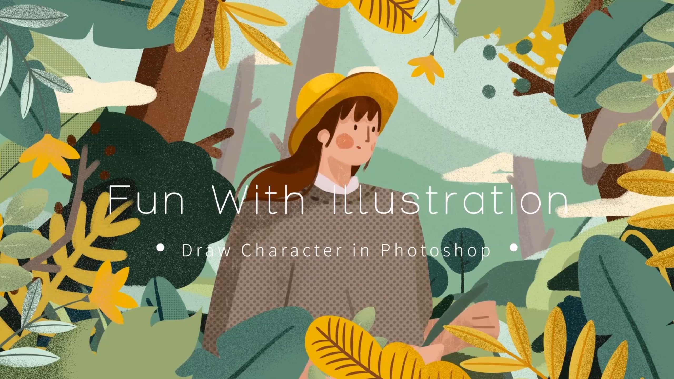
1. Introduction: Welcome to our new
design course, Bl Gris, creating stunning graphic
posters with Adobe Illustrator. My name is Tangio, and as a passionate
graphic designer, I've always been drawn to the proportions and
order of grids. In this course, I will share with you special
techniques and workflows tallored for designers who want to create precise, compelling, and
logically beautiful posters in Adobe Illustrator. This course is suitable for all those interested
in graphic design. Whether you are ready to create
fine graphic design work, are striving for the
beauty of order. I want to find a balance
between the two. You will find here
a framework that will help you create
impressive work. I'll see you in the next video.
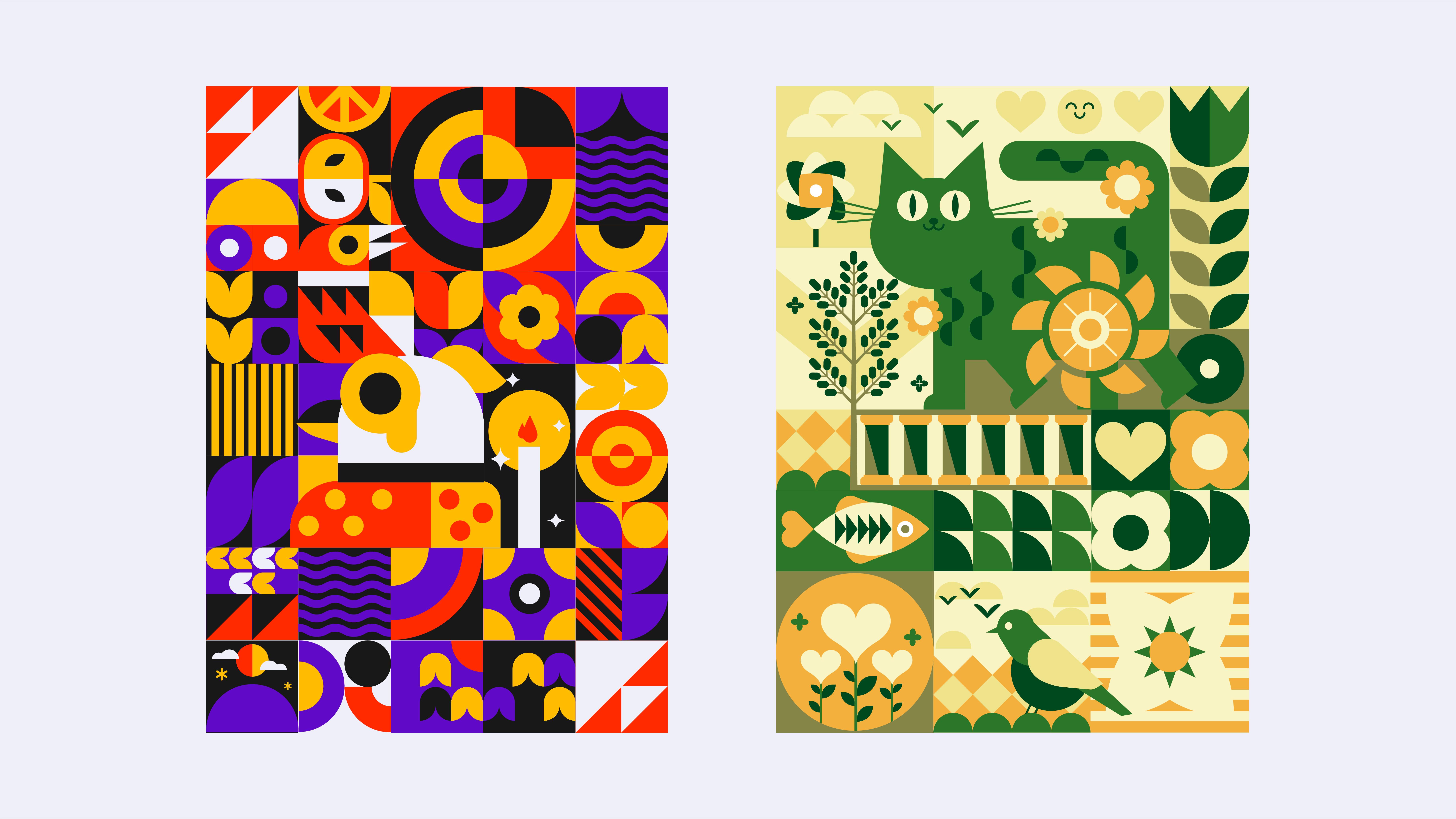
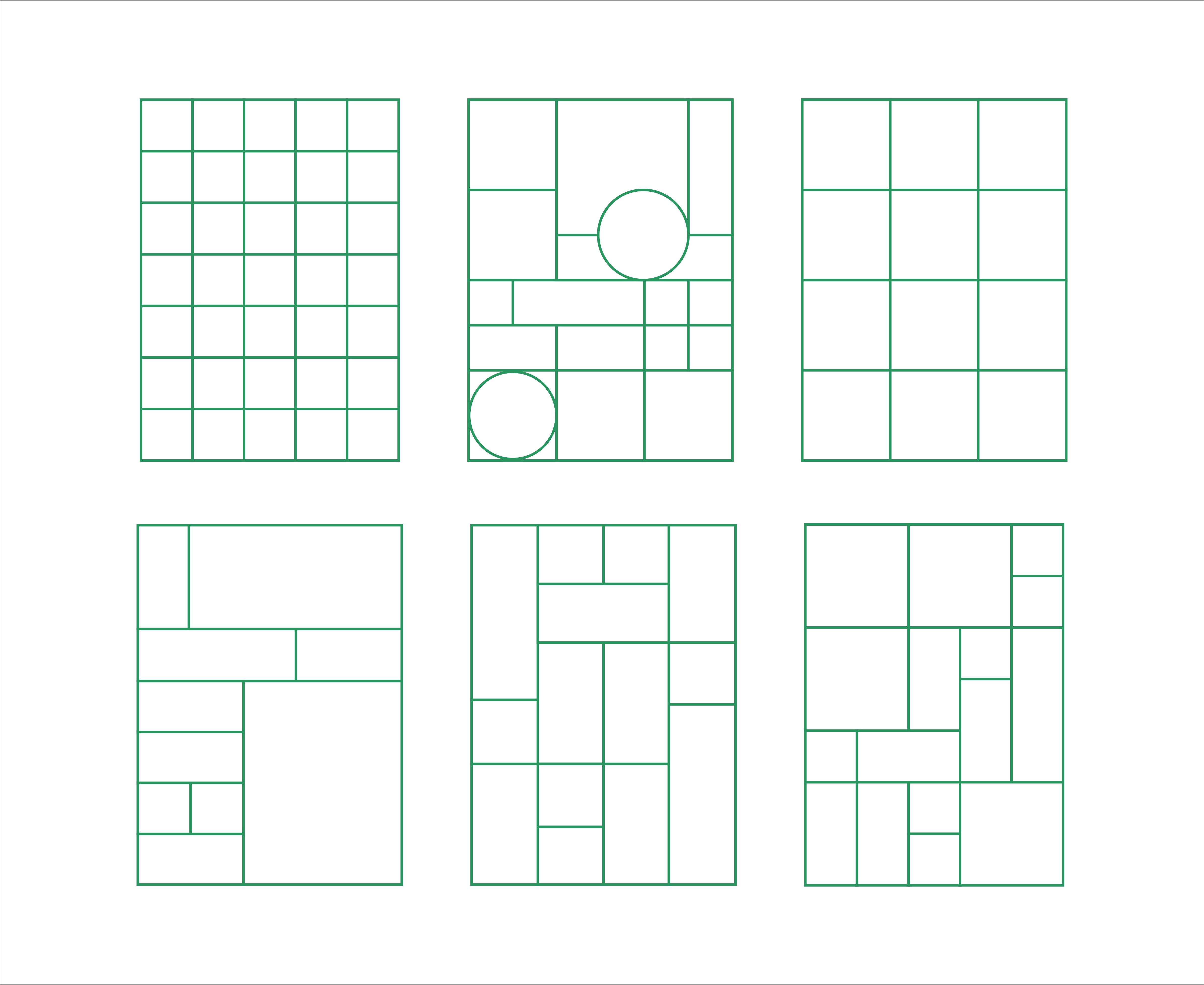
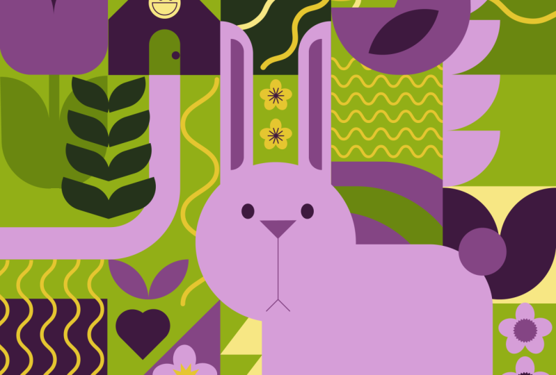
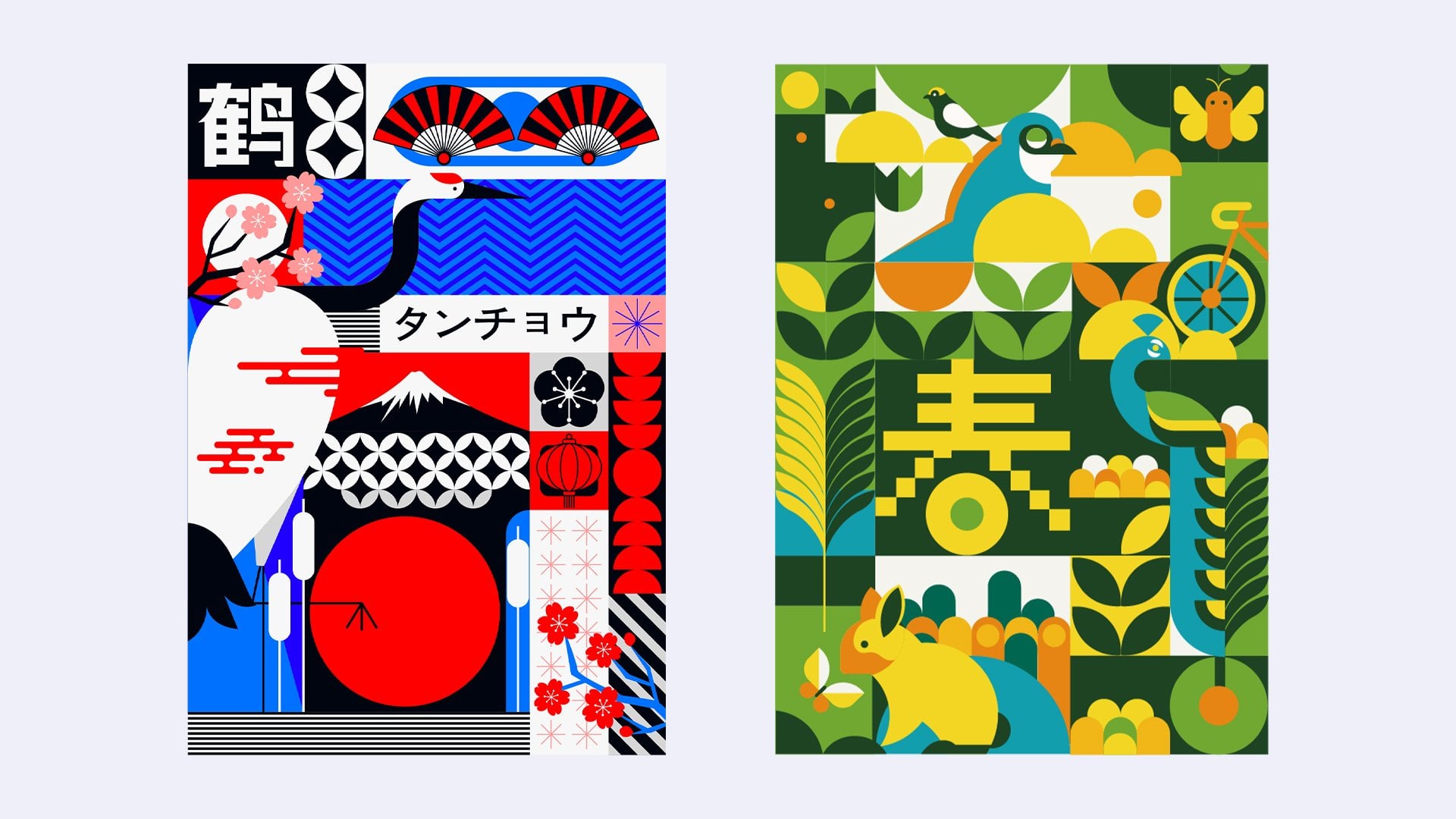
2. Sketch: Visualising your ideas on a grid: Welcome to my class and
today we're going to sketch. First, let's open the
prepared grid or Pcal parts. The same for today's join
is birth and nature. I want to draw the
main character, the bird, in the lower
center of the grid. Choose a pencil brush, depending on what
you are used to. Now let's begin. Draw the figure with a strong sense of geometry. Not too realistic, you don't
have to stick to the grid. You can go little beyond eight. Try to draw the shapes in a more geometric
and orderly way. Father pattern on
the bird can be replaced with this kind
of dots or triangles. Here I use the dots join. The distribution of dots
can be placed freely. Do not join too rigid,
the bird is drawn. Let's move on to the
secondary elements. It may not be enough to have only one
bird in the picture. I'm going to draw another one. The big can go a little
beyond the grid, like this. Here I use the triangles
for the feather pattern. Okay, the bird is also finished. Then we can add some plant
elements around the bird. Like some flowers, the plants don't need to
be down too complicated. Inside the grid, we can continue to divide
the grid and then add some geometric
elements together with the figurative elements so that the picture will
not look too monotonous. Okay, draw some more
flower elements. The same goes for the
surroundings of the big bird. You can add some
botanical elements and then pair them with
some geometric shapes. You draw whatever comes to your mind according
to the theme, and then match it with
some geometric elements. This graphic is like a rainbow. I want to draw some
water elements here. On top of the bird, you can draw some fruits
as food for the bird. If there are too many
figurative shapes, you can add some geometric
elements to balance the picture because the elements around here are quite dense. So I do some simple
geometric shapes here to make the picture
more breathable. Here, you can cut the circle. The graphic here also looks
a bit like a rainbow. I wanted to draw some
water elements on the right side as well
echo in the graphic below. But I wanted to make a bit of a change and could spend
two squares like this. The water element
is quite dense. Continue to draw some
simple geometric shapes around it to match. The previous drawing
was wavelines. I wanted to draw some
straight stripes here, since there are both
plants and water here. I want to draw small
here here with the sun and clouds on top of it. Like I said before, dense shapes need to be surrounded by simple
geometric shapes. Since this is an
environmentalist poster, I wanted to add some
simple type graphics. And I was thinking of candles,
which represent hope. It can be drawn next to the main character of the
image, which is the bird. A circle could be used to
represent luminescence, and some small stars could be added to represent star light. Continue to add some
botanical elements like a circular flower, Then surrounded by
some small flowers, you can change the
direction of the flowers. Here you can draw figure that is symmetrical
to the above. Continue dividing the grid. In the grid, you can add some diagonal
stripes on the side. More flowers placed in such a way as to leave
some gaps in the picture. As appropriate, we come to the last grid and
can make a symmetry with the grid at the beginning
of the upper left corner. Okay, our sketch is done. See you in the next lesson.
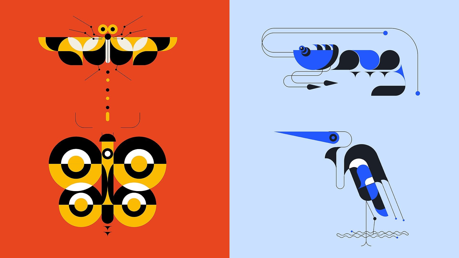
3. Linework: Outlining the Elements 1: Hello, welcome back to my class. In the last lesson, we have finished sketching. Today we're going to
draw the line work. Let's get started, Import the sketch into
Adobe Illustrator, because this line of
the sketch is too dark, so we need to adjust
the opacity to 30% and then press control
and two to lock the reference so that we don't move to it
when we draw it. Let's start by
drawing the big bull. I usually use the rectangle
and ellipse tools to draw a metric shapes. The first step is
to draw the head of the bird with a
curved edge Like this. We select the rounded
corner tool here, drag it, and the outline of
the bird's head will appear. The same is true for
the body of the bird. The ice here are treated with the corner rounding tool
and for the circle, we'll use the ellipse tool. It doesn't matter if
it's a little over here. After drawing a circle, there is still a
small circle inside. You can press the control
key and the C key, and then press the
control key and F key to copy in front of
it. The eyes are done for the mouse. Use the pen
tool for irregular shapes. Use the pen tool because
there are arcs here. I also use the corner to drag and drop
the arcs like this, and they appear the
same for the bottom. You need to draw
sharp corners like this in order to
use the rounding. The shape of the
Birth Rom is well suited for joining with
the rectangle tool. Then drag the point. Okay, adjust the
size a little bit. Then the feather pattern, this is very simple just to use the ellipse tool to
join it. Then copy it. Okay, The wings of the bird
are covering the body. Two shapes are needed. We can press control and then control and
to duplicate it, adjust it to this position. And this is the birth wing. Okay, we're done. And now we have our big
bird press control G, to group this bird so it won't move out of place when
joining other shapes. Okay, let's move onto
the border above. The method is actually the same. Use the rectangle tool
to draw the body. Then drag this point. Now we have the
body of the bird. The head is drawn
in the same way. Draw the head with the
rectangle tool and drag the point because the ice
are at the right angle. Here I use the rectangle
tool instead of the elyx. By holding down the
control and shift keys, you can select the
other three points at the same time and drag
them around a bit. Okay. The mouths all draw
with the pentol like this. Resize it a little bit. The neck, because it's
also a rectangle itself. So to align the lines here, I'll just copy the shape of the head and adjust
it a little bit more. Same thing for the wings, this way the lines fit together perfectly underneath the
wings is a large triangle. So by canceling one of the anchor points
of this rectangle, the triangle piers, and then the pattern of the wings
is also some triangles. So I'll just copy that. Adjust the size and position. Again, draw the remaining
two small triangles too. Okay, the bird is done. Press control energy, group it. Then we'll draw the flower here. This is the rectangle
tool, okay? Like this, it's okay to
draw half of it first. Right click, select transform, then mirror duplicate
the petals are done. Keep copying. Draw
the leaves below. Hold down the control key, you can directly select the individual dots,
the leaves are done. Then draw the flower here, since it's a circle, I'll use the ellipse tool. I'll draw one in the
middle for the petals. You can use the
rotate tool here. Hold down the art key and
then focus on the center of the circle below Left click on the center
of the circle. Point will appear duplicate. And then press the
control key and the key, you can copy the shape
around the circle, select, then hold down the shift key to cancel the unwanted parts. In the pass, finder select
join to merge the shapes, Press control to select the
unwanted part and delete it. Draw square and align it here. Just like this, this
is a concave arc. Select the square, hold down the control key and the
old key at the same time, and then click on this
point and drag it. Okay. Then draw the
flow on the left. First, draw the small grid here. Once you've join it, do the
same and make multiple copies for the circle here. I'm going to use
the rectangle here, select the rectangle and then press the control
key and C key. And then press control and drag the dot continue
in the same way, the following two
small flowers and the previous join is a
little bit different. Use the pen tool to
create an anchor point, the middle of the line
and pull it down. Then create an anchor
point on each side, lining the line here at the top. Then the dots here like
this to round the corners. Then copy here is a semicircle
which is easier to draw. Draw rectangle and drag the dots here are two
triangles easier to draw. Then here is the fruit, here, I want to use the ellipse tool
and then do it like this. Okay, that's the orange and here's the apple
in a similar way. Here's an apple set
which can be drawn like this mirror image. Use the rectangle tool again to draw an apple
stem and leaf here. Okay, the apple is finished. Here is a large circle
with a gap in it. It's easy to draw
the ellipse tool and then do it like this. The knot can be created here by creating an anchor point in
the arc and then deleting it. The rest is the same operation. And then use the pen tool
to connect it like this. Then duplicate the shape
and scale it like this. Put a group together for
these notched circles. And then double click on
them to go into isolated it. Then draw lines in
here like this. And then select these shapes and find the shape
built to here. Click on the part
that you want to split like this, okay? And then draw the river here. For the one above, you
can draw two squares. Then drag the points like
this to round the corners. And then across the grid here, draw another square,
adjust the size. Okay? Then copy it below. And recite it like this. Then, you know, drag the
point to make a semicircle. Okay? And then we're
going to draw the river. The river is made
up of wave lines. First use the pen tool
to draw a straight line. Then select effect here. Then distort and transform
according to the preview. Set the parameters. Okay, so we just draw one
and then we duplicate it. And then press control
D, just like that. Sicken the lines and
see how it looks. I need to tweak it a little bit. Then we'll find the object
here and select extend, and the stroke will
become a graphic. Okay, that's the
end of this lesson. See you in the next lesson.
4. Linework: Outlining the Elements 2: Welcome back to my class today, we're going to continue to draw line work because
it's a wave here too. I copied it directly here. And then we'll go on to draw
the graphic here below. Select the rectangle
tool and draw square and copy it here. Adjust the semicircle here
is a bit easier to draw, so I won't go into detail. Then mirror it and copy it. The circle here is
drawn with Z Elix, the flower has already
been described like this. Then copy it. You can
change the direction, then we'll draw
the stripes here. It's also very simple, use the pen tool to
draw straight line, sick the line, and then copy it. Press control and D, Okay, here's the use the rectangle to adjust the rounded corners. Okay? Then draw the candle here. Use the rectangle tool
to draw the body. Let's draw the flame. Draw a circle and pull
up this anchor point. Duplicate it, shrink,
move it here, and merge the shapes. Then use the elipse tool to
draw an apple too, for eight. Adjust it Next, draw the star. Draw square, then hold down
the control and odd keys. Tap the dot and drag
it to get a star. Make several copies and
adjust the position. Group them, then we'll
draw the rainbow here. This is also very
simple drama players of squares like this. And then just to drag
the rounded corners. Okay. The rest of the
shapes are simpler, so I'll just show
you how it's done. Okay, let's draw the here. Here, the semicircle
is drawn with Z ellipse tool and
then drag the corners. The sun is made up
of two semicircles, and here are the clouds. Draw a small circle, then draw a bigger circle next to it and merge the shapes. Draw a rectangle on top of it. Then select it and choose subtract top layer
here, Duplicate it, and adjust it for the star. Use the pin tool to
draw it like this. Okay, the next shapes are
also relatively simple. Let's continue with a
quick demonstration. Okay, then this is
symmetrical to the one above. I just copy it and rotate it. And that's the end
of the sketch. Let's color it in. See you in the next lesson.
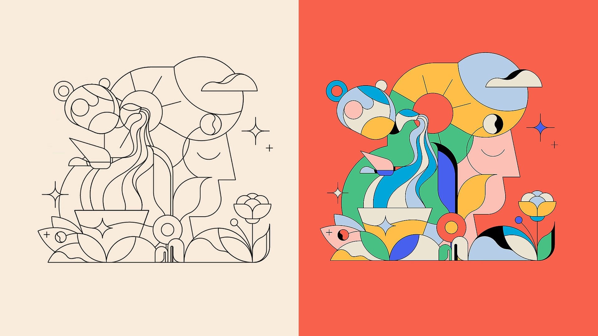
5. Coloring the Elements & Background: In the last lesson, we have drawn the line joining. Today we are going
to color it to make it easier for us
to select the colors. I've placed the matched
colors here like this, and filled the line
joining with white. Then we select the
direct selection tool, which can be used to select
elements within the grid. Then we select the pied tool, which picks up the colors so
that we can switch between these two tools with the control key helping us to match the
colors efficiently. Let's start with
the main character, because I want the whole
picture to be dark. So I can give the main
character a light color because it is the most
important part of the picture, so we need to highlight it. A bright gray would
be appropriate here. The neck here can then be
paired with a darker color as a transition color
like black for the body, I used the same bright
gray as the head. The wings could go on a red
so that the contrast between the colors is more pronounced for the
body feather pattern. I wanted to keep using red to make an echo with the
wings for the body. I changed it to yellow as well. The big could use the
two tone color scheme. Then this big bird is done. The color scheme of this little bird should be
close to that of the big bird. The head is the same
red color as the body, and the wings are
white and yellow. The eyes are black and
yellow like the big bird. Next color the plant. Since there are many
elements in the picture, you can use the same color
for the same shape of flower. Hold down the control
and shift keys. Select multiple shapes
at the same time. I want to use yellow
for the flower, but I didn't want the yellow of the flower to be
connected to the wings. Here I changed the half to red. The leaves could use a color
color which is purple here. The leaves are the same as the flowers with
similar elements, using the same color scheme. Okay, it looks well then
onto the apple here, which is easy enough to just use the realistic
color scheme, red and yellow inside. I'd like to vary it a bit. The other half could be bright green and the core is black, and then this is an orange. And because there's
only one yellow, the flesh inside, I
wanted to use red, like a blood orange color scheme for the flower element.
Keep using yellow. We'll color the figurative
elements first because they're the ones we've seen in real life and are
easier to color match. Then there's a little here here in the bottom left corner. The sun is just red and yellow and the cloths
are bright gray. The stars here
would be in yellow. The candle is bright gray. The flame is red and
the light is yellow. Then the stars here need to
be changed to bright green. I use yellow for the
round leaves here because there's too much purple
here for the flowers. Because there are
more layers here. You need to try more
different color schemes. There's too much yellow and red, so I use black as an excellent
color here in the middle. Okay, The figurative elements are basically done
with their colors. So let's move on to
the geometric shapes. The graphics here are
large and the coloring of a large graphic will affect
the surrounding elements. So they need to be prioritized. I'd like to use a
darker color here, but the elements around
it are red and yellow. It's best to use
red and yellow in the background here to make
the darker color blend in. More like this. Then use a darker
color scheme inside. Because there are
more layers here, You need to keep experimenting. Okay? Then color match the surrounding elements to match the dark colors
I've just used. I've chosen black for
the background here. Adjust the colors of the
elements inside a little more. There are more dark colors now, so I need some lighter
colors to go with them. Then let's go with purple here. And still choose black
for the background. The color scheme between the grease is as
connected as possible. There needs to be at least
one of the same color. The overall match is just a transition from
dark to light colors. The waving stripe
element is denser. It doesn't need too much color. Okay, move on to complete the color scheme for
the other elements. The bottom right corner here is symmetrical to the
top left corner, so you can use the
same color scheme. Then in the lower left corner, you can use a black background to highlight the elements
in the foreground. Here you can use the
same color scheme as the wave stripes
in the front. Keep experimenting with
different color schemes. The background here can also be dark to
highlight the bird. Then here the background
can also be used in a dark color in order to highlight the light
shining through. Continue with the
rest of the elements. If there is too much red, you can use black or
purple to match same here. Continue with the rest
of the color scheme. There are a lot of
repeating colors here, so I wanted to make some variations and use
purple or black as accents. Okay, move on to the
rest of the color was keep trying
different colorways. Okay, we're done with the color scheme and the
graphic poster is now complete. For those of you who have
watched this lesson, try joining a graphic
poster yourself. See you next time.
6. Bonus: "Walking Cat" Poster Drawing Process: Welcome back to my class. This class is bonus, and we're going to draw
another graphic poster. I won't go into too much
detail in this lesson, as the techniques have already been taught in previous lessons. This is a slightly immersive demonstration
of the process, so I hope you can
enjoy watching it. The theme of this
poster is working cat. The first thing I did was
to sketch the poster, this time using a
different kind of grid. Again, we'll start with
the main character, the cat, which I'd like to draw in this big
grid. Here we go. Okay, I'll sketch is done. Next. We'll draw, color the lines. Let's get started. Oh, B, B. Oh. Oh. Oh. Oh. Oh. Oh, okay. Our poster is done. Thanks for watching.
We'll see you next time.
 Xue Huajie