Transcripts
1. Introduction Moonscapes: Always think about
shining in the dark. If you two feel the same way, then you have landed
at the correct class. This course is for
everyone who is struggling with watercolors like basic washes, wet on wet, wet on dry or is
still dabbling with understanding of how to partner with this beautiful
medium watercolors. Hi, guys, I am
Karnath an artist, instructor, mother,
skill share teacher, and brand owner of
vibrant fossils, where we manufacture
handmade sketchbook, artist break paints,
and much more. If you are someone who is
joining me for the first time, I go by the name watercolor
dot illustration dot Letter, on Instagram and
even on YouTube, I go by the same name. The flow of the class is
very easy to understand. We start out with the
materials required, then move on to a
brief description about the colors which I
have used in every project. Every project is
simple and easy, starting with a time limit of 13 minutes to ending it
within 20 to 25 minutes. When we start out,
we think about how we can sketch or
can we even sketch, et cetera, we will use basic shapes like circle
or straight lines, which gives you lesser
thought process of going into the sketching or
getting scared about the sketching and only working through the
watercolors pot. The size of the paper is 5-6, which gives you a
lot more opportunity to play with the colors, as well as do not think much
about getting it wasted if you have not got the exact
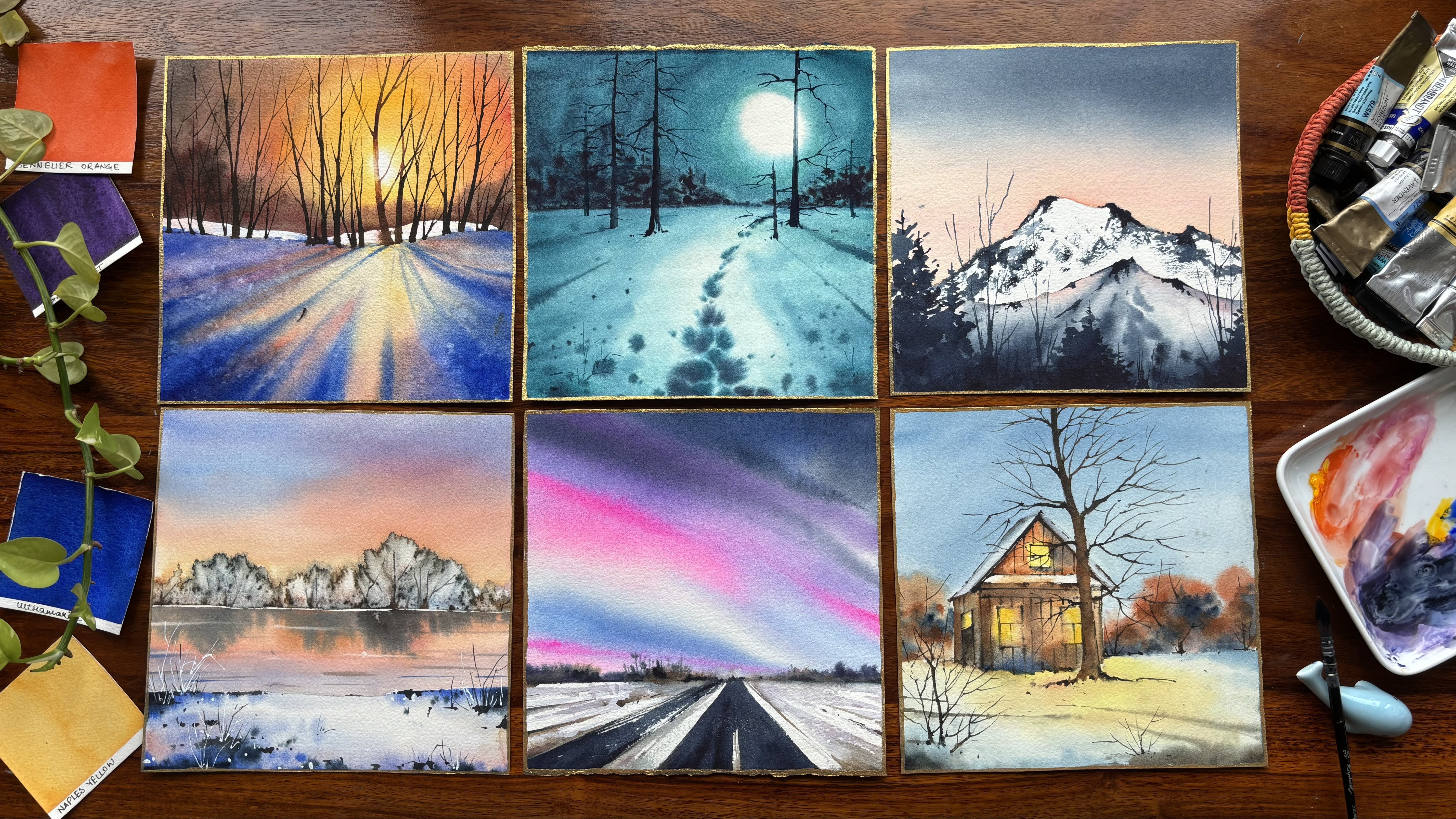
results that you wanted. There are six projects in total. Once you are done
with these projects, we will move on to the
final bonus lessons that is A four size paintings. Each of these paintings
are frameworth. Without any further delay, let's move on to our
first lesson now.
2. Flow of the class: As you know, this is our
first lesson and it has to be everything that we
start out in this class. I give you a basic understanding
of all the materials, but it is not necessary at all to go ahead with
those materials only. Whatever is available with you, please use that, whether
it be the colors, brushes, paper, et cetera. Only the paper is
very important. It has to be 100%
cotton 300 GSM, as all the paintings
are really small, watching this class on a
bigger screen is, of course, going to help you to understand the smaller details
which are being covered. You need to keep
two sizes of paper, actually a single size. You can divide your
A four size paper into two equal halves
or else go ahead with a bit smaller size than A
four and divide it into two halves to have the
smaller paintings covered, and then you can move on to the A four size for
the bonus lesson. The bonus lesson
will come up after a week so that you
have already covered all these six projects
and then you move on to the tougher part or a bit longer part is
all I'm going to say. Finally do enjoy the process of painting with watercolors. That is all I want from you and hope that you nail all the
paintings in this class.
3. Materials Required: Let me tell you
everything that we need from the materials
required perspective, I would be using arches, 100% cotton, 300
GSM, 140 B paper. This is 20 to 20 centimeter, but this particular
paper size is 13 centimeter by 18 centimeter. This is an A four size paper
that you can see over here. This A four size can be exactly same as
what I have taken. If you even want to do it on a bit bigger size,
I'm okay with it. I will keep a board like this. Now, this board is
very helpful when I have to attach my
paper on top of it. I always keep a board like this. Either it can be an
acrylic board or it can be a paper cutting board
as you see over here. Bleed proof white,
pH Martin color, which is majorly a
white wash color that I use for
drawing these areas. Let me tell you a bit
about what all we need. First is eraser. This is a secular eraser. You can use any eraser
that's available with you. Then I have the pencil. I have brushes. This is Escoda
optimal size six brush. This is the Vinci Casaneo
size three brush, this particularly is three
by four Escoda brush. This is Raphael
three by zero brush. Either you can use
this or else if you have any other brushes
like silver velvet, et cetera, feel
free to use that. I'm keeping a scale by my side for one of the paintings
where I need it. Freehand line drawing
is always good, but if you cannot do a
freehand line drawing, I think keeping a scale by your side is always
a great help. A ceramic palette,
and you need to also keep any kitchen
towel or tissues for taking off all the
extra colors or even just putting extra water from your brushes on
top of it that way. We can have dry brushes for any dry brushes in our painting. Two jars of water is mandatory for all my paintings because
one is a fresh supply of water and another one is a regular supply of water where I usually
wash my brushes.
4. Essential Techniques: There are six
essential techniques which would help you to save through your bonus lessons as well as the project
very smoothly. Let's have a look into
each one of them. Guys, the first thing that
today we are going to do is to work on wet on wet. Now what is wet on wet? We will just go ahead and apply a clear layer of photo like
this on top of the paper. And then once you have
a shine like this, you have to see that all the
areas are done well or not. Once this is done, we will take off all the
extra water with the help of our brush and light our
brush which is loaded. Right now, this is not loaded. I would go ahead and
load with a blue colour. Once I have loaded my brush with a blue
color like this one, I will go ahead and
just start painting. Now, this is a wet
on wet method. I will go from the top
and move to the bottom my darkest value can be on the top and my lightest
value can be on the bottom, or I can just go ahead
with a flat wash. In this case, I
would go ahead with just a flat wash. You
can see how this works. I will again load my brush with some colors and start from the bottom and go till the top. Once this is done, you will again load your
brush and move from the right to the left, again, load your brush, move from the right to the left. That was left to the right and now this is right to the left. You can see there is
an even distribution of pigments on each area. This is easy to do
and I would say, I have preferred this
method for many years. If you are a big n, I think this particular method
can work wonders for you. Let's start out with the next, which is wet on dry. For wet on dry method, I would always ask you to
make a pool of paints. Now, why I say a pool of paints, I know many of you are pretty
good with your watercolors, but there are small, small
mistakes that we always do. If we don't have
this pool ready, what happens is that I will
again mix and then add, which would lead
to an uneven mix. Once you are starting
out from the top, see, I think loading this
brush is a bit difficult, so I might have to
switch to a flat brush. I will tell you how.
This is a flat brush. I will load my brush
with lots of paints. It would give me very quickly
this wet on dry method. You see how much amount of
paints this brush can hold? And I'm now moving
towards the bottom, gliding my brush again
and starting out with my ins to move from the top to the bottom
and bottom to the top. This is the best way to
do this, I would say, it is whatever
works best for you. It can be wet on wet. That works best for you, it can be wet on dry, that works best for you. Wet on dry can of course, give you a much darker value
compared to wet on wet. We will see that once
this paper dries off. But since I did add a lot of water even when I was pouring
my wet on dry technique, you might find both of them
pretty much the similar. I would start with
my clear water. This is my Cleo water. Blending is nothing but you
can do it in one color. You can do it with two colors or you can even do it
with three colors. I would prefer going with
two colors at this stage. One would be the same color
that we did apply earlier. I would go from the top part. You will see automatically
the colors will move and I will take
it till the bottom. I'm not going to dip my
brush any further in water, whatever color I'm
getting, that is it. Now I will pick up my ultramarine and go from
the bottom to the top. I start from the bottom and
start moving up till the top. And see how the colors move into each other so well
without doing much work. This was blending on wet. Now blending on wet is way
simpler than blending on dry. I would always say that
if you are a beginner, what happens is we
don't know what is much about the water control
part and that's one of the reasons going from over just a dry surface might become tough because you don't
know the correct brush, how much water it can hold, and that's one of the reasons we commit a lot of mistakes
in watercolors. I will even show you
how I fix my mistakes in the upcoming bonus lesson
that we are going to see. But before that, I think these two exercises can surely help you in your
watercolor techniques. Now, if you feel that this
area has become really less, while you were
blending, you can just add something below it. Like this and allow it
to move into each other. This way they will
automatically create the colors that is needed with the help of the
gravitational pop. I guess I am very much
okay with how the wet on wet wet on dry and blending
on wet has worked out. Let's go to blending on Troy. All I'm going to
show you is I have pool of colors available for me. Now, if I have a pool of color, it becomes really easy for me to go ahead and work
through the watercolor. I have two pool of water. I was earlier having just one. You will see two of them
coming together at this stage, now it becomes very easy for me to work with the
blending process. I will show you how.
Let's just pick up our first color has a very
good and generous amount, as you can see over here, I'm going ahead
with the top part. I will start with my top part. Move, move move move. Again, load my brush. I keep loading my brush
every time I have to light my brush onto the paper. Now, since my other
color is way more darker than what I'm using
over here at this stage, it really doesn't matter if I'm even taking this
color in the bottom. If you are actually using
a very opaque color, then it might be
difficult because watercolors are meant
to be transparent. Now I will go with a
bit more darker value and start applying it on top of the color that
I've already applied. You can see that there are a bit of I would say lines that
are coming up because my paper is becoming really
dry and you will even see this coming up in your projects if something like this,
you are drying up. Let's try with our bottom part. Now since this is d
a bit wet or moist, it becomes easier for me to glide my brush and
blend the colors. I will always take
it to the top. Go a bit slow with this
process, there is no hurry. Always know that watercolors
is not about hurry. It's also about the fact that we have to enjoy the process. Enjoying the process
is most important. If you can enjoy the process, I can tell you you are going to nail your painting perfectly. Landing on dry turns out to be way more darker
for both the colors. Now I can again go
ahead and apply one more layer over here like
this and glide a bit up. And we were at this stage. You can do one more
thing. Now, you can just take off all the
colors from your brush. Take off every color
that's there on your brush and start lighting your brush very nicely on top of the colors that you
have already applied. This way, there will
be a seamless flow of colors on all the
power because we haven't gone ahead
with a brush that has water or that is
holding a lot of water. Now, painting on moist, what
do I mean by painting moist? Let's go ahead and just apply
a clear layer of water. This is not not having lots and lots and lots and pools of
water on top of it. You have seen that
I've just dipped my brush once in water and now I'm leaning ahead and applying that brush over here. Supposedly I want
to work on moist. I will go ahead and start
gliding my brush like this for waves or for
anything of your choice, this can work wonders. It doesn't have a lot of water. That's one of the reasons
you are not going to actually get puddle
or anything like that. It can work great for your future paintings too
in case you are trying out. And other paintings where
you're working on moist. Supposedly, I want to make
some background trees or some kind of Um, Clouds. Everything can work great
with this an approach. This is painting on moist. We will be using
this painting on moist when we are doing
our third project, that is to paint our mood where there is cloud, et cetera. This would be more about
painting on moist. Now is painting on dry. Let's do what's painting
on dry. Let's go ahead. And not have anything and start painting
anything of your choice. Maybe some of my trees that maybe some fine
trees that I'm going to add to this painting. Go ahead with another
layer like this. We will just add a
small line like this. If you want to paint wet, then you can go ahead
and start adding this wet trees or bushes or
whatsoever on this surface. This is mostly painting on dry with a combination
of painting on wet. You can also go here with some splatters if you
were done with this part, use some spatos and you see how beautifully the whole turns up. Some foreground dark
depth that we have given, some background colors
that we have given. You can also have a sky of your choice if
something that you want, or you want to
keep it empty just like that and have
some birds flying. Maybe we'll see how
we can even do that. I will go ahead with my darkest
value that is pain spray, and I have some birds like this. It was just too dry to
even have any colors. Okay. This is what is a
final painting entre.
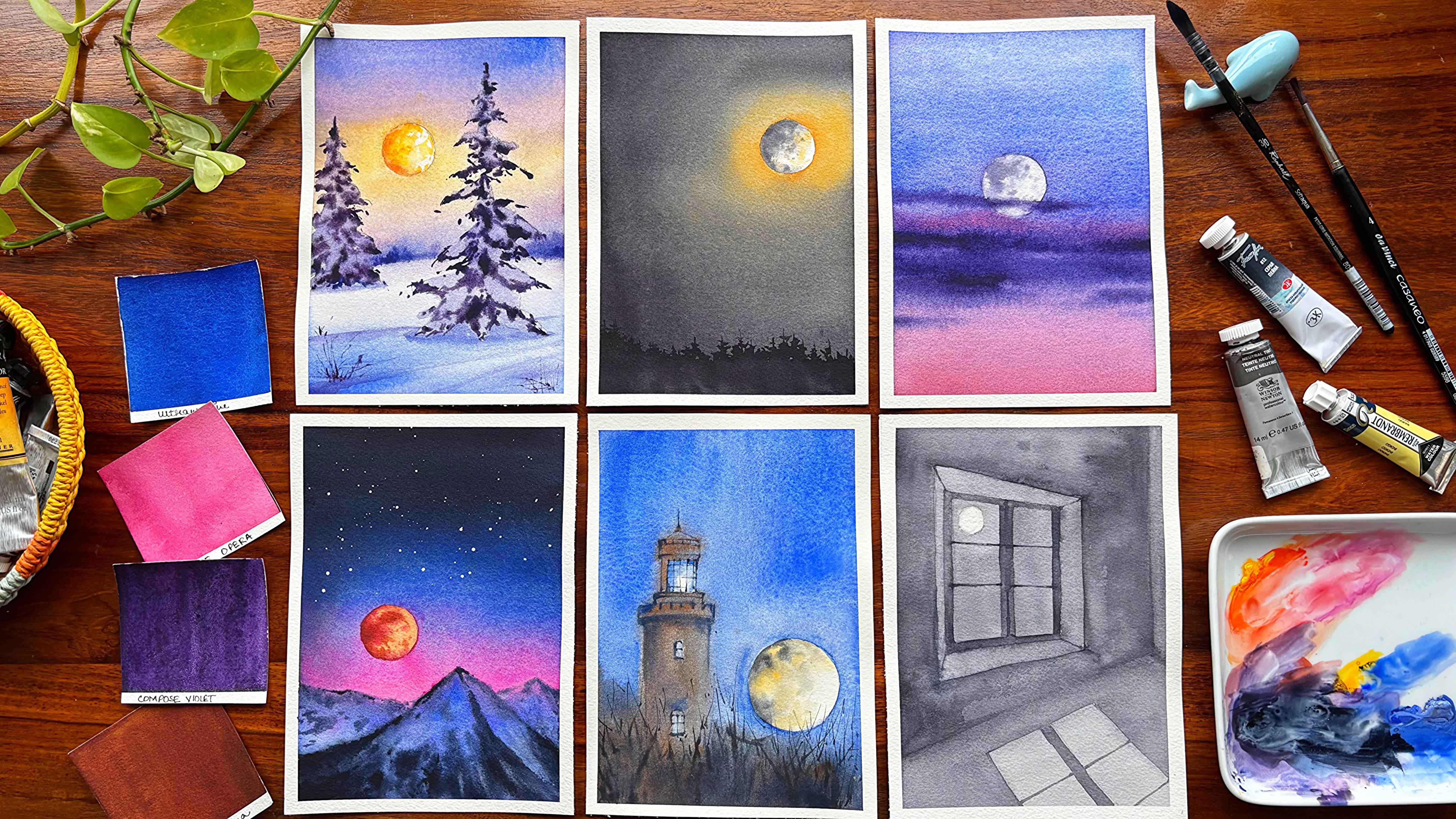
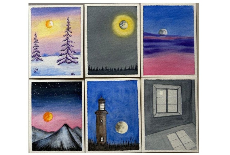
5. Project 1 - Yellow Moonlight: Only two colours are
needed for this painting, naples, yellow, and nutritive. We are starting out with one of the easiest paintings in
whole of this series, though you see a
painting on the left, which we are going to do next. I am going ahead with any coin, take any coin of your choice, and this is kind of
an A six size paper, or you can take it a bit bigger. You want to make it on A five. I'm good to even go with that, but make sure that you are not extending it
more than A five, as there is not much that you have to go ahead and paint
in this particular painting. It's only the light of the moon that we need
to highlight and then go ahead with
the bottom part where we are going
to paint the trees. Let us start out first
with the lightest value. And for this one, my lightest
value is somewhere in between the naples yellow
and the Indian yellow, which is from my own palette
that I've made for myself. This particular palette, I
use it for all my paintings. It has the colors that I need, whether it be an
urban sketching, whether it be
moonscapes, landscapes, water, any subject,
and I can nail all the subjects
with this whole set that I've made for myself. Though you might
have different color that is available
in your palette, go ahead and use that whatever
is there on the palette. You do not need to go ahead with whatever I'm
showing right now. Do not apply any
water on your paper. This is a wet on dry method, and hence a 300 GSM paper is a must or else you will
get very dark lines, or you might get hard edges, which we really want to
avoid in this painting. In case you are someone
who is not using an arches paper or who
is not using a 300 GSM, you can also go ahead with
a wet on wet technique. That way, the blending would
be really smooth and easy. I am applying some more
of my neutral tint. I really do not like
to use any black in my whole of the
paintings that you see, which I do til date. Hence, I keep neutral
tint by my side whenever there is something more
darker or paints like this, so some painting like this, I go ahead with my neutrtint. Though you can also
use Mars black or any of the other black color that's available
with you, as I know, many of you love to paint
black or dark paintings, too, and it's up to you, you want to go ahead with it, you do not want
to go ahead with, you want to keep a neutrtent, you do not want to
keep a neutrtent. Whatever color is available
is good to start out with. All I want you guys is to
have a creative mindset, and that creative mindset can really inculcate lot more ideas. And as you progress
with watercolors, you will understand that using a bigger brush can help you cover larger spaces
very quickly, just exactly the way over here, we switched our brush
to a larger brush. You can also use a 1
" brush if you do not have a brush of
three by four inch. So all of it is up
to you to decide whatever best available
resources you have, use them to make
these paintings. You can see the yellow
is not blending at all with the neutral
thin that I have, and I need to make some effort
to really help it blend. Now, these things do happen
in many of my paintings. Believe me, when I start out, I might look like
I'm struggling and hence we might have to go
ahead dig our paper a bit. This is a very easy
phenomenon that all of you can use in any of your
future paintings, too. What happens this way is that gravity plays a great
role in your painting. The water comes down
and it helps to pull the colors also from
the top to the bottom, and the blending is very
natural in this way. We do not need to put any extra efforts when
you are blending. I have already added some
amount of my naples yellow, even in the middle part as
you did absorb over here, and then again, I've started blending it with
my neutral thin. I continue to pick
up my darkest of the value as I approach
to the bottom. Believe me, right now, I have a lot of water on the paper, and hence once this
paper dries off, it would be way more lighter than what you absorb over here. If you are only going ahead with a wet on dry approach where
you have applied the colors faster and you think that
there would be less of opportunity in terms of the
lighter values coming up, you can always go ahead with only one particular
layer rather than adding more and more colors
as I continue to do over you. Always always move your paper a lot so that the blending
is absolutely natural, you can see the
colors are moving. The blending is
happening so naturally. Only the light from the moon
will be seen in this case, and the rest remains as is. There will be some light, not that the whole of the
place will be littered. You can leave it at this
stage and let it dry off. Once it dries off, we are going to start out
with the bottom part, and that bottom part is all
about painting smaller trees. I have done it even in one of
my earlier moon paintings, and this is a must in
my moon paintings, this kind of one of the
paintings will be of this kind. That's all I have learned. As I feel that this
is simple, easy, it boosts up your confidence
to a great extent, and you can nail all
your future paintings. For every class, I try to keep initial a few paintings really simple so that even if
you are a beginner, you can start out with
that particular painting, moving on to the next and next. And as you build more
and more confidence, the bonus lessons or the lessons in the
last part should be the ones that you
look forward to as they might be a bit more
challenging for you, though a step by se
approach is always helpful, and it can help you to nail any painting
that you were doing. I have seen this in
the past that we initially just
think it's just in our mindset that this
particular painting is difficult or that particular
painting is difficult. But once we start
doing that painting, there's so much learning
that I have during the whole of the process that the final outcome really
doesn't matter to me. I have the same
feeling for gauche. It's not a medium
that I work out with on a daily
basis or regularly, but whenever I walk
out with that medium, I try to pick up easy paintings initially and then move
on to the difficult ones. I've applied a layer
of water initially, and then I'm going over it to make some random pine trees. You can also go ahead
in a similar way. You can see that I have taken
my Escoda optimal brush. This has been with
me for many years. I have used these brushes in
the past so many classes. I have more than 51 classes available already
on skill share. You can go ahead with it and try whatever you want to paint. There are a variety of subjects,
water, flowers, gouache, name it, and you have it landscape, sunset,
sunrise, whatnot. I think I have covered it all, whether it be Northern lights
or even water reflection. Anything that you can think
of is always always there. So feel free to try out
anything of your choice. Yes, there might be different
in terms of subjects, et cetera that I
might have covered. You can look out for the ones
that you and try them out. All I'm looking forward to is a creative journey that
all of you can have. And I can keep enjoying
whatever you are painting. Do tag me always on Instagram or just upload
your projects over here. I would be more than happy
to have a look at them. Always, always may not be sometimes I don't get so much
time to give a feedback, but I do look up to
all the projects. I do give I go through
each one of them. Yes, there are days that I'm so busy that I may not be in a position to write
of everything, but I try how maximum way possible to give most
of the feedback possible. Okay, I'm still going ahead on the left side and
adding some wa tries. You can see they are
very much uneven, though they are concentrated
towards the bottom part, but they will be uneven. I do not want to make it even. If I make it even,
then the whole fun of actually working with
watercolors go away. Using my flat brrush
to just blend my um, you can see there's
a boundary kind of thing that has happened as I was trying to work on the outside of the moon
rather than working inside. This is also called as negative
painting. As you guys. Oh, we do not work
inside the subject. We go ahead and work
outside the subject. This is one of the examples
of negative painting, though you can have
many different kind of negative paintings happening. I'm just picking up some of
the extra water that is, um, happening over here
because of the water that's there in the brush
and then blending it, we will go ahead with some yellow and some white quash also you can go ahead with or the
color that you have applied, majorly your neutral tint. You can see how the colors
move into each other. They don't look like that it is a single gray shade or it is a single naples yellow shade. I'm so happy with the
background colors. Hope you are also having a similar shade
appearing on your paper. Do not forget to upload your
projects, as I always say. And please, please do tag me on Instagram if you are
painting along with me. I would be more than happy to share everything on my story so that others can also learn from you how
well you have painted. And it's an experience
even for the new folks, adding some of my neutro tint, as you can see over here. And this neutral tint
looks very nice. Though the moon doesn't
look up to the mark. I might I'm not sure
if I would go ahead with some more gouache
and add the whites or just add some more of my darker value of this neutral tint that
you can see over here. It's good to go slow with every detail that you
are doing at this stage, because the majority of the
painting is already done. You do not need to touch upon
every space on the moon, nor you have to work less, just a few dots here and there, and then it's done. Now it's time to add some
more of my neutral tint, as I feel that the color
has turned out very, very light compared to
what I would like to add. You can see that the darker value I've just added
on the left side, I'm not going to
add it everywhere. Moon has a few craters and that can be well seen
from the Earth too. We want to keep everything real and absolutely similar to
the one that we observe. I'm not going to go
ahead and change much in our observation
power or whatever we see. I want to keep it as is. Let's remove the
tape at an angle and have a fun look
at the painting. I am super excited and happy to have a fun
look at this painting. Believe me, it's easy but very, very soul satisfying
kind of an experience. Whenever you are nailing
one of the paintings, you just feel that
you have done it. Even as a bigno, it's a
great source of motivation, and all your confusion
about watercolors goes away in this way. Oh
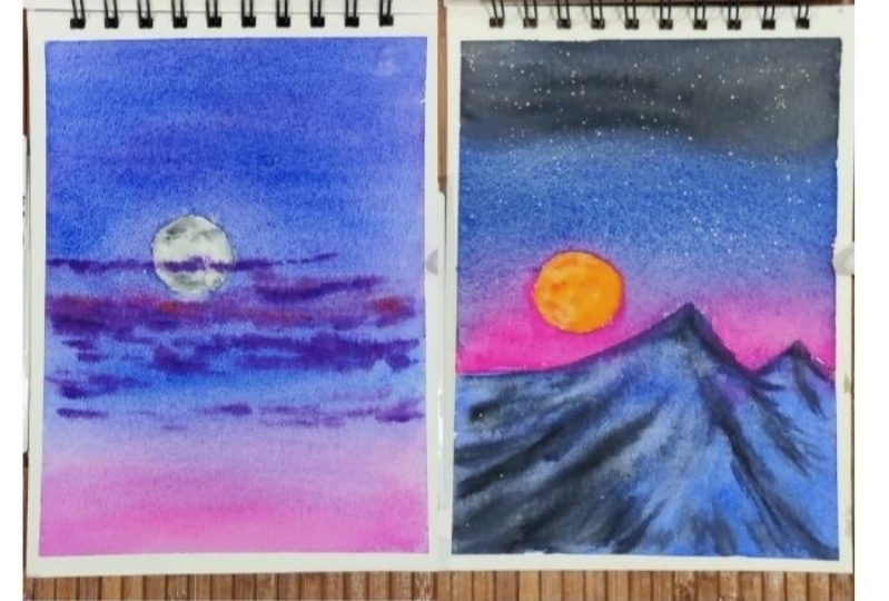
6. Project 2 - Blood Moon: The colors are
paints gray, Opera, yellow, orange,
ultramarine, and indigo. The second painting is also
going to be equally simple, that we are going to add two
or three colors for our sky. And then we are also going to add some mountains
in a wet on wet way. It's going to be
beautiful, believe me, that you need to
have some patience, and let's paint along with me. I'm using the sing
coin and going ahead, making one of the circle
for the moon area, which I want to
preserve over here. In none of these, I have used any masking fluid or
anything like that. Though you can also use this masking fluid
for preserving the spaces wherever
it is needed. This is a great way to go
ahead and preserve spaces. If you're someone
who doesn't like to use masking fluid or
doesn't have masking fluid, then you can use a similar approach that
I have taken right away. This is a blood moon painting, and I'm super excited to
paint this along with you. I have kept one simple mountain
that is in the middle, but I have not pet it in
the middle, as you can see. Also, this particular
mod is on the left side. I will never keep my
subjects in the middle. That's something I have
learned over the years. The whole of the painting, the whole of the energy
goes for a toss. If everything is
focused in the middle, there is a rule of thumb, and it is basically
going ahead and just, dividing your paper
into nine equal halves. At the intersecting point are those points where you should
have all the focus on. If you can do this, that is also called as
the rule of thoughts, just go ahead, check out or do your research about rule of thoughts and you will
get to know everything. There are one or
two classes where I have also covered
this rule of thoughts, you can go ahead
and check them out. I'm using my compose
opera and some opera to add on this part of the paper, or you can say in
and around the moon, I will also use my
tramarin above it and some amount of opera
to blend my colors. You will see that I am not touching my
mountains as of now. When it is semi wet
kind of a situation, I will even touch my mountains. So be around. This is going
to be very, very interesting. You will see how
colors do not move a lot into each other if you
can control the water, or you exactly know the water amount that's
there on the paper. I continue to add
more and more colors, though I see my compose
opera is giving me some kind of breakage
or even that you can say is more like there is
some amount of mixing that has already happened
with the ultrame because of which I'm
getting some granulation. Breakage is nothing but
all I feel is granulation, that is the colors are getting displaced or
the pigments are getting displaced and they
are not equally there on each and every part
of the surface of the paper. That's what I usually
see by granulation. There is a good effect that you can get
through granulation. If you are someone who
loves granulation, please go ahead and use
it wherever you can. I'm using my ultramarine to see that particular
granulation. Yes, I am also in love
with granulation. I may not be using it very
often in most of my paintings, but you see a lot for ultramarine and that
really comes from the granulating effect
that ultramarine brings in for me in any painting
that I want to add it in. Once you have added the ultramarine and almost
one third part of the paper, go ahead and add some amount of your
indigo or paint scream. Now the colors will move into
each other, and believe me, you cannot keep it only
limited to a particular area. Some of them might move up, some of them may move down, so it all depends how the blending happens and
you practically cannot control your colors
or pigments once it is already on a surface, which has water in it, water
is going to play its role, but all you can do
while you choose your colors is to see
how much they move. Now, what do I mean by
how much they move? Just apply a clear
layer of water and apply some
colors on top of it. See if it is moving
absolutely downwards, if it is moving
absolutely upwards, whatever way it is going, is it just moving a lot? I know Milo Mission mole colors
do not move a lot because of which you have a lot
more space to play around. In case you're someone
who loves big paintings, then you should go for colors that move around
more like R colors. UR colors really move
a lot, and for me, it is very difficult
to control when I am using it on a smaller
space like this. Going ahead with some of my beautiful shade or a mix of the ultramarine and the
opera that we have applied. Opera are also of two
kinds that I use. One is compost opera and
one is normal opera. I am going ahead with some
more of the colors towards the bottom area as
you can observe a bit of yellow tint
that you can apply. This gives a beautiful color that I really haven't seen much, but it just adds so much beauty to this
painting is all I can say. Every time I look at any
painting that I'm doing, I get astonished with the mixes
that we get on the paper. Guys, believe me, the mixing on the palette is very different
than mixing on the paper. I really love the mixing that happens on the paper,
always, always. And that's what I
look forward to. You can also move your paper a bit if you are not happy
with the mixing or you're not sure of
how the colors are getting mixed or if they are not getting mixed
with each other. You can observe that
there is a lot of water concentration that I
have towards the bottom area. And now I could use a real
touch of my ultramarine. You can see that even the color that was there for my sky, which is mainly my opera is moving into the ultramarne that I have added
for my mountain. It is absolutely okay to go ahead with how
it is appearing. You will see how I
walk around with this. This is one of my favorite
techniques that I've explored literally
sometime back. It's not that I go ahead with the full
painting at one go. I will take some
time, add the colors, and slowly you will see
how the magic happens. Okay, adding some more
of our darker values towards the top part to
just blend the colors. I do not want my pink to appear on the snow clad
mountains to a great extent. That's one of the reasons. I am again touching
a darker shade of ultramarine and then adding
it on this mountain area. I have blended the colors, and now the colors are not
moving much as you can see the colors already
moved or the pink color, which we had has already moved. Now there is less
that has to move. Go ahead with a darker shade. It can be neutral tint
or paints gray and add it towards the bottom part
of the bigger mountain area. You will see how slowly
we develop this mountain. We are going ahead with only
bit of it here and there and slowly we will add darker and darker values
keeping the paper wet. We will work on it, and then the final painting
will come before you. I am so excited to
show it to you. Now, let's go ahead and work with more of
our darker colors. As we progress,
you will see that some or other lines
I will keep adding or stool blending
our colours and make the background mountains look different than the one
that you see over here. Starting out with
my darkest value, I mixed some amount
of blue in it, and then some of my nutrtint. You can also go ahead with paint gray, nutrtint any color. If your indico is very dark, you can also go ahead with that. My paper is still wet because of which the colors are
still moving a bit, and I want this soft effect. This is what I was
saying that if you have water on your paper, there is a good amount
of control that you can have on that water. And it can be used for
adding all your colors. Slowly, steadily, my
colors are moving a bit, but the top part is not
so wet as you can see, only some of the part is bit wet and rest of
the part is not. I am going ahead and adding a few drops of colors
here and there, not every part I'm going
to paint and make it dark. The idea of adding
the darker values is just to create those ridges, as well as those smaller I
would say trees, et cetera, that's there on, mountain or the rocky terrain that
you see on a mountain. Anything that you can imagine can be worked out when you are adding some of the
darker values in the areas wherever I
think it is necessary, wherever you think it's
necessary, that's most important. I will go ahead for my
background mountain now and add a few drops of
paint here and there. My focus is on the
foreground mountain. I'm not going to go ahead and add everything on my
background mountain. That's something which
I really want to avoid some drops or some dots here
and there, and that's it. We are then moving on to clearing out some
of the spaces where I think it is necessary or just pick up the colours from
a few of the areas, add a few dots here and there. We are going to make up the whole painting look more
aesthetically beautiful. That's all there in my mind. Every time I paint, it's just that whole painting
should come together in a way that it has blended together without any
effort from urine. So effortless blending
or effortless, harmonious colors
moving into each other, making the painting look or come together is something
that's there in my mind. Now my people has
completely dried off and I can see some hardages
that is happening. So more smaller dots and lines with the help
of my thinnest brush that I'm going to add for
this foreground mountain. This looks very organic,
nice and pretty. We might have to work
on the next path that is majorly the area where
you have painted your mon, which is still like a negative painting that you have done. Many people even leave it at this stage just making it white, but this is the black mon
that I'm going to paint, and I'm very happy and excited to show you
how it turns out. This activity is
something that I always say looks like a perfection
for every artist. Like, they will add
some colors into it. They will pick up some colours. Believe me, this part,
even if you don't do, it is really not going to change the painting
to a great extent. But it's what I have been doing pretty regularly for
all my paintings. If something has
turned out very good, I just wait and see, Oh, this looks pretty good, but
I can make it even better. And that way, I go ahead and add something more
into that painting. Sometimes it turns out well, and sometimes, believe
me, it's a disaster. So yes, whenever
you have this urge to paint more and more on
your painting, leave it. Leave it as is because you've already nailed the painting. Believe me, you have nailed it. Again, I'm repeating
the same process that we have done last time. I will go ahead and blend
some of the portions of this area and make these hard edges look more
softer for the moon pot. I will go ahead and apply some clear water
for my mountain. I'm not sure if this is very much necessary, but
I did the same, and now I'm going
ahead and, again, blending my colors
into the background. The paper has dried up. I cannot stay wet for the
entire period of time, and hence we have
to take an approach where you are going
ahead and adding some of a water onto
your paper and then paint over it because I
wanted this soft approach. You will again see that
I will pick up in some of the areas wherever
it is necessary. Believe me, this step might
not be very much necessary, but I did it as I wanted
a perfect painting, though I don't know if it
turned out to be that perfect, or it was perfect
in the beginning, and then we did not
make it so perfect. Overall, the final outcome is something that is very
pleasing to my eyes, and that's why I love it. You can go ahead with this you may even leave
it at this stage where it was and not touch it much because now it's
becoming darker and darker. I might have to go ahead and again pick up the colors in a few of the areas wherever
I think it is necessary. It is a process that I
have learned works for me, but sometimes even backfires, as I did tell you. This is one of the
examples where you can see that I am overworking, and then, believe me, I have to again
pick up the colors and again, give it a touch that is important for completing
this painting. Uh I would leave it now and not touch it much. At least the mountains,
the mountains look fine. If I even need to add one or
two drops here and there, or else the whole mountain will become dark that I
really don't want, we will move on
to the moon next, and we are going to start
out with blood moon. And for this, of course, you have some yellow and some orangish color that you
can add onto your painting. Once you have added this colour, go ahead with some red,
naples yellow, mix. Adding it in some of the places, not adding it in the
whole of this moon area. Continue to work on it. Use a smaller brush
to work on this part, either a three size
or a four size, whatever works well for you. For me, I'm using
a DaVinci brush to actually finish this off. I'm taking some pinkish
kind of colour, which looks more of a
mix of my compose opera and then some of my quinacrodon
oral whatever you have, the paper is still
wet and we can go ahead and add one or
two drops here and there. That's all. Don't think much. Go ahead, do your
bit, and this is it. You are going to have a
beautiful final outcome. Do do not worry. Blood moon is easy to paint. It's usually red in shade. One or two drops of
brown also you can add for the darkest of
the values if necessary. But the brown that
you take is usually a red brown that I would prefer. If you don't have red brown, just mix a bit of red into your brown and you
will get a red. Yes, you have fixes
for everything that you actually want to
work around with. If you don't have a particular
color, try to make it, or if you don't have
a particular shade, try to use something
that is closer to it. Now I'm going and
going ahead and picking a bit of colors
from here and there. I told you that I do this very often in
many of my paintings where I clean up some of the areas wherever I
did add it initially, and then now I'm
cleaning up later on. This cleaning and adding process
is pretty much the same. It remains the same. Just adding the ridge, as you can see over here, a small thin line that would actually define my mountain in a better way. Not much of it. Now it's time to just
cover up the space, make sure that
your paper is dry. You are just only looking
at the top part of the sky. I'm not going ahead and thinking about the
moon or the bottom part, pick up some gouache
on your brush and then just add some of the
stars into your sky. The right one doesn't
have any stars, but the left one
does have a star, and I'm super happy super excited to actually
show you this. One or two biggest stars
wherever you need. That's it. Let it dry and
have a fun look at it.
7. Project 3 - Moon & Clouds: Hello, guys. This is the third
painting from the series. We will be working with a
limited palette mostly, and I'm going to tell you how you are
going to paint moon, clouds and sky together. This is one of my
favorite topics that I have covered a lot of
times earlier also. But again, this is something that I love to paint
again and again and again. So let's go ahead, mix some of our colors
like ultramarine, purple. And it will give me
a mix that looks something in a way that you can see on the top
part of my palette. Yes, you have to keep
watching my palette, and I will explain
you the colors. The exact size of the palette you might not
be in a position to see, which is absolutely
okay. Do not worry. I am continuously going
to tell you about all the sheets that I'm
going to use in my painting. You have to just mix it
in a way that you get a color that looks closer to the one which I have
used over here. Here comes one of
my favorite parts that I'm going to explain you. Once you cover a larger
area with your mob brush, you will see that
this mob brush will allow the color to have
a granulating effect. Now, many of you might think, why is this granulating
effect coming? This granulating
effect is majorly because of the fact
that we have used some amount of purple
and ultramarine blue to get a shade that looks similar to the one which
you see over here. You can also use
a bit of pink in it or else it is also the one, the color that I'm
using is compost opera. Now, compost opera is a bit pinkish in shade
and color, et cetera. The final outcome,
which you observe over here is something that I
completely, completely love. I'm using a wet
on dry technique, and a lot of water is
there on the paper. I go ahead with lot
of water because I don't want my colors
to get dried up, and that would lead
to hard edges, which is something
that I completely, completely avoid in
most of my paintings, as it needs to be soft and
nice and, um, blooming. Now, what does blooming
mean altogether, that they flow
altogether on their own. The flow is continuous, and I do not need
to actually see much in terms of the flow
of the paints, et cetera. Okay, continue with
the painting part. Now, I will go ahead and make some more of
my opera into it. This is not exactly opera. It is compose opera. You can also use carmine if you are not having
compose opera with you. I'm mixing some amount
of ultramarine also in few of the areas where
I think it is necessary. The granulation
effect, of course, is super amazing, and I'm super happy with how it is
slowly turning out. I keep a lot of water. As you see, the top part of the area of course
is becoming drier, so it might be a necessity
that I have to add more and more colors so that they move easily on the
entire part of the paper, and even the top area might
need to get retouched a bit with the help of the
ultramarine shade that we have over here. Purple will be formed
automatically if you are adding some amount of pinks into
it because pinks will, of course, give the purple
that we need in this painting. Have a closer look at it. I am tilting my paper
to a great extent. Tilting always helps
people to get to, like, get to a place where it is automatically
mixing the colors on its own. I do not need to do
much in this case. I will go ahead with coral
or else some amount of any of the other pinks that you have in your palette like
compose opera, et cetera. Or else you can also mix a bit of the purple into
the compose supero or the coral color that you have and get a shade that
looks a bit purplish, not exactly fully purple. So it is a dark color
because when moon comes up, usually it is the nighttime
that we want to show. I want to depict the
same over here also, and I love the granulation that you see on the
paper right now. If you are starting
out with watercolors, I think this is one of the best exercises
that you can look forward to as the colors
are moving into each other. Some of the places are darker, some of the places are lighter, and I am even
clearing out a few of the spaces from where I
think it is necessary. There are some white patches which has come up
in the bottom area, and that's one of the reasons
I am still blending it. I might have to go ahead with some more darker
values if I want to make the top part of the
sky a bit more darker. So those things do
keep happening, but a seamless blend
is something that I always always aim for in
most of my paintings. And You can take a carmine kind of a sheet
and start adding the clouds. The paper is still wet, and this is the perfect time to add any kind of
colors that you want. I'm going ahead
with simple clouds. They will be smaller and concentrated in the
middle of the painting. I'm not going to add the
clouds everywhere in the sky. This is something that
I have learned over the years is not to have a real, um outcome where everything is concentrated in all the
parts of the painting. So you have to choose
your focal point, though I always say
that you should not have your subject in the middle. This subject might
be in the middle, but it's still a bit up compared to just being in
the middle of the people. That way, I try to
strike a balance. This is the major objective
in this painting, which is painting
the moon and hence, if we only concentrate on that, I guess it would be a good
outcome, even for us. Simple painting, easy painting, just go with the
flow, see the colors. There are only two
to three shades that you would have seen
me using over here, mostly a compost opera and
ultramarine and a purple. You can also create the purple with ultramarine
and compost opera. So I would leave that
decision up to you. Keeping a purple by your
side is always good. Rest. You can see how the
colors are getting formed. I would add a bit of
purple just below the carmine where I have added on this part
of the painting. Then keeping it as is slowly going in and around it
and adding the colors, you can see how the colors are being added on top of the paper. The paper is still wet, but it is in a state where there is not a lot of
water on top of the paper. It is just a bit of water or you can say it is moist
kind of a situation. It is not a situation
where there is lots and lots of
water on the paper, and that would make our
work even more difficult. I really want my paper to stay, I would say wet, but moist. I mean, being wet may be puddles of water
moving here and there, which is not the idea
in this painting. We are going to keep
the backgrounds, also being seen in between the clouds
which we have painted. So all those is a very,
very important idea. And when I really want to add some darker values
into the painting. You can either make some amount of your indigo into
it or paints gray. I would leave that
decision up to you how you want
to go ahead with. I have switched to
a size four brush. This is the Vincy
round brush for this part of the
painting and continue to add more and more
clouds here and there, not much just a bit. And then we are done
with this part. You will see how I would
add even some of the clouds in the middle of my moon yes. There is a lot that I have done practically in this particular
painting, I would say, because I have not
experimented that way earlier in any of my
classes which I have given, but this particular class, I wanted to even
experiment with that, how the clouds peep into the moon that we
will be painting. So just be around. I will show you
exactly how we do. I would go ahead and
wet the moon a bit now. Now, if I don't add
water on the moon area, then what will happen
is I cannot paint a wet on wet kind of area. That's one of the
reasons I have switched on to my flat brush to add that wetness into the circle that we did
leave for our moon. I'm going ahead with
very light neutral tint, which just looks more
like watery mixture. It really doesn't
have colour in it. We will slowly add the colours in few of the places
where we need it, rest, I would leave it as is. I'm not going to add
colours in every place. Believe me, less is always
more in these paintings. And if you are someone who has already taken any of my classes, I always say ss is more. Less is more is a great way
to go ahead with watercolors. Watercolors is a medium
which never gives you an opportunity to come back or fix up your
mistakes much. That's one of the reasons to go ahead and add less colors
compared to more colors. I'm blending the
sides and making it a bit softer with the
help of my flat brush. This is an exercise
which I have done even in the past,
as you have seen, and we will be doing even in the current exercise azuls
and the future exercises. It's a common thing to
do for a soft effect. If you are someone who
even like hard ditches, please go ahead and leave it as. No need to go and again
change anything over there. Trying to add some more
of my darker values in my nutriten shade that you can see and then
blending it a bit. I'm not going to add a lot of darker colors or a lot
of lighter colors. This is always there in my mind. Dots, et cetera,
is always enough. My area of the moon is wet, and now is the time to add
the wet clouds on top of it. You can see how the
clouds are moving into this wet area of the moon, and I'm super, super happy with how the final
outcome is coming up. The moon is being covered
with the clouds a bit. We are picking up
the colors with the help of our clean brush, wherever necessary,
even add a bit of the mix from the clouds
that we have used. That's it. I guess we have completely
nailed this painting. I'm not going to touch it a lot here and
there, just a bit. So that I can clean up or
not have the hard edges, which sometimes does crop up in my paintings because
it's all water, right? Water will have its own flow. I really can't control
it to a great extent. I can only work along
with it and make it my partner so that the final
outcome looks very promising. Okay, I guess I'm
fully satisfied. It's time to just
give it a rest. I will see you in the next
video where we will be working with the shadows of the moon
in a particular building.
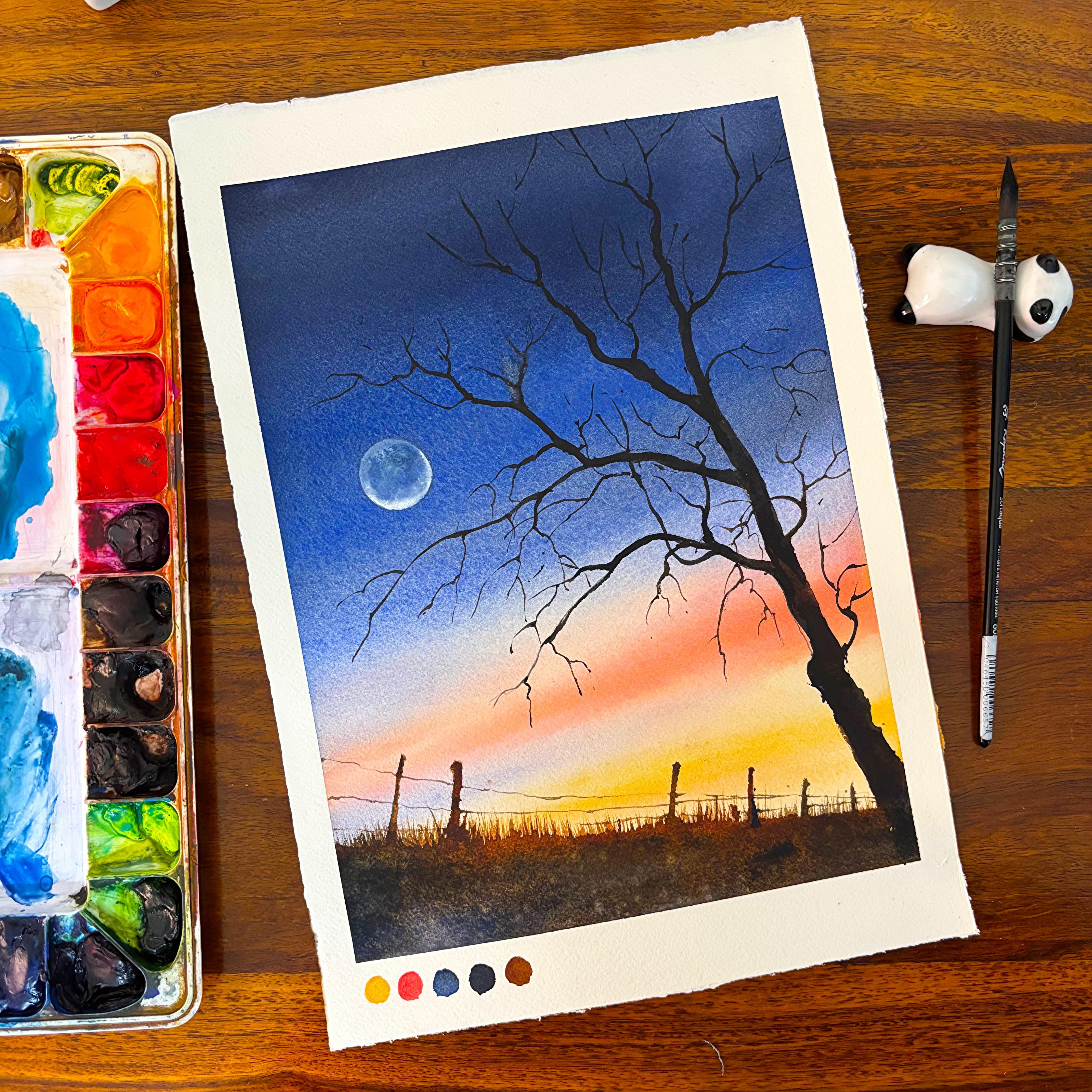
8. Project 4 - Illumination: This is the fourth
painting in the series, and now is the time where
I will go ahead with some of the sketching skills that I want you guys to pick up. You can use your scale. In this case. Do not worry. Just go with an A
six size paper, and I can tell you you
will mingle it completely. If you want to do it on
a bit bigger size paper, like a A five, more than welcome
to do it or even a bit smaller somewhere in
between A five A six. Perfect. Go ahead,
use your scale, make a few lines as I
go ahead and do it. Just observe as I work this out. This is going to be a window, and the window opens up to the sky where there is
moon and you can see a beautiful moonlit area in this particular room or the building room
that you can observe. This was one of the very
important paintings that I wanted to
do in this series. It's black and white. You can
use black or neutral tint. I love to use neutral
tint for all my paintings as sometimes I even mix a bit of blue because I just feel that the final outcome is
completely super impressive. Okay, continue with
your sketching. The sketching is going to take
around eight to 9 minutes. Do not worry, go with the floor. Don't think that it is
around 20, 22 minutes. It is absolutely real time. You do not need to worry. Together, we are going to paint, and you are going to
nail this painting. That's my guarantee. You just have to understand that this particular area
is inside the building, and hence, there are
a few lines which we need to add to depict
this room altogether. Uh My window is done except a few window panes,
which I would be adding. But before that, let's
go ahead and add another line which is
not exactly parallel, yet it is a bit tilted. Now, why do I add these lines? Now, a window when it opens up, usually there is a wall, and that wall I want to
depict even over here. Wherever you think you are not exactly going ahead and
adding a straight line, go ahead and work
with your scale. I always say creativity is most important rather than using
scale, not using scale. See, it's always good to
work with your freehand, and there is no alternative
of free hand drawing. But if you are someone who can work without
your free hand or maybe you are not so good with free hand line drawing,
it's absolutely okay. No need to worry. You will
nail it in a few years. Believe me, when I myself
started out with watercolors, I was not great
with my sketching, and most of my paintings were
for the landscape itself. Now, over the years, I
like to paint animals. I like to paint windows. I like to paint urban sketching. Flowers and so many things I've started adding under my bed. It takes it takes actually
few years to get all of it. So go with the flow, as I say, do not do not worry. It's all in our head. If you can take the
noise out of your head, you can add all skill sets. Do not go with any
word what anyone says. Just think that you will nail it and you're going
to nail it. Okay, great. I think the room
looks perfectly fine. It is more of a to
D kind of a design. You can see it's a two
point perspective. So all these lines will
meet at the end on the right side outside the
paper plane, of course. So it's not that we
have it over here only. I am adding some darker
values. I don't know why. I had to do it now, but yes, you can do it if you
are someone who likes to add a bit more detail
in your sketching. Over the years, I've realized
that adding some bit of your darker values in your sketching is
always always good. Now it's time to add the
shadow on our floor. You will see that
the light falls on the floor and it creates the shadow of the
window on the floor. I am also doing the same in
this particular painting. Creating some small lines
first for my window panes, and now I will just
erase these lines again, yes, it's erasers for your use. So go ahead, use it freely. As I said, do not worry, why I'm erasing, why it is
getting darker, et cetera. Use a HB pencil or
a two edge pencil. Don't use um, two B
or three B, four B, six B kind of pencils
because they are really, really dark and we don't want dark patches in any
part of our painting. You will see I will take measurement with
my fingers only. That's how I go ahead
with any kind of measurement which I want
to add in my painting. Once we have created the
shadow on the floor, we will go ahead
and add the moon. It's a small circle. I will keep it in
white of the paper. That's all I'm going to use
for this part of my painting. It's an absolute black
and white painting. It's a monochrome painting. So go with whatever
color is there. If you want to create it in
blue, go with an indigo. If you want to create
it in any of the black, go with mass black
or lamp black. I'm creating it in colour, neutro int, particular
shade of neutro tint. And I really like
the neutro tint, and hence I'm using
it for this painting. Our sketching is done. It's time to go with a flat wash. Now, this flat wash will be on everything that you
see except the moon. So use a flat brush. This is a big flat brush which I am using for this
size of a paper. It's basically a pool of
colour which I have created. It's a very light tint
of the neutral tint. Or you can say it's a very, very, I would say, less pigmented and
more watery kind of a fluid that I'm using for
this part of the painting. Once this is done, I will also add a layer of colors
on the exterior, which is majorly
leaving out the part of the window and going
with only the walls. Now, it was not captured well in my painting when I was
recording this lesson. But since it was
just a flat wasah, so I thought that I should
still go ahead with this painting and not cut it out from the whole
of the series. Which I did initially
think because I just wanted to keep
it very simple, easy, and not complicated. You have every small
step being explained, but it was just a layer
of color that I added. And hence, I thought that you all know how to do flat washers. You have learned great
with blending of colors, and also I don't need to go into detail every small
detail over here. Okay, let's go ahead and add some more colors
on the walls, and then we will just leave the part of the window
and add a flat wash. The paper remains wet, and on top of it, we will go ahead with
another layer of colors or create the texture that
usually comes up in a house, which is old and there
is some textured walls, et cetera, which has happened because of the wear and
tear over the years. Uh, There is nothing much to explain at this stage. As you can see, I continue
to just add colors unevenly now in various
areas of the painting. Some of the areas are lighter, some of the areas are darker. That's how I go about it. Once this spot is dry, we will go ahead with
another layer on the walls, which you can observe now. I have already added this
particular part of the color on the walls as my storage or the
camera completely stopped, but I did not want to
take it out of my, um, lesson part as this
is one of the very, very beautiful paintings which
came out, and it's easy. That's one of the reasons
I just thought that let it be you guys know flatwhs
and you can easily do it. Now I'm picking up the
colors from some of the areas where I think it
should be lighter and value. The paper is still wet, and I am going ahead with my paints of the
window. It's okay. When the paper is wet, you can surely work it out. You have to blend it
with some clear water. Keep one source of water, which is very just for taking out paints from your brushes and one
source of water, which is clear, or
sometimes many people even like to keep
a huge or a big, big jar of water so that that can be used
multipurpose way. It doesn't go bad very quickly, and it's easy to work on
smaller paintings and have two or three
paintings being nailed before the water goes dirting. Let's now start out with some of the areas where I
want to add the texture. It's absolutely okay. If your paper is semi dry, you might get a few
textured kind of lines. I told you that the walls are not even at any point in time. So just see that and
keep that in mind. Never worry about the fact
that you're not getting that perfect one single color like a flat wash on
the wall, it's okay. Just add different shades or different values
of the same color in various parts of the wall, and you will see that automatically your painting
is falling in place. I have added the darker
value towards the top side. Now I will go with
some clean water and just push it towards
the bottom area. I don't have equal
amount of pigments, or I work with the same kind of values
in ach and every place. Some of the areas I add more, some of the areas I add less. So the values keep changing
to a greater extent. Lighter, darker values
do change that, and you will see a lot of difference in your
final painting. I like to mix or change these
values even on the paper. I don't keep various pos
of colour on my palette. And hence, I really can't show you that even
on my palette. I love to mix my
colors on the paper, as I always always say, because that gives me so
many different values even, which we usually can't absorb in our up in our palette
mixing exercise. So yeah, there are two ways
to always mix your colors. One is you mix on the paper, and one is you mix
on the palette. I love mixing on the paper. That really gives me a great, great outcome, which I always, always look forward to. At least from my end, I just see that as a beautiful outcome. Now I have started
painting my window part. I have switched my brush to
size three or size four, depending on what size
is available with you, the size of paper
that you are using. So there are a lot of factors which are involved when you
are deciding your brush. That's one of the reasons
I never say that you have to go with this
particular size of brush. It's for the paper
size, which I am using. I prefer this kind of a brush. You might have a
different preference, and that's absolutely okay. It all depends on what
works best for you. And Watercolor is a very meditative process, and from here only, you will be in a position
to see that. You are adding all the lines, et cetera, and it's a slow, as well as an iterative
process where you keep adding the lines and the painting
starts building up on its own. You don't need to do much. In this case, there are
some of the areas on the wall which you can see
that is not evenly painted. I am not even looking forward
to an evenly painted wall. As I always say, it all depends. The more is your wear and tear, the better would
be your painting. Time to add some more lines
as you observe over here. And once these lines are done, we are going to go ahead with a final final work
on the window, et cetera, because now it's
the time of final detailing. There are four or 5
minutes more to go. We have to work on some of the
darker and lighter values. The whole of the painting
has come together. Believe me, it's
just a few lines here and there, and that's it. Four or 5 minutes is nothing. Believe me, it's just that you will be refining
your painting at this stage. There is no way
you can go wrong. Don't overwork on this painting. The painting has turned
out really well. You just need to play with your values a bit
or make your lines, work out with your lines, et cetera, wherever
needed, and that's it. We are going to have
a simple, easy, yet very interesting painting by our side once this is over. Adding some textures on the wall and a few
lines here and there. Some of the areas are darker, some of the areas are lighter, as we have done even earlier. Dry brush technique works very well at this stage,
where, frankly, you are just using a
very dry brush to create the textures on your wall
and blending a few areas, creating more and more textures of the wall and letting it as I am already so happy with
how this has turned out. I can't tell you that this painting is my
heart completely. There is so much that we
have done yet so little. There is less, which is more, as I always always all
these paintings are simple. Believe me, all these six paintings are very, very simple. Even the last two
paintings are very simple, which is a bonus lesson. They are just AFO size or
which the time of the whole of the painting increases
15-20 minutes to around 30 to 40 minutes. That's the only
challenge which you will see because you are working
on a large sized paper. When you are working on
a large sized paper, there are variety of
factors which affect the um, whole of the painting. Like, one of the
bonus lessons has a blending which came out
amazing at the first. And I did retouch it, which I always say
that don't do, don't do to each one of
you, but I did it myself. I will show you the
mistake that I created. And then, again, I
had to go over it with a layer to make
it completely even. Though that layer
was very, very light and you really
can't guess that I did retouch it or not have
an outcome which was great. The final outcome looks
absolutely perfect, but, yes, we could have had a outcome just in the first four rather than again retouching
and changing it. Okay, I am just taking off the extra paints from
wherever it is necessary and making it a bit
more drier then we will add some of
the other lines. I guess there were some dots or drops of paints on
top of the moon, et cetera, and hence I have taken it off with the
help of my tissue. Picking up some more colors with the help of my flat brush, you have seen me doing
it even earlier, and I continue to do it
in many of my paintings. For every class, you will
see me doing it very often. Now, once I have started lifting my colors
from various places, I just feel that
it works so well. Not only for this, it works
well, even for the clouds. Yes, there will be a cloud class where you
would be learning how to lift your colors and
how to paint efficiently. So that's also there in my mind, which I will come up with, but it will take some
time too in this so continue with your lines as I'm doing and
extending over here. This is an absolute dry paper. So go with the floor, have just use the brush which
you are most comfortable with because the
brush that you are most comfortable with
will give you a result, absolute you're going to
nail that practically. That particular part,
you're going to nail it. I always use this optimal brush because I'm very comfortable
with this brush. The final outcome I feel comes
out well with this brush. Let's just continue
working on it, and then we will have outcome, which is up to our liking. Okay, great. Um, I guess, I will not touch it anymore
and leave it to dry off. Let's move on to our
next painting now.
9. Project 5 - Winter Evening : Hi, guys. This is the first
painting from the series, and I'm excited to tell you that we will
be painting pines, moons and the early evening
kind of view over here. Now, what is an
early evening view? We will be having darker
colours of the sky, but in very, um, I would say light way, or you can say the
values would be really light as we are going
to add the moon, which should be also seen. These pines will be done
in a wet on wet method. You will see how
we work this out. Some of the portions would
be darker and lighter. They are completely snow
clouded and hence I am making some random shapes and sizes
for making this pine tree. Of course, this particular
pine tree is in the foreground and another one would be in the background. The rest of it would be
majorly the background, colors that we will be
adding in different values, et cetera, which might show the faraway trees
that are there. Continue with the drawing. The top part when you are
starting with the drawing, it is majorly smaller, smaller piece and
parts that we had, whereas as you go
towards the bottom, these circle or you can say not so circular kind of a shape and size
will become a bit bigger in size because each of these pine tree leaves that
you see is covered with snow and it is so much snow
laden that we practically cannot see the pine
tree leaves at all. Only some bit of it would
be seen as a shadow. We were at that kind
of a shadow, also. This is my favorite. You have done this in
one of my audio classes. Last year, where we were
painting this snow. I would be using
the same technique even over in this painting, though the paintings
are different. But having said that, if you want to attempt it, see the right hand corner, you will see the exact name
of the class, et cetera, where you can go and just take
this particular painting. There are about 14
paintings in the class, so yeah, feel free to go
ahead and give it a try. Now it's time to make
the horizon line and start with the
background or pine tree. Of course, the background
pine tree would be way more smaller than what we
have in the foreground. Always remember the
perspective works, whatever is far away from your eye level will
be smaller in size, and whatever is closer to your eye level will
be larger in size. And if you can
keep this in mind, I think you will be
in a position to nail most of the
paintings that you do. Sketching a pine tree is practically a very
iterative process. What you have done
initially will be repeated again for the
background pine tree. I could be working
in a similar way. There will be no change
in terms of pine trees or the snow clad leaves
that we are going to add on this
particular pine tree. So continue in the same
process, and once done, just add a oval kind of like this is an oval structure that
I add on the paper, and once that ov shape is done, we will go ahead and
start with a coin. Now, coin is majorly
going to tell you where exactly I want
to place my moon. Now, this particular radio of the moon is not
exactly in the middle, a bit tilted towards
the left part. You can also have
a smaller moon. I would leave that
decision up to you. I am not going inside the moon. I will go in and around the
moon, I'm not masking it. If you are someone who has
masking fluid with it, please go ahead and mask your moon before you
start with your painting. In case you want your
yellows to be subtle, you should go ahead with
naples yellow and purple. I practically choose
naples yellow and purple. Naples yellow also doesn't
react with the blue, and hence you will never get the green or the dirty mixtures, which you usually get
with other, I mean, shades of yellow when you use it with either a purple
or a blue, et cetera. Make sure that you
go in and around it. This is a wet on dry method that I am using right
now for this painting. You can also go ahead
with wet on wet method. I would leave that
decision up to you as I did tell
you even earlier, the peak size is not huge because of which I can
really work pretty easily, even if I am doing a wet on wet method or a
wet on dry method, whichever is
preferable with you, wet on dry also works well. Wet on wet anyways works well, even on a bigger paper
or on a smaller paper. Let's go ahead and place
a small tape below my paper or this board
because I want the paper to be tilted and I want gravity to do its work so that the colors can automatically
blend with each other with less
effort from mind. I always say this
that blending should not be like you are
adding a lot of effort, and blending should
come very naturally. And that is when I would say that even if you
were a big nerve, or medium level artist
or whatever be the case, but you continue to grow. You continue to grow only
with very simple tips and tricks and techniques that you learn in the process
of watercolors. Time to add a bit of pink. This can be even carmine. I'm using compose opera and then blending
with some purple. You will see how the colors
blend into each other. Anyways, your pink will
not react again with the naples yellow that you have applied already
on the paper. Just in and around the
place where there is moon, I have kept a bit of yellow. Rest, most of the
places are quite dark. I'm not using very
pigmented mixes because of which you will not find
them absolutely dark dark. But still, yes,
the colors are not as light as what you would see
during the day, et cetera. I did start blending
my colors so even from the middle part of
the horizon line after I was done with the sky, and then while I was ending
towards the bottom area, I did apply some
of my ultramarine. Ultramarine is the blue sheet
which I am using for this. You can also go ahead
with bar Blue or any of the other blues
like donthrineblue, whichever works best for you. Cleaning out the
area where I want to make my pine that
is snow cladded. So just go ahead and
clean up those areas. As it is necessary to
clean up the area, I cannot keep the same color of the sky in this
particular area. It has to be lighter as it is completely drenched in snow, and we want to even show
the same in our painting. Blend the colors wherever
it is necessary, your paper is still wet. You can see for
eight to 10 minutes a 300 GSM Arches paper can support you to paint in all
the conditions possible. This particular
painting was done in November and the class
is getting released now. But during that time, of course, the humidity condition did
change to a great extent, and it was almost winter. So, yes, I would say that, that was the climate did
allow me to really have a good time and did allow me with a lot of
time to work on my paper. Even if it is dry climate
or even if it is very, very humid where you have to switch on your AC, et cetera, I think still it gives seven
to 8 minutes for sure. You can work on paper. Continue to just add a few more shades of pink wherever you
think it's necessary. For me, it is necessary
towards the top part. I want to iterate
the same colors from the bottom to the top. I I will add some more yellow on the
outside part of the moon, as you can see
over here and then blend it with the colors
that are already existing. I did apply some amount of blue even on the top
part of the sky, absorb and work around it as
I am doing and again take off all the colors that we have applied on top
of this pine tree. I usually wash my brush and then start
picking up my colors. With the help of flat brush, round brush, whatever
is available, go ahead and use a damp brush to remove all your colors
from the pine tree. Okay, great. I guess this
is an iterative process and you would be in a position to go ahead and work
it on your own. We will start working
on the pine tree next. I The bottom part needs some blue
because it is really, really light and I might go ahead and add a
bit of blue in it. It would be ultramarine blue, which is already
there on the palette. I will mix a bit more
and start adding it. You will see it will go lighter and lighter as I go a bit up, I'm not going to add any of
my darker values over here, blend it with some clear water, and this is how it works now. I will just think a bit before picking up any
of the other colors. This is basically
the background trees which I want to paint. It is with the
same shades that I did apply even for my
top part of the sky, just make does and you can actually go with a smaller
brush because that would allow you to restrict
the colors in and around the horizon line only rather than expanding towards
the bottom area. Cleaning up the edges in and around the horizon line
wherever it is necessary, you can see how I work through it with the help
of my flat brush. I would apply one more layer of darker value on
top of this area, which is majorly for
my background bushes. Once that part is done, let's go ahead and see how
the painting has turned out. I think a bit of it will work
even for our foregrounds, some dry branches, et cetera, that I plan to add. And even the oval
structure that you did see order I want to go ahead and apply some darker values
in that particular part. The paper is too wet. It is practically
moist at this stage, which is because of this particular reason because
of this particular reason, of course, the colors
are not moving a lot, and that gives us a
lot more advantage. This particular water control, you might have to
experiment and see, there should not be any puddles
before you work this out. It's time to work on our
foreground pine tree. We will start with a very, very light wash of your pupu. And then we will extend it even towards the
top and the bottom, we continue to work around
with it, extend it, and make way for this
snow clad pine tree, which this is a flat wash, but only in the areas which
we did mark initially, we are not going to go beyond
that. We will work on this. And once our PPO is wet, we are going to go ahead and
even at a very dark value. Towards the bottom side of these round or circular shapes
which we did initially. I will show you how we work
this out. Do not worry. Just go with a very thin brush
for that particular work, and it should be dry enough. Like, there shouldn't
be a lot of water on that particular dry
brush which you are using for adding
the darkest value. I'm using a thin brush, as you can see over here
and slowly extending. The paper is still wet, which allows the
colors to move a bit. I would say this is not wet. This is a moist condition. As I always always say, moist is very different
than being wet altogether. The colors are not moving a lot, only moving to a smaller extent, as you can see over here. I continue to paint over the
edges as you see over here, not completely taking over
the entire space of the tree. If your paper is not wet or this particular area of
the tree is not wet, then you might have
to go over with a bit of clear water
but not puddles. Always, always remember
this particular painting is not about petals. It's about keeping
your paper moist. I might have to go over
it, and then, again, just see if the colors I don't think that the colors
are moving anymore, yes. So it is time for some clear water or the
color that we did at Odio to go over all the part of my pine tree and then
start painting over it. I am so excited to
give you this lesson, though I have already
given a lesson, which is similar to this one, as I did mention Audio, but still going over it again, gives a lot more
confidence, even to me. I don't throw
everyday paint pines, or I don't everyday
go ahead and work on all my paintings which look similar to the one
that you see over here. You might have to watch this
pine one more time and see if you want to add one
or two more snow clad, like, pine, um stems
here and there. So that part, of
course, can be seen. We'll see how we work
that out because the middle portion just
seems to me a bit odd. That's the reason. Anyways, um, if it works out,
let it be as is. Adding colour on my
background pines, the same wash that we did
for our foreground pines. You can also go ahead
with a lighter wash. I will leave that
decision up to you. Time to add the
darker values again. We will use the same process for the background pine as we
did for our foreground pine. Touch in a few areas and
leave it one or two dots, one or two lines, and that's it. Less is more in this case. So go with that idea in your mind and don't
touch it everywhere, then the colors will move
a lot on top of the pine, which we really don't
want in this painting. I will start working
for my foreground pine. I want to show this
particular area of my pine just under the pine
a bit in a bit better way. And I'm adding, of course, darker value over here and then blending it with my flat brush. Now, flat brush is,
of course, damp, and that's one of the ways
I always keep a control. Adding one or two
lines, that's it. The paper is not wet. You can see these are kind of hardages. So it's time to add some of
the dry plants over here. We will even do that. Nothing much difficult. It's just that it takes a bit of time to work through
the entire process. Y I'm pretty happy with how things are moving on. At this stage. We will add one or two drops and
then small small lines. You can change your
brush or else, go ahead with the same brush, but with less paints, take off all the extra paints and start adding a few lines for the dry plants that
I did tell you earlier. You can also go ahead with a thin brush of any
of the other sizes. This is, of course, a
squadooptimo brush. I did tell you even earlier that this brush has been with
me for many years now, and it's been one of very good brushes
that I've used to date. But then if you don't have
anything of this type, go ahead and use any of the other thin brushes
that's available with you. Now it's time to go ahead
and just blend a bit, that is make the
edges more softer for this particular mod and then start adding
colors inside the moon. It would be mostly the
yellow color that I'm going to add and some bit
of maybe orange, et cetera. It all depends on the mood
you know to a greater extent. Okay, first, take off
all the extra water as I'm doing and trying
to make it more softer. These kind of things
add a lot of, I would say, beauty
to your painting, and then keep adding
more and more yellow. This can be any yellow
of your choice. No particular yellow
that I have in mind, whatever is on your
palette, go ahead with it. I think I'm using a mix
of my Indian yellow and some amount of my Naples yellow that I already
had going with either a red or an orange
kind of a combination, keeping it more subtle, not adding lots and lots
of colors at this stage. I might add a bit or blend
it a bit more as we go towards the right and make it more circular
in shape and size. Some more dots here and there, and then I guess I'm good. I'm pretty happy with
how it has turned out. We will move on to our
next painting after this. It's also a very, very
interesting painting. So get along with me and
let's paint that out. A In between all this, I hope you are liking the class. Yes, there is a good amount of blending and all
that I'm teaching, but the variety of subjects
that I have tried to cover hopefully does satisfy
your creative goals. I
10. Project 6 - Lighthouse View: Finally, we are on to
our last painting, and this is going to be
very exciting for us. The last one is, of course, a bit different than what
we have done till now. This one is one of my
favorite subjects to work on, and it is majorly something
close to urban sketching. Of course, not exactly
urban sketching. We would be loosely drawing a tower and this tower is
basically a lighthouse. You can use a scale for this, or else also go ahead with
direct free hand line drawing. I would leave that
decision up to you. It's all about being
more comfortable. If you are more comfortable with the free hand line drawing, please go ahead
with free hand line drawing for completing
this sketching part. I am just dividing my whole of the tower into two equal
halves, as you can see. I have not added the
tower in the middle. I have already placed it on the left side and on
the right hand side, I would be drawing my moon. Now, the size of the moon
would be bigger in this case, and you will see how we
would be painting the sky. The sky is also
going to be dark, but I'm not adding
any stars as I want the focus to be laid
only on the moon and this easy to go kind of lighthouse that we will be drawing and adding
in this painting. For my lighthouse,
I'm going ahead and adding a few
rectangular boxes, as you can see over here. Now, the rectangular
boxes are very easy. Some of them are more longer, some of them are shorter, some of them are
thinner, broader. You just need to
alter the sizes. For all the sketches, you will find them very easy, as I am a person who has learned the whole skill
set of sketching, drawing, painting on my own. And watching various
other artists, too. I will not deny that
the whole time is always about learning and
you may learn from artists, you may learn from
normal people. Your life is completely
your learning. You continue to learn every day, you continue to watch,
you continue to learn. And hence, this particular
tower that we are adding is also about learning something that I am exceptionally
proud of. It's soft and the soft effect we will get in a
wet on wet method. How we get it is something that I really
want to show you for everyone who love the flow
of watercolors and allow the watercolors to do their own magic rather
than trying to control it. This is all about that. It is all about letting
the flow happen, letting a continuous
flow happen, letting your creativity flow, as well as allow the watercolors
to do their own magic. In my first layer of sketching, I usually go ahead with
very light shade of my pencil once I am a bit
okay with the fact that, yes, we are landing at something
that I also want to do or we are landing at a drawing that can be
further finalized. I go ahead with a darker
value of the pencil. I practically use the
same pencil for doing it. You can go ahead with
any other pencil of your choice or whatever is
available that decision, also, I would leave that up to
only that you fungalise your sketch at a second stage of your drawing rather than
it being the first stage. In the first stage, you just add a few light lines
for your drawing, which will further change
into a final painting. Let us now go ahead
and make the moon. I would use the middle part
of this particular tape, which I have used even
for taping down my paper. I usually use these kind
of shapes and sizes that I see in and around me for even my
sketching purposes. I think the moon was smaller, and I wanted it a bit bigger, so I will go with the
outside part of my tape to get a circular shape
and size for my moon. Uh, this is very
exciting for me, as we are almost done
with the sketching, there is very less time that we did take
for our sketching, and it's time to just think that what we want to go ahead
with the colors, et cetera. Though this particular
class where I am completely guiding you but I will tell you exactly
the process I think. I first go ahead with a sketching
that I have in my mind, and then I think about the
colors that will suit it much. Even try to see the colors
on a small piece of paper, so that if you're using
two colors, three colors, the blending should be clear, et cetera, all of
them put together. It comes to a point where
I start loving everything that we paint in this,
um, particular painting. You can also do a small
thumbnail sketch for yourself. Thumbnail sketches are very, very good and they are very helpful in your
final painting. I have done it in the
past, and I still do it. Otherwise, what happens is
sometimes you go ahead and paint one single painting
two times or three times. And this I have started
avoiding very recently, where I go ahead with a
small thumbnail sketch, see how it works out, and then go ahead with
a final full painting. I'm using my ultramarine. Ultramarine is one of
my favorite colors you have seen in the past, and currently also
it is my favorite. I'm going over the entire part. I'm not thinking about, uh this whole tower part,
just go ahead with it. Leave out your smaller part of the circle that is
majorly your moon. So you have to leave
out your moon. If it goes inside the moon, then we will not get the yellow and the grease that we need. Though your yellow doesn't
react much, but still, let's keep it as is, and let's not go ahead with
any of the other parts. I want to create the light in this middle part of my tower. Hence, I am leaving that part. This is, again,
wet on dry method. We are not going ahead with any wet on wet
method in this case, but I'm using a lot of water. My brush also holds
a lot of water. If you are looking
for brushes which can hold a lot of water, Escoda, the Vince are two major brands that I have been using in
my past for many years. And still I'm using it. And even if you want to have the same kind of approach
for your round brushes too, I think silver black velvet can actually hold gallons of
water in their brushes. So go ahead, reach out to any of the stationaries where
you can get these brushes, and I'm pretty sure about it, you will nail all
your paintings. And, you know, it's also
about an experience. So when you have a good
experience with your brushes, you exactly know that, yes, your painting is going
to turn out well. Initially, when I go ahead with my first layer, it's
usually lighter. You all know that I never go ahead with a very dark
layer in the first go. But when I am doing
a second layer, I try to go ahead
with a darker layer. By mistake, I did apply the
color even in the white area. Now I have to go ahead, I think, even with the tissue
to clear that out, it will not get
cleared on its own. So do keep this in mind. It sometimes does happen. It sometimes happens
even with me. We just fix it on the go. Yes, there are a lot of
things that we can fix, but having said that, watercolor gives us
less opportunity to fix any kind of mistakes
that we do in the process. And hence, it becomes
very important to continue working through
it whenever you are like, working working very carefully, more than working with
an understanding. It's all about being
careful to not touch the areas where we want to
keep the white of the paper. White of the paper
is the best thing that I think has happened to me, how I have used the
white of the paper really defines my painting
to a great extent. Going ahead with my indigo, or you can even use pins cream, mix a bit of Bnciena into it and add it towards
the bottom media. You can see the Bern siena and the ultramarine
or Pains gray, whatever you are taking over here will mix with each
other just on the paper. Why on the paper is something
that you must understand. If the colors move on the paper, what happens is they
will move on their own. They will create
various other values you might not have
thought about altogether. Whereas if you do
it on the palette, you will not get the
opportunity to actually see the beautiful outcome
which happens on its own. The pain's gray, you
can see over here has mixed with the burn sienna
and given various shades. I will add some more of my burned sienna for this
part of the bottom area. You will see how we continue
to work through it. I do always move my people, and this is possible because I did stick it
to my acrylic board. You can use any board of your choice and stick
it so that it's easier, even for you to
move your colors. And seamlessly, it
blends with each other, where you are doing less
work and the colors are automatically doing the work
that is needed by them. And, you know, watercolors
can do a lot of work for you, so let them work on their own. Do not try to control them. You can partner with this
medium, as I always say. Now I'm applying
my brown colour in the middle part of
this tower area, going ahead and adding it on a wet paper. This is not wet. Exactly, this is moist. Again, the same thing
that I did tell you Odio from the Pines painting. That's one of the reasons these two paintings are given in the last because we are
mostly working wet on moist. Ooh. I will be washing my
brush and picking up the colors from the area
where there is window, though you can do
this or else just go ahead and even use your
tissue to pick up the colors. I love to use my brush to do it. You can use a round brush. You can use a flat brush. You can also use a tissue. These are the things which can help you to lift your colors. Secondly, if you are
lifting your colors, make sure that your colors are
not so I would say they do not have the ability to have lots and lots
of stainss in it. Now, why stainss I say? Because if they are
really staining, what happens in the process
is that you will not be in a position to take off
the, the background stain. Like, currently, I have very, very light tint of blue
that is still there. But rest, all the blue, browns, whatever we had has
been taken off. Uh, this is a particular way of going ahead with your
painting where you have or this particular
thing is actually important if you are working
with artist red colors. Artist red colours are much
less staining compared to other set of colors that
you can buy in the market. And artist red colors also
requires less number of layers compared to student red colors that's
available in the market. While student red
color is not so good, I have told it year or, and again, I treated Student grade color has
three components in it. One is pigment, one is binder, and another is filler. If you are working with binder
and more of filler in it, what happens that
your color becomes lighter and lighter and there are many layers that you need. Whereas, if you are working with artist good quality
artist red colors, they usually have binder
and pigments only in it, which gives you a
lot more opportunity to play around with, and it helps you to work in
way more or less layers. Over here, I'm introducing
the darker value even in the tower area or the lighthouse
area, as you can see. Some of the area
I'm keeping lighter on the side where
there is my moon, I'm keeping light,
and the other side, I'm trying to put
a darker value. This usually happens
if you are working with any of the light source on one side and any
of the other part, which is on the shadow
side will be more darker. Cleaning up my edges a bit with the help of my flat brush. I will be using a
thin brush now to add a line as you see over here. Now, this is a brush. Of course, you guys know
it's called optimo. It has got a nice tip, but these kind of brushes
are now available even with Vinci or other brands.
So please go ahead. Whatever brand is
available, you can use it. I'm trying to add one
or two more lines. This is still wet, and I can work around on the
wet surface itself. I have a brown patch in the middle and
really, I don't care. Maybe I can fix it
as we progress, but I may not also fix it. So accept whatever you
get in a painting. If you are happy with whatever you get and
pretty sure about it, you are going to nail a painting because it's
automatically coming up. You don't have any hand in it. I'm trying to add one or two
darker dots here and there, as well as go ahead with some of my darker bushes in
the bottom area. One or two dots, the paper is still wet and hence
they will move. I do not need to do
much work in this case. I will take off all
the extra colors from the tip of my brush with
the help of a tissue, as you can see over
here and then go ahead with any lines
that I want to create. This is easy, yet it is only possible if you understand the
process that less is more. So less colours on your brush, less water on your brush can also give you a great result. Grit results are not practically made with lots
and lots of pigment usage. It's only with less
pigment and more of water that you create good outcomes in a
watercolor painting. Water comes ahead of color, and hence you know
that watercolor is mostly made out
of water only. There is less of pigment
work that is needed. It's more of waterwor
that's needed. I'm adding a few lines
in the light area. You will see that I'm not
occupying each and every space. Some of the part
is a bit broken, and that's absolutely okay. Just make it broken a
bit here and there, and that will show
that the light is glowing from this tower. Once the paper dries up, the colors, of course, will
become way more lighter. That's expected, and
it's absolutely fine if your colors are also
getting lighter and lighter. I'm picking up the colors
because the whole of the paper has gone really dark compared
to what I was expecting. And hence, some of the areas need to be a bit more lighter, and then only we will
be in a position to add one or two dry branches
for this bottom part. Creating simple windows,
as you see over here, there is no particular rule
that's there in my mind. It's just a bit of outline. I'm breaking it in a few
spaces and not giving an exact outline just like we do in a pen or a pencil sketch. Let us now start creating the
bushes for the bottom area. It is basically dry lines. As you see, the dry lines
are easy to create. Use the tip of your brush
to create these dry lines. It's more of an
iterative process. So do not be tired, and it's very, very easy to do. You start, and then you keep adding these lines at
regular intervals. No I should be spontaneous, not in any particular manner
or in any particular way, just the way when you
see a tree that is there in the forest
is never in any line. Whereas the planted trees
that we plant in any area is always in line or in a particular manner,
they are organized. We don't want these bushes
also to be organized. It should be absolutely random. I'm adding a bit light colo
blue in the area where it is my tower or light because some amount
of sky is also seen, right? It cannot be only light light, so I've added a
very light layer, and then around the borders, I've added a bit
darker colour of blue. That's how I go about it. These are done with
very less colors. Again, a limited
palette exercise, you do not need to have
lots and lots of colors. Three colors of four
Clos is quite enough. You can also use ultramarine Bern sienna
and indigo to complete the whole of the painting
or paint scrap whatever you feel is good for
yourself. Use those. And then, of course,
for the moon, we have to go ahead
with other shades. It can be also done with
a neutral tint or if you're even using a dark value of pains gray, it can work. But I wanted to have a
bit of yellow in it. Yellow means naples yellow. Of course, not the
other yellow that works best in a blood moon kind of
situation, of course, not. You can see how
light the wash is, and then we'll go ahead with a bit more darker
value here and there, one or two dots, touching it. And then, again, going ahead with our another shade
of neutral tint. I'm very excited about
neutral tint or paints gray, whatever works best for you. This is a painting
that I really like, and I hope you are also
liking it to the full. If you have liked
all the six exercise and painting along with me, please do upload
the class projects in the project gallery. I'm eagerly waiting to have
a look at each one of them. Secondly, there are two
beautiful bonus lessons which are going to come up next. So once you are done with
these first six exercises, wait for the bonus lessons, do not think that we are not going to work on bigger paper. Now since that is
an EO sized paper, whatever painting you could
do within the last 15, 20 or 30 minutes, I mean, it's usually
15 to 20 minutes. Will get extended,
and it would be around 30 to 40 minutes. That's the only change
which is going to happen. Rest, everything is
going to stay the same. Hence, go ahead and feel absolutely confident when
you work through this class. I will meet you very soon
with my bonus lessons, and then we are going to end this class on a very,
very high note. Et your peer dry off after this and do not
continue to work more. Leave it at this stage. We don't want to overwork
through this painting. Once done, remove the tape at an angle and have a fun
look at the paintings. I mean, both the paintings.
11. Bonus Lesson 1 - Shining Moon: Let's go ahead and
have a look at all the colors which we are going to use in this painting. The first is naples yellow. Second is your
quinacrodon coral. The third would be ultramarine. The fourth would be paint gray, or you can also use indigo, and the last is burned sienna. Let's start out by applying a clear layer of
water on our paper. This is an A four size paper. If you are someone who hasn't
worked on A four size, still be very confident. This is going to be a
very, very easy painting. You do not need to worry. Just go ahead and start applying the colors of yellow
and quinacrodon coral, as you see me doing over here. I'm going towards the bottom
part and applying it. I would be using silver brush
or else you can also go ahead with any kind of mop brush exactly the
way you see over here. Silver brushes or mop brushes
can hold a lot of water, and it would be easier for
us to apply the colors very quickly on top of the paper or else the paper
might get dried off. I'm going ahead with
my ultramarine color. This is the ultramarine blue. You can also squeeze out fresh
paints from your tube if you are not using the colors
from the palette as I do. I usually squeeze out my
paint into the palette and then use it from the
palette whenever I need it. I will go ahead
with some more of my quin acrodoncoro in between, as you see, and then
ultramarine and yellow. So this current part is not exactly what we are going to paint or how the sky
is going to look. Never, ever lose your
patience at this stage. And I have seen many even myself doing it when I was starting
out with watercolors. If something just go wrong
in the initial stages, I would give up
with that painting, which has stopped
completely as I have moved on with my
years of watercolors. And whatever be the painting, I usually like to finish it off and then move on to my next. And every time I
finish a painting, I learn something new. I have stopped calling any of these paintings my failures. They're mostly my learnings. The days which are good, of course, I create something that's
exceptionally beautiful. Now going ahead
with some more of my ultramarine and applying
it towards the top area. The ultramarine is a color which has a lot of granulation, and you should also take that into account that
this would be granulating. If you are someone who doesn't
like much of granulation, you can also go
ahead with cobarblu. Kobal blue is an alternative
color that can be used, and it would look really nice on the whole of the painting. I'm going ahead with my paints gray and just trying
to blend my colors. I do use or take the
support of my board that really helps me to apply
the colors pretty evenly, and the gravitational
pull can help the colors to move in on its own with the
help of the water. Picking up some more ultramarine color and then applying it, you will see how I will create a mistake because of my
overwork for the sky area, and then again, rework on
it to get a perfect plan. So yes, even for watercolors, it's not that your watercolors
are not at all forgiving. Having said that, the white
of the paper might not be so much visible if you
are going ahead in layers. Whereas if you can create something in the first
row, it's easier. The confidence is
usually higher. You can go ahead with
your perfect blending, then perfect, I would say, mixing of colors on the paper. All of it comes
together very quickly. I was initially very happy
with how it turned out. I thought, within
four or 5 minutes, I have failed my sky
and actually, I did. But then something happened. I continuously overworked on this painting and
had to again go over it in layers to
create one more sky, which looks exactly the same
what we have created now. But, yeah, I mean, if you continuously
work on anything, believe me, the one
that you have created may not be the exact outcome. And you might get an outcome
that looks even better. I will not deny I have got that in many of my audio cases. But yes, maybe the first time
beauty goes away in that. And the whole fun of just enjoying the process
sometimes does go away, but do it for your
own sake because, yes, there will be mistakes that you will create
in any medium. Whether it be watercolors,
gauche, oils, et cetera, Oils give you
a lot more opportunity. Your gauche also gives you
a lot more opportunity, and there is a lot less
opportunity with watercolors, having said that, but still
there is opportunity, and I would like to show you
that as we move forward. You can see the colors are moving from the right
towards the left. And there are a few
lines that you also see. Do not worry if it
doesn't get blended. It really doesn't matter with the whole final outcome
of our painting. I did apply some water on the bottom part
of the painting, and now I'm going ahead
with my coral color. You can see the
bottom area has a lot of beautiful coral
and yellow mixes. This coral and yellow mix
looks amazing together. But since I am retouching
it every time, so what happens is I
might get a few lines, and those are
usually the hardages many of you complain
to me that when we try to blend blending doesn't happen naturally or the
blending doesn't come up well. That's what I also
wanted to highlight. Even for me, it doesn't happen, the blending doesn't go up well. These things do happen in
any watercolor journey, so do not think much when
it has happened to you. I would say, at this moment, you should not retouch exactly the way I
am doing. I did it. And yes, then I
had to practically again go over the entire pot, entire sky area, and
apply the colors again. First five to 6
minutes are always always crucial and it
gives you a great outcome. Let it be. No need
to do anything more. I'm trying to blend and pull my colors with the
help of my dry brush, but believe me, it would
be not of much help. I might have to go head
over the entire area again, as you see over here with a clear layer of water and
then apply the colors. This has been the
case earlier, too. I have done this in the past, and I'm again doing it now. These things do happen. If you are working or dappling
with this any medium, I would say this is
bound to happen. So do not fear, again, something like this. Why is it happening or
how it is happening? I experienced artists. I mean, every experienced
artist has also gone through it as quite a few number of years
I have in my experience, but still, I am going
through it till now, so you know, yes, these
things do happen. Again, it's time to go over the entire area and
redo the sky because I have got a big blob of
water on top of the sky, and it's really
not going to help us anyway going through
patches and all. Let's go over the sky and
let's create it again. This is a process, and this process needs to be
followed. So let's do it. You continue to just have
a look at how I progress. If your first sky
has come out, well, please do not go ahead and retouch it exactly
the way I am doing. This is a process
where I'm showing you how you can fix anything
that has gone wrong. Redoing my sky with my corals, then my yellow as
well as tro Marine. And Moving my both so that colors can
blend together with each other and
the mixing happens on its own rather than I go ahead and do it
for this painting. Once you have outcome that
looks similar to the one which I have on my
paper right now, believe me, you don't
need to work anymore. This is the moment
you should give up on your brush, leave your brush, and let this paper
dry off till you can, again, start painting over
it with a next clear. You can see a
beautiful sky outcome, and we will leave it till this. Go ahead with one of your
pencil sketches at this moment. I did not do any
pencil sketch when I started out with my watercolors. Um it was just my
layer one where we were going ahead and just
adding the background sky. This is a night sky,
of course, you know, and that's one of the
reasons there are a lot of darker values that we have added rather than only adding some of our
lighter values. Now it's time to add fence
and some ground area. Though I'm not going
to add lots and lots of things in this painting. Believe me, it itself will look very beautiful and pretty
once we are done with. Going ahead with one
of my trees over here and then starting out
with our watercolor part, you will see that this is mostly the darker value that we
are adding and hence, you do not need to worry. Just that the tree will take
some good amount of time, and that's one of
the reasons all of the painting takes its
own time to get together, and then we can only have
a outcome accordingly. Adding some of the branches
just as a guideline, though you can't see
it at this stage, but you will be in a
position to see it as we progress going ahead with some of my Bnciena
as you can see, I am just adding it
towards the bottom area. We will also mix some amount
of ultramarine orals. You can also go ahead
with pains gray to get theta values as we reach
the absolute bottom area. Mix the ultramarine to
get the bottom part in absolute darker values
as you see over here. And then there would be
some of the plattering. Of course, those plattering
will be with the clear water, and you would really see that the final painting has
turned out very pretty. I would use this
dry brush technique for creating my grasses. Yes, this is a great way
to create your grasses, take off all the
extra water from your brush and then start
adding this kind of lines, as you see over here, which I am doing currently. It's an easy way to create
your grasses, and again, you might have to go with
some of your colors. That is your Bn sienna
to this bottom area because you see some
part has gone really light and we don't want
this lighter value. I'm again drawing
some grasses just to add some mod number
of lines over here, because some of them
are darker and lighter, and I don't want that kind of difference in the blending
of these grasses, like background,
foreground, and all of it. It's simple. And I
want to keep it really simple just going ahead with
some of my splattering. Which I don't think can
be seen at this moment. If you are watching
on a bigger screen, for sure, you can see it. If you are watching
on a smaller screen, it might be difficult
for you to continue watching it at this stage because lots and lots
of smaller lines, et cetera, going to come up. I would request
you to watch it on an iPad or on a screen, maybe a laptop screen
or even a TV is good. But yes, this is what I really want you guys to
go ahead and watch it on. Going ahead and first
adding my fences at this moment and then
adding some of my lines. Now, this is particularly a way where you can
show the perspective. So left inside, which
looks more closer to us is way more, I would say, bigger in terms of the fencing
that you can see, whereas, as you go towards the right, it goes far away from us, and hence the fencing
also becomes smaller. That's how the perspective works in every
watercolor painting, and this is a very, very important
aspect of drawing. If you are someone who
really wants to ace through your any of the
mediums that you are doing, I think you should go
through perspective part to a greater detail that would really help you to
understand more about, I would say, this whole
of these paintings. Like, it gives us so much input on these particular parts. I'm usually using the tip of my brush to make
these thinner lines. You can go ahead with any brush that's available with you, size one, size two, size zero brush, whatever
works best for you. And for some splatters, I will just cover the
top part of my sky as I don't want these
platters to move any part of the lighter values which we
have added in the sky so that these particular areas
can have some texture. That is the ground texture, which I have been
always telling you. Wherever there are a
few dots, et cetera, that have gone up, you can go ahead with a
tissue and remove it. Freeze needs to be very uneven. This is more of a
meditative process. It is going to take some time, so you have to be really patient with this particular
part of the painting. That's around 2020 2 minutes and not exactly 20 21 minutes, but all I'm saying is that
this whole part which we were discussing is one of the
most time taking part, and that is the foregrounds, whether it be the ground area, whether it be the grasses, or the fence or even the tree. Now, the tree comes for
around ten to 12 minutes, which is of the whole painting. That is one third of the time
you're giving to this tree. But at this moment, this is very, very,
very important. Once you are done
with this tree, the whole get up of
this painting comes, the whole painting
looks together, and it looks so much
beautiful, magical, majestic. I really don't have
words to express it. This particular process
is so, I would say, satisfying and really
satisfying to my soul because it brings everything
together as one piece, and you can have a look
at this painting and say, Wow, I have nailed it. I have changed my
brush now as I was not very satisfied with the
brush which I was using. And hence, I wanted to
change my brush and go ahead with a brush which
I'm more confident about. Now, this brush I've
been using for years, and I have a lot of
confidence on this brush. I know how the strokes
are, et cetera. And hence, I can
get something that looks really perfect and
really to my own eyes. And every stroke is all the confidence that
you see in an artist. Even when you are going
to go on that road of becoming an artist or even if you are
practicing as a hobby, I would always say, go with the brush for
thinner strokes, which gives you a
lot of confidence. Practice your strokes
beforehand so that when you apply it
on the final painting, you are going to nail
that painting, too. Your trees are
always spontaneous. And because trees
are spontaneous, it's important to
understand that all the branches of the trees will also be absolutely
spontaneous. Whenever you are making
any spontaneous branches, make sure that
they are not even. That is, they are not
in any particular line. They can move anywhere. So make that thing
go in your mind or help to do it very
spontaneously, always. Do not try to organize it because nature is
never organized. It's only humans who try to organize themselves
in a great way. And hence, whenever you are portraying nature in your art, it cannot also be organized. Frankly, speaking,
at this moment, I don't have much to say, only the fact that we
have to continue with our process of creating
this tree and, like, making it come together. More and more branches, more and more trees. It is absolutely dry tree. I'm not going to add any
leaves on top of it. And, you know, the whole beauty also will go away if we
start adding the leaves. This is somewhere between the winter and the
spring season, as the classes also come
up during the same time, and hence, I want to
keep the mood intact. As we continue to discuss
more about this painting, I would like to tell you
a bit about watercolors, the kind of colors
which I have used. I usually use Rembrandt, not the Van Gogh
one, the Rembrandt one, absolutely
professional trade, Windsora Newton Professional
Rd, Senio Professional raid, as well as Shimenke or any of
the other colors like PWC, Michel Mission Gold,
professional red. Now, why I go ahead with always professional
grade watercolors because they have less
of fillers in it. They have way more
pigments and binder only, which gives me a lot
more opportunity to work only with
the pigment and not think much about how many
layers I need to add on. If I'm good with only one layer, I usually go ahead
with one layer. I do not care much about two or three layers
that I need to add. Overall, putting it together, I can only say that
this helps me to understand how to
create a an outcome that looks absolutely
amazing without much of fear and just
going with the flow. I always go with the flow
in terms of watercolors. Watercolors is something that gives me a lot more confidence. Like, if you're
using good brushes, if you're using good paper, if you're using good colors, it automatically boost
your confidence, and there are less
chances of going wrong. And hence, I always say, even if it be a hobby, always try to invest
on good products. Go store with your investment. That is you can just
buy a small set of professional rate
watercolors and later just keep adding one, two, three tubes which will not be very
huge on your pocket. Like in India, I
know white nights is pretty cheaper compared to the other colors
that are available. So many of you who may
be watching from India, you can go ahead
with white knights. PWC is a great option if you are in US or any of
the other countries. I know PWC comes at a pretty
cheaper rate there, too, and hence that can
really help you to age through your watercolor
journey to a greater extent. In the meantime, Nya now, I would like to only add some music so that you
guys can go ahead, listen to the music and just enjoy the process of creativity. Creativity is something
that comes from within, and no one can
frankly teach you. I can only teach you the stepwise process or
I can only guide you. But once creativity
comes from within, I think you are going to
nail whatever you see. You paint from a photo, you paint from nature, you paint from anywhere, whatever looks good to you, just go ahead and paint. That's what is most important. And hence, once you do this, I know you are going
to feel a lot more, I would say the kind of energy that we feel from
inside is something absolutely different when you are working with watercolor is called a pint medium
that is of your liking. Hence, let's continue
with the process, and there is four
to 5 minutes more, which is there to go. We will continue to
add more branches and add a small moon, of course, the whole
painting is about moon. You would see this in
this whole series, there is way less stars
that we have added compared to what we are working on is mostly a moon or a
sky or a soft painting that usually doesn't come up much in any kind of a
night sky painting. And hence, I just
thought to digress a bit more from the simplest of the form of night
paintings to something that might be of not
only use to you, but also these kind of projects can help
you to ace through your next few projects
that you want to attempt in your in real time, from photos, or from
whatever you see. And that's always the intent of any watercolor sessions or any classes that you are taking, you should use the knowledge of these in your
future paintings, too. I did take a coin to
create the circle, and once I created the circle, it's time to add a
white gouache kind of a colour or an opaque color
that's available with you. I'm not going to
add it everywhere. In some of the places,
it would be lighter, and in some of the places, it would be darker or that
opaque colour will come up. This is just to show the
full moon that's there. I would be using the blue color that I have already applied. I'm not going to add any
other colors for my moon, so it remains the same. And let's continue
to work on this and have an outcome
of our liking. Remove the tape at an angle once your paper is
completely dry, and please please do
leave me on feedback. If you are enjoying this class. This is the first bonus lesson. We are going to come up
with another bonus lesson and where we are going to
paint a beautiful sunset, um, actually not a sunset. It's basically after
the sun has set, the moon just comes up. That's the time which
I'm going to capture. And this is with a bit
more brighter colors that I'm going to capture. All the painting still now has been more lighter in values, but this one is going to
be bright, brilliant. I hope you are going
to enjoy it, too. This is a small
mistake, which I did, and now I will continue
to edit this and remove that particular place till
it becomes kind of white, and then I have to again add the colors and again work on it. Now, this is something that
I have seen even in myself. I do tend to overwork
in a few places which might not even need
that kind of intention. It might even happen to you. So these all things are real. And when you see people
working perfectly, it is not a perfect one. It takes time. It takes
a lot of time to get to the understanding and get to the play of
colors, et cetera. So just be around, just continue to work on it. Don't overwork or just
leave it whenever you are thinking that this is somewhere
which I am overworking, leave it and let it be. It would not look absolutely
bad or something like that, and it would not
even look uneven. No one can literally realize
it till you show it. You continue to see how I'm
overworking on that piece. It is not needed. Believe me, if you have the correct outcome, you don't need to do this step. Is not what I want you to do. Just the way I told you,
you don't need to do that sky part because
I did spoil it a bit, and then I had to go
over the entire piece again to make the sky
a bit more darker. Though my first sky
was even beautiful. The second sky also came
out to be beautiful, but every time it
doesn't happen that way, and you might not be in a position to get
a great outcome. The positive part of using 100% cotton paper
is that it can take multiple washes because of which the final outcome also
looks very pretty. Okay, great. Let's continue
to work a few more lines. And once these lines are done, let's have a fine look
at this painting. I'm truly excited to have a look at it and
share it with you all. Hope to see you again in
the next lesson very soon.
12. Bonus Lesson 2 - The Reflection: This is the last lesson from the watercolor moonscape series. We are going ahead
with naples yellow, John Brilliant number two. Then there is
Quinacridone coral, purple, blue, and indigo. Blue, you can take any color. It can be even your ocean blue or any of the other blues that's available on your palette
on the darker side. I will go ahead and just mark one line from the
top around 15 centimeter, as you can see over here, then I will just add a line. Now, this is basically a
horizon line that's going to separate our sky
from the water area. You can take around eight to
nine centimeter to denote the main line that is going
to show our lighthouse. Now, this is a lighthouse that we are going
to add along with a small building that
you are going to see. It's basically an
evening time where your sun did set and
your moon is up. That's what we are
going to depict in this with my favorite
set of colors. As you know that, yellow, then orange, pink or even
you can say Opera, violets. These are the colors
that I always always love to go here
with in my painting. And there are many paintings
that I have done till now where I have shown the
sunset with these colors. I have just broken my line into three equal
or four equal halves, as you can see over here. I'm drawing a line on
the top, as you can see, and then I'm also extending
it towards the bottom area. I will join these lines very easily in a slanting
way that would actually show my um lighthouse in a simple and easy manner. Everything that you
do can be broken into simple lines and
sizes and shapes. So never think that it is
difficult for you to go ahead and add any kind of
shape or any kind of lines. It's all there in our mind. It can be circle,
it can be triangle. It can be a rectangular, it can be rhombus, trapezium. So these are hexagon. These are the basic shapes and sizes that we all have learned from our beginning
and we were choice. These are geometric
shapes and sizes. I'm going to use only those
geometric shapes and sizes to practically draw this tower
or draw the small area. Every architectural
drawing that you do actually involves
these small, simple lines or some basic
curves, circles, et cetera, nothing much that we really can't define or
nothing much in terms of what you should also think that is difficult to achieve
at any point in time. I always say everything is
easy, everything is simple. We just need to simplify
our painting or maybe simplify our sketching with the help of what
we see, what we absorb. So those are the things where I think we need an
improvement or we need to know how we see the
subject and how we want to actually really
portray in to a painting. There are many difficult
or, I would say, rather more difficult lines, et cetera, which I
ignore in a painting. Every line, shape, size, I'm not going to add in a
painting, only the blocks, which I think really
make or break a particular painting is where
I'm more concerned about. I am not going to add all and every detail in a
painting that my eyes see. It's only the basic or
bigger block size that needs to go in a painting which makes or breaks the
painting, as I always say. Just continue with the sketch. It's going to be simple. As I did tell you even earlier, I'm going to add some old
lines as you see over here, some windows, and I'm going to extend on the right
and on the left. The right is basically
the area where I am going to add the bushes, et cetera, which we see. And the bottom part, of course, is the water area that
we are going to show. For going ahead with my hon, I will usually take my
masking tape circle. I take any circle or any kind of stuff that's available
with me to draw my circles, whether it be plates,
whether it be bolts, whether it be like
the tape roll that we usually all these can
be used in your paintings, and that is something I always, always say that do not concentrate
on your only this way, you can add the colors or only this way is needed
for these shades I want, these brushes I want, this paper, I want,
papers is important. But you always can have a lot of choices
and lot of options. You can go ahead with the cheaper one compared to the one, which is very, very expensive. So overall, I always, always say that buy that
which really suits you. And I'm now going ahead and making the windows
for this particular house. Now you can do it in an equidistant way or you
can do it smaller or larger. Believe me, this is
just an indication, or you can say this
is just an outline. Once we are on a real painting, sometimes these lines do
change to a great extent. So always expect that
that ongoing basis, there might be a few
changes which comes up. Continue to just add a bit of darker values in these because
darker values helps you to understand that these are the spaces where
you will be adding some darker colors compared to the other spaces which
are not so highlighted. Some of the spaces
would be darker, some of the spaces
would be lighter. Why the contrast really works well in any
watercolor painting, whatever you are
whether it be flowers, whether it be any of
the other approachable, stuff that you think you want to paint this architectural
building as I'm showing, flowers, roads, scenery, like the faraway
land can be lighter. But with darker colors. The closer parts can be with lighter colors,
but more darker. So those things you can
always always work on. One is the value and
one is the contrast. Values play a great role in
any watercolor painting, and contrast also plays a great role in any
watercolor painting. The better are your contrasts or the better you can
play with your values. The unique outcome is what
you are going to get. Let us now go ahead
and just draw the top part of this tower. And once this top part
of the tower is done, we will go ahead and start with our colors and start painting
the whole of this painting. It can be wet on wet? It can be wet on dry. I think I would prefer
going wet on wet. The colors can move
very easily as the whole painting comes
together very quickly. It's a four sized
painting going wet on dry would be a bit tough
compared to going wet on wet. That can be way more easier. Once this sketch is done, just take a small break. Why I say that sometimes
what happens is, we just leave out a few things or the sketch is not
turned out as P one, and we need to step back alone. You can take a
quick water break. You can take a
quick coffee break, or chi break, whatever
you want to take, go ahead, take that break, come back with a fresh mind and then start with your
painting part of this. I always do it in my paintings when I'm
doing some new subject. If you are a beginner or even an artist who
is experienced, this always always works. Of course, if you are an
advanced level artist, you really know your stuff, and this is just a cake I think this is just a
walk through for you then. It is very simple, easy. Go ahead and start
with your paint. I would make a few more
lines basically to show the electric lines over
here where from the right, it may join the left. Like that, it carries on. I did tell you initially
about this moon, how I'm going to draw, and that's what I
have even added. I will go ahead and mask
out my moon as well as the reflection of the moon
which falls on the water. Though the reflection
did not turn out well, and I had to really go
ahead with my whitewash to make it work for
myself, but, yes, it can work if you go
ahead with the white gho, but for my case,
it did not work, but I had to literally go
over with my white uh again, rather than going to the
masking fluid in the first go. Masking fluid really
preserves that pte area, and you can use that pit area
in your painting later on. I did mask out my area, but what happened in
the process is that once I took out
that masking fluid, it just made a really
contrasting effects. And the moon reflection
that falls on the water has to move from
the top till the bottom, and there should not
be a lot more lines in it in terms of the waves, et cetera, which I really
did not want to show. Once I completed the
painting, I realized these. Some of the mistakes that we do in watercolor paintings
can really be fixed, and this is one of
them which I fixed in my watercolor in this
particular series. I will show you how you can fix your reflection for the
moon in this series, if it's a white or a
goldenish kind of moon, it's easier to fix it. If it is more darker value, then it might be
difficult to fix, we might have to go ahead, wash out the entire space of the water and then
again repaint it. I have done it a lot in my past, and I really go ahead with this kind of work even in
my present and future. And I think most of the
watercolor artists do it. If they do not like something, just wash off the paper and then again paint over it
with some new colors. Many of you have asked me
about my masking fluid. This particular masking
fluid is from PiBo. It is very thin and
can be easily removed. That way, I would
say this is one of the best masking fluid
that I've come across. It is cheaper also
compared to SneloOrwnson, and Newton, which I have
been using in the past. I think that really makes
it more interesting. If this doesn't work out, you can just throw it away and then go ahead with another
new masking fluid. I'm going ahead with my yellow, and then I would use my
John Brilliant number five. This can be also a
Naples yellow that we usually get in a
set like Shimenke. I know that the similar pigments are available in various brands. This brand, John
Brilliant number two is from the
brand whole being, but all different brands
have named it under different colors and
under different names. So do read the pigments that you have in your painting that
you are going ahead with, and then only
purchase your colors. Do not blindly purchase your
colors at any point in time. I will go ahead with some of my orange shade
or reddish shade. These are basically
your quin trodon coral is well suited for
this painting. If you do not have
quin trodon coral, just mix a bit of
red into the yellow, and you will get a color that really suits for the sky area. Once done, I would add some of my opera pink and add it towards
the bottom part, then going ahead with my purple and some amount of indigo in it. Now, indigo is one of the
colors that I really love. You can also use any other
blue color like Prussian blue or other blues in
like nontrine blue. Any blue that's available
on your palette, you do not need to go ahead
with the same blues that I have because your blues
may not match with my blues, but something
similar to the color that I'm using is good
to go ahead with. Always, remember, we
are never going to mix our blue with the yellow because that would
give us a green, and I always love to avoid that particular dirty mix
in any of my paintings. Green doesn't look
really real, as I say, it looks more not so not real. Yes, it's the same thing
that I'm trying to tell you. It doesn't look great
on my painting. And hence, I like to avoid
it for these kind of mixes. Do try your colors on a
separate paper always and see the color
mixes that you are getting is a great exercise. If you want to also go
ahead with color theory and choose your colors accordingly,
that is also good. If you want to know this, this is particularly
harmonious palette that I am choosing. It's starting from yellow, then it goes to orange. Then it goes to pink
and purple, blue. So like that, they
are placed one after another on the color heel. You can choose
complimentary colors. You can choose analogous colors. You can choose any
colors of your choice. Split complimentary is
something that I really like to go ahead with
in my paintings. I plan to make a class on color theory for sure
because this is something that I see is not well touched in many of
the classes or maybe, I have a separate way
to approach my colors, and that might be
interesting for many of you. Yes, I will bring about
a color theory class, maybe in some time
for all of you. I see that color theory I was ignored in
the initial time. I was just using the
colors that I thought worked well and it moved along. But later, as I think
months and a year passed, I realized that, okay, I am working somewhere
or the other, in line with color it's
just that I am not using it on purpose with the help of my mind or I'm not really directing my
mind towards it, but it automatically
started happening for me, and it really did not call me
for selecting the colors or trying it out separately or really learning the color
theory separately altogether. It just happened pretty harmoniously and pretty
organically for me. And hence, I never struggled
with this particular part. But I know some of you
might be struggling, and this particular set of
knowledge is important. You can see the sky reflection is falling on the water part, and I'm going to show the
same thing over here. I continue to add some more colors towards
the bottom area, as you can see in this
part of the painting. I add some of the
yellows because the entire reflection of the sky has to fall
into the water area, and for the same reason, we might have to go ahead with some more colors
into the water to make it look more
organic and even, and it should reflect the
entire part of the sky. Water has no color of its own, and that's one of the
reasons that you have to go ahead and add the colors
of the sky into the water. Though there are some
paintings where there is green algae in the water or
there is particular kind of coral reef that's
there because of which we might go ahead and just make it on the green or blue
side depending on what is there in the bottom part of the particular sea,
ocean, et cetera. For this and keeping it simple, the color of the sky gets
reflected into the water. Oh You would have seen that I repeatedly
move my paper a lot. This really helps the blending
to happen on its own. I do not need to do much work. Gravitational force helps
to blend the colors. I have mentioned it even
earlier, but again, would like to iterate it that you can actually
consider less work done if you go ahead and just allow the colors
to move on their own. I might continue to work on the bottom part
of this painting, which is practically the water
area till I'm satisfied. But the time you are satisfied, you see the entire part of the sky getting reflected
into the water. Stop at that particular moment. You do not need to continue add colors and make it
darker or lighter. Because I just feel it's
a personal choice when you add your colors or you want to make it
darker or lighter. If you like the colors
to be way more lighter, this particular
painting will also dry lighter than what
you see over here. But if you are someone who
likes more of lighter values, you can always go
ahead and apply just one layer of
colors and it ases. I will now allow my
paper to dry off and then start out with
the tower area. You can go ahead and choose
any of your brush which you are most comfortable with and start painting
the tower part. We will start from the top, go till the bottom area. Um, your paper needs to be absolutely dry when you
start experimenting with it. Why I've taken from the top to the bottom so that the colors or my hands don't touch the
colors of this house area, which is just below
the tower part. I will keep all of
these in my mind, and it's always good to
move from top to bottom. That is always the criteria when you are working
with watercolors. Oh. I have taken a dirty
indigo blue mix. You can also go ahead with
any blue mix a bit of brown in it and get a shade that
looks something like this. You can also do it with purple. I would leave that decision
up to you what colors you want to add or how you want
to actually create the shade. Many of you, I know, also make your ont
with orange to get a shade that looks similar to the one which I'm
using over here. There are many ways to
create a single shade. Believe me, if you even have
three primary colors that can also help you to work
through your painting a lot. Et us continue to paint
our houses and then go ahead and finalize the
other parts of this painting. Right now, it's more like a clear wash. And
as we progress, you will see that the washes
may become darker and lighter and we continue to add more contrast
into the painting. You can take either
Inglku or pain scree at this moment and start
applying the darkest value. We did work around with the
lightest value from the top. As we progress, it would
become the lighter or the darker value
depending on what you think is most important
at this moment. So the top area can be lighter, and then the bottom
area can be darker. That's how I go about it because then the whole painting
ties back together. As the shining of the moon is on the top area and
in and around it is more yellow shade and more lighter shade as we
go towards the bottom, it's more purple colours
that we have used, and hence it becomes
more darker in value. I will continue to work on
the top part of this tower, and we will start from the line that I make
on the top area. And then as we go to the bottom, you will see there will be some more lines which
I'm going to add. I now my paper is wet, and I will go ahead with
some dry waves in this case. We have already done a
lot of wet on wet waves, and that's one of the reasons
I really did not want to again a wet on
wet in this part. I went ahead with some of my
dry waves structure in this. I think you will also
like it because for many who cannot control
water very well, I think this is a great
idea to introduce your introduce you to
the fact that, yes, you can paint wet
over dry area and even create any kind of vase that you want to
add in your painting. Mm. Start adding the lines, which basically will look
like electrical lines, and they will join the wires
from the left to the right. Once you have
joined these wires, then you can really see that the darker values
are coming up well, as well as the
lighter values are also coming up on
the right side. So I'm not going to add a lot
of darks and lot of lights. I will be working with my
contrasts in this painting. Contrast really
adds all the intent or really adds the warmth
and beauty to a painting which we want in any kind of painting or in any kind
of medium that you are working with where you want
to actually show perspective or whether you want to show
the lighter parts of the sky, lighter parts of the water, darker parts of the water, whatever you control
your values, you control your
contrast, and that's it. U I have taken my Escoto optimal brush, and this has got a great clip, which I'm using for
continuously painting the top area of my this tower. I will add some lines. If you are someone who doesn't
have this kind of a brush, you can go ahead
with size one or size zero brush to
add all the lines. I would be going over the
area which I have already painted with the same colors just to make it a
bit more darker. Sometimes I just feel
that this is important, or this is what I need to do, and we might go ahead
with two layers. So lines for the roof area. And once we are done with this, we will go ahead and at the
bottom part of our painting. We will be basically focusing then on the bottom
part of our painting. This whole painting
should take you around 15 minutes to an hour, though I know you might be
thinking that why it is taking so much more time compared to all the paintings that
you have done till now. All I can say is that this
is a painting where you get to learn to paint
on bigger area. That is first, it's
a A four size paper, and then we are working mostly wet on wet
for our base layer. And to make it a
bit more darker, I had to go ahead with
applying some more colors, which I never thought that I had to apply again and again. And that's the reason, yes, it took some more time. And there are the drawing part also takes about
ten to 15 minutes, and then only we start
out with the painting, which is about 30 minutes. Usually I try to keep all my paintings within
the 30 minutes span, though the drawing, of course, can take more or less depending on what kind of
painting we are doing. If it is more of an
architectural painting, it will take more time. If it is not an
architectural painting, then it will take
more or less time. Okay, some of the lines
for the bottom part, as you can see over here, I am just making
or using the tip of my brush to make a few
lines which are broken, and this will show that
the water is moving. I will go ahead with
broader lines when we are working on the bottom
part of our painting, and I will go with
thinner lines as we go towards the top part
or near the horizon line. Let's work through the water continuously and finish it
off till we reach the top. There is not much to
explain at this stage. It's more of an
iterative process, and you have to continue
working through it. I will blend up a few of
the areas with the help of my flat brush wherever I
think it is necessary. Otherwise, leave it as is. It is a wet on dry method, as I did tell you even Audio, we are not going
ahead with wet on wet ripples or any
kind of waves. If you are someone who
loves to paint wet on wet, please go ahead and try
out my other classes. Where I have taught water
like watercolor ocean waves, watercolor ocean waves, 2.2, there are lots and lots
of water related classes, which you can always
go through and gain all the knowledge you
need for painting water. Once this part is done, we will go ahead and remove all the material that
we did apply initially. That is the masking fluid from the bottom part
of the painting where basically
the reflection of the sun is falling
onto the water, as well as I will remove the masking fluid from
the sorry, the moon. Of course. It's a moon
that we are painting. I don't know why I say the sun. But yes, there are
many paintings with the same colour even with
the sunsets, et cetera. So yeah, it just did slip out. Let's continue to work
through the moon area, and I will like, once I did apply the
colors on this white part, which was basically
the bottom area of the reflection of the moon, I was really not satisfied, so I had to go back
and again work on it because I was not happy with the colors
that came out over there. The reflection of the tower and the house needs to come up. That's one of the reasons. Once my paper is dry, I will go ahead and apply a
clear layer of water and then apply some of the darker values to show the house in a very, very easy and simple way, as well as the tower
that we have over here. Reflection is done in a wet on wet manner because
then it's way more easier for us to work through the reflection rather
than working wet on dry, then you have to actually
look through all the small, small details that
you have added for the top part again
into the bottom area. And I really wanted to keep it simple rather
than complicated. All the paintings have to be simple as per my understanding, it's all we want to just go ahead quickly paint
and keep it with us or gift it to our loves or
even frame it and put it on any of the rooms
that you want to. Uh now I'm super excited to just complete the painting and
not sit with it. At this moment, do
not try to go fast. Just keep your patience. We are almost going to end
the painting at this moment. I'm going ahead and
applying some yellow, but actually, you do
not need to do this. Believe me, if you
keep it white, that's the best way
to go about it, and that's what we are going
to do even with the wash. But there are many
mistakes that I also commit when I work
through painting. And there are several ways
to even correct that. One of the ways is by applying white gouache for the
reflections in many of the areas where it might not have
though I do not prefer applying any opaque medium into my transparent watercolors, but there are times
where we have to take some measures to correct
any painting to our liking. Some more thin lines
for the wires, and then we are done with it. We are not going to
add anything more at this moment and leave
it simple and easy, as you see over here. Going with simple
naples yellows, maybe some darker value of
indigo a bit here and there, and that's all
we're not going to paint a lot into the moon area. It's a full moon, and we are going to use almost the similar colors that we did use even on the sky. Remove the tape at an angle, and you see that the beautiful moon reflection
is falling into the water. Though the reflection
did not work out, I will show you the best way how you can make your
reflections work. Go ahead with your gouache, take any brush of size
four, size three, whatever you have
available with yourself, and start adding these kind
of shorter and longer lines. When you start out with it, they are usually
smaller in the middle. They become more broader
as well as longer. And as it ends again, it would become smaller. Uh, so it's kind
of a mirror image when you see from the
sky and to the water. I hope you have liked
the entire series, and if you have any
further suggestions, do drop me in the
discussion section. If you have any doubts, to drop any of your misuse
in the discussion section, I will get back to you
as soon as possible. Do upload your class projects in the project gallery as I eagerly wait for
each one of them. There might be times where I can't give my
feedback, but, yes, I do go through
each one of them, and it makes my day when
I see your projects. Going ahead and just ending
this painting on a high, I will come up with
another new class very soon and hope you
enjoy the series. As I always say, every series
comes up with something new and moonscape
was something that was there in my mind
for quite some time. I wanted to bring it
for each one of you. See you in the next
class till then, happy painting and
enjoy watercolors.
 Dhritikana Nath, Watercolor Artist and Instructor