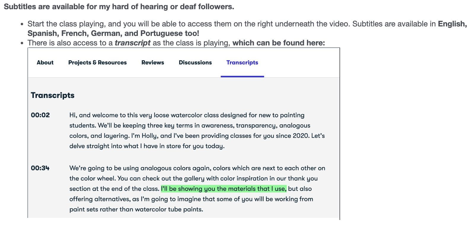
Transcripts
1. Welcome!: Hi, and welcome to this very loose watercolor class designed for new to
painting students. We'll be keeping three
key terms in awareness, transparency, analogous
colors, and layering. I'm Holly, and I've
been providing classes for you since 2020. Let's delve straight into what I have in store
for you today. We're going to be using
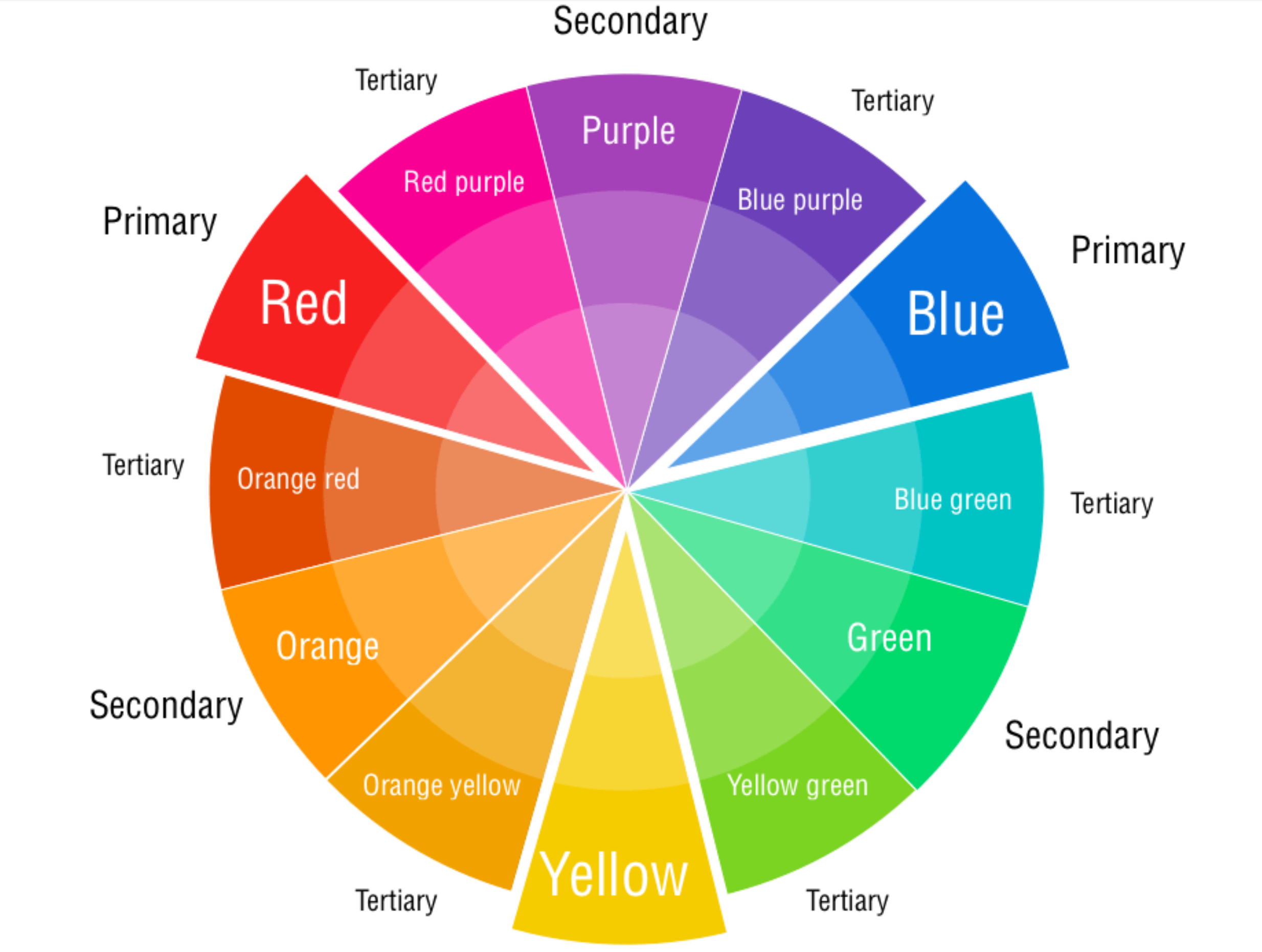
analogous colors again, colors which are next to each
other on the color wheel. You can check out
the gallery with color inspiration
in our thank you section at the end of the class. I'll be showing you the
materials that I use, but also offering alternatives, as I'm going to imagine that
some of you will be working from paint sets rather than
watercolor tube paints. So we'll start off by
mixing our palette. We're going to
choose colours like magenta, lilac, and purple. Although you could choose any of your favorite purples or pinks. And to complement those, we're going to mix a warm
green with green gold, and a cooler green with anthronblue and green
gold mixed together. I'll be taking you
through how to mix colors from a Cotman
watercolor set. And how colors react
to each other. Which ones flow more? Which ones are shyer
and hang back. There can be a lot of frustration starting
out with watercolor, and this is why I've
designed this class to be more of a printing method
than a brushstroke method. We'll be practicing how to mix two layers of
transparent colors, one which has a lot
of water added, and a second layer, which is still very delicate
and transparent, but holds more pigment. We'll be focusing
on how to create pretty light filled layers and
loose pools of watercolor. And although it can
feel counterintuitive, working on a larger
scale painting gives you a lot more insight into how watercolor and
water work together. At the end of our practice, we're going to pull our pencil through little areas
of watercolor. Then moving over to our project, we'll be blotting to
create texture and putting into practice all that we've learned in
the run up to the class. If you like, you can always
upload your project. You'll find where to do this in our projects and resources area. Underneath the class
and on the right, you'll see submit project. It's a lovely way of
showcasing your work, as well as sharing tips and feedback with other
skill sharers. So when you're
ready, let's launch into our loose wood color class.
2. Materials: I'm going to run through materials fairly
swiftly because I'll be going through color prep and
mixing in our next lesson. I've chosen mostly quinacridone colors for their vitality, they're so vivacious
and vibrant, but you don't have to
have quinacrodne colors. Just choose your
favorite pinks, violets, blues, and a nice light green. So we have quin lilac, quinn purple, quin magenta. And in dance throne blue, which is a lovely rich blue. For greens, I have green gold. I'm going to mix a
lovely cool green. And finally, just some white. And I have gouache, but it can be watercolor, or it could be Chinese white from your Cotman set
bottom right there. I'm using a size 18 Escoda
Prado for this class. It's a lovely, large round
brush with a lovely tip. So just your largest
brush, really. And I have a mop brush that's a size zero mop, just
for splattering. So whichever brush you
like works for you. So I have a cop man. I haven't used mine in years, but I just wanted
to bring it in in case this is your primary
source of paints. Now, we're going to be
using a lot of water, so we need something to blot on, and we're also going to use kitchen roll to
scrunch up and blot. So it has two purposes. I bought these recently,
and they're lovely. They're really absorbent,
and I use a mix of the two. I have a large palette
here, which I really like, gives you lots of different
shaped wells and sizes, and really get on well with it. And then finally,
I'm using fabriano, and it's a studio watercolor. You get 12 pages, 25% cotton and 300
grams or 140 pounds, and it's 11 by 14 ". I find it handy because it's not a block you can just rip
off the page and move on. And for a student paper, this is really good. I'm really getting on
very well with it. And it's a little
bit more affordable, of course, than buying
their professional range. I also am going to
bring in a pencil, and I'm using my
mechanical pencil, 0.7 by Faber Castel. It's a fine point, so the finest point
pencil you have, and we're going to use it very gently just to add some
delicate mark making.
3. Preparing Our Palette: So let's prepare our palate. And first off, we have
quinacridone lilac. And then I've put
down quin purple. This is the Quin magenta. And then I wanted
to bring in a blue, and I love in Danthroneblue. It's such a rich color. Just going to put
some of that over there and some green gold
in this far right well. Now, I'm going to put
some up here as well, next to the blue
because we're going to mix a lovely viridian green, and I've also got it
on its own there. So let's start with
the quin lilac and mix a very watery version of that, because we're going
to be creating very, very transparent petals. So starting off with a
very fine watery layer. That's the quin purple. Beautiful. And then I don't have a separate well for the magenta without
going off the screen, so I'm just going to create
a watery pool there. And then I'm going to
prepare this blue. It's quite sticky and old, so I'm having to work
a bit hard here. And if you're using
the Cotman set, you can either mix
intense blue or ultramarine with your cadmium
yellow or lemon yellow. Or you might have a
viridian in your set, and that would be
perfect for this. Or you might want to just
go with a sap green. And isn't that a lush color?
It's really gorgeous. And because we're using
the danthron blue to mix with our
pinks and violets, this will all
harmonize really well. Just adding a bit
more blue there. Really want to get the right color because
I want it quite deep and cool so that we can balance
that with the green gold, which is extremely warm. So to reach a green gold, if you don't have a pale green, just add yellow to your green.
4. Practise Part 1 | Flows & Blooms: Let's start off with
our watery quin lilac. And drop in water just so we can familiarize ourselves
with how blooms work. That's the quinacridone purple. These colors are all very
close to each other, but I've chosen them
for that reason. And you can see how
the water is blooming and moving out,
creating an edge. And that's what we're
looking for when we're trying to create blooms. So we're allowing the water to create that transparent
look, as well. So it gives us two effects, the lovely color flowering
and the edges and a lovely transparent quality where we've dropped
the water in. And we can see here how they're all flowing
together as well. Now, as soon as I put the green
gold next to the magenta, it's going to want to move in quite quickly
into that color. So this is just to allow
you some choice, really. If you're using green gold, it's wonderful for
flowing colors, but it can also take
over that color. Beautiful, though, isn't it? And here's the cool green, and let's put that next
to the green gold, and see how that
behaves and it's less bossy, so that's good to know. And then let's splatter
in because this is how we're going to start out. I really feel it just
helps to ease us in to working with a blank page. And it also has a lovely effect in the watery layers that
we've just put down. So now let's mix up
our second layer, which is going to
be a deeper value. So more pigment to water. And perhaps pulling out that
paint and then dropping in one drip from my large brush. And what we're trying
to achieve here is not a very pigmented color because we're creating
subtle layers. So this layer needs
to be not too watery, but also not too domineering. Just putting a little bit
more of the magenta down. That was slightly more watery
than the other two colors. Going back to our lilac, and you can see it's not the
consistency of a gouache. It's still very watery, but I would say it
has 60% pigment, 40 water, showing you how
much water I like to have. And I'm taking the excess off on my brush when
I'm doing this effect. Kind of rolling the
brush around and just taking the wetness off
the base of the brush, just so there's no drips
that might surprise us. And then into the purple. And what's nice here is
we can see the effect of the paler colors and how they flow into our
second layer flowers. So there's lots of
relationships going on. We can see how all of the lilac violets and
magentas work together, and we can also see how the very watery layer reacts with those. So again, a thicker
layer of green gold, and it's doing what I was
anticipating it to do, and that is kind of flow
quite a lot into the magenta. And then our cooler,
gentler green, which we know now doesn't travel as much as the green gold. So it's always good to know
about the flow capabilities, if you like, of what color. Let's move over to
our Cotman set. Before I do that, I'm just going to show you how we can blot. And we're going to
use blotting to lift areas where it's got a little
too watery and too flowy, but also to use it as
a technique in itself. So here, if I didn't want that magenta to be flowing
in so much, I could lift it. It's a lovely first
layer, by the way, and I think we'll definitely
do something like this because it creates these lovely delicate
flower shapes, and then you can go on to
create further layers. So it's a lovely
technique. Is blotting. So now let me show
you if you don't have tube paints and are
working with a color set, and this is the Winter
Newton Cotman set. Now, with the Cotman, we don't have the same choice really between all of
these lilacs and magentas. And, of course, I don't know exactly which
colors you'll have. So this is ultramarine blue. It's a mid blue, and it's lovely fur mixing because it doesn't lean either way
into the cool or the warm. So let's start off with that. And you could mix this
in a larger palette, but I'm just starting
you off here and showing you which colours
are available to us. Then into the Elsaan crimson. This was one of the first
pinky reds I ever used. I remember it till this day. I haven't used it for years, and it's such a lovely color. So it definitely leans
towards a pinky red, certainly in the Cotman set. And this is because
Alizarin crimson is a cool red leaning towards purple. So it's ideal for this. I have very little left, so I'm trying to eke out
the last remnants of it. I can see how much I loved it. So what we're going to
do is just mix together the ultramarine and
the Elazarin crimson. And that will bring
us a violet color. Now to mix the green, and we can go into
the lemon yellow, which is a transparent color
or handsy yellow light, which is a slightly
bolder color. And here is Vidian. So what we get there
is a lovely bright, almost limey color because
we've got the cool yellow. And then if we mix the cadmium
yellow and lemon yellow, we get a mid yellow. And then bringing
in the viridian, that's going to be
a nice warm green, very close to green gold. So they may not be
exactly the same color as you would get if you
had tubes. So paint. But we certainly have some
beautiful colors there. And we've also got
the sap green here. That's a lot cooler than I
think in other makes of paint, but it's another alternative. Let's drop some water in there, and then do a little
bit of blotting, just so we know what that looks like with the
Cotman watercolors. I'm surprised actually how vibrant the colors
are in the cotman. So I'm hoping that
you'll get lots of colors that you're
really happy with. I
5. Practise Part 2 | Brush 'Printing': Y. So let's start off again with a little
bit of splattering. And then I'm creating more of the watery quin
lilac. Lots of water. Same with the purple. And then I'm just going
to add a little water there as I don't have a well
that will be on camera. Let's practice our brush drokes. So, again, this is a size 18, quite large, round brush, has a nice tip to it, as well. But any brush that
you're happy with, it's really up to you. You could even use a
Filbert or a mop brush. Don't let it stop
you if you don't have a round brush of this size. And then we're just
going to literally print onto the page. Just pressing. We're simply forming the shape of the
brush with the paint. Got a little bit of
magenta in there as well. So we're going to
trust our brush a lot, really, and depend on its shape. So now let's push in
a little bit more and then allow the
bristles to flare out. Let's try that again. Just going to the right there. And we get these
lovely petal shapes, very, very simple shape, and moving to the left
a little bit there, and then up flaring out and
then left a little bit. Flaring out and then
right a little bit. To the right. Do the left. You get these lovely
organic shapes. Pushing in quite a lot, you'll start to get
some of the bristle showing up in the
shape of the brush. What now if we kind of just
smudge it around a little bit and then put some water next to the
more pigmented petals. That's a technique that a
lot of watercolists use, and it's a beautiful one. So we're painting
a petal and then putting down almost
neat water next to it. And we can then
watch as it flows in so just moving left and
right there and then a quick, swift lifting up of the brush. And then in with a
paler color next to it. And you can start to see how we can create lovely
blooms and flows. So I'm adding more
quinllac there, making it more pigmented, 60 pigment, 40 water. And let's do the same
brushstroke with that color and then put some
clear water next to it. And see what happens. You can encourage
it a little bit. So without thinking about it, we're actually creating florals. But all we're thinking
about is the shapes, the flows, the cauliflowers. And, of course, the
water continues to move, so it's not until
it's completely dry that you can
enjoy the effect. But that isn't that beautiful. And that's how we get those kind of slightly harder edges. And here, that's a
much softer flow. And because there's more
pigment in that one, it's not flowed quite as much. Now let's widen the shapes. So we're bouncing our brush
up and down and around. So it's like a continuous
movement of the top row that we did dropping in the
essential water. So the little hard
edges occur when the water pushes the
pigment to the edge, and it stops flowing, and you're left with
this lovely soft line. And then adding some
water into that one so we can see how this flows. And here I'm just doing
large scribbles, really. And let's get
adventurous and drop in some paint now
after our water. It's about trusting
the watercolor and water, the nature of it. And that's what I love
about loose watercolors. We're trusting that the
water knows what it's doing. A lot of watercolrists call it collaboration
with watercolor, and I think that's a very
good way of putting it. It can't be fully controlled. So let's mix up slightly
more pigmented purple. And again, taking off the
excess water from the base of the brush and then scrunching in over the lighter paler
petals that we've just formed. I'm using slightly less
paint and water on my brush, not quite as watery as the
pale layer underneath. We're now going for a
slightly darker value. And mixing up a little
bit more magenta. So in our project, this
will be the second layer. And then we're
just going to very gently go over
these pale layers. And if we get it right, we can see the layer underneath, and we can hold on to
that transparent look. So have a play
around. We don't want to go in too heavily here, but we do want it to be slightly more pigmented than
the first layer. And we're going to
still be dropping in water on our second
layer as well. So you can still see the edges coming through from
the layer beneath, and that's just what
we're looking for. Gorgeous. And over this
larger petal here, and we've still got that
layer showing through. So with the use of watered down colors
and dropping in water, we're getting that
transparent effect. Let's add some leaves, and it's exactly the
same brushstroke. And here you can
see the green gold barging right in to
the purple above. So if you don't
want that effect, I would choose another green. If it flows in too much, you can always just
take your kitchen roll or cloth and lift
it a little bit. Mixing a little bit more of the green gold into a
more pigmented form. Just checking. That feels
a little too pigmented. So I'm going to add two drops
of water from my brush. And that looks gentler. And luckily, green gold, which is my favorite green is
also a transparent pigment, as is the in Dance room blue. As the watercolor dries, we can look back and start
to see the delicate layers. So we can cast a look
over our practice sheet and see if there's anywhere we want to lift
with a bit of kitchen roll. And then the leaves are, again, just that single
print of the brush. And look at that green gold
running into the purple. So this area has a lot of water in it. So I have a choice. I can either place
down the brush shy of that so that the green
doesn't run in and take over. Or I could just blot
the edges a tiny bit. What that does is
create a dam so that the new color that I'm placing down doesn't run into
its adjacent color. So you have a decision
about how much you want the elements to
run into each other. So this is our viridian, which you could use directly
from your Cotman set or mix the anthron
blue with green gold. And I want this to run into or rather be invaded
by the green gold. So I'm going to place some
of them right next to it. This is like witnessing
a little bit of alchemy because there's so
much going on in this page. There are so much
detail, texture, transparency, lovely analogous
colors working together. It's a beautiful sight. I love working with
this technique. This cooler green brings
a lot of balance. So simply printing
with the brush, making sure that they're not all pointing in one direction. And I think that's it. So
let's move on to part three.
6. Practise Part 3 | Pencil: A I think it's time
to get our pencil. And let's practice moving
the paint around with this. So you can see the pencil picks up the paint and moves it, but also runs back into
a pencil in places. So it has a dual purpose. There's nothing I like more than soft pencil on wood colour. A take your time over this, and we're looking for any little pools of
color that we can utilize to create very simple
leaf and petal shapes. Much of this is dry now, but there are some
little pools left. So if I was to press
down on my pencil, we'd get much more
defined lines, and I'm really not
looking for that. So I'm placing the pencil on the paper and just
allowing it to move. So there's hardly any
pressure on it at all. Just bringing out little stems. And where there's a pool of paint at the bottom of a leaf, you've got a real
advantage because we could then just pull that
out into an easy leaf shape. And I do absolutely adore
how we get the pencil mark, and as it runs
through the paint, it acts as a stylus. Let's go back to some of our
practice brushstrokes here. Very calming, very meditative. And although I am doing
loose leaf and petal shapes, I'm holding on to the idea
that this is semi abstract. So they're just shapes of color and texture and transparency, and now gentle pencil. I'm just going back to
mixing a little bluey area that mix of down thrown blue with one of our colors beneath. And this is another
thing that you can do. If a lot of your
paints have dried, you can always go in and add little extra leaves and flowers and then run
your pencil through. So now we can let
it dry completely, as it's still moving
very slightly. And once the paint has dried, we will see the full effect
of the transparency.
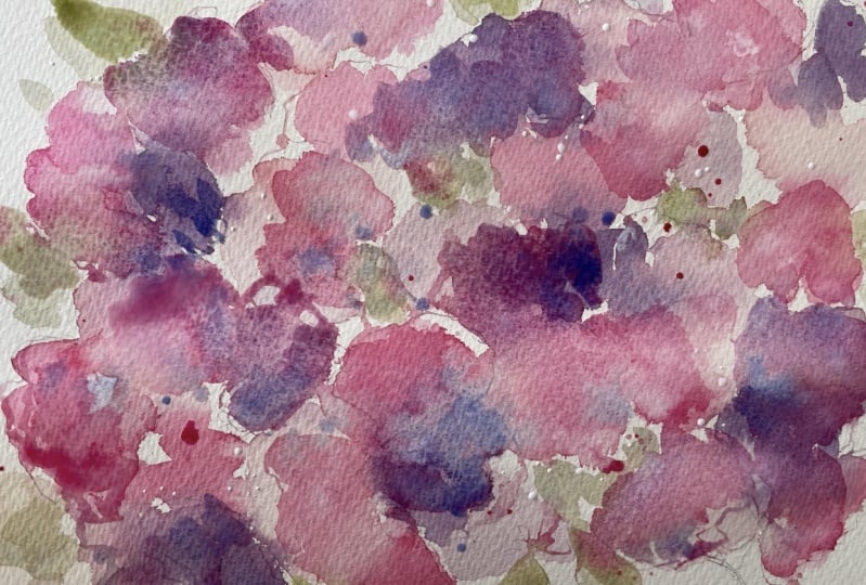
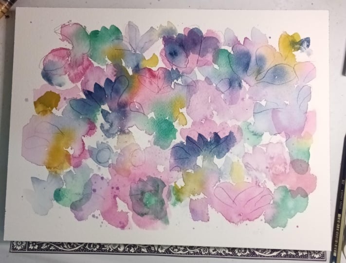
7. Class Project | Part 1: So let's start with the watered
down grinacrodone lilac. And we'll just start
with some splattering. I always think that kind of
breaks the ice a little bit. If you're using a Cotman set, you could aim to mix a
lazarin crimson with a blue. I have this set
which has two blues, and that will give
you a little variety. If not, just go between the
two colors mixing mostly a azarin crimson
with a little bit of blue or mostly blue with
a little bit of crimson. So you can see it's
very, very pale, so don't be afraid
to go quite pale with your first layer of shapes. And I'm just going to create
these shapes by pressing the brush down on the
page as we practiced. Dropping water in as we
go along. More water. Don't be afraid of just splashing loads
of water on the page. 'cause that's a really
good kind of process towards forming
transparent petals. As you can see, I'm
also just adding pure water next to these shapes just to pull
them out a little bit. Dropping in little
bits of paint. And that's enough of the lilac because we want to
introduce lots of colors. So now we're going in with
the grinacrodon purple. Pressing the bush
down on the page, moving it around a little, splattering a little
bit of that in. All I'm doing is
making sure that the shapes are all pointing
in different directions. I don't want them
all facing one way. And now for our third color, which is Quin Magenta. And I'm placing the magenta near the other colors so they can all have a little
swim around together. Keeping it extremely loose, not thinking of them as
flowers, just shapes. Working quickly means that you don't have much
time to think, which I think is a good idea for very loose
watercolors like this. We're getting our pencil out
and doing what we practiced, which is holding the pencil towards the top and
pressing very lightly. If you're not using
a mechanical pencil, just ensure that you have a really sharp tip to your pencil and use a
very light pressure. It's more the texture of the pencil that I
love in watercolor. And where we have
pools of paint, we can draw those out as we
did in the practice run. I'm just going to do a
wee bit of scrunching. This is just kitchen roll. This adds a bit of texture to the transparent look
that we're trying to get. So it's lifting the paint,
but in a different way. And I'm going to create
another color over here with the endanthron
blue and magenta. I just felt like bringing
in a fourth color. So we've got various hues there. We've got the all blue. We've got the blue
with the magenta, and then a very
watered down version of the quin lilac on the left. I do love in down throne blue. It's such a rich color. And we can start
to see how this is flowing into the
pinks and lilacs. Just the printing
movement again. Very simple. And I'm choosing areas that
are slightly wet, so I know that there'll
be some lovely blooms. So this is very much about
shapes not creating flowers. And let's move on to
our second layer.
8. Class Project | Part 2: So why don't we add
some green now, and this is the green gold. A fairly watery mix
because with watercolor, it's always best to go in on a lighter side than have
to lift a darker color. So I'm going in with a
very pale green here. In reality, this is slightly more green,
but through my phone, it's quite yellowy,
but, of course, green gold has a lot
of yellow in it. And I'm just dropping
in extra bits of color and some water. And that's what we need
to bear in mind all the time here is that we're
dropping in water, and this is what continues
that transparent look. So I don't want to overdo it because I know that
I want to bring in another green just
as we practiced. Now, here, I'm not keen on that, so I'm just going to pick up the color with
some kitchen roll. So you have control over this. We want to allow the
watercolor to do its job and be unpredictable
and beautiful. But there may be areas that
you're not so keen on, and it's always
possible to lift that. Quite like the effect of it, so I'm just going to put
in a few extra blots. So you can see we've still
got a few areas that are wet. But it's mostly drying now. This is also because I am
using hot press paper, and on hot press, it dries much more quickly
than on cold pressed. So back in to our
quinacridone lilac, one of my favorite colors. It says lilac, but I
always see it as a pink. And we're trying to go
for that mid range, not too pigmented
and not too watery. And let's just have a little try out and see. And that's lovely. It's not going to overpower
this first layer. So let's pick up
some of that and just scrunch it into
the page. Very easy. I'm going over the
areas that look like pale quinn lilac. But
you don't have to. You can go over the
blue or the green. I'm also slowing down
here now, as well, and just being more considered about where I'm
placing the shapes. And I'm also paying attention to the fact that they're all
going in different directions. I want to keep a
nice flow going. And now I'm dropping
in the essential water just to really get those
lovely cauliflower effects. Too much water going
on in that petal, so I've just lifted it, and
I'm adding some more colour. Green gold took over
completely on that petal. You do have to be quite
careful with green gold. So back into the Quinn purple, what a gorgeous color it is. I'm just going to
check again that it's not too pale and
it's not too pigmented, and that looks lovely. And again, just rolling or scrunching or pressing
the brush to the page. Picked up a little
bit of pigment there, but I quite like that effect, so I'm not going to
try and lift it. You can see that my brush now is kind of flattening
out a little bit, and we can utilize that. Just rolling around a
bit now with the brush. Different directions. Keep looking to see where
your shapes are heading. So I know there's color there. I'm just gonna drop some more
water into these areas now. Where they're wet,
they will, of course, flow more where they
are partially dry. The colorflowers are
smaller and more defined. So a little bit of splattering there 'cause I
can't help myself. It's just lovely,
but not too much. So, I'm mixing some of
that in Danthromblue mix. And I'm just going to put some over the previous layers now. Lovely flows over this little
area of blue over here. And because we've used a pale version of the
second layer flowers, we can now see the
layers coming to life and that soft early layer falling into the background and using slightly more
pigment in our colors, brings it to the fore. So nice and bright colors
over soft, pale colors. Adding a little bit
more green gold to the well and putting that over the previous
layer of green. And I know that there are
still some wet areas, and I know the green will
completely take over. So I'm being careful now, as I don't want too many
runs of green gold. I do like the area with the blue in the
bottom right hand corner.
9. Class Project | Part 3: And now we're going to
get our pencil out again and pull out some little marks. Very, very light,
holding it at the end, and I'm hardly pressing at all. It's just a very
delicate detail. And where there's wet paint, we know that we can
drag that through. Adding a little blob
of green there. The same here, just so I
can pull out the wet paint. So now let's go back in
with our second green mix. And if you're using
your Kopman set, you could actually
use Vidian for this. So we'll just continue to
press our brush into the page. Adding water, blotting. And slowing down. And doesn't this suddenly just come to life
with this green. And that's because we're
using a palette where we are mixing some of the main colors that
we're using together. And that's what creates
this harmony in a palette. So we have the blue petals, and we also have in Danron blue with the green gold to create
this lovely cool green. So they all marry up together. Dropping in some
water in places. Keeping an eye on where
I already have leaves. We're slowing down a lot now, considering where we
want to place these. A little bit of a
dry brush there. I would say I'm not a
cold green lover, really, but using a warm
and cool green is such a great technique to bring complexity
to your paintings. It's such a lovely
addition to what we've already got going on with
all the transparent shapes. I'm just adding a
little bit more blue. Just in places, and this is a mix between the
blue and the Vidian. I quite like the fact that
not everything is placed, and there are little kind of gaps of white here and there. I'm keeping this blue
fairly translucent, adding little pops of color now. So a little bit more of
the quinacridone lilac. And I'm just dragging my
brush for these marks. A few more pops of green gold. So what I'm doing here
is just using the tip of the brush and
moving it sideways. And where I place these
extra areas of paint, I can now go back
in with my pencil, drag out the paint and allow the pencil
to act as a stylus. So you can see I'm moving a
lot more slowly now looking around and seeing where these little pockets
of watery paint are. And, oh, I love the little stem. That's nice. Might do
a few more of those. Do one here. These little details feel like nothing when
you're doing them, but when you look
at it as a whole, you can see how all these little elements come together like a beautiful song. I like that little leaf. And that one is such
a fun thing to do. I love making marks with pencil. It's a lot gentler than going in with a dip pen or
a pigma micron. And this way, we can utilize
the little wet areas. And the pencil carves
in a little furrow. I like this pink area, but it's a little amorphous. I've not got much shape, so just dragging the paint down into a rough kind of leaf shape. It's a very contemplative time, I think, when we
get to this stage. Let's do a finishing touch
here of some splattering. And I've just grabbed
a brush which happens to be a size zero mop. But any soft brush smaller than the one
that we've been using. And I'm going to mix some of the lilac with the anthron blue, although all these colors have now mixed together quite a lot. Make sure you have no
drips on the brush, and we'll just splatter
in some color. Now, we need to be quite reserved because I want to
do another set of splashes. So we're going to
recreate what we did on our practice run
and get some white, and this could be watercolor. It could be Chinese white from your Cotman set or gouache. I'm using gouache just because it was the
closest to hand. We just want to add
some water to that. It's still quite thick, so I would say 80%
white 20 water. A and I'm just going to
splatter this in to the page. And it usually has some sort of surprising effect with
the wet watercolor has to be found out
in the practice run. Because Guesh and watercolor
do react in a magical way. I think that's another
class, perhaps. But look how it's mixing
with the wet watercolor. I love it. And there we have
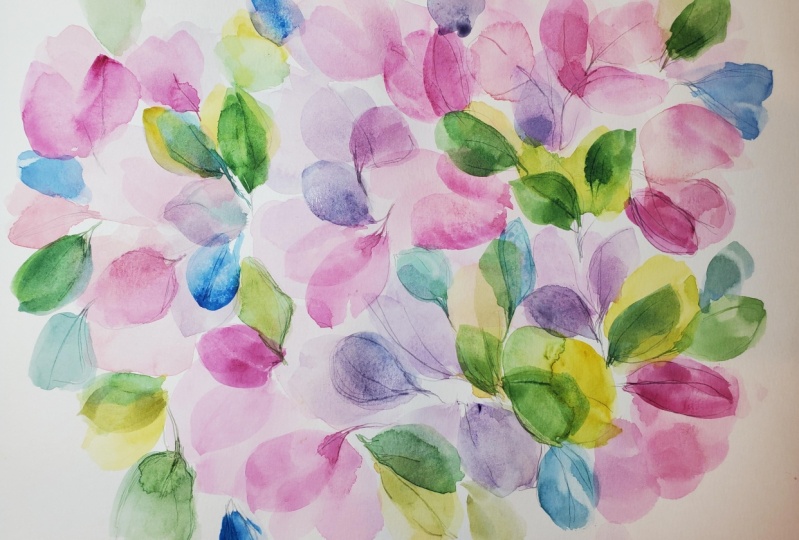
it or finished painting.
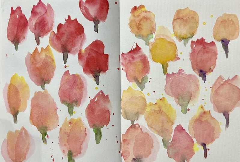
10. Gallery Of Flowers | Thank You!: It was so nice to paint
alongside you in this class. We set out to explore
transparency, analogous colors, and layers. I've put together
this little gallery just to reflect on the
colour choices we made. We touched on the fact that
quinacridone colours do have an advantage for this style in that they're very
transparent pigments, but also really vibrant. The flowers I love in
this color range are sweet peas and hydrangea. Don't forget that
you can showcase your work in our projects
and resources area. If you need help with anything, you can always contact me via discussions or over on my Instagram page at
Holy Thomas Design. Take good care of yourself, and I shall see you
soon. Bye for now.
 Holly Tomas Art, Watercolour | Gouache | Mixed Media | Scotland