Transcripts
1. Materials: Hello, friends. Welcome
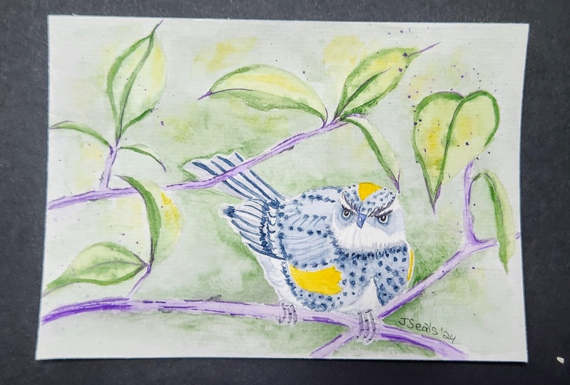
to another tutorial. Today, I'm going to
show you my process for painting this yellow
rumped warbler. Now, for this session, we're going to use a 100% cotton 300 GSM cold pressed
watercolor paper. This is seven by 10
". It's a block. Now, for the watercolors, I'm going to show you each color that we're going to use later. Of course, we're going to
need a mixing palette. This is a ceramic palette,
which I recommend. And then this is a leaf blade for separating the
paper later on. Okay? Again, I'm using a block, and there's a small portion there where you can
insert the blade, so you can separate the paper
from the rest of the block. Here's a pencil that I'm using. I'm using a two B pencil, but you can use any regular
pencil that you have. Have a blunt tip, if you can, because that will ensure that you don't
scratch your paper. For the brushes, this
is a 1 " flat brush. This is good for
wetting your paper. Now if you don't
have a flat brush, that's fine as long as you
have a round brush with you. So we're also going to use a round brush
for this session. This is a size 12
synthetic round brush. Get one that's springy
and has a nice fine tip. I also recommend that
you have an angle brush. This is a size
eight angle brush. Now, if you don't
have one, you can use a size eight round brush. Okay? Next, of course, a clean bottle of water
for rinsing your brush, some tissue paper,
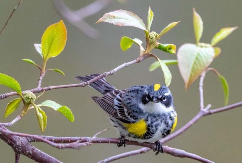
and that's it. So have everything ready, and let me just show you the reference photo
for this session. This is a copyright free
image from Unsplash.
2. Color Mixing: Now, before we get started, let's prepare the colors. For this particular artwork, we're going to use
cadmium yellow medium. Now, any warm yellow that you have would
be perfect for this. Now, if you really
don't have one, then you can take a cool
yellow like a lemon yellow, and then just add a
little bit of orange to it or a tiny tiny bit
of red to make it warm. This is around 50%
color and 50% water. Now the next color is
Hooker's green deep. Now I'm going to mix this with some cadmium yellow to make this a little bit more
like a yellow green color. Same as the color before. This is about 50%
color and 50% water. The next color that we'll be
using would be Teal purple. Some brands will have
this as permanent violet. If you're curious
what brand I'm using, this is Grumbacher, the
artists grade water colors. And then this one is Indigo. This is such a strong color, so it's a bit dark. So I'm adding a little
bit more water to it. Let's say about 30%
color than 70% water. Then the last color is
French ultramarine. And then we're going
to mix this with a little bit of burnt sienna. This would be the
brownish gray color that we'll be using for the
background of this artwork. This is a bit diluted. This is about 40%
color, 60% water.
3. Outline Sketch: Okay, now that we have all of the colors ready, we
can start sketching. Let's start with the head. Of course, a round figure, but it's not perfectly round, so we're going to add a bit
of curve here at the top. Now we're going to do
an outline sketch. We're not going to do a very detailed
sketch for this one. So next, we're going
to add the wing. This is a pretty chubby bird. So there's going to be a lot of circles and ovals on here. So the body is more
like an egg shape. And then this is going
to extend a bit. So that's the rest of
the wing over there. And then let's add the tail. Notice how I'm
holding the pencil, not very close to
the tip, but midway. This allows me to move
the pencil more freely. Now, let's just add a bit
of lines over here to guide us later on over here as well. Sketching is actually a
good practice to do because it makes you more familiar with your subject so that when
you're painting it later on, you're more comfortable
doing the strokes. So sometimes, you'll notice that as you're actually
adding the layers, the lines get a bit diminished, and some actually
just disappear. Now, aside from your
reference photo, the sketching part
actually helps to, you know, put that
image in your brain. And so even when the
lines have diminished, you're actually able to
still add the details. That's more or less accurate
with the reference photo. For the head, the
beak is actually a bit just a little above
the center of the head. Then there's this
radiating curved line that the crown of the warbler. And then there's this really
nice yellow part over there. And then here we'll
have the eye shadow. It's like an eye
shadow of the bird, adjusting the head a bit
over there. All right. And then, of course, we're going to add the eyes. When you're painting this later, just make sure that there's
enough white space between the eyes and the
rest of the head. That's it. That's the
body and the head. Now let's try sketching
the legs and the feet. Okay. Now, I've noticed as I
have been sketching birds that this part of the bird is
actually made of sections. So tiny, tiny sticks that
are connected on the joints. So that's actually what I'm doing right
now, but later on, when we are going to paint this, We're primarily going to
do a lot of brushtrokes. We're not going to follow we're not going to fill in
these sections with color. But we're going to use this to guide us in doing
the brush strokes. Next, let's paint the branch
that the bird is resting on. Just make sure that when
you're drawing this, the claws are actually
clasping the branch. The branch should be
just the right size, the same as how the
claws are formed, and not too narrow
or not too wide. Then let's add a few more
stems and branches. Okay? Now, at this point, I am just looking
at the reference ph and getting some ideas as to how to position the
other elements on the artwork. So We're not going to
copy what's on the image, but we're going to take
bits and pieces of it. Like, you'll see later, the leaf formations
would be a bit different from how they're actually presented on the image. Basically what we
want to achieve here is the main focal point
should be the bird, and then everything else would be supporting that
main focal point. I'm already happy
with the composition. Now let's erase the things that will just confuse us later. So here, we're just going to get all those
unnecessary lines out. And also here, where the leaves are overlapping
with the tail of the bird. I just keeping everything
clean so that later on, we won't be confused
which ones to paint. What color? H.
4. Painting the Background : We're now set, so
grab your flat brush and wet the entire area. So we're going to wet the entire area around
the bird, okay? Now, again, if you don't
have a flat brush, feel free to use a mop
brush or a round brush. Now, when you're wetting the
space surrounding the bird, just make sure that
everything is adequately wet. Not dripping wet, not just
damp, but really wet, especially here in the
Philippines right now, it's summertime, and the paper
can get dry pretty fast. So if you need to, you can go back to
whatever areas you've already wet and wet
them again if they seem to have dried while you're adding water to the other
areas of the paper. So, see how I do the same
thing that I've just said. I'm going back to the
other parts of the paper just to make sure that
they're adequately wet, so that as I'm painting, all of these areas remain wet, and we don't create any
hard edges. All right. We're now ready to add
in the first color. So we're going to use the
round brush for this. This is the mixture of burnt sienna and French
ultramarine, okay. So when you're adding
in the first layer, it's best to make sure that the colors are really
light because you don't want to have an overwhelming range of
colors for your first layer. You want everything to be soft
and light and transparent. And then later on,
we're going to add darker tones to the artwork, which will emphasize
our focal point, which is the warbler. Now, you'll notice that I've actually kept some of
the background white, k. So we're not really
doing a flat wash for the background
that's surrounding the leaves and the stems
and the branches, k? Again, keep in mind that the
bird is actually on a tree, and there's a sky
behind that bird, okay? So the sky will, of course, sometimes have clouds, and so that's the impression that
we're trying to do here. Next, we're going
to paint the leads, When you're painting the leads, it's okay for for the color to start spreading because this
entire area is wet, okay? So we've already expected that. But to minimize having to Having the color
spread so wide, so wide and far from the leaves. Make sure that your
brush is just loaded with enough of the
color mixture, okay, that it's not too wet. Because if your
brush is too wet, there's a lot of water, then the tendency would be for
that color to really burst and spread much farther than
it is spreading right now. We're done with the leaves. Next. Let's paint the
stems and the branches. We're going to use
purple for that. Okay. So as you can see, because this section of
the paper is still damp, we're not creating
any hard edges, and that's exactly what
we want to achieve. Now, you'll notice that some of that purple actually went
on the feet of the bird. And if that happens to
you as well, that's fine. Just leave it. It's a very
soft color to begin with. And later on, as we add a thicker mixture
on the focal point, this would no
longer be seen, ok? Now we're done with the stems. We can now move on to adding
a darker tone to the leaves. For this one, we're going
to use Hookers green deep. As you can see, this is a
very thick consistency. So my brush actually
doesn't have so much water, and I just took a lot of
pigment from my palette. And I'm adding that to just
some parts of the leaves. So basically the middle, the middle line
of the leaves and some parts of the outline, just leaving some of that
outline bare to create a nice, interesting, soft touch to it. So for this one, again, the brush is
highly pigmented. So it's more or less 80%
pigment and just 20% water. The brush is barely wet and I'm getting as much
pigment as I can. So as you can see, the addition of colors doesn't
create very hard edges, but it also prevents the color from spreading too much, okay? It also helps at this point that the paper is
just a bit damp. It's not as wet as before, because even as we were
adding the colors to it, the paper is slowly drying up. So timing is really,
very important here. Now, I'm getting a
bit of that purple. And let's add a bit of indigo to it to make
it a bit darker. Okay. And we're going to add this very thick mixture
also to the branch, the main branch, and
also to the other stems. Now, at this point,
I want you to observe how I'm doing
the brush strokes, you'll see that there are various ways that I'm
doing the brush strokes. Like, there are times
when I start with a sweeping motion with pressure with greater
pressure at first, and then just lifting my brush. And here I'm actually
just adding very, very fine lines to
some of the stems. And then also the manner in
which I'm holding the brush. So there are times when I'm
just letting my the hair or the bristles of
the brush lay flat on the paper and then put
pressure in it and then lift. And then here, you can
see that I'm actually holding the brush
upright for finer lines. Now, you can see here that
there are still no hard edges. And this is what we're actually trying to achieve
because we want to have a stark contrast between the focal point and
the background. So the background should not have any hard edges
at this point. Now, there is a mistake here. The color actually spread too much more than
I wanted it to do. So, when this happens to you, just clean your brush, take off the excess water using a tissue paper or cloth,
and then just lift. Now, I'm already happy with how the background
is at this point. But let's just add a bit of detail on the leaves to
make it more appealing. So here I'm just adding some
of that purple and green. And we're going
to just add tiny, tiny details on certain
parts of the leaves, just to add contrast to them. So You'll see that I'm
not actually tracing the entire mid lines or the outlines of the
leaves, Just parts of it. Some are heavier
than the others. Now, let's do the same for
the stems and the branches. L et's add a bit more detail to the stems in the branches. Let's do some
protrusions like this. Random places where
we can place them. Now, at this point, we're done with the background, and we can now move on to
painting the bird. Oh.
5. Painting the Focal Point : Grab your smaller brush, and we're going to start with
the lightest color first, which is Cadmum yellow medium, and we're going to add this
to the top of the head and also to the two
sides of the breast. Now, let's mix some
French ultramarine, a very diluted consistency, around 30% color and 70% water. And we're going to use this as our base layer for
this part of the wing, as well as the
area on the breast surrounding that those
yellow portions. Now, when you're doing this, make sure that you're leaving this layer very
well, not very wet, but adequately damp
because later on, we're going to tap tap our brush onto these
portions with indigo, and we want the color to
burst a bit when we do so. Let's add a bit
more of that color over here because I see that this area has
already dried a bit. Okay. So at this point, k, I'm going to get
some of that indigo. And my brush is actually
not too wet at this point. It's mostly pigment. And like I said earlier, we're going to top
our brush onto these bluish sections and
allow the colors to burst. Now, at this point, let's do
some diagonal brush strokes. Very quick strokes. Okay? Add a bit more lines over here. I'm constantly looking at
the reference photo at this point to see
whether I need to add the dots or if I need to add any lines onto
this part of the wing. L et's sort of close
these diagonal strokes together with more dots and
a few curved lines. Okay? And we can actually
add more dots on other parts on the breast to add a darker shade or shadow. Again, I'm looking at the
reference photo at this point, just to see which parts
need more of that detail. Okay. This is good. Now we can move on to coloring the head,
this part of the head. For this one, we're
also going to create a base layer of
French ultramarine, similar to what we
did for the breast and the section of the wing. Again, this would be
a very consistency, and we're going to start
with the tip of the crown. Okay. At this point, the yellow part is already dry, and so we can safely
color around it. Then we will be adding this light blue color as
well on the eye shadow. Make sure that you leave that that thin line of white
surrounding the crown, And then at this point, I'm going to grab
some more indigo. And with this section still wet, as you can see, I'm
dabbing my brush onto the section as well to create the same effect as
we did earlier. And then we're going to the eye shadow with
indigo as well, okay? So the left side is actually good because the color
has spread very nicely, but the white portion has not. So with this, we
can actually remedy that by wetting our
brush a bit, k. And then just very
lightly brushing over near the edge of that
part that we want to soften. You can grab a tissue
paper or cloth, and then just also
soften this portion over here so that there's
no super hard edge. Now, if you're going to look
at the reference photo, this portion over
here actually has very fine hairs emanating
from the edges of the face. So what we're going to do is we're just going to
disturb the color a bit. With a damp brush, rub your brush against
this section very lightly. And then from here, you can see that the color is actually being spread a bit. Now, with a damp brush. What you can do is continue
to rub that color. And then when the
timing is right, you can actually start pushing the color towards
the other direction. Okay? This is how you create the
fine lines on the face. Now, let's start adding the
straight lines on the wings. Now, you can continue using
your small round brush, or if you have an angle brush, that will be better. So again, as I've said earlier, An angle brush will
actually help you create better
straight lines, okay? It's going to be easier for you. And so, okay, let's start. So here I'm just using the indigo color that
we mixed a while ago. This is around I think
30% color, 70% water. Okay. So just sweeper brush from
left to right, just like so. All right. Now, let me get a thicker
consistency straight from my palette and just go over the edges of those thicker lines
that I created earlier. Okay? All right. So see how
nice that looks. Okay. So next, we're going to use
the whole brush and just see how that quick
downward sweep made this part of the bird
look really nice. Okay? It just completed the that wing. Now, this longer tip. We're going to use this to add the curved lines on
this part of the wing. So we're going to do some
curve strokes, curvy strokes. But before that, let's do this outline because we want
to keep that area white. Here, I'm using the
more diluted mix again. And I'm using this This tip
to add a darker contrast, like what we did to the
left side of the wing. Let's also add
some dark color on here and over here as well. All right. Next,
let's do the tail. So let's go back to this mix. And add straight lines again. But this time, I'm using the entire width of the brush to fill the tail. Now, once we have that, we're going to grab
a thicker color. Again, with just the
tip of the brush, we're going to add those
thicker and darker lines. Okay. Let's add a bit more
darker tones over here. Again, it helps to look at the reference photo
from time to time. There you go. Now, this point my brush is barely with water, but it still has
a lot of pigment. So I'm going to go
ahead and continue with the bottom of the body, with very dry brush effect. And then we can also move
on to paint the legs. So again, I'm just using the
diluted indigo mix that we have and applying this using the longer tip
of my ankle bruh. Again, if you don't
have the angle brush, you can use the smaller
round brush that you have. Okay? So keep in mind the small sticks that we
were drawing earlier. That's how we'll do
the brush strokes. And then I just got a
more pigmented mix, and adding them to the
joints and the tips. Now let's paint the eyes. I'm going to zoom
in so you can see. So it's very important that
you keep the center of the eye with a slight
white portion. And as I've said earlier, there should be a
white surrounding the eye and separating
it from the eye shadow. It's also important that
when you're doing this, your brush is not too wet. Otherwise, you'll
find a very hard time keeping the color to just this very small
portion of the paper. Now, after that, I'll
just continue and add a few hair like details
onto the crown of the head. By the way, this is how my brush looks when it barely has water. Okay. So next, we're
going to paint the beak. Again, keep your brush
with minimal water, and we're going to use
French ultramarine for this. So for the beak, it's just about outlining the shape of the beak with
the center kept white. Okay. And then let's
just add a bit of dark tone on the bottom right
so as to define it more.
6. Adding More Color to the Background : Here, I just mixed Hooker's
green with indigo, and loaded my brush
with that mix of, let's say, the
color is about 50%, and water is about 50% as well. So now the artwork
is coming to life. So we're going to
do that all over, starting with painting
along the edges of the bird and just
moving the color. So basically, after outlining the central part of the artwork, just rinse your brush, top off the excess water, and use that damp
brush to soften, soften the edges and move the color farther from
this part outward, just to soften that color.
7. Fun with Splatters!: Okay. So, we're practically
done, actually. I'm already happy with this. But since I still have a lot of color on my mixing palette, why don't we do some
splatters, okay? So just load your
brush with color. In this case, I'm using indigo, and just hold your brush on one hand and pat
with the other. Now, when you're
doing this, just make sure that you're doing this on the portions of the paper that's away from the
focal point so that you do not add any unnecessary
colors to the bird, okay? Alright. So, yeah, just
have fun doing this. This is actually the fun part. L et me just clean this
outline of the leaf a bit. And, I guess we're done. All right. So there you go. There you have it. O
warbler for this tutorial. I do hope that you enjoyed
painting along with me. I'm looking forward
to see your output. I'll see you in the next
class, okay? Have fun. S.
 Michelle Gonzalez, Water Color Painting Made Easy