Transcripts
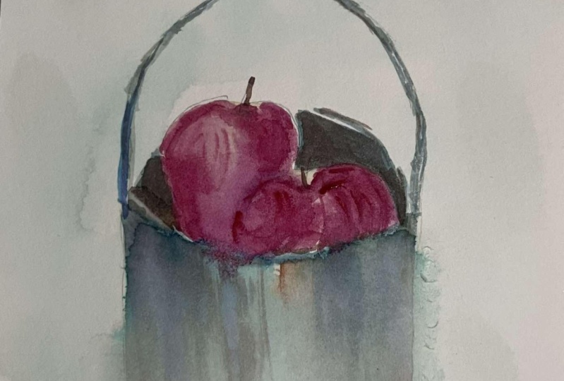
1. Hello!: Hello, there. This is Michelle. I'd like to welcome
you to another class. Today, we are going to paint
this bucket full of apples. We're going to start by drawing an outline sketch from
a reference photo. Then I will show you how you can create a soft background
for your artwork. I'll also be teaching
you how you can build up your water colors
so that you can create a nice
reflective surface. You'll also be learning
how to use shadows to create a nice contrast for
your watercolor painting. I'm also going to
show you how to mix certain colors so that your
apples would look realistic. By the end of this class, you'll be able to paint
this exact artwork, as long as you trust me
and enjoy the process. Let's get started.
2. Reference Photo and Materials: So first, I'm going to show you the copyright free image
that I got from Unsplash, and you can see here that
I cropped the image. So we're just going
to paint the fruits. Now the materials we're
going to use today would be a pencil and an eraser. For the brushes, I'm using
a size eight angle brush, a size two and size
ten round brush, and a size five flat brush. For the watercolor paper, I suggest that you use
100% cotton, 300 GSM, since we're going to do a
lot of wet and wet here, and the paper that I'm
using right now is a block, meaning all of its sides
are glued together, but if you don't have one, you can actually
just tape your paper to a board just to
prevent it from buckling. Of course, you're also
going to need a bottle of clean water and
some tissue paper, and of course,
some water colors. For the colors, I'm using
the following Vidian hue, burnt sienna, burnt umber, Prussian blue, cadmium
orange, Seran blue. Cadmium red deep, lysern
crimson, and dioxazine purple. Now, you may not have
these exact colors, but what's important is you
have a green, an orange, a red, a reddish orange, and some browns to the bins. Now, for the purple, if you
don't have dioxazine purple, you can actually just
use permanent violet.
3. Drawing the Outline Sketch : Now let's start sketching. We're actually going to occupy around two thirds of the paper. I usually start with a tip of whatever
subject it is that I am going to paint just so that I'm sure that the
scale would follow. Now, I sped up the process a bit because I really just want you to see how my
sketching process is, and hopefully it will help
you in yours as well. But feel free to trace or use whatever tools you might have if you don't
prefer to sketch. Now, you can see that
I just made an eraser, which brings me to the
importance of making sure that you sketch lightly because you wouldn't
want to dent your paper, which could actually show when you start adding the
water colors, ok? Now, it's perfectly
fine to do erasures. I actually encourage you
to sketch beforehand, do it on a scratch paper
or on a sketch pad just so that you're more
familiar with the subject. But if you're comfortable
sketching already, then you can sketch directly
on your watercolor paper. Okay? So as you saw earlier
on the reference photo, the bucket of apples is
actually held by a person. We're going to omit that. And although we're going to sort of mimic the composition
of the bucket of apples, we are not going to, you know, be very thorough with
how the overall shape is As long as the bucket is proportionate and the apples look like apples,
then we're fine. That's it. That's
our outline sketch. Now we can start painting.
4. Painting the Background : Now we're ready to add water to the entire paper almost
except for the Apples. So here, make sure
that you actually wet the entire area surrounding the apples,
including the bucket. And if you are in a place that would actually dry
the paper easily, I would want you to
go back and forth with certain areas that need
to be added with water. Just to be sure that once
we do add the colors in, these would go very
smoothly on the paper. So we're done with that, and now we're going to
add our first color. It's Vidion hue. And we're going to add
some burnt sienna to it, just to darken it a bit. Now, again, you don't need
to use this exact color. If you have a dark
green color here, that's perfectly fine.
You can use that. We're going to use this
color for the background. See how nicely the color adds onto the paper
without any hard edges. That's what we want, and that's why it's very important for this section of the
paper surrounding the apples to be adequately wet. Not dripping wet,
but wet enough. Not just tamp, but wet enough so that when
we add the colors, they actually flow very
nicely on the paper. Now for this part,
you'll notice that I'm just adding
color all throughout without actually
creating a separation of the bucket from
the background. Since this is our first layer, we just want to create a nice foundation that
blends everything together. Okay. Now, this point, our paper is still wet, but not as wet as before, and the colors are actually being absorbed
and are becoming lighter. So we're going to add a second layer of the same
color, viridian, and bursiana. Okay. Now, for this particular part, I want you to notice how I'm
holding the brush so that you also get an idea of how the right angles would
create certain strokes. Now, for the second
layer for the bucket, you'll notice that
I'm not actually adding the co throughout
the entire bucket, but I am leaving some space
to show the first layer. That's because from
the reference photo, you'll notice that
the metallic bucket is actually reflective. So we want to also show
that on this artwork.
5. Painting the Bucket: And now it's time
to switch brushes. This time we're going
to use the angle brush. This is a synthetic brush, and so it actually
holds less water, which is ideal if you're
adding color to a damp paper, and you don't want the color to just flow in all directions. Here I'm adding Prussian
blue with some burnt umber, and we're going to use this to add further reflections
of colors on the bucket. For this part, I
want you to hold your brush horizontally and
glide from left to right, and we're not going
to attempt to create a solid
continuous line here. Here I'm actually adding
greater pressure. But towards the center
and the right part, I'm actually adding
lighter strokes. Next, let's add some
shadows onto the left part. Now, at this point,
I just want to gain control of the brush
and make sure that there are straight lines
going downwards because sometimes it can get a bit difficult or challenging
to actually just create that nice straight
downward stroke. Now, once I've gained control of my brush, if you can see here, the brush is again at
a horizontal angle, and I'm just dragging it do and creating a much
softer stroke. There you go. Now, let's add another layer
of reflection to the bucket. So still the same mix, prussian blue and burnt umber. Now, you'll see here that I actually added the
same amount of water and the same amount
of water color to the mix. But the colors are
actually darker. That's because at this
point, the paper is now. And so the colors are actually not being diluted as
we add them onto the paper. A Now, let's create a darker mix, still Prussian blue
and burnt umber, but this time, there's more
burnt umber to the mix, and we're going to add
this color with our brush in a horizontal position gliding downward for
a very soft effect. This will actually soften all those lines that
we just created. Let's add an even darker
shadow this time, just adding burnt umber. So it's really going
to be very dark. Now, at this point,
we need to add more bluish color to
some parts of the pale. This is an blue. We're just going to add this to those parts that
are really light. We want the colors of the bucket to blend
with the surroundings, and that's why we did a
first layer with green, but we wouldn't want it
to overpower the bucket. We're adding blue to those parts that are
mostly very light. Now, you'll see here that
I'm actually just the color, saluting them, them
with a damp brush. Now at this point,
let's get some of that burnt umber and just add them on to certain areas that I feel need to still have
that darker color. Let's add a bit of cadmium
orange onto the pail. Be if you look at
the reference photo, there's a bit of
that color on there. Now, I'm actually not
so happy with this. Let's soften it a bit. Just grab a damp brush, pat it on your tissue paper
and soften it just like that. Now at this point, let's soften the colors on the pail even further by
spraying water on it, slightly spraying onto the pail. This would actually
make the colors blend nicely together and
create a softer touch. Now, let's start painting
the handle of the pail. Now you'll see here that I just grabbed my angle brush and just got the colors from the
mixes that we had earlier. This is primarily hooker screen, burnt umber, and burnt sienna. I didn't wet my brush anymore
because it's still damp, and at this point since we're
creating very fine lines, we really don't want our
brush to be very, very wet. The key here is let's not
create continuous lines. Let me just rinse my brush. Get a bit more of
that burnt umber, and a bit more of
that prussian blue. Now, here we're going
to add a darker color. You'll see here that I'm just tapping the brush on the paper, just to be sure that
I'm not putting much pressure on it and
creating a wider line. Here's the part where you
get to be very careful. There you go. Now, I'm going to zoom in a bit, so you'll see where I'm actually
adding the darker color. You'll see here that the
pales handle is very thin, we really need to
be very careful. I'm adding the darker color onto the inner part
of the handle. While earlier, I
actually added it to the outer part to create
that three D effect. Now, before I add a line into
the inner part of the rim. I'm just tilting my paper a bit towards that light to see
if it's still shimmering, because if yes, then
it's a bit damp and I wouldn't want to
add any color on that. At this point, it's already dry, so we can safely add a very thin line on
there. There you go. Let's add a bit more over here. Okay. I'm already
happy with this. Let's add the inner shadow
inside of the bucket. At this point, let's
mix a bit more of that burnt umber into
the Prussian blue mix, and we're going to add this into the inside of the bucket. We're just going to
create a flat layer. So just the same color
all throughout this part. For this side, I'm going
to zoom in a bit because I want you to see how I'm actually adding a bit of a very thin space by creating a very thin outline
using the same color. Because if you go back
to the reference photo, this part actually shows the
outer rim of the bucket, and there's a bit
of glare on it. We're going to try and
recreate that on this artwork. Now, I'm not so happy with
how dark the shadow is. So let's do another mix. Still the same Prussian
blue and burnt umber, but this time with less water. This one is actually
the perfect shadow that we want for the
inside of the pale. Now, let's wait for that to dry, so we can finally add
colors to the apples. But while we're waiting
for that to dry, let's add more colors to the
handle of the bucket. Okay? So here, make sure that
like what we did earlier, your brush should
not be very wet so that you can actually add
those really thin lines. And it's better for you
to add broken lines. If it helps, just tap your brush onto the
paper like this, just to make sure that you're not creating stronger
or wider lines. Okay? It's really helpful
as well to have this angle brush instead
of using a round brush. It allows you to add
those thin lines easier. Now, let's do the detail on the side of the
bucket just like so. And then also outline the rim. Here, I'm deliberately adding this shadow just to create a more realistic
three D effect. Now, since the pail is
already dry at this point, I can see that the colors have actually blended really well, but we really want
to create a shadow, a darker shadow onto this part, and also onto the other
side of the pail. Contrast is also very important when you're creating
a watercolor artwork. Be sure that you create darker
shades whenever necessary. At this point, you
can already see the difference that having
darker shadows make. Again, this is something that whenever you're
painting on your own, you need to keep in mind to create contrast as you go along. Even if it's a dream atmospheric
that you're painting, there needs to be
contrast as well.
6. Painting the Apples: All right. So at this point, we're ready to begin
painting the apples. So let's grab some
cadmium orange. Cadmium red deep and
Alizarian crimson. You'll also notice that I'm actually using my
round brush this time. This is the size
ten round brush. It's actually a synthetic brush that holds just enough water. You don't want to use a natural
hair brush here because that would hold so
much water that you might not be
able to control. Here I'm just adding
the first color, the lightest one to the
topmost portion of the apples. This is around 50
50 consistency, 50% watercolor and 50% water. Now let's rinse our brush
and then this time, let's grab some of
that cadmium red deep. This is more of a red color with some hint of orange in it. It's not a very warm red color. Now, at this point,
you'll notice that the consistency is
actually very diluted, about 70% water and
30% water color. You'll also notice earlier that when I rinsed my brush
to get this color, I didn't tap off the
excess water so that I still have a lot of
water in my brush. All right. So next, let's grab some of
that Alizarin crimson. This time, I'm getting the color straight
from my palette, so it's very thick, about 70% water color
this time and 30% water. Okay. So what we want to achieve here is the addition
of a darker color without creating a
very hard delineation from one apple to the other. So as you can see here, this apple is actually separate
from the one behind it, but the edge is not too hard. It has a relatively solid edge, but it's a bit soft. We want the colors
to blend well here. Now, I'm just leaving here
for this particular apple. I'm just leaving that
top center portion with its yellow and a bit of that top
right portion as well. Then let's move on to
the apple behind it. Again, timing is
very important here. That's why when I
added the colors, I added them in a certain order. Because definitely, as we
go along at this point, if I add a very strong color or very thick color
at this point, then it's going to be a lot less fluid when
it touches the paper, unlike the first time that we added it to our first layer. Of course, we're going to
leave some of the areas on the apple surface to
show the previous layer, which is a lot lighter. This would actually
help us create a very nice three
D realistic effect showing how the
surface is shining. Now, here I'm just lifting some of that color off
with a damp brush. Rinse your brush and tap it on your tissue paper whenever
you need to lift color. Now it's time to add some
shadows to your apple. We're going to use
dioxazine purple here. If you don't have that
particular color, you can use permanent violet
or any kind of purple, or you can just mix a
red with a blue color. Here, basically,
I'm just looking at the reference photo
constantly for guidance on where to
add the darker shades. As a beginner, if you're
adding shadows to a still life, it's
really important. If you are doing it from
an actual still life, set up. Take a picture. And then if you need to, you can adjust the
contrast to show where the shadows
need to be placed. Okay. So well, similarly, if you're grabbing a
photo from online, then you would need to have a very nice photo to begin with that would show you
where the shadows are. At this point, let
me just take off the color that
accidentally got here. There you go. Then let's just finish off this
apple from behind. Let me just grab some red and add an outline to this part. There you go. Then I'm just
going to rinse my brush, and top off the
excess on my tissue. Lift some of that color
to soften it a bit. Let's also soften
this part over here. I'm using the angle
brush for this. The angle brush is
actually very helpful. It's better to lift. There you go. Then
at this point, I'm going to switch to my
round brush again and just add more of that
Alizarin crimson on certain parts of the
apples for further detail. Okay, I'm already happy with how the dark colors
are on the apple. Now, let's just add a bit
more s him on the surface. So just rinse your brush, off the excess on
your tissue paper. And then let's. Again, the guide here would be the reference photo
just to be safe. Basically, I'm just looking at the reference photo and
looking where I need to lift the color so that the apples look shiny
and more realistic. Next, let's add some
stem to the apple. I'm just using burnt
umber for this. I'm using the longer tip of the angle brush for
this very fine line. Now, let's lift
some of the color. There you go. See what a
difference that makes. That looks really
nice at this point. Then I'm going to grab some of that color again to
have that finished look.
7. Adding the Finishing Touches: Now, at this point, I just want to add further
shadows into the inside of the bucket to make the
apples pop even more. So I'm just getting burnt umber. Now, at this point, I'm just adding this
color next to the apples. Then I'm rinsing my brush, tapping off the excess water and just smoothening out this color so that it doesn't have a stark difference from
the rest of the bucket. We'll do that for
this part as well. Only to those parts
near the apples, and then we're going to
rinse the brush again, take off the excess water
and then just smoothen. Let it blend a bit. Now, without adding
water to your brush, grab more of that burnt umber. This time we're going to create the border from
within the bucket. Now let's also do the same here to separate the bucket
from the background. Let's darken this even further, and then let this
part over here. Now let's add some reflection of the apples on the
handle of the pail. We're using Alizarin
crimson for this. We're going to just add a little bit of color
onto this part. Then we're going to
rinse the brush, top off the excess water, and soften the edge. Now, let's grab that
color straight from the palette this time and just add it onto
the center part. There you go. Now, let's mix prussian blue
again with burnt umber, and we're going to add
a few more shadows to the other side of
the handle this time. So here I'm just going
to run the color through this part up to the part
where it touches the pail. And then I'm going
to rinse my brush, take off the excess water, and soften this color. See how nicely it's transforming from a solid color to something that's
a bit more metallic. It's actually mimking the
surface of the metal. Now, let's also add some
more shadow onto this part. Again, make sure that your brush doesn't have too much water, so you won't have a hard
time creating thin lines. And now, last touch to the bottom part of this
top arch of the handle.
8. Final Thoughts : Congratulations on
finishing this class. I am so excited to
see your outputs. I hope that you enjoyed
painting along with me as much as I enjoyed
preparing this class for you, and I'm so excited
to see your artwork. Please do share them here
so I can provide feedback. And if you liked this class, I would appreciate it so much if you could also share
this with your friends. Thank you so much for taking this class till the
next one. Bye for now.
 Michelle Gonzalez, Water Color Painting Made Easy