Transcripts
1. Intro: [MUSIC] What I love about gouache is those really beautiful, flat matte effects that you can get with it, but I know sometimes that can be a little bit difficult to achieve. So today, I'm going to be teaching you how to get that very flat surface and also create some fun limited color palettes to use in your next project. We might even do a little
project at the end of this too. Hi, my name is Marie-Noëlle Wurm. I'm an artist, illustrator, and Top Teacher here on Skillshare, where I've taught more than 80,000 students to tap into the creativity that lies within. My artwork is delicate, dreamlike, and sometimes a little dark because I believe in the importance of integrating all the parts of ourselves in our artistic practice. I've been working as an artist
for more than a decade, and hundreds of people own some of my art pieces in their homes. I mostly focus on my own personal artworks, but have also created illustrations & commissions for magazines and books and editorial illustration. I'm a huge fan of gouache and, in particular, acrylic gouache, so that's what I'm going to be using today, but you can use any type of gouache. I'm going to give you two of the most important things to focus on when creating art using gouache or any other media. I'm also going to be giving you little tips and tricks in order to really achieve that flat surface that you're looking for. We're also going to be creating beautiful limited color palettes, which I think is super fun and just a wonderful way of reconnecting with your art practice, if you've been experiencing a bit of an art block, which we all go through. I can't wait to get
started. Let's get to it.
2. Materials: Welcome to the class. I'm really glad that you joined. I'm going to be using acrylic gouache by the
brand Holbein today. But that's absolutely
not a requirement, you can use any type of gouache, even just regular
gouache and it does not need to be this same brand. You could actually also
use acrylic paint. If you're looking to still
learn that flat surface, but not so much the matte
effect the gouache achieves, the class will also
be useful to you. One little note here
about gouache and acrylic gouache and in
particular this brand Holbein, which is your favorite. I know that it's a pretty
expensive brand to get and if you are very
worried about wasting paint, then you might want to either practice
with acrylic paint, which is much cheaper, or, and this is what I
would invite you to do, pick one of your acrylic
gouache paints that you hate. one of the colors
that you hate the most and that's going
to be the color that we're going to start
out with in order to practice the method before moving on to
actually integrating the other colors in your kits. For the method itself, you actually really only
need one tube of paint, so you really don't
need to go all out on your gouache in order
to learn the technique. But if you do want to embark on the limited palette
part of the exercise, then you might want to
get a few more colors, 5, 6, maybe 10 if
you're going wild. But know that even if you
just have three colors, red, yellow, blue
or magenta, cyan, and yellow, then you can
still play around with the limited color palette
exercise by mixing. If you're unfamiliar
with the theory behind color mixing or that
scares you a little bit, you can, of course, take my class color collector, where I really deep dive
into the nitty-gritty of color mixing and give you ample practice for that as well. What is the difference between regular gouache and
acrylic gouache? Regular gouache has the capacity to reactivate if you add water. Acrylic gouache is like
acrylic in that once it's dry, it's set, it doesn't
move and you can add many layers
on top of it, which makes correcting
things really easy, but is also really fun to play around with if
you want to layer colors in order to shift the
overall color of your piece. I'm actually going to
make a class about that, I think at some point. Anyway, I thought it would be
fun to use acrylic gouache today because it's
what I use most, but I also have one tube of regular gouache just to show you side-by-side what
that'll be like. Even regular gouache,
you can layer it, but you just have to
be more careful and there's a limit to how
much you can layer. You'll also want a brush. The easiest is going
to be a flat brush. It doesn't need to
be rectangular, but a flat brush is
already a great idea. You can, of course, use the same method even if
you're using a round brush, but for starters, it is easier
with a flatter surface. Of course, you're going
to want a sketchbook. This is a sketchbook that has some slightly thicker paper, and that can be good
if you're using paint. But honestly, I've used gouache on the thinnest paper and
it works fine as well, especially if you're
just practicing. You might also need a palette minus ceramic but plastic
one can work fine as well. I also like to have water in order to clean my
brushes and I usually have two of them so that I
can use one of them for a lighter color or when I really want to have
a clean brush. Finally, a little rag can
be very useful as well in order to blot your brush
and absorb excess water. Let's get started. I'm excited, let's get our hands
dirty. What do you say?
3. Active Observation & Sensation: The two key ingredients
in order to really help you understand and master the mediums
that you're using are observation, and sensation. Observation is the one
that's a little bit more obvious because we're working in the realm of the
visual language. But the type of observation
that I'm talking about is not just observing, but using your
observational skills in order to take information
from the mediums that you're using and understand
where they're at in their process so
that you can better achieve the types of effects
that you're looking for. What I mean by that
is you might be looking at the sheen of
the paint on the paper, you might be looking
at the thickness, you might be looking
at the texture. All of those things are
going to contribute to your understanding of where your gouache is at and what it is that it
might need in order to come closer to the type of effect that
you're looking for. The second key ingredient
is one that I've not often heard talked
about in the visual realm, but I think is one of the most important tools
at least in my books, because it's helped me
so much with working with my tools rather than
fighting against my tools. You know how you have that art material
that you're like, "I don't know, just doesn't work for me. I just have no idea
what to do with it." Often that's because we're
trying to make it do things that it's not actually made to do [LAUGHTER]
if that makes sense. That's a battle that
you can sometimes have. That'll fall away if
you really take each one of your mediums
as its own entity, one that has its own complexities
and its own language. In that sense, you
can then start to try to learn and get to know your medium so that
you're really using it in a way that matches
its personality. Sensation in that
sense is one of the ways that you can really
get to know your mediums. The amazing thing also about
focusing on sensation, it also allows you to
drop into the moment to really land in your sketchbook
with your materials, and also feel like you're more embodied as you're
creating your artwork. You're bringing in more
presence, more mindfulness, and that beautiful
energy is something that will shine
through in your works. Not only is it a tool
that will help you understand how to
better use your medium, it also will help contribute to a beautiful art practice where you feel very connected
to what you're doing.
4. Practice the Two Extremes: Let's get started.
Before I explain to you exactly how we're
going to create the flat surfaces of gouache, I want us to play around with
a few different extremes. What I'm going to do is
use one of my paints, pure out of the tube. Of course, I'm using
Holbein gouache, so everything that
I say is going to be relevant for this
specific brand. But if you have a
different brand, it might behave
slightly different. It's also up to you
to experiment and see how that shifts with the type of gouache
that you're using. I am going to take my dry flat brush and
simply load it up with some paint and
start painting with it. I want you to observe it, but also to notice
the sensations that you're experiencing as
you put this paint down. In the beginning, it feels
like nice and thick, and it has a good
amount of coverage. But then do you see
how quickly it turns into this texture,
dry brush effect? Of course, you can reduce
that effect by simply slowing down the
speed of your mark. But even then, that
doesn't necessarily mean that you're just going to keep having a homogeneous space. You're also going to
notice the sensation. Whereas it starts
out very thick, it still has this
sensation of grippiness. It's like it's
sticky on the page. What that tells you is that
it's quite dry actually, which would explain
also why you get this dry brush effect so easily. On the other hand, I want
us to play around now with the opposite
end of the spectrum. That is where we use a
huge amount of water and use our gouache the way
that you would watercolor. I'm going to load up my palette with a
fair amount of water, and I'm going to apply
that on my page. Not only can you see
the massive difference, you can feel it. When you're using a lot
of water, of course, the sensation is going to be
one that glides, that flows. There's also something where it becomes almost thinner
in comparison to the thickness that
you were feeling when your paintbrush was
loaded with pure paint. Notice the sensation and the
difference in how it looks. Obviously now, you'll know that the texture that we're looking for is neither here nor there, but somewhere in the middle. But again, that means there's a pretty big range
between these two. That's going to be the tricky
part about this technique, is we're going to have to
hone in more precisely using our observational skills and our sensation skills in
order to achieve that nice, smooth effect that
we're looking for. Don't get me wrong. You
can use this pure paint, thicker aspect in order
to get that matte effect, you can see that DOES work. But your paint is not
going to go super far, and you are going
to run the risk of having these more
dry brush effects. It's never about one texture or one way of using your gouache that's correct and the
other one that's wrong, it's simply different types of textures for different
types of needs. As you can see, mine
isn't completely dry yet, so I'm just going to
actually hold it, so it doesn't touch my other page while I start
working on this next one. We're going to try to find the middle ground between the
thick and the super thin.
5. The Creamy Texture In-Between: For this part, I'm
going to ask you to actually use more paint than you think you need just because
I know the tendency is, especially with gouache that can be sometimes
pretty expensive. We have a tendency
to try to minimize the amounts that we use
in order not to waste it. While that's absolutely valid, it's also really important to gain the knowledge
so that you can be able to use your tools in a way
that's really effective. You'd be surprised at
how much paint you actually need for this effect. The nice thing is if you
put a bigger amount, you're also able to more easily shift between the
thicknesses of the paint. Let's say if you went too thin, you can add a little bit more of your pure paint to thicken
it up a little bit. To start off, I'm
washing my brush, but I'm actually going to use the water that is on my
brush as the starting point. You're going to notice
that small amount of water is already going to create a very different texture than the one that you had when you were using
your pure paint. Have you noticed that
I didn't put this directly onto my pure paint? The reason for that is
that I have noticed by looking at it that
it's almost dry. When acrylic gouache dries, since it becomes
fixed and permanent, if it's on its way to
drying or almost dry, and I add fresh paint into
it then I'm going to get those little tiny texturery
dry bits within my paint, which I don't want for
my smooth surface. But with practice, you'll also manage to get
a better awareness of when it is that
you can actually use the paint that you already have on your
palette or not. For example if I added a little bit of water
earlier to this, then I probably could
have used it because it wouldn't be as dry
as it is right now. When we are using that
very thick paint, it had a texture
of sticky honey, that's how I like
to think about it. But the texture
that we're looking for now is something that is slightly creamier,
soft and buttery. We want it to glide smoothly
but not be too thin, then you can see the
transparency of the paper. You'll notice that this
dry brush effect comes much later than it did when
I was using the pure paint. Even though I've added that
small amount of water, I'm still getting a very
consequential coverage. But I want you to
notice something else, when I'm applying
my paint there are these small ridges that
appear where my strokes meet. Those are the parts
where your paint has accumulated like
mountains and valleys. If we were very, very tiny, that would be the
mountain of paint and then there's the
valley on the other side. The issue with that is
that when it dries, then you're going to
have a little bit of that raised texture which
when the light hits it, obviously there's going to be a little bit more of a shadow. What we want to do is we
want to really flatten out those effects and create a
plateau from our mountains. That's much smoother and I'm not getting too much
transparency in my paper. Just to show you what
that looks like, I'm going to add a
tiny bit more water to my paint so that it feels
pretty nice and creamy. I think like, "Okay, this
is the right texture." But then when I apply it, do you see how at the end of
my stroke the color shifts? It gets slightly lighter. The value is not the same as it was in the beginning and you actually see the paper through the marks
that you're creating. This means that you
have just a little bit too much water in your
mix compared to paint, and that's fine it's also a texture that you
might be looking for. But if you want it
to really be flat, then you're going to
need to add a little bit more of this paint
into your mix. As your gouache is drying, you can actually go over it
and fix that transparency. If your paint hasn't
dried too much, if it gets too close to dry, then you might actually
be lifting paint up. That's not going to be very
useful because you're going to be removing paint
instead of adding paint. You're going to
able to know where your paint is at in terms
of it's drying process. The more that you practice
observing what it looks like as it's shifting
from wet to dry. For example if I look up here, this isn't entirely
dry because it has a little bit of
a sheen still to it. As it dries, that sheen is going
to disappear, it's going to become more
satiny and then more matte. I don't want to come into
early into my paint, I really want to give
it the time that it needs in order to
dry fully before I add another layer on
top if I want to be layering or if I
want to be fixing. You can still fix it when
it's a little bit wet or when it's fully dry
and that's fine as well.
6. Limited Color Palettes: What is a limited color
palette? It's pretty simple. It just means you have a certain number of
colors in your palette, and you restrain yourself
to using those colors. The fun thing about
this is that there are an infinite number of variations of limited
color palettes. Each limited color palette
has its own flavor, its own mood that it carries just inherently by the colors
that it is made up of. I love diving into this because it's just so fun to see how simply adding one color to your color palette can completely
change the feel of it. I don't want you to worry
too much about this. It's not that there's a correct color palette
and a wrong color palette. That's the fun part of it, is that it is a discovery. By experimenting with a bunch of different colors and
marrying them together, you can really
start to hone in on the types of mixes that
feel the most like you. That's the most
fun part about it. A limited color palette
can consist of two colors, or three or four, maybe up until six
or seven even. I know that sounds
like a little bit big, but [LAUGHTER] I think we're
going to have a lot of fun. We're going to create
three-color palettes, four-color palettes, and one
five-color palette as well.
7. Three Colors & Pigment Opacity: For our first limited
color palette, we're going to go with
a three-color palette. Just so I can show you
that this technique works if you're using
regular gouache as well, I'm going to be using the tube of regular gouache that I have. When you're using
multiple colors, one of the important factors, especially if you're using a
color that is lighter than the first color that you used is to wash your brush very well, especially if your
color is very light, the smallest amount of paint is going to shift that color. That's why I have my
second water jug. I can really be sure
to start off with a very clean brush. First mistake that I've noticed, I went for less paint
than I would need and so I'm going to just first
add a little bit more. I'm going to dab
my brush so that I have a little bit of water
but not too much on it. Try to find that feeling of
something buttery, creamy. Something that flows
but is still thick. Now that I think that
I've found my texture, and of course, since we're practicing if you don't get that
texture right away, remember that's totally normal. You're going to have to
practice it many times before it becomes
easy to recognize. I'm going to go ahead
and just create my first swatch here. You can go with circles or ovals or squares or rectangles, whatever sounds fun to you. I have a little bit of
this dry brush effect happening on the edges. I usually will just go back over that pulling the paint so that
I have a nice clean edge. Then I'm going to flatten
out the ridges that I see and loop my circle around. Sometimes in order to
get those really nice, clean edges, you're going
to have to go a few times. I'm pretty happy with that. Love that color. I'm going to clean my brush. For your second color, I don't want you to
panic too much about, oh is it going to be the right
color or the wrong color? Just go with something
that sounds fun to you. We're going to see
if it works or not. I have this blue violet that
I think is pretty fun color. I'm going to start out
with a little bit of that. But I'm actually going to create a mix just
to show you that even if you only have a limited number of
colors in your set, then you can also
play around with the limited color palettes
just by doing color mixes. I want to actually lighten my blue violet and
I'm going to take again just a tiny bit of water and create a
homogeneous mix here but this is a little bit
too thick so I'm going to add just a tiny bit
of water to get that creamy texture
I'm looking for. That's a really nice fun color. I'm going to go in
with my second one. You can make your swatches touch if you want
if that sounds fun, or you can just put them
separately, that's fine too. Here this gives me
an opportunity to talk about one of the
things that might affect the homogeneous flat surface that you're looking for. Do you see here that as I
create my brushstrokes, there's a little bit of transparency that
is happening here? Something that
happens sometimes is, I don't know if you've really looked at a tube
of paint before, especially acrylic
paint or oil paint. Any of the more professional
paints that you use, they'll have information
about the pigments. One thing that's
important to note is that some pigments are
transparent themselves. Which means that there are some pigments that
are naturally opaque, some of them are semi-opaque, and then some of them are
completely transparent. It just so happens
that my blue violet, after having tried
it a few times, I noticed that this pigment
is transparent itself. What that means is that's going to make it a little bit more difficult to obtain
that flat surface. I might have to go in twice, creating two layers in order to get that more
homogeneous look, or I might have to
make it slightly thicker so that I don't
get as much transparency. There's actually
a type of signage that you can find on
your tubes of paint. I'm not sure they
have it on these Holbein ones though actually. That tells you whether
the pigment is opaque, semi-transparent, or
fully transparent. That of course is going to
have a massive effect on if your shape looks completely
opaque or not, of course. I'm still pretty happy with
where I got with this one. I'm going to clean my brush
and then add the third color. Honestly, I took a bit too much paint right here
with my first color. Since I also don't really like
wasting paint and I think it's fun to use whatever
paint you have left, I'm going to use some
of this color as my third color for this
three-color palette. Again, this section
has dried already, so I'm not going to
mix my fresh paint into this dry paint so that it doesn't get those
textured little bits in it. I actually didn't manage my
space very well on this. [LAUGHTER] I went a little
big with my shapes. I'm just going to
be pretty stuck to the bottom of my page,
but that's okay. I want you to also notice that when you see the
ridges getting created, there's a slight shift in
the value of those colors. You see how it's
slightly darker. This actually gets
a little bit more intense when you
have more water. Compared to the swatches that
I made on the other side, this texture is
slightly thinner, maybe a little bit more
water than needed. But that's okay because even
though that's the case, I'm still able to get some
good coverage on this one. But sometimes if I notice that and I noticed that
I've gone too thin, I'll try to pick
up the water with my brush a little bit and then add in more pure
paint to thicken it up a little again
and go over it. As I'm doing this one, you've already noticed
my orange is almost dry and you can see it
has that beautiful, flat, matt, opaque surface
that we're looking for. That's the fun part to really notice how the values shift, how the texture shifts
as it's drying. You'll have noticed
two things here. I cleaned my palette because I realized I didn't
have any space left and that in order
to continue with the next color palettes I
needed a little bit of space. But I also cleaned by water jugs to start
off really fresh. But I do want to say one
thing is that you could use the leftover paint that
you had on your palette. I'm going to be honest, I
often do this just because I also don't really
like to waste paint. You could use whatever
paint you had left over here to create an abstract random
experiment of colors and shapes on the right side next to your color
palette swatch. That can be a fun
opportunity to also practice this notion that your sketchbook is a playground, a place for you to play
and experiment and not care so much about the result and really focus on the process, which I think is one of the most important
lessons that we can learn when we're wanting to integrate more art
into our lives. The second thing that
you're going to notice is that what I was telling you earlier about the
transparency of the pigments is definitely
very visible here. I specifically chose to leave
it this way so that you can see how it would look
like when it was dry. You can indeed see that there are little spots where you see the paper shine through instead of just these flat
surfaces of paint. This is exactly that notion
that I was talking about. The transparency of
your pigments is also going to affect
your final result. If I actually
wanted to make sure that I was creating
a very flat surface, I actually would have added
simply another layer of that blue color on top of
this one once it was dry. But I didn't choose
to do that here just so I could show you what it can look like if you're
maybe not layering enough. However, the two others, you can see no issues there. These pigments were not transparent and so that
means that the result, I was able to really get that flat matt surface
that we were looking for. We're going to get another
opportunity to practice feeling and seeing these
different textures with our next palette, which is going to be
a four-color palette.
8. Four Colors, Buying Paint, & Color Value: I'm actually going
to start out with the same color that
I had earlier, the blue-violet, except I'm not going to mix it this time. I'm just going to use it
pure out of the tube. Since we're going to be
working with four colors, I'm actually going to do a smaller surface
area and so I've adjusted the amount of paint that I need in order to do that. I'm going to start out
the same way as before, adding a little bit of water. Actually, I put this paint down a little bit
earlier so it's a little bit drier than if I had just put
it pure out of the tube. So I'm going to have to add
a little bit more water here to get that nice texture. Of course, I want to look for that thick layer
of paint but again, this one has these
transparent pigments and you can see that shine
through already here. I think depending
on how this goes, I might actually add some more paint fresh
out of the tube. Let's see how this goes. I don't want to
flatten those ridges, pull up the little
bubbles that I'm seeing. Then a little bit
of this dry paint that I'm going to put away. Something else is that
sometimes you'll have the ridge on the
edge of your shape and the way that I solve that is just by extending my
shape a little bit more. That's pretty nice even though I still have a little
bit of this dry paint. Maybe it was in my brush. But actually, I think this is
pretty good but of course, we're going to see
how it shifts as it dries and see if maybe
I might need to add a little bit more paint in order to fill up those
transparent spots. I'm going to clean
my brush and dry it and pick a different color. I have a few different
gouache colors here and this is a color that I think is super
fun, misty green. I think that could work
well with this blue. I'm just going to go
ahead and add that in. This gives me the
opportunity to talk to you about buying paint when you're in the store or other art materials it could be pastels or colored pencils. When I started to do art, I didn't have that much money, and buying art
materials or materials, in general, can be
quite expensive. What that meant is
that whenever I would go to the art store, I would have to really
be very mindful with my choice and I really wasn't able to buy huge
amounts of materials. There is one advantage to that, is it forced me to really take time to
think about what it was that I was buying and
how I would maybe use it once I got back home and wanted to
play in my sketchbook. The great thing about that
is that automatically I was creating limited
palettes because I had to because I was
only buying maybe two, three, maybe five colored
pencils or paints. The thing that I have really kept from that time in my life is this notion of buying
colors that feel good to you. I would spend a lot
of time just looking at the different
colors together. I would take maybe a few
pencils and see, Oh, do I like the way
that this works with the other colored pencil
that I've picked? Do I like the way these five colors look
when I put them together? That's something that I
still do to this day, even when I'm buying
new, or materials, is I tend to buy limited
colored palettes. Then when I come home and
I experiment with them, I experiment with them in that order with those
specific colors. Here's some of the things
that I think about when I'm buying different colors, whether that's pink
colored pencils or some other art material. Quick warning,
you'll notice here that I was rushing a
little bit and I made my shapes overlap even
though my blue wasn't quite dried and so some of that blue
came into my green paint. This is what happens when you're a little bit impatient
like I am at times. If you want to make
sure you don't do that, then you want to definitely
wait until your shape dries if you're going to
be overlapping your paint. I'm going to try to
fix that simply by adding a little bit of fresh
paint over the top of that. I wipe my brush away in
a different spot because of the fact that there is a different color that
is now on my brush. This one is definitely
not going to be perfect but that's all right because
that's not the point of it. The point of it is
just to practice, to learn from our mistakes, and to see if we enjoy the
colors together or not. Coming back to my story
of colored palettes, here are a few things that I
think of when I'm trying to buy art materials or
create a colored palette. The first thing
that I think about, as I said earlier, is what color is it
that speaks to me? That's the most important thing. What colors do I feel
go good together? There doesn't have to be a lot
of theory to support that. Your preferences can also be very valuable information
and can create some beautiful color palettes. The second thing that
I think about is the warmth and
coolness of colors. Warm colors are more
on the red end of the spectrum and cool colors are more on the blue
end of the spectrum. In this case, for example, I've used two very warm colors, this orange and this muted purple color and I've put
that with a cool color. There's a nice little balance
that's happening in there. But again, these are just
indications for you, but you don't need to
intellectualize too much. It's just something to keep in mind that you might want a
balance of warm or cool, or on the other hand,
you could decide, I want to make a color
palette that is just warm or just cool, for example. Another thing that you can think about when trying to choose a color palette is color value. Value is the lightness
or darkness of a color. What that basically
means is if you take any of these colors and you
strip it of its actual color, you turn it into, let's say, a black and white photo, then they're going to
be different levels of gray and that is the
value of your color. Just as an example, this blue color is
a very dark value. It's not as dark as
black obviously, but if you stripped
it of its color, it's going to look very
dark against the page. In contrast, my pink is very
light and so it'll be a lighter gray if I strip my colors and put them
all in black and white. That can be a fun thing to take into account when
creating color palettes. You could have multiple colors that are on the lighter end of the spectrum and then one
dark one or the opposite, more dark colors, and then one light one, or a balance of the two. If you play around with
that notion of value, you'll get to see
that it's going to have an impact on the mood of your piece because if you're creating a piece that has
a lot of high contrast, it's probably going
to be a little bit more dramatic, more intense. If you create something
with lower contrast, so that is with less variation between the darkest colors
and the lightest colors, then you're going be creating something slightly more moody. Again, I'm touching on this
subject very briefly here, but if you want to really delve into the topics of
color value and how that's going to
impact your artwork then I have a class
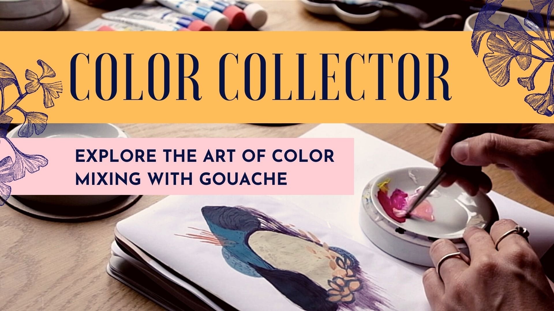
called color collector, explore the art of color
mixing with gouache, where I go in great depth. That can be a fun way to
explore that a little bit more. Speaking of that, these
are all really fun, but I'm going to add a much
darker color in this time, sepia, which is almost black. It's brown but, and I just thought it
would be a fun mix, especially I really like this
brown next to this pink. Adding that in, I think could be a fun addition to my palette. Finally, what you're
going to notice is that sometimes you actually prefer a color
palette when it only has two colors or three colors. As you add the colors, maybe you're going
to not like it as much as you did initially. But that's why it's
super fun to start collecting color palettes
and just have fun experimenting with different color combinations
in order to see what speaks to you and
what maybe inspires you to create some artwork
in your sketchbook. You'll notice that
my blue, well, it's definitely not as flattened opaque as some of
my other swatches. So I'm going to go ahead
and add one more layer of this blue in order to really
get that mild effect. While I'm at it, I'll also
go ahead and add another, oh, no, I'm not going to. Why did I do that?
That's the wrong color. Well, I was like, Oh, why not do two birds with one stone and just
darken this one? I'm actually just going
to have fun putting in half of this and
seeing what that does. I'm turning my
three-colored palette into a three-and-a-half-colored
palette. It's just what happens
when you get distracted. I'm going to make one more
final observation on this one. That is that I think
I actually used a little bit less paint in this color palette than
I did on this one. What that means is that I
think I got a little bit too transparent on some of these
swatches. That's okay. That's good information
that I can take with me for the next
four-color palette. That yes, even though I am
making smaller surfaces, I still need a little bit
more paint even if that means that I might waste
some paint in the end. You can see that
these are nice and dry and definitely adding that second layer helped reduce
some of that transparency. But of course, you're not
going to have something as opaque as this one where the pigment itself
is also opaque. In general, though I would say that with Holbein gouache, I think it's more on the rare side to have these
transparent pigments. It just so happens
that this one is considered a fluorescent color
and I guess I don't know, maybe because of that it has that added layer
of transparency. I'm not entirely sure, but it's still good
enough for my purposes. I still think it's
a really fun color to add into my color palette. Let's move on to our
second four-color palette. I'm actually going
to start out with the sepia color again just because I thought
that one was really fun. I'm going to make it a little
bit thicker this time. I'm going to put
more of that paint so that I get a
more even coverage.
9. The Fun of Themed Color Palettes: Let's start out with my
sepia and for this palette, I actually want to introduce the idea of creating
themed pallets. What I mean by that
is that you can sometimes use your
own imagination, your own inspiration as a starting point for
a color palette. I actually talked
about this in one of my previous classes which was
more about colored pencil, was about using
vintage stickers, I have a vintage sticker
book and using that as the starting point for pulling inspiration
for color palettes. But you can also simply create your own themes for
your color palettes, so I really like this
dark chocolatey sepia, but I've been
looking at a lot of inspirational imagery on
Pinterest from the '60s recently and so I think it
would be really fun to create a retro pop of color '60s palette. I have no idea whether
it's going to work, but I'm going to try to
do that and that will be the starting point
for my color palette is this theme of having poppy, bright, retro colors
along with my sepia. But you could create
a different theme, so, for example,
you could decide, I want to create a theme that is cozy and try to find colors that represent coziness for you or you could use a place
as a starting point, maybe a city that you've seen or let's say the
Botanical Gardens, I loved the Botanical Gardens. What if I use that
as my starting theme in order to build
my color palette? This is where it can also get really fun and really personal because those are things
that are personal to you, what it is that you are inspired by is going to be unique to you, which means that the pallets
and explorations that you're going to do are also going
to be unique to you. It makes them that
much more fun, they carry a little bit of
a story, maybe a memory. I could imagine, create your
pallet and then name it as the place or theme
or whatever it is that you have taken
inspiration from. Since I'm going with
this retro pop color, I thought my cerulean
blue could be super fun, especially in contrast to
the warmth of my sepia. Having this bright cold blue, cerulean blue is quite
close to a cyan and so I think that'll be
a really fun mix. I'm going to try not to
overlap this one too much with the other ones
since the other one doesn't seem dry
and I don't want to repeat of my blending of colors. Different people have
different ways of painting, I'm a messy painter, even though maybe you
can't really tell with this exercise and
so I often have my brushes maybe a little
bit dirty and so the color bleeds in and I usually
don't mind that so much, I think it's actually fun and
unexpected and sometimes it brings you to places that you
wouldn't have tried before. In this exercise, I'm actually trying to be more
careful about that, but yeah, just a quick
reminder that it's good to clean your brush
pretty thoroughly. I really liked the fact that
my swatches were touching each other and so I'm going
to try and do that too here, but just without
overlapping it too much. Smoothing out all
the mountains and the valleys and
cleaning my brush. Maybe a yellow
would be fun here. I actually think a yellow
and a pink would be nice, but rather than putting
my yellow directly here, I think it would be fun to put my pink first and
then my yellow. That's going to have
another effect on your color palettes
is the order in which you put the colors is going to have an impact
on the mood because different colors are going to play off each other and
influence each other. I am going to go ahead
with this yellow, but I'm going to do
that second and first I'm going to do a pink. Since my pink is very light, I want to make sure that I have a very clean brush, I might, if I really wanted
to be super careful, actually changed the water to make sure that I don't
have any color on that, but I think it's going
to be okay, we'll see. I'm going to go in and
add that in there. I already quite like this, I think it's definitely got
like a retro '60s vibe, I think it'll work well. Again, since the other
one is still drying, I'm not going to
make it touch quite yet because I don't want to contaminate my
beautiful pale pink. I want to put some music on just for the rest of this palette, so you can see it being
built in real-time. Feel free to put your own
music on if you prefer that and we can meet again in the next video for our five palette color. [MUSIC].
10. Five Colors, Tonal Palette, & Neutrals: For this final palette, we're going to be working
with a five-color palette. I'd like to introduce you to the notion of a tonal palette. If you don't know what that is, a tonal palette is a
palette where you have a family of colors that is
building up that palette. Often you'll hear about a
tonal palette if you're talking about home decor
or let's say even fashion, where like, let's
say you're all in beige colors, neutrals, etc. But the idea behind it
is really just to gather colors that are part
of the same family. I'm going to decide to go
more towards the reds. Since I have a pink that I used in one of my
prior palettes, that's going to be perfect. I'm just going to start out
with that pink and I'm going to add a few other colors
that are within that family. For example, I can
use my coral red. I also have my ash rose, which is a color I quite like. I think that would be a very fun start for this tonal palette. But I'm actually not
going to stop there. Even if you're building
a tonal palette, it can be fun to add
in a pop of color that's from a
different family of colors than those initial ones. I really loved this mix of
the yellow and the pink. I'm going to actually
maybe bring that one in as a pop of color. Then I could also add a
neutral color just to bring in maybe a little bit of a darker value as well
because if you look at these, these are all quite low contrast on the lighter end
of the spectrum. If I want something to
really give a nice dark pop, then I could choose something
a little bit darker. I could maybe go for my blue
violet that's quite dark. But personally, I'm
not a huge fan of this one with my
mix of colors here. Let's see what else I have. [NOISE] I think actually that
the one that could work the best with that
would be my sepia. I think that could make a really fun tonal palette
with a pop of color. Let's say that [LAUGHTER]
five times best. This is going to be
my five color palette and I'd like to
invite you to try to create your own
tonal palette. You could also simply
decide to have, let's say, you could go fully tonal with just a pop of
color and no contrast. Or you could go seriously fully tonal and see what kind
of a mood that creates. Since I'm going to be
using five colors, I'm going to need even a
little bit less paint, and why don't I also
challenge myself to using my round brush because I've been working with my flat
brush the whole time, and now it could be a good
opportunity to practice the same method of
creating the flat surface, except using a round brush. [NOISE] Even with my round brush, I'm going to need to flatten
out the mountains and the valleys to create a nice smooth plateau
of paint. [MUSIC]
11. Bonus Exercise For the Intrepid: Bonus little exercise for
the intrepid among you. I'm going to demonstrate what I was talking about
earlier where you use what you have left over just to experiment and have fun. I actually quite like
these colors together. This wasn't planned, obviously, some of these
colors were used in my four-color palette and a few others were used in
my five-color palette. But I actually like all of these colors together
and I have six of them, so I could decide this
is a six-color palette. Of course, you could swatch the entire palette here first, but why not just also
dive in and just have fun playing with these colors? In this instance, I'm not going
to pay too much attention to the thickness of my paint. I'm not aiming to have that smooth surface that we
were practicing up until now. I'm really just going to lean into playfulness and discovery
of these mixes of colors. For example, you've
noticed that I have a little bit of yellow
on my pink brush. Instead of trying
to homogenize that, why not just play with that texture and see
where that brings me? The result is really not
the important part here. The important part
is really just to explore and maybe have a visual reminder that your sketchbook is
meant for playfulness, for exploration, and
silliness, why not? But I will ask,
even if you're not looking for that
very smooth surface, that you still
bring a fair amount of presence into your work. Because that's really what makes the painting process fun, it's what makes it pleasurable. I can, of course, decide to create some
shapes that have that flat look that
we've been practicing, or I can play with the
dry brush technique. Either way, what I'd like to
invite you to do is really explore different types of
textures with your gouache, different types
of consistencies, and to remember that this specific exercise is not about creating
something beautiful, but really to have fun, embrace the process, and explore your color
palette in a new way. I'm going to put a
little bit of music on, but you can find me at
the end of the video where I'll talk you through
some of these reminders. [MUSIC] This is actually still drying, but I just really want to call your attention
to the fact that I have a mix of different types of textures going on
in this painting. Again, it's not like
a finished painting, it's not a masterpiece, that's not the point of it. The point of it is
really just to remind me both of the playfulness
of my sketchbook, that this is a place
where I can dive into land and bring
my exploration, my curiosity, my excitement, and love for color, and enjoy that process. It's also a place to
remind me that there is this versatility in gouache and that there is not one correct way of using it
or incorrect way of using it. Simply, they each give us different types of textures
that can be useful depending on the artwork and the specific mood or texture that we're looking
for at that moment. Once it's dry, I could decide to add more
detail onto it, have a little bit of fun adding in a little
bit more texture, or I could even add
some mixed media with some colored pencil and
go ahead and do that. This is just one
example of how you can take over the leftover
paint from your palette and just play around with
that and use that as an excuse to get creative and have fun
in your sketchbook. I hope you do this exercise
because it's really fun. If you feel like sharing, even if you find it absolutely horrendous because
that's the point of it, it's to celebrate our creativity which comes even in
the ugly phases.
12. Palettes as Springboards: So now that we have
our four palettes, I want you to take a moment, especially if you've done
it in the way that I have where you have one
color pallet per page, to really just isolate that
color palette by looking at each one individually without the other color
palette next to it. The reason I'm asking
you to do that is because obviously, when you take a page together, you're not just looking at this. In the corner of your eye, you see the entirety
of these colors. Isolating them will really help you hone in on whether you enjoy that color palette and what the specific mood of
that color palette is. For each one, I really
want you to take some time to really just
sit with these colors, and also to observe the different imperfections
that might exist because yes, imperfections are meaningful and important and beautiful, and they can give you information for what
it is that you might need to practice for your
further color palettes, for your further flat surfaces
that you're looking for. You can also start to identify
which one is maybe the best one in terms of this flat surface effect
that you're looking for, and which one might need
some further exploration. You can try to identify
with which colors it was easier to do this and which ones it was
harder to do it with. Of course, you can start to also expand your idea of the
limited color palette in order to include the entirety of the colors on both sides. What if I created a painting
with all of these colors, not just my four or
five, but all of them. In this case, there
are overlaps, but you see what I'm going. Our limited color
palettes are there to be springboards for imagination, springboards for creativity, and by collecting many
different color palettes, you can also use mixes
of color palettes as also springboard
for your next artwork.
13. Final Project - Part 1: Abstract Shapes: If you would like to
further explore this notion of flat surfaces with gouache, then I have one last
little exercise for you where we're going
to simply create shapes and patterns on the
page where we can practice a little bit more of
that and maybe explore one of your color palettes
a little bit more in depth. If you don't feel like exploring any of the palettes
that you just did or if you're just feeling
intrepid and brave and want to have a little bit of
more improvisational fun, you can also start out with a completely
different color palette, which is what I'm going
to be doing here. In this first part,
we're going to do something quite similar
to what we did in the palettes except that
we're going to be exploring perhaps different shapes
than the ones that you chose to use
for your palettes. It's really just about
continuing to practice this flat surface that
we're looking for, have fun with the colors, and play around with
shapes, overlapping them, putting them
together randomly on the page and seeing
where that brings us. I wanted to put some music on so that you can
paint along with me but of course you can put your own music if
you prefer that. I really invite you to
take this opportunity to sink into the
moment, be creative, and have fun exploring all the different things
that we've learned during the course of creating all our palettes and doing
all our gouache practice. This is a moment for you to
lean into your creativity, to lean into the playfulness and beauty of the
colors that we have such immense
privilege to be using in this day and age where
pigments are easily accessible. We can play with them, they can be a part
of our daily lives, and there's something inherently
beautiful about that. I really invite you to
embrace that and have fun with creating an abstract
piece of artwork using shapes. In the next video,
we'll be getting into detail work on top of our shape. but for this part, it's really about just building up your painting
little by little, different colors, different
shapes, different sizes, and have fun with that. [MUSIC]
14. Final Project - Part 2: Patterns & Textures2: In Part 2 of our exercise, once you've finished
establishing all the shapes that you're
going to have in your piece, we're going to start adding
a little bit more details. You can work with a thinner brush if that
sounds more fun to you. But I'm also going to
invite you in this part of the exercise to
perhaps stray away from that flat gouache surface and you can play around
with different levels of transparency and see how that works in conjunction
with your flat shapes. You'll notice that I'm
adding a second layer on a few of my shapes
where I felt like I was still a little bit
too transparent and didn't get that thick opaque
look that I was looking for. Remember that that's always
an opportunity in case you missed it the
first time around. You can add layers. Once you're all satisfied with that and your paint is all dry, you can move on to adding some
textures and playfulness, some patterns, lines, dots, squiggles, anything
that sounds fun to you. The key principle here is
to, again, keep playing, keep exploring remembering
that these are just beautiful, small opportunities to connect with yourself, with
your sketchbook, with your art materials, and to celebrate our love
of color and creativity. Let's paint. [MUSIC]
15. Outro: Thank you so much for
joining this class. I hope that you enjoyed
playing around with gouache. I'd love to see what you made
if you feel like sharing in the project section and give your fellow
students some love. If you also want to, you can share your
project on Instagram using the hashtag
gouachewithmarienoelle. Speaking of we can become Insta buddies over
there and Instagram, you can also follow me here on Skillshare by clicking
on the follow button in my profile right here and get notified when my next
Skillshare classes out. I of course announce it also on my Instagram and
in my newsletter. If you're wanting to get a
little bit more creative, but in a slightly more
intimate and live setting, I do live drawing
sessions every month on Patreon where I also
do sketch book tours, fan ask me anything's and
where you can become a part of a community of
like-minded people in my cozy, little art cafe. If you want to continue the gouache journey and
color mixing journey, I have a massive class
called Color Collector, where I dive into the depths of color
theory and color mixing using a very hands-on
approach and some fun creative exercises in the second part
of that class. But of course, I
also have a bunch of other classes here
on Skillshare. I hope that you
enjoyed this one. If you did, it would mean the world to me if
you left a review, it just takes a little minute
and it means so much to me. Finally, I would
like you to take a little moment to
celebrate everything that you accomplished in this class because we did a lot of
practice with our gouache, with our paint, explored
color palettes, learned new things and that is absolutely something
to be celebrated. Every moment that you show
up in your sketch book is something beautiful and
a gift to yourself, but also to others. Thank you for joining me as we embark upon this
little gouache journey, and I hope to see you around. Let me know if there's a
class that you'd like me to make in the future in the discussion section
or wherever else. Reach out. I would love to hear from you and thank
you so much. Bye.
 Marie-Noëlle Wurm, Artist, illustrator, HSP