Transcripts
1. Welcome: Have you been seeing tons
of cool lettering and calligraphy videos online and wanting to create your
own hand lettered art? Or maybe you're looking for a new creative hobby as a
way to express yourself. Hi, I'm Shannon, a self taught hand lettering artist from the Caribbean
Island of Barbados. I started lettering with
no art skills whatsoever, but after years of
learning and practicing, I've been able to
turn my passion into my very own
lettering business. Over the years,
I've created logos, wal art, designed
covers for planners, and even for books. In this class, you're
going to learn how you too can create your own
beautiful brush lettering. Starting with the
basics. I'll walk you through the
supplies you need. Then we'll move on to learning all about modern
calligraphy letters. You'll start with
the basic strokes, then learn how to
put them together to form letters in the
calligraphy alphabet. After that, we'll transform those letters into
words and phrases, and then move on to designing and sketching
a hand lettered quote. And of course, I'll share some
simple embellishments that you can incorporate to
bring your quotes to life. At the end of this
class, for your project, you will put all the techniques covered throughout
the lessons into practice and letter
an inspiring quote that you can share online, hang on your walls,
or give to someone. If you're ready to create your own beautiful brush
lettering, let's dive right in.
2. Supplies: So the first, one of the most important things
you will need is good paper, smooth printer paper, like HP, premium LaserJet
paper is perfect for printed out worksheets and practicing and also for planet and sketching
out your quotes. You can also use something like marker paper or Bristol paper. The Margaret paper
is a lot thinner. So you can use
that to place over your practice sheets and latter directly onto
the market paper. If you are worried about running your tips on
your printer paper, then there are also
notebooks with a smooth paper like
this red dot book, which is also
perfect for Lateran, as unlike the other
two that are like the rodeo dot book already has a dot grid that can be
used as guidelines. The last important tools that you will need are rush bands, widespread in so many
different sizes and colors. And the ones that
you choose will definitely be your own
personal preference. If you prefer a smaller nib than pens like the Pentel Touch. Perfect. If you prefer a larger labs, you can use something like
the Tombow Dual Brush brand. You can also use some markers that don't
necessarily have a brush tip. Pick the Crayola, broad
tips or the krill is super tip markers or even the art lines,
sticks, brush marker. You will need some
sketching supplies. And I don't mean anything fancy. I just mean any
pencil that you have, this will be used for planning and scheduling your lettering. You'll also need a ruler. This will come in handy when
it's time to draw your guys. Anyways there to
help you get rid of any unwanted pencil marks. And for adding details
to your lettering, you will need some
other materials like a white gel or paint pen
and a black fine liner pen. And make sure that you download your lettering workbook from
the project section below, because it has some practices
that we're going to be using to form our letters
in the next few lessons.
3. What is Hand Lettering: What is her letter in hand lettering is sometimes
referred to as lateral, and it is the art of
drawing letters by hand. It is a very fun and creative
way for you to express yourself as simply or
as complex as you like. Each letter is drawn by hand rather than
written or typed. And the focus is not on
creating an entire alphabet, but on creating letters for a specific word or phrase
you're working on, as well as all the details and the composition
of the letters. Calligraphy is a form
of writing letters, where the letters are written in individual strokes
that are combined to form the letters rather than being drawn like
with hand lettering. Oftentimes the words are
used interchangeably, but they're completely
different things. And how laddering should not be confused with handwriting, typography or even a font, because these are also
different things. Right here refers
to the way that you usually write with
a pen or pencil. It is something that you flirt
and have been using most likely on a daily basis
for most of your life. The goal where your handwriting
something is usually to communicate a message rather
than to create a design. A font refers to a collection of letter forms that are
all the same style and size and the characters
are repeated and identical when you reproduce
them on the computer, typography refers
to the arrangement and appearance of letter forms to convey a particular
message when they are displayed digitally, or even sometimes in print, magazines and stuff like that. So now that we know
what hand lettering is, it is time to look at
different letter styles.
4. Letter Styles: So now we're going
to take a look at different styles of letters. The first style that
we have is Script. Script lettering is a style of lettering where the
letters are drawn, are written in a flowing motion and are connected to each other. Now we have our second
style of letters, and these are
sans-serif letters. So these letters are not
written in the script style. They're usually not connected. And they look like
block letters. They have sharp edges and curves and lot more bolder
compared to script letter. A serif letters are similar
to sans-serif letters, so they are block letters, but they will have some short lines or strokes at the end of the letters
that are called serifs. You could also have
bubble letters. These are similar
to block letters, so they aren't
typically connected, but they will have
rounded edges. And we can also have
a monoline lettering, which is a style
of lettering where the lines that form the letters
are all the same weight. And they can be done
with tools like bullet tip markers or
even ballpoint pens. You can also categorize
lettering styles by the tools that were used
to create the latter forums. So brush lettering
typically refers to any style of lettering
greeted with a brush pen, watercolor lettering
first to any style of lettering created
with watercolors. Ipad lettering or
digital lettering refers to any form of
Lateran done on an iPad. In this class, we are going to mainly be focusing
on script lettering, specifically modern
calligraphy letters, where we use a brush pen to
form our letters as well. Get a little bit more into that in the next lesson. So
I'll see you there.
5. Intro to Modern Calligraphy: As a beginner, your
first instinct, maybe to hold your brush and use it the same way you
would a regular pen, but that is actually not
the correct way to do it. Holding your brush
pen incorrectly doesn't allow you to
use the nibs full flexibility and can result
in very uneven lanes. And she curated and it can
even damage your brush pens. So to hold your brush pen and you're going to make sure
that you're gripping it between your thumb
and forefinger and that it rests on the side
of your middle finger. You're not going to hold
it too close to the point. Are you not going to hold it
too tightly because this can sometimes be painful
after a while of rated. Then you're going to try
to make sure that your arm is parallel to the
edge of your paper. I personally like to write
sometimes at an angle. So usually you have to turn my paper to just make
sure that it is parallel. This kinda helps you to stay on as a straight of
a line as possible. It does take some practice, but this is really a good
way to haul your pet. And then you're going to hold
it at a 45-degree angle, making sure erase is straight and not bent to
the left or the right. And then you're just
going to wait by moving your entire arm and
not just your fingers. Writing calligraphy
is completely different to your normal
everyday handwriting. So both take some time
for you to get a custom. In the previous lesson, we talked about different
lettering styles and we noted that calligraphy is
not the same as lettering, but we are going to be learned some modern calligraphy first. And then we're going to add some details to our
calligraphy letters to take them from calligraphy to a beautiful hand
lettered quote. So we're first going to take
a look at some rules of modern calligraphy before we dive into forming the letters. The first one of the
most important roles as a thin upstrokes
and thick downstrokes. When you are writing a
word in calligraphy, you are going to apply
pressure as you go downward. And that stroke is
going to be very thick. And anytime you move
your pen upwards, you apply less pressure to
create a thinner stroke. The second rule of calligraphy
is using guidelines. All your letters well fit
within four basic lines. And these lines will
help you to keep your lettering consistent
and correctly sized. The first line is the baseline. This is a line that your letters sit on so
that you don't find that some of the
letters are floating above or sinking
below other letters. The next line is the AC side. This is the height of
lowercase letters like X and C and E that don't go to the ascender
and descender lines, then we have the ascender line. This is the line that all
your letters that go above the x-height will reach two
letters like b, D, and K. Well, a centered this line. Then we have the descender line, which is the labor. All your letters that go below the baseline will decided to letters G and P and Q
will go to this slide. Here's look at a few
letters in the alphabet and how they fit within
these guidelines. The next important is understanding and
using basic strokes. The first is the upstroke. You're going to start from the bottom of your baseline and apply a consistent amount of pressure all the way to
the top of the line. And when I say
consistent pressure, I don't mean you're
pressing with the full weight of your hand
to create a thick line. Because remember, our upstrokes
are going to be thin. We want to press very lightly. We want to make sure that
we are pressing with the same consistency all the way from the bottom of
the light at the top. Then we have the
downstrokes there. You started from the active
site and you're a plane, a consistent amount of pressure all the way
down to the baseline. And you're going to be a plane. Full pressure as you do this downstroke so that you
get it thick downstroke. Then we have the
underturn service starting at the top of the
language, the x-height. And you will begin with
a thicker downstroke, but as you start to
reach the bottom, you will transition with a
curve into a thin upstroke. The next job we have
is the overturn. So starting at the baseline, you will apply a slight amount of pressure until
you reach the top. But instead of stopping, you will continue with a curve and transition
into a downstroke. The next basic stroke we
have is the compound curve, which is a combination of the
overturn and the underturn. So you're starting
with an overturn, but rather than finished
in that stroke, you're going to
continue with a curve and transition to an underturn. The next stroke we
have is the oval. Then we have the ascending
loop and the descending. So the next important rule of modern calligraphy
as lifting your pen. Lifting your pen after each stroke will allow
you to kind of reset. I'm prepared for
the next stroke. So you don't forget
your hand is very tired or cramped when you are writing. The final rule of modern calligraphy is
simply to practice. You're going to need to practice
as much as you can see. You can try to dedicate a
few minutes every day to practice these basic strokes
and your learner formation. And you don't always have to practice with worksheets
and brush pens. When I was a beginner alone with my dedicated practice time, I would also practice anytime that I had maybe a random
piece of paper in front of me. And I would find myself
doing my drills, are practicing my letters using just a regular
pen or pencil. And these all have
flexible tips, but you can still get
a small amount of variation when you
apply pressure. But practicing
really is all about muscle memory and it really
shouldn't be stressful. In fact, I find that
practicing my drills, it becomes very common
and it just really makes the Lateran process
a lot more easier.
6. Forming Letters: So first we providers
we have are all made up with an oval. So we're going to start
with the letter E. And after you form your oval, you're going to lift
your pen and then you're going to create
an underturn that starts at the
x-height and goes to the baseline and then
back up to the x-height. For your letter C,
we're going to start just like we started
with our oval. But instead I'm finishing at
the point where we started, we're going to transition into a thin upstroke that
reaches the x-height. For the letter E, We're going to start
at the middle. Where did those stroke will be? And continuous, just like
we did for the letter C. For letter o, we're just
going to create an oval. But instead of stuffing
really started, you can continue upward
and create a small loop. There are few other letters
that have ovals in them, but I've just included them in the next family because
they also have loops. So that is what we're
going to look at. This next group of letters
are all made up of loops. First up we have beat. So you're going to start with your SLA loop and run the
second part of the ladder, you're going to start with an upstroke that
curves into a loop, similar to the descendant loop, but it's going to
be much smaller. D is a combination of an
oval and an ascending loop, but instead of stopping
at the descendent line, you can curl up into a thin stroke to
complete the ladder. So as these letters continue, you're rarely going
to be able to see exactly which
strokes to use it, to farm which letters. And it will be so easy to form muscle memory and clear,
consistent letters. The last group of
letters are all formed with editors overturns
or compound curves. So when you're
practicing your letters, you can go as slowly
as you need to. Don't worry too much
about trying to get your letters to match the
ones under worksheets. The most important thing is to practice the formation
of the letters. Well, try to keep your
strokes as consistent as you can and contained
between the guidelines. Calligraphy isn't something that you will master overnight. You will need to spend as much time as you
can practice it. I'm burning up your muscle
memory because really that is the key to creating
beautiful calligraphy letters.
7. Connecting Letters: We just finished
creating our letters. Now it's time to connect them. The first way you can
connect letters is by combining two strokes together
to create a brand new one. So you can connect the last stroke of
your first letter with the first stroke of
your second letter to create a brand new stroke
that connects them together. So here I've written my a and then going to connect
it to the letter R. I'm going to connect the underturn of that
letter E. That last part of the underturn with
the beginning part of that loop that forms they are sometimes when you
are connecting to our, because the R can sometimes
be a little tricky, you mainly to go above
the x-height with your loop just to make it look a little bit more balanced. The next way that
you can connect to letters is by starting your second letter at the point where your
first letter ended. And this works well with
letters that end with an underturn where the last part of letter touches the x-height. So for this example, I've replaced the downstroke on my end just to show you how
that connection would look. Of course, with the
ANN connection, you can also combine
the underturn of that with the overturn of the
N to create one new stroke. That also creates a
really fun connection. How you connect your letters is one of those things that
can also come down to personal preference or to those specific quote
that your rating. I'm just going to share a few common letter connections
that I like to meet. And you can definitely try. These are traits
some of your own. So if you're trying
to write out a word and you're struggling with the
connection of the letters. I'm going to share a
technique that you can try to just help your ladder
connections be a lot easier. So the first thing you're going
to do is write out all of the letters that form the
word in modern calligraphy. And you're going to
write them individually, so don't worry about them
connecting at this point. You just want all your letters
saying on your guidelines. And just so you can have
an idea of how they look. The next step is to
pair up the letters. So you're going to look at
the beginning and the end of your letters and
determine whether you're going to combine or you're
going to connect the strokes. Then you are going to rewrite
those pairs of letters. Then you're going
to take a look of those letter appears
that you've just written and decide whether
you're going to connect your strokes are
going to combine them. Then of course you're
going to rewrite that word in its entirety. And this is a technique that
is really great if you're an absolute beginner and you've never attempted to
connect letters before, or maybe you struggled with
your letters connections. As you get more accustomed
to connect in your letters, you don't have to do this step. You can just go straight into
connecting your letters. Once you are finished, practice in your
letter connections, it's now time to move
on to the next lesson, where we take a look at
some composition principles that are really important
when it comes to planning. Your hand letter design.
8. Composition Principles: In order to create the most
visually pleasing designs, there are few
compensation principles that you will need to learn and apply to each
composition that you create. Composition in lettering refers to the way that you combine our arranger ladders to create a layout that will convey
the message of your quote. The most important
principle that you need to keep in mind
is a hierarchy. So you need to make sure that your most important
words stand out. Sometimes, we usually don't read all the words
in a piece of texts. We just pick out the
most important ones and our brains will
fill in the rest. So that's planning
your composition. You need to make
sure that, well, the viewer looks at your
letter in the main focus is on the important words and they don't miss or
misinterpret the message. You can show hierarchy
in many ways. You can make your
important words larger than the other words. You can make them a different
style or a different color. Anything that really makes them the main focus of
the design will work. So we'll have one
level of hierarchy, while others will have more. The most important
words are level one than the words in level
two are important, but still not as important as the ones in the first level. And your level
three words can be the other words in the quotes
that are less important. Lake filler words such as
the Is and stuff like that, that don't need highlighting. When you are working on a quote, Try to keep your
levels of hierarchy to three levels just so that it's easier to get your
message across. The next important principle that you need to
know is balanced. So bones refers to
the distribution of the visual weight of
your words in the layout. So you need to make
sure that one side of your design doesn't look heavier or lighter
than the other. With symmetrical balance,
the weight on both sides of the design is equal
and sometimes identical with
asymmetrical balance, the weight is not
identical on both sides, but still the
design doesn't feel unbalanced because
maybe you have added some extra illustrations or stuff like that to balance out the weight
of the letters. The next principle you need to keep in mind is negative space. Negative space
refers to the space around and between your
words and letters. Created a CSS for layout is
not only about the words, but also how you deal with
the space around them. So when you sketch
out your nail, identify negative spaces in your design and how
you want to fill them. You can fill them by
extending certain letters, are adding flourishes to them. You can add illustrations
and doodles. But if you do want to have that negative space
in your piece, you need to just
make sure that is balanced in comparison
to your latter. And the next
principle you want to keep in mind is movement. So when reading a text
written in English, we typically start from the
top and go to the bottom. And you also read
from left to right. When you're planning your nail, you need to keep this in mind because this is the direction that your viewers eyes will take when they're looking
at your lettering. Now that we have covered
our composition principles, we can now move on
to planning equal.
9. Planning and Lettering A Quote: The first step in the process
of planning and creating your quote is to make
some thumbnail sketches. So thumbnail sketch is just a very small version of the design that you
are going to be using. So first you're going to
write out your phrase in your normal high
rating and identify the main words are the words
that you want to stand out. Then you're going to sketch out any designs that you
may have for your code. At this stage, you're
not focusing on the styles are the
details of the ladders. Instead, you're just trying
to generate ideas for the work placements
and just testing them out to see what
works and what does it. And as you sketch,
remember to keep your main words larger or
a different style fan, you're not so important
words, ghetto, Any ideas as they
pop into your mind. At if you're having trouble
coming up with ideas, you can just start with
your keywords first and then build up the
other words around them. Next step in the
planning and designing process is to choose your
favorite sketch and refine it. So take a look at all your thumbnail
sketches and just choose the one that
you like the most. Then on a new piece of paper, you can draw some guides and sketch out your first draft based on that design
that you've chosen. This point, you can also
change up things or refine the design in any
way you want, if necessary. Once you're finished
making your revisions, you can then move on to transfer your design onto a
new piece of paper. Sometimes you may need to
transfer your sketch onto another piece of
your printer paper to make a few more revisions. Or maybe you're just
ready to transfer your design onto the paper that your final
piece will be on. To do this, you can
use a light box. Simply place your paper with your sketch on
top of the light box. Turn it on, and then you can place your blank piece
of paper on top of it. The boss will shine light
through both of these allow you to see the design and to sketch
it onto your blank paper. You can either transfer your sketch of the
Lateran onto the paper or you can use your
brush pen to let her directly onto your paper. If you don't have a light box, you can take these papers onto a window that has the
sun shining through. And the, and we'll just shine through them and work just like a light box so you can transfer your lateral onto
your paper that way.
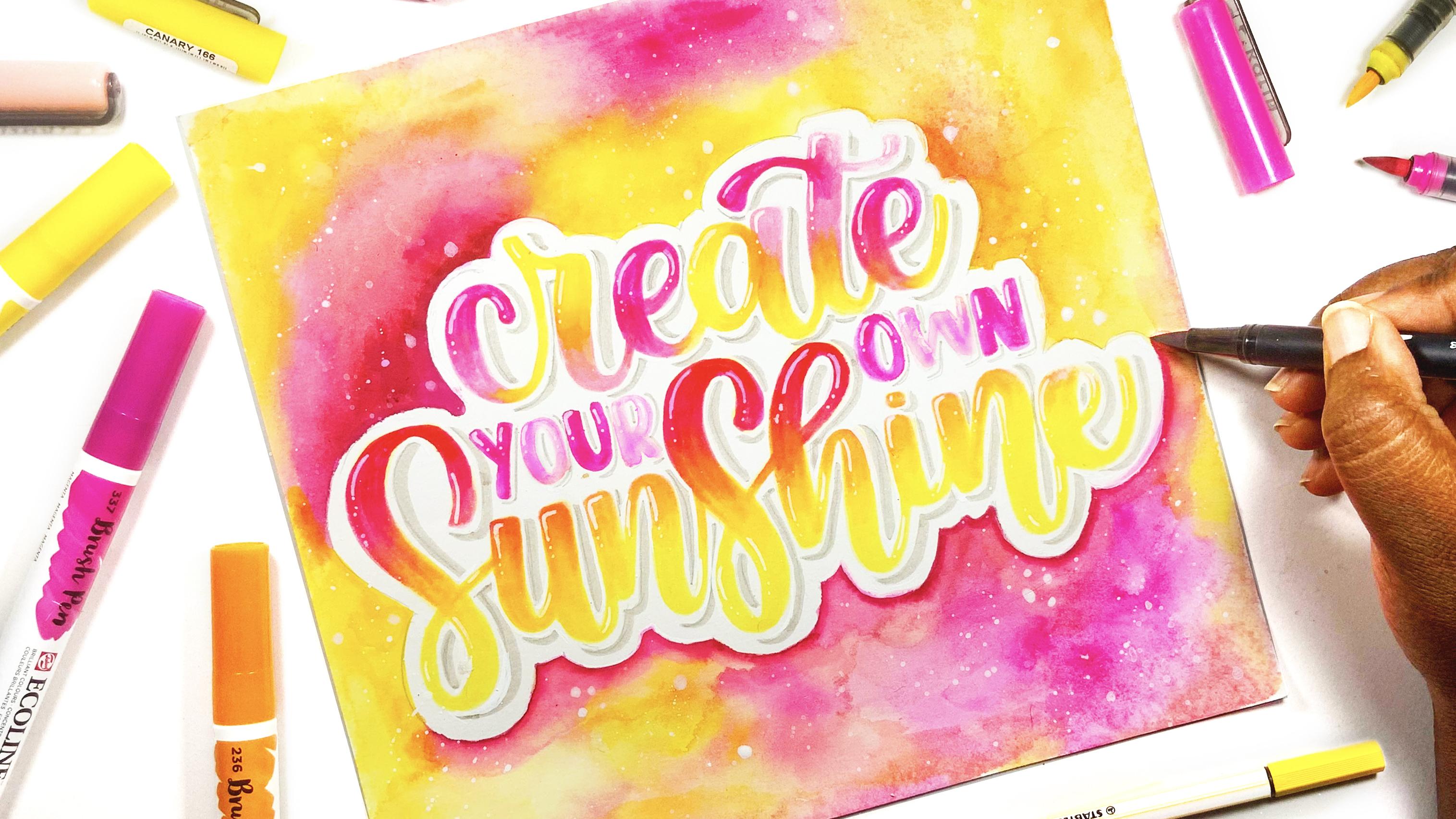
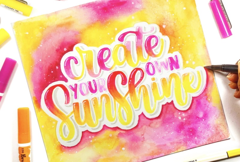
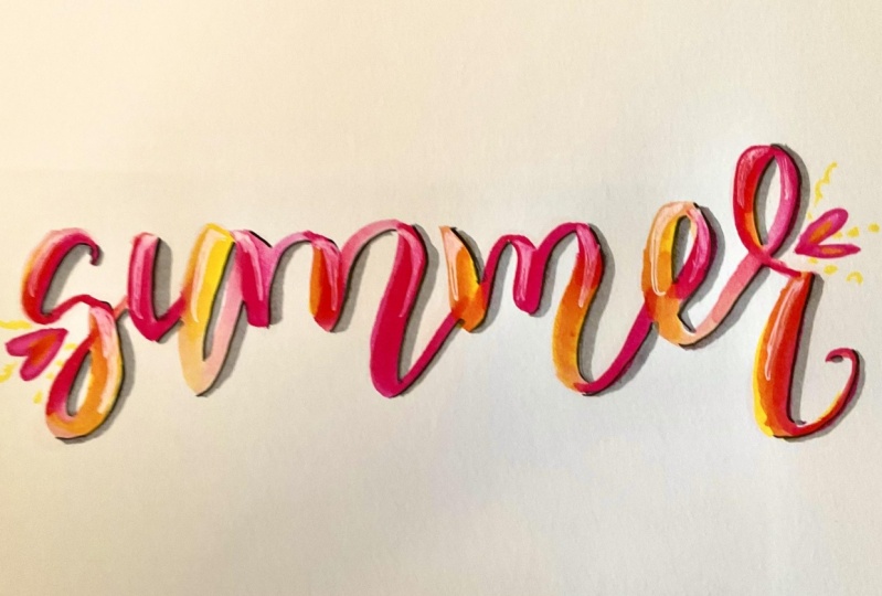
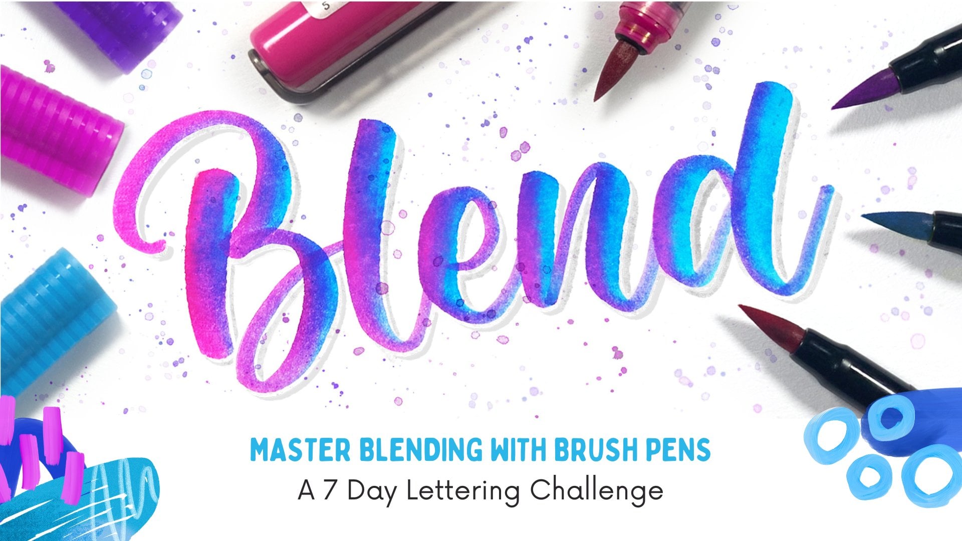
10. Blending: When it comes to hand lettering, blending is one of
the most fun and easiest ways that you can
add color to your letters. The first type of Blind
that I want to show you is a horizontal on-brand blend, where the colors will transition from one to
another horizontally. So the first step to creating this blend is to grab the tip of the darker colored marker onto the tip of the
lighter color marker. The color from the
dark marker will start to bleed into
your lighter marker. And then you can
write with this tiny, you don't have to
worry about running your tips because the color will just transition naturally. Another way to create a
horizontal blend would be to rate each stroke in a different color and then blend the areas
where those colors meet. You can also do a vertical
blend where you start with one color and gradually switch
markers to blend colors, coming down your letter. Another fun type of
blend that you can try is a more loose
style of blending, where you first write out your word in the lightest color, or you can sketch it out. And then you're going
to add your colors randomly on top of that
sketch or that lighter color. Then you can use your
blending brush or your paint brush to blend all
of those colors together. When you are blending, try to use colors that
go well with each other. Like maybe red,
orange, and yellow, or even light and dark shades
of a particular color. Some colors when blending
together will look amazing, while others will
turn a very muddy. Because of that is important
to test your colors before you start to blend to
avoid those muddy colors. So always do a quick
test on a piece of scrap paper before you attempt to blend in
on your final piece. Another thing to keep in mind is to avoid adding
your colors with sharp edges are sharp night and instead add your colors using
sharp feathered strokes. This just ensures
that you will have a much smoother
color transition.
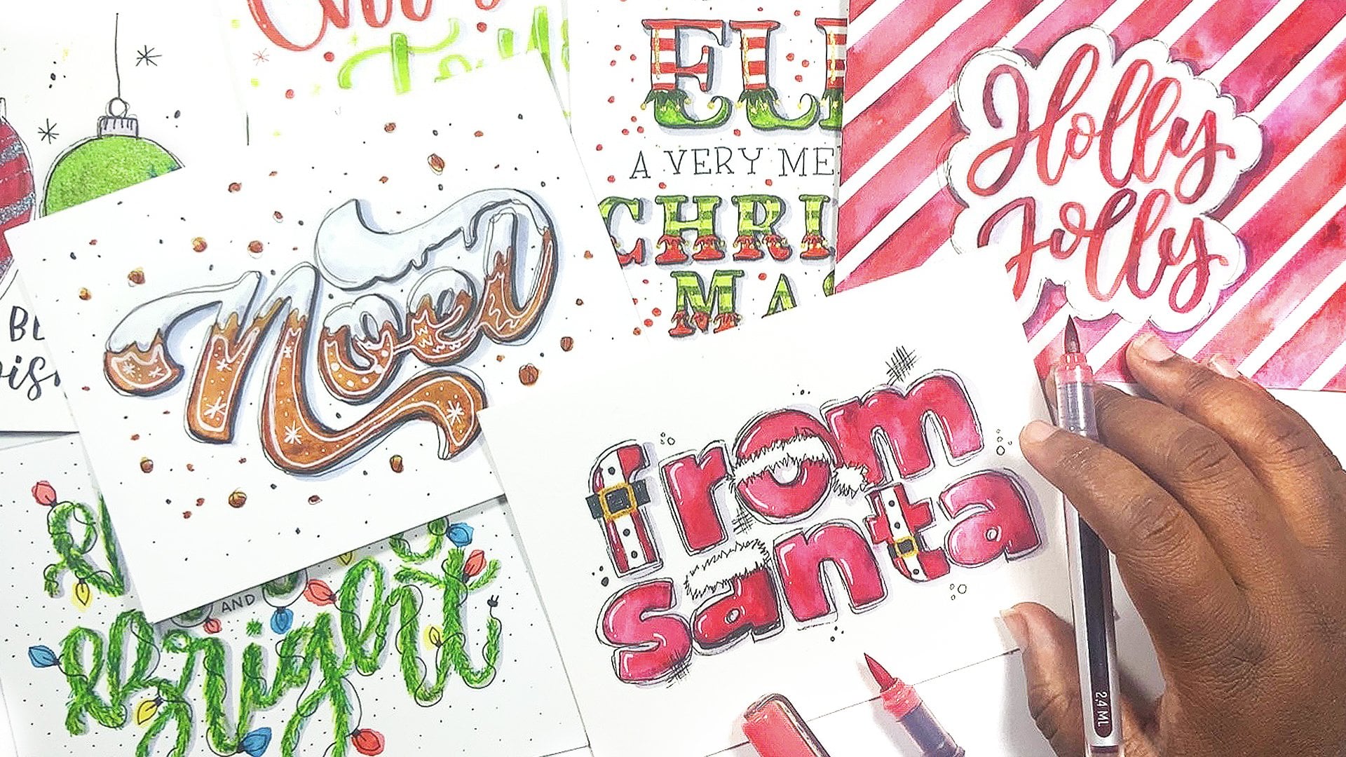
11. Outlines: An outline is just a line that will surround your letters. I like to add outlines to
my letters because they help to define them and
just help them to pop. And also it helps to
emphasize the form of the letters and make them
easier to read and understand. All pieces don't need outlines. And this is definitely
a personal preference, but I'm just going to
share a few outlays that you can try
if you'd like to spice up your ladder in a bit. You can have a
full outline where the outlines surrounds all
your letters completely. Safely start at one end of
your Lateran and outline each letter until all the
letters have been outlined. And to create an even outline, you need to use
smooth fluid strokes rather than a
sharp, choppy ones. You can also have a
partial outline where only certain parts
of your letters have an outline and you leave
spaces in some areas. So following the shape
of your letters, you can use lines or you
can use a combination of lines and dots to
create this outline. Next, you can have
a messy outline, and these are my
absolute favorite. You can use short
choppy strokes and even sharp flakes to loosely outlaw your
letters. In this style. Some of the lines can overlap and they don't have to continue
all around the letters. Tried to add your outline with the shape of your
letters in mind. And be careful that you
don't add too many lines because the outlines can
sometimes overpower the letters. The next type of
outline you can try is a negative space outline. And this is an outline that is far away from your lettering, which gives the effect
of having two outlines, a negative or a white one, and then the one that
you draw with your pen. To create this outline, simply sketch an outline that is far away
from your letters, following the curves
of the letters. After you've gotten your
outline to where you want it, then you can go back in
with your pen and ink. The only lines don't have to be the
same all the time. So you can have fun and experiment with the type of
outlines that you create.
12. Highlights and Shadows: Before you can add shadows, you need to identify where
your light source is. This will determine where your highlight and where
your shadows will be. The most important thing
to remember is that shadows fall on the opposite
side of your light source. So that means if you're like
me and your light source is in the top left
corner of your paper, then your shadows will be in the bottom right corner
of your letters. The first type shadow you
can add is a basic shadow. This is usually done in gray, and you're simply
going to draw a line following the shape
of your latter on the shadow side of all the lines that
make up your letters. So like I said, my
shadow is going to be in the bottom
right of each letter. Plas are quite easy to add. All you need is some form of opaque white ink or paint that will show
up on your color. This can be a gel
or a paint pen. Even gouache or acrylic
ink or paint will work. Once you've allowed
your lettering to dry, you can add your highlights
as lines or a combination of lines and dots in the
highlight area of your letters. So this for me would be the upper left side
of my letters. The next step of shadow you
can add is a double shadow. So you're going to add a shadow in one color. I'm using black. And then you're going to add another shadow in another color. Next to that. I'm using gray. You can also have a
negative space shadow. You're going to use a pencil to sketch is shadow away
from your lettering. Then use your marker to add your shadow next to that
pencil line that you drew. This shadow is really
fun because it makes your letters look as
if they were floated. A fun way that you can change up this negative space
outline is instead of using a solid color
for your shadow, you can also use a dots. Or you can even fill that negative space with
some diagonal lines.
13. Adding Doodles: You can add doodles and
simple illustrations to your pieces to not only
enhance your lettering, but to also fill up any negative
space that you may have. You can choose some
that are generic, which can be incorporated
into any lettering piece. So these can be things
like heart stars, lines, dots, teardrops, triangles, and even
simple florals, which are pretty easy to draw and fit into just about any. Or you can add doodles
and illustrations that fit with the specific
team of your lettering. For a sunk cost,
it will be easy to decide which
illustrations to include. For example, a quote about love. You can include heart, love knows stuff like that. And for calls that
are about water, are there see you can include underwater life forms or
bubbles, stuff like that. So if you are looking
for something to those and you don't know
what to incorporate. The first thing you can
do is a quick search for the tape of illustrations or doodles that you
want to incorporate. You may be wondering,
how can you incorporate these doodles if you
don't know how to draw? The first thing you can do is study the image and identify the main shapes that make up whatever it is that
you're trying to draw. For this example,
I'm doing Symbaloo. Let's have a look
at these balloons. I've broken them down
into very basic shapes. And you'll notice
that it is made up of some that we are
very accustomed to. This set of balloons is
made up of three ovals. And then we have five small rectangles
inside of these circles, but also have some curved
lines that are for the ribbon. Then we have some
triangle or rectangles that the bottom of the balloons. So when you are recreating this, you just need to keep
those shapes in mind and translate them onto your
paper in your own style. Over time, you'll
notice that it becomes a lot easier to study and
identify main shapes. Trying them on your own. The more you practice, the better you will get at incorporating them
into your artwork. Don't be afraid to experiment with how you draw
circle and doodles. Once you figure out the basic
shape you need to start with in order to make your doodle art
object recognizable. You can change up
your joints and add your own personal
touch to them. You can add your doodles and illustrations anyway you want. You can be super realistic or you can go very
loose and playful. And here I want to share some of my favorite pieces that I've
incorporated doodles into. So for this one, it was a
very bright and lively piece. I wanted to incorporate some
very bright illustrations. So I went with some
real close stars hard and like shooting stars and dots and
stuff like that. And it made them
all very bright. And it wasn't too focused
on the realism of this because I wanted to keep this
piece very fun and playful. First of all, we wanted it to look like an explosion of color. So I did some teardrop shapes and the colors of my letters, and I just had them exclude from the center of the
page to the outside. Then for this one, I added some tropical elements and have them interact
with the lettering. For this one, I substituted
the double L and the word roller for a
pair of roller skates. So that's another
fun thing you could do with illustrations
and doodles. For this one, I added some
summer illustrations, all on the outside
of my lettering. This one, I added some planets and some
hearts and some stars. And for this one, I just added some
spiders as well as some web to give this piece
a more haunting effect. And of course, this one, I just added a lot of my
favorites of place in a very loose and fun manner
all around the lettering. So whenever you're looking
to fill some negative space, or you just want to add a little bit of character
to your letters. Consider adding some
doodles all around them.
14. Brush Pen Background : I've been working
on this ladder in, throughout the class and
you've seen how it's progressed from a sketch
to a finished piece, and it is perfectly capable
of remaining as it is. But I want to show
you how you can add a background
to your lettering. So first I'm going to
start by sketching a negative space of line
all around these letters. Then I'm going to use my
brush pen to add colors, the old side of this
old lane and use my water brush to blend
those colors together. Wireless technique,
you need to be using a very thick paper
that can handle water, like mixed media paper or Bristol paper or even
watercolor paper. If you don't want
to ruin the tips of your brush pens by
using watercolor paper, you can always put
down some color on your palette or a non
absorbing surface, and then use your water brush or your paintbrush to pick it up and then paint directly
onto the paper with it. Then I finished it off by adding some white squatters all around
with some white gouache. So I hope that
you've been able to find some inspiration in case you need to add a quick background
to your lettering after you've finished with it.
15. Class Project & Wrap Up: Congratulations. You've made
it to the end of this class. And the best part is your
hand lettering adventure is only now beginning. We started with
the very basics of lettering and explored more and more
techniques on how to form, connect, and embellish
your letters in order to create beautiful
quotes with brush pens. And it is now time for you to
work on your class project. You are going to
design and create your very own inspirational
hand lettered quote that you can give to a friend or you can
hang on your wall, or you can just share it on
social media if you'd like. If you need some help,
choosing a quote, I have included a PDF that
has a few different options that you can choose
from if you need some inspiration
on what to letter. Have any questions,
you can leave them in the discussion area
under this video, and I'd be happy to answer them. I'm really excited to
see what you've created, don't forget to share in
the project section below. You can also share it
on Instagram and tag me at Bishannon Lane so that I can see
your wonderful work. Be sure to head on over
to my Skillshare page to follow me there
so that you're notified when I
post more classes.
 Shannon Layne, Lettering, Procreate & Art