Basic Colored Pencil Techniques for Beginners: Adding Depth & Dimension to a Drawing
 Smitha Rao, Pencil and Pastel Artist
Watch this class and thousands more
Watch this class and thousands more
Lessons in This Class
-
-
1.
Introduction
1:04
-
2.
Materials Required
0:25
-
3.
Balloon Drawing
12:36
-
4.
Closing Thoughts
0:27
-
-
- --
- Beginner level
- Intermediate level
- Advanced level
- All levels
Community Generated
The level is determined by a majority opinion of students who have reviewed this class. The teacher's recommendation is shown until at least 5 student responses are collected.
387
Students
23
Projects
About This Class
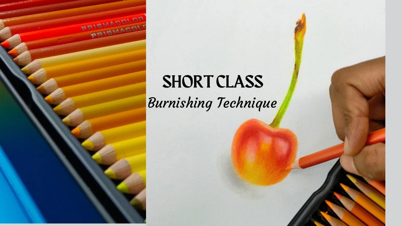
Before mastering Realistic Colored Pencil Drawings one must understand and practice the basic techniques. I will be creating a series of Short Classes, each covering a specific Colored Pencil technique which can be then applied onto any Drawing
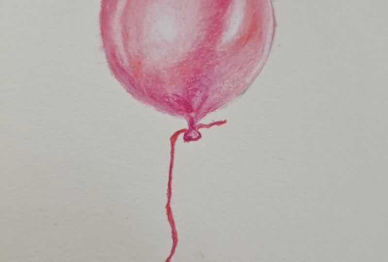
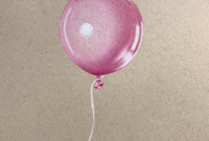
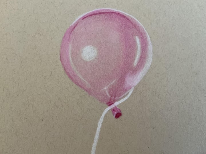
In the first Class, we learnt how to create an analogous Color Gradient. In this second Class of the series, we will learn how to add depth and make any drawing look three dimensional. I will explain all the relevant steps and draw a balloon, which will be your Class Project
Following topics will be covered in this Class:
- Layering Technique
- How much pressure to apply with Pencils
- How to shade to get a 3D look
- How to add highlights, light tones, midtones and dark tones
- When to burnish
- Important Colored Pencil tips to follow to add depth and make a drawing look realistic
This Class is perfect for beginners wanting to learn Basic Colored Pencil Techniques or for those who would like to improve their skills and apply these techniques onto Realistic Colored Pencils Drawings
Materials Required:
Colored Pencils and a Paper suitable for Colored Pencils
Please download the Art Supplies recommendation document from the Projects & Resources Section for more details
More Classes in this series:
Other Useful Resources:

Hands-on Class Project
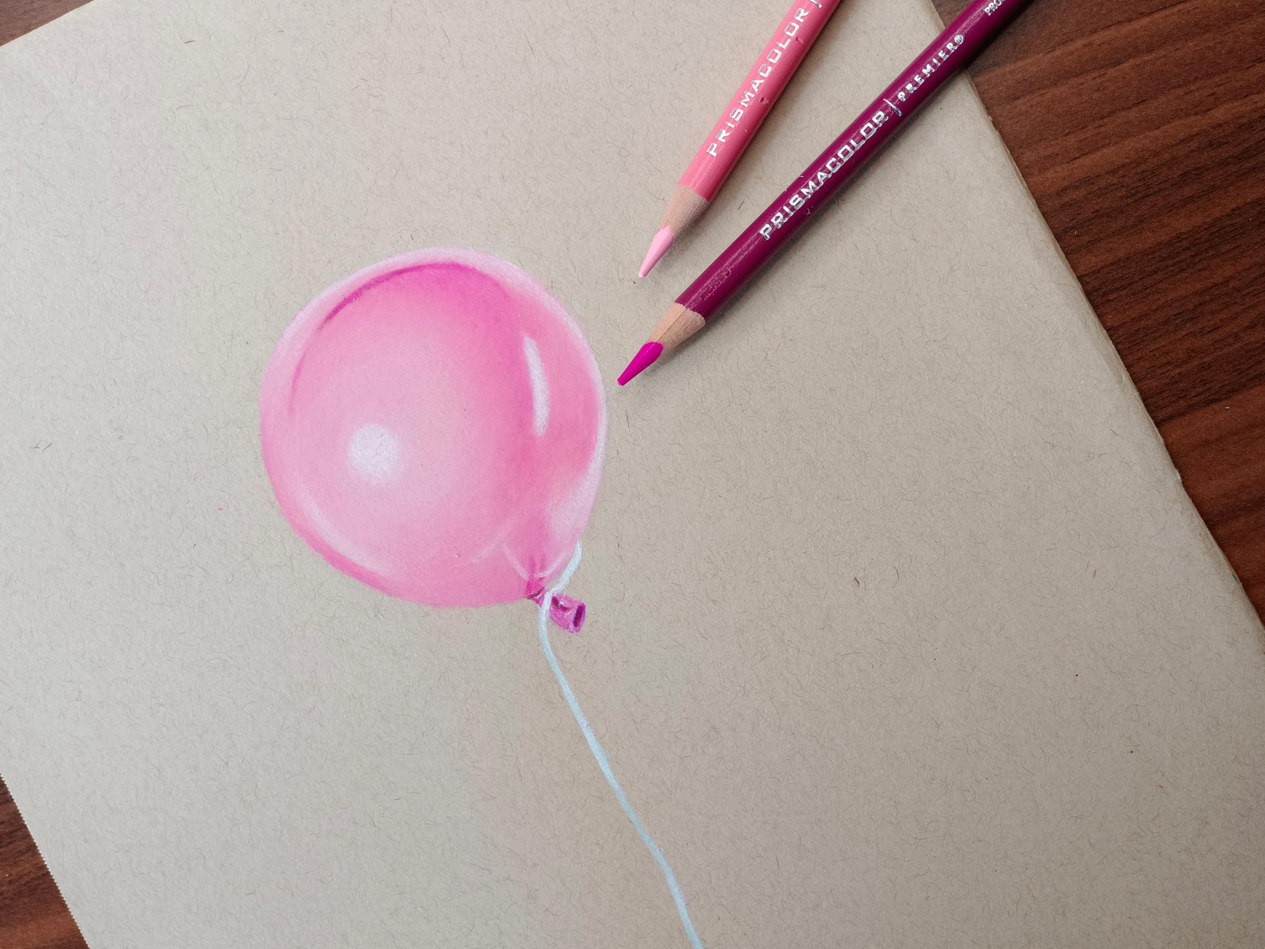
For the Class Project please follow the steps explained, apply the techniques learnt and draw a balloon along with me. You can also choose any other spherical object of your choice
Materials Required:
- I have used Prismacolor Premier Wax Based Colored Pencils. You can use any other decent brand of Colored Pencils, set of 48 preferably. You can also use Oil Based Colored Pencils
- I have used the following shades of Pink for the balloon: Blush Pink, Pink, Hot Pink and Process Red. Please feel free to use a different Color if you wish. Ensure that you have a light tone, mid tone and dark tone of that particular Color and a white Pencil for the highlights
- I have used a Toned Tan Paper by Strathmore. You can use a Mixed Media Paper, a smooth Bristol Paper if you are comfortable or any other Paper that is suitable for Colored Pencils (Medium textured, 160 GSM and above is best)
What you need to do:
- Please download the Art Supplies Recommendation Guide from the Projects & Resources Section. You can refer to the same and understand about different types of Pencils and Paper specifications
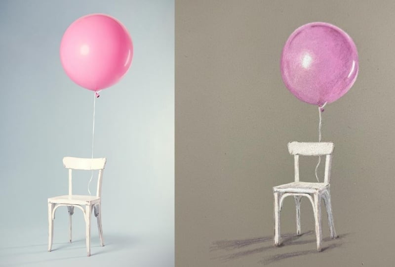
- Download the Reference Photo and Color Chart from the Projects and Resources section
- Observe the Reference Photo carefully, follow the techniques explained and complete the Class Project
- You can start a Discussion in this Class in case you have any questions. I will try my best to help you out
- Upload the finished Drawing in the Projects & Resources section so that I can give you feedback
Class Ratings
Why Join Skillshare?
Take award-winning Skillshare Original Classes
Each class has short lessons, hands-on projects
Your membership supports Skillshare teachers
Learn From Anywhere
Take classes on the go with the Skillshare app. Stream or download to watch on the plane, the subway, or wherever you learn best.