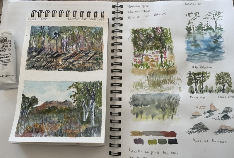
Transcripts
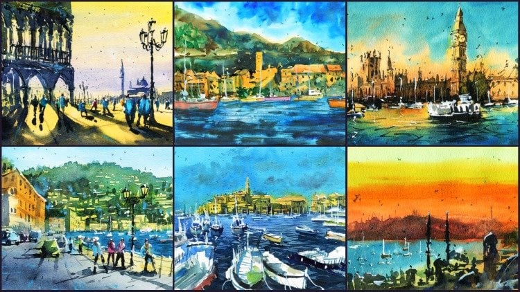
1. Introduction: Hi, and welcome to Australian
watercolor landscapes. In this class, I'm going to show you how to sketch and paint four different
Australian landscapes in a loose atmospheric style. I'll talk you through in
real time the techniques I'm using such as wet and
wet and wet and dry. I'll show you how to simplify and sketch a scene in pencil. And also shared a
paint, rocks, trees, water, in a variety of
different landscapes subjects. Costs aim towards beginners with four for landscape
demonstrations. Joe guide you through
step-by-step. Their scans, drawing, and
tracing templates included for each demonstration
help you transfer your drawing over
quickly and easily. In this class, I narrate my
demonstrations in real-time. I explain every technique I use in the context
of the painting, such as layering into wet areas to paint shadows of the tree. We going over the basics of wet-in-wet
watercolor painting. I'll talk about what
materials you need, your options, which ones
I use and recommend. You have some
brushes, watercolor, paints, and paper,
then you're set to go. So join me in this class. Let's create some
beautiful watercolor paintings that you
can be proud of.
2. Materials Required: So I want to talk a bit about
the materials and I'm gonna be using in this class and
the materials that you need. And just, just ones that
I recommend to save you some time and make sure that you get
some good results to. The paper that I'm using here is a 100% cotton watercolor paper. It's 300 GSM in medium
or cold press texture. And you'll find that
textured paper, cold press paper has certainly
a bit of a grain to it. And this is very useful when we're painting wet on
wet painting landscapes, especially because we can get really loose shapes in here, the paper takes longer
to dry as well. You get a bit of granulation. Just a lot more freedom
and it's more forgiving than using smooth
watercolor paper. In terms of the cotton
content to do recommend using a 100% cotton paper
can be a bit expensive. So if you just have
some sketch paper or some cellulose normal
watercolor paper that's not labeled as cotton, that works quite well. To just bear in mind that
when you're layering, sometimes it can be tricky
when you're layering as the previous layers can get lifted up when you're
using cellulose. So I'll try to stick
with fewer layers. I do go into areas quite often again and again
with a bit of water, with a bit of extra paint. And sometimes it's a little more tricky on cellulose paper. But make sure just
use what you have. But that's what I recommend. The paint that I'm using here is basically just
watercolor tubes. So I use a bunch of these
tubes here, different brands. I've also got a bit
of white gouache, really important as that helps to imply some
highlights at the end. So you can see here some
of this dry brushing. I'm bits there, some of the lighter sections
here on the side, but to the foliage there
in the background. Let's just brought back by
some of this white gouache, which are sometimes mixing
with some yellow bit of green to create some of these tiny
little highlighted effects. It's a great tool that you
bring out right at the end. But for the majority
of the painting, you really want to make
sure that you're using just your watercolors so
you can get that beautiful, transparent, the fuel, especially that
sense of light that comes through the scene. So color wise, I would really just recommend you using
your primary colors. I use bit of yellow
hansa, yellow medium. I've got a bit of yellow ocher, got some oranges here. Don't use the oranges too much. I'm going a bit of
red. So cerulean blue, which is important for the sky. Also, some of this darker
ultramarine blue is important. I use that I mixed it in with
some of this green here, this is a bit of darker green. This is actually
called, this isn't a color called undersea green. You can use hookers green or
any kind of darker green, even a phthalo green would
work pretty well as well. You can mix your greens, you can mix a yellow and a darker blue together
to get a dark green. Okay? Just keep in mind that if
you're, if you're a beginner, stick with fewer colors
and it's going to really save you a lot of hassle. Because sometimes when
you're just learning watercolors and
trying to understand the technique when you
put too many colors, it's just more variables
to worry about. I also have some
earthy colors as well. So over here I've got
some burnt sienna and a bit of burnt umber and
those are good photographer. I just want to get it
a bit of brown in say, the areas of the water, maybe a bit in the background of the foliage
and that kind of thing. It's another color that you
have to buy separately. You can't really mix it
up from your primaries. But again, if you just
got your primaries, I think that's going to get you through
this course anyhow, it's just the
browns can be good, especially when you're
painting streaming landscape. There's often a
lot of browns and really muted down
greens as well. So I tend to add a little
browns and greens at times. I've also got some purples here. The purples work well
for some shadow areas. And so does a bit
of neutral tint. And that's a really
good color to use, just to mix up with some of your primaries are other
colors to darken them down, use the neutral tint here for the branches and trees
in the background. So that's about it for
the colors and the paper. Now in terms of the brushes, here are some of the
brushes that I use. And over this side I
have my mop brushes. These brushes are great
for painting large areas. So things like where
we've got some sky, we've got a large areas
of trees at the back. The water especially
works really well. We can get that in very, very quickly and get a smooth, consistent wash by
using a mop brush. Mop brushes have a larger
belly so they hold more water. Unlike the smaller brushes, these smaller round
brushes here, these don't hold much water, but they do get in
a lot of details. So if you're trying
to get in small areas of trees or grass, or some shadows beyond the rock or some of these trees
in the background. These round brushes
are fantastic to use. This one as well, which is a flat brush with a uneven edge, just allows me to get in
some of these trees in shapes with a little bit more
variation and brushstroke. This one I sometimes
use as well. It's just an old
round brush that I hemorrhage into the palette
to make the tip uneven. And that helps us get a
little bit of scumbling and brush like shapes
for the foliage. So these brushes here, a couple of couple of
specialty brushes, this is a rigger brush, helps you to get in these kind of shapes
here for the branches. Sometimes if you wanna get
in little bits of grass, little bits of grass,
you can use that, well. Same with this fan brush. You can use that to
getting little bits of grass at times so important. But again, if you don't
have these brushes, you can still use and get by
with a small round brush. For the first sample, some of the paintings
you'll find that I have used a bit of a knife to scratch out a little blade or a switch blade or a craft knife just scratch
out a bit of paint. And this works again to create
some areas of highlights, different, different
bits of grass in there. So it's a different kind of texture helps add to
the overall painting. So that's another thing
to just certainly around. And you can also
use a plastic card that works just the same. And also try to grab, make sure that you
have a some tissues or a paper towel or a cloth
towel by your side. So I just use an
old cloth like that and often what I
do is that I'll, I'll pick up a bit of paint on the palette, then
I'll dry it off. This little cloth is so
important to make your brush the correct level of
wetness at certain times. So sometimes you might
pick up too much paint. No going in there is going
to cause a big message. Draft that brush and
you completely fine. You often see me messing around with the tau quite a lot during demonstrations for
that particular reason and trying to get that brush the right level of wetness depending on what
I, what I want to paint. So it's a really
quick introduction as opposed to the materials. And let's continue.
3. Essential Techniques: So I want to go through a number of techniques
that I'll be using in this course and some very simple
ones to begin with. And the first couple of techniques I want
you to understand is wet on wet technique
and wet and dry technique. So wet in wet technique
is essentially where you have an area
that's already wet. And this can be an area
that's got a very light wash. For example, I'm just
picking up a little, little bit of cerulean blue Save I just wet this area like that. You can see that area of this
kind of sheen on the paper. You know that that area
of the paper is wet. And what we do here is I pick
up another bit of paint, normally a darker bit of paint. Because if I want to just get
in a tree or some foliage, that kind of thing,
and we're going to drop that in straight there. Okay? And what
you're gonna notice is moving that brush around, you're getting areas
of these soft inches. So instead of having these sharp edges on
the edge right here, we've gone on with the
blue, get the softness. And that's because that
previous layer is already wet. And usually you go
in with a darker, thicker color that
makes it less likely to spread and move around and give you a
little bit of control. Of course, if you use a
little bit more water in that wet and wet mix, it's going to have some
more unpredictable effects. You'll move around more
and stuff like that. So that's a good way to get in these kind of bushes,
things like that. I tend to also use another
brush such as a rigger brush, thin brush like this. And with this thinner brush, you can pick up
thick paint, very, very thick paint and go
in there and getting kind of indications of branches and stuff like that as
well. Kinda like this. This of course will spread
a little bit the branches. But when using very thick paint, thick sort of darker
paint like this, notice it won't
spread all that much. Another thing you need to
realize is that the longer that you let this area dry, the more control
you're going to have. So you might wait into that
entire area is about 80% dry. Go in with some darker paint and you're going to find
that there's not gonna be too much spread and the paper may already be
dry in a few sessions, if not the entire way through. So that's some simple
wet in wet technique. This is important
because we're gonna be learning in the demonstrations later using different variations of this to create leaves, to create foliage,
to create areas of perhaps some water mixing around on rocks,
that kind of things. So it's very important to have a bit of a
practice with this. And another thing
I tend to do as well as I'll get in
another bit of water. Width three areas and just
have an experiment to see. Wireless ear is
completely weird how the paint reacts when
I drop in some paint. And in this second section, let it dry a little bit further, go in and see how much
that paint spreads and you get an indication of how
empowered dry that paper, how dry that previous wash
needs to be for you to go in and getting sharper
shapes, that kinda thing. So even now if I
go in saying here, we notice a little bit sharper. You get these marks that don't don't really have this softness like
in the background. Now, wet on dry is
a simple concept to understand and basically just means going into an area that's already dry
with some paint. So for example, I just
picked up a bit of this darker paint here. Okay. There. And I might just
go in and get in. Who knows, like a tree shape
or something like that. Okay. Just a couple
of branches and go over a bit like this. Come kind of branches. And notice in comparison today, say this area here with a green just has a soft edge and
blends a bit with the sky. The branches don't
really move around. They just stick onto that same area of the
page and to address, and that's because
that area, that, that bit of paper
in the background, this white area is
completely dry. The same thing would happen is if we went into this
section when it, when it's completely dry here, Andrew in some some,
some tree shapes. So I'll go in now it's going
to spread a little bit. But once it's dried, it's gonna do this
exact same thing. And you use wet on dry technique when you want
to imply a bit more form, you want to make it a bit more obvious as to what
that shape is. It allows you to define, gives you more control. So in terms of both techniques, they are very important to not saying one is more
important than the other. You need to have them in
combination with each other. When you have them
in combination, you actually get something
magical happening. You get this fusion of areas. So you might have a bit of wet
and wet here just for some of this could be some leaves
or something like that. I'm just putting in here
and you let some of that branch,
whatever, just mixer, mixer around and do
something that could be a larger clump of leaves
or something like that. Okay. Then you want to
leave some other areas that are perhaps more sharper. So you've got areas
blending where you've got sort of dark
areas and softer areas. The combination of the, of the two will create very interesting Lost
and Found kind of edges. So in terms of the
techniques, There's a couple, I think that I'd just
the most essential and sort of practicing how
to combine them together. In this kind of exercise, we've got leaves and branches. And that's a really
important thing to try. Once this is all dried, you can also go
straight back into this section and define the
branches a little bit more. It's not really going to work so well now because that area in the background hasn't dried all the leaves and
stuff like that. But what you can do is kind
of practice of what I'm, what I'm doing now
is basically just picking up a little
bit of darker paint, going through and reconnecting, adding on some more branches
and darker branches, going through those leaves
and forming connections. Another little
technique that I use when painting leaves sometimes
is that I grab a brush, that's a really old brush. So something like this here
is a very old round brush. And I just completely
obliterated. Make it into the
palette like this. We've got a very kind of mangled kind of scene like
this mango kind of brush tip. Then you can pick that
up and you can use this funny little edge to create a kind of scumbling
effect like this. Some basic shapes. So this can be some grass, little bits of grass near
the bottom of the tree. Okay? Little bits of grass here. Yeah. And by doing this, you actually get these
randomized strokes that create a little
bit of interest. Not only can you do that with, with grass and stuff like that, but you can also
do it for Britain, which you call it
the tree leaves. So what I'm doing here, I'm just putting a little bit of darker paint underneath the leaves and that's
going to actually create tiny bit more darkness in some areas of the leaves. And this is again, a bit of wet in wet work, what
we did up there, but I'm doing it into the trees, adding a little bit of
darkness into the trees. You can also go into it and use that mangled edge
and get some of these offshoots
tried dried edges like this that just look
a bit more inconsistent. And remind you of a stray
leaves and things coming off. And do this straight
from the beginning. Like that. So using different
types of brushes in different stages and
shapes to create more interesting looking
scenes and trees. If you just use the same round brush the entire way through, It's just kinda look
a little bit boring. And here's a, here's a little
brush called a fan brush. And I like to use this to
create also grassy like affix. See, you can just do this. Create a sort of sense of kras coming up in all
different directions? Well, as similar to what
we did above there. You don't have one
of those brushes. You can always pick up
a small round brush, something like this,
and do the same thing. We've kinda just feather in a few little strokes like this. And of course it takes
a little bit more time. You can get similar
kind of effect. A really good thing to do as well is to make
sure you layer. While I have one layer of this shrubs or grass
or what have you, I like to just put in some more darker bits of
grass perhaps in here. It just growing through. Again, variation, having
some variations of tones and tones running through, it actually creates
a lot more interest. You can start and
restating as well. Again, like I was
mentioning before, restating some of
these branches. You might even go into the Can think, hey, that trunk needs to be a little bit larger. So you can increase that. Okay. While that area of the
background of the tree, the greeny leaves and
stuff is starting to dry. This is where you can
form connections and create a little bit more. This is the kind of branches that go through
the tree as well. So a little bit of
little bit of technique. And in terms of the wet
in wet, wet and dry, using some different wet and
wet techniques to create different colors and
tones in the tree. We practice the
better scumbling here using different brushes
to imply grass. These are pretty important
techniques to keep in mind. What I'm gonna do
is I'm going to go through now just a little bit of techniques to create
some wet in wet water. And this is something that you may need to
practice as well. I think it's important
to give this a try. So I'll switch over here to the other sheet that just
from the left-hand side. And what I'm going to
do is I'm going to just pick up with
my round brush. We can use, I'm actually
going to use one of these. It's mop brushes and I'm
going to pick up it is blue, just a little bit of light blue. I'm going to go into
this area here and I'm going to pretend
this is some water, maybe some rocks, which I'm going to leave out some white
or something in the water. The sides or
something like that. Just on the edges here. Just a bit of water. Okay? And what we're
gonna do is through that water to create the
sense of waves or motion. In there, we pick up a bit of
darker paint, darker blue. You can also use other
types of colors. You can start with even some greenish
color for the water. But the idea here is I'm just picking up a bit darker paint, thicker paint as
well on the brush. And I'm dropping
that in to create these tiny little impressions
on the, on the water. Just like this. Just to indicate a sense
of movement in the water. I can go out to the back and just start pretending
that we've got some trees or whatever
running into the background. Okay. There's some trees or something that is could be a
riverbank or, or who knows. Just on that side. We can
imagine there's a bit of a rock or something here. Tiny bit of rock here. The bases of the trees. Something here like that. Just getting a few more of
these branches coming over k, just for the sake of it. You can see the water starts to look a little
bit more realistic when you have these
smaller impression, smaller dark areas
running through it, rather than if we just
colored it the same thing. You can go through it
at different stages in wait for it to dry
a little bit more. And that will create more
of this sort of effect that you can even create
little reflections for the trees that just runs. So if you've got
the tree running, running in this direction, you want to make sure
that the reflection is imitated in that opposite
direction like that. Same if the tree is just
completely straight, you can just do that reflection
straight down like that. Like that, like that. Very simple sort of exercises in terms of creating
some soft shapes, creating natural shapes as well. But I think this is really
going to help you to understand how to use wet
and wet, wet and dry. Remember, like I'm saying
like I was saying before, makes sure that you practice
wet on wet technique, wet, the paper, wet sort of
three little squares, and add paint of different consistencies
at different times and just see how it reacts. And that's the
best way to learn.
4. Colour Mixing: I wanted to talk a little
bit about color mixing. I think it's something
that everyone of us, what others am I using? My mixing them? What's the
appropriate color to use? And one of the most
surprising things you'll find is that you really
don't need that many colors. Probably only need three
or four colors to complete a beautiful painting
of any sort. Now, I'm going to show
you the colors I use and the ones that I have
just out of convenience. But really you don't need all of the colors that
I have here in the pellet. The main colors that you need, basically a yellow,
a red, and a blue. And if you can only
choose one blue, I'd say choose a darker blue
like an ultramarine blue, or a cobalt blue because
those blues can be diluted down to make a light sky wash. Whereas if you use a cerulean
blue like this one here, and you're going to
have a very tough time getting a dark blue. It's actually going
to be impossible unless you use a bit of
neutral tint with it. So let's have a little go now in terms of just
some basic warm colors. Now, I'm going to talk
about warm colors. I'm talking about colors
that more on the yellowy, orangey, red side of the
color spectrum, okay? And we talk about cooler colors. We're talking about
colors more on the blue side of
the color spectrum, even the purples or even some
of the dark phthalo blue, which have kind of a
bluish green as well. Those are what we
call cooler colors. And I think in
every painting you need to find a balance
between warm and cool. It's important to
have a mix of both. So, for example, I might start out with a
bit of yellow ocher. And notice here on
the palette as well, you really want to have a palette that allows you
to mix the case so that we can have enough
water here to mix up a nice section of it if
we're going to get in, for example, a really
large bit of land or a bit of grass or a bit of sand or something like that, just running
across the scene. We want enough of this
paint that's mixed up here, K for all the warmer and
lighter colors in the scene. For example, the sand or even the sky where we're
putting in a really, really light wash in the sky. We want to add in
a lot of water, okay, So this is just
a bit of yellow ocher. You can add in a bit
of this Hansa Yellow. Hansa yellow is just a more
vibrant t sort of yellow. And look how much
water I'm putting in. It's about 80 per cent of water, if not 90% water in 20%
of the actual paint. So I can basically go
in here and getting a really large wash
of this yellowy, warm color right at the base. And this is just to indicate some of the land
because the ground, for instance here, and I'll start now picking up
a bit of this blue, cerulean blue and look how
much water I'm putting in. Again, it's mostly just
water just dropped in there. It's probably 80% water. Most of it is just
water in 20 per cent paint enough so that we can imply the blue color in there. And you can see
both of those are very light sort of mixes. Okay? So these are just using, I guess I'll really liked
combination of mixes of color and allowing them to kind of mix onto the page you can
see here as well, there's a bit of
color mixing going on between the blue
and the yellow. So while we're doing some
mixing here in the pellet, It's also important to
allow some of these colors to mix here on the paper. Then another example is if I
want to add in some clouds, I'm just dropping in a bit of this darker grayish color here. Just a bit of this dark
grayish or I could use some purple there even just to create some indications of some storm clouds or something off in the
distance like that. And this will all mixing
into the blue and create an interesting
cloud-like effects. So at times, you want to allow the colors to mix
directly on the paper. So if you're implying
bits of clouds, features like leaves, trees
and that kind of thing. That's really good to
mix onto the paper. And at other times when you're
just trying to indicate large areas of uniform color, such as the sky or ground, it's best to just mix it up on the palate to create a large
mix of it so that way you don't run out of
paint and you get a more consistent sort of wash. So that's a little
kind of basic step in terms of mixing colors for a simple scene like this, okay? Now, what you can also do, as I said before, mixing colors into paper, you can wait for this
to dry a little bit or just go straight into it. But here I'm just dropping in a little bit of green or something here
into the background. So this can be, and look
how dark it is as well. I'm making it fairly dark
so that it comes forwards. So that we also have not just, not just these clouds
dominating the entire scene, but we also have some nice little drops or
something like that. Little examples of who knows, Just a little bushes and things running through
this. Just like that. And again, this is
mixing into the paper. And using the side of
the brush as well. It's mixing into the paper. And creating some beautiful, beautiful sort of
effects you can't get if you didn't allow it
to mix on its own. So you can see the yellow just joining in with
some of this green and some of this might pick up bit of brown even in dropping a bit
of brown in here. And you get some sharper sort of bits and pieces
in here as well. That it's so important to use some of this
mixing technique and allowing it to
mix a wet into wet. So you can already
see we've got a, It's almost like a plane, a field of grass with some
darker bits of grass in there. You can even add in some really
dark beats in some areas if you want to like
this just over here. While the paint is still wet. But it's a layering type of layering type of exercise
that we're doing here. And the colors are mixing
into all kinds of varieties of colors in different
concentrations as well. Okay? Another thing to keep in
mind is the composition. You're looking at, the cool
colors and warm colors. Are they balanced and do we have a good sense of light
and dark in there? So we've got the lighter
sky, lighter ground. I've got some of these
softer and at the same time, these darker bits of grass. And so that's going to increase that sense of depth
in the scene. So even if you've got a color
like something really dark, like a purple, it doesn't
even have to be a green or a, or a, or a brown or
something like that. You can really push the, the bits of the
background forward. So just these little bits of shrubs and things and just
give it a bit more depth. Okay? Another thing you
can do as well, going over the top, you can pick up a bit
of really dark paint, something like a neutral tint. And sometimes we
just started getting an indication of a branch or something coming
in from the side, like this little
branch coming in. And this makes it look a little bit more
three-dimensional as well. As if there is a bit more of this
foreground showing through. So using darker
colors like this, as does have this
kind of effect. Could be like a tree branches and we're putting any leaves. Now, we've used a bit of yellow, we usually use a bit of
green in there and we've used a bit of blue for the sky. Now I have green as
a convenience color, but you can mix your own greens. And what you do is
just pick up bit of yellow and a bit of blue. If you've got some
ultramarine blue or some cobalt blue that works best and just mix them together. And what you'll
find is when you're applying them in
different concentrations, you get different
types of greens. So if you use more yellow, more yellow, and less blue, you're going to get
this lighter green mix. But if you add in suddenly
a bit more blue in there, you're going to get a
darker green mix like this. And even more so when you keep
adding in that blue starts turning almost like
a blue-green color. Get a slightly turquoise
Sea type of color. So you can get really
quite a different range of greens by mixing your primary yellow
and your dark blue together. For shadows, what
I'd really like to do is sometimes mixing a bit of blue and a bit of red together that creates
a purplish color. And balance that off. You can use that
straight as it is. I tend to put more blue
end and actual red. Then I'll just mixing
a bit of yellow. This is going to create
a kind of grayish color, which is really good to
use for some shadows. Look at that pretty dark, pretty dark sort of mixing. I just need to add some
more water in there, too. Diluted out of it. But you can get some shadows
coming in like that, some dark shadows just by using your three
primaries mixed together. Okay, something like that. So another thing you
can do is mix a bit of yellow with a bit of
red to get an orange. And these oranges can be
really good for sunset scenes. It's a little bit of
orange like that. Lovely orange. And again, if you
mix more yellow in, you're gonna get more of a
yellowy orange and yeah, okay, more vibrant orange. And if you mix more red in, you're just gonna
get a little bit more of this effect here. So a darker sunset scenes. So they'll mixes and try just having the modes of
paper and you'll find that you get probably the
best explanations when you figure this
out yourself by just adding in different
mixtures of paint, different consistencies, and experimenting around
to see what works. I do recommend using fewer colors to start
off with because you have a list of variables when you have less
variables in watercolors, you're going to just have an easier time in terms of managing the techniques
at the same time when you're playing
around the techniques and trying to
understand color mixing can be really difficult when
you've got so many colors. So once you get comfortable with the mixing your primaries, then you can add
some more colors in it, it becomes easier. I've got some convenience
colors here like neutral tint, which is really dark color. This just saves me
from mixing up. You basically mixing up a gray or something like that when I've got some really
dark color like that. Advantage of this as
well as that I can just mix it in with a yellow or something and I can just create a darker yellow color like that. Okay, so it's a great
little color to use. Also use a bit of gouache, which is an opaque
watercolor paints. And this is great to add in some highlights and
nearly near the end. So pretty, I would say, pretty basic introduction
to color mixing. So we've covered mixing
on the palette and also just mixing on the paper itself. Understanding that both
are important and crucial, essentially when
you're trying to create a watercolor painting.
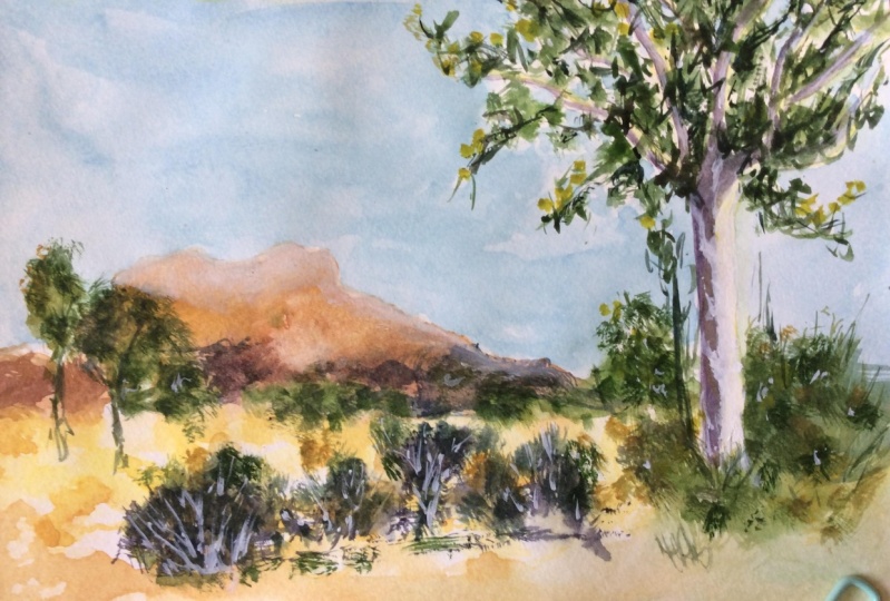
5. Painting Rocks & Trees: Okay, So I want to
show you how to paint some trees and rocks. This is gonna be
really important as most natural
landscapes are gonna be composed of these two things, as well as a few other bushes, shrubs, grasses,
that kind of thing. And there's a couple of
different ways that I start with when I'm doing trees. Now the first way is I will
put the branches in first. So I may grab a brush, grab a mop brush. You can also use
just a round brush. And I'm gonna go grab
some brown paint, K. And I'm just going to
imagine this is the, the base of the tree, okay? This is the base,
right here, the trunk. Just going to go in and
then here near to the top, which is where I'm going to
start putting in a little bit of some branches come in
through the top like this. Okay. Just some little branches. And I'll just kinda
get them to come out and notice how I'm
holding the brushes. I'm holding the brush
near to the end. This is really important
so that we can get a bit of looseness
in the brushes. In the brushstrokes,
they actually look more like branches
rather than every hold them too close
like this and it just looks too stuck on, unless you're
drawing a branch and a very specific way
and you want it to, to get that precision in there, I'd really suggest holding
my brush near the end. Notice as well how I am
drawing these branches. So often what you get is when you're drawing
a tree of some sort, you're going to have
a larger trunk. I'm just going to
enlarge that a bit more. He's coming down
perhaps like that. Then you might have
a branch off into two trees will always come to these little forks all over the place
so you can get them in the main trunk there, then you might get
them up here as well. Some of them splinter
off just until into even two or three different
branches at times. But normally you get this
pattern where it just splinters off into two, okay? Kinda like this. And you carry that same
pattern over and over again. So here's sort of
split into two. Then I'm going to just
split that one off to the right like that and
another one on there, pepsin, other one there. Okay. Something like that. Now the split off here. So you're just finding
each branch like that, drawing each branch with a
brush and then splitting, splitting them off into
different directions. So they have a basic
structure for a tree. Now the other way
that I do trees, and I haven't put
in the leaves yet. I'm going to show you
in this other example, I'm going to get an old brush, just as old round brush, and I'm just really pressing
it into the palette quite heavily so that it
creates a funny looking shape. And look at that we
can get in these kind of cool and, um, indications of of the, of the leaves, clumps
of leaves like that. And interestingly, you also get these kinds of
whitespaces in-between. Okay? So you can do that leaves first, like this, or you can
do the branches first. So I've done the branches
person that one. Here's where I'll just
pick up a little bit of this greenish paint,
this darker paint. And then I can just
go in and in some of these leaves straight after. And of course the branches
would have dried a touch. And that's going to create a bit of sharpness
for the branches. But also because there are some areas which are still damp, you're also going
to get some mixing. So the branches will
mix a little bit in. So you kinda get the
wet and dry effect over this one over here, the one on the right hand side. I just having a look now, we can now go straight in
and get into branches. So the first one here, we've done the branches
first and then we've added in some
of the leaves. Here. I'm just going to
go add in some branches. And sometimes I might pick up a smaller brush like this
rigger brush and getting the branches because it's
just a touch easier at times to get in some
sharper looking branches. When you using a rigger
brush like this. There we go. Like
that, like that. And of course they all come
down again all the way to this trunk here. This is I'm making this trunk a little bit bigger, like that. Brown maybe in their
touch with brown. And of course, with the leaves. I also like to pick up a
bit of darker paint and just drop in some darker
paint underneath the leaves. It really depends. Sometimes you got a
light source that's coming from the right hand side. So you might choose to
just put a bit more. Color, can be more darker
color on the left sides of the leaves or the light's
coming straight from above. Not want to just
put some darkness underneath clumps of
leaves like this. So it's really up
to you just got to decide where that light sources. And they tried to emphasize, emphasize that in
the background. At times, if I want to just
put in a rough indication of some trees in the background or just some foliage
and stuff like that. I'll pick up more green
and just drop that in. Lighter, a lighter wash of
green in the background. Then you can see how it kind of blends together so
that we've still got, we see the tree in front, but perhaps we have
some other shapes, some other bits and
pieces in the back. Darker shrubs, that kind of
thing here in the background. Okay. Let's bring that down. Yeah. That's good. Okay. So pretty simple in
terms of the trees. Sometimes what I like to do as well is while I'm
in this section, I'll pick up a bit
of darker paints and I'll get in some shrubs. These are just a little,
just a little bit of this green paint and darker, neutral tint that
I've picked up. I can just drop in a bit of
paint here at the base of the trees using different
types of brushes. This is just a flat brush, but you can use the edge of
it to create these kind of sharper marks as well. Of course, you're going
to have areas where it's already dried, are still wet, so you're going to have
it mixed around a bit, but it really, of
course depends. You can let it dry then go back in and get some
sharper marks in there. Indicates some grass. Now in terms of rocks, the way you indicate
rocks is to make sure that you keep in
mind that light source. So, for example, might
use a bit of yellow just to highlight some
areas of rocks. Just a bit of the light source. Rocks come in all different
shapes and sizes. You get some that are
taller, like that. You get some that are
triangular shaped, ones that are flatter, ones that are kind of
angular and have a point. Can it, so it's
really important. Make sure you get in a few different rock shapes
that make them all the same. Otherwise it does start
to look a bit boring. I'm just picking
up a few of them. You might painting
in a few of them. You might want to make sure also that some of them
are smaller than others. So you don't want to make
them all the same size, especially as you move out into the background and
the distance here. Just dropping a bit
of paint like that. Often the brush will
just just the shape of that brush will indicate
a rock already. Okay, in the foreground, I tend to make them a lot larger and connect the
rocks to each other. Okay, So that might
be big rock here. I'm just connecting on to make a larger sort of shape
here, here. Here. What have I got that second
larger rock here as well. Okay. Largest rock, like shapes, larger one here, the
front, for instance here. Okay? And what you wanna do
is add in some shadows. I tend to pick up bit of darker, paint me some brown and mix
it with some neutral tint. I'm just dropping a
bit of paint here to the left-hand side to indicate I'm left on an underneath here to indicate perhaps
a touch of Shadow. Little touch of shadow
running underneath this. Okay, just a little
bit of that shadow. And notice as well that you get some depending on whether you go in while the paint's still
wet or you just wait. You can get some sharper
shapes, sharper shadows, and some areas of kind of blending of the shadows
into the rock like that. The most important things
to keep in mind that the light source has
to be consistent. So if I'm imagining
a light source coming over from the
right-hand side, all these rocks need to reflect that shadow in terms of
a darker left-hand side. Because we're going
to have shadows. And when the light
source, the right, the right-hand side of that rock is going to
be illuminated and the left side is going
to have some better. So we have to make
that consistent, that consistent light source. Even go through and adding little shadows that run the left of that
rock as well too. Even at times people
will like to have rocks that just have a sharper shadow like that depending on
the time of the day, this could be later in the day. So the rocks have a bit
more of a shadow cast towards that left hand side and I'm more of an
angle like this. Okay. Just as long as they're
consistent with each other, you're gonna be fine. Okay. So notice some of
them ran into each other as something
don't, that's fine. And it actually helps
with the texture. And sometimes what
I'll do is I'll find like a intermediary color, just a little wash
of a light color. And I'll just touch on
here to soften this edge. Just to soften some
of these edges of shadows where I
feel that it's not really just soften
that edge like that. Some of those rocks. But you want to, might
want to leave some sharper and it just blends
that shadow closer, you have a full turn, a very light tone, and a mid tone right
in the center, for example, for that rock. So it does look a
bit more realistic. So those are some
basic exercises to try out and they will really
help you in this course.
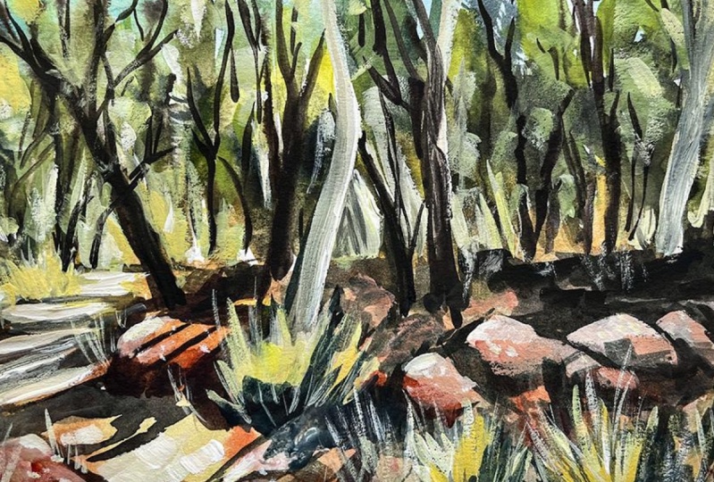
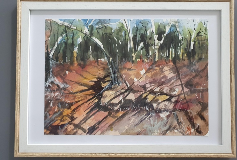
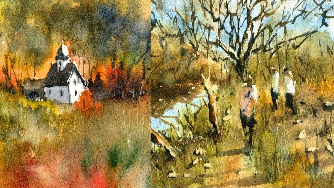
6. Bush Landscape Drawing: Okay, we have this
amazing bush scene and it's a classic sort of path. As you can see going
in from the left, we've got a few rocks here. I'm going to pick out some of
the big ones and use those, the small ones while
figuring out along the way. I'm going to show you
how to get this in, in a nice sort of loose style and hopefully not take
too long in the process. So first thing I'm
gonna do is draw a general line here down the center just for
the horizon line. Okay, it's just where the trees and the back
kinda hit the ground. And probably the next thing
I'm gonna do is look at this part now we
can see the path is coming around the left
side of the scene. So let's go ahead and I'm going to start
right at the back. We aren't going to get it to curve a bit around like that. Then here perhaps down through this section we
have some kind of a rock. Okay, now I'm going to draw the top of that rock,
kind of like this. First the k, and then
there's a bit of the side of the rock that
we can see just comes down. It's really is a squarish
rectangular rock. I'm not gonna put
too much effort into the actual drawing of it, but I do want to make it
look three-dimensional. You can see a bit
of this tree shadow crossing the rock as well. Bunch of the trees run entirely
on the right-hand side. A bit of that detail
for the Rocky, you can even do some
shading here on the left side of
that rock as well. If you want to indicate a
bit of a bit of a shadow, I suppose on the left side of the rock, top side of the rock. I'm not going to really do too much in saying with
that right side, there is a bush, a shrub or something here, which I will get in just
a quick indication of it. As you can see here. Now work on some more of these boulders
that pretty large. And the thing that I
tried to do is look at those boulders and reduce
them down to basic shapes. And this one I'm going
to eat almost looks like a bit of a squarish
shape as well. Okay, so and get the
top of it in a bit like this, like that. And then we're going to
make it three-dimensional by putting in this side here. And that kind of
comes out and touches the ground like this. This shrub here obscures the back of that
rock, which is great. I don't have to
draw all of it in. But again, there's another kinda almost triangular
shaped rock over here. There's so many of them. And really you just try
to pick out a bunch of them to emphasize and create a bit of this shadow pattern on these
rocks amine over here. There's a bit of a shadow
on that rock as well. On this rock you've got a
bit of a shadow behind here, over here as well. Kind of like a
shadow on the ground actually of this rock. And I'm just looking
at ways that we can make it look a little
more three dimensional. Behind this rock,
we've got this shrub, we've got a, a
shrub here as well. So I think just putting in a bit of that indication of that
shrubs is gonna be helpful. There's a few more stones in this section as well
that I can just get a kind of overlapping running through here
in the foreground. That can be the left side of this stone bit of
it in shadow like this is even a few
more smaller rocks, just just that overlap in
this sort of area here. So a little bit of that. Okay. Then we've got some more
over here that we're going to draw in and make them look a bit
more intentional. So kind of having some that
obviously have more of a shadow and some
of them that are just kinda pebbles or
something in the ground. These large ones, I mean, there's another larger one here that I'm going
to draw in as well. It actually goes out
a little bit further, little bit further
at the scene of a bit short. Actually,
it doesn't matter. It's the great thing about
these rocks is that they often can be placed
wherever you want. Compositional wise,
since long as you can achieve some kind
of balanced with them, you will be fine. So this one's more
almost circular, actually sounds like a
circular type rock over here. Then you've got these little, almost like little overlapping
ones in the background. Okay, so just putting
in a few more of these other rocks in
the background here. Notice that I'm shading a little bit as well
and that helps. Or later, when I'm
just trying to get in the darkness in here comes
some kind of shadow patterns. It's going to make it a lot easier when I go on
with the watercolors. So if I can sort of
shade a bit and create more obvious sense of light and dark in these shadowy areas. Little highlights and
things like that. I'm going to just do that. So as we move out into the back, what you find is that these
rocks becomes smaller and smaller to the point where you can't see them too much
and it almost just Looking like the small pebbles or something off
here in the back. Okay, so that's where you
can start to improvise, suppose, and start picking out some shapes that
you want to put in. For example, over here, you might have one
of these slabs of rock in the distance of
just behind like that. Okay. And but you might
not want to put them all in the same
sort of picking and choosing your rocks and be sure to make them look
a bit different as well. Don't keep them all the same
size or even the same tone. So you can see there I've
just drawn another one in, okay, even here in
the foreground, you might notice that there is a large rock sort
of coming in here and a bit of a shadow on that
left side there as well. The path bit of
another rock around the rocks are sticking out some shadow on
that rock as well. Okay. So on the ground There's
obviously going to be some rocks in some
areas and pathway, things like that over here, but I'm not going to
emphasize that too much. Okay. Main thing is
these rocks that are in the way of a path on
the sides of the path. I mean, like these Bushehr just getting in
this little brush, bushy area like that,
lining that out. And then I can start putting in this rock that comes out
on the left-hand side. You can see them just lining
up the side of the scene and creating a bit of this
this kind of leading in. Yeah. I'm looking at just ones
that you can simplify down, pick out a few that
you want to put in. And if you don't, you can
leave them out as well. This is some more areas of
Bush and stuff like that. So we've got a lot of
rocks and we've got a pretty good indication
of a path over here. I think the shadow
patterns is nice as well. We can probably get
this shadow pattern coming in like this. Okay, shadows of the
trees like that. Sun coming in more
like this though. There's an actual tree
over here and you can see it just goes
all the way up. It's just a just a trunk
going all the way up. That large one there. There's another tree here
that comes up most behind this rock on an angle I like that angle of it just makes it look a bit more interesting. And I'm going to hold
the pencil as you can see more on the edge right at the back and start just
drawing in a bit of this outline of the tree. Like to hold the pencil
right at the end as well because it gives
it a bit more freedom. The branches look more natural rather than me just sort of trying to
draw everything in. But with too much accuracy, I find that actually
it's things look too stuck on and natural. So you can see here just a
couple of them going up, some of them in
often the distance. It's another branch
even up here that just goes off in the distance. Like that. I'm just putting in the branches and the trunks at
the moment because the leaves are pretty easy to do or you need to do
for the leaves. The main thing need to do
for the leaves is layer. So I'm not concerned about the leaves are just
more trying to focus on some of these smaller trees in the background because
they do help to create a sense of depth
and meaning drawing. Remember, remember
what I'm doing. I'm using the, the, I'm holding the pencil
right at the end. Okay. This way you can get
in more of a looser feel, even just trying to indicate where heirs of the leaves
and stuff like that. I mean, it's all green
back there anyway, there's not much you can do. There. Look, I mean, there's more trees and stuff off in the distance
is little rocks. And so it looks like
there's a wall of rock. So something over here
you can just make out. It's just kind of a rocky area. So I'm just trying to indicates a few rocks and put them on different
angles and stuff like that. I don't want these to
show through too much. Okay. There's another tree
all the way back here, you can see it looks like a
white gum tree, the case. So it kinda goes all
the way up that branch, sort of scrolling to
the right hand side, right on top here, almost
on this hilly area. So just get that
shrunk that come down. But all the other trees, you'll find that you can
actually do a lot of this just with the brush later. But this area, especially it's just one large bit
and then you've got tree branches coming
up through that section. So have a look and decide
what you want to do. I mean, for example,
this section, I'd wanted to put another
rock here. He's another rock. And I might make this kind of angular rocks so that the end of it here has
some shadows as well. Something like that. Casting shadows. There can be another
shadow cast around here. So that's it for the drawing. Let's get into the painting.
7. Bush Landscape Painting: And I'm going to go
straight into it. Let's get in a little
bit of cerulean first, I'm going to go right
into the back-end. Like that. Just a little bit of
cerulean into the sky. Areas at the top here, you can't really see
much sky anyhow, but I do like to have a bit of blue or something up
in the top section. Some corners up at the top. This is just a small mop brush. I love using these mop brushes. They pick up so much water. So you can just go in like that. I've got a bit of this stuff
here called undersea green, which is a beautiful green
granulating green color. And I'll mix some
yellow with it. This is some lemon
yellow, nothing special. Lemon yellow. And this undersea green
because I want to get in some, some lighter greens
in here as well. You can see there's also some branches in this
section that I'm leaving. Some of them slightly white. Maybe this one here as well, I'll just leave a
bit of white there. Okay. I may coloring darker later on, but for the time being, I think it's going to look better and more interesting if I just leave some bits
of white on the page. So I'm just picking
up this green. Do have another
smaller mop brushes as well that I can use. And sometimes swapping between different mop brushes
is very helpful. You can get different
sense of details, just easier to put in details. So another thing that I
do at times is I might pick up a little bit of paint off the pallet and just
tap in areas like these to create a bit of softness
in the background, to just flick a bit
of water around. Okay. It's really quite
light at the back and I'm trying to preserve that. And by using some
more yellows in here, especially combined
with the greens. This is going to make it certainly help a lot more
that light showing through. We don't want it to be too
dark off into the background. Remember this is
going to dry off. Lighter anyway, I'm almost
forgotten about this side. You've got to be careful
because it does. Watercolors does dry quite
quickly in some environments, it's actually a little
bit dry in my room and so I'm going to
re-wet that area. And as you can see, just help that to run the green, run a bit more into that
blue so that it has more of that wet and wet
sort of feel like a bit more green in here. I like that lighter
color in there, but I think a bit of
darkness will be nice too. Running through this section. The opposition of light and dark in a painting
is so important. As we move through this
area here where the, I guess the foreground, you could call it
the mid ground. And the foreground is, I'm going to start picking
up a little bit of yellow, even a tiny bit of
this yellow ocher. And the yellow ocher is
fantastic because it just, it's kind of a
muted down yellow. I can drop that in
here into the ground, can get almost gets in a bit of the highlighted exit the rocks. But it doesn't
eliminate it doesn't, it doesn't look too saturated. I think having too
much saturation here can be
overpowering at times. So I'm just going through
it That's just sort of mixing in a bit of this here. Verify, leave a little
bit of white on there. That's fine too. We've
got all these rocks, you know that right here. So might be a little orangey. Feel don't feel like you
need to keep it exactly. Yellowy color, change it
around a little bit as well. In some areas you might want
to add in more saturation, tiny bit more saturation
like over there. Okay. The goal here is just to create a really soft wash and have it all blend
together seamlessly. And i'll, I'll do this by
working from the top down and put a bit of creamy color that I'll pop in
a bit of creamy color here. Not only that, but
just dilute this area. Lift off a bit because I think that's got a bit too
much paint in there. I just very, very light
wash of this color running through just a bit
of yellow and more. Light wash of yellow. Okay. Good. Look around here. Good. Orangey color as well. Just as long as you have some variation of
color in there, you're gonna be good to go. And even some burnt
sienna, these rocks, some of them have a brownie
color on them as well. So just trying to
replicate a bit of that, but also trying to
maybe exaggerate the yellows in there too. Okay. So there's some of it,
Here's a bit more of that brown in this mix as well. Run that through. You can even start putting
in a little bit of blue or purple into some of
these areas as well. While we're here and
I just sort of let it mix together like that. I'd recommend using more of the certainly more of the yellows
and lighter colors first. Okay. So say I've got all that
stuff in pretty soft area. Now, what we can do is start
working a little bit on the trees and little bit
on the leaves especially. And look at some areas that
I might want to darken. So for example, here
I'm just dropping in a little bit of
green and let's put in some purple with the green
little bit of purple in there, getting a really sharp
and darker sort of treelike shape here just for some darker leaves,
something like that. Have a look maybe
on here as well. I'm just having a look
at the scene and finding some some darker contrast that I think might
look nice here. I am at this stage,
I've stopped using the mop brush and I'm
using a fan brush. And the fan brushes, just as it looks like. It's kinda like a
little fair there has bristles that
are splayed out. And I do like this brush because it just helps me kind
of like this one. Here. I do have another
that brush as well. That is an irregular shape. It's an angled flat brush. Using these weird sort of
brushes, sometimes our chest, I'm able to get in some
shapes and stop myself from overthinking how I should put in some
of these trees. I also like using things
like a small rigger brush. The rigger brush helps
me to get in some of these sharper
looking branches and trees and things like that
running through as well. Okay. But really my main, my main goal here is just to get in some darker leaves
running through. While this area is still wet. This area is has a lot
of water in it still. And I think we're gonna be able to create a sense of just, just a sense of light
and dark in this area of trees and still want to
preserve some of that sky. But if it if it does disappear, That's not a huge deal as well. I think what's more important
is just having some, some more details with the
leaves here in the background. Okay, so very soft sort
of shapes like that. Having a look at
the scene as well, kind of thinking, maybe I could
put a bit more over here. Let's have a bit of
this green and purple. The green and purple
mix is fantastic. I find that one that you can really getting a good indication
of those darker areas. And the purple sort of darkens that green down
a lot more as well. So you'll notice
in here as well, there's a bit of
darkness on these rocks. So that's something that we
need to play around with. Two, I'll leave that bottom
bit to dry a bit first. So I wanted to just
start putting in maybe some darpa
looking tree branches, as you can see, just running through all the way in the back. And I'm hoping that some of
these will just blend in with the wetness and make it
look a bit more natural. If you look just how quickly
I'm doing this as well. And I'm holding the
brush rod at the end. You find that it's quite quick. And I'm not thinking
about it too much. It just tried to look at the shapes in this scene
and you pick out a few that I like
and go from there. I mean, a lot of these trees are actually quite dark anyway, so there's not the trunks
of them are quite dark. It's not really any
other detail in there. So let's go through. So starting to slow the
dry off bit more green, little bit more green in here. This is just to get in again some more indications
of these leaves, some darker leaves in areas. But remembering to preserve
that light as well. Okay. I think that's looking good.
I want to let that dry off. Dry off a tad. And I'm going to work on, and perhaps some of
these shadows and things across the ground. Firstly, what I'll do is start looking at drawing
a little bit of this bottom bit, but
hairdryer, okay, that first layer has
dried and I want to work on getting in the trees and the shadows
across the ground, also the shadows of the rocks. And for that I'm going
to switch over and start working with
some round brushes, maybe that funny shaped
angled flat brush. So something like
these three brushes. So a number six round brush, this is a number
four round brush. And I've got this one-quarter
angled flat brush. I might start with
a flat brush first. Let's just see how
we go with this. I'm going to pick up
some warm colors. Really will go with maybe
some of this orangey color with this earth, earth hue. So it's burnt sienna and a
bit of quinacridone, orange. And I'll add in a bit
of this neutral tint. Just getting it down
to a nice warm color, hopefully maybe like a
rusty color like this. Let's have a look. How does
that look on the, the raga. Think that's quite
good. That's it. Let's go here. I'm going
to just roll with this. The goal here really, I'm just trying to get in
the shadows of the rocks, the darkness around the rocks. One guy. So there's some of
the rock there in the background and
you can always alter. These colors were put
in a bit of blue here, so then we can go and make
it a teeny bit cooler. Okay, and there we have it. That could be a CEO
and top could be the shadows of the trees coming over like
this for this tree. Okay. And then I could put in
a bit of this color. Let me just getting a bit of that color and put it into the left side of
that tree like this. So that it appears
that there's a kind of a shadow on the left
side of that tree that casts a darker shadow on this
rock running across here. Let's have a look.
What else do we have? We've got this other tree here that just runs
behind that rock. I'm gonna do the same thing. Let's pick up this
bluish gray color. I'm just mixed up
a bit of that and put in a bit of that
to that left side of that tree to imply that there is some
kind of shadow there. As we get to the top area
here doesn't matter too much. I can just paint it all in
the branches and everything. But notice just the
brush that I'm using. It's creating a bit of
getting these sharp edges. But also it, It's also
a little bit irregular, which is good, creates a little bit more
interest in that section. So I'm just picking up
going to the edges. Let's have a look
at this tree here or touch the edge
of the tree there. And that little ranch, we can get some of these
in the proportion of paint here is still, I'd say about 20, 30%, and the rest
of it's just water. Especially as you move
up into the back, when you're working with
these really dark colors, you find that really there's not much water that you want. You basically just need to
use a lot of water in there. And even when you do, you can gain a little bit of paint to get these
darker colors in. As if you're using something like a yellow or what have you. It's often quite light
naturally and you're not gonna, even if you use yellow
straight off the pan, it's not going to be
very dark at all. But again, just trying to get in these sort of shadows on the ground, I'm looking around
and finding more of this bluish color,
blueish rock shadow. I'm going to combine that here. There is a kind of a sense
of a step here or something. I don't know if I should
have put this one in, but we'll try. Just looking at again more of this darkness and he tried to indicate the shadow
underneath this rock. There, there is also another shadow just running
across the ground here. Like that. They're right. That we've got this sort of
indication of the shadows. I'm going to stop working one of these shadows over
on the left as well. Kinda like this. That, Let's get it like that. Now, this may sound more
irregular looking ones as well. As you move into the back, I'm not going to really
indicate them to too dark, but as we come into the front, this is where you can
start changing it up a little bit and that
looks a bit like a step, as you can see. Rock as well. There's a bit of darkness here on that
left side of that rock. This purply color is fantastic. I loved using this as shadows. Just a bit of purple there and may pick up a bit here and
getting a bit on that rock. I think that there's a bit of
that darkness on that rock. Then on top here we
can have a bit of darkness and then
declined, it's okay. Then I can just get another
bit of this running across. So let's have a look more shadow coming into
the foreground here. That's just simplify
this down here. More of the shadow. And that's a bush there. And I need to mix up
a bit more paint. Just a cooler color I think
would be nice here as well. Because we've got a warmer
background, remember, so sometimes it's cooler color. It's going to help to bring
out the warmth of the rocks. Just a tiny bit like that. Let's see where else
can we get some shadow? Maybe here. And here. These rocks as well, just underneath the
rocks and to the left, perhaps a bit of shadow there. This one here could have
some shadow as well. Sometimes you just
making it up as you go. Making sure at the
same time that you're preserving that beautiful
warm in the scene. Because if you forget about it, then it stops glowing. So you have to make
sure you're leaving. Those. There's warmer parts
in there as well. So it's putting in some indications of these
rocks looking in here. Now here's another rock,
maybe behind that. The more rocks here. Again. Just adding a little
bit of color in there, we can bring these out. The great thing about these
rocks is that we can put inhibitor Gua Sha afterwards and bring out those highlights. Once again, if we aren't able to leave
the mean at this stage, I do find that sometimes just
having a nice wash makes it all worthwhile. Even if you have
to go over the top afterwards again
with some gouache. So over here, for example, there's this shrub
that we've obscured. What we might be able to
bring it back later on. Just starting to put in a bit more few little
brush strokes here to indicate some
of these shrubs. I've mixed a teeny
bit of gouache in with some warmer color. And then just to get
a yellow and a bit of white gouache to sort of bring out some of these shrubs that should
be showing through, um, areas of the rock that the area is behind
some of these rocks. They are so important like here because
they actually bring out the shape of the
roundness of the rock. So without having some of these are negatively painted
areas in the background. The rocks in the foreground don't really look like anything. We're getting there slowly, but surely we are getting there. Here are some, maybe some
other tiny little batters. The left sides of these
rocks here as well. Complete that shadow patterns so that it looks consistent. And I'm going in the background. I can even darker and more
to help bring out some of those shadows on the rocks can be just a shrub or
something who knows? I don't want to get rid
of all that lovely color in this light. So just a bit like That's fine. I didn't notice there's
really not too much. Then I've added in terms of the, these little shrubs and
things in the background. A bit more yellow and a
little bit of gouache, yellow and white gouache. I just want a bit more vibrancy
in some of these areas. So check this out just a little lick of
the brush like this. You can get in a
little push the shrub bit more that you can
start to work in. Some of these little
highlights in areas, not to say bring them back, but certainly you can bring
some of these little, you can see tiny
little areas of sharp, sharpness back to dry
brushes won't dry brushes so fantastic when you're
working. Great. Little elements of grass or
shrubs and things like that. A bit more yellow, you can alter the
saturation of it as well. Just as a very slow
process. There's no rush. Take your time. Put those bits and pieces in. The layering of this, really create something magical. So don't rush it. I always tend to use a bit of gouache in my
watercolor paintings. The juxtaposition of
the gouache with the, with the transparency of the watercolors create something quite magical, my opinion. So I tried to
incorporate them both and end up having to
incorporate anyway because I'd lose some
of the highlights. I'm at times such as here by trying to get in a large
shadow shape or something. I think it's better
to have that nice a large shadow shape in there. And get that correct and
have it look consistent. Then to sort of cut around
other bits and pieces. Darkness here at the bottom just changed that around
a bit like that. Okay. Good. Let's have a look. Still want to put in maybe some
more darker shadows here in the background. These rocks potential rocks here in the background as well. I've not indicated them so well. I'm trying to now go back in there with a bit of brown color. I'm just leaving that
top part of that rock. As you can see, the light
on top of that rock. Okay. Drag some of these
shadows across. But I don't want to overdo it. I just want to make
sure that that shadow patterns consistently
carried across as well. Okay, good. It's more important
that the shadows in the foreground and done properly because it's just gonna be easier for us to see
what's happening over here. So you often need to pay more attention to the
foreground, bits and pieces. You just some more rocks
and things here as well. So more indications of cutting around these
rocks, putting those in. Okay. I'm going to get a bit of green and stumble a bit with my brush around
this back area, dry brush in some
of these leaves. You can see that
it's a very subtle, I'm using mainly
just a dry brush with some of these
leftover green paints. So dry that brush
off on the palette, sorry, on the towel. And then I go in that
top area because there is a slightly weaker
area at the top here that I think would benefit from an additional layer of color. Additional layer, not all of it, but some parts of it. Okay. So you notice I'm leaving
I'm leaving areas of the previous wash. And that's the secret with
watercolors in terms of layering, you're leaving in that previous
layer every single time. So that together they
combine and give the illusion of
this dense foliage. This green at the top here, this lovely light green. The temptation is
just to go in there and paint it all in,
but you can't do that. You've gotta, you've gotta leave the of it a bit in that
previous wash behind. Even when I go in and do
this sort of stuff in it, the kind of stresses
me because at times, because you don't
want to overdo it. So you notice I'm just using a very soft light brushstrokes
in that area. Okay. Bit more neutral tint, a bit more blue,
tiny bit of blue. I'm really here. I'm just picking
out some darker, really dark bits to contrast. For the rocks and
things like that. Just some extra dark shadows
touching it in those areas and just leaving it to
the rocks in the back, some of them in the background, but sometimes you get just
some of the rocks look to put too stuck on or too perfect. So just raffle things up a bit and the end of the
day it all works out. Okay. Good. We can get an a bit of maybe dry brush on
the rocks just to get in some the texture of the rock, I suppose just a bit
of that texture of it. In some parts like that. Like that, that
would be to texture. This is a shrub coming down. I'll have to get in
a bit of that later. This area here, this
rock dry brush here. This kinda brownie color. Dry brush here. Dry brush around here as well. If you want to put
in some other trees and a few other trees in here. By all means. Go ahead. You can start using
even that rigor can bring a rigor brush back in and I'm sure out some
little branches. Branches like these scenarios
and bring this down here. Now the one here you can put in another sharp, one like that. And I think this is a great technique to help
join things up where you've got just this layering of
lighter and darker branches, and then also the direction of where these
branches move as well. You notice they go into the left and right
side of the scene. These are moving
into the right side. So it forms a connection from the left side of the scene to the right
side of the scene. But this shrub here and I'm trying not to go
over it as well. So I'm kind of just making
it up at this stage. I'm done with the reference. I'm just looking at my personal idea of what I
want the composition to do. And I do figure, I
want some more trees, some more sharper looking trees off in the
distance like that. So give this a quick dry
and we'll finish it off. Okay, time to finish this off. And what I've done
is I've actually mixed up a little bit of whitewash with some yellow
and a bit of yellow ocher. And I'm gonna go ahead and see if we can put on some of the
highlights for the rock. So let's have a look here. It's gonna be very light touch. But for example, just over here, we might want to get back
a bit of that rock face or hear can put on a bit of that in a bit of that one back there. Okay. Let's have a look. It's
really just getting a bit of color and texture back into
some of these areas of rock. For example, here we can get
in a bit here like that. Yeah. Yeah. Another thing we can
do is also look at working on some of these little, as you can see,
these little rubs. Sum, here is sort of
going, going off. It's got to be careful
underneath here. It's actually a lot darker, so I don't want to I don't
want to obscure it entirely. Bit of water there to
soften that off the touch, as well as nice and just
a bit of darkness there. Good. Let's have a look Maybe bit
here just for this one. Little brush strokes
running through like that. Maybe I could get an
a few here as well, just a few brushstrokes. I think these little
marks can often make a difference in creating
a little bit more contrast. What else do we have on really looking around to find
some small highlights? And then here, here, now just picking up
bits that we might have lost earlier in, I could turn that into one
big rock, for example. Join it on like that. My light here, here, there will highlight here off in the distance
as well. Okay. Some of the trees as well, I think bringing
bringing some of them back in terms of some upward
sort of shapes like this. Going through this
dark area does help. Again, just emphasizing more, little bit more contrast
in some areas that maybe some little indications
of these shrubs here in the foreground as well does
help to again emphasize this sense of depth
and 3D quality. The scene so just appears
as they're these upward, this nice upward growing, then flips that wants to
be, but it doesn't matter. As you can see here, just these little upward
growing shrubs overdo it, but they do often appear in areas through the
cracks and things like that. And the quash is a
great way of getting some of this back here. But here, I don't think
I'll leave that as it is.
8. Gumtrees Details: Okay, so I've added
in a little bit of darker paint in the
background, as you can see here, it's just a mixture of greens, bit of neutral tint,
a bit of purple. Now the thicker the paint
that you use, less water, the darker that you can get the color from
the background. And what I tried to do, especially here in this scene. We've also got an area in the front that's kind
of a purplish color. We've got this kind of
cooler purplish color. So I've mixed up a little
bit of purple and you can mix this up yourself using
a bit of blue and red. And we've got a premixed
purple that works to mix predominantly
water in there. Okay. So only probably about probably about ten to 15% paint the rest
of it just water. You mix that in just
as I'm doing here, is that we've got some of
this purplish mix color here in the foreground, but leave the bits of yellow loading through
there as well. So you want a bit of
that shine through. And I also like
to, at this point, while the paper
is slightly damp, I like to use a
knife and I would actually carve out to areas. And this one was
just to indicate some tiny little shrubs
running through the area. I'm a little bit of texture, especially with these yellowy kind of ones in there as well. You've got to really find an area that's just
about dried but not completely
kind of like here. Just scratch out a
little bit here in this. And you find that this
really makes a difference. Seen it creates a bit of
texture and interests, but you have to wait for
that right moment and at the moment that some of these areas and not
completely dried yet. So you kinda get
a weight around. You can use a little tiny
blue too card as well, like the edge of a
card that works as to get that in using this flap, this little fan brush with a
tiny bit of purple on their dry that brush off and a bit of tau and then drop that in here. Now this area is still damp. But if we're going in here with a bit of dry brush strokes, so the brushes just
basically got a bit of purple and then I dry off
the brush on some paper. You'll notice that it doesn't really shift around too much. So you can get in
some of this texture. And it's in pieces. Are these tiny bits of cooler
areas running through, can even pick up at
some other colors and drop them in as well. The important thing
is to leave some of these areas of yellow
because without the yellow, it's not
going to look good. And it's great actually
having some of these purpley colors in
here because they form a nice complimentary color to the yellows that are in here. Taking my time. Pickup
bit of that purple, dry that brush off and just continue feathering,
feathering it in. I'm gonna go over
that brushstroke once you put it in there. We don't have a fan brush. You always have an option
of using a smaller, smaller brush and
just doing lots of tiny little brush
strokes in there. So like if you're using a round brush or
something like that, this is just an easier
way of doing it. I'm doing this so that
I can get in, I guess, some indications of some
plants that are growing up with some longer
stemmed plants. And in a way, makes the same look a little
bit more three-dimensional. But it also doesn't look too obvious because we were
painting wet into wet. So some of this is
going to just fading and some of it will
little bit sharper. That's why I've got some
of these areas that I used a little blade to just
carve out as well. In the background, I
think what I'll do is just start putting
in a tiny bit of green with some of these
trees off in the distance. Down some of those already. But I just wanted to put in a little bit maybe like
another layer of trees. Tiny bit closer. Okay. Just over the top. Like that. And it
feels too much. Remember just to soften
edges so that you don't get too many sharp edges
or dark areas if you just trying to create a bit of variation
here, look at that. This is spread quite a lot. I didn't plan for it to two. So to do that, but
doesn't matter. Here, of course we have some more of these trees that we will be branches that were
playing around with and using this technique
here, like I said, kind of getting an
old round brush and just kidding it on a surface and it's rubbing
onto a surface here, this kind of splayed look to the brush and I'm going
to pick up a bit of green. And let's put in some more water actually
intellect green. This is just going to
allow me to get in some of these darker bits in
the tree as well. We can just pick
up, maybe you want. It is actually
pretty dark some of these areas of
leaves and things. But I'm also trying to
preserve enough of the trunks. But they also show through. It's funny because
these trunks at the backend actually
fairly dark. So I may actually go in with a tiny bit of neutral
tint and brown. Let's see what we can do. Just work with these ones. We're going to need some
sharpness and details in here. These back, these trees in
the background like that. I'm excluded. This little rigger brush
allows me to do that. Just get in some areas
like that one together. And if that down, I'm going to leave that
right-hand side of the tree or the rigger brush
may be too thin. So I may pick up this other kind of round brush and
play around with this. I think this is actually,
this is a lot better. Something like
that. There we go. Remember to leave a bit of that light showing through on the right-hand
side of the tree. Signified by just this
bit of white there. In areas. Let's just work a
bit on this branch. Sometimes you just
got to leave it and it's that what
you put in here. But while it's drying, you've got a bit of
dampness in there. You can play around
with some areas. Again, it's just
more detail in here. The trunk of this tree
on the right as well. I'm going to put in
some cooler color in here, just through here, left side of the trunks, leaving in a tiny bit of white on the right-hand side in areas. But all the areas but just
in some parts like this. Okay. Sometimes you just got to
make it up as you go because the drawing can disappear quite
easily under all of this. Okay? This is of course, the most important tree in
my opinion because it's quite sharp areas of contrast and it's the
largest tree in the scene. So everything we do here
looks pretty obvious, right? I'm going to join
this up and have a bit of darkness running down the left-hand
side of this tree, like this. The way down to the ground, that right-hand side of the tree illuminated a touch soft enough. Some of the areas like that probably need to
go darker, actually, a little bit darker, bit more bluish purple
color in there. And I'm just going
to drop some of these scene needs to be
significantly darker. I've got in there at the moment. Okay. Good. Of course, we do have some of the branches and stuff like
that coming up here as well, which I can just getting
a few brushstrokes. This near the top as well. Dark contrasts. Parts of the tree. These nooks and
crannies sometimes hide a fair bit of
shadow here and there. So you just want to
indicate some of that. Some more branches like this, these ones just running
up towards the sky like they're like a Y shape
going up into the sky. And then little. Ones just splayed out. This actually might be too dark, so then lift off a bit
of color and try again. One that's going up
towards the sky. They're just these branches
going up towards the sky. Okay. Let's pick up a bit more of that
greenish color and see if I can
get myself in a bit more sharp edge for some of these leaves
in the background. This is just a bit of green, darker green I'm picking out and mixed in with neutral tint. And I'm just feathering
that through some of these areas of the
trees in the background, the leaves, the background to create negatively
painted trunk. Like that. We've got a kind of a darker layer of paint off in some areas
in the background. And this will this will cause, bring out some extra details. I'm carving out a branch
as we speak here. At the top there. We can do it again here. Well, okay. Do it a bit here. Just where the branches
sort of show through. Just putting a bit of green
on the outer edges of them. A little bit there. Holding that brush at the end does help as well
to create a bit more of a softer, softer look, softer field. Okay, here we go. And Destic. I'm good. So I'm going to just work a
bit on this tree to the left because I feel like it's
lost a bit of detail there. I'm going to pick up a bit of
neutral tint and just work. A couple of branches running
through this section. Can use maybe dry brush. Dry brush would be nicer, just a little
indication like that. But it's not too obvious. Something like that. And we can put in
something here, just this, there's
a larger bush or something as well in
the front like that. Just a few little brush strokes and you won't believe what? It already starts
coming together. And I'll put it in a few
little brush strokes here as well for this. Some of the branches
here for this tree, I'm using just a bit
of darker green. You can also use that money
brush that I had before, just that this brush
to do that as well. Just some scribbling
and funny edged areas. Okay. Good. This area probably
is too dry in it. And now to put into
many of these, but you can see what I mean, the areas which have had a little bit of
dampness left in here, you can actually scratch out
a little tiny bit of color. Create these little areas
here of lighter sections. And I'm especially off
in the background here. I think this is nice to do
the bits of grass and things. Just scratching a
bit of that out. We got pockets of detail. I'm running through this. I'm putting a bit more
pressure here to create lift off some of the paint and sometimes you actually scratch
off a bit of the paper, but that's no big deal. You can recover a tiny bit
of the white tenant, Aaron. Actually, quite amazing. Looking at you can still
get on a few these bits and pieces and kind of make them look like
they're leading in. So you've got some larger ones here and they kind of lead into smaller shrugs off
in the distance. The combination of
all these brush, brushstrokes and Marx
create an interesting kind of beam where we've
just got a whole lot of textures and interesting
marks start to come through. I certainly getting there, we're almost there,
almost there. So I'll give it a quick
dry, completely dry now. And we're going to put in
some finishing touches and final finishing touches
and really go from there. So the few things I want to do, I've forgotten to
actually add on some of these little trees. I'll pick up a round brushes, a very small round brushes. And number three, round brush, a bit of neutral tint. Okay, I'm gonna go into
that right-hand side. There are some shrubs here, a couple of tree branches actually are smaller
trees just growing here on the, near
the foreground. And I'll just put in some of the indications
of it, like that. Crossing over the
light of that tree. And contrary to
the left as well, makes for an interesting
looking contrast. And there's actually
another one over here too. So it's just neutral tint. And I'm holding the brush
right at the end so that it just looks a bit more loose.
Says something like that. There's another
one. The branches are probably the most
important thing. And then just connect them
up with some of these bits of leaves like that. Okay. Lee's already in there. I
don't want to overdo it. Okay. Good. I think the branches
look pretty, pretty good on most
of these trees. I mean, the only other thing
we could do is of course, bring out some of
the branches near the top of this scene a
bit more like that one. That one there by just
adding a bit of shadow to the left-hand side of
some of the branches. Apart from that, there's
really not a whole lot else we need to add in there. I think that looks
pretty good already. The only other thing
is maybe just some more of this bronchi. Bronchi but foliage here. Just using a dry brush. Pick up a bit of paint, dry your brush off on
some bit of spare towel, and just drop it in there. And then you get a
little bit more foliage, especially for this larger
tree that does make more sense actually to have some of
these additional foliage. I mean, do fine with a
lot of these countries. You don't get excessive
amounts of vibrancy in them. I tend to tread a little, little more carefully
in terms of the colors, greens that I'm using
here to make sure I'm not overpowering the scene. A bit more. Just stumble a few
brushstrokes in here that just a little bit. Some leaves or whatever,
catching the light. Move a bit over there as well. I think the speed on the left
looks quite good. Actually. One thing of, I think it
would be nice as just, I think a little bit
of dry brushing here for some of these trees
off in the distance. I think it touches sharpness. There would be good
because we've almost lost some of that detail
back in the distance there. So I think a little bit
of that will be good. We can also get in a
bit of detail here, just putting a bit
of a bluish color to k and f shoot through dry brush strokes of this once you may call
it the foreground. So just some little
light brushstrokes. I'm going to use purplish color mixed with a bit of brown. Just doesn't look too vibrant. And I'm going to go
in just like this. Okay, so I've got another layer of detail on top and the
slightly darker layer as well. And I'm keeping in mind that we do want to preserve
that beautiful, warmer wash running through. But this is just
another added layer of complexity over the top that will make it
kinda come together. It look a bit more
like this Pushy, Pushy sort of seen. Okay. So I'm picking up bits and pieces and when
you re wet paper, especially in start
doing stuff like this, it does look pretty
dark when you go in, but when it dries, it does
draw a little bit lighter, but makes sure using a
lot of water in this mix, I'm using probably 80% water and only 20% paint, if not less. Bits and bits and pieces. If it's over, it's too dark. You feel it's too dark in areas. Just dab off dab off
that paint like that, like a little bit more here. Here. This is just getting
some rudimentary sorted little dry brush
strokes into that section. Okay. One thing I've not done is in the background these mountains, I'm going to dry brush
a little bit of color, brown or something in there. Running through the
tops of the heels. Just dark and often
little bit in areas, but I don't want to sharpen it off too much
because it's going to, again start to draw too much attention
to those mountains. I'm just a bit of dry brush perhaps in that
background area like that, just a little scumbling marks. I think that even just touching go and
some spots touching go. Bring it out a little
bit more, but that's it. That's all I'm gonna do. I don't want to draw too
much attention to it. Okay. I wonder if I should put a
few little birds in there. I can. I'll just I'll just leave it. But let's get a bit of gouache in a tiny bit of white gouache. And I want to bring out some final highlights in
some areas of the trees. And especially here that right-hand side of
the tree trunk, perhaps a little bit of white in here would be
good to indicate the sunlight just hitting hitting the side of
that tree like this. Okay. It's just a bit
of white gouache. You can this also
helps to bring out the branches wet enough, so having a little bit of that running
through and you can also indicate some branches that weren't really
there before. Like this. We can put another one
coming up here or here. Okay, So trick is
not to overdo it. Now, this one here
in the background and we can bring out a
bit of that one as well. Just drag this to the into the dragging that
downwards like this. Work a bit more into the tree. Dry brush strokes, nice little dry brush
strokes like this. One down as well when they're bring out some
more little highlights. Start to look a
little bit more like these white gum trees. Okay, good. The amazing quality of some little touch of
gouache like that and really bring back
the white of the paper. Tiny bit like that. I'm mixed up a tiny bit of
yellow week wash as well. See if I can maybe getting a little bit more of
those yellows coming back and erase some
of these shrubs that we'd lost out before. Where's that brush,
that flat edge brush. I can use that again to mix
up this yellow week wash. You can mix a bit of white
with yellow created. Okay, just to sort of wash, Let's try this light enough. Maybe it's more
white, maybe in here. And water. Very important. And this could be like a little
shrub or something here. Then we've got another
one maybe here. Bringing out some
dry brush strokes that might indicate some shrubs. This one just maybe
disappears like that. Else. Can we get them maybe
some more here? Just running through the middle of the page and we'd lost
some of this before, so I'm trying to bring it back. Parts of it back anyway. Like that. More here. Just through these
little sporadic strokes. Just drop it in.
Useful especially where you've got a
really dark areas, it creates some extra contrast, but it's important also to blur the edges a little bit
in some areas like this so that it doesn't look too
back out and find ways to join it and move some of these shrubs downwards
into this area here. So that it's not just
separated areas of highlights. They travel through
the same thought in this area and then
they move and feather, feather downwards until
they disappear outwards. I think that's the way to do
it so that it looks natural. And even on the gum
trees you've got to, it's almost like a yellowy, slightly yellowy color on
some areas due to the light. So tiny bit of that
yellow in there won't. And we'll be good to
maybe a tiny bit here on the mountain and the
distance just to get a touch of that light or
something coming through, just an indication of it. It's the dry brush dry
brush strokes like that. Okay. And I call
that one finished.
9. Gumtrees Drawing & Light Wash: Alright, in this video
we're gonna be doing this amazing scene of
the Australian outback. We've got some white countries
of the right-hand side. Mountainous area, rocky sort of mountainous area in the
background and a few shrubs. But intermixed with all these. We've also got some of
these lighter shrubs. I'm varying color. I mean, I think
these photos being slightly edited as well, but this kind of
cooler color running through inside the bushes
as well as these lovely, yellowish and warmer
colored ones. So I do want to get in
some of those as well. So let's go ahead and
put in the horizon line. And this is the area that's where the sky
meets the Earth. So if we look at right at
the bottom of the mountains, we want to separate that
out from the foreground. So I'm just going to have a look and see roughly where that is. It's not even a
third of the way. It's about almost a
quarter of the way. I'd say quarter of the
way through the page, but have a little estimate and
just draw it in like this. Okay, there we go, screaming
indication like that. Now. Now what I wanna do is start putting in a little
bit of the indication of the mountains is just
an area of where I can place them ride in the
back like this. Okay. And I'm just going to change. Make sure that you measure up roughly where the mountains
finished as well. You can see they go all the way through and then
start to dip down. As we get halfway through the page are a
little bit further. And just turn into these sort of shrubs and things
here like that. So let's do suggest placing those shrubs very gently
but not overdoing it. Let let your brushwork do
a lot of the explaining. So don't, don't sort
of drawing too much, especially with these sort of shapes that are
a little softer, a little bit more abstract. K. Just want to place
bits and pieces so that I don't forget to put some of the darker bits of
shrubs and things as well. But you can see there's
almost a line of shrubs running down
the center here. Okay, and then there's
some lighter ones as well which will live in really the biggest thing that we need to get incorrectly
as this tree, this white country, I'm going
to start putting it in. And here's the truck. This is the main area of
the trunk and it goes all the way up pretty high. So I'm gonna go down and just
place the trunk about here. The width of the
trunk doesn't really increase all the way up. It's roughly the same width. And we can go up, and of course there's a bit
of wiggle room here. You can change
things around a bit. For example, you can
see this Y shape as the branches split off into different areas
and what have you. So you can change
things like that up. If there are little variations, don't stress over it. Okay. Chest, look at how the
branches split off into two, maybe three other
separate little branches. And you're gonna be able to basically get in a nice
indication of these branches. The branches in the background, you can see a few
of them as well. They're pretty dark. So there's not a whole lot to to get in, but the main ones, just these bigger ones, these bigger limbs that go up. I think we've got to really put some effort in there
to draw them in. Okay. So this one coming
off at this side. Again, I'm just trying to
simplify this down a bit. Okay. Limbs gets smaller and smaller. And you've got this one
here which kind of goes off in different directions
as well like this. Okay? Of course we can change
it a bit of this up as as we work through the scene. Now the main, main bigger ones. So let's get those in teaser. Just bring this one
down like that, and then I'll have these
coming off the edge like this. Okay. Let's have a look also. Down the back end of the scene. There's a smaller tree all the way back here,
smaller gum tree. And this is where we can just of course indicate less details. I'm just getting in
some of the branches are getting in this one as well, just next, next to it like this. Notice how this
one comes a little bit further down
the horizon line, whereas these are just right on the horizon line like this. And no fingers only they
know people in this scene. So we have to make sure that the trees gets
smaller to indicate that sense of
perspective in depth in this scene because we
can't use figures. We can add a figure in there to create that sense of depth. Sometimes that's a bit
of a trick that I do. And I'm putting a figure
here or there that gives an indication of
everything else, the size of everything else. So you can see, I'm just trying to draw in a
few clumps of these bushes. Roughly down the side. Okay. And again, I'm just roughly indicating
whereabouts they lie. I mean, even here, like this larger branch, you can see it sort of going
into the scene like there. Then we've got some other trees and stuff here in the
background as well. I'm just going to work on
these touch like that. We've got another tree here, like a darker sort of tree, a shrub or something
at the front. Lot of darkness and
larger sort of shrubs. Know. A lot of it is just
indicating where I'm placing the darker
sense of darker areas. But I think that should be okay. I don't want to overdo it
and draw too much in there. This mainly that tree on the right hand side I
think is important. Let's reshape this mountain. I think I've chopped it down a little bit here
for some reason so I can just keep it a bit
more of a kid like that. Alright, I think we are
ready to get started. So I am going to begin
by using a small, It's more mop brushes is
a three slash 0 my brush. And we'll be picking up some
warmer colors to begin with. So I'm going to go with
some yellow ocher. Okay. My kind of go-to color
to start off with is some of these warmer hues, especially in the background. And I like to pick up a bit
of this other stuff as well. This is just a bit of burnt
sienna that I can chuck in. Their main thing though
is just getting in a light wash of yellow ocher
near the top like that. Okay. They're just
moving through. And let's go ahead and work a bit of this
down the page as well. We do have some of these other little shrubs and things here in
the foreground. And some of them
are quite vibrant. They're almost, they've got
more saturated color in them. So picking up a little
bit more yellow, this is a bit of a tiny
bit of fancy yellow. Then I'm adding into
my yellow can mix and look there as you can see, just these little
bits of tiny bits of yellowy jobs here
coming through. Okay. He's yellowy shrubs and
we need some of this. We do need some of this
and go to preserve it. In this kind of acts as
the light, the scene. Lots of really coming from that right-hand
side of the scene. Mckay. And even on the right-hand
side of the tree here, the odd say this very, very, very, very light wash of yellow. Just mostly water in there. I'm just going to
lighten that up a bit there in some areas, but not really too much. I want that white to show
through on the paper. And let's go ahead. I'm going to start
putting in some of the greens and things. So you can see here
there's actually some bits of green that run
through this entire scene. You've got these shrubs
and things here. The back in which I can start
to just work my way in. Little trick is to use an old round brush and do
this kind of thing with it. Okay. So it looks horrible. Just pick up some green and use that just like these
to get in clumps, clumps of the tree, the leaves. And by doing it this way
funnily enough, it starts, it actually looks more
like a clump of brands, a clump of leaves than it does if you were just
to use a normal brush. So I'm putting a bit of
that in and look at that. You get some sharpness
in there as well. Loved that. So that down make it just
almost like you're abusing it. But we can go across
and look around here, this little bit of
this nice tree. These, these are tiny bits of darkness in here as well,
which I'm going to do. Drop that in there and
move that down a bit. Some of it may bleed into
the the tree trunk as well. Don't worry too much about that. Just try not to get too
much of it in there. Let me go. And you can see there's
even some of it up the top. Remember, you can go
over this again one more time later if you feel like it's too much or not enough
detail in there. So go in there like that. Let's have a look. What
else can we get in here? Maybe a little bit of green
in the background as well, and then we can shift a bit
of it down the page as well. But notice I'm just leaving
the trunks of the trees. I'm leaving that
white on the trunk. Okay, or the yellow
in some cases here. So I'm going to move this down, move some of this green down. They move some of it into here, especially, I want to
double this green down, just use a bit of yellow ocher. I'm mixing a bit of yellow
ocher into this green, It's a darker green. And a shift some
of this into here. I want some more yellow ocher, perhaps in there as well, just to darker yellow ocher
and some brownie color here. Maybe you guys just a bit in
there to fill that space. But don't don't be
afraid to leave some little specks of
white in areas as well. There is a bit, a bit of tops of trees and
stuff here as well. So I'm gonna just dropping a bit of sharpness in here through
the middle of these trees, especially a bit of that
over there as well. Just to get a bit
of this indication, these shrubs running through
and hear over the top. Just having a look,
where else can I potentially add enough
of these brushstrokes? And same time remembering to preserve the outlines of
these the tree trunk. You just want to negatively cut around some of the branches and take
your time with this. And I'm sort of looking
at the reference photo as well to make sure that I'm on the right track to just creates this sense of light
and the tree when you've got this color running into
the background like that, but this darkness running
into the background. And of course, later on I
think I'm going to be using some cooler colors as well
in the tree, the tree trunk. For the time being,
I will leave it. How it is. What I wanna do is
just work a bit on the sky or have not
putting much into the sky. I'm using some cerulean blue, pretty heavy handed
at the top case, I want it to be darker at the top, just marginally darker. One thing you wanna do as well, It's just be careful
with these leaves. You don't want to make them all turn into this bluey
color for the sky. So I'm cutting around them as well to leave some
of that green in there. Leave a bit of that
green in there. But at the same time, we want to make sure
that there's enough blue there in the sky to indicate what's what's
going on. If in doubt. Just make the sky lighter. If in doubt just make the
sky a little bit lighter. Preferably have the sky lighter. And the same time. Still preserve that
sense of these, these trees branches and the bits and pieces
sticking out the leaves. But again, we're
going to be dark in the leaves right at the end. So don't worry too much. Let's go in there
like this area is kinda dried already,
which is great. So I can just go
in and dropping, dropping into this Cerulean, into the background like that. Very light blue as we move
further down as well. So you don't have to
worry about that, have to worry too much as you
get further down like here. Just again, look at that. I'm just cutting around
some of these trees and bits and pieces and then
leaving the trunks white. Let's get a bit more here and move that through that
top of that mountain as well. Like there. There. There. Okay. So we've got some lovely sort of wash running through this
running through this area, this sky wash,
which I quite like, keeping it fairly light as well. So let's move further
down around here though. I do notice that it's
difficult to see exactly, but this certainly yellows. And there's also some kind of almost purplish color
running through here. Some cooler color anyway. They're just leave the colors of the native plants in here, just running through the shrubs. So I'm gonna go ahead and
put in the yellow first, rid of that yellow like that. Some of the areas might leave, just, just leave it white. And what that's gonna
do is it's going to allow me to get
in a little bit of wet and wet worked through here. Most of this, funny enough, is painted wet into wet. I'm going to pick up two of my special little
brushes that I love to use to create sort of little, little bushes and
things like that. This is a flat edge brush, a angled flat brush, and a little fan brush. I'll use this one. Let's use this 1 first. And what you got to realize is that there's actually a lot of darks back here. Firstly, I want to start darkening perhaps
a little bit of this area here just with these
mountains out in the back. I want to just want
to get in something in here to create some darkness near the base
of the mountains here. Not only that, some areas at the top of the
mountains as well, you've noticed there's just
a bit of roughness up there. So jumping in a bit of that. This is really touch of and burnt amber plus a little bit of neutral tint. If we're just darken
it down a little bit. If you don't need to, just
add a bit of tiny bit of blue in there. Look at that. I'm just kidding in a little
bit of this color in there, maybe a tiny bit of orange
as well. I'm looking at it. If I can pick up a little bit of orange genetic get almost like a rusty color perhaps
in some areas. But leaving, obviously
leaving a little bit of that light on top as well. Some of this will be
just dry brush it on. Later on. Here we go. I'm going to
pick up a bit of ultramarine blue and drop that
in here with some, just really mixing up a
few different colors. But I've got some ultramarine. I've got a bit of green
perhaps over here, the corners, then a
bit of brown as well. And we'll drop this in. Maybe a bit more old Ciara will be more ultramarine
and a bit more purple in there
as well to create extra darkness. It's
not dark enough. Just grabbed some
of that neutral tint and mix it in that will certainly darken up some
of these these bushes. And you notice some of these areas are
pretty dry already, so there's not much bread
that you're going to get. So you might want to also give these areas a
little spray of water. So I just like
this little spritz of water with a spray bottle. And that's just going to liven things up a bit for
you so that you can add in some of these
sharper bits and pieces that aren't going
to shift around too much. You can see that there's look at that there's some little, I can't tell what they are, but there's tiny
little shrubs that you can see running through this section
like that as well. You know, I'm not
mixing a bit of purple to just create something
else running through here. I don't want it to
all look the same.
10. Killarney Drawing & Light: Okay, so we're gonna be doing a reverse slash
stream theme here. And this is a town called
colonia over in Queensland, one of many small rural
towns around Australia. And they all, in
a way look quite similar when you go out to
the creeks and streams, we've got areas of
these rocks and trees and bits of grass and
foliage all interacting. And we're gonna go
ahead and try to get this one in and use some loose watercolor
techniques along the way. So let's go ahead and
divide the scene. Let's divide this bit of paper now this is a
portrait based scene. I'm going to divide
it at roughly about halfway through the
page, kinda like this. Roughly again, just placing that line
halfway through the page. I'm putting it there because that's about where the trees in the back areas so to stop off and then you get some smaller trees that
come out like this. Notice how I'm holding
the pencil as well. I'm pretty loose with it. I'm looking at how I can
just put this a bit, this large bushing and get
also some indications. Maybe you have some branches
and things coming up. Mainly just want
to get in a bit of an indication of the
sky here as well. So you can see just a
lot of these bushes and things off in the distance. And the important
thing with these is just to get a bit
of layering going on. So leaving some lighter ones at the front and
then going a bit darker at the back to get a
bit of a contrast in there. Now, over here you can see there is the start of this
river or a stream here. So we can start by
getting in a few rocks. Started off a hears get off a few little rocks
near the edge of the streaming by putting the rocks at the end like that near the
edge of the stream. What you do is that
you create this kind of barrier and edge, okay, to sort of outline
where it starts, where the stream
starts, where it ends. So we want to do
with the rocks in the background is just
make them a bit smaller. As you move forwards. Did you get slightly larger? We've have a look
at this one here. This is a, another larger rock here and
it's obscured by bit of grass or I'm bush or something
like that, just behind. So a lot of this stuff there
is actually quite light. I'm just gonna go ahead and
put in a few more rock, smaller rocks here in
the distance like this. And here's a little bit of darkness on that rock
here to the left. That okay. It does take a bit of a bit of another rock behind
that as well here. Let's have a look,
maybe some smaller ones over on this side as well. Again, just kind of
lining the edge. Now the thing we got
to figure out is where the light source
is coming from. I can see it's it's roughly
coming from the top right, even just from the
top of the scene. So it's almost coming
directly above. Okay. If you picture at
some of the rocks have a bit of shadow underneath, they look like shadows
on the left of the rock. But actually because
the rocks on a bit of an angle and the top part of the rock is actually
casting a shadow or the knee. So it's more so
coming from the top. And I always try to figure out that light source earlier on. Because what that does is that
it allows you to plan out all your darker bits of painting instead of
leaving it right to the end. So again, look,
here's another rock in the water and I'm picking out little bits
of detail I think that I want to add on bits
of darkness on the rock. And I think some darkness at
the bottom of these rocks, as you can see, they the kind of anchor
it onto the ground. So you might even
notice that there's a smaller rocks in the middle of the stream,
that kind of thing. You can go ahead and put
in a few of those as well. You don't have to
follow this exactly. Is over here on the
left-hand side, a large shape here. It's like a tree trunk really. There's a fern kind of
coming out over here. And you get these
sort of tropical looking, much tropical looking, lots more lush, lush foliage
over and Queensland. Just putting in a
few of these shapes, these kind of ferns and they're
really just look at it. It's really just a
little triangles and I'm just pointing the
triangles around, getting a bit of
this indication of that burn and there's
bits of grass and things growing up over here is
what looks like a log. And I'm going to work
on this log of B. It actually may
enlarge it touch. And I'm going to
just pick out a few. The little details in that log, the main thing is
just getting in some darker areas of the log. For example, over in
here just underneath it, I think is really important. So having that contrast with
that top area of the log, it's almost quite abstract. You can't see exactly
what's going on. But once we get the
watercolors in a bit of gouache, bit here and there. You can be able to carve out
this kind of shape in there. So I'm kinda go and
put in another rock here and another rock
and yet another one. You can start just
having a bit of fun placing a few of
the shapes in here. As you move into the foreground, you're going to find as
law, few larger rocks. But before I do what I'm
going to work on a bit is just get on some of this bridge or this area of the tree here that goes up
is this really large tree. Some branches of course, which I'm going to leave
most of it just with the watercolors, but I'm, I'm just planning out how
far those trees go over and I'm making sure that in my mind, I'm making sure that I
plan to leave some of this lighter and have some darker foliage out there in the back. A lot of this stuff
I think I'm going to leave it to later on. For the watercolors,
I think that the rocks are probably
the main thing that we want to make
sure we've gotten enough details in there and
planning for the rocks. And often you find that
the rocks actually give the streamer sense
of a bit of context. So let's get into
another rock here. Okay, just another rock, funny shaped one like that. Change the shape of
them a little bit. That's going to help. Again, just darkening a bit
at the bottom of that rock. And there's a nicely
kind of angled one here. I really liked this
one. It comes off. It's got four sides. Always try to do that kind
of thing and look at it and see how many sides or
what kind of shape is it? What can you reduce it
down to? This one here? It looks kinda like
a like a box shape, kind of irregular box shapes. So just simplifying this down. Of course it's not exactly box shaped so
we have to miss it. Miss it around a little bit
so that it doesn't look too. I too, stuck on man-made
object or something like that. You can see here. I'm just putting in a little bit more of this
rocket, the base. Okay. Let's just draw that in
a little bit more, okay? Some smaller rocks
in here as well. Keeping in mind that these rocks we can change
them up later as well. So don't feel that
once you draw them in, you have to stick with that. And you can't change
your mind later because that's that's the
complete opposite. You can change it anything. But I do like to
get into a bit of detail and use this to relax, plan out what I wanna do. So that later when I
actually pick up the brush, I don't have to think too
much about all the planning. Well, the little rocks go, the shadows and
things like that. I can just focus directly on
the watercolor techniques. It can be a struggle at times
in watercolor where you are just doing your best to focus on so many things
at the same time. And the more you can simplify that process and allow yourself to focus on some
of the important things. The immediate things like in the moment when you're
doing some painting, picking up some paint and
putting it into a wet area. Focusing on that and taking a bit of that
mental load off, my planning really improves
the quality of the paintings. So I find that often
with the amount of planning that I have on that I spend actually doing the
drawing always results in a, a better put together painting. And I don't have
to think too much. I always try to leave a bit
to the imagination as well. And not, try to, not try
to draw everything in. Here's some more bush
and things like that. And there are bits of rock
that we can chuck on here. This is kind of
like a bit of the, the bank and the
river bank. Okay. You can even see some little
rocks underneath the water. Okay. I won't emphasize that
too much, a lot of it. And see, the water is a kind of a greenish brownish color. It's mixed in with
all the mud and the dirt and at the bottom
of that creek and then you've got some of the
reflection reflected greens in the water as well. So. I think that looks good
for the time being and a decent sort of drawing. Let's go ahead and get
started on the painting. And I'm gonna be
using a couple of small mop brushes to get in
this first wash. First wash, I would say is one of the
most important washes because it allows
you to really plan ahead and get an
older light areas first get a nice soft,
Impressionistic feel. So I'm gonna go in
with this mop brush. This is a three
slash 0 mop brush. And let's go ahead and put in. Let's go ahead and put in
a bit of a yellow first. The great thing
about the yellow is that it's always very light, so you can just start
off with the tiny bit of water I'm sorry, tiny bit of paint and a
lot of water in there. Okay. So if you look at it, it's mainly just mainly just
water in this this wash. I'm going in with some of
the yellow first because I know when I start
putting in the greens, it's gonna be very difficult to get any of that yellowing. So I like to just put
in a bit of that first, especially as we come down here, we've got some perhaps
greenie areas, light green areas at the front. And let's put in So for
example about here, could it be this kind of
green and looking grass? So I can just drop that in
a little bit like that. And of course I still have
a lot of those rocks, so I can just drop in a bit of colorful those rocks as well. Okay. This point we are not
trying to detail at all. We're just putting in color. Okay? It'll get to color and
we're letting it and merge together to form an overall, a very impressionistic
sort of feel. Okay, so don't feel like you
need to get in any detail. Okay. But try to visualize
the light in here, the light that's
coming in the scene, especially in the back here, a bit of that light
on the rocks. Perhaps some of it reflected
into the water as well. Um, I'm gonna go ahead
and put a bit of this yellowish color, yellowish, greenish color now into the this tree here on the
left. A little bit of that. Look how soft and
light I'm going here. It's very light. It almost looks too pale. And the mistake here
is to start thinking, hey, it's not dark enough. I need to go a lot darker. What you wanna do
is just go with it, go with this softness. And then we can drop in more of that color and the
greens and stuff later. Notice I'm also leaving a bit
of why it's from the paper. That really helps. Again, just to create
a bit of contrast but a spark when they're in
the top of the scene, I'm dropping in a bit
of spirulina blue, trying to get into those areas. There's nooks and crannies at the top here where
there's no yellow. And then let that infuse downwards while everything
is still wet so that we have some
combinations of sharp edges and some
soft edges in there. As you can see, sharp
and soft edges. Just get rid of those
funny bubbly bits. Right? So I'm going to continue
working down the page. And again, looking at some of these areas
of light in here, there's actually
been a green light, greeny color for some of
these ferns and stuff, which I'll have
to drop in there. I'll go just add in some more of this yellow ocher in there. Okay. Where that tree stump is. What you can do as well. We start putting
in a little bit, tiny bit of color into those background
trees and that just, for example, you might
do something like this. This is just a bit off. I'm darker green. Again, I'm picking that up. I also like to mix
in a bit of blue or a bit of purple into the green. It just creates a
slightly different and darker green off in the
background as well. We get some variations of
what's going on in here. But at the same time, remembering to leave some of this lovely warm hello in there. Okay, so that it's not all, it's not all just
green in there because it really is a
combination of greens and there's even a yellowy
sort of sunlit area. Well, I like to
imagine it anyway. Sometimes when you're
simplifying things down in watercolors because we look at this reference photo,
this so much in there. If we simplify it down, we also need to change it up and add something
else that's different in here to make the watercolors
work with its simplicity. So look at that, just a
drop of this green in here. Now I can pick up a
bit of this blue, this ultramarine blue, and
drop that in with the green. And all of a sudden
I've got some darker bits here in the front. Like that. Good
how it just melds in and darkness in there. Okay, bit more blue, bit more blue with that green. Here we have another
kind of darker, sort of rainy area in parts. And test take just a
little bit of that. I'm going to move into
the water a little bit too while we're here. Let's go ahead. I'm going to drop in. Sport has gotta be a
bit darker really. I'm going to pick up
some of this green and let's, let's
drop this in here. Green and maybe a bit of brown. I want it to be
do you want it to be a mixture of green
and browns in here? So I'm just going
to drop this in. Notice I'm also trying to
leave in little bits of white. And they can be for rocks, imaginary rocks in that air
in the background as well. This area of green,
It's pretty light. I've got mostly
water in this mix, probably 30% paint that's
kinda like greeny brown color. Okay. You've also got a bit of, you've also got a bit
of a yellowy color for some of these rocks that you can look at that I'm just going to drop that in very quickly. Like this, so that it doesn't all just disappear
under the green case. It's just something
like these little bits of that running through. You might have a bit of
it because of this brush. A little bit of this yellowy
area here near the front. And work again based on this topic or this
greeny brown area. Again, this is
mostly just water. May be 60% water, and the rest of it is paint. But one thing I wanna
do is make this significantly darker than all
this area here at the back. And you notice
some of these sort of lighter color
starts to seep in. That's good. Let
it, let it do that. And that creates a kind of
suggestion of reflections. Reflections here. This will seep down, especially, especially if you've got the
paper on a slight angle, which is how I normally work. I keep erasing some of these
lovely white highlights. Don't do that. Just remember, leave some
parts of it wide like this. This can be some more rocks
we will put in later. For the time being,
I just want to cut around some of the rocks, some of these areas, and leaving some of these
white parts in here. This is why it's important
not to draw everything in. Because sometimes you just
get feeling while you're painting of what you
want to implying there. So here I'm just putting
in a tiny bit of blue, bit of coolness in here. This is just a bit of the sky being reflected
in the water. Okay, so tiny bit
of blue in here. Not much, just a bit and encouraging it to mix
around a touch. Okay. So just more so at
the bottom parts, then we're going to go
back into the green again. Here. Look how I just mix it in
with the yellow as well. Let the watercolors do
what it wants to do. One of the most important
thing is not to force it to not mix with each
together and stuff like that. You got to let it let it
mix and do its thing. Even if it doesn't turn
out the way you intended, There's a degree of abandonment. In watercolors, especially when you're
painting the sort of River, river scenes or
abstract looking scenes. Right? That's pretty good
for a first wash. So far. What I like to do is while
the paint is still wet, I think continued
just working on this area and implying
some small details. For example, I might
like to put in a bit of some splatter or
something like that here. So I've just picked up a bit
of a little bit of paint, maybe a bit of white paint here that I've
gotten the palette, just wet the brush and just tap, tap the brush a bit like that. Okay. And that's going to create a little bit of interests over
into the background. Okay, you might get a bit
that goes a bit far up, so I just wipe some of
that off with the brush. Now I can start going
into that area again, it started to dry a little bit, which is interesting
because now if I start putting in a bit of
this darker paint, this is a slightly thicker, darker paint in here. You notice it still spreads. Certainly still spreads,
but it spreads a lot less. Okay, so you can go in here and put in a
little bit of detail, little bit of the tiny
bit of brushwork in here. I like to use a rigger brush
at times and such moments. We don't want to get too much detail in there and too large
sort of brushstrokes. You might have a bit of that branch or
something going up, as you can see, something
like that, right? Might have a few more
that I liked here. This wall, we'd be melting. They're just tiny
bits like that. This bit here I just want
to soften off that, touch. Them look a bit too harsh. Now you can work a bit more
on the ones to the left. So I've got a bit of darker, neutral tint to
paint on here again, there's a kind of a bit of this branch or something
moving up there. There's maybe one here. And I'm using very dry paint
in this brush is pretty dry. I've just picked up the
paint almost straight from the palette and dry the
brush off a little bit, then gone, gone in here. And what this does
is that it stops the paint from
spreading too much. So you still get a bit
of a soft edge here, which is really what I want. But at the same time, you're getting some
sharp edges as well. And especially up here
in the foreground. Sharper edges really
look quite good. And you compare them
in juxtaposition them with the softness of
the background washes. This stuff is just wet
and wet work really. In the water. You might
wanna do something like pick up a bit of green
but a darker green. Mix that around and
we can even get in a few little ripples on
the surface of the water. Just dry off that brush pickup
a little bit more of this. Pick a green paint, dry off that brush. Just dropping a few
little strokes like this. And this will help
the color to mix. And Milton, is that
area is still wet. That now I can put in
a bit here as well. Here. Some sharper, sharper, shorter strokes like this
near the front as well. That okay. Again, just more wet and
wet work while the paper is still is still dry. Okay. I'm liking that section, how it's moving down
the page a little bit in always encourage it as well by using
a spray bottle, just giving a little spray there and hopefully that some of that paint
moves downwards. Okay. I'm darker paint in here, just to slightly dark area. We're going to have to leave
a lot of that actually for later in a and another dry wash over the
top of wet on dry wash. But I think this is a
good place to start. And I can also start
putting in a little bit of, little bit more of this
greeny color in here. This brush, little bits of shrubs and stuff like
that there as well. Okay. This area at the bottom, I just want to re-wet it
a bit like here to help the building green
to mixing blue. I don't want to just throw
all that blue in there, but just encourage it
to mix a bit more. If you find that there's, you can lift off a
bit of paint as well. If you put too much in there, you can do that as well. Another thing you can do
is just wait for that to dry and lived off
a bit of paint. Ok. So really at this stage, we are just fiddling around and getting in
some small details or sometimes like to pick up
some of these other brushes. I've got to fan brush and
I've got this kind of angled flat brush and mess around with some
of these colors. And use this brush to
getting some more irregular, irregular sort of brushstrokes. And remembering the
plan here is that I wanted to leave this, this tree here on the left-hand
side, negatively painted. I'm really being careful
here not to eliminate all of that beautiful soft edge here. And we can have some
sharp edges in that, near that tree as well. See here to bring out the
light here on that tree. But I don't want to over do it. So she appears softer, soft enough that edge a bit. Often off that edge that you get a bit of this
sharp edge there on that tree. And that should be enough
to signify that this tree here on the left is in front of this darker area of
trees in the back. Again, you've got these softer, sort of warm areas here for the trees and
you can start going downwards a little
bit and bring some of the darker green bit with you. And I'm going to
take a bit of blue. There's a little
tiny bit of blue. Do have some purple,
which works well. Surprisingly, and just looking
at these darker trees, darker areas at the basis there. Then I can drop in. You can pick up this small
rigger brush as well. If it spreads too much again, you can mount and
modify that change. Just lifted off a touch. But some of these little hair is here in the background with their smaller trees there
you can barely see them. Just a few little
lines like that. Signify those trees or
bushes or whatever. Often the distance. You'd be surprised just how much you can indicate
with a few little, little brushstrokes,
especially in a fairly abstract
looking seem like this. You've got areas that
are homeless, dried, but the same time, they're still very
little bit damp. So when you go back into
them with a bit of water, a bit of darkness, you get these kind of inconsistent areas that
bloom a little bit. And that actually
creates a nice little, nice little effect,
sometimes a little theory sort of
effect and in areas. So it is actually, it is actually a good thing. It have some of that going on. Mixing, dropping
in painting here. The main thing is that we
want these trees here on the left hand side
to be more detailed. I've already done that with
some of the brushstrokes in there for the actual branches
and stuff like that. But some darker bits
like this, for example, just a few little
brush strokes that might round like
this. Sealers shop. A little brush strokes
that I'm dropping in here. Another very quick
just indicating some darker leaves and things
running through in here. This helps to move. Bring this area of the
scene a little bit closer. This bit of branch or
something like that, I could and just reemphasize
a touch like this, okay? Again, to create the
illusion that this, this bit of trees, the left is coming
forward slightly. You can redefine the branches as well if you feel
that you've lost. The general shape of them can happen when you're
working wet into wet this it can be quite easy to lose some of that
detail in areas. So I always redefine
if I need to, especially if the
paint is still wet. Now, go ahead and
play around with it and see what you
can get out of it. Over here. I'm just
going to soften off the area a little bit. I've put in too much
paint, just lift off. Okay. It's not done until
that piece of meat, that area of paint dries. Okay. You've also got to know when
roughly to stop in terms of all this area of a wet and wet because
there is a point where you just have to let go
and do your thing. Realize the end of the day, there's only so much
detail you can get in with one wash. At the moment, I'm trying to work a
bit on this trunk. Little bit on this trunk. I'm just a bit of the
darkness underneath here. And it's not too much I can
really do in that section. Actually. Having a look, having a look around,
see what else we can potentially do in those areas. A little bit lighter as well. The right side and left
side, it's helping. What I'm doing there
is I'm trying to push that back a little bit, but still have a few
spots of darkness in areas to just draw out
the light on those trees. Okay, here we go. Softness in here. Fantastic. Good. What we can do is start
working a little bit on the rocks and some
sharpest areas in there. But I'm going to give
this a really quick dry.
11. Killarney Details: This is dried off now. And what I wanna do
is start putting in some of the shadows in
the areas of the rocks. We're going to define
some of the shadows. Not only that, we're also
going to put in some grass, some small details with me. We're going to use a bit of
gouache in there as well. Let's pick up. I'm gonna be neutral tint here, but I've also got
some purplish color. So I'm going to mix up a kind of general grayish color or dark color and mix your
primaries together. Or if you've got a dark color, you could just use that
experiment around. So over here, actually
warm up this shadow, a little bit of neutral tint
with some of this brown, maybe a bit of red
in there even. And here we've got
a bit of rock. And I thought I would
just make this one pretty dark. That you can see. There's one area that's
really dark and I'm just dropping that
darkness straightaway. Got another bit of rock
here, here underneath. So I'm just picking some
really dark areas in here that we can just draw out the darkness and
remember as well, the light's coming
straight from above. You want to put that darkness
right underneath the rock. Like in here, in the little
nooks and crannies below. That little bit of darkness underneath the
rock on the creek. It actually helps to anchor it and draw attention to that, to it being a rock
in the first place. Okay. So I'm using this kind
of funny aged flat brush because it's actually giving me a kind of irregular
brush brush stroke. And I don't want it to
look too neat and tidy. So really just
looking at putting a little broken edge or some darkness underneath
some of these white spots, some of the areas of the
stones out the back. Here, we can get in a
bit of that as well. Like there there and there could be another
rock there and there. Okay. I'm touching go as soon as you as soon as you've got an area that you're happy
with, just move on. I'm getting a few
little brush strokes to indicate that shadow. And move on. The more you fiddle around with
it I find the, the less convincing it. You can look in this style. So really think
about where you're putting those shadows in for me, I'm just looking more so at
the bottom of the rocks, getting in a bit of a bit of darkness
there at the bottom. You might have rocks that are a little bit darker as well. You can just make some up. But look at that,
just putting in a bit of darkness in them. Some of the rocks
might be pretty dark themselves,
so you can color, you can really just
color the entire rockin to bring it out. But as you can see here, I'm just picking out a
few and taking my time. Just get a bit of
that. A little bit of darkness underneath them. Look at the patterns
of shadows as well. You said, certainly get
some that are join, join moreover onto the rock. And I kind of part
of the rock is actually slightly darker
in the other areas, but not as dark as
this shadowy bits. So actually have to go
back into that later. Here, look at that.
There's another rock here is a little bit of that. I'm holding this brush down the bottom of
it as well so that I can get in a little
bit more detail. And cheese so many
rocks in this, this area here at the bottom. And the trick is really just to look
at how to apply them. Put them in with the brush very slightly and look at
the reference and just look at the pattern of how the rocks tessellate and
join on with each other. Use the whites of the paper, a little bit of leftover
bits in here as well. Now this is some rock here. I'd forgotten about that. A couple of rocks
here in the water. That could be one there as well. That could be one here as well. Just using any of this
white area that we've left. It's why I said these little, tiny little white and magical bits like this
sparkle here they bring out. You can bring them out to
make it look like something, like a rock or anything
really tweak even you could just carry that one
across a bit like that. Then that could be maybe
like part of a branch. Even though you could indicate. Okay, so a lot of this
stuff you'll find, it's actually quite abstract. And you're just
drawing out pieces. This is like a negative
painting as well. In some spots. Especially near to this
rock here where we've got perhaps a bit more
darkness in the water, meaning that you can get some nice little tooth like that running
across the water. It just indicate the
emotion of the stream. I think I'll, I'll actually dark and dark in that area of the stream a little
bit at the top. So I'm going to pick up some of these brownie green color. Really light wash of it. Yeah, not too much. You can see and just start to
work a bit of that upwards. Bring it, obviously
bring a tiny bit of it down here like that. Let's kinda tossing
out whether to use this larger brush for this one. I think I'll just use this one and cut around those rocks. And what I can do
is just slightly dark and over the top like that. And get another very, very light layer of a darker sort of water
running through here. Sits mostly just water
in with this green mix, but just going over it slightly. Some of these areas. And I'm going to leave some
of that green up there, sorry, not green but
still leave some of that. Dry a wash off the top. Just carry it over and look
at that and leave some of that going through that
previous wash showing through. Now you're getting this
beautiful duo duo tone rebar. Kind of look. It might not seem like much, but every layer adds
detail. Interest. Put it a bit more of a here, even if you use sort of a
quick strokes like that. Something here. Yeah, it's put in a
bit more in here. Just trying to find areas that I can bring out might add some darker bits
in the water as well. You can actually see some
slightly darker areas in the water that I it would be nice to indicate
once this dries, I don't think you'd be able to tell too much about
what's going on. I'm fantastic. I think some nice
dry brush strokes in the background
would be nice too. So I'm mixing up
a green and a bit of purple and blue here. Move some of these brushes, they started to fall
onto the palette. Look over here, for example, I'll just draw off that brush a little bit and I
can get in some of these little brush strokes
for this background area. Just to indicate some trees, the bottom of these trees
running through that. Can you just going upwards? So this is just a little
bit of dry brush work. Okay. Indicate these these little
trees running up and notice how I draw these lines in a slightly broken
fashion as well. I don't try to connect
the lines completely. And strangely enough, it looks better when
you do it that way rather than try to draw
in the exact shape. The branch of every
single branch, it looks out of place in a scene where you've got
all this looseness in here. So some of these softer brush
strokes and things as well. A little trick I use is also using a fan brush like
this little fan brush. And I'll pick up some
of this darker color. And we could get
through here like that. Another thing you can do is use when some areas are
still slightly wet, you can actually scratch
off a bit of the paint. I don't know if it's
to move on here. Maybe this year you can
do it here as well. You can scratch off a bit, a bit of paint here. You kinda gotta do it while the, while it's wet like here. Okay. You can get in some little
highlights running through. You have to do all the
paints wet. That could be. I made a brush, grass
or something like that. They're running through
near the water. He's a bit of grass. Just add some texture, sets a little bit
of texture and in spots here is another bit here. It's in pieces. All makes a difference. And here we can do things like put in a few brush
strokes for the trees, these like leaves and
things coming out. They're not leaves,
so they are leaves. They're basically kind of now we call them
pine needle leaves, which are the sort of have all these little
little pointy things sticking off different areas. And I'm just using
this fan brush because I think it's just going to save me some time for me
to indicate a bit of that. This bit up here as well. Sometimes just a
slight indication like this makes a difference. Suddenly you can see suddenly you can see
what's going on. Fingernail in there
at times as well. That helps scratch off a bit. It's a very, very light wash of green and brown that
I'm using here just to go over the top and
indicate a very light layer of these pine needle leaves
or whatever you call them. These can see you can
use a smaller brush, like a little round
brush to do this. But I'm using a larger fan brush because for me I think
it just saves some time. Stopped me from overthinking
what I'm doing. So look at that. Things are starting to shape. These little bits
of it's in pieces. Okay. Let's see what else
can we work on? In here, I will start
picking out maybe some details of the burn
or something in here, maybe some grassy areas
and lighter grassy areas. These dark areas as
well for that trunk. I'm going to mix
up a bit of brown and a bit of neutral tint. And let's see if I can maybe
draw out a bit of that. The darkness really just
bring out the darkest area of the scene here and have a
few bits coming out there. These kind of little
sporadic marks. Not only that they
helped to bring out these lighter colored
almost 20 areas of these firms or whatever
in there as well. You can see kind of sharp
shadow here on the ground. Area of darkness. Good. I can start putting in a few more indications
in this area. So quite dark in there, so I don't want to mess it up. These rocks. I just
want to get in a little wash of brown or
something on some of them. For example, like this one. What else do we have in a
little bit of yellow on that one and give them
a touch of color. You don't have to
color them all in. But just to make sure
just to join a bit of that light onto this sharp
at darker area of the rock. So that doesn't look too. Doesn't go just from light
to dark all of a sudden. So really just picking up a transitory color
transition color in-between the darkest and lightest color and trying to merge it around a little bit. As you can see, soften that edge a little bit and hopefully make it
appear more natural. Slightly more natural looking. See just soft in that shadow. Dark bit softer. And this one a touch. I'm even just painting over the top of it a
little bit does help. Okay, Fantastic. This one's really need a bit more darkness
at the bottom base. We are almost done here. I think what we wanna do is put in some little bit of white
gouache and a bit of yellow, a bit of greeny color
to finish things off. Hey, I've got a bit
of white gouache here and I'm just mixing it up. Mixing it up with a touch of
perhaps a yellow or green. It's green in here. This greenish color going
on with thick wash, maybe the yellow
as well in here. And I'll draw off that brush. And then what I can do is just
sort of go into areas like this off in the background
especially and we can recover, not doing that,
that's a bit much, but this just recover
a bit of that light. We might've lost or just sort of change things up a little
bit here in the background. You can even have bits of branches that are
slightly illuminated. The trick with this
is not to overdo it. It's very easy to
go overboard here. I'm just going to pick
up a bit of this, almost like this
yellowish bit of color. And I'll start to indicate
few, little strokes here. Especially near the river bank. Just run them upwards like that. He kind of blues some parts
of it and really naff it merges the river with the rocks. I didn't really like that bit, but something like that that you can also put
in a little bit of it into the water as well, some small little overdo it, but bits like this running
through the water. Again to create a bit more
variation in the water. It's almost creates a slightly
misty effect in areas, but you've got to be
careful how you do it. Not too much. Here in the, in this section, you can just dry brush
some of these leaves on these little fine leaves
or whatever you call them. Just go ahead and nuts. They're just in a
few bits and pieces. I try not to overthink
it in these ones because you can just sit here
and draw them all in. But it's not going to look good. So layering of this is important and just trying to make sure to get
some of them in. It'd be like this. Just to change it up a bit. And it might have
been highlighted. Grass and stuff just flowing onto that
tree trunk like that. Here we again have this kind of whatever you
call it over here. This I thought I'd just
getting a bit more be more gouache in that area that in a few more brushstrokes, if you think you've
gone overboard as well, don't be afraid to just dab
onto that area and lift up in a few more strokes like this, running through. And sometimes I get
too obsessed with using that same the same brush. And so it's always
good to switch over, use something different every
now and then someone go, use this smaller rigor
and pick up some of that white gouache and green and getting a
few of these little, these little things that stop putting a few. Let's have a look
at that fan brush. I think I'll start
putting it over here as well here
in the foreground. Just a feather. Some of this scene, especially near this
river bank I think, would be nice to have some under this over lapping
and doing its thing. Okay, here in the foreground. Just pick up some of this
green that I had before. And dark and actually
I didn't want it to be that dark. That off. And just soften and
putting some of this some of this color in here sound like a yellowy
sort of wash color there. Just dropping everything
green as well. To keep things interesting. More over here, just picking up a little bit of grass and stuff growing
in from the sides. It's not really in there
in the reference photo, but I wanted to include it. Okay. Maybe putting a
few bits of grass or something just growing
by the riverbank. Um, to like that. Okay. Good. And I think I'll call
this one finished.
12. Uluru: Today we're gonna be painting
this scene of LRU and amazing iconic scene that people often think about when
you mentioned Australia. And this particular scene
here is during the day time, probably a little
bit after the midday because you can see the
shadows cast the left side. So we're going to have possibly a light source running a little bit to
the right hand side, probably top right-hand side, moving across to the
left of the page, I think the shadow
is make it look a lot more interesting. So let's go ahead and
the first thing I want to do is put in
the horizon line. And this is quite a little
bit more simple here, the horizon line is
roughly a third or just a little more than a third
of the way down the page. So I'll say around about here. Okay. Little more than a third. He'd make it a third.
That's fine as well. Now what I'm gonna do,
I'm gonna stop putting in the general shape of
Iraq in the background. And I'm trying to just start out really with a basic shape. Once you wanna do when
you're drawing is makes sure that you are looking at
the curves of the line, the angles of the
lines you can see here there's just a slight
angle going upwards. We don't want to make
it too large as well. Because we make it too large. It's just going to
dominate the whole scene. So I do want to make
it around about the same size as what I see
in the reference photo. So there's a lot of well, there's just enough
sky up the top there. So the rock probably takes
up about a third of the, of the scene where the sky is. I'm going to go across, Let's just carry this down and I'll go across a bit
extra like this. Sometimes, especially
with these iconic scenes, you have to pay a bit
more attention to the structure of the
actual landmarks because they're gonna be recognized unlike a generic rock or a generic tree or
something like that. So you have to take a
little bit more here. And I'm coming across here. You can also see that there
are these little shadows. I can go ahead and start putting in a little
indication for some of these shadows coloring in a
bit of the rock like this. Okay, just where I want to indicate for the shadows to run. Okay? And this really helps because
I don't have to think too much later when I'm adding
in some darker color. Okay, little bits
of shadow here. And then we can see
like another one that's sort of cut across
the top like that. It's quite basic the shading
that I've put in here, because I do want, I do want to leave a favorite for the
watercolors if possible. But that's basically
the indication here. We can tidy it a little
bit with an eraser. I can just go around and just reshaped some of
the areas that I feel need to be besides
little more clearly. So just again, tidying
up just a sharper edge. And again, the reason why
I'm doing this and being a little bit more pedantic is, is because we've got
an actual structure here that can be recognizable. So we just got to make
sure that we kidding in the basic structure and making sure you're even on
this side here is larger side, it just that's the
highest point on that right-hand side
and then kinda comes down around about here. So just try to get
it in like that. So that's, that's the main
part of the drawing really. I mean, here in the
foreground we've got a large tree there. We've got a bush here. We've got lots of
these little bushes that just run through. And there's favorite green, It's kinda like a duller green running through all the
way in the background, but there's also a
lot of this yellow. But a grassy areas and shrubs. Though. I'm actually going to leave
that up to the watercolors. So you can see it's a
very simple drawing of the moments really just to give me an indication of where to go with the brushwork. So I'm gonna go in with a mop brush and this is
a, let's have a look. This is a three slashes
or 0 mop brush. The first thing I'm going to
do is work a bit on the sky, just going to pick up
some cerulean blue and very light wash of cerulean blue. And what you can do as well, you can also just
pretty wet some of these areas like here, just with a bit of water, then go straight
in with the blue. That way. That way you get a little
extra bit of white, I suppose in the
sky if you want, indicates some lighter
areas of clouds. I find that just helps to get those clouds
in some softer, softer sort of clouds as well. Around the top, I tend to
put a little bit more blue, little bit more
darkness at the top. Then as I move down. I soften it off with
some more water, just add water
straight in there. And you can see I've added in some of these sharper
clouds as well. Okay, so I'm just trying to get this quiet light as I move down. A lot of this is kinda
painted wet into wet with some of these
clouds indications there. See I'm not going straight
into that area of whiteness. I'm just going to leave that
you can see just bits of the white kind of
poking through the sky. And that's just a great way to paint skies by leaving out
a bit of the white there. So I think that's about all that I want to
do for the sky. It's pretty, pretty
simple. At this stage. I'm just a quick little
indication and notice I'm cutting around the
background rock, so I don't want
that to turn blue. I want to make sure that I'm
preserving some of that sort of reddish warm color
in the background. So what I wanna do now is start putting in a little bit
of a yellow. For that. Really, just looking at all the lighter colors
you can see I've got the sky and now I'm going to start working on the lighter
areas here in the foreground and the yellow there is
actually not as bright as, as you think it's, it's kind
of like a creamy yellow. It's almost like this. Okay, so if you've got a
yellow that's quite vibrant, I'd suggest you
kinda dull it down a little bit and then go
straight in like this. And you notice even
in the background, there are these kind of bits
of green areas as well. But I do just like to go over the top of all that with
a bit of this yellow because one thing
you find is that it actually just disappears a
little bit later anyway, in, when we get in some of these greenish color
in the background, we want it to mix a little
bit so that there's not just that pure green color, we just have a mixture of
different yellows in here, um, that may create some lighter green areas and
little bits of interests. So I always like to get in the yellows first and
these type of things, especially here in
the foreground, you can see that
there's some of these, these little killer
brushy sort of bids. And I'm not trying to get in all of that
what the paper is, why I'm leaving some
bits of white in there. You can also start putting in a little more yellow
in some areas, but really it's
quite light wash. So you can see a
very light wash. Simple, that's probably the easiest
part of the whole scene, just painting these
the software bits, but you have to really make sure that you're
going quite light. You don't want to go too dark. You can have because
this is just the lightest part of the scene. He doesn't look like
much at this point. I'm going to start picking up
a smaller brush and looking at what else I might
want to add in here. Now, probably the, one of the most important things is this rock in the distance. And I'm going to be using a
bit of this Quinacridone, good orange mixed in
with perylene read. Okay, I'm going to
just have a look at what it appears to be. This is even a
slightly brownish, rusty sort of feel
to it as well. So I've got some of this GFR, but it's another paint I've got kind of a brownish
color, granulating Brown. And I'm mixing, mixing this
all in and just making sure I have interesting kind of mix here in the
background, the case. So it's not just,
it's not just red. And there are also some other earthy tones
in there as well. So the hues that I'm just
going to go around and you can see some of it is blending
into the sky a little bit, but most of that sky
wash as pretty much dry. So I may get a little bit of
a theory edge in some areas. But for most part
it should create a sharp edge against the sky. Not that's what I want. Okay. So coloring it in the k
and we're making sure that that reddish brown color permeates all the way through the beast
instead that rock. And you also want to
make sure that it's darker than this yellowy
color here in the foreground. So take your time. Get that the right on into that. It's not too it's not too light because we do need
a bit of darkness in there. And I started to just
modify it a bit. You're not picking
up a bit of burnt sienna and seeing if I can drop in some of that
burnt sienna in here. Okay. Some of this, some of
this darker colored. I've got to be
neutral tint here, I think here on this side. And I can just pick up as well, use that and mixed it in. C Viking, get myself in it. Some of the striations
on the rock. Little bits like this. Little striations, but it's kinda tricky to get
them in now it's all the, the paper is still wet. But little bits like this
you certainly can work in. While the paint is still wet, the paint is still wet. I'm going to just wet
this background area a little bit like
this and try to lift off at some of
this paint here. To lighten off a little bit. I'm mixing a little bit of
yellow in there as well. I just want to get in a bit
more of an orangey color. So this is just some little
bit of yellow ocher. And as I introduce
some water in here, what happens is that you get these gloomy effect
in some parts, okay? So I want some
inconsistencies on this rock. I don't want it to
just write it all in one nice looking shape. I want there to be some
highlights and some blooms, some interesting things
going on in there. Okay. I'm just lifting off a bit here. Let's put in a little
bit more yellow. A tiny bit more yellow. You can, you can see
there's parts of it are blooming a bit and
doing its own thing. Okay. Am I, I'll go back
into that later. There's definitely
a lot more work that needs to be done there. But what we'll do now is
start working a little bit on the greeny kind of areas in here because I know
this is all starting to dry. And if I can get a little
bit of this stuff in here, this is really going to blend together and
look quite interesting. Software in the background, a little bit of this green. You can see that at all just
kind of melts together. Okay. Of course it's fairly
light still wet. I'm just going in at the
base there in getting in a quick indication of
these distant greens. Greens near the horizon line goes back here and
you can see it's quite soft, certainly
quite soft. You ever feel like
the brushes too big? Simply just pick up
another smaller brush. I've got myself a couple of
other smaller brushes here. I've got a number
four and number this is number
eight, round brush. And I didn't know
what this one is just a number six round brush. So you can go in there and
make sure that you've got a brush that can imply just enough of what's going on in there
without overdoing it. But misstating. The great thing about
these round brushes that they already matched the shape of what
we're trying to paint, which is these little
these little bits of bushing and things
coming through there. Okay. So just going through
just a bit like that. Yeah. As you can see, and I'm not getting too precious
about each individual thing. I'm drawing in each,
in each interval. Drew Bush. Look good. It's still quite, you
look at the back, it's still quite light
out the back there, there's a a little tree
or something here on the right-hand side which I'll
just scribbling like that, just scratched it in. Somewhere there. We can move our way down. And sometimes what you
might want to do as well, It's re-wet the certain areas. So I might just spray into this area at the
bottom, re-wet that. This will help the paint
to remain wet and more fluid as I moved down the scenes so much stopped putting in a bit
more green here, a bit of green here, here there's a bit of a row of these trees and then there's like some yellow
showing through. So I'm making sure I'm getting
indication of this scene. And I want it to
appear soft as well. Because these trees and shrubs, they do appear quite soft
and they have very edges, especially where they meet
that yellowy sort of grass. So I do want to make
sure that I'm implying that make sure you use
some browns in here too. It's not just all green. So there's just
fiddling around with a few different colors
as even some grays and very muted colors, I'd say. In these Australian scenes, you don't often get really, really vibrant looking, vibrant looking leaves and
trees and things like that. You do find that the colors are quite close together at
times and more muted. So here I am. I'm just putting in some
more on the left-hand side. Bit more, meaning ME of yellow
and mixing that in as well to put in a yellowy
green color here. And just cutting around
again more of this. Area here, and you can also just indicate bits of darkness underneath some of these
shrubs and things as well. So you can see here,
this is just a bit of black that I've
got here as well. So cutting around this
almost like a bit of negative painting in a sense, but this is all wet into wet, most of its width to it anyway. And you're leaving out, making sure that you're leaving this beautiful yellow in here. You don't want to
get rid of all that yellow because I'm amazing. One of the amazing
parts of this scene, just the light showing
through a bit of this green, bit more of this green. Over here on the left-hand side, I'm going to start getting
in this tree here. It's again quite subtle. So I'm gonna put in a little
bit more yellow actually in this side and blend that in a bit with some
of these green for the, these tiny little trees and things here off in the
distance like that. And always remember to make those trees smaller in
the distance so that you don't have too many large
trees out in the back. You want to great This
feeling of decreasing size and decreasing complexity
as you go further back. So all this, as you can see now it's starting
to come together. Starting to melt in a sense, together in the scene. So just really looking through
this area and thinking, what else could I
potentially add in here? Are there any other brushstrokes that might be beneficial? I love using this little
brushy, this fan brush. It helped me to get in a wide
variety of brushstrokes. These little, sort of little
brush strokes like this. Ok. So much like drawing a whole bunch of blades of grass which is dropping
in some color. You can even dry brush, dry brush and a few
little areas in as well, and don't overdo it. I'm just trying to put in a few little strokes like
this to just indicate. Okay. And let's have a look. You can always lift
out as well if you feel like there's too
much color in them, you just want to add a
little bit of interests. You can lift off a bit of color and then
pick up some more, go back in there. Like this. Okay, good. And I can put in a bit of
darkness here is always have a blend of soft
and hard edges. Okay, so that we've got some variation of brushstrokes and these techniques
showing through. Sometimes you just
got to let it dry and go into it a second round. This ONE, there's only
a certain amount of detail that you can actually
get in with one wash. So you've got to be patient and you've certainly
got to be patient. Not only that,
you've got a bit of gouache at the end there
that you can play around with and adding some
further bits and pieces. So like I just, I love using this little
brush and putting in some of these lighter
bits and pieces. Sometimes I can pick up a
bit of gouache as well, just added into the yellow. Again, this will that helped me get colors like these
little how should I put it? These little pink areas that cut over the top of the darkness came while
everything is still wet, it also looks much better. I'll try to do this
while the paper is wet. So we get some sort
of softer, grassy, softer areas that run through the darker areas and
just mixes and goes through. Some artists don't
like using gouache. I'm in there watercolors, but I love to combine the two. You need a little bit of
white gouache for this. And it's really quite amazing
what you can achieve. You can just get this kind
of weird miss the effect. It creates a bit of softness
once it's dried as well. And it goes very well. Actually. You can see what I'm doing. A little bit of this, a little bit whiter down
the front as well. So again, change
up the contrast. You've got bits here,
these two shrubs here. So bit of that going in, there might be a bit
here, even just. Carry that over. Use the
reference as a reference. Don't try to copy everything. Just, just look at
the shrubs and think, okay, maybe I can move
that sharp they are, maybe I want that one there. That looks good. Let's
put that one in. Don't feel like you have to put everything that's in there. They're just instances of bits of tree and shrub
and what have you. So I'm going to remind myself
not to overdo it as well. Okay, we might have
some more greens, some darker green here. The great thing with
this gouache that you can go over the top
again afterwards. Of course, I think
this tree here would be nice with, again, a little bit of wash
running through it, just a little bit of white
gouache here on the side. And we have small round
brush I can pick up as well. And look at detailing
some of these trees, just slightly a bit of the
green that's mixing a bit of darker green here, the side. And let's think, what can we do? We can perhaps mix up a
bit of this green and say, make some of these
trees a bit darker. A little bit darker. It's kinda just changes
around and makes it a bit more varied as you
can see in the distance. Actually some of these
trees and shrubs are a little bit darker. That they also have
a bit of a shadow to the left-hand side of some of these, some of them as well. So it does pay to add a little bit of that
in from time to time. That helps create
this nice sense of light and dark
running through. While everything's wet as well. It's just a an amazing
time to do this stuff. Because it doesn't overwhelm. Want to. You don't want to eliminate that beautiful
soft feeling here. Times I even just
get rid of some of these hard edges
in areas so that it just combines better. Okay. Good. I'm going to put in
some of the shadows for the Rockne I just
hear in the back. Let's just put in
That's pretty dark. I mean, it's almost sometimes the darkest pit of
the scene, isn't it? Using a bit of this, It's really just black. Lunar black that I had
leftover going to just put in this large shadow
here on the rock and notice the paint
I'm picking up as well. It's pretty getting
that brush really dry. So that when I go through, it doesn't it doesn't create
a super obvious sort of edge where I'm
where I'm trying to create these striations
because a lot of time with these rock striations,
they don't appear. You see this sort
of come and go in areas and some areas
that be sharper smears, they're not here. Here. You want to leave the
red rock as well? Trying my best to just pick up in or you can even
pick up that red, a bit of that brown and just
mix it in with the black. So it kind of is a warmer black. Carry that cross. This. I'm using a lot more
paint than water here, but still ensuring that
it is transparent, always remember that you
have to keep it transparent. You don't keep the
watercolor is transparent. You will lose that
magical feeling to it. So it's getting a bit of ease, bit of the darker color here. I'm just trying to darken off some spots as well
near the base here. And we've got to crevasses
and things in the rock. It all really just
joins up, doesn't it? With the ground
slightly in areas. Okay, good. I have another bit
coming up here. That little bit here as well. Shadows here. I'm going to find
some areas just a dark and a bit more at the base. That's good. Here in the back. Let's use a little pocket knife to scratch off sharper, sort of little indications
of these shrubs. As you can see, you can get some individual ones just
coming off like that. And it just gives it
a bit more texture, a little bit of
interest in there. You don't have to do this, but I've offered to
do it like doing this at times just to get in a different kind
of texture in here. Okay? Maybe some here on this tree coming in
on the left as well. That little bit of texture. We need just a little bit of that running through like that. K. Let's have a look. I just want to bring out a bit more of the
rock and a bit more. I might use some wash, some areas as well. So I'm going to mix
up a bit of white, tiny bit of this white wash, and a tiny bit of that tiny bit of that white
to get a warmer color. Now, just see if I
can put in a bit. In some areas, I want it
to be quite more read. Some parts. It's just going to modify this touch like that. Good. Just trying to bring out
the details of the rock. The more you spend, more time that you spend doing, is this, the better
it's going to look. Me. I try not to fiddle
around too much with it, but when you have a
landmark like this, at times it does pay to, um, to try to get in those
little features a bit better. So that's why you can see me
using a small brush here and just trying to work
on these rocks, bit more downward strokes just to get these little
striations of the rock.
13. Class Project: Your class project
is to sketch and paint a watercolor landscape. This can be seen featured in one of the class
demonstration videos, or based on one of
your own photographs or scenes that you've
observed outside. You can also refer
to the skin drawing and painting templates attached, which will allow you to trace the drawings if you
choose to do so. I recommend drawing
each scene. Freehand. Growing is an important step in improving your painting skills. Provides you with
an opportunity to compose and plan your painting. Completely drawing
lightly and loosely in pencil so that it won't show through in the
final painting. This is especially important for background details
such as mountains. Once you've finished
the drawing, usually watercolors, steps, and processes included to
complete your whole painting.
 Watercolour Mentor (Darren Yeo Artist), Art Classes, Mentoring & Inspiration!