Transcripts
1. About the class: Have you ever wondered with just your sweep of
Indigo and Sap Green watching mystery and
light breathe life into each layer of your
miss shrouded forest? If yes, then this
class is for you. Hi, guys. Hi, I'm Rika
Nath an artist instructor, mother, care share teacher, and brand owner of ibritFossls where we manufacture
handmade sketchbook, artistry paints, and mushroom. If you are joining me
for the first time, I go by the name waterclo dot Illustration dot
LeO on Instagram. You can also find me on
YouTube by the same. This is a bigner friendly
watercolor class where you learn how to
master basic colors, light to dark values
effortlessly. The secret to smooth, beautiful layers using
easy glazing techniques, how to paint a
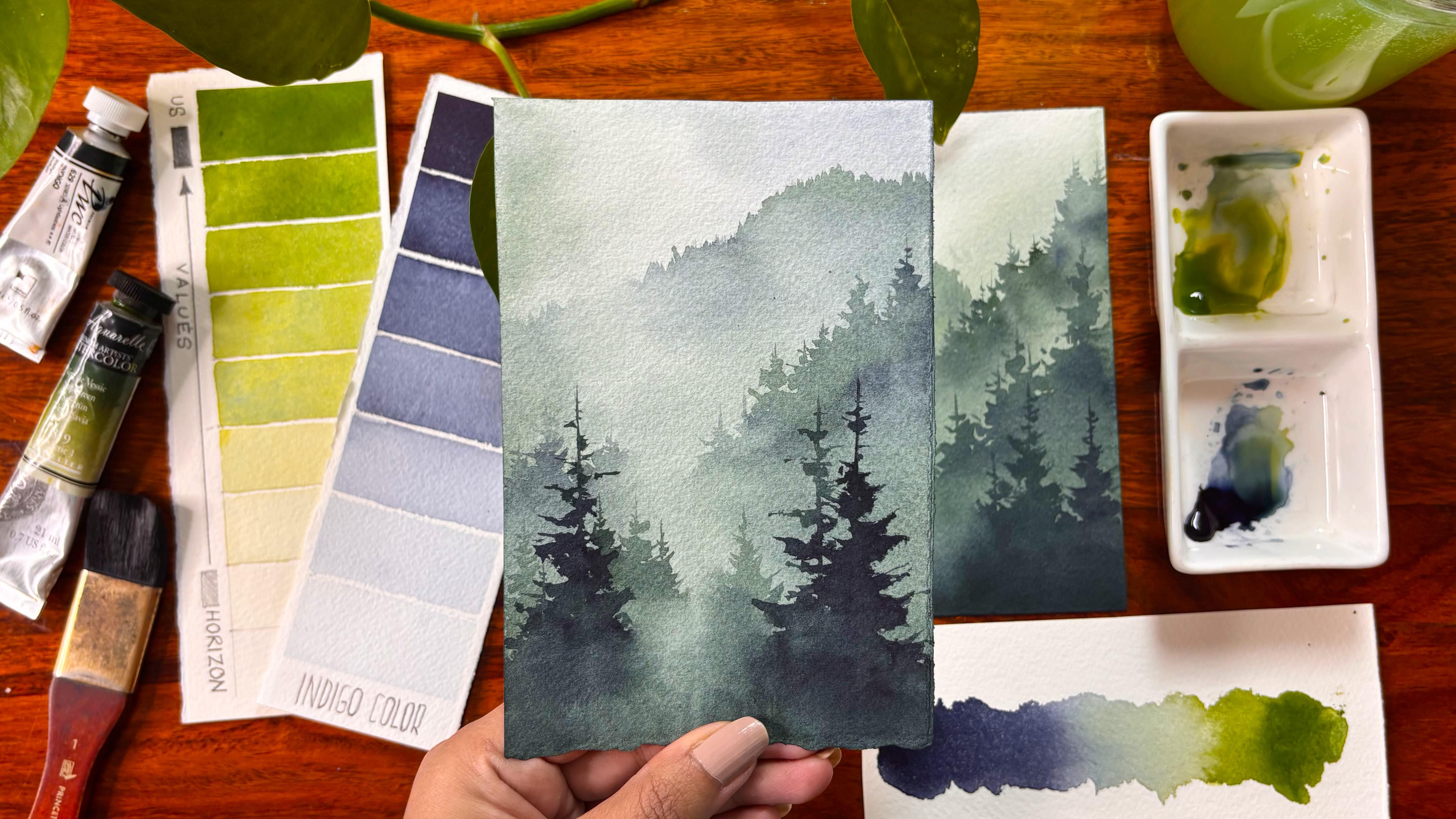
breathtaking pine forest using only two colors, that is Indigo and sap cream. Grab a brush, unwind, and leave with a
painting you will actually be proud of to hang up.
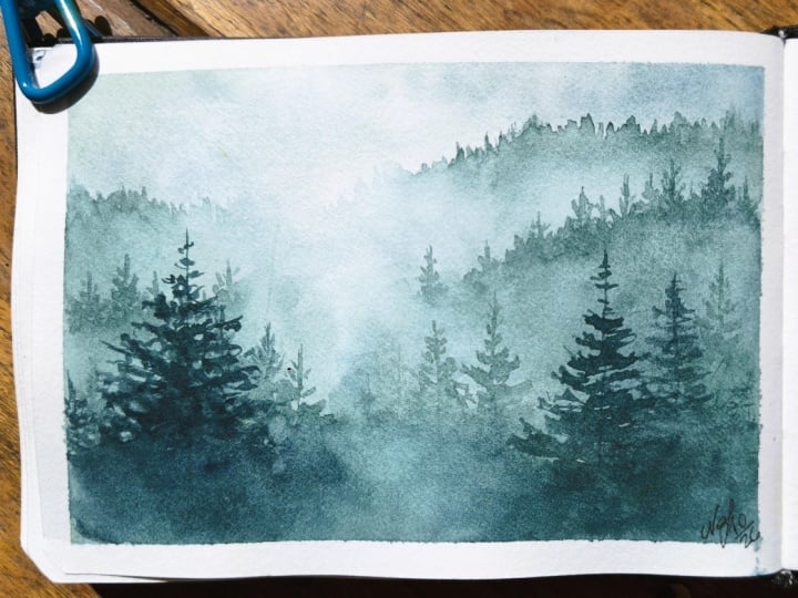
2. Basics of Watercolors: As the name suggests, this is atmospheric pine forest. We will start with a
very simple concept called as atmospheric
perspective, which explains how the
atmosphere changes the appearance of object as they recede
into the distance. Light scattering and
haze particles moisture and dust in the
air scatter light. The further away an object is, the more layers of atmosphere stands in between
it and our eyes. Tonal value progression. Foreground elements
having high contrast, dark rich values, sharp details, and
saturated colors because there is minimal atmospheric
obstruction in between. Midrounds values become
moderately lighter, details blur and
colors lose intensity. Background or horizon, values shift significantly
lighter and cooler, often taking on atmospheric
hues like soft blue, warm creams or pale gray. To match the light of the sky. High value near the horizon, merge with the backgrounds,
creating depth. Now, let's understand how do we define this in our painting? I'm starting out
with two pencils. One is to ch and another is the darkest value from
the Black wick family. I will add the darkest
value towards the bottom, and in the top area, we will have the lightest
value that is to ch. The values keep on becoming darker and darker as it
is closer to our eyes. This is how we will be also painting in our final project. Hence, I would like to replicate the same with our
sap green colour. This sabgreen color is
from the brand sinelia. You can pick up any sabran color or olive green color
that's available with you. Starting out with
the darkest value that is very light
amount of water, dipping your brush so
that you can pick up the particular pigment from your palette and then
apply it on the paper. As we go towards the top, it would become lighter
and lighter in value. Let us break it down
a bit more in detail. Looking at the value scale, this is very important. From us, that is basically
VRs or whosoever is closest to these
foreground places to the horizon or
the atmosphere, whichever is farthest away. Pigment density, heavy cream to buttery consistency of saprane mixed with minimal
amount of water, as I tell you earlier,
I have applied. Visual effect
represents elements closest to the viewer
dense foliage, sharp foreground trees, or
immediate ground shadows. Middle ground pigment density, milk to T consistency of
sabrine diluted with water. Visual effect represents
mid distance tree lines or hills where the color retains
a distinct green hue, but loses dark tonal intensity. Bottom, pigment density, very light wash or tinted
with warm, cool skytes. Visual effect represents
distant mountains, tree lines near the horizon, where atmospheric
haze washes out the true green hue into
a faint pale value. Now, this is how it
happens in a painting. But if you want to do
it as an exercise, I would highly ask you to go
ahead and start with layers. Layers in a way that first is the creamy buttery
layer of the mix, which we are adding to
the paper first layer. Then the second would be adding
a bit more water into it, going with the second one. And this is nothing but creating
the second value layer. Once that is done, we will
go with the third layer. Then the fourth one where
more and more water is added. By the time we are done, the top value which you
create would be almost water. That's how we go about
it for the Sap Green. I would request
you guys to create the same thing as you can
see for the Indigo color. I have already created
it on the left. I would request you to take it as your exercise and do it, as well as upload it in
the project section. Why this exercise is very important whenever
you are starting out with watercolors or even if we are intermediate
to advanced level, sometimes just brushing up on our basics helps us to
analyze the color pigments, et cetera, to a greater extent. When I'm working on a sap green color with
the darker tones, I do not realize that there
is a yellow hue underneath, whereas when I am working
with one single pigment, I really get to analyze that there is a yellow hue
in this sap green, and then there is
a green part too. Sometimes those two can be seen separately compared to one
single color of sap green. Now, these things you really
will not realize at one go. It takes a while, and
slowly and steadily, you will have this
understanding. Once you have this
kind of understanding, you can go ahead and kneel
any kind of pigment values, hues, whatever you want to create in your
watercolor painting. While you create
the value chart, I would like to go ahead and
tell a bit about Sagren. Sagrene is one of
the most essential, widely used green pigments in landscape painting prized
for its ability to mimic the natural colors of organic plant life without looking artificial
or overly harsh. Warm organic hue. Sab green is a warm
yellow, leaning green. Unlike vibrant tallo green
or cooler emerald greens, its yellow undertone give it a natural early quality that resembles sunlit leaves,
grass, and moss. Convenience green.
Modern sabrene is almost exclusively
a convenience color. A factory premixed paint using two or more
modern pigments, where one of them is green
and another is warm yellow. High transparency
and glazing power. It is traditionally
non granulating and highly transparent
to semi transparent, making it exceptional for glazing layers to build
luminosity and depth. Mass tone versus
undertone range. In mass tone appears
as a dark, olive, tinged green in dilution
lightens into a bright, vibrant, glowing yellow green. That's one of the reasons that this has so
many properties. I love to always experiment with the
yellow or you can say, the sub greek that has undertone of yellow
with some indigo, and this gives me
fantastic outcomes, the darker or lighter tone of values that's really
needed for a forest. These have become my go to
colors for painting forest. And since many of you have already followed me
on Instagram and have seen how many of these atmospheric
pine forest I have painted over the past few days, which gives you a
lot of insight into how powerful these two
pigments or together. And the power of these
pigments helps you to create so many different
kind of outcomes without hesitating or thinking
much about adding more colors or leaving out
spaces in white, et cetera. This is something that I
have learned over time. Do not try to overcrowd
with a lot of colors. Try to stick to
only a few colors, which gives out various values. You can also try to have
only a few values out of it. You can have a
foreground middle ground and you can have a background. If you are starting
out with watercolors, these are the three areas
where you can play with. You can start out
with one single color or maybe just go ahead with only two colors and not think about overcrowding
your whole painting. Let's move on to the
next lesson now.
3. Technique Glazing: Glazing glazing with sap green is one of the most
effective ways to build huminosity depth, and realistic light and foliage, landscape and botanical
illustrations because sap green is
naturally a warm, slightly yellow leaning green
with moderate transparency, control layering transforms
flat green washes into rich dimensional forms. Let us understand step by
step, the glazing technique. Apply your initial wash using a wet on dry or wet
on wet technique. Here we are doing a
wet on dry technique. Allow it to dry 100% completely. Touch the paper with
the back of your hand. If it feels cool to the touch moisture remains and glazing will bleed or
lift the lower pigment. Mix the glaze, dilute
sam green with plenty of clean water
to reach a juicy, light to medium tea consistency. Avoid heavy thick paint glazing, relies on thin fluid films. For me, I usually always prepare a small pool of color and
then go over each layer, but always let your
paper bone dry before you go ahead with the second
layer or third layer. Application. Load a soft
synthetic or natural hair brush with glaze mix, sweep lightly across
the dry base layer in a single confidence stroke. Minimize fiction. Do not
scrub or rebrush over the same spot while with overworking disturbs
the underlying layer, pulling up base pigment
and causing muddy texture. Drying and stacking. Let the
first glaze dry completely. If deeper values or subtle
hue shift are needed, apply subsequent glaze of complimentary hues
over the sap green. I would go ahead and
remove the tape. Once I have removed the tape, I would love to
just write glazing, but make sure that each part of your paper is
completely dry before you touch or the color will lift out from
that particular space. Let's move on to the
next technique now.
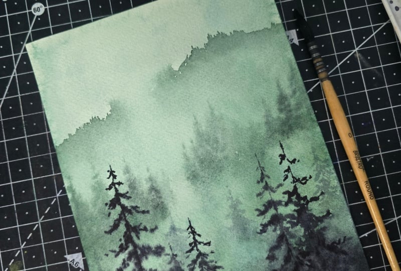
4. Technique - Beginners Mist & Pine Forest: Today, I'm going to
teach you how to create your mist in a very
easy and simple way. We are starting out with
a small piece of paper, and I would apply water on
all the part of this paper. We are doing a wet
on wet technique. Hence, the part of this paper
needs to be wet enough. Then we are going to
make some amount of our indigo along with sap
grain since the sabrene has an underlying yellow
and it will not give me much of a misty pine forest
which I really need, I would add some more amount
of indigo into it and create misty effect by adding some brush strokes towards
the top and the bottom area. I would always keep some
white spaces or keep some areas which are showing
off the white of the paper. I do not use any kind of wash to create the mist as it
is watercolors and I would love to use the space of the white paper to create
the spaces which are basically you can say
negative spaces and white spaces that looks like it is atmospheric,
it is misty. And finally, it will give you an understanding of how lighter and darker
values can work. Now it's time to create
the faraway forest. Now, this is a very, very
simple and easy technique. I will do a wet
on dry technique. In this case, I will
make some amount of indigo and some
amount of sap green and start creating
these brush strokes which are coming from the top. I will use the tip of the brush to create
small, small, small, small lines and then take
it towards the bottom, mix it with both the
colors I love to mix and then only
create it so that there can be darker and
lighter value play None of the spaces are absolutely
dark or absolutely light. It is more of a play
of values and colors. Some of the spaces
are better seen as there are less of atmospheric
particles in between, whereas some of the
spaces are least seen, and there are different, I would say, leaves, et cetera, that come into play. Some of the pines are younger, and hence they are
more lighter in value. Some of the pines
would be darker, more mature, they are
more darker in value. You need to keep all of these nuances that is basically coming from
the nature in your mind when you are
creating any kind of forest or are creating any kind of spaces that should imitate
nature in your painting. Let's continue to work
through it and finish the whole part of this space that is
majorly the mountain, which has some
amount of fines that can be seen extended
towards the right. I will just add some colors or the pigments that we have used earlier towards
the bottom area. Now let's move on
to the next lesson.
5. Knowing your colors: Indigo and sa grain is the ultimate door
for painting deep, realistic forest because
it balances temperature, desaturation, and
value in a single mix. Temperature Sap
green brings warm, sunny yellow undertones
while Indigo adds cool, shadowy blue black tones. Blending them creates an
organic green that reflects real woodland lighting rather
than synthetic tube greens. Natural desaturation,
Indigo dark pigment, gently mute sabrene brightness without turning the
mix muddy or chalky, capturing the dusty, natural
look of the dense foliage. Massive value range. Sabrene alone cannot
reach deep shadow values. Adding indigo allows
you to transition smoothly from sun dappled mid tones to pitch black canopy shadows simply by adjusting the
ratio of the palette. Quick mixing ratio use
70% sabrene for sunlight. Pine needles and
midground trees and 70% indigo for the deep forest
hallows and core shadows. Let's move on to
the next lesson.
6. Atmospheric Pine Forest - Part 1: This painting is very special because we are not
going to draw anything. We will go directly
with the paints. So I would go ahead and just add some water on the
back side of the paper. I have used a spray bottle
for doing the same. You can also use normal
brush and just add some water on the back
side of your paper exactly the way we are doing right
now for the front side. Once this process is done, we will do heavy washes, as we are going to add a lot of mist in this painting
and for mist, having a good wet paper
is always very helpful. I have taken an acrylic
board to stick my paper. This is an important step as I would move this paper a lot, and an acrylic board really
helps me to do the same. Starting out with a
beautiful Indigo color from the brand PBC, I was really not very happy with the shade from Sennelier. Hence, I switch to this one. It's a great shade if you are someone who wants
more of blue into it, but I am someone who wants
some amount of darker shade of blue that gives a lot of atmospheric effect
in my painting, which I am always
looking forward to. Just adding the paints very, very randomly do not
have much in my mind. I am just initially adding some darker, lighter, but very, I would say tone down value of these paints or pigments
into my painting. Now why I add very tone
down layers at this moment? Because the values have to
be lighter on the paper. This is the first layer
that we are doing. We are going to add two
to three more layers. And hence, if you have a
very, very dark layer, you will not be in
a position to see through it as you progress
in your painting. I have picked up
my acrylic board and started moving it in various direction
so that the colors can automatically move
into each other and merge. Keep adding some
more colors in few of the areas without
thinking much. Towards the top part of the sky, I would like to keep some
white spaces that's only there when I think about adding my colors into this
particular painting, rest, you can go ahead
and add any shade. Only thing to keep in mind the
values need to be lighter. This particular paint
will, of course, dry one to two shades lighter, though I am using my
artist rate paints. If you are even using
student rate paints, then you have to go ahead and add more paints compared to what I am doing
at this stage. Student rate paints have
more fillers into it. Hence the shades are way more lighter than what we expect. I would go ahead and
let my paper dry before I actually
add my second layer. Always keep this in mind when you are adding
your second layer, you need to apply it only when this particular
paper is bone dry. Do not add it if your
paper is not dry enough. Your earlier rays
will get mixed with a new layer and the complete
painting will go for a toss. Wherever I feel
that I did not have a good mixing or a good
radiant wash, just go ahead, apply a bit of water in
those areas and then just move your paper as it is on an acrylic board in
various direction, and you will get a
particular color that looks very
soothing to your eyes. The process might appear
very much like repetitive, but you have to just do
it in an intuitive way. Understand where exactly you want to place your
darker values, which would be majorly the
foreground at the bottom area. The top area is far
away from our eyes. That is the atmospheric
effect will be more over there compared
to the bottom part. Hence, bottom part will be darker in value compared
to the top part. So if you have this particular
thing in your mind, I think you can for
sure nail the painting. I'm pretty sure that I'm
almost done with the painting. Extra water, I will take
it off on my tissue, and then just lay this particular acrylic
board flat on the table, allow the colors to mix
and dry on its own. I did place a small teep
underneath towards the top area. There is a movement of colors
towards the bottom part. The only thing is the
gravitational pole, and the gravitational
pole allows the top area to be more lighter compared to
the bottom area, which would be more darker. You can see that the colors have dried way more lighter
than we expected. In case this is the
condition that you two have, now you have to again go
ahead with a tone down value exactly almost the
similar values which we have applied in our first layer for our
second background wash. These are basically the
trees in the background, and the bottom part
of these trees will be lighter or just exactly water blending into
the atmosphere that we have already
created in the background. Though you might see that
I have kept three colors, that is a neutral
tint, sap green, and the first, which is Indigo. But usually, I'm going ahead and using only two of my sheets, that is your sap
green and Indigo in case I feel that the colors
have become more brighter, then only I will use a neutral tint or I
will give it a pass. There are a few things which
we do just for the comfort, and keeping this
particular neutral tint is for my comfort, as I did not want to
go back and again, take out the colors when I'm already applying the
colors on the wet paper. Time is very crucial, and if you do not understand the essence
of time in watercolors, then your whole painting
can go for a toss. Always keep your paints very, very handy whenever you are
working with watercolors. You can also keep a small
pool of colors ready. Since I only had three particular places
of keeping my paints, I did not create any pool, and I'm pretty used to doing
my watercolors in this way. But as a good practice, you can also keep a
small pool of, I mean, paints and pigments
ready for yourself, which can be applied very
quickly on the paper. As you can see, my second
layer is very light, as we have applied just
kind of glazing on top of the colors that we
have applied in layer one. I'm using my flat brush to pick up the colors
from a few areas. I have been using this
Princeton 1 " flat brush in most of my paintings, and it comes really handy. I like to blend the total
portion in a great way. And hence, I apply even the clear water till
the bottom of the paper. It is your choice,
but what it tosses that it doesn't leave
any marks or any kind of effects on your
paper if you take it till the bottom part
or till the ending of your area of applying your
paints. This is it, guys. We are going to go ahead and start off with our third now.
7. Atmospheric Pine Forest - Part 2: I really love how
the mist is coming towards the bottom part from
the top left hand conumn. It's time to make some
of the sap green with some amount of our indigo that's available on the palette. This particular shade
of both colours blended together is Oanshe darker than what we
have applied earlier. I would just make a
small line and then start adding some
conical like structures, or you can say loose lines that goes towards the top
right side and left side. Slowly, steadily, it
becomes a cone like. The top area will be smaller. As you go below, it would become more broader and broader. Believe me, this painting
has been done after 21 to 25 days of
continuously painting puns. So you might find this
to be very expressive. But all I can say is
that when you practice one particular subject
for 2021 days, you are automatically going to completely nail
that painting. So practice is always the key. If you continue to
practice daily, you will have an outcome
that looks extraordinary. Yes, there have been times
where I could not practice. As you know, I
have two children. One is around eight months old. Hence, any challenge that I
pick up always runs to two, 2.5 months. That's
absolutely okay. Mostly my challenges
are painting one particular subject
for about 30 paintings, and I spread it over a
longer period of time, achieving the
achieving something very quickly is not the idea. Just to understand the
subject and achieving it in my own slow pace
is always the idea. I enjoy the process. I enjoy the paintings. Failures are also mine as well as the masterpieces
are also mine. If you have that
kind of a mindset, you are going to completely nail allo watercolor paintings. I'm starting out with the particular shade as
I did tell you earlier, and then while I go
towards the bottom, I blend it with more of Indigo
shades or Indigo color. I will continue to add
some more of these pines. They are smaller in size. As you know, it is a bit
far away from our eyes. The mountain that we
have created earlier had a few line like structure because it is far
away from our eyes, compared to the ones
that we are drawing now, the top part is mostly pines. It's a forest area. I will also add it on the
left side and then just blend it with the bottom area with the help of
my blending brush, which is majorly my
1 " Princeton brush, as I have quali
done even earlier. I continue to do this process. Blending always helps
in having an even tone, as well as it gives the colors to go down with the help of
the gravitational pull. It doesn't allow it to sit at the particular area and automatically move around
with the help of water. I have continuously
created more pins, but with various values, as you observe and then now is the power of
the blending brush. You can see that
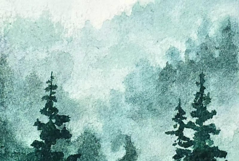
the top part has a fog and I want that
fog to also go down. That's one of the reasons I did not paint in a particular area, the forest part and just allow my washbush to go over that area and make that
area look lighter. The fog is coming
towards the bottom part. I want to make these portions
very even hence just adding some bit bits and parts of the pig
bins here and there. This is a generic
practice which I have been doing for long time now. From the time, at
least, I've started painting pins on
a regular basis. I would be doing this
experiment for a few more days, and then I will be stopping this and moving on
to a new subject. I feel if you practice
a subject for 21 days, you just know how the complete
subject works for you, where basically your flows, how to create the trees. Initially, when I started
creating the trees, I was really not sure of
how to create the trees, how my particular
brushwork will be. But over time, I've realized brush chokes work
very differently, and the pigments sometimes do not flow evenly on the paper. You have to use your plenic
brush in various places. Let your paper dry off, and now we are starting
off with our fourth layer. This is the reason I always say use a 300 GSM arches paper. It's a mold made paper and it can support multiple washes. We will be going ahead
with another wash after this and hence if
you have a handmade paper, it might not give you an even wash after the
fine painting is ready. You might get some
blobs here and there. That's the reason
to go ahead with either Ovabiano or Bahong or the arches is one of the best and I have been using this for
many years now. The core press part. You can
also use 180 GSM or 190 GSM. But for arches, I think
that particular works, but there can be a
bit of buckling. But in this paper, there
is hardly any buckling. You can also go a bit above that is around
650 GSM or more. These decisions, I would
leave it up to you, but having good paper for
yourself is always the key. You can always, always nail a painting when
you have a good paper. These trees are
way more closer to my eyes compared to what
I did draw earlier. I would again use my
blending brush to apply the water and then some of my brush strokes just
to make it look more even. I would continue to paint
some of my trees further on. Then blend it while I
go towards the bottom. Again, this is a very
iterative process. As I do tell you, it's
like a meditation. You can just take the
paints on your brush. It's like a breath in. And when you paint your tree,
it's like a breath out. So breathe in
breathe out process. It can be a long breathe
and a long breathe. This is how I have
been practicing and it is fun to do these exercises. Believe me, it's very relaxing and after a very hectic day, this kind of a smaller
painting can be nailed within 30 minutes after all the
drying time and all, because you can always
use a hand dryer to fast forward the
process of drying. I will continue to add
one or two more trees. Once it is done, we
will allow the paper to dry off and then start
out with our final layer. Final layer is very
crucial and it's very, very important compared to all the other layers which
we have applied till now. There is no coming back when you have applied
your final layer. Hence, whenever you are thinking about applying
your final layer, be very calm composed and then only start out
with your final layer. Just don't think much,
go with the flow, enjoy the process, and you
can surely make it happen. Let's move on to the P three, where we are going to paint
final foreground trees.
8. Atmospheric Pine Forest - Part 3: This is the final
layer and it is going to be very
crucial at this moment. It's important to
just understand where exactly we want
to place our pines. For me, I do not
want to go ahead with a lot of pines
for my foreground. Otherwise, the background
will lose the whole intent, the charm, the look
that we have created, already, the atmospheric effect. Everything just comes
together at this moment. Let's just mark out that
there will be three lines, though you cannot see
those lines properly. It's mostly for your
muscular memory that yes, here I want to place my trees. I will start out with
a straight line, and the first or the top area, I would say, will have less number of your leaves
compared to when you go down. That's how I have kept my trees. I mean, you can have
a different way of actually adding these trees. I love this way
because that gives me more area to show my background and it looks
completely put together. Okay. If you can see that I did draw out with
the help of my tip, the entire line, this
is not a thin brush, as you have seen already. I have been working with this brush for the entire
part of the painting, except the two other
brushes which we have used. I did keep a size four
brush in case it is needed, but it was not needed
in the whole process, and we did complete the entire painting with the help of only
one single brush. That's the power of
having a good brush, and it really can help you to improve the complete
painting in a grade Okay, adding some lines on the
right and on the left. Nothing is in a clear
direction or a clear way, which what I meant to say
is that you will make one of going on the right,
another on the left. Not like that. Few of
them are on the right, few of them are on the left. Having said that, I'm not
trying to add one after another or trying to build up a space where
everything looks even. This is something that
I've done in most of my paintings, even earlier. I should not look even. Keeping that in mind,
you will create a painting that really
looks more natural. It has more nature
effect, the atmosphere, then all the layers that you have put together,
the mist, fog, et cetera, everything
binds together, and it makes a painting
look complete. Again, I'm not trying to add a lot of character
towards the corners. As you know that I keep
my corners very boring. I do not try to add
a lot of character towards the corner areas. I follow the rule of thirds. Rule of thirds is you
divide your paper into nine equal halves and focus
on the intersecting points. You can place your subjects in and around that
intersecting points. We have done the same for the lower half wherever the
points are intersecting. You can see that the middle
part I have left it as empty. I'm not going to draw
a tree over here. I'm just going to add a bit
of paints, and that's it. I can see the right tree has become lighter than
what I expected. I might go over it
once more to paint it, but we'll decide upon it later. Let's continue to
paint on the left and then come back to it slowly. I always like to do
my painting slow. I do not like to just fast forward the process
though you might feel that, yeah, I paint very quickly
because it is watercolors. Watercolors needs a bit of quick movement of
your brush paints, et cetera, or else. You might lead to something that is like quick
drying in a few places, which will lead to cauliflower
effect as we progress. This we really want to
avoid in our paintings. Going ahead and starting out with the top area of the tree, again, I am not going to add
a lot of leaves over there. I will just make it
very skinny and then add more character as we go
towards the bottom area. This is something that
I always keep in mind. I try to give the space that
the background trees also demand because we have given it a lot of effort while we created the background trees. And slowly now when we are
creating the foreground trees, we should not forget
how much effort we did already put into
our background tree. As you know, this is a postcard size paper,
which we are working on, and it is pretty easy to quickly finish off a painting on
any postcard size paper. That's another reason I have
picked up a postcard size for this Atlas class so that
all of us can finish it off. I would also add a small
prompt at the end and then you guys can paint it and upload it on the
project section. A prompt is always helpful
to understand how we want to go ahead and work
on a photograph next. This would be a very simple
photograph. You can paint it. You can also consider
this as a final project, painted and uploaded
as well as paint that particular
photograph too and upload it in the
project section. I know this might have
been a quick and easy one wherever you think
that you want to stop see and then again, paint, you can do that. If the right tree has
been really dark, then don't go over it. I just feel that my
foreground tree on the right side has become really light, which
I don't want. It looks more like
a background tree rather than a foreground tree. I want to add some
more darker values and give it a bit
more character. It is closer to my eyes, and hence I should focus
on it and make it way more darker than the other trees which appears in our background. Mm. I think I did successfully go over my first part of the tree painting and then
just added the darker value. Now I'm picking up
the colors from wherever I think
it is necessary, blending it with
the background art as the background is still wet. I have already blended the color with the help of
my blending brush. This is something
that I am really excited to teach always, always. You can see that the fog is moving from the top
towards the bottom area. Requesting you to upload this project in the
project section and also use the prompt from the resources section
for the painting.
 Dhritikana Nath, Watercolor Artist and Instructor