Transcripts
1. Welcome: Painting with the iPad Pro is so fun and it's easier than you might think. Using the amazing Procreate app, I'm going to be sharing my favorite drawing and painting techniques that will help you draw any subject anywhere. Procreate is such a fantastic painting tool. When I first used it, I was actually stunned by how powerful yet user-friendly it is. It's perfect for making casual sketches, practice paintings, and even professional illustration work. Since it's on the iPad, it's a completely transportable medium too, so whether you're traveling or just sitting in front of the TV, you've got every brush and every color right at your fingertips. It's made me want to carry it around everywhere and paint all the time. In class, I'm going to be sharing my favorite Procreate discoveries, as well as general drawing and painting techniques that you can start applying to your designs right away. I'll also show my approach to drawing people, places, animals, and more. If you don't have an iPad or iPad Pro but you still want to join in and pick up some tips, please do. I'd love to see you in class, so join in and let's get started.
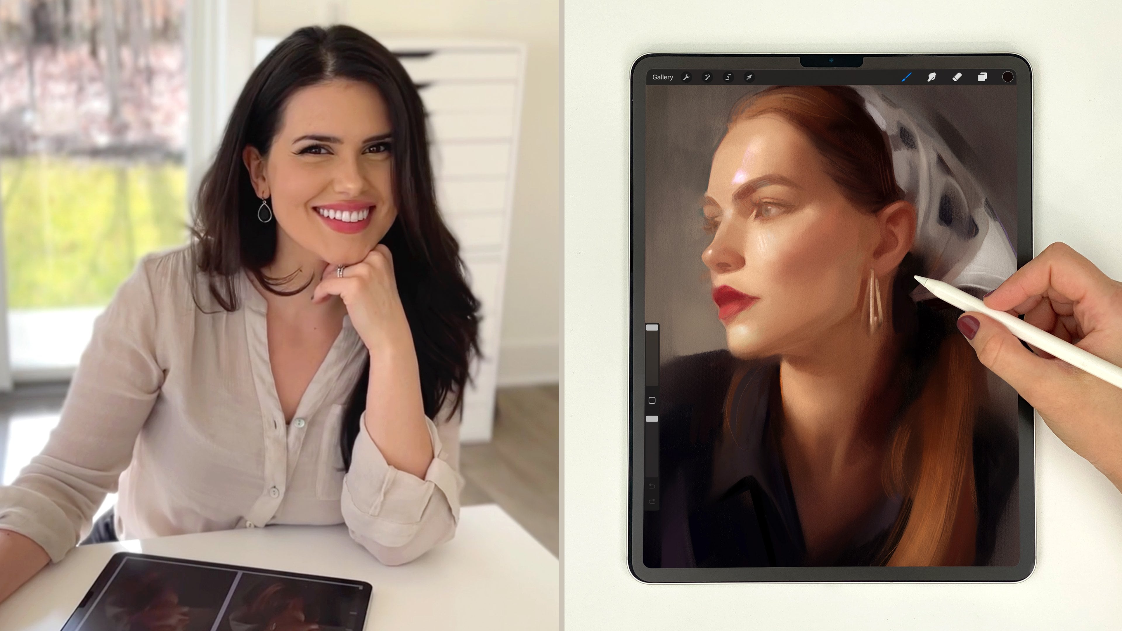
2. Procreate Tour and Tips: You can find Procreate in the App Store. It's $5.99 at the time of me making this video, and it's absolutely worth every penny. If you don't have an iPad, there's actually Procreate Pocket that you can use on your phone. It doesn't have the full power of Procreate for the iPad, but it's still an awesome sketching tool, especially if you're on the go. You can use Procreate on the iPad. You'll just have to use your finger. If you have an iPad Pro and the Apple pencil, that will be the perfect setup. Here's a quick look at the Procreate Interface. Refer back to this if ever, you need a little reminder where something might be. When you open up Procreate, you're going to want to press this plus sign here in the corner and create a Canvas. I like to press new Canvas and then pick dimensions that will fit both my reference and my painting while still being high quality. I found anything around 2,000-3,500 pixels on a shortest side works well. When you press Gallery in the upper left corner, that's going to save whatever progress you've made and takes you back to Gallery view. With the Canvas open again, you'll see there are a variety of little icons at the top here. This wrench icon is where you will find your actions. In your actions you'll be able to insert reference photos from your camera roll, use the perspective guide and flip your Canvas, save your artwork and export your processed videos, record a screen capture and a lot more. I would encourage you to literally click each of these actions to find out what will be useful for you as an artist. Here are some of the main ones you'll want to know for this class though. Now clicking here to the second icon that looks like a magic wand, you'll find your color adjustments, blur, sharpening tools and more. The ones I touch on in this class are Gaussian blur, Sharpen and Hue, Saturation, Brightness. But again, absolutely experiment. All of these do cool things that will probably be useful to you at some point. This third icon that looks like an S is our selection tool. I use this when I want to outline a shape so that I only paint within that shape. It also helps when I want to draw a super sharp edges. Pushing selections around is easy with this fourth icon that looks like an arrow. You can easily move things around by selecting with the selection tool and then moving it with the transform tool. With the transform tool, you can also distort the contents of a layer by grabbing at the corner here and moving it around. You can also share it by grabbing at the middle here. Now let's take a look at brushes. I think the procreate brushes are really amazing. I think they're a step up from other painting programs. They look very real, which I personally love. So spend some time going through and trying all of these out. This finger icon here is the smudge tool. I'll use this on occasion. You have all the same brushes here though, which is cool. This third icon here is the Eraser. Again, all the same brushes are there for you. This double square icon here opens up your layers. To add more layers, you just have to press this plus sign. Here in the corner are all your colors, which we'll get more into in a bit. Now with a brush selected over here, you can see this bar changes the size of your brush. Then this lower bar here will change the opacity of your brush. With a stylus, your pressure will also affect opacity. But if you happen to be painting with your finger, this will be the blur to adjust for opacity. I've programmed my Modify button here to open up this menu when I press it. This Modify button can also help me select colors. What I can do is hold the Modify button with my left hand and touch a color with my right. Then as you can see, procreate picks up that color for me, so now I can use it. Now white is selected. You can also touch and hold a color like this. That will also pick up colors for you. I color pick like this all the time when I paint. That's part of the greatness of digital painting. Color picking from photos is absolutely simple. You can go to Actions, press, Advanced gesture controls, if you'd like to edit your Modify button and edit how you can pick up colors. Now I want to show you some of my favorite procreate tips and tricks. If you ever need to draw a straight line, just hold it at the end and it will snap to a straight line. This is super useful. Another thing you can do is hold it at the end and pose for a bit like before, but then take your finger and tap the screen. This will give you 15 degree tics, which is perfect for getting that perfect vertical or horizontal line. Another cool trick with Procreate is when you have a closed-off shaped like this, you can pick a color and then just drag it into the shape. Then Procreate will fill it in for you. Another time saver for me is just take three fingers and stroke downward. This will open up a quick Cut Copy Paste menu. If you ever want to delete a layer, just swipe left on the layer and press Clear. If you ever want to merge multiple layers, you can actually just pinch them together. Or you can just tap a layer and press Merge Down and it will merge with the one below it. Here's another cool little thing I use quite often. If you ever want to get pure white, just double-tap up here near the white and it will automatically snap to pure white. Same goes for black. You can also create and save your own color palletes. You can see Procreate already has a few made for you, but you can also press this little plus sign and make your own. To add a color, just find a color you want and then press an open square. Easy. Now this I use all the time. It's called Alpha lock. Here is a shape, and I want to only paint one that shape without going outside the edges. All I have to do is Alpha lock the layer by swiping right with two fingers. You can see how the background of the layer is now checkered. This means it's Alpha locked. When I paint on the layer, I will only paint on the pixels that are already colored in one that layer. I can't paint outside the lines, which is awesome. If you ever want to lower the opacity of a layer, just click this N and then lower the opacity here. Another awesome thing about Procreate is it makes a time lapse recording of your painting process, which is super cool, especially if you'd like to share these videos online. Just make sure the time lapse recording is set on. If you want to up the quality of your videos, just go to settings on your iPad, Procreate, and then change the time lapse recording quality to what you want. Perspective guide is a cool feature located under Canvas. You may find this helpful for extremely technical drawings. You can also press a layer and then press Assist. This will assist you in drawing lines that are all in line with the perspective you made. Not a feature I use often in my work, but definitely cool. Under Actions Help, you can find a great customer support team and an awesome community of Procreate artists. There are also tons of free brushes and resources there, so check it out. The Procreate iBook is also a quick and super informative read. If you'd like to learn more about what you can do with procreate, be sure to check that out.
3. Drawing and Painting Techniques: As artists, we need to know different techniques and skills, tools in our toolbox that we can pull out whenever we need them. Here are some techniques that I like to use while painting. Like I mentioned, I like to have my reference right next to my artwork, so I make my canvas big enough to fit both. You'll want to have magnetic wand while you're putting this into place. Otherwise, things could go wonky if you place it with free form selected. With magnetic wand, I put this in place. When I'm finished, I just press the arrow. Then I go to my layers, swipe left and duplicate. Now again, with my Transform tool, I move this copy over. But what is the point of this you might ask? Well, what I like to do then is alpha lock that copy layer and using a big soft brush, I fill it in. Basically, what I've just done is I've made it so that my canvas is the exact same size as my reference. This is going to make measuring for accuracy so much easier, because I will be comparing things that are the exact same size. You can also put a grid on your drawing to help with accuracy. All you have to do is insert the grid and then place it exactly where you want it. Make sure magnetic is on for this too. Then from there, just add a new layer, drag it below the grid and get to drawing. I also like to draw horizontal lines on occasion to see if my reference and my drawing are lining up. To do that just add a new layer, then do the straight horizontal line trick using my finger to make sure it snaps to the perfect horizontal. Then I make sure I have the features in the right spot. You can add as many lines as you want and you can even move them around with the Transform tool. I looked over at my cat Olive one morning and I said, "stay there. I need to take your picture so I can show my class." Here she is. Isn't she adorable? That's all I wanted to show you here. Just kidding. What I actually wanted to show you was how simple her shapes are. When you're painting it's always a good idea to try and break down complex subjects into their most simple, basic shapes. This will help you confidently draw. Because of course, you can draw this drumstick shape, this rounded triangle, this teardrop shape, and those two little triangles on top. You'll also want to look at more abstract negative shapes. Those are the shapes around your subjects. Our brains have programmed how it thinks things should look. For example, an eye, a tree, a house, people would probably draw these symbolic images similarly if asked to draw them from their imagination. But when we observe abstract shapes, because our brains don't have any preconceived ideas for how they should look, we can actually draw things more accurately. This is why drawing the negative space, which is the abstract shapes around objects can help us draw more accurately. Because we've never seen this exact shape before, we'll give it our attention, helping us find its exactness. I'm constantly on the lookout for negative space. It's a great way to check yourself. You can even put a quick grid on a new layer and then check a smaller section for accuracy if you wish. A solid value structure can lead you to a solid painting. Try breaking down your reference into just five graphic value shapes. Connecting similar values will help you achieve a simple yet confident design statement. Painting like this will help your painting read from a distance as well. Squint out your reference if you can't see the value hierarchy clearly. This will simplify the values, grouping similar values together. Sometimes I want to get a summary, golden hour glow in my paintings and it's really easy to do. You just take a soft brush and make it really big. Then using an orangey color like this and using a light circular motion add that orange glow. I just loved the warmth that this gives images. Sometimes when I'm color picking from an image, I'll just push the saturation and contrasts to add more. I just find this helps to get where I'm going faster in my painting process. I also don't have to press down as hard on my pen. There are also tons of color adjustments you can try out. So experiment and push your color to where you want it. Here's a quick tip for creating depth in a painting; select your background with the selection tool, and then go to adjustments, Gaussian blur. Then you can take your finger and slide it to add blurriness. This creates an instant depth of field effect like a camera gives. It's a good way of showing space and distance in your painting. I think it's important to get a solid structure on a painting before adding details. To render realistic forms, you can do this in your imagination or even turn this into a painting exercise. First, draw cross contours, basically wrapping lines around your object. If it makes it easier, imagine sticky strings wrapping around your objects and clinging to its curves. This will break your object down into several sections or planes. Then you can color pick from the image and find the average color of each of these planes. Then you can find a color that would fall between those two planes. Using a soft brush, you can just paint that on. This is a method that you can use for blending two planes together. Every plane change is going to be a color change. This is an excellent way to practice painting light and shade. Quick tip. You can make this bigger like this to pick even more precise colors. Throughout class, you'll see me drawing a lot with my favorite pencil, the 6B pencil found in the sketching section. The change I personally make to this brush though, is I like to push the size limits to max. This gives me a full range of sizes and a good variety to the lines I can get. I like to use the tip of the pencil for thinner lines, then also I like to put the pencil on its side for thicker strokes. Experiment with the tilt of your pencil to see the variety you can get. If you ever want to reset your brush from its modified state, just swipe left and press reset. As you can see, you can also duplicate if you ever want to as well. Using lines can also be a great way to render form. You can use cross contour lines to help describe volumes. Like here, I used lines with varying values to help show the form of the cheekbone turning. For textures, experiment with the fantastic brushes procreate has to offer. You can add a new set, name it, and drag and drop your favorites there. Procreate will store a copy there. I like to do this so I can easily access my favorite go tools. You can also create brushes by pressing this plus sign. Or if you don't want to start from scratch, duplicate a brush you already like. Clicking source, you can change the shape of the brush and the grain. I spent literally days playing around and making brushes. It's really a lot of fun. Basically, what you need are black and white square photos to use a source files. Have fun with this. The possibilities are endless. Check out the procreate community forum to find free brushes, brushes for purchase, and where you can share your own. A quick note about style; each brush will give you a slightly different look and style, so embrace it and have fun with it.
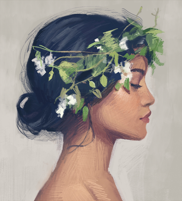
4. Painting People: Just a quick note before we begin, I have lots of class resources available for you all. If you're own an iPad, you can find the link to the class resources on my first post in the discussion section. If you own a computer, you can find these resources in the your project section. That said, let's begin. I started this drawing with a grid, quickly massing in the shapes of color. But really quickly in the process, I realized that the difficult angle and tilt to the head were going to be a problem for me. I knew I had to lean on my drawing skills a bit to properly constructor. I restarted, tackling this painting with a new approach since my first method just wasn't working out for me for this particular piece. I think different pieces can call for different processes, and you'll see this throughout my demos. I typically don't paint with a grid, but I've found that it made the process of capturing accurate proportions much simpler. I wanted to show you this way of mapping out your drawing. I would say don't use a grid as a crutch though. Try to practice and develop your drawing skills, with and without a grid. When I do use a grid, I like to keep the grid squares quite big. Too many squares for me would just be too overwhelming, and it would also make me go too much into copy mode, and I would stop thinking about concepts and forms and bigger ideas. When I place my grid, I like to anchor the edges of the rectangles at important landmarks. Here I place the edges of the main rectangle at her brow edge and at the bottom of her nose. That helps me place these important features more easily because I know that they're just right on that edge. At this point, this is what my layers look like, super simple. There's the photograph, my painting, and then the grid layer on top which I can turn on and off as I wish. I personally like to keep my layers super simple like this. Too many layers tends to confuse me. I also like the feel of working on one layer with all the strokes interacting with their surroundings strokes. It feels more natural to me like I'm working with a traditional medium. This is my preference, but use as many or as few layers as you want, do whatever works for you. For this portion of the piece, I'm pretty much just using the 6B sketching pencil. Sometimes using the point of the Apple pencil and sometimes turning it on its side to get a nice thick stroke. Drawing portraits is a difficult thing to do, so go into this knowing that it might be a challenge. You have to get miles of canvas behind you with practice before it will become simple. If you'd like a really in-depth lesson on drawing portraits, check out my pencil portrait class.There we'll cover the needed basics of proportions and structure. I struggled with the details of this earring. To be honest, I wasn't in love with the look of it, and I didn't want to put in all the effort I knew it would take, so I took it out, and that's fine. As artists, we have the liberty to put things in that aren't there and to also take things out that are. I also experimented with the idea of giving our hair piece. But in the end, I decided to just keep it simple. I added a couple oil paint strokes for some textual interests. I may add an accessory to this one eventually. That's one of the cool and unique things about digital painting. I can have this version and I can also copy it later and make another version if I want to. If you took my female character drawing class then you know all about how to draw a character like this. The cool thing is the process transfers over to this medium really well. Using the 6B pencil I sketch out my girl. I can feel totally free to experiment with her hair, expression, and accessories because pressing the Undo button is so simple. Once I'm happy with the basic sketch, I Add a New Layer and put it under my sketch layer. Then I just pick colors like I would if I were coloring in a coloring book. Since my line work is on a separate layer, I can even change the color of the lines from the brown I initially chose to this purpley pink. On the color layer, I can add this orangey glow with a large soft brush. I love getting this harmonizing look. With an eraser brush, I can erase anywhere I went outside the boundaries of my line work. Now I have a cute little character. I found this man to have a really interesting look. I decided to sketch a man roughly to start. Once I had the basics laid out, I went in and started massing in shapes. The image is in black and white, so we're only working with values here. I tried to think about the lighting situations so that I can make good value decisions and render the form of his face effectively. I tried to make soft and hard edges using the soft brush for the softness and the 6B brush for harder edges in comparison. I also drop straight horizontal lines to get the forehead, brow line, nose, and chin placed in proper relationship. I struggled with putting in too many details on his face too quickly. I had to pull myself back sometimes. It's better to have good believable forms in place first and then put detail in on top. It's like icing a cake. You can't ice a cake before you've even pulled it out of the oven, and so it's the same with painting I believe. You have to get the solid big structures in first and then add detail only once your forms are in place. I think I could have made this portrait better if I'd really honed in on that idea and not rushed into detail. With this drawing, I wanted to try out a new charcoal brush that I made. I wasn't focused on the likeness at all. I just wanted to pose as reference. I started with a simple sketch, imagining her head as a ball with a jaw. After putting in some basic line work, I went in with one of my big charcoal brushes and got some values up there on the canvas to work with, then with a kneaded eraser brush I made, I erased out some of the tones. I tried to approach this like I want a real charcoal drawing. That's one of the coolest things about Procreate. The brushes feel so real. This drawing is just a big experiment, but I'll have my charcoal set available and comrades soon, so look out for that if you'd like to try it. Or like I said, make your own brushes. I actually got out my real materials to make these. I just made different shapes with the charcoal dust and smudges, took some photos and turned them into charcoal brushes. I painted this portrait on a boat with my family while we were watching a movie.That's another reason why I love Procreate and the iPad Pro so much. You can paint anywhere. I used a grid because I just wanted to get to where I was going quickly so I could get into the fun of painting. I masked in the painting with a soft brush, experimented with some brushes and then landed on my favorite 6B. This was my first Procreate portrait. I painted the piece in one layer, painting by instinct, and frankly pretty sloppily, but that's sometimes the fun of it, being loose and expressive. I find that areas like this are worth grabbing onto. Getting in warm, crisp cast shadows like this will start to make your subject look 3D. I like finding little areas like this. They give a piece and an impressive look while being super simple to do. Looking at the negative spaces in this piece really helped me draw it too. Instead of looking at the nose shape, I looked at this gray shape. I absolutely loved the head scarf in this photo. It's always inspired me. Plus she's a beauty and the color palette is just gorgeous to me too, so I just had to paint her. First, I planted everything in place using a soft brush. It's actually scribbling and messy as I get to know what I'm looking at. I'm constantly looking at positive and negative spaces to get these things in place. Once I have the basics, I go in with my 6B and I start to curve out the forums like a sculptor would. She stayed in this phase without a mouth for quite a while because I knew that the underlying forms of her mouth weren't ready for lips yet. If I'd put the lips on right away, all the forms around her mouth would have looked flat, so I took the time to sculpt this area, so forgive me for how creepy she looks right now. Finally the surrounding forms are ready for lips, so I put them in place. I found that I was able to build up the face by working in a small value range with incremental value changes. I also use the technique where I drew small lines with my 6B around forums to give them push and direction.
5. Painting Animals: For this moth, I actually began by tapping around with my finger using a soft brush. I really liked the depth in the photo. How the background is really blurry and the moth is really sharp. I wanted to capture that effect in my painting, so I kept that in mind and only made the areas around the moth crisp or areas that were pointing to him. I even used the sharpen adjustment a couple times to make sure that moth really stood out. Another thing I realized while painting this was you don't have to be completely literal with your brush choices. I actually used the crystal brush to paint the edges of these flowers, and I think it worked pretty nicely for it. This little guy was a challenge. He has such an expressive and cute smile and being a portrait artist, it was strange to draw without thinking human. What helped me in this was leaning on my copying skills a little more. I looked at the little shapes of light and tried to put them in as best I could. When I stopped thinking about how I thought the dolphin should look and started focusing on what was actually right in front of me, that was when I was able to draw him more accurately. It's a simple little painting, but it was a good exercise for me. With more practice painting dolphins, I'll become better. That's what's important to remember about anything you want to paint and become good at. Practice, practice, practice. With this painting, I went in with intention. I wanted to make a confident painting to reflect the confidence of this very proud lion. I deliberately considered each stroke before I put it down, analyzing each different shapes, color, size, and placement on the canvas. There's so many ways you can tackle a painting. I really enjoyed painting with this approach. I think it's important to realize that you don't need to copy every minute detail. You don't need to copy pixel for pixel. In fact, a simple statement with simple shapes will do well. Find the shapes of light and shade and place them in the proper place and you'll have yourself a painting. I find that painting is as much what you put in as you leave out. As artists, we have the ability to omit. This lion doesn't need every little detail on his face in order for me to make him look like a lion. In fact, I think if I added all these details in his face, it would end up taking away from the picture as a whole. I like how this one is left simple in design. I'm allowing you as the viewers to do some of the work, and that's part of the fun of looking at art, I think. For this painting, I use my favorite 6B pencil and mostly on its side, but I did up the streamlining of the brush. This helped me make confident chiseled shapes. For this painting, I began with a line drawing instead of going right in with paint. I found there to be a beautiful graceful poetry to her, so I wanted to embrace that by drawing with rhythmic lines. Since I let myself be more rhythmic and free, I wanted to go back and check my structure. I took a closer look at proportions by painting her as two simple rectangular shapes. Then I'm visually compare the two rectangles to each other and then also compared them to my drawing. I like to drop lines, compare distances, and make quick grids whenever I need to to help me with proportional accuracy. She doesn't look exactly like the photo and that doesn't bother me. What does matter to me though is that she looks like a deer, so checking measurements helps a lot with that. Instead of using a textured brush for her spots, I decided to draw them by hand. Sometimes a textured brush will work better, and sometimes drawing the details slowly by hand will work better. You can decide what will work best for your painting on a case by case basis. With this painting, I actually started off using the flat marker, making long strokes to make his body. I like to switch up the way I start as you can see. I think every piece calls for a slightly different approach, so it's good to have a few techniques obviously. Here's something new that I tried out. To get the texture on the branch, I just selected the area, and then I just stamped it with the burnt tree brush. I think it worked. It was an easy way to get the look I wanted. As you can see, I ran into a glitch in the recording of this one, and I think it was because my iPad went in to sleep mode once while I still had my drawing open. To prevent the problem from happening again, what I did was I went into my settings, display and brightness, auto lock, and I set it to never. I haven't run into this recording problem since. This is just a little side note, if you'd like to record your processes. But back to the painting, I think it's important to always be checking yourself, compare measurements to one another, test yourself, and evaluate the distances and exact spaces between things. If you're going for a general likeness, big differences from the reference will make a big difference. Sometimes, I like to take the time to make sure I've nailed down my proportions. To move things around in Procreate, what I do is I just make a copy of my drawing and then I move things around with the selection tool and the transform tool. I went into this drawing with no real desire of making a painting that was accurate to the photo, but this little bird isn't paying me to paint his likeness anyway, so I didn't feel too bad about it. I did want to capture the nostalgic feeling I got from looking at it though. I wanted to paint a warm summer glow on this peaceful looking bird. I actually drew it with the selection tool to get a quick defined outline of the bird. For this painting, I used the soft pastel brush, the 6B sketching brush, and the soft brush for a nice warm orange glow. I also went to the adjustments and made a slight change to the hue and saturation here just to get that final look, I was going for.
6. Painting Places: To start with this one, I ended up duplicating my reference and blurring it with this much soul. There were so many pretty details I didn't want to get distracted by too soon, so I smashed it to focus on the basics. Then I started my painting with descend ski ink, another fun brush I like. After the initial color run, I returned to my favorite 6B pencil using the side of the pencil to get those thick strokes. I really enjoy painting in this style but I only discovered I liked it by experimenting with the procreate brushes. I painted this one slowly thinking about each stroke I made similarly to the way I painted the lion. For this piece I wanted to try the Perspective Guide and one-point perspective. Then I just clicked assist on my painting layer and I got this really abstract looking start. Having the perspective assist on made the technical part of this easy so I could focus more on the artistic side of it. For the sunbeams coming in, I just held my stroke at the end so it would straighten it out for me with the quick line. In this piece it helped me to remember that contrasted colors will tend to come forward, while using similar values will help push things back in space. For change of pace I put in a bit more texture detail on this one to make it look more realistic. For this painting I squinted down at the reference to help me see the various shapes then I just painted them with a general swatch of color picked up from the reference. I experimented with making several different mountain texture brushes but I couldn't get away with just using a mountain brush alone. I had to go in and hand draw more of the tiny details as well to make it look convincing. Then for the water I experimented with different smudge brushes to get a watery looking effect. I like this photo because it's all about edges, super smooth edges and really crisp edges. I use a soft brush almost exclusively, using a big size brush for big smooth areas and then making my brush smaller when the edge got a bit more defined. To get the crisp edges on the top of the sand dunes, I use the selection tool and I also used a tiny soft brush. This was a good exercise for me in edge control. This was another time for me I realized I don't have to be so literal in my brush choices. I started off with a water brush but it was just too much details straight off the bat so I painted over and again considering color changes instead of texture. Since this was a simple composition, I took the opportunity to experiment with a couple brushes.
7. Painting Things: I went into this painting with the mentality of being quick and expressive. I painted this one after a long day of serious studies. After lots of slow work, I wanted to work off creative instinct. I masked in the background in basic shapes with a few brushes from the industrial set. Using the stonewall, twisted tree and rusted decay brushes. I like these textured brushes because they aren't super obvious, but they still provide a nice visual interest. I also discovered that the oil paint brush works great for shiny surfaces, and when you make quick confident strokes with that brush, it can help the painting look energetic. I also enjoyed using a big soft brush to get the soft glow in the orange and on the table. I love using a soft brush to add these soft harmonizing glows. Interestingly enough, the old skin and rough skin brushes worked well for the orange peel texture. I actually started this painting with my fingers. After a long day of painting, my hand was tired, but I could still stamp around. I blocked in the background with textured industrial brushes. Then I started drawing with my pencil again. I wasn't overly concerned about completely accurate proportions here. After all, it's just a painting of a bike. Instead, I took the time to experiment with more brushes. There are so many great ones to explore. It's a very rough painting, but it was relaxing and fun, and sometimes it's good to just paint to relax. My dad loves trains, so I was inspired to paint this one. I quickly marked in the big shapes with my 6B pencil. Drawing this made me realize the importance of nailing down certain landmarks. When you nail down exactly where certain points go, you can go back and compare other measurements to that measurement you know is already correct. Don't put things like this in too soon or before you're ready for them. Because once you put little things like this in, it's mentally hard to change them. Lock them in place when you're ready and then use them as anchors for placing other things. I used the brand tree brush for some of the foliage and the luminous light pen and flare worked well for the lights on the front of the train. The cloud rush also worked well for the billowing smoke. I started this painting super loose and scribbly with my 6B pencil. To get the table texture, I just added a layer on top of my sketch, painted a quick patch with the wood brush, and I transformed the entire layer with the Transform tool, pressing and holding the edges to get the perspective distortion that I wanted. Then I just erased out the areas that extended past my canvas. I also used a Gaussian blur on the table layer so that the texture wouldn't compete with the focus of the cappuccino. As I paint this, I'm considering what the light sources in the image might be. There's probably one light source that's coming from a window, so natural light is pouring in there and another electric light source is probably coming from an overhead light. The overcast lighting coming in through the window makes the transitions of light and shade on the cup soft and smooth. While the overhead electric light provides us with a crisper cast shadow. These are good things to keep in mind while I'm rendering this. For the foam on the top, I drew it with my 6B and then I carved the shape design into it. The little highlights or reflections on the spoon and the cup are the little sparkles in this painting. I approached painting this fruit tart in the same way I approached my orange painting. After a long day of hard work, I wanted to relax with a quick painterly piece. I used a rusty decay brush to massen all the shapes. Then I went in with the oil paint brush. I love this brush for the freshness that it gives and I really think it works nicely for glossy and shiny surfaces. I'm finding that I really enjoy this type of painting for warm up and cool down exercises. I wanted to try painting a transparent object. I started with the rusty decay brush and then went in with a few quick oil paint strokes. Then I selected the entire crude and went in with a big soft brush, using various shades of gold, brown and green. I think this started giving me that transparent look I was trying to achieve. My oil crude was looking a bit too squat though, so I duplicated the entire painting layer and used the transform tool to quickly skinny it up. Then I merged it with my original painting layer. At this point, I'm just painting more shapes of color, deciding as I go what I want to keep in, and what I need to emit. I found that streamlining my 6B pencil a bit helped me get these details down more confidently. I don't always like to paint realistically though. Here I did some really quick watercolor looking florals. I made a full watercolor set with seven rushes and 20 paper textures that's available for purchase from my [inaudible] store. To paint these quick florals, I used my watercolor round brush, pressing lightly for thin strokes and then harder for thicker strokes. I chose darker, more saturated colors for the inner petals, and then lighter colors for the outside petals. For these flowers I wanted to get the look of an oil painting, so I went in with a soft brush to start and then headed straight for my oil paint brush. I grabbed vivid colors for the centers of the flowers, then more muted colors for the outer petals. I kept my stroke's loose and painterly, not allowing myself to define every edge. I did make up an awesome free palette knife brush from a Procreate brush creator. I used it with the Smudge tool here. Go to Actions, Help, Community, and scroll down to the Free Brushes to find awesome brushes procreate artists are making available for free.
8. Demo Part 1: So I got this photo from Shutterstock.com. I picked it for this demo because the lighting is providing us with simple shapes. It won't be the most compositionally interesting piece, but this type of pose is good to study. Also, I can paint more quickly when the shadow shapes are simple like this. So I picked this photo so you won't be sitting here forever watching me paint. Usually a painting will take me anywhere from three to seven hours, sometimes more, sometimes less, and I think all in all this piece took me around three hours from start to finish. So to start, I'm placing my reference on a 5,000 by 3500 pixel canvas. This will easily fit both my reference in my painting and it will result in a nice clear painting in the end that I can blow up pretty big if I ever want to. Now I'm Alpha locking layer, color picking the background, picking the soft brush, making it a bit bigger, and filling it in. I am just picking up this lighter color too for a nice gradation. Grabbing my 6B pencil large, I'm going to start plucking in shapes of color. So you can color pick if you want, or you can make your best guesses for the colors and really take this as a study for color. I'm going to color pick though. When I color pick, I don't try to pick the lightest color or the darkest color, but more so the middle average of a color. There's a bit of blow out here because I'm filming the screen, but try to keep that in mind. For skin colors, don't pick a color that's too light. When in doubt, go a little darker than you think. That'll make the highlights later a lot more effective. I'm just trying to see simple shapes first. I don't want to make this more difficult than it needs to be done. I'm squinting down my eyes at my reference as I work to see where I can simplify and combine shapes into simpler, bigger shapes. I see a lot of triangles and this in a lot of long skinny rectangles too. I find this 6B brush is perfect for setting up a portrait. I think it's an excellent brush because it has a sharp side and a softer side to it. So it works great for both crisp and soft edges. Looking at and studying the planes of the head from many angles will help you in understanding the general facets of the head better. Also, if you can get out to a life drawing group. I plan on doing this soon again myself. I think it's good to always be practicing and developing your skills and working from life is an excellent way to do this. You'll see things in real life that you don't see in photos. Usually community colleges will have portrait drawing and painting sessions, so Google around and see what's available in your area. Think of this stage as if it's a blocky woodcarving, and we're just going to keep chipping away at it until it becomes a person. So now I'm making light lines to indicate the tilt of the head, it's easy to lose the tilt. So if you want to maintain an accurate tilt to the head, be conscious of our human tendency to want to straighten things out and always be checking your angles. Now I'm carving out the eye sockets. You can get different strokes depending on how you hold your pencil. This is something that will start coming to you naturally as you try out different things and see what you like. But sometimes I'll hold my pencil near the back for setup work like this, in other times I'll hold it closer to the tip. I'll do that for smaller shapes or when I'm getting more specific. Right now I'm trying to look at the value hierarchy, asking myself, "What's the darkest and what's the lightest and the picture?" It's good to have those boundaries in your head. Then you'll know every other value will have to fall between those values. I'm thinking the lightest light is on the forehead and the darkest darks are in the shirt shadows. So everything's still just simple shapes. No single hairs yet or little wrinkles, just shapes of color. I'm shaping up the mid tones, the dark accent shapes and the lake shapes. This will give you a really nice basic foundation that you can then build onto. Look at the positive shapes when you're setting up like this, but also the negative shapes at the background to help you place your subject. As you know this video is double time right now, and I'll speed it up a little bit more later too. But take time to think if you need to. Your pencil doesn't always have to be moving. Pause for a bit and let your mind do the work, then execute your ideas. So I've got the colors up here, but before I pushed forward, I'm making sure I have the shapes in basically the right place. Instead of drawing lines, I'm trying to continue to think as if this were wood and I'm carving. So I mark the shadow shapes of the eye sockets, the side of the nose, and under the chin. This also gives me more wiggle room if it's not placed in exactly the right spot, because it's not detail work, but just simple strokes. Now I'm getting a not rounded cast shadow shape of the nose. If you want to learn more about lighting on the face, check out my lighting class. So now I'm drawing a line on a new layer so that I can check my placement. I'm being sure to tap my pointer finger with the other hand so that it snaps to a perfectly horizontal line. I add an extra little dot so I can easily move around the line layer. So now with the arrow, I can check and see if I have the features placed in about the right spot. So when I want to change the proportion slightly with the selection tool, I'll make a copy of my painting and move the feature on the copy. This works nicely because the colors on the original painting will show through underneath. So there will be little cleanup. When I'm happy, I'll merge the layers together. I see that this no shadow touches the line, so I make the move now before I invest anymore time with details into it. I think at this point, it's time to press forward. So I get a little more bold and start adding the upper and eye line. These dark lash lines are good in green points. You can see I'm actually making the whole shape with this color. Then I'll end up picking out the later values. There are also these darker little accents in here, so I grab that color and start marking in the nostrils and nose one for out here. You can drop a straight line down from the inner corner of the eye to see where the nose and corner of the lips land. Now I'm adding some lighter skin color for the eyelids. Because I can fight against this all day, but if it's in the wrong spot, it's in the wrong spot. So I go ahead and add some color for more eyelid space. Make sure when you're moving around you're measuring line, you're not accidentally painting on the line layer because that can be kind of annoying to fix. I'm just refining my shapes and values now. It's okay that this still looks planar. We can smooth out later.
9. Demo Part 2: Now, I'm getting in this little eyelash shadow. I'm trying to get a little more specific with the cheek and jaw. Here, I'm trying to find a value that will help me turn the face from front to side. Now I pick up an average color for the lips, and instead of drawing the exact details I put in the general angles. The basic shape is almost like a squished hexagon. Now I'm happy with this, so I merge it down. For this type of piece. I usually paint on one layer like this whenever I can. I started drawing and painting traditionally, so that's what feels most natural to me for this type of portrait. I also like the feel of togetherness it gives my work. But if you like using lots of layers, absolutely go for it. I'm just pushing around my straight line again to make sure that things are in the right spot, now that I have all the feature shapes placed. The design is a little strange there I think, and all the details are not essential in my opinion, so I'm simplifying it a bit. Now am adding some of the smaller shapes to these eyes, so they can start becoming eyes. I'm trying to place the irises in relationship to the measuring line. Sometimes I cover up each side of the face with my hand to see which one is looking better, and which one needs a bit more attention. Now I'm making a new thinner measure line. Again, I just had that random dot on the layer two so that I can easily move around this layer. Now I'm switching over to my willow charcoal brush. I like this brush because it's soft yet it still has a little grainy texture to it. I'm just continuing to develop these eyes. First I used big shapes to describe what I was seeing. But now I'm going in on those middle-sized shapes. I like this little piece of light that hits over here, so I'll be sure to hang on to that. If you're color picking, sometimes you may find, you think you're selecting a certain color, but then your hand slips a little bit and selects something near it. If when you place the color down it seems wrong value wise, then it might be. Sometimes you'll have to zoom in close to select a certain color if it's small. Or like I mentioned, take the time to exercise your color instincts by making your best guesses, and modifying as you need to. Back with my 6B, I'm continuing to add any shape and volume information I think is necessary to get in before I go on with my smudge tool. I'm trying to get in these value changes that happen on her features, trying to consider her plane changes. Now it's time to move her from the blocky planes head into something more human. I'm making a copy of my painting, and I'm going to use the smudge tool on the copy, so I can adjust the opacity if I want to. Using one of my favorite brushes for smudging, the soft pastel brush, I start by pulling some of these neighboring colors on the eyes into each other. I stroke both with the shape and against the shape as well. But usually I find blending across the features works the best. Usually for me, it's a squiggle back and forth across two color changes. I love doing this part. I'm not afraid to smudge things, because for one, it's on a copy, so all the hard work I put in previously is still on that layer underneath. But also we can always add things back on top of this. The smoothness really brings a lifelike quality to the portrait. I'm continuing to pull colors into other colors. There's really no right answer for which color gets pulled where. That's an artistic or instinctual choice you make as you go along. You can get really carried away, and expressive with your edges if you want. I think that can be a really beautiful look. For me, I find working this way gives me a solid foundation to work on. Laying down the solid shapes of color, and then developing the planes like a woodcarving, and then smudging. This isn't the only way you can paint though. Sometimes I'll start with a sketch or even sometimes I'll start with a soft brush and just put in big blobs of color. Know that this is not the only process that you can use. You can experiment and figure out what you're drawn to and what you find you like, and what gives you the results you want. You'll inevitably develop a process you like the more you work. Embrace your unique techniques that you can bring to the table too. Now with a bit of blending, she's looking a bit more like clay rather than wood, so we're developing here. Now that I've blurred out, I need to bring something definite back in. I put in some of my light and dark accents, that will help me bring back some sharpness to all this fuzziness. I also place these warm orange lid creases. Now please excuse this horrible view for a moment. Sometimes it's hard for me to draw from certain angles, and film at the same time. Now I'm happy with everything, so I'm merging down and duplicating the layer because I want to move her face down just a bit, and tilt it a bit more. This is one of those blessings of working digitally. You can move things around really easily. I don't see this as a cheat though, but rather an advantage of digital painting. It allows me more time to work on other things I want to develop in my art, like my knowledge of brushwork, or the planes of the head, or edges, et cetera. I have freeform on for this, so I can easily move the head around without it wanting to lock into place, like if I were to have a magnetic one. Just be careful with freeform on, not to blow things up too big or scale them down too small accidentally while you're doing this. I erase a bit to fix the hair as best I can, to reveal the original underneath. Then I merge it down. Whenever I'm relatively happy with a piece, and I'm about to experiment a little bit, I'll work on a duplicate layer. This just makes it easier on me mentally, but you can work on the main layer if you want. There's still always that go back button. Personally, I work on portraits over about three to six sessions, over several different days. I almost never start and finish a portrait in one session. I find breaking it up helps me personally because I find I make better artistic decisions when I work in small bursts, and maybe you like that too. It's hard for me to sit down for hours at a time and finish something like this. Also I find I stop being objective when I've been looking at my painting for too long. I think it's important to step away from your work and come back with a fresh eye from time to time. Even if it's just a five-minute break, you'll see things more clearly and be able to spot what's wrong more easily.
10. Demo Part 3: Now is the time in the piece where I'm being more observant. I'm not looking at average colors and shapes anymore, but I'm getting more specific. This is the part of the piece where I can often lose steam because it requires a lot more brain power for me. I have to take time and observe color and shape nuances. I can't tell you how many pieces I have in my procreate gallery, just waiting for this stage. I'm developing the face further by adding a couple highlights to the nose and chin. I'm also trying to consider the form of the forehead. Now I'm getting that little triangular like part of the lips in. With some of these added highlights, her face starts looking a bit more like skin. What I'm also working on here are those transition colors, those colors that move us smoothly from what's in the light, to what's in the shadow. I really love the simpleness of this statement. In my own work, I'm still trying to develop a way where I can add details, but still have that simpleness show through. Art I believe is a lifelong journey. I also live by the idea that as long as I continue to practice and learn new things, then my skills will develop. We're all on this path of learning together. I think it's good to study with different artists so you can pull from them what you personally like. Now I'm grabbing my soft brush. See how that mark just pulled my values away from making any sense. Values are super important. When you go into this stage, remember the importance of the main value statement that you put in at the beginning. Nothing in the shadow should jump out as being too light, and nothing in the light should jump out as being too dark. Painting in black and white will help if you want to develop your skills with painting values further. I do lots and lots of pencil and charcoal drawings and also digital grayscale drawings to help me with this. It helps because it takes up the other two components of color. You don't have to worry about hue or saturation anymore and you can exclusively focus on values. At this point, I'm starting to think about the anatomy of each feature. If you'd like to learn a bit about that, I talk about this in my pencil portrait class. But I plan to dive into facial anatomy a bit more in my future classes. It's good to have a basic knowledge of the skull and muscles. There are lots of great resources online and books which can help too. Now I want to do a basic check of my proportions. You definitely don't have to copy your reference by any means, but this is a way to check your proportions if you want to. On a new layer, I'm making that basic grid I talked about before. Just try and place the second grid as best you can with magnetic checked. You can add as many lines as you want. Right now, I'm outlining some of these shapes to show you the discrepancies I have. Some are close, but some need more work. I don't think it's necessary to copy this thing, but it's definitely a good thing to practice because it'll exercise your ability for drawing accurate shapes. Look at your negative shapes and positive shapes. Then make those corrections you want to make. Just make sure you're painting on your painting layer and not the grid layer. Duplicating the painting layer, I can easily move over this armpit crease. Then I can merge it down and make corrections. See how the white of the eye just overhangs the red line. I want to make sure I get that placement right I'm fixing that. Also the cupid's bow doesn't touch the red line but it's just under it. So I make that change. These are the little things you want to spot if you want better accuracy. I couldn't even push that further. Like I said, sometimes you'll have to zoom in closer to grab tiny colors. I see her neck needs to actually be pushed in quite a bit, so now I'm just working to correct that. Really that color doesn't even overhang that red line, but with clothes, you can get away with things like this if you want to. It's the facial features which really need to be locked in a place for any amount of lightness to happen. Switching to the Smudge tool, I'm blending my colors into each other a little. For details, I sometimes like to open my reference in my camera roll. Then I swipe up and drag the Procreate app to the side and let go. This makes it so that I can view both the photo and my camera roll and my painting in Procreate. I'll be able to zoom in on both closer. You just can't color pick anymore from the camera roll reference. Now I'm adding some of these highlight details to the eyes. Now I'm adding a couple eyelashes. I actually take the eye highlights back out and add a couple colors in the iris first. I add a couple of other accent details to her nose and mouth. Personally, I like to cut out a lot of detail on my paintings because that's just my style. But you can add as much as you personally like. Swiping the middle here, I can push the camera roll away and just have Procreate open again.
11. Demo Part 4: Now duplicating my layer, I want to experiment with some of my portrait brushes. So I add a tiny bit of shimmer to her cheeks and forehead. This helps give some of that spark units to her skin. Back into the split view, I go in and add some of the tiny shape details with my 6B pencil. We've worked from big shapes, to medium shapes, and now to small shapes. This eyebrow is a little too high up, so I fuzz it out with the soft pastels smudge tool, and redraw it back in lower. Now, I'm just continuing to add these tiny shapes of value. If you want to learn more about the basics of portraits, check out my pencil portrait class, my lighting class, and also my Grayscale Photoshop class. In those, I talk about all the basics that have helped me learn portraiture. They're all available in a Skillshare subscription, and I'll be sharing more in the future too. It's hard to see anything really changing here, since it's just one tiny detail after the next. I'm not capturing every detail and shape on her because I'm not striving for an exact likeness. But our exact shapes are what make each of us unique. So be extra-attentive if that's what your goal is. If you do want a likeness, you can try this. What you can do is duplicate your reference and drag it on top of everything. Then take your arrow, and click ''Magnetic'' and bring it over and try your best to put it right on top of your drawing. Then this can be a little heartbreaking if you're going for a likeness, but you might find it helpful. Click it on and off and see, '' Okay, where am I off here? What's getting weird''? What you can also do is bring down the opacity, and just study what's happening. I see that in my drawing, her eyelid is up there when it should really be tucked down, whereas this one's looking pretty good. I also see that her nose comes down a bit further. So that's an important thing to see. I also have her lips too high. Let's compare the face shape. I have a general curve right, but it could be pulled down a bit, and a bit more unique to her. If we look at the eyebrow here, we can see it didn't go long enough. These are the things you can think about if you're going for a likeness. Looking at something like this will probably be helpful. If you're not going for a likeness though, you don't really have to worry about getting a specific, since you're just trying to capture the impression of the person. I'm going to go for something in between. I would like to get this eye moved over. Looks like I need to take it down, and to the right. I'm also noticing that everything in general here needs to shift down. So I'm just going to work to make those adjustments. So I'm going to delete the reference, so that I can do this by my intuition. I get a little distracted by the shape here. But now I'm duplicating the painting, and just zooming in and selecting around the eye. Then with my eraser, it's pretty easy to erase and rebuild some of that original underneath. I'm happy with that in the smaller view and in reverse too, so I merge it down. Now I duplicate the painting again, and select the jaw line to bring it down just to here. Then once I'm happy, I merge it down. There's a lot of detail up in here in the reference that I don't think is necessary to put in my painting. So I'm trying to work out the values here and how I can simplify the shapes. Just a few more value changes now, making this hair lighter in value, so that it pops out into the light. I'm starting to address some of these hair groups now. We started with those big shapes, and now we're working into those medium-sized shapes. As a note, if you go to Actions and then Prefs, you can edit your pressure curve. Sometimes I curve mine up to make it easy on my hands since I naturally have a lighter touch. But sometimes I'll bring it back to average. You can experiment to see what feels best to you. Usually, I have mine arced up so that I don't have to press down super hard when I want to make a bold mark. Now with our split-screen again, I'm finally putting in some of these flyaway hairs. I do it on a duplicate, just in case I want to adjust the opacity. I'm using a hair brush I made to add some of the texture. I'm using different colors too. Some the blonde and some the brown shades. In the reference, this part is coming out into the light, but I kind of like it going back into the shadows in there. So I'm just making that decision to push that back. There are typically some baby hairs around the forehead here, which will help you make a nice transition from forehead to hair. Now I'm just getting in some details, being observant of little color changes that I find interesting in the skin, or little detail shapes that I find fun and want to incorporate into my piece. Just remember, you don't have to put in every detail for the viewer. You get to pick and choose what you want in your piece as a painter. Taking a break from the piece for a couple hours, I came back and wanted to tweak some things. So this is a screen recording of my iPad for some small changes. I also typically draw with my iPad on my lap rather than at a desk, so this allowed me to draw over my tablet from a more comfortable perspective. So please excuse the lack of live filming for these last few minutes. I want to show you-all one more app, and that's Adobe Photoshop Fix. I like using this for the warp tool. You can up the brush size by sliding your fingers upward here on the left. Then I just use the warp tool here and pull in her chin and jaw slightly. This is a nice way to push around proportions too. You can see a little before and after by clicking this button here. Now I click here and save the image to my camera roll. Then I crop the painting, and then back in Procreate, I insert a photo to bring the new edited version in. I try my best to put it right on top of the other version. You can lower the opacity to see if you're putting it in the right spot. Then once it's in the right spot, you can up the opacity to 100 percent, and merge it down. Then you can go back in and continue with any changes you want to make. You can keep your painting Alpha-locked, which is nice. So this is the process I typically use for painting. I hope some part of this will be helpful for you and your workflow.
12. Sharing Your Work: To move your art around, you can use AirDrop on your phone. I also use Dropbox to get my original pieces backed up to my desktop. I found that Dropbox is an absolute lifesaver when it comes to transferring files quickly. I would absolutely love to see the work you make and procreate or even in another medium. If you found some of the techniques taught in class useful, I'd be happy to help you if you have any drawing or painting questions too. Be sure to hop on a computer and share your work in the project section. If you don't know where to start with your project, here are a few ideas. Make 100 stroke painting. Limit yourself to only putting your pencil to the canvas a 100 times. This will teach you to be a decisive painter who makes deliberate strokes, rather than just drawing around and hoping for the best. It will teach you to make calculated decisions and you'll likely end up with a very strong paint for it. Make a 45 minute quick study. By contrast from the first, this approach will teach you to lean on your painting instincts. This type of painting can be super refreshing and it will keep your painting loose and lively. You can also make a three-hour photo study, or life study. Spend three hours or more on one piece. This will teach you determination, but it will also teach you new techniques. In the span of time, you'll inevitably end up teaching yourself little hacks that will work uniquely for you in your painting process. Thank you so much for joining this class. If you enjoyed the course, a thumbs up review would be awesome and so appreciate it. I can't wait to see your awesome creations. I'm so excited, until next time guys, happy painting.
 Gabrielle Brickey, Portrait Artist - ArtworkbyGabrielle.com