Transcripts
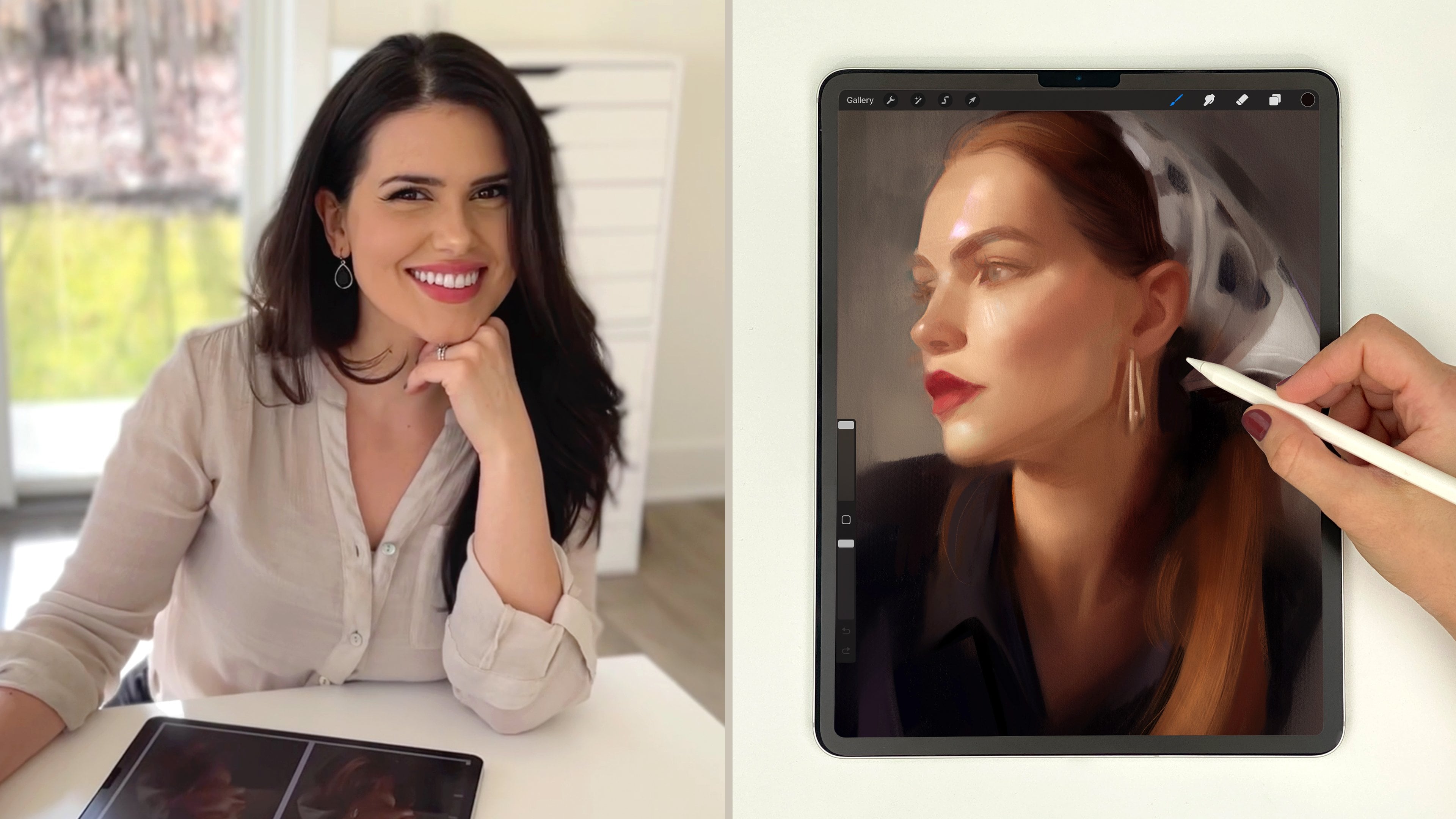
1. Introduction: Hi there. I'm Gabrielle Bike, and I'm an artist and teacher who loves painting portraits. In this mini class, I'm going to show you
how you can begin any portrait painting in
Procreate on a solid foundation. I'll be sharing some of
my favorite tips and techniques for painting
portraits with confidence. I'll walk you through
some things that I find to be essential
at the start of a portrait from
finding a great photo reference to setting up
a high quality canvas, blocking in the painting
with big shapes of value, and checking to make sure everything's
in the right place. I'll be sharing tips for working with color, edges, brushwork, and textures, too, those things that really bring a
portrait to life. This class won't cover the full portrait painting process. Instead, I'm going to show
you how to start strong. So you can build any
portrait painting and procreate on a
solid foundation. Then we'll move into
some of my favorite techniques that will help you add style and expressiveness
to your digital paintings. Whether you're brand new
to portraits or you just want to feel a little more confident in your
digital process, this class is here
to help you start strong and build your own
painter and only style. By the end of class,
you'll feel more confident approaching
the blank canvas, and you'll have
tools and techniques you can return to
again and again. Ready to paint and have some
fun? Let's get started.
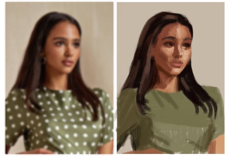
2. Start with an Incredible Reference: So to begin, I want to share
with you four ways you can start every portrait
painting on a solid foundation. And they are start with
an incredible reference, set up a high quality canvas, paint only the big shapes
of value at the start, and check your proportions
before adding any detail. So let's jump in
first by talking about how to find great
photo references. Now, it's important to note that not every beautiful photo will translate into a
beautiful painting. Over the years, I
found that one of the most important
factors is having a reference with clear
and readable lighting that defines the
forms of the face. If a photo has strong, clear shapes of value
or light and shadow, you likely have a
winner on your hands. On the other hand,
poor lighting can make the painting process
frustrating and challenging, even with a stunning
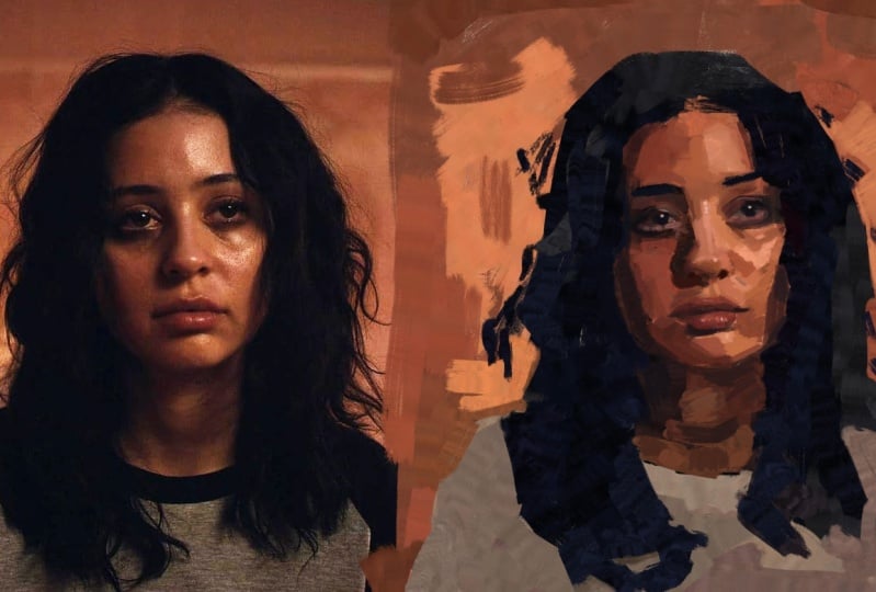
model or composition. Let's look at this example here. On the left, here's a
reference photo where the painting process felt
effortless to me. But why? The model and composition
are beautiful. But more importantly,
the shapes of value here are clear
and easy to see. But here on the right,
although we have a beautiful model and
a beautiful photo, when I went to paint
from this photo, I struggled to see
clear shapes of value. When I would squint down
my eyes at the reference, I couldn't really see
the shapes I needed to paint because they weren't really well defined
by the lighting. So the process turned
into a struggle for me, and because of that struggle, I eventually gave up on
the piece altogether. But this photo on the left, because there are clear
light and shadow shapes, I was able to make a more
successful painting. So here's a look at my painting, and it was just a joy to create. It was easy to do because all these shadow shapes and all these shapes of light and shade are really easy to see. I believe the best
photo references have incredible lighting
that enhances the composition and
creates a strong, clear contrast between
light and dark, making the shapes and forms easy to see and therefore paint. But then on top of
this, it needs to be a subject that inspires you. So where do you find great
photo references like this? Well, unfortunately,
these photos aren't just going to
fall on your lap. It's definitely a
hunt to find them. So when you do stumble upon
a great photo reference, definitely save it in
a dedicated folder. I like to use shutterstock.com
for my reference photos, usually, but there are also some free sites like
unsplash.com and pixabay.com. But in summary, take the
time to find or take great photo references
with excellent lighting. This will make the painting
process smoother and more enjoyable and will end in a more successful painting
in the end, I believe. So take your time, seek out those clear shapes
of light and shadow, and start your portraits
on a solid foundation.
3. Set Up a High-Quality Canvas: All right next up, let's
talk about Canvas setup. For painting portraits
in Procreate, you'll want to work on a
nice, high quality canvas. You'll also want to set up your reference photo and
painting perfectly side by side. This will make
getting proportions correct down the
line so much easier. So here's how I set up mine. So right here in the
corner, we're going to tap this plus icon here. And then right here where
it says New Canvas, tap the little icon right here. So what I do is I make the width 5,000 and I keep the
height at 3,500 pixels. And I like to have
the DPI at 300. Now, something else
I want to show you here is in the color profile. For me, I set the
color profile to be this SRGB color profile because I find that if
it's display P three, sometimes if you put the images you make
in display P three, they look beautiful
on your iPad. But then when you go to
upload them to the Internet, sometimes the colors
can get dulled down, and that's just because the monitor that you
might be looking at doesn't have the same range of colors that your iPad does. So I always like to work within the range of colors
offered within this SRGB range because it's pretty standard
for the Internet. So back to here, 5,000, 3,500, 300 DPI, color profile
at SRGB that top one, and then we press Create. So now this is perfect. We're going to set
this up so that our reference and our painting are perfectly side by side, and I'm going to show
you how I do that. Go up here and you
see this wrench icon, tap that and where it says add, you're going to press
Insert a photo. Tap that, and I'm going to
grab this photo right here. It's importing. And then
I'm going to tap my layers for now just to deselect it
and zoom out a little bit. Then I'm going to grab
the transform arrow. And what you want
to do here is make sure when you tap snapping
here at the bottom, make sure magnetics and snapping are both turned the one. So
we're going to tap those. They're going to light up
blue means they're on. And then what I'm going
to do is just drag at the corner here and
pull this up so that it fills about
half the canvas here. So that's probably a little bit, I want to be able to fit
both of these side by side. So let me make it
a little smaller. I'm going to put it just
right in the middle. That's probably
going to be good. Let me tap my layers again. What we're going to do here
is take your finger and swipe left with one finger
and press duplicate. Then take the transform arrow
again and drag it on over. I want you to see that
yellow line there. That means it's
perfectly in line with that first one, and
that's what we want. I'm going to put it right
there and let it go. We can see they're
perfectly side by side, but they're a little off center from the canvas, and
I want to fix that. Let's go to layers and swipe right on that bottom one there so that they're
both highlighted in blue. Grab the transform arrow again and we're just
going to stretch it out a little bit and make it so
it's perfectly right in the middle here and we're going to know it's
right in the middle. Let me see. I locks up perfect there with the
cross hairs in the middle. That's good. I'm going
to tap my layers, and what I'm going to do
is grab this top layer. If you're right handed like me, this is going to be
your reference photo. This is going to eventually
become your painting. If you're left handed,
just switch it. What we're going
to do now is grab the layer that's going to become your painting and take two fingers and swipe
right with them. What this is going to do is it's going to alpha lock that layer. And you can tell it's alpha
locked because of these. You see this checker
background here? That means it's alpha locked. You can also double check and make sure just by tapping it, and you can see that
little check mark right there. So
it's alpha locked. And what that means
is that when I go to paint on this layer now, the paint I put down is only going to stick to
what's already there. So it's only going to stick to this rectangle here, basically. Okay, so what I'm
going to do now is go ahead and
go to my brushes, and I'm going to grab
a big fluffy brush. I like to use this
soft brush here. This is a modified procreate
default that I really like. So just this one and make it nice and big as
big as it'll go. And what you want
to do at this point is select a background color, like a nice mid tone color. I'm going to grab this one here, and you're going to just
paint over the entire thing. Now we have a reference and a would be painting
perfectly side by side. This is going to make spotting
negative space and making proportional measurements
and comparisons so much easier, okay? So I definitely recommend
taking the time to set up your reference
and your painting perfectly side by
side like this.
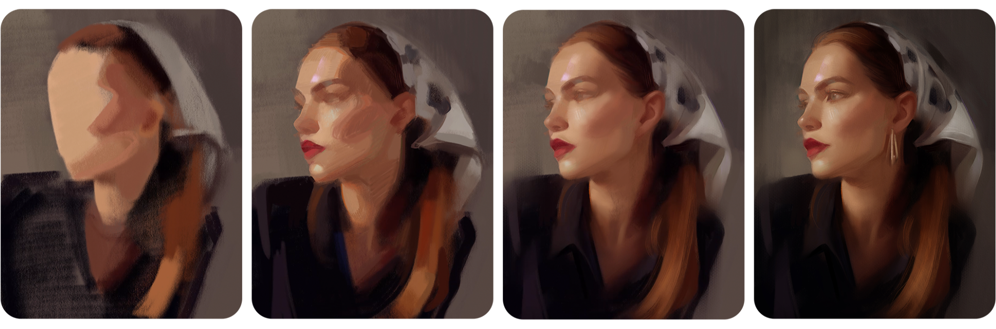
4. Paint the Big Shapes of Value: The third key to building
a solid foundation for your portraits is starting with a focus on shapes of value. If you're unfamiliar
with the word values, what I'm talking about here is when you start your painting, think about breaking down
your piece by painting the abstract shapes
of light that you see and the abstract shapes
of dark that you see. Sometimes looking at a
reference like this, the idea of starting with, like, a line drawing can
be so intimidating. So my suggestion is to skip
the line drawing altogether. Instead, let's
focus on capturing abstract shapes of
light and dark. And let me give you a tip to
make this super easy to do. So again, let's go
back to our layers. Go back down to the
reference photo, swipe to the left with
it, and press duplicate. Now on this duplicate image, what we're going
to do is blur it. What blurring will do is it
will eliminate the details of this photo so that no
longer is it going to look like an intimidating
photo that we need to draw, it's going to be blobs of value. Let me show you what
I mean. So make sure you have that
layer selected. Go here to adjustments, this little magic
wand looking button here and tap Gaussian blur. Okay. And we can see it's on because of this,
but nothing's happened. What we have to do is
take our finger and just drag it to the right, okay? Now, this is way too much blur. That's gonna be unhelpful. We want something
about right. Mm. About right there
where we can see. Okay, well, now there's
just a little blob here. It's just a little brown blob. This is another
little brown blob, and then there's this shape here and this little thing here. And there's this lighter part right here. It's
like a triangle. That's how you want
to start seeing this. So now it's no longer
eyes, nose, mouth, it's shapes, and they
are abstract shapes, which are so much
easier to paint. Okay, so let's keep
it about there. I'm going to tap
my layers again. So now if you want to,
you can even label these. You could label this. Painting. And this is blurred reference. Blurred reef and down here, Rf. Okay. So then back up here
on the painting layer, we're going to keep
it alpha locked. Let's move into trying to
paint some shapes of value. Okay, so now we are going to
mentally free ourselves up. This is no longer a
portrait painting. These are just little blobs, little abstract shapes
that we're going to try our best to copy over. What I'm going to
mostly be considering here are shapes of value, like I said, but
also negative space. That's what's really
going to help me place this on the canvas. And if that's an
unfamiliar idea to you, let me just add a little
layer on top here real quick and explain what I mean. Instead of looking at
the positive spaces, which is her, the girl, we're going to be
looking at negative spaces and negative shapes. So for instance, I'm going to instead of trying to draw this
shape of hair, I'm going to try and draw. Let me grab a blue collar so
you can see. There we go. I'm going to be trying
to draw this shape. Okay? This weird little
shape right here. So I'm not going to
try and draw her hair, which is the positive shape. Instead, I'm going to try
and draw to place it better, this negative shape and
the shapes surrounding it. Of course, eventually,
I'm going to get in here and paint the hair, but I'm always going to consider the shapes
around that, too. So here, I'm not going to
try and draw her arm per se. I'm going to instead look at this shape right here,
this little triangle. So these negative shapes around her are going to make it a lot easier to place her on the
page, if that makes sense. This is really
sloppy, but hopefully you understand what
I'm going for here. Okay. That's the way we're going to consider
this and approach it. Let me grab one of my very
favorite brushes for starting. I love this six B pencil here. This is a modified Procreate
default brush and I'm just going to use that brush
to place her on the page. But let me go back here, make sure you're doing it
on your painting layer because basically
that's going to lock in all your colors into
these dimensions here. Thinking with the same
mentality as before, we're going to think
in simple shapes of value, blobs of color. Okay? Just go to start
with her face here. And it's a mess. We're
not thinking about lines. We're not thinking
about making a drawing. You're thinking more with
a painter's mentality. Okay? And I'm just looking
at shapes of value, shapes of light and dark, okay? And already this is like a mess. It's like, where is
she going with this? It comes together in the end. Okay? I see this little dark
kind of triangle in here, so I'm trying to hint at that. And here's that hair
I was talking about. But as I'm painting it, I'm looking at this shape. Okay. Looking at this shape back here as I'm painting it so I can make sure I place her
correctly on the page. Here, as I'm drawing the top of this head here,
I'm thinking, well, what's the distance between
here and here, here and here. It needs to be a
little higher on mine, so I got to push it up
so that it can match. Coming around here, we get
this side of the hair here. This kind of loops down. I'm thinking now about
this negative shape. What does that shape look like? Kind of pushes in a little
bit more than I have. Already, I have
her head floating a little too far this way. It's got to come.
Scooch this way, some. So I'm looking again. Okay, what does that negative
shape look like? What does this look like here? And this is just
the first things you want to think
about as you're placing these shapes
of value up on. Page. And like I said, I'm not thinking about
drawing a girl here. I'm thinking about these
really abstract fun shapes. If you even wanted to, you could turn your entire
composition upside down. Okay? Let me flip it so
that it's right for me. And you could copy the
shapes of value like this. And I know I'm using
the color picker. I know that's kind of
a controversial thing. Some people don't like using it. I don't mind it. I'm having fun. This is, like, therapy for me. I love just getting into the zone and copying
over these shapes. And if you want to study
color, absolutely study color. I like to study
color in oil paint. And, like, real life mediums, and I kind of just
like to use one of the digital art
shortcuts we have here. And I'm okay with that. But of course, do what's best for you. You can absolutely
go and pick each of these colors if you want to make it a study of color as well. So I'm seeing just this kind
of big shape here of green. So I'm just putting that in. Okay. It's a little triangle of color down here. Here, there's a little bit, but I think this is
a hand peeking in, but I'd probably take that out, edit that out in my
painting just because it's kind of an unnecessary detail that kind of takes
us off the page. Takes takes the viewer's eye
out of the composition or out of the away from
the composition. You always want to
keep your viewer's eye flowing towards whatever
your focal point is. So something like this little
hand could probably get omitted. Let me
flip it back now. But you understand the
point I'm trying to make. You can even flip this
thing whatever way you want, copy those shapes. You're not painting a
person at this point. I think a lot of
times we get hung up on the details of
something like this. A portrait is so special and usually we're
drawing someone. Sometimes you're
drawing a loved one, and it's such a
special person to you. You know them so
well, and it's like, how could you possibly
capture them? You have to take out all that intimidation
by just saying, It's just shapes of color. It's just shapes of value. And having that
nice reference from the start is what makes
this so much simpler because I'm able to see these shapes better.
You know what I mean? If you don't have a nice
lighting statement, a nice clear readable statement where you can see these different shapes
of light in here, it's really, really challenging. So here kind of see this
triangle shape happening here. That's not a nose.
That's a triangle. Okay. Here there's these
darker shapes in here. And then there's this dark
shape happening here. And then I'm looking
like, Okay, well, let me see here. This looks. Let me add a layer on top. You can do these
kind of negative space measurements as you go. So let me grab blue so you
can see what I'm doing. Okay. So this is like the general If you tap your finger,
it'll go straight. This is kind of
the general shape I'm trying to get over here. I know already that
I'm really off, but this is the time to
make those adjustments. So let me go here. Let me duplicate this weird
little shape I've made. And drag it over. Okay. Look at what this is showing us. Now I can see I painted this in a way where her face
overhangs that line so much. You see all this extra
I've put over here, it doesn't belong there if I want to make something that
truly looks like this. Over here, we can see
nothing's overhanging here. So already I know that this
entire face needs to shift. Probably her entire portrait
needs to shift over. So these are the type of
things you want to look at. Now, though, when you're 10 minutes into a
painting versus 5 hours into a painting
and everything becomes delicate and precious and
you don't want to move it. So early on in this, that's when you
want to make these proportional checks and things. So let me get a little bit
more up here with the values, and then we're going to go into some of those
proportional checks. So let me delete this for now. And as soon as you
notice something like this, make the adjustment. Even if it looks awkward
at first, you can fix it. It's easier to pick something like this that
looks kind of awkward. Like, obviously, that
looks weird now, but it's going to be
easier than letting it go on and on and on and then
having to change it later. It's really tough to change stuff once details get involved. And if you're a
traditional painter, you especially know
this to be true or a traditional artist working with pencils or ink or whatever, you know this to
be true because we don't have the luxuries that we have with digital tools with
those traditional tools. Like, we're able to
use selection tools and move things around
and liquefy things. You don't really have that
traditional art, right? So I still think, though, even still, it's
easier to move it now. Alright, so you just want to get your strongest values in, whatever's going to show
that lighting statement. The best. Those are the
values you want to get in. Shapes of light shapes of dark. I can see already that chin her face is just getting too long. I've made
her face too long. It's got to go up
quite significantly. So you make that change now. You don't wait to do it
once the details involved. You got to move it
up now. I'll show you a really easy way
to check all this. In a minute when I get a
few more values up here. If I squint my eyes down, I can kind of see and knowing kind of way the
planes of the body are here, this part is a darker green than this front
plane of her body. So you kind of get in
that value shift now. Okay. If you've studied
portraits at all, you know the importance
of the planes and how each plane change is going
to be a color change. Basically, if you
consider the head or the body like something
more blocky and sculptural, every time you get
that shift in plane, it's gonna be a different
color and a different value, and that's what's gonna give
you the illusion of light. Hopefully that wasn't
too confusing, but if it is, you'll know what I mean as
you continue your journey. Let me just get a little
marker for her lips now. And then I want to
show you how you can do some quick measurements
at this point.
5. Check Your Proportions: Before I even get in
those middle tone colors, you really do want to make
a proportional check. So the final thing I
want to share with you, so you're able to
start any portrait on a solid foundation is to check proportions before
going into any details. Even adding those mid tones, you got to do a
proportional check. And because we set up
our canvas like this with the reference and painting
perfectly side by side, this is going to be
super easy to do. So at this point, we have
something up on the canvas. Let's check it. Go ahead to your layers and add
a new layer on top. Grab a color where you
can kind of see it well. I like to use, like,
a light blue or red. That'll be good. And then you're going to
want to grab a kind of straight sort of brush. So I'm going to grab my willow
charcoal streamline brush. I love this brush. It's one of my very, very
favorites, if not my favorite. And you're going to make
the brush about you know, not too big, not too small, basically about that size. Okay? Then from here, we're already on that new layer. What we're going to do is draw perfectly horizontal
lines across this canvas. And you're going to want to try and hit the major landmark. So where her eyes land, where the bottom
of her nose lands, perhaps where the part
of her lips lands at where the top of
her shoulders land, where the top of her head lands, that sort of thing, okay? And what we're going
to do is compare. Did we make the mark? Did we hit the mark? Are we lined up where things
are supposed to go? So from here, it's essential for this that they be
perfectly horizontal lines. So I'm going to drag a
straight line across, and then I'm going to take
my finger and tap it down. What that's going to do
is it's going to make a perfectly horizontal
line, okay? And I didn't really do that
with any landmark in mind, but there we go to just show
you. Okay, let me do one. I'm going to try and hit
the top of her head here. Tap, right? So I got that one pretty good. Let's try and hit the
bottom of her chin. Got a little higher. To. Okay, look at this. This
is really telling, right? Because I can see
here, the bottom of her chin very clearly ends here. There's no overhang
here of her chin. Yet mine really overhangs, and I kind of sensed this earlier in the painting process, but it's got to shift up even higher if I want to match
up with this reference. And this isn't to say, you have to paint something
exactly like a reference. You are the artist. You are free to veer
as far away from this photo reference or as close to it as you
want. That's up to you. For me and my style, I like to hang out when I'm
doing this sort of painting, I like to hang out like the actual proportions
that are shown. And then I like to have
fun with brush strokes and colors and all those sorts of things later and be
more expressive there. But when it comes
to proportions, I do like to kind of lock
it in because this is a real person and I want to make my painting look
like a real person. So I like to lock into the actual proportions
that are there. So, of course, you can always go in and change
things if you want, alter them to fit your
artistic style and needs. But if you want to
do it correctly, this horizontal line trick
is great for checking. Alright, now let's go in and check maybe this eyeline here. Tap it. That's pretty good. Let me do one try and hit the
bottom of the nose. It's kind of a
really good anchor right there at the
bottom of the nose. Mm. Okay, so this is
very telling, too. I can see that.
Like, it is blurred, so it's a little
hard to tell here, but let me bring the
blur down a little bit. So go onto your
layers, and if you ever want to change the
level of blurriness, you can just tap this in
and bring it down, okay? That's how I go through my whole painting process
as I slowly sneak this down and give myself a little bit more detail as I move forward on
my own painting. Okay, so let's put it
about right there. And I can tell her nose, it doesn't end on this line. It ends right up here, okay? But in my painting, if I had continued on
with this and rendered it and added all the
details in the world, it would have ended up too low. This needs to push up. So then at this
point, I see, Okay, I need to make a couple changes
here. What did I learn? I learned that the nose
needs to be pushed up, and so does this chin. With digital art, you can
either hand paint that. If you want to, though,
you could even take the selection tool back
on your painting layer. Go ahead and duplicate it. Take that selection tool, grab free hand, select it. Grab the transform
arrow, push it up. And it looks awkward,
but that's more proportionally accurate
than what I had before. Okay? So you can do
that in digital art. We do have this
luxury of just using the selection tool
and pushing things around and I
definitely utilize it. However, I typically this early on in a piece
because I'm a painter, I like painting, so I would rather go back and just hand paint and
make those corrections. So you'd go back here and say, Okay, let me grab
my brush I like. You'd go back here and say, Okay, that's got to move up. We can try and fight it,
but it's got to move up, so there it goes. Okay. And then it looks like the
lips have to go up too. There's more space
here with the lighting of the bottom of the chin there. So that's got to push up.
These lips have to push up. So that eventually this
nose can also be pushed up. Okay. So this is more proportionally accurate than what
I had previously. Then, of course, you can
take these horizontal lines, turn them on and off, use them as they're
beneficial to you. I don't recommend gridding
out an entire piece. For me, I just think that takes a little bit of
the joy out of it. But you're your own artist
and your own person. If you want to use the
grid method where you literally do out a
full grid, you do you. You have fun. As long as
you're enjoying the process, I think that's
what matters most. So this is how I start my pieces on a solid foundation,
my paintings. I make sure I have a
reference that has incredible lighting or
just great lighting. I make sure I set
up my reference and my painting
perfectly side by side on a high quality canvas. I think in terms of abstract
shapes of light and dark, shapes of value, and
then I always make sure I check proportions before adding any
amount of detail. This is my approach to starting
on a solid foundation. And I kind of stay in
this state where things are malleable until I know everything's
in the right spot, and I have a really solid
light and shadow statement down on the campus. Don't go into detail
mode until you know those proportions are correct and everything's
in the right spot. And as a quick note,
I know some folks like to work on a bunch
of layers on a painting. I'll typically do is work on one layer kind of in a
more traditional fashion. So say I liked how this looked, what I would do is just
swipe left and duplicate it, and then work on that duplicate. What that does for
me is I kind of am storing up backups of the
piece if I need them, but at the same time, I'm
working on one layer. So I don't separate
things by the eyes, the nose, the mouth, whatever. That's a different
approach, which leads to great results. I just don't
personally work that way when I'm doing a
more realistic portrait. Just wanted to make
a note of that.
6. Class Project: Let's talk about
your class project. Your project is to start
your own portrait painting. Sometimes starting can
feel intimidating. But I hope the
process you just saw will help you see that
it's approachable. It doesn't need to
be this scary thing. You don't need to finish
a full detailed painting. Just follow the steps
we just covered to get your portrait
off to a strong start. That means picking a
good reference photo, or you can use the
one that I used, setting up your canvas and procreate with a nice,
high quality canvas, blocking in the big shapes
of light and shadow, and doing a quick
proportional check. You can stop right
there and share a screenshot of what you make. I've included two resources
to make it easier for you, the reference I'm
using in class, and also the brushes
I used in the demo. And you can grab
those right here in the projects and resources
tab on a computer. Whether you follow along with me or try this on another portrait, I can't wait to
see what you make, so be sure to share with
us in the project section.
7. A Look at the Full Process: Real quick, I'm going to
play back a little bit of this time lapse replay here, you can see how the
piece progresses. Let me play this and I can
explain what's happening. But I do set it up with
the big shapes of value. You'll see here, big
shapes of value, looking at negative space. But it's very abstract
in the beginning. We're not thinking
in terms of line and doing like you would
with a pencil sketch. There's really no
sketching here. It's really thinking with
a painterly mentality, thinking with big shapes. Here I'm checking
my proportions. Of course, you can also
look at vertical lines. Here I'm getting up
close to the anatomy. You can see I'm sort of
breaking down the forms there. So once you get something
up on the canvas, that's when you can go
into these details. But even still, you can
see how it's very blurry. I'm not getting super detailed. I'm not drawing eyelashes yet. Looking at perspective, making sure
proportions are right. Okay. And then finally, at the very end, I
get into some detail. So hopefully that just
gives you a little bit of an idea of how this
process looks. But I do want to show you
a few more techniques that can help you create
really expressive, beautiful portraits. So
let's go ahead and jump in.
8. Quick Tips: Edges : Switching gears a little now. I want to show you
some easy go to painting techniques that you could try in your future pieces. These are just some fun
things I like to play around with as I'm working
through my pieces, especially in the middle and towards the end of my process. I think these
techniques add a lot of expressiveness and
uniqueness to paintings, and they are experimenting
with edgewk, playing with color,
experimenting with brushwork, and
adding textures. So let's first talk
about edgework. So when I'm talking about edges, I'm talking about
soft edges that are sort of misty and smooth and hard edges
which are crisper, and it's just the edge
between two areas. So let's take a look
at this as an example. So if I make a comparison, I'm going to show you
a hard edge versus a soft edge or a softer edge. So right here on
this shoulder here, do you see how the edge here is a little bit tighter between this light red
and this darker red? Then as you move
over towards here, it's softer and mistier here. This is a softer edge. This is a harder edge. And I think what brings a
lot of beauty to a piece and a lot of expressiveness is
exploring that difference. So here again, there's a
really hard tight edge, whereas over here, it's really
misty and smooth, right? And you can see this
throughout the whole piece, and it kind of helps your eye
to bounce around the piece. I tend to use mistier edges
around the edges of, like, shoulders and things
like around this collar, it got a little misty, but it's going to depend on
the reference, too. So let me look at a reference where I have the image here. So back here on this one. You know, you get to choose as the artist what to make
hard and what to make soft, but you can also use the
reference as a guide. So here, I noticed
that on her forehead, it kind of was a
nice point here. You know, there's a lot
of bone structure here, so I wanted to make this
a tighter edge right here on her forehead.
So that's what I did. I made it a nice hard
edge where there's a clear edge between her face
and the background, okay? But then over here, a place that's less
important like her shoulder, I thought, Well, why would I put a hard edge right at
the edge of the piece? That's going to take my viewer's
eye right off the edge, and they're gonna go
look at something else. So instead of mimicking the hard edge that's right
here, it's very hard. You can clearly see the
distinction between her shoulder, her shirt color,
and the background. Instead, I thought
to myself, Well, why don't I make it
softer right there, mistier so that my
viewer's eye is in catching this point
that's going to fly right off the page
and onto something else. Okay? So I made it soft so that the focus would
remain here on the face. So I want to show you how to get soft edges
in your pieces, and two ways, I like to get
hard edges in my pieces. So in my work to get soft edges, I love to use Procreate's
soft pastel brush. I've modified it a little bit, but I love to use it
with this mudg tool, this one that looks like
a finger right here. I grab that and I use
this brush right here. Okay. And the size just depends on what exactly you're smoothing
out and softening, but kind of like a middle range is typically good for my use. And what I like to do
is I just go like that. Not too hard, not too soft, just kind of softly, push one color into the next. And I don't know what it
is about this combination of soft pastel smudge
brush and smudge tool, but it's just a magical
little way to soften colors. And you just do it kind
of softly like that. And it's also great for
unifying an entire piece. So say everything got
a little too detailed, oftentimes what I'll
do is I'll take my soft pastel smudge brush and just go over
the whole thing. And it just makes everything
a little mistie and just brings it back to a
more uniform state. See that difference? So what I like to do is just make it
a little misty in places. And that's what's going to make your harder edges
even more special. Back when I first learned
how to draw and was experimenting with painting
things more realistic, I found that I wanted to
make everything a hard edge. I wanted everything to
be tight and realistic. And then I learned
about edges and I found the beauty
of the soft edge. I think what a soft edge does is it makes when you put them in, it makes it so that your
harder edges can really sing. They can really be something special versus everything
being all hard edged. So that's how I like to
make a nice soft edge. But let's look now at how
we can make a harder edge. So there's two main
ways I like to do this. You can use a selection tool. So let's pretend like we
want to crisp this back up. So I got really misty. Maybe we decide, I don't want to make it misty. I want to
make it a harder edge. This is what you could do. You take the selection tool and use the freehand selection, and you just kind
of go like this, select right up on
the area where you want it to be a little bit
harder in edge quality. Then I like to use the six B brush that's
perfect for this. I'm going to pick up
the background color. I'm going to select
the background color, and then I'm just going
to butt it up right up against that headscarf there. Then when I deselect it, see how nice and crisp
and sharp that is now. So this is a really
hard edge there. Let's see back that soft edge. See? But you can go
either way with it. And I think exploring these
edges is where your work is really going to
start looking kind of magical and dreamy. So have fun with your edges. Let me go back to where
it was a hard edge. I think that looked
kind of cool. Alright. Now let me show
you one more method or way of making a
hard crisp edge, and that is with
the six B brush. So this six B brush right here, what you can do is this
brush is very versatile. Let me show you how
to layer on top here. It can do thin marks, but if you put it on its side, so right now I'm holding
it kind of upright. If you tilt it downward, and I like to put
my hand on top like this and hold it that way, you can make this nice thick
sort of stroke like that. I find that on those thick
strokes where it's like that. Do you see how this is a
hard edge right there? And here it's kind
of misty and softer. So if I want to
make a hard edge, I would just put it
on its side and put the pencil using this edge
against the hard edge. Let me see if I can find
somewhere to show you. So say I wanted to crisp up like this area of her neck here. I wanted to make this part like a harder edge between this
dark and this light color. What you could do is you have to kind of move
it around so that it's the right angle
for the pencil. But what you could do is
pick up a nice dark color. Let me make it even darker
and using that hard edge, just kind of push it
right against there. And you'll have to get some
practice with this pencil. I've been using it
for I don't know. Yes and years and years now. So I'm pretty familiar with it. But I think once you get
familiar with this brush, you're really going to like
it and how versatile it is. And this is an old legacy
brush that they took away, and I made a couple of
modifications to it, so it's a little different
than it was before. But that's how I like to do
it. That's just another way. You can add some sharper
edges to your piece. And then if it gets a
little too hard in here, you can always go
back, soften it up with that soft
pastel, right here.
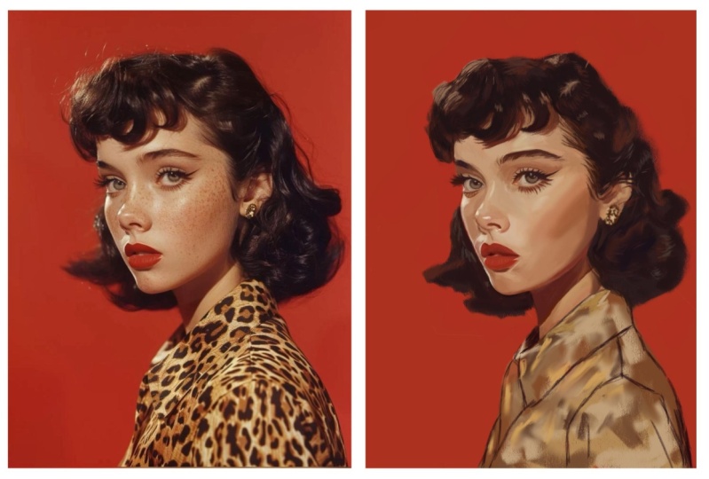
9. Quick Tips: Color: Now let's chat about color. There are so many ways you can experiment with
the element of color, but this is one of my
very favorite techniques, and that is to add different
colors on top of each other and colors that you
wouldn't necessarily expect. So here on this one, I added this little
if you zoom in. See this little pop
of pink in there. Or, you know, right
along the edge here even. Maybe you can see it. You see this little, like, blue. Like, you wouldn't expect
to see that color there, but it makes it exciting, and it just makes your colors
more exciting to look at. So right here, we
have a little bit of green. So that sort of thing. Let me see if I can
find another example here. Let's look at this one. So here on this one,
I was like, Oh, what would it look
like if we added this nice slice of blue
in here? It's different. It's a little bit unexpected. And the same thing with
this, this little purple. And what I'm often
thinking about when I'm doing this is I'm
thinking in my head, Well, she's got a
yellow headscarf here. What if I added the
complimentary color or the color across the
color wheel from it? Would that make it look more
exciting and more visually appealing to see that
contrast of color there? And even in the background
here, I added it a little bit. So here, it's kind of just
this boring brown color. But I thought, Well,
let's spice it up, make it a little
more scintillating and add it in a
little bit of purple, adding these little blue marks, just experimenting and playing. And digital art makes
this so easy to do, there's no reason
to not experiment because if you don't like it, you can always delete it. You can always do
it on a new layer. If you don't love it, delete it.
10. Quick Tips: Brushwork: To let me show you some
brush work techniques. You don't have to tightly
render everything. In fact, I think the
beauty of portraits can come from the spontaneity
of your brush strokes. So instead of making everything
perfectly realistic, try being more artistic
and abstract in places. And like you can see here, I find great places to explore this are in
the backgrounds. And like I said,
digital art makes this experimentation so easy. You can always try something out if you
don't like it, delete it. So here, you know, I didn't want to render
out the shoulders. I didn't want to do
all so I went for a more prima painterly vibe where I just
kind of hinted at, well, what would a
shirt line look like? And I did a little painterly
brush stroke there. And then, you know, here in her head scarf, you
know, it's very simple. It's just simple strokes. It's not fully rendered. It's not just, like, fully
rendered satin cloth. It's just brushstrokes.
You know what I mean? And that's what I think
is fun about painting, doing things that are artistic. Like, these are just a
bunch of strokes here. And I think I pulled this piece into a little bit further. Let's see this final piece. So we can see, you
know, I had fun. I just kind of slopped
on some digital paint. You know what I
mean? Up here too. The brushes I really like to use for more
expressive brush work are some more painterly brushes or ones that are a
little bit jagged. So in the set I've given you, glossy paint is great
for this painterly. This one here is great. It just comes from not
thinking about it too much. What you can do in
a scenario like this is literally
duplicate your painting. You're feeling your
painting, you're liking it, but you want to have a
little fun, duplicate your painting and
just start playing. Just start having a
little bit of fun. It doesn't have to be this
thing that's super serious. Where everything is rendered out. And there's nothing wrong. If you want to render
something, you do it. If you want to make something
super realistic, you do it. Like you just got
to follow whatever your artistic gut is telling you in the moment for what's going to
make the best piece. So, like, that's kind
of fun. It makes it more artistic to look at and kind of just adds a little
bit more energy into it. You can kind of feel that energy of making those brush strokes. In my portrait making process, the goal is to
capture the essence or spirit of the subject, but also while adding
my own artistic flair and brushwork can
help a lot with that.
11. Quick Tips: Textures: Textures, there's just
something about adding a paper or canvas
texture on top of digital work that just
brings it to the next level. It just gives it this real
feel that I just love. So here's how you can add
a texture to your piece. What you'll want to do
is, and I typically do this towards the end of my
portrait making process, what I'll do is go to
the wrench icon, add, insert a photo,
and you'll want to have some already stored
in your camera roll. Okay. And then
let's try this one. So it imports on Zoom here, grab that transform arrow and just make sure it's big enough
to cover the whole thing. And then what I love to do with this is just play
with the blend modes. So tap that in next to
the texture you put in, and just scroll through
these blend modes. You can really get some, like, fun looking things here. Let me zoom in so you can see the grain a little bit better. And you just scroll through and see what do I like to look of? Typically, for me, I'll
do multiply blend mode. Sometimes color burn, sometimes linear burn
just kind of depends. I'll also often play with the opacity of it to get,
you know, just the right. It's like, how much
salt do you want? You know what I mean?
It's just to taste. So you decide what you
like to look of there. But typically, I'll
go for multiply. I find that that gives
a nice little bit of texture without
being overwhelming.
12. Next Steps: So much for joining
me in class today. I hope you're feeling more confident starting your
portraits and procreate. And remember, you
don't need to have everything figured out in
the beginning of piece. Just taking those
first few steps like finding a great reference, setting up a high
quality canvas, locking in the big
shapes value and checking your
proportions can give you a solid foundation to make the whole painting process feel a lot simpler
as you move forward. Now, I have some things I'd
love to share with you. If you'd like to keep exploring portrait
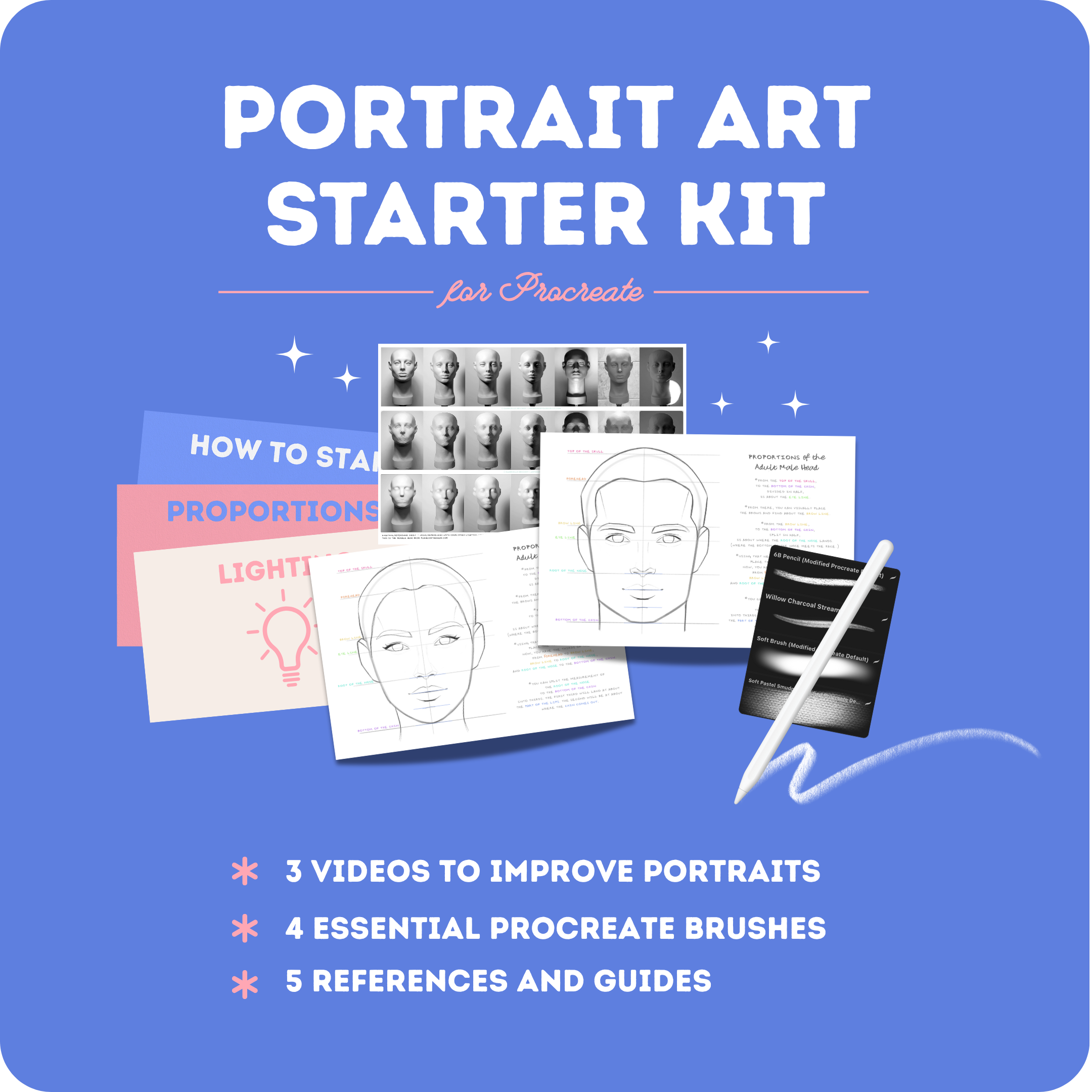
painting with me, I have a free portrait art starter kit for
you that you can grab. There, I'll share a
free mini training, appropriate rush pack, and more helpful guides to support you as you grow your
portrait painting skills. You can find a link to my
portrait art starter kit in the Projects and Resources
tab, your own Skillshare. And if you're ready to
continue learning to paint portraits,
start to finish. I'd love to invite
you to join me in my full class
here on Skillshare. Paint with me digital portrait
painting and procreate. In that class, we'll move past the foundation stage
and walk through the entire process of painting a portrait and
procreate step by step. If you love painting portraits, you'll love this class, and I really hope to see you there. Thank you again for
being here with me. I hope you enjoyed and until
next time, happy painting.
 Gabrielle Brickey, Portrait Artist - ArtworkbyGabrielle.com